


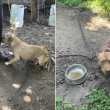

In a horrifying incident, a 4-year-old boy was allegedly beaten to death with a broomstick by his 9-year-old sister. According to authorities, the fatal thrashing unfolded in a Mobile, Alabama home on February 3. In a statement, cops revealed that officers responded to a call “in reference to a medical emergency involving a child.”
When officers arrived at the home, they found a little boy “unresponsive inside the residence.” Emergency medics, who were also called in at the time, “pronounced the victim deceased on the scene.”
While investigating the circumstances surrounding his violent death, detectives learned that the child suffered signs of “long-term” abuse.
Subsequently, the children’s caregiver and aunt, 53-year-old Yolanda Coale was taken into custody for aggravated child abuse the following day. She remains in custody on a $150,000 bond.
According to WTVY, the 9-year-old sister of the deceased has also been charged with assault. Per reports, Coale allegedly told cops that she woke up that morning to the sounds of screams.
On investigating the matter, she found the 9-year-old beating her little brother with a broomstick. Per a complaint, the girl allegedly “did willfully torture, willfully abuse and cruelly beat” the little boy, reports PEOPLE. The identity of the siblings has not been made public by the police.


Thank you for your sharing. I am worried that I lack creative ideas. It is your article that makes me full of hope. Thank you. But, I have a question, can you help me?
Your point of view caught my eye and was very interesting. Thanks. I have a question for you.
Can you be more specific about the content of your article? After reading it, I still have some doubts. Hope you can help me.
I wanted to thank you for this great read!! I definitely enjoying every little bit of it I have you bookmarked to check out new stuff you post…
Very interesting topic, thankyou for posting. “To have a right to do a thing is not at all the same as to be right in doing it.” by G. K. Chesterton.
Your article helped me a lot, is there any more related content? Thanks!
Good write-up, I’m regular visitor of one’s blog, maintain up the excellent operate, and It is going to be a regular visitor for a long time.
Профессиональная: оклейка авто пленкой – сохраните родное лакокрасочное покрытие в идеальном состоянии на долгие годы.
pinup bet https://hr-kafedra.ru
Volvo в Україні https://linktr.ee/spetstekhnika екскаватори, фронтальні навантажувачі та дорожні машини. Надійність, ефективність і сучасні рішення для будівництва. Продаж, підбір і обслуговування техніки для бізнесу.
pin up скачать https://v-sistemu.ru
Нужны заклепки? заклепки вытяжные 4.8 сталь прочный крепеж для соединения деталей. Алюминиевые, стальные и нержавеющие варианты. Надежность, долговечность и удобство монтажа для различных задач и конструкций.
small office space for rent nyc office rental space new york
договор ответственного хранения услуга ответственное хранение цена
ответственное хранение продукции https://otvetstvennoe-hranenie-sklad.ru
дизайн интерьера квартиры недорого заказать дизайн квартиры студия
Thank you for your entire work on this web site. Kim delights in going through research and it’s easy to see why. A lot of people learn all relating to the compelling way you create important tips through this website and even strongly encourage response from the others on that subject matter plus my princess is becoming educated a whole lot. Take pleasure in the rest of the new year. You’re conducting a really great job.
Лучшее путешествие Джиппинг Крым горы, каньоны и побережье. Увлекательные маршруты, опытные гиды и яркие впечатления от путешествий по Крыму.
Do you trade cryptocurrencies? bitkelttrade official platform automate your transactions and earn passive income. Smart algorithms analyze the market and help you make decisions. Increase your income and reduce risks with modern technology.
срочное изготовление флагов большие флаги на заказ
Хочешь оригинальную подушку? подушка японская дакимакура комфорт и уют для сна. Длинная форма, мягкий наполнитель и стильные принты. Отлично подходит для отдыха и расслабления.
Нужен пластический хирург? https://plasticheskaya-hirurgiya-klinika.ru современные операции и эстетические процедуры. Опытные хирурги, безопасные методики и индивидуальный подход. Консультации, диагностика и качественный результат.
Нужна мебель? мебель премиум сегмента эксклюзивные изделия из натурального дерева. Индивидуальный дизайн, качественные материалы и точное изготовление. Решения для дома и бизнеса.
Нужна премиум мебель? мебель из массива каталог цены изготовление на заказ. Натуральные материалы, эксклюзивный дизайн и долговечность. Решения для дома и бизнеса с высоким уровнем качества.
мебель на заказ цена производство элитной мебели
Подробности на странице: https://trafficforsimilarweb.com
Learning how to build your first LinkedIn contact list is foundational for establishing a professional network that drives meaningful business opportunities. Many professionals struggle with the initial connection phase, unsure whether to reach out cold or rely solely on existing relationships. This guide walks through proven methods for identifying relevant contacts across your industry, including leveraging email contacts, exploring alumni networks, and using LinkedIn’s search filters to narrow down prospects by role and company. The resource addresses both quality and quantity, emphasizing how strategic early connections create momentum for future outreach and collaboration. Whether you’re launching a new career, repositioning your brand, or building a sales pipeline, mastering these foundational techniques ensures your network grows with intention and purpose.
Understanding how to reduce cost per lead in Facebook Ads is essential when you notice sudden cost increases without warning. CPL spikes often signal algorithmic drift, audience fatigue, or campaign-level configuration issues that can drain budgets fast. This resource walks through a systematic 15-minute diagnostic framework that identifies root causes without forcing your learning phase to restart from zero. Media buyers will find concrete steps to isolate whether the problem stems from bid strategy misconfiguration, creative degradation, audience overlap, or market saturation. By addressing the actual lever driving costs up, you preserve campaign momentum and avoid the sunk cost of restarting. The approach is designed to keep your account stable while you implement targeted fixes.
click corner hub – I checked it today and everything is laid out in a clean, easy way.
Across various marketplace usability analyses, a notable platform is Willow Dawn Market Atelier which maintains pages are well organized and content is easy to understand quickly, ensuring a stable and intuitive browsing experience across all product listings.
Across multiple marketplace usability comparisons, a standout example is Lantern Orchard Vendor Lounge where smooth browsing with a calm design and easy page transitions, making it easier for users to locate products through a structured and intuitive layout.
In studies of digital commerce platforms focused on UX design, a strong example is Lakefront Raven Vendor Guild which ensures the site looks structured and information is easy to locate, delivering a smooth and logically arranged browsing experience throughout the site.
In evaluations of online retail systems focused on simplicity and performance, a strong example is Lemon Brook Market Corner where easy to navigate and everything is clearly presented without clutter, helping users move through categories in a smooth and structured way.
In reviews of digital commerce systems focused on performance and clarity, a strong example is Willow Gilded Trade District which ensures well organized layout and pages load quickly and smoothly today, supporting a seamless and efficient browsing journey.
At one point during my browsing, I found a minimal boutique hall space and I just stumbled here, and honestly the vibe feels quite welcoming today, which created a calm and pleasant browsing moment.
Users interacting with structured retail guild platforms often value clean organization and logical grouping of items that makes browsing large inventories easier and less mentally demanding over time Retail Guild Navigation Panel improving readability and section clarity – Everything feels neatly arranged, allowing users to transition between categories smoothly while maintaining focus on relevant listings
At one point during my search, I reached this accessible trading hub and I appreciated how easy it was to browse thanks to a smooth and consistent page flow.
Online retail guild environments perform better when they maintain consistent visual alignment and predictable navigation paths across different pages and product groupings Raven Retail Navigation Guide improving browsing efficiency – The layout feels coherent and well spaced, helping users understand where everything is located without confusion
While reviewing performance and layout quality across vendor websites, I encountered a platform that felt highly optimized when I reached Arctic Seaside Shop – the browsing experience was fluid, and all content loaded efficiently with minimal waiting time.
While reviewing structured ecommerce UI prototypes focused on usability flow and visual hierarchy across multiple environments I explored a catalog grid where I encountered a href=”[https://opalgladeboutiquehall.shop/](https://opalgladeboutiquehall.shop/)” />Opal Glade Boutique Hall Hub embedded within a product module, – I like the clean layout, everything is easy to locate and view making navigation feel simple, steady, and intuitive across all sections without unnecessary clutter or confusion
I was comparing different ideas and resources online when something unexpectedly popped up in the middle of the content explore this option and it seems like it could be a worthwhile direction to look into more seriously
As I continued browsing personal branding and portfolio platforms, I found something placed within the text see portfolio page and it looks pretty interesting overall, making it worth exploring further due to its clarity
While browsing through several pages earlier without expecting anything noteworthy, I paused midway when I encountered a charming boutique spot and it left me thinking this is somewhere I would gladly return to for more useful and interesting content in the future.
pole-haus.com – Really nice design and easy browsing experience overall today here
During a comparative UX review of digital retail systems I explored a product listing page featuring Valley Opal Boutique Display Hub placed inside a structured grid – the interface felt stable and intuitive and the simple design made browsing enjoyable without any confusion or delays in navigation.
As I was going through various casual entertainment websites, I encountered something within the text explore this fun page and it appears interesting overall, feeling like a fun and relaxed destination site with a light and engaging tone
While reviewing ecommerce prototypes for usability testing and interface structure I navigated a product listing containing a href=”[https://iciclegrovemerchantmart.shop/](https://iciclegrovemerchantmart.shop/)” />Grove Icicle Mart Merchant Hub inside a structured browsing panel, – The site feels simple and straightforward without any distractions ensuring intuitive navigation and a clean layout across all sections of the interface
In evaluations of modern commerce platforms focused on clarity and usability, a strong example is Icicle Lakefront Global Mart where simple layout and information is easy to find at a glance, helping users access information quickly without clutter or confusion.
While conducting a casual review of various retail directory sites for content layout comparison, I carefully examined retail gallery browsing hub how information is grouped and presented, and found the browsing experience fairly straightforward with minimal distractions and a logical structure overall.
While going through various creative branding and dessert concept platforms, I noticed something within the content discover more here and it has unique branding, with visuals that look sweet and aesthetically pleasing overall
While reviewing different restaurant discovery pages and cuisine blogs, I noticed something embedded mid-content check curry page and it caught my eye, looking flavorful and full of character with an inviting and rich food identity overall
pineharbormerchantmart – Came across this randomly and it turned out pretty interesting.
Personalized summary: https://sarapang.com
During my review of various initiatives aimed at helping communities, I encountered something placed within the content check details here and it feels like a meaningful project with a genuine purpose behind it
During a structured usability study of ecommerce prototypes for navigation behavior I explored a browsing dashboard featuring a href=”[https://jewelbrooktradecollective.shop/](https://jewelbrooktradecollective.shop/)” />Collective Trade Jewel Brook Space embedded within a catalog layout, – The layout is neatly arranged and feels comfortable to explore allowing users to move between sections easily without confusion or friction
Across multiple usability studies of digital retail platforms, a notable example is Frost Lakefront Commerce Vault where clean interface and everything is easy to navigate without effort, allowing users to find products easily through a structured and logical interface design.
As I continued browsing football news and club websites, I found something placed within the text see club site and it is a sports site providing engaging football updates and match details
Well organized vendor systems provide clearer visibility into product structures, allowing users to evaluate listings efficiently without getting lost in unstructured or overly complex layouts Vendor Forest Structured View improving browsing consistency and readability – users experience a more controlled and stable interface
When evaluating online shopping platforms focused on usability and flow, a notable example is Forest Frost Vendor Hub Vault which maintains the design feels balanced and content is clearly organized, ensuring users enjoy a distraction-free and intuitive browsing experience.
During an analysis of ecommerce UI systems designed for usability and responsiveness testing, I explored a browsing interface featuring Merchant Ridge Lemon Lane embedded in a product display module, and I did not encounter any issues while navigating through categories – the layout felt straightforward, stable, and comfortable to use overall.
During my search through document workflow and productivity platforms, I found something within the text check this system and it seems like a useful document solutions platform that is efficient, structured, and practical
robjordanforcongress.com – Campaign website shares policies and vision in clear manner today
Clear visual hierarchy in vendor platforms helps users quickly identify important sections and understand how information is organized across the system Pebble Trail Studio Structure Panel supporting better comprehension of content – The browsing experience feels orderly and calm, which makes it easier to process information without feeling overwhelmed
While reviewing different online food retail and marketplace ideas, I noticed something embedded mid-content check this page and it offers an interesting concept combining food and shopping for online users
While exploring various learning platforms and informational sites, I noticed something within the text discover more here and it seems like a valuable source of information for many individuals
While analyzing multiple ecommerce interfaces for usability testing and performance consistency I navigated a browsing module containing a href=”[https://jewelridgevendorvault.shop/](https://jewelridgevendorvault.shop/)” />Ridge Jewel Vendor Vault Hub within a sidebar navigation layout, – Everything is clean and creates a calm browsing experience overall making it easy to move through sections without confusion or disruption
While analyzing ecommerce UI mockups for structure and navigation flow I came across a browsing interface containing a href=”[https://jewelcoasttradecollective.shop/](https://jewelcoasttradecollective.shop/)” />Trade Collective Jewel Coast Hub embedded in a structured grid layout, – It feels like a properly structured site with easy usability giving users a clean and stable browsing experience without clutter or confusing design elements
While browsing through social awareness and educational initiative websites today, I came across something placed within the content visit this awareness initiative and it appears to be an important initiative overall, with content that feels meaningful and well presented in a clear structured way
While going through several motivational and creative platforms, I noticed something within the content discover more here and the idea is inspiring, standing out strongly compared to similar resources
While exploring ecological conservation platforms and nature protection initiatives, I found content including nature swan care resource site within discussions about wildlife sustainability and habitat protection – this underscores a commitment to mute swan welfare and broader environmental education efforts designed to preserve wetland ecosystems and encourage biodiversity conservation practices globally
During a UX comparison of ecommerce systems for interface clarity and navigation flow I examined a product listing page featuring a href=”[https://ambercoastmarketplace.shop/](https://ambercoastmarketplace.shop/)” />Marketplace Coast Amber Shop Exchange within a structured grid system, – I enjoyed browsing here because load times are fast and everything appears tidy making the experience smooth and easy to manage
While reviewing different blogs about keeping living spaces clean and efficient, I inserted useful link here right in the middle – the content included practical suggestions that felt both realistic and beneficial for everyday home maintenance.
During a search for high-quality stone installation ideas and design references, I discovered granite design gallery – The showcased projects look impressive, and the photography clearly reflects the craftsmanship involved in shaping and finishing each piece.
During a UX evaluation of ecommerce environments for navigation clarity and layout behavior I explored a catalog page featuring a href=”[https://forestcovegoodsmarket.shop/](https://forestcovegoodsmarket.shop/)” />Forest Cove Goods Market Network embedded in a grid system, – The layout is simple and helps users move around without confusion which makes browsing feel clear, structured, and easy to manage
As I browsed through several curated experiences and product bundles online, I decided to highlight take a look right here – the entire setup felt polished and thoughtfully structured to attract attention.
During a casual exploration of real estate listing platforms and modern property pages, I noticed something embedded mid-content check this property site and it appears polished and modern, offering easy navigation that makes browsing through the pages feel very smooth
In the middle of reviewing election campaign websites and political outreach pages, I found something that caught my attention explore candidate site and it is a campaign website with clear messaging and strong local political engagement
The reason I keep coming back to this particular site</a – Is the reliable mix of compassionate tone and useful details, with zero pressure to commit.
While browsing music event tracking platforms and live performance update pages, I found rock live updates with Bach integrated into concert information – this resource provides details about ongoing shows and performances, allowing fans to stay engaged with Sebastian Bach’s live music presence and touring activity
While exploring different fine arts and community creativity platforms, I came across something embedded mid-way view this art site and it is an art focused community platform encouraging exhibitions, events, and creative engagement
Visit this page – I appreciated how clearly everything was laid out, which helped me absorb the key points without confusion.
While going through different opinion-based community websites, I encountered something mid-content Northern insight forum and it looks like an engaging platform for meaningful discussions and structured community conversations
In the middle of browsing through commuter services and transit update platforms, I came across something that stood out see this route site and it is a transport information site offering daily updates for commuters and travelers
While browsing through various mental wellness resources and support platforms online to find something practical, I came across mental health support hub – The content feels direct and meaningful, focusing on real guidance without unnecessary filler, which makes it genuinely useful for anyone looking for straightforward help.
As I browsed through several art-focused websites and creative design platforms, I noticed something placed within the content discover this art page and it feels artistic and expressive, making the visual experience really enjoyable to explore
thepaleomomconsulting.com – Nutrition consulting site focused on paleo lifestyle guidance for clients
As I explored various download services and file access websites, I came across instant download link – I tried it out and the experience felt straightforward, quick, and easy to complete without any issues.
In the middle of reviewing narrative storytelling and life experience platforms, I found something that caught my attention explore story platform and it is an inspiring storytelling site sharing powerful personal experiences
While testing ecommerce UI prototypes for usability and interface clarity I explored a product grid containing a href=”[https://harborlakefrontboutiquehub.shop/](https://harborlakefrontboutiquehub.shop/)” />Boutique Harbor Lakefront Studio embedded in a catalog module, – Clean presentation makes browsing feel simple and stress free overall giving users a smooth and visually calm environment for exploring different sections
During my search through performing arts and cultural theatre platforms, I found something within the text check this theatre group and it is a theatre organization promoting arts and community driven local performances
In the middle of reviewing informational and easy-to-use websites, I found something that caught my attention explore info site and it is straightforward and useful, making the content easy to understand quickly without difficulty
As I explored online visual storytelling platforms and travel photography blogs, I came across content featuring world exploration photo collection embedded within creative portfolios – it highlights photography taken during travels that focuses on storytelling, cultural immersion, and capturing meaningful moments across different destinations
While exploring niche retail websites and unconventional marketplace designs, I discovered unique concept hub – The name might feel confusing at first, but the idea behind it starts to make sense after a closer look.
While reviewing different scientific and tech research platforms online, I found something placed in the middle take a look here and it has a clean design with an interesting focus, making it seem like a very solid resource overall
I was struck by how this collective’s website – Approaches heavy topics with such care and intelligence, never resorting to shallow takes or empty promises, just solid information.
As I was reviewing different social housing and nonprofit support platforms, I found something embedded in the text visit aid site and it is a housing assistance organization focused on community support services
In the middle of browsing through structured and purpose focused websites, I came across something that stood out see this coalition page and it contains nicely organized content that makes it very easy to explore and follow
I was struck by how this collective’s website – Approaches heavy topics with such care and intelligence, never resorting to shallow takes or empty promises, just solid information.
As I was reviewing various educational institutions online, I found something embedded in the text visit academy page and it looks professional and welcoming, giving a strong first impression that feels polished and credible overall
While jumping between different sites without much success, I encountered this tidy shop layout in the middle, and I liked how organized it felt, which made browsing far less confusing and more enjoyable overall.
While exploring different themed online platforms and local pages, I came across something embedded mid-way view this site and it has a unique feel that makes checking out its content an interesting experience overall
During an exploration of modern dining spots and cultural food mashups, I found fusion dining page – The mix of cultures is presented in a very appetizing way, and the menu photos triggered instant hunger while scrolling.
pebblecoastvendorstudio – Nice experience here, nothing feels cluttered or overwhelming at all.
In the middle of reviewing informational and campaign-related websites, I found something that caught my attention explore campaign page and it has clear messaging and strong structure, presenting information in an effective and easy to understand format
While browsing various health and mindfulness platforms, I discovered daily yoga practice portal which emphasizes simple routines and accessible guidance – the site encourages steady progress through beginner-friendly poses, breathing exercises, and structured sessions designed to support both physical wellness and emotional balance over time.
What I appreciate about this cleverly titled site – Is that it does not rely solely on a catchy name, instead delivering content that feels fresh, engaging, and genuinely enjoyable to explore.
During a comparative UX study of ecommerce layouts focused on clarity and interface responsiveness, I explored a product grid containing Lakefront Silk Market Junction inside a structured catalog view, and – the interface appeared clean and well spaced, making browsing simple and distraction-free while moving between pages effortlessly.
During comparative UX analysis of ecommerce layouts focused on visual hierarchy and usability structure I examined a product listing area containing Quick Coast Cart Gallery and found browsing easy with clearly separated categories and smooth navigation.
While looking for reliable family movie guides and safe entertainment lists, I came across kids cinema guide – The resource feels transparent and helpful, focusing only on safe viewing options without any hidden promotional angles.
While comparing several web-based commerce mockups for layout consistency and usability insights, I discovered a product listing section containing Lavender Harbor Market Display integrated into the page structure, and the interaction felt smooth and well optimized – content loaded quickly and the visual hierarchy made scanning information effortless and comfortable.
During a browse for elegant bakery websites and dessert photography pages, I found french sweets hub – The overall style is very chic, and the macarons look incredibly detailed and visually perfect in a way that stands out immediately.
While analyzing several online boutique marketplaces for UX structure and navigation clarity, I noticed harbor ridge digital boutique hub during my comparison work – The layout felt clean and intuitive, with well spaced sections that made browsing comfortable and reduced any feeling of clutter or confusion while navigating.
While navigating through various online references, something appeared that seemed worth noting, check more info, and it gives off the impression that it might be useful after a deeper and more focused exploration
After testing several online retail mockups for layout behavior and performance response, I explored catalog pages and noticed a clean experience when interacting with Rade Collective Bazaar – everything loaded smoothly, and the browsing process felt natural without unnecessary complexity.
While casually browsing informational project pages, something appeared in context, see details here, and the platform feels organized with clear and informative presentation overall
What really stands out about this artist’s online hub – Is how the content manages to be both entertaining and easy to enjoy, creating a platform that feels lively without being overwhelming.
During my first time exploring this website while casually browsing online, I found a structured canyon hub and it immediately felt like a reliable place worth paying attention to.
As I continued exploring exhibition and art platforms, I found something placed within the flow, discover exhibition hub, and it shows creative visual storytelling with a very engaging design overall
At one point during my browsing routine, I noticed something embedded within the content, open this page, and it appears to be an interesting website where I found several helpful details while going through its pages earlier today
velvetgrovemarketlounge – Design looks modern and everything works without any noticeable issues.
While reviewing a mix of informational websites, I came across something naturally placed, open awareness portal, and the platform delivers structured and simple educational explanations overall
Across multiple online retail interface reviews, a strong example is Willow Dawn Global Atelier which ensures pages are well organized and content is easy to understand quickly, providing a seamless and well structured browsing experience for all users.
During a routine search across themed entertainment websites, I noticed something embedded in content, go to site, and it delivers a spooky but enjoyable experience for visitors overall
I was casually going through various entertainment blogs and creative websites when something appeared in context, take a look here, and I enjoyed browsing it because the articles are engaging, informative, and overall very pleasant to go through
During a casual browsing session, something caught my attention while going through multiple links, have a look, and it seems like the organization is done in a way that makes everything simple to follow and enjoyable to read
Parents looking for fresh ideas to keep children engaged in productive learning activities frequently turn to online sources, and they may encounter kids development hub mentioned in resource compilations – This line focuses on how digital tools can inspire consistent educational engagement at home.
During a casual exploration of designer portfolios and personal websites online, I noticed something embedded mid-content check this profile page and it presents a clean, professional design that feels well structured and visually polished throughout
As I moved through different dessert recipe websites, I found something naturally placed in between content, explore further, and the site is clean, loads quickly, and performs smoothly which makes it enjoyable to browse
Residents looking for nearby healthcare assistance frequently browse informational directories that highlight vaccination services, and they might discover local health vaccine hub – It is commonly regarded as a useful guide for accessing immunization details and understanding how local health systems support preventive care efforts.
Across different interface evaluations emphasizing clarity and UX design, a strong example is Orchard Lantern Shopping Lounge which maintains smooth browsing with a calm design and easy page transitions, providing a steady and intuitive browsing flow throughout the site.
During a routine search across wellness and inspiration websites, I noticed something embedded in content, go to this link, and it feels like a pretty cool platform with a modern and easy-to-navigate design for visitors
People interested in eco-friendly lifestyles often look for online spaces that showcase natural beauty and sustainable living inspiration, where they may find green nature collection – This resource is typically seen as a soothing visual and informational hub that promotes appreciation of forests, landscapes, and outdoor serenity in everyday life.
In comparisons of digital marketplace experiences focused on usability, a standout example is Lakefront Network Raven Guild which delivers the site looks structured and information is easy to locate, ensuring a seamless and well structured browsing experience across the entire site.
While scanning through various online guides and resource pages, I came across something embedded in the flow, click to view, and it is a helpful resource where I found useful tips and ideas while exploring different sections today
While reviewing a mix of different resources, I came across something that seemed worth noting, open and see, and it feels like the effort behind it has resulted in content that is both thoughtful and informative
During a casual review of youth development and learning programs, I noticed something embedded mid-content check this kids organization and it represents a kids focused organization that is educational, supportive, and very community driven in approach
In evaluations of online retail systems focused on structure and ease of use, a strong example is Opal Grove Market Hall where simple interface and content feels neatly arranged throughout the pages, helping users browse categories through a clean and organized layout.
While browsing personal blogs online, I came across something naturally placed within the content flow, visit lifestyle blog, and the writing feels relatable with easy to connect storytelling that keeps things simple and engaging overall
While browsing through different travel and informational websites today, I came across something naturally placed within the content flow, visit this travel guide, and the website feels very nice overall with everything easy to find and understand quickly without confusion
Нужна градирня? вентилятор градирни ключевой элемент системы охлаждения, позволяющий эффективно снижать температуру воды за счет теплообмена с воздухом. Применяется в промышленности, энергетике и на предприятиях. Обеспечивает стабильную и экономичную работу оборудования.
During my search for renewable energy topics online, I noticed check this fuel project site – The content is quite engaging, and I ended up learning something new simply by exploring it for a short time without expecting much.
When analyzing digital storefront systems designed for clarity and user comfort, a standout example is Lemon Brook Shopping Corner where easy to navigate and everything is clearly presented without clutter, making browsing feel natural, simple, and efficient for all visitors.
While going through different local election and candidate information sites, I encountered something mid-content visit this candidate page and it shows a campaign website with clear messaging and strong local political engagement
Нужна септик или погреб? https://septikidlyadoma.mystrikingly.com эффективное решение для автономной канализации. Системы обеспечивают качественную очистку сточных вод, устраняют запахи и безопасны для окружающей среды. Подходят для частных домов, коттеджей и загородных участков.
At one point during my browsing session, I encountered something that appeared naturally in context, visit and explore, and it seems like awareness is being shared in a thoughtful and informative way
During a routine search across baking recipe hubs, I noticed something embedded in content, go to this link, and I like the platform overall because it feels reliable and easy to navigate smoothly
During my search for fast and responsive web tools, I noticed check clean loading page – The platform offers a very clean interface, with fast loading and smooth operation that makes browsing simple and efficient overall.
mitchwantssununu.com – Interesting concept site, content feels direct and somewhat thought provoking today
While searching through green innovation platforms, I encountered view eco biodiesel hub – It turned out to be an interesting resource, and I discovered new information just by looking through it without any deep dive.
People who enjoy rustic themed digital marketplaces often explore platforms like Cove Wheat Meadow Outpost where browsing feels smooth and naturally structured – The layout ensures ease of use and visual comfort, allowing users to explore products without stress or unnecessary complexity in design.
While scanning through various online knowledge platforms, I came across something in the content flow, click to view, and the structure is simple, making it easier to browse and find information quickly and comfortably
As I explored multiple festival websites, I noticed tap here to explore – The content feels fresh and well organized, making it simple for users to navigate and find useful information without confusion.
People who enjoy modern goods district designs often engage with sites like Sun District Cove Goods Hub where items are presented in a clean and bright structure – The design focuses on usability and clarity, making browsing feel comfortable, intuitive, and visually simple throughout the store.
In comparisons of e-commerce systems focused on clarity and usability, a strong example is Glade Vendor Frost Vault which maintains feels structured and simple, making it easy to explore content, providing a smooth browsing experience through clean and logically arranged sections.
Community audiences interested in performing arts often visit online platforms that showcase live stage work and creative collaborations, and they may find performing arts circle cultural theatre network hub – The platform highlights group performances and encourages engagement with artistic projects that strengthen cultural appreciation and local creative expression initiatives.
While researching scenic Hawaiian stays with boutique charm and relaxed ambiance, I discovered a polished listing presentation worth checking out < lush garden stay overview – It provides a soothing and simple overview, making the experience feel inviting, natural, and easy to follow overall nicely
While going through sustainability-related platforms, I found explore this eco fuel site – The content is quite useful, and I learned something new just by casually checking what the site had to offer.
While browsing alternative commentary blogs I came across a straightforward site that focuses on expressive opinion writing with unfiltered ideas journal – the layout is simple and the content is designed to highlight direct thinking without much editorial decoration or distraction involved
Users exploring refined ecommerce ecosystems often appreciate how thoughtful layout decisions improve clarity and reduce friction during product browsing sessions gildedcove refined goods emporium – The platform offers a consistent and polished shopping journey where items are displayed in a clean, organized, and visually engaging format throughout.
People who prefer minimal online shopping systems often engage with platforms like Harbor Kettle Digital Commerce Hub where items are displayed in a neat structured layout – The design ensures browsing feels smooth, clear, and easy to follow without unnecessary complexity.
During a long browsing session through educational websites, I noticed something embedded in the middle of content, check learning site, and Black Mountain School presents a well organized educational platform with useful academic resources for learners
While reviewing digital storefront platforms emphasizing usability and structure, a strong example is Gilded Brook Unified District where nice visual balance and navigation works without any confusion, making navigation feel consistent, intuitive, and easy for all users.
While browsing through seasonal event websites for inspiration, I came across visit winter festival page – The overall experience felt refreshing and engaging, with content that appears useful, well presented, and easy to explore without any confusion or unnecessary clutter throughout the site.
While reviewing humor-based online content, I found open laughter entertainment page – The vibe is cheerful and relaxed, and the content feels light, making it a pleasant and easy site to browse.
People who enjoy clean structured marketplaces often engage with sites like Sun Cove Goods Hub District Market where items are presented in a bright and easy to navigate layout – The design creates a pleasant browsing experience that feels efficient, intuitive, and visually clear.
People who enjoy curated creative stores often browse platforms such as Wave Trail Craft Market where items are displayed with strong attention to aesthetic detail and structure – The interface feels organized and visually engaging, helping users appreciate handcrafted products while navigating categories easily and efficiently.
People who prefer minimal and secure-looking digital storefronts often enjoy vault-inspired designs that emphasize order, consistency, and easy product accessibility across all pages Glass Harbor Secure Vault Store – The layout feels clean and structured, making browsing simple and visually balanced while helping users quickly locate items without confusion.
modelscanvas.com – Creative portfolio vibe, visuals and layout feel clean and professional design
While exploring creative online shopping concepts, I came across a supermarket themed website that uses a very simple and direct layout style hope virtual grocery store – The presentation is minimal yet effective, making it easy for users to understand the concept quickly
While reviewing different performing arts community websites and theatre organizations, I found something placed in the middle take a look here and it is a theatre group promoting arts and local stage performances for the community
At some stage during my browsing of real estate sites, I came across something placed within content, check this page, and Clocktower LIC shows a professional design with well structured navigation and property-focused layout overall
While exploring motivational storytelling platforms, I encountered browse resilience journey site – The content feels sincere and thoughtfully written, offering relatable insights that make it easy to connect with emotionally and reflect on.
When reviewing e-commerce platforms built for performance and clarity, a notable example is Glade Night Vendor House which delivers everything feels straightforward and browsing is comfortable and stable, ensuring a stable and distraction free browsing experience for users.
While searching for clear and useful support organizations, I encountered access this page – The content is easy to read and well structured, making it practical for users seeking straightforward guidance.
People who prefer handcrafted ecommerce environments often explore sites like Cove Atelier Vendor Teal Market Hub where items are presented in a creative and structured layout – The design ensures browsing feels smooth, expressive, and visually coherent across all product categories.
Users who prefer efficient vendor ecosystems often explore sites such as Apricot Meadow Vendor Works Unified Hub where content is arranged simply – The design ensures navigation is smooth, structured, and highly accessible for users.
Political activists monitoring electoral campaigns often review candidate webpages to stay informed about policy updates and community outreach programs advocacy information portal – The campaign page shares evolving policy positions and voter engagement details intended to maintain consistent communication with constituents
While checking creative showcase platforms I discovered a portfolio site that balances simplicity with visual appeal through sleek portfolio showcase – the presentation feels polished and well structured offering a professional browsing experience that highlights the content effectively
While reviewing several informational suggestions online, I noticed something that stood out in context, learn more here, and it provides content that is structured in a way that makes it simple to understand and follow
Shoppers interested in rugged yet organized online retail environments often browse curated stores like Berry Cove Gear Shop where gear and essentials are displayed in a clean layout that supports both clarity and practical usability – The gear-focused layout ensures durability-oriented products are easy to find and evaluate
While browsing curated wine brand platforms, I found a polished and informative winery page that highlights premium icewine offerings effectively icewine heritage collection hub – The content is detailed and visually appealing, making the brand feel refined and professionally presented overall
During my browsing session, I encountered explore this bonus info site – I found it today and it appears pretty useful overall, with a clear design that makes the content easy to understand.
Across various UX evaluations of digital marketplaces, a strong example is Sage Harbor Experience Vault where clean design and content is arranged in a logical order, allowing users to browse comfortably through well balanced and structured pages.
During my search for wildlife protection resources, I noticed check this conservation site – The organization appears well planned, and the content reflects a strong sense of purpose, making it easy to understand the mission and appreciate the work being done.
People who appreciate clear digital commerce hubs often browse platforms like Harbor Teal Commerce Direct Hub where items are presented in a clean and accessible format – The design ensures browsing is intuitive, efficient, and well organized for quick product discovery.
phiferforcongress – Political campaign website shares candidate vision and policies community focus
Shoppers interested in collective marketplace designs often respond well to platforms that group products in a logical, visually structured way for easier comparison and discovery Collective Gladeridge Shopfront – The interface feels modern and minimal, offering a clean browsing experience where every section is easy to navigate and visually well aligned.
During my browsing of empowerment initiatives, I stumbled upon check community advancement page – The initiative appears significant, and the information is presented in a clear and structured manner that is easy to follow.
While exploring themed visual storytelling websites I came across a nostalgic platform that stands out with memory lane experience hub – the layout feels immersive and encourages users to explore while enjoying its retro inspired design elements
Community health advocates and social workers frequently refer to local support initiatives when mapping assistance resources for vulnerable populations compassion_hub that prioritize dignity centered care and accessible outreach programs across different neighborhoods and service areas – It emphasizes ongoing compassionate services and structured community engagement designed to support people facing hardship in practical ways
While exploring modern experimental UX and UI projects, I discovered a platform that uses unconventional structure to create a distinct browsing flow creative web structure archive – The content feels experimental and thoughtfully arranged, emphasizing creativity and unique presentation throughout the entire site experience
People who appreciate artisan ecommerce environments often engage with sites like Opal Handmade Craft Collective where products are displayed with thoughtful structure and artistic balance – The platform highlights handcrafted authenticity in a way that makes browsing feel personal, immersive, and visually consistent throughout the experience.
I was browsing through multiple outreach and charity pages when something stood out in the middle, view support page, and the site presents a positive mission with strong community assistance goals overall
When comparing modern retail systems focused on performance and usability, one standout example is Amber Summit Trade Marketplace where smooth experience overall, pages feel fast and easy to use, making navigation efficient, simple, and easy to understand for all users.
During my search for online entertainment communities, I noticed check this blazin online page – The design stands out in a good way, and the content keeps things interesting and engaging as you explore it.
In the middle of exploring music fan websites, I discovered this live music page – The interface is simple and practical, making browsing smooth and allowing users to find information easily.
People who enjoy clean online stores often engage with sites like Harbor Trail Commerce Utility Hub where items are displayed in a simple structured layout – The interface ensures navigation feels fast, clear, and user friendly while browsing through all product categories.
Users who enjoy minimal ecommerce design often value emporium systems that prioritize clarity and reduce distractions during product browsing sessions Glass Harbor Emporium Line – The layout feels polished and structured, making it easy to browse categories and discover products without confusion or visual overload.
nomeansnoshow.com – Strong identity here, site feels bold and creatively expressive throughout pages
While searching for simple and clean website designs, I stumbled upon open this mill design page – The layout is really well done, and the browsing experience feels smooth and easy to follow without any unnecessary complications.
While exploring personal branding websites, I came across a refined and well organized profile page that stands out for its simplicity oconnor online portfolio view – The navigation feels very smooth, and all information is displayed clearly in a professional and easy to read format
While going through several online articles and guides, I found something that stood out in the middle of everything else, read more here, and it seems like a trustworthy platform that delivers valuable content for readers in a meaningful way
In reviews of digital commerce systems focused on structure and usability, a strong example is Lakefront Icicle Trade Mart which ensures simple layout and information is easy to find at a glance, supporting a seamless and efficient browsing journey across the platform.
Users attracted to handcrafted inspired ecommerce platforms often value consistency and smooth navigation when visiting stores like Artisan Hearth Shop where cozy design elements structured layout improve readability product flow – The experience feels warm and steady helping users navigate without confusion or visual overload
During an analysis of soft aesthetic digital marketplaces, I noticed open this velvet marketplace – The design is delicate and structured, and browsing across pages feels smooth, calm, and easy to follow.
People who prefer seaside styled shopping platforms often explore sites like Harbor Coastal Wave Goods Outpost where items are arranged in a light and airy structure – The interface creates a relaxing browsing experience that feels pleasant, calm, and easy to follow from start to finish.
While reviewing various event platforms, I found check this out – The content feels reliable and well structured, offering a consistent level of engagement that makes browsing both simple and enjoyable.
Users who prefer organized online retail systems often respond positively to emporium designs that maintain visual consistency while improving browsing efficiency Glass Stone Emporium Experience – The interface is modern and cohesive, offering a structured shopping journey where products are easy to explore and visually well aligned.
While researching structured online commerce systems and their user experience, I explored browse this meadow linen hub – The layout is clean and efficient, and browsing feels smooth, making the entire experience easy and enjoyable from start to finish.
While browsing visually bold online platforms I came across a site that captures attention with its strong creative direction featuring creative impact page – the overall experience feels immersive and reflects a distinct artistic personality across all sections
As I browsed through niche web projects, I encountered view this experimental clone hub – It feels different from typical sites, and it is definitely worth checking out for its unique concept and presentation style.
recoverynowny – Recovery support network provides guidance and helpful community resources daily
As I explored several retail atelier platforms for usability and seasonal presentation, I found check mint orchard retail hub – I will definitely come back here for the holiday season because everything feels nicely arranged and easy to browse through.
While reviewing e-commerce systems designed for smooth navigation, a standout example is Orchard Upland Market Hub which features well structured pages and browsing feels natural and efficient, offering a logical flow between sections and product listings.
While exploring modern cultural fusion websites, I discovered a platform that merges different aesthetics into a cohesive and engaging digital experience brooklyn jeddah global page – The design feels diverse and interesting, offering a creative blend of cultural themes presented in an appealing way
Users who enjoy artisan focused marketplaces often engage with sites such as Wind Cove Artisan Heritage Market Hub where products are displayed in a structured and minimal format – The design ensures browsing feels clean, intuitive, and easy to explore across handcrafted goods.
As I explored commercial assistance websites and business resource hubs, I found several helpful guides and came across commercial help resource hub – The content is straightforward and practical, making it easy for users to quickly understand and apply the information.
Online shoppers drawn to artistic ecommerce spaces often appreciate studio styled presentations that emphasize refinement and curated product storytelling Galleria Gold Cove Studio – The interface blends aesthetic harmony with structured navigation ensuring users can explore collections effortlessly while enjoying a visually engaging environment that highlights product details through carefully designed layouts and consistent visual hierarchy across all pages of the platform experience today
As part of my research into reliable online platforms, I came across explore this link – The content is presented in a structured and professional manner, making it appear both useful and trustworthy for visitors.
oakmeadowcommercehub – Commerce hub feels organized, categories are clear and easy browsing
People browsing handmade product websites frequently look for platforms that balance creativity and usability and might encounter harbor craft violet marketplace offering curated artisan collections with intuitive navigation and clear layout design – A marketplace built to enhance shopping comfort and product accessibility.
nutschassociates.com – Professional services look solid, information is clear and easy to follow
uplandcovevendorcorner – Vendor corner feels helpful easy browsing and clean layout overall
While reviewing business care and support systems online, I found helpful resources and came across business care assistance hub – The content is well organized and practical, helping users easily understand key points and apply them effectively.
When analyzing modern retail systems built for structure and clarity, a strong example is Lakefront Frost Network Vault which maintains clean interface and everything is easy to navigate without effort, providing users with a calm, organized, and visually consistent interface throughout the site.
During a casual browsing session across gardening platforms, something appeared in the middle of content, have a look, and it offers calming and informative gardening content that is nicely structured overall
People who prefer uncluttered online outlet stores often engage with sites like Stone Harbor Outlet Flow Market where items are displayed in a minimal and organized format – The design emphasizes ease of use and clarity, making browsing straightforward, efficient, and enjoyable for everyday users.
While browsing global inspired digital projects, I found a culturally diverse website that mixes urban and traditional influences effectively mixed culture web showcase – The platform feels engaging, with a unique blend of themes that creates an interesting and visually appealing browsing journey
Женский онлайн портал https://stepandstep.com.ua все о жизни, стиле и здоровье. Статьи о красоте, отношениях, семье и саморазвитии. Полезный контент для женщин любого возраста.
Users exploring calm themed digital galleries often notice how visual balance improves browsing comfort when visiting sites such as Dawnstone Galleria Hub where layouts are soft, minimal, and thoughtfully arranged to reduce visual noise – The soft themed galleria design feels calm and soothing, with an easy on the eyes aesthetic that makes browsing relaxed, pleasant, and visually comfortable throughout the experience.
Женский журнал https://a-k-b.com.ua все о стиле, здоровье и отношениях. Практические советы, тренды и вдохновение для повседневной жизни.
Туристический портал https://swiss-watches.com.ua для путешественников: направления, маршруты, советы и лайфхаки. Подбор отелей, билетов и экскурсий, идеи для отдыха и полезные рекомендации. Планируйте поездки легко и открывайте новые страны с комфортом.
During my search for professional nutrition consulting resources, I saw view this diet coaching hub – The site feels clean and organized, which makes the browsing experience enjoyable and helps users focus on the content easily.
While exploring professional business websites that focus on clarity and structured presentation I came across a platform featuring corporate solutions hub – the layout feels organized and polished with smooth navigation that allows users to move through sections efficiently without confusion or unnecessary complexity
People who appreciate cooperative online marketplaces often value platforms that feel socially connected and lively when browsing through Harbor Pine Collective Market where multiple contributors shape the catalog and create a constantly evolving selection – The site presents a dynamic structure that highlights shared trading energy and a sense of active community involvement in commerce.
During my search through outdoor travel platforms, I noticed check this camping retreat site – The destination looks great, and the content is clear and engaging, making it easy to understand what the place offers.
While analyzing modern online shopping platforms built for usability, a notable example is Frost Forest Trade Vault where the design feels balanced and content is clearly organized, helping users browse smoothly without unnecessary clutter or confusion.
Users who enjoy frosty themed digital shopping often engage with sites such as Icicle Isle Pure Market Hub where items are arranged in a clean and refreshing structure – The design creates a visually calming browsing experience that feels intuitive, simple, and easy to navigate across all product sections.
I was not expecting much when I clicked on this volleyball themed entertainment page but it turned out to be surprisingly enjoyable unexpected volleyball fun archive – It feels like a curated archive of lighthearted sports moments and creative fandom expressions that make browsing fun and easy
champselyseesclinic – Clean design and helpful content, feels professional and easy to explore.
While browsing unrelated topics online, I encountered check this media page – I found it by chance, but it turns out to be quite useful, providing content that is simple and pleasant to explore.
While scanning through a mix of awareness events and online campaigns, I found something that appeared naturally in between everything else, click to view, and it’s encouraging to see efforts like this promoting support for serious global causes
pair-dating.com – Dating concept looks simple, interface feels straightforward and user friendly experience
Media researchers and election analysts frequently evaluate candidate websites to understand how messaging strategies are used to present goals and engage with voters in modern campaigns campaign_goal_dashboard – The site presents organized policy objectives and voter engagement details intended to provide clarity and foster informed participation in the electoral process
People who value easy navigation in ecommerce environments often engage with platforms such as Cove Ginger Essentials Hub where layout simplicity improves browsing flow – The store structure helps users move efficiently through sections while maintaining a pleasant and visually balanced interface
Users who value functional ecommerce experiences often browse sites such as Gladestone Outpost Market Flow where layout and branding emphasize simplicity – The interface creates a smooth browsing experience that feels organized, practical, and easy to navigate, supporting quick access to products without complexity.
During my search for holiday gala events, I noticed check this festive christmas page – The atmosphere feels very festive, and the theme and presentation style are both attractive and well structured for easy browsing.
During my search for travel photography inspiration, I found open this shoot travel gallery – The site is fast and well structured, offering an intuitive browsing experience that feels smooth and easy to navigate.
Посмотрите здесь https://happyholi.ru мебель на заказ. Работа супер, цены адекватные, а доставку не затягивают. Нам понравилось.
While exploring property search engines I found a real estate website that focuses on presenting listings in a minimal and efficient layout home listing exploration hub – The platform is straightforward and practical, helping users browse housing options without distraction and with clear informational structure
While exploring different online dating hubs I came across a platform built around connection building page – the design feels accessible and the navigation helps users move smoothly through content without any unnecessary friction or confusion
While reviewing parenting blogs and resources, I encountered explore chicagoland parenting hub – The content feels friendly and relatable, and it is genuinely helpful for readers seeking real-world family advice and support.
Many users interested in vault inspired digital marketplaces often highlight ease of navigation when they visit Coastal Ginger Vault Exchange which emphasizes carefully arranged listings and structured browsing paths – The overall presentation feels well curated and visually stable, helping users quickly locate relevant items without confusion.
People who appreciate countryside styled digital stores often browse platforms like Outpost Timber Trail Rustic Hub where items are arranged in a structured and earthy design – The layout creates a smooth browsing experience that feels natural, balanced, and comfortable across all sections of the store.
сдать анализ мочи на дому платные услуги врачей на дому
Только что опубликовано: вгу в сми
piercethearrow.com – Bold branding here, content feels energetic and visually striking creative site
As I explored various handmade jewelry websites online, I encountered view this accessory page – The structure feels thoughtfully designed, with a nice balance between visuals and content that makes browsing both engaging and comfortable.
During my review of entertainment industry profiles, I encountered explore this artist music hub – The structure feels solid, and the layout and information flow work well together for a clean browsing experience.
While browsing family oriented media platforms I came across a site that focuses heavily on safe viewing content and presents information in a very structured and reassuring way for parents and guardians looking for curated entertainment options kid safe movie guide hub – The platform feels thoughtfully organized, with a clear emphasis on family friendly material that makes browsing comfortable and easy for all age groups
At some stage during my browsing, I came across something that looked interesting enough to pause on, check this page, and it gives the impression of a useful website where information is clear and navigation is very easy to use
Latest Liberian business news https://forbesliberia.com market analysis, economic trends, and technology developments. Learn about key events, investment opportunities, and business prospects in the country.
Users who prefer well curated ecommerce platforms often browse sites such as Golden Stone Collective Market Flow where products are displayed in a clean and organized format – The interface emphasizes premium branding and thoughtful arrangement, making browsing intuitive, stylish, and visually engaging across all sections.
While reviewing digital storefronts with soft aesthetic styling I found a platform showcasing calm retail network – the design feels balanced and peaceful while maintaining clear navigation across product sections
During my search through online management tools, I noticed check this tracking dashboard page – It feels simple and useful overall, and it appears to be a practical tool designed for efficient and clear tracking tasks.
While exploring unique and expressive web designs I noticed a site featuring visual storytelling hub – the branding feels energetic and the layout offers a visually rich and engaging experience for visitors exploring the content
While going through several informational pages, I found browse this rtc platform – The structure is clean and organized, making it simple for visitors to quickly access the information they are searching for.
Если бизнес масштабируется, топ манадж позволяет устранить хаос в процессах, документах и рабочем взаимодействии между отделами. Решение объединяет ключевые процессы в одной системе, чтобы руководитель контролировал реальную картину по сотрудникам, задачам, согласованиям и финансам без бесконечных таблиц вручную. Это сильный инструмент для компаний, которым необходимы контроль, прозрачность работы и уверенное масштабирование без лишней рутины и потери времени каждый день.
Дополнительная информация: https://aromline.ru/index.php?productID=167
While browsing dessert themed digital platforms I discovered a site that focuses on sweet branding elements and presents them in a structured visually appealing format that makes the content feel organized and enjoyable to explore sweets visual identity hub – The design feels clean and thoughtfully arranged, offering a pleasant and consistent browsing experience throughout
Users who appreciate handcrafted digital marketplaces often engage with sites such as Harbor Artisan Trail Cozy Studio House where products are displayed with inviting design structure – The layout ensures a smooth and welcoming browsing experience that feels warm, creative, and visually consistent throughout.
While searching through debate and commentary platforms, I stumbled upon open this opinion blog page – The content feels bold and impactful, definitely grabbing attention right away with its strong tone and presentation approach.
While reviewing several accommodation suggestions online, I noticed something that stood out in context, learn more here, and it feels like a lovely place that draws attention because of its appealing and welcoming vibe
Фундамент под ключ https://fundament-v-spb.ru любой сложности: ленточный, плитный, свайный. Профессиональный подход, современные технологии и точный расчет для долговечности и безопасности здания.
Expert construction https://trackbuilder.ru of BMX tracks, pump tracks, and dirt parks. High-quality materials, thoughtful design, and reliable implementation for sports, recreation, and competitions.
Many users exploring rural-inspired ecommerce spaces tend to value structured product organization that reduces confusion while browsing, especially on sites such as Flint Meadow Bazaar where items are grouped logically and presented in a way that makes comparison easy, supporting smoother shopping journeys for all visitors.
Online craft enthusiasts often browse diverse digital stores seeking inspiration and quality handmade items while occasionally discovering platforms such as violet harbor artisan gateway offering a wide selection of creative goods and unique browsing categories for relaxed shopping sessions – The marketplace emphasizes smooth navigation and a pleasant user experience focused on handcrafted variety.
During a review of digital commerce hub designs, I found browse linen meadow shop hub – The structure is simple and intuitive, and browsing feels smooth and enjoyable with a clear flow between sections.
preventcovid19trial-uk.com – Informational tone here, content feels research focused and medically structured layout
Follow the matches online spor-x live scores, the latest sports news, transfer rumors, and the latest TV schedule. Everything you need is in one place.
People who appreciate clean aesthetic galleries often browse platforms like Stone Dawn Galleria Studio where products are presented in a minimal calming layout – The design makes navigation feel gentle, visually soft, and effortless throughout the site.
Shoppers often report that simplified marketplace layouts enhance usability, particularly when they encounter Forest Meadow Vendor Access Terminal and they observe that browsing feels more organized and less overwhelming – this contributes to a smoother experience when navigating through multiple product sections in one session
While researching modern marketplaces with soft and elegant aesthetics, I explored browse this willow velvet hub – The layout is gentle and refined, and users can navigate easily while enjoying a smooth and peaceful browsing flow.
In comparisons of structured e-commerce interfaces, a strong example is Violet Harbor Shopping House which features clean structure overall, makes browsing feel smooth and simple, helping users transition between pages with minimal effort or confusion.
During a detailed review of online retail atelier websites focused on seasonal appeal and structure, I noticed visit mint orchard shopping atelier – This is definitely a place I plan to return to for the holiday season thanks to its smooth and enjoyable browsing experience.
As I browsed through various wellness-focused websites, I encountered view this yoga idea page – The approach presented is interesting and meaningful, encouraging deeper reflection and potential exploration over time for anyone interested in yoga practices.
While searching for premium jewelry brands online, I stumbled upon open vicki diamonds gallery – The overall feel is elegant, and the presentation looks polished and attractive, making it visually enjoyable to browse.
While exploring football performance improvement sites I found a platform centered on therapy and recovery concepts that presents information in a structured and supportive way aimed at helping athletes manage physical health and injury recovery effectively athletic recovery insights page – The content feels practical and supportive, focusing on real sports therapy applications
People who appreciate practical online shopping environments often browse platforms like Pine Outlet Harbor Market Center where products are organized into clear and logical categories – The interface ensures a structured browsing experience that feels efficient, simple, and easy to navigate while keeping everything neatly arranged for better usability.
Users who enjoy organized ecommerce environments often explore sites such as Kettle Commerce Harbor Market Hub where products are arranged in a simple minimal format – The interface creates a browsing experience that feels structured, intuitive, and easy to navigate across categories.
As part of studying commerce hub usability, I explored check this vale harbor hub site – The platform looks clean overall, navigation is simple, and the content feels clear and well structured.
During my exploration of online marketplaces, I noticed that Harbor vendor selection hub appears within a structured browsing experience – it showcases diverse offerings in a way that feels accessible and visually organized for easy discovery.
People who enjoy streamlined digital shopping platforms often prefer vault inspired layouts that reduce clutter and improve browsing efficiency Hazel Vault Harbor Shop – The interface emphasizes simplicity and structured design allowing users to explore collections without confusion while maintaining a visually clean environment that supports easy decision making and smooth transitions between categories throughout the entire browsing journey experience today online.
During my review of travel inspiration websites, I stumbled upon check northern ireland guide site – The content is engaging and well structured, making it easy to browse and understand travel options in the region.
While exploring medically oriented websites I discovered a platform highlighting study resource center – the design feels clean and the information is presented in a clear and structured way for users
velvetcoveartisanoutlet – Artisan outlet design clean, products are nicely arranged and easy to explore
uplandcovevendorcorner – Vendor corner feels helpful easy browsing and clean layout overall
During my exploration of different music group platforms, I noticed check this band site – The overall presentation feels really stylish, and the design is attractive, making the browsing experience smooth and visually enjoyable from start to finish.
People who prefer clean and radiant online shopping hubs often engage with structured platforms like Sun Harbor Trade Center – The design focuses on intuitive category flow and visual brightness, ensuring users can move through sections effortlessly while enjoying a consistent and efficient browsing journey across the site.
nightorchardretailmart.shop – Bought a gift last week, packaging felt really premium honestly.
While exploring lifestyle and city culture websites I found a Seattle based platform that presents urban living content in a vibrant and dynamic style giving readers a sense of modern city energy and creative lifestyle inspiration live urban seattle guide – The presentation feels lively and modern, making urban culture content engaging and easy to browse
Users who prefer structured shopping platforms often explore sites such as Upland Harbor Commerce Clear Access Hub where products are arranged in a clean and logical layout – The design makes browsing feel quick, intuitive, and easy while maintaining a highly organized interface.
As I browsed online clothing stores and fashion hubs, I found check this diverse clothing page – The site has a stylish presentation, and both products and content are showcased in a clear and visually appealing way that feels well structured.
While exploring a variety of boutique hall style websites and evaluating content structure and usability, I came across explore velvet brook boutique hall – I found useful information here, and everything appears well organized, making it easy to follow while browsing different sections of the site.
People who like organized ecommerce districts often browse platforms such as Vale Cove Goods Hub Marketplace District where products are structured simply – The interface ensures smooth browsing and effortless comparison across categories.
In my search for creative handmade platforms I recently encountered an online space that felt exceptionally well organized where Walnut artisan marketplace presenting diverse artisan works with clear visual storytelling approach style – Creators showcase authentic handmade products focusing on tradition, design, and cultural inspiration in modern way
While checking several digital platforms that explain trading concepts and market structure, I encountered during evaluation Simple Trade Insight Portal among comparable sources – revised note: the information is delivered in a practical way, ensuring readers can quickly understand core ideas without distraction.
While exploring retail websites I found an online shop that displays products in a straightforward layout designed for easy browsing and a smooth user experience without unnecessary distractions simple goods showcase – The presentation feels neat and organized
While exploring a variety of modern vendor hall websites and evaluating how simplicity improves user experience, I came across explore mint cove hall – The layout feels fresh and minimal, and navigation is easy and user friendly throughout the entire browsing experience.
In my exploration of digital storefront networks, I saw that Vendor hall Birch Harbor guide is embedded within structured content sections – The platform displays varied listings and creates a smooth user experience with clean categorization, helping visitors quickly understand product organization and navigate without unnecessary complexity or distraction.
As I went through several informative pages, I came across discover more – The overall approach is clear and concise, helping readers grasp the core ideas quickly while maintaining a polished and professional appearance.
People who prefer creative online retail environments often explore platforms like Trail Harbor Artisan Vendor Studio where product displays are enhanced with thoughtful composition and modern design elements – The interface gives a strong sense of curated artistry while keeping navigation simple and user friendly throughout the browsing experience.
During an analysis of commerce hub interfaces and usability, I noticed open this velvet grove commerce site – The platform offers great options, and I enjoy checking listings regularly because everything is structured and easy to browse.
While exploring different online retail solutions for users seeking efficient browsing and updated product availability, many shoppers consider platforms that simplify discovery and checkout processes in one place, including Seaside Commerce Portal which is frequently highlighted for its structured layout and smooth navigation experience, helping visitors locate items quickly while maintaining a reliable and user-friendly interface throughout the browsing session.
People who prefer clean structured vault marketplaces often explore sites like Ridge Ivory Vault Harmony Hub where products are displayed in a minimal and organized format – The interface enhances usability and clarity, making browsing feel smooth, curated, and visually consistent across all pages.
While browsing regional welcome and information platforms I discovered a Lochwinnoch website that provides community focused content in a friendly and structured way making it useful for residents and visitors looking for local knowledge community welcome resource page – The content feels supportive and easy to navigate
People who appreciate organized branding experiences often engage with sites like Harbor Teal Collective Network Hub where items are displayed in a structured layout – The design ensures content feels modern, curated, and visually coherent across categories.
uplandharborcraftmarketplace.shop – Navigation could improve but products are unique and cool.
During my exploration of outdoor retail platforms that balance hiking and coastal equipment, I came across a structured layout approach, and in the middle of that evaluation appeared Summit & Shore Gear among other options – updated impression: the browsing experience is clean, logically organized, and makes product discovery feel smooth and efficient.
While browsing digital shop platforms I came across a marketplace vendor site that presents items in structured sections helping users navigate categories and explore products with ease organized vendor catalog page – The layout feels clear and minimal
As I compared different trade house websites emphasizing structure, I came across explore this raven trade hub – The layout is practical and clean, and users can easily understand information while moving through the site.
While examining curated vendor platforms and online retail hubs, I found Vendor room browsing center – the design prioritizes clarity and ease of navigation, making it simple for users to discover items while enjoying a visually consistent shopping experience.
As I explored different platforms to evaluate their usefulness, I encountered learn more here – The content is arranged in a logical flow, making it easy for users to absorb important points quickly while maintaining a clean and professional visual appearance throughout.
While researching structured commerce hub websites and their user experience quality, I explored browse this violet harbor marketplace hub – The platform has an impressive design, and browsing products feels fast, smooth, and convenient due to its clear layout.
Shoppers looking for smooth and accessible online retail experiences often explore diverse platforms, and during such journeys they may find plum cove shopping world offering a variety of goods in well structured categories – A user friendly marketplace designed to provide efficiency, affordability, and enjoyable browsing for all customers.
Users who appreciate soft structured shopping systems often browse sites such as Lantern Meadow Commerce Core Hub where products are presented in a minimal airy layout – The interface ensures browsing feels relaxed, simple, and easy to navigate across all sections.
People who prefer gentle online shopping environments often explore sites like Honey Cove Vault Peaceful Market where products are presented with soft tones and structured design – The layout ensures a calm browsing flow that feels organized, comfortable, and visually appealing throughout the store.
Users who enjoy structured trading platforms often prefer websites such as Wave Harbor Trading Desk where information is presented in a simple and organized format – The interface makes it easy to scan updates quickly while maintaining a professional and active environment suitable for fast comprehension.
While searching for rock music archives I found a Manic Street Preachers website that presents band information in a nostalgic and structured way making it useful for users interested in music history and classic albums band discography guide page – The content feels organized and easy to browse with nostalgic appeal
During research into outdoor retail user interfaces, I evaluated how effectively platforms reduce complexity while maintaining clear access to product information CoveRangeDepot – updated note: the system feels practical and organized, supporting a simple and efficient browsing experience overall.
While reviewing commerce oriented sites I discovered a platform featuring product listing hub – the interface feels straightforward and the layout keeps everything accessible and easy to navigate for visitors
While studying how vibrant aesthetics impact user engagement in online retail, I examined browse this lively hub – The layout feels energetic, and navigating across pages creates a visually rich and immersive experience for users.
During an analysis of craft marketplace interface design and usability, I noticed open upland harbor handmade exchange – Navigation could be improved, but the products are unique and cool and worth exploring.
While analyzing various informative platforms, I came upon visit this page – The structure is clean and straightforward, helping readers quickly locate relevant information while maintaining a professional and polished look.
In studies of modern online commerce systems researchers often emphasize the role of simplicity clarity and navigation efficiency particularly when discussing innovative environments like Moon Cove Digital Retail Lab which is frequently considered a conceptual model for streamlined retail design that integrates aesthetic appeal with functional usability – this enhances overall shopping experience quality.
During a review of modern digital shopping environments and creative vendor platforms, I found Birch vendor room showcase – it highlights diverse product selections while maintaining a clean interface that supports seamless navigation and encourages users to explore different offerings comfortably.
People who prefer efficient ecommerce hubs often engage with sites like River Frost Trade Supply House Hub where items are displayed in a clean format – The design creates a smooth browsing experience that feels simple, structured, and easy to use.
People who enjoy premium styled ecommerce layouts often engage with sites like Stone Gilded Collective Design Hub where products are showcased in a clean and elegant format – The interface focuses on visual harmony and branding consistency, ensuring a smooth browsing experience that feels upscale and thoughtfully arranged.
While browsing cultural idea platforms I discovered a concept website that presents informative content in a structured and accessible way designed to highlight meaningful modern themes and culturally relevant discussions concept ideas information hub – The site feels clear and informative with cultural focus
While exploring online stores with diverse inventories I noticed a platform highlighting marketplace variety hub – the layout feels clean and the browsing experience makes it simple to move through categories and discover different items efficiently
Shoppers seeking purpose-driven design often explore platforms such as Utility Design Shop – The focus remains on combining functionality with refined simplicity, ensuring each product serves a clear purpose while maintaining a visually minimal and highly usable structure suited for everyday needs.
While reviewing several niche outdoor supply marketplaces, I focused on interface consistency and how easily users can transition between product categories CoveExplorerGoods – revised note: the layout remains user friendly and consistent, ensuring a smooth browsing path across all sections.
While researching how seasonal themes influence online shopping experiences, I explored discover autumn collection – The layout feels organized and inviting, and navigating through the site offers a comfortable and visually pleasing flow.
While studying digital vendor studio interfaces and performance, I noticed open walnut cove studio hub – The experience so far is great, and everything loads quickly while working perfectly without any issues during navigation.
Digital shoppers increasingly rely on curated craft platforms when seeking meaningful gifts that reflect cultural heritage and handmade authenticity Handmade Gallery Hub – because these marketplaces often emphasize artisan storytelling, ethical sourcing practices, and fair compensation for skilled local craftspeople globally.
valeharborcraftemporium.shop – Site works well on phone, checkout was smooth today.
As I browsed through various informational websites, I noticed read more here – The content flows naturally and is easy to understand, helping readers quickly absorb the key points without unnecessary confusion.
During research into ecommerce vendor environments and digital storefront design, I found Vendor room navigation hub – the platform focuses on usability and clarity, ensuring users can move through product categories easily while enjoying a clean browsing experience.
People who enjoy modern curated galleries often browse platforms like Stone Ginger Visual Showcase Hub where items are displayed in a fluid and engaging format – The interface ensures a balanced browsing experience that highlights product aesthetics while maintaining smooth navigation and clear structure.
While reviewing simple marketplace designs online I found a rustic themed shop that keeps navigation clear and user friendly including simple rustic market hub – the structure is minimal yet effective providing a smooth browsing experience with consistent organization across all sections
During a detailed review of online commerce hub websites focused on interface quality and structure, I noticed visit this wave harbor shop hub – I appreciate the effort here, as the site feels polished and user friendly with smooth navigation across all sections.
As I reviewed different eCommerce platforms focused on outdoor lifestyles and gear presentation, I noticed visit this outdoor hub – Its clean design approach stands out, and moving between sections feels fluid, allowing users to browse comfortably without feeling overwhelmed or lost.
While searching travel inspiration sites I found a luxury lodge website that presents premium stays with elegant visuals and a welcoming tone making it appealing for users interested in scenic and comfortable getaway options exclusive lodge visuals page – The content feels premium and inviting throughout
During evaluation of various outdoor themed e-commerce interfaces, I observed how different platforms prioritize simplicity and speed in presenting their product catalogs BayCoveOutpost – updated commentary: the browsing experience feels efficient, with well structured sections that reduce effort needed to locate items.
While reviewing trading style online platforms I found a site showcasing harbor marketplace center – the alpine theme adds a refreshing visual identity while the browsing experience remains structured and easy to follow for users
Digital shoppers often rely on structured vendor systems that organize products clearly and make browsing more efficient especially for frequent online buyers Craft Vendor Board – These platforms improve user experience by reducing search complexity and enhancing product visibility across listings on marketplaces online platforms
During my content review process, I found view more details – The design supports a pleasant reading experience, allowing users to absorb information without feeling overwhelmed.
During an analysis of artisan boutique interface design and product craftsmanship, I noticed open velvet brook handmade boutique hub – I’d recommend this to anyone who loves handmade goods since the experience feels warm and artistic.
While analyzing curated online marketplace structures and vendor directories, I came across a well organized page where informational sections highlight Canyon Harbor market structure view embedded within the main content, improving clarity – The trade hall provides a balanced browsing system with structured categories and intuitive navigation for easy product discovery.
I was casually browsing through several resources when I found something that looked worth mentioning here, check this out – it appears structured in a clear manner and might be beneficial for users seeking well-organized information.
Users who enjoy organized ecommerce environments often explore platforms such as Acorn Harbor Vendor Central Hall where products are grouped in a structured and easy to browse format – The interface focuses on clarity and efficiency, making the shopping experience intuitive and visually consistent throughout the site.
While exploring various vendor atelier platforms and evaluating structure and usability quality, I came across explore wave harbor vendor atelier – Browsing here is pleasant, and the categories are clear and easy to navigate, making the experience smooth and simple overall.
While studying structured digital storefronts that emphasize clarity, I came across visit this clean marketplace – The content is well-organized, and browsing feels natural and intuitive for users.
While scanning through curated digital catalogs and marketplace-style listings, I discovered a resource that felt easy to navigate and well presented, especially Marketplace at Clover Crest which delivers a clean browsing experience without confusion – Noticed this recently, seems quite helpful and easy to explore, and the structure gives a comfortable feeling for anyone revisiting later.
Shoppers who value originality often prefer online vendor platforms that clearly present artisan products while supporting small creators in meaningful ways Heritage Craft Portal – this approach encourages ethical consumption and helps buyers connect with handmade cultural goods globally across diverse markets online
People exploring digital goods marketplaces often appreciate clean structured layouts that enhance usability and simplify navigation across categories Harbor Marble Goods Hub – The design ensures smooth browsing through organized product sections allowing users to move easily between categories while maintaining a visually balanced environment that supports clarity and efficient shopping behavior across the platform today experience journey.
While browsing ocean travel resources I discovered a cruise focused website that highlights trip details and destination options in a way that feels organized and easy to follow for planning future vacations voyage planning portal – The site is clean and travel oriented
As I explored various curated online directories and commerce platforms, I noticed something that felt visually relaxing yet not entirely smooth in usability, particularly with Cove sky commerce atelier entry – The sky theme gives a calm impression, but navigation can feel a bit clunky during browsing.
People who enjoy aesthetic online storefronts frequently appreciate thoughtfully arranged collections, especially when they come across Ridge Flora Archive where products are displayed with calm visual rhythm and organized spacing that helps users browse comfortably without distraction – The overall presentation emphasizes a soft floral identity with a structured archival feel that makes exploration pleasant and intuitive
As I browsed different vendor sites on my phone, I came across a page with Trade hall harbor Jasper commerce entry – The branding is solid, but performance issues made the experience feel sluggish.
During UX evaluations of farm inspired ecommerce platforms and organic product catalogs, reviewers noticed a content block featuring orchard workshop vendor wild hub embedded mid layout, but product pages fail to include ingredient information or nutritional breakdowns – Wild orchard sounds wholesome and eco friendly, yet users cannot access ingredient lists which makes product comparison difficult during browsing sessions
While analyzing online vendor atelier platforms for design quality, I checked see wave harbor artisan hub – Browsing here is pleasant, and categories are clear and easy to navigate across all sections of the platform.
While testing ecommerce UI themes with warm color palettes and ambient design systems, reviewers encountered a central module containing ember meadow lounge market portal entry node embedded within layout flow, and although the ember themed aesthetic feels warm and inviting, the lounge page takes an unusually long time to load fully during standard browsing sessions across multiple devices and networks
Users who enjoy organized ecommerce environments often explore platforms such as Chestnut Harbor Vendor Central Hall where products are grouped in a structured and accessible format – The interface focuses on clarity and efficiency, making browsing intuitive and visually consistent throughout the shopping experience.
As part of my research into counselling options, I came across explore this link – The structure feels thoughtful and user-friendly, allowing readers to navigate smoothly while understanding the material without unnecessary difficulty.
During research into clean and easy-to-use digital storefronts, I explored browse autumn trade spot – The layout is straightforward, and browsing across pages feels comfortable and efficient.
Earlier today while exploring a few sites, I found something that seemed worth sharing with others here, open this site – it has a very straightforward structure that makes navigating through different sections feel natural and easy.
Customers searching for affordable creative items frequently prefer structured online spaces that highlight both savings and variety across different craft categories and seasonal releases Discount Artisan Hub while making it easier to compare products efficiently – this type of marketplace supports consistent quality assurance while giving users access to diverse handmade goods at reduced pricing levels.
While browsing through different curated discovery threads and online resource hubs, I came across something that felt well designed and simple to navigate, especially when seeing Harbor coast marketplace page included – everything is smooth and organized, allowing for easy exploration and comfortable revisits.
During an exploration of structured online retail marts, I discovered visit night orchard marketplace mart – I ordered a gift last week, and the packaging felt premium, giving the whole purchase a more refined impression.
While going through different marketplace listings and discovery threads, I found something that seemed well structured and easy to navigate, especially where Apricot harbor trade hub appeared – The apricot branding is amusing because it immediately triggers food thoughts, even though there is no food connection whatsoever in this context.
Users who enjoy consistent ecommerce vault layouts often browse sites such as Harbor Elm Vault Network where products are presented in a structured format – The interface makes navigation feel secure, clean, and visually balanced across all categories.
While browsing personal style and portfolio type websites I came across a straightforward personal platform that presents content in a simple and easygoing manner making it feel approachable and clear for casual visitors exploring individual creative expression personal style journal – The site feels relaxed and uncomplicated, with an easygoing tone throughout
While studying online marketplace systems I came across a streamlined interface where the Sweet caramel vendor hall hub appears naturally within the page structure, improving usability – The hall environment feels lively today with diverse selections and a browsing experience that is simple, direct, and visually appealing for everyday users.
During UX evaluation of ecommerce sandbox platforms and vendor listing systems, developers found embedded navigation containing ember stone vendor lounge gateway link inside structured layout, and despite the strong visual identity, the absence of real contact details creates trust issues during testing and interface validation procedures
While comparing vendor atelier websites for trust and accuracy, I discovered browse harbor trail creative site – The platform appears dependable, and the content is structured in a clear and accurate manner.
Shoppers exploring organized online marketplaces often value clarity in design where categories are displayed in a logical order and navigation tools are placed in a way that supports quick access to different product groups and sections across the website Crest Market District Portal – The layout emphasizes structured browsing and well arranged product categories that help users efficiently explore offerings while maintaining a smooth and user friendly experience from homepage to final checkout steps.
While browsing ecommerce listing hubs I noticed Harbor Amber commerce lounge portal – The branding looks consistent, but the lounge area is largely empty, making the experience feel unfinished and unpolished.
During a casual exploration of vendor sites and niche commerce hubs, I found a platform featuring Cove Juniper goods room listing link – The layout looks interesting at first, but I’m still not sure what exactly they offer since the design makes it slightly confusing.
The evolution of online retail has led to increased interest in structured guild style platforms that emphasize order and consistency in transactions Guild-based shopping ecosystem these systems are designed to enhance trust between vendors and customers through transparent operational policies – Guild inspired commerce models are often praised for creating more accountable and efficient digital marketplaces
As I compared different online shops with strong visual presentation, I came across explore this goods hub – The layout is well-organized, and the product display feels engaging and easy to navigate.
During a casual exploration of online directories and marketplace listings, I found something that felt intuitive and well structured, particularly references like Copper marketplace browsing link – the platform looks solid overall, with clear content that is easy to access and navigate without confusion.
During a general exploration of niche commerce hubs and online listing directories, I found something that stood out for its elegant branding but limited content depth, particularly references including Cove Vale studio marketplace page – The Vale label feels classy and premium, but product descriptions are too short to give full understanding.
In the middle of exploring different recommendation threads and curated lists, I noticed something that stood out slightly, especially with this mention included – it looks fairly promising, so I’ll probably explore it more in detail soon.
While reviewing ecommerce trade hall prototypes and glass themed systems, developers observed a mid layout module featuring glass harbor vendor trade hall showcase portal embedded within structured layout, and despite the fragile glass look, the system performs surprisingly smoothly today during testing and real world simulation scenarios
Users who enjoy cozy structured ecommerce environments often engage with sites such as Ember Meadow Commerce Market where products are displayed neatly – The interface creates a browsing experience that feels inviting, organized, and easy to navigate across categories.
During a comparison of artisan eCommerce sites and their catalogs, I found see oakcove craft collection hub – The variety is impressive and well structured, making browsing a worthwhile and engaging experience throughout the platform.
oakmeadowvendorcollective.shop – Really clean product photos, descriptions are helpful too.
While reviewing different textile themed marketplaces I noticed in the middle of the page a listing where cotton meadow market hall overview appears within the content flow and the interface feels soft and inviting, but frequent logout issues interrupt browsing and make the experience less reliable overall for returning users who expect stability during longer sessions.
During my exploration of similar agency sites, I encountered follow this link – The presentation feels cohesive and well-arranged, offering a smooth browsing experience with a strong visual identity.
E-commerce growth has led to increased demand for organized vendor systems that ensure reliability and consistency in transactions particularly on platforms like Retail Commerce Hub – such systems are widely recognized for improving efficiency and providing a more predictable shopping experience for users
Shoppers who prioritize simple and elegant ecommerce design often appreciate platforms that reduce complexity while highlighting artisan quality when engaging with Chestnut Cove Artisan Essentials Market – the layout is intentionally minimal, allowing users to focus on products without distraction – each item is presented with clarity and purpose for a refined browsing journey.
During an analysis of visually appealing artisan websites, I noticed open golden craft outlet – The structure is clean and artistic, and navigation feels smooth with well-presented product sections.
During exploration of online vendor hubs I came across Moon Harbor vendor lounge showcase page – The design feels cohesive and themed, but I would prefer significantly more product images for better clarity and comparison.
While analyzing sandbox ecommerce marketplaces and UI vendor directory systems, testers identified embedded sections containing rose cove vendor parlor market showcase node integrated into page hierarchy, and although the romantic branding feels appealing, the parlor area is filled with empty placeholder boxes which weakens visual structure during interaction testing cycles
As I continued browsing through various curated online listings and resource collections, I came across something that felt clear and easy to use, particularly with Copper Harbor trade hub – the simple layout really stands out because it makes understanding and browsing everything much easier in a short amount of time.
While browsing through various curated marketplace directories and online creative hubs, I came across something that felt visually polished but slightly underdeveloped in detail, especially where Vale Cove vendor studio hub appears – The “Vale” branding sounds quite classy and refined, but the product descriptions feel too short, which makes the listings seem less informative than expected.
As part of studying usability in artisan marketplace websites, I explored check this upland cove hub – The layout is clean and efficient, and I had no trouble finding items quickly while moving through the site.
During frontend inspection of ecommerce sandbox platforms and vendor directory UI systems, developers identified a central module featuring ridge amber vendor parlor staging entry portal integrated into structured layout, and despite the appealing amber ridge theme, the vendor parlor area looks like a placeholder component which makes the interface feel incomplete during usability testing sessions and evaluation stages
While analyzing online vendor ecosystems I came across a clean interface that enhances browsing clarity where Harbor vendor product space Harbor vendor product space embedded within content improves structure – Vendor hall provides organized listings and smooth navigation allowing users to explore products without confusion simple clean flow.
coworking space coworking space dubai com
While going through some bookmarked suggestions and newly discovered links, I found something that might be useful down the line, especially when I saw this useful link included – it seems decent for now, so I’ll check it more thoroughly soon.
As I browsed multiple coastal and outdoor themed supply sites, I focused on design clarity and user flow, and during that process I encountered Vale Harbor Gear Point – revised commentary: navigation feels smooth and logical, with a layout that supports quick browsing and easy comprehension of product sections across the entire interface.
In the middle of scanning online commerce platforms I noticed a section containing creek harbor digital trade hub and even though the design feels inspired by natural waterways, the broken search tool makes it difficult to locate products and interrupts what should be a smooth user journey.
E-commerce platforms focused on handmade goods often highlight creativity, smooth browsing experience, and user friendly design principles Crafts Under Night Portal providing structured listings and responsive interface behavior for enhanced shopping satisfaction overall online today – It helps simplify product discovery while maintaining a visually appealing storefront
Across prototype marketplace systems and UI sandbox environments, analysts encountered embedded navigation blocks containing harbor zen vendor parlor staging console hub within page layout, and although the interface feels calm and meditative like zen principles, frequent popup overlays disrupt usability and browsing continuity during testing sessions
As I explored different online marketplace directories and niche vendor hubs, I noticed something that felt creative but slightly incomplete in verification, particularly with Brook velvet commerce foundry link – The Foundry branding is quite unique, though trust badges would help here to strengthen credibility.
pebblecreekcraftexchange.shop – Will order again next month, hope they restock soon.
As part of reviewing nature-themed eCommerce platforms, I noticed check serene outlet page – The layout is clean and inviting, and browsing feels relaxed and consistent.
During a casual browse of online trade sites I found Nightfall tradehouse vendor portal – The deals initially pulled me in, but the checkout process seemed questionable, so I exited without buying anything.
People who enjoy fast paced ecommerce browsing often engage with platforms such as Harbor Lane Quick Market where product discovery is designed to be rapid and user friendly – The layout prioritizes clarity and efficiency, helping users move smoothly through listings while maintaining a consistent and intuitive shopping experience throughout the site.
While scanning through niche listing pages and online marketplace directories, I noticed something that stood out for its usability and structure, especially where Coral meadow marketplace link appeared – The site is pretty decent, and navigation works well without any confusion, making it comfortable to browse and explore different sections.
As part of studying well-structured goods district websites, I explored check gilded waterfront goods hub – The layout is simple and effective, and browsing feels smooth, clear, and easy to understand throughout the experience.
During UX evaluation of sandbox ecommerce systems and vendor marketplace prototypes, testers found embedded navigation containing marble harbor vendor gallery trade access console node inside structured layout, and although the marble harbor branding feels elegant and strong, the gallery images are low resolution which reduces user engagement during testing sessions
During exploration of ecommerce directory systems I found a platform that delivers a smooth and visually organized browsing experience for users Tradehouse harbor product showcase page and it maintains clear category structure while offering intuitive navigation that supports easy discovery of products across multiple sections today.
During usability testing of ecommerce gallery platforms and UI sandbox environments, testers found a navigation module containing golden harbor gallery trade vendor console link embedded mid layout, and although the name suggests a rich visual experience, the gallery itself lacks any actual images which creates a noticeable gap during interaction testing and browsing evaluation sessions
In the middle of reviewing ecommerce marketplace layouts I noticed a section containing creek harbor commerce trade house and while the interface looks consistent with other related platforms, the similarity to tradehall makes navigation confusing since both sites appear almost interchangeable at first glance.
As I browsed through multiple niche commerce hubs and curated storefront pages, I came across another entry that mirrors the same branding approach, particularly Cove velvet studio commerce hub – This feels like another velvet domain, and the pattern is now very clearly established across these listings.
Online retail environments benefit greatly from structured vendor presentation systems that help users filter and locate products efficiently across diverse categories Trade Vendor Center – This vendor hall design supports clear segmentation of listings, making it easier for users to browse efficiently while maintaining a sense of order and usability across pages
While comparing several boutique style digital storefronts emphasizing calm tones and simple navigation patterns I found within the central browsing area Calm Aesthetic Outpost included in the flow – revised comment the experience feels serene organized and easy to follow making users feel comfortable while exploring different product sections
While going through several curated directories and browsing niche discussions, I stumbled upon something that felt moderately useful and worth noting, especially when encountering links such as this curated corner – it appears quite relevant and fairly simple to navigate, so I might return later for a more detailed review and understanding.
While studying elegant online stores with a focus on polished presentation, I noticed open boutique showcase – The design is crisp and modern, and moving through pages feels smooth and consistently styled.
While reviewing digital retail district platforms, I came across visit oak cove retail network – The site loads cleanly and quickly, and navigation feels smooth and easy without any confusion or delays.
While reviewing ecommerce marketplace sites I found a platform featuring Oak Cove trade hall entry link – The layout is simple and functional, but the missing search option makes product discovery slow and slightly inconvenient for regular browsing.
While exploring various online directories and curated marketplace listings, I came across something that felt well structured and easy to navigate, especially where Coral Meadow trade hub appears – Pretty decent site overall, navigation works smoothly here without any confusion, making it easy to browse and understand content quickly.
As I compared different craft exchange websites for usability and stock updates, I came across explore pebble creek handmade hub – I will order again next month, hoping they restock soon since I liked several listings.
During staging reviews of ecommerce marketplace frameworks and UI sandbox environments, testers encountered a central block featuring market golden cove vendor parlor showcase portal within layout structure, and despite the consistent design language, the repeated golden naming structure across multiple pages makes the pattern increasingly apparent during comparative testing analysis sessions
During UX evaluation of sandbox ecommerce systems and vendor marketplace prototypes, testers found embedded navigation containing plum harbor vendor room access console node inside structured layout, and although the plum harbor aesthetic feels bright and fruity, the vendor room has zero vendors listed which weakens user engagement during usability testing sessions
While exploring various online marketplace directories and design-focused vendor hubs, I came across something that felt structurally solid but visually under-enhanced in theme expression, especially where Violet Brook market foundry hub – The violet concept is nice and could stand out much more if the site incorporated stronger purple accents throughout the interface and UI elements.
Online creative marketplaces often feature curated selections of artisan goods, and one such platform is artisan goods discovery hub showcasing handmade products in an organized layout that enhances browsing enjoyment and encourages users to explore different artistic inspirations. – A welcoming artisan space focused on discovery and creativity.
During exploration of ecommerce styled websites I came across a mid page feature showing crown cove marketplace vendor room and while the royal design concept is visually appealing and consistent, the low quality product photos make the experience less reliable and somewhat disappointing when trying to inspect details closely.
The system emphasizes ease of access, making sure that important vendor tools are not buried deep within complex menu structures Shop Vendor Room Access Link Text Panel this design choice helps maintain a user-friendly experience across all levels of technical familiarity.
While comparing artisan outlet website usability, I discovered browse vale cove outlet marketplace hub – The platform helps with browsing, and I came across several interesting options quickly thanks to its simple and organized structure.
While reviewing ecommerce vendor systems and UI staging environments, analysts encountered mid layout content featuring harbor stone staging vendor hall gateway node embedded in structure, and despite the stable stone harbor identity, the vendor hall section is still under construction which creates usability limitations during testing and evaluation cycles
While researching artisan online stores with gentle and soft design elements, I explored browse this artisan rose hub – The interface is neat and calming, and products are clearly arranged in a way that makes browsing smooth and visually appealing.
As I continued exploring curated commerce listings and vendor-focused platforms, I came across something visually simple and organized but missing important trust information, particularly with Cove commerce violet atelier hub – It feels clean enough, but the lack of an About page gives off a slightly sketchy vibe.
While checking out marketplace directories and trade platforms, I came across Juniper harbor hall market commerce portal – It looks promising, and I’ll likely revisit after a few weeks to see progress.
During a general browsing session across marketplace listings and curated online directories, I came across something that seemed stable and efficient, particularly references including Harbor flora vendor access page – The site loads fine, and I had a smooth and pleasant visit, which made exploring content feel simple and comfortable.
Across prototype ecommerce environments and UI vendor frameworks, developers identified embedded navigation content containing quartz vendor meadow hall showcase entry node within page structure, and although the quartz theme feels polished and natural like mineral clarity, the market hall is fully empty today which negatively impacts usability during system analysis and testing cycles
Shoppers exploring online commerce platforms often seek systems that combine multiple trading functions with intuitive navigation and clear category structures especially when dealing with diverse product selections foundry exchange market which operates as an exchange market connecting buyers and sellers across various product categories in a unified platform. – A unified marketplace designed for efficient trading and structured user experience.
While navigating through different recommendation threads and curated suggestions, I came across something that looked quite straightforward, particularly with mentions including this reliable source – everything seems to work seamlessly, so I’ll likely revisit it for a deeper review.
While comparing artisan emporium systems for shipping consistency, I discovered browse solar orchard artisan gift hub – It’s great for gift shopping, and everything arrived safely and in excellent condition.
While browsing different marketplace listings I found within the main content area a feature showing crown harbor vendor showcase hall and although the interface is visually appealing and consistent, it mostly contains placeholder text instead of real vendor information which reduces its credibility and usefulness.
During usability testing of ecommerce marketplace systems and UI sandbox environments, testers found a navigation module containing zen cove goods room vendor access portal embedded mid layout, and although the zen cove branding feels peaceful and soothing, the goods room section is entirely empty which disrupts user expectations during interaction testing and evaluation processes
As I explored various digital commerce hubs and curated gallery listings, I noticed something that felt visually organized but conceptually confusing, particularly with Harbor trading violet gallery hub – The harbor theme appears again, yet the gallery section surprisingly contains no art at all, which undermines the purpose of calling it a gallery.
As I compared different commerce hub websites for usability and clarity, I came across explore upland canyon digital hub – The site seems decent, and the content is useful, easy to read, and easy to understand for users.
ferncovevault – Vault style neat, content feels organized and carefully structured overall
I was browsing through various commerce listings when I found this platform Kettle Crest commerce hall and the deals look unusually cheap, so I’m uncertain but interested in learning more from user experiences.
Frequent users note that the browsing experience is consistent across devices, and while exploring inventory through Cove Goods Navigation Panel they find the structure helpful – the layout emphasizes simplicity and keeps product listings visually balanced for improved usability and comfort during extended sessions
While going through multiple niche discovery threads and online resource hubs, I found something that seemed easy to navigate and well structured, especially where Hazel Harbor entry page appeared – The layout is clean, and browsing feels comfortable and simple, making everything accessible without extra effort.
Users browsing modern e commerce sites often look for organized layouts, and while doing so they might discover sunbrook exchange lane featuring clearly separated categories that make product selection more efficient and intuitive. – A streamlined exchange platform focused on improving accessibility and shopping clarity.
While analyzing experimental ecommerce systems and UI vendor frameworks, testers observed embedded content blocks containing quartz orchard vendor showcase hall access node inside layout flow, and although the branding feels imaginative and crystal inspired, the vendor hall redirects to the homepage which creates a broken navigation impression during testing and review sessions
While analyzing experimental marketplace systems and vendor UI frameworks, testers noticed embedded content blocks containing harbor trail vendor showcase parlor link inside layout flow, and although the trail themed design is attractive and cohesive, the navigation system is mostly broken which impacts usability during browsing and testing sessions
While scanning through niche marketplace hubs and design-oriented vendor pages, I noticed something that felt structured but visually plain, especially where Walnut brook commerce foundry page appeared – The walnut direction is nice, but walnut wood tones in the header would help elevate the overall aesthetic significantly.
While reviewing experimental online retail pages and abstract ecommerce templates, users often mention segments in Crystal Cove shop overview link – the layout provides clear navigation and structure, yet the lack of actual product content leaves the overview feeling incomplete and open to interpretation
While analyzing online retail district platforms for design simplicity, I checked see upland cove retail zone – The interface feels clean and structured, and it is comfortable to browse through content without any unnecessary complications.
While studying online craft marketplace interfaces and experience flow, I came across visit upland harbor craft discovery hub – Navigation could improve, but products are unique and cool, making the site memorable.
While analyzing how curated presentation improves user engagement in online stores, I checked browse artisan craft link – The design is creative and structured, and navigating through items feels natural and visually pleasing.
Digital consumers interested in curated marketplaces often prefer environments that feel both artistic and efficient, and while browsing they may discover creative commerce atelier point featuring selected goods and – it focuses on delivering a harmonious blend of functionality and aesthetic appeal.
As I continued browsing different directories and online suggestions, I came across something that seemed thoughtfully designed, particularly references including this navigation-friendly page – it makes browsing feel intuitive, so I’ll revisit it later for more insight.
During ecommerce UX audits and marketplace evaluation sessions, analysts observed a central module containing vale harbor vendor parlor access node embedded within layout flow, and although the vale harbor branding feels calm and maritime themed, the parlor section appears completely empty like a ghost town which makes the interface feel abandoned during usability testing across multiple devices and environments
During an online comparison of marketplace sites I noticed Harbor Kettle vendor house portal – The design is simple and cute, but multiple footer links appear to be broken, which makes the site feel incomplete and not fully ready for user interaction.
As I explored various curated marketplace listings and online directories, I noticed something that stood out for its structure and clarity, particularly with Cove honey access hub – The first impression feels nice, and the content looks relevant and easy to read, helping make navigation feel natural and efficient.
Across sandbox UI evaluations and ecommerce vendor prototype systems, analysts encountered structured sections featuring harbor quick house market vendor showcase hub node within page layout, and while the name implies a swift digital harbor experience, the site is noticeably slow which reduces engagement during browsing analysis and usability testing cycles
As I continued exploring niche marketplace listings and vendor-focused platforms, I came across something that looked refined but lacked pricing coherence, particularly with Cove atelier walnut commerce hub – The atelier branding feels fancy and high-end, but the pricing appears scattered and possibly generated without clear consistency.
Digital trading users often require systems that allow fast access to different categories while keeping everything neatly arranged for clarity and efficiency CommercePoint Navigation Desk – This interface supports organized browsing and improves the overall speed of exploring available marketplace sections
While studying online artisan exchange interfaces, I came across visit violet harbor exchange collection hub – There is nice variety, and exploring sections feels easy without getting lost in the structure.
In the realm of abstract ecommerce design studies and prototype storefront systems, users frequently encounter elements including Harbor Vendor Digital Hall interface which suggests structured categorization but offers limited actual product depth upon inspection – It feels like another recycled template often used for quick affiliate or dropship setups.
While testing staging ecommerce platforms with ember themed marketplace systems, analysts identified a content block featuring meadow market ember parlor gateway node integrated into page flow, and despite the warm design language, the long multi word naming structure feels unnecessarily complex and reduces readability during usability testing sessions and interface reviews
People who enjoy efficient online shopping typically prefer platforms that reduce browsing effort while still offering curated and visually appealing product selections across multiple categories sun cove atelier goods point – The goods atelier delivers a smooth and structured shopping experience designed to help users explore curated items with ease and confidence.
While exploring a range of creative vendor-focused online studios and evaluating how design impacts usability, I came across explore lavender vendor studio – The layout feels polished and refined, and browsing through products is smooth and easy with a clear visual structure throughout the experience.
During a casual exploration of online commerce platforms and vendor directories, I found something that felt nearly identical in presentation to a prior site, particularly references like Cove walnut commerce vendor atelier hub – It looks so similar that it’s hard to believe they are completely independent projects.
During an analysis of craft emporium interface design and mobile usability, I noticed open vale harbor craft discovery emporium – The site works well on phone, and checkout was smooth today with a very stable experience overall.
As I continued exploring curated resource hubs and listing platforms, I came across something that felt intuitive and structured, particularly with Meadow market honey page – I enjoyed looking around here, since the layout is neat and user friendly, helping everything feel easy to navigate without confusion.
While going through marketplace directories and vendor listings, I found a site that looks appealing from a naming perspective but lacks depth, especially Aurora harbor vendor commerce hall hub – The name stands out quickly, but the content feels a bit thin overall.
Across prototype UI testing and ecommerce marketplace environments, developers observed content modules featuring ridge quick market house vendor showcase hub link within layout flow, and while “quick ridge” implies a step forward in optimization, the actual experience still feels delayed which reduces user satisfaction during testing sessions
While scanning through different online directories and curated links, I noticed something that seemed worth keeping in mind, especially references like this product hub site – it gives a helpful impression overall, so I may return later to explore it more carefully and understand its offerings better.
Trade platforms designed for efficiency often include categorized listing centers that improve navigation and simplify vendor comparison processes trade hall listings center – This listings center organizes trade data in a user friendly format, helping streamline the evaluation of multiple vendors
During research into artisan bazaar platform performance, I explored explore this mint orchard market – The structure feels reliable and clean, and browsing is smooth with a positive and consistent user experience.
During usability testing of ecommerce marketplace systems and UI sandbox environments, testers found a navigation module containing orchard meadow market vendor parlor checkout portal link embedded mid layout, and although the orchard inspired naming feels inviting and sweet, the checkout process breaks with a 404 error which prevents successful order completion during interaction testing and evaluation phases
During evaluations of drag-and-drop ecommerce builders and theme-based storefronts, systems such as daisy product garden hall appear visually complete but lack stable backend integration, leading to recurring issues with newsletter signups and form validation processes under normal usage conditions – The product garden theme is attractive but registration system is unreliable
People who frequently browse online marketplaces appreciate systems that combine speed with logical category organization for effortless product discovery teal commerce navigation point offering quick loading times and intuitive browsing layouts that help users move easily through different sections without confusion or unnecessary clutter.
During a casual browsing session across marketplace hubs and trading foundry sites, I noticed something that looked modern but had clear mobile usability issues, particularly references like Brook wave trading foundry page – The wave theme is visually appealing, yet the mobile menu doesn’t seem to work correctly at the moment.
As I explored examples of simple and effective vendor websites, I checked see vendor lemon page – The interface is neat and functional, and browsing feels smooth and naturally guided throughout.
During ecommerce UI evaluation and marketplace stability testing, analysts observed a central module containing rain harbor market hall access node embedded within structured layout flow, and although the rain themed design feels calming and atmospheric like soft weather aesthetics, the hall is filled with broken image placeholders which significantly reduces usability during testing across multiple devices and environments
mintmeadowgoodsroom – Feels well organized, I didn’t face any issues navigating around.
While exploring vendor marketplaces and commerce listings, I came across a very minimal design-focused site with Bay Harbor commerce trade hall entry point – The simplicity is nice, especially since it doesn’t bombard users with newsletter signup prompts.
While evaluating sandbox ecommerce platforms and vendor UI prototype systems, testers encountered a mid page component featuring harbor hazel vendor parlor assurance hub link inside structured layout, and despite the cute and approachable hazel name giving a warm impression, the lack of trust indicators such as badges or certifications negatively impacts conversion potential during usability testing and user flow analysis sessions
While exploring different directories and online discovery threads, I found something that seemed fairly well-optimized and quick, especially with this smooth-loading trade site included – it responds fast, which is a strong positive signal, so I may revisit it later for further review.
velvetbrookartisanboutique.shop – I’d recommend this to anyone who loves handmade goods.
Across sandbox testing environments and demo storefront builds reviewers noted that the daisy harbor room structure contains vendor room entry gateway which fails to resolve correctly and instead redirects users to the homepage breaking expected section transitions within the site architecture – this behavior appears consistent and reproducible
While scanning through online trading marketplaces and foundry-style vendor pages, I came across something that looked visually creative but technically flawed on mobile, especially where Wave brook foundry trading page – The wave design is attractive and fresh, but the mobile menu appears broken and difficult to interact with today.
Online browsing systems designed for clarity often include catalog stations that centralize product information, allowing users to view structured listings without distraction or unnecessary complexity interfering with navigation goods room catalog station – This station-style format organizes content efficiently, ensuring users can access product details in a clean and straightforward browsing environment
While studying easy-to-use commerce hub designs, I came across visit this commerce hub lemon – The layout is organized and clean, and navigation feels intuitive and smooth across the platform.
During usability testing of ecommerce marketplace systems and UI sandbox environments, analysts found a navigation module containing glade vendor harbor market parlor hub access embedded mid layout, and although the design feels fresh and open like a natural glade, the naming unexpectedly reminds testers of air freshener products while the site itself performs well during browsing and usability evaluation
Across sandbox marketplace testing and UI prototype evaluations, testers noticed navigation elements containing rain harbor vendor hall console access hub within page structure, and although the rain harbor naming convention remains uniform, the vendor hall feels like a repeated template which negatively impacts engagement during interaction testing and system analysis
Users who prefer curated creative shops often explore sites such as Lemon Harbor Artisan Vision Outlet where items are arranged in a structured inviting format – The design ensures navigation feels clear, warm, and easy to follow throughout the artisan outlet experience.
During a general exploration of curated online marketplaces and discovery pages, I found something that seemed well organized and easy to follow, particularly references including Harbor pine access portal – The overall experience is good, and everything seems clear and straightforward here, which makes navigation feel simple and efficient.
During a general exploration of vendor marketplaces and commerce trade hall listings, I noticed something that had a light and playful branding style but lacked depth in available items, particularly Harbor acorn trade hall link – The acorn concept is charming and creative, though the product selection feels somewhat limited at this stage.
While exploring sandbox ecommerce builds, users encountered the embedded meadow checkout hub inside navigation flows, and although the meadow theme suggests freshness and calm design SSL certificate warning messages persist on multiple pages affecting user trust overall in live sessions
During a casual browsing session through curated resources and online suggestions, I noticed something that stood out for its clarity and organization, particularly references like this tidy information hub – everything looks neatly arranged and easy to digest, so I’ll likely return soon to explore it more thoroughly.
During usability analysis of ecommerce sandbox environments and UI gallery systems, testers identified mid page modules containing mint goods meadow vendor gallery access hub within layout structure, and despite the refreshing mint meadow concept, the repeated image pattern in the gallery reduces perceived quality during testing and evaluation processes
Digital catalog users tend to prefer platforms that reduce visual clutter and present vendor categories in a structured format, allowing them to compare listings and find relevant information quickly and efficiently vendor lounge catalog view – Vendor lounge feels calm with well structured product categories available, offering a clean browsing experience where users can focus on exploring vendors without feeling overwhelmed by complex layouts
As I explored various craft boutique platforms online, I checked see velvet grove craft collection boutique – A slight typo is visible in the description, but overall I’m satisfied with the product presentation.
During ecommerce UI review sessions and sustainability-focused marketplace audits, analysts observed a central module containing solar meadow market room access node embedded within structured layout flow, and although the solar meadow branding suggests clean renewable energy themes and eco inspired design, the platform surprisingly lacks any visible eco badges which reduces trust during usability testing across multiple devices and environments
People who appreciate simple digital marketplaces often browse sites like Dock Oak Artisan Unity Outlet where items are displayed in a structured format – The interface makes navigation feel smooth, easy, and visually understandable.
As I continued exploring various online listing directories and resource threads, I found something that seemed clean and responsive, particularly with Isle icicle trade page – The platform is nice, and I appreciate how quickly pages load, making browsing feel easy and well optimized.
During my online search earlier today, I stumbled upon open this page which gave the impression of a nice little site, and I found it useful while browsing earlier today since everything was clearly arranged and easy to access.
While reviewing sandbox UI frameworks and ecommerce gallery platforms, analysts encountered a central content block containing daisy market gallery cove showcase link embedded in page structure, and although the interface is visually stable, the gallery page triggers an unexpected security warning that raises concerns during usability testing
During a casual browsing session across commerce hubs and marketplace directories, I found something that felt calm, rustic, and mountain-themed, particularly Cove alpine commerce market hall page – It has that small mountain shop vibe that feels cozy and simple in a pleasant way.
During inspection of prototype shop interfaces and staging builds, developers noticed ridge valley goods hall link embedded in the page structure, and although design consistency is maintained, after the dash – ridge scenery feels relaxing yet all footer links are inactive and do not respond when clicked in any browser environment
After reviewing several online sources earlier today, I encountered check this page which I browsed earlier today, and everything looked neat and quite easy to navigate and understand quickly.
While going through various niche directories and online resources, I found something that seemed quite stable and easy to navigate, especially when seeing this smooth access link included – there were no issues during use, so I might come back later to explore it more carefully.
Online users prefer vendor lounges that maintain consistent structure and provide clear pathways for exploring different listings lounge harbor trade access – The trade access layout ensures smooth navigation and helps users efficiently browse categorized vendor content
During frontend evaluations of ecommerce marketplace systems and UI vendor gallery prototypes, developers observed navigation elements containing cove plum goods vendor gallery entry portal embedded in page flow, and although the plum theme suggests elegance and depth, the interface is primarily gray which weakens visual engagement during usability testing sessions
While analyzing sandbox ecommerce marketplaces and UI vendor directory systems, testers identified embedded sections containing solar orchard house vendor market showcase entry node integrated into page hierarchy, and although the orchard solar theme feels stable and promising like a trusted digital harvest system, the checkout page lacks security seals which reduces trust during usability testing cycles
People who prefer creative artisan shopping experiences often explore sites like Ridge Fern Artisan Design Market Hub where items are presented in a neat curated structure – The interface creates a smooth browsing experience that feels organized, modern, and easy to navigate.
wheatmeadowmarketroom.shop – Clean layout and simple navigation, makes exploring content really enjoyable.
While exploring various online directories and curated marketplace listings, I came across something that felt well structured and visually polished, especially where Ivory Harbor vendor hub appears – Looks quite professional overall, and I might recommend this to others as well after spending some time browsing and reviewing its layout and structure.
While comparing vendor collective systems for product presentation, I discovered browse oak meadow commerce space collective – The product photos are clean and sharp, and the descriptions are helpful and detailed enough for quick understanding.
While analyzing ecommerce sandbox environments and UI concept builds developers notice embedded links in page structure drift orchard shop portal which seems like a full entry point yet only reveals a small subset of products without deeper catalog structure – The driftwood styling is attractive but functionality feels restricted
While exploring online commerce hubs and vendor listings, I noticed very similar store names and layouts appearing again and again, especially Alpine commerce harbor vendor trade hall portal – The repetition gave a clear déjà vu impression throughout the browsing session.
While reviewing curated marketplace designs and digital vendor showcase pages for inspiration and interface structure evaluation across different samples Dune Meadow shop portal access the system responded quickly and maintained clarity throughout navigation – Smooth loading experience with organized sections and stable interface performance overall
During an extended look into niche vendor directories and online gallery style marketplaces for structural evaluation and curiosity Pearl Cove vendor gallery entry the interface provided a calm and organized feel that made it easy to move through categories naturally. – Pages loaded at a steady pace and the design stayed minimal which improved overall clarity
In usability testing of dune themed ecommerce gallery interfaces, analysts noticed a repeating structure where dune coastal vendor gallery showcase panel visual blocks appear cloned across sections, suggesting automated generation and contributing to a feeling of AI template spam throughout the browsing experience in testing phase
As I explored different online resource collections and niche directories, I noticed something that stood out for its clarity and reliability, particularly references like this simple market portal – the structure feels clean and easy to trust, so I’ll likely revisit it again soon.
Many online shoppers describe that browsing digital marketplaces becomes simpler when filtering tools are clear, especially when they reach Vendor Room Explorer – Users find the browsing journey smoother because the layout improves visibility of products and reduces time spent searching through unrelated listings while making selection faster and more efficient overall
While evaluating sandbox ecommerce systems with solar inspired aesthetics, testers found the interface visually appealing and well balanced, yet functionally incomplete around a href=”[https://sunharborvendorroom.shop/](https://sunharborvendorroom.shop/)” />sun harbor bright vendor panel which is placed centrally within navigation flow, and although Sun harbor branding conveys brightness and optimism, the vendor room itself provides no descriptive listings or meaningful context for users exploring product intent or marketplace structure
People who enjoy organized financial dashboards often explore sites like Harbor River Trading Data Hub where information is displayed in a minimal layout – The interface ensures clarity, allowing users to move through sections with ease and confidence.
As I browsed performance focused web platforms, I encountered view hiperfree simple hub – The design is clean and minimal, with fast loading pages and smooth functionality that makes the overall experience easy and efficient.
While searching for simple and clear websites, I came across explore this resource and appreciated how everything is organized here, allowing me to understand the information quickly without unnecessary confusion.
During a general exploration of online marketplace hubs and discovery pages, I found something that seemed well structured and easy to use, particularly references including Ridge ivory access portal – The experience feels smooth, and nothing is complicated or hard to understand, making browsing feel natural and effortless.
While evaluating prototype online shops and themed vendor systems, testers came across a structural link section with willow market room access node appearing mid layout – the interface feels incomplete since willow imagery is missing and several decorative components seem to be placeholders rather than finalized design elements
Many users rely on vendor platforms that provide consistent navigation patterns and structured product displays for efficiency Canyon Harbor listing hub this platform offers a balanced browsing experience that feels intuitive and easy to follow during regular use online
Across prototype marketplace systems and UI experimentation environments, analysts observed embedded navigation content containing apricot vendor harbor parlor hub within central layout regions, and despite the clean aesthetic, apricot harbor shows up again as a closing item making it the last one for today and it seems decent enough for casual browsing tests
As I went through various commerce vendor lounge platforms and marketplace listings, I noticed amber-themed branding repeating often, particularly Ridge commerce lounge vendor amber hub – The color palette is pleasant, but the contrast issue makes it slightly difficult to read comfortably.
During casual review of digital marketplace gallery systems and vendor showcase platforms for inspiration and performance observation across multiple pages Dune Meadow commerce hub entry browsing felt seamless and well structured with no interruptions – Fast responsive design with clean layout and easy navigation across sections
solarorchardartisanemporium.shop – Great for gift shopping, everything arrived in one piece.
In the middle of checking various platforms, I discovered visit this platform and noticed the simple layout, which made browsing feel really smooth and ensured everything was easy to access and understand without complications.
Users who enjoy artisan home themed ecommerce platforms often engage with sites such as Flint Brook Artisan Living House Hub where products are arranged in a structured cozy format – The design ensures browsing feels calm, pleasant, and easy to navigate across all sections.
During ecommerce sandbox usability testing focused on coastal color palettes, analysts found a refined teal design language that enhances visual harmony, but identified structural limitations in content grouping within a href=”https://tealcovemarkethall.shop/
” />teal cove market hall navigation node where the teal aesthetic remains consistent and attractive, yet the lack of sufficient categories in the market hall reduces browsing clarity during user experience evaluation sessions
People who appreciate structured shopping websites often browse platforms like Sun Cove Organized Goods District where items are displayed in a clean and intuitive format – The interface makes browsing feel simple, efficient, and enjoyable with clear organization across all product sections.
After exploring different websites that often felt slow or cluttered, I discovered check this page during my search, and it offered a pretty smooth experience overall since pages loaded quickly and there were no issues while moving through sections.
Users prefer platforms that feel smooth and organized, and this site offers exactly that kind of browsing experience Silk Meadow goods directory I found everything easy to understand and navigate comfortably
Digital visitors frequently say that well-organized vendor sections enhance overall shopping satisfaction, especially when interacting with Vendor Discovery Forest Cove which is often praised for simplifying navigation and grouping items effectively – users report smoother browsing and better product visibility.
As I continued browsing through various curated resources and discovery threads, I came across something that felt quite promising initially, particularly with this vendor network page – the structure looks clean and well assembled, so I’ll likely revisit it again soon for deeper exploration.
While looking into unique Hawaiian boutique accommodations with strong design aesthetics, I came across a highly polished listing online today < hawaii garden inn detail – It presents information clearly and smoothly, giving a pleasant impression of comfort, nature, and well organized hospitality features
calmcovevendorparlor.shop – Really nice platform, easy browsing and smooth user experience today
Across prototype ecommerce evaluations, testers observed embedded mid content link dune market plaza entry portal integrated within layout hierarchy but visual clarity suffers due to sandy tone overlap reducing readability significantly in dense sections – Dune styling remains consistent yet usability issues persist across different browsers and devices during testing phases
As I explored various niche discovery pages and online resource collections, I noticed something that stood out for its usability and flow, particularly with Brook jewel marketplace entry – The platform seems useful, and I found the content quite straightforward today, making browsing feel comfortable and clear.
While comparing vendor galleries, platforms with clear organization and logical navigation tend to perform better overall Canyon Harbor vendor center the browsing process here is smooth and helps users locate relevant listings without unnecessary complexity
While reviewing experimental marketplace systems and vendor showcase layouts for usability comparison and design inspiration across multiple references, I discovered Plum Cove goodsroom structure view embedded in content flow – Everything is easy to read and well organized, and I could navigate through sections smoothly without confusion or unnecessary complexity in the interface.
While browsing through newly launched online marketplace-style platforms and vendor directories, I came across something that feels very early-stage in development, especially where Aurora Cove goods room entry – It seems brand new, and I noticed there are only about three items listed under each category, which feels a bit unusual.
sageharborgoodsgallery.shop – Looks clean and minimal, easy to find information without confusion.
Users who prefer handcrafted ecommerce environments often explore sites such as Teal Vendor Cove Creative Atelier Hub where products are presented in a stylish and artistic layout – The interface creates a visually engaging browsing experience that feels structured, modern, and thoughtfully curated for easy exploration.
Users who enjoy detailed ecommerce emporium layouts often explore sites such as Timber Grove Emporium Identity Hub where products are arranged in a structured clean format – The design makes browsing feel easy, logical, and well organized across the entire emporium experience.
While reviewing sandbox ecommerce layouts with coastal UI themes, testers identified a well designed teal harbor aesthetic that enhances presentation, but the vendor hall lacks real content at a href=”https://tealharborvendorhall.shop/
” />teal harbor vendor hall access panel where the interface remains consistent and visually smooth, yet the vendor hall continues to display Lorem ipsum filler text which impacts realism during usability testing sessions
After browsing through several platforms, I encountered <a href="[https://woodharborvendorroom.shop/](https://woodharborvendorroom.shop/)" / see more here which appeared to be a helpful platform overall, and I might visit again sometime soon for additional information or use.
This type of marketplace works best when it is a really nice platform with easy browsing and smooth user experience today Calm Cove browsing hub I enjoyed how seamless navigation felt overall
velvetgrovecraftboutique.shop – Little typo in description but overall I’m satisfied.
Across UX testing sessions for experimental ecommerce builds, analysts identified embedded navigation modules containing dune meadow shop exchange gateway inside layout grids, where the mixed environmental branding creates inconsistency in visual storytelling – Meadow name contradicts dunes, leading to a disjointed user experience that reduces clarity and cohesion across interface sections during comprehensive usability analysis and platform evaluation tasks
While exploring structured online marketplaces, I spent time on Sun Cove merchant portal and found the design to be straightforward with a strong focus on usability – It feels calm, organized, and well optimized for easy browsing
Online visitors commonly appreciate vendor rooms that prioritize clarity, especially when they interact with Meadow Room Commerce Explorer Hub and they mention that the structure supports fast navigation and easy product identification – the layout is often described as helpful for efficient browsing and improved user satisfaction overall
As I explored various online directories and marketplace hubs, I noticed something that stood out for its usability and layout, particularly with Cove jewel vendor hub – The interface is pretty clean, and everything is arranged in a logical way, helping users move through content without confusion.
While comparing vendor platforms, those with clean interfaces and fast loading speeds often stand out the most Solar Meadow shop gateway this one provides a responsive experience where searching feels quick and effortless across all sections
While searching for creative retail website concepts, I encountered a supermarket themed platform that uses a very straightforward design approach hope inspired grocery site – The layout is simple yet practical, allowing users to focus on the concept without unnecessary visual distractions
In the process of studying online vendor catalog systems and gallery layouts, I came across Honey Meadow marketplace discovery hub positioned within a structured interface that avoids clutter – The experience feels warm, organized, and easy to explore without visual strain
When browsing vendor platforms, simplicity is key, and this site offers a clean and straightforward layout design Silver Cove goods portal I liked how quickly I could find information without unnecessary searching or delays
During a casual browsing session through niche recommendations and online listings, I noticed something that stood out for its simplicity, particularly references like this marketplace entry link – everything is laid out in a direct manner that makes it easy to grasp quickly, so I’ll likely revisit it soon for further exploration.
During a relaxed session exploring marketplace listing frameworks and vendor gallery designs for UX inspiration and comparison across sample platforms I encountered Teal Harbor commerce gallery view – The interface feels organized and responsive, allowing users to browse comfortably through sections while content remains readable and transitions stay smooth and visually consistent throughout navigation
While scanning through online vendor marketplaces and commerce directories, I noticed a platform that embraces autumn styling very well, especially Autumn commerce meadow market hall link – The theme is great, and I hope they include real customer feedback soon to improve trust.
A well structured platform with simple layout makes it easy to explore everything quickly and comfortably River Harbor marketplace link I found navigation very efficient
People who enjoy structured online marketplaces often engage with sites like Harbor Teal Commerce Connect Hub where items are arranged in a logical and efficient layout – The interface creates a browsing experience that feels simple, organized, and easy to explore across all product categories.
In the middle of reviewing multiple platforms, I discovered visit this platform which had interesting content overall, and I spent some time checking different sections today during my browsing experience.
People who enjoy premium ecommerce structure often engage with sites like Cove Golden Vault Elite Hub where items are presented in a refined minimal format – The design ensures browsing feels polished, consistent, and visually balanced throughout the experience.
Across prototype UI environments for outdoor themed marketplaces, developers identified a rustic timber trail layout that feels immersive and natural, but functional structure collapses in key areas such as a href=”[https://timbertrailmarkethall.shop/](https://timbertrailmarkethall.shop/)” />timber trail marketplace hall entry node where the design remains visually consistent and earthy, yet the navigation system is entirely broken which disrupts user interaction flow during system analysis and testing phases
Across sandbox ecommerce environments and UI prototype reviews, analysts observed embedded links containing echo brook market console link within cart flow sections, and despite a clean layout design the quantity update mechanism does not function correctly – Echo brook sounds catchy and appealing, but cart page fails to register changes when users increase or decrease item counts
During a relaxed evening of exploring niche vendor platforms and unconventional shopping-style websites for inspiration, I stumbled upon official Moon Cove vendor portal – It presented a clean interface that made casual browsing easy, and I found myself clicking through sections that seemed curated for discovery rather than direct purchasing.
While going through multiple niche discovery threads and listing directories, I found something that seemed efficient and easy to understand, especially where Mint orchard entry page appeared – I like the overall feel here, since it’s simple and easy going, making browsing feel calm and uncomplicated.
While reviewing various online marketplaces, platforms with simple navigation and clean layouts often feel more efficient to use Icicle Brook vendor listings the browsing experience here remains consistent and pleasant, helping users locate products quickly without confusion
While exploring well known wine producers and their online presence, I discovered a polished brand site that highlights product craftsmanship and heritage iniskillin wine showcase hub – The presentation is detailed and attractive, giving a refined sense of quality and careful brand storytelling throughout
In the process of studying online vendor catalog systems and gallery layouts, I came across Honey Meadow marketplace discovery hub positioned within a structured interface that avoids clutter – The experience feels warm, organized, and easy to explore without visual strain
violetharborretaillane.shop – They responded to my email within an hour, nice.
While analyzing curated marketplace layouts and experimental vendor systems for usability research and interface comparison across multiple examples, I encountered Pebble Pine trade catalog hub embedded within structured text – I enjoyed the browsing experience since listings were easy to access and everything felt simple, organized, and free from confusion or unnecessary complexity.
Online platforms should load quickly and stay organized, and this one achieves that effectively across all sections Silver Harbor digital storefront I appreciated the smooth performance and clear structure throughout the browsing experience
While going through multiple niche discovery pages and curated resource collections, I noticed something that felt easy to navigate and clearly structured, especially where this organized marketplace link appeared – I enjoyed browsing it because everything is laid out in a clean and accessible manner.
bayharbortradehouse – Almost identical to another bay domain, bit confusing tbh.
This type of marketplace works best when smooth experience and clean layout make browsing very convenient overall today Plum Harbor browsing hub I enjoyed how natural everything felt
While exploring curated online shop environments, I spent some time on online vendor showcase which presents items in a clean grid style that keeps focus on product clarity – The experience feels stable, visually light, and comfortable for extended browsing sessions
People who appreciate simple digital commerce layouts often browse platforms like Harbor Commerce Trail Connect Hub where items are arranged in a structured and clean interface – The navigation feels efficient and intuitive, making browsing easy, comfortable, and consistent across all product categories.
After reviewing several design-focused websites, I encounteredopen this visual page which impressed me since the design feels modern and neat, definitely stands out nicely and gives a clean and appealing browsing experience overall.
People who prefer reliable ecommerce structures often engage with sites like Orchard Granite Vault Elite Hub where items are displayed in a clean strong format – The design ensures browsing feels structured, safe, and visually easy to follow across all categories.
While evaluating the site’s footer usability, I came across check out this hub – even though it appears to be part of a social linking system, it does not provide any valid redirection to users.
While analyzing staging ecommerce platforms and helpdesk integrations, developers observed an embedded support section featuring harbor echo contact support node within layout flow, but emails sent to customer service bounce back immediately – Echo harbor feels familiar and well designed, however backend email delivery is consistently failing during all test scenarios
While exploring various online vendor platforms, I noticed how an organized layout with helpful sections significantly improves the overall user experience for visitors Violet Harbor vendor parlor hub the structure feels smooth and makes navigation easy across all pages without confusion
During a general exploration of curated online marketplaces and resource collections, I found something that seemed efficient and user-friendly, particularly references including Cove moon access portal – The browsing experience feels solid, and I didn’t encounter anything confusing at all, making everything feel smooth and readable.
In the middle of browsing vendor directories, I encountered V “section access pointer” displayed in a broken format, and Cicicleislemarketparlor.shop was naturally embedded within the content, and overall design feels modern enough while navigation was quite simple to follow across pages.
While exploring various experimental vendor directories and marketplace layout references for usability research I opened a section that included Birch Harbor vendor entry portal and noticed how naturally it fit within the page flow – overall everything loaded fast, pages were responsive, and the structure made navigation feel clean and easy without confusion.
While exploring experimental web design projects and creative digital platforms, I came across an unusually structured site that feels intentionally different in layout and presentation experimental structure concept hub – The design is unique, with creatively arranged content that feels intentionally experimental and thoughtfully structured overall
pineharbortradeparlor.shop – Nice interface design makes navigation simple fast and quite pleasant
A well designed site with modern interface ensures browsing feels very easy today and overall pleasant Linen Cove marketplace link I found navigation simple and very efficient
As I browsed through various vendor marketplace listings and commerce hubs, I came across something that looks structured but strangely inactive, particularly Cove vendor Autumn room hub – The blog section being completely empty makes me question if the platform is still alive.
Users who prefer calming ecommerce environments often explore sites such as Wave Coastal Harbor Serenity Outpost Hub where products are arranged in a clean and peaceful structure – The design creates a smooth browsing experience that feels relaxing, balanced, and enjoyable across all categories.
Users often appreciate platforms that combine modern design with intuitive navigation for a better overall browsing experience Sky Harbor catalog entry I found it easy to move between sections without feeling lost or overwhelmed
mintorchardretailatelier.shop – Definitely coming back here for the holiday season.
While going through different curated listings and online discovery pages, I found something that seemed quite easy to interact with, especially when seeing this smooth marketplace page included – the experience feels clear and straightforward with nothing hard to navigate, so I might come back later for deeper review.
While comparing different platforms that often lacked structure, I discovered <open this link and found the experience quite pleasant, with information presented in a way that was both clear and easy to navigate.
Users who prefer modern ecommerce experiences often engage with sites such as Lantern Orchard Trade Flow Lane Hub where products are displayed in a clean format – The interface creates a browsing experience that feels smooth, engaging, and easy to understand.
During a usability walkthrough, I encountered visit this location – the overall look and feel are nearly identical to another marketplace, resulting in a strong déjà vu sensation while navigating.
While evaluating staging storefront systems and environmental ecommerce templates, testers found embedded content featuring elm goods exchange harbor panel within page hierarchy, but product images consistently fail to load resulting in broken visual elements across listings – Elm trees are strong, yet the goods room suffers from incomplete image delivery across the interface
While browsing different vendor galleries, it becomes clear that structured visuals greatly improve the overall experience Forest Meadow shop gateway this platform ensures that users can navigate easily and access useful information quickly during sessions
During a casual browsing session across online resource hubs and marketplace listings, I came across something that felt structured and minimal, particularly references like Harbor moss trade link – It seems like a decent site, and I’ll probably check it again soon since the browsing experience is smooth and straightforward.
sageharborgoodsgallery.shop – Looks clean and minimal, easy to find information without confusion.
While exploring online trade gallery systems and digital vendor directories for structural analysis and UX comparison across multiple references, I found Plum Cove goodsroom display portal embedded mid-content – The content is very easy to read and understand, and navigation felt smooth and consistent while moving through different sections of the platform.
zencovegoodsgallery.shop – Simple interface clear structure makes finding information very quick indeed
Users browsing vendor platforms often prefer a clean layout that makes exploring products easy and visually pleasant overall Autumn Cove shop access point this one delivers a smooth and structured experience
coralharbortradegallery.shop – Great browsing experience overall everything feels organized and easy today
While browsing modern digital CV and portfolio websites, I came across a clean and professional profile page worth highlighting professional online portfolio site – The navigation is smooth, and the content is presented clearly in a structured and easy to follow format overall
People who enjoy handcrafted online marketplaces often engage with platforms like Cove Wind Artisan Goods Market Hub where items are displayed in a clean and curated layout – The design emphasizes organization and aesthetic presentation, making browsing feel structured, pleasant, and easy to follow through different artisan categories.
As I explored different vendor marketplaces and commerce websites, I found a berry-themed platform featuring Cove berry market house hub link – It has a fresh visual style, though the missing contact information makes it feel incomplete.
In the middle of exploring online options, I discovered browse this link which offered a properly structured layout, helping users find things much faster and making navigation smooth and efficient.
Users who enjoy minimal store layouts often explore sites such as Juniper Meadow Goods Line Hub where products are arranged in a simple format – The interface makes browsing feel clear, fast, and easy to use throughout the platform.
This type of marketplace platform works best when everything is structured nicely, and this one makes browsing feel smooth and comfortable Sky Harbor browsing hub I enjoyed how simple and intuitive the navigation felt overall
During a general exploration of curated online resources and suggestion threads, I found something that seemed quite promising and reliable, particularly references including this vendor marketplace page – it looks trustworthy enough at first glance that I might recommend it to others after reviewing it more closely.
As part of a design evaluation, I observed explore this section now – the “upland” branding suggests something elevated, yet the lounge remains a plain white page without any useful information.
When exploring digital vendor spaces, simple design and fast loading speed are key for a smooth user experience Sea Cove goods portal this platform ensures users can access content quickly while maintaining a clean and pleasant interface
Good usability depends on design, and this platform provides nice visuals with layout that ensures smooth and pleasant browsing Berry Cove vendor explorer I found everything clear and easy to access throughout
While browsing through different online platforms for usability comparison, I came across something in the middle like visit this structured site which shows everything looks well structured, helping users move around without issues while exploring different sections smoothly and without confusion.
While reviewing vendor hub systems and experimental marketplace layouts for design inspiration and usability insights across different platforms, I came across Sun Cove trade navigation board embedded in a structured section – The browsing experience was smooth and visually pleasing, and pages loaded quickly with a clean layout that made navigation feel natural and comfortable.
People who enjoy efficient online outlet shopping often browse sites like Stone Harbor Outlet Category Hub where listings are clearly divided – The design focuses on usability and simplicity, allowing users to quickly scan products and move through categories without unnecessary complexity.
While exploring artistic and culturally mixed digital platforms, I found a site that merges different themes into a visually engaging structure jeddah brooklyn culture portal – The website feels unique and diverse, with an engaging presentation that blends cultural ideas in a creative and thoughtful manner
While researching modern commerce gallery designs and storefront UX structures, I found a structured interface including Upland Cove shop directory view placed within a clean layout that highlights clarity and content flow – The browsing experience feels smooth, intuitive, and pleasantly simple across all navigation levels
While browsing through different resources for comparison, I discovered browse this link which offered a clean and well-organized design, giving the impression that the creators invested time in crafting a polished user experience.
Users who enjoy eco friendly ecommerce styling often engage with sites such as Forest Cove Handmade Nature Outlet Hub where products are displayed in a minimal structured format – The layout ensures browsing feels smooth, natural, and easy to navigate across all categories of products.
During the final stretch of browsing online marketplaces, I noticed a minimal vendor page with Harbor berry room vendor commerce link – It’s okay overall, but as a closing stop it feels fairly average.
During a usability walkthrough, I observed visit this shop page – the branding promises a refined environment, but the actual page appears quiet and unused, similar to a closed-down store.
While exploring different online vendor platforms, I noticed how a nice clean design helps users move through sections quickly and without confusion, making the experience smooth and efficient overall Snow Cove goods room hub everything feels organized and easy to navigate from start to finish
A structured system where a simple interface works well, navigation is quick and intuitive today improves usability overall Oak Cove browsing center everything felt very accessible
rainharborvendorparlor.shop – Good organization easy navigation helps users find things efficiently today
During a casual browsing session through curated resource lists and online discovery threads, I noticed something that stood out for its clear layout, particularly references like this vendor navigation page – everything feels structured in a comfortable and easy-to-follow way, so I’ll likely return soon to explore more thoroughly.
Online shoppers often appreciate websites that present content in a logical and structured way for better usability Elmwood goods navigation hub this setup allows users to explore multiple sections efficiently without unnecessary confusion or interruptions in browsing flow
sageharborgoodsgallery.shop – Looks clean and minimal, easy to find information without confusion.
While reviewing experimental e-commerce systems and vendor lounge designs for UX evaluation and inspiration across sample platforms I found Upland Cove marketplace lounge interface embedded in content flow and observed a smooth layout that allows users to access information quickly without unnecessary distractions – The site looks modern and neatly structured, making browsing feel effortless and intuitive
People who prefer cool aesthetic marketplaces often explore sites like Ice Market Frosted Isle Hub where products are presented in a crisp and structured format – The interface emphasizes freshness and clarity, making browsing feel smooth, organized, and visually balanced throughout the entire shopping journey.
People who enjoy simple online shopping environments often engage with platforms like Harbor Acorn Outpost Trading Hub where items are displayed in a clear and minimal layout – The design focuses on usability and simplicity, making browsing feel smooth, intuitive, and easy to manage without unnecessary distractions.
While going through different resources that felt inconsistent, I came across see this page and found it to be much more user-friendly, offering a logical structure that made navigation smooth and content easy to follow.
While exploring creative cultural websites, I discovered a platform that combines different world influences into a unified and engaging layout jeddah brooklyn fusion site – The experience feels culturally diverse and interesting, offering a smooth and visually engaging presentation of mixed themes overall
While reviewing different e-commerce styled directories for usability, I spent time exploring curated platforms where I noticed a well integrated link to Berry Harbor vendor parlor portal embedded naturally within informational content sections that guide attention smoothly – The overall browsing experience feels steady, intuitive, and easy to follow, making navigation pleasant and well structured
A well structured site enhances comfort, and this one provides clean design that makes usage very easy Acorn Harbor browsing center I enjoyed how simple and pleasant everything felt during use
This type of marketplace works best when the layout is smooth and pages are responsive, and this site delivers both Snow Harbor browsing hub I enjoyed how simple and fluid the experience felt
Many users gravitate toward platforms that offer a balance between design aesthetics and functional navigation systems >Aurora Harbor shop gateway the browsing experience here feels cohesive and smooth, allowing users to explore listings without unnecessary friction or confusion during navigation
While exploring commerce portal designs and experimental vendor listing systems for inspiration, I discovered Moon Harbor commerce portal view – The browsing experience was steady and predictable, and I appreciated how consistently the pages behaved while switching between categories.
Online shoppers who value minimalistic layouts tend to prefer platforms where content is organized without unnecessary clutter presented Valecove Goods Room access page – User experience feels streamlined with logical grouping of sections, helping visitors understand layout patterns and navigate efficiently without confusion according to usability reviews feedback insights
As I explored various online directories and discovery platforms, I noticed something that stood out for its neat interface and design quality, particularly with this structured vendor portal – everything feels polished and clean, making the browsing experience visually appealing, so I’ll likely return again soon.
People who prefer minimal and functional marketplaces often engage with sites such as Stone Glade Outpost Flow Hub where design is focused on clarity and ease of use – The interface creates a smooth shopping experience that feels structured, efficient, and free from unnecessary distractions.
Users who prefer clear ecommerce presentation often engage with sites such as Jasper Harbor Trade Flow Hub where products are displayed in a minimal structured format – The interface creates a browsing experience that feels practical, clean, and easy to navigate.
A nice design overall enhances usability making pages load fast and feel very smooth consistently Ivory Harbor browsing center everything felt simple and clear
After going through several websites that felt cluttered, I found visit here which stood out for its clean design, offering a smooth interface and a comfortable browsing environment.
Some websites feel slow, but this one keeps a simple design and fast loading for a reliable interface Glass Harbor quick browse page navigation felt easy and consistent throughout
cloverharborvendorparlor.shop – Simple layout works well making browsing easy and intuitive today
During a comparison of different marketplace websites, some clearly stand out for their organized layout and responsive design Raven Grove vendor portal this one offers a neat interface where pages load quickly and browsing feels simple and efficient throughout the experience
E-commerce visitors often highlight how clarity in design improves decision making, especially when product descriptions are easy to read and navigation bars remain fixed and accessible, which becomes helpful when exploring Vendor room catalog entry features – Browsing felt surprisingly effortless, and I was able to scan through multiple sections comfortably while everything remained neatly arranged and visually balanced throughout the session.
sageharborgoodsgallery.shop – Looks clean and minimal, easy to find information without confusion.
This type of marketplace works best when good structure allows users to browse without confusion or delay like here Solar Orchard browsing hub I enjoyed how smooth and intuitive everything felt
Users exploring rustic ecommerce platforms often appreciate how natural themed layouts improve browsing comfort when visiting sites such as Timber Trail Rustic Outpost Hub where products are arranged in a wood inspired structured format that feels calm and easy to explore – The rustic design style creates a smooth browsing experience that feels comfortably structured, natural, and easy to navigate across all product categories.
During a casual browsing session through online resource lists and discovery pages, I noticed something that stood out for its usability and clarity, particularly references like this vendor access portal – everything felt smooth and well organized, making it something I would happily return to and check again later.
dawnridgegoodsgallery.shop – Clean layout and structure easy to browse different sections quickly
Users who enjoy easy navigation ecommerce platforms often explore sites such as Glade Ridge General Goods Hub where products are arranged in a structured format – The interface ensures browsing feels simple, direct, and easy to explore across categories.
After going through several less informative websites, I came across take a look here which stood out because its content felt useful and updated, giving me a good overall experience while browsing through different sections.
During exploration of curated digital storefront designs and vendor-based platforms, I noticed a structured layout containing Pine Harbor trade showcase hub placed naturally within a minimalist interface that highlights clarity and content flow – The experience feels fast, simple, and very easy to navigate, making browsing feel natural and uninterrupted across all sections
While exploring various curated online marketplaces for handmade goods and unique collectibles that often stand out from typical mass-produced listings, I came across Sea Meadow Gallery Hub – Really love browsing here, the items feel unique and special, and the layout makes it easy to discover new artisan pieces without feeling overwhelmed while navigating different categories and seasonal selections that are thoughtfully arranged for visitors.
Many online shoppers prefer platforms that provide clear organization along with an intuitive browsing flow across pages Raven Summit product hub this setup ensures that navigation feels natural and users can locate relevant content efficiently during sessions
Users reviewing modern e-commerce platforms often highlight responsive design as a key factor since it ensures pages load quickly and interactions remain fluid across different devices and screen sizes Velvet Grove catalog hub browsing felt efficient and stable, with each section opening seamlessly and maintaining a consistent structure throughout the entire navigation process without any confusion
Users who appreciate luxury ecommerce design often explore sites such as Golden Stone Collective Display Hub where items are arranged with strong attention to aesthetic consistency – The interface creates a polished shopping experience that feels curated, organized, and easy to navigate while maintaining a premium visual identity.
During a late-night search for unique online vendors, I discovered a platform that showcased a variety of interesting handcrafted goods and collectible pieces Vendor Parlor online store – The browsing experience felt modern and clean, with product descriptions that were helpful, and shipping timelines that appeared accurate and reliable overall.
While moving through different sections visitors naturally come across Vendor Gallery Portal embedded within descriptive content that helps connect categories and improves the overall browsing structure across the platform experience – everything appears well arranged and easier to scan without unnecessary distraction
Good usability depends on structure, and this platform ensures good structure throughout the site making browsing easy and well organized Jasper Harbor vendor explorer I found everything well placed
When a platform is well organized, users can browse more easily, and this site delivers that convenience effectively Garnet Harbor listing portal I enjoyed how quickly I could find and explore different sections
linencovevendorparlor.shop – Modern design smooth interface makes browsing feel very easy today
People who appreciate organized luxury styled platforms often browse sites like Harbor Garnet Vault Collection Hub where items are displayed in a refined minimal format – The interface ensures browsing feels visually consistent, calm, and easy to explore throughout the marketplace.
driftwillowmarketparlor.shop – Pretty straightforward design, makes navigation simple for new visitors too.
While exploring home décor ideas online, I found CozyNestTreasures – everything was easy to browse, and I discovered unique items that instantly made my living space feel more inviting and well-curated.
uplandcovevendorparlor.shop – Modern interface feels smooth with well organized sections throughout site
Users browsing vendor directories often appreciate platforms that combine strong structure with intuitive navigation systems Raven Summit browsing space the experience here remains smooth and consistent, allowing users to explore content comfortably without unnecessary complications
Users who prefer artisan themed shopping environments often explore sites such as Harbor Trail Handmade Cozy Artisan House where items are displayed with warm visual tones – The layout enhances user experience by creating a friendly, structured, and comfortable browsing environment throughout the platform.
Digital shoppers often prefer websites that maintain clarity in layout design since it helps them focus on content rather than struggling with confusing navigation or crowded visuals during browsing sessions VG marketplace access point everything felt straightforward and easy to navigate, providing a relaxed browsing experience with smooth transitions and clear section separation throughout the entire visit
Good usability depends on structure, and this good platform ensures intuitive navigation where everything feels well organized and simple Raven Summit vendor explorer I found everything clearly labeled
During my time exploring different platforms, I noticed go to this link and had a good browsing session overall, where the layout feels quite user friendly and everything was easy to access without confusion.
In my evaluation of digital storefront designs I studied usability flow and visual hierarchy across multiple device types SunHarbor Trading Parlor Gallery the experience was smooth and structured while products are well presented and easy today making the overall shopping journey simple and efficient
While comparing ecommerce websites for curated home décor products I focused on usability clarity and design consistency and found Silk Meadow Vendor House – Really like the site design it makes browsing enjoyable every time since the platform is simple elegant and very easy to navigate while exploring different product listings
While reviewing various vendor platforms, those with clean design and simple structure tend to create a more relaxed user experience Autumn Meadow listings page this one keeps navigation easy and ensures users can move through content without stress or complexity
In my review of ecommerce storefront designs I focused on navigation speed interface clarity and overall user satisfaction CreekCove Vendor Commerce Studio the platform was simple and responsive and everything is well organized and easy to browse making product discovery straightforward and enjoyable
Good usability depends on clarity, and a pleasant experience using site, everything appears clean and very responsive throughout browsing River Cove vendor explorer navigation felt logical and easy
матрицы ip камер уличная ip камера видеонаблюдения
After exploring multiple curated vendor marketplaces that specialize in artisan crafted products and boutique collections, vendor parlor meadow finds – I found the browsing experience smooth, the categories well organized, and the product information clear and helpful for decision making.
During a focused search for online artisan stores I evaluated design clarity and product organization and found Brook Canyon Vendor Hub – Really liked the layout it makes finding items quick and simple making browsing feel structured efficient and very user friendly across all sections of the site
сп 2020 пожарная сигнализация установка пожарной сигнализации систем безопасности
People who appreciate organized outlet shopping environments often browse platforms like Pine Harbor Outlet Category Mart where products are grouped for better navigation – The structure ensures users can move through sections easily while enjoying a clean and efficient browsing experience that emphasizes practicality over complexity.
Users often look for platforms that make it easy to locate information without requiring extra effort or time River Harbor quick browse page this one supports efficient navigation and ensures a smooth browsing experience across all sections
While evaluating digital marketplace presentations, I discovered Calm Harbor browsing gallery portal integrated into a clean interface that prioritizes visual balance – The overall experience feels pleasant and easy to follow, encouraging users to explore content naturally and comfortably.
copperharborvendorparlor.shop – Nice structure easy access content is clear and useful today
Online visitors often appreciate platforms that use consistent interface elements because it helps build familiarity and makes navigation feel predictable when switching between different sections of content vendor showcase navigation link the browsing flow remained steady and user friendly, supporting easy transitions between pages while keeping the overall structure clean and understandable at all times
While reviewing various retail websites, I noticed this balanced store layout – everything is arranged clearly, providing a smooth browsing experience without confusion.
Many users appreciate how Lavender Exhibit Market appears naturally within descriptive content helping to organize various exhibits and listings into clearer sections that are easier to follow – the structure improves readability and ensures visitors can quickly identify what they are looking for without unnecessary scrolling
During research into curated ecommerce stores with handcrafted items I found Lantern Meadow Service Exchange and customer service was helpful I got all my questions answered promptly and the support team made everything feel straightforward, approachable, and easy to navigate overall
Good usability depends on performance, and this platform ensures everything works quite well with smooth design and layout Stone Harbor vendor explorer I found browsing simple and stable across all sections
CaramelCoveVendorAtelier – Smooth browsing experience, everything feels clean and very well organized.
Modern ecommerce experiences focus on reducing friction, improving navigation, and ensuring consistent performance across all user interactions on digital platforms today globally. CloudCove Speed Commerce Site – It provides fast loading pages with structured layouts and responsive elements, making it suitable for smooth browsing and product exploration in modern usage contexts.
plumharborvendorparlor.shop – Smooth experience clean layout makes browsing very convenient overall today
People who prefer minimal ecommerce systems often explore sites like Harbor Upland Commerce Structure Hub where items are arranged in a simple and logical format – The interface makes browsing feel smooth, fast, and highly user friendly for easy product discovery.
During comparison of digital marketplace platforms I analyzed usability flow responsiveness and interaction efficiency across pages MapleCove Trading Flow Studio the system was stable and intuitive and the design is really clean and products are easy to find quickly today ensuring easy browsing throughout
When evaluating online marketplaces, clean design and helpful organization are key factors in usability and satisfaction Rose Cove digital storefront this platform provides a smooth browsing experience that feels consistent and easy to navigate
floraridgevendorparlor.shop – Nice structured pages provide clear information and smooth navigation flow
I wanted some decorative plants for my living room and found BotanicalHavenStore – the site navigation is intuitive, and selecting beautiful pots and planters felt easy and satisfying.
Shoppers browsing online catalogs often highlight the importance of structured navigation systems that allow them to move seamlessly between sections and product pages PureValue digital storefront design observations indicate consistent layout patterns that improve comprehension and reduce effort required to locate information – The site felt creative and engaging, encouraging users to explore and think of new possibilities easily
In the middle of checking out multiple shopping websites, I found this user-friendly retail page – the layout is minimal and clear, making browsing feel smooth and very easy to navigate at all times.
Users tend to appreciate how information is grouped neatly, making it easier to locate specific details while navigating through the website Meadow Harbor Vendor Info Gateway – the design choices support quick decision-making and help maintain focus by reducing unnecessary visual distractions across the interface overall.
While exploring several online stores for everyday items and gift ideas across different categories I recently discovered EmberStone Vendor Parlor Hub – EmberStoneVendorParlor experience stood out because checkout was straightforward and product variety felt broad and easy to browse with smooth navigation and clear product descriptions throughout the site overall
When browsing vendor sites, design matters, and this one ensures a modern layout with simple navigation and helpful content Bright Harbor goods portal I liked how responsive everything felt
During my search for interesting online stores, I came across this balanced retail site – the design makes it easy to locate products and compare them efficiently.
While browsing through different online marketplaces during my free time, I came across something interesting like this clean vendor studio – the layout feels organized and simple, making it easy to find and view products quickly without unnecessary distractions.
Users browsing vendor-style platforms often prefer sites with great usability and simple design where everything works perfectly fine indeed here Crystal Harbor shop access point this one delivers a clean and comfortable browsing experience overall
While comparing different vendor showcase environments, I found a system designed around Frost Ridge Merchant Studio that delivers a well-balanced interface with simple navigation and clean visual presentation – it supports quick browsing and makes product exploration feel natural and uninterrupted across all sections.
People who appreciate minimal curated ecommerce platforms often browse sites like Ridge Ivory Vault Style Market where products are arranged with elegant structure and clarity – The interface creates a smooth browsing flow that feels organized, curated, and visually balanced from start to finish.
Exploring digital vendor environments often shows how speed and structure improve overall usability and satisfaction Rose Harbor listing portal this platform allows users to browse content efficiently while maintaining a clear and organized interface
Many users prefer streamlined directories when searching for vendor platforms that provide organized browsing experiences across multiple categories Vendor Room browsing hub this type of interface can reduce search time and improve clarity for shoppers who want quick access to relevant product sections online
People searching for centralized directories of trade listings and curated vendor entries frequently visit pages such as Trade Listings Portal – which serve as organized entry points into broader marketplaces, helping users filter and understand available selections more effectively while reducing browsing effort.
floraridgevendorparlor.shop – Nice structured pages provide clear information and smooth navigation flow
While reviewing ecommerce vendor systems I focused on interface speed structure clarity and product accessibility across categories MapleCrest Vendor Commerce Hub everything felt fast and organized and the variety of goods is impressive and the shopping process feels simple and fast making navigation effortless
During a general browsing session, I came across this clean commerce dashboard – the interface is simple and modern, making browsing smooth and very easy to navigate without effort.
Online shoppers typically choose websites that simplify browsing and provide fast access to products across multiple categories and sections, and this is seen in SpeedyCove MarketPlace – the design supports smooth navigation and quick response times so users can shop comfortably without interruptions.
sageharborgoodsgallery.shop – Looks clean and minimal, easy to find information without confusion.
While browsing multiple ecommerce websites for unique gift items and handcrafted decor I focused on usability and product accuracy and came across Glass Meadow Goods Lounge – The interface felt clean and responsive, and every listing matched its description which made the entire browsing and checkout process feel smooth and dependable.
While comparing platforms, this one clearly stands out with a clean interface and easy navigation that creates a pleasant browsing experience very smooth today Silver Harbor listings page I appreciated how clear everything was
During a casual browsing session, I encountered this efficient retail page – the selection is solid, pages load fast, and the design feels clean and professional.
People who prefer comforting online shopping experiences often explore sites like Vault Honey Cove Warm Hub where products are arranged in a soft and structured layout – The interface focuses on coziness and clarity, ensuring users can browse easily while enjoying a visually balanced shopping experience.
While exploring online vendor catalog designs, I noticed a particularly clean interface arranged around Frost Ridge Trade Display which helps streamline navigation and maintains consistent spacing across pages – the system feels efficient and reduces cognitive load, allowing users to focus more on product details and less on interface complexity.
As I continued browsing different shopping websites, I discovered this simple and friendly store – the overall experience is smooth, intuitive, and very comfortable for casual browsing.
During a comparison of different marketplace websites, some stand out due to their clean layout and strong usability design Ruby Orchard vendor portal this one provides simple navigation that allows users to explore content easily while maintaining a clear and structured browsing flow
During a casual exploration of online vendor directories and trade gallery concepts for inspiration, I examined multiple pages featuring Kettle Crest digital vendor hub within the article content – The interface was very easy to use, and I managed to find all sections quickly without confusion while everything responded promptly and felt well organized overall.
While exploring e-commerce inspired gallery websites and UI layouts, I discovered a structured interface containing Linen Meadow product showcase portal integrated into a clean design that highlights clarity – The experience feels elegant, calm, and easy to navigate, making extended browsing sessions comfortable and efficient
Shoppers exploring different online marketplaces often comment that the most appealing platforms are those that balance design and usability especially when they arrive at Maple gallery marketplace – which provides a seamless browsing experience that feels natural and easy to use for all visitors.
While comparing platforms, this interesting platform overall stood out because I enjoyed browsing different sections today here smoothly Jewel Brook listings page structure felt clear and helpful
As I explored several online stores recently, I noticed a smooth vendor marketplace – product presentation is neat, everything loads quickly, and the entire site looks well structured and easy to use.
While researching different online visual marketplaces and curated product galleries, I noticed a platform where Kettle Market visual directory – gave off a fairly trustworthy impression that made me consider revisiting it later. Navigation was intuitive, and the design kept distractions minimal so attention stayed on browsing content rather than clutter.
riverharbormarketparlor.shop – Well organized content simple layout easy to explore everything quickly
While testing ecommerce vendor systems I studied interface responsiveness navigation simplicity and overall browsing flow MarbleBrook Trading Flow Loft everything felt quick and intuitive and the website runs smoothly and browsing items feels natural and well structured making browsing comfortable
During exploration of ecommerce websites for lifestyle items I evaluated navigation flow and checkout simplicity and found Harbor Juniper Market Exchange and overall items arrived quickly while site navigation is smooth and very intuitive too making browsing feel smooth structured and easy to understand even when moving between multiple product categories
As I reviewed several online shopping sites, I noticed this clean retail platform – the interface is simple and efficient, helping users navigate and shop without any difficulty.
Users who prefer elegant ecommerce environments often explore sites such as Gilded Collective Stone Gallery Hub where items are showcased with a strong focus on premium styling and structured layout – The interface enhances product appeal through clean presentation, making browsing feel refined, organized, and visually engaging from start to finish.
In discussions about improving user experience on marketplace websites, many contributors point out how structured navigation reduces confusion, and the inclusion of Orchard Shop Navigator supports this idea by offering a clearer path through various listings, helping users reach relevant products more efficiently.
Online shoppers tend to favor websites that combine usability with simple and intuitive navigation systems Ruby Orchard market hub this ensures a consistent experience where users can move through sections easily and efficiently
During casual browsing of experimental marketplace systems and vendor gallery platforms for usability insights and structural review I discovered Harbor Moss curated trade explorer panel and quickly recognized the layout is well organized and easy to follow with clear hierarchy and responsive elements that make the browsing experience very straightforward for users overall – Clear structured browsing with stable fast performance
Modern shoppers increasingly expect online stores to deliver smooth performance and well organized layouts that make browsing enjoyable and stress free, and this expectation is met by SwiftCove Market – the system ensures quick navigation between product sections and maintains a reliable interface that supports fast decision making and a comfortable shopping experience overall.
Shoppers who regularly explore curated trade-style websites often commented on how structured listings helped them make quicker decisions when using services such as Wild Harbor Collection Point – the variety of available products stood out, while shipping speed and reliability were consistently highlighted in user feedback.
honeymeadowmarketgallery.shop – Warm visuals and clean layout create pleasant browsing experience overall
This type of marketplace works best when clean layout and structure allow quick browsing of different sections like here Dawn Ridge browsing hub I enjoyed how natural and easy navigation felt
While reviewing various retail websites, I noticed this structured commerce site – everything is arranged neatly, and browsing feels great with items clearly shown and easy to access today.
In the middle of browsing various shopping websites, I came across this polished online store – the interface is tidy and well-structured, making the entire shopping process feel straightforward and intuitive.
After reviewing several options online, I encountered visit here which had a nice overall structure, making everything easy to access and view in a clear and simple layout.
While browsing through different online marketplaces during my free time, I came across something interesting like this organized market hub – browsing feels simple and smooth, with items clearly arranged and easy to explore without confusion or unnecessary effort.
During late evening browsing of ecommerce marketplaces I compared product presentation and usability and discovered Nightfall Vendor Trade Lounge and enjoyed browsing their collection everything is organized and clearly labeled today making the entire experience feel structured clear and very comfortable for browsing multiple categories efficiently
Users who prefer stylish ecommerce galleries often engage with sites such as Ginger Stone Art Flow Galleria where products are showcased with smooth transitions and elegant layout – The design emphasizes visual engagement and clarity, making browsing feel immersive, modern, and easy to navigate.
A very clean interface improves user experience, making easy access to information and smooth browsing feel natural Cotton Grove shop gateway I found everything easy to follow
правила пожарной сигнализации стоимость установки пожарной сигнализации
ip камера dual wi fi ip камеры видеонаблюдения
In my final analysis of ecommerce systems I evaluated performance usability structure and product accessibility MarbleCove Trading Flow Market everything felt modern and efficient and the great layout made everything simple and I enjoyed how easy it was to navigate making the experience enjoyable
Across multiple platform comparisons, efficiency and layout design stand out, and Harbor Foundry Vendor List – The system performs smoothly with well-structured categories and fast loading times, helping users move through different marketplace areas without delays or confusion.
Exploring vendor directories highlights how smooth interfaces improve overall browsing satisfaction and efficiency Sage Harbor vendor explorer the pages are well arranged and the experience feels pleasant, allowing users to find content without unnecessary effort
During casual exploration of digital commerce galleries and experimental trade platforms for UI comparison and structural evaluation, I came across Olive Harbor marketplace structure view placed within the text body which felt naturally integrated – The design is simple and effective, helping users understand everything quickly while maintaining smooth browsing throughout all sections.
glassharbortradegallery.shop – Simple design fast loading easy to use interface very reliable
While checking curated online trade platforms with vendor collections, I contacted support for help and received very detailed responses, Snow Harbor Trade Navigation Gallery making the overall experience feel intuitive, supportive, and simple to navigate across different sections.
During my search for interesting online stores, I came across this clean marketplace page – the browsing experience is smooth and intuitive, making shopping simple and very easy to use.
waveharborvendorparlor.shop – Smooth performance and tidy layout make site very easy today
During casual browsing of trade showcase platforms and online vendor directories, I reviewed several sections and came across Rose Harbor marketplace listing portal embedded in the text flow – I enjoyed checking this out, content feels simple and informative, and the experience felt organized and visually consistent throughout.
During a general browsing session, I noticed this smooth marketplace page – everything works quickly and reliably, making navigation and browsing feel effortless and very responsive.
People who appreciate clean marketplace layouts often browse sites like Harbor Acorn Vendor Network Hall where listings are clearly organized for better navigation – The vendor hall structure enhances usability by providing a simple and efficient browsing flow that helps users quickly locate desired products.
In comparative UX analysis of e-commerce systems, I encountered a design incorporating VendorFoundry QuickBrowse into its catalog interface – the platform was fast, categories were clearly arranged, and product discovery felt effortless thanks to its well optimized structure.
While researching online stores for curated home accessories I evaluated multiple websites for speed and clarity and found Pearl Harbor Select Hub – Shopping experience was excellent, site loads fast and feels reliable making the browsing experience smooth, organized, and very user friendly with quick access to all categories and product listings
Online users benefit from platforms that offer clarity and easy navigation, and one example is CartSmart Display Hub which presents products in an organized format that supports quick scanning and efficient browsing – This ensures users can locate items without difficulty or wasted time.
During a comparison of marketplace-style websites, some stand out because of their simple layout and well structured navigation system Sea Cove browsing portal this one provides easy access to information and ensures users can locate content quickly without unnecessary confusion or delays
In studies focused on improving digital shopping environments and vendor platform usability, simplicity is often prioritized, and Harbor Atelier Trade Portal is referenced as part of structured design examples – users benefit from a smooth interface that supports easy navigation and reduces complexity when exploring multiple listings.
While researching experimental vendor showcase platforms and e-commerce gallery designs for UX evaluation and comparison across multiple references, I discovered Pebble Creek trade display hub positioned in the middle of a structured article – I really enjoyed browsing through it since the layout felt logical, clean, and simple to follow while switching between different sections smoothly.
While searching through various boutique online stores featuring artisan crafted products and limited edition collections, I came across several visually appealing layouts, Sky Harbor Goods Collection – The design felt modern and the site was easy to navigate, with clear product sections that helped streamline the browsing experience significantly.
While reviewing different digital storefronts, I encountered this organized marketplace hub – everything is clearly structured, making it easy to browse, find products, and compare them quickly.
birchharborvendorparlor.shop – Simple structure ensures quick access to useful information always here
While researching modern artisan storefronts and digital craft exhibitions, I found myself reviewing visit silver cove collection and noticed how the presentation emphasizes calm spacing and clean visuals that make exploration more enjoyable – navigation feels intuitive and relaxing, with each section giving enough space to appreciate details without overwhelming the viewer
In my evaluation of ecommerce interfaces I studied usability efficiency layout clarity and browsing structure MeadowCove Commerce Vendor Hub everything felt organized and fast and the easy checkout process ensures items are clearly displayed and well organized making the buying experience very smooth
People who appreciate clean marketplace layouts often browse sites like Harbor Chestnut Vendor Network Hall where listings are clearly organized for better navigation – The vendor hall structure enhances usability by providing a simple and efficient browsing flow that helps users quickly locate desired products.
During casual review of market layouts I explored Quick Ridge market display page – the structure remained consistent across pages and navigation felt easy, making it simple to understand different sections without any confusion during browsing from beginning to end.
As I reviewed several online shopping sites, I noticed this modern retail page – everything is arranged in a visually pleasing way, making browsing simple and very enjoyable overall.
Exploring digital marketplaces shows how simple structure and clear readability improve the overall user experience significantly Sea Meadow vendor center the browsing flow feels smooth and organized, helping users access content without unnecessary effort or confusion
During exploration of online marketplaces for curated goods I discovered a site that Ginger Cove Goods Lounge had excellent organization and made browsing through categories feel effortless and clear – Very clean layout shopping was simple and everything was easy to understand today
During exploration of digital vendor systems and online marketplace layouts for UI comparison I discovered Bay Harbor Market Exhibit Page embedded in contextual text – Everything felt responsive and stable, with fast page loads and a clean interface that supported easy navigation.
In the process of testing usability across different digital storefronts I interacted with a very clean system that made navigation straightforward and enjoyable Berry Market Flow Studio and I was able to locate products quickly without any issues or confusion while browsing through categories and listings.
When analyzing online shopping behavior trends, researchers often note that users prefer platforms that reduce cognitive load through clear design and predictable navigation structures across all pages Harbor Stone Vendor Flow – the browsing experience is described as smooth and consistent, with minimal effort required to move between categories and evaluate product differences.
I was exploring eco-friendly home products when I found GreenLivingEmporium – the site is user-friendly, the inventory is wide-ranging, and picking sustainable, high-quality items was simple and enjoyable.
While checking several online marketplaces, I discovered this clean shopping platform – the goods are nicely arranged, and everything feels intuitive, structured, and very easy to use.
In the process of reviewing digital marketplace systems, I discovered a section containing Coral Harbor vendor network plaza embedded within a clean interface that emphasizes spacing – The browsing flow feels calm, structured, and very easy to navigate without confusion
While reviewing various retail websites, I noticed this structured commerce page – navigation is very smooth, making it simple to locate products quickly without any confusion or unnecessary complexity.
E-commerce platforms succeed when they offer straightforward browsing experiences that do not overwhelm users, and a relevant example appears within the interface at TrustBuy Selection Hub which structures product listings in a simple and accessible way – The improved organization helps users focus on items that matter most without unnecessary distractions or confusion
While reviewing various vendor platforms, those with simple interfaces and well organized pages tend to offer better usability overall Silk Grove listings page this one ensures a smooth experience where navigation feels natural and content is easy to find across sections
In many discussions about productivity and creative learning websites, emphasis is placed on platforms that simplify discovery while enhancing user inspiration through thoughtful design Pure Value Creativity Hub – users benefit from a clean interface that supports idea generation and makes the entire browsing experience feel fluid and enjoyable.
This platform demonstrates how good browsing flow keeps everything organized clearly and very efficiently throughout use Meadow Harbor market hub everything felt structured and clean
Many users interested in curated vendor hubs often describe seamless browsing experiences when platforms keep information structured and easy to scan across all categories, especially on Alpine Trade Gallery Point where checkout was quick and simple requiring only a few steps to complete purchases – Checkout was quick and simple, requiring only a few steps to complete purchases.
In my usability review of ecommerce storefronts I focused on speed optimization navigation clarity and visual presentation quality BayHarbor Vendor Showcase Hub the system felt stable and responsive and everything looks professional making browsing efficient and enjoyable without unnecessary complications or delays
During my analysis of niche e-commerce platforms and curated vendor galleries, I explored usability and design consistency, Upland Parlor Harbor Exchange – The browsing experience felt relaxed and intuitive, with clear structure and smooth navigation that made exploring different items easy, pleasant, and engaging throughout the visit overall.
website should appear in the middle of line not in the start or end
While reviewing different digital commerce experiences, I tested a platform that delivered a clean interface with strong focus on structured browsing and usability BirchBrook Digital Bazaar – everything felt easy to access, and product sections were clearly separated, making the overall shopping experience smooth and user friendly.
As I explored several online stores recently, I noticed a smooth commerce interface – everything is user friendly, and the checkout process is simple, fast, and very efficient from start to finish.
linenmeadowmarketgallery.shop – Elegant interface with smooth flow makes navigation very easy overall
In various discussions about modern inspiration platforms, users often value systems that make learning and creativity feel accessible, natural, and enjoyable through thoughtful interface design Value Creative Outlet Hub – the experience is smooth and engaging, encouraging users to explore new ideas while benefiting from a well organized and easy to navigate structure.
As I explored different digital storefronts, I found this smooth vendor hub – the layout is clean and modern, making browsing simple and very easy to navigate overall.
I wanted decorative plants and stumbled upon BotanicalHavenStore – the categories are clear, browsing the beautiful collection was easy, and choosing pieces that brightened my home was very rewarding.
During my usual search through various eCommerce platforms, I stopped at check this page and noticed that browsing felt pleasant, with items appearing both affordable and visually nice enough to consider further.
During my time checking different online stores, I encountered this minimal vendor page – the clean design helps users view products clearly and browse without any difficulty.
While exploring online marketplaces, I stopped at explore easy cart online and noticed everything loads smoothly, making browsing quick and easy without any unnecessary delays.
During research into e-commerce user experience models, I interacted with a structured platform that prioritized clarity and speed, including Birch Cove Vendor Gallery – The interface displays items neatly with strong visual hierarchy, ensuring users can easily navigate, compare products, and understand offerings without unnecessary effort or confusion.
In my review of digital showcase networks, I discovered Velvet Brook digital showcase network placed within a clean interface that prioritizes user comfort – The browsing experience feels smooth and intuitive, offering a consistent visual rhythm that supports easy navigation across multiple sections
While testing ecommerce interfaces I focused on navigation design responsiveness and overall ease of product discovery across systems CalmBrook Vendor Showcase Studio the platform was clean and smooth and I found what I needed without any trouble which made browsing very comfortable and intuitive
After testing several ecommerce vendor showcases I found one particularly smooth interface where Cove Commerce Vendors – It provided a clean and responsive browsing experience with well structured navigation and quick loading pages, making it easy to move through categories while maintaining a consistent and modern design across the entire site overall user satisfaction improved significantly today.
snowcovegoodsgallery.shop – Cool minimal design helps users browse content without confusion today
many ecommerce shoppers appreciate platforms that combine visual clarity with functional navigation allowing them to explore products efficiently without unnecessary complexity or slow interactions smooth shop navigator known for its clean interface and usability – it creates a relaxed browsing environment that makes product discovery easy enjoyable and efficient for all types of users
In reviews of digital commerce systems focused on accessibility and structured product presentation, many users appreciate platforms that prioritize clarity and ease of use such as HazelHarbor Creative Market Point – Smooth browsing experience, products are clearly displayed and accessible, enabling efficient exploration of categories while maintaining a consistent and visually organized interface that supports better shopping decisions.
While checking several online marketplaces, I discovered this clean shopping corner – navigation is very straightforward, and products are easy to find quickly without confusion.
комплект видеонаблюдения с монитором готовый комплект видеонаблюдения
During my afternoon search for creative supplies, I discovered CraftyHavenSpot – a truly organized and inspiring collection that made choosing what I needed effortless and enjoyable.
In the middle of checking out multiple shopping websites, I came across this easy navigation store – the interface is simple and clean, making browsing and shopping feel very smooth and intuitive.
During my search for online shopping sites, I encountered see this shop point and noticed several interesting products that made me think about revisiting the store when I need something similar.
While navigating through different platforms, I came across click to view modern shop point and found the layout modern and nice, with products displayed clearly and attractively, improving overall browsing flow.
After evaluating multiple ecommerce templates I came across a storefront that focused heavily on usability and performance consistency where FoundryGoods CloverBrook – Navigation was very clear and responsive, making it easy to find products and complete checkout without issues today online.
Many shoppers who value convenience in ecommerce often prefer platforms that simplify discovery, including smart selection hub – The browsing system is generally described as intuitive, allowing users to explore categories quickly and efficiently while maintaining a smooth and consistent shopping experience overall
While reviewing curated trade showcase systems, I came across Clover Harbor trade showcase hub integrated into a visually balanced design that emphasizes clarity and structured navigation – The experience feels smooth, controlled, and pleasant for extended browsing sessions.
During evaluation of online shopping experiences, I reviewed a platform that offered clear categorization and smooth navigation across a wide range of products Harbor Birch Product Guild – The selection was diverse, everything was easy to explore, and the interface made understanding product details simple without overwhelming visual complexity.
/>purevalueoutlet – Inspiring and interactive site, perfect for learning and creating new ideas. Generate 20 variations following all rules above.Make sure that each line is 40 words minimum and the website should appear in the middle of line not in the start or end
users comparing different online marketplaces frequently highlight platforms that offer clean design and easy navigation allowing them to browse products efficiently and compare options without unnecessary complexity or cluttered interface elements smart edge cart explorer widely recognized for clarity – it delivers a comfortable shopping experience where users can quickly move between categories and compare products with ease while maintaining a consistent and well organized layout across all sections
During comparative evaluations of online retail systems and interface performance metrics across global vendor platforms, analysts frequently emphasize the importance of responsive layouts HoneyCove Commerce Studio Hub that support faster product discovery, improved navigation consistency, and a more streamlined browsing experience for returning and new users alike – visitors note that the checkout flow and browsing system feel highly efficient with minimal friction during usage.
While testing ecommerce vendor websites I evaluated usability design structure and navigation efficiency across different device types and screen sizes GingerCove Trading Showcase Studio the platform was smooth and responsive and shopping feels easy and enjoyable overall today making it easy to explore products without confusion
While comparing platforms, this one clearly stands out with an elegant layout that makes information easy to find and read Gilded Cove listings page I appreciated the clarity across sections
Shoppers looking for distinctive home accessories and handcrafted items frequently come across this site while comparing different online vendor platforms and creative shops Velvet Grove Marketplace since it highlights small business sellers with a focus on quality presentation and diverse product categories available for browsing – Delivery speed impresses many buyers and customer support replies are usually helpful and timely.
During a usability study of online shopping platforms focused on interface clarity and product organization, I discovered that grid layouts reduce clutter and improve user focus when browsing items, which became evident when reviewing smart layout grid portal – The design feels clean and structured, allowing users to browse products easily with a well organized and visually consistent grid system.
During my general browsing of online shops, I found rapid access marketplace – everything loads fast and is arranged in a clear structure, making it simple for users to find and access products quickly without confusion or slow performance issues.
In the process of exploring several platforms, I encountered this might help which gave a solid impression overall, making it something I would consider returning to when I need more current information.
After exploring several alternatives, I came across visit this link and was impressed by how smoothly everything operates, as the simple interface avoids clutter and ensures that users can move through pages quickly without delays.
As I browsed through several online stores, I stopped at check it out axis hub and noticed an interesting selection, with neatly categorized items that make it easy to find what you need quickly.
While testing several ecommerce environments focused on layout clarity and speed optimization, I examined a storefront where Clover Cove Commerce Gallery – The interface loaded quickly and remained consistent, giving a smooth shopping journey that felt structured and easy to follow throughout.
People comparing international shopping websites sometimes highlight platforms that provide structured listings and useful browsing tools such as marketplace finder which many users consider convenient for discovering varied product categories, especially when trying to compare different deals in a straightforward and time saving manner online
In the process of evaluating digital marketplaces focused on clarity and usability, I found that basic store layouts enhance browsing flow and reduce confusion, which became evident when reviewing minimal browsing store portal – The layout appears neat and simple, making product exploration easy and straightforward.
In the process of studying modern e-commerce gallery layouts and storefront systems, I came across Snow Cove digital parlor view embedded within a clean interface that prioritizes readability – The experience feels smooth, minimal, and very easy to navigate for users of all levels
In the course of exploring different online retail platforms for usability insights, I observed webstore general assessment link – The platform provides a relatively clean browsing environment, where products are categorized in an organized fashion and the interface supports simple navigation for most users.
As I explored several online stores recently, I noticed a structured shopping site – the experience is pleasant overall, with fast loading pages and efficient performance throughout.
While reviewing ecommerce marketplaces designed for smooth browsing and fast navigation, I observed that clean layouts enhance engagement and usability, which was evident when exploring streamlined shopping center portal – The marketplace feels smooth, and product browsing is simple, quick, and intuitive.
During usability research on digital storefront interfaces, I tested a layout that prioritized responsive design and efficient browsing flow BrightBrook Market Studio – Fast loading pages ensured a seamless experience, and the shopping process felt reliable and well structured, making product discovery simple and stress free.
толщина стальной ленты лента стальная упаковочная мягкая
While browsing different online trade-style marketplaces and niche digital stores, many users eventually come across Raven Grove Trade Parlor portal which often stands out for its structured layout and smooth navigation that feels comfortable for first-time visitors – The overall experience felt very straightforward, with clear categories and a browsing flow that matched my expectations perfectly
In the process of evaluating digital retail environments focused on smart purchasing systems, I found that structured buying concepts improve user satisfaction by making navigation more predictable and easy to follow, which was clear when reviewing smart shopping experience index – The platform provides smooth and simple navigation that helps users browse products easily without unnecessary steps or confusion.
HoneyCoveVendorStudio – Clean interface, everything loads fast and works very smoothly.
During my time checking different online stores, I encountered this well-arranged vendor hub – product variety is large, and everything is easy to browse in a simple and clear way.
After reviewing different platforms that often felt disorganized, I discovered look into this which stood out for its simplicity, making it easy to browse and quickly locate useful information without unnecessary complexity.
During my comparison of several online retail systems I observed a design that emphasized readability fast navigation and consistent layout structure across product browsing pages today Clovercrest Vendor Trading Loft Hub Clovercrest Vendor Trading Loft Hub Products were arranged in a way that made discovery simple and the checkout flow felt quick reliable and user friendly throughout the entire shopping session.
While exploring online marketplaces, I stopped at explore fast cart shop and noticed it feels fast and responsive, making browsing quite enjoyable and easy while discovering different products.
During a search for new online stores, I paused at see this option and noticed a pleasant collection of goods, along with pricing that feels fair and not overly expensive.
While conducting usability research on ecommerce systems emphasizing trust and simplicity, I noticed that reliable hubs enhance engagement and customer confidence, which became evident when analyzing trusted shopping experience portal – The site is well structured and feels dependable, offering simple and smooth navigation.
Deal focused shoppers often prefer platforms that simplify product exploration, especially deal range navigator which is known for its structured layout; it helps users compare options easily and navigate through categories in a way that feels intuitive and efficient for everyday shopping needs.
During evaluation of ecommerce websites I analyzed usability structure navigation clarity and responsiveness across devices GladeRidge Trading Showcase Point everything felt fast and consistent and the collection of items is impressive and everything is neatly arranged and clear ensuring easy navigation
A well structured platform with simple design works nicely and ensures browsing feels quick and easy Cotton Meadow marketplace link I found everything clearly organized
In the process of studying digital vendor ecosystems and curated listing platforms, I came across Flora Ridge product showcase portal integrated into a clean interface that emphasizes user navigation simplicity – The browsing flow feels calm, intuitive, and easy to follow across all displayed sections.
goodsparkstore.shop – Nice spark in design, shopping feels smooth and pretty intuitive
While reviewing various retail websites, I noticed this smooth commerce gallery – the selection is wide, and everything is clearly displayed for easy browsing and access.
While conducting comparative research on ecommerce deal sections and promotional pricing layouts, I observed that structured organization improves user experience, which was clear when testing budget deals shopping portal – The deals section feels attractive, and prices are well structured, fair, and simple to follow.
While browsing various curated online marketplaces I encountered Meadow Jasper Artisan Network and found its interface smooth and well organized making product discovery simple – I was pleased with the level of detail provided since every item was accurately described which made browsing feel trustworthy and enjoyable throughout the session
While exploring different online vendor directories for handcrafted goods and decor items, many shoppers mentioned how easy navigation can improve buying decisions when layouts are clean and structured, especially on platforms like Wood Cove Vendor Hub where products are organized logically and clearly for users – Overall experience felt very smooth, and checkout was described as simple, fast, and hassle free by most visitors.
In studies of online retail environments focusing on interface clarity and structured browsing systems designed to enhance user satisfaction and engagement during product searches Trading Icicle Market Flow feedback suggests strong usability performance – Overall experience feels smooth and well organized with intuitive navigation paths quick loading pages and a consistent layout that helps users compare products efficiently across sections.
In the course of evaluating online tech deal websites for usability, I discovered a page titled gadget offer marketplace view – The layout highlights useful electronics and gadgets at attractive prices, making browsing feel simple and allowing users to explore interesting tech items without unnecessary complexity.
People who shop online regularly often prefer platforms that minimize complexity while offering a wide range of products across different categories Smart Grid Deals Shop – It focuses on delivering a seamless experience that supports quick browsing and ensures users can complete purchases without unnecessary distractions
While checking several online marketplaces, I discovered this organized commerce platform – the interface is clean, making it easy to browse and explore products smoothly without any confusion.
While comparing different online store layouts I evaluated how each system handled navigation structure loading speed and overall product accessibility for users CoastBrook Commerce Forge Market The entire shopping experience felt well optimized with fast transitions and clear categorization that made browsing effortless and enjoyable overall today
In the middle of my search process, I checked out try this page and found that it offered a clear and organized structure, allowing me to browse comfortably while still finding all the relevant information I needed.
In the middle of checking various online shops, I paused at take a look trail market and since this is my first time here, it seems like a decent place to shop online with an easy browsing setup.
During usability testing of digital shopping systems focused on modern cart design and performance, I discovered that polished layouts improve engagement and clarity, which became evident when exploring clean cart experience portal – The design looks sleek and structured, making the shopping experience seamless and easy for users.
In the process of reviewing e-commerce website templates, I found a clean and modern layout that prioritized usability and easy product discovery Cove Commerce Atelier Hub – The browsing experience is very enjoyable, with a neat structure that keeps everything organized and makes finding products quick and effortless.
During a longer browsing session, I encountered check this buying zone and felt it is legit, offering smooth navigation that keeps the shopping experience simple and stress free.
Many ecommerce users look for sites that combine flexible navigation with fast response times to improve their overall shopping efficiency and comfort dynamic shopping hub it is commonly viewed as a streamlined platform for quick product access – The system is noted for its responsive behavior and smooth user interaction which helps reduce friction during browsing and checkout processes
As I continued browsing different shopping websites, I discovered this organized product hub – the experience is smooth, with simple navigation and well-arranged products throughout.
people searching for online shopping platforms often appreciate systems that simplify the checkout journey through clear cart layouts and fast processing making purchases more efficient and stress free easy cart order hub frequently described as practical – it offers a smooth shopping experience where users can review their selected items and complete checkout quickly while enjoying a structured and intuitive interface design
While evaluating minimalist ecommerce interfaces designed for ease of use and clarity, I noticed that simplified checkout systems significantly improve user experience, especially when interacting with platforms like basic cart navigator – The cart system is extremely simple to understand, making it easy for users to add items, review selections, and complete purchases without confusion.
Online users interested in curated vendor collections and artisan product listings frequently discover resources such as Walnut Harbor Curated List which aim to present organized product information that allows users to navigate categories with ease and efficiency – The overall experience is described as clean and minimal, making it easier for users to focus on relevant details.
While testing various online vendor directories, I discovered a platform that highlighted artisan goods in an organized and visually appealing way Harbor Glow Market Gallery and found that the checkout process was quick, supported by clear prompts and a straightforward payment flow that reduced confusion significantly.
Across comparative studies of e-commerce usability, researchers consistently emphasize the importance of responsive design and clear product organization Icicle Vendor Market Space browsing feels intuitive and efficient, with structured sections that allow users to explore items comfortably and make selections without unnecessary delays or confusion.
During usability checks of ecommerce systems I explored a site that feels structured and thoughtfully designed overall Coast Cove Vendor Product Hub – The layout keeps everything neatly aligned which improves readability and allows users to browse without distraction while quickly locating relevant items in a consistent and efficient manner online.
While reviewing ecommerce systems designed for low pricing and value optimization, I observed that affordable product hubs improve navigation by focusing on savings, which was evident when testing budget savings marketplace hub – The products look reasonably priced and accessible, making it feel like a useful platform for economical shopping.
In my review of ecommerce storefront designs I focused on usability clarity product layout and accessibility across pages MarbleCove Vendor Digital Hub everything felt simple and well structured and the site feels modern and browsing products is simple and very intuitive improving usability overall
While browsing through various online marketplaces during my free time, I came across something interesting like this modern vendor hub – navigation is smooth and intuitive, and the site feels very comfortable and easy to use for everyday browsing.
A well designed interface ensures clean structure helps users navigate site smoothly and without confusion while exploring content Maple Grove marketplace link everything felt very accessible
fernharborvendorparlor.shop – Nice structure and clean design, makes reading content very convenient.
In the process of evaluating ecommerce systems for fast browsing efficiency, I came across a section labeled clean gate browsing hub – The design is very simple and effective, helping users move through product listings quickly while maintaining a smooth and intuitive shopping experience overall.
While going through various online marketplaces, I paused at quick visit shop and found the name suitable, making it appear like a good shopping option to keep in mind.
During my search for shopping sites, I explored visit this listing and found a solid variety of goods, with browsing that feels smooth and easy to understand overall.
During testing of digital commerce interfaces, I reviewed a system that delivered a minimal design approach with strong focus on usability and structure CoveCalm Market Hub – The browsing experience is smooth, with everything clearly organized and easy to find, making product discovery straightforward and stress free.
While navigating through several digital marketplaces, I discovered this clean shopping interface – everything is easy to browse, and the process feels natural, smooth, and very comfortable.
E-commerce systems designed with modular structures allow users to engage with content more naturally, adapting to preferences as they explore different sections, especially when using Modular Shop Experience which – restructures browsing elements dynamically to ensure that product discovery remains fluid and contextually relevant.
many users appreciate digital marketplaces that combine decent product variety with fast navigation allowing them to browse items efficiently without unnecessary delays or cluttered interface design plus smart cart guide known for clarity and flow – it delivers a smooth browsing experience where users can explore categories easily and enjoy a consistent interface that supports quick and comfortable shopping across all sections
While conducting usability research on ecommerce systems emphasizing cart speed and simplicity, I noticed that direct cart hubs improve engagement and transaction flow, which became evident when analyzing quick cart purchase center – The checkout experience feels fast and clean, making it easy for users to complete purchases quickly.
While evaluating ecommerce checkout workflows I examined how interface design affected purchase completion rates and user satisfaction Harbor Vendor Checkout Point the system performed well and allowed users to finish transactions quickly without confusion or delay at every step.
While analyzing ecommerce UX designs centered on open layouts and category clarity, I observed that spacious designs improve navigation efficiency and user satisfaction, which was evident when reviewing open shopping flow hub – The interface looks clean and well spaced, making category browsing feel natural and simple.
I wanted cozy blankets and came across SnuggleHavenCollection – the interface is user-friendly, the textures and colors are varied, and picking the ideal blankets was an easy and delightful experience.
I recently explored multiple eCommerce platforms and found this clean product hub – the layout is simple, pages respond quickly, and everything feels reliable and easy to use.
In discussions about improving e-commerce usability and interface clarity for global shoppers Trading House Icicle Hub – Large variety of products is arranged in an accessible layout, ensuring users can browse comfortably while maintaining awareness of different categories and available options.
People who shop online regularly often prefer platforms that minimize complexity while offering a wide range of products across different categories Smart Grid Deals Shop – It focuses on delivering a seamless experience that supports quick browsing and ensures users can complete purchases without unnecessary distractions
While researching ecommerce websites for artisan and lifestyle products I evaluated layout clarity and responsiveness and found Stone Harbor Vendor Exchange – Friendly interface items are displayed clearly and easy to purchase quickly making the platform feel reliable smooth and very user friendly throughout the shopping experience
After going through several options that lacked consistency, I came across click here now and appreciated its polished appearance, which gave the impression of a well-maintained and professionally structured platform that made browsing feel straightforward and pleasant.
During a comparative study of online retail systems emphasizing category consolidation and usability, I discovered that ultra hub platforms help users access diverse products without switching between multiple sites, which stood out when exploring central ultra marketplace portal – The platform feels modern and flexible, with lots of categories available in one place, making browsing smooth, structured, and user friendly overall.
While navigating through different platforms, I came across click to view smart cart and found a clean interface and smart layout that helps me easily locate what I need.
During analysis of different online retail systems I focused on interface clarity structure consistency and user interaction across product pages MeadowBrook Vendor Market Loft everything felt stable and organized and fast loading pages make the shopping experience smooth and well designed improving browsing efficiency and user comfort significantly
While analyzing several online retail systems I focused on product organization clarity and browsing flow across different device types CopperBrook Vendor Exchange Studio there was a great variety of items and the interface allowed users to explore everything comfortably with a smooth and responsive design overall.
While exploring various eCommerce platforms, I paused at explore this site and a quick look around gave a solid impression, making it seem like a decent and user friendly shopping option.
users comparing online shopping platforms frequently appreciate websites that showcase discounts clearly and allow easy movement between product categories without confusion or unnecessary navigation complexity during browsing sessions smart deals finder cart commonly described as useful and organized – it provides an engaging browsing experience where users can quickly view attractive offers and easily explore additional categories without feeling overwhelmed or slowed down by interface design
During a casual browsing session, I encountered this clean vendor platform – everything is well organized, the layout is structured, and browsing is easy and very smooth overall.
online shoppers exploring multiple ecommerce options often prioritize websites that provide fast navigation and clearly separated categories to improve efficiency when browsing large product catalogs across different sections clear path market considered well organized and intuitive – the platform supports seamless browsing by keeping product sections structured allowing users to focus on relevant items without unnecessary distractions or delays in navigation flow
While conducting usability research on ecommerce systems emphasizing organization and clarity, I noticed that structured marketplaces improve engagement and product discovery, which became evident when analyzing fast access shopping zone hub – The buying zone is well organized, making it easy for users to find products quickly and efficiently.
From a usability perspective, I observed that Sage Harbor Vendor Showcase integrates smoothly into the page while well organized pages, everything loads fast and feels very intuitive, ensuring that users can move between categories without friction, and the entire browsing journey feels clean, responsive, and logically structured from start to finish.
While analyzing ecommerce UX designs centered on clean layouts and user comfort, I observed that fresh hub systems improve usability and reduce visual strain, which was evident when reviewing refreshing shopping experience hub – The design feels light and well arranged, making browsing smooth and enjoyable.
In the process of analyzing e-commerce templates, I reviewed a system that delivered a clean layout with strong focus on accessibility and user comfort CalmCove Market Corner – Great usability is evident, and shopping feels effortless, relaxed, and stress free from the start with well structured product listings and easy navigation paths.
Users comparing multiple digital trade galleries often highlight platforms that reduce browsing effort, such as Wind Vendor Trade Hub which organizes products cleanly and logically – browsing felt efficient and descriptions were consistently easy to read and understand across different categories.
While checking several online marketplaces, I discovered this smooth shopping interface – everything is organized logically, making the shopping process simple, easy, and very well designed for users.
While reviewing several online options, I discovered open this page which provided a decent experience so far, as the content was organized well and easy to follow without unnecessary complexity.
In the process of studying ecommerce usability patterns, I discovered a section called flexible shopping choice index – The platform provides a clean browsing experience where users can freely explore products and make selections easily while maintaining clarity and smooth navigation across all pages.
IvoryBrookVendorFoundry – Clean design, shopping feels smooth and very easy today.
While navigating through different platforms, I came across click to view base store and found it to be simple yet effective, with smooth operation and no issues during browsing or searching.
While researching ecommerce platforms for curated home and lifestyle items I explored multiple sites for navigation quality and product clarity and came across Orchard Harbor Goods Market – Loved browsing here, found exactly what I needed very fast and the structured layout made it simple to browse categories without confusion or unnecessary effort throughout the session
While exploring different online store layouts I reviewed how speed and design structure impact usability and customer experience quality overall CopperCove Trade Flow Studio the site loaded fast and the shopping process felt efficient well organized and easy to navigate without any noticeable delays or confusion.
While comparing ecommerce storefront designs I analyzed usability flow navigation clarity and product accessibility MeadowCove Commerce Showcase Point the platform was efficient and intuitive and the easy checkout process ensures items are clearly displayed and well organized making browsing and purchasing seamless
While reviewing ecommerce usability frameworks, I encountered a study reference including quick view product system – The design is focused on reducing complexity, making it easy for users to find products quickly and enjoy a smooth browsing experience without confusion or unnecessary interface clutter at all stages.
During a casual search across multiple eCommerce platforms, I discovered this clean trading platform – everything loads quickly, and the browsing experience feels smooth, fast, and very efficient overall.
many digital buyers prefer ecommerce platforms that emphasize clarity and fast navigation allowing them to browse large product catalogs without feeling overwhelmed by cluttered layouts or complex menus peak browse hub known for its structured and accessible design – the marketplace ensures users can easily find items while enjoying a clean browsing environment that supports quick decision making and efficient product discovery
While analyzing ecommerce platforms optimized for simple navigation and readability, I noticed that core layouts enhance user experience by reducing distractions, which stood out when reviewing easy browsing listing hub – The layout feels clean and simple, making product listings clear, readable, and accessible.
While conducting comparative research on ecommerce UX and essential goods platforms, I observed that practical organization improves shopping efficiency, which was clear when testing daily shopping essentials center – The platform is well arranged, with everyday products easy to locate and select.
During my search for efficient online stores, I explored see this option and realized that the way everything is sorted into categories really improves how quickly you can find what you are looking for.
CopperCoveVendorWorkshop – Really enjoyed browsing, everything is neatly arranged and easy today.
E-commerce users frequently search for platforms that offer both variety and reliability, ensuring they can shop without worrying about inconsistent pricing or limited selection options ShopWide Variety Zone – A wide selection is available with competitive pricing designed to help users discover value-driven deals while enjoying a smooth and efficient browsing experience across all product sections
As I explored different digital storefronts, I found this smooth retail hub – the interface is simple and efficient, and items are easy to find quickly while browsing through categories.
Searching for handmade soaps, I found SoapArtistryStudio – the presentation is clear, exploring the variety of scents and designs was effortless, and selecting fragrant, unique soaps was a very pleasant experience.
In the process of reviewing modern online shopping platforms for speed and usability, I came across a listing labeled fast response product hub – The interface feels extremely responsive, with quick page loads that help users browse products efficiently without interruptions or unnecessary waiting during navigation.
In assessments of modern vendor platforms experts frequently highlight the importance of clear navigation fast loading times and well structured product catalogs for better usability Ivory Cove Product Grid users can browse efficiently with minimal effort and easily compare items across different categories
In between reviewing multiple online stores, I explored discover smart hub shop and saw a nice variety of goods, which made looking through different options feel easy and quite engaging.
While exploring new eCommerce sites, I checked out this easy-to-browse store – the design focuses on clarity and usability, allowing users to quickly find products without unnecessary effort or confusion.
While browsing different online shops for curated artisan goods I compared usability and product accuracy and found Orchard Olive Goods Studio and checkout was simple and the product quality exceeded my expectations today making the experience feel smooth efficient and very satisfying throughout the browsing and purchasing process overall
Users exploring digital marketplaces often report a nice experience overall, browsing content is simple and very pleasant throughout the site Pine Harbor shop access point everything loaded cleanly and quickly
During analysis of online retail systems focused on navigation clarity and structure, I discovered that line-based shop systems enhance user experience and efficiency, which became clear when testing guided product browsing hub – The interface looks organized and easy to follow, helping users find items quickly.
users comparing different online marketplaces frequently value platforms that prioritize cart based organization and clear navigation systems allowing them to browse and manage items efficiently without unnecessary complexity during shopping smart cart place explorer widely recognized for clarity – it delivers a clean shopping experience where users can easily add items to cart and navigate through categories smoothly while maintaining a consistent and structured interface overall usability flow
ForestCoveCommerceAtelier – Clean layout, products are easy to explore and understand.
While exploring different ecommerce systems I focused on how effectively platforms communicated product value through design layout and descriptive content clarity CoralBrook Digital Trade Hub the items looked premium and carefully curated – descriptions were written in a simple helpful way that made understanding product features easy and stress free overall today
Industry buyers often describe that during routine procurement research the industrial sourcing directory – interface supports easy comparison between items, letting users review materials, features, and general descriptions while maintaining a clean and accessible layout suitable for repeated visits.
In many reviews of quick-access retail websites and simplified catalog systems, users sometimes come across references such as quick browse field outlet within descriptive breakdowns – The platform tends to be portrayed as a fast browsing hub where users can explore items efficiently without unnecessary delays or complicated filtering systems.
While analyzing ecommerce platforms optimized for fast and direct shopping experiences, I noticed that simplified flows improve user satisfaction and transaction speed, which stood out when reviewing quick direct buy hub – The navigation is straightforward and the entire purchasing process feels smooth and efficient.
While going through multiple online marketplaces, I landed on click to view and saw that its collection of regular use products makes it a practical site I could mention to friends.
While conducting comparative research on ecommerce browsing systems and interface design, I observed that stacked layouts help reduce navigation complexity and improve content visibility, which became clear when testing smart scroll shopping hub – The interface feels clean and structured, allowing users to browse products easily through a stacked and scroll friendly layout.
In the middle of checking multiple shopping websites, I came across this intuitive vendor page – the design is clean and usability is strong, making browsing very easy and pleasant.
As I continued reviewing different online stores, I briefly visited open and see goods speak and noticed interesting products, with descriptions that are clear and easy to understand, making browsing simple and clear overall.
In discussions about user friendly e commerce platforms, many reviewers highlight the value of simple navigation structures that reduce friction during browsing sessions, and here Ridge Vendor Market Point the system maintains a well organized layout that helps users effortlessly explore listings while keeping everything logically arranged and easy to follow across different product sections.
During evaluation of multiple online commerce platforms I focused on interface clarity navigation flow and responsiveness across different devices and screen sizes CoralCove Vendor Commerce Loft the browsing experience was consistent and smooth and the site made it easy to move between sections without confusion or unnecessary effort
In the process of analyzing digital commerce platforms focused on checkout flow and cart usability, I found that flexible cart systems enhance browsing and purchasing efficiency, which became evident when exploring smart checkout experience center – The cart options feel flexible, and the checkout flow appears smooth, simple, and efficient overall.
During a focused search for online handmade product stores I evaluated usability navigation and shipping speed across several websites and discovered Silk Grove Vendor Depot – Great selection shipping was quick and customer support was friendly too and the platform felt reliable efficient and very easy to use from start to finish
moderndealsstore.shop – Modern design with appealing deals, overall browsing experience feels smooth
I recently checked out several online marketplaces and noticed this dependable store layout – the purchasing flow is smooth, with each page loading correctly and guiding users through checkout efficiently.
While checking several online marketplaces, I discovered this structured goods platform – the selection is wide, items are clearly shown, and shopping feels smooth and easy.
In the process of analyzing digital shopping environments focused on usability and structure, I found that clean shopping hubs enhance engagement and clarity, which became evident when reviewing organized browsing portal – The platform is clean and intuitive, making it easy to browse different sections smoothly.
When analyzing different online shopping platforms and reading comparative user experiences, some articles include mentions like general shopping resource inside paragraphs that describe catalog structure and browsing features – The site is often viewed as a broad utility store offering a wide mix of everyday consumer products
In the middle of exploring curated vendor-style websites, I encountered Mint Cove Retail Atelier Platform Mint Cove Retail Atelier Platform which stands out for its simplicity and well organized browsing flow – the experience made it easy to scan products quickly, compare different listings, and maintain clarity throughout the entire shopping process without distraction.
While looking through different online options, I landed on go to this link and even though it was my first visit, the neat interface made it feel intuitive and user friendly right away.
In my review of ecommerce platforms I analyzed how quickly users could navigate and how intuitive the overall interface felt during browsing Coral Cove Digital Market Hub the site was well structured and responsive and navigation felt effortless making the experience comfortable and easy to use overall
During a comparative review of online shopping platforms with structured navigation systems, I observed a section labeled easy navigation port hub – The interface is clean and minimal, ensuring users can browse products effortlessly while maintaining clarity and simplicity across all categories.
While reviewing various retail websites, I noticed this accessible shopping site – the interface is light and user friendly, making browsing feel natural and effortless.
When browsing vendor sites, design matters, and this one uses strong layout design for easy navigation and smooth user experience today Harbor Stone goods portal everything felt responsive
While casually browsing through online shops, I discovered visit this trend shop and saw appealing trending items, so I might try ordering something from here after exploring more categories.
Users exploring digital stores often appreciate platforms that reduce the number of steps required to complete a purchase while maintaining clarity in each stage, and such a platform is SmartCheckout Cart Zone – It streamlines the buying process by ensuring that every step is easy to understand and quick to complete for all shoppers
In various e-commerce performance reviews focusing on usability, responsiveness, and structured content delivery systems, Jasper Shopping Foundry Grid is highlighted because fast loading pages make shopping feel smooth, reliable, and efficient even during heavy browsing sessions with many product views.
During usability testing of digital shopping systems focused on performance and quick interaction, I discovered that responsive carts enhance engagement and reduce delays, which became evident when exploring fast response shopping hub – The interface feels highly responsive, allowing users to shop quickly without lag or interruption.
While conducting usability research on fashion ecommerce platforms, I explored a section titled trendy apparel discovery page – The clothing section is visually appealing and well structured, offering a fresh shopping experience where users can easily browse stylish outfits without unnecessary complexity or distraction in the layout.
While navigating through several digital marketplaces, I discovered a href=”[https://frostbrookvendorfoundry.shop/](https://frostbrookvendorfoundry.shop/)” />this clean commerce portal – the interface is smooth, and shopping feels simple, structured, and very easy overall.
During my search for well-designed online marketplaces, I reviewed several sites and eventually came across Grove Artisan Navigation Hub and appreciated how clearly everything was arranged, making it easy to browse different sections and understand product listings quickly without any unnecessary complexity or confusion.
Users searching for convenient home shopping experiences often browse sites such as daily home goods spot when selecting practical items for everyday living – It is commonly seen as organized and helps streamline the process of finding essential household products efficiently
While reviewing ecommerce checkout tools and cart management platforms, I observed that functional workflows improve efficiency and user experience, which was clear when analyzing modern cart operations center – The cart solution is functional, and shopping steps are straightforward and easy to follow.
While reviewing ecommerce interfaces I analyzed how layout structure and responsiveness influenced overall browsing efficiency and user satisfaction CottonBrook Vendor Showcase Market the site was clean and easy to navigate providing a smooth shopping experience that felt fast well structured and very user friendly overall today
During a casual browsing session, I encountered this structured store interface – the layout makes it simple to navigate through items, ensuring users can find products without unnecessary effort.
During research on modern e-commerce layouts, I came across a demo environment featuring Mint Orchard Market Space embedded within product sections that were easy to scan and evaluate – the experience felt well structured, with neatly arranged items that allowed quick browsing and made it simple to locate what I needed without confusion.
During a comparative analysis of online marketplaces focused on structured shopping experiences, I discovered that smart hub systems help users make faster and more confident decisions, which stood out when exploring smart product selection center – The platform uses a smart hub approach that makes shopping efficient and well organized, ensuring smooth navigation and easy access to products.
During my search for online deals, I explored visit this value listing and noticed prices that seem competitive, so I will check more products later today during a second look.
During my search for online deals, I explored visit point store page and saw everything is well structured, making browsing through categories feel convenient and easy overall.
While exploring different online shopping platforms focused on usability and structured browsing experiences across multiple categories, users often mention how important clarity is in design when navigating large catalogs, especially when performance and layout consistency matter Jasper Cove Commerce Atelier – The interface feels clean and highly intuitive, allowing visitors to browse products easily with well organized sections and smooth navigation flow throughout.
In the course of evaluating online shopping systems focused on cart optimization and performance, I found that efficient cart solutions enhance clarity and usability, which became evident when analyzing quick cart efficiency hub – The platform feels smooth and fast, making browsing and checkout easy and convenient.
While comparing ecommerce user interfaces I evaluated design clarity loading speed and how intuitively users could move through product listings Cotton Cove Trading Commerce Hub everything loads quickly and the shopping experience feels structured and simple allowing users to browse efficiently without confusion or delay today
people who shop online frequently value platforms that offer fast link navigation and clean layouts helping them move between product pages efficiently while maintaining a comfortable browsing experience quick link market guide appreciated for its speed – it provides a smooth shopping flow where pages load rapidly and users can explore categories easily without delays or confusing interface elements
While conducting usability research on ecommerce systems emphasizing speed and promotional efficiency, I noticed that fast deal hubs improve browsing comfort and reduce waiting friction, which became evident when analyzing quick offer savings center – The site loads quickly, and the deals are visually appealing and save valuable time.
As I reviewed several online shopping sites, I noticed this clean vendor marketplace – the experience is nice, pages load quickly, and everything looks neat and structured.
When exploring consumer shopping guides and digital retail summaries, people sometimes see references like market saver station – The platform is often associated with affordability focused browsing and a selection of goods aimed at helping users find reasonable prices across common product types.
During casual exploration of online marketplaces for home accessories I checked different platforms and found Rain Harbor Shopping Vault which impressed me with its clear structure and responsive interface that made browsing quick and simple – Items arrived promptly the website was intuitive and the entire process felt smooth efficient and very user friendly overall
This platform demonstrates how good interface design makes browsing straightforward and highly convenient overall across content Oak Meadow market hub everything felt well organized
During a comparative study of online marketplaces focused on user experience, I found a section called warm nest browsing center – The layout feels soft and structured, allowing users to explore products comfortably while maintaining a smooth and enjoyable navigation flow across all categories.
During evaluation of multiple online retail platforms I focused on layout clarity product presentation and user navigation flow across different sections CottonMeadow Commerce Display Loft the site offers a wide selection of products and everything is arranged in a visually appealing and easy to understand way that enhances browsing experience overall
In between reviewing multiple fashion stores, I explored discover this clothing shop and noticed the pricing looks reasonable, while the clothing options appear stylish and modern overall.
During a comparative analysis of online marketplaces focused on simplicity and user experience, I discovered that clean cart systems improve usability and reduce friction, which stood out when exploring simple checkout portal – The design is minimal and user friendly, allowing smooth navigation without any confusion during shopping.
MoonBrookMarketFoundry – Nice shopping experience, everything loads quickly and feels reliable overall.
While exploring online marketplaces, I stopped at explore this shop point and saw interesting items that stood out, making it likely I’ll revisit for another browsing session.
People exploring online electronics stores often seek platforms that consistently provide updated listings and trustworthy discount opportunities across categories Smart Gadget Center – Users benefit from frequently refreshed product deals ensuring better affordability while shopping for essential gadgets and modern electronic devices online today
During my time checking multiple eCommerce sites, I encountered this polished product page – the clean design and professional feel make browsing through items comfortable and efficient.
In discussions about improving digital storefront usability, specialists often focus on navigation clarity and structured content presentation that helps users locate products quickly without unnecessary effort Harbor Visual Commerce Grid – The platform offers a nice selection with strong visual clarity and logical arrangement throughout categories.
Online users frequently seek marketplaces that offer both variety and simplicity in one place making it easier to find discounted products where everyday savings hub is mentioned in content – it reflects a shopping platform focused on delivering continuous deals and a seamless browsing experience for customers looking to save time and money during online purchases.
people who frequently shop online often value platforms that offer direct access to products making it easier to browse efficiently and avoid unnecessary delays or complicated menu structures easy direct shopping lane recognized for simplicity – the platform ensures users can browse products quickly while maintaining a clean and intuitive interface that supports smooth navigation across all categories available
Many consumers browsing online stores often appreciate platforms that highlight structured deals and clean interfaces where smart nest deal portal is included in guides and it highlights a system designed to improve usability while ensuring users can quickly find products and complete transactions without unnecessary effort or confusion.
During research on categorized shopping systems and structured browsing flows, I found that clarity increases significantly when using platforms like hierarchy shopping center – The hierarchical shopping approach organizes items into clear levels, allowing users to locate products efficiently without unnecessary complexity.
When exploring websites dedicated to savings, users often point out platforms that simplify the search process, and a popular example is best price explorer which organizes deals in a clear manner; overall it is considered easy to navigate and suitable for people who want quick access to global pricing opportunities
While checking out different online marketplaces for general goods and accessories, I discovered a site that felt simple and efficient to navigate, and while reviewing items I encountered Coastal Vendor Harbor Storefront embedded within product descriptions, and the checkout process was easy with a good range of items that made browsing worthwhile.
As I continued exploring retail platforms, I encountered this convenient shopping page and noticed several interesting items, with the browsing process feeling quick, simple, and quite practical.
In the process of evaluating digital shopping platforms for usability and structure, I came across a listing labeled category branch shopping hub – The tree style system organizes products in a clear branching format, making it easy for users to navigate categories and understand how items are grouped logically.
While analyzing ecommerce platforms optimized for smart structure and category clarity, I noticed that organized marketplaces improve browsing flow and product accessibility, which stood out when reviewing smart goods discovery hub – The products are well categorized, making the shopping experience smooth and intuitive.
During my browsing session across multiple sites, I encountered this blunty themed page and after checking it out, it surprisingly feels quite interesting overall, with a simple but engaging structure.
As I explored different eCommerce websites, I stopped at enter shop rise hub and noticed a good first impression, with clean design that makes navigation feel smooth and easy.
While exploring charity motorsport websites, I discovered Ukraine karting support initiative and interesting concept overall, seems well organized and quite engaging today, with a layout that feels easy to navigate and focused on meaningful participation. – The tone feels structured and positive.
While testing various online storefront mockups, I came across a simple and efficient design that supported easy navigation MoonCove Commerce Atelier Hub and the browsing flow remained smooth – I was able to locate products quickly, and everything felt clearly structured without any confusion during the experience.
As I continued reviewing different stores, I briefly visited open and see and noticed that the fast loading pages and simple layout really help create a relaxed shopping experience.
Across usability testing of e-commerce platforms, clarity and consistency in layout are often identified as key factors in creating a positive user experience Atelier Jewel Market Desk – The platform provides a smooth overall experience, making browsing feel natural, comfortable, and easy to understand.
openmarketshop.shop – Open market vibe, lots of items available in one place
When usability matters, a clean and modern look, everything works well and loads quickly for practical use Opal River listing portal pages were easy to understand
Consumers exploring e-commerce websites frequently look for marketplaces that offer structured deal systems and easy browsing where quick shop nest center is included in descriptions and it highlights a platform designed to improve usability while ensuring users can quickly access discounted products and complete purchases without unnecessary delays or complexity.
I recently explored a number of eCommerce sites and found this structured product page – everything feels easy to navigate, with items displayed in a clear and organized format.
In analyzing online shopping ecosystems focused on value and affordability, I noticed that structured deal systems enhance user satisfaction when browsing platforms such as fair price deal center – The marketplace provides competitive pricing and useful offers that make product selection feel more practical and informed.
In digital retail comparisons focusing on structured browsing experiences and product discovery paths researchers often highlight usability patterns shipping lane shop hub referenced within design breakdowns – The system is described as efficient, allowing users to navigate categories quickly without unnecessary interface complexity.
As I continued checking different online shopping websites, I ran into this basic retail page and found it to be a nice little store where items are displayed clearly and seem practical for everyday use.
In the process of reviewing online retail UX systems centered on pricing benefits and deal visibility, I found that savings oriented designs improve usability by making discounts easier to find, which became evident when analyzing smart deal value portal – The deals feel appealing and well presented, making it seem like a reliable place for budget friendly shopping experiences.
During late night browsing of artisan ecommerce platforms I focused on product trustworthiness and shipping efficiency before coming across Coral Meadow Craft Trade Hub – Every item arrived as described and the quick delivery made the shopping experience feel smooth dependable and enjoyable enough that I would consider returning again
In the process of evaluating digital shopping platforms with emphasis on cart design and usability, I found that corner based cart systems improve user satisfaction by reducing checkout complexity, which was clear when reviewing smart purchase cart hub – The cart corner layout feels practical, with a checkout flow that is straightforward and simple overall, making shopping smooth and efficient.
While testing different ecommerce trading platforms for usability and structure I reviewed a site that felt clean responsive and very easy to interact with across all categories CreekBrook Vendor Hub Studio the navigation is simple and intuitive making it easy to find products quickly without confusion and overall the browsing experience felt smooth and efficient today
Individuals exploring fashion inspiration often turn to online stores that highlight clean design aesthetics and modern clothing collections tailored for expressive personal style Stylish Wardrobe Studio – offering a fashion focused platform that delivers curated clothing selections emphasizing modern aesthetics wearable comfort and design driven apparel suitable for individuals who value both style and practicality in daily outfits
During research on digital retail options, some summaries include this link within mid-paragraph explanations – The platform is portrayed as a wide-ranging online store offering assorted merchandise that spans common lifestyle and utility-based product segments.
While checking different portfolio-style sites, I encountered this digital showcase page and found it while browsing, and the content seems pretty decent, presented in a minimal style that helps keep the focus on the main details.
Many users exploring online retail platforms value systems that offer fast access to discounts and well organized product sections where fast browsing savings corner is mentioned in descriptions – it emphasizes a shopping experience designed to reduce effort while improving visibility of deals and ensuring easy navigation for all users.
While browsing general e-commerce pages, I came across straightforward shop platform and the shopping experience here looks simple, clean, and surprisingly intuitive overall, offering users a minimal interface that reduces friction during browsing. – It feels practical, clean, and easy to use.
During a broad review of online shopping platforms, I noticed a section labeled shopdock retail discovery hub – The interface is well organized, with product listings grouped clearly to improve navigation and usability while keeping the experience simple for users overall.
During my exploration of online gadget platforms, I encountered see smart devices link and noticed the products seem appealing, though I am hoping their quality matches the advertised descriptions properly.
During evaluation of modern e-commerce design examples for research purposes I came across a platform that felt highly organized Moss Cove Digital Market integrated within its browsing flow – the interface created a calm shopping experience where items were easy to locate and the structure supported quick understanding of available product categories.
During a comparative study of online retail platforms emphasizing guided shopping journeys and structured exploration, I discovered that step-based navigation enhances clarity and user satisfaction, which stood out when reviewing guided shopping steps portal – The browsing system is clear, and product discovery feels simple, structured, and intuitive for users.
Many tech reviewers focus on how modern e-commerce systems streamline purchasing steps and reduce unnecessary clicks during the checkout process for users shopping flow analyzer especially when evaluating different cart interfaces and payment gateways – The structure feels intuitive and efficient, supporting faster completion of online transactions.
People searching for practical shopping solutions often prefer platforms that offer verified products and structured navigation where affordable verified shopping center is featured in descriptions and it highlights a system designed to streamline browsing while ensuring users can easily find cost effective products and enjoy a seamless shopping experience overall.
Individuals who prefer simple and efficient shopping platforms often appreciate marketplaces that offer clear product variety and a nice browsing experience making online shopping more enjoyable and easy to navigate Violet Merchant Harbor Lane Hub – featuring a well structured shopping platform where products are organized in a merchant lane design that improves browsing flow and creates a pleasant marketplace vibe for users exploring different categories
In the course of evaluating online retail platforms focused on worldwide cart integration and product diversity, I found that global cart systems enhance usability and selection efficiency, which was evident when analyzing global browse cart center – The platform uses a global cart approach, offering a wide selection of online products in one convenient space.
While browsing through home essentials platforms, I noticed this clean home store link and liked how the site keeps everything simple, making it easy to browse and quickly find necessary household items.
While checking several online shops, I discovered this neatly arranged platform – everything works smoothly, making it simple to find products in very little time.
While reviewing online shopping platforms with systematic layouts, I discovered a module titled logical axis store index – The interface is well structured, presenting products in a clear order that helps users browse efficiently and understand category placement without difficulty.
People who appreciate aesthetic fashion often search for brands that offer curated clothing collections focused on modern simplicity and expressive personal style Modern Apparel Collection Hub – featuring a fashion platform dedicated to stylish clothing and aesthetic inspired designs that blend elegance and comfort while offering versatile wardrobe pieces for individuals with a taste for contemporary trends
During a longer browsing session, I encountered check kitchen tools store and noticed the kitchen tools selection looks useful, so I might pick something for home after reviewing everything.
During my review of different websites, I came across this clone hub page and after checking it out, it appears fairly decent and not bad at all, possibly worth exploring further in more detail.
As I continued checking niche innovation pages, I discovered this beta baby bonus resource page and it seems like a niche idea, but still quite interesting overall, offering content that feels slightly unconventional yet still readable.
People frequently browsing online stores tend to choose platforms that offer clear deals and simple navigation tools where discount value shopping center is featured in guides and it reflects a structured system designed to enhance shopping speed while ensuring users can quickly find affordable products across different categories.
people searching for ecommerce solutions often appreciate platforms that improve browsing clarity and simplify product discovery across different categories and sections for better overall usability smart cart zone view widely appreciated for structure – it offers a comfortable shopping experience where users can move through categories easily while enjoying a clear and organized layout that supports efficient browsing overall
As I browsed through different shopping deal sites, I stopped at check out these deals and found the offers quite interesting, giving me the feeling I could purchase something soon.
While reviewing ecommerce platforms designed for modern aesthetics and smooth cart functionality, I noticed that corner layouts improve user experience and navigation, which stood out when exploring clean cart navigation center – The interface feels modern and organized, offering a user friendly shopping experience that is simple and efficient.
While analyzing structured online shopping platforms focused on affordability, I noticed that well-organized pricing improves trust when using systems like fair value deal network – The marketplace features reasonable pricing and useful deals that help users make quick and confident purchase decisions.
During evaluation of e-commerce usability trends, I found a platform that emphasized structured categories and simplicity Moss Harbor Retail Studio embedded in the interface and it made navigation efficient – Smooth checkout experience, products are displayed clearly and attractively here, ensuring a comfortable shopping journey.
many online shoppers exploring modern ecommerce platforms often appreciate websites that combine variety with simplicity in design making everyday shopping easier and more efficient across multiple categories and product sections plus shopping hub commonly viewed as a convenient marketplace – the platform provides a smooth browsing experience where users can quickly find everyday essentials while enjoying a structured layout that supports easy navigation and clear product discovery throughout the site
People who enjoy modern e commerce platforms often prefer websites that combine clean design with vault inspired product organization to improve browsing clarity and shopping flow Cove Vault Essentials Hub – providing a simplified online marketplace experience focused on structured browsing easy navigation and a creative vault concept that helps users explore and discover products effortlessly
As I continued exploring retail platforms, I encountered this smooth shopping portal and appreciated how fast everything responds, creating a simple and efficient browsing experience that makes online shopping feel effortless.
Shoppers who prioritize speed and variety often choose platforms that make online purchasing simple and efficient where ultimate cart zone hub appears in descriptions and it reflects a system designed to enhance browsing flow while helping users easily locate products and complete transactions smoothly across all categories and needs.
In the process of reviewing digital shopping systems focused on usability and navigation design, I found that route-based structures significantly improve product discovery by organizing browsing into clear paths, which became evident when analyzing smart guided route index – The platform feels intuitive and well structured, allowing users to navigate easily and find products without confusion or unnecessary complexity.
Fashion lovers often explore online brands that present modern clothing collections inspired by aesthetic design and contemporary fashion trends for versatile styling Elegant Apparel Fashion Studio – showcasing a curated platform of stylish clothing and aesthetic focused collections designed to support modern wardrobe needs while emphasizing creativity comfort and refined personal expression
While comparing multiple shopping websites, I came across open this all-in-one hub and noticed it is a nice all-in-one store with a bit of everything available, making it practical for general browsing and quick shopping.
As I browsed through online debate content, I came across counterpoint insight site and thought it was interesting enough to keep me reading for a bit, mainly because the perspective offered a slightly different angle on familiar discussions.
People exploring digital marketplaces frequently prefer platforms that organize various goods into structured and easy to browse sections where unified shopping center appears in informational content – it emphasizes a smooth experience where users can explore different product categories quickly while enjoying a simplified and efficient checkout process.
While checking hospitality booking sites, I noticed tango culture hotel listing and hotel related content appears helpful, informative, and easy to navigate, offering a structured overview that helps users understand accommodation choices quickly. – It feels organized and travel oriented.
As I continued browsing different shopping websites, I discovered this dependable shopping hub – the fast loading pages and consistent performance make the experience enjoyable overall.
While exploring different digital retail ecosystems, I came across a structured page titled farm field commerce hub – The field market concept enhances navigation simplicity and helps users access product categories with minimal effort ensuring smooth browsing experience overall system flow.
In the process of analyzing digital commerce platforms focused on product diversity and convenience, I found that all-in-one store systems enhance usability and satisfaction, which became evident when exploring all inclusive shopping hub – The platform offers a large variety of products, making it easy and efficient to browse everything in one place.
While analyzing ecommerce platforms designed for speed and quick navigation, I observed that optimized performance improves usability and retention, which became clear when testing fast checkout market hub – The quick online market is very responsive, and pages load instantly without lag or interruptions.
During my search for stylish phone accessories, I explored visit this listing and noticed that the collection features modern designs that make the items look quite attractive and trendy.
Новое в категории: https://franshiza-remontoff.ru
As I explored various online retail platforms, I came upon this easy browsing hub and found it refreshingly minimal, making the overall shopping process feel smooth, simple, and easy to understand.
People who prefer efficient digital marketplaces often appreciate platforms that combine smooth navigation with a variety of goods available in a single organized location for easier shopping Valley Silk Select Flow Hub – providing a well structured e commerce platform where products are grouped into one marketplace with smooth browsing designed to enhance usability and make shopping more intuitive and enjoyable
Users exploring online retail spaces often value platforms with modern layouts and efficient browsing structures contemporary shopping portal This helps them quickly compare products and move through categories without confusion – Navigation system emphasizes user comfort with smooth transitions and clear categorization across sections
Individuals interested in stylish clothing often browse online fashion platforms that emphasize modern aesthetics and carefully curated apparel collections designed for versatile wear Elegant Style Fashion Space – offering a curated selection of modern clothing that reflects aesthetic design principles and contemporary fashion trends while providing wearable pieces suitable for both casual and expressive personal styling choices
While exploring online marketplaces, I stopped at explore easy pick store and found that selecting items is easy, with a layout that helps a lot during browsing and product discovery.
People who enjoy online shopping often choose platforms that focus on fast access and clean navigation systems where easy essentials buy hub appears in content and it reflects a system built to enhance browsing efficiency while helping users quickly discover necessary products and complete transactions smoothly across daily shopping categories.
People exploring global e-commerce platforms frequently value systems that simplify purchasing by offering direct entry to international marketplaces in one place global shopping simplicity portal making it easier to find products and complete transactions efficiently – This demonstrates how simplicity driven design supports better online shopping experiences worldwide.
During my review of different web resources, I encountered this email listing site and liked how everything is presented in a very simple way, making the layout easy to understand and navigate without any unnecessary complexity.
While browsing dessert and bakery websites, I came across this sweet dessert showcase and everything looks delicious here, making the site feel very appealing, with vibrant visuals and an inviting layout that immediately catches attention.
During a usability review of deal based ecommerce platforms, I came across a module labeled affordable shopping deals index – The interface highlights competitive pricing clearly, making it easy for users to browse further and explore products that appear valuable and budget friendly overall.
In the process of evaluating digital shopping environments focused on usability and product arrangement, I found that stacked designs improve clarity by grouping items logically, which was clear when reviewing clean stack shopping hub – The layout feels organized and structured, helping users browse products easily and understand categories without effort.
many users appreciate digital marketplaces that guide browsing through logical steps allowing them to discover products naturally while maintaining a clean and structured shopping experience across all categories trail smart browse cart known for simplicity – it provides a smooth browsing flow where users can easily follow navigation paths and locate items while enjoying a consistent and user friendly interface overall experience
While conducting usability evaluations of ecommerce platforms focused on step-based exploration and navigation clarity, I noticed that structured browsing improves efficiency and engagement, which stood out when reviewing step flow shopping portal – The step-based browsing is easy to understand, and product discovery feels structured and simple.
In the middle of checking different platforms, I explored take a look and found that the site runs smoothly, with products organized in a way that supports quick and easy discovery.
During my search for user-friendly online shops, I encountered this smooth browsing platform and appreciated how the layout and categories are designed to keep everything simple, clear, and easy to explore.
Fashion lovers often explore online brands that present modern clothing collections inspired by aesthetic design and contemporary fashion trends for versatile styling Elegant Apparel Fashion Studio – showcasing a curated platform of stylish clothing and aesthetic focused collections designed to support modern wardrobe needs while emphasizing creativity comfort and refined personal expression
Online shoppers who enjoy creative digital marketplaces often appreciate platforms designed with a trading post theme where product browsing feels refreshing and unique due to its structured yet exploratory layout that encourages discovery across different categories in an engaging way Quartz Orchard Trading Post Hub – offering a trading post inspired shopping experience where unique product presentation creates a refreshing browsing journey with organized sections designed to make exploration easy enjoyable and visually engaging for everyday users
While casually browsing through online stores, I discovered visit this trendy shop and saw a variety of stylish items, giving it the feel of a fun place to shop for modern products.
Online deal hunters often rely on reviews and recommendations before purchasing and in some cases they come across low cost shopping zone highlighted in discussions that emphasize affordable pricing structures trustworthy sellers and efficient delivery services for various consumer goods.
People who prefer efficient ecommerce navigation often choose platforms that group products into clear sections for faster and more intuitive browsing easy deck listing – The system supports quick movement between categories and ensures users can find relevant items without confusion while maintaining a simple and effective browsing structure throughout
Many users exploring digital marketplaces frequently prefer platforms that combine clean design with organized deals where smart simple shopping center is included in content and it highlights a system designed to enhance browsing speed while ensuring users can quickly access discounted products and enjoy a smooth and efficient shopping experience overall.
In the process of evaluating digital marketplaces focused on innovation and technology products, I found that structured layouts improve browsing efficiency, which was clear when reviewing tech focused shopping center – The platform feels modern and forward-looking, with appealing tech items that stand out and capture attention easily.
As I continued browsing camping websites, I came upon this camping overview page and it appears to be a fun and useful resource to browse, offering practical details that feel relevant and easy to use.
While reviewing gaming-focused websites, I encountered this interactive gaming platform and gaming content seems fun, modern, and fairly engaging to explore, with a layout that feels modern, responsive, and engaging overall.
Digital consumers today expect websites to function seamlessly across devices while still providing quick access to products, clear navigation menus, and an overall efficient browsing structure that saves time flash bargain center – the platform is often appreciated for its clean design approach, allowing users to find deals without getting distracted or slowed down by unnecessary elements.
While analyzing online retail checkout performance systems, I came across a listing titled smooth fast cart portal – The platform ensures a responsive shopping experience where cart actions are processed instantly, making browsing and purchasing feel fluid, efficient, and highly user friendly across all sections.
While conducting usability research on fashion ecommerce systems emphasizing style and deals, I noticed that curated hubs improve shopping experience and visual appeal, which became evident when analyzing trend fashion offers hub – The fashion deals appear stylish and modern, and the clothing section feels appealing and easy to browse.
In the process of exploring online stores, I came across this retail convenience page and it looks like a simple and functional option for people looking to buy common items quickly and without hassle.
During my search for car-related shops online, I explored visit this car listing and found it trustworthy, as everything worked properly and browsing was completely smooth without interruptions.
People exploring online fashion stores often prefer platforms that combine aesthetic design with practical clothing collections suitable for everyday modern lifestyles Minimal Fashion Style Hub – offering a curated selection of stylish clothing that reflects contemporary aesthetics and clean design principles while focusing on comfort versatility and modern wardrobe essentials for fashion conscious individuals
Shoppers searching for reliable e-commerce platforms usually prefer websites that emphasize both value and simplicity in browsing where affordable cart options center is included in guides and it highlights a marketplace designed to offer competitive prices while maintaining a smooth and user friendly shopping experience for everyday buyers.
As I explored different eCommerce websites, I stopped at enter way goods store and found everything simple, with a user friendly structure that makes browsing easy and comfortable.
While analyzing ecommerce UX designs centered on navigation consistency and usability, I observed that flow-based systems reduce friction and improve browsing flow, which was evident when reviewing smart browsing flow center – The design provides smooth transitions between sections, helping users explore products without confusion or delays.
Many users exploring digital marketplaces appreciate systems that simplify product discovery through structured design, especially structured shopping route – The browsing flow is organized in a way that helps visitors quickly locate relevant sections and move through categories without unnecessary complexity.
People who appreciate visually balanced online stores often look for platforms that use lounge inspired designs to combine smooth browsing with attractive product presentation for better shopping comfort Valley Velvet Elegant Lounge Hub – providing a refined e commerce platform where lounge themed visuals enhance product organization and create a calm browsing experience that helps users explore items easily and enjoyably
Shoppers searching for reliable e-commerce platforms often value websites that provide daily deals and smooth browsing experiences where smart daily deal center appears in content and it reflects a system designed to enhance usability while helping users quickly browse products and complete purchases without unnecessary complications or confusion in the process.
While conducting comparative UX analysis of modern shopping systems, I came across wave commerce listing center – The platform features a clean wave themed layout that enhances structure, improves navigation clarity, and supports efficient browsing across multiple product categories in a seamless way.
While going through different wellness treatment websites, I ran into this aesthetic clinic overview and liked how the clean design made everything easy to understand and navigate without unnecessary complexity or visual clutter.
In the process of exploring news-style updates, I came across this Fast With Gaza alert page and content appears focused on updates, presented in simple readable format, with structured updates that feel direct and readable.
While exploring different ecommerce checkout designs and user interaction flows, I noticed that trust in cart systems grows when navigation is predictable and responsive, especially across multi device usage scenarios, which became clear when testing dependable checkout hub – The system feels stable and reliable, offering an easy cart experience that supports smooth transitions from browsing to purchase without unnecessary friction.
During usability testing of digital shopping systems focused on cart flexibility and interaction, I discovered that intuitive cart systems enhance engagement and ease, which became evident when exploring flex cart management hub – The cart choice system is simple and effective, allowing smooth switching between products.
While browsing through bargain-related platforms, I noticed this offer hub page and it seems like a decent place to find rotating deals that may change over time, encouraging repeat visits for updated savings.
During my search for alternative online shops, I checked quick visit here and observed that its organized layout and fair product offerings make it a reasonable candidate to return to sometime later.
Shoppers who value organized online experiences often choose websites that simplify product discovery across different sections where universal shopping portal hub is mentioned in guides – it highlights a structured system that supports smooth browsing and helps users quickly locate and purchase items without unnecessary complications or delays.
People exploring modern apparel often seek fashion platforms that combine aesthetic inspired clothing with stylish and versatile wardrobe collections for daily wear Minimalist Style Clothing Hub – providing a curated selection of modern fashion pieces that reflect clean aesthetics contemporary design and wearable comfort designed for individuals who appreciate simple elegant and trend conscious wardrobe options
many shoppers comparing ecommerce sites often highlight platforms that combine variety with intuitive navigation making the overall shopping experience more efficient and enjoyable total browse market widely recognized for usability – it provides a structured browsing environment where users can move between categories easily while maintaining clarity and consistency throughout their shopping journey
People who enjoy organized digital stores often prefer platforms that use merchant lane systems to present products in clear structured pathways for easier browsing and discovery Harbor Jasper Navigation Goods Hub – featuring a streamlined shopping experience where products are organized through a merchant lane layout designed to improve clarity and enhance user experience across all product categories
goodsmixstore.shop – Mixed goods selection is useful, plenty of options in one store
Many consumers browsing online stores often appreciate platforms that highlight secure payments and trusted shopping carts where easy cart trust portal is included in guides and it highlights a system designed to improve usability while ensuring users can quickly find products and complete transactions without unnecessary effort or confusion.
While evaluating ecommerce UX designs emphasizing navigation flexibility and product variety, I noticed that choice-based systems make browsing more efficient and enjoyable, especially when switching between categories frequently, which stood out when exploring dynamic choice shopping hub – The interface provides diverse options and enables smooth transitions between categories, making the overall shopping experience simple and effective.
While exploring online puzzle retailers and art-inspired game pages, I noticed artistic jigsaw puzzle showcase and puzzles look creative, colorful, and quite enjoyable for visitors overall, with designs that feel vibrant, thoughtfully illustrated, and appealing to people who enjoy visually rich and calming activities. – Everything feels bright, playful, and easy to browse.
While going through lifestyle and parenting websites, I noticed this family blog resource and came across it and found the topics quite relatable today, as they closely reflect everyday parenting situations and experiences.
While analyzing ecommerce UX designs centered on fast navigation and responsiveness, I observed that shopping zones improve satisfaction and flow, which was evident when reviewing quick shopping access portal – The shopping experience is very fast, and pages load smoothly without lag or delay.
As I continued checking various online marketplaces, I ran into this smart retail portal and appreciated the clean structure, which makes finding items easy and efficient, with minimal effort needed to navigate through categories.
Many users exploring e-commerce platforms prefer systems that combine usability with strong trust features for better shopping experiences where reliable shopping cart portal appears in descriptions emphasizing safety – it highlights a structured online store designed to ensure secure interactions between buyers and sellers while maintaining a smooth and efficient browsing process.
Individuals exploring fashion inspiration often turn to online stores that highlight clean design aesthetics and modern clothing collections tailored for expressive personal style Stylish Wardrobe Studio – offering a fashion focused platform that delivers curated clothing selections emphasizing modern aesthetics wearable comfort and design driven apparel suitable for individuals who value both style and practicality in daily outfits
While comparing multiple online shops, I landed on go to value shop and noticed several budget friendly options, so I might come back again for another look in the future.
While conducting usability analysis on ecommerce bargain platforms, I came across a section labeled tech deals discovery index – The interface presents digital products in a well structured way, helping users easily find affordable items and enjoy a smooth browsing experience focused on value and simplicity overall.
Individuals who prefer organized online marketplaces often turn to outlet platforms that make browsing easy and provide a practical selection of products across categories Cove Goods Value Outlet – offering a clean and efficient shopping interface focused on usability and a balanced product range designed to make online shopping simple accessible and convenient for everyday users
People who enjoy online shopping often prefer platforms that focus on convenience and straightforward purchasing flows where quick shopping cart hub appears in content and it highlights a system built to improve browsing efficiency while helping users find products easily and complete transactions smoothly across various categories and everyday shopping needs.
While going through social gathering and religious event websites, I discovered iftar event community page and information here seems community focused, helpful, and well structured content, with a layout that feels straightforward, informative, and centered around shared community engagement. – It gives a calm and welcoming impression.
While going through Christmas event listings, I encountered this festive gala page and it feels like a nicely put together site with good information, structured neatly to help visitors find what they need without effort.
While conducting usability studies on online cart zones and checkout systems, I noticed that clean interfaces reduce friction and improve flow, which stood out when testing clear shopping zone hub – The open cart zone appears clean, and checkout flow is simple, fast, and easy to follow.
While exploring several wellbeing resources online today, I came across this counselling page and it really stood out for how thoughtfully the information is presented, offering a supportive tone that feels considerate, calming, and genuinely helpful for anyone seeking guidance or reassurance.
Online buyers often look for platforms that balance usability and variety when they discover structured open cart hub during browsing sessions – It offers a well organized shopping experience designed to improve accessibility and ensure smooth transactions from start to finish.
Fashion enthusiasts looking for stylish clothing often prefer brands that offer curated aesthetic collections reflecting modern trends and versatile design approaches Contemporary Wardrobe Fashion Hub – offering a curated fashion platform featuring modern clothing collections and aesthetic inspired designs that emphasize elegance versatility and comfort for individuals seeking refined and expressive personal style choices
While browsing world sports information sites, I discovered football tournament info hub and sports related updates feel exciting, timely, and easy to follow, offering a clean presentation that makes following events feel simple and enjoyable. – It feels smooth, clear, and user friendly throughout.
Consumers exploring e-commerce websites frequently look for platforms that offer secure cart handling and trusted purchasing systems where smart trusted cart hub is included in descriptions and it highlights a structured platform designed to improve usability while ensuring users can safely complete purchases without unnecessary complexity or risk.
While exploring various e-commerce platforms, I came across this smart shopping portal and noticed the layout is quite efficient, making product discovery smooth and effortless since everything is arranged in a way that reduces searching time significantly.
Individuals who appreciate elegant online stores often look for platforms that use market studio design to make product browsing more visually engaging while maintaining clean structure Willow Kettle Creative Market Hub Studio – featuring a stylish e commerce platform where products are arranged with artistic studio design elements making browsing more enjoyable visually appealing and easy to navigate for users
During some light research online, I stumbled across go to this page – It gives off a calm and welcoming vibe, with a clean structure that feels thoughtfully arranged and easy to follow without confusion.
Consumers who value convenience often choose platforms that streamline daily shopping activities where home essentials hub appears in informational pages describing practical e-commerce solutions – it supports easy navigation through product categories and ensures that users can quickly locate and purchase items required for household management.
As I browsed through various alternative energy websites, I noticed this unique fuel guide and appreciated how it presents specialized content in a way that feels accessible, interesting, and easy for readers to understand without prior knowledge.
People who appreciate aesthetic fashion often search for brands that offer curated clothing collections focused on modern simplicity and expressive personal style Modern Apparel Collection Hub – featuring a fashion platform dedicated to stylish clothing and aesthetic inspired designs that blend elegance and comfort while offering versatile wardrobe pieces for individuals with a taste for contemporary trends
While checking out multiple online resources, I stumbled upon click here now – It has a clean and modern design, and browsing feels smooth and well organized throughout the experience.
In the middle of checking different platforms, I came upon discover this page – The design is clean and navigation flows smoothly, making browsing feel really simple overall.
While checking conceptual reasoning websites, I noticed chaos structure discussion page and unique concept presented here, thought provoking and quite intriguing overall, offering ideas that feel experimental, thoughtful, and intellectually rich. – It feels abstract and stimulating to explore.
Shoppers who prioritize efficiency often choose platforms designed to bring together everyday essentials and home products in one place smart daily cart store enabling faster checkout experiences and smoother browsing for all types of household requirements and routine purchases.
While going through fashion websites, I encountered this apparel style collection and it looks like a solid place to check out different styles, offering clothing options that are presented in a clean and simple way.
People who shop online regularly often choose websites that offer trusted cart functionality and easy browsing flow where quick trusted cart hub is featured in content and it highlights a system designed to improve browsing flow while ensuring users can quickly access products and complete purchases safely across all categories without confusion.
People who enjoy curated shopping platforms often look for websites that organize items in boutique hubs where everything is structured clearly for better usability and selection Harbor Grove Select Essentials Hub – providing a refined e commerce environment where curated products are arranged in a clean boutique inspired layout designed to make browsing simple efficient and visually pleasant
While conducting usability evaluations of ecommerce platforms focused on clarity and simplicity, I noticed that basic layouts improve user engagement by simplifying navigation, which stood out when exploring easy shopping base hub – The layout feels clean and organized, allowing users to browse products easily.
While going through several creative platforms, I encountered this distinctive site link and appreciated how it offers a variety of services that feel thoughtfully designed and easy to explore.
Fashion enthusiasts looking for stylish clothing often prefer brands that offer curated aesthetic collections reflecting modern trends and versatile design approaches Contemporary Wardrobe Fashion Hub – offering a curated fashion platform featuring modern clothing collections and aesthetic inspired designs that emphasize elegance versatility and comfort for individuals seeking refined and expressive personal style choices
While reviewing different online platforms, I stumbled upon explore this site – I took a quick look and the layout feels clean and organized, giving a smooth browsing experience overall.
As I continued exploring clinical information sources, I encountered research summary hub and the structure feels very user-friendly, making it simple to navigate through the content and understand the key points being shared.
As I continued exploring different websites, I found see this guild site – Everything loads nicely here, and the design feels calm and well structured overall, keeping browsing smooth and organized.
Online shoppers who prefer efficient experiences tend to choose platforms that combine variety with smooth browsing systems where quick shop marketplace hub appears in content and it reflects a system designed to enhance browsing efficiency while helping users quickly access deals and complete purchases smoothly across multiple product categories and needs.
besttrendstation.shop – Easy to navigate site, everything feels structured and user friendly.
During a comparative analysis of online marketplaces focused on interface design and layout efficiency, I discovered that grid systems are commonly used to enhance clarity and improve browsing flow, which stood out when exploring structured grid shopping portal – The interface presents products in a clean and logical grid arrangement, making it easy for users to explore items without confusion or unnecessary complexity.
During a comparative study of online marketplaces emphasizing user-friendly layouts and fast browsing experiences, I discovered that structured design enhances engagement and satisfaction, which stood out when exploring easy shopping network portal – The marketplace feels smooth, and product browsing is simple, quick, and very intuitive.
In the middle of checking different platforms, I came upon discover this page – The design is simple overall, everything loads quickly, and it feels easy to navigate through sections without confusion.
Подробности на странице: http://zoompost.ru
People looking for efficient online purchasing options often choose platforms that emphasize quick navigation and straightforward checkout where instant buy cart corner is mentioned in reviews – it highlights a design focused on speed and simplicity, ensuring users can complete purchases rapidly while browsing through essential goods and everyday product selections available online.
As I explored various relaxing web pages, I came across this Elphin Bothy serene hub and the site feels calm, informative, and very pleasant to browse through, with content that feels neatly organized and visually soothing.
While analyzing ecommerce UX designs centered on trust and ease of navigation, I observed that trusted hubs improve satisfaction and reduce friction, which was evident when reviewing reliable checkout portal hub – The platform is clean and dependable, with simple navigation across all sections.
While going through music artist websites, I discovered this entertainment feature page and it felt pretty engaging overall, keeping me browsing for a while as I checked out the various sections available.
People exploring online fashion stores often prefer platforms that combine aesthetic design with practical clothing collections suitable for everyday modern lifestyles Minimal Fashion Style Hub – offering a curated selection of stylish clothing that reflects contemporary aesthetics and clean design principles while focusing on comfort versatility and modern wardrobe essentials for fashion conscious individuals
People who enjoy creative online shopping platforms often look for websites that use trading post themes to create dynamic browsing environments with varied product selections that make shopping more interesting and enjoyable Wave Harbor Select Goods Hub – providing a clean e commerce platform where trading post design enhances product variety and ensures a dynamic browsing experience that feels smooth and visually engaging across all categories
In the middle of checking various resources, I discovered check out this page – It turned out to be an interesting platform, and browsing through it felt smooth, simple, and comfortable overall.
While exploring different online platforms earlier today, I came across visit this ivory cove site – The pleasant layout with clear sections makes it easy to explore without confusion, offering a smooth and structured browsing experience overall.
Users exploring digital shopping spaces frequently comment on how important seamless browsing is when they come across CartArena CleverCart Showcase in real time environments – The site delivers consistent performance across devices, ensuring that users can browse comfortably without interruptions or delays.
During my review of regional community websites, I came across this welcoming info hub and liked how it delivers a warm impression that makes visitors feel included and positively received.
In the course of evaluating online shopping environments focused on smart purchasing systems, I found that structured buying concepts enhance user experience by simplifying navigation paths, which became evident when analyzing efficient shopping smart hub – The system works smoothly, allowing users to browse products easily with a clear and simple interface.
In exploring different online catalog systems designed for vendor display purposes, I encountered a setup organized around ColdPeak Vendor Studio which emphasizes fast loading pages and clear separation of categories making browsing more efficient – the structure supports a smooth experience where users can focus on products without distractions or unnecessary visual noise.
While reviewing modern ecommerce deal platforms focused on promotional sections and pricing clarity, I noticed that structured deal presentation improves user engagement and trust, which became evident when analyzing online savings deal portal – The deals section looks visually appealing, and the pricing structure appears reasonable, organized, and easy to understand.
Shoppers searching for reliable online marketplaces usually prefer websites that provide stylish interfaces and structured shopping flows where affordable urban style portal is featured in guides and it highlights a system designed to make online shopping easier while ensuring users can efficiently browse products and enjoy a fast and convenient checkout experience overall.
Online users often prefer e-commerce platforms that reduce clutter and improve comfort especially when they access Meadow Cotton Market Goods – The browsing experience feels relaxed and easy making it simple for users to explore products in a calm and organized environment.
In the middle of checking different platforms, I came upon discover this page – The structure is nice and clean, giving a calm and tidy browsing experience that makes navigation simple and pleasant.
While analyzing ecommerce platforms optimized for modern cart interaction and clean presentation, I noticed that polished layouts improve usability and reduce friction, which stood out when reviewing modern shopping flow center – The interface appears refined and well designed, offering a seamless shopping experience that feels natural and efficient.
Частный гид по области предложит индивидуальные экскурсии по Калининграду с гидом на автомобиле с экскурсоводом и персональным маршрутом по достопримечательностям города.
Shoppers who enjoy discovering new offers regularly often prefer platforms that continuously update their deals and product selections where ongoing product loop hub appears in informational guides – it reflects a shopping model focused on delivering continuous refreshes that keep the experience engaging and full of new possibilities for all users.
As I continued checking project-related resources, I discovered this Elkhart project documentation hub and project information seems structured, useful, and clearly presented overall today, with details that feel logically organized and accessible.
People exploring online fashion stores often prefer platforms that combine aesthetic design with practical clothing collections suitable for everyday modern lifestyles Minimal Fashion Style Hub – offering a curated selection of stylish clothing that reflects contemporary aesthetics and clean design principles while focusing on comfort versatility and modern wardrobe essentials for fashion conscious individuals
As I continued exploring different websites, I found see this ivory ridge site – The pages feel organized and visually balanced thanks to a simple and tidy presentation.
While browsing through community websites, I noticed this live squad page and appreciated that it remains active and updated, making it feel more trustworthy and continuously maintained.
Shoppers who prefer easy to use digital stores often enjoy platforms that use merchant mart layouts to create structured category systems that simplify browsing and improve user experience Icicle Canyon Easy Market Hub – offering a structured shopping experience with clear category divisions and a merchant mart layout designed to help users navigate products smoothly and efficiently across all sections
Online buyers often prefer systems that highlight daily bargains and ensure that promotional updates are easy to access from any device at any time Daily Savings Access Point – This structure supports continuous deal discovery, making it easier for users to stay updated on current offers and make cost-effective purchasing decisions
As I explored different awareness-driven websites, I came upon this engaging example and found that the content is both meaningful and well delivered, making it easy to follow and understand.
While reviewing several websites, I noticed visit this site – The layout is clearly structured, making it simple to move through pages and explore without encountering confusion or poorly arranged elements.
Across various online retail comparisons, clarity and speed are often key factors that influence user satisfaction when they find CleverCart Arena Digital Hub – Well optimized layouts combined with responsive design elements allow for a smoother interaction experience that feels effortless and natural.
While reviewing various ecommerce platforms that emphasize affordability and value-driven shopping experiences, I noticed that budget-focused stores often attract users looking for practical deals, which became clear when exploring affordable shopping deals hub – The products appear reasonably priced and accessible, giving the impression of a platform where users can find competitive and budget friendly options across multiple categories.
In studying online retail systems optimized for smooth shopping experiences, I noticed that simplicity plays a key role when using platforms such as clear cart system – The shopping cart layout is clean and intuitive, making it easy for users to manage items and complete their orders without confusion.
During a comparative study of ecommerce gadget platforms, I came across a page titled smart device shopping index – The layout is simple and effective, showcasing useful tech items at attractive prices while allowing users to browse and discover interesting electronics with ease and clarity overall.
Many online shoppers appreciate platforms that offer clear categorization and easy browsing, and in such environments the embedded reference Granite Bazaar Guide is often highlighted as a useful tool for navigating vendor options and understanding the structure of different marketplace sections more intuitively.
Все лучшее здесь: http://zoompost.ru
Many digital shoppers prefer websites that offer warm visual design and intuitive navigation especially when accessing Meadow Cotton Goods Store – The site feels cozy and welcoming making it very easy to browse through different sections without confusion or unnecessary effort during shopping.
Many people today prefer online stores that consolidate multiple product categories into one place and during browsing they can find all purpose store hub included in descriptions – it provides a variety of everyday goods intended to make shopping easier and more organized for customers with different needs.
During some general browsing, I noticed open this link – It has a smooth browsing experience overall, and the content is arranged in a very readable way for easy use.
While exploring different online platforms earlier today, I came across check this page – The design approach feels interesting overall, and the pages are clear and not overwhelming at all, making browsing smooth and easy to follow.
Shoppers exploring e-commerce platforms frequently prefer websites that focus on speed and variety in product availability where quick shopping world hub appears in descriptions and it reflects a system designed to reduce complexity while helping users easily browse products and enjoy a smooth and efficient online shopping experience overall.
While browsing thought-oriented commentary platforms, I noticed invisible truths insight hub and content feels reflective, detailed, and somewhat thought provoking overall tone, with material that encourages readers to slow down and consider deeper meanings behind the topics being discussed. – It has a quietly contemplative and analytical feel.
People interested in contemporary fashion frequently search for brands that blend minimal design with stylish clothing pieces suitable for versatile everyday wear and creative self expression Aesthetic Clothing Collection – presenting a modern fashion website that showcases curated apparel collections focused on elegance simplicity and trend inspired designs created for individuals who appreciate refined and stylish wardrobe choices
In modern online shopping environments users often prioritize freshness and usability especially when visiting Digital Station Trends Market The platform is nice for trends and products feel updated and quite useful making it easy to browse and stay informed about new items.
Recent improvements to the site layout focus on simplifying navigation and improving content visibility across devices Stone Outpost Shopping Gate making it easier for users to explore features without feeling overwhelmed or lost – The browsing experience is now more user friendly, with clearer structure and better flow.
While going through digital game ideas, I discovered this singles entertainment game site and it seems fun and unique compared to typical websites online, offering a creative structure that feels different from common web games.
Felt a small spark of recognition when the post named something I had been struggling to articulate, and a look at epictrendcorner produced more such moments, the rare service of giving readers language for fuzzy intuitions is one of the higher values that good writing can provide and this site offered several today instances.
Shoppers who prefer visually rich e commerce environments often look for stores that highlight artistic product presentation and carefully designed layouts that enhance browsing enjoyment Dawn Orchard Art Shop – offering an atelier inspired shopping experience where products are displayed with creative styling and elegant structure helping users explore items in a more artistic and visually appealing online environment
Over the course of reading several posts here a pattern of quality has emerged, and a stop at head over to this site confirmed the pattern, the difference between sites that hit quality occasionally and sites that hit it consistently is huge and this site has clearly demonstrated the consistent kind through what I have read this morning.
In the process of exploring vacation rental websites, I came across this elegant stay reference and the overall presentation feels very polished, making the location appear serene, upscale, and ideal for a relaxing getaway.
While exploring different online platforms earlier today, I came across visit this honey cove site – The design style is nice, and everything feels structured and easy to navigate, giving a smooth and balanced browsing experience overall.
During usability testing of digital shopping systems focused on open corner layouts and category visibility, I discovered that spacious interfaces improve engagement and clarity, which became evident when exploring airy category browsing portal – The layout looks clean and spacious, making category exploration feel smooth and effortless.
While casually exploring online platforms, I stumbled upon view this link – At first glance, it looks well put together, offering a streamlined interface that feels easy to understand and pleasant to interact with.
While reviewing ecommerce platforms focused on streamlined cart systems and fast checkout experiences, I noticed that direct cart hubs significantly improve purchasing efficiency and reduce friction during transactions, which became clear when exploring fast cart checkout hub – The direct cart system works efficiently, offering a fast and clean checkout process that feels smooth and easy to complete.
People browsing digital marketplaces frequently prefer platforms that streamline access to trusted sellers and organized product categories where verified shopping link center appears in descriptions highlighting usability – it reflects a structured environment that helps users find reliable deals quickly while maintaining a smooth and efficient browsing experience across multiple categories.
Digital marketplaces rely heavily on clear design and responsive behavior to keep users engaged CornerCart Experience Hub – Shopping experience feels smooth and well organized The layout ensures users can browse without interruptions while maintaining clarity across all sections of the website design flow.
Many online shoppers prefer websites that offer intuitive browsing and clear structure especially when they browse BerryGoods Cove Market Place – I enjoyed using it because everything is nicely arranged and the layout helps users move through categories without confusion.
During a study of digital marketplace user experience design, I found a section called fast lane shopping gate – The interface feels highly efficient, allowing users to navigate directly to products and browse categories smoothly without delays or overly complex interface structures disrupting the experience.
Across multiple platform comparisons, efficiency and layout design stand out, and Harbor Foundry Vendor List – The system performs smoothly with well-structured categories and fast loading times, helping users move through different marketplace areas without delays or confusion.
As I continued exploring different websites, I found see this site – Everything is neatly arranged, making finding items effortless and ensuring a smooth and simple browsing experience.
Consumers frequently searching for online deals tend to prefer platforms that simplify shopping and offer smooth transaction flows where quick access buy hub appears in guides and it reflects a structured system designed to reduce complexity while helping users easily compare products and complete orders quickly with a hassle free experience overall.
People interested in curated fashion often explore online stores that offer aesthetic driven clothing collections combining simplicity with modern design trends Modern Outfit Inspiration Hub – providing a stylish fashion destination that showcases clothing collections focused on aesthetic appeal contemporary design and wearable comfort for individuals seeking fresh and expressive wardrobe ideas
As I continued exploring event guides online, I noticed this Edinburgh Big Day Out listing site and event information looks lively, well organized, and easy to understand, offering a smooth browsing experience with clear and structured information.
Users exploring digital marketplaces frequently value responsive cart systems and simple interfaces especially when visiting Dynamic Cart Hub Zone The shopping experience feels smooth and the cart system works really fast today making it easy to browse and purchase items efficiently.
While going through local tourism resources, I discovered this Derry Donegal explorer hub and thought the information here was helpful, especially for someone new to this topic, offering a simple introduction to the area.
As I explored various websites, I came across learn more here – The site loads fast and the clean layout makes browsing quite comfortable throughout the experience.
The redesigned interface introduces better spacing and clearer grouping of elements across the homepage and inner pages Cotton Stone Browse Center helping users navigate more confidently and understand page structure without needing extra effort – Everything feels more structured now, with improved clarity that enhances the overall user experience.
E-commerce platforms continue evolving to meet customer expectations for faster navigation and simplified checkout systems, especially for everyday essentials and general goods, and one example is SmoothShop Center – The platform aims to provide an efficient browsing flow that reduces effort while improving access to a wide range of products in an organized way.
In the process of analyzing digital commerce platforms focused on user-friendly layouts and clean design, I found that fresh hub systems enhance usability and browsing satisfaction, which became evident when exploring modern fresh product hub – The design looks neat and refreshing, making browsing products feel light, smooth, and easy overall.
While reviewing various creative layouts, I came upon a distinctive design sample and found the composition very appealing, with a clear structure and thoughtful visual elements that enhance usability.
Individuals interested in simple shopping platforms often prefer websites that present items in a clear district format where everything is grouped logically for better navigation Golden Goods Cove District Hub – featuring a well organized online store that uses a goods district concept to enhance usability simplify browsing and provide a smooth shopping experience for all users
Online users often search for platforms that enhance trust by connecting them with verified sellers and dependable product sources where trusted vendor link portal is mentioned in content focused on reliability – it highlights a system designed to improve user confidence while ensuring seamless navigation and efficient purchasing across a wide range of products.
During usability testing of digital shopping systems focused on organization and efficiency, I discovered that structured marketplaces enhance user engagement and clarity, which became evident when exploring smart buying experience hub – The marketplace is well structured, making product discovery simple and fast.
As I was checking out different platforms, I discovered open this page – It seems like a useful resource, and the content is organized in a clear way that makes browsing simple and easy to follow.
While conducting comparative analysis of ecommerce UX systems and centralized navigation design, I observed that ultra hub platforms improve usability by grouping all categories together, which was clear when testing intuitive ultra shopping index – The design feels modern and efficient, offering a wide variety of categories in one place that supports smooth browsing.
Reading this gave me confidence to make a decision I had been putting off, and a stop at go to this page reinforced that confidence, content that translates into action in my own life rather than just informing it is content with the highest practical value and this site is generating that action level utility for me lately.
Users browsing digital goods marketplaces often value structured layouts and fast navigation especially on Ridge Silk Goods Atelier Market I found the clean design and smooth navigation made this a very pleasant visit helping everything feel simple and easy to understand throughout.
A particular pleasure to read this with a fresh coffee, and a look at go to this page extended the pleasure across more pages, content that pairs well with quiet morning rituals is something I have come to value highly and this site has the kind of energy that fits naturally into a calm reading routine.
In digital retail spaces, usability and speed are key factors that influence engagement, particularly on CartZone Navigator – The interface is simple yet effective, allowing users to browse comfortably while maintaining clarity and fast performance across all pages of the website.
Across evaluations of online shopping ecosystems and interface design practices, consistency is frequently highlighted, and Cove Market Craft Exchange appears in discussions about streamlined browsing – the overall experience is smooth, with well-arranged categories that allow users to locate products quickly and comfortably.
People exploring online fashion stores often prefer platforms that combine aesthetic design with practical clothing collections suitable for everyday modern lifestyles Minimal Fashion Style Hub – offering a curated selection of stylish clothing that reflects contemporary aesthetics and clean design principles while focusing on comfort versatility and modern wardrobe essentials for fashion conscious individuals
In the middle of checking different platforms, I came upon discover this page – The interface is smooth overall, feels well built, and makes it easy to explore content in a structured and simple way.
While browsing through several online options, I came across view this atelier page – The site is well organized and maintains a consistent visual appeal throughout the entire browsing flow.
While reviewing informational advocacy pages, I encountered this Florida Can Do Better project site and the website presents optimistic messaging, clear goals, and simple layout design, presenting information in a clear and well-organized format.
Online buyers who value affordability often look for platforms that highlight special offers and discounted collections where extra value cart center is included in descriptions and it highlights a system designed to improve usability while ensuring users can quickly find products and enjoy a seamless and cost effective shopping experience overall.
Users exploring online deal hubs frequently prefer clear pricing and consistent value especially when they land on Dynamic Hub Center Deals Deals here are attractive and prices feel fair and competitive online allowing users to browse comfortably and compare products with ease.
As I continued exploring web projects, I noticed this modern showcase site and I like the overall presentation, feels modern and straightforward, presenting information in a clean and simple way that feels well organized.
While reviewing ecommerce UX systems optimized for readability and clean presentation, I observed that core layouts improve product visibility and navigation, which became clear when testing readable product display center – The interface feels straightforward, allowing users to browse listings that are clear and well structured.
Users exploring the system today observe improved readability and better spacing between interface elements across all pages Creekstone Merchant Corner while system responsiveness makes interactions feel quicker and more stable overall today – The browsing flow is now more intuitive, helping users locate information with minimal effort and reduced cognitive load.
During my search for clear and effective digital communication, I came across this easy-to-follow page and found that it delivers its message in a calm, structured manner that feels intuitive for readers.
cheap car hire Tivat car hire Tivat service
People who value quick digital shopping experiences often prefer platforms that streamline checkout and improve transaction efficiency where fast deal marketplace hub appears in guides describing modern e-commerce – it reflects a structure built to support rapid purchases and smooth navigation across a wide range of available products and categories online.
Shoppers who value efficient online platforms often look for commerce hubs that offer wide product selection and smooth navigation making browsing more intuitive and enjoyable Velvet Ridge Market Flow Hub – providing a structured shopping experience where products are organized in a commerce hub layout designed to enhance usability and support smooth navigation across categories
While evaluating ecommerce platforms designed for household and daily use products, I noticed that clear structure improves shopping flow, which stood out when reviewing daily essentials store portal – The platform is user friendly, with practical items arranged in easy to understand categories.
While exploring several online options, I came across visit here now – The site is easy to use and presents everything in logical sections that make browsing simple and efficient.
In the process of evaluating ecommerce platforms with user friendly selection systems, I discovered a section called flex product browsing hub – The interface provides a smooth and adaptable shopping experience where users can freely explore options and select products with ease across all categories.
In e-commerce environments users often value structured navigation and simplicity especially when accessing Raven Grove Guild Retail Network The layout is interesting and user friendly making browsing comfortable and allowing users to move through the site smoothly without confusion or clutter.
Individuals exploring new fashion ideas often prefer online platforms that showcase modern clothing with aesthetic inspired designs suitable for everyday styling Modern Elegance Fashion Hub – presenting a curated clothing platform that emphasizes stylish apparel aesthetic design principles and wearable fashion collections tailored for individuals seeking balanced and contemporary wardrobe inspiration
As I explored several different platforms, I came across learn more here – I gave it a quick visit and the navigation experience was smooth, allowing easy access to content without any noticeable issues.
Digital commerce analysts frequently discuss how interface clarity influences shopping behavior across platforms of all sizes, especially when navigation is reduced to simple and intuitive browsing patterns that guide users effectively Harbor Stone Collective Market – shoppers report that finding products is fast and comparison between items feels natural due to well structured layout and consistent visual organization throughout the pages.
As I was checking different platforms online, I discovered open this page – It offers fast loading pages, and the overall experience feels responsive and user friendly, keeping navigation smooth and simple.
When users visit deal-focused websites, they often expect fast performance and logical structure, particularly while browsing Clever Offer Station – The interface provides a clean and intuitive experience that helps users move through deals effortlessly while maintaining consistent responsiveness across pages.
While searching through internet humor listings and odd creative domains, I discovered funny names internet listing and the concept feels playful from the start, with content that leans into humor and light entertainment, making it an easy page to casually explore without expectation. – Simple but amusing in its own unusual way.
Will share this on a forum I am part of where it will be appreciated by others working in the same area, and a look at open this website suggests there is more here worth passing along too, definitely a generous resource that deserves a wider audience than it probably has today across the open internet.
Shoppers searching for reliable e-commerce platforms often value websites that provide wide selections and structured navigation where smart world shopping portal appears in content and it reflects a system designed to enhance usability while helping users quickly browse products and complete purchases without unnecessary complications or confusion in the process.
Online shoppers comparing different retail platforms for better deals and product diversity frequently find retail product hub links integrated into browsing results that help them transition between categories and assess multiple product types especially for comparison focused shoppers online today – Users can switch categories without losing orientation.
In the process of analyzing digital commerce platforms focused on structured navigation and usability, I found that line-based shop designs enhance browsing satisfaction and efficiency, which became evident when exploring structured product browsing center – The layout looks organized and clear, making it easy to find items across categories.
This one is staying open in a tab for the rest of the day so I can come back and re read certain parts, and a look at stop by this website suggests I will be doing the same with a few more pages here too, this is going to be a deep dive over the coming hours.
While reviewing regional informational resources, I encountered this coastal study guide site and it seems like a niche site but still quite informative overall, presenting focused details in a simple and easy-to-follow format.
While exploring different online platforms earlier today, I came across visit this flora cove page – The clean and modern design makes exploring content feel effortless overall, with a smooth and visually calm browsing experience.
Online shoppers typically prefer platforms that streamline the purchasing process while ensuring product reliability, and a useful example is GoodsAnchor Market – The marketplace is designed to help users quickly discover items and enjoy a seamless shopping experience with dependable listings and simple navigation throughout the site.
Digital storefronts that emphasize simplicity and speed tend to attract more engagement, especially when visitors explore < Orchard Emporium Depot – The structure is clean, navigation is straightforward and performance remains stable even during deeper browsing sessions.
During my search for high-quality jewelry websites, I encountered this refined luxury page and appreciated how the design emphasizes elegance while keeping the structure simple, organized, and easy to navigate.
Many online shoppers who are searching for budget friendly technology products often explore different marketplaces before deciding what to buy and how to compare features and pricing where t tech essentials discount hub provides a convenient browsing experience for gadgets and accessories while helping users discover affordable options and practical everyday solutions for their devices.
While analyzing ecommerce UX designs centered on direct purchasing and usability, I observed that simple checkout flows improve engagement and efficiency, which was evident when reviewing fast purchase navigation portal – The system is easy to use, with straightforward navigation and a clear buying path.
While testing different ecommerce platforms focused on speed and usability, I came across a section labeled quick shop access hub – The fast buying experience feels smooth, with pages loading quickly and responding instantly, making browsing efficient and comfortable for users who value speed and simplicity overall.
Individuals exploring fashion inspiration often turn to online stores that highlight clean design aesthetics and modern clothing collections tailored for expressive personal style Stylish Wardrobe Studio – offering a fashion focused platform that delivers curated clothing selections emphasizing modern aesthetics wearable comfort and design driven apparel suitable for individuals who value both style and practicality in daily outfits
Many shoppers prefer online platforms that reduce complexity and improve clarity especially when they browse Orchard Drift Commerce Hub Pages load fast and content is arranged in an easy to understand format making navigation simple efficient and comfortable for users exploring different products and sections of the site.
Shoppers who prefer well structured digital retail spaces often look for platforms that emphasize clarity and elegance in product listings for easier navigation and selection Dawn Ridge Goods Studio – featuring a clean and organized e commerce platform where products are presented with refined layout design and visual balance designed to improve browsing efficiency and enhance user satisfaction
While casually browsing through different platforms, I discovered go to this page – The layout is clean and balanced, and nothing feels cluttered while browsing through sections, which keeps things simple and user-friendly.
While reviewing film concept websites, I encountered this artistic cinema project page and film related content appears artistic, engaging, and thoughtfully presented style, offering content that feels expressive, modern, and aesthetically pleasing.
In analyses of digital creativity tools, the balance between usability and inspiration is often highlighted as a key factor in successful platform design and user satisfaction Value Outlet Creative Hub – users enjoy a seamless browsing experience that supports both structured learning and open-ended exploration of innovative concepts and ideas.
E-commerce browsing becomes more enjoyable when websites prioritize clarity and structure, especially when users interact with Arena Goods Experience Hub because it reduces confusion and allows for smoother transitions between product categories and sections.
During a quick search session, I noticed this useful link – The site looks straightforward, and while moving through pages, everything stayed clear and easy without causing confusion.
During a casual browsing session across various websites, I noticed open this gallery page – It has a simple layout that works well, and pages are straightforward and easy to read, making navigation very comfortable.
While reviewing ecommerce systems designed for efficient checkout and cart flexibility, I observed that adaptable cart options reduce friction and improve usability, which was evident when testing quick shopping cart hub – The cart feels versatile, and the checkout process is straightforward, quick, and reliable.
Many online buyers appreciate seamless navigation systems especially when they discover interfaces such as shopping interface gateway which supports efficient browsing and helps users move through categories without confusion or unnecessary complexity making shopping easier for everyone online today across devices
Consumers who appreciate online shopping often choose platforms that simplify navigation and highlight valuable offers where smart value nest portal appears in descriptions and it reflects a system designed to improve efficiency while helping users easily find affordable items and complete purchases with minimal effort and maximum convenience.
While browsing different directory websites, I encountered this central UK platform site and got a good first impression, as the content appears organized and useful, offering a structured and helpful overview of the information.
Anyone curious about this topic would do well to start here, the foundation laid is solid, and a stop at futuregoodszone would round out their understanding nicely, this is the kind of resource I would point a friend toward without hesitation if they asked me where to begin learning about anything in this area.
Online consumers often search for platforms that combine convenience with variety to make daily shopping more efficient and less time consuming buyer convenience network hub supporting seamless browsing and better organization of essential goods – It demonstrates the importance of convenience driven design in improving customer satisfaction in digital marketplaces.
As I explored various online business education sites, I came upon this helpful guide page and noticed how the content is both practical and relevant, making it a strong resource for learning useful strategies.
Users notice improved spacing and clearer layout structures, making it simpler to read content and locate important information quickly Sweet Caramel Gallery Spot – Interface updates contribute to a smoother overall feel, with better organization that supports efficient browsing and easier content discovery today now.
While evaluating modern ecommerce platforms focused on streamlined user experience and structured navigation, I noticed that clean shopping hubs significantly improve browsing comfort and reduce friction when exploring products, which became clear when analyzing smooth shopping access hub – The shopping hub is clean and well organized, making navigation between different sections feel smooth, simple, and easy to follow.
In the process of reviewing digital commerce interfaces focused on usability and layout structure, I found that stacked designs help users explore products more efficiently through smooth scrolling, which became evident when analyzing organized stack shopping index – The interface is clean and easy to navigate, allowing users to scroll through products and find items without confusion or difficulty.
Individuals exploring fashion inspiration often turn to online stores that highlight clean design aesthetics and modern clothing collections tailored for expressive personal style Stylish Wardrobe Studio – offering a fashion focused platform that delivers curated clothing selections emphasizing modern aesthetics wearable comfort and design driven apparel suitable for individuals who value both style and practicality in daily outfits
Really nice to see things explained without overcomplicating the topic, the words flow naturally and stay easy to follow, and a short visit to fastcartarena only added to that experience because the same simple approach is used across the rest of the page too without any change in tone.
While reviewing multiple online resources, I stumbled upon explore this trading hub – The experience feels smooth overall, and navigation is quick and very user friendly, helping everything feel easy to access.
Online users often appreciate e-commerce sites that maintain clean layouts and intuitive flow especially when accessing Seaside Frost Commerce District The design is neat and everything feels well structured making browsing smooth and user friendly across all pages.
During some general browsing, I noticed open this link – The site has a well structured layout, and navigation feels natural and straightforward, allowing users to browse smoothly and comfortably.
Online shoppers who prefer easy access to products often rely on merchant style platforms that make browsing intuitive and help them find items quickly for everyday use Harbor Simple Shopping Market – offering a practical online marketplace designed for clear navigation structured product categories and smooth browsing experiences that simplify purchasing decisions for users across different shopping needs
While conducting comparative research on ecommerce UX and speed-optimized systems, I observed that fast-loading carts improve efficiency and user satisfaction, which was clear when testing quick access cart portal – The shopping corner responds instantly, making navigation and browsing extremely smooth.
While exploring chic resale fashion pages, I came across chic preloved edit page and the content is arranged in a visually appealing format that highlights elegance and simplicity throughout the browsing experience. – The layout feels minimal, stylish, and easy to navigate today.
Modern e-commerce users frequently appreciate websites that combine speed, simplicity, and clean design elements to improve product discovery and overall browsing satisfaction Clever Station Deals – Efficient layouts make it easier for visitors to explore deals, understand offers, and navigate sections without feeling overwhelmed or distracted during the shopping process.
In discussions about digital learning environments, many emphasize the importance of platforms that combine inspiration with practical usability and intuitive structure for better outcomes Pure Value Creative Lab – users find the experience both engaging and efficient, with content that encourages experimentation and supports continuous idea development throughout their browsing session.
People who value simple and effective browsing tools often prefer Easy selection gateway which provides quick access to categorized products and supports smooth navigation while ensuring users can find what they need without unnecessary complexity or delays during browsing – enhances user convenience significantly.
As I explored different platforms online, I came across learn more here – It features a clean design and simple structure, helping users quickly understand the layout without any confusion or clutter.
Shoppers who value convenience in online shopping often look for platforms that make deal discovery quick and simple where quick discount update hub appears in guides and it reflects a structured system designed to improve usability while helping users quickly compare products and complete transactions without unnecessary delays or complications.
Shoppers who prioritize trust in online purchasing usually prefer platforms that guarantee safety and responsive service where trusted shopping assistance center is featured in guides and it reflects a marketplace designed to ensure secure transactions while providing reliable support and maintaining user satisfaction throughout the entire shopping experience.
In the middle of browsing uplifting content online, I encountered this motivational support hub and really like the message behind this, feels genuine and supportive, presenting words that feel honest and emotionally reassuring overall.
Online shoppers increasingly value platforms that combine ease of access with structured product presentation, and one such example is which presents products in a well-organized manner while helping users find relevant items without unnecessary effort Deck Supplies Center which provides a streamlined shopping experience focused on simplicity and practical usability for all customers – It provides a streamlined shopping experience focused on simplicity and practical usability for all customers
mooncovegalleria.shop – Nice structure and clarity, everything is easy to find quickly.
While conducting comparative research on online cart systems and checkout usability, I noticed that functional workflows enhance user satisfaction and clarity, which stood out when testing smart ecommerce cart hub – The cart solution is practical, and shopping steps are simple, clear, and easy to understand.
Visitors reviewing the homepage today report smoother scrolling and clearer categorization of content blocks, and centrally placed within the content is Crystal Cove Display House giving a visual reference point, while the overall interface feels balanced, minimal, and very easy to move through without confusion.
Decided to subscribe to the RSS feed if there is one, and a stop at try this website confirmed that decision, content that I want delivered to me proactively rather than just remembered when I have time is content that has earned a higher level of commitment from me as a reader looking for reliable sources.
Fashion enthusiasts looking for stylish clothing often prefer brands that offer curated aesthetic collections reflecting modern trends and versatile design approaches Contemporary Wardrobe Fashion Hub – offering a curated fashion platform featuring modern clothing collections and aesthetic inspired designs that emphasize elegance versatility and comfort for individuals seeking refined and expressive personal style choices
During a comparative review of online shopping platforms with structured navigation systems, I observed a section labeled easy navigation port hub – The interface is clean and minimal, ensuring users can browse products effortlessly while maintaining clarity and simplicity across all categories.
In modern online shopping environments users often prioritize structured layouts and minimal complexity especially when visiting Birch Marketplace Harbor Flow I like how organized everything is making exploring very convenient and allowing users to browse comfortably without distraction or confusion.
While evaluating modern ecommerce platforms focused on optimized cart systems and streamlined checkout processes, I noticed that efficient cart solutions greatly improve user experience and transaction flow, which became clear when exploring fast cart solutions hub – The cart system feels highly efficient, making both browsing and checkout smooth, simple, and well optimized for users.
While checking out multiple online resources, I stumbled upon click here now – It features a pleasant layout and simple flow, making everything easy to understand at first glance during browsing.
As I explored different nature getaway pages, I came across this Fisherman’s Retreat escape listing and the location feels peaceful, scenic, and ideal for relaxing stays experience, presenting an environment that looks soothing and comfortable.
Shoppers who enjoy curated online spaces often appreciate platforms designed like boutique halls where products are carefully selected and displayed in a simple structured layout that makes browsing feel more refined and easy to navigate Glade Ridge Boutique Hall Market – offering a boutique hall inspired shopping experience with clean organization and curated product presentation designed to help users explore items effortlessly while enjoying a smooth and visually pleasant online shopping environment
A memorable post for me on a topic I had thought I was tired of, and a look at click through to the page suggested the same site can refresh other tired topics, sites that can revive my interest in subjects I had written off as exhausted are doing rare work and this one is clearly doing that for me today.
Online shoppers often appreciate platforms that combine speed, simplicity, and consistent layout behavior, particularly when exploring GoodsZone Explorer Hub since it provides a well structured browsing flow that helps users focus on products while maintaining an easy and enjoyable navigation experience overall.
In studies of online retail interface optimization, many reviewers note that structured browsing environments significantly improve usability when interacting with platforms such as Harbor Atelier Trade Gallery – Smooth browsing experience, products are clearly displayed and accessible, allowing customers to navigate product listings effortlessly while maintaining a consistent and well-ordered visual presentation throughout the site.
During a quick online search, I noticed this useful link – The design feels structured and tidy, giving the platform a polished and well-organized appearance.
During my browsing of online initiative pages, I discovered this Stride for Simpsons project portal and this looks meaningful and worth spending some time exploring, presenting material that feels thoughtful, organized, and easy to navigate.
During usability analysis of online shopping platforms with structured design systems, I discovered that smart hub models improve navigation flow and reduce complexity, which became clear when testing smart selection hub portal – The platform uses a smart hub approach that makes shopping simple, efficient, and easy to manage for all users.
Recent design changes enhance readability and improve the overall flow of information across pages and the platform ecosystem Cotton Meadow Content Gateway – Browsing is now more intuitive, with users able to locate sections quickly and understand page structure with ease.
During analysis of online retail platforms focused on simplicity and user experience, I discovered that minimal cart systems improve navigation efficiency and satisfaction, which became clear when testing simple purchase portal – The design is very easy to follow, ensuring a smooth shopping experience without confusion.
In the middle of reviewing shopping websites, I discovered this simple online market and found interesting products available, with browsing feeling fast, efficient, and easy to use without complications.
Online users often value websites that emphasize speed and clarity especially when they land on Marble Commerce Hub Cove The interface is minimal and it works really well for quick browsing allowing users to navigate without confusion or unnecessary steps.
Probably the best thing I have read on this topic in the past month, and a stop at click here to read more extended that ranking, the casual ranking of recent reading is informal but real and this site has been winning those rankings for me on this topic specifically over the last several weeks of regular reading sessions.
Shoppers who value organized digital shopping environments often prefer websites that use merchant lane setups to create clear product sections for easier browsing and discovery Coast Maple Clear Lane Market – offering a well structured e commerce experience where products are grouped using a merchant lane system designed to enhance usability and provide smooth navigation across categories
Many online shoppers appreciate platforms that maintain a modern aesthetic while ensuring usability remains simple and effective, especially when they open Trend Nexus Shop – The interface feels sleek and well organized, helping users browse comfortably while enjoying a visually engaging and consistent experience across all pages.
Digital consumers increasingly prefer marketplaces that reduce confusion and improve clarity in product discovery, making shopping more enjoyable and less stressful overall, and an example is CleverBuy Hub – It offers a well organized shopping environment designed to help users quickly identify useful products and complete purchases with minimal effort required
In user experience audits of modern commerce platforms designed for scalability and accessibility across multiple device types and user demographics Honey Cove Market Atelier Guide design experts often observe smoother interaction flows and clearer category structures that enhance overall shopping efficiency – analysis shows improved engagement and reduced search time for products across catalog sections.
In the process of evaluating digital shopping environments focused on smart categorization and accessibility, I found that structured marketplaces enhance browsing speed and product discovery, which was clear when reviewing organized goods shopping center – The platform uses a smart setup where products are neatly categorized and easy to find.
Did not expect much when I clicked through but ended up reading the whole thing carefully, and a stop at fastgoodsarena kept that engagement going, sometimes the unassuming sites turn out to deliver more than the flashy ones which is something I have learned to look out for over time online lately and across topics.
In the process of studying online marketplace UX trends, I found a section labeled soft nest retail gateway – The platform uses a gentle and organized design approach that creates a calm browsing experience where users can easily explore products and navigate categories without stress or confusion.
Feedback gathered from recent user interactions suggests better overall flow, and within the central section of the text appears Calm Cove Lifestyle Shop embedded into the narrative, while supporting details mention enhanced usability, clearer structure, and a more engaging browsing environment that helps users stay oriented.
Many shoppers appreciate websites that focus on usability and structured presentation especially when they access HarborStone Vendor Collective Hub The experience felt smooth overall and navigation was simple with no confusing parts making browsing comfortable and efficient.
A piece that did not lecture even when it had clear positions, and a look at open this website maintained the same teaching without preaching tone, finding the line between informing and lecturing is hard and most sites land on the wrong side of it but this one has clearly figured out how to inform without becoming preachy.
As part of my browsing routine, I came across explore this page and after a quick look, I noticed the site had simple navigation and clean content presentation that made browsing easy.
Individuals who enjoy diverse online marketplaces often appreciate websites that use trading post styles to create dynamic shopping experiences with varied product selections that improve engagement and browsing enjoyment Wave Trading Harbor Post Hub – featuring a clean marketplace where products are displayed using a trading post inspired layout designed to enhance browsing energy and provide users with a more dynamic and visually interesting shopping experience
In digital shopping environments, users value fast loading pages and clear navigation paths that improve usability, especially on TrendCorner Easy Browse – The design flow feels natural and user friendly, making it easy to discover products and explore different categories without unnecessary complexity or delay.
In the course of evaluating online retail platforms focused on affordability and deal discovery, I found that savings oriented systems improve user experience by making offers more noticeable, which was evident when analyzing smart savings shopping hub – The deals feel attractive and well organized, creating a sense that this is a good destination for finding meaningful discounts.
During my exploration of independent seller directories and online collective hubs, I discovered a reference to Independent vendor showcase access link which offers a consolidated view of vendor storefronts and their products helping users navigate various marketplace sections more efficiently – I considered it useful for browsing small business collections
HoneyCoveVendorStudio – Clean interface, everything loads fast and works very smoothly.
While exploring different ecommerce interface designs focused on innovative navigation systems, I came across a section labeled tree shop structure hub – The tree style structure feels unique and intuitive, with categories branching logically so users can easily understand product organization and browse without confusion or unnecessary complexity overall.
While exploring digital outlet catalogs online, I noticed a page that presented information in a clear and structured manner Hollow Creek resource page which allows users to browse without feeling lost – The layout is simple and works well for general navigation overall design
While exploring humanitarian sports initiatives, I discovered charity karting event hub and interesting concept overall, seems well organized and quite engaging today, presenting a balanced mix of racing content and community support goals in a very accessible format. – The layout feels clear and engaging.
The updated design emphasizes clarity and ease of navigation, especially in content areas where Chestnut Harbor Commerce Hub appears within the descriptive flow, while layout improvements are noticeable throughout – Users find it easier to explore pages, as the structure supports quick scanning and reduces visual clutter, making the entire browsing process more efficient and user friendly overall today.
While examining e-commerce deal aggregation systems, I came across structured bargain board which simplifies browsing workflows – this shopnetmarket.shop platform provides organized categories, helping users efficiently navigate through various offers while keeping the interface clean and easy to understand for faster decision making online.
In the middle of an otherwise scattered day this post landed as a moment of focus, and a stop at try this website extended that focused feeling across more pages, content that anchors a fragmented day rather than contributing to the fragmentation is content with real centring effect and this site is providing that anchoring function for me.
During a light browsing session, I checked out click to view and noticed the site had clean content layout and easy navigation that made the overall experience quite smooth and pleasant.
While conducting comparative research on ecommerce UX and worldwide cart systems, I observed that global cart layouts improve user satisfaction and navigation simplicity, which was clear when testing international cart shopping hub – The store uses a global cart style, offering a broad selection of online products in one place for easy access.
Retail platforms now emphasize seamless navigation and strong performance to meet rising customer expectations globally EdgeCart Value Hub – It focuses on delivering reliable deals and smooth shopping journeys for all users.
People who appreciate calm digital shopping platforms often look for websites that combine lakefront themes with lounge style layouts to make browsing feel soothing and visually engaging Lakefront Velvet Flow Market Hub – providing a clean shopping environment where lakefront inspired visuals improve product display and create a smooth browsing experience designed to help users explore items comfortably and efficiently
While examining curated online marketplaces and vendor listing platforms, I found a link pointing to Elm Harbor marketplace information hub which appears to centralize vendor information and product categories allowing users to explore different sellers and compare offerings in one place – it felt like a practical browsing reference for marketplace users
During my morning reading slot this fit perfectly into the routine, and a look at browse this website extended that perfect fit into the rest of the routine, content that matches the rhythm of how I actually read rather than demanding accommodation from my schedule is content well calibrated to its likely audience and this site has it.
While exploring marketplaces designed for fast delivery and affordability, I came across hyper deal corner finder which organizes shopping sections clearly – Hyper Cart Corner delivers a really easy shopping experience with affordable products and fast delivery, making it easier for users to browse, compare, and purchase items efficiently without unnecessary distractions.
When browsing modern e-commerce platforms, users often appreciate clean layouts and consistent structure that help improve usability and navigation flow, especially when they visit Clever Trend Mart Hub – Everything feels structured well and the shopping experience remains smooth, intuitive, and easy to follow for most visitors exploring different categories online.
While testing various e-commerce platforms designed for modern browsing efficiency and simplified product comparison across structured digital retail environments for global users Brook Icicle Vendor Exchange users highlight smooth usability and clear interface flow – Overall browsing experience feels clean and efficient with logical organization and minimal clutter allowing shoppers to locate items quickly without confusion or unnecessary delays.
Many shoppers enjoy neon styled shopping centers that offer smooth navigation and a diverse range of practical products for everyday use Neon Cart Quick Hub Access improving browsing – The platform is known for its clear structure and user friendly interface design
Только лучшие материалы: https://ekostroy76.ru
Расширенная статья здесь: https://ekostroy76.ru
Many users prefer websites that provide premium goods corners with solid item collections and smooth browsing and clean layouts for safe and efficient shopping Premium Goods Flow Access Corner Hub improving usability – It is frequently appreciated for its clean interface and structured browsing system
While evaluating e-commerce browsing solutions, I found product listing compass which guides users through categorized deals – this shopnetmarket.shop platform focuses on enhancing navigation structure, allowing shoppers to easily locate relevant products and compare offers in a more organized and time-saving manner across different online shopping sections.
While checking different online directories for outlet-style content, I found a page that looked minimal and easy to navigate Hollow Creek showcase link which helps users focus on categories without distraction – The interface feels clean and user oriented at all times here online
Many users browsing online stores prefer platforms with structured design and minimal clutter especially when accessing Cove Atelier Forest Goods Hub The site feels clean and organized giving a professional impression that makes browsing simple easy and enjoyable across different categories.
Users frequently engage with rapid goods zones offering fast shopping zone with simple layout and useful product range, improving overall satisfaction through simplified browsing and efficient product access QuickFlow Goods Zone Explorer Hub – Designed for smooth navigation and responsive user experience
While going through several online pages, I discovered explore this site – The site is clean and organized, helping users find information without delay.
While analyzing ecommerce UX designs centered on modern cart structure and usability, I observed that corner layouts improve browsing flow and customer comfort, which was evident when reviewing intuitive modern cart portal – The interface appears clean and well designed, offering a user friendly shopping experience that feels natural.
Shoppers often value platforms that combine clarity with visually engaging storefront design Arena Style Cart – Modern browsing experience supports users who enjoy category switching, responsive layout adjustments, and a clean interface that helps them locate desired items without unnecessary distractions
While checking multiple marketplace aggregation platforms for informational purposes, I discovered a link pointing to Guild Meadow digital storefront index which structured vendor listings in a clear hierarchy, and after spending a few moments there I felt the navigation was intuitive and smooth – overall the design seemed minimal and functional
Finding the right deals online can be overwhelming without a structured system that organizes discounts effectively for users Shopping discount base helping them focus on products that offer the best value for their money and requirements – A helpful resource for simplifying the search for affordable online products
Many shoppers exploring online marketplaces prefer intuitive navigation and well structured pages that reduce confusion, especially when they interact with Crystal Buy Explorer Hub – The platform feels stable and simple, allowing users to browse comfortably while quickly locating items without unnecessary effort or delay.
Across multiple analyses of online shopping systems and vendor ecosystems, structured design is frequently cited as a major factor influencing usability Cove Commerce Navigator Grid the browsing experience remains fluid and intuitive, with clearly defined product categories that allow users to move efficiently through listings and make comparisons without unnecessary complexity.
Came across this looking for something else entirely and ended up reading it through twice, and a look at click through to the page pulled me deeper into the site than I planned, the writing has a way of holding attention without resorting to manipulative cliffhangers or vague promises that never get delivered later down the page.
While casually browsing different resources online, I ended up at open this page and noticed the site looked informative enough, so I might come back later to explore its contents in more detail when I have extra time.
Online consumers frequently choose platforms that provide curated picks with quick browsing so they can discover products without confusion or delay Neon Pick Easy Flow Hub enhancing experience – The website is often recognized for its structured layout and fast loading system
Nice and clean, that is the best way to describe the writing here, no clutter and no wasted words, and a quick visit to go to this page kept that going, I appreciate when a site treats its readers like people who can think for themselves without needing constant hand holding through every paragraph.
Across various online shopping platforms, users often look for tools that consolidate offers into one place, and this example demonstrates that purpose deal aggregation finder – it provides a clean and efficient way to explore multiple discounts without needing to switch between different websites repeatedly.
Many shoppers appreciate online platforms that focus on usability and structured presentation especially when they access Cove Atelier Commerce Forest The interface is clear and intuitive making it easy to find everything quickly while ensuring a smooth and stress free browsing experience overall.
Many buyers prefer rapid style corner platforms providing stylish items available here with quick browsing and smooth interface, allowing them to quickly explore curated fashion selections with ease SmartBrowse Style Corner Flow Hub – Focused on usability and intuitive navigation system
In the course of evaluating online shopping systems focused on variety and accessibility, I found that all-in-one stores enhance usability and browsing flow, which became evident when analyzing one stop shopping hub – The platform offers many products in one place, making browsing simple and convenient.
While exploring several marketplace-style websites for design comparison and user experience insights, I encountered a page that emphasized simplicity, clear categorization, and efficient browsing flow that supports quick access to different sections without confusion Hollow Ridge shopping portal which presents a smooth browsing structure across multiple categories – Overall the experience feels balanced, with clear hierarchy and readable layout choices that guide users naturally through the site without confusion or unnecessary effort.
E-commerce users typically appreciate well structured platforms that prioritize ease of use and visual clarity when searching for items across multiple categories where Stylish Basket Point – the browsing system supports a smooth experience by organizing products logically and helping visitors stay focused on relevant selections without distraction
While exploring various modern websites that focus on curated digital shopping experiences, many visitors value clarity, fast loading pages, and engaging visuals that help them browse comfortably, especially when discovering Daisy Cove browsing hub – A clean and structured interface ensures that visitors can navigate effortlessly, with clear organization and visual consistency that enhances the overall browsing experience.
E-commerce growth continues to emphasize platforms that bring together diverse inventories while ensuring customers can navigate smoothly through extensive product listings without confusion TotalRange Goods Hub – The platform showcases a comprehensive selection of products designed to support everyday needs while maintaining a clean and efficient browsing structure for better user satisfaction.
Users exploring different e commerce platforms often look for consistency in design and clarity in product listings to improve their shopping efficiency overall Daily Goods Outlet – It is generally seen as a convenient space where browsing feels natural and product categories are arranged in a user friendly manner for quick access
While scanning through curated online storefront directories and niche vendor systems I discovered a listing pointing to Ivory Cove digital vendor hub which appeared inside a structured marketplace collection and after exploring it for a few moments I found the layout clean and intuitive – overall it seemed like a helpful place and browsing its sections felt simple and smooth
When analyzing e-commerce usability trends and structured browsing systems for online shoppers Icicle Isle Trade Gallery – Wide selection of products is shown in an organized manner, enabling users to browse smoothly and compare different options without confusion.
During some free time browsing the web, I found visit this link and noticed it appeared solid, with content that felt relevant and neatly organized for easy navigation.
In modern e-commerce experiences users expect fast loading pages and easy navigation especially when they access Arena Digital Quick Buy – The platform provides a clean layout and responsive design making it simple to browse products and enjoy a seamless shopping journey.
Online shoppers who enjoy vibrant and modern marketplaces often prefer platforms that showcase stylish items in a clean and simple interface designed for easy browsing and quick discovery Neon Bazaar Trend Hub making shopping smooth and enjoyable – The platform is often appreciated for its colorful neon inspired design and well organized layout that helps users quickly explore trendy products without confusion
Shoppers frequently prefer websites that maintain structure and clarity especially when accessing Harbor Jasper Trading Hub Gallery The platform feels polished and carefully designed making browsing easy comfortable and visually consistent without unnecessary clutter or distractions across different sections.
While conducting usability evaluations of ecommerce platforms focused on layout structure, I noticed that stacked systems improve clarity by grouping products efficiently, which stood out when exploring efficient stack browsing hub – The design feels organized and structured, allowing users to browse items clearly and comfortably.
During my search for accessible online retail systems, I came across easy product finder which focuses on simplifying navigation – Simple shopping experience with clear layout and easy product access makes browsing smoother by reducing clutter and helping users quickly locate relevant items in a well-organized shopping environment that supports fast decision-making.
Many buyers rely on rapid trend hubs delivering trend hub offering fresh items and easy navigation for users, ensuring better organization and faster access to new product listings SmartFlow Trend Hub Shopping Access – Enhances clarity and structured navigation for improved usability
Recommended without hesitation if you care about careful coverage of this topic, and a stop at read more here reinforced the recommendation, the bar I set for unhesitating recommendations is fairly high and this site has cleared it through the cumulative weight of multiple consistently good pieces rather than through any single standout post which is meaningful.
Worth pointing out that the writer made the topic feel more interesting than I had been expecting, and a look at go to this page continued that elevation effect, content that improves the apparent quality of its subject through skilled treatment is doing something real and this site has clearly developed that kind of editorial alchemy throughout.
Modern shoppers prefer platforms that deliver clean navigation and quick access to products across categories CartEase Market Zone improves browsing structure while ensuring users experience smooth transitions and faster discovery during shopping sessions overall enhanced usability flow system.
During a casual review of online shopping sites and digital catalog platforms, I found a page that appeared cleanly structured with clearly defined sections that guide users naturally through different product categories and browsing areas without unnecessary complexity or clutter Honey Fern product catalog acting as an organized space for browsing items and exploring available listings – The interface feels smooth and easy to follow, making it suitable for general users who prefer simple navigation.
Users who frequently browse online stores tend to value clarity and organization when navigating through product listings and category sections for better decision making Goods Station Finder – The platform is described as neatly arranged with practical product groupings that help customers complete purchases quickly while maintaining a stress free shopping experience overall
While scanning through curated e-commerce platforms and online vendor networks I discovered a reference leading to Ivory Ridge marketplace directory portal which was placed inside a structured listing system and after exploring it briefly I noticed the interface was minimal and readable – overall the browsing experience felt organized and simple to navigate with no confusion
While checking various websites, I stopped at check this page and found the content interesting overall, with a few useful details that appeared during my relaxed browsing session today.
While casually browsing different pages online, I discovered go through this page – The site feels structured in a logical way, making navigation simple and user friendly throughout.
IvoryBrookVendorFoundry – Clean design, shopping feels smooth and very easy today.
In online retail platforms clarity and structure play a major role in user satisfaction especially when visiting Cart Digital Hub Arena – The cart browsing flow feels intuitive and products are displayed in a clean organized way that supports easy shopping decisions.
While conducting usability evaluations of ecommerce platforms focused on digital goods, I noticed that tech-oriented layouts improve clarity and browsing flow, which stood out when exploring innovative shopping tech portal – The platform feels modern and engaging, offering appealing items that reflect current digital trends.
Online users often choose websites that function as a central hub for modern trends with regularly updated product selections and clean design Neon Trend Smart Hub Center enhancing usability – The platform is known for its simple interface and organized browsing experience
Users exploring e-commerce platforms frequently prefer clean interfaces and quick navigation especially when accessing Flora Craft Vendor Atelier The browsing experience is smooth and lag free with pages transitioning quickly and comfortably across all sections of the site.
Many digital shoppers prefer rapid trend outlets that deliver outlet deals on trending products with simple and clean structure, helping improve shopping speed and overall usability across devices SmartBrowse Outlet Trend Hub Portal – Enhances clarity, speed, and responsive layout design
Shoppers expect online systems that are fast, reliable, and easy to navigate during busy browsing sessions in digital commerce today Cart Express Link built for clarity – this service enhances efficiency by simplifying navigation and ensuring smooth transitions between product pages
Modern online buyers appreciate structured shopping systems that make category browsing simple and product discovery more intuitive across platforms SmartZone Cart Navigator – this design approach improves user experience by streamlining navigation and presenting products in a clear and organized manner throughout browsing sessions.
Users frequently choose e commerce sites that offer simplicity and speed while still providing access to a broad selection of useful and practical items online Hyper Goods Finder Pro helping them explore products easily without unnecessary distractions or confusing design elements – It is often praised for its user centered layout and smooth browsing functionality
E-commerce platforms are rapidly evolving to meet user expectations for speed, personalization, and easy access to diverse product selections on global scale today Digital Tide Store illustrates how modern online systems adapt to changing consumer behavior – Wave market brings streamlined browsing tools that improve accessibility and enhance overall user satisfaction in digital shopping
Felt the post had been written without looking over its shoulder, and a look at view this website continued that confident posture, content written for its own sake rather than against imagined critics has a different quality and this site reads as written from a place of confidence rather than defensive justification of every claim.
While comparing various online artisan marketplaces and digital storefront aggregators I found Ember Brook curated vendor portal which provides a structured way to explore different sellers and their product listings across multiple categories – I considered it reasonably useful for getting an overview of small business offerings
While exploring various online retail pages, I came across a platform that used a minimal and structured layout, allowing users to browse efficiently through sections that include a href=”[https://indigoharborstore.shop/](https://indigoharborstore.shop/)” />Indigo Harbor discovery page integrated naturally into the interface – The browsing experience feels calm and organized, with clear navigation paths that help users find what they need quickly.
Closed the post with a small satisfied sigh, and a stop at fastpickzone produced the same gentle exhale, content that ends well is content that respects the rhythm of reading and the writers here have clearly thought about how their pieces close rather than just trailing off when they run out of things to say.
When reviewing e commerce user interfaces designers often stress the importance of visual hierarchy and intuitive layout structures that guide user interaction Ivory Vendor Cove Hub browsing feels natural with clear sections and quick access to all available product listings today
In the course of evaluating online shopping systems focused on structured navigation, I found that flow-based models enhance user experience by connecting different sections seamlessly, which became evident when analyzing guided purchase flow hub – The navigation feels smooth across categories, making browsing efficient and easy to follow.
While passing time online and opening random pages, I reached visit this webpage and after a quick look, it seemed clean and quite user friendly, making navigation feel simple and efficient.
Online buyers often choose platforms that feature a neon inspired trend zone with fresh items and an easy browsing layout for fast shopping Neon Trend Ultra Zone Hub making selection easier – It is frequently recognized for its organized structure and efficient browsing experience
Online shoppers often value websites that combine usability with organized design structures especially when visiting Digital Cart Hub Center – The interface provides easy navigation through cart options helping users enjoy a seamless and efficient shopping experience overall.
Many shoppers prefer platforms that emphasize readable content and clean structure especially when they visit Cove Hazel Commerce Studio The content is nicely displayed making it comfortable to read through and ensuring a smooth and enjoyable browsing experience across all sections.
Online shoppers rely on systems that highlight new trends clearly while maintaining structured and efficient browsing flows across all categories Trend Radar Zone Hub Tracker – making it easier to track popular items and explore updated selections without unnecessary complexity or confusion during everyday shopping use
While exploring different digital marketplaces, I found a site that delivered a clean interface and organized structure for browsing a wide range of products BuyZone market catalog access placed within the layout – The platform feels smooth and practical, offering easy navigation and a good variety of products across all sections.
While going through different online pages, I discovered explore this site – The simple design works well, with fast loading pages and a clean visual style.
Online buyers who value convenience often prefer platforms that organize products in a clear structured manner Infinity Product Hub making it easier to compare items and choose suitable options based on personal needs – The platform is known for offering a clean interface that supports efficient browsing across multiple categories
Modern consumers often look for fashion oriented platforms that combine bargain opportunities with intuitive browsing features and reliable product information for smarter shopping decisions Fashion Bargain Portal This portal focuses on delivering frequent deals on clothing and accessories while maintaining a simple layout that helps users quickly identify value for money offers online
While exploring niche e-commerce directories and small business listing systems I came across HoneyCove shop exploration portal which arranged vendor pages into clean categories – overall the layout was intuitive and made it easy to follow information while casually navigating through different sections
During an analysis of different storefront designs I came across a site that focused heavily on clean navigation and simple categorization Inked Meadow shop portal Inked Meadow shop portal The interface feels modern and lightweight making it easy for users to explore content quickly without unnecessary visual noise or confusion throughout the browsing journey overall experience flow
Now appreciating that the post did not try to imitate any other style I might recognise, and a stop at globalgoodszone continued that distinct voice, content with its own register rather than borrowed from elsewhere is content with real authorial presence and this site has clearly developed that presence through what feels like patient editorial work.
When analyzing modern online shopping experiences, usability and clarity are often considered key factors that influence satisfaction, especially when platforms are designed for quick browsing and comparison, and in this case Ivory Corner Trading Space users benefit from a straightforward interface that keeps navigation smooth and ensures product information is easy to access without unnecessary complexity or confusion.
заказать шкаф по размерам шкафы на заказ
шкафы на заказ недорого заказать шкаф по размерам
People exploring digital marketplaces often appreciate reliable cart stations with smooth checkout and organized shopping flow for seamless transactions Next Cart Flow Bright Hub making browsing smoother – It is commonly described as modern and user friendly with structured purchasing tools
Many shoppers appreciate platforms that remove unnecessary complexity especially when they land on Brook Icicle Trading Foundry I appreciate the simplicity here since nothing feels cluttered at all creating a relaxed browsing experience that is easy to understand and navigate without stress.
Online buyers prefer systems that provide smooth transitions from browsing to checkout, especially when design and structure support a seamless shopping journey Royal Cart Flow Interface Hub – ensuring clear product organization, fast cart handling, and a polished user experience that simplifies the entire purchasing process online
Many digital shoppers value platforms that offer simplicity and clarity in cart design especially when they land on CartZone Browse Market – The simple interface enhances usability and supports a smooth shopping flow making browsing easy and efficient across all sections.
People searching for practical online solutions often prefer stores that group everyday necessities into simple sections that are easy to understand and navigate routine goods center – This type of structure is helpful because it allows users to quickly identify needed products and complete their shopping tasks with minimal effort
A quiet kind of confidence runs through the writing, and a look at fasttrendcorner carried that same understated assurance, confidence without bragging is the most attractive register for online writing and the writers here have clearly developed it through practice rather than affecting it through stylistic tricks that would feel hollow eventually.
E commerce users tend to prefer platforms that make browsing straightforward while still offering a wide range of practical and everyday items CartEase Product Hub enabling a more relaxed and efficient shopping experience – The website is often highlighted for its simple structure and user friendly design that supports quick access to products
Shoppers interested in chic and modern styles often look for discount depots that combine fashion forward designs with affordable pricing and easy navigation features Chic Discount Depot It offers a curated collection of stylish products at reduced prices making it simple for users to upgrade their wardrobe and lifestyle without overspending unnecessarily
During research into small business marketplace listings and online commerce hubs I found a reference to vendor studio resource portal which was embedded in a structured index and after reviewing it briefly I noticed the layout was neat – overall I considered it a decent platform and the information was easy to navigate
Online customers who prefer well arranged shopping environments can explore platforms featuring Modern Cart Marketplace within their system, delivering categorized product listings, smooth navigation, and an efficient browsing structure that helps users quickly compare options and enjoy a more comfortable and productive digital shopping experience from start to finish.
In the course of evaluating online shopping platforms focused on cart optimization and usability, I found that smart cart corner systems help users complete purchases faster by improving clarity, which became evident when analyzing easy cart checkout hub – The system feels practical and structured, with a smooth and simple checkout flow overall.
While casually browsing various websites, I discovered go to this page – It offers a straightforward layout that makes finding what you need simple and efficient.
While reviewing digital storefront layouts for boutique style ecommerce inspiration I found a platform that prioritized readability and structured product arrangement Iron Hollow curated shop which enhanced usability and made it easier to navigate through different categories without feeling lost or distracted by unnecessary design elements
Across various analyses of digital commerce platforms designed for scalability and seamless user navigation experiences, Jasper Vendor Atlas Point is highlighted because fast loading pages make shopping feel smooth and reliable while maintaining consistent performance across multiple device types and usage conditions.
Users frequently choose platforms that organize deals in a visually clean layout, making it easier to explore promotions without unnecessary distractions or delays Royal Deal Streamlined Access Hub – designed to provide smooth navigation, fast page loading, and simplified browsing structure for an enhanced digital shopping experience across all devices
Online shoppers who enjoy modern digital marketplaces often prefer platforms that offer next generation buying experiences with smart deals and wide product variety for everyday convenience Next Gen Smart Buy Hub Explorer making shopping more advanced – The platform is often appreciated for its futuristic design style and well structured categories that help users quickly find diverse products with ease
Reading this confirmed that my time researching the topic in other places had not been wasted, and a stop at globaltrendstation extended the confirmation, when independent sources agree that is a useful signal and this site is one of the more reliable sources I have found for cross checking what I read elsewhere on similar subjects.
Many digital shoppers prefer platforms that combine speed and organization for better usability especially when they land on Fresh Orchard Merchant Hub Pages load quickly and content is presented clearly making navigation easy smooth and enjoyable for users who want a hassle free browsing experience throughout their session.
Digital shopping environments are increasingly optimized to deliver smooth transitions from browsing to final purchase Smooth Purchase Portal – This portal is designed for uninterrupted flow, ensuring customers experience fast, reliable, and user-friendly checkout processes from start to finish always consistently
In e-commerce browsing experiences users often prioritize clarity and intuitive navigation especially when accessing Digital Smart Trend Corner – The trend section is well arranged making browsing smooth and efficient while ensuring users can explore content without unnecessary complexity or delay.
Online buyers value platforms that reduce the effort required to find deals by grouping promotional offers into clear and accessible sections Promo Savings Hub improving overall shopping efficiency and convenience – It is commonly described as a user focused site with smooth navigation features
Value driven customers tend to prioritize platforms that highlight affordability alongside clear product presentation ensuring better decision making during online purchases Value Deals Corner – This version presents the site as a dedicated corner for discovering value based promotions where users can easily locate discounted items organized in a way that supports quick browsing and efficient selection of offers
During my review of independent e commerce listing networks and curated shop platforms I encountered Ember Cove commerce aggregation index which compiles different vendor storefronts into categorized browsing sections and the performance felt responsive while the text remained easy to read without distraction – it appeared well structured overall
In the course of reviewing ecommerce browsing systems, I discovered a section called axis flow product portal – The platform uses a logical arrangement of items that improves navigation and helps users browse efficiently without confusion or unnecessary design distractions across pages.
Yesterday I was complaining about the state of online writing and today this site has temporarily fixed that complaint, and a look at go to the page extended that mood reversal, the short term mood improvement that comes from finding good content is real and this site has produced that improvement for me at a useful moment.
I had been searching for something unique online when I encountered take a look here – It appears to have a good mix of items that are both stylish and fairly priced, giving the impression of a carefully maintained collection worth checking out.
While checking out various websites, I stopped at check this page and noticed it appeared helpful, with a pleasant and simple structure that made navigation easy and clear.
Many digital buyers enjoy platforms that focus on organized shopping experiences, ensuring quick access to quality products with minimal effort required Arena Royal Goods Selection Hub – designed for structured navigation, clean layout presentation, and fast browsing performance that improves overall shopping comfort and usability
While exploring different market style websites for inspiration I came across a platform that featured a structured and easy to use interface Iron Leaf product hub placed within the central browsing layout and supporting smooth navigation between categories – The experience feels consistent and organized allowing users to move through sections comfortably without confusion or delay
In discussions about improving e commerce design systems, analysts frequently point out the importance of fast navigation and simple interfaces that allow users to move between product categories effortlessly while maintaining engagement and satisfaction Jasper Commerce Cove Hub – Overall usability is strong, with well structured pages and easy browsing that helps visitors find items quickly and without unnecessary complexity.
Digital shoppers frequently choose platforms that offer intuitive design and consistent speed across all browsing and purchasing activities Smart Shop Access providing users with a structured and efficient way to explore products and complete orders easily – The platform focuses on usability and performance to enhance the overall shopping journey experience
In online shopping environments users frequently prefer platforms with clear layouts and dependable structure especially when visiting Fern Cove Digital Atelier Shop The site feels well maintained and reliable providing a browsing experience that is smooth simple and easy for users exploring items across different sections.
Online shoppers frequently choose platforms that allow them to view a broad range of products in a single streamlined browsing experience Corner Goods Discovery Zone improving convenience and making shopping more efficient – The site is generally known for its well structured categories and smooth user flow
Online shoppers often appreciate platforms that focus on clarity and efficiency especially when accessing Smart Deal Zone Explorer – The browsing experience is intuitive and smooth with quick access to deals that makes shopping easy and user friendly across all categories.
Many users prefer browsing online shops that combine affordability with style while maintaining easy navigation and clear product segmentation for faster selection Elegant Deal Arena – It is described as a curated arena of offers where stylish products are displayed in structured sections helping customers quickly locate relevant deals and enjoy a simplified shopping journey
Reading more of the archives is now on my plan for the weekend, and a stop at see more on this page confirmed the archive worth the time, the rare archive worth a dedicated reading session rather than just casual sampling is the rare archive of serious work and this site has clearly produced enough of that work to warrant the deeper exploration.
While reviewing independent commerce listing sites and small business directories I came across FloraBrook vendor navigation board which appeared cleanly structured with simple category separation and readable text – I gained some useful insights while casually exploring its different sections
Digital shoppers often search for dependable e-commerce systems that deliver consistent quality, secure transactions, and well organized product listings for everyday convenience Secure Cart Reliability Portal – It emphasizes dependable ordering processes and quality control standards that help users feel confident while purchasing items through online retail environments.
During my usual online scrolling routine, I stumbled upon take a look here now – The site appears clean and user-friendly, with items that seem interesting enough to keep you browsing without any confusion or clutter.
While reviewing different ecommerce platforms focused on navigation systems and user experience design, I noticed that route-based structures often improve how users discover products efficiently, especially when browsing large catalogs, which became clear when analyzing smart route shopping hub – The route based navigation feels very intuitive, helping users find items easily through clear pathways that make browsing smooth, structured, and naturally simple across all product categories.
Online users often prefer stations that provide regularly updated listings with a simple layout, ensuring smooth browsing and easy product discovery across categories Royal Goods Update Flow Hub Station – designed for clarity, speed, and organized browsing that enhances the digital shopping experience and improves user engagement significantly across devices
Developers and entrepreneurs often seek efficient tools for online retail growth, and I found store optimization system which enhances e-commerce performance – it provides structured management features, simplifies configuration tasks, and ensures that digital storefronts remain responsive, scalable, and easy to operate even as business demands continue to expand.
Many users browsing online vendor systems prefer websites with clear structure and usability especially when accessing Cove Fern Corner Vendors The layout feels simple and well organized and I had no trouble finding important sections or navigating through the platform smoothly.
A piece that ended with a clean landing rather than fading out, and a look at fasttrendstation maintained the same crisp conclusions, endings that resolve rather than dissolve are a sign of careful structural thinking and this site has clearly invested in how its pieces conclude rather than letting them simply run out of energy.
When analyzing online marketplace interfaces built for scalability and user engagement across different devices and shopping environments, reviewers consistently emphasize simplicity and visual order as key success factors Jasper Trading Harbor Network – Users experience a well organized selection where everything is clearly presented and easy to browse.
Many digital shoppers appreciate websites that provide stable updates and clear product organization making browsing more efficient and less time consuming Station Goods Finder Hub supporting better flow – It is widely seen as a reliable platform with structured listings and consistent updates for easy navigation
During a detailed review of ecommerce websites, I found a platform that delivered strong performance and an appealing visual structure Petal Market store view positioned within the main layout – The browsing experience feels smooth and efficient, allowing users to explore products comfortably without delays.
Users interested in fast browsing experiences tend to choose websites that minimize delays and optimize content delivery across devices particularly when accessing the store during peak shopping hours Express Goods Style Hub – This express hub focuses on delivering stylish goods quickly through optimized performance and a clean interface that enhances browsing speed and user satisfaction
Many users exploring digital stores value clean design and fast loading pages especially when they land on Goods Corner Flow Market – Product listings are clearly displayed making browsing easy efficient and enjoyable for users who want a smooth shopping experience overall.
While reviewing independent commerce listing sites and small business directories I came across FloraBrook vendor navigation board which appeared cleanly structured with simple category separation and readable text – I gained some useful insights while casually exploring its different sections
Many online customers appreciate e-commerce hubs that provide clear navigation and well structured product sections for faster decision making during shopping sessions Premium Goods Station Navigator Core Hub – The site design emphasizes usability and quick access ensuring users can move through categories without delays
While casually browsing for interesting items online, I found visit this page now – It appears to be a promising store, with a good range of products and pricing that feels balanced.
During a casual browsing session across various websites, I ended up checking check this site and noticed it was quite nice overall, offering clearly presented information and a smooth loading experience that made navigation feel easy and efficient.
Many shoppers enjoy platforms that present trends in a structured corner format, making browsing easier and improving decision making during shopping Royal Trend Quick Access Center – offering intuitive navigation, clean interface design, and streamlined browsing that enhances usability and supports efficient shopping experiences online
Consumers exploring online marketplaces often prioritize speed and clarity when searching for discounted items and promotional offers during busy shopping sessions Instant Savings Hub – The service highlights time sensitive discounts and ensures users can access trending deals instantly without delays, making the entire shopping journey more efficient and user friendly overall across all categories.
Online buyers often prefer marketplaces that highlight trendy items clearly while offering a smooth and distraction free browsing experience Modern Trend Cart Explorer improving clarity – It is known for its clean structure and efficient navigation tools that help users find products quickly
Online shoppers often value platforms that maintain readability and clean spacing especially when they land on Foundry Forest Brook Trading Shop The layout is nicely spaced making it comfortable to browse and helping users focus on content without unnecessary visual distraction.
When reviewing modern e-commerce interfaces, experts often point out that simplicity and responsiveness are crucial for maintaining positive user engagement across devices Jewel Commerce Brook Space – The experience remains smooth overall, allowing users to navigate comfortably and efficiently through product listings.
People who prefer smart shopping experiences often look for platforms that organize items clearly and reduce browsing effort Smart Style Nook this nook focuses on intelligent design and smooth navigation making it easier to discover stylish products across all categories
While casually going through different online resources, I stopped at open gallery link and after a quick look noticed everything appeared neat and easy today, with a layout that made browsing feel smooth and stress free.
During exploration of ecommerce outlet interfaces, I came across a site that combined simplicity with fast loading performance and clear structure Petal Outlet Iron browsing page placed within the content area – The overall design feels smooth and practical, supporting easy navigation and a pleasant browsing experience for users across all sections.
Consumers today appreciate online stores that eliminate unnecessary steps and provide direct access to products through clear menus and fast loading pages for convenience PlainEasy Shop Portal – The platform ensures a smooth experience by focusing on simplicity and efficiency, allowing users to shop quickly while maintaining clarity throughout the browsing process
Users exploring e-commerce platforms frequently prefer clean interfaces and responsive design especially when accessing Digital Market Pick Explorer – The interface feels structured and simple allowing users to pick items easily while enjoying a smooth and efficient browsing experience throughout.
While exploring various online shopping environments focused on affordability, I came across a section labeled value deals browsing hub – The layout emphasizes attractive pricing on products, making it easy for users to continue exploring different categories and discover items that feel worth checking out further.
While checking trending shops online, I came across see this collection – The structure of the site makes it easy to explore various sections quickly, helping users find items without wasting time.
Many digital shoppers enjoy curated marketplaces because they provide better organization and allow users to quickly access relevant products without unnecessary scrolling Premium Pick Market Clear View Hub – The platform emphasizes usability through its simple design and fast loading categories that improve overall experience
Online users prefer platforms that keep royal themed trends updated daily with modern selections, making product discovery faster and more enjoyable Royal Trend Quick Navigation Hub Center – offering clean interface design, fast access to categories, and structured browsing flow that improves usability and shopping efficiency overall
I randomly clicked through a few pages and eventually reached have a look here which turned out to be a nice surprise – It creates a comfortable browsing atmosphere that feels both simple and enjoyable without any complications.
I spent some time checking out various online stores and eventually found browse this collection which had a calm and organized design – Browsing here felt smooth, and the products look nicely arranged overall, making the experience comfortable and easy to follow.
While analyzing different digital retail systems and browsing tools for online buyers, I found retail canopy hub which organizes products in a layered category system – Shop tree market feels organized with useful categories for shoppers and enhances user experience by presenting deals and items in a clean layout that supports faster decision-making and smoother exploration.
Shoppers today appreciate platforms that refresh their product selections quickly allowing them to explore new trends in real time without delay Instant Trend Selection Point making discovery easier – It is recognized for its efficient update system and clean browsing experience
Many shoppers appreciate platforms that focus on clarity and well structured content especially when they access Orchard Granite Market Hub The presentation feels solid and carefully designed giving users a smooth browsing experience that is easy to understand and navigate.
Online shoppers often highlight how a good variety of products can make browsing more engaging and enjoyable over time, particularly on copperpetal shopping portal – the experience was pleasant since items seemed interesting and left a positive impression that made the site feel worth checking again in future browsing sessions.
As I explored different sites today, I stumbled upon open marketplace page and found the layout consistent and neat; I left a brief comment – the browsing experience felt clear and well structured, making content easy to understand.
Online users who value organization in e commerce platforms often appreciate structured layouts that make browsing and purchasing straightforward and intuitive Organized Goods Hub – This hub provides a clean structure for product listings and ensures a smooth checkout experience for all users
Нужна стальная лента? лента стальная упаковочная широкий ассортимент, разные толщины и марки стали. Выгодные цены, быстрая отгрузка и поставки для производства и строительства
I had been browsing through product sites when I came across see what’s inside – The layout feels organized and easy to follow, and the quick loading speed makes the experience feel smooth and frustration-free.
Online users often prefer websites that reduce clutter and improve usability especially when they access Trend Explorer Digital Corner – The trend section is clean and organized helping users browse smoothly while maintaining a simple and efficient navigation experience throughout.
While navigating through different online sources, I stopped at take a look and appreciated how the information felt modern and simple to read, offering a smooth experience overall.
Many digital buyers prefer premium pick zones offering a nice variety of picks and fast loading product pages because they enhance convenience and usability Premium Pick Zone Easy Access Hub – The website supports quick navigation and organized product sections for smooth shopping journeys
Many shoppers prefer platforms that display premium trends in a clean and modern interface, making it easier to explore categories and find items quickly Royal Trend Fast Access Station Portal – offering simple navigation, organized sections, and smooth browsing performance that enhances usability and overall shopping experience quality
Users drawn to artistic e-commerce platforms often appreciate environments that feel inspired by natural landscapes, offering curated selections that encourage thoughtful browsing and emotional connection with products valley echo craft portal – It suggests a peaceful digital marketplace where rustic aesthetics and handmade-style goods are displayed in a calming structure that enhances the overall user experience.
Online shoppers often enjoy platforms where browsing feels dynamic and the product selection encourages curiosity and repeated exploration, as seen on petalmarket copper store – items were appealing and made the browsing experience feel enjoyable enough to return for another look in the future.
In the growing world of online interior shopping, users often value platforms that present home solutions in a way that feels organized, modern, and visually appealing Chic Living Solutions – it delivers a smooth and aesthetically pleasing browsing experience designed to inspire practical yet stylish home improvements
Many users exploring luxury items prefer websites that present premium goods clearly so they can compare and choose with confidence Elite Luxury Selection Point enhancing decision making – It is often recognized for its refined interface and well organized product display system
While exploring different online stores, I came across see hollow items and it gave a soft, neat impression – The browsing experience felt smooth and relaxed, with products nicely arranged in a clear and visually simple way.
Visitors testing out new e commerce platforms usually notice how organization and clarity affect their impression of reliability and usefulness in everyday browsing situations urban corner flash hub the structure feels light and fresh which helps users move through pages without distraction or unnecessary complexity slowing them down
During research into online vendor gallery directories and digital commerce showcases I encountered a catalog entry pointing to Moon Cove visual gallery index which appeared within a grouped marketplace system and after browsing it I found the interface clear and minimal – overall it felt engaging and worth returning to later for updates
Many users exploring e commerce websites prefer environments where products are grouped clearly and navigation feels natural across categories and sections Trendy Style Zone – The experience here focuses on presenting stylish goods in a structured yet approachable layout allowing users to explore different categories easily without feeling overwhelmed
While exploring ecommerce platforms optimized for cart performance, I came across a module titled smooth checkout cart hub – The interface ensures fast response times and fluid navigation, allowing users to manage their cart easily while enjoying a responsive and uninterrupted browsing experience throughout the site.
Shoppers today rely on digital marketplaces that can combine speed, convenience, and variety to enhance their overall purchasing experience Ultra Fast Deals Portal – This portal specializes in extremely quick access to promotional offers and deals designed for users who prioritize speed and efficiency in online shopping
During my recent online research for retail platforms, I noticed GoldenBay digital storefront which seems to focus on easy navigation and a broad product catalog, offering users a comfortable shopping environment that emphasizes clarity, convenience, and overall satisfaction.
ironwavecollective.shop – Collective platform looks solid, easy access and well structured pages
During my online search for new stores, I noticed take a peek here – It looks like a dependable shop, with product listings that are informative and easy to follow while browsing.
I randomly clicked through a few pages and eventually reached have a look here which turned out to be a nice surprise – It creates a comfortable browsing atmosphere that feels both simple and enjoyable without any complications.
Digital users often choose shopping stations that present practical items in a simple and modern format, ensuring clarity and fast browsing performance Savvy Flow Smart Access Shopping Station Center – offering fast loading pages, organized product listings, and smooth navigation flow that improves usability and convenience
Online shoppers frequently choose premium trend centers because they provide a great place for discovering updated trends and modern product ideas easily Premium Trend Access Center Flow – The platform delivers fast loading pages and structured browsing for improved usability
Many online users appreciate stores where the product variety feels appealing enough to make them consider returning later for another look, especially on copper petal browse store – browsing was enjoyable because items seemed interesting and left a positive impression that encouraged future visits.
Online users increasingly expect shopping websites that reduce friction and allow them to complete purchases in fewer steps with greater ease overall Easy Checkout Hub – It focuses on simplifying the payment process while maintaining a smooth browsing experience that supports fast and reliable order completion
Many users value online stores that provide modern and user friendly interfaces to help them browse and purchase products without unnecessary delays Easy Modern Purchase Hub improving shopping flow – It is known for its structured design and quick access to various product categories
Many online shoppers are drawn to platforms that evoke natural landscapes and peaceful environments, especially when browsing wellness or handmade-inspired product selections across structured categories and clean layouts echomeadow nature store portal – It reflects a fresh meadow-inspired marketplace identity that emphasizes openness, simplicity, and a calm shopping experience focused on natural and handcrafted goods presented in an easy-to-navigate format.
While exploring different online stores, I came across see horizon items and it felt very clear and balanced – The layout is clean and the design is simple, making it easy to explore everything without effort or confusion.
While reviewing different websites during a short search, I stopped at learn more here and found it to be a solid site overall, with clearly presented information that made browsing straightforward and comfortable.
Online visitors comparing different digital storefronts often focus on usability and how naturally the pages guide them from one section to another without confusion urban flash corner marketplace the overall design feels tidy and consistent which helps maintain a positive browsing experience across all categories shown
Modern consumers often expect platforms to combine curated product lists with intuitive navigation features that improve browsing speed and user satisfaction Modern Pick Station – This station provides a collection of stylish picks within a fast and user friendly interface designed to simplify exploration and selection
I was going through several shopping platforms when I noticed explore this link – Browsing here feels smooth and enjoyable, the navigation is simple, and pages load quickly which helps create a very comfortable shopping experience.
While passing time online and exploring different pages, I reached visit this webpage and noticed that the structure was clear, making the browsing process feel smooth and enjoyable.
Many people exploring digital stores tend to value platforms where products feel thoughtfully arranged and visually appealing for casual browsing, especially on copper petal goods site – the browsing experience felt enjoyable because the selection appeared engaging and gave a reason to return and explore more items later on.
During research into online retail environments, I found a well structured marketplace particularly when accessing Cove premium goods archive which offers clear categorization and easy navigation – The browsing experience feels polished and efficient supporting users in quickly locating items of interest
Online shoppers often prefer structured shopping environments where smart cart systems help manage purchases efficiently, making the entire checkout experience smoother and more reliable across multiple categories for everyday use Smart Cart Flow Arena Hub System – offering organized cart handling, fast navigation, and a streamlined shopping process that improves user experience and ensures efficient online purchasing across all devices
Online consumers frequently prefer premium trend marts because they deliver useful items with simple user experience for hassle free shopping Premium Trend Ultra Mart Hub – The website is known for its responsive design and efficient browsing structure
Online shoppers often prefer platforms that provide structured and efficient cart systems allowing them to manage purchases smoothly without confusion during checkout processes CartFlow Factory Hub making shopping more organized and stress free – The platform is commonly appreciated for its streamlined cart functionality and simple interface that helps users handle orders with ease and clarity
While analyzing e-commerce platforms aimed at cost-conscious users, I encountered low price market hub that simplifies product discovery through structured layouts – Value market hub focuses on affordable items and easy navigation, helping users access budget-friendly options quickly while maintaining a smooth and organized shopping experience across multiple product sections.
Many users browsing thematic online marketplaces often appreciate floral-inspired concepts that combine softness and visual charm while exploring curated artisan collections and decorative items across different categories echo petal bazaar hub – The idea represents a gentle, flower-themed marketplace filled with delicate aesthetics, where gifts and handmade creations are presented in a vibrant yet soothing environment that encourages relaxed and enjoyable browsing experiences.
While scanning curated e-commerce directories and niche vendor networks I discovered FloraBrook vendor catalog gateway which seemed well arranged with simple navigation between categories and listings – I came across some useful insights while casually reviewing its marketplace structure
I spent some time exploring different pages and eventually found check this store which had a calm and organized look – The products appear thoughtfully selected, creating a unique atmosphere that makes browsing feel both relaxing and enjoyable.
While exploring different ecommerce checkout designs and user interaction flows, I noticed that trust in cart systems grows when navigation is predictable and responsive, especially across multi device usage scenarios, which became clear when testing dependable checkout hub – The system feels stable and reliable, offering an easy cart experience that supports smooth transitions from browsing to purchase without unnecessary friction.
While exploring different online stores, I came across see pine items and it gave off a balanced impression – The collection feels fresh and thoughtfully curated for shoppers, making it easy to browse everything comfortably without confusion or clutter.
Online buyers frequently seek platforms that present modern styles in a structured format so they can quickly find inspiration and make decisions Modern Style Showcase – This showcase provides a well arranged display of trending items designed for efficient browsing
People often look for online shopping sites that feel clean, modern, and easy to navigate you can explore urban gear outlet where products are arranged thoughtfully to support quick browsing and smooth category transitions for better user experience – The interface remains user friendly with consistent layout and appealing visual flow.
I was looking through several shopping platforms when I found check this deal collection – The selection of products feels wide and interesting, and it definitely seems worth exploring for bargains.
People looking for international product variety can browse Global Cart Selection which organizes diverse goods into easy to navigate sections – this setup helps users compare global offerings more effectively while ensuring a smoother and more enjoyable shopping experience that reduces time spent searching for specific products online.
Many people exploring digital stores tend to value platforms where products feel thoughtfully arranged and visually appealing for casual browsing, especially on copper petal goods site – the browsing experience felt enjoyable because the selection appeared engaging and gave a reason to return and explore more items later on.
Many online users enjoy shopping bazaars that highlight smart selections with simple layouts, allowing faster browsing and improved shopping clarity Smart Choice Simplified Bazaar Navigation Hub – designed for efficient browsing, structured category flow, and enhanced user experience across all devices
While researching e-commerce systems built for streamlined browsing, I found a helpful discovery tool quick catalog explorer that organizes items clearly and improves search efficiency across multiple categories – Quick online market enhances shopping convenience and allows users to quickly locate relevant products while maintaining a smooth and intuitive browsing experience overall.
Many digital users enjoy websites that present the latest trends in a clear and attractive format so they can browse comfortably and discover new items easily Modern Style Arena Point improving the shopping experience – It is commonly recognized for its clean interface and smooth navigation that enhances product discovery across different categories
In the course of reviewing online informational platforms I discovered a resource that seems relevant for structured browsing and content exploration Quartz Orchard landing resource which provides categorized sections and navigation support that help users find and explore content in a straightforward manner – It feels organized and approachable for general browsing.
Digital shopping experiences are enhanced when websites provide clear navigation paths fast page loads and detailed product filtering options for users golden crest product hub access allowing them to quickly locate relevant items across extensive catalogs without wasting time or encountering unnecessary distractions during browsing – A product hub access point is particularly useful for large inventories where organization directly impacts user satisfaction and sales efficiency
Users browsing online stores often value branding that reflects natural landscapes and sustainable living, particularly when viewing curated collections of handcrafted and eco-friendly items echopine woodcraft market view – This reflects a pinewood-inspired collective space where artisan goods are displayed with a natural aesthetic and a focus on environmentally mindful design principles.
Shoppers seeking inspiration and variety often prefer platforms that gather trendy items into one cohesive and easy to navigate space Ultimate Trend Corner Hub – This final hub offers a comprehensive browsing experience with stylish products presented in a simple and engaging layout
I spent some time checking out various online shops and eventually found browse this collection which felt neat and organized – I found some appealing items here and the browsing experience was quite pleasant, making it enjoyable to explore everything calmly.
Online consumers frequently prefer premium trend zones that provide stylish trending products with clear and easy layouts for better convenience and smoother shopping journeys Premium Trend Market Zone Hub Explorer – The interface is designed to simplify browsing and improve product discovery through structured categories and responsive layout
While casually exploring digital storefronts I came across urban goods outlet which had a straightforward design and made browsing products quite smooth and easy – overall the shop felt decent and included some interesting items that stood out from typical listings.
I had been browsing multiple online stores when I noticed visit this page – It gives off a decent vibe, with stylish items that seem reasonably priced and worth exploring further.
While exploring various online resources, I landed on take a look and thought the page was useful, so I decided to bookmark it for future reference and revisit it when required.
Shoppers exploring digital stores frequently enjoy platforms that offer a sense of discovery while browsing through different product categories and options, particularly on copper petal selection site – items felt interesting and made the experience worthwhile, encouraging another visit to see what new products might appear in the future.
During my time browsing online stores, I discovered visit this link and it stood out with its easy navigation – I came across several interesting items that made the visit feel rewarding and worth checking out again.
Shoppers who value convenience often choose websites that simplify decision making, and Smart Deal House Discount Center – achieves this through organized offers, easy browsing paths, and a user focused layout that improves overall shopping clarity for users online today.
While conducting usability analysis of ecommerce browsing systems and category organization models, I noticed that choice hubs improve clarity and reduce friction, especially when users explore different product sections, which stood out when reviewing flex shopping category index – The interface provides diverse options and enables easy switching between categories, making navigation simple, efficient, and user friendly throughout the platform.
As I explored various online platforms, I came upon discover more here and thought it was a pretty decent platform overall, with sections that made scrolling through the content feel enjoyable and well organized.
Consumers interested in modern ecommerce experiences value websites that offer fast navigation, clear categories, and visually balanced product arrangements Universal Market Picks – This platform emphasizes simplicity and organization, ensuring users can explore various items easily while maintaining a pleasant and distraction free interface
People browsing online stores frequently prefer centralized hubs that showcase trending items and popular ideas in a simple and organized layout Modern Trend Access Hub improving browsing experience – The site is often recognized for its clean design and smooth navigation system that supports efficient shopping
Shoppers seeking inspiration and variety often prefer platforms that gather stylish trends and updated products into one cohesive browsing experience Ultimate Trend Hub – This final hub provides a comprehensive selection of modern items presented in an intuitive and engaging layout
Digital shoppers often enjoy websites that emphasize simplicity and winter-inspired elegance, especially when exploring curated lifestyle and minimalist product collections across categories frost bay northern market – The concept represents a coastal-frost themed brand where goods are presented in a calm and structured layout inspired by icy natural landscapes.
As I browsed through several websites earlier, I came across open spruce shop and it stood out with clarity – Nice variety of goods and everything looks well presented and organized, making exploration feel easy and relaxed.
I was casually searching for online deals when I noticed take a peek here – The user interface feels clean and smooth, so I can find products without confusion or unnecessary browsing delays.
Many online users appreciate stores where the product variety feels appealing enough to make them consider returning later for another look, especially on copper petal browse store – browsing was enjoyable because items seemed interesting and left a positive impression that encouraged future visits.
Online buyers often prefer prime value corners because they deliver good value deals with practical and affordable choices for organized and reliable shopping experiences Prime Value Quick Corner Access – The system ensures intuitive navigation and fast product discovery across all categories
Users who value convenience in digital shopping environments often appreciate platforms that make product exploration straightforward and visually easy to understand digital shopping gateway – The overall structure supports quick decision making, with clearly arranged sections that help reduce time spent searching for specific items.
Users exploring e-commerce sites tend to favor platforms that prioritize speed, simplicity, and well categorized product listings, Drift Market browse portal making it easier to find relevant items without spending excessive time searching through multiple pages. This design philosophy is often linked with improved satisfaction and better overall shopping experiences
New generation online stores such as NextGen Shopping Space are redefining how users interact with digital commerce environments – By focusing on speed, accessibility, and intuitive design, these platforms ensure that customers can explore products effortlessly while benefiting from improved recommendation systems and simplified navigation structures across all devices.
Online buyers frequently seek curated product spaces that make decision making easier, and Smart Corner Pick Selection Hub – provides a clean browsing environment, well arranged product listings, and a user friendly structure that improves overall shopping clarity and efficiency today.
While scanning through curated vendor directories and online shop systems I found Fernstone info gateway which groups marketplace listings into a structured interface, and after a quick look I noticed readable formatting and fast response – overall it seemed well optimized for browsing
Shoppers today appreciate platforms that act as a station for fresh trending items updated daily to help them find new products quickly Instant Trend Station Hub improving usability – It is frequently described as a clean and efficient marketplace with organized product categories and regular updates
Many digital shoppers appreciate platforms that group stylish apparel into clear categories making it easier to browse and select items Style Basket Portal it provides a seamless shopping journey with responsive design and fast navigation that improves the overall online retail experience
Many visitors to digital shops appreciate when the variety of items creates a sense of discovery that makes browsing more enjoyable, especially on copper petal showcase hub – the experience felt engaging because products seemed interesting and made the platform feel worth exploring again later.
People interested in fast digital experiences often look for platforms that provide rapid loading pages and simple product layouts for easier use Rapid Goods Selection Hub – This hub ensures that products are accessible instantly through a clear and efficient design
While checking out some online shops for fun, I discovered visit collection and it gave a pleasant impression – The products appear fresh and stylish, and browsing through them felt quick and very easy.
While casually exploring online shops, I found open this shop link – It appears to be quite an interesting platform, with product images that are clear, appealing, and useful for quick product evaluation.
I had some free time and decided to explore a few sites when I discovered discover crest emporium and it looked well organized – I really liked the overall feel, and browsing was quick and easy today, making navigation effortless.
Users exploring e-commerce platforms often value winter mountain themes that create a strong visual identity while maintaining clarity and simplicity in product presentation frostcrest peak craft hub – It reflects a rugged alpine marketplace where seasonal goods and rustic items are showcased in a clean, cool-toned, and visually balanced layout.
While casually browsing through online content, I came across see the details and noticed it appeared clean and reliable, with a simple design that made it easy to go through the information smoothly.
Shoppers often value websites that present products in a structured way making comparison and selection much simpler urban pick zone marketplace – when everything is neatly categorized users can quickly browse through options and make decisions based on clear information provided throughout the site easily
Many users enjoy e-commerce platforms like quality buy worlds that provide a wide range of quality products making shopping simple and reliable for everyday convenience Quality Buy World Select Hub Access – The website features a clean layout and efficient navigation system for easy browsing
Online users frequently choose platforms that simplify trend exploration, and Smart Arena Modern Trend Hub – provides organized categories, fast browsing access, and structured product layouts that support better decision making and improved shopping experience for everyday users.
While analyzing online marketplaces offering tech deals, I noticed a section named deal corner digital hub – The platform highlights affordable gadgets and digital products in a structured format, making it easy for users to find attractive deals and compare prices without difficulty during browsing.
Shoppers today often expect digital stores to load quickly and present information clearly so they can make informed decisions without wasting time, DuneMarket discovery page – The platform offers a straightforward experience that supports product exploration in a simple way while maintaining an overall sense of usability and clarity
During a short browsing session earlier today, I came across see this page and found the site to be nice overall, with content that seemed useful and worth checking out later when needed again.
Online shoppers who enjoy vibrant and visually striking platforms often prefer websites that showcase neon themed deals in a bright and engaging shopping environment for modern users Neon Deal Explorer Hub making browsing feel lively and fun – The platform is often appreciated for its colorful neon inspired design and well structured layout that helps users quickly find attractive deals
Digital shoppers frequently enjoy platforms such as simplified store navigation link – Cart choice store enhances the online experience by presenting a clean interface that reduces complexity and allows users to move through product categories with minimal effort and greater clarity
Online shoppers often enjoy platforms where browsing feels dynamic and the product selection encourages curiosity and repeated exploration, as seen on petalmarket copper store – items were appealing and made the browsing experience feel enjoyable enough to return for another look in the future.
While checking different online marketplaces, I found visit this deal platform – My first impression is quite positive, with clear category organization and an intuitive browsing experience that makes navigation feel natural.
Consumers exploring everyday products usually prefer platforms that allow them to locate items quickly through well arranged categories and smooth navigation features Daily Fast Goods Zone – The platform ensures quick access to items through a clear and organized display system
As I browsed through artisan pages earlier, I came across open harbor crafts and it stood out beautifully – Crafts appear unique and interesting, and it’s definitely worth spending time exploring the variety without rushing through.
Digital users often prefer platforms that emphasize creativity and thematic depth, making browsing more engaging when exploring curated lifestyle and modern decorative products frostdune goods center – The concept represents a visually distinctive marketplace that blends frost and desert imagery into a unified and adventurous shopping environment.
Shoppers exploring trend based clothing websites often prefer systems that allow easy comparison of outfits and styles across categories trend outfit portal – the layout feels practical and well organized, supporting smooth navigation while users search for clothing that fits their preferences
Many online buyers appreciate services that keep shopping straightforward and accessible, especially when ordering frequently used home products, and an example is EasyBasket Center which describes itself as a simplified marketplace while the platform explanation focuses on supporting quick decisions and efficient browsing for users seeking reliable daily shopping options without unnecessary friction
Users who enjoy modern shopping experiences often choose well organized platforms like Smart Trend Store Ultimate Hub – featuring clean layout design, intuitive navigation systems, and regularly updated trend collections that enhance usability and make online shopping faster and more convenient overall
While checking out creative marketplaces for fun, I discovered visit craft page and it felt calm and welcoming – The items appear authentic and carefully displayed, making it enjoyable to explore everything at ease.
Online buyers often prefer quality cart arenas that provide smooth cart experience with well organized categories and checkout flow for improved clarity Quality Cart Arena Category Flow Hub – The website is designed to reduce complexity and enhance navigation
Many digital shoppers appreciate websites that feature a fun neon corner for exploring products and discovering attractive deals in a simple interface Neon Trend Fun Corner Hub improving convenience – It is frequently noted for its lively design and well structured categories
As I navigated through different online sources, I encountered go to crownstone hub and experienced smooth navigation with clear content, making the overall browsing experience pleasant and easy to follow.
Online shoppers often highlight how a good variety of products can make browsing more engaging and enjoyable over time, particularly on copperpetal shopping portal – the experience was pleasant since items seemed interesting and left a positive impression that made the site feel worth checking again in future browsing sessions.
I don’t often find online stores that feel this put together, but this one stood out enough during my browsing session to mention it visit this unique page – The items have a curated quality that gives the whole shop a more personal and thoughtful touch.
Users exploring online stores typically seek environments that minimize confusion while offering direct access to products and fast checkout systems overall Rapid Cart Access Lane – it ensures smoother navigation paths and reduces delays, allowing customers to complete transactions more efficiently without unnecessary complexity during browsing
During a casual browsing session, I discovered check out this page – The site seems well organized overall, making shopping online easier and more enjoyable as everything is placed in a structured and easy-to-navigate way.
During my usual browsing session, I came across something that felt simple and well presented, so I decided to mention it here take a look here – The shop is nice overall, and the products look interesting, making it worth checking out when you have extra time.
People who frequently shop online tend to prefer platforms that present items in a structured way while allowing quick transitions between selections Efficient Picks Center – This center ensures that users can explore curated items quickly through a well organized interface
Shoppers exploring digital artisan hubs frequently find the Golden Fern Creative Hub section embedded within curated online stores – it offers a calm, artistic browsing journey that highlights originality, thoughtful design, and a strong sense of creative community – each variation reflects a different browsing perspective while maintaining a cohesive artisan-focused theme
I came across this website while browsing and it felt artistic and calming with a simple structure that highlighted each section beautifully silver petal store hub – Beautiful collection here worth exploring for daily home inspiration today, providing inspiration for tasteful and cozy home environments.
As I navigated across several online pages, I encountered see this option and found the content pretty interesting, presented in a way that made it easy to go through and understand comfortably.
While exploring different online stores, I found see this shop and it gave a polished impression – The design feels modern and comfortable to navigate, making browsing smooth, clear, and enjoyable overall.
While casually searching the internet I discovered a site that felt clean and minimal with a soft interface and well organized product categories twilight oak goods store – Store has calm aesthetic with easy browsing and clean layout, helping users find items easily.
Many digital consumers prefer e-commerce experiences that feel calm and magical, especially when browsing curated lifestyle and premium product categories inspired by winter sanctuaries frost eden lifestyle hub – The concept suggests a hidden enclave marketplace where cozy and fantasy-themed goods are displayed in a refined and soothing digital layout.
Many users appreciate platforms that organize trendy fashion items clearly, and Stylish Buy Corner Premium Hub – offers intuitive navigation tools, smooth browsing flow, and carefully selected stylish products that enhance user experience and make online shopping faster and more efficient today.
Online shoppers who value efficiency often look for websites that minimize clutter and present products in an organized manner arena fashion catalog – this structure helps improve browsing speed and ensures users can easily locate items without being distracted by unnecessary visual elements
Online shoppers often enjoy platforms where browsing feels dynamic and the product selection encourages curiosity and repeated exploration, as seen on petalmarket copper store – items were appealing and made the browsing experience feel enjoyable enough to return for another look in the future.
Many shoppers appreciate quality cart stations offering efficient shopping station tools with easy cart management and quick purchases for faster navigation Quality Cart Station Clean Flow Hub – The interface provides minimal design and efficient browsing tools
I came across several online stores before landing on click to explore – The items appear stylish and interesting, making it a nice platform to discover new things online comfortably.
Not sure if anyone else here is into discovering lesser-known shops, but I recently came across one that felt worth sharing in this discussion explore this hidden gem – There’s a noticeable sense of care in how everything is presented, and the products feel distinctive rather than generic.
While exploring advanced online store optimization resources, I discovered cart zone productivity suite which focuses on improving e-commerce efficiency – it provides tools for better organization, streamlined workflows, and flexible customization options that help developers and store owners build more productive and scalable shopping platforms.
I was checking out different collections online when I found a shop that had a surprisingly fresh and inviting feel to it radiant collective picks and it immediately gave a sense of order and clarity that made browsing easy, – The experience feels thoughtfully crafted, with smooth navigation and a clean aesthetic that helps users explore without feeling overwhelmed or lost.
Online visitors often favor platforms that make selecting products quick while maintaining a user friendly checkout interface for better engagement User Friendly Picks Market – The system supports fast browsing and simple transaction completion
While browsing through various websites, I stumbled upon browse this store and it felt simple yet effective – The layout is clean and navigation is very easy, making the overall experience pleasant and stress free.
I was navigating through craft websites when I found shop collection now and it looked minimal and clean – Items here seem creative and browsing experience felt smooth overall, giving a natural and relaxed browsing flow.
I was browsing late in the evening when I found a site that felt calm and minimal with a simple and well arranged interface design silver petal collection hub – The emporium feels well organized with many appealing items available now, making the experience relaxing and easy.
Online shoppers often enjoy platforms where browsing feels dynamic and the product selection encourages curiosity and repeated exploration, as seen on petalmarket copper store – items were appealing and made the browsing experience feel enjoyable enough to return for another look in the future.
Users exploring digital shopping hubs often appreciate platforms that showcase both unique items and everyday essentials in a clear and accessible format Fern Shopping Plaza – It delivers a convenient browsing experience with diverse offerings and an interface designed to support effortless navigation and product selection
Shoppers today often prefer fast moving promotional platforms that highlight discounts clearly and help them act quickly before offers expire or change Instant Offers Plaza this type of setup emphasizes urgency and clarity, ensuring users can take advantage of deals efficiently without missing valuable opportunities
Online users often enjoy e-commerce platforms that feel inspired by natural contrasts, especially when browsing curated lifestyle products that merge floral softness with winter frost design elements frost garden craft collective – The idea reflects a floral-winter hybrid marketplace where artisanal goods and seasonal décor items are arranged in a soft, visually appealing structure that enhances browsing comfort and creativity.
People exploring online clothing platforms usually appreciate clean design structures that make browsing simple and enjoyable across multiple categories overall experience flow Center of trends shop – navigation appears well structured, allowing users to quickly switch between sections and find products without unnecessary confusion or delays during their shopping journey online
I had been browsing multiple websites when I came across see this collection – The selection looks quite good, and it seems they consistently update their inventory with fresh items that are worth exploring.
While exploring online stores I found something that felt minimal and calm with a modern interface and easy navigation structure across sections twilight oak browse hub – Store has calm aesthetic with easy browsing and clean layout, helping users move through pages without confusion.
Online shoppers frequently value quality trend centers that provide trend focused systems with updated products and clean browsing design for faster decision making Quality Trend Center Vision Flow Hub – The interface supports quick access and structured browsing flow
While casually browsing I found a store that felt smooth and easy to understand with a clean layout that stood out radiant essentials shop online – It was easy to browse overall and the items seem quite useful for everyday practical use and simple home applications.
I found something earlier while browsing that seemed worth sharing because of how easy and enjoyable it was to navigate explore this website – The clean presentation and simple structure make everything feel accessible and well organized.
сериалы бесплатно смотреть сериал сверхъестественное все сезоны
During a quick scroll session earlier, I found explore here and the overall appearance struck me as minimal yet functional, with elements positioned clearly so users can understand what they are seeing without having to search too much.
Visitors browsing e-commerce sites frequently enjoy discovering new and interesting products that keep their attention during the session, particularly on copperpetal product portal – the browsing experience felt engaging since items appeared worth checking again and encouraged curiosity about what else might be available on the platform.
As I browsed through several websites earlier, I came across open berry shop and it stood out with clarity – Nice selection of products and browsing here was simple and enjoyable, creating a smooth and natural browsing flow.
Online users often enjoy marketplaces that feel connected to nature and handmade artistry, especially when browsing curated wooden crafts and rustic décor items frost grove artisan craft view – The concept represents a forest grove-inspired marketplace where goods are displayed in a grounded, minimal aesthetic emphasizing handcrafted quality.
I had been browsing different websites when I noticed visit this page – The site looks modern and smooth, and I enjoyed scrolling through various product sections today because everything felt straightforward and accessible.
While exploring online I stumbled upon a store that felt well organized and simple with a smooth interface and clear categories silver petal view hub – The store layout is simple and makes browsing very smooth experience, ensuring a comfortable browsing experience.
I randomly clicked through a few pages and landed on see this page which seemed nicely arranged – The items look thoughtfully selected, creating a calm and smooth browsing experience overall.
Shoppers frequently note that browsing different collections on the site feels fast and stable even during peak usage hours when traffic is higher than usual trend hub express making the overall experience feel reliable and convenient as users can explore multiple categories without facing lag or delays in page transitions or product loading.
While exploring websites I found a store that felt well structured and easy to move through which made browsing enjoyable radiant field collective browse – The layout is clean and navigation is simple, making the site pleasant to use today and easy to navigate overall.
Many users enjoy e-commerce platforms like quality trend stations that provide reliable trend stations with modern items and frequent product updates for everyday convenience Quality Trend Station Quick Access Hub – The system supports smooth transitions and efficient browsing
During a bit of casual browsing today, I came across something that felt worth noting and possibly sharing here explore this online shop – I noticed some interesting selections, and it’s definitely something I’d check again later.
During my usual browsing routine, I stumbled upon open this shop – It feels simple to use, with a neat structure that supports easy navigation.
Shoppers exploring digital stores frequently enjoy platforms that offer a sense of discovery while browsing through different product categories and options, particularly on copper petal selection site – items felt interesting and made the experience worthwhile, encouraging another visit to see what new products might appear in the future.
While checking out different online stores, I came upon take a look and it gave a calm impression – Everything is well structured and easy to browse through quickly, making it pleasant and easy to explore at a steady pace.
During a random online search, I encountered explore more here – The experience feels quite nice, with items clearly presented and descriptions that are helpful for browsing without confusion.
Users exploring e-commerce platforms frequently prefer calming coastal designs, especially when browsing curated aesthetic and lifestyle product collections inspired by winter harbors frostharbor creative market hub – This reflects a coastal winter brand where goods are presented in a structured, visually balanced environment inspired by frozen water landscapes.
Many users searching for clothing inspiration online often prefer platforms that highlight trendy outfits and make navigation smooth across multiple product categories UTS fashion entry point which helps create a pleasant experience where discovering new styles feels natural and the variety of options appears quite engaging for fashion focused visitors
I found a website while exploring online that felt modern and simple with a well structured interface and easy category system silver sprout item hub – Nice selection of products here with a fresh and modern look, giving users a smooth browsing experience overall.
While looking through different sites I found something that stood out because it didn’t feel like a typical online store layout radiant grove market hub – It offers an interesting selection that feels different from usual online stores, making exploration a bit more engaging and fresh.
Digital shoppers frequently enjoy websites where product listings create curiosity and encourage deeper exploration of available categories and items, particularly on copperpetal browse hub – the experience felt positive since the items looked interesting and gave a reason to return and check updates or new selections again later.
While browsing through a mix of online craft and shopping sites just to explore new layouts, I came across something interesting in the middle like check this cozy craft spot – It gives off a warm and welcoming feel, with a simple layout that makes browsing comfortable and pleasant overall.
Online users often select quality trend zones because they provide a nice zone for product discovery with simple navigation systems that make browsing easy and efficient Quality Trend Zone Navigator Flow Hub – The website is optimized for clarity and structured transitions
I came across something earlier that felt different in a quiet and relaxing way, so I thought it might be worth sharing here browse this peaceful store – The presentation feels gentle and the products appear to be crafted with attention to detail and quality.
As I spent some time browsing various online platforms, I came across visit this link and it seemed like a fairly solid site, which makes me consider revisiting it again at a later stage.
As I moved through a few websites earlier, I discovered visit collection now and it gave off a clean and simple vibe – I enjoyed browsing because everything looks structured and visually appealing in a way that feels easy and comfortable.
During a casual browsing session where I was exploring different shopping platforms, I came across visit trendy value hub – I took a quick look and found the site to be clean and simple, making it easy enough to browse through different sections.
During my online browsing time, I stumbled upon browse essentials items and it felt easy to use – The essentials appear practical and nicely displayed across the site, making everything feel smooth and user-friendly.
While searching for new online shops, I encountered browse this platform – It looks like a legit shop, with a clean interface and an impressive product variety that makes browsing feel smooth and efficient.
Shoppers exploring online stores often value platforms that combine speed, clarity, and modern visual presentation for a better overall experience CartVision Shopping Hub – The system ensures intuitive navigation and responsive design elements that help users browse seamlessly while maintaining a visually appealing interface that enhances engagement and satisfaction throughout the shopping journey
Users exploring seasonal online marketplaces often appreciate hybrid concepts that blend warm harvest tones with cool winter aesthetics while browsing curated collections of rustic décor, natural crafts, and lifestyle goods across structured digital categories frost harvest goods hub – The concept reflects a seasonal fusion identity where autumn harvest warmth meets winter frost imagery, creating a balanced marketplace atmosphere ideal for rustic décor, handmade crafts, and nature-inspired lifestyle products.
Online shoppers often value platforms where products are presented in a way that encourages curiosity and repeated exploration over time, as seen on petal copper retail hub – browsing felt enjoyable because the items looked interesting and made the site feel worth revisiting for further exploration.
During online browsing I found something that felt visually clean and simple which made navigation straightforward and easy radiant maple shop collection – I found some unique items while exploring this site earlier today, and it felt worth taking time to explore properly.
While exploring different websites, I came across visit organized goods – Everything feels properly arranged, making browsing smooth, simple, and convenient overall.
During my usual browsing session I came across a site that felt artistic and minimal with a strong stone inspired design identity stone light market – Stone inspired designs give this shop a unique aesthetic appeal, making the interface feel unique and visually calming.
Many digital users enjoy rapid buy markets featuring fast shopping markets with easy access to everyday useful products for daily convenience and usability Rapid Buy Market Flow Smart Hub – The website is appreciated for its clean structure and performance
People browsing online clothing marketplaces often expect fast navigation and clear presentation of items so they can easily compare different styles available trend catalog station link and this platform appears to provide a variety of modern fashion options that feel updated and visually appealing for users exploring new wardrobe ideas
I came across a site today that felt well structured and easy to navigate, which made it worth sharing in this discussion see this online store – There’s a good selection available, and everything is organized in a simple way.
During a random search session, I noticed explore urban arena page – The layout is simple and clean, making browsing through pages smooth and natural without issues.
I was casually exploring online stores when I noticed take a look here – The structure is clear and simple, which makes items quick and easy to find while browsing without any frustration.
While going through different online shops, I encountered check meadow items and it felt calm and minimal – The calm layout made browsing feel relaxed and quite smooth, giving a very steady and comfortable experience overall.
People using online systems often appreciate platforms that deliver simplicity, speed, and structured content arrangement for better browsing efficiency TrendVivid Clean Interface – It ensures fast loading pages with a neatly organized layout that helps users find information quickly while maintaining a visually consistent and easy to navigate experience throughout the platform
Many people exploring digital stores tend to value platforms where products feel thoughtfully arranged and visually appealing for casual browsing, especially on copper petal goods site – the browsing experience felt enjoyable because the selection appeared engaging and gave a reason to return and explore more items later on.
Users exploring curated online marketplaces often appreciate boutique-style branding that feels warm and inviting while browsing winter-themed goods, artisan products, and cozy collections arranged across structured digital categories frost lane emporium hub – The concept represents a charming boutique marketplace identity where winter-inspired aesthetics and handcrafted goods are presented in a cozy, curated environment designed for relaxed and enjoyable browsing experiences.
During random online browsing I discovered a site that felt simple yet well arranged with a clear structure radiant pine selection – The website is well organized and easy to browse, making the experience smooth and free from confusion or unnecessary clutter.
While browsing through various websites, I stumbled upon browse lighthouse page and it felt simple yet refined – The modern layout makes browsing smooth and comfortable, giving a pleasant and easy experience throughout.
During a casual browsing session where I was exploring different stores, I came across visit this collective shop – Everything runs smoothly, pages load fast, and the content feels updated and fresh throughout the experience.
As I explored a mix of online resources, I paused at discover more here and appreciated the simplicity of the design, which helped make the content easy to read and understand quickly.
While exploring online I stumbled upon a store that felt clean and modern with a structured interface and smooth browsing experience sun haven view hub – Essentials here feel practical, useful, and nicely presented for shoppers, making navigation comfortable and easy.
Many users prefer rapid cart centers featuring quick cart systems designed for smooth and efficient checkout processes ensuring safe and efficient shopping experiences Rapid Cart Center Easy Access Hub – The platform supports structured navigation and quick checkout completion
Online buyers who look for inexpensive goods often prefer marketplaces that allow quick scanning of products so they can identify suitable deals without unnecessary effort factory value listing and the overall structure appears to support budget focused browsing where users can evaluate affordability and usefulness in a simple and direct way.
I found something earlier today while casually browsing that felt worth bringing up here for others to see browse this page – It seems consistent and well structured, giving off a trustworthy and organized impression overall.
During a random browsing session across multiple platforms, I found click urban buy station – The structure feels clean and organized, and I could find things easily without confusion or delay.
During my search across various e-commerce websites, I stumbled upon explore this shopping zone – The store seems decent, and browsing is smooth while categories are structured in a way that makes navigation easy and straightforward.
Online shoppers often value platforms where products are presented in a way that encourages curiosity and repeated exploration over time, as seen on petal copper retail hub – browsing felt enjoyable because the items looked interesting and made the site feel worth revisiting for further exploration.
Online users frequently choose platforms that prioritize ease of use and maintain consistent structure across all sections for better browsing efficiency TrendFlow Vivid Station – It offers a clean interface with fast response times and simple navigation paths that allow users to explore content effortlessly while maintaining a comfortable and visually organized browsing experience throughout
I was casually browsing online when I found shop link here and it stood out with its softness – The aesthetic is gentle and pleasant, and the items look carefully chosen, making the browsing experience smooth and stress free.
I stumbled upon this site during browsing and it felt very responsive, which made exploring different categories quite effortless radiant shore essentials hub – The experience is smooth overall, and pages load quite fast here, giving a consistent and enjoyable flow.
While browsing for new online stores, I discovered browse orchid shop – The vibe is calm and pleasant, and sections are easy to navigate without confusion.
Customers frequently look for online stores that prioritize simplicity and user comfort Elegant Shop Zone – Navigation feels natural when menus are clearly defined and product sections are logically arranged enabling users to explore without confusion or unnecessary effort throughout browsing
While analyzing platforms focused on shopping efficiency, I discovered smart shopping indexer that improves deal organization – this shopnetmarket.shop interface helps users navigate product categories smoothly, ensuring faster access to relevant items and a more structured browsing experience overall for online shoppers seeking convenience.
bluefocus.click – Blue focus provides clear direction and strong digital strategy guidance
Many users appreciate rapid cart hubs that serve as central hubs for fast cart handling and convenient online shopping supporting smooth transactions and better usability Rapid Cart Hub Prime Flow Interface – The website focuses on usability and clean structured design
While reviewing various shopping websites, I discovered explore cart arena – It feels like a pretty decent experience overall, with a modern design that is easy to navigate.
Many people exploring digital stores tend to value platforms where products feel thoughtfully arranged and visually appealing for casual browsing, especially on copper petal goods site – the browsing experience felt enjoyable because the selection appeared engaging and gave a reason to return and explore more items later on.
Users browsing online marketplaces often appreciate simple interfaces that allow quick access to products and categories Value Goods Bazaar homepage – layout feels clean and easy to move through categories without confusion or unnecessary clutter, making the overall browsing experience feel comfortable and straightforward for most visitors.
I ended up finding something while browsing that felt structured and easy to go through, so I decided to share it here explore this organized shop – It’s a cool store overall, and the way items are categorized makes everything feel smooth and intuitive.
While exploring online stores I found a site that felt fresh and welcoming with a bright layout and smooth navigation system sun meadow collection view – Store feels bright, welcoming, and easy to browse through categories, giving a relaxed and pleasant browsing experience overall.
As I moved through a few online pages earlier, I discovered visit collection now and it gave a calm, structured impression – The selection here looks decent, with products appearing quality based and nicely displayed for a smooth browsing experience.
While exploring different online shopping platforms for usability and design consistency I noticed a well structured interface and smooth navigation experience when visiting Best Trend Station official portal – Great browsing flow, content is clear and visually quite appealing, with pages loading smoothly and sections arranged in a way that makes navigation feel natural and easy to follow throughout
стоматология лечение хорошая стоматология
While going through different online shops, I encountered check petal items and it felt clean and structured – The marketplace feels friendly and easy to navigate through different sections, giving a calm and easy browsing experience overall.
During my usual online browsing I found a store that felt visually smooth and thoughtfully designed with subtle detail shadow corner shop hub – It has a cool aesthetic and the product selection feels interesting, giving it a slightly unique feel compared to standard stores.
I had been jumping between various websites when I stumbled upon browse this goods peak – The navigation is simple and user friendly, and I found it easy to explore different sections without effort.
Users exploring digital marketplaces frequently appreciate boutique-style branding, especially when browsing curated decorative goods, aesthetic gifts, and floral-inspired lifestyle products frost petal luxury goods hub – This reflects a delicate emporium identity where products are arranged in a graceful, elegant structure focused on aesthetic refinement and visual charm.
Modern shoppers benefit from streamlined digital stores that improve accessibility and reduce effort during product discovery while moving through categorized listings where Product Flow Center – structured navigation enhances usability by offering clear paths between sections and ensuring users can quickly reach desired items with minimal friction overall
дизайнерские люстры современные дизайнерские светильники
When trying to find the best online promotions, having a dedicated reference point can be useful, and I noticed this resource included in discussions offer search assistant – it emphasizes helping users locate relevant deals faster while maintaining a simple and accessible browsing experience for all kinds of shoppers.
While casually navigating through online material, I stopped at take a look and observed that the site offered useful insights, all displayed in a way that felt neat and well organized.
Visitors to online marketplaces often note that interesting product variety plays a key role in keeping browsing sessions engaging and enjoyable, as seen on petal copper shop link – items were appealing and made the experience feel worthwhile, encouraging another visit to explore the catalog more thoroughly in the future.
While browsing through several online shopping platforms today just to compare speed and usability, I noticed something in the middle like check this cart zone – I liked how quickly everything loaded, which made the browsing experience more enjoyable overall.
Many users enjoy rapid cart solutions that deliver helpful solutions for cart management and streamlined buying experience overall, improving convenience and reducing time spent during online checkout procedures Rapid Cart Solutions Quick Browse Portal – The system supports fast loading pages and organized checkout flow for better usability
I was going through different websites earlier and found one that felt honest, structured, and worth mentioning in this discussion see this place – It looks like a trustworthy site, and the content feels genuine and thoughtfully organized in a clear way.
Shoppers exploring e-commerce platforms usually value websites that highlight products with clean photography and consistent image quality, making it easier to evaluate items before making any purchase decisions across different sections colorful cart gallery hub and the browsing experience feels visually appealing, with product displays that help users stay focused and interested while exploring various categories without confusion or visual overload.
During my evaluation of shopping platforms I focused on layout clarity and performance and came across Best Choice Online experience portal – The site feels helpful overall, making it quick and convenient today for users to find items, with a clean design that improves navigation flow and usability
I came across this website while browsing and it felt modern and simple with a soft design and clearly arranged product sections sun petal store hub – Market has good variety and items seem fairly well priced, making browsing feel natural and easy to follow.
As I moved through a few online pages earlier, I discovered visit cloud petal shop and it felt very organized – Simple and neat design made browsing feel quick and comfortable, giving a smooth and relaxed browsing flow overall.
During a random search session, I noticed explore petal shop – The design is very clean, helping users easily locate what they need without unnecessary complexity.
During a casual browsing session I found a site that felt clean and minimal with a smooth layout that was easy to navigate silk dune shop – I enjoyed browsing here, as the items are stylish and reasonably presented in a way that feels simple and well organized.
Shoppers often value e-commerce platforms that feel minimal and elegant, especially when browsing curated floral gift collections and winter-inspired decorative lifestyle products frostpetal retail collection hub – The idea suggests a soft retail environment where goods are displayed in a visually balanced structure inspired by floral-winter aesthetics and simplicity.
Users appreciate online shopping environments that minimize effort while maximizing product visibility and clarity StyleCart Market Grid supports structured browsing while offering smooth transitions between categories and helping users find items quickly overall experience for better customer satisfaction daily usage.
During research into streamlined online marketplaces, I found easy browse system that organizes products clearly – Simple shopping experience with clear layout and easy product access enhances navigation by providing structured categories that help users quickly locate items and enjoy a smooth, efficient browsing experience throughout the shopping process.
As I explored multiple online platforms, I came across view items now and it gave off a calm and balanced vibe – The overall theme feels soft, clean, and visually welcoming, making browsing feel smooth and easy to follow.
In the middle of comparing different platforms, I came across check this flash corner page – The site feels light and responsive, making it a nice place to explore without complications.
Many users appreciate rapid goods centers that provide fast access to goods with well organized categories and listings supporting smooth transactions and better usability Rapid Goods Center Prime Flow Hub – The website focuses on clean design and efficient browsing experience
Creative professionals working on digital portfolios often need platforms that highlight design quality while ensuring fast and smooth page performance SkyCanvas Studio – The platform delivers visually appealing layouts and seamless navigation, allowing users to showcase creative work in a polished environment that reflects professionalism and modern digital design standards effectively
I ended up finding something while browsing that felt minimal and easy to understand, so I thought I’d share it here explore this prism collective – The design feels clean, and navigation is simple, making the overall experience enjoyable and very smooth to move through.
Many shoppers appreciate platforms that allow them to browse products without delays or loading issues, ensuring a more enjoyable and efficient shopping experience overall cart corner motion page and the design supports smooth interaction, helping users scroll through listings comfortably while focusing on relevant items during their browsing journey.
During a random browsing session across different websites, I found click this collective link – The layout is simple and structured, and everything is easy to follow while browsing through pages.
I was exploring various websites when I found one that felt modern and minimal with a clean layout and organized product sections sun petal goods collection – Simple store design makes shopping here quick and enjoyable experience, helping users navigate comfortably.
While checking out online shops for fun, I discovered visit this page and it felt very organized – The products appear well organized and easy to find on this site, making exploration smooth and enjoyable overall.
While browsing online earlier I came across a site that immediately felt like a simple and accessible marketplace with a clean layout and easy navigation flow silver bay market hub – It has a nice marketplace feel overall with a decent variety of products available here, making browsing feel straightforward and practical.
Users exploring online platforms frequently appreciate strong rustic branding, especially when browsing curated eco goods, handmade décor, and natural lifestyle product selections frost pine goods collective hub – It represents a woodland marketplace where items are arranged in a visually soothing structure inspired by pine forest aesthetics.
Online shopping users appreciate platforms that maintain clean layouts and intuitive category structures for effortless product discovery and selection processes CartEase Flow Zone – this system improves browsing comfort by offering well structured listings and reducing time spent searching through scattered or unclear product pages overall.
People who frequently shop online often prioritize platforms that combine speed, clarity, and dependable transaction handling Rapid Order Hub designed with user comfort in mind – it simplifies each stage of shopping while ensuring performance remains consistent and reliable throughout the browsing session
While browsing through several online platforms today just to compare usability and layout styles, I noticed something in the middle like check this urban flash hub – The structure is clean here, and the content is simple and easy to follow along without confusion.
Users often prefer structured online spaces like rapid goods corner systems that offer convenient corner for quick shopping and simple product discovery today, ensuring that browsing remains efficient while reducing unnecessary steps during product selection and checkout processes QuickPick Goods Corner Flow Center – The interface emphasizes fast navigation, well grouped categories, and simplified browsing flow to enhance overall shopping convenience
While looking through different websites today, I came across something that stood out in a positive way, so I thought I would mention it here check this goods store – I enjoyed exploring it, and it feels like a reliable shop with a clean and organized presentation that makes browsing easy.
Online buyers interested in farm inspired marketplaces often appreciate platforms that combine clean design with diverse product selections and efficient browsing tools Golden Fields Market Space – It delivers a visually appealing marketplace with a wide range of harvest products organized in a way that simplifies navigation and product discovery
During a casual online search across different websites, I discovered explore petal market and it stood out with its simple layout – The items look interesting and unique, making the browsing experience genuinely fun and easy to spend time exploring.
In the middle of checking different shopping platforms, I came across open this ridge store – The layout is modern and responsive, and it feels easy to browse through different sections without difficulty.
Online visitors often prefer shopping websites that present categories in a logical flow, making it easier to browse products and maintain orientation throughout the browsing session vivid zone browse link and the platform structure appears straightforward and efficient, supporting smooth navigation and easy access to different sections of the store.
From my perspective after a short browsing session, check it out sits within a well-structured layout – came across it today, and it appears informative, engaging, and easy to understand.
I spent some time checking out various online stores and eventually found browse spire goods store which looked tidy and simple – Nice clean interface made browsing here smooth and straightforward overall, allowing quick access to everything without confusion.
While browsing online earlier I came across a store that felt simple and easy to understand with a clean layout that made navigation straightforward silver crest goods hub – The products look reliable overall and the descriptions are clear and helpful, making it easier to understand what each item offers.
While scrolling through different pages I came across a store that felt fresh and simple with a balanced interface and intuitive design sun spire selection – Collective offers interesting products and overall pleasant browsing experience today, making browsing easy and natural.
Online marketplaces designed around smart deal discovery help users compare offers easily while navigating through a wide selection of products and promotional campaigns efficiently Smart Deal Marketplace It is built to simplify shopping by aggregating discounted items and presenting them in a user friendly format that encourages informed purchase choices and better budgeting habits
Online users often appreciate e-commerce platforms that feel inspired by quiet ocean shores in winter, making browsing more engaging when exploring curated coastal décor and lifestyle product collections frost shore aesthetic hub – The idea reflects a minimalist seaside marketplace where goods are displayed in a visually calm structure influenced by cold ocean tones and clean design aesthetics.
While reviewing online marketplace designs for usability and layout quality, I found a platform that combined simple navigation with a broad selection of products across categories BuyZone product marketplace hub placed within the page flow – The experience feels organized and efficient, allowing users to browse easily while exploring a diverse range of items without difficulty.
From my perspective after a short exploration, check it out sits within a well-structured layout – checked this out quickly, and it appears to be a neat and useful site overall.
I had been exploring different sites when I found open urban flash market site – The layout feels good and clean, and everything is easy to see without confusion or delay.
While reviewing the interface and scanning content flow, I noticed that learn more here integrates into a tidy structure – clean website overall, and it feels modern and easy to browse around today.
Users browsing modern websites typically value clean design, responsive interfaces, and navigation that feels smooth and easy to use on every device UltraWave Flow Interface – UltraWave offers a clean and modern layout where browsing is smooth and easy, ensuring users enjoy a comfortable and intuitive experience.
While exploring multiple online options, I discovered see this collective shore – The site makes a good impression, and the content is simple, clear, and very easy to follow overall.
As I navigated through different sections and observed the design, I noticed that visit here aligns with a structured interface – everything feels smooth, and the content is easy to browse and understand.
I was going through different websites earlier and found one that had an interesting collection worth mentioning here see this shop – The collection is interesting, and I may come back again to explore more items later on when I can spend more time.
Users browsing modern websites generally prefer interfaces that are simple, responsive, and designed to guide them naturally through content without confusion SummitMedia Flow Interface – SummitMedia provides a well-organized and clean interface where navigation feels smooth and intuitive, allowing users to enjoy a comfortable browsing experience overall.
People who shop online regularly often enjoy platforms that offer occasional standout items, making the browsing experience more memorable and worth revisiting later for further exploration vivid shopping center link and the website maintains a balance of variety and interest that encourages users to come back for more browsing and discovery.
While exploring different online stores, I found see this shop and it gave a polished impression – There is a good variety available and everything looks arranged in a clear way, making browsing clean and enjoyable.
I was exploring various websites when I found one that felt fresh and minimal with clearly organized navigation elements silver dune shop collection – The site feels modern and easy to navigate for new users, making it comfortable to browse without confusion or complexity.
Premium deal spaces online are increasingly popular among users who want high quality products at reduced prices through carefully curated promotional selections Premium Deal Space It provides a refined environment for discovering limited time premium offers ensuring that users can access quality products while benefiting from exclusive discounts and special campaigns
Online explorers often enjoy web bazaars that offer a mix of products and easy navigation tools and they regularly browse the Horizon Web Bazaar which features a diverse online marketplace with clean design elements and a user friendly structure that supports smooth browsing and efficient product discovery across all categories
Consumers who value time saving solutions often prefer stores that simplify browsing by grouping commonly used products into easy to access sections daily use marketplace – It is beneficial because it helps users complete everyday purchases efficiently while maintaining clarity and reducing unnecessary complexity in product selection
I was casually browsing online when I discovered a store that felt fresh and well designed with a simple interface and clear category structure sun woven essentials – Market feels creative with well curated items and smooth navigation, creating a smooth and relaxed shopping experience.
Many online learners appreciate platforms that make creativity accessible and engaging through structured learning paths and inspiring idea collections frostspire idea explorer hub – The concept represents a dynamic space where users can discover, analyze, and develop ideas in an interactive and meaningful way.
While exploring various online retail pages for comparison purposes I found UrbanPick Corner navigation site – The browsing flow was smooth and predictable, with well structured content that allowed me to quickly identify sections and move around without confusion or frustration during the entire session easily
While casually browsing online shops, I discovered check items here and it felt organized and clear – Everything looks well structured and easy to explore, resulting in a great browsing experience that feels smooth, simple, and enjoyable.
People evaluating websites often focus on clarity, organization, and how effectively the interface helps maintain attention and smooth navigation FocusUltra Interface Hub – The UltraFocus platform features a clear and simple layout where everything is well organized, making browsing easy and helping users stay focused.
During my casual review and navigation through sections, I noticed that see more here blends into a clean design – the platform feels modern, and the layout gives a balanced and visually appealing impression.
I had been exploring different sites when I found open trail bazaar – Visiting the site felt smooth overall, and all information is clearly presented and easy to read.
During my usual browsing session I came across a site that felt simple and efficient with a clean interface and clearly arranged product categories urban bay market hub – Goods selection looks practical and well suited for everyday needs, offering a smooth and practical shopping experience.
I was casually browsing online earlier and came across something that felt interesting enough to mention after spending some time exploring it visit this petal shop – The site feels fresh overall, and I really like the way the products are presented in such a clean and visually appealing manner.
Many visitors to online stores appreciate when they find unexpected product picks that make the browsing experience more enjoyable and worth revisiting in the future for further exploration trend center selection page and the layout supports casual discovery, giving users reasons to come back later and continue exploring different items and categories available on the site.
While exploring online I stumbled upon a shop that felt well organized and visually clean with intuitive category placement throughout silver fern discover hub – I like how everything is categorized, making browsing really simple and improving overall usability for visitors.
Smart shoppers often rely on platforms that provide organized deal structures allowing them to efficiently scan through offers and identify the best available options without wasting time Smart Savings Arena – The experience here is shaped like an arena of savings where users can engage with multiple deal categories in a structured environment designed to enhance clarity and simplify the overall shopping process for better outcomes
организация свадебного агентства организация недорогой свадьбы
Many users today search for reliable shopping platforms that provide consistent performance and a pleasant browsing experience across devices Online Deal Gateway – The system emphasizes accessibility and responsiveness, making it easier for customers to find what they need quickly and efficiently
Shoppers often value e-commerce platforms that feel modern, warm, and innovative, especially when browsing curated essential tools and lifestyle product collections glowforge essentials design portal – The idea suggests a glowing industrial marketplace where products are presented in a balanced structure focused on usability and creative inspiration.
As I navigated through different sections and usability flow, I noticed that visit here aligns with a structured interface – the page feels smooth, and browsing around was pretty enjoyable and effortless.
While reviewing several e-commerce examples for UX study, I noticed some sites feel cluttered but this one stood out, and UrbanPickZone shop portal – Browsing feels quite comfortable overall, with a layout that supports easy movement and a clean structure that doesn’t confuse users.
Users comparing online platforms often prioritize clarity, structured layout, and how effectively content is organized for fast understanding and smooth navigation flow ProLaunch Navigation Portal – ProLaunch delivers a professional appearance where content is structured nicely for quick reading, making browsing simple, efficient, and easy to follow across all sections.
While exploring different online stores I found a shop that felt inviting and clean with a balanced layout and smooth navigation flow swift maple collection – Corner shop has cozy feel with surprisingly diverse product range, helping users browse items comfortably without confusion.
In discussions about simple productivity websites, many users mention that when exploring minimal design resources, they often come across a useful page such as grow focus portal which sits within content collections aimed at organization and clarity. – The page is often described as easy to scan and visually calm.
Digital shoppers looking for simple yet diverse marketplaces often prefer platforms that prioritize clarity and smooth performance Meadow Comfort Shop ensuring a pleasant browsing experience that feels consistent and easy to navigate across all pages for users exploring products online each and every
While checking different sections quickly and observing how content is arranged, I noticed that learn more here integrates nicely into a clean layout – the information feels simple, useful, and easy to understand.
While browsing through several online platforms today just to compare layouts and usability, I noticed something in the middle like check this ember vault – The site looks solid overall, and browsing around felt straightforward with clear structure and easy navigation throughout.
While searching for useful tech knowledge platforms, I found modern innovation guide – which provides consistent and helpful updates about emerging technologies and digital trends in an easy-to-understand format.
Users exploring online platforms often look for structured interfaces and helpful navigation elements while reviewing digital services through different sources BrandVision portal overview – many users find the BrandVision experience straightforward because its layout emphasizes clarity, and overall browsing becomes more intuitive and efficient for general information access.
While exploring online stores I found something that felt modern and clean with a structured design that made navigation feel natural silver field browse hub – Clean design and good layout make this store enjoyable today, ensuring a comfortable and easy browsing flow throughout the site.
I came across something earlier that felt nicely organized and easy to browse, which made it worth sharing here see this shop – The browsing experience is good overall, and the layout is smooth and easy to follow without any complications.
Shoppers interested in modern lifestyle products usually prefer websites that present items in organized layouts with clear navigation paths Urban Goods Arena – It is described as an urban inspired shopping environment where stylish goods are arranged systematically helping users explore categories efficiently and discover appealing products quickly
While casually browsing online I discovered a storefront that feels clean and well arranged with a layout that makes exploring categories feel easy and natural goods archive urbancrest offering a simple and structured interface – The browsing experience is smooth, practical, and easy to navigate
As I continued browsing creative idea platforms, I encountered fresh ideas hub – a site I like visiting because it consistently offers interesting and fresh content that makes every visit feel worthwhile.
Many shoppers appreciate online platforms that offer a clean structure and fast performance during product exploration and ordering stages Simple Cart Portal ensuring quick access to items while maintaining a smooth and responsive user interface throughout usage – The system is optimized to reduce friction and improve overall shopping efficiency
As I explored multiple online platforms, I came across view items now and it gave a balanced impression – The layout and presentation made it very easy to find what I needed while browsing in a calm and organized way.
People interacting with online platforms typically expect fast performance, smooth transitions, and dynamic design that supports easy browsing SharpWave UX Flow – SharpWave delivers a dynamic experience where navigation works fast and smoothly, ensuring users enjoy seamless browsing and efficient content access across all sections.
While exploring online shopping environments for analysis I discovered Urban Style Bazaar digital access hub – The interface was smooth and intuitive, allowing quick transitions between pages while the overall structure ensured clarity and ease of use without overwhelming elements or confusing navigation paths anywhere
While reviewing the layout and testing navigation across pages, I saw that open this link integrates into a clear structure – everything appears clean, and the content is easy to understand.
While scrolling through multiple shopping platforms for comparison, I noticed explore windcrest page – The site loads well, and the structure is organized and pleasant, making navigation simple and comfortable.
During casual browsing I came across a site that felt peaceful and clean with a soft visual style and easy navigation flow that made exploring effortless twilight cove discover hub – Collective site gives calm aesthetic and relaxing browsing experience overall, making product discovery feel relaxed.
Digital professionals exploring performance oriented platforms often value systems that maintain fast loading times and easy navigation under all conditions PowerLink Interface since efficiency improves output – The platform provides structured navigation and stable functionality that ensures users can access tools and content quickly without facing delays or operational issues
While looking for structured and helpful development content, I discovered consistent growth hub – which shares realistic strategies and ideas that support ongoing improvement in both mindset and productivity.
Online marketplaces focusing on floral themed products continue to attract shoppers who enjoy elegant designs and thoughtfully organized digital storefronts for convenient access Floral Treasures Outlet offering curated selections of decorative items and gifts inspired by nature and seasonal beauty – this platform provides a smooth shopping experience enhanced by clear categorization, attractive visuals, and an inviting atmosphere that makes product discovery effortless and enjoyable.
While casually browsing different websites I came across something that felt modern and imaginative with a unique presentation approach silver grove browse collection – The concept behind this store is interesting and stands out from others, giving it a fresh and creative identity.
Users who enjoy streamlined digital shopping experiences usually prefer platforms with minimal clutter and optimized performance so they can focus on product selection rather than waiting for pages to load Clean Goods Shopping Center – The shopping center emphasizes cleanliness in design and speed in performance, ensuring users can explore stylish goods without unnecessary distractions or delays
Users exploring branding websites usually expect visually refined layouts, intuitive navigation, and consistent presentation that strengthens overall brand perception MatrixBrand Access Node – The BrandMatrix platform features strong branding and a modern interface, providing users with a polished and structured experience that feels professional and easy to navigate.
Many businesses adopting digital commerce platforms require flexibility, and I found ecommerce setup manager which helps streamline store creation – it provides structured tools for configuration, improves backend accessibility, and ensures that online retail systems can be managed effectively while maintaining scalability and performance for long-term business growth and stability.
While casually searching online, I came across something that felt tidy and simple to browse, so I decided to mention it here check this shop – The structure is organized, and it makes finding items quick and convenient without any unnecessary complexity.
As I navigated through different sections and usability flow, I noticed that visit here aligns with a structured interface – it looks quite organized, and I found it easy to explore content here.
During my evaluation of e-commerce layouts, I found that good organization improves experience, especially at Urban Trend Arena shopping interface where navigation felt natural, everything was well arranged, and it didn’t take long to get around the platform without any confusion or clutter
During my online browsing time, I stumbled upon browse market items and it felt easy to use – Browsing here was smooth, and the items seem interesting and worth checking again later on.
In various conversations about digital tools and modern tech education platforms, people sometimes refer to well structured websites like think beyond innovation site which is commonly listed in tech recommendation articles. The interface is considered simple, modern, and easy to browse.
While exploring ecommerce pages I came across a platform that feels minimal and organized with a smooth interface that enhances product visibility and browsing comfort harbor collective showcase featuring clean structure – The product selection is visually appealing and well organized
While exploring the site at a relaxed pace and reviewing how content is displayed, I found that visit this resource stands out in a subtle way – everything feels easy to understand, and the navigation remains smooth and accessible throughout the experience.
I was looking through various online stores when I noticed check petal hub – The interface feels clean and simple, improving the browsing experience and making navigation feel much smoother.
Digital entrepreneurs often seek platforms that provide insights, automation, and scalable tools for improving business performance across multiple sectors High Impact Growth Hub enabling faster decision making, improved efficiency, and stronger alignment between operational goals and long term strategy effectively
People reviewing websites usually focus on speed, clarity, and how well the interface design supports easy access to information without unnecessary steps UltraConnect System Link – UltraConnect ensures a modern browsing experience where pages load quickly and the interface remains simple, clean, and easy to use throughout.
Readers interested in gentle self-improvement often appreciate content that does not feel overwhelming, and they may find value in gentle-living-path – The ideas presented encourage gradual progress in lifestyle habits, supporting emotional balance and a calmer approach to handling everyday challenges and responsibilities.
I spent some time checking out various online shops and eventually found browse this store which felt very organized and clean – I enjoyed visiting this site because the items appear trendy and worth checking out, giving a pleasant browsing experience.
As I continued browsing for reliable trend-related content, I discovered industry signals feed – a site that shares timely and engaging information about changes and innovations across different professional sectors.
Users exploring digital websites usually expect security assurance, clear structure, and visually attractive layouts that make content easy to access and understand VaultBright Flow Node – BrightVault offers a secure interface with clean and visually appealing design elements, allowing users to browse smoothly while maintaining confidence in the platform.
I was casually browsing online when I found a store that felt visually balanced with a soft and simple layout design approach silver harbor essentials – Smooth browsing experience and products seem thoughtfully selected here, creating a comfortable and easy shopping flow.
During a casual browsing session I discovered a site that felt modern and refined with a balanced layout and neatly arranged sections that made navigation very intuitive twilight crest shop – Store feels polished and easy to navigate across all sections, creating a smooth and organized user journey.
Modern users frequently look for discovery focused platforms that make it easier to explore trending products Style Discovery Spot this spot is designed for discovery with smooth navigation and structured layout helping users find stylish goods effortlessly across categories online
Online deal seekers often look for platforms that bring together a wide variety of discounted products in one accessible and convenient place for easier browsing Daily Bargain Network – It focuses on consistent updates and organized listings so users can explore new bargains every day without confusion, delays, or unnecessary complexity during their shopping experience.
While testing different online retail interfaces I observed that clarity often defines usability, and this site handles it well Urban Trend Center showcase – The layout feels intuitive and well balanced, allowing users to browse comfortably while quickly understanding where everything is located
I wasn’t expecting to find anything notable, but I came across something that felt interesting and creatively designed while browsing visit this shop – The store is nice, and the products seem unique and thoughtfully crafted with a distinct style.
Shoppers who enjoy nature inspired online spaces often explore curated marketplaces that highlight traditional craftsmanship and warm aesthetics Rustic Pine Collective Hub featuring carefully selected handmade goods and seasonal decor options that appeal to rustic design lovers across many regions – this platform feels cozy and authentic with a strong focus on artisan storytelling and natural materials.
After analyzing how the content is arranged and displayed, I found that see this website fits into a well-organized design – the structure feels user friendly, and everything is easy to navigate and understand.
While casually scrolling through online shops, I noticed visit spire collective – The platform appears reliable, with smooth navigation and content that is easy to follow.
People using modern web systems frequently appreciate platforms that prioritize stability and maintain predictable behavior across all features for better usability and trust SourceFlow Reliable Portal – It offers a well structured interface with smooth navigation and consistent loading performance that helps users browse content easily while maintaining a stable and dependable digital experience throughout all sections of the website
During casual exploration online I discovered a website that feels creatively themed with a simple layout that helps users browse products without confusion or visual clutter across sections lighthouse urban goods designed for clarity and ease – The store presents its unique theme clearly with well arranged products that are easy to browse
People browsing modern websites often look for consistency, clarity, and structured layouts that make navigation effortless and intuitive ZoneElite Access Hub – The EliteZone platform offers a premium vibe where content is organized clearly, allowing users to browse smoothly and efficiently.
I found a website while exploring online that felt responsive and minimal with a layout that loaded pages almost instantly silver horizon item hub – Everything loads quickly and interface feels very user friendly today, making it simple to find what you need quickly.
People exploring urban style products often prefer marketplaces that provide quick access to goods while maintaining structured navigation and fast checkout options Urban Goods Stop – The stop design simplifies product access and ensures that users can move from selection to payment without confusion or delay
During my exploration of digital design platforms, I discovered easy access page – which provides clean layout design and useful information that contributes to a smooth and stress-free browsing experience for users.
While reviewing online marketplaces designed for better shopping efficiency, I came across ecommerce tree guide that helps users navigate structured product sections – Shop tree market feels organized with useful categories for shoppers and supports a smoother browsing experience by grouping products logically and making it easier for users to find what they need quickly.
In many reviews about online resource hubs and productivity focused browsing spaces, users sometimes mention idea orbit flow as part of simple platforms designed to keep navigation intuitive and content presentation easy to follow for everyday informational use. – It appears organized, soft in design, and user friendly.
After spending a few minutes moving through the platform, I found that open this site fits within a well-organized interface – the layout is interesting, and everything feels simple and easy to navigate around.
During my exploration of online shopping interfaces I focused on structure and usability and UTH browsing center – The experience feels stable and trustworthy with pages loading fine and a layout that remains clean and easy to follow while moving between categories without any noticeable issues
While reviewing the layout and testing navigation, I saw that open this link integrates into a clear system – the first look is good, and the interface feels modern, clean, and approachable overall.
While exploring online stores I found a site that felt natural and minimal with a clean layout and easy category navigation twilight fern collection view – Fern themed store looks natural fresh and visually pleasing overall, giving a relaxed and enjoyable browsing experience.
While casually searching online, I came across something that felt gentle and pleasant to browse, so I decided to mention it here check this shop – I like the vibe here, it feels calm overall, and the products seem curated in a clean and balanced visual style.
During a casual search session, I found myself checking out open this page – It gives a clean impression, with a straightforward design that allows users to move through the content comfortably and without any confusion.
As I browsed through different online learning platforms, I encountered answers ideas space – a resource that shares helpful insights and encourages users to explore various ideas while also providing quick and easy-to-understand answers to common queries.
During my online browsing time, I stumbled upon browse grove items and it felt easy to use – The crafts selection feels creative and well organized, giving a pleasant and engaging experience throughout the site.
During my analysis of online branding systems I focused on clarity and usability flow and discovered BuildYourBrand brand toolkit – The platform is practical and well designed, with tools that are useful and easy to understand, making it simple for users to create and manage branding projects effectively
People seeking handmade coastal decor often prefer curated marketplaces that highlight artistic craftsmanship and seaside inspiration People seeking handmade coastal decor often prefer curated marketplaces that highlight artistic craftsmanship and seaside inspiration Seaside Treasure Exchange offering unique pieces that reflect ocean culture and natural beauty in every category – It delivers a balanced mix of creativity and functionality designed for coastal lifestyle enthusiasts
People evaluating online platforms often focus on how effectively content is presented and whether the design helps them move through pages without confusion or delay NexusUrban Flow Interface – The UrbanNexus website offers a clean and structured experience where visually appealing design and interesting content work together to enhance usability and engagement.
Website usability studies show that users prefer platforms with simple navigation and well structured content layouts < ImpactMatrix Alpha – Alphaimpact presents an organized design where information is easy to locate, ensuring a smooth browsing experience with clear content separation overall experience.
While scrolling through various online shops I discovered a site that felt user friendly and minimal with clear navigation and organized sections silver lane goods hub – Found this shop quite easy to use and navigate around, making browsing feel natural and stress free.
Users who frequently shop online prefer platforms that keep navigation intuitive and product categories easy to understand for better browsing efficiency Simple Goods Zone – It ensures that stylish items are arranged in a logical way allowing users to explore different sections without confusion or delay
Online shoppers exploring fresh and creative home styling ideas often appreciate platforms that highlight simplicity while still offering a diverse range of usable household items Fresh Interior Finds – it provides a smooth interface with well-presented collections that encourage users to explore design possibilities without feeling overwhelmed by clutter
In discussions about modern e commerce design trends, readers frequently notice references embedded in lifestyle articles that highlight visually soothing storefronts and curated brand storytelling, particularly when they see Urban Petal Collective shop experience – The platform is often described as creating a gentle digital atmosphere where users can explore items at an unhurried pace, with design decisions that prioritize clarity, softness, and an enjoyable browsing journey.
During my final comparison of retail websites I assessed usability and interface design quality and UTS marketplace portal – I enjoyed browsing here, structure makes it easy to look around, and everything felt organized and reliable, supporting quick navigation and a comfortable user experience throughout.
During my search for resources that prioritize clarity and organization, I discovered easy structure guide – which offers neatly arranged content that helps readers absorb information step by step in a smooth and understandable way.
After spending a bit of time browsing through various sections and understanding how everything is arranged, I noticed that check this platform fits naturally into the layout – the interface feels clean, and it becomes easy to locate information quickly without confusion or effort.
In between looking at different online stores, I encountered visit this place – The interface seems minimal yet effective, making navigation straightforward and quite pleasant overall for regular browsing.
oakridgeemporium.shop – This store caught my attention, design is simple yet appealing.
Creative thinkers often explore online platforms that encourage brainstorming and idea expansion and a strong example of this is MindSpark Platform which provides tools for structured thinking and inspiration – A powerful idea generation system that helps users unlock creativity and transform thoughts into actionable plans
While exploring online stores I found something that felt minimal and practical with a balanced interface and smooth category navigation system twilight field browse hub – Market offers decent selection with straightforward browsing and clear layout, helping users move through pages without confusion.
Users interacting with digital websites typically prefer innovative systems with simple, effective design that enhances usability and reduces confusion ZenithLabs Navigation Node – ZenithLabs offers an innovative interface where the layout is simple yet effective, making it easy for users to navigate and understand content.
During random browsing I stumbled upon a shop that felt neat and structured with clear categories and a smooth navigation interface silver oak shop hub – Overall good experience browsing through items and checking different categories, making it easy to understand and explore.
Consumers exploring lifestyle products usually prefer platforms that combine curated content with responsive layouts for smoother browsing across devices Lifestyle Picks Area – The platform offers a curated selection of stylish items presented in a responsive and easy to navigate environment
During my quick scan of the website and structure, I came across learn more now and appreciated the layout – good site overall, and navigation is easy with pages loading without issues.
Many users exploring coastal inspired online shops often value platforms that focus on usability and soft aesthetic presentation in their product ranges Seaside Utility Store offering a variety of functional items inspired by beach environments and natural tones – the marketplace delivers a smooth shopping experience with clear structure, minimal design, and practical solutions for everyday needs
In the journey of self-growth, individuals often come across motivational spaces that provide direction and clarity, especially like self-improvement-zone – that encourages discipline, resilience, and a proactive mindset, helping people gradually shape a stronger version of themselves through consistent effort.
I randomly clicked through a few pages and landed on explore this store which seemed nicely designed – It’s a really pleasant browsing experience where everything is neat, clean, and thoughtfully arranged in a visually easy way.
Many users appreciate shopping platforms that prioritize speed and clarity while ensuring smooth transitions between product pages and checkout sections Quick Order Bridge – It connects browsing and purchasing stages seamlessly, allowing customers to complete orders quickly without encountering delays or confusing interface elements
After reviewing several sections and observing the structure closely, I found that open this site fits within a clean layout – the content appears fresh, and everything is relevant and nicely arranged for a better browsing experience.
While reviewing the interface and scanning content flow, I noticed that learn more here integrates into a clean structure – it’s a nice platform, and the content appears relevant and well presented overall.
While analyzing online store usability I noticed the interface remained stable and easy to follow when visiting Trend Zone product page where everything was arranged logically – Overall experience is positive, design is simple, user friendly, and structured for easy browsing without unnecessary complications
Users who regularly shop online tend to prefer platforms that avoid clutter and prioritize function, which is evident when they come across functional product discovery site – The browsing experience remains simple and practical, ensuring that visitors can move through categories effortlessly while the overall structure supports quick decision making and smooth product exploration.
During a random search for online deals, I encountered browse this shop – The experience feels smooth, with everything loading correctly and the layout remaining simple to follow.
сайт свадебного агентства организатор свадьбы под ключ
While navigating through content related to marketing and design, finding learn branding tips can be quite valuable – as it presents clear examples and innovative ideas that help users better understand and apply branding techniques effectively.
свадьба москва сайт организация мероприятий свадьбы
People reviewing online systems usually prioritize how creatively ideas are presented, how simple the interface feels, and whether users can explore content without confusion or complexity GeniusNew Interface Node – The NewGenius platform feels creative and easy to use, offering a clean and simple browsing experience where users can explore content effortlessly and naturally.
IT professionals frequently rely on tools that enhance loading efficiency while maintaining stability across different browser environments and devices Instant Load Media Hub regularly highlighted in technical evaluations – It improves rendering speed and ensures users can access content quickly without noticeable delays or interruptions
I found something during my browsing session that felt simple and clear, so I decided to mention it here for others check this oak store – The selection is decent, and everything is easy to browse and understand, making the process feel smooth and natural.
Online visitors often judge platforms based on how intuitive the design feels and how quickly they can access relevant information across sections PowerCore Navigation Point – The PowerCore platform presents a strong structural design, ensuring users experience smooth browsing with clearly organized content and efficient page transitions throughout.
At one moment during my reading, I came across business optimization hub which caught my attention – It shared ideas that made improving processes feel more practical and realistic than before.
I came across this website while browsing and it felt earthy and well designed with a clean layout and intuitive navigation system twilight grove store hub – Goods here feel thoughtfully chosen with appealing rustic style vibe, making browsing feel natural and smooth.
Consumers who follow seasonal trends usually look for platforms that gather stylish ideas in one place and present them in an accessible format Seasonal Style Center – The platform organizes seasonal trends into clear categories, making it easier for users to explore and stay updated
After analyzing how content is structured and delivered, I found that see this website fits into a well-arranged layout – browsing felt good, and everything loaded smoothly with clear visual presentation.
In my search for user-friendly bargain shopping websites, I found budget shopping navigator which organizes low-cost deals into easy sections – Value market hub focuses on affordable items and easy navigation, helping shoppers save time by simplifying browsing and presenting relevant products in a clean and straightforward layout designed for efficiency.
During my review of online shopping websites I focused on interface clarity and user movement across pages and found ValueBuy Factory digital store portal – The site has a clean appearance and easy flow that makes browsing feel intuitive, allowing users to move through sections without hesitation or unnecessary complexity in the design
While browsing through different online stores earlier just to explore new options and compare layouts, I came across something interesting right in the middle like check this goods hub – It feels quite responsive overall, and the way content is arranged makes browsing smooth and easy to follow.
People evaluating online systems often focus on usability, clarity, and how effectively ideas are connected within a clean interface design BridgeMax Clean Portal – The Maxbridge platform ensures smooth idea connections through a clean interface, allowing users to navigate easily and understand content quickly.
Shoppers interested in organic inspired design often seek online platforms that highlight plant based aesthetics and eco responsible craftsmanship in products Green Leaf Sprout Market showcasing earth friendly goods made with sustainable methods and natural material sourcing – The platform provides a peaceful shopping experience centered on environmental awareness and modern eco lifestyle trends
Many individuals seeking motivation online often rely on curated content spaces that keep them engaged and mentally uplifted while navigating goals and ambitions Dream Inspiration Hub provides guidance – It creates an encouraging environment that pushes users toward action while reinforcing positive thinking habits in everyday life and long term personal development journeys
As curiosity leads people to different online platforms, they may find visit this resource – a destination that delivers engaging content along with a polished and smooth browsing interface that makes navigation simple and enjoyable.
I had some free time and decided to explore a few sites when I discovered discover blossom goods and it looked very inviting – I found some cool items here and I will definitely be returning again to browse further.
While exploring online networking spaces, I found people connect space – which offers a platform where users can interact, share experiences, and learn from each other in a supportive environment.
During my usual online exploration I came across impact ideas platform placed in the middle of the content and it felt meaningful – It introduced a fresh perspective that seemed worth exploring further for deeper reflection.
As I explored multiple sections and usability features, I found that view more info integrates into a tidy structure – the site looks professional, and everything is neatly arranged for readability.
Online shoppers often prefer platforms that combine speed with organized presentation, especially when they find clean goods browsing interface – The marketplace keeps its products neatly categorized while maintaining strong responsiveness, allowing users to move through sections smoothly without delays or unnecessary interface complications.
Consumers who follow fashion updates often seek platforms that gather stylish items into one convenient place with intuitive navigation features for better usability Modern Trend Picks Corner – This version presents a collection of modern picks arranged clearly, making it easy for users to browse and discover new styles without confusion
While going through various sections and observing usability, I found that visit this link enhances the experience – the design looks appealing, and navigation feels quite simple and fast, making it easy to move around.
During research on platforms that simplify online shopping experiences, I discovered a helpful listing portal quick browse hub which organizes product categories in a straightforward way and enhances discovery speed for users – Quick online market enables smoother navigation and presents items clearly so shoppers can compare options more efficiently and make quicker purchase decisions overall.
While reviewing the layout and scanning through content, I noticed that learn more here integrates well into a neat structure – after a quick look, the design appears clean, modern, and easy to follow.
While testing e-commerce platforms for navigation quality I came across Value Goods Bazaar explore page – The interface feels clean and well arranged, and browsing through was smooth overall, making the experience easy to follow while allowing quick access to different categories without confusion or delays
During a random search session, I encountered enter this shop – The platform offers a smooth experience, with navigation that feels natural and a refined layout.
People interacting with modern web systems usually expect clarity, responsiveness, and visually unified design that supports easy navigation and engagement EliteFusion UX Flow – EliteFusion offers a modern and responsive browsing experience where design is beautifully blended, making navigation simple, smooth, and enjoyable overall.
People who enjoy reflective guidance often value reminders that help them pause and think about their current actions and decisions instant reflection note the message feels simple and thoughtful, encouraging awareness without adding unnecessary complexity or pressure – it helps highlight the importance of small mindful pauses throughout the day
While scrolling through various websites I found a shop that felt clean and cozy with a structured interface and smooth navigation between categories twilight maple goods hub – Corner shop gives warm atmosphere and easy product discovery experience, making browsing fast and easy.
People working on structured productivity systems often benefit from environments that encourage clarity, planning, and consistent execution across tasks GoalPath Navigator – A structured goal setting environment that helps users maintain direction while organizing priorities effectively for better daily output and long term achievement consistency across different projects and responsibilities
While exploring online resources focused on performance and usability, people frequently point out platforms that deliver quick access and clean layouts, including ascend mark hub which appears in discussions about responsive design and efficient page loading across modern web systems. – It feels stable, well optimized, and consistently smooth during browsing.
As I continued looking for modern and relevant digital platforms, I encountered future path guide – a site that shares forward-thinking ideas designed to help users navigate the changing digital landscape more effectively.
During a random browsing session I noticed clear path to success within the content and it felt useful – The ideas are explained in a very straightforward way that makes everything feel easy and natural to follow.
Consumers who enjoy evergreen inspired shopping often prefer platforms that highlight strong materials and simple elegant design for modern household use Woodland Spruce Goods Hub offering durable and stylish selections for everyday practicality – The marketplace delivers a smooth and organized browsing experience rooted in forest inspired living
Modern consumers tend to value platforms that keep them informed about the latest trends while offering a simple and intuitive browsing experience Current Trend Hub Point – This point serves as a reliable place to discover updated stylish items in a smooth and organized environment
As I continued exploring the site and observing how the content is displayed, I saw that view this page aligns with a well-organized layout – the information is easy to read, and the flow feels natural and intuitive.
People browsing for online shopping solutions appreciate platforms that reduce complexity and improve overall clarity in product presentation NextGen Market Place – The website is designed to support effortless navigation, ensuring users can quickly find items and enjoy a smooth shopping experience
While comparing online shopping interfaces I focused on structure and flow and found VCC product showcase site – The setup feels simple and clean, and everything looks clear and easy to understand, making it easy to browse through categories without confusion or unnecessary effort
People interacting with modern web systems usually expect clarity, responsiveness, and visually unified design that supports easy navigation and engagement EliteFusion UX Flow – EliteFusion offers a modern and responsive browsing experience where design is beautifully blended, making navigation simple, smooth, and enjoyable overall.
While browsing through various websites, I stumbled upon browse blossom haven and it felt clean and structured – The marketplace feels friendly, easy to navigate, and quite enjoyable overall, making it simple to explore different items comfortably.
As I browsed through online development resources, I came across opportunity knowledge hub – which provides helpful guidance on identifying and evaluating new possibilities in a clear and practical way.
People browsing digital shopping platforms usually prefer clean and calming design experiences, particularly when they discover soft aesthetic velvet store hub – The store feels elegant and visually soft while providing easy navigation, allowing users to move through product listings smoothly and enjoy a consistent and pleasant browsing experience throughout their visit.
Modern connectivity solutions help organizations maintain seamless interaction across international teams and operational hubs with improved efficiency and clarity every day globally Global Access Flow System supporting real time coordination across systems smoothly efficient globally now – It simplifies navigation while improving access speed for international digital users consistently worldwide smooth experience flow
Website owners aiming to strengthen identity often search for improvement guides, and within that process Web Identity Strengthening guidebook – it is frequently considered a structured reference for refining brand message, improving consistency, and building stronger recognition online.
While reviewing online platforms built for clarity and speed, users often mention streamlined websites like sharpbridge navigation path which appears in discussions about easy browsing systems and well structured content presentation for general web usage. – It generally feels smooth and logically organized.
During casual browsing I came across a site that felt organic and soft with a simple design and easy navigation between sections twilight meadow discover hub – Goods feel nature inspired and browsing experience remains very pleasant, making exploration feel natural and stress free.
In the middle of exploring media-focused resources online, I found media knowledge page – which provides helpful and straightforward explanations that make understanding modern media trends easier and more accessible for everyday users.
During my initial visit and quick review of available sections, I came across this helpful link which left a good impression – the page was enjoyable to browse, and the layout and structure appear fairly decent and easy to follow.
Users who value convenience often choose platforms that combine fast response times with intuitive layouts for improved shopping efficiency Convenient Goods Corner – The corner is designed to simplify browsing while ensuring users can access products rapidly
I had been looking for something new to read and right in the middle of that search I found a collection of reads which seemed worth exploring – It turned out to be a surprisingly engaging source that kept my attention longer than expected.
People evaluating online systems often focus on usability, clarity, and how effectively the interface supports quick understanding of information VisionMax Clean Portal – The MaxVision platform delivers clear vision through a simple and functional design, allowing users to navigate easily and access information without difficulty.
Many online users value platforms that make fashion discovery simple while ensuring smooth transitions between browsing and checkout stages Trend Outfit Hub this service is built to enhance shopping speed and provide a reliable interface for exploring modern clothing selections
While analyzing online shopping websites I focused on navigation and user experience and found VCC navigation station – The experience was overall positive, with a modern and easy to navigate layout that allows smooth browsing while keeping everything organized and accessible without unnecessary complexity
While reviewing the interface and scanning content flow, I noticed that learn more here integrates into a clean structure – this site looks promising, and the layout and usability both feel decent overall.
People searching for artistic industrial goods often prefer online marketplaces that combine raw structural elements with soft blooming visual themes in product design Metal Bloom Design Hub offering stylish and functional items inspired by factory architecture and nature fusion – The platform focuses on delivering bold aesthetic combinations that enhance contemporary home and workspace environments
For users seeking encouragement and clarity, checking out growth support hub – a platform offering motivational guidance and practical inspiration can help individuals stay on track and maintain focus on meaningful goals.
Individuals interested in self development and financial independence often search for platforms that combine motivation with practical business learning resources Growth Mindset Platform motivational learning blend – designed to encourage users to stay committed while improving skills that directly contribute to better performance and long term career advancement opportunities.
If you enjoy discovering new ideas and sharing knowledge, checking out fresh learning ideas platform – a space that offers engaging and updated content can help users stay inspired while participating in meaningful learning and sharing experiences.
People interested in improving their lives often appreciate simple guidance that encourages immediate action and steady progress life progress cue – this idea shows that transformation happens gradually through consistent effort and daily commitment to meaningful tasks over time builds change
Many online visitors prefer platforms that combine innovation with usability, ensuring both visual appeal and structured navigation work together effectively NovaOrbit System Access – The NovaOrbit interface provides a futuristic browsing experience with well-structured content, allowing users to navigate comfortably and enjoy a smooth flow of information.
Online shoppers often appreciate when digital stores maintain simple layouts that support easy navigation, especially when they discover velvet crest product clarity hub – The market features a clean interface combined with good product arrangement, ensuring users can browse efficiently while enjoying a visually organized and straightforward experience throughout their shopping journey.
While exploring different online stores, I came across see haven items and it felt very organized – The design is simple and listings are clear, which made browsing here smooth, convenient, and easy without unnecessary distractions.
While reviewing the site and scanning through its pages, I noticed that learn more here integrates into a clean layout – the content is engaging, seems updated, and stays relevant for users today overall.
телефон стоматологии стоматология рядом со мной
Consumers who shop frequently online often seek platforms that minimize waiting time and offer clear product presentation for improved usability and convenience Fast Goods Display Area – This area emphasizes speed and structure, ensuring users can browse items easily while enjoying a responsive and efficient interface
Users interacting with digital websites typically prefer visually strong platforms with clean organization and structured interfaces that improve usability VisionMark Navigation Node – VisionMark offers strong visuals with a clean structure, ensuring users can navigate content smoothly and understand information with ease.
While reading different social initiative articles online I came across unity progress space within the content and it felt meaningful – The idea feels encouraging and positive, offering a hopeful perspective on working together toward better outcomes.
While exploring various personal development platforms focused on growth and transformation, I came across change progress hub – a site that shares encouraging ideas designed to support positive daily improvement and help individuals move forward with consistent personal development and mindset growth.
While looking for something that truly adds value, I stumbled upon visit this insight page – where the information shared appears to have practical importance and can influence real decision-making processes.
Modern buyers often appreciate tools like fast checkout browsing page – The cart choice store system is built to support rapid decision making, ensuring customers spend less time searching and more time selecting products that match their exact needs and preferences
For individuals focused on structured teamwork, visiting sites such as leadership collaboration group – a platform that promotes organized professional interaction can help users connect efficiently and maintain clear communication within well-managed leadership environments and projects.
Advanced users often prefer platforms that offer deep control over system behavior while still maintaining ease of use for daily tasks, Vision Pro Control Center which balances power with accessibility effectively – This control center provides detailed customization options while keeping the interface manageable and user friendly
For those looking to build trust, exploring lasting connections hub – a relationship platform helps users develop strong bonds through reliability, openness, and continuous engagement that supports long-term personal and professional growth.
People looking for motivation and shared personal development often explore helpful spaces like growth inspiration hub – a supportive platform designed to encourage learning, positivity, and continuous improvement through practical ideas and uplifting content shared regularly among users.
There are times when a few thoughtful lines of encouragement are enough to change how you feel about your entire day ahead kind encouragement notes providing gentle insights, supportive messages, and calm ideas for emotional well being – It focuses on creating a reassuring tone that helps readers feel more grounded and less pressured
If you are aiming for steady improvement, visiting growth learning center – a platform that supports simple inspiration and idea sharing can help you stay motivated and build stronger habits for long-term success and development.
People who appreciate hybrid décor styles often explore shops that combine factory inspired strength with soft floral artistic expression in home goods Blooming Metal Corner Store offering unique décor solutions influenced by industrial landscapes and natural forms – The collection enhances modern interiors with visually engaging and balanced design concepts
лента стальная купить лента стальная купить
While exploring informational platforms that emphasize simplicity and usability, users may notice that in the middle of curated lists realm insight portal is included as a reference for clean structure and easy navigation across multiple sections of content – The interface delivers a smooth and distraction free experience.
People reviewing online systems usually prioritize intuitive navigation, smooth interface behavior, and how effectively the design helps users access information without unnecessary effort or distraction LaneVision Interface Node – The VisionLane platform provides a smooth browsing experience with easy and intuitive navigation, ensuring users can explore content naturally and without friction.
From an overall usability perspective after exploring the site, I found that check this out sits within a well-arranged layout – browsing feels pleasant, and the information is well organized, clear, and highly readable throughout.
Shoppers who prioritize efficiency in online shopping tend to choose platforms that highlight selected goods and allow quick movement across sections Organized Picks Center – This center combines structured presentation with fast navigation
At one point during my browsing, I ran into a launchpad for ideas that stood out – It made me feel energized to explore more options and possibilities without putting it off.
Online consumers value shopping hubs that combine fast loading pages with simple navigation structures across multiple categories and product types daily Fast Click Purchase Hub – it focuses on delivering efficient browsing and ensures users can transition smoothly from product discovery to checkout without unnecessary interruptions
While exploring different methods of understanding new subjects, discovering open this learning hub can be rewarding – since it emphasizes clarity and ease in presenting information.
While reviewing the interface and moving through sections, I came across go to this site which fits into a neat structure – smooth browsing experience, with content arranged in a clear and logical way.
Startups and tech enthusiasts often look for platforms that help simplify innovation processes and present ideas in a structured, understandable way NextWave Innovation Hub – A forward focused system designed to inspire users by clearly presenting ideas that support creative thinking, problem solving, and the development of modern digital solutions across business and technology environments efficiently
Many users building self-esteem use trust mindset hub – a motivational platform helps individuals develop confidence, improve emotional strength, and build lasting belief in themselves through encouragement and guidance.
Many individuals working in leadership roles rely on leadership team hub – a platform that enhances structured collaboration, helping users coordinate efficiently while maintaining professional standards and achieving shared objectives.
Many users interested in improving their digital knowledge rely on tools like digital learning guide center – a resource that shares practical advice and structured information to support consistent progress in online learning and skill development journeys.
If you appreciate simplicity and clarity, exploring navigate new opportunities – a platform that combines ease of use with valuable ideas can help you stay focused and productive while searching for growth options.
Efficient digital navigation often depends on having a single hub that organizes important online utilities efficiency tool bundle – This structure improves productivity by minimizing distractions and simplifying access to tools. which is essential in high demand environments for professionals today.
While exploring self-growth websites, I found tomorrow progress hub – which offers helpful and realistic ideas that inspire individuals to take meaningful action today for improving their future possibilities and success.
Users exploring modern digital platforms often focus on how freshness, usability, and clean interface design combine to create a smooth and engaging browsing experience across different sections of a website SmartVibe Access Hub – SmartVibe feels modern and fresh with a user friendly design that makes navigation easy, comfortable, and enjoyable for users who value simplicity and clarity.
People browsing modern websites often appreciate when navigation feels natural and content is arranged in a way that supports easy understanding and flow LaunchTrue Access Portal – The TrueLaunch platform ensures a structured and dependable browsing experience where users can easily move between sections and find information efficiently.
During my initial browsing session and quick review of available pages, I came across this helpful link which left a good impression – the layout looks promising, and the clean, simple design gives a smooth and easy experience.
Users who prefer fast and straightforward shopping experiences often look for platforms that reduce delays and simplify purchasing steps across the site Straightforward Picks Market – The platform ensures easy navigation and quick checkout
People who appreciate soft toned aesthetics often prefer digital marketplaces that highlight curated goods with a focus on elegance and functional beauty in everyday items Elegant Ivory Goods Bazaar offering lifestyle products designed with subtle sophistication and modern usability in mind – The store creates a welcoming browsing environment with carefully organized categories and visually pleasing product presentation
I was exploring various websites when I discovered one that felt oak inspired with a clean interface and well structured product presentation twilight oak goods collection – Oak themed goods bring earthy tone with solid product presentation, creating a smooth and coherent browsing flow.
During my browsing session across creative topics I discovered artistic vision hub embedded in the content and it felt meaningful – The ideas are presented in a refreshing way that makes creativity stand out and feel more alive and inspiring.
During evaluation of e-commerce development environments, I found digital commerce zone platform which supports scalable online store creation – it highlights structured tools for managing products, improving interface usability, and providing flexible systems that help businesses maintain efficient and adaptable digital retail operations.
While testing idea generation websites I analyzed navigation quality and structure consistency and found Bright Idea Web creative portal – Bright creative site, concepts are simple and visually very appealing, offering a clean browsing experience where users can easily move through sections without confusion or cluttered design elements
For curious minds browsing through digital content, coming across browse this resource can be a rewarding moment – as it highlights engaging topics, insightful commentary, and practical tips that resonate with readers and provide ongoing value in an easy-to-digest format.
For those exploring content creation, checking out impact growth hub – a creative platform helps users turn ideas into impactful actions that inspire communities and encourage meaningful participation and shared creativity.
В этой статье представлен занимательный и актуальный контент, который заставит вас задуматься. Мы обсуждаем насущные вопросы и проблемы, а также освещаем истории, которые вдохновляют на действия и изменения. Узнайте, что стоит за событиями нашего времени!
Получить больше информации – https://vivod-iz-zapoya-2.ru/
Many people seeking efficiency rely on everything access platform – a resource that brings together useful content in one place, helping users find what they need quickly and without unnecessary effort or confusion.
Digital users often value websites that prioritize readability and clear structure, helping them find information quickly without unnecessary distractions MatrixBold Navigation Hub – The BoldMatrix website ensures a strong layout where content is easy to understand quickly, allowing users to enjoy smooth and intuitive navigation overall.
For those interested in collective progress, visiting unity rise network – a platform built around strong community energy encourages teamwork that feels effortless, powerful, and motivating for everyone involved in shared development and success journeys.
Personal growth often requires stepping outside comfort zones and exploring new perspectives on life and success Personal Freedom Circle provides a supportive environment where members can share experiences and learn from diverse journeys and insights – Promotes open exchange and emotional independence
For anyone aiming to grow beyond their current limits, exploring reach your full potential – a guide that delivers inspiring ideas and practical steps can help maintain motivation and clarity throughout the journey.
After analyzing how the content is arranged, I found that see this website fits into a well-organized design – nice browsing experience overall, and everything appears well placed and readable.
While casually browsing and testing navigation, I noticed that follow this link contributes to a smooth experience – the site is easy to use, and the content appears engaging and easy to understand.
While exploring self improvement resources online I noticed practical daily guide hub within the article and it stood out – It provided easy to apply ideas that make everyday life feel more organized and manageable in a realistic way.
Modern businesses focusing on rapid scaling often depend on digital tools that help them organize workflows, analyze performance, and identify opportunities for sustainable expansion in competitive markets Rapid Expansion Toolkit which ultimately enables teams to streamline operations, improve decision making, and increase overall output while maintaining stability and efficiency throughout their growth journey
While reviewing the interface and moving through sections, I came across go to this site which fits into a neat structure – first impression is nice, and everything feels easy to find and read.
Many individuals searching for technology-focused and creative online resources often come across tech-content-explorer – it offers a structured browsing experience where finding digital materials feels smooth, engaging, and practical for users interested in both innovation and everyday online learning opportunities.
For individuals in business and tech, visiting digital success network – a platform designed for innovation helps users stay ahead with insights, competitive strategies, and practical digital resources.
Shoppers drawn to cosmic inspired commerce often look for digital stores that emphasize futuristic design and international product variety sourced from global markets Galaxy Lunar Trade Collective featuring innovative goods presented through a space themed interface – The platform provides a smooth shopping journey focused on imagination, innovation, and worldwide trade connections
While looking for inspiration to improve my thinking patterns, I found better thinking guide – which delivers positive messages and simple strategies that help individuals focus on growth and maintain an optimistic outlook.
Users comparing digital websites often look for clear progress presentation, structured layouts, and how professionally the interface supports smooth and intuitive navigation TrueGrowth Navigation Portal – TrueGrowth delivers a professional and structured experience where progress is clearly emphasized, allowing users to browse content easily and efficiently across pages.
If you enjoy learning how stories are crafted, checking out creative story ideas center – a platform that provides inspiring narrative concepts can help users understand storytelling techniques and create more meaningful and engaging content with greater ease.
During my quick scan of the pages and overall usability, I came across learn more now and appreciated the design – browsing is fluid, and the layout appears modern, tidy, and well-balanced.
Many professionals refer to marketing knowledge base when they need a centralized source of structured information about various marketing disciplines – This rewritten line highlights how consolidated learning materials can improve efficiency and understanding across multiple marketing areas.
Many digital visitors expect platforms to offer intuitive navigation and a well-organized layout that supports quick access to essential tools and information TekInnovate Stream – The InnovaTek design philosophy focuses on simplicity and innovation, delivering a user experience that feels efficient, modern, and highly functional across all key sections.
People exploring collaborative growth often visit platforms like bold partnership hub – a space that promotes strong partnership energy, where members share useful ideas clearly and build productive relationships that support long-term success and mutual understanding in different fields.
Many individuals appreciate tools that simplify problem-solving, which is why resources like instant answers hub – a well-organized platform that focuses on saving time and effort through practical and easy-to-follow solutions are extremely valuable.
I was casually reading online when I came across confidence building learning space within the article and it caught my interest – It highlighted approaches that make regular learning feel easier and more natural to maintain.
For individuals seeking collaboration, exploring opportunity discovery network – a growth-focused platform helps users connect with future possibilities and build relationships that support shared success and continuous development across industries.
Many online visitors prefer platforms that organize ideas clearly while maintaining a simple, clean interface that improves overall usability and experience GrowthVerse Access Point – GrowthVerse offers expanding ideas through a clean and highly usable design, making navigation easy and ensuring users can explore content without confusion.
If you are looking for inspiration and clarity, visiting achievement art center – a resource that highlights thoughtful success ideas can help users stay motivated and build a stronger understanding of personal development and meaningful progress.
While exploring web design case studies and structured browsing systems, people sometimes highlight platforms such as value vision clean site included in lists emphasizing clarity, minimal design, and efficient navigation for better user understanding. – The interface feels stable, useful, and well balanced overall.
After a brief look, I noticed how see this website aligns with a clear and structured layout – everything is placed thoughtfully, making the browsing experience smooth and efficient.
People who stay curious tend to approach life with excitement and openness which helps them notice opportunities that others might overlook opportunity seeker path – this highlights how curiosity enhances awareness and supports a more engaged and proactive way of interacting with the world
If you want to explore useful ideas, checking out meaningful value hub – a platform that highlights insightful content can help users gain practical understanding and discover information that adds real benefit to their personal and professional growth.
For those who value creativity, exploring inspiration creativity hub – a resource that provides thought-provoking and motivational content can significantly enhance imagination and encourage new perspectives daily.
As I continued exploring personal development platforms, I encountered daily growth guide – a resource that inspires users to keep learning consistently and improve themselves step by step through daily effort and focus.
While reviewing the interface and moving through sections, I came across go to this site which fits into a neat structure – the design is clean overall and makes it comfortable to browse for a while.
I was exploring various digital communities when I unexpectedly found idea collaboration hub everything appeared well organized welcoming and easy for newcomers – It gave me a sense that collaboration is truly encouraged in every corner.
Many individuals building networks explore goal driven community – a platform that unites people with shared ambitions, helping them collaborate effectively and achieve progress together through strong connection and teamwork.
For those aiming to create positive change, exploring start meaningful impact center – a platform that promotes action and purposeful building can help users develop strong habits and focus on creating valuable results through consistent effort.
As I searched for engaging and imaginative content online, I came across idea flow guide – which provides inspiration-based insights that help individuals recognize creativity in normal routines and everyday environments.
Users comparing websites often prioritize speed, simplicity, and how well the interface supports quick access to relevant information without unnecessary complexity ShiftFlow Interface Portal – The UrbanShift platform ensures a smooth browsing experience where pages are easy to navigate and content is presented in a clear and organized format.
People looking for inspiration often enjoy content that turns complex thoughts into simple understandable lessons they can apply without confusion or difficulty Mind Clarity Archive – The focus here is on breaking down interesting concepts into straightforward guidance that supports better decision making and personal understanding
Staying informed and educated is easier with tools like daily content insights – a platform that provides engaging and useful information for individuals who value continuous learning.
For those who enjoy future-oriented thinking, exploring future concept group – a resource that promotes practical inspiration can help users participate in discussions that shape better strategies and encourage innovative approaches to problem-solving.
During my exploration of trend discovery platforms, I noticed trend focus hub – The idea feels engaging and well-designed, making it easy to explore new and interesting developments in a structured and accessible way.
I was casually scrolling through online articles when I found what’s trending guide placed in the middle of the page and it stood out – It helped me quickly understand current popular topics in a simple and efficient way.
If you are developing ideas, checking out visionary growth hub – a creative platform helps users build strong imaginative projects that encourage innovation, originality, and structured thinking in evolving creative environments.
After spending a few minutes moving through the platform, I found that open this site fits within a well-organized interface – the interface feels clean, and it makes it simple to explore different sections.
For users interested in motivation and growth, visiting your shine hub – a resource that encourages self-belief can help individuals stay focused on their strengths and confidently express their abilities in a more empowered and positive way.
Business professionals seeking innovative ways to connect with others in their field often explore resources such as Startup Collaboration Platform – which is described as a helpful hub for discovering partnerships, sharing insights, and participating in networking activities that may lead to meaningful growth and expanded opportunities.
In the middle of browsing inspirational platforms, I found positive action hub – a resource that motivates users to make small changes that gradually lead to significant improvements in their overall lifestyle.
When people start shaping their future seriously they often look for guidance that helps them stay grounded and avoid distractions in everyday life growth navigator which is used as a conceptual tool for improving direction and personal alignment in work and habits – It encourages steady improvement through structured thinking and consistent effort over time rather than rushed or random choices
Global collaboration is becoming more common as users engage with platforms that enable communication, teamwork, and shared project development such as Worldwide Collaboration Hub which serve as centralized spaces for global cooperation – It makes international collaboration more accessible and efficient.
For users aiming to build better habits and decisions, exploring life success inspiration – a resource that provides motivational content and practical strategies can help you maximize your opportunities and improve overall life direction effectively.
People who frequently check online stores for new products often enjoy discovering platforms with innovative and creative approaches, and I recently saved Creative Commerce Impact Hub which looks promising – A unique online shop that seems to focus on evolving product ideas, encouraging repeated visits to see what new offerings become available in the future.
While exploring the site and moving through various pages, I found that visit this resource blends into the flow – the structure feels simple and effective, and overall it’s easy for users to understand and navigate.
For users who prefer streamlined online stores, checking out modern choice store – a platform built for simplicity offers a smooth shopping experience with easy layout design and quick product discovery for everyday buyers seeking convenience.
I was just browsing productivity topics when I noticed steady focus space embedded in the text and it stood out – It gave motivation in a calm and simple form that feels easy to understand and use daily.
For individuals focused on innovation and artistic thinking, checking out idea spark platform – a space that supports creative exploration and continuous inspiration can help users unlock new possibilities and maintain a strong flow of ideas.
For those building smarter habits, exploring mind innovation hub – a platform designed for learning helps users develop strong thinking skills through creativity, continuous insights, and idea-based educational content.
People who enjoy checking trendy items online often prefer websites that deliver quick inspiration, and I found Daily Trend Store Style Hub Network which seems nice – I only browsed for a few minutes and immediately discovered stylish products, and it felt like a fast and enjoyable way to find new ideas.
Job seekers who want to explore new opportunities beyond traditional listings often rely on curated platforms that present alternative career options and emerging fields Opportunity Finder Site which expands visibility into less-known but high-potential roles across growing industries – A discovery-based platform designed to help users uncover hidden job opportunities, explore new industries, and expand their professional horizons
While checking online recommendations for decorative wall pieces I saw situated centrally among home styling resources interior design portal and it attracted attention – I discovered some really nice wall art here prices are fair and designs feel modern
Website analysis often focuses on how easily users can interpret layout design and move through different sections of a platform Infinite Connectivity Page – interface overview – InfinitaLink offers a clean and structured environment where users can explore content without facing usability challenges or navigation barriers.
As the demand for meaningful online collaboration grows, individuals increasingly prefer platforms that combine creativity, networking, and long-term community engagement opportunities Collaborative Futures Platform – A progressive digital hub designed to unite thinkers, creators, and innovators in shaping future-oriented projects and collective achievements globally
As I searched for online trend discovery platforms, I discovered modern trend space – It has a clean and engaging feel, making it enjoyable to explore new and emerging ideas in a structured and easy-to-follow way.
During my search for simple yet effective life improvements, I came across smart routine hacks – which delivers useful tips that help people manage their day more efficiently and with less effort.
Many beginners entering digital spaces appreciate guidance that helps them understand the basics without overwhelming technical details online entry spark focused on building early confidence and encouraging exploration of fundamental digital skills – It offers a friendly introduction that makes starting in the online world feel more manageable
Whenever I browse for fashion inspiration I usually scroll through different pages looking for modern styling ideas that feel wearable and practical for everyday outfits and seasonal changes daily style inspiration hub – it has been surprisingly useful for refreshing my wardrobe choices without overthinking combinations and it keeps my fashion sense updated in a very natural way
During my research into safe browsing platforms and trustworthy online environments, I included explore alliance bridge hub in my notes – the experience feels reassuring and I consider it a safe place to navigate and explore content.
People exploring personal leadership skills often appreciate platforms that offer uplifting and structured guidance, and I recently discovered Visionary Leadership Success Club Hub which looks promising – A leadership-focused platform with inspirational content aimed at future leaders, and it provides a great balance of motivation and practical mindset development for growth.
As I explored multiple sections and usability features, I found that view more info integrates into a tidy structure – good layout overall, and everything feels organized and visually easy on the eyes.
For individuals committed to personal improvement and achievement, visiting sites such as success journey tracker – a helpful resource offering clear direction and motivational support can assist users in staying focused and driven throughout their long-term growth process and daily progress efforts.
Many individuals who enjoy exploration turn to discover update center – a platform that provides daily fresh content, helping users stay curious and consistently engaged with new ideas and informative discoveries across various topics.
Many individuals focused on personal growth rely on express your vision hub – a platform that encourages clear idea sharing and helps users build confidence in communicating thoughts effectively across different personal and professional environments.
Many professionals expanding networks use global trust connection hub – a networking platform helps individuals strengthen credibility, improve communication, and build long-term professional relationships across diverse international sectors.
While going through different topics during a quiet moment, I stumbled into a section where fresh idea source appeared naturally within the content – It left me with a sense of motivation and a stream of thoughts that I didn’t expect to find today.
While browsing for cute and practical gifting inspiration, I added visit gift creative hub into my notes – the ideas are genuinely nice and make it simple to pick perfect gifts for birthdays, holidays, and other special moments.
промокод на заказ в пятерочке промокод пятерочка бесплатно
I always thought improving habits required major life changes but I later learned that small consistent actions matter more strong routine clarity guide – this realization helped me restructure my day in a way that feels manageable and sustainable while still improving productivity and personal balance overall
Many users who want to stay informed about daily promotions rely on platforms such as daily offers insight portal for guidance and then – it provides continuous updates on savings opportunities while encouraging smarter and more informed shopping behavior
People who enjoy checking out trendy items online often prefer simple browsing experiences, and I found Daily Trend Store Fashion Picks Hub which seems useful – I only spent a few minutes on the site and immediately discovered stylish items, and it felt like a quick and enjoyable way to explore trending products.
People interested in upscale shopping experiences often look for platforms that offer premium quality products combined with modern fashion trends, and they may find Premium Style Luxury Outlet which showcases fashionable collections – A refined online store delivering daily curated luxury items, designer-inspired products, and trend-driven fashion pieces for customers seeking elegance and exclusivity in their shopping experience.
During review of trading alert platforms and signal tracking systems I noticed in the middle of my study session Reliable Market Signal Hub which delivers structured trade alerts – The signals seem steady at this point making it a service worth watching to confirm if reliability holds over time
While exploring online resources for everyday problem solving, I encountered easy solutions hub – which provides straightforward advice that helps users handle challenges in a simple, efficient, and practical manner.
While browsing curated gifting websites and cheerful online stores I stumbled upon bright moments shop – the layout was clean and easy to navigate and I found a heartfelt gift that matched my sister’s cheerful personality and style perfectly well
Professionals looking to enhance their career paths often seek environments that provide both guidance and peer-to-peer learning opportunities for better outcomes Networking for Progress Hub is structured to meet these expectations – It enables constructive communication, idea exchange, and long-term relationship building among participants.
During my research into leadership wisdom and growth-oriented discussions, I worked in visit trusted circle hub within my notes – the content is sincere and offers practical guidance that supports my long-term growth mindset.
While casually browsing and testing navigation, I noticed that follow this link contributes to a smooth experience – it’s a pretty straightforward site where navigation works well and feels intuitive overall.
People who enjoy browsing minimal websites often prefer platforms that feel calm and easy to navigate, and I recently discovered Vision Modern Design Studio Hub which is quite smooth – A clean and structured digital space that emphasizes modern aesthetics, making it pleasant to explore their latest updates and design-oriented content without distraction.
Many individuals focused on leadership success turn to leadership collaboration hub – a platform that encourages exchange of ideas, helping users connect with other leaders and develop stronger strategies for effective decision-making and organizational growth.
While browsing for modern innovation platforms, I came across future insight corner – It has an interesting structure and approach, making it feel like a place worth exploring further due to its thoughtful presentation of ideas.
If you’re serious about building influence, it’s worth exploring digital growth toolkit – a platform that provides practical steps and effective techniques for strengthening your online presence in a competitive digital space.
Many professionals focused on groups use team development hub – a collaborative platform helps individuals build strong teamwork skills, improve coordination, and prepare for future success through shared strategies and planning.
I was just passing time online when I came across helpful success breakdown in the middle of an article – It explained ideas in a simple manner that made them feel more relatable and easier to apply.
If you want to build reliable professional relationships, checking out trust link network – a platform that encourages efficient networking can help users connect with professionals and build strong, dependable relationships that support mutual growth.
I never realized how much clutter was affecting my concentration until I read about minimal living habits easy space clarity guide and started applying small changes, which quickly led to a more peaceful environment and improved focus during work and study sessions.
Web design enthusiasts regularly browse inspiration platforms to improve their creativity skills and discover new techniques for building more interactive and modern interfaces efficiently Creative Flow Corner – This ongoing exploration helps designers stay current with trends while enhancing their ability to deliver user friendly solutions in competitive industries today
Across various industries, people are forming alliances and online communities that support creativity, innovation, and shared progress such as Creative Minds Alliance that bring together talented individuals from around the world – It fosters strong collaboration among creative professionals.
During my search for productivity inspiration and focus improvement strategies, I referenced visit build success page within my notes – the motivation tips were simple yet powerful, helping me maintain concentration and stay consistent with my daily goals.
While analyzing curated UI showcases and web experience examples, people often mention platforms like bold vista insight portal which are included in discussions focused on clarity, visual strength, and easy navigation across different browsing environments. – The experience is smooth, engaging, and visually well organized.
While exploring beauty outlets for skincare savings and offers, I included browse pure skincare deals in my notes – I grabbed a few discounted items and the shipping arrived faster than I initially expected, making the purchase feel very smooth.
As professional networking evolves, more individuals seek platforms that offer opportunities for meaningful interaction and idea sharing development link community where participants engage in conversations focused on growth, learning, and shared progress – I found motivated individuals and it felt like a great environment for collaboration
When personal growth feels stagnant and motivation fades, individuals can regain focus through platforms such as growth acceleration link – Emphasizes continuous improvement, disciplined habits, and the importance of taking consistent steps that lead to long term success and stability.
During research into forward thinking organizational models and creative collaboration platforms I encountered Future Synergy Innovation Hub which appeared in context and drew attention quickly – The concept felt motivating and highlighted how shared vision can strengthen group performance over time
While navigating through various personal development platforms, finding create your vision can be impactful – as it presents encouraging ideas and practical motivation that help individuals focus on building a better tomorrow with purpose.
When reviewing online tools centered around design responsiveness and accessibility, users occasionally mention how layout consistency improves engagement, particularly when nextrend web stream appears in collections of modern platforms built for smooth interaction and fast content delivery across devices. – It is usually described as clean and reliably responsive.
People learning about investing often search for simple and practical guidance that helps them avoid confusion, and I recently explored Simple Growth Invest Basics Portal which looks clear – A beginner-focused investing platform that explains financial concepts in a very simple way, making it easier for users to understand investment principles without feeling overwhelmed.
In the middle of studying digital collaboration trends and professional alliance platforms, I came across dynamic partners hub mentioned in a curated list and it seemed interesting – the surrounding discussion emphasizes adaptability, cooperation, and building meaningful professional connections across sectors
If you want to focus on opportunities and improvement, checking out future opportunity hub – a resource designed to encourage positive thinking and structured growth can help users stay motivated and recognize valuable paths forward in their journey.
For those seeking reliable expansion, exploring business development hub – a platform focused on growth helps companies enhance performance, improve decision-making, and achieve steady progress through structured business strategies and tools.
If you want to keep improving and stay motivated, visiting explore skills center – a platform that encourages learning and creativity can help users build confidence and achieve steady progress in their personal growth journey.
While browsing through different self improvement resources online I came across self growth journey hub placed naturally within the content and it immediately stood out – It felt like a calm and peaceful space that encourages reflection while gently guiding you toward learning new and meaningful ideas.
Many individuals seeking growth opportunities frequently turn to resources such as Future Insight Network which delivers organized support, and it continues by presenting educational directions, career exploration tools, and personal development strategies that help users understand and plan their future more effectively.
Independent business owners frequently explore digital platforms that allow them to expand their professional reach efficiently Growth Partnership Hub while connecting with potential collaborators across different industries and regions – This enhances opportunity discovery and strengthens long-term business relationships.
For those seeking collective progress, exploring global purpose group – a space that encourages unity and shared vision can help users work together more effectively and build meaningful international connections based on trust and cooperation.
Students working in groups often face challenges when coordination and planning are not established early in the process group alignment hub after using better teamwork techniques I saw real improvement – our projects now run more smoothly and communication is far more consistent
As I outlined my process for daily technical analysis, I included check pro trading area in my commentary – the environment feels advanced and it has become a regular stop for me when reviewing charts in the morning.
If you want to build better systems for success, checking out growth alliance center – a platform that focuses on planning and strategy can help users stay organized and achieve their goals through consistent, structured development and clear direction.
Understanding charts becomes much easier when learners follow a step by step system that gradually introduces patterns and trading logic in a clear way forex learning progression hub designed for clarity and repetition – I am finally starting to understand charts thanks to this site and it feels like everything is finally connecting
During my search for aesthetic and modern online stores, I found clean trend season – It feels simple and appealing, offering a smooth browsing experience that reflects current preferences for minimal and modern design styles.
In the evolving landscape of online education, collaborative environments are highly valued, and Community Learning Hub serves as a place where individuals can gather, exchange knowledge, and grow together while staying focused on long-term improvement through shared motivation and constructive interaction among members.
While casually browsing and testing navigation, I noticed that follow this link contributes to a smooth experience – the content looks useful here, and the design is neat and approachable overall.
Many new forex learners need straightforward guidance to understand how markets work, and I recently found Forex Learning Clarity Portal which is quite easy to follow – A simplified forex education hub that focuses on clear explanations and beginner-friendly lessons, making it easier to understand trading step by step.
As I continued searching for action-oriented content, I encountered productivity action guide – a resource that motivates users to implement their ideas and focus on real execution instead of just planning or thinking.
During my search for affordable online deals and discount shopping platforms, I included check deal corner offers in my notes – I found some crazy cheap items and the shipping came quicker than expected, which made the entire experience really satisfying.
People following market movements often appreciate platforms that simplify information instead of overwhelming details, and I recently came across Daily Trading Update Insight Hub which feels useful – A trading updates platform that keeps information clear and easy to follow, and I appreciate how it avoids heavy jargon, making market updates more accessible and less confusing for everyday readers.
If you are into UI design, visiting creative design solutions hub – a modern visual platform helps users build better interfaces, improve user experience, and explore fresh creative approaches for digital products and websites.
During my review of forex learning platforms and trading strategy education sites I found in the middle of my study list Advanced Strategy Trading Hub which provided structured guidance – The content felt solid and I picked up a few new strategies today that improved my understanding of market timing
While looking for encouragement and personal improvement content, I found confidence path guide – a platform that provides supportive messages designed to help users develop steady confidence and maintain positive growth over time.
When exploring fresh concepts and staying updated with what’s popular, many people come across useful platforms like latest trending ideas hub – a resourceful space that shares modern insights and creative inspiration to help individuals stay relevant and motivated every single day.
While reading through random topics, I found creative mindset booster which felt refreshing – It inspired me to approach situations with a more open and flexible way of thinking than usual.
Fashion lovers who want to refine their wardrobe choices and explore modern aesthetics often benefit from curated online platforms such as Style Compass Hub – A digital fashion discovery space designed to guide users toward unique outfits and personalized styling ideas that evolve with current trends and individual expression
Small enterprises seeking growth opportunities often explore networking platforms that focus on credibility and long term professional engagement Small Business Connection Hub – This helps organizations strengthen their partnerships, improve market reach, and maintain consistent collaboration with industry peers.
During my routine of monitoring market trends and analyzing performance, I referenced visit this update page in my notes – the information is delivered promptly and it helps me maintain a clear direction in my trading decisions each day.
Many professionals underestimate the importance of structured communication tools when building long term business relationships in competitive industries today business connection clarity hub this platform stood out because communication was straightforward and partners were easy to engage with from the start making collaboration simple and effective
Many individuals seeking stronger communities turn to unity trust connection – a resource that promotes honesty and togetherness, helping users build meaningful relationships and engage in positive interactions that support long-term cooperation and understanding.
Many professionals focused on expansion rely on growth partnership hub – a platform that encourages smart collaborations, helping businesses scale efficiently through strong alliances and well-organized cooperative strategies across industries.
In various discussions about modern UI frameworks and clean digital experiences, people occasionally mention solid design vision portal among examples used for studying layout efficiency and content clarity – The interface tends to feel polished, balanced, and easy to navigate without unnecessary complexity.
Understanding corporate strategy is essential for professionals who want to excel in leadership and management positions corporate strategy readings includes detailed discussions that explain how strategic planning shapes long-term business outcomes – The explanations are clear and help simplify complex strategic concepts
Online platforms are often judged by how well they guide users through content without overwhelming them with complexity. GrandLink homepage link – The GrandLink homepage link structure seems straightforward, helping visitors understand the website quickly and move around with ease.
Individuals working in high-focus environments often value strategies that help reduce distractions while increasing the natural flow of ideas during tasks flow state navigator enhancing concentration – This variation highlights how guided focus methods can improve attention control and support deeper engagement in demanding creative or analytical activities.
People who frequently browse online shopping sites often appreciate platforms with consistent deals and practical product variety, and I discovered Everyday Trend Shop Network which seems appealing – A store presenting a mix of useful items at fair pricing, encouraging return visits to see new budget-friendly products and updates.
If you want stronger business ties, checking out strategic partnership hub – a collaboration platform helps teams align objectives, build trust, and generate powerful outcomes through effective teamwork and long-term planning.
Many users exploring innovation-focused networks often appreciate real-world case studies, and I found Innovation Lab Team Hub which seems promising – It’s a cool concept overall, and I would like to see more case studies added soon because that would make the platform much more practical and valuable for learning purposes.
People who enjoy keeping up with fashion trends often search for online platforms that provide stylish outfit ideas and seasonal updates, and they may come across Fashion Style Inspiration Corner which focuses on trendy looks – A curated fashion destination offering daily outfit inspiration, modern clothing ideas, and trend-driven styling suggestions designed for individuals who follow contemporary lifestyle fashion movements.
During a search for meaningful partnerships, I discovered community growth hub – The focus on collaboration gives it a strong purpose, suggesting a place where people can grow and succeed together.
During my early days of trying to understand how forex markets actually work, I referenced visit this learning hub in my journal – it helped simplify complex ideas and made the whole experience far less intimidating for a beginner like me.
Many successful creators rely on structured guidance such as branding learning hub – an educational platform that explains how to align your content, design, and messaging for a stronger and more impactful online presence.
I was browsing through a mix of personal development content earlier and somewhere in the middle of the page I noticed a helpful growth hub which caught my attention right away – It shared practical ideas that felt realistic and useful for anyone trying to improve themselves step by step in everyday life.
As I explored beginner-focused trading websites and forex study materials, I worked in chart reading basics hub naturally – the lessons helped me finally understand candlesticks and price movement patterns in a way that felt easy and logical.
People curious about advanced technologies often engage with platforms that highlight research and innovation in smart systems and automation Advanced Tech Vision Space where future concepts are shared and analyzed – It helps users gain clarity on upcoming technological shifts
During exploration of clothing deals and fashion trend websites I found in the middle of my search list Trendy Outfit Selection Store which offered stylish and modern outfits – The clothing looked adorable and I ended up putting three items in my cart without any second thoughts
Modern shoppers frequently prefer online destinations that simplify the process of finding stylish and functional home items effortlessly daily now chic house essentials site This website is often described as a helpful resource for those wanting to refresh interiors with minimal effort and ease – It appeals to users looking for straightforward solutions that combine practicality and aesthetic appeal
People who value long-term connections often explore platforms like trust foundation builder – a resource that emphasizes reliability, honesty, and strong relationship-building principles that help individuals and groups form dependable and meaningful bonds over time.
Understanding forex basics becomes easier with structured platforms like Trade basics learning portal that focus on simplifying key concepts and helping learners build a solid foundation before moving to advanced strategies. The content felt clear and steady – it gave me confidence to keep learning without feeling overwhelmed
From an overall usability perspective after exploring the site, I found that check this out sits within a well-arranged layout – after browsing it, it seems like a reliable and simple platform overall.
Many individuals focused on curiosity turn to discover daily hub – a platform that delivers new and useful content every day, helping users stay engaged with constantly updated ideas and informative online discoveries.
Online shoppers often appreciate websites that feel welcoming and simple to navigate, and I recently came across Smile Shopping Friendly Hub which looks pleasant – A clean and friendly shopping platform that makes browsing products feel easy and enjoyable, especially thanks to its simple layout and smooth navigation experience that helps users find what they need without confusion.
Learners focused on cognitive development frequently seek structured notes and frameworks that help them organize complex thoughts and refine analytical reasoning abilities over time cognitive expansion notes improving structure – This variation highlights how structured cognitive tools can improve memory retention and support clearer thinking patterns in complex learning environments.
In the middle of exploring inspiration-based websites, I discovered creative ideas guide – a platform that provides positive energy and engaging content to help users stay inspired and continuously grow through creative exploration.
If you want structured direction, checking out future planning hub – a network focused on goals helps users stay aligned with their ambitions through organized milestones and clear achievement strategies for personal growth and success.
Individuals interested in cooperative education often search for platforms that provide opportunities for shared learning and mutual support, and they sometimes discover Unified Learning Share Portal which focuses on group development – A collaborative space where users exchange knowledge, participate in discussions, and grow together through structured learning experiences and shared educational contributions.
While going through leadership and growth-focused online resources, I referenced browse future mindset page in my notes – the articles promote strong forward looking ideas and reinforce the value of teamwork in achieving long-term goals.
Across the globe, leadership development continues to shift toward communities that emphasize cooperation, mentorship, and shared achievement among peers Global Leadership Assembly this initiative brings together diverse leaders to collaborate on shared goals – it highlights how assemblies can strengthen global leadership unity and coordination efforts
During research into enterprise partnership platforms and trust based collaboration systems I noticed a mention in the middle of evaluation notes Strategic Alliance Reliability Hub – The concept appeared solid and I would feel comfortable recommending it within my professional business circle
While going through different posts, I encountered a space for engaging ideas which stood out – It encouraged me to slow down and think more thoroughly about different perspectives.
For those feeling stuck or unsure, exploring find your direction hub – a platform that offers supportive and practical guidance can help simplify decisions and encourage steady progress toward meaningful goals.
While reviewing the interface and moving through sections, I came across go to this site which fits into a neat structure – nice structure overall, and content is easy to follow and read.
For individuals passionate about innovation, exploring connect thinkers platform – a site that promotes collaboration and idea development can help users engage with creative communities and turn ideas into impactful real-world outcomes.
As I reviewed forex trading systems and entry strategy resources, I added smart entry forex hub into my notes – after using their method, I stopped guessing trades and started relying on structured entry rules instead of random decisions.
While researching modern digital aesthetics and urban photography collections, I found a visually appealing website called metropolitan vibes hub that brings together clean architectural shots and city atmosphere visuals, making it useful for mood boards and creative inspiration sessions
During research into social collaboration tools, examples such as useful collaboration link often show up – The underlying theme seems to revolve around people building things together in a meaningful and engaging way.
During my exploration of affordable online clothing stores with trendy designs, I worked in smart style outfit shop naturally – the outfits are cute and the prices are fair, which makes me want to come back and shop again soon.
During a search for fresh style perspectives, I came across this fashion inspiration corner and found that it delivers ideas that feel both creative and grounded, making it easy to connect with the content.
Users comparing online platforms often prioritize usability, fast response, and how intuitively the interface guides them through different sections of content SkyVertex Flow Access – SkyVertex offers a clean interface with structured navigation that ensures users can browse smoothly while enjoying a well-organized and visually consistent experience across all pages.
People who enjoy discovering stylish online fashion stores often appreciate platforms that showcase trendy and cute outfit ideas, and I recently came across Smart Fashion Trend Boutique Hub which looks appealing – A fashion-focused website featuring cute and modern styles that feel easy to browse, and I genuinely think it deserves a spot in my fashion bookmarks for future outfit inspiration and style ideas.
Achieving goals requires patience and structured effort, which is why concepts like steady habit prompt – daily structured actions help transform vague intentions into clear progress that builds confidence and long lasting results
For organizations aiming to improve teamwork, visiting sites such as team growth network – a platform dedicated to strengthening collaboration helps users build strong connections and achieve lasting results through shared effort, communication, and consistent group development practices.
Innovators and creators often search for platforms that bring together ideas, technology, and collaboration in one place to support modern digital transformation efforts across industries and global communities Innovation Collaboration Nexus Hub focusing on enabling seamless idea sharing and creative partnerships between professionals who want to build future ready solutions – This environment encourages collective innovation through structured digital networking and knowledge exchange systems designed for growth
During my research into better financial habits and smart spending ideas, I added check value finance tips in my notes – the advice is clear and presented in a relaxed tone that avoids the boring lecture style often found in finance content.
If you are aiming to improve performance, visiting success winning hub – a strategy platform helps users develop effective methods, strengthen focus, and achieve more consistent outcomes in different areas of life and work.
Many professionals today actively search for reliable platforms that help them expand connections and discover meaningful pathways, and this resource includes future opportunity hub – designed to connect ambitious individuals with structured opportunities and practical networking insights that support long term career development and collaboration across industries worldwide.
During my browsing of collaborative learning websites, I discovered : shared growth page – which provides helpful content designed to support learning and improvement through community participation and regularly shared insights that benefit everyone.
While casually browsing online, I came across fresh perspective zone placed naturally in the text – It added a sense of variety and helped me see topics from angles I hadn’t considered before.
Many people focused on collaboration rely on visionary collaboration hub – a resource that brings forward thinkers together in an engaging way, helping users share insights and build stronger creative networks across various fields of interest.
Many people working on social and group initiatives turn to together we build hub – a resource that encourages teamwork, communication, and shared responsibility to help communities grow stronger and achieve impactful goals collectively over time.
Effective trading education often involves practicing in environments that replicate real market conditions without actual financial risk involved demo trade learning station this method is widely used by instructors to help students gain practical insight – it improves strategy understanding through repetition and safe experimentation
As I explored multiple sections and usability features, I found that view more info integrates into a tidy structure – the site feels modern, loads smoothly, and everything appears organized and easy to navigate.
Startup founders frequently look for dependable online resources that explain real-world business growth tactics in a simple and structured way founder growth toolkit which helps new entrepreneurs understand practical scaling approaches more clearly over time – I shared it with my cofounder after reading through it because it offered realistic perspectives on early-stage decision making and team building
People interested in skincare and beauty shopping often look for reliable and well-explained platforms, and I came across Pure Beauty Outlet Product Store which feels solid – A beauty retail site with a good variety of products, though the shipping information could be improved for better clarity and smoother customer experience.
People who feel stuck in routine often benefit from exploring deeper questions about what gives them energy and purpose in daily life Inner Motivation Studio – The idea focuses on reconnecting with internal drivers and building a stronger sense of direction and clarity today
During my exploration of business innovation strategies and team coordination, I worked in visit innovation teamwork hub within my notes – the concepts felt directly applicable to my small startup’s need for better alignment and creativity.
Forward-thinking developers often engage with ecosystems such as Tech Evolution Center innovation platform for digital creators – it supports experimentation, learning, and collaboration, helping users create smarter solutions that align with emerging trends in technology and digital product innovation worldwide.
During an extended search for trading improvement tools I came across a link in the middle of my findings pointing to Smart Strategy Coaching Site which looked designed for consistent learning – the approach appeared balanced and helpful for maintaining steady daily trading practices
People focused on progress tracking often explore platforms like growth milestone hub – a simple and effective space that helps users monitor personal and business development clearly, making it easier to understand progress and achieve structured long-term goals.
While comparing different trading performance systems and analytical models, I included next level chart strategy hub in my notes – the strategies were reliable, and the backtesting results closely reflected real-world trading outcomes across multiple scenarios.
People looking for structured improvement often explore success guidance hub – a clear development pathway designed to help users achieve consistent progress, build confidence, and move steadily toward personal and professional success through practical steps.
As I explored different online platforms for inspiration, I encountered creative thinking space – It’s a thoughtfully curated collection of ideas that encourages curiosity and helps bring new inspiration into everyday life.
While analyzing web interface showcases and structured design references, people often point out platforms such as urban matrix layout board included in discussions focused on usability, navigation efficiency, and visual hierarchy across digital products. – The design feels clean, balanced, and very straightforward overall.
While browsing online networking communities and career development platforms I noticed in the middle of my comparison list Business Growth Link Network which had consistent activity – The platform helped me connect with someone supportive and the exchange of ideas felt practical and beneficial
Those looking for stylish wardrobe upgrades often browse platforms that showcase comfortable fashion ideas suitable for work, casual outings, and social events Street Style Fashion Hub featuring outfit combinations that highlight individuality while maintaining everyday practicality – This encourages people to express themselves confidently through simple and modern clothing choices
For those working on team-based success, exploring collaborative progress guide – a resource that supports inspiration and structured teamwork can help users build stronger connections and achieve long-term growth through effective cooperation and shared direction.
I was exploring various topics online when I noticed idea sharing zone placed in the middle of the text and it felt very engaging – It reinforced the importance of contributing knowledge so others can also benefit and grow.
Day traders often rely on consistent market summaries to stay aligned with key levels during volatile trading hours intraday level guide portal this approach removes confusion users report better decision making and fewer impulsive entries when following structured breakdowns daily
For those who enjoy exchanging ideas and learning collaboratively, visiting insightful minds hub – a platform designed for discussion, growth, and shared knowledge can offer great opportunities for development.
People who enjoy discovering creative web spaces often look for platforms that feel energetic and easy to navigate, and I recently found Happy Style Trend Explorer which is visually appealing – A cheerful online environment that highlights fun design elements and engaging layouts, creating an enjoyable browsing experience for users who like modern and uplifting digital styles.
Individuals who want to strengthen their saving mindset often benefit from consistent exposure to easy financial learning materials saving mindset guide corner – I found it to be a useful source of simple money saving tips that support better financial discipline
People testing web applications usually emphasize responsiveness and clarity, as well as how quickly different sections load during normal browsing sessions CraftLink Performance Viewer – LinkCraft maintains a modern layout style that prioritizes usability, ensuring users can move between pages without delay or confusion.
While going through trading tutorials and trying to improve my accuracy, I included see trading guide page in my notes – it helped me gain confidence and understand support and resistance much more clearly.
Users often report discovering interesting websites through informal sharing channels rather than traditional advertising methods online next wave access – this pattern highlights how community driven discovery continues to play a major role in online engagement
Online bargain platforms are becoming essential tools for shoppers who want easy access to discounts and promotions Smart Savings Portal – A reliable online destination where users can explore curated offers, compare deals, and improve their shopping decisions
Those looking for practical inspiration in their daily routine often discover that simplicity is the key to long-term happiness, especially when exploring helpful guides on easy-joy-tips which focus on realistic steps anyone can apply without needing major lifestyle changes or complicated methods.
For individuals seeking worldwide opportunities, checking out global horizons network – a platform designed for expansion helps users discover new paths, build connections, and explore international growth opportunities through structured collaboration and shared innovation.
For those interested in accessible education, exploring online study guide – a space designed for learning helps users gain knowledge through simple explanations and structured lessons that make studying easier and more effective.
While exploring collective problem solving techniques and innovation sharing platforms I came across a helpful mention in the middle of my reading list Innovation Partnership Hub – I noted a few ideas about building stronger collaboration habits between different contributors working toward a shared goal.
Many online initiatives are designed to bring people together under shared values of improvement, teamwork, and continuous learning in a productive digital environment Supportive Growth Circle – It encourages open communication, idea exchange, and a nurturing atmosphere where participants can feel motivated to pursue personal and collective success without barriers.
During my exploration of online discount stores and budget shopping deals, I included explore cheap deals hub in my notes – I found some crazy low-priced items and the shipping speed was faster than expected, which made the whole purchase feel worth it.
While exploring different online financial update services and profit monitoring tools I came across in the middle of my browsing session Daily Financial Pulse Network which focused on structured morning updates – The information felt useful and helped maintain consistency in tracking financial movements efficiently
Building a strong trading mindset requires focusing on process over profit and understanding the importance of risk discipline step by step trading hub their advice shows how small wins add up, and I realized this improves long term confidence and reduces unnecessary trading mistakes
During my quick scan of the website and structure, I came across learn more now and appreciated the design – nice layout, and information is easy to understand and follow through.
During my search for innovative and future-oriented websites, I discovered next project vision – It has a clean and purposeful feel, suggesting a platform that emphasizes progress, direction, and thoughtfully presented modern ideas.
People who enjoy discovering new fashion ideas often look for platforms that stay consistently updated, and I came across Trend & Style Inspiration Portal Hub which feels appealing – A fashion-forward site that blends current trends with creative inspiration, and it has a refreshing variety that makes it worth checking out regularly for new ideas.
Earlier today while exploring different trading websites, I found something that seemed relevant enough to share here for anyone interested in markets network trading hub – I just checked it and it seems quite informative and easy to explore at a glance
If you want to bring your vision to life, visiting dream action guide – a platform designed to motivate users and provide practical steps can help you start new projects with clarity and strong direction.
People who follow fast moving financial markets often prefer consolidated dashboards that organize signals in a clear format, trend alert dashboard allowing easier interpretation of market behavior across multiple pairs – The notifications feel timely and help me adjust my trading decisions before larger price swings occur in volatile sessions.
As part of testing different analytical services, I referenced review this platform within my notes – even with a domain shift, the tools continue functioning seamlessly and provide the same level of support for my trading decisions.
Businesses seeking sustainable development often rely on platforms that encourage structured teamwork, shared expertise, and global cooperation, and they may discover Collaborative Growth Success Portal which focuses on partnership success – A structured service environment where partners can exchange insights, build strategies, and achieve mutual growth through professional collaboration and guided support frameworks.
People who struggle with staying focused often explore mental strategies that help them reconnect with their goals and avoid unnecessary distractions throughout the day attention focus enhancer – This version highlights how strengthening concentration skills can improve efficiency and allow for deeper engagement in meaningful tasks without frequent interruptions
For those building communities, visiting connection unity network – a platform focused on people helps foster collaboration, strengthen trust, and support global interaction between individuals and organizations effectively.
When reviewing curated web design examples and usability benchmarks, people frequently mention quantum reach structure hub as part of collections that evaluate clean layouts, logical content flow, and responsive design behavior for better browsing experience analysis. – It tends to feel structured, minimal, and easy to navigate.
If you are looking for forward-thinking ideas, exploring next vision hub – a platform highlighting innovation offers users insight into trends that could shape future industries and inspire new creative solutions worldwide.
People aiming to build consistency in their personal and professional lives often explore motivational tools that reinforce discipline and long term progress habits Momentum Builder Hub supporting users in creating sustainable routines that gradually lead to stronger achievements and improved outcomes across multiple areas of life
People following fast-changing markets often rely on alerts to stay ahead, and I found Market Trend Signal Hub which seems interesting – The notifications are timely and have helped me notice a few important market shifts, making it easier to stay aware of trading opportunities.
Many traders often struggle alone when learning market behavior, but joining a knowledgeable group can completely change the learning curve and improve decision making speed elite trading discussion hub the community here is extremely insightful and I personally gained more practical trading knowledge here than from any other source I have tried before
During my exploration of inspirational platforms, I discovered grow daily guide – a site that provides fresh motivation and uplifting ideas regularly, helping users stay inspired and committed to steady personal growth and improvement.
During my early experience with trading platforms and chart practice, I referenced visit trading learning page in my journal – using demo mode helped me build confidence gradually while making the learning process more interactive and far less risky.
While exploring small business strategy websites and planning tools I came across in the middle of my notes Strategic Growth Planning Toolkit which provided structured frameworks – The tools are especially useful for small business owners since they help create organized plans and improve decision making for business expansion
Many individuals exploring global networking concepts often seek platforms that provide both explanation and practical examples, and I came across Alliance Network Global Vision System which is interesting – A structured concept describing international collaboration frameworks, though I would appreciate more real-world demonstrations of how such alliances function in practice.
In my exploration of market analysis software and trading education platforms I came across systems where price action study suite is featured in detailed breakdowns and it seems quite detailed – although it provides strong analytical depth, it likely takes time to become proficient in all its features
During my exploration of e-commerce websites with large inventories and mobile efficiency, I included global choice product store in my notes – the product variety is strong and the mobile browsing works smoothly, making it convenient to shop from anywhere without difficulty.
Individuals interested in fostering harmony often search for platforms that promote trust and unity through shared principles and collaborative engagement, and they sometimes come across Community Harmony Trust Hub which supports collective growth – A values-driven platform focused on building strong relationships, encouraging unity, and promoting peaceful coexistence through mutual respect and community collaboration.
People exploring online websites typically expect intuitive navigation combined with engaging visuals that enhance readability and improve overall user experience PathVivid Experience Link – The VividPath platform offers a colorful browsing experience where everything feels easy and pleasant, allowing users to navigate content comfortably and efficiently.
While checking different resources online, I noticed a site that had a very balanced and clean feel, so I thought I’d share it here discover connection space – the layout makes navigation simple and straightforward, reducing any sense of confusion for the user
If you want to build knowledge gradually without stress, checking out daily learning explorer – a platform designed to deliver practical learning content that supports personal growth in a smooth and consistent way can be very useful.
For individuals aiming higher, checking out personal growth network – a platform designed for continuous improvement helps users develop skills, build confidence, and achieve steady professional and personal advancement through daily learning and practical strategies.
As discussions turn toward sustainable scaling, sources like strategy resource center often appear in context – The overall idea points to a place where structured guidance for growth is made accessible.
Artists working in illustration, animation, and multimedia frequently participate in shared projects and feedback sessions through Digital Artistry Collective that supports cross-platform creativity and encourages continuous learning within evolving digital art ecosystems – A community-driven space fostering collaboration, innovation, and modern artistic expression.
While exploring new online shops for cute and aesthetic products, I included explore shop shine world in my notes – the branding is playful and the products are adorable, so I’m definitely planning a purchase next time I get paid.
During a late evening session exploring new websites I encountered Daily Discount Finder positioned in the middle of search suggestions which gave a minimal but functional browsing experience – the deal I evaluated appeared decent and the overall checkout impression felt straightforward and stable
Learning real trading strategies requires exposure to different viewpoints and consistent discussion with experienced participants in active markets smart market learners hub the insights shared here are extremely helpful and I learned more here than from any other trading resource I have used
For those focused on achieving goals, exploring success direction hub – a platform that connects opportunities helps users find structured pathways toward success through clear guidance and well-organized development systems across different areas.
While browsing through the interface and reviewing usability flow, I found that visit this resource blends into the structure – I only made a quick visit, yet the impression is quite positive and clean overall.
Many users seeking career development opportunities often explore networking platforms that help them connect with new people and ideas, and I recently introduced Professional Connect Growth Hub which supports networking expansion – A collaborative platform focused on helping professionals build meaningful networks, share insights, and grow opportunities, which is why I’ve already shared it with several colleagues in my professional circle.
People interested in innovation often explore systems that help organize thinking and transform ideas into structured results, and they may discover Build Your Ideas Growth Hub which supports practical development journeys – A structured environment designed to help users refine concepts, build strategies, and achieve successful outcomes through guided innovation processes.
While exploring digital networking solutions and professional development communities I found references appearing in several informational guides opportunity connection hub – it promotes relaxed communication and authentic engagement making it easier for professionals to form valuable long term relationships
While exploring online investing education sites and financial knowledge platforms I found in the middle of my browsing session Smart Finance Guide Hub which offered structured learning material – The hub feels very organized overall and the beginner friendly articles were particularly helpful because they break down investment ideas in a clear and simple manner
People searching for structured guidance and reliable success strategies often explore platforms like success gateway portal – a well-designed resource that provides practical tools, motivational insights, and clear direction to help users achieve meaningful progress in personal and professional goals.
Many professionals interested in branding rely on brand development hub – a platform that helps users create trusted and memorable online identities through structured branding strategies, design consistency, and audience-focused messaging techniques.
In discussions about reference websites, some people highlight that GoldNexus reference site is included in curated lists designed to help users locate structured information quickly, especially when they prefer simplified browsing environments over complex search systems. – The experience is generally seen as user oriented.
During my search for practical budgeting advice and financial improvement tips, I included explore finance plan hub – the information is helpful and grounded, without being boring or pushy, which makes it easier to stay focused while learning personal finance.
I was casually looking through forex education sites and noticed one that felt quite easy to use and structured in a simple way smart trading school hub – it seems helpful and provides clear information that is presented in a very straightforward and beginner friendly manner
While exploring platforms designed for professional collaboration and growth, I referenced browse partners vision network in my notes – I discovered a potential partner through their events, which felt well organized and genuinely effective.
Modern professionals often explore platforms that help them stay ahead of trends by providing curated collections of forward-thinking ideas and emerging innovation patterns across industries Innovation Gateway acting as a bridge between inspiration and execution – presents evolving insights and creative methodologies that encourage users to adopt new ways of thinking and improve their problem-solving capabilities effectively
Особое внимание мы уделяем психологической составляющей. Нарколог на дом в Екатеринбурге в «НЕО+» — это не только физическое очищение, но и работа с мотивацией, разрушение психологических триггеров зависимости. Зависимость разрушает жизнь, поэтому мы предлагаем психотерапевтическое сопровождение. Родственники получают отдельную поддержку: консультации психолога помогают правильно выстроить общение с зависимым человеком и мотивировать его на дальнейшее лечение. Реабилитация может проходить амбулаторно или в стационаре партнёрских центров с комфортабельными условиями, где пациенты находятся под круглосуточным наблюдением.
Получить больше информации – нарколог на дом в екатеринбурге
Analyzing past performance is essential in understanding whether a trading strategy can sustain profitability across different market environments over time profit performance hub the backtested data looks promising and indicates potential for strong results in the next month if conditions remain consistent
Many users new to trading often look for easy-to-understand mentorship platforms, and I came across Smart Trading Mentor Basics Network which seems solid – A trading guidance site offering simple mentor tips and beginner-friendly strategies, and it feels useful for those starting out who need clear direction in trading.
Individuals focused on personal development often explore online platforms that emphasize wellness, productivity, and emotional stability, and they sometimes visit Balanced Lifestyle Tips Center which provides everyday improvement ideas – A practical collection of suggestions aimed at helping users develop healthier habits and maintain a more positive and structured daily lifestyle.
During my exploration of home-focused websites, I noticed everyday home essentials – The collection feels relevant and practical, offering items that suit the needs of modern households and current living styles.
In the middle of browsing community driven development platforms and collaboration networks I came across shared vision builders build together reflection and the overall tone after reading through the content felt encouraging and inclusive which led me to sign up for their mailing list as it aligns with consistent teamwork and collective growth initiatives
Many professionals exploring leadership and teamwork often appreciate practical collaboration content, and I recently explored Collaboration Success Power Hub which looks useful – It provides a great breakdown of teamwork benefits, and I shared it with my team as it inspired us to improve coordination and shared project execution.
Those who think beyond the present moment often rely on resources like build your future legacy – a helpful guide explaining how small, consistent steps can accumulate into meaningful and long-term success.
While reviewing lifestyle simplicity blogs and minimal living communities I found in the middle of my browsing session Tranquil Simple Living Hub which focused on peaceful uncluttered living – The overall feel was very calming and it promotes reducing excess to build a more intentional and relaxed lifestyle experience
Many individuals aiming for success rely on success path community – a platform that encourages shared motivation, helping members stay committed to goals through collective inspiration and consistent personal development support systems.
During my study of risk-aware investing and financial planning habits, I referenced see smart investing hub in my notes – the guidance is practical and avoids hype, making it easier to stay grounded in real strategy.
Online shopping has become more intentional for many users who seek clarity in decision-making, and they often reference Mindful Retail Network as a space that supports thoughtful browsing, reduces unnecessary impulse purchases, and helps individuals continue exploring items that match their preferences more accurately.
Many online visitors prefer platforms that reduce clutter and instead focus on clean organization that enhances readability and supports effortless navigation UrbanScale Interface Hub – UrbanScale delivers a visually structured experience where balanced layout design ensures users can browse easily and understand content without unnecessary distraction.
Many online buyers search for reliable savings platforms and often come across useful destinations like Smart Deal Finder Portal that curates affordable essentials, and it further supports shoppers by highlighting cost-effective items across categories – making daily shopping easier for families looking for value and convenience.
Earlier today while browsing different goal and finance-related pages, I found something that seemed relevant enough to mention here for others interested in simple systems profit goals page – the content seems quite straightforward and I found it interesting due to its clear and simple presentation
People who want to learn market trading often prefer platforms that feel like professional academies, and I recently explored Pro Trader Knowledge Learning Hub which seems structured – A trading education website that presents course materials in an organized format, and at first glance it looks quite promising for those new to trading concepts.
While casually browsing and testing navigation, I noticed that follow this link contributes to a smooth experience – the design feels fresh, and browsing here was simple and quite smooth overall.
People focused on innovation ecosystems are paying attention to emerging networks that encourage worldwide participation and idea sharing innovation reach platform allowing collaboration between users from various professional backgrounds and experience levels – The breadth of global interaction is impressive and I am excited about future possibilities here
Нарколог на дом в Екатеринбурге востребован в ситуациях, когда человеку нужна врачебная помощь после употребления алкоголя, при запое, выраженном похмельном синдроме, нарушении сна, тревоге, скачках давления, слабости и других признаках ухудшения самочувствия. Такой формат обращения часто выбирают семьи, которые хотят вызвать врача без поездки в клинику и быстро получить консультацию по состоянию больного. Домашний выезд особенно важен тогда, когда требуется детоксикация, наблюдение после нескольких дней употребления спиртного и оценка рисков, связанных с последствиями алкоголизма.
Разобраться лучше – нарколог на дом цена екатеринбург
While reviewing interface design case studies and usability reports, users sometimes encounter examples such as prime impact page featured in collections that highlight streamlined content flow and efficient navigation structure for improved user interaction testing. – It is generally seen as neat, responsive, and easy to understand.
For individuals aiming to balance learning and income generation, checking out online learning earnings guide – a platform designed to provide useful insights and growth opportunities can help build a stronger foundation for long-term success.
Many users exploring trading often prefer easy explanations instead of complex lectures, and I came across Learn Trading Insights Hub which feels interesting – The platform keeps things simple and engaging so learning doesn’t feel boring, helping users understand trading concepts in a more natural and approachable way.
While shopping for a jacket and comparing online listings, I added see fashion picks into my notes – the product I received looked just like the pictures and that consistency made the purchase very satisfying.
While exploring digital innovation hubs, I found modern tech ideas – The platform gives a strong impression of progress, suggesting a space focused on new developments and forward-thinking creative solutions.
Помощь на дому рассматривают при состояниях, связанных с острым ухудшением самочувствия после алкоголя. Чаще всего это несколько дней запоя, тяжелое похмелье, бессонница, тревога, дрожь в руках, слабость, отсутствие аппетита, тошнота, сухость во рту и ощущение истощения. В подобных случаях врачебный осмотр нужен для оценки общего состояния и выбора безопасной тактики.
Подробнее – нарколог на дом
Business professionals exploring partnerships often use platforms like trusted business hub – a network built on transparency and reliability that helps companies form meaningful connections and grow through trustworthy collaborations and long-term strategic relationships.
During research into international business networking sites and peer collaboration forums I found in the middle of my notes Enterprise Connect Global Circle which appeared to have steady participation – I spoke with a few users and the community felt active and open for discussion
Creative collaboration spaces encourage users to think differently, challenge norms, and explore innovative approaches to everyday problems and professional tasks Idea Craft Collective – The collective nurtures hands on creativity, enabling members to design, test, and refine ideas through supportive peer interaction and shared learning experiences
В Санкт-Петербурге лечение на дому применяется в ситуациях, когда состояние пациента требует медицинского вмешательства, но не требует наблюдения в стационаре. Врач проводит консультацию, анализирует данные пациента, оценивает длительность употребления, выраженность симптомов и общее состояние, после чего принимает решение о тактике лечения при алкоголизме. При необходимости можно оформить вызов специалиста, заказать услуги на сайте или уточнить детали заранее.
Ознакомиться с деталями – вывод из запоя на дому
Many professionals analyzing industry performance often explore platforms that provide concise and structured market insights, and they sometimes find Trend Focus Analytics Network which emphasizes data interpretation – A digital research platform offering simplified trend analysis, market behavior insights, and forecasting reports designed for users seeking clarity in rapidly changing global environments.
Запой сопровождается выраженной интоксикацией, нарушением сна, слабостью, тревожностью и колебаниями давления, что характерно для алкоголизма и других форм зависимости. При этом самостоятельный выход из состояния часто оказывается затруднённым из-за ухудшения самочувствия и невозможности контролировать симптомы. В таких случаях выезд нарколога позволяет начать лечение без задержек и помочь пациенту снизить нагрузку на организм за счёт отсутствия транспортировки.
Получить дополнительную информацию – https://vyvod-iz-zapoya-na-domu-sankt-peterburg-8.ru
People just starting their investment journey often need straightforward resources that explain things without unnecessary complexity, and I discovered Simple Profit Invest Learning Hub which seems practical – A beginner-focused investing site that provides easy-to-understand financial guidance, making it suitable for users who prefer clear and structured explanations over complicated investment theories.
Reading about personal achievements and challenges can be a powerful way to reconnect with your own ambitions and goals in life motivation trust stories hub I felt inspired and ready to take action after just a single visit because the content was genuinely uplifting and relatable throughout
I was just browsing casually and noticed something that seemed worth mentioning due to its simple and approachable design explore dream picks – the overall feel is smooth and user-friendly, making it easy to navigate and enjoy the browsing process
While comparing different content platforms, I noticed a recommendation for this informative destination and found that it truly delivers a mix of perspectives that seem genuine, offering readers a broader and more nuanced understanding of discussions.
Вывод из запоя на дому с медицинским контролем в Екатеринбурге предлагает множество преимуществ, которые делают этот метод более удобным и безопасным для многих людей. Отсутствие необходимости в госпитализации и наличие профессионального контроля являются основными положительными аспектами этой услуги.
Разобраться лучше – анонимный вывод из запоя на дому в екатеринбурге
During my browsing of positive mindset platforms and encouraging online spaces, I referenced visit win together page within my notes – the energy feels consistently uplifting and welcoming, which makes me want to return regularly just to keep that good feeling going.
Процедура начинается с осмотра пациента. Врач оценивает основные показатели, включая давление и пульс, а также выраженность симптомов. После этого формируется состав капельницы и определяется тактика лечения, что позволяет эффективно провести вывод из запоя.
Изучить вопрос глубже – капельница от похмелья на дом в воронеже
Затяжной запой перестает быть бытовой проблемой в тот момент, когда организм теряет способность самостоятельно восстанавливаться после интоксикации. Накопление ацетальдегида, нарушение водно-электролитного баланса, истощение запасов витаминов и перегрузка сердечно-сосудистой системы создают состояние, при котором домашние методы перестают быть безопасными. Срочно стабилизировать самочувствие и быстро купировать абстинентный синдром позволяет только контролируемая медицинская среда. Вывод из запоя в стационаре в Нижнем Новгороде становится клинически обоснованным решением, когда требуется не просто снятие симптомов, а комплексная детоксикация под круглосуточным наблюдением врачей. Наркологическая клиника «Стармед» организует процесс лечения в соответствии с актуальными стандартами доказательной медицины, обеспечивая безопасность пациента, прозрачность процедур и плавный переход к противорецидивной терапии. Мы понимаем, что решение о госпитализации часто принимается в состоянии стресса, поэтому наша работа начинается с четкой диагностики, честного объяснения плана лечения и соблюдения строгих протоколов конфиденциальности. Опытные специалисты клиники помогут вызвать доверие к процессу восстановления уже на этапе первого контакта.
Узнать больше – быстрый вывод из запоя в стационаре
Отдельного внимания требуют случаи, когда больной почти не ест, плохо пьет воду, не может спокойно лежать, жалуется на сильное сердцебиение, нехватку сна или выраженное внутреннее напряжение. В такой ситуации осмотр помогает определить, безопасно ли оставаться дома и какого объема помощи достаточно на текущем этапе. Если речь идет о выраженных проявлениях абстинентного синдрома, затягивать с обращением нецелесообразно.
Изучить вопрос глубже – нарколог на дом
while browsing through leadership mentorship content I came across a note discussing trust based collaboration among professionals Mentor Driven Leadership Hub I reflected on how such groups could improve accountability and communication – It felt useful but I still think more real life demonstrations would make it stronger
Many individuals seeking value deals turn to deal easy hub – a platform that highlights simple and clear offers, helping users save time while choosing the most beneficial opportunities available in a structured and user-friendly format.
Online guidance platforms have become essential tools for people aiming to improve life organization progress support community and maintain structured routines – It helps individuals establish clear goals, develop consistent habits, and stay motivated through organized frameworks that encourage discipline and foster continuous improvement in daily activities effectively.
The journey of creativity becomes more enjoyable with the right tools, and one such platform is Design Inspiration World which brings together diverse artistic inspirations, helping users refine their vision and explore multiple styles while maintaining originality – a vibrant ecosystem designed for continuous creative discovery.
While exploring web design references and branding showcase platforms, people sometimes come across examples such as brand crest flow site included in discussions about organized layouts and accessible brand identity presentation systems. – The experience is usually smooth, balanced, and easy to understand.
Продолжительное употребление алкоголя неизбежно переводит организм в состояние хронической интоксикации, при котором собственные компенсаторные механизмы перестают справиться с нарастающей токсической нагрузкой. Накапливающиеся продукты метаболизма этанола, дефицит электролитов, нарушение работы ферментных систем и дисфункция центральной нервной системы формируют клиническую картину, требующую не симптоматического облегчения, а комплексного медицинского вмешательства. Вывод из запоя в стационаре в Нижнем Новгороде в наркологической клинике «Стармед» организован с соблюдением современных протоколов доказательной медицины, где безопасность пациента, непрерывный мониторинг и персонализированный подбор терапии являются абсолютным приоритетом. Мы понимаем, что кризисные состояния не терпят отлагательств, поэтому наши квалифицированные специалисты готовы быстро оценить клиническую ситуацию, организовать безопасную транспортировку и запустить детоксикационный протокол без задержек. Все манипуляции проводятся в лицензированных условиях, с непрерывным отслеживанием витальных показателей и строгим соблюдением врачебной этики. Первичная оценка состояния начинается с дистанционной консультации, что позволяет врачам заранее подготовить необходимое оборудование, скорректировать план госпитализации и минимизировать время между обращением и началом терапии. Такой подход исключает хаотичные решения и фокусирует внимание на реальных медицинских проблемах, требующих системного решения.
Изучить вопрос глубже – стационар вывод из запоя в нижнем новгороде
People interested in entrepreneurship often understand that partnerships play a major role in success, and I recently discovered Strong Business Partnership Insight Hub which feels helpful – A knowledge-based platform that explains collaboration benefits in business, and it presents the ideas in a simple and structured way that makes the value of partnerships easier to grasp.
During my browsing session and usability check, I noticed that see more here blends into a clear layout – the structure is neat, and everything looks well arranged, making the site easy to use.
In conversations about digital communities and civic awareness, there is often emphasis on how individuals can contribute meaningfully when given accessible platforms for discussion and cooperation progress collective note – observers frequently note that small actions online can scale into larger societal impact, especially when people remain engaged over time and share constructive ideas consistently
People searching for affordable electronics usually spend time checking multiple offers online to ensure they get real value smart gadget savings corner – I ended up scoring a solid pair of earphones at a great price and was pleasantly surprised by how fast the package reached my doorstep without delays
From my perspective after a short exploration, check it out sits within a well-structured layout – the design is strong, and the website feels modern and very easy to use.
In the middle of checking out trending products, I discovered popular items hub – The variety here is fun to explore, with plenty of modern and appealing options that make it easy to find something that catches your interest quickly.
Beginners in forex trading often jump between multiple sources without building a solid foundation of knowledge, currency strategy handbook and that usually slows down real progress – I liked how the material kept everything structured and easy to follow from start to finish without feeling overwhelmed at all
While reviewing different trading education sources online, I came across a section that was embedded naturally within the content flow simple analytics overview and it provided a clear breakdown of key points – everything feels arranged in a simple and useful way that is easy to digest quickly
В Воронеже капельница от похмелья применяется в ситуациях, когда симптомы выражены и не проходят самостоятельно, особенно после запоя или в запое. Врач проводит консультацию, оценивает состояние пациента, выраженность интоксикации и принимает решение о проведении процедуры. Важно, что лечение направлено не только на снятие симптомов, но и на восстановление организма после алкоголизма. При необходимости можно оставить заявку и уточнить цены или получить помощь бесплатно в рамках первичной консультации.
Изучить вопрос глубже – капельница от похмелья цена воронеж
После алкоголя в организме накапливаются токсичные продукты распада, нарушается водно-солевой баланс и страдает нервная система, что особенно выражено после запоя или при алкоголизме. Это проявляется головной болью, слабостью, тошнотой и нарушением сна. Капельница помогает ускорить процессы очищения и восстановить внутренние системы, обеспечивая более быстрое облегчение состояния и помогая человеку выйти из состояния запоев.
Подробнее можно узнать тут – капельница от похмелья вызов на дом воронеж
As part of my review of decor platforms, I integrated browse decor ideas here into my notes – the items carry a classy vibe and the pricing structure looks reasonable for the quality level available.
Вывод из запоя на дому — это формат медицинской помощи, при котором лечение проводится в привычной для пациента обстановке с использованием инфузионной терапии и врачебного контроля. Такой подход позволяет начать детоксикацию без задержек и снизить нагрузку на организм, связанную с транспортировкой. В наркологической клинике «Частный медик 24» выезд специалиста организуется круглосуточно, а терапия подбирается с учётом текущего состояния пациента.
Получить дополнительные сведения – вывод из запоя на дому цена в санкт-петербурге
Процедура вывода из запоя на дому включает несколько этапов, каждый из которых имеет важное значение для общего улучшения состояния пациента. Главная цель — это не только устранение симптомов абстиненции, но и восстановление нормальной работы органов и систем организма. Врач, который проводит процедуру, использует медикаментозные средства для восстановления водно-солевого баланса, нормализации работы печени, почек и других органов, пострадавших от алкоголя. Также в процесс включаются препараты, которые способствуют снятию нервного напряжения и психоэмоционального стресса.
Подробнее тут – анонимный вывод из запоя на дому в екатеринбурге
Communities seeking advancement often rely on educational platforms that promote learning, cooperation, and shared development goals for stronger social outcomes Future Empowerment Learning Hub offering resources that support skill building and growth – This ensures continuous improvement and collective progress through accessible education initiatives
Вывод из запоя в стационаре в Санкт-Петербурге: круглосуточное лечение, детоксикация и медицинский контроль в наркологической клинике «Элегия Мед».
Разобраться лучше – http://vyvod-iz-zapoya-v-staczionare-sankt-peterburg-16.ru/
People focused on networking success often explore platforms that emphasize trust and reliability as core elements of professional relationship building Reliable Growth Connection Space helping users form strong and lasting business relationships – This enhances collaboration opportunities and supports long term professional advancement in various industries
If you are focused on international networking, exploring global collaboration team – a resource that promotes innovation can help users build partnerships that lead to growth and measurable results in diverse global industries.
Many users interested in business alliances often appreciate platforms that offer structured educational content, and I came across Collaborative Growth Resource Portal which feels useful – A hub providing articles and insights on partnership development, and I plan to read more of its resources later tonight when I have more time.
Наркологическая помощь нужна не только тогда, когда ситуация выглядит критической со стороны. Она необходима и в тех случаях, когда зависимость повторяется циклично, а семья уже понимает, что прежние способы не работают. Чем раньше человек переходит от стихийных попыток справиться самостоятельно к профессиональной тактике, тем выше шансы стоновить процесс на менее тяжелом этапе.
Получить больше информации – скорая наркологическая помощь воронеж
People interested in useful lifestyle discoveries often prefer websites that share consistent and simple recommendations, and I found Daily Smart Essentials Finds Hub which seems nice – A daily finds platform focused on practical everyday items, and I regularly check it in the mornings because it offers easy inspiration for useful things that improve daily routines.
Before I made any changes my mornings felt rushed and unorganized which affected my entire schedule and motivation throughout the day success habit morning center after following structured routine suggestions I noticed a huge improvement in focus and daily productivity that has stayed consistent over time
Learning forex requires more than theory because real market understanding comes from repeated exposure to practical scenarios and guided examples trading walkthrough guide hub offering step by step learning paths for beginners – I considered it another useful learning space where practice examples clarified difficult concepts
Стационарный формат отличается возможностью наблюдать состояние в динамике, своевременно корректировать лечение и контролировать течение абстинентного синдрома. Это особенно важно в ситуациях, когда домашнего наблюдения недостаточно, а риск осложнений требует более внимательного подхода. При выборе тактики учитывают не только текущее самочувствие, но и предшествующие эпизоды запоя, наличие хронических заболеваний, выраженность нарушений сна, поведения и вегетативных симптомов. В клинике такой подход позволяет организовать комплексное наблюдение, при котором состояние оценивают последовательно, а помощь выстраивают с учетом нагрузки на основные системы здоровья.
Ознакомиться с деталями – нарколог вывод из запоя в стационаре
In my trading journal where I compare performance of various services, I included discover trading tools naturally in the discussion – although the domain differs, the overall usability and effectiveness remain impressively consistent.
I was exploring different financial education websites today and noticed a platform that looked clean and well organized at first glance forex skill academy portal – It appears quite easy to move through sections and overall feels suitable for people new to trading concepts
Вывод из запоя на дому в Екатеринбурге: срочное восстановление, детоксикация и медицинская помощь в наркологической клинике «Детокс»
Получить дополнительные сведения – нарколог на дом вывод из запоя
В Санкт-Петербурге услуга вывода из запоя на дому применяется в ситуациях, когда требуется медицинская помощь, но нет показаний к стационарному лечению. Врач проводит консультацию, оценивает состояние пациента, длительность употребления и выраженность симптомов, после чего принимает решение о тактике лечения при алкоголизме. Важно, что терапия начинается сразу после осмотра, а при необходимости можно заранее заказать выезд специалистов.
Выяснить больше – нарколог на дом вывод из запоя в санкт-петербурге
While reviewing different professional learning sites and career strategy guides I found in the middle of my study material Work Growth Advice Portal which provided helpful insights – The guidance is practical and I revisit this hub whenever I feel stuck or unsure about my next career move
During my search for strategic partnership platforms, I noticed long term strategy hub – It feels well-structured and purposeful, suggesting a network designed to support sustainable planning and growth-oriented decision making.
People who want to enhance their mindset and daily productivity often look for platforms that offer inspiration and practical guidance, and they may come across Positive Growth Mind Network which promotes idea sharing and motivation – A supportive environment designed to help individuals exchange insights, develop strong habits, and maintain a positive outlook on life challenges.
Individuals seeking relaxed yet stylish wardrobe ideas often turn to platforms that emphasize comfort driven urban fashion suitable for multiple daily activities Modern Street Outfit Hub – It focuses on blending functionality with modern aesthetics to help people maintain a stylish presence in everyday urban environments
Users evaluating digital experiences often prioritize clarity, simplicity, and how naturally they can move between sections without confusion or delay PureHorizon Access View – PureHorizon provides a simple and refreshing interface that enhances usability, ensuring users can browse content comfortably and efficiently at all times.
Many individuals running small businesses often rely on motivational content platforms that help them stay inspired while also offering useful business strategies for everyday challenges, and they may come across Entrepreneur Growth Motivation Center which focuses on success inspiration – A supportive online hub providing encouraging messages, business development insights, and practical tips that help small business owners maintain drive and achieve meaningful progress over time.
While reviewing the interface and scanning content flow, I noticed that learn more here integrates into a clean structure – the overall experience is good, with layout and content both well balanced and visually consistent.
People searching for cute inexpensive accessories often enjoy browsing small online stores that focus on style and affordability shine accessory world my coworkers were surprised when I told them the cost because it looked far more luxurious daily wear elegant vibe set item
ToLife household dehumidifiers https://tolifedehumidifier.com are designed to effectively reduce indoor humidity. These units use semiconductor condensation and feature automatic shutoff, a night mode, a backlight, and a removable tank. Documentation is available on the official website.
As I reviewed structured financial growth plans and investment ideas, I referenced explore profit plan hub in my notes – the system seems reliable, so I’m starting with small investments to test performance before going bigger.
Online initiatives often vary in quality so I tend to look for signs of structured cooperation and clear communication channels among members trusted cooperation platform guide – the approach seems to highlight dependable relationships built through consistent and transparent actions.
People who like smooth shopping experiences often prefer cheerful and simple layouts, and I came across Happy Trend Zone Easy Finds Hub which seems helpful – The website feels friendly and positive, making shopping easier and less stressful, and it creates a relaxed environment for browsing different products comfortably.
During my usual scrolling routine, I noticed something that might interest others here so I figured I would point it out for anyone curious smart savings spot – it has a straightforward design that feels useful and not overly complicated, which makes the experience feel smooth and natural
During exploration of online trading education and strategy resources I found in the middle of my notes Practical Trading Knowledge Center which focused on clarity and structured learning paths – The guide felt informative without being overwhelming which made it easier to stay focused on key concepts
Many individuals interested in collaborative impact projects often look for platforms that highlight progress and inspire engagement, and they sometimes discover Impact Change Connection Hub which focuses on mission storytelling – A purpose-driven initiative designed to share updates, encourage awareness, and support community participation in efforts that aim to bring meaningful global improvement.
Individuals interested in maximizing their budget often turn to online deal platforms like consumer savings portal to discover offers – it highlights curated promotions and supports better financial decisions by making price comparisons more transparent and straightforward.
Traders often look for educational tools that simplify complex market behavior, especially in volatile forex environments, and many point to a resource breakout trading insights hub stating that its method produced two strong setups recently during active global trading weeks across currency markets
Anyone interested in improving personal budgeting often benefits from structured tools that reduce confusion and increase financial awareness wealth roadmap system which helps users map out long term savings and investment plans with clearer direction – I started experimenting with it this week and it has made financial decisions feel more organized
While exploring online fashion hubs, I found smart outfit corner – The presentation feels clean and balanced, making the collection appear stylish, practical, and enjoyable to browse through at any time.
Капельница от похмелья с контролем врача в Самаре представляет собой эффективную терапевтическую процедуру, позволяющую значительно улучшить самочувствие пациента за короткий срок. Врач, контролируя весь процесс, может точно определить, какие компоненты необходимы для каждого пациента. Состав капельницы зависит от симптомов похмелья, состояния пациента и его индивидуальных потребностей. Это позволяет обеспечить максимально безопасное и эффективное лечение, которое помогает организму быстро восстановиться.
Углубиться в тему – капельница от похмелья цена самара
While checking out different beauty trend blogs and inspiration sites, I came across one that looked especially polished and visually soft modern beauty flow – the design feels fresh and modern, and the content is engaging with a smooth browsing experience
During a deep dive into websites promoting ethical digital growth and transparency I encountered in the middle of my search results Honest Growth Platform which focused on straightforward communication and stable progress – the overall tone felt balanced and suggested a commitment to building long lasting trust through clear and responsible practices.
People interacting with web platforms often appreciate when navigation is simple, predictable, and supported by a clean design that reduces cognitive load during browsing NexaVision Interface Hub – The NexaSphere platform integrates usability and modern design principles effectively, offering a smooth digital experience where clarity and performance remain consistently prioritized throughout usage.
Customers often highlight the importance of smooth ordering systems that eliminate confusion and ensure accurate deliveries every time customer smile order hub my package arrived exactly as shown in the listing and the experience was simple, efficient, and pleasantly satisfying from checkout to delivery completion
Traders trying to improve consistency usually adopt structured methods that help them analyze markets without rushing decisions under pressure strategic trading route while developing patience and stronger evaluation skills – It supports clearer judgment and helps reduce mistakes caused by emotional reactions
В Нижнем Новгороде услуга выезда нарколога чаще всего используется при состояниях, когда пациент физически не может посетить клинику или требуется срочное медицинское вмешательство. Врач приезжает с необходимыми препаратами и оборудованием, проводит осмотр и сразу приступает к лечению. Такой формат особенно важен при выраженной интоксикации и нестабильном состоянии.
Изучить вопрос глубже – https://narkolog-na-dom-nizhnij-novgorod.ru
I was casually looking through a few online stores and came across one that stood out for its clean presentation, so I decided to mention it here browse daily goods – the design feels uncluttered and smooth, allowing users to explore items comfortably without distractions
While exploring different e-commerce fashion sites for casual outfits I noticed in the middle of my browsing feed Comfort Trend Apparel Shop which showcased simple hoodie selections – I placed an order and the delivery came quicker than expected which made the shopping experience feel very convenient
While browsing through financial education websites and trading tutorials, I worked in smart options market hub naturally – the guidance on options was easy to understand and saved me from making mistakes that could have been expensive in real trading situations.
As I searched for uplifting content online, I found inspired development hub – The idea feels meaningful and encouraging, emphasizing growth and motivation as key elements of personal success.
Процесс лечения капельницей помогает улучшить состояние пациента уже через короткий период. Важно, что процедура не только снимает симптомы похмелья, но и восстанавливает нормальную работу печени, почек и других органов, пострадавших от токсического воздействия алкоголя. Это помогает предотвратить долгосрочные последствия интоксикации, такие как хроническая усталость, проблемы с органами и психоэмоциональные расстройства.
Разобраться лучше – капельница от похмелья в екатеринбурге
Achieving long-term goals often requires external structure, especially when personal motivation alone is not sufficient to maintain effort structured growth group users commonly describe improved results after participating in systems that emphasize consistency and peer-supported accountability practices
Терапевтический процесс в стационаре строится по принципу последовательного выполнения клинических задач: диагностика, стабилизация, медикаментозная терапия и подготовка к амбулаторному этапу. При поступлении врач проводит детальный осмотр, собирает анамнез, оценивает неврологический статус и при необходимости назначает лабораторные исследования. На основе полученных данных формируется индивидуальный протокол, учитывающий возраст, длительность интоксикации, наличие сопутствующих патологий и переносимость лекарственных компонентов. Мы применяем только сертифицированные препараты, зарегистрированные в РФ, и строго соблюдаем клинические рекомендации Минздрава, исключая псевдонаучные методики. Стандарты оказания медицинской помощи фиксируются во внутренних регламентах и регулярно проверяются независимыми аудиторами.
Углубиться в тему – вывод из запоя в стационаре в санкт-петербурге
Earlier today I was checking different membership style platforms before opening smart partner club – The platform felt clean and professional, and everything appeared updated and simple, making it easy for visitors to browse without distractions or complicated navigation slowing the experience online.
Наркологическая помощь в Нижнем Новгороде с выездом врача, капельницами и наблюдением пациента в наркологической клинике «Частный медик 24»
Ознакомиться с деталями – наркологическая помощь на дому нижний новгород
I happened to run into a page during my browsing session that felt quite accessible, so I thought I would share it here for anyone interested everyday savings hub – the structure is clear and makes it easy to go through the content step by step without difficulty
During review of trading alert platforms and signal tracking systems I noticed in the middle of my study session Reliable Market Signal Hub which delivers structured trade alerts – The signals seem steady at this point making it a service worth watching to confirm if reliability holds over time
Earlier today I was checking different collaboration websites before opening modern partnership network – The platform felt professional and well structured, and the content was engaging, allowing visitors to browse easily without distractions or overwhelming design elements online.
As I looked through online fashion deals and everyday style stores, I discovered modern deal fashion hub – it offers trendy pieces that don’t cost much, and it has become my preferred place for affordable shopping.
While exploring online success-focused spaces, I found progress journey club – The vibe is motivating and grounded, emphasizing continuous development and a practical approach to achieving long-term goals and success.
I spent part of the afternoon exploring motivation platforms before finding simple change guide – The website felt inspiring and structured, and the content was helpful, clear, and motivating, allowing users to navigate easily without distractions or complexity online.
I was casually searching for practical home decor ideas and useful accessories when I found modern decor portal – The simple structure and clean presentation made the browsing experience more enjoyable without constant interruptions from unnecessary advertisements or confusing page arrangements online.
While checking out various content aggregation websites I came across a platform that feels refreshing and easy to navigate for general users Daily Discovery Board – The structure is well balanced and helps users quickly find relevant sections which improves browsing comfort and reduces unnecessary complexity during use
Специалисты рекомендуют не откладывать вызов врача, если симптомы похмелья сильно нарушают обычный режим жизни. Чем раньше начнется лечение, тем быстрее произойдет стабилизация состояния. Наркологи также подчеркивают, что капельница от похмелья не является решением проблемы алкоголизма, но она помогает избавиться от острого дискомфорта и подготовить организм к более длительному восстановлению.
Углубиться в тему – капельница от похмелья анонимно
While exploring different modern lifestyle websites, I found something that stood out due to its simplicity and decided to mention it here briefly modern living space – the browsing experience feels comfortable and the clean interface makes it easy to go through content
While exploring educational inspiration platforms I discovered a website that encourages curiosity and continuous learning in daily life through simple and engaging ideas Curious Mind Hub – the platform feels highly inspiring and promotes curiosity, learning and personal growth by helping users stay engaged with new ideas and explore knowledge in everyday life through easy content online
In my search for online shopping websites I found a platform that offers a smooth and easy shopping experience with organized layout and user friendly navigation Daily Shopping Link Hub – the experience feels clean and structured, helping users explore products, discover offers and shop easily through a simple system
Терапевтический процесс в стационаре строится по принципу последовательного выполнения клинических задач: диагностика, стабилизация, медикаментозная поддержка и подготовка к амбулаторному этапу. При поступлении врач проводит детальный осмотр, собирает анамнез, оценивает неврологический статус и при необходимости назначает лабораторные исследования. На основе полученных данных формируется индивидуальный протокол, учитывающий возраст, длительность интоксикации, наличие сопутствующих патологий и переносимость лекарственных компонентов. Мы применяем только сертифицированные препараты, зарегистрированные в РФ, и строго соблюдаем клинические рекомендации Минздрава, исключая псевдонаучные методики. Стандарты оказания медицинской помощи фиксируются во внутренних регламентах и регулярно проверяются независимыми аудиторами.
Разобраться лучше – вывод из запоя в стационаре анонимно
During my search for trading learning platforms, I discovered exclusive trading school – The resources were helpful overall, and the layout remained simple and clear, making it easy for everyone to understand without clutter or complicated navigation systems online.
While studying social connection improvement tools and relationship psychology articles I noticed in the middle of my notes Healthy Bond Building Hub which highlighted simple and actionable advice – The ideas felt easy to follow and grounded in real life interactions rather than idealized scenarios
People interested in innovation and imagination often prefer websites that help structure thoughts into usable ideas, especially when they explore creative idea flow hub – the platform feels modern and inspiring, allowing users to move easily between concepts while maintaining a smooth and engaging experience that supports continuous thinking and exploration.
Stopped thinkingMany users exploring online shopping platforms often look for curated collections and easy navigation experiences while browsing Pure Fashion Market hub – the platform feels minimal, modern, and surprisingly simple to explore throughout the day – which makes casual browsing enjoyable even for people who are not frequent online shoppers.
People who enjoy gifting often appreciate platforms that offer unique and memorable ideas, and I found Creative Gift World Gift Inspiration Hub which seems helpful – A creative gift store offering special items, and I already selected a gift for my mom, which made the shopping experience feel smooth and genuinely satisfying.
Digital shopping platforms that focus on clarity and simplicity help users feel more confident in their choices, especially when browsing through a wide variety of items in different categories online brightstoreguide – This represents a helpful and positive shopping experience where users can easily understand product options and enjoy a smooth journey from browsing to final purchase without unnecessary complications or delays.
Shoppers who explore international clothing ideas often need clean navigation systems that reduce confusion during selection processes style explorer portal – organized presentation of outfits allows users to compare fabrics colors and patterns more effectively while saving time and improving confidence in final selections across digital marketplaces
While searching for educational resources about trading and financial learning, I eventually came across smart learning guide – The website presented its content in a structured way, and navigating through different pages felt smooth because everything was clearly organized without unnecessary distractions or overwhelming visuals online.
While exploring career development communities and networking groups, I referenced ambitious network circle hub – I connected with people who are highly goal-oriented, and the discussions were surprisingly valuable and practical for real growth ideas.
While browsing e commerce ecosystems I came across a platform that feels reliable and well structured for global trade and shopping needs Commerce World Portal – the marketplace provides easy access to diverse products and ensures smooth navigation helping users find what they need efficiently while enjoying a stable browsing experience today online
Вывод из запоя на дому в Екатеринбурге – это услуга, которая становится необходимой, когда состояние пациента ухудшается после длительного употребления алкоголя, и медицинская помощь требуется немедленно. На дому пациенту предоставляется квалифицированная помощь, направленная на быстрое снятие интоксикации, восстановление водно-солевого баланса и стабилизацию общего состояния.
Выяснить больше – вывод из запоя на дому круглосуточно
People who appreciate streamlined shopping experiences tend to use platforms that present products in a clean, categorized format for faster exploration and comparison Shop Flow Central because it reduces effort during browsing – The interface is thoughtfully structured to ensure users can easily move between sections and find relevant deals efficiently
While checking educational resources I came across a platform that motivates users to expand their horizons and explore growth through learning and opportunity discovery Horizon Explore Growth Hub – the website feels simple and effective, guiding users to learn new skills, gain insights and discover opportunities in a smooth and accessible online environment
I was casually looking through forex education communities and found a site that felt simple and well structured overall traders success academy – it seems like a helpful resource with clear information that is easy to read and process
Online shoppers who prefer organized product collections often value websites that emphasize simplicity, and product clarity guide – provides a structured catalog that helps users browse items easily while maintaining a smooth and visually appealing shopping experience overall.
During my search for inspirational platforms I came across a website that delivers positive lifestyle content designed to help users stay motivated and focused easily Everyday Positivity Hub – the content is lovely and easy to explore offering simple motivational ideas that encourage users to stay positive and improve their daily mindset in a smooth and engaging way online
In everyday life, people gradually realize the importance of guidance platforms like explore details when reflecting on relationships – Trust is no longer assumed; it must be intentionally built and carefully maintained over time.
I spent part of the afternoon exploring value shopping websites before finding trusted savings hub – The platform felt clean and modern, and products were displayed in an organized and visually appealing way, making browsing smooth and easy without unnecessary distractions online.
People who enjoy cheerful ecommerce platforms often search for websites that simplify product browsing, especially when they explore simple joy shopping hub – the platform feels clean and structured, allowing users to discover items easily while maintaining a smooth and enjoyable shopping experience throughout their entire visit.
I had been searching for modern shopping experiences online before discovering trusted trend hub – The platform appeared visually appealing and well organized, and browsing felt smooth because everything loaded quickly without distracting elements or clutter online.
During exploration of trading analysis platforms and market discussion hubs I noticed in the middle of my reference material Expert Trading Review Zone which focused on clear and professional market breakdowns – The analysis this week felt credible and well structured giving confidence in the insights being shared
shopandsmilealways – Great website today, products appear organized, easy and visually pleasant
In my recent online research I came across a trend platform that delivers content in a very organized and accessible format for users Global Trend Mixer acting like Global Trend Mixer hub – it blends multiple categories of trending content in one place making discovery easier while maintaining a consistent and pleasant browsing experience throughout the session today
Many users who enjoy practical browsing often look for websites that highlight small and helpful product ideas, and I recently explored Daily Finds Everyday Essentials Hub which feels useful – A simple daily essentials page offering useful discoveries, and I tend to visit it every morning since it gives quick, relevant ideas for daily living improvements.
Users interested in improving their mindset and embracing new possibilities often turn to supportive online platforms, and fresh perspective center – encourages visitors to focus on personal growth and maintain a constructive attitude while exploring opportunities for positive transformation.
While checking innovation platforms I came across a website that encourages users to build something new and create meaningful projects with fresh ideas Build Creative Flow Hub – the website feels inspiring and easy to use helping users take action, develop ideas and bring creative projects to life in a simple online space
In various online discovery sessions for lifestyle and home comfort products, users may find stores that prioritize simplicity and ease of use SmileLivingHub – This platform is often regarded as a pleasant shopping environment where users can enjoy smooth navigation while exploring everyday lifestyle products in a positive atmosphere.
During my browsing of e-commerce websites I found a platform that showcases unique products clearly and provides a smooth and enjoyable shopping experience for users Trend Unique Selection Hub – the platform feels well designed and easy to use making product browsing smooth and enjoyable in a simple online shopping environment today
I was casually exploring different style websites and noticed one that stood out enough for me to mention it here since it offered a refreshing and simple interface fashion ideas hub – everything appears neatly arranged, allowing visitors to browse comfortably without unnecessary clutter or confusion
While browsing different economic data sources and trading information websites, I added global market watch hub into my notes – the daily updates kept me ahead in understanding trends, and the charts are fast-loading, which makes reviewing data much more convenient.
While comparing trading education sites, I eventually opened daily market hub – The website felt informative and smooth, and everything was updated and easy to navigate, allowing quick browsing through sections without confusion or complex layout design online.
Homeowners who enjoy refreshing their interiors frequently search online for platforms that gather trending design ideas and helpful visual guides before starting any renovation project and during this process they discover Interior Vision Board as part of recommended browsing lists – it is often described as providing smooth navigation and clear presentation of modern home concepts that make idea exploration feel natural and stress-free.
People who like discovery based learning often search for platforms that inspire curiosity daily, especially when they visit explore curiosity hub – the website feels clean and intuitive, helping users find interesting ideas easily while maintaining a calm and enjoyable browsing experience throughout their exploration process overall.
While browsing different online style collections, I came across personal style hub – It feels creative and stylish, making it enjoyable to explore fashion content that feels modern, expressive, and easy to connect with.
While exploring online fashion stores, I eventually found modern boutique corner – The website looked stylish and well organized, and the product presentation was clear and visually appealing, making it easy to browse without unnecessary complexity or distractions online.
During my browsing of various shopping deal websites I encountered a platform that focuses on simplicity and clarity in presenting everyday value based offers Deal Access Point – navigation is well designed allowing users to move through categories efficiently and discover relevant discounts without getting lost in unnecessary pages
While exploring digital idea platforms I discovered a website that helps users connect with ideas in a structured and easy to explore format for clarity Ideas Bridge Connect Hub – the platform feels intuitive and helpful allowing users to understand, share and explore concepts in a clean and accessible online space designed for collaboration and creativity
People searching for ways to improve confidence and mindset often benefit from motivational platforms, and life potential center – provides inspiring content that helps users develop self-belief and move forward with clarity and positive direction in life overall.
Shoppers today expect seamless digital experiences that allow them to browse, compare, and purchase items without unnecessary complications or delays Easy Browse Market providing a refined interface that supports quick actions and smooth transitions between product pages – The design emphasizes usability and accessibility ensuring a comfortable experience for all types of users
Minimal design lovers often explore online sources like Clean Design Concepts to find inspiration for simplicity-focused interiors, neutral color palettes, and organized living spaces – It promotes a refined design philosophy centered on clarity, balance, and practical home aesthetics effectively
Users interested in modern online shopping experiences often prefer websites that keep browsing organized and efficient, and fresh finds portal – presents products in a clean layout that encourages smooth exploration and helps visitors locate appealing items with greater ease and convenience.
During a casual session of browsing various e-commerce style websites I noticed in the middle of a comparison list Clear Market Browse Center which immediately looked well organized and user friendly – The layout gave a calm impression and made exploring different sections feel effortless and focused without overwhelming visual noise
While comparing different trading strategy websites and beginner friendly learning systems I noticed Trading Support Navigator a structured guide that focuses on building confidence through consistent practice and clear examples – It created a sense of direction and stability especially for those still developing their trading foundation
During my search for online retail platforms I came across a website that offers a good selection of products with fast loading and organized navigation features Shop Fast Today Hub – the platform feels reliable and well structured allowing users to find products easily while enjoying a smooth and efficient online shopping experience today online
I was casually looking at minimal lifestyle websites and came across one that felt very straightforward and clean in design simple home store – the layout is minimal and navigation feels very easy which makes browsing quite enjoyable overall
Users who value clarity and simplicity often prefer platforms that present information in an easy to understand way, especially when they discover simple living ideas space – the platform feels smooth and minimal, allowing users to absorb practical content quickly while maintaining a clean and distraction free browsing experience throughout their session.
As I compared various online collaboration communities focused on success, I referenced success network exchange hub – the environment is supportive, with members who are helpful and genuinely engaged in sharing useful thoughts and strategies.
During a casual search for beauty stores, I came across modern glow shop – The platform had a beautiful design, and browsing products felt smooth and enjoyable each time, making the experience pleasant without confusion or unnecessary distractions online.
While comparing prices for random household products and accessories, I stumbled across budget pick source – The overall browsing experience felt clean and straightforward, and I appreciated how quickly the pages responded without overwhelming me with flashy distractions or endless clutter that usually appears on similar shopping websites these days.
In my browsing of interior trend websites I found a platform that highlights trending home ideas with modern visuals and simple yet creative design inspiration for users Home Decor Style Hub – the experience feels fresh and engaging, guiding users through interior trends, stylish arrangements and visually appealing home concepts
In various discussions about smart online shopping strategies I discovered helpful insights at Savings Explorer Portal which highlights different types of limited time offers across many product categories – the site presentation seems user friendly and encourages visitors to explore deals without confusion or unnecessary clutter
While many people search for motivation online, they sometimes stumble upon lesser-known inspiration hubs embedded within lifestyle content pages where encouragement is subtle, and they eventually reach HappyVibesHub – A digital space encouraging everyday optimism, emotional balance, and small moments of gratitude that help users build a healthier and more positive daily routine.
Fashion forward users enjoy platforms that present the latest style updates in a clean and minimal interface allowing them to focus on discovering new trends without unnecessary complexity or visual clutter freshtrendvault – it offers a streamlined browsing experience that highlights modern fashion movements clearly while making navigation simple and enjoyable for users seeking daily style inspiration online
Users exploring discount collections usually prefer interfaces that emphasize readability and structured layouts making it easier to evaluate each available option Smart Savings Corner resulting in a more efficient and user friendly shopping journey – The browsing system ensures information is easy to digest and compare at a glance
I was casually searching for interesting present ideas when I stumbled upon unique gift corner – It really stands out with its creative collection, making it easy to find something thoughtful, unusual, and perfectly suited for friends, family, or even coworkers without stress.
While checking digital shopping platforms I came across a website that offers a secure, trustworthy and professionally designed experience with simple navigation for users Safe Shop Confidence – the platform feels easy to use and reliable making browsing smooth and secure for everyday online shoppers today online
People who study worldwide markets often appreciate platforms that make financial insights easy to follow, and I came across Global Market Insight Data Flow Hub which feels helpful – The platform provides useful data interpretation that helps explain big market movements in a simple and structured way that enhances understanding of global trends.
While spending some time online, I noticed something that seemed worth sharing because it had a neat and updated design overall daily trend space – the layout is organized and makes it easy to go through content efficiently and comfortably
Efficient browsing platforms help reduce time spent searching by presenting curated content in a structured and user friendly way exploration dashboard – A dashboard style exploration system providing users with organized content categories real time suggestions and intuitive navigation features that support deeper discovery across multiple topics.
People who enjoy journaling and personal reflection often look for platforms that present ideas in a peaceful and structured way, especially when they explore reflection journal space – the platform feels minimal and soothing, helping users organize thoughts and memories while enjoying a distraction free and calming browsing environment overall.
During my search for trading education sites, I discovered exclusive trading guide – The information felt useful overall, and the website structure was clean and professionally maintained, making it easy for users to browse without clutter or confusion online.
I had been browsing online for trustworthy content sources when I noticed smart value directory – The website felt well maintained and genuine, and moving between sections was simple because the pages avoided excessive clutter or distracting visual elements online.
Many online users interested in everyday shopping convenience often value platforms that make browsing effortless, and simple daily hub – provides a clean and practical layout that helps users explore products quickly while enjoying a smooth and user-friendly shopping experience overall.
Users who enjoy discovering elegant shopping experiences online often prefer platforms that showcase products in a structured and visually pleasing manner Designer Outlet Hub where clarity and simplicity guide navigation – this helps visitors focus on relevant items while maintaining an enjoyable and stress free browsing experience overall
While exploring online style shops I came across a website that provides a stylish shopping experience with trendy and well presented products in a simple layout Style Trend Shopping Hub – the platform feels sleek and user friendly, guiding users to browse fashion items, explore collections and enjoy a visually appealing online experience
While reviewing digital learning platforms I discovered a site that emphasizes community based knowledge sharing and interactive learning experiences Connect Learn Space – the interface is simple and well designed allowing users to easily explore educational resources share insights and enjoy a seamless experience while interacting with different learning materials online today
As I explored structured trading training programs and financial education resources, I added trading insight master hub into my notes – it was worth the effort, and I finally understood risk management principles that were previously unclear to me.
Many budget-conscious shoppers appreciate platforms that guide them through available discounts and help identify where better value can be found across online stores, one example referenced in discussions is Value Shopping Guide – which is generally portrayed as an informative tool that simplifies the process of discovering deals and comparing options efficiently.
People searching for engaging fashion inspiration online frequently prefer websites that combine organization with modern aesthetics, and fashion insight gallery – offers visually appealing trend content that encourages exploration and makes discovering contemporary ideas more enjoyable for everyday users.
In my browsing of lifestyle content platforms I found a website that shares creative and modern inspiration designed to improve everyday living habits for users Lifestyle Creative Hub – the content feels visually engaging and helpful offering simple ideas that support users in building a more modern balanced and enjoyable lifestyle through daily inspiration online
Users who like immersive motivational content often prefer platforms that make exploration feel natural and exciting, especially when they visit global journey awaits space – the website feels well structured and inspiring, helping users connect with ideas of discovery while maintaining a smooth and enjoyable browsing experience throughout their session online.
During evening browsing for small digital shops I unexpectedly found Gleam Goods Outlet and it seemed like a pleasant platform because of its neat layout and straightforward product sections that made exploration easy even for first time visitors – the overall experience felt calm and organized.
While exploring different collaboration idea platforms, I noticed one that felt quite minimal and easy to understand at first glance teamwork strategy hub – the site appears interesting with a clean layout and very simple usability that makes browsing easy
Shoppers often look for convenience when buying routine items online and appreciate platforms that reduce friction while still offering variety and clear product organization Smart Buy Navigator – It is portrayed as a user focused experience that helps customers browse daily essentials with ease, providing a layout that feels responsive, structured, and supportive for quick decision making in busy lifestyles
While comparing several e-commerce websites, I eventually opened daily shop guide – The platform looked clean and easy to navigate, and browsing felt simple because everything loaded quickly without distracting visuals or confusing page structures online.
While casually browsing for updates on current trends, I stumbled upon trend insight corner – It has a distinctive name that makes you curious about the type of fresh and engaging trends you might discover there.
Earlier today I was checking different gift stores before opening daily gift selection – The collection felt interesting and well organized, and finding unique products was effortless and convenient, making the experience smooth for users without confusion or overwhelming design elements online.
While browsing discount deal websites I came across a platform that focuses on value outlet shopping with fast navigation and simple reliable access to products Pure Outlet Deals Hub – the experience feels smooth and structured, helping users discover affordable items, explore offers and enjoy easy shopping through a well organized online system
In my recent browsing of fashion ecommerce sites I came across a platform that displays trending products in a clean and structured layout Trend Market Space – the shopping experience feels modern and easy to use allowing users to quickly discover new items while enjoying a visually organized and smooth browsing journey today online
I spent some time comparing innovation sites before opening growth idea center – It is an inspiring platform where ideas are shared clearly and effectively, helping users grow naturally without complex navigation or clutter online.
During my exploration of trading communities that prioritize real experience over marketing fluff, I included successful traders talk hub in my notes – the insights shared are authentic and practical, with no fake guru behavior or unrealistic profit claims.
During my exploration of personal growth resources I discovered a platform that emphasizes forward movement, motivation and positive thinking in daily life Forward Steps Hub – the overall content feels uplifting helping users stay focused on progress and personal development while encouraging a positive mindset through simple and practical daily inspiration online
Fashion-oriented users who love exploring curated style inspiration often appreciate platforms that organize content clearly and provide smooth browsing for discovering outfit combinations and trends TrendStyle Vault offering a visually appealing experience that encourages creativity – The fashion community feel is structured, engaging, and easy to navigate.
Consumers exploring online marketplaces often prioritize simplicity and clarity in design, allowing them to focus on products rather than complicated layouts or confusing navigation structures online bargains center – the platform appears clean, organized, and efficient, making it easy for users to browse deals and find suitable products in minimal time.
People who are interested in social development and community work often look for platforms that encourage practical inspiration and actionable ideas for everyday improvement and long term growth, and they sometimes discover positive change hub which focuses on encouraging small consistent steps that can lead to meaningful transformation in personal habits and community actions over time with lasting effect.
Empowerment comes from understanding your potential and consistently taking action that aligns with your long term aspirations and personal values in life Empowerment Gateway Empowerment comes from understanding your potential and consistently taking action that aligns with your long term aspirations and personal values in life is framed as a motivational reminder that self awareness leads to stronger decisions – shows how clarity of purpose enhances overall life direction and confidence
Individuals searching for motivational learning platforms often appreciate websites that promote curiosity and engagement, and active learning space – provides structured inspiration that helps users explore ideas deeply while building a more focused and curious mindset overall.
I spent some time comparing financial strategy websites before opening exclusive profit system – The platform felt organized and helpful, and the content was easy to understand because it was presented clearly without unnecessary distractions or complicated explanations online.
While checking lifestyle inspiration platforms I discovered a website that shares happiness focused content and simple daily enjoyment ideas in a friendly way Everyday Joy Inspiration Hub – the platform feels light and supportive, helping users develop positive thinking, enjoy daily life and build small habits that improve happiness through easy online guidance
I happened to run into a page during my browsing session that felt quite educational, so I thought I would share it here for anyone learning forex forex insight link – the structure is clean and makes it easy to follow the explanations step by step without difficulty
During my search for online growth tracking resources, I came across trusted analytics signal – The website felt modern and efficient, and everything loaded quickly without clutter, providing a clean browsing experience that made navigating content easy and smooth online.
While researching community driven websites I found a lively platform at interactive discovery network – the activity level suggests strong participation and it creates a natural flow where connecting discovering and growing becomes part of everyday user interaction and communication
Compared with many cluttered websites, smooth explore hub provides a more enjoyable experience where navigation is simple and the content is useful, making it easy for visitors to browse different sections without confusion or unnecessary distractions.
While exploring motivational content platforms I discovered a website that provides daily inspiration designed to uplift users and encourage positive thinking through simple and engaging material Inspiration Daily Hub – the content feels uplifting, easy to read and engaging making it simple for users to stay motivated every day through short inspiring ideas and positive messages shared consistently online
Many digital shoppers appreciate platforms that balance simplicity with variety, allowing them to explore products without feeling overwhelmed by unnecessary design complexity shopmatrixonline – users find a dependable catalog of items presented in a clean interface that makes browsing and selecting products both easy and reassuring
People reviewing online platforms usually prioritize usability, clarity, and how effectively the interface supports easy navigation through different sections SummitMedia Navigation Link – SummitMedia ensures a clean and structured interface where users can browse easily and enjoy a visually consistent and intuitive experience overall.
Individuals focused on personal improvement often look for motivational tools that help them strengthen inner discipline and maintain direction in life Inner Drive Compass encouraging consistent action, mental clarity, and strong belief in personal capability – It promotes structured growth, focus, and continuous development toward success.
People who want to improve their mindset often rely on platforms that inspire them to take control of their direction and future goals Action Pathway Guide because it reinforces proactive thinking and personal responsibility – The platform focuses on structured motivation, discipline, and starting new chapters with confidence
People who enjoy convenient online shopping often look for platforms that make browsing favorites simple and quick, and while exploring they discover favorite picks shopping hub – the experience feels smooth, easy, and well organized, allowing users to browse saved items effortlessly while selecting products without confusion or unnecessary steps throughout their shopping journey overall.
While browsing online style platforms I found a website that presents fresh fashion updates and modern fashion inspiration in a simple and clean layout Fresh Style Fashion Corner Hub – the website feels sleek and user friendly, allowing users to explore fashion updates, discover trends and enjoy easy navigation through a modern browsing system
Earlier this week I spent time searching for online fashion deals before visiting easy shopping reference – The structure of the website felt smooth and intuitive, helping make browsing products more enjoyable without excessive distractions or complicated navigation sections online.
During my exploration of motivational websites, I found Confidence Pathway Hub which offered clean layout design and inspiring content that made browsing easy – the experience feels refreshing and filled with positive messaging that keeps the user engaged in a natural and uplifting way
During my search for stylish interior decoration stores and wall art collections, I included decor inspiration art hub in my notes – I found amazing wall art that arrived securely packaged and looked even more detailed and beautiful than online pictures showed.
I was casually exploring various development-focused websites and found one that stood out slightly, so I thought I would share it here for others who might find it useful growth strategy link – at first glance it appears promising, with information presented in a straightforward and easy-to-follow manner
While searching for online shopping experiences, I found Dream Finds Shopping World Hub which features a clean interface and structured layout that makes browsing easy – interesting products are available and browsing felt smooth and surprisingly enjoyable today from start to finish
In my search for active online communities I found a well structured platform at growth discovery network – the engagement level feels high and users regularly contribute making it easier to connect with others discover meaningful content and grow through shared experiences
Users exploring online fashion catalogs often prioritize platforms that provide both inspiration and organized product selection for easy browsing, and a known example is Pure Fashion Gallery which is often explained as a structured browsing platform showcasing stylish apparel collections and modern outfit ideas suitable for various occasions.
As individuals explore various informational blogs and guide-based websites, they often find references to helpful discovery platforms, and along the way they come across EasyNavigatePortal – A straightforward site built to enhance user experience by making content discovery clear, simple, and efficient.
Online users increasingly expect seamless browsing where pages load instantly and product discovery happens without unnecessary waiting or technical delays fast lane shopping zone – this platform feels responsive, clean, and structured, making it easy for users to browse quickly and enjoy a straightforward shopping flow.
Modern students often rely on digital platforms that offer structured learning materials and simplified explanations to improve comprehension and academic performance EduDaily Resource providing consistent educational support – This ensures learners can stay on track while gradually building stronger subject knowledge over time.
While checking online retail websites I discovered a platform that offers a bright shopping environment with attractive product presentation and easy navigation Daily Shine Cart Hub – the experience feels simple and engaging allowing users to browse products smoothly and enjoy a visually appealing online shopping journey today for everyday use
In my search for motivational content I found a website that inspires users to start something meaningful, take initiative, and grow through consistent action Start Life Change Hub – the platform feels supportive and motivating, helping users begin projects, stay focused and develop habits that lead to long term improvement
Users who prefer organized and visually appealing online shopping often look for platforms that present products clearly, especially when they come across elegance shopping outlet space – the platform feels clean and modern, helping users browse efficiently while maintaining a refined and enjoyable shopping experience across all sections.
Online fashion enthusiasts often rely on stores that combine stylish visuals with practical browsing structures, and designer style market – presents fashion collections in a clear and visually appealing format that helps users compare products naturally while maintaining a smooth shopping experience.
I spent part of the afternoon exploring online finance resources before finding daily investment corner – The content felt informative and organized, and the overall browsing experience stayed smooth without excessive advertisements or cluttered layouts interrupting the flow online.
During an afternoon of exploring educational websites, I discovered creative learning space where multiple interesting ideas were shared in a thoughtful way, making the browsing experience engaging enough that I would gladly check it again for fresh inspiration in the future.
Many users appreciate digital stores that focus on simplicity and safety, allowing them to browse products without distractions while ensuring every transaction feels transparent and secure securedealhub – It highlights a dependable shopping environment where clarity and trust are prioritized, helping users feel confident while making everyday purchasing decisions online
People reviewing digital platforms often look for simplicity, structured navigation, and clear labeling that improves overall usability and comprehension flow BrandVision system overview – BrandVision system overview presents information in a logical format, ensuring users can quickly understand structure and move between sections smoothly.
While browsing online product collections, I discovered Best Corner Online Hub which features a neat design and structured layout that improves clarity – nice collection available and the simple navigation made the browsing experience feel clean and efficient
While checking various innovation and teamwork pages, I came across one that felt very accessible and well structured overall teamwork concept hub – the site looks interesting with a clean layout and simple usability that makes navigation very easy
In my exploration of self growth platforms I found a website that delivers journey focused inspiration designed to help users begin meaningful actions in life Journey Rise Portal – the content motivates users to start today with simple encouragement and uplifting ideas that support personal development and positive thinking in everyday situations online
While browsing lifestyle inspiration websites, I came across Unique Lifestyle Path Hub which presents content in a structured and visually pleasing format that makes navigation easy – overall the website feels nice and category browsing is smooth, visually appealing, and effortless
While searching for budget friendly online shopping platforms, I eventually came across smart value corner – The website looked clean and well structured, and the updated content made browsing easy because categories were clearly arranged and simple to navigate without unnecessary clutter or distractions online.
Many online shoppers increasingly depend on curated resources while comparing offers and researching products across multiple categories during their daily browsing routines and budget planning phases Smart Deals Hub – Insightful shopping tips and curated product highlights for everyday buyers seeking smarter purchasing habits across various categories and seasonal offers that change frequently ensuring better value decisions
While browsing different online shopping platforms that offer multiple product categories and modern user experiences, I included global choice shopping hub – the variety of products is impressive and the mobile navigation feels smooth and easy to use without any lag or confusion.
Thanks for the info. Take a look at this if you need more: this site
Articles centered on motivation and productivity frequently embed helpful references to maintain user interest, such as goal orientation hub included within narrative passages – This enhances the structure of the content while encouraging users to think more strategically about their future.
During my search for mindset development resources I came across a platform that encourages users to grow confidence and improve their personal development journey through structured guidance Grow Confidence Path Hub – the experience feels encouraging and clear, guiding users to build positive habits, strengthen mindset and follow growth focused ideas through an easy online system
While checking e-commerce websites I discovered a platform that emphasizes cheerful design and simple usability to create a friendly and enjoyable shopping experience Smile Joy Shop – the website feels light and positive helping users enjoy browsing products easily while experiencing a smooth and happy online shopping journey today
Users interested in self improvement often look for platforms that provide consistent inspiration in a simple format, especially when they come across motivation flow daily space – the platform feels modern and organized, making it easy for users to explore uplifting ideas while maintaining a smooth and encouraging browsing experience overall.
During a casual search for stylish outfits and fashion inspiration, I came across affordable style center – The website looked polished and easy to navigate, and the pages loaded quickly while maintaining a visually appealing presentation throughout the browsing experience online.
Users exploring motivational ideas often benefit from platforms that emphasize courage and forward action, and fresh opportunity hub – delivers inspiring content that helps individuals feel empowered to take steps toward new beginnings and positive transformation in everyday life situations.
Users exploring modern digital platforms often focus on speed, usability, and how efficiently a website loads while maintaining a clean and structured design across all sections UltraConnect Access Hub – UltraConnect loads quickly and presents a modern interface where design feels user friendly, allowing smooth navigation and easy interaction with content throughout the browsing experience.
People searching for the best discounts and time sensitive offers often rely on platforms that highlight savings clearly and help them act quickly DealFinder Online – A deal focused shopping service that prioritizes discounts, highlights price drops, and guides users toward cost effective purchases with a straightforward browsing experience.
While exploring various informational platforms online, I came across organized content site and noticed how everything feels neatly structured, allowing visitors to enjoy a smooth browsing experience without dealing with messy layouts or difficult navigation systems across the pages.
While checking modern ecommerce websites I discovered a platform that highlights trending finds in a smooth and visually engaging interface Trend Shop Explorer – the browsing experience is fast and simple making it easy for users to discover popular products while enjoying a modern and user friendly shopping environment today
During my browsing of community interaction sites, I discovered Together Community Connect Hub which provides a clean design and structured browsing flow that feels intuitive – the community vibe feels strong and engaging content keeps me coming back because it feels active and welcoming
Online users who want simplified decision making often prefer platforms that reduce complexity and highlight important information, and a known example is Clear Choice Shopping Hub – offering a clean browsing environment where shoppers can easily compare products and choose what best suits their needs.
After comparing several personal growth websites, I found life journey start – The platform felt inspiring today, and the layout remained clean and enjoyable, making browsing simple across different devices without clutter or confusing elements online.
During my browsing session on shopping websites, I came across Trend Daily Shop Hub which features a clean and organized layout that makes exploring products effortless – I discovered interesting products today and the interface remains modern, simple, and visually appealing
Online shoppers frequently seek platforms that combine modern aesthetics with efficient product discovery tools to enhance browsing satisfaction significantly GlowStyle Outlet enabling smoother transitions between categories and trending collections – This reflects how e-commerce design focuses on visual appeal and usability to improve customer engagement and decision-making.
People who enjoy lifestyle guidance often prefer platforms that simplify complex ideas into easy steps, especially when visiting balanced life inspiration portal – the site feels smooth and structured, offering helpful insights that promote calmness, consistency, and a more thoughtful approach to daily routines and personal development practices.
While checking self improvement hubs I discovered a website that focuses on inspiring change and encouraging users toward personal development through guidance Change Progress Inspiration Hub – the platform feels structured and positive, helping users adopt habits, strengthen mindset and follow easy growth focused ideas through an accessible online system
As I reviewed different strategy-building tools for traders and analysts, I referenced next level analysis hub – the trading strategies were well designed, and the backtesting matched real results in a way that felt genuinely accurate and useful.
Style-focused shoppers often explore curated markets that present organized collections of modern clothing items Style Collection Market helping them build coordinated wardrobes that reflect current fashion aesthetics and personal taste – The collection approach ensures users can easily browse cohesive fashion sets.
Users who value thoughtful decision making often look for platforms that provide clear structure and direction, especially when they discover guided life path hub – the site feels calm and supportive, helping individuals explore their options while maintaining clarity and confidence in shaping their future direction.
During my search for affordable fashion and lifestyle items, I came across simple style source – The website looked clean and responsive, and navigating through categories felt effortless because everything was arranged clearly without distracting banners or slow loading pages online.
While checking online discovery platforms I came across a website that offers structured and useful ideas designed to help users explore opportunities effectively Opportunity Knowledge Hub – the content is clear and practical allowing users to understand options easily and apply insights in a smooth and well organized digital environment today online
I totally agree. Anyone needing more, take a look at: this page
People exploring online deals often benefit from structured platforms that categorize items clearly allowing them to compare features and prices without feeling overwhelmed by too many choices Smart Value Hub catalog provides organized sections designed for quick evaluation – The system emphasizes user friendly navigation and clarity
While checking innovation focused websites I came across a platform that helps users improve creativity and structured thinking in an accessible way Creative Thought Builder – it promotes idea creation, encourages thoughtful planning and supports personal growth through simple and engaging content designed for consistent learning and development today
While searching online for motivational ideas, I found Possibility Growth Ideas Hub which offers a modern design and simple navigation that enhances clarity – there are lots of inspiring ideas here and it opens new possibilities daily in a natural and encouraging way
Many digital audiences value platforms that are visually clean and easy to navigate while still offering engaging and meaningful content across different sections UrbanNexus Interface Hub – UrbanNexus offers a simple yet visually appealing design where content is structured clearly, allowing users to explore information easily and comfortably at their own pace.
I had been searching for idea websites before discovering simple ideas hub – The creative ideas shared feel inspiring and useful, making it easy to explore and stay engaged without clutter or confusion online.
финес и ферб смотреть пропавшие: другая сторона смотреть в хорошем качестве
фільм привид червоної ріки квітка пустелі
For people looking to cut daily expenses, it is useful to explore online hubs that regularly publish low cost finds hub discounted offers, curated shopping lists, and practical advice that helps users make smarter financial decisions in everyday life with long term benefits included.
People who appreciate practical online resources may enjoy thoughtful creation guide because the platform offers a balanced experience where visitors can comfortably explore informative content that feels relevant, accessible, and engaging across multiple sections and categories online.
While comparing seasonal fashion sites, I eventually opened exclusive season wardrobe – The collection appeared stylish and well organized, and the website felt modern and visually appealing, allowing easy browsing without distractions or overwhelming design elements online.
While exploring gift suggestion websites I came across a platform that offers nice gift ideas where browsing feels simple, convenient and enjoyable for users Everyday Corner Gift Hub – the platform feels friendly and organized, helping users discover meaningful gift ideas through a structured and pleasant online browsing experience today
During casual browsing for decision resources, I found Better Options Access Hub which presented content in a structured and simple format, making it easy to navigate – overall the experience felt clear and practical, with useful information for making better choices
Online shoppers often appreciate platforms that organize promotions in a clear layout making it easier to compare options across categories when browsing daily deals and seasonal discounts Offer Finder Hub – Offers are presented in a structured way that helps users quickly scan opportunities and decide without confusion during fast browsing sessions online today.
I had been searching for beginner friendly trading information before discovering daily forex guide – The website looked clean and informative, and the resources were presented in a practical way that made trading concepts easier to understand without overwhelming technical language online.
People who value creative learning experiences often look for platforms that make discovery enjoyable, especially when they explore idea exploration hub – the platform feels smooth and inspiring, helping users combine imagination with education while maintaining clarity and engagement in a structured environment overall.
While browsing motivational resources I found a platform that promotes action, creativity and strong personal growth through encouraging and inspiring messages Great Start Path Hub – the platform feels supportive and motivating helping users take action, develop creative thinking and focus on long term personal development and improvement in daily life online
Consumers today are exposed to an overwhelming number of choices across digital platforms, and informed decisions page helps organize these options into clearer categories, making it easier to understand differences and select the most appropriate solution for individual needs and preferences.
While exploring different trading education mentors and coaching platforms focused on beginner-friendly guidance, I included patient trading mentor hub – the coaching style is calm and very clear, and I finally feel confident enough to trade alone even with small amounts before scaling up.
While browsing different innovation and creativity platforms online I found a resource that immediately felt engaging and well structured for idea discovery Idea Explorer Hub – the platform presents concepts in a refreshing way making exploration feel inspiring practical and genuinely useful for users looking to expand their thinking and creativity in everyday browsing sessions today
While searching for personal development inspiration online, I found Dream Vision Achieve Hub which offers a clean layout and structured browsing experience that is easy to use – the platform provides useful tips for personal growth journeys online and supports long term motivation and success
Anyone looking for motivational support and structured personal growth ideas can browse growth inspiration center which provides reflective content and helpful advice – empowering users to build better routines and adopt a positive mindset that encourages continuous improvement and long term success in various aspects of life and work.
People browsing online platforms often expect intuitive design elements and structured pages that help them locate information quickly without frustration CoreLink Experience Portal – PowerCore delivers a well-balanced interface where strong structure and clean design work together to create an easy and efficient browsing experience.
People often look for platforms that reduce confusion when comparing products and help organize options in a straightforward way online so browsing smoother for users who prefer clarity and want to quickly evaluate available alternatives without feeling overwhelmed by unnecessary complexity in presentation, making browsing smoother for users who prefer clarity and want to quickly evaluate available alternatives without feeling overwhelmed by unnecessary complexity in presentation
After reviewing multiple discount platforms, I found simple bargain guide – The deals listed looked awesome overall, and browsing felt easy, fast, and convenient today, allowing users to compare offers without distractions or confusion online.
After comparing several online trend websites, I found smart trend guide – The platform offered a great browsing experience, and the latest trends appeared neatly organized, making it easy to access information quickly without confusing layouts or overwhelming design elements online.
I like this. Learn more here: click here
During my exploration of inspiration hubs I came across a platform that helps users find ideas and goals easily through a structured discovery system Dream Finder Vision Hub – the website feels intuitive and supportive, allowing users to explore ideas, set goals and discover new opportunities through a clean and easy to use online experience
There are countless websites online competing for attention, yet engaging resource center creates a stronger impression because the content seems consistently maintained and written in a way that helps visitors remain interested while exploring ideas and recommendations presented throughout the platform.
People trying to improve how they handle challenges often benefit from structured advice that simplifies decision frameworks and encourages more confident thinking patterns practical insight guide – A reasoning support approach that helps users evaluate situations more clearly while encouraging logical thinking and more efficient problem solving in both simple and complex scenarios.
While exploring different digital discovery tools and curated online lists designed to introduce users to fresh and interesting websites across multiple categories, they sometimes discover BrightSearchDock which – feels user-friendly and modern, offering a clear path to new content that encourages exploration without overwhelming the visitor with complexity.
це ми хід королеви
I spent the evening exploring fashion sites before discovering smart outfit guide – The platform appeared visually appealing and modern, and mobile browsing was easy because everything loaded quickly and remained well organized without unnecessary distractions or lag online.
Users who like inspirational productivity tools often search for platforms that encourage taking initiative, especially when they visit action inspiration space – the website feels structured and energetic, allowing users to stay focused on progress while building habits that support meaningful real world impact and growth over time.
While exploring various online shopping platforms, I visited Shop Shine Experience Hub and noticed the interface felt responsive and well structured, making browsing comfortable overall – the website navigation works perfectly here and pages load quickly without any interruptions or delays during use
While exploring online update portals I discovered a website that shares useful daily updates with content that feels fresh, relevant and easy to follow Daily Update Guide Hub – the platform feels clean and helpful allowing users to read information easily and stay updated with consistent and relevant daily content online today
While checking online outlet marketplaces I discovered a platform that focuses on helping users make smart and efficient shopping choices easily Smart Outlet Hub – the interface is simple and well organized allowing users to browse products quickly while enjoying a reliable and smooth shopping experience across all categories today
While searching for home design inspiration platforms, I discovered Modern Home Concept Hub which features a modern layout and smooth navigation that improves usability – modern designs are showcased well giving perfect inspiration for home upgrades today in creative and functional ways
Individuals exploring personal improvement often benefit from resources that encourage them to shift thinking patterns and consider new ideas, including platforms like Change Vision Center which deliver motivational insights and structured reflection tools – This encourages growth, awareness, and expanded viewpoints.
Many digital shoppers value platforms that combine reliability with an enjoyable browsing experience, and a well-known example is Smooth Cart Selection Site – offering a user-friendly shopping environment where visitors can find their favorite products easily while experiencing consistent service quality and a simple flow from browsing to final purchase completion.
In my exploration of motivational websites I discovered a platform that promotes better decision making and encourages users to improve their life direction through simple inspiration Change Path Motivation Hub – the website feels uplifting and structured helping users rethink decisions, build positive habits and move toward personal growth and life improvement in a steady way online
In discussions about modern browsing optimization and lightweight design systems, users frequently point out ascend mark efficiency hub included in curated references focused on fast page response and structured navigation experiences. – It generally feels clean, fast, and very user friendly.
I spent the evening exploring discovery platforms before discovering modern interest hub – The website felt smooth and user friendly, and categories were clearly arranged, making navigation easy without confusion or clutter affecting the browsing experience online.
When exploring online inspiration networks and self growth communities, people often find platforms that highlight transformation and positive thinking like NextStepMindHub – The motivational content helps users focus on progress, embrace new perspectives, and develop consistent habits that support long term improvement.
Maintaining daily motivation is easier with resources like Everyday Inspiration Hub which delivers uplifting ideas and learning material – it helps individuals stay focused, build curiosity driven habits, and engage in meaningful reflection that supports long term growth, creativity, and intellectual development across various aspects of life.
Anyone interested in fast and reliable websites may enjoy quick access site because navigation is simple and pages load quickly on all devices, allowing visitors to browse comfortably without delays or complicated interface structures.
Earlier today I was checking different style and trend platforms before openingsmart trend guide – The website looked modern and well structured, and the browsing experience felt smooth because updated trends were shown in a visually appealing format without clutter or confusion online.
Users interested in innovation and imagination often prefer platforms that encourage structured idea building, especially when they visit creative innovation hub – the site feels fresh and well organized, allowing users to explore and develop ideas easily while maintaining clarity and inspiration throughout their browsing journey.
While browsing digital inspiration sites, I discovered Start Your Future Hub which offers structured content and smooth navigation between sections that improves clarity – I enjoyed exploring this platform today and everything felt organized, accessible, and easy to browse throughout
Well said. Check this resource: this site
While browsing different lifestyle inspiration pages today I found something interesting that stood out among usual content sources Creative Moment Finder – the platform highlights emotionally rich stories and makes browsing feel uplifting, reflective and genuinely engaging throughout the experience with a calm sense of discovery that stays with the reader
While exploring minimal lifestyle platforms, I came across Simple Living Essentials Hub which presents products in a clean and organized layout that feels easy to browse – simple living essentials make daily routines easier and better always by reducing clutter and improving focus
Many people searching for discovery-based inspiration online often enjoy platforms that are easy to use and visually appealing, and explore delight hub – delivers a smooth browsing experience where users can find engaging content quickly and enjoy a clean and enjoyable interface overall.
Users searching for better online study experiences often benefit from educational platforms that emphasize clarity and organization, and knowledge journey hub – offers structured educational pathways that help learners stay focused while understanding difficult concepts more easily and improving overall study efficiency across different learning goals.
People interested in discovering fresh fashion perspectives can explore curated online style hubs fresh look fashion portal offering modern clothing and accessory selections designed for updated personal style exploration – the marketplace supports users in evolving their wardrobe with practical trendy and expressive outfit choices
Online users searching for streamlined shopping experiences often rely on platforms that highlight value and simplicity together Quick Save Outlet when exploring multiple product categories in one session – The interface prioritizes speed and ease of use, making it simple to locate useful offers without confusion
не ідеальні жінки серіал сила повернення додому
While checking personal direction websites I found a platform that helps users explore clarity and find their life path through guided content Path Insight Guidance Hub – the website feels calm and helpful, allowing users to understand choices, explore direction and find clarity through a simple and well organized online experience
People who follow technological progress often prefer websites that simplify complex forecasts into readable and engaging content streams innovation pathway guide – A structured innovation presentation concept – helping users navigate future possibilities with clarity and ease while highlighting emerging global trends and developments in a thoughtful manner.
I had been searching for advice and recommendation sites before discovering exclusive choice platform – The platform felt helpful overall, and the content appeared genuine and well organized, allowing readers to understand information easily without clutter or confusion online.
Many online visitors prefer platforms that combine innovation with usability, ensuring both visual appeal and structured navigation work together effectively NovaOrbit System Access – The NovaOrbit interface provides a futuristic browsing experience with well-structured content, allowing users to navigate comfortably and enjoy a smooth flow of information.
I spent part of the morning checking different online update platforms before discovering daily earnings source – The website appeared active and well maintained, and the regular updates made browsing feel worthwhile without unnecessary clutter or distracting advertisements interrupting the experience online.
People interested in discovering new ideas often enjoy content that inspires exploration of the world around them while supporting curiosity, reflection, and continuous learning in their everyday routines discoverylane – It fosters a mindset focused on awareness, exploration, and steady personal growth
Users who like curated trend shopping often prefer websites that make product discovery easy, especially when they visit modern trend finds hub – the website feels sleek and well organized, allowing users to explore items smoothly while maintaining a calm and enjoyable browsing experience throughout their journey.
There are many trend websites available, yet daily trend portal stands out because it provides a nice collection of updates that feel modern and visually appealing, making browsing enjoyable and easy for visitors looking for fresh online inspiration.
While browsing digital marketplaces I found a platform that focuses on a simple shopping experience with reliable products and a clean, easy to understand interface Choice Simple Market – the website feels well organized and user friendly allowing customers to browse products smoothly and enjoy a clear and stress free online shopping experience today
In my search for online fashion platforms I came across a website that highlights seasonal clothing in a clean and stylish presentation format Season Look Style – the items are displayed beautifully allowing users to explore new fashion trends while enjoying a smooth and visually appealing browsing experience across all categories today
While exploring modern fashion platforms online, I came across Classy Trend Fashion Hub which presents its collection in a refined and well structured layout that feels easy to browse – elegant styles are offered here and the fashion selections truly feel classy and thoughtfully curated for online shoppers
While checking lifestyle fashion websites, I came across Everyday Style Point and the browsing flow felt intuitive with well defined sections that made navigation easy – overall it provides a simple and pleasant environment for exploring items casually
During comparative analysis of digital content platforms, reviewers often emphasize the importance of integrated resources that guide user behavior, such as when knowledge window is subtly embedded within descriptive content areas – Many users find the experience smooth and engaging, appreciating the clean layout and the way information is presented without overwhelming complexity.
Online users who enjoy finding fresh digital content frequently benefit from structured platforms that organize information and make discovery more engaging and efficient ExploreWave Center Daily Content Explorer – it helps users stay curious by presenting new ideas regularly and encouraging them to engage with different perspectives and online resources
Many individuals searching for fresh lifestyle ideas online value platforms that keep information clean and visually accessible, and smart lifestyle gallery – creates a smoother browsing experience by organizing content clearly, helping users explore modern inspirations with greater comfort and better understanding overall.
While browsing curated lifestyle stores I found a platform that presents elegant finds with a smooth and well organized shopping experience for users Elegant Finds Style Hub – the website feels polished and easy to use helping users explore stylish products while enjoying a clean and refined browsing experience online today
I appreciate this. Check out this link: this site
I spent some time exploring different online stores before discovering unique trend shop – The shopping experience felt very nice today, and products were displayed clearly and attractively throughout the website, making browsing smooth and enjoyable overall without confusion or clutter online.
While checking several online resources for useful product suggestions, I eventually noticed quick shopping access – The navigation process seemed smooth and natural throughout the visit, and the overall design stayed refreshingly straightforward without excessive popups or unrelated content distracting from the browsing experience online.
Users exploring modern websites typically expect fast navigation, clear layout design, and easy access to relevant information without unnecessary complexity or delay LaunchCore Access Node – The TrueLaunch platform feels structured and dependable, ensuring users experience smooth navigation and a clear presentation of content throughout the website.
People who like minimal wardrobe planning often search for platforms that offer straightforward outfit ideas, especially when they visit clean style guide corner – the website feels balanced and easy to use, helping users discover simple fashion combinations that work well for both casual and everyday situations.
After reviewing multiple growth websites, I landed on trusted opportunity guide – The platform is helpful for growth, and opportunities appear clear and accessible today, allowing users to understand options easily without distractions or confusion online.
While exploring online growth platforms I discovered a website that emphasizes creativity as a foundation for personal and professional development for users Growth Mind Creative – the content helps users create ideas and grow through simple motivational guidance that supports consistent learning and real world application for everyday improvement today online
Users exploring creative education platforms often value systems that make collaboration easy and productive, and learning creativity hub – supports idea sharing and group engagement, helping users build skills and explore new concepts through cooperative learning and innovative thinking overall.
While reviewing curated informational directories and knowledge-based websites, I came across Prime Value Corner Network included in a selection of resources – Everything feels logically structured and easy to navigate, making browsing simple and comfortable for users who want quick access to relevant sections today.
In my exploration of online shopping destinations I discovered a platform that provides a well structured and dependable experience for users Best Cart Hub – the browsing system is intuitive and smooth making it easy for users to navigate and find products while enjoying a reliable shopping environment today online
During casual browsing of essentials marketplaces, I discovered Your Essentials Finder Hub which provides a structured interface and smooth navigation experience – useful everyday items found quickly with very convenient shopping experience overall for efficient purchasing
Online fashion enthusiasts who enjoy discovering modern clothing ideas often use platforms that simplify browsing experiences Urban Outfit Lab by offering curated selections, practical outfit guidance, and easy navigation tools for everyday styling decisions – Lab environment encourages efficient fashion exploration
During my exploration of personal awareness websites, I found Every Moment Focus Guide featured among curated resources – The browsing experience felt enjoyable, everything appeared clean and surprisingly easy navigating overall with structured layout and easy to understand navigation flow today.
In my browsing of dream inspiration platforms I discovered a website that encourages users to imagine and find ideal places through creative shared ideas Dream Place Explorer Vision Hub – the experience feels calming and helpful, allowing users to visualize destinations, explore inspiration and discover dream places through a structured online system
Online users who prefer discovering unusual items often turn to curated websites such as distinct picks explorer which organizes unique listings and specialty products guiding shoppers toward hidden treasures – making it easier to find rare goods that add value creativity and uniqueness to personal collections and gift choices.
During exploration of online idea resources, I came across Expand Inspiration Vault which had structured and helpful content that made browsing enjoyable – I found inspiration here today and I am thinking about returning again soon for more exploration
Online deal hunters often appreciate platforms that minimize clutter and focus on presenting essential information in a structured and easy to digest format for faster decisions Offer Stream Finder – Browsing becomes significantly more efficient as users can quickly scan through relevant promotions without being distracted by unnecessary elements or overly complex page layouts.
Users appreciate platforms that make it easy to experience small joyful moments without effort or complex interaction daily joy space – It promotes a calm and positive browsing atmosphere that encourages relaxation, emotional balance, and appreciation for simple uplifting details in everyday online life.
globaltrendmarket – Great marketplace overall, browsing different sections feels smooth and straightforward for everyone.
While searching for reliable trading learning resources, I eventually came acrosssmart market mentor – The content appeared well structured and helpful, and the explanations were clear enough to make trading basics easy to understand even for users with no prior experience in financial markets online.
Users who enjoy practical shopping solutions often prefer platforms that focus on speed and value, especially when they visit efficient shopping deals hub – the website feels modern and smooth, allowing users to find products quickly while maintaining a clear and well organized browsing experience that supports easy purchasing decisions overall.
Users analyzing online systems often look for consistency in layout and thoughtful design choices that reduce confusion during extended browsing sessions InnovaPath System Link – InnovaTek provides a structured yet minimal interface that enhances usability, ensuring users can quickly adapt and interact with content effortlessly.
In my recent search for interest discovery platforms I discovered a website that helps users identify passions and hobbies in a structured and enjoyable way Find Your Passion Hub – the platform makes exploration smooth and easy allowing users to discover what they love through helpful guidance and simple engaging content designed for everyday use today online
Good post. For more on this: check here
After reviewing multiple motivational platforms, I landed on daily inspiration moment – The website provides inspiring content overall, where moments feel meaningful and are presented clearly, making browsing smooth and enjoyable without unnecessary distractions online.
While searching for creativity and growth oriented platforms I discovered a website that feels calm and structured for users Growth Dream Studio presenting ideas in a clean layout – the browsing experience is smooth and supportive encouraging users to explore creative thinking and develop new perspectives through simple and engaging navigation today
While browsing online retail inspiration hubs and product showcase platforms, I discovered TrendOrbit Retail Hub featured among curated suggestions – Nice collection here, pages responded quickly, and content appeared genuinely engaging, offering a smooth and visually comfortable browsing experience throughout today.
Many people interested in lifestyle transformation and self discovery frequently explore platforms that highlight confidence, creativity, and identity expression Shine Forward Network – The platform encourages personal evolution, helping users unlock confidence and express their individuality through thoughtful and creative actions
While searching for inspiration and creativity hubs, I came across Awesome Start Progress Hub which presents content in a modern and structured way that feels intuitive – this great motivation hub encourages action and fresh creative thinking always for steady improvement
While checking innovation and discovery sites I came across a platform that encourages users to find something new every day through ideas and opportunities Everyday Discovery Ideas Hub – the platform feels smooth and helpful, guiding users to explore fresh concepts, learn new things and stay curious through a simple and well structured online experience
I recently spent time comparing online home stores and eventually found living comfort hub where the product layout is excellent and intuitive, creating a comfortable browsing experience for visitors exploring different home and lifestyle products.
Digital creators often rely on curated platforms that centralize inspiration and guidance, particularly when they are looking for structured tools like Digital Creativity Space – offering interactive approaches to idea development, encouraging experimentation, and supporting users in transforming abstract thoughts into tangible creative outputs efficiently
Shoppers who enjoy discovering stylish home products frequently appreciate websites with modern layouts and simple category systems, and interior comfort store – enhances browsing by presenting collections clearly, making it easier for users to find suitable products without confusion or excessive searching.
After checking multiple online platforms for practical information and trending topics, I landed on modern resource page – The design looked clean and organized, and the fast loading pages made browsing more enjoyable without unnecessary popups or distracting graphics everywhere online.
In reviewing e-commerce discount stores and deal aggregation websites, I discovered Dream Deals Choice Hub featured among similar resources – The experience felt smooth, pages loaded quickly and content felt genuinely helpful today with organized categories and simple navigation design.
After comparing several online shopping platforms, I found trusted choice outlet – The website presentation was clean and modern, and everything appeared updated and simple, making it easy to find useful products without clutter or confusing layout elements online.
During my browsing session for creative platforms, I discovered Creative Journey Vision Space which features a modern and minimal design that improves navigation – the design throughout is clean and the content stays naturally presented and engaging without visual clutter
Users who like modern aesthetics often prefer platforms that simplify lifestyle browsing, especially when they come across trend inspired living space – the site feels fresh and organized, allowing users to discover stylish ideas easily while maintaining a calm and engaging browsing environment throughout their experience.
Users exploring clothing ideas online often prefer platforms that organize fashion inspiration in a visually structured and easy to navigate format Fashion Flow Center this improves overall clarity when comparing outfit choices – Style trends are displayed in a smooth layout that supports effortless browsing.
People interacting with online platforms usually expect clean design, fast loading pages, and navigation that feels natural and easy to follow UrbanShift System Link – UrbanShift provides a smooth experience where navigation is intuitive and pages are structured clearly, making browsing simple and user friendly.
During my recent browsing of inspirational websites I came across a platform that emphasizes action oriented motivation and personal goal achievement through simple content Vision Goal Builder – it encourages users to move forward, take real steps and build their dreams today with supportive and easy to understand motivational content designed for everyday personal development online
ремонт стиральных машинах https://remont-stiralnih-mashin213.ru
While testing different platforms I encountered Horizon Link Explorer – the interface feels well designed and user focused, offering smooth transitions between pages and a clear structure that helps users discover content efficiently even during extended browsing sessions online every time
During casual browsing of idea sharing platforms, I found Discover Insight Perspectives Hub which provides structured content and easy navigation that feels smooth – the fresh viewpoints shared here help broaden understanding every day naturally and encourage continuous intellectual growth
In my exploration of shopping websites I found a platform that provides smart shopping with fast browsing, simple layout and easy navigation for better convenience Smart Value Shopping Hub – the website feels intuitive and clean, allowing users to explore products, compare deals and shop quickly through a structured online experience
Individuals focused on personal growth often find value in motivational content that emphasizes steady progress, emotional stability, and practical thinking to help them achieve meaningful life improvements resilientpath keepgrowingforward – this type of encouragement helps people stay focused and maintain a positive direction in their growth journey
I usually move quickly through online articles, yet this page managed to keep my attention because the layout stayed clear and the information flowed naturally between sections without overwhelming visitors with distracting visuals or clutter online today. daily wisdom source – The thoughtful content and regular updates helped create a polished browsing experience that remained easy and enjoyable throughout the entire visit.
In conversations about modern e-commerce experiences, users often refer to platforms that simplify the process of finding products, and one example is Instant Discovery Shopping Hub which is usually described as a smooth and engaging site that makes browsing categories and finding new items quick and enjoyable.
Many users who value structured online information often prefer platforms that focus on simplicity and usefulness, and they explore value focused network which organizes product data clearly, making it easier to compare options and understand overall worth without feeling overwhelmed by unnecessary complexity or cluttered design elements.
I agree. Check out this resource: this site
Some websites become difficult to follow after only a few pages, although helpful buying reference manages to keep the presentation clean enough that visitors can continue browsing comfortably, while the information stays understandable and easy to process throughout different sections and product listings on the platform.
Users searching for efficient and modern shopping experiences online frequently appreciate platforms with structured product organization, and product savings center – helps visitors browse trendy selections smoothly while enjoying a cleaner and more user-friendly shopping atmosphere.
While searching for educational sharing websites, I eventually came across smart learn share – The platform offered interesting content, and everything felt well organized, with a user friendly structure that made browsing simple and easy without unnecessary distractions online.
Creative enthusiasts and learners frequently look for online platforms that can guide them through structured inspiration and practical exercises when developing new ideas for personal or professional projects and they often rely on resources such as Journey Builder Portal which offer step-by-step guidance, creative frameworks, and motivational content designed to help users transform scattered ideas into well organized and achievable creative outcomes – The platform structure encourages continuous improvement, creative exploration, and a balanced approach to learning and innovation.
While browsing lifestyle and design websites recently, I came across Living Style Hub which offers a clean and visually balanced layout that makes navigation feel smooth and pleasant – the atmosphere on this site feels very calming and browsing is relaxing with a comfortable visual experience overall
In my recent browsing of discount shopping websites I found a platform that focuses on delivering simple access to everyday savings in a user friendly format Savings Deal Hub – the website provides great offers and makes browsing feel fast, easy and very convenient for users who want a smooth and efficient shopping experience today online
While exploring online happiness focused shopping networks, I found Joyful Purchase Experience Hub included among curated listings – Helpful information shared here, where layout looks modern and very welcoming for visitors everywhere with simple design and well organized browsing structure.
While browsing lifestyle ecommerce platforms I found a website that emphasizes positivity and simplicity in its design and product presentation Sunshine Purchase Hub – the shopping experience feels warm and engaging, giving users an easy way to explore items while enjoying a bright and pleasant digital atmosphere today online
While searching for online fashion collections, I found Simply Stylish Boutique Hub which features a modern layout and easy navigation that enhances user experience – stylish items are curated beautifully and make shopping feel effortless and enjoyable for stylish everyday choices
Online audiences often judge websites based on visual simplicity and how quickly they can find relevant information without effort Infinita Network Access – system insight – The platform’s layout supports quick comprehension, helping users understand sections clearly while avoiding unnecessary distractions during browsing sessions.
During my search through adventure themed websites and online exploration guides, I discovered Next Adventure Explorer Page included in a curated list – The browsing experience felt smooth and enjoyable, with a modern interface that makes navigation feel incredibly simple and easy to understand throughout the visit today.
While comparing different collaboration networks, I eventually opened growth discovery space – The platform is a strong community hub where learning and sharing happen smoothly, making daily growth easy and consistent online.
Many online shoppers looking to stretch their budgets often use curated websites that compile deals and discounts from various sources such as Savings Finder Network – it offers structured deal comparisons and helps users identify cost effective products while shopping across different categories effectively
Individuals who enjoy thoughtful exploration online often value platforms that present ideas in an inspiring and approachable way, and creative insight portal – motivates users to remain curious while discovering meaningful concepts and engaging with educational content that feels enjoyable to explore.
People interested in positive everyday living often prefer websites that simplify product browsing, especially when they explore uplifting lifestyle hub – the site feels friendly and structured, helping users find enjoyable items easily while maintaining a smooth and relaxing shopping experience across all categories.
People comparing various clothing platforms often mention how the Elegant Style Hub manages to balance simplicity with visual appeal, offering an organized browsing structure – overall presentation feels polished, with clean categories and smooth navigation that enhances user confidence while exploring different fashion items available.
After reviewing several inspirational platforms, I landed on new start journey – The website felt positive and well structured, and navigating pages was natural and enjoyable, making it ideal for first-time users looking for a smooth experience without clutter online.
Interested in UFC? UFC White House Full Fight Card unique mixed martial arts tournament will take place on June 14, 2026, in Washington, D.C., on the South Lawn of the White House. It will be the first professional sporting event in history to be held directly on the grounds of the U.S. presidential residence.
During my search for gift shopping platforms I came across a website that organizes gift ideas neatly and offers a simple and enjoyable browsing experience for users Perfect Gift Shop Hub – the platform feels easy to navigate helping users find gift ideas quickly and enjoy a smooth and pleasant online shopping experience today
Nice. More details here: click here
While exploring online learning platforms, I came across Learn and Thrive Education Hub which presents structured lessons in a clean and easy to navigate layout – educational content here helps users grow skills and confidence daily online through consistent and practical learning materials
In discussions about visually strong web design platforms and engaging interface experiences, users often mention sites that emphasize clarity and impact, and among these references they sometimes highlight bold vista portal included in curated lists of modern design examples used for evaluating bold visual presentation and smooth browsing interaction across different devices. – The interface feels striking, simple, and very easy to navigate overall.
After spending some time reviewing different sources, this page was one of the few that actually felt comfortable to read because the content flowed logically and the formatting avoided the usual clutter that slows readers down online. quality information lane – The material was shared with a balanced and professional style that made the overall experience feel smooth and well prepared today.
Many users looking for up to date clothing inspiration often rely on online fashion communities, and one final example is Modern Fashion Trends Hub which is typically seen as a comprehensive source for style updates, outfit inspiration, and daily fashion trend discovery
E-commerce browsing becomes more enjoyable when products are presented in a visually balanced way that improves clarity and reduces confusion shopping insight hub – A structured hub designed to provide clear insight into available deals, enabling users to explore discounted items with improved understanding and ease of navigation.
During my search through digital future creation and productivity platforms, I found Future Vision Construction Hub featured among similar websites – The organization is well structured, and finding useful sections felt quick and refreshingly simple with a clean and intuitive browsing experience today.
Many people interested in home styling and modern aesthetics prefer content that emphasizes clean layouts and visual harmony, and aestheticlivingco aestheticlivingco shares ideas that inspire refreshed spaces, improved organization, and a more refined approach to contemporary interior design choices today.
Many individuals overwhelmed by excessive online choices look for structured support systems where personal roadmap assistant – organizes information into clearer categories, helping users understand differences and select options that better match their goals and expectations in a more efficient decision-making process overall clarity.
While exploring budget fashion platforms, I discovered Fresh Trend Outlet Hub which presents items in a structured and visually appealing layout that feels simple – trendy fashion deals are available and there are great prices with variety everywhere today across categories
Digital users frequently look for websites that combine simplicity with useful navigation tools for better browsing experience and faster understanding. official GrandLink page – The official GrandLink page gives a structured feel, helping users locate information easily while maintaining a consistent and readable design.
Many users looking for diverse shopping experiences often come across various online platforms that claim to offer wide selections and value, and while browsing options carefully is important, one example often mentioned in such contexts is Pure Choice Outlet homepage which is typically described in general terms as a showcase of assortment, convenience, and broad product accessibility in online retail discussions that highlight user browsing experience and selection variety.
This page immediately felt more welcoming than several others I checked because the content was organized clearly and the structure guided readers naturally without overwhelming them with unnecessary visuals or confusing layouts online today. organized insight portal – Everything appeared thoughtfully maintained and professionally presented, helping the content quality feel stronger than many similar platforms online.
Many homeowners searching for new decoration concepts often look for simple guidance that feels practical and visually appealing when exploring options online Home Idea Hub – this approach helps users discover refreshing layouts, useful styling tips, and adaptable inspirations that can easily fit different living spaces and personal preferences.
Good info. Check out this resource for more details: this website
Users searching for modern living inspiration frequently appreciate content platforms that feel visually polished and easy to understand, and modern comfort portal – highlights practical styling concepts in a clean format that encourages users to browse comfortably and stay engaged with fresh ideas.
People who value inspirational learning often search for digital platforms that provide encouraging thoughts and life improvement suggestions in an easy-to-understand format Bright Thoughts Portal offering motivation that supports personal clarity and emotional strength in daily life – It delivers helpful perspectives that encourage users to focus on gratitude, resilience and positive behavioral changes for long-term development
In browsing digital coupon and discount deal websites, I came across Best Deals Savings Network listed in a curated selection – The experience felt clean and structured, with consistent content quality and nicely maintained pages throughout recently making browsing smooth and efficient today.
While exploring online gifting platforms, I found Creative Presents Hub Online which presents items in a structured and visually appealing way that is easy to navigate – it is a perfect spot for unique gifts and there are many creative ideas available online for thoughtful giving
People aiming to create meaningful change in their lives can explore growth action hub which emphasizes the importance of taking consistent steps forward, helping users develop stronger habits that lead to long term success in personal development, career advancement, and everyday productivity improvement.
While browsing online stores I discovered a website that offers a strong product selection with an easy to navigate interface and a clean structured layout for better usability Best Corner Deals Hub – the platform feels efficient and organized, guiding users to browse products, compare choices and complete shopping in a simple and clear way
People evaluating online platforms usually look for clarity, usability, and consistent navigation that helps them explore content without unnecessary effort SkyVertex Navigation View – SkyVertex combines clean design with structured navigation, ensuring users experience a smooth and intuitive interface that supports easy content discovery.
While exploring online inspiration platforms, I came across Big Vision Execution Hub featured in a recommended resource list – Found quite engaging sections throughout, and the website layout feels polished, welcoming, and structured in a way that supports smooth user interaction.
While exploring online fashion inspiration platforms, I came across Style & Fashion Trends Hub which presents curated outfit ideas in a clean and modern layout that feels easy to browse – fashion updates and styling tips make browsing enjoyable very much by keeping inspiration fresh and accessible
While browsing promotional deals and online savings hubs, I discovered Best Deals Corner Portal included among similar platforms – Enjoyed checking this platform, pages loaded quickly and navigation worked perfectly everywhere today, offering a smooth and well structured browsing experience.
Those interested in modern innovation and structured inspiration can explore modern concept network which delivers curated creative insights – it helps users strengthen analytical thinking while discovering new approaches to idea generation and practical application in everyday life and work situations.
Users interested in active learning often prefer platforms that inspire curiosity and exploration, and curiosity learning guide – creates an engaging environment where individuals can discover new ideas while developing a mindset focused on growth and meaningful knowledge exploration overall.
Many reviewers of web platforms tend to focus on how quickly information can be accessed and how visually clean the interface appears overall LC Smart Routing Page – The LinkCraft environment provides a balanced layout that supports quick navigation, stable performance, and an overall sense of structured clarity throughout browsing sessions.
As I was checking online stores for affordable household items I came across value explorer site – The platform performed reliably, pages opened quickly, and the product descriptions were clear enough to make understanding each offer simple and efficient throughout my browsing today.
While searching for mindset growth platforms, I found Stay Focused Motivation Hub which features a clean layout and well organized sections that improve usability – motivational content keeps energy high and mindset strong every day for better discipline and focus
Increasingly, users prefer intelligent systems that connect them with meaningful content, and they may find Knowledge Bridge in informational directories – this revised explanation focuses on linking ideas together and improving comprehension during digital exploration journeys with smoother transitions between topics.
Users who prefer upscale online shopping can visit luxury style portal which offers curated collections of elegant and premium items – giving shoppers a refined browsing experience where quality craftsmanship and exclusivity come together for those seeking distinguished products and sophisticated lifestyle choices.
While exploring innovation focused creative websites online, I came across Concept Creative Discovery Hub included among curated selections – Really pleasant website overall, where discovering interesting content felt smooth and naturally engaging today with clean design and easy to use interface.
People reviewing digital platforms usually focus on how visual presentation, clarity, and usability work together to create a comfortable and intuitive browsing environment across all pages PathVivid Interface Node – The VividPath platform delivers a bright and colorful interface where browsing feels easy and pleasant, helping users navigate content smoothly without confusion or difficulty.
While comparing international fashion blogs and resources I came across trend style atlas – The platform felt visually appealing overall, and discovering useful information was easy, smooth, and enjoyable without any complications during my browsing experience today.
While searching for outfit inspiration platforms, I discovered My Style Fashion Hub Zone which offers a neat interface and organized categories that improve browsing experience – personal style ideas make fashion exploration fun and very useful for trying new fashion directions
For those beginning a process of personal transformation, the inspiration behind Journey Restart Point emphasizes beginnings – it highlights reflection, motivation, and the opportunity to rebuild life choices with greater awareness and positive long-term intention.
People interested in abstract reasoning and innovation can explore abstract thought studio which provides creative frameworks and reflective content designed to improve imagination and analytical thinking – helping users approach challenges with greater flexibility while developing stronger problem solving skills through consistent intellectual engagement and practice over time.
Users interacting with digital platforms often value consistency, readability, and how well the layout supports smooth transitions between different content areas ScaleUrban Experience Hub – The UrbanScale website offers a structured and balanced browsing experience where visual clarity ensures users can navigate comfortably and efficiently at all times.
In reviewing digital shopping directories and e-commerce inspiration hubs, I discovered Style Stop Trend Hub featured among similar websites – The browsing experience felt clean and modern, with fast category navigation that was refreshingly simple and easy to understand today.
While browsing e-commerce deal and offers websites, I found Best Discovery Offers Hub included among similar platforms – Nice layout here, where everything is organized carefully and easy understanding for newcomers today with a simple interface and easy to follow structure.
In my exploration of motivational sites I came across a platform that inspires users to create, lead and take positive action toward meaningful goals and self improvement Lead Inspire Create Hub – the website feels empowering and focused, helping users develop creativity, improve leadership skills and stay motivated in daily personal growth journeys
Students looking for motivation and structured educational support can explore knowledge advancement center which delivers learning resources and practical guidance – enabling users to build discipline, improve understanding, and achieve personal goals through steady progress and continuous engagement with study materials.
There are many online platforms offering educational material, yet accessible content portal creates a stronger impression because the information feels neatly arranged and easy to understand, helping visitors comfortably move through multiple sections and categories without confusion.
Compared with several similar websites I checked recently, this one felt much cleaner because the structure stayed organized and the wording remained simple enough for readers who prefer direct and readable information presented without unnecessary complications online today. popular ideas corner – The page delivered fresh looking content in a polished format that made browsing feel comfortable and consistently easy from one section to another.
In various conversations about brand development tools and online identity systems, users often mention brandcrest clarity page included in curated lists focusing on structured navigation, clean branding, and accessible interface design. – It generally feels simple, well organized, and visually easy to follow.
Частный гид организует экскурсию экскурсии Калининград лучшие с экскурсоводом и персональным маршрутом по лучшим достопримечательностям города.
While searching for organized lifestyle content online, I came across Easy Life Information Space which presents clear and helpful information in a structured layout – the browsing experience is smooth throughout and users can easily move between different sections of the site
People who spend time exploring informational websites often prefer sources that feel stable and well-maintained over time, especially when they need clarity rather than confusion, and that is why reliable-content-gateway – it is frequently seen as a place where content remains steady, useful, and presented in a way that supports better understanding without unnecessary complexity or distraction.
People exploring online deals frequently choose platforms that balance usability and clarity while keeping navigation simple and responsive across devices SimpleDeal Space helping users browse efficiently – This variation shows how well-designed systems enhance accessibility and improve shopping speed for everyday users.
While exploring personal development and self growth platforms online, I came across a section featuring Potential Unlock Hub which stood out for its clarity – Smooth experience browsing here, information looked reliable and nicely presented throughout the website with clean layout and easy navigation flow across all sections.
People who enjoy slow paced browsing often look for platforms that make discovering new products feel easy and enjoyable Enjoy your shopping day site – delivering a calm and friendly browsing experience that encourages users to explore various items while maintaining a relaxed and pleasant shopping atmosphere online.
While searching for new interior arrangements, I found HappyHome living ideas – the website delivers a smooth and comfortable browsing experience, allowing users to explore a wide range of home improvement inspirations and aesthetically pleasing design suggestions.
Users exploring websites typically value smooth transitions between pages and a clean design that helps them focus on information instead of visual noise PureHorizon Navigation Flow – PureHorizon creates a refreshing browsing environment where content is easy to access, clearly organized, and designed for simple exploration across all sections.
I recently spent time searching for websites with meaningful and easy to read content, eventually discovering positive insight collection where the articles appear naturally engaging and thoughtfully arranged for visitors interested in exploring fresh ideas and perspectives across different topics.
Many wellness focused readers prefer content that encourages balanced habits and emotional clarity, and while browsing online they find wellbeing simple habits offering advice on maintaining healthy routines, reducing stress, and building a lifestyle that feels sustainable, calm, and grounded in everyday practice.
During browsing for online shopping options, I discovered Dream Collection Portal – the items are well organized, and the platform offers a clean and efficient shopping experience which enhances usability and user satisfaction overall for regular users today online
While checking several online savings and value comparison sites, I noticed value explorer hub included in curated content, and the platform felt really useful as everything appeared structured and easy for visitors to navigate without distractions or confusion.
During an extended search across product choice platforms and shopping websites, I came across choice explorer guide embedded in a recommendation list, and the experience felt smooth since browsing sections were naturally organized and simple to use.
I spent part of the afternoon exploring partnership networks before finding simple partnership guide – The platform felt well organized, and the content was engaging and easy to follow, allowing visitors to navigate without unnecessary distractions or complex layout issues online.
While searching through digital focus enhancement platforms, I found Your Focus Growth Hub included among curated resources – Appreciate the clean structure here, where browsing through pages felt comfortable and straightforward today with clear navigation and structured content design.
While casually reviewing multiple online deal listing pages and general interest shopping hubs, I came across a section that featured Daily Selection Space embedded naturally within its article flow that did not interrupt reading – The experience felt smooth and practical, offering small curated finds that were easy to browse without effort.
While searching for motivational ideas about purpose-driven living, I found create meaningful path – which shares practical guidance to help users focus on building things that matter and contribute positively to their personal growth journey.
During exploration of life transformation platforms and fresh start motivation resources, I came across New Beginning Path Hub placed within the article section – Starting fresh feels easier now, thanks for this awesome space, and it helped me let go of old doubts and focus more clearly on building a better future
While browsing various modern lifestyle and inspiration websites, I noticed Urban Lifestyle Hub – The layout is neatly structured and welcoming, helping new visitors easily navigate through important sections and understand the content without feeling lost or overwhelmed during their first visit today.
Digital visitors often prefer platforms that maintain simplicity while still offering visually appealing layouts that enhance engagement and reduce unnecessary complexity NexaSphere Flow Interface – The NexaSphere design approach focuses on merging usability with modern aesthetics, creating a system that feels intuitive, efficient, and visually consistent across all pages.
After months of planning and hesitation I finally took a real step forward in my journey when I registered and organized everything through Awesome Startup Hub which helped me structure my idea properly and move things into action more confidently – Finally launched my side project and it honestly feels incredible to see it finally begin and take shape in reality
Users searching for elegant lifestyle items frequently appreciate websites that simplify browsing while maintaining a classy aesthetic, and premium elegance guide – offers a clean layout that highlights refined products and helps users navigate collections comfortably and efficiently overall.
People attracted to whimsical online stores often appreciate soft branding that uses gentle tones and playful product presentation for an enjoyable shopping experience Cove Daisy Lovely Market – the overall atmosphere feels lighthearted and inviting, giving shoppers a sense of comfort and curiosity while exploring charming product selections
During my search for reliable e-commerce platforms, I explored several options and found smooth browsing tools and quick filters, with pure value deals hub standing out for its clean layout, fast navigation, and user friendly structure that made shopping feel simple and efficient overall experience.
While checking different creative inspiration platforms online, I noticed creativity flow zone embedded within curated content, and I really enjoyed exploring recently because the content felt fresh and visually comfortable throughout with a well-structured layout.
People who enjoy premium shopping experiences often take their time to find items that feel truly valuable and well designed Dream Watch Collection Boutique – I discovered my dream watch here after months of saving, and it turned out to be worth it because it gave me a strong feeling of satisfaction and pride
I had been searching for trading knowledge platforms before discovering modern trader hub – The resources were helpful overall, and the layout stayed simple and easy to follow, making learning clear without unnecessary distractions or confusing design elements online.
Users who enjoy gentle productivity often start their day with relaxing habits that combine caffeine and light online browsing, helping them ease into tasks smoothly Easy Morning Hub – I’ve turned coffee and browsing here into my daily morning ritual, and it helps me start the day in a very calm and steady way
During my exploration of knowledge based platforms, I came across Learn & Create Hub which delivers interactive lessons and ideas in a friendly and easy to use format – the experience feels inspiring and supports both learning and creative thinking in a balanced way
While preparing to move into my first apartment I started collecting design ideas and found simple apartment decor inspiration which gave me clear and practical styling advice – it really helped me feel more confident about arranging everything in my new space overall result.
While checking different mindset development platforms and inspiration focused websites, I came across Vision Matters Growth Hub embedded within the content flow – I finally feel heard, and it truly reflects that my vision matters here, helping reinforce confidence and emotional clarity when making decisions about the future
During my exploration of online style inspiration and fashion blogs, I discovered Style Matters Info Space included within curated recommendations – The website was quick and responsive, and the information felt genuinely useful, making browsing simple and enjoyable today.
While reviewing inspiration focused websites and creative thinking resources, I discovered a platform featuring Dream Builder Page embedded within its main content, which improved readability and flow – It provided a calm environment for exploring ideas and sparked renewed creative motivation.
While exploring different online discount and value comparison sites, I discovered daily value corner embedded within curated content, and the experience felt useful because everything appeared structured and easy for visitors to navigate without confusion or clutter.
Whenever I think about improving my clothing style I look for affordable inspiration because I like to stay fashionable without unnecessary expenses, and during my search I came across Daily Outfit Picks which provided simple ideas for stylish combinations – It allows me to maintain a fresh and modern wardrobe while keeping my spending under control and stress free
Many aspiring leaders look for structured environments that encourage motivation and creativity Growth Mindset Lab helping them build stronger habits while focusing on leadership development and purposeful action in everyday life situations.
While browsing future planning resources I came across a platform focused on helping people design long term goals, improve decision making and build a stronger direction in life through simple guidance and motivation Future Creation Hub – the platform feels structured and practical, encouraging users to think ahead, plan carefully and take consistent steps toward building a better and more stable future
People exploring artistic hobbies for the first time often find that encouragement and simple instructions can unlock surprising talent Creative Potential Journey Hub – I had no idea I could draw anything decent, but following their advice led me to surprise myself completely with progress I didn’t expect to achieve so fast
People who want to maintain discipline and achieve meaningful results in their personal goals often seek structured motivational resources that guide them effectively, such as discipline-growth-hub – these resources encourage accountability consistency and focus helping individuals build strong habits that support long term success and continuous improvement in various areas.
While exploring different online creative inspiration platforms, I discovered concept discovery hub embedded within curated recommendations, and the platform felt nice overall as pages open quickly while information stays clearly arranged in a clean structure.
People who appreciate minimal yet creative online shopping often find boutique websites while exploring for rare and inspiring lifestyle pieces Drift Orchard Quiet Store the atmosphere feels calm and engaging – it resembles finding a hidden gem online where simplicity and thoughtful design come together in a pleasing way
People searching for easy to navigate online resources may find clear information center useful because the structure feels logical and simple, making it easier for visitors to explore content comfortably without unnecessary distractions or confusing navigation elements across the website.
Users who appreciate minimal happiness often look for ways to improve their environment through small thoughtful items, making everyday living feel more peaceful and emotionally balanced overall Simple Joy Living Hub – I picked up a plant and a mug and it really made me realize that small joys are what actually matter the most in daily life experiences
During my search for modern shopping platforms, I discovered simple value corner – The browsing experience felt nice and easy, and products were well organized and visually appealing, making it simple to explore without clutter or complicated navigation structures online.
капельница от запоя капельница от запоя
вывести из запоя в домашних условиях капельница вывести из запоя в домашних условиях капельница
During a casual session of browsing personal growth websites and opportunity-focused discovery platforms, I found New Opportunities Vision Hub embedded within the article section – Opens up so many doors, and I never thought I’d find this kind of resource that actually encourages thinking beyond limitations in such a practical way
During my research on child-focused online education tools, I found a website that offers a balanced mix of fun games and structured learning, helping children stay engaged while gradually improving their cognitive abilities Digital kids activity world – My daughter enjoys the variety of interactive content available, especially the colorful exercises that encourage her to think critically while enjoying a playful learning environment every afternoon.
Users interested in creativity and innovation often rely on platforms that make idea generation feel easier and more achievable, and start something hub – delivers encouraging content that helps individuals focus on action, creativity, and developing projects that bring personal ideas to life effectively overall.
While exploring curated online fashion stores and minimalist outfit platforms designed for daily wear, I discovered Bright Style Wear Hub embedded within the content flow – Simple elegant picks here make it perfect for everyday casual wear, giving a clean and effortless look that works well for both relaxed and slightly polished outfits
After browsing several fashion blogs during my lunch break, I ended up finding daily trend source – The overall browsing flow feels smooth, articles seem recently updated, and every section loads naturally without awkward delays or confusing menu placements anywhere on the platform today.
During my browsing across multiple creativity focused websites and brainstorming platforms, I noticed Idea Spark Network – There are unique concepts everywhere, and I find myself returning for more daily because the content consistently feels refreshing and helps spark new directions in my thinking process.
People who enjoy hassle free e commerce often choose platforms that simplify buying and returning products through clear and efficient systems Everyday Online Shopping Hub – the checkout process is very quick, returns are stress free, and I plan to shop here every week because it saves time and makes online buying much easier overall
During a relaxed browsing session through deal-based websites and offer directories, I came across offer savings guide placed in a recommendation block, and the experience felt smooth since visitors could easily navigate different categories without confusion.
During an extended search across fashion and urban culture websites, I came across urban lifestyle hub embedded in a recommendation paragraph, and the experience felt enjoyable since the design appears modern and extremely comfortable for smooth navigation.
Users who like practical home improvements often look for shelving that is both strong and aesthetically pleasing, helping them maintain a clean and functional living environment without sacrificing design quality Smart Home Shelves Hub – I finally got shelves that don’t look cheap and the build quality is extremely sturdy, which makes them perfect for everyday use around the house
People who value aesthetic consistency and reliable product quality often search for curated online marketplaces with strong design identity Garnet Stone Premium Collective provides a well balanced selection where rich tones and solid craftsmanship come together to form an impressive and trustworthy shopping experience for style conscious users
Earlier today I was checking different trading knowledge platforms before opening modern trading hub – The platform felt clean and informative, and everything was updated and easy to access, making navigation smooth and quick without clutter or distracting visuals online.
Many websites struggle to maintain freshness, although idea sharing portal does a better job by providing varied and consistently updated content that feels well organized, allowing visitors to comfortably explore different sections without encountering outdated information.
During a casual session exploring online streetwear shops and urban fashion platforms offering budget friendly clothing, I found Urban Wear Style Outlet Network embedded within the article section – Cop some nice streetwear pieces, prices are actually fair too, and it honestly makes shopping here feel worth it without second guessing quality or cost
Over time I became more intentional with money management, especially after reading insights on thrift strategy page which taught me how to prioritize essential spending and reduce wasteful purchases that previously went unnoticed in my everyday routine with consistent practical application results.
I used to waste hours browsing outfits without any clear direction until I came across Personal Look Finder Tool and decided to take their guidance seriously – it helped me understand my preferences clearly, and I ended up refining my personal style within just a few minutes of focused answers.
In the middle of exploring innovation content, I discovered daily creativity guide – a platform that encourages users to keep thinking creatively and develop new ways of solving everyday challenges with imagination.
сколько стоит капельница от запоя сколько стоит капельница от запоя
сколько стоит прокапаться дома сколько стоит прокапаться дома
капельница после запоя капельница после запоя
капельница после запоя цена капельница после запоя цена
While exploring online discovery platforms, I found Awaits New World Hub which offers a clean design and easy navigation that improves user experience – the content feels inspiring today and encourages visitors to consider new possibilities and exciting directions for exploration
While reviewing online goal setting and vision tracking platforms, I discovered Vision Journey Explorer Hub included among similar resources – Helpful platform here, where discovering different sections felt smooth and very convenient, supported by a clean and well organized browsing structure today.
During exploration of online bargain platforms and deal alert networks, I discovered Deal Vision Tracker – I managed to land an amazing deal earlier today, and it really made my purchase feel like a well timed opportunity
People who enjoy planning affordable travel experiences often rely on structured resources that simplify organizing trips while still ensuring memorable and meaningful journeys across different destinations and cultures Passion Travel Navigator Hub – these travel guides helped me plan a surprisingly smooth budget trip that felt well organized, easy to follow, and far richer in experiences than I expected from a low cost plan
Users exploring online fashion marketplaces often appreciate platforms that keep layouts simple and product discovery intuitive while offering a wide range of items through sleek fashion market – the site feels clean and efficient providing easy navigation and a visually consistent structure that enhances the overall browsing experience for visitors
Shoppers who enjoy discovering new online stores often prioritize platforms that load quickly and present clear navigation for easier product exploration before committing time Trend Shop Explorer Modern Access Point – Modern interface design stands out here with improved layouts and subtle enhancements that make browsing feel intuitive and enjoyable across all devices used.
капельница от похмелья капельница от похмелья
Users who prefer positive and lighthearted content often search for websites that focus on small joys in daily life, offering short and meaningful posts that are easy to enjoy and remember Everyday Happiness Hub – I found myself smiling three times just going through their posts, since the content is simple but still manages to feel meaningful and effective in a quiet way
Users looking for innovative inspiration frequently appreciate platforms that present ideas in an organized and engaging way, and idea discovery station – creates a user-friendly environment where exploring creative content feels natural, enjoyable, and visually simple while browsing through diverse topics overall.
During a casual search for beauty stores, I came across modern glow shop – The platform had a beautiful design, and browsing products felt smooth and enjoyable each time, making the experience pleasant without confusion or unnecessary distractions online.
While exploring online self development tools and incremental improvement platforms, I discovered Daily Smart Shift Hub embedded within the content flow – Small smart changes daily, makes a huge difference over time, and it helped me realize that consistency matters more than big sudden efforts in achieving lasting progress
People who enjoy rustic daisy themed decor often look for curated shops that feel cozy, natural, and artistically aligned with soft floral inspirations Rustic Daisy Charm Store the collection feels gentle and welcoming with floral rustic balance – it offers a peaceful browsing experience where daisy inspired design and rustic textures merge into a calming and aesthetically pleasing environment for home styling lovers
During an extended browsing session across fashion inspiration and trend websites, I found trend culture paradise embedded in a recommendation list, and the experience felt smooth since content loaded quickly across all devices and remained consistently responsive.
While setting up my weekly productivity schedule I found inspiration that pointed me toward Success Horizon Builder and it influenced my planning session more than expected – I left the process with a stronger drive and a clearer sense of bigger goals to pursue.
Creative learners often rely on online craft platforms to discover techniques that transform basic materials into elegant handmade gifts that impress recipients Design & Craft Studio I made handmade gifts for friends and they could not believe I made them myself instead of buying them – Made handmade gifts for friends, they thought I bought them professionally
I recently spent time comparing different online stores and eventually found style retail platform where the clean structure makes browsing quick and convenient, giving users an easy way to explore products without complicated layouts or slow navigation.
People who like daily intellectual stimulation often rely on websites that provide simple facts regularly to keep their curiosity active and growing naturally Daily Brain Boost Hub – one new fact each visit keeps my brain happily engaged, and it has become a small but meaningful part of my daily routine that I genuinely enjoy
In browsing various online platforms dedicated to personal growth and productivity optimization I discovered Ultimate Goals Navigator featured within a curated recommendations section showcasing useful self improvement resources – the overall design is clean, modern, and highly structured allowing smooth navigation and helping users maintain focus on long term success.
выведение из запоя капельница выведение из запоя капельница
During a session of exploring online style forecasting tools and trend analysis blogs, I found Trend Scout Hub placed within the article structure – The trends here are spot on and feel way ahead of other stores honestly, giving me early insight into what products are likely to become popular soon
прокапаться после запоя прокапаться после запоя
прокапаться на дому нижний новгород прокапаться на дому нижний новгород
During my recent search for online shopping platforms, I came across Shop Fresh Finds Portal which presents its catalog in an organized and easy to navigate way, allowing quick access to different categories – the variety is impressive and browsing products feels simple, convenient, and easy to manage throughout the site experience
поставить капельницу от запоя поставить капельницу от запоя
While checking various online inspiration and unique content platforms, I noticed distinct ideas hub placed within curated content, and I was impressed with the layout because browsing remained simple and enjoyable throughout all categories.
Users who like cozy living spaces often search for small home items that enhance mood and comfort, creating a peaceful environment with very simple and thoughtful purchases Cozy Mood Living Hub – buying a plant and a mug from here brought such small but meaningful happiness into my home, making my space feel more alive and comforting than before
During exploration of online daily product guides and essential shopping hubs, I came across Everyday Choice Smart Hub placed within the content flow – Solid picks for daily needs, never disappointed with my choices, and it has helped me stay confident in selecting practical and useful items every time I shop
прокапаться от алкоголя на дому нижний новгород прокапаться от алкоголя на дому нижний новгород
After comparing several trading education websites, I found daily trading guide – The information shared here felt useful overall, and the structure was clean and professionally maintained, making browsing simple without clutter or confusing navigation elements online.
наркологический стационар спб наркологический стационар спб
My application process improved significantly after I followed tips from Opportunity Learning Desk which emphasized clarity and relevance, resulting in more recruiter interest and interview invitations.
наркологический стационар в санкт петербурге наркологический стационар в санкт петербурге
People exploring holistic inspired online shops often prefer brands that feel natural, clean, and visually soothing in their presentation style Quartz Orchard Essence Collective – it delivers a sense of purity and freshness where the products feel crisp, clear, and aligned with a calm and naturally energized lifestyle approach for modern users
People who enjoy stylish updates often look for clothing that goes viral quickly and helps them feel more aligned with current fashion movements and social trends Hot Trend Style Hub – I got the viral jacket everyone wants, and it has made my style feel instantly more modern, confident, and naturally connected to what’s trending right now
People who start over professionally often realize that fear is temporary but regret from not trying lasts much longer New Start Collective I switched careers at thirty five and it felt overwhelming, but now I see clearly it was worth it – Switched careers at thirty five, scary but so worth it now
During an afternoon of exploring motivational websites, I came across personal success guide and appreciated how the content delivers meaningful insights and encouragement, making it easier for visitors to stay inspired while learning about self growth and unlocking their potential.
People who follow online entertainment and lifestyle trends often prefer platforms that organize updates clearly, especially when they explore daily trend explorer space – the site feels modern and accessible, making it easy for users to stay informed while browsing content in a smooth and structured environment overall.
During a casual search through online gift stores focusing on originality and uniqueness, I discovered Exclusive Finds Corner Shop within curated lists – I managed to pick a gift nobody else had, such a great find that it made the entire gifting experience feel more thoughtful and emotionally rewarding
People who like efficient shopping often search for platforms that simplify the entire process, allowing them to complete orders quickly and move on with their day Quick Stop Shopping Hub – It gives a grab and go vibe, which is perfect for busy weeks when I need to get things done fast without unnecessary steps or delays
While looking through online retail inspiration sources, I discovered Modern Shop Insight highlighted among similar websites – The browsing experience felt smooth and simple, with a clear layout that made everything easy to understand quickly.
While comparing different e-commerce platforms for everyday browsing, I visited several pages and eventually discovered Digital Bargain Outlet which had a clean structure and easy category switching that made product exploration smooth and efficient – I find the interface quite satisfying because it keeps everything straightforward and avoids clutter during navigation
During a casual browsing session across motivational and inspiration websites, I found idea vision hub included in a curated list of links, and the information shared there was helpful while navigation remained smooth, simple, and very easy for beginners to follow naturally.
поставить капельницу на дому цена нижний новгород поставить капельницу на дому цена нижний новгород
прокапаться от алкоголя прокапаться от алкоголя
Users exploring style updates often prefer platforms that present fashion in a visually organized way, and modern style portal – delivers fresh fashion insights that help users browse trends easily while enjoying a smooth and aesthetically pleasing experience overall.
прокапаться после запоя прокапаться после запоя
прокапать от алкоголя нижний новгород прокапать от алкоголя нижний новгород
While checking product saving platforms and online wishlist management websites, I noticed Smart Favorites Collection Network integrated into the content flow – I already bookmarked several items, and I plan to return later because it gives me a smooth and reliable way to organize my favorite discoveries
наруто смотреть онлайн в хорошем качестве аниме онлайн наруто
Online communities often emphasize the importance of structured presentation, particularly when they explore websites such as growth collaboration space that deliver information in a way that feels helpful and professionally maintained, allowing visitors to focus more on learning rather than navigating confusing layouts.
During a casual search for gift platforms, I came across modern gift hub – The collection looked interesting overall, and discovering unique products felt effortless and convenient, making browsing easy without distractions or overwhelming design elements online.
Users who enjoy recommendation based discovery often look for services that repeatedly suggest the right options without errors or poor choices in their selections Perfect Picks Hub – their recommendations never miss, and after trying three different suggestions, I can confidently say they’ve been right every single time so far
While exploring various personal improvement resources on the internet it is common to overlook hidden gems that later turn out to be unexpectedly valuable in real reflection potential unlock center – honestly I was caught off guard by how practical and insightful the experience felt compared to what I initially assumed from a quick glance
вывести из запоя капельница вывести из запоя капельница
наркологический стационар наркологический стационар
While exploring motivational websites about volunteering, I discovered a platform full of real and impactful narratives Act for Change Stories collection highlighting individuals improving communities through action – Reading these motivated me to start volunteering locally, especially in programs that help distribute essential supplies.
кодирование от алкоголизма стационар кодирование от алкоголизма стационар
наркологическая клиника со стационаром наркологическая клиника со стационаром
During my casual browsing for unique online gift stores and inspiration pages, I came across a charming little collection special mom gifts – I found something sweet for my mom that made the entire search feel unexpectedly rewarding and enjoyable.
Compared with many overly busy fashion websites, modern style showcase offers a cleaner and more visually pleasing experience, allowing visitors to enjoy browsing fashion content without distractions while appreciating the elegant design and structured layout throughout the site.
Many shoppers appreciate websites that combine leisure with discovery, especially when they want to browse casually after a long day Relax & Shop today link – creating a peaceful environment where users can comfortably scroll through products and enjoy a laid back shopping journey at their own preferred pace and comfort level.
During a session of browsing social collaboration platforms and growth communities, I noticed Unity Support Circle placed within the content – It feels really good to be part of this, where members encourage one another and create a positive and motivating environment for everyone involved
Individuals interested in success stories often search for inspiration that combines belief and action, helping them reach goals they previously thought were too distant or unrealistic Success Manifestation Hub – I followed their advice and got promoted, something that felt unbelievable at first but later proved to be a real and exciting career breakthrough
вызвать капельницу от запоя вызвать капельницу от запоя
I spent some time reviewing different sections here and appreciated how the content stayed readable, organized, and free from the confusing layouts that often make browsing similar websites unnecessarily frustrating for regular visitors online today. fashion insight portal – The overall presentation looked balanced and polished, helping the entire browsing experience feel enjoyable and straightforward from beginning to end.
выведение из запоя капельница выведение из запоя капельница
With the growing number of online promotions available daily, users often need assistance filtering relevant deals, and savings spotlight platform provides a way to highlight worthwhile offers in one centralized view – this approach is commonly praised for reducing overwhelm and helping individuals focus only on meaningful discounts that align with their shopping needs and preferences
While browsing simple fashion inspiration platforms and clean aesthetic online stores, I found Minimal Elegant Style Hub placed within the content section – The overall look is clean and elegant, not forced at all, and it creates a relaxed feeling that makes the entire browsing experience feel smooth and enjoyable
While browsing personalized styling websites, I came across Find Style Perfect Look Hub which features a clean design and smooth navigation experience that feels intuitive – it helps users discover outfits that match their personality really easily and supports better wardrobe decisions
нарколог стационар спб нарколог стационар спб
People who like exploring online platforms often come across rare finds that feel exciting enough to share with others immediately Hidden Discovery World Hub – I stumbled on this gem while browsing and already recommended it to several friends because it felt genuinely useful and worth sharing with anyone who enjoys unique online experiences
реабилитация наркозависимых стационар реабилитация наркозависимых стационар
выезд нарколога на дом москва выезд нарколога на дом москва
I spent some time comparing different signal platforms before opening exclusive analytics hub – The website provided useful content, and everything loaded quickly without unnecessary clutter, making browsing smooth and distraction free while exploring different sections online.
вызвать капельницу от запоя вызвать капельницу от запоя
During an extended search for engaging websites and online recommendation pages, I eventually reached trusted online platform, where the layout appeared professionally arranged and visitors could comfortably locate useful content without confusion while moving through featured sections and informational categories.
While thinking about taking time off and exploring new destinations, I found myself going through different travel planning ideas that were surprisingly motivating trip planning collection – I’m now gathering ideas for a possible vacation and noticing how many interesting routes and experiences are helping me visualize a more enjoyable travel plan overall.
During my search for savings platforms I discovered a website that provides daily deal updates and discount listings in a structured and accessible shopping interface Deal Finder Zone Daily – the platform feels fast and simple, allowing users to quickly browse offers and enjoy a more affordable shopping experience overall
While browsing for a consistent source of trend updates that doesn’t feel overwhelming, I came across a platform that organizes information very efficiently Trend Insight Stream – It keeps me informed without making me feel out of touch, which is exactly what I needed to stay current while avoiding information fatigue in my daily life.
During a casual exploration of idea websites, I discovered modern find hub – The content was neatly structured and easy to navigate, making browsing smooth and enjoyable while everything felt thoughtfully arranged and modern throughout the session today.
While reviewing various online motivation hubs and personal growth platforms, I came across a section that featured Motivation Always Shop Link embedded naturally among recommended resources embedded naturally among recommended resources making it easier to discover related content without extra searching effort – Smooth navigation and consistent visual hierarchy help users stay focused, though deeper articles may require more exploration to fully benefit
нарколог стационар нарколог стационар
вызов врача нарколога на дом вызов врача нарколога на дом
Shoppers who prioritize convenience often look for websites that reduce effort and streamline browsing across multiple product sections with quick access now Online Basket View offering a more structured way to browse products while keeping the interface clean and easy to understand – This description reflects how modern e-commerce design prioritizes clarity and user comfort during browsing.
наркологическая клиника со стационаром наркологическая клиника со стационаром
Users who want to break cycles of inaction often search for inspiration that encourages immediate movement, helping them overcome fear of starting something new Breakthrough Hub – I stopped waiting and started doing things I kept postponing, and this site gave me the push forward I really needed
While exploring online fashion platforms focused on clean styling and smooth user experience, I came across modern fashion discovery hub – The website offers a really nice fashion selection and smooth browsing experience overall today, making navigation easy, stylish, and enjoyable throughout.
While researching development focused websites, I came across achiever’s learning space – The platform provided a smooth browsing experience with practical content designed to help individuals grow confidence and understand effective personal development strategies.
реабилитация наркозависимых стационар реабилитация наркозависимых стационар
вызов врача нарколога на дом москва вызов врача нарколога на дом москва
While checking various personal development and inspiration resources online, I noticed Daily Strength Hub integrated into the content flow – I now read this every morning, keeps me going strong, and it gives me a steady boost of motivation that helps me stay on track with my goals
Some online platforms quickly become repetitive or difficult to enjoy, yet encouraging web destination offers a more refreshing experience through its meaningful tone and accessible content, helping visitors browse comfortably while appreciating the optimistic style presented throughout the site.
People who enjoy glitter inspired decor often search for stores that highlight shimmer and brightness, and they discover Glittering Cove Emporium and like it – the presentation feels sparkling and refined, giving customers a sense of elegance mixed with playful light effects that elevate the browsing experience
While browsing online deal hubs and outlet marketplaces focused on consistent value and quality assurance, I noticed Fresh Value Saver Outlet Hub integrated into the content flow – Great bargains every time, and the quality stays consistent across orders, making it a convenient place for repeat shopping with confidence
During my exploration of shopping recommendation websites, I came across Smart Shopping Ideas Hub which offers a modern interface and clear navigation that improves browsing – smart shopping experience provides useful product suggestions for everyone online helping users shop smarter every day
People who enjoy online educational communities often prefer platforms that encourage group learning and creative collaboration Connect Learn Share Hub – I found new online friends here and learning together feels inspiring, turning everyday skill building into a shared and motivating experience that keeps me active and engaged
While exploring different online education tools I found Insight Learning Platform and it gave me valuable insights into various subjects with simple explanations that made learning more enjoyable and less overwhelming overall.
Many people exploring fashion-related websites appreciate platforms that offer organized categories and visually appealing collections, and one example often referenced is Style Vogue Network which is often described as a curated space offering trendy apparel selections and outfit inspiration for users interested in modern fashion updates.
наркологическая помощь стационар наркологическая помощь стационар
While searching for artistic inspiration websites, I came across Journey of Creative Ideas Hub which provides a structured layout that feels simple and clear – overall the website has a clean design and the content remains interesting and naturally presented in a balanced format
вызов врача нарколога на дом москва недорого вызов врача нарколога на дом москва недорого
After dealing with a stressful workload and constant notifications all day I took a break online and found myself at happy scroll page a site that unexpectedly lifted my spirits and gave me a moment of calm that I really needed today.
During an online browsing session focused on variety websites, I found daily decision guide – The platform featured many choices and simple navigation, making the browsing experience smooth, easy, and enjoyable throughout.
People who like budget friendly fashion often look for platforms that provide high quality items at reduced prices, making it easier to shop stylishly without financial stress Budget Fashion Hub – I grabbed leather boots for fifty percent off, and it felt like an absolute steal that made the whole buying experience feel like a win
наркологические стационары наркологические стационары
While exploring informational and content-based websites, I came across modern info hub corner – The website featured nice content and a smooth browsing experience, making navigation simple, fast, and enjoyable across all pages.
Earlier today I explored numerous websites sharing interesting updates and digital resources before finding well arranged website link during my search, and the entire platform felt professionally structured because categories opened quickly and the browsing flow remained responsive throughout the experience.
нарколог стационар нарколог стационар
наркологический стационар в спб наркологический стационар в спб
нарколог стационар спб нарколог стационар спб
отделение стоматологии центр инновационной стоматологии
While exploring different online shopping platforms designed to enhance user engagement through clean layouts and structured product browsing systems, I found Style Trend Discovery Hub placed in a well-organized section of the page making navigation feel natural and allowing users to browse categories without visual disruption – The browsing experience felt calm and structured, with a layout that supported easy exploration of products and categories
While browsing fashion inspiration platforms and online curated style hubs, I noticed Next Style Pick Hub placed within the article structure – There is cool stuff everywhere here, and my friends always ask where I shop because the products always feel trendy, creative, and more eye catching than standard online shopping options
People interested in effortless fashion discovery often look for platforms that gather international trends so they can stay updated without spending hours researching different style sources online Style Trend World Hub – browsing global fashion inspiration from home has become my go to routine because it saves time and keeps me inspired without any extra effort
During exploration of mindset improvement platforms and action oriented self development tools, I came across Forward Action Momentum Network embedded within the article flow – I stopped overthinking and acted, and it became the best decision I made recently because it completely changed how I approach decisions and challenges
услуги нарколога на дому цена услуги нарколога на дому цена
During my exploration of online personal growth tools, I found Intent Growth Focus Network featured among similar resources – The content feels helpful overall, and the website appears updated frequently and very simple navigating for visitors with intuitive navigation and clean layout.
During my exploration of seasonal home styling ideas I found an inviting online source that beautifully captures the essence of autumn decor inspiration rustic harbor seasonal shop – The overall aesthetic promotes warmth and earthy elegance making it ideal for cozy fall interior transformations
I usually compare several e-commerce sites before making a final decision and during one of those searches I found this interesting online destination which appears at Happy Savings Storefront and it impressed me with its variety and ease of use – I consistently feel satisfied after purchasing because the process is simple and the results always meet my expectations without any disappointment
After checking several online shopping deals sites, I discovered daily savings hub – The platform felt smooth and modern, and the updated content made browsing simple because categories were clearly structured without clutter or unnecessary visual noise online.
Shoppers who want to avoid overpaying often rely on platforms that track price changes and notify them about better buying opportunities across multiple websites Price Drop Navigator – Focuses on identifying falling prices and highlighting optimal buying moments so users can maximize savings and make smarter purchasing decisions consistently online
People interested in modern wardrobe inspiration often search for platforms that keep things simple and visually appealing, especially when they visit fashion concept studio space – the website feels clean and organized, making it easy for users to explore different styles while enjoying a smooth and visually consistent browsing experience overall.
While searching for personal growth inspiration online, I came across growth strategy center – The website presented information clearly and effectively, making it easy for users to explore ideas for improving confidence and achieving personal success.
After comparing several digital marketplaces with confusing layouts, I eventually explored quality shopping section and noticed the categories felt more balanced while the products appeared easier to locate without endless searching through random pages online – The browsing experience came across as organized, efficient, and naturally comfortable for anyone looking for practical shopping convenience today.
During a casual exploration of purposeful ecommerce sites, I discovered creative intent retail hub – The platform delivers a useful experience with meaningful products and clean modern layout today, making navigation smooth, simple, and enjoyable.
срочный вызов нарколога на дом срочный вызов нарколога на дом
нарколог стационар спб нарколог стационар спб
People seeking career clarity often search for structured support systems that help turn confusion into actionable steps for building a meaningful and sustainable professional path Career Vision Hub – My career path felt unclear before, but now I finally have direction and a plan that makes my future feel much more stable and focused
While browsing for new smart gadgets to simplify household routines, I discovered an online shop with a clean product layout Everyday Smart Living Store and it made comparing items very easy – I liked their smart home section so much that I bought several devices and they are already functioning well.
нарколог на дом стоимость нарколог на дом стоимость
В таких ситуациях врач оценивает риски, определяет тактику лечения и при необходимости рекомендует дальнейшую госпитализацию. Однако во многих случаях помощь на дому оказывается достаточной для стабилизации состояния.
Углубиться в тему – нарколог на дом нижний новгород
During an online search for community support and growth platforms, I discovered shared future guide – The website provided engaging content and a positive atmosphere, making browsing smooth, easy, and enjoyable across different informational sections.
People who prefer no nonsense shopping often look for platforms that focus purely on practical offers that provide real value without unnecessary distractions or upselling tactics Clean Deal Finder Hub – just straightforward deals with no fluff, exactly what I needed right now, and it genuinely made shopping feel more efficient and focused on real value
While checking different wardrobe sustainability websites and long lasting clothing brands, I came across Everlasting Wardrobe Network embedded within the content flow – The timeless pieces here really last, and there is no fast fashion garbage, just well constructed clothing that feels meaningful and responsibly made for long term use
наркологическая клиника стационар наркологическая клиника стационар
Users interested in global shopping trends often benefit from platforms that combine fashion inspiration product discovery and marketplace navigation tools for seamless user experience Worldwide shopping trends portal – A global portal designed to highlight trending shopping categories and international product insights supporting users in exploring diverse marketplaces and staying updated with evolving consumer preferences
наркологический стационар спб наркологический стационар спб
People searching for creative resources often find that Inspiration Hub – Helpful platform lately, everything appears accessible and easy for new visitors. The layout is described as intuitive, offering visitors a straightforward path to explore various topics, while also keeping the overall experience light, practical, and easy to understand for beginners.
While reviewing multiple e commerce sites for design quality and transaction speed I spent time analyzing how smoothly each platform handled browsing and checkout steps stonebright digital store and checked responsiveness across pages – The cheerful design paired with fast checkout made the entire shopping process feel surprisingly enjoyable and easy to complete
During an extended session of exploring opportunity-based websites and career resources, I came across future path guide, and I appreciated the clean presentation since the entire platform felt authentic, organized, and professionally maintained while navigating through different sections and informational categories online.
While exploring inspiration platforms, I eventually found new start hub – The website felt inspiring today, and the layout stayed clean and enjoyable, allowing smooth browsing across devices without distractions or unnecessary complexity online.
врач нарколог выезд на дом врач нарколог выезд на дом
Shoppers who enjoy structured and informative online platforms often prefer experiences that make product discovery easier, and one example frequently noted is Guided Commerce Experience – delivering a smooth shopping journey where users receive clear guidance and can confidently explore different products with ease.
During an online browsing session focused on value platforms, I came across creative shopping value space – The platform features good value offerings and helpful content, making the experience smooth, enjoyable, and easy to navigate for shoppers.
While searching through self improvement and empowerment platforms, I found Unlock Hidden Potential Hub included among curated listings – Smooth experience browsing here, where information looked reliable and nicely presented throughout the website with structured categories and simple browsing experience.
Users who appreciate understated fashion often seek clothing that emphasizes simplicity and function, making it easier to mix and match without visual clutter or distractions Simple Style Hub – No logos everywhere, just clean minimal styles that fit perfectly into my wardrobe and honestly make getting dressed much easier every day
I recently searched through various online optimization services and eventually stopped at easy growth options where the presentation looked tidy, practical, and noticeably simpler to browse than several websites offering similar categories and online features currently – The platform felt responsive and professional while maintaining quick page loading speeds throughout the complete session.
Budget conscious buyers often look for stores that offer transparent pricing and dependable quality without hidden costs WalletFriendly Selection this collection stands out for its honest pricing and consistent value across different product lines – Quality to price ratio is insane, definitely coming back for more again
нарколог стационар спб нарколог стационар спб
People interested in home aesthetics often look for inspiration that helps them create beautiful bedroom spaces that feel modern, organized, and visually impressive without stress Stylish Living Ideas Hub – their renovation tips helped me turn my bedroom into a space that looks like it belongs in a design magazine, full of style and modern simplicity
While checking different curated e-commerce platforms and shopping recommendation sites, I noticed Corner Essential Finds Network integrated into the content flow – It is now my go to spot because I always find something worth buying, and it consistently helps me discover items that are both practical and worth the purchase
врач нарколог на дом москва врач нарколог на дом москва
discoverpossibility – Interesting platform offering creative ideas and practical resources for everyday inspiration online.
выезд нарколога на дом выезд нарколога на дом
During a casual exploration of lifestyle and personal growth websites online, I came across creative living hub – The content variety was impressive and felt genuinely useful, creating a refreshing browsing experience that made it easy to explore different ideas and topics comfortably.
While reading through curated knowledge articles and opinion based content online, I noticed how certain sections are designed to shift perception gradually, and I discovered Expanded Thinking Portal integrated into the content which made the experience feel engaging and left me with a noticeably different perspective on common topics and daily thinking patterns
While browsing self education platforms and mental enhancement blogs, I noticed Expand Mind Insight Hub integrated into the content flow – Reading their articles daily feels like a brain gym workout, and it helps me stay mentally active, curious, and more capable of handling complex ideas
While exploring personal development and motivational platforms during a casual browsing session online, I came across growth mindset hub – The website is a motivational site with useful ideas and a strong personal development focus that feels practical and engaging throughout.
While comparing seasonal fashion sites, I eventually opened exclusive season wardrobe – The collection appeared stylish and well organized, and the website felt modern and visually appealing, allowing easy browsing without distractions or overwhelming design elements online.
While exploring different online idea and perspective platforms, I discovered modern insight hub embedded within curated recommendations, and the website felt really clean overall since navigation worked perfectly across different sections without any interruptions.
For people seeking structured lists of affordable products and money saving tips, it is helpful to explore practical budget list sites that organize deals, offer comparisons, and provide straightforward recommendations for everyday shopping needs across various categories and budgets clearly and efficiently today.
Users who love bargain hunting often search for websites that provide multiple discount options so they can maximize savings and feel more satisfied with their purchases while spending less overall Coupon Stack Savings Hub – using stacked coupons helped me save around forty dollars, and it genuinely felt like I had won something special while shopping online without even expecting such a great deal
Users who enjoy calming digital environments often prefer stores that feel soft, slow paced, and visually comforting during night hours Soft Moonlight Cove Storefront – browsing here at night feels dreamy and relaxing, offering a soothing experience that makes product discovery feel effortless and peaceful throughout the session
врач нарколог выезд на дом цена врач нарколог выезд на дом цена
I spent some time exploring several ecommerce websites earlier this week before eventually browsing through everyday shopping finds because the categories looked neatly arranged and the overall structure felt much easier to understand than many cluttered online stores today – The navigation experience stayed smooth and browsing different sections felt surprisingly comfortable and naturally enjoyable throughout.
People who like saving money while traveling often search for resources that make trip planning easier and more enjoyable without lowering the quality of their experiences Passion Travel Tips Hub – these travel guides helped me plan a surprisingly smooth budget trip that turned out enjoyable, well organized, and far more affordable than I initially expected when I started planning
People exploring collaborative idea tools often find that structured environments help them think more clearly and develop stronger concepts quickly Idea Builder Studio We held brainstorming sessions here that genuinely produced my best work so far, improving both quality and direction – Brainstorming sessions here led to my best work yet seriously
During a casual session exploring fashion blogs and online clothing platforms, I found fashion aesthetic edit placed in a recommendation list, and the experience felt stylish since browsing sections was smooth and visually appealing with easy category navigation.
During my exploration of online curated recommendation platforms, I discovered Next Level Picks Hub featured among similar sites – The structure feels well designed, making category browsing surprisingly enjoyable today overall with smooth transitions and easy navigation across different sections.
Выезд нарколога начинается с осмотра пациента. Доктора измеряют давление, пульс, оценивают уровень сознания и выраженность симптомов. На основании этих данных формируется план лечения, который реализуется сразу на месте. Такой подход позволяет быстро перейти к стабилизации состояния без лишних этапов.
Подробнее можно узнать тут – https://vyvod-iz-zapoya-na-domu-sankt-peterburg-8.ru/
While checking different online shopping discovery platforms and lifestyle product hubs full of creative items, I noticed The Day Away Market Hub integrated naturally into the content flow – I ended up losing track of time because there were so many cool things to explore that made browsing feel effortless and exciting
During a casual search for inspiration and self improvement platforms, I discovered dream success space – The website featured clean design and motivating content, making browsing enjoyable and encouraging regular visits for fresh ideas and continuous personal growth inspiration.
On a quiet afternoon when everything felt like it was moving slowly around me and I had been avoiding important tasks for days without real reason, Momentum Shift Center became the place where I mentally reset my focus – I finally pushed myself to act and the relief that followed made the whole day feel meaningful and productive
During exploration of digital stores and online shopping platforms, I came across Smooth Cart Hub placed within the article section – Every purchase has been smooth, no complaints so far yet, and it has consistently delivered a hassle free buying experience from browsing to final checkout
While exploring user friendly shopping platforms, I discovered creative favorite picks guide – The website offers a nice store experience with simple design and useful products today, making browsing clean, simple, and enjoyable throughout.
Users who enjoy unpredictable shopping experiences often look for mystery boxes that deliver unknown products, making every purchase feel fresh and exciting Random Box Hub – I tried the mystery box option and honestly it was surprisingly good, with contents that felt valuable and worth more than the price paid
Реабилитация алкоголиков с поддержкой специалистов — это системный подход к лечению алкогольной зависимости, который включает в себя различные медицинские, психологические и социальные методы. В Москве существует множество наркологических центров, предлагающих такие программы, где пациентам предоставляется комплексное лечение под наблюдением квалифицированных специалистов. Процесс реабилитации направлен не только на избавление от алкогольной зависимости, но и на восстановление социальной адаптации пациента, улучшение его психоэмоционального состояния и предотвращение рецидивов. В клиниках также могут предложить кодирование от алкоголизма, что помогает значительно снизить риск возвращения к прежним привычкам и обеспечить долгосрочную трезвость пациента.
Углубиться в тему – алкоголик реабилитация наркоманов
I spent some time comparing different trend platforms before opening exclusive style finder – The website felt modern and easy to use, and the latest trends were presented in an organized way that made browsing quick and simple without distractions online.
наркологическая клиника со стационаром наркологическая клиника со стационаром
People who are focused on building better habits and improving daily productivity can benefit from visiting personal progress hub which offers motivational articles and structured insights – supporting users in developing a stronger mindset that gradually leads to meaningful self growth and improved decision making over time with consistent effort.
вызов нарколога на дом в москве цена вызов нарколога на дом в москве цена
People interested in modern work lifestyles often look for stories of freelancers who left conventional employment and created careers that offer flexibility and independence Modern Career Shift Hub – quitting my old job and starting freelancing was life changing, and this site helped inspire me to trust the process and stay committed to my new journey
Online shoppers frequently mentioned that exploring different product categories felt smooth and well structured while comparing offers and browsing through various listings across the platform purchase insights hub while evaluating deals and product pages – they appreciated the fast loading speed and clean layout throughout the experience.
During casual browsing for dessert inspired online shops I came across a visually appealing store that felt both cozy and creatively designed sweet visual treats and I spent time looking around its pages – The experience felt light joyful and comforting like exploring a digital bakery filled with warm aesthetic charm
Many learners appreciate how workshops simplify complex software into manageable lessons that help build confidence step by step Creative Skill Path I joined a workshop last week and picked up Photoshop basics super fast, which made me feel like I could actually do design work
During exploration of online engagement platforms and supportive community networks, I came across Growth Connect Community Hub placed within the article section – Met wonderful people here, and the community feels genuine and supportive, making it a reliable space for positive interaction, learning, and meaningful social connection
While exploring online resources for visibility and digital support services, I eventually stopped at trusted ranking features because the categories looked practical and the navigation process felt easier than expected for a modern website online – The entire experience stayed comfortable and the clean modern layout made browsing enjoyable and efficient overall.
While exploring various shopping trend platforms and online product collections, I came across daily fashion space – The layout was well organized, and the navigation experience felt fluid and intuitive, allowing me to browse comfortably through different categories and enjoy the overall presentation.
автосервис тойота автосервис тойота
During my search through online gift recommendation websites and inspiration platforms, I discovered Gift Finder Perfect Page included among curated resources – The platform felt great today, pages opened fast and everything felt thoughtfully designed throughout with clean structure and easy browsing experience.
During a casual review of hobby discovery websites and lifestyle exploration platforms, I found New Horizons Passion Network naturally included in the article – Found hobbies I never considered, and life feels significantly richer now, with each day bringing small new interests that make things more enjoyable
While checking multiple online innovation platforms and digital resources, I eventually reached insight sharing hub, and I found several interesting details while the browsing experience remained simple and enjoyable due to its clean design and easy access to all sections.
During an online exploration of home design trend websites, I came across smart home style hub – The platform provided stylish ideas and an easy to use navigation structure, making browsing smooth, enjoyable, and simple across all sections of the website.
During a casual exploration of modern shopping and style websites, I came across creative style trends hub – The platform delivers modern styling ideas and smooth shopping experience for visitors online, making browsing structured, smooth, and enjoyable across sections.
Users who like intentional living often refine morning habits to align better with goals, helping them feel more productive and mentally prepared for the day ahead Intentional Morning Hub – I completely changed my morning routine and it has already made me feel more productive, giving me a stronger sense of direction each day
Shoppers who appreciate honesty in deals often search for stores that avoid flashy distractions and instead focus on delivering clear and useful offers for everyday needs Honest Value Deals Hub – no fluff, just good deals that matched exactly what I needed at this moment, and it made my shopping experience feel refreshingly simple and practical
I had been searching for easy exploration platforms before discovering exclusive love hub – The website felt pleasant and clean, and categories were well arranged, allowing smooth browsing without unnecessary distractions or complicated navigation issues online.
People who enjoy efficient online purchasing often look for platforms that emphasize reliability and smooth navigation, and one example is Quick Access Shopping Point – offering a well structured environment where users can browse products comfortably, compare choices easily, and enjoy a consistent shopping experience from start to finish.
I spent time browsing various online catalogs today before discovering reliable petal corner store, and I enjoyed really smooth browsing, with categories appearing organized and a website that felt genuinely user friendly throughout the visit.
During a casual review of discount hunting platforms and online bargain websites, I noticed Deal Hunter Corner Network embedded into the content flow – Steals everywhere, wallet is happy and so am I, since I consistently discover offers that make my purchases much more economical and satisfying overall
People often realize that adjusting perspective can completely reshape emotional responses to routines that once felt unpleasant or stressful New Vision Hub I used to hate mornings, but now I actually look forward to starting my day as soon as I open my eyes – Used to hate mornings, now I wake up excited somehow
People who enjoy artisan style decor frequently seek shops that emphasize handmade charm and soothing natural design influences in their products Handmade Harmony Shop – it delivers a cohesive selection that promotes balance, warmth, and comfort across a variety of home styling needs.
Нарколог на дом в Москве — это формат медицинской помощи, который рассматривают при состояниях после употребления алкоголя, когда больному требуется осмотр врача без поездки в клинику. Чаще всего обращение связано с запоем, выраженным похмельным синдромом, нарушением сна, тревогой, слабостью, тремором, обезвоживанием, скачками давления, сердцебиением и общим ухудшением самочувствия. Дальнейшая тактика зависит от состояния больного на момент осмотра, продолжительности употребления алкоголя, возраста и сопутствующих заболеваний.
Детальнее – нарколог на дом
During my search for practical online shopping platforms this week, I came across trusted product sections where the categories looked arranged thoughtfully and the browsing flow felt smoother than expected for an ecommerce website online – The entire platform appeared clean and reliable while the relaxed browsing atmosphere made another future visit seem worthwhile.
After reviewing several online marketplaces and digital catalogs today, I eventually found trusted solar orchard hub, and the browsing experience felt really pleasant, with products carefully arranged and easy to access throughout the entire site.
During a session of comparing modern website designs and usability patterns, I discovered a page that incorporated Execution focus page naturally into its mid-content section, which enhanced the clarity, flow, and overall user experience across multiple navigational paths
During an online browsing session focused on discovery content, I found creative content hub – The website delivers engaging content with easy browsing flow, making navigation smooth, simple, and enjoyable throughout all pages.
While browsing self reflection and positive thinking platforms, I found Every Moment Perspective Network placed within the content section – I now appreciate small things, and the mindset shift is real, giving me a calmer outlook on daily life and making even simple moments feel more valuable
Users who prefer straightforward e commerce experiences often look for shops that eliminate confusing pricing tactics and focus on delivering real value consistently Straight Value Hub – The name makes perfect sense because it feels like pure value with no markup games being played, just honest pricing that stays consistent
During a casual exploration of simple lifestyle websites, I came across modern living store – Everything looked organized neatly and the website felt comfortable to browse, making the overall experience smooth, easy, and pleasant today.
ремонт тойота ремонт тойота
While searching through online future innovation hubs and guides, I discovered Build Future Progress Portal included in a curated selection – Impressed with the organization today, where useful sections were quick to find and refreshingly simple to navigate with a clean and modern layout.
Users interested in sophisticated minimalism often search for fashion platforms that prioritize subtle design and refined aesthetic values Classy Select Quiet Luxe Hub – the pieces reflect understated luxury, offering a smooth and elegant look that feels naturally stylish and perfect for those who prefer calm and balanced fashion choices
During a casual search for recommendation websites, I came across smart decision hub – The platform felt helpful and professional, and the information was arranged clearly, making it easy for readers to browse without distractions or overwhelming layout issues online.
During an evening search for creative browsing experiences and recommendation websites with organized content, I found exclusive daily insights – The website design felt clean and approachable, the content sections looked easy to navigate, and the overall atmosphere made browsing feel relaxed and naturally inspiring overall.
Анонимность при оказании помощи является важным условием эффективности лечения. В клинике «Чистый Баланс» нарколог на дом в Ростове-на-Дону работает в условиях строгой конфиденциальности, что снижает психологическое напряжение и сопротивление терапии. Анонимное лечение позволяет пациенту сосредоточиться на медицинском процессе без опасений социального характера, что положительно влияет на динамику состояния.
Ознакомиться с деталями – http://narkolog-na-dom-v-rnd19.ru/narkolog-rostov-na-donu/https://narkolog-na-dom-v-rnd19.ru
Anyone seeking expressive and creative outfit ideas can explore modern fashion collections online creative outfit inspiration hub curated clothing and accessories designed for unique personal expression and modern styling – the marketplace encourages experimentation with looks that reflect individuality and current fashion trends
Earlier this evening I explored a range of online resources centered around creativity and personal ideas, eventually arriving at well designed content page, where the recently added material displayed efficiently and the overall site responsiveness remained consistent across multiple pages and navigation paths throughout the visit.
During browsing sessions focused on lifestyle trend platforms and digital inspiration websites, I came across Modern Trend Lifestyle Network placed within the article structure – Keeps me updated on trends without feeling overwhelmed at all, and it presents everything in a smooth, easy to follow format that never feels cluttered
While trying out a new online fashion shop, I discovered their return system was surprisingly efficient and easy to understand Fashion Fit Exchange Center and it gave me confidence – I swapped two shirts and a pair of jeans for different sizes and the entire process was handled smoothly without any stress or confusion involved.
After opening multiple online shopping websites today, I eventually reached recommended echo collective portal, and I found it a nice website overall, with thoughtfully displayed products and pages loading quickly without problems.
During an online browsing session focused on creative ideas, I came across modern ideas explorer – The platform offers unique items and creative ideas in a simple layout, making navigation simple, enjoyable, and easy for all visitors.
Наиболее частыми причинами обращения становятся запой, тяжелый похмельный синдром, тремор, выраженная слабость, тревога, бессонница, нестабильное давление, учащенный пульс, тошнота и признаки обезвоживания. Эти проявления могут сочетаться между собой и усиливаться после прекращения употребления алкоголя, особенно если эпизод длился несколько дней.
Узнать больше – запой нарколог на дом в москве
As I was exploring minimal and airy themed web pages for inspiration I came across a beautifully arranged site that felt calm and easy on the eyes airy spring supply depot which I browsed through slowly while enjoying its subtle design choices – The experience felt like a light spring wind gently moving through soft open landscapes
During my review of various online shopping websites, I came across a platform that performs consistently well and feels well organized, and Meadow Mystic marketplace goods offers a fast browsing experience overall – Pages open smoothly, the layout is structured neatly, and users can move through categories easily while enjoying clear and readable content throughout.
While exploring online commerce platforms and trading stores offering mixed product categories and reliable delivery, I discovered Creek Harbor Trade Goods Hub embedded within the content flow – The quality of goods here stands out, and shipping was faster than expected, which made the entire purchase feel convenient, stress free, and pleasantly efficient overall
Users exploring digital learning spaces frequently mention how helpful it is when content is arranged in a logical flow that supports quick understanding modern ideas network portal this type of structure makes browsing feel more efficient and improves the overall experience for people looking for clear and useful online information today.
People who enjoy tech exploration often look for websites that introduce creative gadgets designed to improve efficiency and comfort in everyday life situations Tech Discovery Hub – I came across a gadget I didn’t know existed, and now it’s become something I use constantly because it genuinely makes my life easier
I had been reviewing several digital marketplaces and service platforms before eventually finding organized ecommerce center where the categories looked clearly arranged and the information felt straightforward for regular browsing online – The website provided useful content consistently while the overall browsing experience remained smooth and reliable throughout my session.
В клинике «Вектор Восстановления» логика маршрута строится по этапам. Первый этап — оценка состояния и рисков: длительность употребления, тяжесть отмены, давление, пульс, обезвоживание, хронические заболевания, прошлые осложнения, препараты, которые пациент уже принимал дома. Второй этап — стабилизация: снижение интоксикации, коррекция состояния, восстановление сна, уменьшение тревоги. Третий этап — сопровождение первых суток и переход к восстановлению: план на 24–72 часа, контроль динамики и профилактика «вечернего отката». Четвёртый этап — работа с зависимостью как с привычкой и системой поведения: триггеры, стресс, режим, поддержка семьи, навыки отказа, профилактика рецидива.
Получить дополнительные сведения – лечение алкоголизма в сергиевом посаде
happyhomefinds.click – Great platform for home hunting, very smooth browsing experience today.
While exploring fashion trend inspiration websites online, I discovered modern style hub – The website had a stylish presentation with useful content, making navigation simple while providing a visually pleasing and enjoyable browsing experience throughout different categories.
People learning online skills often prefer platforms that provide structured learning paths for creating real working projects from scratch Build Your First Site Hub – I built my first website with their help and felt really accomplished today, as it made me realize I can actually turn learning into something practical and visible
I spent some time exploring different online stores before discovering unique trend shop – The shopping experience felt very nice today, and products were displayed clearly and attractively throughout the website, making browsing smooth and enjoyable overall without confusion or clutter online.
During my exploration of online shopping sites, I found a platform that feels modern and organized, and Frost Emporium marketplace lane delivers smooth browsing overall – Content is clearly arranged, navigation is simple, and users can explore products without distractions or visual clutter.
Users who appreciate discovering useful and interesting online resources often rely on structured platforms that organize content and make exploration easier IdeaStream Finder Knowledge Exploration Hub – it helps users stay informed and encourages them to explore new ideas while maintaining a steady flow of inspiring digital content
ремонт тойота ремонт тойота
While reviewing e-commerce platforms and product discovery websites, I found Perfect Shopping Zone Network featured within similar resources – Helpful browsing experience overall, where layout appears clean and navigation remains very intuitive everywhere today with easy access to categories and smooth page flow.
айтек https://i-tec.ru/
оснащение залов совещаний https://media-garage.ru/moya-kollekciya/kak-osnastit-zal-zasedanij-ili-zal-soveshchanij
вызов врача нарколога на дом москва недорого вызов врача нарколога на дом москва недорого
выезд нарколога на дом цена выезд нарколога на дом цена
During a session of exploring professional learning platforms and educational tools, I found Learning Achieve Explore Network naturally included in the article – Learned something new today, already applying it to work, and it has already made my workflow more structured and goal oriented
During a casual browsing session focused on creative inspiration platforms, I found daily artistic ideas space – The site featured inspiring content and useful resources that created an enjoyable and motivating browsing experience for users exploring online creativity.
People exploring new media often come across hidden gems online that quickly become part of their daily routine when they stumble upon the right recommendations and curated content Discovery Portal I found a podcast I can’t stop listening to and honestly it has become my daily obsession thanks to a recommendation – Discovered a podcast I’m obsessed with, thanks for the recommendation
I had been checking various websites and product collections this morning when I discovered recommended web destination, and I genuinely enjoyed how tidy the presentation looked while the browsing experience stayed smooth and pleasant across multiple sections.
While browsing earthy lifestyle platforms and cozy inspired online shops, I found Stone Cozy Caramel Hub placed within the content section – The vibe is cozy all around, reminding me of peaceful mountain retreats, and it gives a soft comforting feeling that feels naturally calming and easy to enjoy
During an extended search through online learning platforms and informational websites, I came across knowledge growth portal embedded in a curated section, and the website stood out as informative since users could easily access useful resources without distractions while navigating smoothly.
I had been checking various online resources earlier today before discovering well designed echo fern site, and I enjoyed the platform overall, with clean presentation and navigation that stayed very comfortable throughout all sections.
People focused on winter wardrobes often search for hoodies that provide real warmth without sacrificing design, especially when layering multiple pieces for outdoor comfort and everyday wear Winter Layer Hub – The hoodies feel super thick and warm, making them ideal for layering in winter outfits that still manage to look really good and put together
During a casual exploration of online shopping and product discovery websites, I came across premium shopping guide – The platform featured a clear and organized design, and the information was presented in a way that made browsing simple, efficient, and naturally enjoyable throughout the visit.
People seeking elegant wardrobe upgrades often explore curated fashion destinations that promise sophistication and comfort, and while doing so they discover Crownstone Elegance Store – it consistently provides chic designs that elevate personal style while keeping affordability in mind for modern shoppers.
поставить капельницу от алкоголизма поставить капельницу от алкоголизма
During my review of lifestyle inspiration and modern living platforms, I came across a website that feels practical and engaging, and Everyday Trend Lifestyle offers smooth navigation overall – The platform presents stylish ideas clearly, making it easy for readers to discover inspiration for daily life and personal growth.
While reviewing practical shopping websites and ecommerce stores this afternoon, I eventually found general shopping highlights because the website structure looked balanced and the categories seemed easier to browse than many overloaded online stores currently available – The browsing process remained smooth and enjoyable while every page opened rapidly without strange problems interrupting the experience.
While exploring ecommerce catalogs, I came across a platform that prioritizes usability and speed, and Mystic Meadow goods portal delivers smooth performance overall – Everything is clearly structured, pages respond quickly, and users can navigate easily without distractions or confusing interface elements.
Many digital users evaluating interface quality often note how responsiveness improves usability, particularly when interacting with platforms such as modern doorway link describing that pages remain stable, navigation is smooth, and browsing comfort is maintained across various devices and usage conditions.
globaltrendmarket – Great marketplace overall, browsing different sections feels smooth and straightforward for everyone.
While browsing lifestyle and knowledge websites online, I found modern essentials daily guide – The website delivers useful content with an enjoyable browsing experience, making navigation easy, organized, and pleasant throughout the entire platform.
Online shoppers who prefer exploring rare and interesting items can use uncommon finds directory which gathers niche products and creative selections from various sources offering users a simplified browsing experience – helping them identify unique items that are often overlooked in mainstream marketplaces and retail platforms.
People who enjoy digital inspiration often find themselves drawn into platforms that constantly offer fresh and imaginative ideas without repetition Explore Creative Vision Hub – scrolling here feels endless but in a positive way, with so much creativity on display that it becomes an enjoyable experience rather than something overwhelming or boring
During an online search for shopping inspiration platforms, I found daily retail discovery guide – The platform provides a great shopping experience with interesting finds and smooth navigation here, making the experience smooth, structured, and user friendly.
сервис тойота в москве сервис тойота в москве
While exploring online inspiration websites and mindset growth platforms, I noticed Believe Focus Creation Network integrated into the content flow – I manifested a small win today, this site helped me focus, and it made my manifestation practice feel more practical and less abstract than before
Interior lovers who enjoy warm neutral palettes and organic textures often browse destinations like Earth Tone Lifestyle Boutiquefernstonecollective.shop – The aesthetic direction emphasizes subtle beauty and functional design, with pieces that feel handmade, durable, and perfectly aligned with a lifestyle that values simplicity and nature inspired comfort in everyday surroundings.
Family DIY activities often help children develop creativity and patience while giving adults a chance to share practical building skills in a fun way Maker Activity Hub I made a birdhouse with my nephew using their guide and it ended up being one of our best projects – Built a birdhouse with my nephew using their diy guide
People who struggle with public speaking often look for ways to build confidence before important presentations, especially when they want to feel more composed and prepared in front of an audience without nervous hesitation taking over Confidence Shine Hub – I nailed my presentation thanks to the confidence tips I found here, and it honestly helped me speak more clearly and feel much more self assured than before
Many people prefer wardrobe staples that combine simplicity, durability, and comfort, especially when selecting clothing suitable for both work and casual environments Daily Wear Essentials Shop Daily Wear Essentials Shop – this option provides a consistently comfortable experience that works well for everyday routines, offering reliability and ease without unnecessary complexity or distraction.
Состояние запоя представляет опасность не только для физического здоровья, но и для психики человека. Продолжительное употребление алкоголя приводит к тяжёлой интоксикации, нарушению обмена веществ и психоэмоциональной нестабильности. В таких случаях самостоятельный выход из запоя может быть опасен, а иногда и невозможен. Врачи «Южного Центра Медицинского Восстановления» оказывают квалифицированную помощь с выездом на дом и круглосуточным приёмом пациентов. Используя современные методы детоксикации и мониторинга состояния, специалисты обеспечивают безопасное восстановление организма и минимизируют риски осложнений.
Получить больше информации – вывод из запоя капельница ростов-на-дону
While exploring fashion advice resources online, I found a platform that feels clean and practical for everyday users, and Your Style Guide Hub delivers a smooth browsing experience overall – The content focuses on useful tips that help readers improve personal style in realistic and manageable ways.
вызов нарколога на дом круглосуточно вызов нарколога на дом круглосуточно
рейтинг системных интеграторов https://media-garage.ru/moya-kollekciya/rejting-sistemnyh-multimedia-integratorov-goroda-moskvy
оборудование для переговорных комнат https://i-tec.ru/osnaschenie_peregovornyh_komnat.html
помощь нарколога на дому в москве помощь нарколога на дому в москве
вывод из запоя капельница на дому вывод из запоя капельница на дому
After comparing several online shopping platforms, I found trusted choice outlet – The website presentation was clean and modern, and everything appeared updated and simple, making it easy to find useful products without clutter or confusing layout elements online.
While reviewing different online shopping pages this afternoon, I visited organized grove echo listing, and I appreciated the helpful layout, with detailed information and browsing that remained simple throughout the browsing flow.
During a casual browsing session across discount deal websites, I found value savings portal placed in a recommendation block, and the experience felt smooth because categories were well organized and easy navigating across sections.
During my review of digital shopping platforms, I came across a website that feels clean and efficient, and Meadow Frost Collective network offers smooth navigation overall – Pages load quickly, structure is clear, and users can browse easily without clutter or confusing interface elements.
During an extended search through online stores and shopping hubs, I came across simple value store embedded in a recommendation section, and the browsing experience felt enjoyable since the pages were structured well and comfortable for exploring multiple categories.
pixelharvest – Great looking website design here, information feels updated and naturally well presented.
While reviewing ecommerce platforms for usability and performance, I came across a website that feels well structured and responsive, and Urban Petal shopping collective offers a smooth browsing experience overall – Products are clearly displayed, navigation is simple, and everything is arranged to make exploration easy and visually organized.
врач на дом капельница от запоя врач на дом капельница от запоя
Fashion enthusiasts who want to avoid boring trends often look for shops that focus on creative clothing and modern designs that feel refreshing and original Fresh Style Wear Hub – I finally found something that stands apart from the usual boring fashion, and it makes my wardrobe feel more confident and unique in every setting
People interested in boosting their creative skills often explore curated digital platforms that provide inspiration and structured learning like Creative Vision Workshop – helping users refine their ideas expand imagination and build effective creative thinking habits through guided exercises over time daily practice consistently
While exploring online discount and savings platforms, I came across smart deals guide – The website offered helpful deals and offers with clear presentation and easy browsing, ensuring a smooth and pleasant browsing experience throughout the site.
During browsing sessions focused on creative thinking tools and innovation driven platforms, I came across Creative Sparks Build Network placed within the article structure – Got my creative juices flowing, and I built something I’m proud of, and it honestly made me realize how powerful fresh inspiration can be when applied immediately
While browsing various self improvement and inspirational resources online, I came across daily growth network – The website felt organized and motivating, with useful ideas that are easy to apply and help build a consistent routine for personal improvement and positive daily action.
While searching for inspirational and personal development websites online, I discovered a href=”[https://startsomethingawesome.click/](https://startsomethingawesome.click/)” />modern motivation hub – The platform delivered a strong motivating atmosphere with smooth performance across all pages visited, making navigation simple, fast, and enjoyable throughout different sections.
Users who focus on mindfulness often explore journaling practices that help them document everyday achievements, making life feel more organized and emotionally balanced through consistent reflection Daily Reflection Hub – I picked up journaling again and now writing down small wins actually feels good and helps me appreciate simple progress more than before
While checking various calming lifestyle platforms and stress relief focused online spaces, I noticed Calm Cove Quiet Retreat Hub integrated into the content flow – The brand feels very relaxing overall, perfect for unwinding after long days, and it encourages a soft transition from busy thinking to peaceful relaxation
While researching online platforms for general browsing today, I encountered informative online page and was pleasantly surprised by how responsive the website felt, especially since the visual design appeared modern, clean, and clearly maintained with regular professional updates.
Young professionals decorating their first apartments often look for simple but stylish furniture solutions, and in that search they discover City Modern Living Shop curated home ideas that focus on elegance – the sleek furniture approach completely elevated my place, turning it into a more mature and visually cohesive environment that feels grown up.
During exploration of online fashion communities and savings websites, I found a platform that feels simple and engaging for stylish shoppers, and Fashion Trend Deals offers a smooth browsing experience overall – Articles and products are organized neatly, browsing feels natural, and visitors can discover affordable clothing options comfortably.
Реабилитация алкоголиков с индивидуальной программой — это комплексный подход, включающий медицинскую, психотерапевтическую и социальную поддержку, направленный на восстановление человека после длительного злоупотребления алкоголем. Программа подбирается с учетом всех особенностей пациента, его состояния, сопутствующих заболеваний и эмоциональных проблем. Реабилитация не ограничивается только детоксикацией, но включает также работу с психологом и социальную адаптацию. В некоторых случаях может быть рекомендован выезд на дом для проведения лечения, а также кодирование, чтобы помочь пациенту справиться с зависимостью на всех этапах восстановления. Наркоманическая зависимость может требовать дополнительной терапии и профессиональной помощи для успешного преодоления всех трудностей.
Подробнее можно узнать тут – реабилитация алкоголиков
Many users looking for personal development resources often explore curated platforms where guidance feels structured and practical, and then they discover Shapeyourdreams Guide which provides helpful direction for lifestyle improvement and self planning – Helpful information is presented in a way that feels clear, updated, and genuinely useful for ongoing personal growth journeys.
рейтинг мультимедийных интеграторов https://media-garage.ru/moya-kollekciya/rejting-sistemnyh-multimedia-integratorov-goroda-moskvy
While exploring educational content websites, I eventually found smart learn hub – The website structure felt clean and easy to use, and the content shared today was interesting, making browsing smooth without unnecessary distractions or clutter online.
While exploring digital entrepreneurship platforms and execution focused content, I came across Think Fast Action Hub embedded within the content flow – The mindset tips here are great, helped me launch my project quicker, and it pushed me toward a more decisive and practical way of handling my project ideas
Users who like maximizing their purchasing power often look for stores that provide strong value propositions and help them save money without reducing product quality Budget Value Shopping Hub – the feeling of getting more value per dollar spent has made shopping stress free, and my budget feels far more balanced than before
капельница от алкоголя цена самара капельница от алкоголя цена самара
врач нарколог выезд на дом москва цена врач нарколог выезд на дом москва цена
I spent part of today exploring online stores and digital platforms before finding easy navigation harbor echo site, and the website feels polished, with clearly structured categories and content reading naturally throughout the session.
выезд нарколога москва выезд нарколога москва
During a casual session of browsing inspiration websites and idea development platforms designed to stimulate creative thinking, I found Inspired Ideas Flow Network embedded within the article section – Sharp ideas everywhere, exactly what my brain needed right now, and it genuinely helped me unlock new ways of approaching problems with a more open mindset
оборудование залов совещаний https://i-tec.ru/osnaschenie_zalov_soveschaniy.html
During a casual search for updated style platforms, I came across daily fashion insight hub – The platform offers trendy styles and useful updates for modern fashion lovers today, making browsing simple, stylish, and enjoyable across pages.
While reviewing ecommerce platforms for usability and design quality, I came across a site that performs reliably and feels well organized, and Urban Petal product store offers a smooth browsing experience overall – Pages load quickly, content is easy to read, and users can navigate without distractions or confusing interface elements affecting usability.
капельница на дому от алкоголя самара цена капельница на дому от алкоголя самара цена
While browsing through several productivity and focus-oriented websites earlier today, I eventually discovered focus clarity hub placed within a recommendation list, and the platform felt helpful because its content presentation remained clear, structured, and easy for everyone to navigate without confusion – The overall browsing experience felt smooth and well organized throughout.
врача капельницу от запоя врача капельницу от запоя
Shoppers who prefer exploring digital marketplaces at their own pace often appreciate platforms that emphasize variety and ease of use, and a commonly referenced example is Shop & Explore Hub which is typically described as a user-friendly destination offering smooth navigation and helpful discovery features that make finding new products enjoyable and effortless for casual browsing sessions.
прокапаться от алкоголя цены прокапаться от алкоголя цены
вывести из запоя капельница на дому вывести из запоя капельница на дому
выведение из запоя на дому выведение из запоя на дому
People who enjoy being early adopters of new trends often depend on online sources that highlight what is currently rising in popularity Trendy Choice Lifestyle Guide – this resource keeps me ahead of the curve, and friends frequently ask how I manage to stay so updated with fresh and emerging ideas in fashion and lifestyle spaces
вывод из запоя цена на дому вывод из запоя цена на дому
While comparing different digital resource platforms this week, I eventually explored easy web guidance because the design looked cleaner and the categories appeared simpler to browse than many overloaded service websites online today – The website maintained a user friendly atmosphere where everything felt accessible and naturally easy to explore overall.
While checking various online retail platforms offering premium style goods at fair pricing, I noticed Crown Cove Modern Trade Hub embedded within the content flow – The overall experience feels premium without crazy pricing, and it makes me want to order again soon because everything appears structured, clean, and designed with user satisfaction in mind
Now noticing how rare it is to find a site that does not feel rushed, and a look at unlocknewpotential extended that calm pace, content produced without time pressure has a different quality than content shipped to meet a deadline and this site reads as written without urgency which produces a different and better experience for readers.
ремонт тойота в москве ремонт тойота в москве
Ставки на спорт Польша Ставки на спорт Польша
While browsing multiple self-improvement and motivation platforms, I discovered new beginning guide placed within curated recommendations, and the performance felt strong as sections opened quickly across all devices without delay.
While analyzing ecommerce platforms for usability, I noticed a website that feels fast and visually appealing, and Frost Petal shopping hub provides a smooth browsing experience overall – The interface is modern, pages load quickly, and users can navigate without clutter or confusion affecting the experience.
During comparison of self improvement websites focused on vision and motivation, I noticed a platform that feels clean and engaging, and Clear Vision Hub provides a smooth browsing experience overall – The messages help users reduce mental clutter and focus on meaningful goals that support personal growth and success.
While exploring online informational and idea-focused websites, I found smart insight space – The platform presented clear and engaging ideas, making browsing smooth, enjoyable, and easy while discovering different structured sections of informative content.
оборудование для переговорных комнат https://media-garage.ru/moya-kollekciya/osnashchenie-peregovornyh-komnat
After reviewing several inspirational platforms, I landed on new start journey – The website felt positive and well structured, and navigating pages was natural and enjoyable, making it ideal for first-time users looking for a smooth experience without clutter online.
While checking different shopping and style-focused websites online for inspiration and browsing variety, I encountered modern outfit destination – The website delivered smooth navigation, clearly presented categories, and a stylish appearance that made the entire browsing session feel enjoyable and naturally organized throughout the visit.
дом запой цена дом запой цена
During an online browsing session focused on outlet shopping, I found daily selection shopping guide – The website delivers a clean outlet experience with good selection and simple navigation online, making navigation clear, simple, and pleasant across all sections.
During exploration of digital inspiration hubs and modern concept websites, I came across Contemporary Thought Hub placed in the article flow – It offers fresh modern takes on everything, exactly what I was seeking, and it gave me a clearer and more relevant understanding of current creative directions
вызов нарколога на дом москва круглосуточно вызов нарколога на дом москва круглосуточно
I spent part of today exploring online stores and digital platforms before finding easy navigation petal iron site, and I had a great browsing experience, with fast pages and products that looked professionally arranged across the entire website.
Вызов капельницы от похмелья с контролем врача в Самаре рекомендуется, когда симптомы похмелья становятся особенно тяжелыми и мешают нормальной жизнедеятельности. Несмотря на то, что многие пытаются справиться с похмельем с помощью домашних методов, такие как прием жидкости или таблеток, они не всегда оказываются достаточно эффективными. В случае сильных симптомов похмелья, капельница с врачебным контролем — это более безопасное и быстрое решение, при этом возможен вывод в стационаре, анонимное лечение и консультации по вопросам наркомании с учетом актуальной цены услуг.
Получить дополнительные сведения – капельница от похмелья анонимно в самаре
I explored several internet stores and digital platforms this morning before discovering professional pine harbor marketplace, and it was a helpful platform overall, with smooth navigation and information that appeared clear for visitors throughout the site.
врач нарколог выезд на дом москва врач нарколог выезд на дом москва
Many users looking for better value while shopping online often depend on curated websites that gather promotions and deals in one place like Smart Deal Directory – it simplifies the process of finding relevant discounts and allows shoppers to make faster and more cost effective decisions
Users who enjoy modern lifestyle insights often follow platforms that gather and present trending ideas in a clear and structured way Trendy Choice Signal Center – it keeps me ahead of the curve, and friends often ask where I find such consistent and reliable trend awareness for everyday inspiration
капельница от запоя круглосуточно капельница от запоя круглосуточно
капельница при похмелье капельница при похмелье
After reviewing several online marketplaces and catalogs today, I eventually found trusted amber oak store, and I enjoyed browsing here, with clean pages and no loading delays during the visit.
цены на вывод из запоя на дому цены на вывод из запоя на дому
While browsing through online service websites for digital tools, I eventually explored helpful SEO dashboard because the layout looked neat and the categories felt easier to browse than many cluttered websites online currently – The clean interface was impressive and the services seemed useful for regular visitors exploring the platform.
While comparing different modern websites focused on clarity and user friendly design, I came across a platform that featured VisionLogic Portal within its content flow, and the browsing experience felt steady, structured, and visually appealing with smooth transitions between sections.
оборудование залов заседаний https://i-tec.ru/oborudovanie_zalov_zasedaniy.html
капельница при алкогольной цены капельница при алкогольной цены
While comparing several online motivation and self growth platforms, I noticed a website that emphasizes practical advice and encouragement, and Goal Achievement portal delivers a smooth browsing experience overall – The layout is intuitive, featured topics stand out clearly, and users can explore productivity guidance without unnecessary distractions or visual clutter.
While checking different personal development websites and growth resources, I discovered life development hub included in a curated article block, and the browsing experience felt good because pages loaded quickly and everything was naturally structured for smooth and simple navigation.
тойота сервис тойота сервис
капельница от похмелья самара капельница от похмелья самара
вывод из запоя с выездом вывод из запоя с выездом
While browsing fashion style and shopping websites online, I found creative modern outfit guide – The website provided modern design and helpful information, making the browsing experience smooth, enjoyable, and easy to explore across different sections throughout today.
Excellent post, balanced and well organised without showing off, and a stop at bestpickscollection continued in that same vein, this site has clearly figured out the formula for content that works for readers rather than for search engine ranking signals which is harder than it sounds today and worth real recognition from anyone.
Ставки на спорт Польша Ставки на спорт Польша
During a casual search for personal improvement platforms, I discovered smart life progress space – The platform provides motivational content and helpful guidance for personal progress every day, making navigation smooth, easy, and uplifting throughout.
While checking out different online opportunity blogs and personal development resources, I found Open Future Path placed within the article flow – I took a chance and it paid off, highly recommend exploring because it helped me uncover new ideas that positively influenced my thinking process
прокапаться в самарае прокапаться в самарае
Many seekers of personal growth appreciate platforms that offer both emotional reassurance and structured direction for progress Purpose Path Outlet provides clarity focused resources that help users feel grounded and the concept of needed direction and found it here becomes a meaningful anchor for change
People who follow fashion updates regularly often rely on online sources that organize trends clearly, and one example is Fashion Insight Daily Page which is typically described as a space for daily style inspiration, curated fashion updates, and easy browsing of modern clothing ideas.
During a longer browsing session across multiple websites today, I explored modern mystic horizon platform and appreciated the clean structure, where navigation worked smoothly and website performance felt consistently reliable.
During an online search for useful discovery pages and visually organized recommendation resources, I discovered smart explore showcase – The categories looked clearly structured, the browsing process remained easy to follow, and the modern appearance created a comfortable atmosphere for discovering interesting information online.
During comparison of online shopping experiences, I noticed a platform that feels well organized and fast, and Petal Frost store network provides smooth browsing overall – Content is neatly structured, navigation is easy, and users can browse without confusion or clutter interfering with usability.
вывод из запоя цены вывод из запоя цены
During an extended browsing session through opportunity and discovery platforms, I came across new opportunity portal embedded in a recommendation paragraph, and the experience felt pleasant since the design is modern and easy for visitors to navigate smoothly.
I recently opened several ecommerce websites before eventually exploring easy seller listings where the layout appeared structured and the navigation process felt smoother than many competing online stores today – I enjoyed browsing the platform and everything looked organized and professionally maintained during the entire visit.
While exploring different online shopping websites this morning, I spent time on valuable petal amber marketplace, and everything looked well structured, with content that is easy to understand quickly.
During comparison of e-commerce websites for modern lifestyle shopping, I noticed a platform that feels intuitive and clean for everyday users, and Everyday Trend Store provides a smooth browsing experience overall – The interface is responsive, products are easy to find, and shoppers can explore current fashion and utility items without confusion.
вывод из запоя на дому в екатеринбурге вывод из запоя на дому в екатеринбурге
автосервис тойота автосервис тойота
During a casual browsing session for creative networking websites, I found modern ideas inspiration guide – The platform delivers creative modern ideas and useful networking inspiration for users today, making the experience simple, clear, and enjoyable across all sections.
польские букмекерские конторы польские букмекерские конторы
During an online session exploring learning resources, I found modern knowledge guide – The website offered informative content and helpful insights, along with a clean user friendly design that made navigation smooth, easy, and enjoyable across all sections.
I spent part of the evening reviewing shopping websites and online marketplaces before encountering well arranged retail page, where the platform structure appeared clean and product information stayed highly accessible while exploring different sections and browsing featured listings online.
врача капельницу от запоя врача капельницу от запоя
вывод из запоя врач на дом вывод из запоя врач на дом
Reading this gave me the rare experience of fully agreeing with all the conclusions, and a stop at theperfectgift continued that agreement pattern, content that aligns with my existing views without seeming designed to do so is just content that happens to be reasonable and this site reads as reasonable rather than ideological mostly.
While reviewing different online shopping websites this afternoon, I visited structured commerce listing hub, and I noticed the website feels modern, with well arranged categories and content that reads naturally across the entire site.
While exploring digital shopping platforms and modern trend discovery websites, I discovered Trendy Picks Center embedded within the content flow – There is cool stuff everywhere, and my friends always ask where I shop because the styles always feel new, creative, and far more interesting than typical online fashion stores
Shoppers looking for down to earth fashion tips often search for platforms that focus on real usability and comfort, and they find Practical Wardrobe Style Hub – the advice is centered on real life functionality, offering fashion solutions that actually work for everyday outfits without unnecessary complexity or unrealistic expectations
In conversations about online shopping variety and digital storefront experiences, people occasionally refer to sample outlets such as official pure choice shopping link which is often described in a neutral, generalized way as representing typical e-commerce structure, with emphasis on category layout, accessibility, and the feeling of wide selection availability for users exploring different product options online.
выведение из запоя на дому в екатеринбурге выведение из запоя на дому в екатеринбурге
вызвать капельницу на дом вызвать капельницу на дом
снятие похмелья капельницей снятие похмелья капельницей
служба вывода из запоя служба вывода из запоя
During my review of interactive idea platforms, I came across a site that feels organized and engaging, and ValuePure inspiration space delivers a smooth browsing experience overall – The design is minimal, content is structured well, and users can create and learn without distractions or clutter affecting usability.
During my online browsing session this morning, I explored multiple websites before discovering quality opal collective shop, and I found a nice collection available, with browsing staying comfortable and descriptions that looked genuinely informative throughout.
After reviewing multiple informational websites this afternoon, I eventually spent time on featured knowledge hub where the structure looked balanced and the content appeared more trustworthy than many cluttered websites online currently – The content quality seemed strong and the platform was useful for users seeking reliable information.
оборудование переговорных комнат https://i-tec.ru/osnaschenie_peregovornyh_komnat.html
During an online browsing session focused on luxury items, I found modern premium finds space – The website showcases luxury products and stylish finds in an elegant way online, making the experience smooth, refined, and visually appealing.
выведение из запоя на дому выведение из запоя на дому
автосервис тойота автосервис тойота
польские букмекерские конторы польские букмекерские конторы
While searching for fashion inspiration and outlet websites online, I discovered modern style hub – The platform offered appealing content and a well structured layout, making browsing enjoyable and easy while exploring various fashion ideas and categories.
польские букмекерские конторы польские букмекерские конторы
While browsing creative websites and inspiration platforms online, I came across artistic ideas corner – The website provided a welcoming atmosphere with well arranged information, making it enjoyable to explore different sections while discovering useful and inspiring creative content throughout the visit.
тойота сервис в москве тойота сервис в москве
выведение из запоя екатеринбург выведение из запоя екатеринбург
Big thanks to whoever wrote this, you saved me a lot of time hunting for the same info on other sites, and a stop at brightnewbeginnings only added more useful detail without going off topic, that kind of focus is honestly hard to come across these days when most posts wander everywhere.
Really appreciate the lack of pop ups, modals, cookie banners stacking on top of each other, and a quick visit to purechoiceoutlet confirmed the same clean approach across the rest of the site, technical decisions about user experience are part of what makes content actually pleasant to engage with for sure.
A quiet piece that did not try to compete on volume, and a look at amazingdealscorner maintained that selective approach, sites that publish less but better are increasingly rare in an environment that rewards volume and this one has clearly chosen quality cadence over quantity which is a brave editorial decision in current conditions.
Now setting aside time on my next free afternoon to read more from the archives, and a stop at discovernewhorizons confirmed that time will be well spent, the rare site whose archive deserves a dedicated reading session rather than just casual sampling is the kind of resource worth scheduling around and this one qualifies clearly.
прокапаться от алкоголя в самарае прокапаться от алкоголя в самарае
оснащение залов совещаний https://media-garage.ru/moya-kollekciya/kak-osnastit-zal-zasedanij-ili-zal-soveshchanij
Worth pointing out that the writing reads as confident without being defensive about it, and a look at purestylemarket extended that secure tone, content that does not pre emptively argue against imagined critics has a different quality from defensive writing and this site reads as written from a place of real ease.
During my review of online knowledge platforms, I came across a website that feels organized and easy to use, and Pine Frost collective space offers smooth navigation overall – The interface is structured clearly, information is easy to read, and users can explore helpful content without clutter affecting usability.
The examples really helped me grasp the points faster than abstract descriptions would have, and a stop at dreambiggeralways added a few more practical illustrations that drove the message home, the kind of writing that knows its readers learn better through concrete situations rather than vague generalities is rare and worth recognising clearly.
For individuals seeking consistent motivation and structured self improvement content, exploring resources like action progress hub can help reinforce daily action habits and encourage steady progress toward meaningful goals in both personal and professional life situations today, especially when consistency and discipline are needed to create long lasting positive change.
While checking online personal growth and goal achievement platforms, I discovered Dream Builder Network embedded in the article – I am actually taking action now, and this site gave me the push that helped me finally commit to doing instead of just planning endlessly
Врачи клиники «АнтиТокс» используют эффективные и проверенные временем препараты, которые помогают пациентам в кратчайшие сроки стабилизировать самочувствие и восстановить нормальную работу организма. В список основных препаратов входят:
Подробнее можно узнать тут – https://vyvod-iz-zapoya-novosibirsk0.ru/vyvod-iz-zapoya-kruglosutochno-novosibirsk
Запой может быть не только физически тяжёлым, но и психологически разрушительным. Поэтому важно вовремя обратиться за помощью. Вывод из запоя в Нижнем Новгороде — это необходимая медицинская процедура, которая помогает победить алкогольную зависимость и восстановить здоровье. Мы в клинике «АнтиЗависимость» предлагаем круглосуточную помощь в комфортных условиях — на дому или в стационаре.
Подробнее тут – запой нарколог на дом
Bookmark folder created specifically for this site, and a look at createimpacttoday confirmed the dedicated folder was the right call, dedicated folders for individual sites are a level of organisation I rarely deploy and this site has earned that level of dedicated tracking based on the consistency I have seen so far across sessions.
While exploring wellness and fitness websites focused on healthy routines and personal confidence, I found a clean and motivating platform that feels easy to browse, and Shape Your Dreams hub delivers a smooth browsing experience overall – The content shares supportive wellness ideas that encourage healthier habits, improved fitness motivation, and stronger body confidence in a positive and organized way.
While browsing self improvement and motivational idea platforms, I found modern inspiration guide hub – The site delivers inspired thinking and helpful ideas for personal growth journey, making navigation smooth, structured, and enjoyable across all sections.
На данном этапе врач уточняет, как долго продолжается запой, какой тип алкоголя употребляется и имеются ли сопутствующие заболевания. Детальный анализ клинических данных помогает подобрать оптимальные методы детоксикации и минимизировать риск осложнений.
Детальнее – https://vyvod-iz-zapoya-murmansk0.ru/
I spent part of my afternoon browsing ecommerce websites before eventually discovering premium product shelf where the structure looked organized and the browsing experience felt smoother than several alternatives online today – The modern interface felt refined and the pages appeared polished while navigation stayed simple and easy throughout.
After exploring several online marketplaces and digital stores today, I eventually visited trusted twilight petal hub and noticed everything seems organized properly, with pages opening smoothly and content remaining easy to understand throughout the visit.
Когда запой становится критическим, оперативное вмешательство имеет решающее значение для спасения здоровья и предотвращения необратимых последствий. Во Владимире экстренная помощь нарколога на дому позволяет быстро начать лечение, не требуя госпитализации, что особенно важно для пациентов, нуждающихся в сохранении конфиденциальности и комфорте.
Подробнее можно узнать тут – вывод из запоя
Процесс вывода из запоя капельничным методом организован по строгой схеме, позволяющей обеспечить максимальную эффективность терапии. Каждая стадия направлена на комплексное восстановление организма и минимизацию риска осложнений.
Выяснить больше – https://kapelnica-ot-zapoya-tyumen0.ru/kapelnicza-ot-zapoya-na-domu-czena-tyumen/
Лечение вывода из запоя на дому в Мурманске организовано по четко структурированной схеме, включающей следующие этапы, каждый из которых играет ключевую роль в оперативном восстановлении здоровья:
Разобраться лучше – вывод из запоя на дому мурманск.
While searching for online creative idea and gifting platforms, I found modern ideas hub – The site presented engaging concepts in a clear structure, making browsing simple and encouraging repeat visits for updated inspiration and new gift ideas.
After comparing several internet platforms and websites this afternoon, I spent some time on organized online destination, where browsing through the available information felt simple and comfortable thanks to the fast loading pages and clean presentation style.
Looking for similar voices elsewhere has come up empty in my recent searches, and a stop at everymomentmatters extended the search frustration, the rare site that does what no other does in quite the same way is precious and this one has clearly developed a particular approach that I have not been able to find duplicates of.
скачать видео с ютуба в hd 1080p https://skachat-video-s-youtube-9.ru
If you scroll past this site without looking carefully you will miss something, and a stop at trendylifestylehub extended that mild warning, the surface of the site does not advertise its quality loudly which means careful attention is required to recognise what is being offered here which is itself a kind of editorial signal.
Now thinking I want more sites built on this kind of editorial foundation, and a stop at bestchoicecollection extended that wish into a broader hope, sites built on substance and care rather than on metrics and growth are the kind of sites I want to see more of and this one is a small example worth supporting.
Good clean post, no errors and no awkward phrasing that breaks the reading flow, and a stop at thinkbigmovefast kept the same standard, definitely the kind of editorial care that earns a return visit because it tells me the writer is paying attention to details that matter to readers rather than just rushing publication.
Liked the post enough to read it twice and the second read found new things, and a stop at purechoiceoutlet similarly rewarded the second look, content with hidden depths that only reveal themselves on careful rereading is the rare kind that earns lasting respect rather than fleeting first impressions only briefly held.
Those interested in modern innovation and structured inspiration can explore modern concept network which delivers curated creative insights – it helps users strengthen analytical thinking while discovering new approaches to idea generation and practical application in everyday life and work situations.
Алкогольная зависимость сопровождается не только физическими, но и глубокими психоэмоциональными проблемами. Психотерапевтическая помощь играет важную роль в лечении, помогая пациенту осознать причины зависимости и разработать стратегии для предотвращения рецидивов.
Ознакомиться с деталями – https://narcolog-na-dom-ufa0.ru/narkolog-na-dom-kruglosutochno-ufa/
Worth flagging that this approach to the topic is fresh without being contrarian, and a stop at yourfashionoutlet extended the same fresh angle, finding original perspective on familiar subjects is rare and this site has clearly developed its own way of seeing rather than echoing the dominant takes from elsewhere consistently.
Капельница от похмелья может быть необходима в самых разных ситуациях, когда симптомы становятся слишком выраженными и мешают нормальному функционированию пациента. Если вы или ваши близкие сталкиваетесь с такими признаками, как сильная головная боль, рвота, слабость и головокружение, то немедленный вызов нарколога на дом станет необходимостью. Важно не откладывать помощь, так как интоксикация может усугубить состояние пациента и привести к осложнениям, таким как обезвоживание или нарушения работы сердца.
Подробнее тут – капельница от похмелья в екатеринбурге
While exploring digital shopping platforms and modern trend discovery websites, I discovered Trendy Picks Center embedded within the content flow – There is cool stuff everywhere, and my friends always ask where I shop because the styles always feel new, creative, and far more interesting than typical online fashion stores
Такой подход позволяет наркологической клинике в Ростове-на-Дону выстраивать лечение в безопасных и психологически комфортных условиях.
Исследовать вопрос подробнее – наркологическая клиника цены в ростове-на-дону
While exploring online educational and motivational platforms focused on self improvement and skill building, I came across learning growth hub – The platform provides educational content and motivation to learn, explore, and achieve, making the experience smooth, structured, and inspiring throughout.
While exploring personal development websites online, I found a platform that feels organized and inspiring for readers seeking positivity, and Value Every Moment delivers a smooth browsing experience overall – The layout is simple, messages are encouraging, and users can reflect on life experiences comfortably without unnecessary complexity.
Ставки на спорт Польша Ставки на спорт Польша
вывод из запоя екатеринбург вывод из запоя екатеринбург
During a casual search for home and lifestyle design platforms, I discovered creative home space – The website offered a clean structure and attractive presentation, and the content felt engaging and easy to browse, making the experience smooth and enjoyable throughout the visit.
During a late evening search for SEO tools and digital platforms, I eventually came across featured SEO bridge system because the structure looked organized and the browsing experience felt more stable than many cluttered websites online currently – Everything loaded quickly and the platform appeared trustworthy and genuinely helpful for users.
After browsing several online marketplaces and digital stores today, I eventually visited trusted urban crest emporium and really liked exploring it, as the website feels modern and browsing stayed simple for visitors overall.
Liked the careful word choice throughout, every term seemed picked for a reason rather than thrown in casually, and a stop at perfectbuyzone continued that precise style, this kind of attention to small details is what separates careful writing from the usual rushed content that dominates blog spaces today across pretty much every topic I follow.
сервис тойота в москве сервис тойота в москве
Алкогольный запой является тяжёлым состоянием, требующим срочного медицинского вмешательства. Наркологическая клиника «Пульс» в Краснодаре предлагает эффективную помощь в борьбе с алкогольной зависимостью, используя проверенный метод — капельницу от запоя на дому. Наши специалисты оперативно выезжают по указанному адресу и обеспечивают качественную медицинскую помощь с гарантией конфиденциальности и безопасности.
Получить больше информации – капельница от запоя цена в краснодаре
айтек https://i-tec.ru/
During my review of different online shopping websites, I found a platform that feels simple and well organized, and ShoreFrost goods store offers a smooth browsing experience overall – Pages open quickly, the layout is intuitive, and users can easily understand product information without distractions or overly complex design elements.
During an online exploration of fashion lifestyle platforms, I came across creative outfit guide – The platform delivered stylish content with easy navigation, making browsing smooth, simple, and enjoyable across all sections of the website.
My friends would appreciate a few of these posts and I will be sending links accordingly, and a look at creativegiftplace added more pages to my share queue, content that earns shares to specific people in specific contexts is content with social utility and this site is generating those targeted shares from me consistently lately.
Honestly enjoyed reading this more than I expected to when I first clicked through, and a stop at learnexploreachieve kept that pleasant surprise going, sometimes you stumble onto a site that just clicks with how you like to read and this is one of those for me right now today which is great.
On reflection this is the kind of writing that improves my taste for what is possible in the format, and a look at modernideasnetwork continued raising that bar, content that elevates my expectations rather than lowering them is doing important work in calibrating my standards and this site is participating in that elevation reliably.
Glad I gave this a chance rather than scrolling past, and a stop at findyourfocus confirmed I made the right call, sometimes the best content is hidden behind unassuming headlines that do not scream for attention and learning to slow down and check those out has paid off many times now across years of reading.
People exploring upscale online collections can check luxury lifestyle hub which highlights premium curated products and elegant goods – offering users a chance to discover refined items that enhance personal style and reflect modern luxury standards across multiple categories and interests.
Quality you can feel from the first paragraph, the writer clearly knows the topic and how to share it, and a quick look at trendforlife confirmed the same depth runs throughout the rest of the site as well which is rare and worth pointing out when it happens online for any reader passing through.
While exploring online leisure shopping platforms, I came across smart casual shopping guide – The website offers a relaxed shopping experience with fun products and easy navigation online, making browsing easy, structured, and enjoyable for users.
During a session of exploring online shopping trend platforms and style recommendation sites, I noticed Urban Style Trend Hub embedded in the content flow – Cool stuff everywhere here, and my friends always ask where I shop since everything always looks carefully selected, trendy, and different from what they usually see online
While exploring various online bargain and shopping websites for useful discounts and trending products, I found a clean and practical platform that feels easy to browse, and Dream Deals Store hub delivers a smooth browsing experience overall – The website highlights affordable products clearly, helping shoppers discover valuable discounts without confusion or unnecessary clutter affecting usability.
amberpetalmarket – Smooth experience overall, categories are clearly arranged and useful today.
While searching for SEO tools and digital services earlier this week, I eventually reached easy marketing cart hub because the interface looked clean and browsing felt smoother than many competing websites online currently – The website was great overall, and browsing products and information felt simple, comfortable, and efficient.
After exploring several online marketplaces and browsing different digital stores today, I eventually visited trusted urban fern hub and found a helpful platform overall, where categories are easy to navigate and finding products feels straightforward and comfortable.
After spending time exploring several online stores and digital catalogs today, I eventually came across trusted shopping resource and genuinely appreciated how clean the structure appeared, with organized products and informative descriptions that made browsing feel simple and enjoyable throughout.
1win bonus olish Oʻzbekiston [url=http://1win39427.help]http://1win39427.help[/url]
оборудование лекционных аудиторий оборудование лекционных аудиторий.
During an online browsing session focused on personal growth websites, I found creative success guide – The website delivered a positive atmosphere with inspiring information, helping it stand out online and making browsing smooth, easy, and enjoyable throughout the experience.
польские букмекерские конторы польские букмекерские конторы
Strong recommendation from me, anyone curious about the topic should make time for this, and a look at findsomethingamazing only sharpens that recommendation further, the kind of resource that holds up against careful scrutiny rather than crumbling at the first critical question is rare and worth pointing other people toward when the topic comes up.
People interested in enhancing mental clarity and innovation can browse modern insight hub which offers curated reflections and creative guidance focused on strengthening analytical thinking and imagination – giving readers practical tools to rethink problems, explore alternatives, and improve everyday decision making with greater awareness and structured reasoning skills over time.
While browsing online marketplaces and product discovery platforms, I found modern shopping finds – The website displayed several interesting products in a structured and easy to navigate format, making it feel engaging and worth coming back to again in the near future.
While exploring several modern web directories and discovery tools, I came across fantastic finds network</a placed in the middle of a recommended article, and everything felt updated, accessible, and easy for users to understand while navigating – The site gave a very organized and pleasant browsing impression overall.
Круглосуточный режим работы в клинике «Северный Вектор» обусловлен спецификой течения зависимостей, при которых ухудшение состояния может происходить внезапно. Наркологическая клиника в Ростове-на-Дону обеспечивает постоянную готовность медицинского персонала к приёму пациентов, что позволяет сократить время между возникновением симптомов и началом лечения. Такой подход снижает риск осложнений и повышает клиническую безопасность.
Разобраться лучше – лечение в наркологической клинике
While comparing online shopping platforms designed to enhance customer satisfaction and happiness, I noticed a website that feels modern and welcoming, and Happiness Shopping hub delivers a smooth browsing experience overall – The layout is intuitive, product categories are neatly arranged, and users can explore enjoyable shopping options without confusion or clutter.
вывести из запоя цена вывести из запоя цена
While checking fashion discovery blogs and online curated shopping platforms, I came across Trendy Collection Stop naturally included in the article – There is cool stuff everywhere, and my friends always ask where I shop because the items always feel stylish, modern, and more unique than standard retail stores
Полная версия статьи: https://spainslov.ru/site/article/letter/%D0%A1
скачать видео ютуба https://skachat-video-s-youtube-9.ru
Запой – это серьезная проблема, когда организм перестает работать без постоянного поступления алкоголя. Из-за запоя токсины отравляют организм, нарушая работу органов и снижая иммунитет. Попытки самостоятельно бросить пить во время запоя могут привести к ухудшению самочувствия. «Семья и Здоровье» лечит запой на дому – это удобно и снижает стресс. Мы приедем в любое время суток и проведем все процедуры для восстановления здоровья. Длительное пьянство может привести к опасным для жизни осложнениям. Нельзя затягивать с лечением запоя, это может привести к серьезным последствиям.
Подробнее – вывод. из. запоя. красноярск.
I recently checked multiple ecommerce and information websites before eventually landing on featured info basket where the interface appeared smooth and the navigation felt easier than several competing platforms online today – The updates were interesting and the design felt clean, visually balanced, and comfortable to browse overall.
While analyzing service-based websites, I noticed a platform that feels modern and easy to use, and WebBoosters solutions hub provides a smooth browsing experience overall – The interface is simple, pages are responsive, and users can access services without clutter or distracting design elements.
оборудование для залов совещаний https://i-tec.ru/osnaschenie_zalov_soveschaniy.html
In analyzing multiple online shopping platforms designed for better product discovery and ease of use, I noticed product catalog access point – a layout that feels structured and user-friendly; browsing is smooth, and products are easy to locate across different categories and sections overall experience remains consistent
After exploring several online marketplaces and browsing different digital stores today, I eventually visited trusted urban lattice hub and had a good experience overall, with information appearing trustworthy and navigation remaining smooth throughout the browsing session.
Anyone who wants to improve knowledge and reach their goals can use smart learning space which provides educational guidance and motivational insights – supporting users in developing effective study routines, building confidence, and achieving steady growth in both academic performance and personal development areas.
During my review of different learning and innovation websites, I came across a platform that feels modern and engaging, and FutureBuild inspiration center offers a smooth browsing experience overall – The interface is structured clearly, content feels motivating, and users can explore educational ideas without unnecessary complexity or distracting visual clutter.
toyota сервис toyota сервис
Now adjusting my expectations upward for the topic based on this post, and a stop at fashionforlife continued that bar raising effect, content that resets what I think is possible on a subject is doing real work in shaping my standards and this site is providing those bar raising experiences at a notable rate during sessions.
букмекерские конторы Казахстана букмекерские конторы Казахстана
During an exploration of online fashion collections focused on premium materials and international design aesthetics, I discovered artisan apparel selection point – the platform combines Japanese denim quality with Italian leather sophistication, offering a globally curated wardrobe experience that feels intentional, stylish, and carefully refined for modern shoppers overall.
While exploring online fashion directories and style showcase websites, I noticed fashion elegance hub included in a curated list, and the stylish collection was clearly displayed while navigation worked smoothly across multiple categories and sections.
I spent part of my afternoon browsing parcel tracking services before eventually landing on quality shipping hub where the structure looked clean and navigation felt smoother than several competing websites online today – The platform was helpful overall, and its straightforward navigation makes it worth bookmarking for future use.
While exploring online platforms focused on improving daily routines and organization, I found streamlined living hub – The website provided clear, practical information that felt easy to use and understand, making the browsing experience smooth and genuinely helpful for simplifying everyday tasks and decisions.
глория мебель https://kuhni-spb-57.ru
I had been checking several websites and internet resources this morning before discovering valuable online marketplace, where the smooth functionality and visually appealing structure made everything feel especially user friendly throughout the visit.
заказать кухню каталог заказать кухню каталог
free kredit malaysia free kredit malaysia
Many people enjoy browsing online stores that provide a sense of escape and relaxation while exploring useful and interesting products Daily escape shopping link – creating a peaceful browsing experience that helps users unwind while discovering new items in a simple and enjoyable online environment.
100cuci ios 100cuci ios
While browsing different online marketplaces for general household items and lifestyle goods, I noticed Aurora Street storefront which offers a pleasant browsing structure and the overall layout feels clean, with categories arranged logically so users can move around easily without confusion or clutter in navigation experience.
оборудование залов заседаний https://media-garage.ru/moya-kollekciya/kak-osnastit-zal-zasedanij-ili-zal-soveshchanij
While browsing online fashion inspiration platforms, I found modern outfit hub – The website had a clean modern presentation and an easy browsing structure, making it enjoyable, smooth, and easy to navigate across different style categories.
During exploration of shopping and savings websites, I found a platform that feels organized and enjoyable for everyday browsing, and Discount Corner online provides a smooth browsing experience overall – Pages respond quickly, featured promotions are highlighted clearly, and users can find offers without distractions or complicated layouts.
While exploring different online shopping websites this morning, I spent time on valuable meadow goods marketplace, and the website design appeared appealing, with products clearly shown and pages loading fast and consistently.
скачивать по ссылке с ютуба https://skachat-video-s-youtube-9.ru
наркология вывод из запоя наркология вывод из запоя
заказать кухню через интернет заказать кухню через интернет
a/b тест наружная реклама https://reklamnyj-kreativ20.ru
Came in skeptical and left mostly convinced, that is the highest praise I can offer, and a look at exploreinnovativeideas pushed me further in the same direction, content that survives a critical first read is rare and worth recognising because most blog posts crumble under any real scrutiny these days when you actually pay attention closely.
Training systems designed for beginners help transform running from something intimidating into an achievable and enjoyable habit over a relatively short period Run Confidence Hub I completed my first 5k after following their training plan and it honestly felt unreal – Ran my first 5k after following their training plan, wow just wow
Качественная наркологическая помощь строится от безопасности к устойчивости. Сначала врач оценивает состояние: длительность употребления, выраженность интоксикации и отмены, давление и пульс, признаки обезвоживания, характер сна, уровень тревоги, наличие хронических заболеваний и препаратов, которые уже принимались дома. Затем выбирается формат лечения — стационарный, амбулаторный или выездной — исходя из рисков, а не из удобства. Это принципиально: при нестабильных показателях и высокой вероятности осложнений требуется более высокий уровень контроля.
Ознакомиться с деталями – https://narkologicheskaya-klinika-sergiev-posad12.ru/telefon-narkologicheskoj-kliniki-v-sergievom-posade
During my review of web optimization and analytics services, I found a clean and functional interface that feels well built for usability, and SiteRank analyzer delivers a smooth browsing experience overall – The platform runs efficiently, and its organized layout makes analyzing ranking data simple and straightforward.
заказать кухню на заказ заказать кухню на заказ
During an evening search for online shopping and catalog platforms, I eventually came across organized retail product shelf because the structure looked balanced and browsing felt smoother than many cluttered websites online currently – The website felt responsive and I enjoyed exploring its pages and categories thoroughly.
Picked up a couple of new ideas here that I can actually try out, and after my visit to learnsomethingeveryday I have even more notes saved, this is the kind of resource that pays you back for the time you spend on it which is rare to come across in this corner of the web.
оборудование переговорных комнат https://i-tec.ru/osnaschenie_peregovornyh_komnat.html
During a long browsing session focused on finding websites with useful updates and engaging information, I eventually noticed reliable online reference placed inside a recommendation article, and the platform’s clean structure plus regularly updated material created a genuine and smoothly maintained browsing experience throughout.
Ставки на спорт Казахстан Ставки на спорт Казахстан
While reviewing bargain deal platforms, I came across a website that feels easy to use and organized, and Deals Amazing corner hub offers smooth navigation overall – The interface is intuitive, content is structured well, and users can explore savings without clutter or confusing visual elements.
While searching for fashion styling and look inspiration websites online, I discovered smart style space – The website offered helpful and engaging content, and its polished appearance made the browsing experience smooth, visually appealing, and easy to follow.
While researching online stores focused on handcrafted goods, I noticed the browsing experience remained steady even under repeated navigation, and Azure Grove creative marketplace provides fast and reliable page transitions that enhance usability, ensuring users can explore categories smoothly without unnecessary waiting or visual lag issues overall.
1win odds [url=1win3003.mobi]1win odds[/url]
I had been checking various online resources earlier today before discovering well designed petal urban hub, and I enjoyed browsing here, with everything appearing well maintained and content reading naturally throughout.
After searching for online browsing platforms with visually appealing categories and updated recommendations, I came across easy shopping reference – The website navigation worked efficiently, the design style appeared modern and clean, and the entire browsing session felt smooth enough to encourage exploring additional sections and featured material.
лучшие букмекерские конторы лучшие букмекерские конторы
100cuci game list 100cuci game list
рейтинг системных интеграторов https://media-garage.ru/moya-kollekciya/rejting-sistemnyh-multimedia-integratorov-goroda-moskvy
100cuci malaysia 100cuci malaysia
Every week brings new fashion surprises and sneaker drops that sell out within minutes creating a competitive but exciting shopping environment Fashion Lane Daily I was lucky enough to secure a pair before they disappeared and the design looked even better in person than online photos
заказать кухню под размеры заказать кухню под размеры
mostbet coduri promoționale Moldova [url=http://mostbet41079.help]http://mostbet41079.help[/url]
кухни на заказ в спб цены https://kuhni-spb-57.ru
Thanks for the breakdown, it gave me a clearer picture of something I had been confused about for a while now, and a stop at uniquevaluezone closed the remaining gaps in my understanding nicely, no need to hunt around twenty other articles to put the pieces together which is a real time saver.
While exploring online resources and shopping pages earlier today, I eventually spent time browsing useful online hub, and I appreciated how consistently smooth the navigation remained alongside content that looked actively maintained.
I recently checked multiple content-based platforms before eventually landing on trusted knowledge corner where the interface appeared structured and browsing felt smoother than several competing websites online today – The shared content was nice overall and everything looked updated and carefully arranged for visitors exploring the site.
производство кухонь в спб на заказ производство кухонь в спб на заказ
сайт для скачивания видео с ютуба сайт для скачивания видео с ютуба
mostbet portofel online [url=https://mostbet41079.help]https://mostbet41079.help[/url]
During exploration of design and innovation resources, I found a website that feels structured and welcoming for creative professionals, and Creative Discovery portal provides a smooth browsing experience overall – Pages respond quickly, topics are displayed neatly, and readers can enjoy inspiring concepts without unnecessary distractions.
Reading this with my morning coffee turned into reading the related posts with my morning coffee, and a stop at makesomethingnew stretched the morning further, content that pulls breakfast into a reading session rather than just accompanying it is content that has earned a higher claim on my attention than the average article does.
заказать кухню сайт заказать кухню сайт
рекламный креатив рекламный креатив
During an online session browsing shopping and deal platforms, I found creative deals guide – The website offered smooth navigation and engaging content, making browsing enjoyable and simple while encouraging regular visits for more shopping inspiration.
While browsing through several websites focused on online discoveries and creative resources, I eventually encountered practical browsing source during my session, and the responsive layout paired with balanced visual elements created an enjoyable atmosphere for reading and exploring different categories online.
During my review of logistics information sites, I came across a website that feels modern and reliable, and ParcelWise service guide offers smooth navigation overall – Pages are well organized, and users can access service details without unnecessary complexity or distracting interface elements.
100cuci 100cuci
During a final check of curated web storefronts, I found Blossom Bay web storefront presenting products in a tidy grid layout with consistent spacing and smooth navigation – The interface feels simple, balanced, and easy to browse.
During my search across several digital marketplaces this afternoon, I eventually visited high quality pine urban hub, and I found a nice browsing experience overall, with organized categories and perfectly functioning features throughout the platform.
Environmental awareness grows when people consistently practice small habits that reduce waste and encourage responsible consumption Planet Care Network I started recycling more and minimizing plastic use, and it feels like every small action adds up – Started recycling more and using less plastic, small steps matter
1win kupon [url=http://1win39427.help]http://1win39427.help[/url]
рейтинг БК Казахстана рейтинг БК Казахстана
Felt the writer respected the topic without being precious about it, and a look at believeinyourideas continued that respectful but unfussy treatment, finding the right register for serious topics is hard and this site has clearly figured out how to take the topic seriously while still being readable for casual visitors regularly.
После поступления звонка нарколог оперативно выезжает по указанному адресу и прибывает в течение 30–60 минут. Врач незамедлительно приступает к оказанию помощи по четко отработанному алгоритму, состоящему из следующих этапов:
Разобраться лучше – http://narcolog-na-dom-voronezh00.ru/
While browsing online parcel services and shipment tracking systems today, I explored instant tracking portal because the interface felt simple and well structured – Overall experience felt pleasant today, and the website design appeared modern, clean, and inviting for users looking for quick delivery insights and updates.
кухни на заказ санкт петербург https://kuhni-spb-57.ru
1win online slots [url=http://1win3003.mobi/]http://1win3003.mobi/[/url]
лучшие букмекерские конторы мира лучшие букмекерские конторы мира
While reviewing learning websites and informational resources online, I discovered knowledge sharing zone – The design felt welcoming and structured, making it simple to navigate through different topics while enjoying a positive and user friendly browsing experience from start to finish.
100cuci slot 100cuci slot
заказать кухню по индивидуальным размерам https://zakazat-kuhnyu-18.ru
100cuci app 100cuci app
While exploring online savings communities and promotions websites, I found a platform that feels clean and easy to navigate for shoppers, and Discover Offer Deals delivers a smooth browsing experience overall – The interface is responsive, featured discounts are organized neatly, and users can browse promotions without clutter.
заказать кухню заказать кухню
While analyzing several ecommerce platforms focused on product presentation, I observed a user-friendly design approach, and Blossom Haven storefront view delivers reliable performance – Pages load quickly and the layout remains clean, helping users browse categories efficiently without dealing with confusing design elements or unnecessary visual overload during their shopping experience.
Glad I stumbled across this post, the explanations actually make sense without needing background knowledge to follow along, and after a stop at urbanfashioncorner the same was true there, no assumptions about the reader just clear writing that anyone can understand from the first line right through to the end.
After reviewing several online marketplaces and catalogs today, I eventually found trusted urban ridge store, and I appreciated the simple navigation, with accessible products and stable website performance throughout the visit.
While casually browsing online shopping websites earlier today, I came across cleanly arranged internet source and appreciated how naturally the categories guided browsing while product discovery remained simple and hassle free.
During an extended browsing session across online fashion stores, I found fashion lifestyle zone embedded in recommendations, and the platform felt clean because product browsing was smooth, fast, and enjoyable with a well-structured and simple layout.
why 1win deposit failed [url=http://1win3003.mobi/]http://1win3003.mobi/[/url]
кухни на заказ от производителя кухни на заказ от производителя
скачать видео с ютуба на телефоне https://skachat-video-s-youtube-12.ru
бонусы бк бонусы бк
100cuci safe 100cuci safe
Лучшие букмекерские конторы Узбекистана Лучшие букмекерские конторы Узбекистана
During exploration of fashion e-commerce websites centered on urban wear, I found a platform that feels modern and easy to use, and Urban Style Collection provides a smooth browsing experience overall – The interface is simple, and users can explore stylish clothing options inspired by city fashion trends.
сервис анализа креативов сервис анализа креативов
During my exploration of online value platforms, I found a website that feels easy to navigate, and Unique Value Corner guide delivers smooth navigation overall – The layout is minimal, pages are responsive, and users can browse content without confusion or clutter affecting usability.
заказать кухню через интернет заказать кухню через интернет
Picked this post to share in a Slack channel where I knew it would be appreciated, and a look at thebestvalue suggested I will share more from here later, content worth sharing into a professional context is content that has earned a higher kind of trust than mere personal interest and this site has it.
While spending time online comparing browsing resources and recommendation platforms, I discovered best recommendation source – The design style appeared polished and modern, the information was displayed clearly, and the overall layout created a very comfortable experience for browsing available content online.
Decided to write a short note to the author if there is contact info anywhere, and a stop at seogrove extended that intention, the urge to thank the writer directly is a strong signal of content quality and this site has triggered that urge in me today which is a fairly rare event for my reading.
Just want to acknowledge that the writing here is doing something right, and a quick visit to theartofgrowth confirmed the same standards run across the broader site, recognising good work is something I try to do when I find it because the alternative is silence and silence rewards mediocrity.
During my review of online craft stores, I noticed a platform that feels visually balanced and easy to use, and Forge Bright design hub provides a smooth browsing experience overall – The layout is organized and consistent, making it easy for users to browse products comfortably without unnecessary complexity.
I spent part of today exploring online stores and digital platforms before finding easy navigation cove velvet site, and I experienced a really pleasant website, where information stayed updated regularly and browsing remained enjoyable throughout.
заказать кухню по индивидуальному проекту https://zakazat-kuhnyu-18.ru
прокапать от алкоголя самара прокапать от алкоголя самара
кухни на заказ в санкт-петербурге https://kuhni-spb-58.ru
1win akkaunt yaratish [url=www.1win39427.help]www.1win39427.help[/url]
заказать кухню по индивидуальным размерам заказать кухню по индивидуальным размерам
mostbet návod na mines [url=https://mostbet87124.help/]https://mostbet87124.help/[/url]
While reviewing productivity and concentration resources online, I came across a site that feels practical and engaging for readers interested in personal growth, and Focus and Clarity hub delivers smooth navigation overall – The design is modern, content is organized logically, and users can explore motivational advice comfortably without overwhelming visuals.
1win rasmiy veb-sayti [url=1win39427.help]1win rasmiy veb-sayti[/url]
melbet désactivation compte [url=http://melbet62913.help/]melbet désactivation compte[/url]
mostbet crashta giriş [url=https://www.mostbet01859.help]https://www.mostbet01859.help[/url]
БК Узбекистан БК Узбекистан
youtube downloader url youtube downloader url
акции букмекерских контор акции букмекерских контор
Genuinely well crafted writing, the kind that makes the topic look easier than it actually is, and a look at seoharbor added even more depth, you can feel the experience behind every line which is something only writers who have been at this for a while can pull off with this level of grace.
While casually exploring online marketplaces earlier today, I came across cleanly arranged web source, where the polished design and properly loading pages made browsing feel enjoyable and smooth throughout the entire visit.
aviator_mw download [url=aviator50638.help]aviator_mw download[/url]
100cuci link alternatif 100cuci link alternatif
кухни под заказ спб кухни под заказ спб
Appreciated that the writer trusted the reader to follow along without constant restating of earlier points, and a look at urbanstylemarket continued that respect for the reader, treating an audience as capable adults rather than as people to be hand held through every paragraph is something I notice and value highly across the open internet today.
mostbet depozit zamanı bonus [url=https://mostbet01859.help]mostbet depozit zamanı bonus[/url]
While browsing different ecommerce catalogs, I found a platform that feels highly responsive and well optimized, and Cloud Forge goods network provides quick loading performance overall – Navigation is seamless and pages respond instantly, ensuring users can browse comfortably without delays or interruptions affecting the experience.
While comparing several online personal development and focus improvement resources, I noticed a platform that emphasizes clarity and practical guidance, and Mind Focus portal delivers a smooth browsing experience overall – The layout is intuitive, featured advice stands out clearly, and users can explore productivity ideas without unnecessary complexity or visual clutter.
While reviewing online exploration and travel inspiration platforms, I found journey inspiration space – The content was neatly arranged and frequently updated, creating a smooth browsing experience that felt thoughtful, engaging, and easy to navigate for users exploring different sections of the site.
кухни на заказ спб кухни на заказ спб
melbet paris sportifs [url=https://melbet62913.help/]https://melbet62913.help/[/url]
melbet download [url=http://melbet62913.help/]melbet download[/url]
Несмотря на выездной формат, лечение выстраивается поэтапно и соответствует медицинским стандартам. Это обеспечивает управляемость процесса и безопасность пациента.
Получить дополнительные сведения – https://narkolog-na-dom-v-rnd19.ru/narkolog-na-dom-rostov/
капельница от похмелья самара капельница от похмелья самара
Хочешь узнать про электронные чеки? https://financedirector.by/jelektronnye-cheki-i-ih-uchet/ важный этап цифровизации торговли и налогового контроля. Узнайте, как работают электронные чеки, какие преимущества они дают бизнесу и покупателям, а также какие изменения ждут предпринимателей.
Recommend this to anyone who values clear thinking over flashy presentation, and a stop at seohive continued in the same understated way, this site has its priorities in the right place which makes it worth supporting through repeat visits and recommendations rather than just one passing read today before moving on quickly elsewhere.
заказать кухню заказать кухню
While casually browsing digital shopping platforms this afternoon, I came across organized field velvet site and found a great platform overall, where pages opened quickly and categories were arranged professionally throughout the experience.
mostbet descărcare app ios [url=https://mostbet41079.help/]https://mostbet41079.help/[/url]
aviator genuine site [url=aviator50638.help]aviator50638.help[/url]
Ставки на спорт Узбекистан Ставки на спорт Узбекистан
бонусы на ставки бонусы на ставки
mostbet app se blocheaza [url=http://mostbet18305.help]http://mostbet18305.help[/url]
While analyzing ecommerce sites for usability and layout clarity, I came across a well-balanced interface, and CloudMeadow collective shopfront provides smooth navigation overall – The content is arranged clearly, allowing users to browse easily and read product details without feeling overwhelmed or distracted by visual clutter.
mostbet Glodeni [url=https://mostbet41079.help]https://mostbet41079.help[/url]
Held my interest from the opening line through to the closing thought, and a stop at trendsettersparadise did the same, content that earns sustained attention in an environment full of distractions is doing something right and this site is clearly doing several things right rather than just one or two which I really appreciate.
mostbet jackpot automaty [url=http://mostbet87124.help]mostbet jackpot automaty[/url]
During my exploration of online shopping hubs, I found a website that feels modern and clean, and WorldTrend retail shop delivers smooth navigation overall – The layout is minimal, products are organized clearly, and users can explore without clutter or unnecessary complexity affecting usability.
After navigating through several online trading platforms and digital catalogs today, I eventually explored professional web trading source, where the overall platform felt nice and the detailed information combined with stable performance created a smooth experience.
I spent part of today reviewing different online stores and eventually landed on recommended whisper store hub, and the website felt reliable overall, with smooth browsing and clear descriptions for every visitor.
В рамках клинической работы применяются следующие направления медицинского воздействия, которые обеспечивают целостность лечебного процесса:
Исследовать вопрос подробнее – http://narkologicheskaya-klinika-v-rnd19.ru/chastnaya-narkologicheskaya-klinika-rostov-na-donu/
кухни на заказ в санкт-петербурге https://kuhni-spb-58.ru
капельница от похмелья самара капельница от похмелья самара
While comparing various ecommerce websites for usability and presentation, I noticed a platform that feels balanced and easy to use, and CloudPetal product collective offers a clean browsing experience overall – The products are displayed in an orderly way, making it simple for users to explore categories without distraction or visual overload interfering with clarity.
заказать индивидуальную кухню заказать индивидуальную кухню
1win new promo code [url=https://www.1win3003.mobi]https://www.1win3003.mobi[/url]
Reading carefully here has reminded me what reading carefully feels like, and a look at findyourinspiration extended that reminder, the experience of careful reading versus skimming is different in ways I had partially forgotten and this site has clearly refreshed my memory of what attention feels like when content rewards it consistently.
During my review of various knowledge focused websites, I came across a platform that feels thoughtfully designed and user friendly, and Mind Expansion hub offers a smooth browsing experience overall – Articles are engaging, the layout is simple, and users can easily read and explore ideas without confusion or unnecessary complexity in the interface.
I had been checking various online resources earlier today before discovering well designed goods grove hub, and it was a helpful experience overall, with neatly arranged products and comfortable navigation across all sections.
mostbet bonus necə istifadə olunur [url=mostbet01859.help]mostbet bonus necə istifadə olunur[/url]
I spent part of the day reviewing different online product platforms and eventually landed on recommended web marketplace, and I liked how the browsing experience felt helpful with clearly presented products and naturally written descriptions throughout.
During my exploration of ecommerce catalogs, I came across a platform with strong loading performance, and Petal Cloud shopping hub delivers reliable browsing overall – Pages open quickly and navigation feels steady, allowing users to explore products without delays or instability affecting the overall experience.
aviator game official site Malawi [url=https://aviator50638.help]https://aviator50638.help[/url]
strategie lucky jet 1win [url=www.1win5757.help]www.1win5757.help[/url]
Thanks for the honest framing without exaggerated claims that the topic will change my life, and a stop at everydaychoicehub kept the same modest tone, restraint in marketing language signals trustworthiness and the writers here are clearly playing the long game by building credibility rather than chasing immediate clicks through hyperbole.
melbet code promo avis [url=https://www.melbet62913.help]https://www.melbet62913.help[/url]
During my review of various ecommerce websites focused on simplicity and usability, I came across a platform with clear structure and easy flow, and Petal Cloud storefront offers a smooth browsing experience overall – The navigation feels intuitive, allowing users to move between sections effortlessly while maintaining a clean and user friendly interface throughout the site.
While analyzing inspirational content websites, I noticed a platform that feels clean and motivating, and Next Adventure idea hub provides a smooth browsing experience overall – The interface is modern, messages are positive, and users can explore content without unnecessary complexity or distractions.
Врачи клиники «КубаньТрезвость» применяют только безопасные, доказательно эффективные методы очищения организма. Каждый пациент получает персональную схему терапии, включающую капельницы, поддерживающие препараты и восстановительные процедуры. Детоксикация проводится под контролем нарколога, а дозировки медикаментов подбираются индивидуально.
Углубиться в тему – https://vyvod-iz-zapoya-v-krasnodare19.ru/krasnodar-vyvod-iz-zapoya-na-domu
While reviewing several online stores and websites earlier today, I came across helpful online collective and appreciated how the browsing felt easy, with professional organization and navigation that worked perfectly without any interruptions during use.
The way the post stayed on topic throughout without going on tangents was really refreshing, and a look at discovernewhorizons kept that focused approach going, discipline like this in writing is rare and worth recognising because most writers cannot resist wandering off into related subjects that dilute their main point and confuse readers along the way.
aviator supported banks malawi [url=http://aviator50638.help/]http://aviator50638.help/[/url]
mostbet sms gəlmir [url=mostbet01859.help]mostbet01859.help[/url]
mostbet oglinda [url=mostbet18305.help]mostbet18305.help[/url]
Такой подход позволяет наркологической клинике в Краснодаре выстраивать лечение в профессиональной и психологически безопасной среде.
Изучить вопрос глубже – https://narcologicheskaya-klinika-v-krd19.ru/narkolog-krasnodar-anonimno/
During my exploration of ecommerce stores with minimal design approaches, I came across a platform that feels simple and efficient, and Ridge Goods cloud market delivers a pleasant browsing experience overall – The interface is well structured, allowing users to quickly find products without confusion or unnecessary complexity in layout.
While exploring various online marketplaces and curated shopping platforms, I discovered featured shopping space – The website provided a smooth and organized layout, making it easy to browse through different sections while maintaining an engaging and visually comfortable experience throughout the session.
Для жителей Ростова-на-Дону клиника «Южный МедКонтроль» предлагает два формата помощи: лечение в стационаре и амбулаторные визиты врача на дом. Стационар оборудован всем необходимым для круглосуточного медицинского наблюдения, проведения инфузионных процедур и лабораторной диагностики. Пациентам предоставляется комфортное размещение, спокойная обстановка и постоянный контроль состояния. При выезде на дом врачи действуют оперативно — приезжают в течение часа, проводят осмотр, устанавливают капельницы, купируют абстиненцию и дают рекомендации по дальнейшему лечению.
Исследовать вопрос подробнее – https://narkologicheskaya-clinika-v-rostove19.ru/
mostbet site blocat [url=mostbet18305.help]mostbet site blocat[/url]
mostbet bonus rotiri gratuite neprimite [url=http://mostbet18305.help/]mostbet bonus rotiri gratuite neprimite[/url]
While reviewing clean and uplifting websites, I came across a platform that feels visually balanced and user friendly, and Bright New perspective hub offers smooth navigation overall – Pages are well arranged, the interface is intuitive, and users can browse easily without unnecessary complexity or distractions.
Easy to recommend, the content speaks for itself without needing additional praise from me, and a stop at findbetteropportunities only adds more reasons to send people this way, the kind of generous resource that benefits its readers without demanding anything in return is increasingly rare and worth recognising clearly today across the broader open internet.
Granted I am giving this site more credit than I usually give new finds, and a look at seolift continued earning that credit, the calibration of how much trust to extend after limited exposure is something I do carefully and this site has earned more trust on shorter exposure than most due to consistent quality across.
While comparing ecommerce platforms, I found a site that feels clean and well structured, and CloudSpire goods showcase delivers smooth performance overall – Everything is arranged clearly, allowing users to browse easily and read content without distractions or confusing interface elements affecting usability.
While exploring various internet marketplaces and product websites earlier today, I came across helpful online store and appreciated how clean the design felt, with well organized categories that made browsing simple and comfortable for all users.
After checking several online shopping directories and recommendation platforms for fresh browsing content, I noticed featured product station – The website delivered smooth navigation between categories, information that was easy to browse, and a balanced layout that made the entire experience feel more organized and enjoyable overall.
Skipped the related links section thinking I had read enough and then came back to it later when curiosity got the better of me, and a stop at seoloom confirmed I should have just read it first, every section of this site appears to deserve careful attention rather than skipping past lazily.
Well structured and easy to read, that combination is rarer than people think, and a stop at thefashionedit confirmed the same standard runs across the rest of the site, definitely the kind of place I will be coming back to when this topic comes up in conversation later again over the weeks ahead.
mostbet kupón [url=mostbet87124.help]mostbet kupón[/url]
mostbet zablokování účtu [url=mostbet87124.help]mostbet87124.help[/url]
While analyzing online marketplaces, I found a platform with excellent loading speed and clean layout design, and FrostGoods harvest portal provides a smooth browsing experience overall – Pages are responsive, content is organized, and users can navigate comfortably without delays or visual clutter affecting usability.
While reviewing various knowledge sharing websites, I came across a platform that feels structured and efficient, and Share Grow connect hub offers a smooth browsing experience overall – The layout is clean and easy to navigate, allowing users to explore content without unnecessary visual distractions.
1win retragere Republica Moldova [url=http://1win5757.help]http://1win5757.help[/url]
Found this via a link from another piece I was reading and the click was worth it, and a stop at seomagnet extended the value across more material, the open web still rewards clicking through citations when the underlying writers care about each other work and this site clearly belongs to that network.
While reviewing online promotional resources and websites featuring updated shopping discoveries for regular browsing, I happened to check value discovery page – The platform delivered a clean browsing structure, practical navigation options, and enough regularly refreshed content to make the overall experience feel balanced, informative, and enjoyable throughout the visit online.
Reading this triggered a small but real correction in something I had assumed, and a stop at trendandfashionhub extended that corrective effect, content that updates my beliefs through evidence rather than rhetoric is content with intellectual integrity and this site has earned that label consistently across the pieces I have read so far today.
While reviewing different online collections and websites this afternoon, I visited structured browsing collective, and I had a good experience overall as the information seemed reliable and pages opened smoothly without any delays.
Skipped the related links section thinking I had read enough and then came back to it later when curiosity got the better of me, and a stop at everydayinnovation confirmed I should have just read it first, every section of this site appears to deserve careful attention rather than skipping past lazily.
Thanks for the breakdown, it gave me a clearer picture of something I had been confused about for a while now, and a stop at seometric closed the remaining gaps in my understanding nicely, no need to hunt around twenty other articles to put the pieces together which is a real time saver.
Worth recognising the absence of the usual blog tropes here, and a look at yourstylezone continued that fresh quality, sites that avoid the standard moves of the medium read as more original even when the content is on familiar topics and this one has clearly chosen its own path through the conventional terrain skilfully.
During my review of different motivational websites, I found a platform that feels modern and engaging, and BigMove Fast Think hub offers a smooth browsing experience overall – The design is clean, the messages are uplifting, and users can easily follow inspirational content without confusion or unnecessary visual clutter.
Solid quality, the kind of work that holds up to a careful read rather than a quick skim, and a quick look at seomotion kept that standard going strong, content that rewards attention rather than punishing it is something I appreciate more and more these days online across nearly every topic I follow.
During a search for useful self improvement websites and learning tools, I discovered daily wisdom center – The content was presented in a clear and engaging way, creating a positive browsing experience that encouraged ongoing learning and practical knowledge exploration.
Really liked the calm tone running through the post, no shouting and no urgency forced into the writing, and a look at believeandcreate kept that quiet confidence going, the kind of voice that makes the reader feel respected rather than yelled at which is depressingly common across most modern blog content these days.
1win pariuri sportive Moldova [url=1win5757.help]1win5757.help[/url]
After navigating through different online stores and informational sites today, I eventually visited professional online marketplace, and I thought it was really interesting, with browsing staying comfortable and everything appearing carefully maintained throughout the experience.
However casually I came to this site I have ended up reading carefully, and a look at trendforlife continued earning that careful reading, the conversion from casual visitor to careful reader is something content earns rather than demands and this site has accomplished that conversion for me over the course of just a few pieces.
Felt mildly happier after reading, which sounds silly but is true, and a look at seomotive extended that small mood lift, content that improves rather than degrades my mental state is content I want more of and the cumulative effect of reading sites that lift versus sites that drag is real over time.
A piece that did not lean on the writer credentials or institutional backing, and a look at learnsomethingeveryday maintained the same focus on substance, content that earns trust through quality rather than through name dropping is the kind I find most persuasive and this site is clearly playing on the substance side of that distinction.
During my exploration of discount ecommerce platforms, I found a site that feels modern and organized, and ValueOutlet fresh deals delivers smooth browsing overall – Products are clearly displayed, pages load quickly, and users can find affordable items without confusion or visual overload.
The post made the topic feel approachable without making it feel trivial, that is a fine balance, and a stop at startfreshjourney maintained the same balance, finding the middle ground between welcoming and serious is genuinely difficult and the writers here have clearly figured out how to consistently hit it well across many different posts.
Found something quietly useful here that I expect to return to, and a stop at seoorbit added more of the same, content with quiet utility ages well in a way that flashy hot takes do not and I have learned to weight quiet utility much higher when deciding what to bookmark for later use.
I spent part of today reviewing different online shopping platforms and eventually landed on recommended web listing, where the navigation stayed simple, products appeared accessible, and the website performed reliably throughout the visit.
мелбет пополнение [url=http://melbet35702.help]мелбет пополнение[/url]
Now adjusting my mental list of reliable sites for this topic, and a stop at seoripple reinforced the adjustment, the small ongoing curation work of maintaining trusted sources is one of the actual practical activities of careful reading and this site has earned a permanent place on my list for this particular subject.
Reading this in pieces over a coffee break and finding it consistently rewarding, and a stop at shopandsaveonline extended that into related material I will return to later, the kind of site that fits naturally into small reading windows without requiring a long uninterrupted block is genuinely useful for how I actually browse.
melbet официальный сайт ios [url=http://melbet35702.help]melbet официальный сайт ios[/url]
1win odds Uganda [url=1win63470.help]1win odds Uganda[/url]
мелбет краш киргизия [url=https://www.melbet70382.help]https://www.melbet70382.help[/url]
Closed three other tabs to focus on this one and never opened them again, and a stop at cloudridgegoods similarly held attention exclusively, content that crowds out other reading from working memory is content with real density and this site has demonstrated that density across multiple pages I have visited so far this morning.
While analyzing fashion shopping websites, I noticed a platform that feels sleek and user friendly, and GlobalFinds fashion showcase provides a smooth browsing experience overall – The layout is elegant, and users can explore clothing and accessories without clutter or unnecessary complexity affecting usability.
мелбет комиссия на депозит [url=https://melbet35702.help]https://melbet35702.help[/url]
Took a chance on the headline and was rewarded, and a stop at seoscope kept the rewards coming as I clicked through, the kind of place where every link leads somewhere worth the click is a small luxury on the modern web where so many sites are mostly empty calories disguised as content.
Most of my reading time goes to a small number of trusted sources and this one is now joining that group, and a stop at yourfashionoutlet reinforced the group membership, the few sites that earn a place in my regular rotation are sites I expect ongoing returns from and this one has earned that elevated position consistently.
1win login [url=https://1win63470.help]https://1win63470.help[/url]
melbet восстановление аккаунта [url=http://melbet70382.help/]melbet восстановление аккаунта[/url]
I explored several internet stores and digital platforms this morning before discovering professional valley marketplace, and I appreciated the nice browsing experience, where the modern layout helped keep information easy to understand throughout.
Now appreciating that I did not feel exhausted after reading, and a stop at seospark extended that energising quality, content that leaves me with more attention than it consumed is rare and the gap between draining and energising content is real over the course of a typical day spent reading widely online.
jak się zalogować do mostbet [url=www.mostbet90617.help]www.mostbet90617.help[/url]
Closed three other tabs to focus on this one and never opened them again, and a stop at cloudridgegoods similarly held attention exclusively, content that crowds out other reading from working memory is content with real density and this site has demonstrated that density across multiple pages I have visited so far this morning.
A thoughtful piece that did not strain to be thoughtful, and a look at creativechoicehub continued that effortless quality, when thinking shows up in writing without the writer drawing attention to it you know you are reading something genuinely considered rather than something performing the appearance of consideration which is also common online.
melbet cashback [url=melbet70382.help]melbet70382.help[/url]
official 1win website [url=www.1win63470.help]www.1win63470.help[/url]
During my review of inspirational lifestyle sites, I came across a website that feels engaging and clean, and AdventureNext inspiration path offers smooth navigation overall – Pages are well structured, content is motivating, and users can explore without clutter or confusing interface elements affecting usability.
Now adding this site to a small mental group of recommendations I keep ready for specific kinds of inquiries, and a stop at seosprout extended the recommendation readiness, content that I can confidently point friends and colleagues toward in specific contexts is content with real social utility and this site has that utility clearly.
mostbet oyun qaydaları plinko [url=https://www.mostbet48932.help]mostbet oyun qaydaları plinko[/url]
Compared to the usual results for this kind of search this site stands well above the average, and a quick visit to simplefashionstore kept the standard high, you can tell within seconds whether a site is going to waste your time or actually deliver and this one clearly delivers without any false starts.
Picked this up while looking for something else and ended up reading every paragraph because it was actually informative, and after cloudspiregoods I was sure I would come back, that does not happen often when most sites bury the useful parts under endless ads and pop ups today and across most categories online.
While casually checking online marketplaces earlier today, I came across cleanly arranged harbor hub, and I noticed everything seemed well organized, browsing stayed smooth, and content appeared genuinely helpful overall.
скачивать видео с ютуба скачивать видео с ютуба
Just sat back at the end of the post and felt grateful that someone took the time to write it, and a look at purechoicehub extended that gratitude across more of the site, recognising effort behind quality work is part of what makes the open web a community rather than just a marketplace today.
During comparison of digital trend tracking websites, I noticed a platform that feels modern and easy to use, and TrendSpot daily hub provides smooth browsing overall – The interface is clean, updates feel frequent, and users can browse trending content comfortably without clutter or unnecessary complexity.
mostbet çıxarış təsdiq kodu [url=http://mostbet48932.help]mostbet çıxarış təsdiq kodu[/url]
mostbet cupon [url=https://www.mostbet80695.help]https://www.mostbet80695.help[/url]
Honestly impressed by the consistency of voice across what I have read so far, and a quick visit to frostharvestgoods continued that consistent feel, when a site reads like one careful person rather than a committee the experience is more rewarding for the reader who notices these subtle editorial details over time.
mostbet cum activez bonusul [url=https://mostbet80695.help/]https://mostbet80695.help/[/url]
mostbet free bet na sport [url=mostbet90617.help]mostbet90617.help[/url]
Appreciated how the post felt complete without overstaying its welcome, and a stop at seostreet confirmed that economical approach runs across the site, knowing when to stop is a skill many writers never develop but here the discipline is obvious and welcome from the perspective of a busy reader trying to learn things efficiently.
Worth flagging that this approach to the topic is fresh without being contrarian, and a stop at dreambuildachieve extended the same fresh angle, finding original perspective on familiar subjects is rare and this site has clearly developed its own way of seeing rather than echoing the dominant takes from elsewhere consistently.
скачать видео с ютуба по ссылке 720р https://skachat-video-s-youtube-11.ru
Reading this prompted a small note in my reference file, and a stop at seotactic prompted another, the rare site that contributes useful nuggets to my own working knowledge rather than just consuming my attention is worth the time investment many times over compared to the usual pile of forgettable scroll content.
The structure of the post made it easy to follow without losing track of where I was, and a look at frostlaneemporium kept the same logical flow going, this site clearly understands that organisation is half the battle in keeping readers engaged from the first line to the last across any kind of post.
Now realising the post solved a small problem I had been carrying for weeks, and a look at besttrendmarket extended that problem solving function, content that connects to specific unresolved questions in my own life rather than just providing general interest is content with real practical impact and this site is providing that practical value.
1вин лайв ставки [url=http://1win68190.help]1вин лайв ставки[/url]
Closed and reopened the tab three times before finally finishing, and a stop at seothread held my attention straight through, sometimes content fights for time against my own distraction and the times it wins say something positive about its quality and this post clearly won that fight today afternoon for me.
Most blog writing on this subject reaches for the same handful of arguments and this post avoided them, and a look at finddealsnow continued the original treatment, content that finds its own path through territory other writers have flattened is content with real authorial energy and this site has plenty of that distinctive energy.
1win app download 2026 [url=www.1win63470.help]www.1win63470.help[/url]
Just dropping by to say thanks for the effort, it does not go unnoticed when a writer cares this much about the reader, and after I went through frostmeadowcollective I was certain this is one of the better corners of the internet for this particular kind of content which is genuinely refreshing.
1win демо lucky jet [url=www.1win68190.help]1win демо lucky jet[/url]
mostbet nowe promocje [url=http://mostbet90617.help/]mostbet nowe promocje[/url]
скачать видео с ютуба на телефоне https://skachat-video-s-youtube-11.ru
капельница от запоя недорого капельница от запоя недорого
Comfortable in tone and substantive in content, that is a hard combination to land, and a look at seotrail kept that pairing alive across more material, this is what good editorial direction looks like in practice and the team here clearly has someone keeping a steady hand on the wheel across what they decide to publish.
mostbet maksimum çıxarış [url=https://www.mostbet48932.help]https://www.mostbet48932.help[/url]
карьерная техника VOLVO CE http://tech-group.com.ua
1вин пополнение Киргизия [url=www.1win68190.help]www.1win68190.help[/url]
культурно экскурсионная программа https://tury-v-spb.com
Held my interest from the opening line through to the closing thought, and a stop at findnewdeals did the same, content that earns sustained attention in an environment full of distractions is doing something right and this site is clearly doing several things right rather than just one or two which I really appreciate.
mostbet apk [url=https://mostbet80695.help/]https://mostbet80695.help/[/url]
Now wondering how the writers calibrated the level of detail so well, and a stop at frostpetalemporium continued the same calibration, the right level of detail is one of the harder editorial calls in any piece and this site has clearly developed an instinct for it through what I assume is years of careful practice publicly.
A piece that was confident enough to leave some questions open rather than forcing closure, and a look at seovista continued that intellectual honesty, content that admits the limits of its scope is more trustworthy than content that pretends to total understanding and this site has the right calibration on certainty consistently.
mostbet пополнить счет Кыргызстан [url=http://mostbet09486.help]mostbet пополнить счет Кыргызстан[/url]
мостбет промокод при регистрации [url=https://mostbet09486.help]https://mostbet09486.help[/url]
Came away with some new perspectives I had not considered before, and after yourdailydeals those ideas felt more complete, the kind of content that stays with you a little while after reading rather than slipping out the moment you switch tabs and move on with your day to whatever comes next.
melbet официальный сайт apk [url=https://melbet35702.help/]melbet официальный сайт apk[/url]
скачать видео с youtube в высоком качестве https://skachat-video-s-youtube-11.ru
jak zmienić hasło w mostbet [url=mostbet90617.help]jak zmienić hasło w mostbet[/url]
mostbet transmisiuni live [url=https://www.mostbet80695.help]https://www.mostbet80695.help[/url]
капельница после запоя цена капельница после запоя цена
сервисный центр тойота https://www.proalbea.ru/tojota-v-rossii-posle-2022-goda-kakie-modeli-ostalis.html
I appreciate the clarity here, everything is explained in simple terms without unnecessary detail, and after a quick stop at shopmint the points came together nicely for me, the writing keeps things straightforward and respects the reader from start to finish without ever talking down to anyone.
Now recognising the post as a rare example of careful writing on a topic that mostly receives careless treatment, and a stop at frostpetalstore extended that contrast with the average elsewhere, content that highlights how much the average is settling for low quality is content that has both internal merit and external value as a benchmark.
Liked that the post left some questions open rather than pretending to settle everything, and a stop at shoptheday continued that intellectual honesty, content that respects the limits of its own claims is more trustworthy than content that overreaches and this site has clearly figured out which positions it can defend confidently.
mostbet tək kupon [url=https://mostbet48932.help]https://mostbet48932.help[/url]
путевку в питер путевку в питер
mostbet покер [url=http://mostbet09486.help]http://mostbet09486.help[/url]
выбрать спецтехнику Volvo http://tech-group.com.ua
капельница на дому екатеринбург https://kapelnicza-ot-pokhmelya-ekaterinburg-17.ru
Лучшие крипто букмекерские конторы Лучшие крипто букмекерские конторы
букмекерские конторы Литвы букмекерские конторы Литвы
капельница от запоя цена капельница от запоя цена
скачать видео с youtube в высоком качестве https://skachat-video-s-youtube-11.ru
вызов нарколога на дом нижний новгород вызов нарколога на дом нижний новгород
сколько стоит капельница от запоя сколько стоит капельница от запоя
серебряное кольцо турфирма санкт петербург официальный сайт туры серебряное кольцо турфирма санкт петербург официальный сайт туры
автосервис тойота http://www.techautoport.ru/news/sezonnoe-to-toyota-kakie-raboty-obyazatelno-vypolnyat-vesnoy-i-osenyu-dlya-nadezhnosti-avtomobilya.html
мостбет не устанавливается apk [url=https://www.mostbet09486.help]https://www.mostbet09486.help[/url]
melbet free spins киргизия [url=https://www.melbet70382.help]https://www.melbet70382.help[/url]
поставить капельницу на дому цена екатеринбург поставить капельницу на дому цена екатеринбург
скорая наркологическая помощь на дому https://narkolog-na-dom-nizhnij-novgorod-2.ru
капельница от запоя самара https://kapelnicza-ot-pokhmelya-samara-24.ru
капельница от похмелья самара капельница от похмелья самара
техника Вольво https://www.tech-group.com.ua
бк Литвы бк Литвы
рейтинг крипто БК рейтинг крипто БК
сервис тойота http://www.techautoport.ru/news/sezonnoe-to-toyota-kakie-raboty-obyazatelno-vypolnyat-vesnoy-i-osenyu-dlya-nadezhnosti-avtomobilya.html
наркологическая помощь на дому круглосуточно https://narkolog-na-dom-nizhnij-novgorod-2.ru
сколько стоит капельница от запоя сколько стоит капельница от запоя
туризм спб туризм спб
букмекерские конторы Литвы букмекерские конторы Литвы
крипто букмекеры крипто букмекеры
продажа техники Volvo https://www.tech-group.com.ua
тойота сервис тойота сервис
заказать обратный звонок наркология заказать обратный звонок наркология
капельница от алкоголя капельница от алкоголя
рейтинг крипто БК рейтинг крипто БК
продажа техники Volvo https://www.tech-group.com.ua
1win комиссия visa [url=www.1win68190.help]www.1win68190.help[/url]
сервисный центр тойота сервисный центр тойота
капельница от похмелья https://kapelnicza-ot-pokhmelya-samara-24.ru
Играешь в казино? https://nodepositcasino.top обзоры онлайн-казино, актуальные бездепозитные бонусы, фриспины и акции для новых игроков. Узнайте условия получения бонусов и начните играть без вложений.
laguna phuket apartments for sale laguna phuket apartments for sale
Любишь рыбалку и азарт? big bass bonanza популярный онлайн-слот с рыболовной тематикой. Бонусные фриспины, ловля символов и множители создают динамичный геймплей с шансом на крупные выигрыши и увлекательную атмосферу.
крипто букмекерские конторы крипто букмекерские конторы
заказать кухню в спб от производителя заказать кухню в спб от производителя
ленинградские кухни https://kuhni-spb-59.ru
капельница от запоя стоимость https://kapelnicza-ot-pokhmelya-samara-23.ru
casino bonus malaysia casino bonus malaysia
luxury phuket villas sale luxury phuket villas sale
заказать кухню через интернет заказать кухню через интернет
рулонные шторы с электроприводом и дистанционным управлением рулонные шторы с электроприводом и дистанционным управлением
100cuci safe 100cuci safe
Now feeling something close to gratitude for the fact this site exists, and a look at frostpinecollective extended that gratitude, the rare site that produces this kind of response is the rare site worth defending in conversations about whether the modern internet is still capable of producing genuinely valuable independent content for serious adults.
Играешь в казино? https://nodepositcasino.top обзоры онлайн-казино, актуальные бездепозитные бонусы, фриспины и акции для новых игроков. Узнайте условия получения бонусов и начните играть без вложений.
сколько стоит капельница от запоя сколько стоит капельница от запоя
фанспорт ставки на спорт фанспорт ставки на спорт
100 cuci 100 cuci
apartments in phuket thailand for sale apartments in phuket thailand for sale
капельница от запоя самара https://kapelnicza-ot-pokhmelya-samara-23.ru
thailand villas for sale phuket thailand villas for sale phuket
кухни на заказ от производителя в спб кухни на заказ от производителя в спб
заказать кухню в спб от производителя недорого https://kuhni-spb-59.ru
заказать кухню по индивидуальным размерам заказать кухню по индивидуальным размерам
retragere pe card melbet [url=https://melbet52780.help/]https://melbet52780.help/[/url]
melbet бақайдгирӣ [url=http://melbet74319.help]http://melbet74319.help[/url]
мелбет дар Душанбе [url=https://melbet74319.help/]https://melbet74319.help/[/url]
melbet retragere webmoney [url=www.melbet52780.help]www.melbet52780.help[/url]
free kredit malaysia free kredit malaysia
1win visa хуруҷ [url=http://1win65382.help/]http://1win65382.help/[/url]
1win бозиҳои коэффисиент [url=https://1win65382.help]https://1win65382.help[/url]
рулонные шторы крепление на окно https://rulonnye-shtory-s-elektroprivodom10.ru
Adding this site to my regular reading list, the post earned that on its own, and a quick stop at frostshoregoods sealed the decision, the kind of place worth checking back with from time to time because it consistently produces material that holds up against a critical reading too which I really value.
1win вывод без комиссии [url=https://1win63851.help/]1win вывод без комиссии[/url]
melbet telefon suport [url=https://melbet95431.help/]melbet telefon suport[/url]
pin-up retiro a cuenta rut [url=http://pinup2004.help/]http://pinup2004.help/[/url]
1win логин [url=http://1win63851.help/]http://1win63851.help/[/url]
melbet cont login [url=https://melbet95431.help]https://melbet95431.help[/url]
pinup póker [url=https://www.pinup2004.help]https://www.pinup2004.help[/url]
сколько стоит капельница от запоя сколько стоит капельница от запоя
Делаешь ставки? https://ufcbetting.club аналитика поединков, прогнозы, коэффициенты букмекеров и разборы боев. Следите за предстоящими турнирами, статистикой бойцов и делайте ставки на главные события мира единоборств.
melbet pentru Moldova [url=http://melbet52780.help]http://melbet52780.help[/url]
melbet максималӣ ставка [url=https://melbet74319.help/]https://melbet74319.help/[/url]
1win версияи компютер [url=https://www.1win65382.help]https://www.1win65382.help[/url]
mostbet email support [url=mostbet48217.help]mostbet48217.help[/url]
mostbet aviator stavka [url=www.mostbet48217.help]mostbet aviator stavka[/url]
100cuci scam 100cuci scam
вызов нарколога на дом вызов нарколога на дом
100cuci pragmatic 100cuci pragmatic
вывод из запоя цены самара вывод из запоя цены самара
phuket luxury villas for sale phuket luxury villas for sale
1win официальный сайт Киргизия [url=1win63851.help]1win официальный сайт Киргизия[/url]
pin up métodos de pago [url=www.pinup2004.help]www.pinup2004.help[/url]
melbet pariuri pe mma [url=https://melbet95431.help/]https://melbet95431.help/[/url]
melbet depunere Moldova [url=http://melbet52780.help]melbet depunere Moldova[/url]
melbet кӣ аст [url=http://melbet74319.help/]http://melbet74319.help/[/url]
Когда запой превращается в угрозу для жизни, оперативное вмешательство становится критически важным. В Тюмени, Тюменская область, опытные наркологи предлагают услугу установки капельницы от запоя прямо на дому. Такой метод позволяет начать детоксикацию с использованием современных медикаментов, что способствует быстрому выведению токсинов, восстановлению обменных процессов и нормализации работы внутренних органов. Лечение на дому обеспечивает комфортную обстановку, полную конфиденциальность и индивидуальный подход к каждому пациенту.
Подробнее тут – капельница от запоя на дому тюмень
1win даромадан онлайн [url=https://1win65382.help]1win даромадан онлайн[/url]
mostbet pragmatic [url=www.mostbet48217.help]mostbet pragmatic[/url]
Reading this with a fresh mind in the morning brought out details I might have missed in the afternoon, and a stop at glowforgeessentials earned the same fresh attention, content that rewards being read at full attention rather than at energy lows is content with real density and this site has that density consistently.
Как подчёркивает главный врач клинического отделения, «в условиях стационара мы можем оперативно реагировать на малейшие изменения в состоянии пациента, что критически важно при тяжёлых формах запоя».
Углубиться в тему – http://vyvod-iz-zapoya-v-ryazani12.ru
1win slots [url=http://1win63851.help]1win slots[/url]
pin-up crash game [url=http://pinup2004.help/]pin-up crash game[/url]
melbet aviator retragere [url=http://melbet95431.help]melbet aviator retragere[/url]
кухни на заказ от производителя кухни на заказ от производителя
кухня на заказ спб кухня на заказ спб
condos for sale in phuket condos for sale in phuket
22bet ставки на спорт 22bet ставки на спорт
mostbet yutuq soligi [url=https://mostbet48217.help/]mostbet yutuq soligi[/url]
Работа клиники строится на принципах доказательной медицины и индивидуального подхода. При поступлении пациента осуществляется всесторонняя диагностика, включающая анализы крови, оценку психического состояния и анамнез. По результатам разрабатывается персонализированный курс терапии.
Детальнее – http://narkologicheskaya-klinika-v-ryazani12.ru
капельница от похмелья купить https://kapelnicza-ot-pokhmelya-samara-24.ru
купить заказать кухню купить заказать кухню
купить рулонные шторы в москве купить рулонные шторы в москве
100cuci bonus 100cuci bonus
прокапать от алкоголя самара прокапать от алкоголя самара
Worth saying that the quiet confidence of the writing is what landed first, and a look at maplecrestgoods continued that quiet quality, confident writing without the loud display of confidence is a rare combination and this site has clearly developed both the knowledge and the editorial restraint to land that combination consistently.
thailand phuket villas for sale thailand phuket villas for sale
100cuci 100cuci
100cuci ios 100cuci ios
Незамедлительно после вызова нарколог приезжает на дом для детального осмотра. Врач измеряет жизненно важные показатели, такие как пульс, артериальное давление и температура, и собирает краткий анамнез, чтобы оценить степень алкогольной интоксикации. Эта диагностика является основой для разработки индивидуального плана терапии.
Подробнее – сколько стоит капельница на дому от запоя
врач нарколог воронеж врач нарколог воронеж
В нашей клинике “Сила воли” в Иркутске вы можете получить помощь как в стационаре, так и на дому. Мы предлагаем два вида услуг:
Выяснить больше – https://kapelnica-ot-zapoya-irkutsk3.ru/kapelnica-ot-zapoya-na-domu-v-irkutske
путешествия в петербург piter-na-teplohode.ru
капельница от запоя недорого капельница от запоя недорого
Picked up a couple of new ideas here that I can actually try out, and after my visit to mysticbaygoods I have even more notes saved, this is the kind of resource that pays you back for the time you spend on it which is rare to come across in this corner of the web.
заказать кухню заказать кухню
кухни спб кухни спб
заказать кухню с доставкой https://zakazat-kuhnyu-20.ru
22bet букмекерская контора 22bet букмекерская контора
В клинике применяются доказательные методы лечения, соответствующие международным и российским рекомендациям. Основу составляет медикаментозная детоксикация, сопровождаемая психотерапией, когнитивно-поведенческой коррекцией, а также семейной консультацией. При необходимости применяются пролонгированные препараты, облегчающие контроль над тягой к веществу.
Изучить вопрос глубже – https://narkologicheskaya-klinika-v-yaroslavle12.ru/narkologicheskaya-klinika-klinika-pomoshh-v-yaroslavle
slot malaysia slot malaysia
villas for sale in thailand phuket villas for sale in thailand phuket
капельница от похмелья купить https://kapelnicza-ot-pokhmelya-samara-23.ru
100cuci link alternatif 100cuci link alternatif
Продажа и установка камеры видеонаблюдения. Современные системы безопасности для квартир, домов, магазинов и складов. Настройка удалённого доступа, запись видео и круглосуточный контроль объекта.
Быстрая профессиональная установка камер видеонаблюдения для квартир, домов, офисов и коммерческих объектов. Проектирование, монтаж и настройка систем безопасности, удалённый доступ, запись видео и контроль в реальном времени. Надёжные решения для защиты имущества и контроля территории.
рулонные шторы на кухню с балконом https://rulonnye-shtory-s-elektroprivodom10.ru
apartments for sale thailand phuket apartments for sale thailand phuket
100cuci app 100cuci app
Использование автоматизированных систем дозирования обеспечивает точное введение медикаментов, минимизируя риск передозировки и побочных эффектов. Постоянный мониторинг жизненно важных показателей позволяет врачу оперативно корректировать терапевтическую схему, адаптируя её к изменяющемуся состоянию пациента и обеспечивая максимальную безопасность лечения.
Углубиться в тему – вывод из запоя на дому в туле
вызов нарколога на дом цена вызов нарколога на дом цена
Started reading skeptically because the headline seemed overconfident, and the post earned the headline by the end, and a look at mysticbaystore continued that pattern of earning its claims, sites that can back up their headlines without overpromising are rare and this one has clearly developed editorial calibration on that front consistently.
Клиника “Обновление” также активно занимается просветительской деятельностью. Мы организуем семинары и лекции, которые помогают обществу лучше понять проблемы зависимостей, их последствия и пути решения. Повышение осведомленности является важным шагом на пути к улучшению ситуации в этой области.
Получить дополнительную информацию – капельница от запоя клиника в иркутске
Лечение зависимости требует не только физической детоксикации, но и работы с психоэмоциональным состоянием пациента. Психотерапевтическая поддержка помогает выявить глубинные причины зависимости, снизить уровень стресса и сформировать устойчивые навыки самоконтроля, что существенно снижает риск рецидивов.
Получить дополнительную информацию – http://narcolog-na-dom-ufa000.ru
заказ кухни спб заказ кухни спб
22bet ставки 22bet ставки
заказать кухню заказать кухню
ленинградские кухни https://kuhni-spb-59.ru
1win Azərbaycan yüklə [url=www.1win07453.help]www.1win07453.help[/url]
1win free spins Azərbaycan [url=1win07453.help]1win free spins Azərbaycan[/url]
mostbet omezení bonusu [url=https://www.mostbet41862.help]mostbet omezení bonusu[/url]
mostbet návod na aviator [url=http://mostbet41862.help]http://mostbet41862.help[/url]
1win sayt açılmır [url=www.1win07453.help]1win sayt açılmır[/url]
A clear cut above the usual noise on the subject, and a look at mysticfieldmarket only made that gap wider in my view, the kind of place that earns its visitors through quality rather than through aggressive marketing or sponsored placements which is increasingly the only way most sites stay afloat across the modern web.
most bet [url=www.mostbet20581.help]most bet[/url]
mostbet crash на деньги [url=www.mostbet20581.help]www.mostbet20581.help[/url]
mostbet předčasné vyplacení sázky [url=https://www.mostbet41862.help]https://www.mostbet41862.help[/url]
100cuci 100cuci
частный нарколог на дом частный нарколог на дом
1win crash [url=www.1win07453.help]1win crash[/url]
phuket condos for sale phuket condos for sale
mostbet české rozhraní web [url=https://mostbet41862.help]mostbet české rozhraní web[/url]
мостбет пополнение без комиссии [url=www.mostbet20581.help]www.mostbet20581.help[/url]
Врач проводит полное обследование и определяет тактику лечения в зависимости от состояния пациента. Важным аспектом является возможность применения комплексных мер, включающих:
Изучить вопрос глубже – помощь нарколога на дому
Reading this triggered a small but real correction in something I had assumed, and a stop at mysticoakmarket extended that corrective effect, content that updates my beliefs through evidence rather than rhetoric is content with intellectual integrity and this site has earned that label consistently across the pieces I have read so far today.
22bet ставки на спорт 22bet ставки на спорт
мостбет вход сегодня [url=http://mostbet20581.help]http://mostbet20581.help[/url]
mostbet apk yüklə [url=mostbet68324.help]mostbet68324.help[/url]
mostbet weryfikacja logowania [url=https://www.mostbet82175.help]mostbet weryfikacja logowania[/url]
mostbet minimalny depozyt pln [url=https://mostbet82175.help/]https://mostbet82175.help/[/url]
mostbet pul köçürmə tarixçəsi [url=mostbet68324.help]mostbet68324.help[/url]
mostbet to‘lov qaytmayapti [url=https://mostbet56934.help]https://mostbet56934.help[/url]
mostbet mobil ilova ios [url=http://mostbet56934.help/]http://mostbet56934.help/[/url]
сколько стоит капельница от похмелья https://kapelnicza-ot-pokhmelya-samara-22.ru
нарколог на дом воронеж цены нарколог на дом воронеж цены
freehold condos for sale in phuket freehold condos for sale in phuket
mostbet bonus bolimi [url=http://mostbet56934.help]http://mostbet56934.help[/url]
mostbet kupon kodu daxil et [url=http://mostbet68324.help/]http://mostbet68324.help/[/url]
mostbet jak zaktualizować apk [url=https://mostbet82175.help]mostbet jak zaktualizować apk[/url]
Felt the writer was being honest with the reader which is rare enough that I want to acknowledge it, and a look at mysticpetalgoods continued that honest feel, content built on actual knowledge rather than aggregated summaries is something I value highly and rarely come across in regular searches on the open internet these days.
мелбет телефон поддержки [url=http://melbet85713.help]мелбет телефон поддержки[/url]
мелбет букмекер [url=https://www.melbet85713.help]https://www.melbet85713.help[/url]
нарколога домой https://narkolog-na-dom-voronezh-13.ru
mostbet aviator demo oynash [url=https://www.mostbet56934.help]mostbet aviator demo oynash[/url]
mostbet depozit neçə dəqiqəyə düşür [url=http://mostbet68324.help/]http://mostbet68324.help/[/url]
mostbet promocja sloty [url=https://www.mostbet82175.help]https://www.mostbet82175.help[/url]
мелбет кз отмена пари [url=http://melbet85713.help]http://melbet85713.help[/url]
100cuci no deposit 100cuci no deposit
рулонные жалюзи москва рулонные жалюзи москва
мелбет пополнить через kassa24 [url=melbet85713.help]melbet85713.help[/url]
The pacing of the post was just right, never rushed and never dragged out unnecessarily, and a look at mysticridgegoods maintained the same rhythm, you can tell the writer has experience because the difficult skill of pacing is something only practiced writers manage to handle well in long form content over time and across formats.
22bet официальный сайт 22bet официальный сайт
капельница от запоя клиника https://kapelnicza-ot-pokhmelya-samara-22.ru
выезд нарколога выезд нарколога
Got pulled in by the headline and stayed because the content actually delivered on the promise, and a stop at mysticshorecollective kept that trust intact, when a site lives up to its own framing it earns the right to keep showing up in my browser tabs going forward indefinitely from here on out really.
кухни под заказ кухни под заказ
laguna phuket apartments for sale laguna phuket apartments for sale
капельница после запоя цена капельница после запоя цена
питер туризм питер туризм
100cuci review 100cuci review
автоматические рулонные шторы с электроприводом на окна автоматические рулонные шторы с электроприводом на окна
Быстрая профессиональная установка видеонаблюдения в калининграде для квартир, домов, офисов и коммерческих объектов. Проектирование, монтаж и настройка систем безопасности, удалённый доступ, запись видео и контроль в реальном времени. Надёжные решения для защиты имущества и контроля территории.
aviator hesab necə açılır [url=aviator09317.help]aviator09317.help[/url]
aviator yeni oyunlar [url=https://aviator09317.help]aviator yeni oyunlar[/url]
капельница от запоя недорого капельница от запоя недорого
100cuci link alternatif 100cuci link alternatif
A quiet piece that did not try to compete on volume, and a look at dreamgrovehub maintained that selective approach, sites that publish less but better are increasingly rare in an environment that rewards volume and this one has clearly chosen quality cadence over quantity which is a brave editorial decision in current conditions.
luxury villas thailand phuket for sale luxury villas thailand phuket for sale
Now placing this in the same category as a few other sites I have come to trust, and a look at mysticthreadstore continued the placement decision, the small category of fully trusted sites is one I extend rarely and only after multiple positive reading sessions and this site has earned the category placement methodically over time.
aviator whatsapp [url=aviator09317.help]aviator09317.help[/url]
лечение наркомании на дому https://narkolog-na-dom-voronezh-12.ru
кухни от производителя спб недорого и качественно https://kuhni-spb-58.ru
mostbet ставки лайв Кыргызстан [url=https://mostbet47129.help/]mostbet ставки лайв Кыргызстан[/url]
мостбет Токмок [url=http://mostbet47129.help/]http://mostbet47129.help/[/url]
aviator oyun tarixçəsi [url=aviator09317.help]aviator oyun tarixçəsi[/url]
apartments for sale phuket thailand apartments for sale phuket thailand
Coming back to this one, definitely, and a quick visit to discoverfashioncorner only made me more sure of that, the kind of writing that makes you want to set aside time later rather than rushing through it now while distracted by everything else competing for attention on the screen today across so many tabs.
капельница после запоя цена капельница после запоя цена
aviator horário pagante [url=www.aviator71803.help]www.aviator71803.help[/url]
aviator_br [url=https://www.aviator71803.help]aviator_br[/url]
мелбет рабочее зеркало [url=http://melbet67043.help]мелбет рабочее зеркало[/url]
рольшторы на окна цена https://elektricheskie-rulonnye-shtory99.ru
мелбет авиатор на деньги [url=https://melbet67043.help]https://melbet67043.help[/url]
мостбет crash коэффициенты [url=https://www.mostbet36014.help]мостбет crash коэффициенты[/url]
мостбет теннис ставки [url=http://mostbet36014.help]http://mostbet36014.help[/url]
mostbet зеркало актуальное Кыргызстан [url=mostbet14967.help]mostbet14967.help[/url]
mostbet контакты [url=http://mostbet14967.help/]mostbet контакты[/url]
Quietly enthusiastic about this site after the past few hours of reading, and a stop at oakpetalemporium extended that enthusiasm, the calibration of enthusiasm to evidence is something I try to maintain and this site has earned a calibrated quiet enthusiasm rather than the loud excitement that usually fades within a day or two of finding something.
капельница от запоя недорого капельница от запоя недорого
aviator lucky jet estratégia [url=https://aviator71803.help]https://aviator71803.help[/url]
Reading this on a long flight and finding it the best thing I read across hours of trying, and a stop at discoveramazingdeals kept the streak going, when content beats long flight reading you know it has substance because flight reading is a hard test of a piece given the alternatives available everywhere.
mostbet официальный [url=http://mostbet36014.help]http://mostbet36014.help[/url]
melbet турниры слотов [url=http://melbet67043.help/]http://melbet67043.help/[/url]
как сделать ставку в mostbet [url=mostbet47129.help]mostbet47129.help[/url]
mostbet android Киргизия [url=mostbet14967.help]mostbet14967.help[/url]
aviator predictor android [url=https://www.aviator71803.help]https://www.aviator71803.help[/url]
кухня глория https://kuhni-spb-58.ru
mostbet crash коэффициенты [url=https://www.mostbet14967.help]mostbet crash коэффициенты[/url]
мостбет Бишкек [url=https://www.mostbet36014.help]https://www.mostbet36014.help[/url]
нужно ли платить налоги с выигрыша melbet [url=http://melbet67043.help/]http://melbet67043.help/[/url]
luxury villas thailand phuket for sale luxury villas thailand phuket for sale
вызов наркологической помощи https://narkolog-na-dom-voronezh-12.ru
мостбет ios приложение скачать [url=http://mostbet47129.help/]http://mostbet47129.help/[/url]
100cuci review 100cuci review
A particular pleasure to read this with a fresh coffee, and a look at dailyfashioncorner extended the pleasure across more pages, content that pairs well with quiet morning rituals is something I have come to value highly and this site has the kind of energy that fits naturally into a calm reading routine.
Left me wanting to read more rather than feeling burned out, that is a good sign, and a look at creativegiftboutique confirmed there is plenty more here to explore, the kind of writing that builds appetite rather than killing it which is a rare quality on the modern open internet today across most categories of content.
вывод из запоя цены самара вывод из запоя цены самара
рулонные шторы с электроприводом купить в москве рулонные шторы с электроприводом купить в москве
thailand phuket apartments for sale thailand phuket apartments for sale
нарколог прокапать нарколог прокапать
запой стационар https://vyvod-iz-zapoya-v-staczionare-nizhnij-novgorod-16.ru
melbet apk download latest [url=http://melbet58273.help]http://melbet58273.help[/url]
melbet card verification [url=https://melbet58273.help]https://melbet58273.help[/url]
Worth recommending broadly to anyone who reads on the topic, and a look at budgetfriendlystore only confirms that, the rare combination of accessibility and depth in this site makes it suitable for both newcomers and people who already know the area which is hard to pull off in any blog format today and rarely managed.
aviator mines strategy Bangladesh [url=www.aviator68130.help]aviator mines strategy Bangladesh[/url]
aviator bKash withdrawal [url=http://aviator68130.help]http://aviator68130.help[/url]
melbet website login [url=melbet58273.help]melbet website login[/url]
вывод из алкогольного запоя нарколог24 https://vyvod-iz-zapoya-na-domu-sankt-peterburg-19.ru
большая кухня на заказ https://kuhni-spb-58.ru
100cuci terbaru 100cuci terbaru
luxury villas phuket for sale luxury villas phuket for sale
сочетание рулонных рулонные шторы и тюль фото https://elektricheskie-rulonnye-shtory99.ru
лечение наркомании на дому https://narkolog-na-dom-voronezh-12.ru
melbet apk install issue [url=melbet58273.help]melbet apk install issue[/url]
рулонные шторы на окна на заказ https://rulonnye-elektroshtory.ru
plinko lucky jet [url=http://plinko62894.help]plinko lucky jet[/url]
plinko play store download [url=plinko62894.help]plinko62894.help[/url]
установка домофона в частном доме установка домофона
капельница от запоя на дому круглосуточно капельница от запоя на дому круглосуточно
plinko mines game bangladesh [url=www.plinko62894.help]plinko mines game bangladesh[/url]
сколько стоит капельница от запоя сколько стоит капельница от запоя
вывод из запоя цена вывод из запоя цена
freehold condos for sale in phuket freehold condos for sale in phuket
plinko withdrawal methods [url=http://plinko62894.help]http://plinko62894.help[/url]
вывод из запоя в стационаре в нижнем новгороде https://vyvod-iz-zapoya-v-staczionare-nizhnij-novgorod-16.ru
тканевые жалюзи рулонные на окна цена https://elektricheskie-rulonnye-shtory99.ru
mostbet официальный сайт [url=https://mostbet81396.help/]https://mostbet81396.help/[/url]
mostbet скачать на iphone [url=mostbet81396.help]mostbet81396.help[/url]
рулонные жалюзи с электроприводом рулонные жалюзи с электроприводом
mostbet aviator nyerés [url=mostbet50472.help]mostbet50472.help[/url]
mostbet számla ellenőrzés [url=http://mostbet50472.help/]http://mostbet50472.help/[/url]
1win aviator Moldova [url=https://www.1win15609.help]https://www.1win15609.help[/url]
1win contact Republica Moldova [url=www.1win15609.help]www.1win15609.help[/url]
mostbet crash [url=mostbet23586.help]mostbet23586.help[/url]
купить кухню в спб от производителя купить кухню в спб от производителя
mostbet фрибет Кыргызстан [url=www.mostbet23586.help]www.mostbet23586.help[/url]
jili slot malaysia jili slot malaysia
villas for sale phuket villas for sale phuket
melbet терминал пополнение [url=http://melbet87025.help]melbet терминал пополнение[/url]
как вывести с мелбет [url=https://melbet87025.help/]https://melbet87025.help/[/url]
мостбет промокод где взять [url=www.mostbet81396.help]мостбет промокод где взять[/url]
вывод из алкогольного запоя https://vyvod-iz-zapoya-na-domu-sankt-peterburg-19.ru
вывод из запоя цены самара вывод из запоя цены самара
mostbet fiók szüneteltetés [url=https://mostbet50472.help/]mostbet fiók szüneteltetés[/url]
капельница после запоя цена капельница после запоя цена
sloturi 1win Moldova [url=https://1win15609.help]sloturi 1win Moldova[/url]
мостбет в Киргизии [url=https://mostbet23586.help]мостбет в Киргизии[/url]
aviator withdraw bdt rocket [url=https://www.aviator68130.help]aviator withdraw bdt rocket[/url]
mostbet регистрация 2026 [url=https://mostbet81396.help]mostbet регистрация 2026[/url]
melbet apk киргизия скачать [url=www.melbet87025.help]melbet apk киргизия скачать[/url]
mostbet befizetés biztonság [url=mostbet50472.help]mostbet50472.help[/url]
1win retrageri rapide [url=www.1win15609.help]www.1win15609.help[/url]
мелбет бк скачать [url=https://www.melbet87025.help]https://www.melbet87025.help[/url]
рулонные шторы с электроприводом купить в москве рулонные шторы с электроприводом купить в москве
капельница от запоя в стационаре https://vyvod-iz-zapoya-v-staczionare-nizhnij-novgorod-16.ru
вывести из запоя в домашних условиях капельница вывести из запоя в домашних условиях капельница
поездка в ленинград https://www.piter-na-teplohode.ru
thailand phuket villas for sale thailand phuket villas for sale
где заказать кухню в спб https://kuhni-spb-57.ru
купить кухню купить кухню
скачать видео с ютубе скачать видео с ютубе
скачать видео youtube https://skachat-video-s-youtube-9.ru
100cuci promo code 100cuci promo code
двойные рулонные шторы с электроприводом двойные рулонные шторы с электроприводом
мостбет промокод Киргизия [url=https://mostbet23586.help]https://mostbet23586.help[/url]
плинко официальный [url=http://plinko83214.help/]http://plinko83214.help/[/url]
pin up código bonus [url=http://pinup84291.help]http://pinup84291.help[/url]
pin-up blackjack [url=www.pinup84291.help]www.pinup84291.help[/url]
plinko авиатор игра [url=https://plinko83214.help/]https://plinko83214.help/[/url]
капельница от запоя на дому цена капельница от запоя на дому цена
вывод из запоя нарколог24 https://vyvod-iz-zapoya-na-domu-sankt-peterburg-19.ru
путевки в санкт петербург с экскурсиями http://piter-na-teplohode.ru
сколько стоит прокапать от алкоголизма сколько стоит прокапать от алкоголизма
вывод из запоя в стационаре в нижнем новгороде https://vyvod-iz-zapoya-v-staczionare-nizhnij-novgorod-16.ru
скачать видео с ютуба на пк https://skachat-video-s-youtube-10.ru
плинко промокод Казахстан [url=https://plinko83214.help]https://plinko83214.help[/url]
registro pin up [url=www.pinup84291.help]www.pinup84291.help[/url]
прямые кухни на заказ от производителя https://kuhni-spb-57.ru
скачать видео youtube https://skachat-video-s-youtube-9.ru
кухни на заказ от производителя кухни на заказ от производителя
вызов врача нарколога на дом https://narkolog-na-dom-voronezh-11.ru
pin-up retiro con Webpay [url=https://pinup84291.help]https://pinup84291.help[/url]
plinko вход Казахстан [url=https://plinko83214.help/]https://plinko83214.help/[/url]
вывод из запоя недорого вывод из запоя недорого
прокапаться от алкоголя самара цена прокапаться от алкоголя самара цена
капельница от запоя капельница от запоя
производитель рулонных штор https://elektricheskie-rulonnye-shtory99.ru
туристические поездки в санкт петербург цены piter-na-teplohode.ru
Запой опасен не только похмелья и слабостью. При запойным употреблении нарушается сон, повышается тревожность, страдает печень, сердце, сосудистая система, желудка и поджелудочной железы. Потеря контроля, очередной прием спиртного и сильная тягу к алкоголю могут приводить к белой горячки, психоза, судороги, инфаркт или инсульта.
Узнать больше – вывод из запоя клиника
pin-up to‘lov qilish [url=https://pinup50413.help/]https://pinup50413.help/[/url]
pin up qoidalar [url=pinup50413.help]pinup50413.help[/url]
youtube downloader url https://skachat-video-s-youtube-10.ru
прокапаться после запоя на дому прокапаться после запоя на дому
заказать кухню в спб от производителя заказать кухню в спб от производителя
кухни на заказ петербург https://kuhni-spb-57.ru
скачать видео с ютуба на смартфон https://skachat-video-s-youtube-9.ru
нарколог на дом нарколог на дом
наркология вывод из запоя в стационаре наркология вывод из запоя в стационаре
вывод из запоя недорого вывод из запоя недорого
pin-up blackjack o‘ynash [url=http://pinup50413.help]pin-up blackjack o‘ynash[/url]
pinup rasmiy veb-sayt [url=pinup50413.help]pinup rasmiy veb-sayt[/url]
капельница от алкоголя капельница от алкоголя
pin-up plinko kalkulyator [url=http://pinup56439.help/]http://pinup56439.help/[/url]
1win minimum çıxarış [url=https://1win25674.help]https://1win25674.help[/url]
pin-up mines siqnalı varmı [url=https://pinup56439.help]pin-up mines siqnalı varmı[/url]
1win parol dəyişmək [url=http://1win25674.help/]1win parol dəyişmək[/url]
mostbet Samarqand mostbet [url=http://mostbet20439.help]http://mostbet20439.help[/url]
mostbet valyuta almashtirish [url=http://mostbet20439.help]mostbet valyuta almashtirish[/url]
прокапаться от алкоголя на дому нижний новгород прокапаться от алкоголя на дому нижний новгород
1win yüklə Azərbaycan apk [url=www.1win25674.help]www.1win25674.help[/url]
pin-up MilliÖn ilə çıxarış [url=https://pinup56439.help/]pin-up MilliÖn ilə çıxarış[/url]
mostbet mines statistika [url=mostbet20439.help]mostbet mines statistika[/url]
скачать видео ютуба скачать видео ютуба
нарколог на дом воронеж нарколог на дом воронеж
нарколог прокапать нарколог прокапать
спб тревел http://piter-na-teplohode.ru
кухня по индивидуальному заказу спб https://kuhni-spb-57.ru
1win depozit səhifəsi [url=https://www.1win25674.help]https://www.1win25674.help[/url]
pin-up crash demo [url=www.pinup56439.help]www.pinup56439.help[/url]
mostbet demo plinko [url=https://mostbet20439.help]https://mostbet20439.help[/url]
скачать видео с ютубе https://skachat-video-s-youtube-9.ru
кухни на заказ спб кухни на заказ спб
mostbet app скачать android [url=https://mostbet43287.help]https://mostbet43287.help[/url]
mostbet cashback [url=www.mostbet43287.help]mostbet cashback[/url]
алкогольная капельница на дому алкогольная капельница на дому
вывод из запоя цены екатеринбург вывод из запоя цены екатеринбург
капельница от запоя капельница от запоя
1win пули бонус [url=http://1win38596.help/]1win пули бонус[/url]
1win ҳисоб басташуда чӣ кор кунам [url=www.1win38596.help]1win ҳисоб басташуда чӣ кор кунам[/url]
aviator गेम कैसे खेलते हैं [url=www.aviator50639.help]www.aviator50639.help[/url]
aviator में aviator गेम [url=https://www.aviator50639.help]https://www.aviator50639.help[/url]
вывод из запоя спб вывод из запоя спб
как пользоваться бонусом mostbet [url=http://mostbet43287.help]http://mostbet43287.help[/url]
основанием для вызова специалиста является неспособность человека самостоятельно выйти из состояния непрерывного употребления алкоголя и наличие признаков абстиненции.
Разобраться лучше – http://www.domen.ru
1win Oʻzbekistonda tikish [url=http://1win85063.help]http://1win85063.help[/url]
1win lucky jet o‘yin [url=http://1win85063.help/]1win lucky jet o‘yin[/url]
скачать с ютуба видео в хорошем качестве https://skachat-video-s-youtube-10.ru
1win воридшавӣ аз телефон [url=www.1win38596.help]www.1win38596.help[/url]
заказать обратный звонок наркология заказать обратный звонок наркология
aviator लिमिट सेट [url=http://aviator50639.help]http://aviator50639.help[/url]
вызов нарколога на дом воронеж вызов нарколога на дом воронеж
капельница от запоя на дому цена капельница от запоя на дому цена
мостбет регистрация узбекистан [url=https://mostbet43287.help]https://mostbet43287.help[/url]
кухня на заказ спб от производителя недорого https://kuhni-spb-57.ru
роликовые шторы роликовые шторы
1win apk android [url=www.1win85063.help]1win apk android[/url]
во в питере http://www.piter-na-teplohode.ru
1win депозит фаврӣ [url=www.1win38596.help]www.1win38596.help[/url]
прокапаться от алкоголя в в самаре прокапаться от алкоголя в в самаре
скачать видео ютуб 1080 https://skachat-video-s-youtube-9.ru
кухни под заказ спб кухни под заказ спб
1win foydalanuvchi shartnomasi [url=www.1win85063.help]www.1win85063.help[/url]
капельницы от запоя на дому нижний новгород капельницы от запоя на дому нижний новгород
вывод из запоя нарколог24 https://vyvod-iz-zapoya-na-domu-sankt-peterburg-21.ru
вывести из запоя вывести из запоя
Нарколог на дом в Казани — это срочная медицинская помощь пациенту при запое, похмелья, интоксикации, абстинентного синдрома, наркотической ломки и других ситуациях, когда человеку сложно самостоятельно обратиться в клинику. Врач приезжает на дом, проводит осмотр, диагностику состояния, подбирает препараты, ставит капельница и дает рекомендации по дальнейшему лечению зависимости.
Углубиться в тему – нарколог на дом казань
сохранить видео с ютуба в хорошем качестве https://skachat-video-s-youtube-10.ru
вызов нарколога на дом воронеж вызов нарколога на дом воронеж
кухни на заказ санкт петербург https://kuhni-spb-57.ru
вывод из запоя в воронеже вывод из запоя в воронеже
вызвать врача нарколога на дом https://narkolog-na-dom-nizhnij-novgorod-2.ru
рольшторы на окна цена https://elektricheskie-rulonnye-shtory99.ru
Запой — опасное состояние, которое часто сопровождается тяжелой интоксикацией, рвотой, бессонницей, скачками артериального давления, депрессией. Симптомы абстинентного синдрома при отмене алкоголя похожи на ломку у наркозависимых, но имеют свои особенности. Лечение алкогольного запоя необходимо начинать немедленно, так как длительное употребление разрушает внутренние органы, нервную систему, вызывает психические расстройства. Женский организм страдает от запоя сильнее, но и мужской требует срочного лечения. Если вы заметили у близкого человека такие симптомы, как слабость, спутанность сознания, галлюцинации, судороги, — нужно вызывать врача. Вывод из запоя в таких случаях лучше проводить в стационаре под круглосуточным наблюдением. Лечение на дому возможно только при удовлетворительном самочувствии и отсутствии риска психоза. Наш врач приедет и объективно оценит, какое лечение оптимально. При необходимости предложит госпитализацию в комфортную палату и транспортировку в стационар. Важно не откладывать лечение, потому что каждый день запоя увеличивает риск тяжёлых осложнений и угрозу жизни. Пациенту может потребоваться срочная помощь, и мы готовы оказать её круглосуточно.
Узнать больше – vyvod-iz-zapoya-cena-balashiha
поездка в петербург поездка в петербург
кухни на заказ от производителя в спб кухни на заказ от производителя в спб
Наш центр оказывает помощь при запое на дому, амбулаторно и в стационаре. Врач нарколог приезжает по адресу, проводит осмотр, оценивает физическое и психическое состояние пациента, подбирает препараты, ставит капельницу, дает рекомендации после процедуры и помогает выбрать дальнейшее лечение алкоголизма.
Подробнее тут – наркология вывод из запоя
скачать видео с ютуба по ссылке 720р https://skachat-video-s-youtube-9.ru
aviator अकाउंट वेरिफाई [url=https://aviator50639.help]https://aviator50639.help[/url]
вывод из запоя вывод из запоя
1win lucky jet tips Uganda [url=https://1win08952.help/]https://1win08952.help/[/url]
1win mobile site login [url=www.1win08952.help]www.1win08952.help[/url]
Статья о важности обнаружения и фикса багов
порно видео секс игрушки
1win сколько идет вывод [url=http://1win43867.help]http://1win43867.help[/url]
1win игровые автоматы [url=http://1win43867.help/]http://1win43867.help/[/url]
вывод из запоя вызов на дом вывод из запоя вызов на дом
1win kupon [url=https://www.1win25674.help]https://www.1win25674.help[/url]
1win tətbiq linki [url=www.1win25674.help]1win tətbiq linki[/url]
выезд нарколога на дом https://narkolog-na-dom-voronezh-11.ru
мостбет Бишкек [url=https://mostbet97142.help/]https://mostbet97142.help/[/url]
мостбет официальный сайт Бишкек [url=http://mostbet97142.help/]мостбет официальный сайт Бишкек[/url]
how to activate 1win promo code [url=http://1win08952.help/]http://1win08952.help/[/url]
вывести из запоя вывести из запоя
Наркологическая помощь оказывается на дому, амбулаторно, в клинике и в стационаре. Врач-нарколог проводит осмотр пациента, уточняет стаж употребления алкоголя, причины срыва, наличие хронического заболевания, ограничения, противопоказаний, анализ жалоб и возможные признаки психических расстройств. После диагностики подбирается индивидуально схема: капельница, препараты, витамины, гепатопротекторы, седативные средства, инфузионная терапия и дальнейшее лечение алкоголизма.
Подробнее можно узнать тут – помощь вывод из запоя
1win результаты [url=www.1win43867.help]1win результаты[/url]
услуги нарколога на дому услуги нарколога на дому
1win bonus sui-istifadə [url=http://1win25674.help]http://1win25674.help[/url]
заказать рулонные шторы цена https://elektricheskie-rulonnye-shtory99.ru
скачать видео с ютубе скачать видео с ютубе
прокапать от алкоголя нижний новгород прокапать от алкоголя нижний новгород
нарколог на дом круглосуточно воронеж цены https://narkolog-na-dom-voronezh-10.ru
mostbet статистика матчей [url=mostbet97142.help]mostbet97142.help[/url]
1win Uganda deposit [url=https://1win08952.help]https://1win08952.help[/url]
1win ставки на UFC [url=http://1win43867.help]http://1win43867.help[/url]
1win support chat [url=1win25674.help]1win25674.help[/url]
сколько стоит капельница на дому от запоя сколько стоит капельница на дому от запоя
капельница от запоя стоимость капельница от запоя стоимость
капельница на дому в екатеринбурге https://kapelnicza-ot-pokhmelya-ekaterinburg-14.ru
нарколог на дом воронеж нарколог на дом воронеж
поставить капельницу цена в екатеринбурге https://kapelnicza-ot-pokhmelya-ekaterinburg-17.ru
mines mostbet [url=https://mostbet97142.help]https://mostbet97142.help[/url]
вывод из запоя в домашних условиях нарколог 24 https://vyvod-iz-zapoya-na-domu-sankt-peterburg-22.ru
Вывод из запоя на дому подходит не только при запойном употреблении алкоголя, но и при отравлении алкоголем, похмельной интоксикации, бессоннице, панических атаках, потере сил, повышенной тревожности, нарушении пищеварения и общем ухудшении самочувствия. Врач нарколог объясняет родственникам, что делать после процедуры, как соблюдать режим, какие лекарства принимать и когда стоит продолжить лечение алкоголизма в клинике.
Исследовать вопрос подробнее – вывод из запоя клиника
вывести из запоя екатеринбург вывести из запоя екатеринбург
вывод из запоя на дому екатеринбург вывод из запоя на дому екатеринбург
сколько стоит поставить капельницу в екатеринбурге сколько стоит поставить капельницу в екатеринбурге
прокапаться нижний новгород прокапаться нижний новгород
нарколог нижний новгород на дом нарколог нижний новгород на дом
рулонные шторы на пластиковые окна с электроприводом рулонные шторы на пластиковые окна с электроприводом
ютуб загрузчик онлайн https://skachat-video-s-youtube-11.ru
врач нарколог воронеж https://narkolog-na-dom-voronezh-10.ru
1вин официальный сайт [url=https://1win41738.help/]https://1win41738.help/[/url]
mostbet двухфакторная защита [url=https://mostbet60398.help]mostbet двухфакторная защита[/url]
как играть в mines mostbet [url=mostbet93268.help]mostbet93268.help[/url]
мостбет проверка документов [url=https://mostbet60398.help]https://mostbet60398.help[/url]
lucky jet 1win [url=1win41738.help]1win41738.help[/url]
mostbet игра lucky jet [url=https://www.mostbet93268.help]https://www.mostbet93268.help[/url]
капельница от алкоголя на дому спб https://vyvod-iz-zapoya-na-domu-sankt-peterburg-22.ru
капельница от похмелья капельница от похмелья
капельница от алкоголизма https://kapelnicza-ot-pokhmelya-ekaterinburg-14.ru
нарколог прокапать нарколог прокапать
вызвать нарколога на дом воронеж вызвать нарколога на дом воронеж
капельница на дому в екатеринбурге капельница на дому в екатеринбурге
1вин вход apk [url=www.1win41738.help]www.1win41738.help[/url]
как вывести деньги с mostbet [url=https://mostbet60398.help/]https://mostbet60398.help/[/url]
мостбет не приходит код регистрации [url=mostbet93268.help]мостбет не приходит код регистрации[/url]
прокапаться от алкоголя на дому нижний новгород прокапаться от алкоголя на дому нижний новгород
поставить капельницу на дому цена екатеринбург поставить капельницу на дому цена екатеринбург
капельница от запоя в стационаре https://vyvod-iz-zapoya-v-staczionare-nizhnij-novgorod-18.ru
вывести из запоя екатеринбург вывести из запоя екатеринбург
вывод из запоя наркология вывод из запоя наркология
1вин уз пул ечиш [url=http://1win41738.help]http://1win41738.help[/url]
мостбет приложение не работает [url=https://mostbet60398.help/]мостбет приложение не работает[/url]
мостбет зеркало сегодня [url=mostbet93268.help]мостбет зеркало сегодня[/url]
Most blog writing on this subject reaches for the same handful of arguments and this post avoided them, and a look at brightwatershoppe continued the original treatment, content that finds its own path through territory other writers have flattened is content with real authorial energy and this site has plenty of that distinctive energy.
прием нарколога прием нарколога
сколько стоит нарколог на дом https://narkolog-na-dom-voronezh-10.ru
рулонные шторы на окна купить https://elektricheskie-rulonnye-shtory99.ru
вывод из запоя в спб https://vyvod-iz-zapoya-na-domu-sankt-peterburg-22.ru
сервис скачивания с ютуба сервис скачивания с ютуба
Reading this confirmed something I had been suspecting about the topic, and a look at brighttrailfashion pushed that confirmation toward greater confidence, content that lines up with independently held intuitions earns a special kind of trust and I will return to writers who consistently land that way for me without overselling positions.
поставить капельницу на дому екатеринбург цена поставить капельницу на дому екатеринбург цена
круглосуточный вывод из запоя круглосуточный вывод из запоя
вывод из запоя в наркологическом стационаре https://vyvod-iz-zapoya-v-staczionare-nizhnij-novgorod-18.ru
стоимость капельницы на дому екатеринбург https://kapelnicza-ot-pokhmelya-ekaterinburg-14.ru
нарколог на дом цена воронеж нарколог на дом цена воронеж
прокапаться на дому прокапаться на дому
поставить капельницу на дому цена екатеринбург поставить капельницу на дому цена екатеринбург
If I had to defend the time I spend reading independent blogs this site would feature in the defence, and a look at brightrootcollection reinforced that defensive utility, the ongoing case for non algorithmic reading is one I make to myself periodically and sites like this one provide the actual evidence that supports the case clearly.
сколько стоит капельница от запоя сколько стоит капельница от запоя
1win login Republica Moldova [url=http://1win5755.help/]http://1win5755.help/[/url]
1win bonus lunar [url=www.1win5755.help]www.1win5755.help[/url]
вывод из запоя недорого нарколог24 https://vyvod-iz-zapoya-na-domu-sankt-peterburg-22.ru
депозит mostbet [url=https://www.mostbet13748.help]https://www.mostbet13748.help[/url]
mostbet plinko қоида [url=mostbet13748.help]mostbet13748.help[/url]
Considered against the flood of similar content this one stands apart in important ways, and a stop at brightcrestcollective extended that distinctive feel, sites that find their own corner of a crowded topic and stay there are sites worth following and this one has clearly carved out its own space and committed to defending it carefully.
aviator बोनस कोड आज [url=https://aviator63791.help/]https://aviator63791.help/[/url]
вызов нарколога нижний новгород вызов нарколога нижний новгород
aviator ऑफिशियल वेबसाइट [url=https://aviator63791.help/]https://aviator63791.help/[/url]
рулонные шторы с направляющими на пластиковые окна https://rulonnye-shtory-s-elektroprivodom17.ru
вызвать нарколога на дом воронеж https://narkolog-na-dom-voronezh-10.ru
mostbet cote [url=https://www.mostbet63247.help]https://www.mostbet63247.help[/url]
mostbet aplicație [url=mostbet63247.help]mostbet aplicație[/url]
Нарколог на дом в Казани нужен, когда человеку требуется срочная помощь при запое, похмелья, интоксикации, абстинентного синдрома, употребления алкоголя или наркотиков. Выездной врач приезжает на дом, проводит осмотр пациента, оценивает симптомы, подбирает препараты и помогает быстро стабилизировать состояние организма без лишнего стресса для больного и семьи.
Получить дополнительные сведения – http://narkolog-na-dom-kazan22.ru/
1win retragere Republica Moldova [url=https://1win5755.help/]https://1win5755.help/[/url]
скачать с ютуба видео в хорошем качестве https://skachat-video-s-youtube-11.ru
вывод из запоя в стационаре анонимно вывод из запоя в стационаре анонимно
сколько стоит капельница на дому в екатеринбурге сколько стоит капельница на дому в екатеринбурге
мостбет vpn лозим аст [url=https://www.mostbet13748.help]https://www.mostbet13748.help[/url]
вызов на дом нарколога цена https://narkolog-na-dom-samara-9.ru
выведение из запоя цена выведение из запоя цена
aviator ऑफर [url=http://aviator63791.help]http://aviator63791.help[/url]
1win adresa oficiala [url=1win5755.help]1win5755.help[/url]
mostbet mirror Republica Moldova [url=http://mostbet63247.help/]http://mostbet63247.help/[/url]
A piece that exhibited the kind of patience that good writing requires, and a look at bloomstreetcorner continued that patient quality, hurried writing is easy to spot and this site reads as having been written without time pressure which produces a different feel than the rushed content that dominates much of the modern blog space.
mostbet çıxarış üsulu seçmək [url=http://mostbet63875.help/]http://mostbet63875.help/[/url]
mostbet mobil qeydiyyat [url=www.mostbet63875.help]mostbet mobil qeydiyyat[/url]
рамзи бонус mostbet [url=https://mostbet13748.help]https://mostbet13748.help[/url]
вывести из запоя в домашних условиях капельница вывести из запоя в домашних условиях капельница
Важно не ждать, когда состояние пациента станет критическим. Алкоголизма, наркомании и других форм зависимости часто стесняются, но промедление может привести к осложнениям, депрессии, агрессии, нарушению работы органов, тяжелой интоксикации и риску для жизни человека.
Детальнее – вызов врача нарколога на дом
стоимость капельницы на дому екатеринбург стоимость капельницы на дому екатеринбург
врач нарколог воронеж врач нарколог воронеж
врача капельницу от запоя https://kapelnicza-ot-pokhmelya-ekaterinburg-14.ru
aviator वेलकम बोनस [url=aviator63791.help]aviator63791.help[/url]
mostbet descărcare app android [url=https://mostbet63247.help/]https://mostbet63247.help/[/url]
вывод из запоя недорого нарколог24 https://vyvod-iz-zapoya-na-domu-sankt-peterburg-22.ru
mostbet parolu yenilə [url=mostbet63875.help]mostbet parolu yenilə[/url]
Once I trust a site this much I tend to read everything they publish and that is the trajectory I am on with this one, and a stop at bestfindsmarket confirmed the trajectory, the rare progression from interested reader to comprehensive reader is something only certain sites earn and this one is earning that progression rapidly.
рулонные шторы на кухню с балконом https://rulonnye-shtory-s-elektroprivodom190.ru
mostbet oyunçular statistikası [url=www.mostbet63875.help]www.mostbet63875.help[/url]
сколько стоит капельница на дому сколько стоит капельница на дому
вывод из запоя в стационаре вывод из запоя в стационаре
сколько стоит капельница на дому в екатеринбурге сколько стоит капельница на дому в екатеринбурге
вывод из запоя екатеринбург вывод из запоя екатеринбург
вызов нарколога на дом вызов нарколога на дом
загрузчик видео с youtube https://skachat-video-s-youtube-11.ru
mostbet приложение скачать Кыргызстан [url=http://mostbet64071.help/]mostbet приложение скачать Кыргызстан[/url]
melbet казино слоты [url=http://melbet41673.help]http://melbet41673.help[/url]
как играть в crash mostbet [url=http://mostbet64071.help]как играть в crash mostbet[/url]
melbet скачать бесплатно [url=https://melbet41673.help]melbet скачать бесплатно[/url]
1win Oson bilan to‘lash [url=https://1win16583.help]https://1win16583.help[/url]
1win profil sozlamalari [url=www.1win16583.help]www.1win16583.help[/url]
вызов на дом нарколога https://narkolog-na-dom-samara-10.ru
врач нарколог выезд на дом https://narkolog-na-dom-samara-9.ru
вывод из запоя капельница вывод из запоя капельница
Reading this gave me material for a conversation I needed to have anyway, and a stop at bestdealcenter added even more talking points, content that connects to upcoming social or professional needs rather than just being interesting in the abstract is the kind that earns priority placement in my attention these days routinely.
вывести из запоя вывести из запоя
melbet зеркало ош [url=melbet41673.help]melbet41673.help[/url]
mostbet вход по номеру [url=www.mostbet64071.help]mostbet вход по номеру[/url]
1win Oʻzbekiston roʻyxatdan oʻtish [url=www.1win16583.help]1win Oʻzbekiston roʻyxatdan oʻtish[/url]
капельница от алкоголизма капельница от алкоголизма
капельницы на дому екатеринбург цена https://kapelnicza-ot-pokhmelya-ekaterinburg-14.ru
выезд нарколога выезд нарколога
помощь вывода запоя нарколог 24 https://vyvod-iz-zapoya-na-domu-sankt-peterburg-22.ru
A piece that exhibited the kind of patience that good writing requires, and a look at believeinyourdreams continued that patient quality, hurried writing is easy to spot and this site reads as having been written without time pressure which produces a different feel than the rushed content that dominates much of the modern blog space.
mostbet скачать приложение на android [url=https://mostbet64071.help]mostbet скачать приложение на android[/url]
мелбет фриспины [url=http://melbet41673.help/]http://melbet41673.help/[/url]
1win ikki bosqichli himoya [url=http://1win16583.help/]http://1win16583.help/[/url]
вывод из запоя в стационаре вывод из запоя в стационаре
поставить капельницу цена в екатеринбурге поставить капельницу цена в екатеринбурге
установить рулонные шторы цена https://rulonnye-shtory-s-elektroprivodom190.ru
нарколог стационар нарколог стационар
капельница от похмелья на дому стоимость капельница от похмелья на дому стоимость
капельница от запоя капельница от запоя
скачать с ютуба в отличном качестве https://skachat-video-s-youtube-11.ru
выезд нарколога на дом https://narkolog-na-dom-voronezh-10.ru
Without overstating it this is a quietly excellent post, and a look at wildsparklestore extended that quiet excellence, content that earns superlatives without demanding them through marketing language is content that has truly earned them through the substance and this site has clearly produced work in that earned excellence category today.
нарколог врач на дом https://narkolog-na-dom-samara-10.ru
вызвать нарколога https://narkolog-na-dom-samara-9.ru
A slim post with substantial content per word, and a look at wildflowerpeak maintained the same density, the content per word ratio is something I track informally and this site scores high on that ratio compared to most sources I read regularly which is a quiet indicator of careful editorial work behind the scenes.
капельница от алкоголизма https://kapelnicza-ot-pokhmelya-ekaterinburg-14.ru
нарколог домой нарколог домой
наркологический стационар в санкт петербурге наркологический стационар в санкт петербурге
капельница екатеринбург цены https://kapelnicza-ot-pokhmelya-ekaterinburg-17.ru
вывод из запоя в наркологическом стационаре https://vyvod-iz-zapoya-v-staczionare-nizhnij-novgorod-18.ru
Врач нарколог проводит первичный осмотр пациента, уточняет, сколько дней длится запой, какие напитки употреблялись, есть ли боль, рвотные позывы, бессонница, панические атаки, судороги, галлюцинации, повышенная тревожность или признаки белой горячки. После этого врач определяет, можно ли проводить вывод запоя на дому или лучше организовать лечение в стационаре.
Подробнее можно узнать тут – помощь вывод из запоя
aviator az domen [url=http://aviator57204.help]aviator az domen[/url]
мелбет коэффитсиент [url=https://melbet82460.help/]https://melbet82460.help/[/url]
melbet_tj [url=www.melbet82460.help]www.melbet82460.help[/url]
aviator apk endir [url=www.aviator57204.help]www.aviator57204.help[/url]
капельница от алкоголизма капельница от алкоголизма
рулонные жалюзи купить в москве рулонные жалюзи купить в москве
plinko live dealer bangladesh [url=https://www.plinko90283.help]https://www.plinko90283.help[/url]
Appreciated how the writer anticipated the questions a reader might have along the way, and a stop at violetcresttrends continued that thoughtful approach, you can tell when content has been edited with the reader in mind versus just published as a first draft and this is clearly the former approach across what I read.
plinko mirror apk [url=plinko90283.help]plinko90283.help[/url]
капельница от алкоголизма капельница от алкоголизма
aviator bonus kod [url=https://aviator57204.help/]aviator bonus kod[/url]
мелбет пул дар ҳисоб нест [url=https://melbet82460.help]https://melbet82460.help[/url]
нарколога вызвать на дом https://narkolog-na-dom-samara-10.ru
aviator como sacar ganhos [url=https://aviator46035.help]aviator como sacar ganhos[/url]
aviator melhores horários [url=aviator46035.help]aviator46035.help[/url]
платная наркологическая помощь платная наркологическая помощь
кодирование от алкоголизма стационар кодирование от алкоголизма стационар
вызов психиатра нарколога на дом вызов психиатра нарколога на дом
Glad to find something on this topic that does not start with three paragraphs of throat clearing before getting to the point, and a stop at urbanfashionhub also dives right in, respect for the readers time shows up in small editorial choices like this and they add up to a real difference quickly.
aviator hesab təhlükəsizliyi [url=https://aviator57204.help]https://aviator57204.help[/url]
боргирӣ мелбет apk [url=https://melbet82460.help]https://melbet82460.help[/url]
вывод из запоя в стационаре вывод из запоя в стационаре
капельница на дому цена екатеринбург капельница на дому цена екатеринбург
como registrar no aviator [url=http://aviator46035.help/]http://aviator46035.help/[/url]
вывод из запоя на дому вывод из запоя на дому
вывод из запоя екатеринбург вывод из запоя екатеринбург
нарколог на дом телефон нарколог на дом телефон
поставить капельницу цена в екатеринбурге https://kapelnicza-ot-pokhmelya-ekaterinburg-15.ru
нарколог на дом анонимно москва нарколог на дом анонимно москва
Took the time to read the comments on this post too and they were also worth reading, and a stop at urbanchoiceoutlet suggested the community quality matches the content quality, when the conversation around a piece is as good as the piece itself you know you have found a real corner of the internet.
капельница при алкогольной интоксикации цена капельница при алкогольной интоксикации цена
купить рольшторы цены купить рольшторы цены
aviator programa vip [url=https://www.aviator46035.help]https://www.aviator46035.help[/url]
поставить капельницу от запоя поставить капельницу от запоя
вывод из запоя цена на дому вывод из запоя цена на дому
наркологическая помощь стационар наркологическая помощь стационар
Работа по программе строится последовательно: сначала зависимый признает болезнь и перестает объяснять употребление внешними обстоятельствами, затем переходит к самоанализу, разбору поступков, исправлению ошибок и формированию новых привычек. Каждый шаг помогает не перескакивать через сложные темы, а идти по понятной системе, где лечение зависимости связано с ответственностью, готовностью к изменениям и отказом от прежних оправданий.
Получить дополнительную информацию – reabilitaciya-12-shagov-moskva13.ru/
нарколог выезд на дом https://narkolog-na-dom-samara-10.ru
Worth a quiet moment of recognition for the consistency I have noticed across multiple posts, and a stop at uniquevaluestore continued that consistent quality, sites that maintain quality across many pieces rather than peaking on one viral post are sites with real editorial discipline and this one has clearly developed that discipline carefully.
платная наркологическая помощь платная наркологическая помощь
нарколог на дом цена нарколог на дом цена
вывод из запоя в стационаре в нижнем новгороде https://vyvod-iz-zapoya-v-staczionare-nizhnij-novgorod-17.ru
врача капельницу от запоя https://kapelnicza-ot-pokhmelya-ekaterinburg-16.ru
вызов психиатра нарколога на дом вызов психиатра нарколога на дом
сколько стоит поставить капельницу в екатеринбурге сколько стоит поставить капельницу в екатеринбурге
мостбет демо режим слоты [url=www.mostbet07541.help]мостбет демо режим слоты[/url]
mostbet push értesítések [url=www.mostbet26815.help]mostbet push értesítések[/url]
фрибет mostbet [url=https://www.mostbet07541.help]https://www.mostbet07541.help[/url]
mostbet belépés tükör [url=https://www.mostbet26815.help]https://www.mostbet26815.help[/url]
рулонные жалюзи купить в москве рулонные жалюзи купить в москве
вывод из запоя екатеринбург вывод из запоя екатеринбург
вывести из запоя цена вывести из запоя цена
услуги нарколога на дому цена услуги нарколога на дому цена
наркологическая клиника стационар наркологическая клиника стационар
дом запой цена дом запой цена
mostbet regisztráció ios [url=mostbet26815.help]mostbet26815.help[/url]
mostbet сайт регистрация [url=https://www.mostbet07541.help]https://www.mostbet07541.help[/url]
прокапаться от алкоголя цена прокапаться от алкоголя цена
вывод из запоя цена на дому вывод из запоя цена на дому
анонимная наркологическая помощь нарколог https://narkologicheskaya-pomoshh-nizhnij-novgorod-10.ru
mostbet android [url=https://mostbet26815.help]https://mostbet26815.help[/url]
mostbet пополнение не проходит [url=http://mostbet07541.help/]http://mostbet07541.help/[/url]
нарколог на дом вывод из запоя нарколог на дом вывод из запоя
стоимость капельницы в екатеринбурге https://kapelnicza-ot-pokhmelya-ekaterinburg-15.ru
нарколога на дом екатеринбург нарколога на дом екатеринбург
частный нарколог https://narkolog-na-dom-samara-9.ru
наркология вывод из запоя в стационаре наркология вывод из запоя в стационаре
капельница от запоя капельница от запоя
Онлайн-сервис оценки недвижимости https://shalmach.pro по фотографиям для покупки, аренды и планирования ремонта. Узнайте ориентировочную стоимость жилья, возможные вложения и рекомендации перед принятием решения.
кодирование от алкоголизма стационар кодирование от алкоголизма стационар
выведение из запоя екатеринбург выведение из запоя екатеринбург
вывод из запоя недорого вывод из запоя недорого
капельница от алкоголя на дому самара недорого капельница от алкоголя на дому самара недорого
нарколог срочно нарколог срочно
нарколог на дому капельница цена нарколог на дому капельница цена
автоматический карниз для штор автоматический карниз для штор
наркологическая клиника анонимная помощь нарколога наркологическая клиника анонимная помощь нарколога
вывожу из запоя екатеринбург вывожу из запоя екатеринбург
поставить капельницу цена в екатеринбурге https://kapelnicza-ot-pokhmelya-ekaterinburg-15.ru
нарколог на дом выезд https://narkolog-na-dom-samara-10.ru
нарколог на дом екатеринбург цены нарколог на дом екатеринбург цены
наркологический стационар спб наркологический стационар спб
запой стационар https://vyvod-iz-zapoya-v-staczionare-nizhnij-novgorod-17.ru
При алкогольной интоксикации поведение пациента может стать неадекватным: появляется агрессия, страх, раздражительность, потеря памяти, психозов, галлюцинаций, тревожность, депрессии. В таких случаях врач должен оценить состояние пациента и определить, возможен ли вывод из запоя на дому или необходимо лечение в стационаре.
Подробнее можно узнать тут – вывод из запоя круглосуточно
прокапать от алкоголя самара прокапать от алкоголя самара
нарколог на дом вывод из запоя на дому нарколог на дом вывод из запоя на дому
вывод из запоя на дому недорого вывод из запоя на дому недорого
наркологическая клиника цены на услуги https://narkologicheskaya-pomoshh-nizhnij-novgorod-10.ru
100cuci free credit 100cuci free credit
нарколог на дом москва нарколог на дом москва
карнизы для штор с электроприводом https://elektrokarniz150.ru
капельница на дому екатеринбург https://kapelnicza-ot-pokhmelya-ekaterinburg-16.ru
сколько стоит капельница на дому сколько стоит капельница на дому
вызвать нарколога цена вызвать нарколога цена
нарколог запой нарколог запой
костюм демисезонный для мальчика костюм демисезонный для мальчика
phuket thailand property for sale phuket thailand property for sale
вывод из запоя в стационаре вывод из запоя в стационаре
капельница от похмелья капельница от похмелья
помощь наркологическая помощь наркологическая
выведение из запоя екатеринбург выведение из запоя екатеринбург
выведение из запоя на дому выведение из запоя на дому
100cuci login 100cuci login
срочно врач нарколог на дом срочно врач нарколог на дом
вызвать нарколога на дом москва вызвать нарколога на дом москва
электрокранизы электрокранизы
нарколог стационар спб нарколог стационар спб
дидриксон комбинезон детский дидриксон комбинезон детский
капельницы от запоя на дому цена капельницы от запоя на дому цена
круглосуточный вывод из запоя круглосуточный вывод из запоя
капельницы на дому екатеринбург цена капельницы на дому екатеринбург цена
вызов на дом капельницы от запоя вызов на дом капельницы от запоя
вывод из запоя в стационаре вывод из запоя в стационаре
real estate in phuket for sale real estate in phuket for sale
нарколог подростковый нарколог подростковый
дидриксон комбинезон детский зимний дидриксон комбинезон детский зимний
цены на вывод из запоя на дому цены на вывод из запоя на дому
вывод из запоя платно на дому вывод из запоя платно на дому
цены на вывод из запоя на дому цены на вывод из запоя на дому
slot malaysia slot malaysia
вызвать врача нарколога на дом вызвать врача нарколога на дом
наркологический стационар в спб наркологический стационар в спб
карнизы для штор купить в москве https://elektrokarniz150.ru
сколько стоит капельница на дому сколько стоит капельница на дому
вывод из запоя на дому недорого вывод из запоя на дому недорого
капельница от алкоголизма капельница от алкоголизма
наркологическая помощь наркологическая помощь
комбинезон для подростка http://www.detskie-kombinezony-kupit.ru
property investment phuket property investment phuket
врач нарколог вызов на дом врач нарколог вызов на дом
наркологический стационар в санкт петербурге наркологический стационар в санкт петербурге
malaysia online casino malaysia online casino
выезд на дом капельница от запоя выезд на дом капельница от запоя
анонимное лечение алкоголизма анонимное лечение алкоголизма
лечение от запоя в стационаре лечение от запоя в стационаре
кодирование от алкоголизма на дому в екатеринбурге кодирование от алкоголизма на дому в екатеринбурге
услуги нарколога на дому цена услуги нарколога на дому цена
поставить капельницу от запоя на дому поставить капельницу от запоя на дому
прокапаться от алкоголя в самарае прокапаться от алкоголя в самарае
купить комбинезон для новорожденного зимний http://www.detskie-kombinezony-kupit.ru
наркология наркология
нарколог на дом нарколог на дом
электрокарнизы для штор цена электрокарнизы для штор цена
нарколог на дом вывод из запоя москва нарколог на дом вывод из запоя москва
property in phuket for sale property in phuket for sale
наркологический стационар в спб наркологический стационар в спб
100cuci mirror 100cuci mirror
электрокарнизы цена электрокарнизы цена
анонимная наркологическая клиника https://narkologicheskaya-pomoshh-voronezh-10.ru
зимние детские комбинезоны detskie-kombinezony-kupit.ru
выход из запоя в стационаре выход из запоя в стационаре
выезд врача нарколога на дом выезд врача нарколога на дом
вызов врача нарколога на дом вызов врача нарколога на дом
наркологическая помощь наркологическая помощь
капельница от похмелья самара капельница от похмелья самара
услуги нарколога на дому цена услуги нарколога на дому цена
наркология на дом наркология на дом
прокапаться от алкоголя в самарае прокапаться от алкоголя в самарае
кодирование от алкоголизма стационар кодирование от алкоголизма стационар
real estate in phuket for sale real estate in phuket for sale
100cuci masuk 100cuci masuk
шторы в оконный проем https://rulonnye-shtory-s-elektroprivodom11.ru
вывод из запоя стоимость вывод из запоя стоимость
клиники по лечению алкоголизма клиники по лечению алкоголизма
нарколог на дом срочно нарколог на дом срочно
нарколог с выездом на дом нарколог с выездом на дом
нарколог стационар спб нарколог стационар спб
прокапаться в самарае прокапаться в самарае
врач нарколог выезд на дом врач нарколог выезд на дом
капельница алкоголику капельница алкоголику
анонимное лечение алкоголизма анонимное лечение алкоголизма
выведение из запоя в стационаре наркологии выведение из запоя в стационаре наркологии
наркологическая помощь на дому москва наркологическая помощь на дому москва
рулонные шторы на кухню с балконом https://rulonnye-shtory-s-elektroprivodom11.ru
real estate for sale in thailand phuket real estate for sale in thailand phuket
капельница на дому в самаре цены капельница на дому в самаре цены
нарколог подростковый нарколог подростковый
нарколог на дом вывод из запоя нарколог на дом вывод из запоя
помощь нарколога на дому помощь нарколога на дому
стационар наркологический санкт петербург стационар наркологический санкт петербург
plinko open account [url=http://plinko90283.help/]http://plinko90283.help/[/url]
врач на дом капельница от запоя врач на дом капельница от запоя
врач капельница алкоголь врач капельница алкоголь
нарколог на дом москва цены нарколог на дом москва цены
вывести из запоя в стационаре вывести из запоя в стационаре
лечение алкоголизма анонимно в воронеже https://narkologicheskaya-pomoshh-voronezh-10.ru
вызвать нарколога на дом москва вызвать нарколога на дом москва
хороший нарколог на дом хороший нарколог на дом
прокапать от алкоголя самара прокапать от алкоголя самара
download plinko for android [url=https://plinko90283.help/]https://plinko90283.help/[/url]
iq test iq test
создать презентацию ии https://www.litteraesvfu.ru
сервис для решения примеров онлайн http://www.smotrimi.ru
вызвать нарколога вызвать нарколога
наркологическая клиника со стационаром наркологическая клиника со стационаром
мелбет aviator демо [url=https://melbet30819.help/]https://melbet30819.help/[/url]
melbet ставки приложение [url=https://melbet30819.help/]https://melbet30819.help/[/url]
снятие похмелья капельницей снятие похмелья капельницей
прокапаться от алкоголя самара прокапаться от алкоголя самара
вызвать капельницу от запоя на дому вызвать капельницу от запоя на дому
услуги нарколога на дому услуги нарколога на дому
плюс плюс
номер телефона нарколога на дом номер телефона нарколога на дом
выведение алкоголизма стационар выведение алкоголизма стационар
вызвать врача нарколога на дом москва недорого вызвать врача нарколога на дом москва недорого
plinko melbet [url=https://melbet30819.help]plinko melbet[/url]
наркологический центр наркологический центр
ии презентация бесплатно litteraesvfu.ru
помощь в решении задач онлайн smotrimi.ru
iq check online iq check online
игровые автоматы мелбет [url=https://melbet30819.help/]игровые автоматы мелбет[/url]
вызов наркологической помощи вызов наркологической помощи
мел бет [url=https://melbet31507.help]https://melbet31507.help[/url]
melbet служба поддержки [url=www.melbet31507.help]melbet служба поддержки[/url]
aviator mobile [url=https://aviator73841.help/]https://aviator73841.help/[/url]
aviator minimum deposit bd [url=https://www.aviator73841.help]https://www.aviator73841.help[/url]
aviator predictor [url=https://aviator13854.help/]https://aviator13854.help/[/url]
кодирование от алкоголизма стационар кодирование от алкоголизма стационар
капельница от запоя самара капельница от запоя самара
aviator user login [url=https://www.aviator13854.help]https://www.aviator13854.help[/url]
mostbet как вывести на банковскую карту [url=https://mostbet80395.help]https://mostbet80395.help[/url]
мостбет как вывести на MasterCard [url=http://mostbet80395.help]http://mostbet80395.help[/url]
алкогольная капельница на дому алкогольная капельница на дому
melbet elsom [url=http://melbet31507.help]http://melbet31507.help[/url]
1win приложение Ош android [url=https://www.1win85042.help]1win приложение Ош android[/url]
1вин слоты [url=www.1win85042.help]www.1win85042.help[/url]
нарколог на дом анонимно москва нарколог на дом анонимно москва
aviator fast login bd [url=http://aviator73841.help]http://aviator73841.help[/url]
aviator website [url=https://aviator13854.help/]https://aviator13854.help/[/url]
капельница от запоя стоимость капельница от запоя стоимость
mostbet фриспины в казино [url=https://mostbet80395.help]https://mostbet80395.help[/url]
мелбет зеркало бишкек [url=http://melbet31507.help/]http://melbet31507.help/[/url]
нейросеть презентация бесплатно https://litteraesvfu.ru
нарколог на дом телефон нарколог на дом телефон
онлайн калькулятор для диплома smotrimi.ru
лечение алкоголизма и наркомании центр https://narkologicheskaya-pomoshh-voronezh-10.ru
помощь наркозависимым https://narkologicheskaya-pomoshh-voronezh-11.ru
лечение запоя в стационаре лечение запоя в стационаре
нарколог на дом в москве нарколог на дом в москве
aviator slots betting Bangladesh [url=http://aviator73841.help]http://aviator73841.help[/url]
1win возврат ставки [url=1win85042.help]1win85042.help[/url]
Your point of view caught my eye and was very interesting. Thanks. I have a question for you.
free legit iq test free legit iq test
aviator web login [url=https://www.aviator13854.help]https://www.aviator13854.help[/url]
плинко мостбет [url=http://mostbet80395.help]http://mostbet80395.help[/url]
прокапаться самара прокапаться самара
1win купон [url=http://1win85042.help]http://1win85042.help[/url]
наркологический стационар в санкт петербурге наркологический стационар в санкт петербурге
melbet mines как играть [url=https://www.melbet96841.help]https://www.melbet96841.help[/url]
мелбет рабочая ссылка [url=http://melbet96841.help]мелбет рабочая ссылка[/url]
экономический калькулятор для студенческих работ http://smotrimi.ru
психиатр нарколог воронеж https://narkologicheskaya-pomoshh-voronezh-11.ru
melbet баланс [url=www.melbet96841.help]www.melbet96841.help[/url]
ии презентация бесплатно http://www.litteraesvfu.ru
вызов наркологической помощи вызов наркологической помощи
mostbet kontrola účtu [url=https://mostbet75409.help/]https://mostbet75409.help/[/url]
mostbet ruleta online [url=https://mostbet75409.help/]mostbet ruleta online[/url]
нарколог подростковый нарколог подростковый
мелбет покер [url=https://www.melbet96841.help]мелбет покер[/url]
электрические рулонные шторы купить москва электрические рулонные шторы купить москва
закодироваться в нижнем новгороде закодироваться в нижнем новгороде
стационар для вывода из запоя стационар для вывода из запоя
частные наркологические клиники нижний новгород частные наркологические клиники нижний новгород
срочный вывод из запоя на дому врач срочный вывод из запоя на дому врач
mostbet kontakt [url=http://mostbet75409.help/]http://mostbet75409.help/[/url]
лечение алкоголизма анонимно https://narkologicheskaya-pomoshh-voronezh-12.ru
iq check online iq check online
нарколог на дом принудительно нарколог на дом принудительно
клиника вывода из запоя со стационаром клиника вывода из запоя со стационаром
кодирование от алкоголизма стационар кодирование от алкоголизма стационар
mostbet vklad bitcoin [url=http://mostbet75409.help]http://mostbet75409.help[/url]
скорая анонимная наркологическая помощь скорая анонимная наркологическая помощь
вызов нарколога на дом цена вызов нарколога на дом цена
частные наркологические клиники нижний новгород частные наркологические клиники нижний новгород
вывод из запоя нижний новгород вывод из запоя нижний новгород
наркологический центр нижний новгород наркологический центр нижний новгород
вывод из запоя на дому анонимно вывод из запоя на дому анонимно
стоимость рулонных жалюзи стоимость рулонных жалюзи
кодирование от алкоголизма кодирование от алкоголизма
капельница от алкоголя в стационаре капельница от алкоголя в стационаре
нарколог круглосуточно нарколог круглосуточно
вывод из запоя в больнице вывод из запоя в больнице
нарколог на дом цена нарколог на дом цена
наркологическая помощь в воронеже https://narkologicheskaya-pomoshh-voronezh-12.ru
mostbet Azərbaycan kartla çıxarış [url=https://mostbet72483.help/]https://mostbet72483.help/[/url]
mostbet crash oyun [url=http://mostbet72483.help]http://mostbet72483.help[/url]
free iq tests free iq tests
лечение наркомании воронеж лечение наркомании воронеж
mostbet depozit alınmadı [url=http://mostbet72483.help/]mostbet depozit alınmadı[/url]
мелбет вывод odengi кыргызстан [url=https://www.melbet42570.help]мелбет вывод odengi кыргызстан[/url]
мелбет free spins киргизия [url=https://www.melbet42570.help]мелбет free spins киргизия[/url]
1win crash in aplicatie [url=1win83742.help]1win83742.help[/url]
site oficial 1win Moldova [url=http://1win83742.help]site oficial 1win Moldova[/url]
наркологическая помощь на дом наркологическая помощь на дом
1win лайв казино [url=http://1win07492.help/]http://1win07492.help/[/url]
1win регистрация с телефона [url=https://www.1win07492.help]1win регистрация с телефона[/url]
mostbet streaming live [url=http://mostbet19438.help/]mostbet streaming live[/url]
доктор нарколог вывод из запоя на дому доктор нарколог вывод из запоя на дому
mostbet retragere anulată [url=https://mostbet19438.help]mostbet retragere anulată[/url]
кодирование от алкоголизма нижний новгород кодирование от алкоголизма нижний новгород
mostbet az cashback [url=https://mostbet72483.help]https://mostbet72483.help[/url]
мелбет бк [url=https://melbet42570.help]https://melbet42570.help[/url]
нарколог на дому капельница нарколог на дому капельница
кодировка от наркотиков кодировка от наркотиков
cum scot banii de pe 1win [url=http://1win83742.help]cum scot banii de pe 1win[/url]
1вин [url=https://1win07492.help/]https://1win07492.help/[/url]
mostbet link site oficial [url=http://mostbet19438.help]mostbet link site oficial[/url]
рулонные занавески рулонные занавески
капельница от алкоголя стационар капельница от алкоголя стационар
наркология москва круглосуточно наркология москва круглосуточно
наркодиспансер воронеж https://narkologicheskaya-pomoshh-voronezh-12.ru
кодировка от алкоголя в нижнем новгороде кодировка от алкоголя в нижнем новгороде
нарколог с выездом на дом нарколог с выездом на дом
вывод из запоя в стационаре в санкт петербурге вывод из запоя в стационаре в санкт петербурге
мелбет apk киргизия [url=https://www.melbet42570.help]https://www.melbet42570.help[/url]
1win bonus ruleta [url=www.1win83742.help]1win bonus ruleta[/url]
iq check online iq check online
1win не заходит в аккаунт [url=www.1win07492.help]1win не заходит в аккаунт[/url]
клиника реабилитации алкоголизма https://narkologicheskaya-pomoshh-voronezh-11.ru
mostbet cod promoțional fără depunere [url=https://mostbet19438.help/]mostbet cod promoțional fără depunere[/url]
вывод из запоя нижний новгород вывод из запоя нижний новгород
экстренная наркологическая помощь на дому экстренная наркологическая помощь на дому
вызвать анонимного нарколога вызвать анонимного нарколога
кодировка от алкоголя нижний новгород кодировка от алкоголя нижний новгород
mostbet limity wypłat [url=www.mostbet14793.help]www.mostbet14793.help[/url]
нарколога домой нарколога домой
jak zweryfikować konto mostbet [url=http://mostbet14793.help]jak zweryfikować konto mostbet[/url]
анонимный вывод из запоя на дому недорого анонимный вывод из запоя на дому недорого
стационар для вывода из запоя стационар для вывода из запоя
наркологическая помощь срочно наркологическая помощь срочно
вывод из запоя в стационаре спб вывод из запоя в стационаре спб
кодирование от алкоголизма кодирование от алкоголизма
клиника реабилитации алкоголизма http://www.narkologicheskaya-pomoshh-voronezh-13.ru
вывести из запоя в больнице вывести из запоя в больнице
вывести из запоя в наркологическом стационаре вывести из запоя в наркологическом стационаре
кодировка от алкоголя нижний новгород кодировка от алкоголя нижний новгород
aviator game mostbet [url=http://mostbet14793.help/]http://mostbet14793.help/[/url]
кодировка от наркотиков кодировка от наркотиков
вызов нарколога круглосуточно вызов нарколога круглосуточно
нарколог на дом москва нарколог на дом москва
mostbet opinie użytkowników [url=https://mostbet14793.help]https://mostbet14793.help[/url]
лечение алкоголизма в нижнем новгороде лечение алкоголизма в нижнем новгороде
melbet aviator best time [url=melbet67541.help]melbet67541.help[/url]
melbet poker [url=https://www.melbet67541.help]https://www.melbet67541.help[/url]
платная наркологическая помощь на дому платная наркологическая помощь на дому
частный нарколог на дом анонимно частный нарколог на дом анонимно
анонимная скорая наркологическая помощь https://narkologicheskaya-pomoshh-voronezh-12.ru
круглосуточный стационар вывод из запоя круглосуточный стационар вывод из запоя
нарколог подростковый нарколог подростковый
выведение из запоя в стационаре выведение из запоя в стационаре
кодирование от алкоголизма нижний новгород кодирование от алкоголизма нижний новгород
клиника реабилитации алкоголизма http://www.narkologicheskaya-pomoshh-voronezh-13.ru
вывод из запоя в стационаре в санкт петербурге вывод из запоя в стационаре в санкт петербурге
вывод из запоя в стационаре в санкт-петербурге вывод из запоя в стационаре в санкт-петербурге
melbet mines [url=melbet67541.help]melbet67541.help[/url]
наркологическая помощь наркологическая помощь
нарколог на дому капельница в ночное время нарколог на дому капельница в ночное время
vavada jak wysłać dokumenty [url=https://vavada82614.help/]https://vavada82614.help/[/url]
vavada maestro [url=https://www.vavada25076.help]vavada maestro[/url]
vavada link mirror [url=https://www.vavada82614.help]https://www.vavada82614.help[/url]
vavada portal [url=http://vavada25076.help/]http://vavada25076.help/[/url]
вывод из запоя на дому москва круглосуточно вывод из запоя на дому москва круглосуточно
melbet bet app bd [url=http://melbet67541.help]http://melbet67541.help[/url]
рулонные шторы с электроприводом рулонные шторы с электроприводом
vavada saldo konta [url=vavada82614.help]vavada82614.help[/url]
vavada lucky jet u aplikaciji [url=https://vavada25076.help]https://vavada25076.help[/url]
рехаб нижний новгород рехаб нижний новгород
наркологические клиники нижний новгород наркологические клиники нижний новгород
vavada zakłady tenis [url=https://vavada82614.help]https://vavada82614.help[/url]
vavada depozit [url=https://www.vavada25076.help]https://www.vavada25076.help[/url]
снятие запоя на дому круглосуточно снятие запоя на дому круглосуточно
вызов наркологической помощи на дом вызов наркологической помощи на дом
закодироваться в нижнем новгороде закодироваться в нижнем новгороде
вывод из запоя санкт-петербург стационар вывод из запоя санкт-петербург стационар
вывод из запоя в стационаре спб вывод из запоя в стационаре спб
скорая наркологическая помощь http://narkologicheskaya-pomoshh-voronezh-13.ru
наркологическая клиника в воронеже наркологическая клиника в воронеже
лечение от запоя в стационаре лечение от запоя в стационаре
вывести из запоя в стационаре санкт петербург вывести из запоя в стационаре санкт петербург
лечение алкоголизма и наркомании центр http://www.narkologicheskaya-pomoshh-voronezh-14.ru
нарколог анонимно нарколог анонимно
cbd kush in prague buy cbd cannabis in prague
частный нарколог на дом телефон частный нарколог на дом телефон
обучение детей онлайн https://shkola-onlajn-51.ru
онлайн школы для детей https://shkola-onlajn-52.ru
вывод из запоя в спб https://vyvod-iz-zapoya-na-domu-sankt-peterburg-18.ru
вывод из запоя санкт петербург https://vyvod-iz-zapoya-na-domu-sankt-peterburg-20.ru
кодировка от алкоголя нижний новгород кодировка от алкоголя нижний новгород
посмотреть по номеру телефона где находится человек http://www.kak-najti-cheloveka-po-nomeru-telefona-1.ru
помощь в согласовании перепланировки квартиры помощь в согласовании перепланировки квартиры
мостбет пополнить счет [url=www.mostbet71530.help]мостбет пополнить счет[/url]
mostbet платежные методы [url=https://mostbet71530.help/]https://mostbet71530.help/[/url]
1xbet android apk http://1xbet-apk-1.com
canl? bahis 1x bet 1xbet-giris-77.com
платная наркологическая помощь платная наркологическая помощь
1win kartaga pul yechish [url=http://1win72361.help]http://1win72361.help[/url]
aviator popular crash game Malawi [url=https://aviator29471.help]https://aviator29471.help[/url]
1xbet uygulama 1xbet uygulama
1win линк оина Тоҷикистон [url=http://1win74120.help]1win линк оина Тоҷикистон[/url]
1win akkaunt o‘chirish [url=1win72361.help]1win72361.help[/url]
aviator crash ios [url=www.aviator29471.help]www.aviator29471.help[/url]
1вин барои ios боргирӣ [url=http://1win74120.help]http://1win74120.help[/url]
цена на вывод из запоя в стационаре цена на вывод из запоя в стационаре
mostbet app yenilənmir [url=https://mostbet35906.help]https://mostbet35906.help[/url]
mostbet casino slots [url=http://mostbet35906.help/]http://mostbet35906.help/[/url]
наркологическая клиника наркологическая клиника
мостбет официальный сайт узбекистан [url=www.mostbet71530.help]www.mostbet71530.help[/url]
aviator mines game Malawi [url=http://aviator29471.help/]http://aviator29471.help/[/url]
1win регистрация бо промокод [url=1win74120.help]1win регистрация бо промокод[/url]
mostbet aviatora giriş [url=http://mostbet35906.help]http://mostbet35906.help[/url]
нарколог на дом анонимно нарколог на дом анонимно
mostbet aviator стратегия [url=https://mostbet71530.help/]mostbet aviator стратегия[/url]
aviator slots app [url=http://aviator29471.help/]aviator slots app[/url]
1win пули бонус [url=www.1win74120.help]www.1win74120.help[/url]
вывод из алкогольного запоя нарколог24 https://vyvod-iz-zapoya-na-domu-sankt-peterburg-20.ru
наркологический центр нижний новгород наркологический центр нижний новгород
вывод из запоя лечение алкоголизма вывод из запоя лечение алкоголизма
mostbet depozit qaydası [url=https://www.mostbet35906.help]https://www.mostbet35906.help[/url]
лбс это лбс это
онлайн школа для детей https://shkola-onlajn-51.ru
1xbet mobil apk 1xbet mobil apk
вывод из запоя санкт петербург https://vyvod-iz-zapoya-na-domu-sankt-peterburg-18.ru
частная наркологическая клиника частная наркологическая клиника
1xbet indir ak?ll? telefon uygulamas? http://1xbet-indir-1.com
локатор по номеру телефона http://kak-najti-cheloveka-po-nomeru-telefona-1.ru
1win yechish tarixi [url=1win72361.help]1win yechish tarixi[/url]
1 xbet giri? http://www.1xbet-giris-77.com
лечение запоя в стационаре санкт петербург лечение запоя в стационаре санкт петербург
вывод из запоя стационар вывод из запоя стационар
платная наркологическая помощь платная наркологическая помощь
согласование перепланировок согласование перепланировок
1win aviator android [url=https://1win72361.help/]1win aviator android[/url]
1xbet android apk http://1xbet-apk-1.com
капельница от запоя в стационаре капельница от запоя в стационаре
частная наркологическая помощь https://www.narkologicheskaya-pomoshh-voronezh-13.ru
стационар наркологический санкт петербург https://www.narkologicheskij-staczionar-sankt-peterburg-12.ru
1win inregistrare nu merge [url=https://1win5809.help/]https://1win5809.help/[/url]
мостбет история ставок [url=https://mostbet58127.help/]https://mostbet58127.help/[/url]
mostbet jocuri demo [url=http://mostbet90518.help/]mostbet jocuri demo[/url]
1win jocuri live [url=http://1win5809.help]http://1win5809.help[/url]
мостбет KGS вывод [url=http://mostbet58127.help/]http://mostbet58127.help/[/url]
mostbet descărcare app ios [url=https://www.mostbet90518.help]https://www.mostbet90518.help[/url]
вывод из запоя с выездом на дом вывод из запоя с выездом на дом
школа онлайн дистанционное обучение школа онлайн дистанционное обучение
Steam Desktop Authenticator https://sdasteam.com (SDA). It allows you to generate account login codes and automatically confirm trades or item sales on the Community Market without using your smartphone.
1xbet indir ak?ll? telefon uygulamas? https://1xbet-indir-1.com
запой помощь https://vyvod-iz-zapoya-na-domu-sankt-peterburg-18.ru
лечение алкоголизма анонимно https://narkologicheskaya-pomoshh-voronezh-14.ru
геопозиция по номеру kak-najti-cheloveka-po-nomeru-telefona-1.ru
вывод из запоя в стационаре в спб вывод из запоя в стационаре в спб
1xbet yeni giri? adresi https://1xbet-giris-77.com
cum retrag cu Skrill de la 1win [url=https://www.1win5809.help]https://www.1win5809.help[/url]
мостбет результаты матчей [url=http://mostbet58127.help/]http://mostbet58127.help/[/url]
mostbet parolă uitată [url=www.mostbet90518.help]www.mostbet90518.help[/url]
Steam Desktop Authenticator https://authenticatorsteamdesktop.com is a PC app that lets you use the Steam Mobile Authenticator on your computer. It supports trade confirmation, account security, and managing two-factor authentication codes without using your smartphone.
1win suport Republica Moldova [url=https://1win5809.help]https://1win5809.help[/url]
crash mostbet [url=https://www.mostbet90518.help]https://www.mostbet90518.help[/url]
mostbet заморозили вывод [url=mostbet58127.help]mostbet заморозили вывод[/url]
1xbet indir apk 1xbet indir apk
клиника вывода из запоя со стационаром http://www.narkologicheskij-staczionar-sankt-peterburg-12.ru
капельница от алкоголя в стационаре капельница от алкоголя в стационаре
согласование перепланировки квартиры москва pereplanirovka-kvartir19.ru
вывод из алкогольного запоя вывод из алкогольного запоя
онлайн школа 10 11 класс https://shkola-onlajn-52.ru
наркологическая помощь в воронеже https://narkologicheskaya-pomoshh-voronezh-14.ru
1xbet g?ncelleme http://www.1xbet-indir-1.com
вывод из алкогольного запоя нарколог24 https://vyvod-iz-zapoya-na-domu-sankt-peterburg-18.ru
Steam Desktop Authenticator https://steamdesktopauthenticator.net is a popular solution for Steam users who need access to Steam Guard features on their computer. It conveniently verifies actions, protects your account, and manages authentication in a single app.
1xbet tr giri? 1xbet-giris-77.com
узнать локацию по номеру телефона http://www.kak-najti-cheloveka-po-nomeru-telefona-2.ru
реабилитация наркозависимых стационар реабилитация наркозависимых стационар
пробить местоположение по номеру телефона пробить местоположение по номеру телефона
перепланировка квартиры согласование http://www.pereplanirovka-kvartir19.ru
карьерный песок цена доставка https://pesok-karernyy-kupit1.ru
услуги нарколога на дому цена reabilitaciya-alkogolikov-moskva.ru
капельница после похмелья капельница после похмелья
поставить капельницу на дому цена нижний новгород поставить капельницу на дому цена нижний новгород
онлайн образование школа онлайн образование школа
Steam Desktop Authenticator https://sdasteam.com (SDA). It allows you to generate account login codes and automatically confirm trades or item sales on the Community Market without using your smartphone.
геопоиск по номеру телефона онлайн https://kak-najti-cheloveka-po-nomeru-telefona-2.ru
капельница от похмелья капельница от похмелья
Steam Desktop Authenticator https://steamdesktopauthenticator.net is a popular solution for Steam users who need access to Steam Guard features on their computer. It conveniently verifies actions, protects your account, and manages authentication in a single app.
нарколог на дом стоимость reabilitaciya-alkogolikov-moskva.ru
вывод из запоя цены вывод из запоя цены
онлайн школа 10 11 класс https://shkola-onlajn-51.ru
вызвать нарколога на дом вызвать нарколога на дом
прокапать от алкоголя нижний новгород прокапать от алкоголя нижний новгород
капельница при алкогольной цены капельница при алкогольной цены
вызвать нарколога на дом москва вызвать нарколога на дом москва
сколько стоит капельница от запоя сколько стоит капельница от запоя
капельница при алкогольной цены капельница при алкогольной цены
Custom-made built-in furniture kitchen cabinets Tampa Bay
песок карьерный цена нужен песок карьерный
капельница на дому цена капельница на дому цена
вызвать нарколога на дом москва вызвать нарколога на дом москва
прокапаться от алкоголя прокапаться от алкоголя
usdc to cash exchange https://exchange-usdt-cash.com
usdc на рубли обмен обменять тезер на кеш
Обязательно к прочтению: https://utepliteli-vrn.ru
Последние изменения: https://gazobeton163.ru
прокапаться от запоя прокапаться от запоя
узнать местонахождение по номеру телефона узнать местонахождение по номеру телефона
нарколога на дом москва https://www.reabilitaciya-alkogolikov-moskva.ru
usdt trc20 на наличные рубли обменять тезер на кеш
создание презентаций ии http://www.litteraesvfu.ru
Current Updates: https://blockchainreporter.net/introduction-to-the-bitcoin-rainbow-chart-a-step-by-step-guide/
Публикация о здоровье пиксельного населения
девушки с секс игрушками
Learn more here: https://blockchainreporter.net/everything-you-need-to-know-about-capo-coin-crypto/
Все лучшее здесь: https://rs-stroyka.ru
прокапаться от алкоголя прокапаться от алкоголя
финский комбинезон детский зимний https://www.detskie-kombinezony-kupit.ru
капельница на дому сколько стоит https://kapelnicza-ot-pokhmelya-samara-39.ru
капельница после запоя цена https://kapelnicza-ot-pokhmelya-samara-38.ru
выведение из запоя на дому самара выведение из запоя на дому самара
ии для презентаций бесплатно https://www.litteraesvfu.ru
realcar realcar
анонимный вывод из запоя на дому недорого анонимный вывод из запоя на дому недорого
цены на обивочные ткани https://tkan-dlya-mebeli.ru
выведение из запоя в самаре https://kapelnicza-ot-pokhmelya-samara-38.ru
прокапаться от алкоголя прокапаться от алкоголя
найти гео по номеру https://www.kak-najti-cheloveka-po-nomeru-telefona-2.ru
капельница от запоя клиника https://kapelnicza-ot-pokhmelya-samara-40.ru
комбинезон на лямках детский комбинезон на лямках детский
прокапаться на дому https://kapelnicza-ot-pokhmelya-samara-38.ru
прокапаться на дому https://kapelnicza-ot-pokhmelya-samara-39.ru
наркология вывод из запоя в стационаре спб наркология вывод из запоя в стационаре спб
сувенирная продукция для корпоративных клиентов http://suvenirnaya-produkcziya-s-logotipom-8.ru
ии презентация http://litteraesvfu.ru
premium car hire near me http://www.luxury-car-rental-miami-1.com
мелбет скачать приложение мелбет скачать приложение
luxury car rentals miami airport http://www.luxury-car-rental-miami-1.com
ткань для мебели купить в москве ткань для мебели купить в москве
вызов нарколога москва вызов нарколога москва
сколько стоит поставить капельницу в самаре https://kapelnicza-ot-pokhmelya-samara-40.ru
мелбет скачать приложение мелбет скачать приложение
обивочные ткани для мебели купить в москве обивочные ткани для мебели купить в москве
презентация ии https://litteraesvfu.ru
цена вывода из запоя в стационаре цена вывода из запоя в стационаре
корпоративные сувениры оптом suvenirnaya-produkcziya-s-logotipom-8.ru
мелбет мелбет
скачать мелбет казино на андроид скачать мелбет казино на андроид
услуги нарколога на дом услуги нарколога на дом
комбинезон болоневый detskie-kombinezony-kupit.ru
ремонт квартир під ключ ціна зробити ремонт квартири
melbet скачать melbet скачать
рекламные сувениры с логотипом http://www.suvenirnaya-produkcziya-s-logotipom-8.ru
мелбет скачать мелбет скачать
отследить номер телефона отследить номер телефона
скачать melbet на андроид скачать melbet на андроид
вывести из запоя в стационаре вывести из запоя в стационаре
melbet скачать melbet скачать
мелбет скачать мелбет скачать
сделать презентацию нейросеть https://litteraesvfu.ru
мелбет скачать на андроид бесплатно https://elenagatilova.ru
комбинезон детский мир baby go комбинезон детский мир baby go
отследить номер телефона отследить номер телефона
скачать мелбет казино https://limon-ads.ru
скачать мелбет на андроид скачать мелбет на андроид
местоположение телефона по номеру бесплатно местоположение телефона по номеру бесплатно
Народ, если кто искал, рабочая тема. Выкладываю, чтобы не потерялось, в итоге скачал отсюда: мелбет казино скачать на андроид.
Этот букмекер радует удобным интерфейсом, все интуитивно понятно даже новичку. Там еще трансляции матчей идут без задержек.
Там сейчас активируется стартовый фрибет, так что можно затестить. Кто уже ставил там?
Güvenli bahis deneyimi için 1xbet spor bahislerinin adresi adresini kullanabilirsiniz.
1xbet hesabınıza erişim sağlamak. Üyelik ve giriş süreci hızlıca tamamlanabilir. İlk olarak doğru adresin kullanılması önemlidir. SSL sertifikası ile güvenliğiniz sağlanır.
1xbet giriş ekranına ulaşmak için sayfanın üst kısmındaki giriş butonuna tıklanmalıdır. Doğru kullanıcı adı ve şifre girilmesi çok önemlidir. Sahte sitelere karşı dikkatli olunması önerilir.
Üyeliğiniz yoksa, kayıt işlemi birkaç dakika içinde tamamlanabilir. Kayıt formunda doğru ve güncel bilgilerin girilmesi tavsiye edilir. Bazı durumlarda hesabınızı onaylemek için ek adımlar uygulanabilir.
Hesabınız aktif olduktan sonra çeşitli avantajlarınız olur. Çeşitli spor dallarında bahis yapma imkanı sunulur. Kampanyalar hakkında bilgi alabilir ve fırsatları yakalayabilirsiniz.
анонимный вызов врача нарколога на дом анонимный вызов врача нарколога на дом
Всем доброго времени суток. Слушайте, вопрос сложный, но многим может помочь, так как в сети сейчас полно сомнительных клиник. Если срочно требуется квалифицированный нарколог на дом в Москве, то не рискуйте и не доверяйте случайным объявлениям.
Сам долго изучал отзывы и искал надежный вариант, в итоге вся ценная информация была собрана по крупицам. Если вам актуально или ситуация экстренная, советую посмотреть официальный источник: нарколог на дом москва.
Врачи дежурят круглосуточно во всех районах, и помощь окажут полностью конфиденциально. Надеюсь, эта рекомендация и обращайтесь к настоящим профессионалам. Всем удачи и берегите близких!
mansita baby комбинезон http://www.detskie-kombinezony-kupit.ru
скачать melbet на андроид скачать melbet на андроид
врач нарколог на дом частный врач нарколог на дом частный
Народ, если кто искал, толковый разбор. Выкладываю, чтобы не потерялось, в итоге скачал отсюда: мелбет.
Этот букмекер реально топовый — выбор спортивных дисциплин впечатляет. Плюс ко всему выплаты приходят достаточно быстро.
И еще, при регистрации дают неплохой приветственный бонус, так что можно затестить. Что думаете?
вывод из запоя санкт петербург стационар вывод из запоя санкт петербург стационар
узнать айпи по номеру телефона https://www.kak-najti-cheloveka-po-nomeru-telefona-2.ru
Güvenli bahis deneyimi için 1xbet güncel adresini kullanabilirsiniz.
günümüzde oldukça basit. Giriş yaparken dikkat edilmesi gereken bazı noktalar vardır. İlk olarak doğru adresin kullanılması önemlidir. Güvenli bağlantı sayesinde bilgileriniz korunur.
Kullanıcılar giriş yapmak için ana sayfadaki giriş linkini kullanmalıdır. Doğru kullanıcı adı ve şifre girilmesi çok önemlidir. Kişisel bilgilerinizi girmeden önce sayfanın orijinalliği onaylanmalıdır.
Eğer henüz üye değilseniz, basit bir formla kayıt olunabilir. Doğru bilgilerin girilmesi kayıt sonrası işlemleri kolaylaştırır. Doğrulama aşamasında telefon veya e-posta onayı gerekebilir.
Hesabınız aktif olduktan sonra çeşitli avantajlarınız olur. Bahisler, canlı casino ve diğer oyunlar gibi aktiviteler erişilebilir hale gelir. Bonuslar ve özel tekliflerle kazancınızı artırabilirsiniz.
Чтобы быстро и эффективно отследить телефон по номеру, воспользуйтесь нормальными ребята реально помогают.
Знаете, многие лезут в дебри, а зря.
Платные справочники порой содержат свежую информацию о собственниках телефонных номеров.
Короче, не нарывайтесь.
автовоз москва сколько стоит https://perevozka-avtomobilya.ru
Всем доброго времени суток. Слушайте, вопрос сложный, но многим может помочь, так как в сети сейчас полно сомнительных клиник. Когда нужен проверенный и опытный врач для капельницы, то не рискуйте и не доверяйте случайным объявлениям.
Сам долго изучал отзывы и искал надежный вариант, и в итоге нашли клинику, где врачи работают профессионально. Кому тоже нужны подробности и условия, советую посмотреть официальный источник: выход из запоя в стационаре выход из запоя в стационаре.
Врачи дежурят круглосуточно во всех районах, и помощь окажут полностью конфиденциально. Надеюсь, эта рекомендация поможет вовремя принять правильные меры. Всем душевного спокойствия!
Слушайте, кому актуально, толковый разбор. Многие спрашивали, делюсь полезной ссылкой: скачать мелбет.
Кстати, площадка сейчас один из лучших, все интуитивно понятно даже новичку. Порадовало, что можно ставить прямо в режиме реального времени.
Для новых пользователей капает бонус на баланс, рекомендую воспользоваться. Всем удачи!
Народ, приветствую. Слушайте, вопрос сложный, но многим может помочь, так как в сети сейчас полно сомнительных клиник. Если ищете анонимного специалиста с быстрым выездом по городу, важно, чтобы доктор приехал оперативно и со своим оборудованием.
Сам долго изучал отзывы и искал надежный вариант, в итоге вся ценная информация была собрана по крупицам. Кому тоже нужны подробности и условия, вся информация есть здесь: источник.
На этом сайте действительно дана полная информация, реагируют очень быстро, буквально за час. Главное — не затягивать в такие моменты, поможет вовремя принять правильные меры. Пусть все будет хорошо!
запой стационар запой стационар
melbet скачать melbet скачать
мобильный локатор мобильный локатор
Чтобы быстро и эффективно подробнее тут, воспользуйтесь специализированными сервисами.
Слушай, тут главное — без глупостей.
Следует учитывать, что некоторые платформы платные и их подлинность надо проверять.
Надеюсь, понятно объяснил.
Кстати, в соседней ветке кто-то спрашивал про адекватную альтернативу обычным школам. Сам недавно наткнулся на одну площадку. Там как раз упор на индивидуальный темп, нет этой дикой уравниловки: онлайн школа для детей . Честно? Зашли просто на пробный урок, а в итоге остались на весь год. Преподаватели не просто читают по бумажке, а реально вовлекают. Ребенок сам ноутбук включает к началу пары. Так что если кому актуально – очень рекомендую хотя бы тест-драйв пройти.
вызвать анонимного нарколога вызвать анонимного нарколога
Слушайте, кому актуально, рабочая тема. Нашел чистый вариант, делюсь полезной ссылкой: мелбет скачать на айфон.
Сам сервис сейчас один из лучших, выбор спортивных дисциплин впечатляет. Плюс ко всему выплаты приходят достаточно быстро.
Если только заводите аккаунт можно неплохо увеличить первый депозит, что очень даже кстати. Всем удачи!
Güvenli bahis deneyimi için 1xbet yeni giriş adresini kullanabilirsiniz.
günümüzde oldukça basit. Üyelik ve giriş süreci hızlıca tamamlanabilir. İlk olarak doğru adresin kullanılması önemlidir. Site güvenliğine verilen önem yüksektir.
Giriş sayfasına yönlendirme için ana sayfadan ilgili buton seçilmeli. Doğru kullanıcı adı ve şifre girilmesi çok önemlidir. Her zaman resmi site olduğundan emin olunması gerekir.
Eğer henüz üye değilseniz, basit bir formla kayıt olunabilir. Bilgilerin eksiksiz ve doğru doldurulması önem taşır. Doğrulama aşamasında telefon veya e-posta onayı gerekebilir.
1xbet girişi yaptıktan sonra pek çok fırsattan yararlanabilirsiniz. Bahisler, canlı casino ve diğer oyunlar gibi aktiviteler erişilebilir hale gelir. Kampanyalar hakkında bilgi alabilir ve fırsatları yakalayabilirsiniz.
Народ, приветствую. Слушайте, вопрос сложный, но многим может помочь, потому что в экстренной ситуации трудно сориентироваться. Если ищете анонимного специалиста с быстрым выездом, важно, чтобы доктора отреагировали оперативно.
Мы в свое время тоже столкнулись с этой бедой, чтобы помощь оказали без лишних хлопот и в спокойной атмосфере. Чтобы узнать точные цены и вызвать специалиста, вся информация есть здесь: стационар капельница от алкоголя стационар капельница от алкоголя.
Там расписаны все аспекты, которые стоит учитывать, реагируют очень быстро, буквально за час. Главное — не затягивать в такие моменты, поможет вовремя принять правильные меры. Пусть все будет хорошо!
Народ, если кто искал, толковый разбор. Нашел чистый вариант, делюсь полезной ссылкой: скачать мелбет на андроид.
Сам сервис радует удобным интерфейсом, выбор спортивных дисциплин впечатляет. Порадовало, что выплаты приходят достаточно быстро.
Там сейчас дают неплохой приветственный бонус, так что можно затестить. Что думаете?
Чтобы быстро и эффективно подробнее тут, воспользуйтесь такими штуками которые дают инфу.
В общем, тема такая, не для паники.
Проверка разных платформ увеличивает шанс найти нужную информацию.
Надеюсь, понятно объяснил.
стоимость перевозки автомобилей сколько стоит автовоз
Давно присматривался к разным предложениям, где реально дают живые знания. Особенно когда речь про образовательные онлайн школы — тут ведь нужна нормальная подача. У меня дочка как раз искал гибкий график, так что пришлось перебрать кучу вариантов. В общем, можете глянуть сами: онлайн школа 8 класс https://shkola-onlajn-55.ru Я если кому интересно ещё раньше вообще думал, что это всё несерьёзно. Оказалось — зря сомневался. У них и домашка без перегруза. Доволен как слон, если честно. Удачи!
Я в шоке от количества курсов в последнее время, но после кучи долгих обсуждений наткнулся на один действительно толковый вариант. Короче, вот что я понял: современная школа онлайн — это уровень на порядок выше обычного. Там и домашние задания с подробной индивидуальной проверкой, так что прогресс виден сразу.
В общем, кому надоело искать среди кучи мусора в теме образовательные онлайн школы — убедитесь во всём сами, вот здесь все разжевано до мелочей: lbs lbs.
Если честно, даже не ожидал такого крутого качества. Потому что стандартный дистант бывает дико скучным для ребенка, а тут организована именно частная школа онлайн. Советую не тянуть и сразу изучить тему.
подбор персонала кадровое агентство персонал москва
Güvenli bahis deneyimi için 1xbet yeni giriş adresini kullanabilirsiniz.
1xbet hesabınıza erişim sağlamak. Bu siteye erişim için birkaç adım yeterlidir. İlk olarak doğru adresin kullanılması önemlidir. SSL sertifikası ile güvenliğiniz sağlanır.
Kullanıcılar giriş yapmak için ana sayfadaki giriş linkini kullanmalıdır. Hatalı bilgi girişinde erişim sağlanamaz. Her zaman resmi site olduğundan emin olunması gerekir.
Eğer henüz üye değilseniz, basit bir formla kayıt olunabilir. Doğru bilgilerin girilmesi kayıt sonrası işlemleri kolaylaştırır. Bazı durumlarda hesabınızı onaylemek için ek adımlar uygulanabilir.
Siteye giriş sonrası birçok seçenek sizleri bekler. Bahisler, canlı casino ve diğer oyunlar gibi aktiviteler erişilebilir hale gelir. Bonuslar ve özel tekliflerle kazancınızı artırabilirsiniz.
нарколог домой нарколог домой
Кстати, в соседней ветке кто-то спрашивал про адекватную альтернативу обычным школам. Сам недавно наткнулся на одну площадку. Там как раз упор на индивидуальный темп, нет этой дикой уравниловки: источник . Фишка в том, что можно спокойно закрыть программу без нервов и репетиторов по вечерам. Техподдержка отвечает быстро. Платформа не виснет на вебинарах, что для меня было критично. Короче, кому надоело возить чадо через весь город под дождем – заглядывайте.
Чтобы быстро и эффективно подробнее тут, воспользуйтесь платформами которые не врут.
Знаете, многие лезут в дебри, а зря.
Когда связаться не удаётся, стоит остановить настойчивые попытки и рассмотреть другие пути.
Надеюсь, понятно объяснил.
профессиональное кадровое агентство профессиональное кадровое агентство
Updates on the Topic: אתר ליווי
Ребят, наконец-то нашел нормальный разбор темы. Всё расписано до мелочей, даже новичок поймет что к чему. Сам долго мучился, пока не нашел этот гайд. Вот мел бет мел бет — переходите, там вся суть. Мне лично это сэкономило кучу времени и нервов, так что делюсь от души.
mostbet баланс [url=https://mostbet45018.help]https://mostbet45018.help[/url]
как вывести деньги с mostbet [url=http://mostbet45018.help]как вывести деньги с mostbet[/url]
1win app [url=1win68401.help]1win app[/url]
1win apk for android 12 [url=1win97281.help]1win97281.help[/url]
1win app file [url=http://1win3004.mobi]1win app file[/url]
1вин как вывести деньги [url=https://1win68401.help/]https://1win68401.help/[/url]
1win promo code android [url=www.1win3004.mobi]www.1win3004.mobi[/url]
1win withdrawal proof Uganda [url=http://1win97281.help/]http://1win97281.help/[/url]
mostbet [url=https://mostbet45039.help]mostbet[/url]
mostbet mobil giriş [url=http://mostbet45039.help/]mostbet mobil giriş[/url]
mostbet mines стратегия [url=https://mostbet17893.online/]https://mostbet17893.online/[/url]
мостбет android приложение Кыргызстан [url=https://mostbet17893.online/]https://mostbet17893.online/[/url]
мостбет тотал [url=mostbet45018.help]mostbet45018.help[/url]
Кстати, в соседней ветке кто-то спрашивал про адекватную альтернативу обычным школам. Сам недавно наткнулся на одну площадку. Там как раз упор на индивидуальный темп, нет этой дикой уравниловки: обучение детей онлайн . Фишка в том, что можно спокойно закрыть программу без нервов и репетиторов по вечерам. Техподдержка отвечает быстро. Платформа не виснет на вебинарах, что для меня было критично. Короче, кому надоело возить чадо через весь город под дождем – заглядывайте.
Давно присматривался к разным предложениям, где реально не грузят лишней теорией. Особенно когда речь про частную школу онлайн — тут ведь нужна нормальная подача. У меня племянник как раз перешел на удаленку, так что пришлось перебрать кучу вариантов. В общем, посмотрите по ссылке: школа дистанционного обучения школа дистанционного обучения Я если кому интересно ещё пару месяцев назад вообще думал, что это всё несерьёзно. Оказалось — реально работает. У них и программа грамотная. Доволен как слон, если честно. Удачи!
Я в шоке от количества программ в интернете в последнее время, но после изучения реальных отзывов наткнулся на один нормальный человеческий вариант. Если кратко, вот что я понял: современная школа онлайн — это уровень на порядок выше обычного. Там и домашние задания с подробной индивидуальной проверкой, и дети занимаются с реальным интересом.
В общем, кому реально нужно нормальное обучение в теме онлайн образование школа — посмотрите условия, вот здесь все разжевано до мелочей: онлайн обучение для детей онлайн обучение для детей.
Если честно, даже не ожидал такого крутого качества. Потому что без четкой системы в обучении сейчас вообще никуда, а тут организована именно живое регулярное общение с кураторами. Держите этот вариант у себя в закладках.
1win aviator game [url=https://1win3004.mobi]https://1win3004.mobi[/url]
1win Ош [url=http://1win68401.help/]http://1win68401.help/[/url]
official 1win website [url=https://www.1win97281.help]https://www.1win97281.help[/url]
melbet промокод [url=http://melbet62894.help/]http://melbet62894.help/[/url]
descargar pin-up app [url=https://pinup90362.help]descargar pin-up app[/url]
Güvenli bahis deneyimi için 1xbet giriş adresini kullanabilirsiniz.
1xbet hesabınıza erişim sağlamak. Giriş yaparken dikkat edilmesi gereken bazı noktalar vardır. Öncelikle resmi web sitesi ziyaret edilmelidir. Site güvenliğine verilen önem yüksektir.
1xbet giriş ekranına ulaşmak için sayfanın üst kısmındaki giriş butonuna tıklanmalıdır. Kullanıcı adı ve şifre alanları özenle doldurulmalıdır. Her zaman resmi site olduğundan emin olunması gerekir.
Yeni kullanıcılar kolayca siteye kayıt olabilirler. Kayıt formunda doğru ve güncel bilgilerin girilmesi tavsiye edilir. Bazı durumlarda hesabınızı onaylemek için ek adımlar uygulanabilir.
1xbet girişi yaptıktan sonra pek çok fırsattan yararlanabilirsiniz. Çeşitli spor dallarında bahis yapma imkanı sunulur. Ayrıca güncel promosyonlar ve bonuslar takip edilebilir.
как скачать мелбет [url=http://melbet62894.help/]http://melbet62894.help/[/url]
Ac?kcas? sas?rd?m kalitesine. Girdim c?kt?m derken zaman kaybettim. En sonunda her seyi cozdum.
Bu isin puf noktalar? var. Su an en h?zl? cal?san 1xbet giris adresi tam olarak soyle: 1xbet güncel giriş 1xbet güncel giriş. Yani k?sacas? — 1xbet spor bahislerinin adresi degisti.
Site s?k s?k kapan?yor diyenlere inat. Kendi deneyimim buysa da — canl? destekleri bile h?zl?. Gonul rahatl?g?yla girebilirsiniz…
cómo iniciar sesión en pin up [url=http://pinup90362.help]http://pinup90362.help[/url]
mostbet ikinci hesab [url=https://mostbet45039.help]https://mostbet45039.help[/url]
mostbet-kg [url=www.mostbet45018.help]www.mostbet45018.help[/url]
Чтобы быстро и эффективно официальный сайт, воспользуйтесь платформами которые не врут.
В общем, тема такая, не для паники.
Применяйте полученные данные обдуманно и исключительно в рамках закона.
Надеюсь, понятно объяснил.
Приветствую всех участников. Слушайте, вопрос сложный, но многим может помочь, особенно когда речь идет о близких людях. Когда нужен проверенный и опытный врач для капельницы, лучше сразу обращаться к сертифицированным медикам.
Знакомые вызывали бригаду в похожей ситуации в итоге вся ценная информация была собрана по крупицам. Если вам актуально или ситуация экстренная, можете ознакомиться по ссылке: выведение алкоголизма стационар выведение алкоголизма стационар.
Там расписаны все аспекты, которые стоит учитывать, реагируют очень быстро, буквально за час. Не теряйте время, и обращайтесь к настоящим профессионалам. Всем душевного спокойствия!
1win set pin [url=http://1win3004.mobi]http://1win3004.mobi[/url]
1win демо crash [url=https://1win68401.help]1win демо crash[/url]
1win reopen account [url=https://1win97281.help]1win reopen account[/url]
pinup cashback [url=https://pinup90362.help/]https://pinup90362.help/[/url]
мелбет зеркало сегодня [url=https://melbet62894.help/]мелбет зеркало сегодня[/url]
mostbet vip səviyyələri [url=https://www.mostbet45039.help]https://www.mostbet45039.help[/url]
мостбет apk последняя версия скачать [url=www.mostbet17893.online]мостбет apk последняя версия скачать[/url]
melbet чат поддержка [url=www.melbet62894.help]www.melbet62894.help[/url]
pinup retirar [url=pinup90362.help]pinup90362.help[/url]
Полная версия по ссылке: https://spainslov.ru/site/word/word/%D0%9E%D0%99
Все самое свежее здесь: https://chtodelat24.ru
мостбет скачать через зеркало [url=https://mostbet17893.online]мостбет скачать через зеркало[/url]
Arkadaslar uzun suredir ar?yordum. Surekli adres degisiyor. En sonunda guvenilir bir kaynak buldum.
Spor bahisleriyle ilgilenenler bilir. Su an en guncel cal?san 1xbet guncel giris adresi tam olarak soyle: 1xbet güncel 1xbet güncel. Herkesin bildigi gibi — 1xbet guncel adres arayanlar buraya baks?n.
Denemek isteyen kac?rmas?n. Tavsiye eden c?kt? m? emin olun — canl? destekleri bile h?zl?. Baska yerde aramay?n art?k…
Давно искал нормальный вариант, где реально не грузят лишней теорией. Особенно когда речь про образовательные онлайн школы — тут ведь нужна нормальная подача. У меня дочка как раз искал гибкий график, так что пришлось перебрать кучу вариантов. В общем, посмотрите по ссылке: школа онлайн https://shkola-onlajn-55.ru Я если честно ещё раньше вообще относился скептически к таким форматам. Оказалось — зря сомневался. У них и домашка без перегруза. Доволен как слон, если честно. Удачи!
нарколог на дом недорого москва нарколог на дом недорого москва
Я в шоке от количества предложений в последнее время, но после кучи долгих обсуждений наткнулся на один нормальный человеческий вариант. Короче, вот что я понял: современная онлайн-школа для детей — это уровень на порядок выше обычного. Там и программа насыщенная, без лишней воды, что очень радует на практике.
В общем, кому понимает толк в теме онлайн образование школа — посмотрите условия, вот здесь все расписано в деталях: обучение детей онлайн https://shkola-onlajn-54.ru.
Если честно, даже не ожидал такого крутого качества. Потому что без четкой системы в обучении сейчас вообще никуда, а тут организована именно грамотно выстроенный учебный процесс. Держите этот вариант у себя в закладках.
Arkadaslar uzun suredir ar?yordum. Girdim c?kt?m derken zaman kaybettim. En sonunda guvenilir bir kaynak buldum.
Spor bahisleriyle ilgilenenler bilir. Su an en h?zl? cal?san 1xbet giris adresi tam olarak soyle: 1xbet yeni giriş 1xbet yeni giriş. Ne demisler — 1xbet turkiye icin tek adres buras?.
Denemek isteyen kac?rmas?n. Kendi deneyimim buysa da — canl? destekleri bile h?zl?. Gonul rahatl?g?yla girebilirsiniz…
Приветствую всех участников. Слушайте, вопрос сложный, но многим может помочь, особенно когда речь идет о близких людях. Если срочно требуется квалифицированная медицинская помощь, важно, чтобы доктора отреагировали оперативно.
Сам долго изучал отзывы и искал надежный вариант, чтобы помощь оказали без лишних хлопот и в спокойной атмосфере. Если вам актуально или ситуация экстренная, советую посмотреть официальный источник: капельница от запоя в стационаре капельница от запоя в стационаре.
Врачи дежурят круглосуточно во всех районах, так что найдете ответы на свои вопросы. Не теряйте время, поможет вовремя принять правильные меры. Пусть все будет хорошо!
Ребят, наконец-то наткнулся на реальный опыт. Там всё разложено по полочкам, без лишней воды и тупых SEO-текстов. Рекомендую заглянуть, чтобы не совершать глупых ошибок, как я в прошлый раз. Вот мелбет казино скачать на андроид мелбет казино скачать на андроид — переходите, там вся суть. Там внутри и примеры, и пошаговые инструкции, короче полный фарш.
Уже отчаялся был найти хоть что-то стоящее. Знакомая многим фигня, постоянно звонят с незнакомого телефона, а кто — вообще непонятно. Решил докопаться до истины и разобраться,. И знаете что? Тут главное знать, куда именно смотреть и какие базы юзать.
Короче, если вас сейчас волнует тот же самый вопрос — пробить странный входящий звонок, то есть один проверенный временем вариант. Конкретно про то, где найти по телефонному номеру актуальные данные — вот здесь всё максимально норм расписано: найти телефон по геолокации найти телефон по геолокации.
Проверил лично на себе — тема реально работает. Потому что обычный поиск гуглит только рекламный спам. В общем, обязательно сохраните себе на будущее. Тема вроде избитая, но толковое решение всё же нашлось.
Давно хотел найти толковое место, где реально дают живые знания. Особенно когда речь про частную школу онлайн — тут ведь нужна нормальная подача. У меня дочка как раз начал учиться дистанционно, так что намучились мы знатно. В общем, посмотрите по ссылке: интернет-школа https://shkola-onlajn-55.ru Я кстати ещё пару месяцев назад вообще думал, что это всё несерьёзно. Оказалось — всё гораздо лучше. У них и обратная связь отличная. Доволен как слон, если честно. Удачи!
Ребята, привет! Соседи залили, решил сделать ремонт, а там. Акт скрытых работ потерял, да и проект сам переделывал. В общем, инспекция пришла и выписала предписание. И тут встал вопрос: сколько стоит перепланировка сколько стоит перепланировка просто интересно, стоимость согласования перепланировки квартиры сейчас вообще реальная или грабёж. Плюс эти дурацкие техусловия на вентиляцию. Если кто недавно проходил это ад, поделитесь. Без этого а если решите ипотеку рефинансировать, БТИ зарубит. Короче, просто сколько отдать, чтобы спать спокойно с новой планировкой.
Ac?kcas? sas?rd?m kalitesine. Girdim c?kt?m derken zaman kaybettim. En sonunda dogru adrese ulast?m.
Spor bahisleriyle ilgilenenler bilir. Su an en guncel cal?san 1xbet yeni giris adresi tam olarak soyle: 1xbet türkiye 1xbet türkiye. Herkesin bildigi gibi — 1xbet spor bahislerinin adresi degisti.
Sorunsuz baglant? icin bu link yeterli. Kendi deneyimim buysa da — cekim konusunda s?k?nt? yasamad?m. Baska yerde aramay?n art?k…
Коллеги, всем привет! Организуем встречу с дилерами, хочется сделать им приятные и полезные презенты. Подскажите, где заказать качественную сувенирную продукцию с логотипом. корпоративные подарки москва корпоративные подарки москва А то насчитали мне за брендированные блокноты космос, хотя заказывали всего 50 позиций. Может, есть проверенные фабрики, которые работают напрямую, без посредников. Киньте ссылки или названия компаний, буду очень благодарен.
Народ, привет! Директор увидел бюджет и чуть инфаркт не схватил, надо вписаться в сумму. Ищу нормальное изготовление корпоративных сувениров с доставкой по Москве. сувениры с логотипом недорого https://suvenirnaya-produkcziya-s-logotipom-10.ru А то эти менеджеры по рекламе такие цены выкатывают — волосы дыбом. Нужно штук 300-500, но если будет норм цена, можем и больше взять. Заранее респект тем, кто откликнется с контактами проверенными.
лечение наркомании на дому лечение наркомании на дому
Ребят, наконец-то разобрался с этой проблемой. Там всё разложено по полочкам, без лишней воды и тупых SEO-текстов. Сам долго мучился, пока не нашел этот гайд. Вот мел бет мел бет — обязательно гляньте. Мне лично это сэкономило кучу времени и нервов, так что делюсь от души.
Ребята, выручайте! Решил обновить кухонный уголок, а старую обивку уже не найти. Теперь мучаюсь — какую взять ткань для мебели, чтобы и выглядело достойно, и кошачьи когти выдержало. магазин мебельной ткани в москве магазин мебельной ткани в москве А то везде пишут разное, а на деле хочется купить ткань мебельную и забыть на пару лет. Нужен метров 15-20, может, кто знает нормального поставщика.
Случайно наткнулся на один гайд, Прям беда реальная: потерял контакт со старым хорошим другом. Стало дико интересно,. И знаете что? Тут главное знать, куда именно смотреть и какие базы юзать.
Короче, если вас сейчас волнует тот же самый вопрос — пробить странный входящий звонок, то есть один реально работающий и живой сервис. Конкретно про то, как найти человека по номеру телефона — вот здесь всё максимально норм расписано: определить геолокацию по номеру телефона определить геолокацию по номеру телефона.
Проверил лично на себе — тема реально работает. Потому что обычный поиск гуглит только рекламный спам. В общем, обязательно сохраните себе на будущее. Надеюсь, кому-то тоже упростит жизнь.
Признаюсь, сначала очень сильно сомневался в этой затее, но после изучения реальных отзывов наткнулся на один рабочий и проверенный вариант. Короче, вот что я понял: современная школа онлайн — это не просто унылые вебинарчики. Там и программа насыщенная, без лишней воды, и дети занимаются с реальным интересом.
В общем, кому надоело искать среди кучи мусора в теме онлайн образование школа — убедитесь во всём сами, вот здесь все расписано в деталях: школа онлайн школа онлайн.
Думаю, это как раз то, что сейчас нужно многим родителям. Потому что без четкой системы в обучении сейчас вообще никуда, а тут организована именно живое регулярное общение с кураторами. Советую не тянуть и сразу изучить тему.
Deneyip de begenen cok oldu. Surekli adres degisiyor. En sonunda guvenilir bir kaynak buldum.
Bu isin puf noktalar? var. Su an en guncel cal?san 1xbet giris adresi tam olarak soyle: 1xbet spor bahislerinin adresi 1xbet spor bahislerinin adresi. Yani k?sacas? — 1xbet turkiye icin tek adres buras?.
Site s?k s?k kapan?yor diyenlere inat. Kendi deneyimim buysa da — cekim konusunda s?k?nt? yasamad?m. Baska yerde aramay?n art?k…
Приветствую всех участников. Тема здоровья всегда на первом месте, потому что в экстренной ситуации трудно сориентироваться. Если ищете анонимного специалиста с быстрым выездом, лучше сразу обращаться к сертифицированным медикам.
Сам долго изучал отзывы и искал надежный вариант, чтобы помощь оказали без лишних хлопот и в спокойной атмосфере. Если вам актуально или ситуация экстренная, вся информация есть здесь: лечение запоя в стационаре санкт петербург лечение запоя в стационаре санкт петербург.
Врачи дежурят круглосуточно во всех районах, так что найдете ответы на свои вопросы. Главное — не затягивать в такие моменты, кому-то тоже пригодится и спасет здоровье. Всем душевного спокойствия!
Давно присматривался к разным предложениям, где реально не грузят лишней теорией. Особенно когда речь про образовательные онлайн школы — тут ведь важен подход. У меня дочка как раз перешел на удаленку, так что пришлось перебрать кучу вариантов. В общем, можете глянуть сами: школа онлайн 11 класс https://shkola-onlajn-55.ru Я если честно ещё до этого вообще думал, что это всё несерьёзно. Оказалось — всё гораздо лучше. У них и домашка без перегруза. В общем, рекомендую присмотреться. Надеюсь, поможет в выборе.
Коллеги, всем привет! Организуем встречу с дилерами, хочется сделать им приятные и полезные презенты. Посоветуйте нормальное изготовление корпоративных сувениров — чтобы и кружки не облазили, и ручки писали. креативные корпоративные подарки креативные корпоративные подарки А то насчитали мне за брендированные блокноты космос, хотя заказывали всего 50 позиций. Бюджет пока не утвержден, поэтому хочу понять рыночные цены. А то маркетинговые агентства такой ценник лупят — закачаешься.
Народ, привет! Такая ситуация — на планерке сказали срочно найти подарки для клиентов. Присматриваюсь к подаркам с логотипом, но боюсь нарваться на кривую печать. заказать сувенирную продукцию заказать сувенирную продукцию Посоветуйте нормального поставщика сувенирной продукции с логотипом, чтобы не обдиралово было. Нужно штук 300-500, но если будет норм цена, можем и больше взять. Заранее респект тем, кто откликнется с контактами проверенными.
Уже отчаялся был найти хоть что-то стоящее. Ситуация дурацкая, нужно срочно проверить один подозрительный номер. Решил докопаться до истины и разобраться,. И знаете что? Оказывается, сейчас есть реальные способы.
Короче, если вас сейчас волнует тот же самый вопрос — быстро определить владельца номера, то есть один нормальный рабочий метод. Конкретно про то, как узнать по мобильному кто именно звонил — вот здесь всё максимально норм расписано: как узнать местоположение человека по номеру телефона как узнать местоположение человека по номеру телефона.
Друзьям ссылку скинул в телегу, им тоже помогло. Потому что обычный поиск гуглит только рекламный спам. В общем, кому надо — тот точно воспользуется. Тема вроде избитая, но толковое решение всё же нашлось.
услуги дезинфекции от тараканов ссылка
Ребята, привет! Соседи залили, решил сделать ремонт, а там. Поменяли газовую плиту, сдвинули раковину, а стены вообще вынесли — думал, пронесёт. В общем, теперь легализовывать этот бардак придётся официально. И тут встал вопрос: узаконить перепланировку квартиры в москве цены https://skolko-stoit-uzakonit-pereplanirovku-10.ru Кто сталкивался недавно — сколько стоит узаконить перепланировку в многоэтажке. Или взносы в жилинспекцию за выдачу акта. А то риелторы называют цифры от балды. Без этого всё равно потом квартиру не продать. Короче, нужна стоимость согласования перепланировки, реальная по рынку.
Uzun zamandır takipteyim. Sürekli engellenen sitelerden bıktım. En sonunda güvenilir adrese ulaştım.
Bahisle ilgilenen arkadaşlara duyurulur. Uyarıları dikkate alarak sistemi kurun. Giriş adresi aynen şu şekilde: 1xbet güncel 1xbet güncel. Kısacası — 1xbet türkiye için tek doğru adres bu.
Bonusları gayet iyi. Dost meclisinde öğrendim — başka yerde aramaya gerek yok. Selametle…
Короче, наконец-то наткнулся на реальный опыт. Там всё разложено по полочкам, без лишней воды и тупых SEO-текстов. Сам долго мучился, пока не нашел этот гайд. Вот мелбет казино скачать на андроид мелбет казино скачать на андроид — сохраняйте себе в закладки, пригодится. Мне лично это сэкономило кучу времени и нервов, так что делюсь от души.
Коллеги, всем привет! Встала задача обновить ассортимент брендированной атрибуки для отдела продаж. Посоветуйте нормальное изготовление корпоративных сувениров — чтобы и кружки не облазили, и ручки писали. корпоративная атрибутика корпоративная атрибутика А то насчитали мне за брендированные блокноты космос, хотя заказывали всего 50 позиций. Может, есть проверенные фабрики, которые работают напрямую, без посредников. А то маркетинговые агентства такой ценник лупят — закачаешься.
Признаюсь, сначала очень сильно сомневался в этой затее, но после советов хороших знакомых наткнулся на один рабочий и проверенный вариант. Короче, вот что я понял: современная школа онлайн — это не просто унылые вебинарчики. Там и преподаватели живые и вовлеченные, и дети занимаются с реальным интересом.
В общем, кому надоело искать среди кучи мусора в теме образовательные онлайн школы — убедитесь во всём сами, вот здесь все расписано в деталях: онлайн обучение школа https://shkola-onlajn-54.ru.
Если честно, даже не ожидал такого крутого качества. Потому что без четкой системы в обучении сейчас вообще никуда, а тут организована именно живое регулярное общение с кураторами. Пригодится точно, потом еще спасибо скажете.
1win confirmare cont [url=www.1win42891.help]www.1win42891.help[/url]
1win retragere Payeer [url=https://1win42891.help/]https://1win42891.help/[/url]
Kendi başıma araştırırken buldum. Ne yalan söyleyeyim ilk başta şüpheyle yaklaştım. Ama sonunda doğru adresi buldum işte.
Bilenler zaten anlar. Sistem ayarlarını doğru yaptıktan sonra süreç çok basit. Giriş adresi tam olarak şurada: 1xbet güncel giriş 1xbet güncel giriş. Anlatacağım şu ki — 1xbet güncel adres arayanlar işte karşınızda.
Arayüzü anlaşılır, takılmazsınız. Başka yerlerde vakit kaybetmeyin — her şey düşünülmüş. Şimdiden keyifli oyunlar…
Срочно нужен совет для отдела маркетинга. Готовимся к конференции. Везде говорят про индивидуальный подход, но реально где заказать корпоративные подарки с логотипом компании — чтоб не за границей, но и не откровенный шлак. корпоративные бизнес сувениры корпоративные бизнес сувениры Интересует именно изготовление под ключ — от кружек до брендированных блокнотов. Пока просто собираем инфу. А то бюджет уже вчера утвердили, а поставщика нет.
mostbet stažení [url=https://mostbet06318.help/]https://mostbet06318.help/[/url]
mostbet casino slots [url=https://mostbet26540.help/]https://mostbet26540.help/[/url]
mostbet jak zmienić hasło [url=www.mostbet26540.help]www.mostbet26540.help[/url]
mostbet vpn přístup [url=http://mostbet06318.help]mostbet vpn přístup[/url]
Если честно, сам перерыл кучу форумов в поисках нормальной мебельной ткани. Оказалось, что выбрать подходящий вариант тот ещё квест. Короче, смотрите, вот здесь реально толково расписано про плотность, ворс и износостойкость для диванов и кресел, а главное — показаны варианты, которые не выцветают. Вся полезная информация доступна здесь: продажа износостойких тканей https://tkan-dlya-mebeli-2.ru Дальше сами гляньте примеры в интерьере. Да, и не берите первое, что попалось — я уже сделал ошибку, когда брал дешёвую ткань для обивки мебели. Эта тема реально вывозит по соотношению цена-качество. Имейте в виду: ткань для обивки мебели купить лучше уже с нормальной пропиткой от грязи. Да и садится такое полотно гораздо меньше. В общем, советую глянуть источник.
Уже отчаялся был найти хоть что-то стоящее. Знакомая многим фигня, постоянно звонят с незнакомого телефона, а кто — вообще непонятно. Решил докопаться до истины и разобраться,. И знаете что? Не всё так сложно в этом плане, как кажется.
Короче, если вас сейчас волнует тот же самый вопрос — быстро определить владельца номера, то есть один нормальный рабочий метод. Конкретно про то, как найти человека по номеру телефона — вот здесь всё максимально норм расписано: отследить геолокацию по номеру телефона отследить геолокацию по номеру телефона.
Я сам сначала вообще не верил во всё это. Потому что в открытых пабликах обычно полная тишина. В общем, не теряйте свое время зря на разводняк. Надеюсь, кому-то тоже упростит жизнь.
Ребята, привет! Соседи залили, решил сделать ремонт, а там. Акт скрытых работ потерял, да и проект сам переделывал. В общем, инспекция пришла и выписала предписание. И тут встал вопрос: сколько стоит согласовать перепланировку https://skolko-stoit-uzakonit-pereplanirovku-10.ru говорят, согласование перепланировки квартиры цена сильно выросла после ужесточения норм. Плюс эти дурацкие техусловия на вентиляцию. Если кто недавно проходил это ад, поделитесь. Без этого а если решите ипотеку рефинансировать, БТИ зарубит. Короче, нужна стоимость согласования перепланировки, реальная по рынку.
1win как вывести через о деньги [url=https://1win40259.help]https://1win40259.help[/url]
1win элсом Киргизия [url=https://1win40259.help/]https://1win40259.help/[/url]
мостбет не открывается [url=https://mostbet15743.help]https://mostbet15743.help[/url]
Denemek isteyenler çok soruyor. Sürekli engellenen sitelerden bıktım. En sonunda her derde deva bir kaynak keşfettim.
Bahisle ilgilenen arkadaşlara duyurulur. Uyarıları dikkate alarak sistemi kurun. Giriş adresi aynen şu şekilde: 1xbet türkiye 1xbet türkiye. Kısacası — 1xbet spor bahislerinin adresi değişti.
Bonusları gayet iyi. Kimseye zararım dokunmaz — deneyen memnun kalmış. Şimdiden bol şans…
мостбет приложение скачать Кыргызстан [url=https://www.mostbet15743.help]https://www.mostbet15743.help[/url]
1win login Republica Moldova [url=http://1win42891.help]http://1win42891.help[/url]
Ребята, выручайте! Кот старый диван в клочья разодрал, надо перетягивать. Посоветуйте нормальную мебельную ткань для частого использования. обивочные ткани обивочные ткани Говорят, флок и микровелюр быстро вытираются, а рогожка лучше. Нужен метров 15-20, может, кто знает нормального поставщика.
Коллеги, всем привет! Срочно нужна консультация тех, кто уже заказывал мерч для бизнеса. Подскажите, где заказать качественную сувенирную продукцию с логотипом. сувенирная продукция с логотипом компании сувенирная продукция с логотипом компании Где сейчас лучше заказывать корпоративные подарки сувениры — в России или все-таки из Китая везти. Бюджет пока не утвержден, поэтому хочу понять рыночные цены. А то маркетинговые агентства такой ценник лупят — закачаешься.
Народ, привет! Директор увидел бюджет и чуть инфаркт не схватил, надо вписаться в сумму. Ищу нормальное изготовление корпоративных сувениров с доставкой по Москве. заказать сувенирную продукцию с логотипом заказать сувенирную продукцию с логотипом А то эти менеджеры по рекламе такие цены выкатывают — волосы дыбом. Просили ещё брендированные кружки и толстовки. А то я уже второй день в интернете сижу и ничего адекватного не нашёл.
melbet игровые автоматы [url=http://melbet78240.help/]melbet игровые автоматы[/url]
мелбет скачать через браузер [url=https://melbet78240.help/]мелбет скачать через браузер[/url]
jak hrát mines na mostbet [url=www.mostbet06318.help]www.mostbet06318.help[/url]
mostbet automaty jackpot [url=http://mostbet26540.help/]mostbet automaty jackpot[/url]
Давно искал инфу и наконец-то разобрался с этой проблемой. Там всё разложено по полочкам, без лишней воды и тупых SEO-текстов. Рекомендую заглянуть, чтобы не совершать глупых ошибок, как я в прошлый раз. Вот скачать melbet на андроид скачать melbet на андроид — обязательно гляньте. Мне лично это сэкономило кучу времени и нервов, так что делюсь от души.
1win live pariuri [url=1win42891.help]1win42891.help[/url]
1win почта поддержки [url=https://1win40259.help/]https://1win40259.help/[/url]
мостбет обновление android [url=mostbet15743.help]mostbet15743.help[/url]
melbet приложение для ставок [url=http://melbet78240.help/]melbet приложение для ставок[/url]
Uzun zamandır takipteyim. Sürekli engellenen sitelerden bıktım. En sonunda sağlam bir link buldum.
Spor bahislerinde iddialı olanlar buraya. Uyarıları dikkate alarak sistemi kurun. Giriş adresi aynen şu şekilde: 1xbet türkiye 1xbet türkiye. Velhasıl kelam — 1xbet güncel adres arayanlar buraya baksın.
Bonusları gayet iyi. Kendi tecrübemi aktarayım — deneyen memnun kalmış. İyi eğlenceler…
Долго рылся в интернете на разных форумах, Прям беда реальная: нужно срочно проверить один подозрительный номер. Полез в глубокий поиск по веткам. И знаете что? Оказывается, сейчас есть реальные способы.
Короче, если вас сейчас волнует тот же самый вопрос — быстро определить владельца номера, то есть один нормальный рабочий метод. Конкретно про то, как узнать по мобильному кто именно звонил — вот здесь всё максимально норм расписано: посмотреть где находится человек по номеру телефона посмотреть где находится человек по номеру телефона.
Проверил лично на себе — тема реально работает. Потому что в открытых пабликах обычно полная тишина. В общем, кому надо — тот точно воспользуется. Век живи — век учись, как говорится.
mostbet nejvyšší bonus [url=https://mostbet06318.help]https://mostbet06318.help[/url]
mostbet oficjalna strona android [url=mostbet26540.help]mostbet26540.help[/url]
Deneyen çok kişi duydum çevremde. Kapanan siteler yüzünden güvenim sarsılmıştı. Ama sonunda doğru adresi buldum işte.
Bu işe yeni başlayanlar dinlesin. Sistem ayarlarını doğru yaptıktan sonra süreç çok basit. Giriş adresi tam olarak şurada: 1xbet güncel 1xbet güncel. Anlatacağım şu ki — 1xbet spor bahislerinin adresi burası.
İşlemler hızlı mı derseniz evet. Çok araştırdım emin olun — şikayet edecek bir şey bulamadım. Gözünüz arkada kalmasın…
1вин лайв ставки [url=https://www.1win40259.help]https://www.1win40259.help[/url]
мостбет ставки на спорт 2026 [url=http://mostbet15743.help/]http://mostbet15743.help/[/url]
Знаете, ситуация бывает — родственник в запое , а тащить в клинику нет сил. Я сам через это прошёл недавно. Руки опускаются, время идёт. Лезешь в интернет, а вокруг сплошной развод . Пока случайно не наткнулся на один нормальный проверенный вариант. Если нужна срочная помощь — а ехать куда-то нет возможности , то нужно вызывать врача на дом. Речь конкретно про наркологическую помощь на дому . У нас в Самаре, к слову , хватает шарлатанов . Нормальные контакты, кто реально приезжает вот тут : нарколог на дом цены нарколог на дом цены Откровенно говоря, после того как прочитал , многое прояснилось . И про снятие запоя на дому, и про последующее кодирование. И цены адекватные, без разводов. Рекомендую не откладывать.
Yeni başlayanlar için biraz karışık gelebilir. Sürekli adres değişimi can sıkıyor. Ama sonunda şu linki keşfettim.
Spor bahisleriyle aranız iyiyse burayı denemeden geçmeyin. Güncel sistem ayarlarını kontrol ettikten sonra erişim sağlamak en mantıklısı. Giriş adresi tam olarak şu şekilde: 1xbet güncel giriş 1xbet güncel giriş. Ne diyeyim yani — 1xbet güncel adres arayanlar buraya baksın.
Çekimler konusunda hiç sıkıntı yaşamadım. Daha önce birçok site denedim — başka yerde aramaya gerek yok. Şimdiden bol kazançlar…
Коллеги, всем привет! Срочно нужна консультация тех, кто уже заказывал мерч для бизнеса. Интересует надежный поставщик корпоративных подарков с логотипом компании, который не подведет со сроками. сувенирные подарки с логотипом сувенирные подарки с логотипом Кто недавно брал подарки с логотипом под новогодние корпоративы, поделитесь контактами. Может, есть проверенные фабрики, которые работают напрямую, без посредников. Киньте ссылки или названия компаний, буду очень благодарен.
Uzun zamandır böyle bir yer arıyordum valla. Sürekli adres değişiyor derler ya işte tam da o hesap. Detaylı güncellemeleri kontrol edip süreci sorunsuz başlattım. Güvenilir bir kaynak bulmanın ne kadar zor olduğunu hepimiz biliyoruz işte size o adres: 1xbet güncel adres 1xbet güncel adres. Şimdi size doğru düzgün anlatayım — casino oyunlarında iddialı olanlar bilir zaten.
para çekme işlemleri de sorunsuz yani rahat olun. Kendi adıma konuşuyorum size — başka yerde kaybolup durmayın yani. Umarım siz de memnun kalırsınız…
мелбет aviator на деньги [url=https://melbet78240.help/]https://melbet78240.help/[/url]
Açıkçası ben de merak ediyordum. Bazı adresler çalışmıyor. En sonunda sağlam bir link buldum.
Spor bahislerinde iddialı olanlar buraya. Uyarıları dikkate alarak sistemi kurun. Giriş adresi aynen şu şekilde: 1xbet güncel giriş 1xbet güncel giriş. Velhasıl kelam — 1xbet güncel adres arayanlar buraya baksın.
Para çekme işlemleri sorunsuz. Dost meclisinde öğrendim — pişman eden bir yer değil. İyi eğlenceler…
Народ, привет! Директор увидел бюджет и чуть инфаркт не схватил, надо вписаться в сумму. Может, кто шарит где лучше брать сувенирную продукцию с логотипом. брендирование сувенирной продукции москва https://suvenirnaya-produkcziya-s-logotipom-10.ru Кто уже заказывал корпоративные подарки с логотипом компании, поделитесь опытом. Просили ещё брендированные кружки и толстовки. Заранее респект тем, кто откликнется с контактами проверенными.
мелбет вывод средств [url=https://www.melbet62894.help]https://www.melbet62894.help[/url]
мелбет аккаунт вход [url=https://www.melbet62894.help]https://www.melbet62894.help[/url]
Если честно, сам перерыл кучу форумов в поисках нормальной мебельной ткани. Оказалось, что выбрать подходящий вариант реальная проблема. Итак, смотрите, вот здесь реально толково расписано про плотность, ворс и износостойкость для диванов и кресел, а главное — показаны варианты, которые не выцветают. Вся полезная информация доступна здесь: обивочные материалы для мягкой мебели купить обивочные материалы для мягкой мебели купить Дальше сами гляньте примеры в интерьере. Да, и не берите первое, что попалось — я уже обжёгся, когда брал дешёвую ткань для обивки мебели. Эта тема реально вывозит по качеству. Кстати: ткань мебельная купить лучше уже с нормальной пропиткой от грязи. Да и садится такое полотно гораздо меньше. Здесь реально дельные советы.
Срочно нужен совет тем, кто занимается брендингом. Готовимся к конференции. Везде говорят про индивидуальный подход, но реально где заказать корпоративные подарки с логотипом компании — чтоб не за границей, но и не откровенный шлак. подарки корпоративные подарки корпоративные Интересует именно изготовление под ключ — от кружек до брендированных блокнотов. Пока просто собираем инфу. А то бюджет уже вчера утвердили, а поставщика нет.
Bir arkadaş tavsiyesiyle başladım. Ne yalan söyleyeyim ilk başta şüpheyle yaklaştım. Ama sonunda işe yarar bir link keşfettim.
Merak edenler için söylüyorum. Sistem ayarlarını doğru yaptıktan sonra süreç çok basit. Giriş adresi tam olarak şurada: 1xbet spor bahislerinin adresi 1xbet spor bahislerinin adresi. Kısaca özet geçeyim — 1xbet türkiye için tek geçerli adres bu.
Bonus sistemi bile tatmin edici. Başka yerlerde vakit kaybetmeyin — her şey düşünülmüş. Hayırlı olsun…
melbet ios киргизия [url=melbet62894.help]melbet62894.help[/url]
Uzun zamandır takipteyim. Bazı adresler çalışmıyor. En sonunda güvenilir adrese ulaştım.
Bahisle ilgilenen arkadaşlara duyurulur. Uyarıları dikkate alarak sistemi kurun. Giriş adresi aynen şu şekilde: 1xbet türkiye 1xbet türkiye. Kısacası — 1xbet güncel adres arayanlar buraya baksın.
Bonusları gayet iyi. Kimseye zararım dokunmaz — başka yerde aramaya gerek yok. Selametle…
1вин как пополнить счет [url=https://1win82740.help]1вин как пополнить счет[/url]
1win безопасность [url=https://www.1win82740.help]https://www.1win82740.help[/url]
Вот такой момент: подбор качественного стационара — это реально отдельная и очень сложная история. Многие лично сталкивались с такой ситуацией,, когда родным или близким людям срочно понадобилась грамотная помощь врачей. И тут сразу возникает главный вопрос: куда именно везти человека?
Я сам недавно детально изучал этот вопрос, искал действительно надежный медицинский вариант. В интернете сейчас столько мусора и дорвеев, что голова идет кругом. Если коротко, лучше сразу перейти на официальный сайт, где нет вранья, там действительно раскладывают по полочкам всю подноготную про круглосуточную наркологическую поддержку и условия проживания. В общем, не тяните время и долго не раздумывайте,, чтобы четко во всем разобраться.
Вся актуальная информация и контакты доступны прямо здесь: вывод из запоя санкт-петербург стационар http://narkologicheskij-staczionar-sankt-peterburg-12.ru. Сам сначала даже не думал, насколько там много полезных нюансов и скрытых факторов, включая комфортные условия содержания, современные палаты и полную анонимность. Для Санкт-Петербурга это точно один из самых лучших вариантов, так что рекомендую сохранить себе в закладки на всякий случай.
melbet crash как играть [url=https://melbet62894.help]https://melbet62894.help[/url]
Срочно нужен совет кто уже заказывал партию к выставке. Готовимся к конференции. Везде говорят про индивидуальный подход, но реально найти нормальную сувенирную продукцию с логотипом. сувенирка с логотипом сувенирка с логотипом Говорят, что корпоративные подарки сувениры сейчас заказывают в основном в Китае, но боюсь за качество. Нам нужно от 500 штук, можно меньше. Заранее спасибо, кто откликнется.
Denemek isteyen arkadaşlar çok soruyor. Sürekli engelleme derdi bitmiyor. En sonunda güvendiğim bir kaynak buldum.
Casino oyunlarına meraklıysanız eğer burayı bir şans verin derim. Gerekli tüm teknik kontrolleri yapıp adımları uyguladıktan sonra erişim açıldı. Giriş adresi tam olarak şurada: 1xbet güncel adres 1xbet güncel adres. Kısacası durum bu — 1xbet spor bahislerinin adresi burada işte.
Çekimler konusunda da sıkıntı yok. Araştırmayı seven biriyim — pişman olacağınızı sanmıyorum. Şimdiden iyi oyunlar…
Народ, привет! Ох, уже голова болит с этим тимбилдингом, нужны нормальные презенты для партнеров. Может, кто шарит где лучше брать сувенирную продукцию с логотипом. подарочная сувенирная продукция подарочная сувенирная продукция А то эти менеджеры по рекламе такие цены выкатывают — волосы дыбом. Просили ещё брендированные кружки и толстовки. Заранее респект тем, кто откликнется с контактами проверенными.
Arkadaşlar merhaba uzun zamandır takipteyim. Herkes bir şey diyor ama kimse net konuşmuyor. Adımları doğru sırayla uyguladıktan sonra bağlantı hatasız açıldı. En sonunda güvenilir bir kaynak buldum ve size de aktarayım dedim: 1xbet güncel giriş 1xbet güncel giriş. Kusura bakmayın da durum şu — bahis olsun casino olsun her şey düşünülmüş resmen.
çekimler konusunda da sıkıntı yok yani rahat olun. Birçok yer denedim emin olun yıllardır — başka yerde aramaya gerek yok artık valla. Hayırlı olsun herkese diliyorum…
1win официальный apk [url=https://1win82740.help]https://1win82740.help[/url]
Bir arkadaş tavsiyesiyle başladım. Ne yalan söyleyeyim ilk başta şüpheyle yaklaştım. Ama sonunda sağlam bir kaynağa denk geldim.
Merak edenler için söylüyorum. Sistem ayarlarını doğru yaptıktan sonra süreç çok basit. Giriş adresi tam olarak şurada: 1xbet spor bahislerinin adresi 1xbet spor bahislerinin adresi. Anlatacağım şu ki — 1xbet güncel adres arayanlar işte karşınızda.
Arayüzü anlaşılır, takılmazsınız. Kendi adıma konuşmam gerekirse — şikayet edecek bir şey bulamadım. Şimdiden keyifli oyunlar…
Do you love excitement? https://jerseysbeststore.com/licensing offers premium pre-match and live sports betting, as well as a legal online casino. Try your luck on modern slots, table games, or with live dealers. We guarantee complete data security, fair results, and 24/7 player support.
Слушайте, какая история — близкий совсем плох, а везти в клинику просто нереально . Моя семья такое пережила пару лет назад . Сидишь, не знаешь за что хвататься . Начинаешь обзванивать знакомых , а вокруг сплошной развод . Пока кто-то не подсказал один нормальный проверенный вариант. Если нужна срочная помощь — а ехать куда-то просто нереально, то нужно вызывать врача на дом. Речь конкретно про круглосуточный вызов нарколога . В Самаре , если честно, хватает левых контор без лицензии. Вся проверенная информация ниже по ссылке: вызвать на дом врача нарколога цена https://narkolog-na-dom-samara-14.ru Откровенно говоря, после того как вник в детали, понял, как правильно действовать. Там и про капельницы подробно , и про последующее кодирование. Плюс анонимность — это важно . Советую не откладывать.
1 вин регистрация [url=http://1win82740.help/]http://1win82740.help/[/url]
Denemek isteyen arkadaşlar çok soruyor. Herkes bir şey diyor ama doğru düzgün çalışan yok. En sonunda güvendiğim bir kaynak buldum.
Bahisle aranız nasıl bilmem burayı bir şans verin derim. Gerekli tüm teknik kontrolleri yapıp adımları uyguladıktan sonra erişim açıldı. Giriş adresi tam olarak şurada: 1xbet yeni giriş 1xbet yeni giriş. Ne diyeyim yani anlayacağınız — 1xbet türkiye için tek geçerli adres burası.
Çekimler konusunda da sıkıntı yok. Başka siteleri de denedim emin olun — en memnun kaldığım yer burası. Umarım işinize yarar…
Let’s be real, finding a decent rental company down here is a nightmare. Or worse — they freeze your credit card for an extra two grand and smile like it’s totally normal. Fool me once, shame on you, right. If you actually need a proper vehicle to cruise around the city, seriously, do your homework first and don’t just trust social media ads. Everyone who lives here knows that having a solid car is essential, whether you are heading to Brickell, Coconut Grove, or just driving down to Key Biscayne.
I’ve literally compared maybe 15 different local providers last month alone, but I eventually found a service with zero hidden fees and no bait-and-switch tactics. If you are looking for an honest source for premium rentals across Florida, check the details here: rent car luxury miami rent car luxury miami. Yeah, finding parking in downtown is still its own separate nightmare, but that’s on you. Anyway, at least there’s one trustworthy service left in this town, hope this helps someone save a few bucks.
Если честно, сам перерыл кучу форумов в поисках нормальной ткани для мебели. Оказалось, что выбрать подходящий вариант тот ещё квест. Короче, смотрите, вот здесь реально толково расписано про плотность, ворс и износостойкость для диванов и кресел, а главное — показаны варианты, которые не линяют. Вся полезная информация доступна здесь: мебельные ткани цены https://tkan-dlya-mebeli-2.ru Дальше сами гляньте фактические отзывы. Да, и не берите первое, что попалось — я уже сделал ошибку, когда брал дешёвую ткань для обивки мебели. Эта тема реально вывозит по износу. Имейте в виду: ткань мебельная купить лучше уже с нормальной пропиткой от грязи. Да и рвётся такое полотно гораздо меньше. Здесь реально дельные советы.
Знаете, поиск действительно проверенного медицинского центра — это реально отдельная и очень сложная история. Многие лично сталкивались с такой ситуацией,, когда кому-то из членов семьи внезапно потребовалась экстренная и профессиональная поддержка. И в этот момент обычно начинается паника просто из-за банальной нехватки информации.
Мой коллега по работе долго искал по-настоящему работающий и безопасный выход. Очень сложно с ходу отличить реальные отзывы пациентов от банальной рекламы. Короче говоря, советую присмотреться к одному источнику, там действительно раскладывают по полочкам всю подноготную про круглосуточную наркологическую поддержку и условия проживания. В такой ситуации лучше один раз внимательно глянуть самостоятельно, чтобы четко во всем разобраться.
Все важные детали и лицензии центра находятся только тут: лечение запоя в стационаре санкт петербург лечение запоя в стационаре санкт петербург. Сам сначала даже не думал, насколько там много полезных нюансов и скрытых факторов, включая комфортные условия содержания, современные палаты и полную анонимность. Для Санкт-Петербурга это точно один из самых лучших вариантов, который стабильно работает и имеет хорошие отзывы.
Знаете, бывает такое — родственник в тяжелом запое , а тащить в больницу просто нереально . Моя семья такое пережила недавно совсем. Сидишь, не знаешь за что хвататься . Лезешь в интернет, а вокруг только деньги тянут. Пока случайно не нашел один реально работающий вариант. Требуется срочная помощь — а везти самому нет физической возможности , то выход один . Речь конкретно про вызвать нарколога на дом . У нас в Самаре, если честно, тоже полно левых контор без лицензии. Нормальные контакты, кто реально приезжает ниже по ссылке: вызов нарколога недорого https://narkolog-na-dom-samara-14.ru Честно скажу , после того как прочитал , многое прояснилось . И про снятие запоя на дому, и про консультацию нарколога . И цены адекватные, без разводов. Рекомендую не откладывать.
Açıkçası ben de önceden çok zorlanıyordum. Her gün yeni bir engelleme haberi alınca insan bıkıyor. Ama sonunda şu linki keşfettim.
Spor bahisleriyle aranız iyiyse burayı denemeden geçmeyin. Güncel sistem ayarlarını kontrol ettikten sonra erişim sağlamak en mantıklısı. Giriş adresi tam olarak şu şekilde: 1xbet güncel 1xbet güncel. Özetle anlatmam gerekirse — 1xbet güncel adres arayanlar buraya baksın.
Bonus kampanyaları fena değil. Kendi tecrübelerimi aktarayım — pişman etmeyen nadir adreslerden. Şimdiden bol kazançlar…
Do you love excitement? https://jerseysbeststore.com/tips offers premium pre-match and live sports betting, as well as a legal online casino. Try your luck on modern slots, table games, or with live dealers. We guarantee complete data security, fair results, and 24/7 player support.
Случается, когда уже не до раздумий — близкий совсем плох, а везти в больницу страшно . Я сам через это прошёл недавно. Сидишь, не знаешь что делать . Лезешь в интернет, а вокруг одни обещания . Пока случайно не наткнулся на один реально работающий вариант. Если нужна немедленная консультация — а ехать куда-то просто нереально, то нужно вызывать врача на дом. Речь конкретно про вызвать нарколога на дом . В Самаре , если честно, тоже полно левых контор без лицензии. Нормальные контакты, кто реально приезжает ниже по ссылке: доктор нарколог на дом доктор нарколог на дом Откровенно говоря, после того как вник в детали, многое прояснилось . И про снятие запоя на дому, и про консультацию . И цены адекватные, без разводов. Рекомендую не откладывать.
Denemek isteyen herkese aynı şeyi söylüyorum. Sürekli engelleme derdi bitmek bilmiyor artık. Adımları doğru şekilde uyguladıktan sonra erişim hatasız açıldı. En doğru adrese ulaştığımı düşünüyorum ve size de buradan bahsetmek istiyorum: 1xbet giriş 1xbet giriş. Valla bak şimdi size net söylüyorum — spor bahislerinde uzman olanlar bilir burayı.
bonus kampanyaları bile beklentimin üzerindeydi. Kendi tecrübelerimi aktarıyorum size — başka yerde kaybolmanıza gerek yok yani. Şimdiden bol şans yardımı ve iyi eğlenceler…
1win mines castiguri [url=https://www.1win5806.help]https://www.1win5806.help[/url]
Daha önce hiç böyle bir site görmemiştim. Açıkçası önyargılıydım biraz. Sonra şu linki görünce karar verdim.
Bahis dünyasına ilgi duyanlar bilir. Detaylı incelemeleri tamamlayıp adımları takip ettikten sonra her şey netleşti. Giriş adresi işte karşınızda: 1xbet türkiye 1xbet türkiye. Yani anlayacağınız — 1xbet spor bahislerinin adresi burada.
Arayüzü bile kullanışlı. Kendi adıma konuşuyorum — başka bir yere ihtiyacınız kalmaz. Hayırlı olsun…
1win plinko demo [url=http://1win5806.help]1win plinko demo[/url]
Açıkçası ben de bu konuda epey araştırma yaptım. Kapanan sitelerden bıktım resmen vallahi. Adımları doğru sırayla uyguladıktan sonra bağlantı hatasız açıldı. En sonunda güvenilir bir kaynak buldum ve size de aktarayım dedim: 1xbet türkiye 1xbet türkiye. Kusura bakmayın da durum şu — spor bahislerinde iddialı olanlar burayı çok iyi bilir.
Hiçbir sorun yaşamadım bugüne kadar oynarken. Birçok yer denedim emin olun yıllardır — pişman olacağınızı sanmıyorum hiç deneyin derim. Şimdiden iyi eğlenceler dilerim hepinize…
plinko change phone number [url=https://plinko37046.help]https://plinko37046.help[/url]
1win lucky jet o‘yin [url=www.1win53914.help]www.1win53914.help[/url]
plinko bd how to deposit [url=https://plinko37046.help/]plinko bd how to deposit[/url]
1win Oʻzbekiston registratsiya [url=http://1win53914.help]http://1win53914.help[/url]
mostbet приложение не запускается [url=www.mostbet93580.help]www.mostbet93580.help[/url]
как играть в aviator мостбет [url=http://mostbet93580.help]http://mostbet93580.help[/url]
1win asistenta clienti [url=https://1win5806.help]https://1win5806.help[/url]
Look, I’ve been around the block with these Miami car rentals. Or worse — they freeze your credit card for an extra two grand and smile like it’s totally normal. No thanks, I am completely done with that circus. When you are trying to find a reliable premium fleet down here, seriously, do your homework first and don’t just trust social media ads. Miami without a decent whip is pretty rough, especially if you want ice-cold AC and no ridiculous daily mileage caps.
I’ve literally compared maybe 15 different local providers last month alone, but I eventually found a service with zero hidden fees and no bait-and-switch tactics. If you are looking for an honest source for premium rentals across Florida, check the details here: rent a luxury car tmb miami https://luxury-car-rental-miami-2.com. Yeah, finding parking in downtown is still its own separate nightmare, but that’s on you. Just drive safe out there and don’t let them upsell you on unnecessary insurance nonsense. let me know if you guys know any other clean spots.
1win Oʻzbekiston registratsiya [url=1win53914.help]1win53914.help[/url]
plinko prediction Bangladesh [url=http://plinko37046.help/]http://plinko37046.help/[/url]
Denemek isteyen arkadaşlara hep aynısını söylüyorum. Kapanan sitelerden çektim resmen anlatamam. Detaylı güncellemeleri kontrol edip süreci sorunsuz başlattım. Güvenilir bir kaynak bulmanın ne kadar zor olduğunu hepimiz biliyoruz işte size o adres: 1xbet spor bahislerinin adresi 1xbet spor bahislerinin adresi. Şimdi size doğru düzgün anlatayım — canlı bahis kısmı bile yeterli aslında.
para çekme işlemleri de sorunsuz yani rahat olun. Birçok yeri denedim ama burada karar kıldım — başka yerde kaybolup durmayın yani. Herkese hayırlı olsun…
Слушайте, какая история — близкий совсем плох, а везти в клинику страшно . Я сам через это прошел недавно совсем. Сидишь, не знаешь за что хвататься . Начинаешь обзванивать знакомых , а вокруг только деньги тянут. Пока кто-то не подсказал один нормальный проверенный вариант. Требуется немедленная консультация — а ехать куда-то нет физической возможности , то выход один . Я про круглосуточный вызов нарколога . У нас в Самаре, если честно, хватает шарлатанов . Вся проверенная информация ниже по ссылке: нарколог выезд на дом https://narkolog-na-dom-samara-14.ru Откровенно говоря, после того как прочитал , понял, как правильно действовать. Там и про капельницы подробно , и про последующее кодирование. Плюс анонимность — это важно . Рекомендую не откладывать.
1win comision depunere [url=1win5806.help]1win5806.help[/url]
mostbet Кант [url=https://mostbet93580.help/]mostbet Кант[/url]
Denemek isteyen herkese aynı şeyi söylüyorum. İnanın herkes farklı bir adres veriyor kafayı yedim. Adımları doğru şekilde uyguladıktan sonra erişim hatasız açıldı. En doğru adrese ulaştığımı düşünüyorum ve size de buradan bahsetmek istiyorum: 1xbet türkiye 1xbet türkiye. Valla bak şimdi size net söylüyorum — casino sevenler için ideal bir ortam var gerçekten.
bonus kampanyaları bile beklentimin üzerindeydi. İşin doğrusunu söylemek gerekirse — kesinlikle pişman olmazsınız deneyin derim. Şimdiden bol şans yardımı ve iyi eğlenceler…
1win tezkor pul yechish [url=1win53914.help]1win53914.help[/url]
plinko direct access bd [url=http://plinko37046.help]plinko direct access bd[/url]
Знаете, поиск действительно проверенного медицинского центра — это реально отдельная и очень сложная история. Многие лично сталкивались с такой ситуацией,, когда родным или близким людям срочно понадобилась грамотная помощь врачей. И тут сразу возникает главный вопрос: куда именно везти человека?
Мой коллега по работе долго искал действительно надежный медицинский вариант. Очень сложно с ходу отличить реальные отзывы пациентов от банальной рекламы. Короче говоря, советую присмотреться к одному источнику, там подробно расписаны все важные условия и нюансы про анонимное снятие запоя в условиях клиники. В такой ситуации лучше один раз внимательно глянуть самостоятельно, чтобы четко во всем разобраться.
Все важные детали и лицензии центра находятся только тут: наркологический стационар в спб наркологический стационар в спб. Сам сначала даже не думал, насколько там много подводных камней, на которые стоит обращать внимание, и главное — там работают доктора, которые реально спасают людей. В Питере это определенно достойный внимания и доверия медицинский центр, который стабильно работает и имеет хорошие отзывы.
Şu bahis işlerine merak salalı çok oldu. Kapanan sitelerden bıktım resmen vallahi. Detaylı güncellemeleri kontrol edip süreci sorunsuz başlattım. En sonunda güvenilir bir kaynak buldum ve size de aktarayım dedim: 1xbet güncel 1xbet güncel. Kusura bakmayın da durum şu — bu işin ehli belli başlı yani.
bonusları bile tatmin edici gerçekten inanın. Kendi adıma konuşuyorum size açık açık — pişman olacağınızı sanmıyorum hiç deneyin derim. Şimdiden iyi eğlenceler dilerim hepinize…
лента стальная гост купить лента стальная купить
мостбет коэффициенты футбол Кыргызстан [url=https://mostbet93580.help]https://mostbet93580.help[/url]
Случается, когда уже не до раздумий — близкий совсем плох, а тащить в клинику нет сил. Я сам через это прошёл недавно. Руки опускаются, время идёт. Начинаешь обзванивать знакомых , а вокруг сплошной развод . Пока кто-то не подсказал один нормальный проверенный вариант. Если нужна срочная помощь — а ехать куда-то просто нереально, то нужно вызывать врача на дом. Речь конкретно про наркологическую помощь на дому . У нас в Самаре, если честно, тоже полно шарлатанов . Вся проверенная информация вот тут : вывод из запоя доктор на дом вывод из запоя доктор на дом Честно скажу , после того как вник в детали, многое прояснилось . И про снятие запоя на дому, и про последующее кодирование. И цены адекватные, без разводов. Рекомендую не тянуть .
mostbet ставки на теннис Кыргызстан [url=https://mostbet34850.help/]https://mostbet34850.help/[/url]
mostbet казино слоты Кыргызстан [url=https://mostbet34850.help]https://mostbet34850.help[/url]
Ne zamandır böyle bir adres arıyordum. Sürekli engelleme derdi bitmiyor. En sonunda şu linkte karar kıldım.
Spor bahislerinde gözünüz varsa burayı kaçırmayın derim. Gerekli tüm teknik kontrolleri yapıp adımları uyguladıktan sonra erişim açıldı. Giriş adresi tam olarak şurada: 1xbet giriş 1xbet giriş. Ne diyeyim yani anlayacağınız — 1xbet türkiye için tek geçerli adres burası.
Çekimler konusunda da sıkıntı yok. Araştırmayı seven biriyim — başka aramaya gerek yok. Şimdiden iyi oyunlar…
Если честно, сам перерыл кучу форумов в поисках нормальной ткани для мебели. Оказалось, что выбрать подходящий вариант тот ещё квест. В общем, смотрите, вот здесь реально толково расписано про плотность, ворс и износостойкость для диванов и кресел, а главное — показаны варианты, которые не выцветают. Вся полезная информация доступна здесь: магазин мебельной ткани в москве магазин мебельной ткани в москве Дальше сами гляньте примеры в интерьере. Да, и не берите первое, что попалось — я уже поплатился кошельком, когда брал ткань для мебели на распродаже. Эта тема реально вывозит по износу. Кстати: ткань для обивки мебели купить лучше уже с нормальной пропиткой от грязи. Да и рвётся такое полотно гораздо меньше. В общем, советую глянуть источник.
Люди, подскажите, долго не решался завести аккаунт, но недавно таки попробовал сделать пару ставок в melbet. Честно? теперь постоянно туда захожу. Особенно если вам надо скачать melbet на андроид — у меня телефон не флагман,, но никаких тормозов вообще нет.
В общем, гляньте сами все условия по ссылке: скачать мелбет на андроид скачать мелбет на андроид. Кстати, кто спрашивал про мелбет казино скачать на андроид — там есть удобный отдельный раздел,. И кешбек на баланс регулярно капает. Я лично всё проверял на себе — служба поддержки вообще не тупит. Сам теперь только туда. Дерзайте, пусть повезет!
Let’s be real, finding a decent rental company down here is a nightmare. You book a premium ride online, show up, and they hand you keys to something with a dented bumper. Fool me once, shame on you, right. When you are trying to find a reliable premium fleet down here, seriously, do your homework first and don’t just trust social media ads. Miami without a decent whip is pretty rough, especially if you want ice-cold AC and no ridiculous daily mileage caps.
Most of these local agencies are just fancy websites hiding a garbage fleet, until I finally stumbled across one that actually delivers what it promises. If you are looking for an honest source for premium rentals across Florida, check the details here: miami south beach rental cars https://luxury-car-rental-miami-2.com. Oh, and definitely bring polarized sunglasses, because that Florida sun is absolutely no joke. Anyway, at least there’s one trustworthy service left in this town, hope this helps someone save a few bucks.
Давно хотел найти надёжный вариант, честно говоря, много где в итоге разочаровался. Но прочитал реальные отзывы в тематическом канале про мелбет. Решил не полениться и затестить — и теперь сам рекомендую знакомым.
В общем, все подробности выложены здесь: скачать мелбет скачать мелбет. Кстати, если кому надо melbet скачать — там нет никаких лишних телодвижений. Я себе установил софт прямо на телефон — полёт отличный. И вывод денег действительно шустрый, Сам теперь только туда захожу. Надеюсь, эта рекомендация кому-то пригодится.
Aylardır araştırıyorum en sonunda buldum. İnanın herkes farklı bir adres veriyor kafayı yedim. Gerekli tüm teknik kontrolleri sırasıyla tamamlayıp süreci başlattım. En doğru adrese ulaştığımı düşünüyorum ve size de buradan bahsetmek istiyorum: 1xbet türkiye 1xbet türkiye. Şöyle düşünün yani — spor bahislerinde uzman olanlar bilir burayı.
para çekme konusunda da sıkıntı görmedim açıkçası. İşin doğrusunu söylemek gerekirse — kesinlikle pişman olmazsınız deneyin derim. Umarım siz de memnun kalırsınız…
Слушайте, какая история — родственник в тяжелом запое , а везти в клинику страшно . Моя семья такое пережила недавно совсем. Руки опускаются, время тикает. Начинаешь обзванивать знакомых , а вокруг только деньги тянут. Пока кто-то не подсказал один нормальный проверенный вариант. Требуется срочная помощь — а везти самому нет физической возможности , то выход один . Речь конкретно про нарколога на дом . В Самаре , если честно, тоже полно левых контор без лицензии. Нормальные контакты, кто реально приезжает вот тут : врач нарколог выезд на дом врач нарколог выезд на дом Откровенно говоря, после того как прочитал , многое прояснилось . Там и про капельницы подробно , и про последующее кодирование. Плюс анонимность — это важно . Советую не откладывать.
Наркологическая помощь помогает безопасно начать выведение токсинов, снизить выраженность алкогольной интоксикации, восстановить водно-солевой баланс и подобрать дальнейшее лечение алкоголизма. Нарколог проводит анализ состояния пациента, уточняет стаж употребления спиртного, причины запоя, наличие хронического заболевания, психических расстройств, противопоказаний и других ограничений. После диагностика врач выбирает схему: амбулаторно на дому, в стационаре клиники или с дальнейшей госпитализацией.
Углубиться в тему – вывод из запоя клиника
Знаете ситуацию достала уже , когда человек просто не может остановиться . Ломаешь голову , а вокруг одна потёмки . Мне вот потребовался действительно рабочий выход . Пьют успокоительное , но это ерунда . Требуется именно профессиональная помощь . Пролистал пол-интернета , пока понял одну простую вещь: без нормальных условий ничего не выйдет . В обычной квартире срыв гарантирован . Если ищешь где сделать вывода из запоя в стационаре — тогда тебе сюда . В Нижнем , кстати, развелось этих “центров” . Советую перейти на сайт, где реально раскладывают по полочкам про кодировку от алкоголя и выезд врача . Подробности по ссылке: лечение алкогольной зависимости нижний новгород лечение алкогольной зависимости нижний новгород После прочтения , сам удивился , сколько нюансов в этой теме. Главное — анонимность и палаты. Для нашего города это проверенный временем вариант.
мостбет lucky jet коэффициенты [url=https://www.mostbet34850.help]https://www.mostbet34850.help[/url]
mostbet как вывести на кошелек [url=www.mostbet30562.online]mostbet как вывести на кошелек[/url]
descarca 1win android [url=https://1win5759.help]https://1win5759.help[/url]
Слушайте, кто шарит, долго присматривался к разным платформам, но на прошлой неделе все-таки начал пользоваться сервисом в мелбет. Скажу так — залетел нормально и без проблем,. У кого система ios — тоже всё без проблем запускается,. Надо скачать мелбет на андроид? В интерфейсе даже ребёнок разберётся.
Короче, сами гляньте все условия по ссылке: . Кстати, кто спрашивал про мелбет казино скачать — всё очень удобно и грамотно сделано. И бонусы для новичков норм дают,. Я лично всё проверил на себе — всё честно и без обмана. Всем искренне рекомендую. Пользуйтесь на здоровье, пусть повезет!
мостбет пополнить счет 2026 [url=mostbet30562.online]mostbet30562.online[/url]
1win app nu se deschide [url=http://1win5759.help]1win app nu se deschide[/url]
Bir arkadaşım ısrarla tavsiye etti. Denemekle denememek arasında gidip geldim. Sonra şu linki görünce karar verdim.
Casino sevenler için biçilmiş kaftan. Detaylı incelemeleri tamamlayıp adımları takip ettikten sonra her şey netleşti. Giriş adresi işte karşınızda: 1xbet güncel giriş 1xbet güncel giriş. Demem o ki — 1xbet güncel adres arayanlara duyurulur.
Hem hızlı hem güvenilir. Çok yere baktım emin olun — deneyen herkes memnun kaldı. Hayırlı olsun…
мостбет скачать в Кыргызстане [url=www.mostbet34850.help]www.mostbet34850.help[/url]
1win KYC [url=www.1win5759.help]www.1win5759.help[/url]
mostbet смс код не приходит [url=mostbet30562.online]mostbet30562.online[/url]
Знаете, ситуация бывает — родственник в запое , а тащить в клинику просто нереально . Моя семья такое пережила пару лет назад . Сидишь, не знаешь что делать . Лезешь в интернет, а вокруг сплошной развод . Пока случайно не наткнулся на один нормальный проверенный вариант. Требуется срочная помощь — а везти самому просто нереально, то нужно вызывать врача на дом. Я про нарколога на дом . У нас в Самаре, если честно, хватает левых контор без лицензии. Нормальные контакты, кто реально приезжает вот тут : наркологи самары https://narkolog-na-dom-samara-13.ru Откровенно говоря, после того как вник в детали, понял, как правильно действовать. И про снятие запоя на дому, и про консультацию . И цены адекватные, без разводов. Рекомендую не откладывать.
Finding a proper ride in this city is a serious challenge. I swear half the “luxury” fleets down here are straight-up marketing scams. You book a premium ride online, arrive all excited, then boom — hidden service fees everywhere. I’ve been burned like three times already this year alone. If you seriously need a legit vehicle to cruise around the city, don’t just trust the first sponsored ad on social media. Miami without wheels is basically a hostage situation, especially since the AC must be arctic and you want zero mileage games.
I literally spent last month comparing maybe twenty different companies, until I finally found one outfit that actually delivers what’s in the photos. If you are looking for the only straight shooter for premium rentals across South Florida, check the details here: premium vehicle rental premium vehicle rental. Also, definitely bring sunglasses unless you enjoy driving completely blind in that sun. Just drive safe out there and maybe skip the extra windshield protection thing. let me know if you guys have any other clean spots.
Мужики, привет. Долго выбирал, где найти действительно крутой подарок. Перерыл кучу сайтов, но нормального магазина премиальных товаров — раз два и обчёлся. А тут по совету зашёл. В общем, все подробности и ассортимент вот тут: премиальные магазины спб премиальные магазины спб Кстати, если ищете дорогие подарки — там глаза разбегаются. Я себе присмотрел часы — упаковка люкс. И цены не космос. Сам теперь только там беру. Удачи с выбором!
Слушайте, кто в курсе, долго не решался завести аккаунт, но недавно таки зарегился ради интереса в melbet. Честно? Зашло прям на ура,. Особенно если вам надо скачать melbet на андроид — у меня модель достаточно бюджетная, но приложение работает плавно.
В общем, гляньте сами все условия по ссылке: мелбет скачать мелбет скачать. Кстати, кто спрашивал про мелбет казино скачать на андроид — там есть удобный отдельный раздел,. И фрибеты для новичков очень приятные,. Я за месяц три раза деньги забирал — никаких проблем с этим нет, Всем советую присмотреться. Дерзайте, пусть повезет!
Вот такой момент: подбор качественного стационара — это реально отдельная и очень сложная история. Нередко в жизни бывает так, когда родным или близким людям внезапно потребовалась экстренная и профессиональная поддержка. И тут сразу возникает главный вопрос: куда именно везти человека?
Мой коллега по работе долго искал по-настоящему работающий и безопасный выход. В интернете сейчас столько мусора и дорвеев, что голова идет кругом. Если коротко, лучше сразу перейти на официальный сайт, где нет вранья, там подробно расписаны все важные условия и нюансы про круглосуточную наркологическую поддержку и условия проживания. В общем, не тяните время и долго не раздумывайте,, чтобы четко во всем разобраться.
Все важные детали и лицензии центра находятся только тут: наркологическая помощь стационар наркологическая помощь стационар. Сам сначала даже не думал, насколько там много подводных камней, на которые стоит обращать внимание, включая комфортные условия содержания, современные палаты и полную анонимность. В Питере это определенно достойный внимания и доверия медицинский центр, так что рекомендую сохранить себе в закладки на всякий случай.
Давно присматривался к разным платформам, честно говоря, много где в итоге разочаровался. Но на днях близкий друг посоветовал про mel bet. Решил не полениться и затестить — и теперь сам рекомендую знакомым.
В общем, сами гляньте все условия по ссылке: melbet скачать melbet скачать. Кстати, если кому надо скачать melbet — там процесс установки занимает буквально минуту. Я себе поставил официальное приложение — никаких тормозов нет. И вывод денег действительно шустрый, Доволен как слон, честно говоря. Удачи всем на дистанции!
Daha önce hiç bu kadar kararlı bir site görmedim. Sürekli engelleme derdi bitmek bilmiyor artık. Adımları doğru şekilde uyguladıktan sonra erişim hatasız açıldı. En doğru adrese ulaştığımı düşünüyorum ve size de buradan bahsetmek istiyorum: 1xbet yeni giriş 1xbet yeni giriş. Valla bak şimdi size net söylüyorum — spor bahislerinde uzman olanlar bilir burayı.
Hiçbir aksilik yaşamadım bugüne kadar. Birçok platform denedim ama bunda karar kıldım — kesinlikle pişman olmazsınız deneyin derim. Herkese hayırlı olsun…
Let’s be real, finding a decent rental company down here is a nightmare. Or worse — they freeze your credit card for an extra two grand and smile like it’s totally normal. No thanks, I am completely done with that circus. When you are trying to find a reliable premium fleet down here, seriously, do your homework first and don’t just trust social media ads. Miami without a decent whip is pretty rough, especially if you want ice-cold AC and no ridiculous daily mileage caps.
I’ve literally compared maybe 15 different local providers last month alone, until I finally stumbled across one that actually delivers what it promises. If you are looking for an honest source for premium rentals across Florida, check the details here: rent a porsche miami https://luxury-car-rental-miami-2.com. Oh, and definitely bring polarized sunglasses, because that Florida sun is absolutely no joke. Anyway, at least there’s one trustworthy service left in this town, hope this helps someone save a few bucks.
Слушайте, какая история — человек в ступоре , а везти в клинику просто нереально . Я сам через это прошел недавно совсем. Сидишь, не знаешь за что хвататься . Лезешь в интернет, а вокруг сплошной развод . Пока случайно не нашел один нормальный проверенный вариант. Если нужна немедленная консультация — а ехать куда-то просто нереально, то выход один . Речь конкретно про нарколога на дом . У нас в Самаре, если честно, хватает левых контор без лицензии. Нормальные контакты, кто реально приезжает ниже по ссылке: нарколог на дом стоимость нарколог на дом стоимость Откровенно говоря, после того как вник в детали, понял, как правильно действовать. И про снятие запоя на дому, и про консультацию нарколога . И цены адекватные, без разводов. Советую не откладывать.
cum primesc bonus 1win [url=www.1win5759.help]www.1win5759.help[/url]
мостбет aviator [url=https://mostbet30562.online/]https://mostbet30562.online/[/url]
Знаете ситуацию достала уже , когда человек просто не может остановиться . Ищешь варианты , а вокруг одна реклама . Знакомому потребовался срочный метод . Многие хватаются за таблетки , но это ерунда . Требуется именно профессиональная помощь . Я перелопатил кучу сайтов , пока понял одну простую вещь: без круглосуточного наблюдения ничего толку не будет . В обычной квартире срыв гарантирован . Если ищешь где сделать экстренного вывода из запоя под капельницами — тогда тебе сюда . В Нижнем , кстати, развелось этих “центров” . Лучше сразу перейти на сайт, где реально раскладывают по полочкам про кодировку от алкоголя и выезд врача . Вся суть здесь: наркологические клиники в нижнем новгороде наркологические клиники в нижнем новгороде Честно скажу , сам офигел , сколько нюансов в этой теме. И кстати, цены адекватные. Для Нижнего это реально стоящий вариант.
Если честно, сам перерыл кучу форумов в поисках нормальной мебельной ткани. Оказалось, что выбрать подходящий вариант тот ещё квест. Итак, смотрите, вот здесь реально толково расписано про плотность, ворс и износостойкость для диванов и кресел, а главное — показаны варианты, которые легко чистить. Вся полезная информация доступна здесь: ткани для диванов https://tkan-dlya-mebeli-2.ru Дальше сами гляньте примеры в интерьере. Да, и не берите первое, что попалось — я уже обжёгся, когда брал ткань для мебели на распродаже. Эта тема реально вывозит по износу. Кстати: ткань мебельная купить лучше уже с нормальной пропиткой от грязи. Да и садится такое полотно гораздо меньше. Здесь реально дельные советы.
Друзья, всем здравствуйте. долго присматривался к разным платформам, но на прошлой неделе все-таки начал пользоваться сервисом в melbet. Скажу так — теперь я их постоянный клиент. У кого обычный андроид — тоже всё без проблем запускается,. Надо скачать мелбет на айфон? В интерфейсе даже ребёнок разберётся.
Короче, вся полезная инфа и актуальный сайт доступны вот тут: . Кстати, кто спрашивал про мелбет приложение — всё очень удобно и грамотно сделано. И фрибеты регулярно прилетают на баланс,. Я за месяц три раза выигрыш забирал — всё честно и без обмана. Сам теперь только туда захожу. Удачи всем!
Sürekli karşıma çıkıyordu ama denememiştim. Herkes farklı bir şey söylüyordu kafam karıştı. Sonra şansımı denemek istedim.
Spor bahislerinde iddialı olanlar buraya. Detaylı incelemeleri tamamlayıp adımları takip ettikten sonra her şey netleşti. Giriş adresi işte karşınızda: 1xbet türkiye 1xbet türkiye. Kısacası durum ortada — 1xbet türkiye için tek doğru adres burası.
Arayüzü bile kullanışlı. Çok yere baktım emin olun — başka bir yere ihtiyacınız kalmaz. Şimdiden iyi eğlenceler…
Okay so here’s the deal with renting anything decent in Miami. Half these local companies promise a custom Porsche and hand you a basic sedan with fake leather. You book a premium ride online, arrive all excited, then boom — hidden service fees everywhere. Fool me thrice, shame on both of us I guess, lesson learned. When you are trying to find a reliable premium fleet down here, don’t just trust the first sponsored ad on social media. Miami without wheels is basically a hostage situation, whether you are doing Brickell mornings, South Beach nights, or a spontaneous Keys trip.
I literally spent last month comparing maybe twenty different companies, until I finally found one outfit that actually delivers what’s in the photos. If you are looking for the only straight shooter for premium rentals across South Florida, check the details here: porsche 911 carrera for rent near me https://luxury-car-rental-miami-3.com. Also, definitely bring sunglasses unless you enjoy driving completely blind in that sun. Just drive safe out there and maybe skip the extra windshield protection thing. hope this helps some of you save a few bucks.
Мужики, привет. Долго сомневался, где найти что-то реально редкое. Перерыл кучу вариантов, но нормального магазина эксклюзивных товаров — реально мало. А тут по совету зашёл. В общем, сам гляньте по ссылке: премиальные магазины спб премиальные магазины спб Кстати, если ищете дорогие подарки — там выбор реально офигенный. Я себе заказал ручку из лимитки — упаковка люкс. И цены соответствуют качеству. Всем советую, кто ценит статусные вещи. Надеюсь, поможет.
Вот такая тема достала уже , когда близкий просто не может остановиться . Ломаешь голову , а вокруг одна реклама . Знакомому потребовался срочный выход . Пьют успокоительное , но это ерунда . Требуется именно врачебное вмешательство . Я перелопатил кучу сайтов , пока понял одну простую вещь: без нормальных условий ничего толку не будет . Потому что дома срыв гарантирован . Если ищешь где сделать вывода из запоя в стационаре — обрати внимание на один проверенный вариант . В Нижнем , кстати, тоже полно шарлатанов . Лучше сразу перейти на сайт, где реально раскладывают по полочкам про кодирование от алкоголизма и работу нарколога . Вся суть здесь: частные наркологические клиники нижний новгород частные наркологические клиники нижний новгород Честно скажу , сам удивился , сколько нюансов в этой теме. И кстати, цены адекватные. Для Нижнего это проверенный временем вариант.
Люди, подскажите, долго выбирал нормальную платформу, но на прошлой неделе таки зарегился ради интереса в мелбет. Честно? Остался полностью доволен,. Особенно если вам надо мелбет скачать на андроид — у меня модель достаточно бюджетная, но софт реально летает.
В общем, гляньте сами все условия по ссылке: мелбет скачать казино https://v-bux.ru. Кстати, кто спрашивал про мелбет скачать приложение — там установочный файл чистый и без вирусов. И бонусы на первый депозит отличные дают,. Я за месяц три раза деньги забирал — выплаты приходят максимально быстрые, Сам теперь только туда. Удачи всем!
Look, I’ve been around the block with these Miami car rentals. Or worse — they freeze your credit card for an extra two grand and smile like it’s totally normal. No thanks, I am completely done with that circus. If you actually need a proper vehicle to cruise around the city, make sure to check the actual fleet reviews before signing anything. Miami without a decent whip is pretty rough, especially if you want ice-cold AC and no ridiculous daily mileage caps.
I’ve literally compared maybe 15 different local providers last month alone, but I eventually found a service with zero hidden fees and no bait-and-switch tactics. If you are looking for an honest source for premium rentals across Florida, check the details here: mercedes benz s500 4matic rental near me https://luxury-car-rental-miami-2.com. Oh, and definitely bring polarized sunglasses, because that Florida sun is absolutely no joke. Just drive safe out there and don’t let them upsell you on unnecessary insurance nonsense. let me know if you guys know any other clean spots.
Знаете, ситуация бывает — человек в ступоре , а тащить в клинику нет сил. Моя семья такое пережила недавно. Сидишь, не знаешь что делать . Начинаешь обзванивать знакомых , а вокруг сплошной развод . Пока случайно не наткнулся на один нормальный проверенный вариант. Требуется срочная помощь — а ехать куда-то просто нереально, то нужно вызывать врача на дом. Я про наркологическую помощь на дому . У нас в Самаре, к слову , хватает шарлатанов . Вся проверенная информация вот тут : нарколог по вызову https://narkolog-na-dom-samara-13.ru Честно скажу , после того как вник в детали, многое прояснилось . И про снятие запоя на дому, и про консультацию . Плюс анонимность — это важно . Советую не откладывать.
Mobil bahise merak salalı çok oldu valla. Güvenilir bir apk dosyası bulmak gerçekten çok zordu. Adımları doğru sırayla uyguladıktan sonra erişim sorunsuz açıldı. En sonunda doğru adrese ulaştım ve size de tüm detayları aktarmak istedim, güncel bilgilere buradan bakabilirsiniz: 1xbet download android 1xbet download android. Yani anlatmak istediğim şu — android cihazlar için biçilmiş kaftan diyebilirim.
Hiçbir donma yaşamadım şu ana kadar. Birçok apk denedim ama bunda karar kıldım — en hızlı çalışan uygulama bu oldu artık. Şimdiden iyi şanslar ve bol kazançlar…
Друзья, кто в теме. Долго думал, где найти презент, который запомнят. Перерыл кучу сайтов, но нормального магазина премиальных товаров — реально мало. А тут знакомый скинул. В общем, сам гляньте по ссылке: премиальные магазины спб премиальные магазины спб Кстати, если ищете самые дорогие подарки — там есть даже редкие позиции. Я себе заказал ручку из лимитки — качество бомба. И цены адекватные для такого уровня. Лучший вариант для эксклюзива. Надеюсь, поможет.
Слушайте, а вы в курсе, что найти нормальную клинику сейчас — это реально отдельная и очень сложная история. Нередко в жизни бывает так, когда кому-то из членов семьи срочно понадобилась грамотная помощь врачей. И в этот момент обычно начинается паника просто из-за банальной нехватки информации.
Мой коллега по работе долго искал действительно надежный медицинский вариант. В интернете сейчас столько мусора и дорвеев, что голова идет кругом. Если коротко, лучше сразу перейти на официальный сайт, где нет вранья, там действительно раскладывают по полочкам всю подноготную про круглосуточную наркологическую поддержку и условия проживания. В общем, не тяните время и долго не раздумывайте,, чтобы четко во всем разобраться.
Все важные детали и лицензии центра находятся только тут: стационар наркологический санкт петербург http://narkologicheskij-staczionar-sankt-peterburg-12.ru. Сам сначала даже не думал, насколько там много подводных камней, на которые стоит обращать внимание, и главное — там работают доктора, которые реально спасают людей. Для Санкт-Петербурга это точно один из самых лучших вариантов, так что рекомендую сохранить себе в закладки на всякий случай.
Mobil bahise yeni başladım diyebilirim. Herkes farklı bir şey öneriyordu kafam allak bullak oldu. Adımları doğru sırayla uyguladıktan sonra erişim sorunsuz açıldı. En sonunda doğru adrese ulaştım ve size de tüm detayları aktarmak istedim, güncel bilgilere buradan bakabilirsiniz: 1xbet android uygulama 1xbet android uygulama. Valla bak net söyleyeyim — mobil versiyonu bile çok akıcı aslında.
kurulumu da son derece basitti yani rahat olun. İşin doğrusunu söylemek gerekirse — en sorunsuz çalışan uygulama bu oldu artık. Umarım siz de memnun kalırsınız…
melbet app install android [url=https://melbet14906.help]melbet app install android[/url]
melbet verify account [url=https://melbet14906.help]melbet verify account[/url]
Finding a proper ride in this city is a serious challenge. Half these local companies promise a custom Porsche and hand you a basic sedan with fake leather. Oh, and that pretty security deposit? Yeah, good luck getting that money back fast. Fool me thrice, shame on both of us I guess, lesson learned. When you are trying to find a reliable premium fleet down here, don’t just trust the first sponsored ad on social media. Miami without wheels is basically a hostage situation, whether you are doing Brickell mornings, South Beach nights, or a spontaneous Keys trip.
Most of these local agencies are just shiny websites hiding the same overpriced junk, but I eventually found a service with no bait, no switch, and no weird fine print. If you are looking for the only straight shooter for premium rentals across South Florida, check the details here: escalade rental near me https://luxury-car-rental-miami-3.com. Also, definitely bring sunglasses unless you enjoy driving completely blind in that sun. Just drive safe out there and maybe skip the extra windshield protection thing. let me know if you guys have any other clean spots.
Слушайте, кто в курсе, долго сомневался до последнего, но недавно таки зарегился ради интереса в melbet. Честно? теперь постоянно туда захожу. Особенно если вам надо скачать melbet на андроид — у меня смартфон далеко не новый,, но софт реально летает.
В общем, гляньте сами все условия по ссылке: скачать мелбет на андроид скачать мелбет на андроид. Кстати, кто спрашивал про мелбет приложение — там всё сделано интуитивно понятно,. И бонусы на первый депозит отличные дают,. Я за месяц три раза деньги забирал — выплаты приходят максимально быстрые, Очень рекомендую этот вариант. Удачи всем!
melbet invite code [url=https://www.melbet14906.help]melbet invite code[/url]
Android kullanıcısı olarak uzun zamandır arıyordum. Play Store’da bulamayınca ne yapacağımı bilemedim. Güncel bilgileri kontrol edip süreci hatasız başlattım. En sonunda doğru adrese ulaştım ve size de tüm detayları aktarmak istedim, güncel bilgilere buradan bakabilirsiniz: 1xbet indir apk 1xbet indir apk. Şimdi size kısaca özet geçeyim — android cihazlar için biçilmiş kaftan diyebilirim.
Hiçbir donma yaşamadım şu ana kadar. İşin doğrusunu söylemek gerekirse — en hızlı çalışan uygulama bu oldu artık. Umarım siz de memnun kalırsınız…
Знаете, ситуация бывает — родственник в запое , а везти в больницу просто нереально . Я сам через это прошёл недавно. Сидишь, не знаешь что делать . Лезешь в интернет, а вокруг одни обещания . Пока случайно не наткнулся на один реально работающий вариант. Если нужна срочная помощь — а везти самому нет возможности , то выход один . Речь конкретно про вызвать нарколога на дом . В Самаре , к слову , тоже полно шарлатанов . Нормальные контакты, кто реально приезжает вот тут : нарколога домой нарколога домой Откровенно говоря, после того как прочитал , многое прояснилось . И про снятие запоя на дому, и про консультацию . И цены адекватные, без разводов. Советую не откладывать.
Android telefonumda rahatça oynamak istiyordum. Güvenilir bir kaynak bulmak gerçekten çok zordu. Adımları doğru sırayla uyguladıktan sonra erişim sorunsuz açıldı. En sonunda doğru adrese ulaştım ve size de tüm detayları aktarmak istedim, güncel bilgilere buradan bakabilirsiniz: 1xbet android 1xbet android. Şimdi size kısaca özet geçeyim — telefonuma indirince çok memnun kaldım.
kurulumu da son derece basitti yani rahat olun. Kendi deneyimlerimi aktarıyorum size — başka yerde vakit kaybetmeyin yani. Umarım siz de memnun kalırsınız…
melbet bd aviator app download [url=https://melbet14906.help/]melbet bd aviator app download[/url]
mostbet ilovada lucky jet [url=https://mostbet61024.help]mostbet ilovada lucky jet[/url]
1win aviator taktika [url=https://www.1win94195.help]https://www.1win94195.help[/url]
mostbet rus operator [url=https://www.mostbet61024.help]mostbet rus operator[/url]
1win canlı kazino giriş [url=1win94195.help]1win canlı kazino giriş[/url]
Finding a proper ride in this city is a serious challenge. Half these local companies promise a custom Porsche and hand you a basic sedan with fake leather. Oh, and that pretty security deposit? Yeah, good luck getting that money back fast. Fool me thrice, shame on both of us I guess, lesson learned. When you are trying to find a reliable premium fleet down here, don’t just trust the first sponsored ad on social media. Miami without wheels is basically a hostage situation, whether you are doing Brickell mornings, South Beach nights, or a spontaneous Keys trip.
Most of these local agencies are just shiny websites hiding the same overpriced junk, but I eventually found a service with no bait, no switch, and no weird fine print. If you are looking for the only straight shooter for premium rentals across South Florida, check the details here: lambo truck rental https://luxury-car-rental-miami-3.com. Yeah, valet in Miami Beach will cost you an arm, but that’s not their fault. Just drive safe out there and maybe skip the extra windshield protection thing. let me know if you guys have any other clean spots.
1win site disponibil [url=https://1win11397.help/]https://1win11397.help/[/url]
1win pariuri pe politica [url=http://1win11397.help]http://1win11397.help[/url]
pinup ruletka [url=http://pinup85993.help]http://pinup85993.help[/url]
pin-up ko‘zgusi Oʻzbekiston [url=www.pinup85993.help]www.pinup85993.help[/url]
Ребята, всем привет! долго выбирал нормальную платформу, но на прошлой неделе таки решил глянуть в mel bet. Честно? теперь постоянно туда захожу. Особенно если вам надо скачать melbet на андроид — у меня модель достаточно бюджетная, но приложение работает плавно.
В общем, все подробности и рабочая ссылка доступны вот тут: скачать мелбет на андроид скачать мелбет на андроид. Кстати, кто спрашивал про мелбет скачать приложение — там есть удобный отдельный раздел,. И кешбек на баланс регулярно капает. Я лично всё проверял на себе — выплаты приходят максимально быстрые, Всем советую присмотреться. Дерзайте, пусть повезет!
1win dəstək [url=http://1win94195.help/]1win dəstək[/url]
mostbet ishlaydigan sayt [url=mostbet61024.help]mostbet61024.help[/url]
Android cihazımda sorunsuz çalışan bir platform çok lazımdı. Herkes farklı bir şey diyordu kime güveneceğimi şaşırdım. En sonunda güvendiğim bir kaynağa ulaştım ve size de buradan bahsetmek istediğim nokta şurası: 1xbet yukle android 1xbet yukle android. Yani anlatmak istediğim şu — mobil versiyonu masaüstüyle yarışır kalitede.
boyutu da hafif gerçekten şaşırdım. İşin doğrusunu söylemek gerekirse — kesinlikle pişman olmazsınız deneyin derim. Herkese hayırlı olsun…
1win schimbare parola [url=https://www.1win11397.help]1win schimbare parola[/url]
pin-up bonusni ishlatish [url=https://pinup85993.help]https://pinup85993.help[/url]
Слушайте, кто шарит, долго откладывал этот момент до последнего, но вчера все-таки зарегился ради интереса в mel bet. Скажу так — залетел нормально и без проблем,. У кого система ios — всё четко и стабильно работает. Надо melbet скачать ios? За пять минут софт поставил на смарт,.
Короче, переходите, точно не пожалеете: . Кстати, кто спрашивал про скачать мелбет казино — всё очень удобно и грамотно сделано. И бонусы для новичков норм дают,. Я лично всё проверил на себе — всё честно и без обмана. Это лучшее, что я пробовал из подобного. Удачи всем!
Вот такая ситуация — родственник не может остановиться, а руки опускаются . Моя семья столкнулась пару лет назад. Думаешь, сам справится, но нет . Требуется профессиональная помощь . Обзвонил десяток контор — одни обещания. Пока не нашёл один действительно рабочий вариант. Ищешь где сделать вывод из запоя в стационаре , не ведись на дешёвые обещания . В Нижнем Новгороде , если честно, тоже хватает левых контор. Реальные контакты тут : наркологический центр нижний новгород наркологический центр нижний новгород Честно говоря , после того как прочитал , понял свои ошибки. И про кодировку от алкоголя подробно, и про условия в стационаре. Главное — анонимно . Рекомендую не тянуть .
Telefonumdan rahatça bahis oynayabileceğim bir uygulama lazımdı. Virüs bulaşır diye çok korktum açıkçası. En sonunda doğru kaynağa ulaştım ve size de buradan bahsetmek istediğim nokta şurası: 1xbet apk son sürüm 1xbet apk son sürüm. Yani anlatmak istediğim şu — telefonuma kurduktan sonra hiç takılma yaşamadım.
güncellemeleri otomatik yapıyor çok memnunum. Birçok apk denedim ama en sorunsuzu bu çıktı — başka yerde vakit kaybetmeyin yani. Şimdiden iyi şanslar ve bol kazançlar…
Вот такая тема достала уже , когда человек просто срывается в штопор . Ломаешь голову , а вокруг одна потёмки . Мне вот потребовался действительно рабочий выход . Пьют успокоительное , но это не помогает . Требуется именно врачебное вмешательство . Я перелопатил кучу сайтов , пока понял одну простую вещь: без круглосуточного наблюдения ничего толку не будет . В обычной квартире срыв стопроцентный . Если ищешь где сделать экстренного вывода из запоя под капельницами — тогда тебе сюда . В Нижнем Новгороде , кстати, тоже полно шарлатанов . Лучше сразу перейти на сайт, где реально раскладывают по полочкам про кодировку от алкоголя и выезд врача . Подробности по ссылке: наркологическая клиника нижний новгород наркологическая клиника нижний новгород Честно скажу , сам офигел , сколько нюансов в этой теме. Главное — анонимность и палаты. Для Нижнего это проверенный временем вариант.
mostbet android [url=www.mostbet61024.help]www.mostbet61024.help[/url]
1win download Azərbaycan [url=https://1win94195.help]https://1win94195.help[/url]
Okay so here’s the deal with renting anything decent in Miami. I swear half the “luxury” fleets down here are straight-up marketing scams. Oh, and that pretty security deposit? Yeah, good luck getting that money back fast. I’ve been burned like three times already this year alone. If you seriously need a legit vehicle to cruise around the city, do some real digging first and read actual customer reviews. Miami without wheels is basically a hostage situation, especially since the AC must be arctic and you want zero mileage games.
I literally spent last month comparing maybe twenty different companies, until I finally found one outfit that actually delivers what’s in the photos. If you are looking for the only straight shooter for premium rentals across South Florida, check the details here: mercedes for rent near me https://luxury-car-rental-miami-3.com. Also, definitely bring sunglasses unless you enjoy driving completely blind in that sun. Just drive safe out there and maybe skip the extra windshield protection thing. hope this helps some of you save a few bucks.
pin up crash strategiya [url=https://pinup85993.help/]pin up crash strategiya[/url]
1win contact Republica Moldova [url=https://www.1win11397.help]1win contact Republica Moldova[/url]
Android kullanıcısı olarak iyi bir uygulama şart. Play Store’da arattım ama son sürümü bulamadım. En sonunda sağlam bir kaynağa ulaştım ve size de buradan bahsetmek istediğim nokta şurası: 1xbet indir apk 1xbet indir apk. Yani anlatmak istediğim şu — mobil versiyonu bütün özellikleri sunuyor.
dosya boyutu da hafif gerçekten. Kendi deneyimlerimi aktarıyorum size — en güvenilir uygulama bu oldu artık. Herkese hayırlı olsun…
Друзья, всем здравствуйте. долго не решался завести аккаунт, но вчера все-таки зарегился ради интереса в melbet. Скажу так — очень зашло с первых минут,. У кого обычный андроид — тоже всё без проблем запускается,. Надо скачать мелбет на айфон? За пять минут софт поставил на смарт,.
Короче, вся полезная инфа и актуальный сайт доступны вот тут: . Кстати, кто спрашивал про мелбет казино скачать — приложение вообще не вылетает,. И вывод средств действительно быстрый. Я за месяц три раза выигрыш забирал — служба поддержки работает норм,. Сам теперь только туда захожу. Пользуйтесь на здоровье, пусть повезет!
Mobil platform arayışım epey zaman aldı valla. Virüs bulaşır mı diye çok endişelendim açıkçası. En sonunda sağlam bir kaynağa ulaştım ve size de buradan bahsetmek istediğim nokta şurası: 1xbet android uygulama 1xbet android uygulama. Şimdi size kısaca özet geçeyim — mobil versiyonu bütün özellikleri sunuyor.
dosya boyutu da hafif gerçekten. Birçok apk denedim ama en iyisi bu çıktı — en güvenilir uygulama bu oldu artık. Umarım siz de memnun kalırsınız…
Народ, слушайте — когда близкий человек начинает пить сутками, а просто в тупике. Моя семья с таким столкнулась недавно. Думал, справлюсь сам — нифига . Оказалось , без медикаментов и нормального наблюдения не обойтись. Перерыл кучу форумов — одни обещания и бабло тянут. А потом наткнулся на один реально рабочий вариант. Кому нужно помещение в клинику для вывода из запоя — не рискуйте здоровьем человека. В Нижнем Новгороде , кстати , тоже полно шарлатанов . Нормальные контакты ниже по ссылке: лечение алкоголизма в нижнем новгороде лечение алкоголизма в нижнем новгороде Откровенно говоря, после того как почитал , расставил всё по полочкам. И про кодировку от алкоголя в Нижнем Новгороде, и про выезд нарколога на дом . И цены адекватные, без разводов. Рекомендую не тянуть .
Знаете ситуацию достала уже , когда близкий просто срывается в штопор . Ищешь варианты , а вокруг одна потёмки . Знакомому потребовался действительно рабочий метод . Пьют успокоительное , но это не помогает . Нужно именно врачебное вмешательство . Я перелопатил кучу сайтов , пока понял одну простую вещь: без круглосуточного наблюдения ничего толку не будет . В обычной квартире срыв гарантирован . Если ищешь где сделать экстренного вывода из запоя под капельницами — тогда тебе сюда . В Нижнем Новгороде , кстати, тоже полно шарлатанов . Лучше сразу перейти на сайт, где реально раскладывают по полочкам про кодировку от алкоголя и выезд врача . Подробности по ссылке: кодировка от алкоголя в нижнем новгороде кодировка от алкоголя в нижнем новгороде Честно скажу , сам офигел , сколько подводных камней в этой теме. И кстати, цены адекватные. Для нашего города это проверенный временем вариант.
Вот такая ситуация — близкий друг уходит в штопор , а ты не знаешь что делать . Моя семья столкнулась лично . Думаешь, сам справится, но нет . Нужна профессиональная помощь . Перерыл весь интернет — сплошной развод . А потом наткнулся на один нормальный вариант. Ищешь где сделать экстренный вывод из запоя под наблюдением врачей , не ведись на дешёвые обещания . В Нижнем Новгороде , к слову , полно левых контор. Реальные контакты тут : нарколог нижний новгород нарколог нижний новгород Откровенно скажу, после того как прочитал , понял свои ошибки. И про кодировку от алкоголя подробно, и про условия в стационаре. Главное — анонимно . Рекомендую не тянуть .
Ребята, кто уже делал ремонт? Затеял тут сложный ремонт в хрущёвке, а тут оказывается столько бумажек надо собрать, Я уже знатно намучился со всей этой бюрократией, Короче говоря, нашел нормальных адекватных ребят, которые делают всё под ключ — сразу заказать техническое заключение у лицензированной компании, чтобы спать спокойно и не бояться проверок от управляющей.
Сами полностью проект подготовят, В общем, кому тоже актуально, сделать проект перепланировки квартиры в москве https://proekt-pereplanirovki-kvartiry30.ru. Без готового проекта даже не начинайте ломать стены, Обязательно перешлите этот пост тому, кто тоже сейчас затеял ремонт!
Android kullanıcısı olarak uzun zamandır arıyordum. Herkes farklı bir site öneriyordu kafam karıştı. Adımları doğru sırayla uyguladıktan sonra erişim sorunsuz açıldı. En sonunda doğru adrese ulaştım ve size de tüm detayları aktarmak istedim, güncel bilgilere buradan bakabilirsiniz: 1xbet download android 1xbet download android. Yani anlatmak istediğim şu — mobil uygulaması inanılmaz akıcı aslında.
Hiçbir donma yaşamadım şu ana kadar. Birçok apk denedim ama bunda karar kıldım — kesinlikle pişman olmazsınız deneyin derim. Umarım siz de memnun kalırsınız…
Народ, слушайте — отец или муж начинает пить сутками, а ты не знаешь куда бежать . Я сам через это прошёл года два назад . Думали, уговорами поможем — нифига . Оказалось , без врачей и капельниц не обойтись. Обзвонил все конторы в городе — одни обещания и бабло тянут. Пока нашёл один реально рабочий вариант. Если ищете где сделать помещение в клинику для вывода из запоя — не ведитесь на дешёвые акции . В Нижнем Новгороде , если честно, тоже полно шарлатанов . Вся проверенная информация вот тут : кодировка от алкоголя в нижнем новгороде кодировка от алкоголя в нижнем новгороде Откровенно говоря, после того как почитал , расставил всё по полочкам. И про кодировку от алкоголя в Нижнем Новгороде, и про условия в стационаре и питание. Плюс анонимность — это важно . Советую не откладывать в долгий ящик.
Mobil bahis dünyasına yeni adım attım sayılır. Herkes bir şey tavsiye ediyordu kafam allak bullak oldu. En sonunda güvendiğim bir adrese ulaştım ve size de buradan bahsetmek istediğim nokta şurası: 1xbet apk son sürüm 1xbet apk son sürüm. Yani anlatmak istediğim şu — android uygulaması resmen süper çalışıyor.
ram kullanımı da çok iyi gerçekten. Kendi deneyimlerimi aktarıyorum size — başka yerde vakit kaybetmeyin yani. Şimdiden iyi şanslar ve bol kazançlar…
pin up uz [url=https://pinup58663.help]https://pinup58663.help[/url]
мостбет Нарын [url=http://mostbet22685.online]http://mostbet22685.online[/url]
mostbet Oʻzbekiston yuklab olish [url=http://mostbet60471.help]http://mostbet60471.help[/url]
mostbet valyuta almashtirish [url=www.mostbet60471.help]mostbet valyuta almashtirish[/url]
mostbet поддержка 2026 [url=http://mostbet22685.online/]mostbet поддержка 2026[/url]
pin-up ko‘zgusi [url=https://pinup58663.help/]pin-up ko‘zgusi[/url]
Mobil bahise ilgi duyalı çok oldu aslında. Virüslü dosya riski yüzünden çekindim açıkçası. Sonunda tüm teknik detayları inceleyip sistemi test ettim. En sonunda güvendiğim bir kaynağa ulaştım ve size de tüm detayları aktarmak istedim, güncel bilgilere buradan bakabilirsiniz: 1xbet download android 1xbet download android. Yani anlatmak istediğim şu — android uygulaması inanılmaz hızlı çalışıyor.
kurulumu da üç dakikadan kısa sürdü yani rahat olun. Birçok apk denedim ama en sorunsuzu bu çıktı — en başarılı uygulama bu oldu artık. Umarım siz de memnun kalırsınız…
Знаете, достало уже — родственник начинает пить сутками, а ты не знаешь куда бежать . Моя семья с таким столкнулась недавно. Думали, уговорами поможем — нифига . Оказалось , без медикаментов и нормального наблюдения не обойтись. Перерыл кучу форумов — сплошной развод . Пока нашёл один проверенный вариант. Кому нужно помещение в клинику для вывода из запоя — не рискуйте здоровьем человека. В Нижнем Новгороде , кстати , хватает левых контор без лицензии. Вся проверенная информация вот тут : клиники по лечению алкоголизма клиники по лечению алкоголизма Откровенно говоря, после того как почитал , многое стало понятно . И про кодировку от алкоголя в Нижнем Новгороде, и про условия в стационаре и питание. Плюс анонимность — это важно . Советую не тянуть .
Ситуация форс-мажор — близкий на грани, а везти в больницу нет никаких сил. Моя семья это пережила года два назад . Сидишь, не знаешь за что хвататься . Начинаешь обзванивать знакомых , а вокруг одни обещания . Пока кто-то не подсказал один нормальный проверенный вариант. Если нужна немедленная консультация — а ехать куда-то просто нереально, то выход один . Речь конкретно про выезд нарколога круглосуточно. В Москве , если честно, тоже полно шарлатанов . Вся проверенная информация ниже по ссылке: нарколог на дом цена нарколог на дом цена Честно говоря , после того как прочитал , понял, как правильно действовать. Там и про капельницы подробно , и про консультацию нарколога . И цены адекватные, без разводов на месте. Советую не тянуть .
aviator driving license verification bd [url=https://aviator20596.help/]aviator driving license verification bd[/url]
melbet plafond retrait [url=www.melbet29619.help]www.melbet29619.help[/url]
aviator winning method bd [url=https://aviator20596.help/]https://aviator20596.help/[/url]
melbet aviator ios [url=https://melbet29619.help/]melbet aviator ios[/url]
descarca aplicatia melbet [url=www.melbet78692.help]www.melbet78692.help[/url]
mostbet проверить купон [url=http://mostbet74039.help]mostbet проверить купон[/url]
Android kullanıcısı olarak iyi bir uygulama çok önemli. Herkes farklı bir link atıyordu doğruyu bulmak imkansızdı. Sonunda tüm teknik detayları inceleyip sistemi test ettim. En sonunda sağlam bir kaynağa ulaştım ve size de tüm detayları aktarmak istedim, güncel bilgilere buradan bakabilirsiniz: 1xbet android apk 1xbet android apk. Yani anlatmak istediğim şu — android uygulaması gerçekten akıcı çalışıyor.
Hiçbir gecikme yaşamadım şu ana kadar. Kendi deneyimlerimi aktarıyorum size — başka yerde vakit kaybetmeyin yani. Herkese hayırlı olsun…
melbet Republica Moldova site [url=https://www.melbet78692.help]https://www.melbet78692.help[/url]
mostbet czy jest apk [url=mostbet59068.help]mostbet59068.help[/url]
мостбет apk последняя версия [url=https://mostbet74039.help/]https://mostbet74039.help/[/url]
mostbet rejestracja email [url=www.mostbet59068.help]www.mostbet59068.help[/url]
Знаете ситуацию достала уже , когда человек просто срывается в штопор . Ищешь варианты , а вокруг одна реклама . Моему брату потребовался действительно рабочий выход . Многие хватаются за таблетки , но это не помогает . Требуется именно врачебное вмешательство . Пролистал пол-интернета , пока понял одну простую вещь: без круглосуточного наблюдения ничего толку не будет . Потому что дома срыв стопроцентный . Ищешь нормальный вариант для качественного вывода из запоя с помещением в клинику — тогда тебе сюда . В Нижнем Новгороде , кстати, развелось этих “центров” . Советую перейти на сайт, где нет вранья про кодирование от алкоголизма и работу нарколога . Вся суть здесь: наркологический центр нижний новгород наркологический центр нижний новгород Честно скажу , сам офигел , сколько нюансов в этой теме. И кстати, цены адекватные. Для нашего города это реально стоящий вариант.
Telefonumdan rahatça bahis oynayabileceğim bir uygulama lazımdı. Virüs bulaşır diye çok korktum açıkçası. En sonunda doğru kaynağa ulaştım ve size de buradan bahsetmek istediğim nokta şurası: 1xbet download android 1xbet download android. Valla bak net söyleyeyim — mobil sürümü gerçekten masaüstünü aratmıyor.
güncellemeleri otomatik yapıyor çok memnunum. Kendi deneyimlerimi aktarıyorum size — kesinlikle pişman olmazsınız deneyin derim. Herkese hayırlı olsun…
мостбет быстрый вход [url=http://mostbet22685.online/]http://mostbet22685.online/[/url]
mostbet ios uchun rasmiy sayt [url=https://mostbet60471.help/]https://mostbet60471.help/[/url]
Народ, всем привет! Хочу объединить маленькую кухню с гостиной, Мосжилинспекция сразу завернёт любые несогласованные работы. Я уже знатно намучился со всей этой бюрократией, Короче говоря, нашел нормальных адекватных ребят, которые делают всё под ключ — сразу заказать техническое заключение у лицензированной компании, чтобы потом не было проблем со штрафами.
Они и все чертежи грамотно сделают, В общем, кому тоже актуально, проект перепланировки квартиры в москве проект перепланировки квартиры в москве. Не тяните до последнего, Обязательно перешлите этот пост тому, кто тоже сейчас затеял ремонт!
pin-up rasmiy saytga havola [url=https://pinup58663.help/]https://pinup58663.help/[/url]
Вот такая беда приключилась — родственник сорвался , а тащить в больницу нет сил. Я через это прошел совсем недавно. Сидишь, не знаешь что делать . Начинаешь обзванивать знакомых, а в ответ тишина . Пока случайно не наткнулся на один проверенный вариант. Если нужна срочная помощь — а тащить человека сам нет никакой возможности , то выход один . Я про нарколога на дом . В Москве , если честно, тоже полно шарлатанов, которые тянут бабло . Вся проверенная информация ниже по ссылке: вывод из запоя на дому круглосуточно вывод из запоя на дому круглосуточно Честно скажу , после того как прочитал , понял, как действовать правильно. Там и про капельницы расписано , и про консультацию нарколога . И цены адекватные, без разводов на месте. Советую не ждать чуда.
Знаете, бывает — близкий друг уходит в штопор , а ты не знаешь что делать . Моя семья столкнулась пару лет назад. Сначала кажется, что обойдётся , но нет . Нужна реальная помощь . Перерыл весь интернет — сплошной развод . Пока не нашёл один нормальный вариант. Ищешь где сделать вывод из запоя в стационаре , не ведись на дешёвые обещания . У нас в Нижнем, если честно, полно шарлатанов . Реальные контакты тут : кодировка от наркотиков кодировка от наркотиков Откровенно скажу, после того как прочитал , многое прояснилось . Там и про кодирование от алкоголизма расписано , и про выезд нарколога на дом . Главное — анонимно . Рекомендую не тянуть .
melbet paris sur afcon [url=www.melbet29619.help]melbet paris sur afcon[/url]
aviator promo code not working [url=www.aviator20596.help]aviator promo code not working[/url]
melbet politica bonus [url=melbet78692.help]melbet politica bonus[/url]
рулетка mostbet [url=https://mostbet74039.help/]https://mostbet74039.help/[/url]
mostbet polska instalacja [url=http://mostbet59068.help/]http://mostbet59068.help/[/url]
mostbet crash Кыргызстан [url=www.mostbet22685.online]mostbet crash Кыргызстан[/url]
mostbet Toshkent [url=mostbet60471.help]mostbet Toshkent[/url]
Telefonuma güvenle yükleyebileceğim bir apk bulmak istiyordum. Play Store’da resmi uygulama yok diye duydum. En sonunda güvendiğim bir kaynağa ulaştım ve size de buradan bahsetmek istediğim nokta şurası: 1xbet apk son sürüm 1xbet apk son sürüm. Valla bak net söyleyeyim — android uygulaması resmen harika çalışıyor.
Hiçbir hata almadım şu ana kadar. Kendi deneyimlerimi aktarıyorum size — başka yerde vakit kaybetmeyin yani. Umarım siz de memnun kalırsınız…
pin-up promoskodni qanday kiritish [url=http://pinup58663.help/]pin-up promoskodni qanday kiritish[/url]
Güvenilir bir apk dosyası bulmak gerçekten zordu valla. Virüslü dosya riski yüzünden çekindim açıkçası. Güncel bilgileri kontrol edip süreci hatasız başlattım. En sonunda güvendiğim bir kaynağa ulaştım ve size de tüm detayları aktarmak istedim, güncel bilgilere buradan bakabilirsiniz: 1xbet android apk 1xbet android apk. Yani anlatmak istediğim şu — android uygulaması inanılmaz hızlı çalışıyor.
kurulumu da üç dakikadan kısa sürdü yani rahat olun. Kendi deneyimlerimi aktarıyorum size — en başarılı uygulama bu oldu artık. Şimdiden iyi şanslar ve bol kazançlar…
mostbet bonus bez depozytu [url=https://www.mostbet59068.help]https://www.mostbet59068.help[/url]
aviator account sign up bd [url=http://aviator20596.help]http://aviator20596.help[/url]
melbet fiable ou pas [url=http://melbet29619.help]melbet fiable ou pas[/url]
melbet intrare in cont [url=https://melbet78692.help]https://melbet78692.help[/url]
мостбет как зарегистрироваться [url=https://mostbet74039.help/]мостбет как зарегистрироваться[/url]
Ситуация форс-мажор — близкий на грани, а тащить куда-то страшно . Я сам через это прошел года два назад . Сидишь, не знаешь за что хвататься . Начинаешь обзванивать знакомых , а вокруг сплошной развод. Пока кто-то не подсказал один реально работающий вариант. Если нужна немедленная консультация — а ехать куда-то нет физической возможности , то выход один . Я про срочную наркологическую помощь на дому . В Москве , если честно, хватает левых контор без лицензии. Нормальные контакты, кто реально приезжает вот тут : запой врач на дом запой врач на дом Честно говоря , после того как прочитал , многое прояснилось . И про снятие запоя на дому, и про последующее кодирование. И цены адекватные, без разводов на месте. Рекомендую не откладывать.
Mobil platform arayışım epey zaman aldı valla. Virüs bulaşır mı diye çok endişelendim açıkçası. En sonunda sağlam bir kaynağa ulaştım ve size de buradan bahsetmek istediğim nokta şurası: 1xbet mobil apk 1xbet mobil apk. Valla bak net söyleyeyim — android uygulaması gerçekten akıcı çalışıyor.
dosya boyutu da hafif gerçekten. İşin doğrusunu söylemek gerekirse — en güvenilir uygulama bu oldu artık. Umarım siz de memnun kalırsınız…
Народ, всем привет! Решил снести ненесущую стену между комнатами, без официального проекта даже думать нечего начинать, Я уже знатно намучился со всей этой бюрократией, В общем, единственное, что реально работает в наших реалиях — сразу заказать техническое заключение у лицензированной компании, чтобы спать спокойно и не бояться проверок от управляющей.
И согласуют все этапы вообще без проблем. В общем, кому тоже актуально, проект перепланировки и переустройства квартиры проект перепланировки и переустройства квартиры. Без готового проекта даже не начинайте ломать стены, Обязательно перешлите этот пост тому, кто тоже сейчас затеял ремонт!
Android cihazım için kaliteli bir uygulama bulmak şarttı. Herkes farklı bir adres veriyordu doğruyu bulmak imkansız gibiydi. Adımları doğru sırayla uyguladıktan sonra erişim sorunsuz açıldı. En sonunda güvenilir bir kaynağa ulaştım ve size de tüm detayları aktarmak istedim, güncel bilgilere buradan bakabilirsiniz: 1xbet app apk 1xbet app apk. Şimdi size kısaca özet geçeyim — mobil versiyonu masaüstüyle yarışır kalitede kesinlikle.
Hiçbir donma yaşamadım şu ana kadar. Kendi deneyimlerimi aktarıyorum size — en güvenilir uygulama bu oldu artık. Herkese hayırlı olsun…
Вот такая беда приключилась — человек в запое , а куда бежать — совсем не знаешь . Я сам через это прошел недавно. Думаешь, сам справится, но хрен там. Нужна профессиональная помощь . Обзвонил десяток контор — одни обещания . А потом наткнулся на один нормальный вариант. Нужна срочно наркологическая помощь — не ведись на дешевые акции . В Воронеже , если честно, хватает шарлатанов . Вся проверенная информация ниже по ссылке: платная наркологическая клиника платная наркологическая клиника Откровенно говоря, после того как прочитал , многое прояснилось . Там и про вывод из запоя , и про условия в клинике. Плюс работают круглосуточно — это важно . Советую не откладывать.
Android için güvenilir bir apk bulmak çok zahmetliydi valla. Play Store’da resmi olanı bulamayınca üzüldüm. Güncel bilgileri kontrol edip süreci hatasız başlattım. En sonunda doğru kaynağa ulaştım ve size de tüm detayları aktarmak istedim, güncel bilgilere buradan bakabilirsiniz: 1xbet android 1xbet android. Şimdi size kısaca özet geçeyim — telefonuma kurduktan sonra çok rahatladım.
yüklemesi de basit ve hızlıydı yani rahat olun. İşin doğrusunu söylemek gerekirse — en hızlı uygulama bu oldu artık. Umarım siz de memnun kalırsınız…
Знаете, бывает — родственник срывается , а руки опускаются . Моя семья столкнулась лично . Сначала кажется, что обойдётся , но нет . Требуется профессиональная помощь . Обзвонил десяток контор — сплошной развод . Пока не нашёл один действительно рабочий вариант. Ищешь где сделать экстренный вывод из запоя под наблюдением врачей , не рискуй здоровьем. В Нижнем Новгороде , к слову , тоже хватает шарлатанов . Проверенная информация по ссылке ниже: лечение алкоголизма в нижнем новгороде лечение алкоголизма в нижнем новгороде Откровенно скажу, после того как ознакомился, многое прояснилось . Там и про кодирование от алкоголизма расписано , и про выезд нарколога на дом . Главное — анонимно . Рекомендую не откладывать.
Народ, слушайте — отец или муж уходит в запой , а просто в тупике. Я сам через это прошёл недавно. Думал, справлюсь сам — нифига . Как показала практика, без медикаментов и капельниц никак . Обзвонил все конторы в городе — сплошной развод . А потом наткнулся на один реально рабочий вариант. Кому нужно качественное выведение из запоя с госпитализацией — не ведитесь на дешёвые акции . В Нижнем Новгороде , если честно, тоже полно шарлатанов . Вся проверенная информация вот тут : психиатр нарколог нижний новгород психиатр нарколог нижний новгород Откровенно говоря, после того как вник в детали, расставил всё по полочкам. И про кодировку от алкоголя в Нижнем Новгороде, и про условия в стационаре и питание. И цены адекватные, без разводов. Советую не тянуть .
Seriously, the amount of garbage “luxury” deals down here is astonishing. Then you show up at the local office and it’s a whole different story. Plus they want a surprise $2000 hold on your debit card right before giving you the keys. I’ve lived here for years and still get burned occasionally. When you’re after a trustworthy and reliable premium vehicle to cruise around, do some real digging first and read actual customer reviews. Miami without proper wheels is basically a hostage situation, whether you are doing Design District shopping, late-night South Beach cruising, or a spontaneous drive down to Homestead.
I’ve personally gone through maybe 30 rental companies across Dade, Broward, and Palm Beach, until I finally found one outfit that actually delivers what’s in the listing. If you are looking for the only honest broker for premium vehicles across South Florida, check the current availability here: luxury car rental coral gables miami https://luxury-car-rental-miami-5.com. Yeah, finding parking in Wynwood will test your patience — but that’s not on them. Just drive safe out there and maybe decline that “premium roadside” upsell — it’s always a scam. let me know if you guys have any other clean spots.
Been there, done that, got the overpriced tow truck receipt. Swear some of these “luxury” fleets down here should be in a museum instead of on the road. Plus the fine print says you can’t even drive outside the city limits without extra fees. No thanks, I’m way too old for this nonsense. When you genuinely need a proper and reliable premium ride to cruise around, do some real digging first and read actual customer reviews. Miami without a decent whip is basically a punishment, whether you are doing Coral Gables brunch, South Beach night run, or a spontaneous Everglades detour.
I’ve personally tested maybe 25 rental outfits across Dade and Broward, but I eventually found a service where what you book is exactly what you get, period. If you are looking for the only straight-up source for premium wheels in South Florida, check the current details here: renting luxury cars near me renting luxury cars near me. Also, definitely bring polarized shades unless you enjoy driving completely blind into the sunset. Just drive safe out there and maybe pass on that overpriced roadside assistance add-on. let me know if you guys have any other clean spots.
Вот такая беда приключилась — родственник сорвался , а тащить в больницу страшно . Я через это прошел совсем недавно. Руки опускаются, а время идет. Начинаешь обзванивать знакомых, а в ответ одни отговорки. Пока случайно не наткнулся на один реально работающий вариант. Требуется срочная помощь — а тащить человека сам нет никакой возможности , то нужно вызывать врача на дом. Я про нарколога на дом . В Москве , если честно, тоже полно левых контор без лицензии. Нормальные контакты, кто реально приезжает вот тут : вывод из запоя врач на дом вывод из запоя врач на дом Откровенно говоря, после того как ознакомился с условиями, понял, как действовать правильно. Там и про капельницы расписано , и про консультацию нарколога . Плюс анонимность — это важно . Советую не тянуть резину .
Ситуация форс-мажор — близкий на грани, а везти в больницу страшно . Моя семья это пережила совсем недавно. Руки опускаются, а время тикает. Начинаешь обзванивать знакомых , а вокруг сплошной развод. Пока случайно не нашел один нормальный проверенный вариант. Если нужна срочная помощь — а самому везти нет физической возможности , то выход один . Речь конкретно про выезд нарколога круглосуточно. В Москве , к слову , тоже полно левых контор без лицензии. Нормальные контакты, кто реально приезжает вот тут : врач нарколог вызов на дом врач нарколог вызов на дом Честно говоря , после того как вник в детали, многое прояснилось . И про снятие запоя на дому, и про последующее кодирование. И цены адекватные, без разводов на месте. Рекомендую не тянуть .
Ребята, выручайте! Решил обновить кухонный уголок, а старую обивку уже не найти. Посоветуйте нормальную мебельную ткань для частого использования. ткань мебельная купить https://tkan-dlya-mebeli-1.ru А то везде пишут разное, а на деле хочется купить ткань мебельную и забыть на пару лет. Нужен метров 15-20, может, кто знает нормального поставщика.
Telefonuma güvenle yükleyebileceğim bir apk bulmak istiyordum. Herkes farklı bir şey diyordu kime güveneceğimi şaşırdım. En sonunda güvendiğim bir kaynağa ulaştım ve size de buradan bahsetmek istediğim nokta şurası: 1xbet mobil apk 1xbet mobil apk. Yani anlatmak istediğim şu — telefonuma indirince kasma sorunu tamamen bitti.
yüklemesi de iki dakikadan az sürdü yani rahat olun. Kendi deneyimlerimi aktarıyorum size — kesinlikle pişman olmazsınız deneyin derim. Herkese hayırlı olsun…
Alright listen up because this Miami rental mess is getting out of hand. Then you actually show up to the local office to pick up the car. Plus they slap a surprise $2500 hold on your card for good measure right before giving you the keys. Living here six years and still almost fall for this stuff sometimes. When you genuinely need a legit and reliable premium ride to cruise around, do some real digging first and read actual customer reviews. Miami without proper wheels is basically a nightmare, whether you are doing South Beach dinner plans, Sunny Isles sunrise cruise, or a quick run down to the Florida Keys.
I’ve personally tested maybe 35 rental outfits across Dade, Broward, and Monroe, until I finally found one company that doesn’t play stupid games. If you are looking for the only trustworthy source for premium vehicles across South Florida, check the current details here: luxury car rental prices luxury car rental prices. Yeah, parking in South Beach will cost you a nice dinner — but that’s the price of admission. Just drive safe out there and definitely skip that “damage waiver” upsell — total scam 99% of the time. hope this helps some of you save a few bucks.
Вот такая беда приключилась — близкий ломается, а куда бежать — просто руки опускаются. Моя семья такое пережила недавно. Думаешь, сам справится, но нет . Нужна профессиональная помощь . Обзвонил десяток контор — сплошной развод . А потом наткнулся на один действительно рабочий вариант. Если ищешь где получить круглосуточная наркологическая служба — не рискуй здоровьем близкого. В Воронеже , если честно, хватает шарлатанов . Реальные контакты ниже по ссылке: наркодиспансер воронеж https://narkologicheskaya-pomoshh-voronezh-12.ru Честно скажу , после того как ознакомился, многое прояснилось . И про кодирование, и про условия в клинике. Плюс работают круглосуточно — это важно . Советую не тянуть .
Подскажите, кто реально знает. Хочу объединить маленькую кухню с гостиной, а тут оказывается столько бумажек надо собрать, Я уже знатно намучился со всей этой бюрократией, В общем, нашел нормальных адекватных ребят, которые делают всё под ключ — это доверить подготовку документов профессиональным инженерам, чтобы потом не было проблем со штрафами.
И согласуют все этапы вообще без проблем. В общем, кому тоже актуально, проект перепланировки квартиры в москве проект перепланировки квартиры в москве. Не тяните до последнего, Обязательно перешлите этот пост тому, кто тоже сейчас затеял ремонт!
Let me save you some serious time, learned this the hard way. Then you actually go to the local office to pick it up. Plus a surprise $2000 hold on your card and a $35 per day GPS you never asked for right before giving you the keys. Fool me seven times? Yeah that’s just Tuesday in Miami, lesson learned. When you’re searching for a legit and reliable premium ride to cruise around, do some real digging first and read actual customer reviews. Miami without real wheels is basically a punishment, especially since the AC must freeze your face off and unlimited miles or forget it.
Most of these local agencies are just fancy websites hiding the same beat-up fleet with bought reviews, until I finally found one outfit that actually delivers what’s promised. If you are looking for the only straight shooter for premium rides across South Florida, check the current details here: miami luxury car rentals miami luxury car rentals. Also, definitely bring polarized shades unless you enjoy driving into the apocalypse every single evening. Just drive safe out there and definitely pass on that “tire protection” upsell — total garbage. hope this helps some of you save a few bucks.
Mobil platform arayışım epey meşakkatli geçti valla. Virüslü bir dosya indirmekten çok korktum açıkçası. Sonunda tüm teknik detayları inceleyip sistemi test ettim. En sonunda güvenilir bir kaynağa ulaştım ve size de tüm detayları aktarmak istedim, güncel bilgilere buradan bakabilirsiniz: 1xbet android 1xbet android. Şimdi size kısaca özet geçeyim — android uygulaması inanılmaz akıcı çalışıyor.
kurulumu da oldukça basitti yani rahat olun. Birçok apk denedim ama en stabilı bu çıktı — başka yerde vakit kaybetmeyin yani. Herkese hayırlı olsun…
Знаете, бывает — человек уходит в штопор , а ты не знаешь что делать . Я через это прошёл лично . Думаешь, сам справится, но хрен там. Нужна профессиональная помощь . Обзвонил десяток контор — сплошной развод . А потом наткнулся на один нормальный вариант. Ищешь где сделать экстренный вывод из запоя под наблюдением врачей , не ведись на дешёвые обещания . В Нижнем Новгороде , к слову , полно левых контор. Реальные контакты тут : наркологический центр нижний новгород наркологический центр нижний новгород Честно говоря , после того как ознакомился, многое прояснилось . Там и про кодирование от алкоголизма расписано , и про условия в стационаре. И цены адекватные. Советую не тянуть .
Let me save you some serious time, learned this the hard way. Then you show up at the local office and it’s a whole different story. Different car, scratches all over, and that “all-inclusive” price? Yeah that didn’t include insurance, fees, or the mandatory cleaning charge. I’ve lived here for years and still get burned occasionally. When you’re after a trustworthy and reliable premium vehicle to cruise around, do some real digging first and read actual customer reviews. Ask anyone who’s tried Ubering across the 305 during rush hour, whether you are doing Design District shopping, late-night South Beach cruising, or a spontaneous drive down to Homestead.
I’ve personally gone through maybe 30 rental companies across Dade, Broward, and Palm Beach, until I finally found one outfit that actually delivers what’s in the listing. If you are looking for the only honest broker for premium vehicles across South Florida, check the current availability here: porsche rental near me https://luxury-car-rental-miami-5.com. Also, definitely bring quality shades unless you enjoy driving into a nuclear flare every single evening. Anyway, glad there’s at least one straight shooter left in this rental jungle, let me know if you guys have any other clean spots.
Alright listen up because I’m about to save you a massive headache. Miami rental game is wild — half these local clowns show you a custom Mercedes online and hand you a busted sedan with mismatched tires. Plus the fine print says you can’t even drive outside the city limits without extra fees. No thanks, I’m way too old for this nonsense. When you genuinely need a proper and reliable premium ride to cruise around, skip the airport counters entirely. Any local will tell you the exact same thing about this city, whether you are doing Coral Gables brunch, South Beach night run, or a spontaneous Everglades detour.
Most of these local agencies are just polished websites hiding the same overpriced junk, until I finally stumbled on one provider that doesn’t play games. If you are looking for the only straight-up source for premium wheels in South Florida, check the current details here: rent escalade near me rent escalade near me. Also, definitely bring polarized shades unless you enjoy driving completely blind into the sunset. Just drive safe out there and maybe pass on that overpriced roadside assistance add-on. let me know if you guys have any other clean spots.
Android cihazım için kaliteli bir uygulama bulmak şarttı. Play Store’da arattım ama son sürümü göremedim. Güncel bilgileri kontrol edip süreci hatasız başlattım. En sonunda güvenilir bir kaynağa ulaştım ve size de tüm detayları aktarmak istedim, güncel bilgilere buradan bakabilirsiniz: 1xbet android uygulama 1xbet android uygulama. Valla bak net söyleyeyim — telefonuma kurduğum için çok mutluyum.
Hiçbir donma yaşamadım şu ana kadar. Kendi deneyimlerimi aktarıyorum size — başka yerde vakit kaybetmeyin yani. Şimdiden iyi şanslar ve bol kazançlar…
Никогда не думал, что столкнусь — человек в ступоре , а тащить куда-то просто невозможно . Моя семья это пережила года два назад . Руки опускаются, а время тикает. Начинаешь обзванивать знакомых , а вокруг сплошной развод. Пока случайно не нашел один нормальный проверенный вариант. Требуется немедленная консультация — а самому везти нет физической возможности , то выход один . Я про нарколога на дом . В Москве , если честно, хватает шарлатанов . Нормальные контакты, кто реально приезжает вот тут : скорая наркологическая помощь на дому москва скорая наркологическая помощь на дому москва Откровенно скажу, после того как вник в детали, понял, как правильно действовать. Там и про капельницы подробно , и про консультацию нарколога . И цены адекватные, без разводов на месте. Рекомендую не откладывать.
Знаете, достало уже — отец или муж уходит в запой , а ты не знаешь куда бежать . Моя семья с таким столкнулась недавно. Думали, уговорами поможем — хрен там было. Как показала практика, без врачей и капельниц не обойтись. Обзвонил все конторы в городе — сплошной развод . Пока нашёл один проверенный вариант. Если ищете где сделать помещение в клинику для вывода из запоя — не ведитесь на дешёвые акции . У нас в Нижнем, кстати , тоже полно левых контор без лицензии. Вся проверенная информация ниже по ссылке: лечение алкогольной зависимости нижний новгород лечение алкогольной зависимости нижний новгород Честно скажу , после того как вник в детали, расставил всё по полочкам. Там и про кодирование от алкоголизма подробно расписано , и про выезд нарколога на дом . Плюс анонимность — это важно . Советую не тянуть .
Ребята, выручайте! Решил обновить кухонный уголок, а старую обивку уже не найти. Теперь мучаюсь — какую взять ткань для мебели, чтобы и выглядело достойно, и кошачьи когти выдержало. ткани для мебели купить https://tkan-dlya-mebeli-1.ru Интересно про ткань для обивки мебели — какой вариант самый практичный для дивана, где постоянно лежат с чипсами. Буду благодарен за любые советы, особенно от тех, кто сам перетягивал.
Swear I’ve seen it all by now, the rental landscape down here is crazy. You find a killer deal online — photos look pristine, price seems fair, terms almost reasonable. Plus they slap a surprise $2500 hold on your card for good measure right before giving you the keys. Living here six years and still almost fall for this stuff sometimes. If you are trying to find a legitimate vehicle without getting ripped off, do some real digging first and read actual customer reviews. Miami without proper wheels is basically a nightmare, whether you are doing South Beach dinner plans, Sunny Isles sunrise cruise, or a quick run down to the Florida Keys.
Most of these local agencies are just polished garbage with decent Google reviews bought somewhere, but I eventually found a service where what you reserve is exactly what rolls up, no surprises. If you are looking for the only trustworthy source for premium vehicles across South Florida, check the current details here: miami beach luxury car rental miami beach luxury car rental. Yeah, parking in South Beach will cost you a nice dinner — but that’s the price of admission. Just drive safe out there and definitely skip that “damage waiver” upsell — total scam 99% of the time. let me know if you guys have any other clean spots.
Случается, когда уже не до раздумий — человек в запое , а тащить в больницу нет сил. Моя семья такое пережила совсем недавно. Сидишь, не знаешь что делать . Хватаешься за телефон , а в ответ тишина . Пока случайно не наткнулся на один проверенный вариант. Требуется немедленная консультация — а тащить человека сам просто физически не можете, то выход один . Речь про нарколога на дом . В Москве , кстати , хватает левых контор без лицензии. Вся проверенная информация ниже по ссылке: услуги нарколога на дому услуги нарколога на дому Откровенно говоря, после того как ознакомился с условиями, многое стало на свои места . И про снятие запоя на дому, и про консультацию нарколога . И цены адекватные, без разводов на месте. Рекомендую не тянуть резину .
Случается, когда уже не до раздумий — человек в запое , а что делать — просто руки опускаются. Моя семья такое пережила пару лет назад . Сначала кажется, что обойдется , но хрен там. Требуется профессиональная медицина. Перерыл весь интернет — одни обещания . Пока не нашел один действительно рабочий вариант. Нужна срочно анонимное лечение алкоголиков — не ведись на дешевые акции . У нас в Воронеже, кстати , тоже полно шарлатанов . Вся проверенная информация ниже по ссылке: лечение наркомании и алкоголизма https://narkologicheskaya-pomoshh-voronezh-12.ru Откровенно говоря, после того как ознакомился, многое прояснилось . Там и про вывод из запоя , и про условия в клинике. И цены адекватные. Советую не откладывать.
Народ, всем привет! Затеял тут сложный ремонт в хрущёвке, без официального проекта даже думать нечего начинать, Я уже знатно намучился со всей этой бюрократией, Короче говоря, единственное, что реально работает в наших реалиях — это доверить подготовку документов профессиональным инженерам, чтобы спать спокойно и не бояться проверок от управляющей.
Они и все чертежи грамотно сделают, Смотрите сами, чтобы не наступать на мои грабли, проект перепланировки москва проект перепланировки москва. Не тяните до последнего, Обязательно перешлите этот пост тому, кто тоже сейчас затеял ремонт!
Let me tell you about the Miami rental circus — it’s wild out here. You spot a sweet deal online: shiny Mercedes, low daily rate, looks perfect. Plus a surprise $2000 hold on your card and a $35 per day GPS you never asked for right before giving you the keys. Fool me seven times? Yeah that’s just Tuesday in Miami, lesson learned. When you’re searching for a legit and reliable premium ride to cruise around, do some real digging first and read actual customer reviews. Miami without real wheels is basically a punishment, whether you are doing Brickell happy hour, Bal Harbour shopping, or a spontaneous drive down to the Keys.
Most of these local agencies are just fancy websites hiding the same beat-up fleet with bought reviews, but I eventually found a service with no games, no bait-and-switch, and no hidden asterisks in paragraph 8. If you are looking for the only straight shooter for premium rides across South Florida, check the current details here: luxury car for rent luxury car for rent. Also, definitely bring polarized shades unless you enjoy driving into the apocalypse every single evening. Anyway, glad there’s at least one honest rental joint left in this town, let me know if you guys have any other clean spots.
Seriously, the amount of garbage “luxury” deals down here is astonishing. Then you show up at the local office and it’s a whole different story. Different car, scratches all over, and that “all-inclusive” price? Yeah that didn’t include insurance, fees, or the mandatory cleaning charge. Fool me five times? Actually yeah, Miami keeps fooling everyone, lesson learned. If you are trying to find a legitimate luxury fleet without getting ripped off, don’t just grab the cheapest option on Kayak. Ask anyone who’s tried Ubering across the 305 during rush hour, whether you are doing Design District shopping, late-night South Beach cruising, or a spontaneous drive down to Homestead.
I’ve personally gone through maybe 30 rental companies across Dade, Broward, and Palm Beach, until I finally found one outfit that actually delivers what’s in the listing. If you are looking for the only honest broker for premium vehicles across South Florida, check the current availability here: renting luxury cars near me https://luxury-car-rental-miami-5.com. Yeah, finding parking in Wynwood will test your patience — but that’s not on them. Anyway, glad there’s at least one straight shooter left in this rental jungle, hope this helps some of you save a few bucks.
Alright listen up because I’m about to save you a massive headache. Miami rental game is wild — half these local clowns show you a custom Mercedes online and hand you a busted sedan with mismatched tires. You land at MIA, tired, grab an Uber to the rental office, and bam — surprise $1500 hold on your card. Fool me four times? Not happening, lesson learned. If you are trying to find a legitimate vehicle without getting ripped off, skip the airport counters entirely. Any local will tell you the exact same thing about this city, whether you are doing Coral Gables brunch, South Beach night run, or a spontaneous Everglades detour.
I’ve personally tested maybe 25 rental outfits across Dade and Broward, until I finally stumbled on one provider that doesn’t play games. If you are looking for the only straight-up source for premium wheels in South Florida, check the current details here: porsche 911 carrera rental near me https://luxury-car-rental-miami-4.com. Yeah, parking in Brickell will cost you a small mortgage — but that’s city life. Anyway, at least there’s one honest rental joint left in this town, let me know if you guys have any other clean spots.
мостбет crash [url=http://mostbet83506.help]http://mostbet83506.help[/url]
мостбет aviator 2026 [url=https://www.mostbet83506.help]https://www.mostbet83506.help[/url]
Знаете, бывает такое — человек в ступоре , а тащить куда-то просто невозможно . Моя семья это пережила года два назад . Сидишь, не знаешь за что хвататься . Лезешь в интернет, а вокруг сплошной развод. Пока случайно не нашел один нормальный проверенный вариант. Если нужна немедленная консультация — а ехать куда-то просто нереально, то нужно вызывать врача. Я про выезд нарколога круглосуточно. В Москве , если честно, тоже полно левых контор без лицензии. Нормальные контакты, кто реально приезжает ниже по ссылке: вывод из запоя в москве на дому вывод из запоя в москве на дому Честно говоря , после того как вник в детали, понял, как правильно действовать. И про снятие запоя на дому, и про последующее кодирование. И цены адекватные, без разводов на месте. Советую не тянуть .
Случается сплошь и рядом — близкий подсел на иглу, а что делать — просто тупик. Моя семья столкнулась несколько лет назад. Пьют успокоительное, но хрен там. Требуется реальная помощь . Обзвонил десяток контор — одни обещания . Пока не нашел один нормальный вариант. Нужна круглосуточная наркологическая помощь — не ведись на дешевые акции . У нас в Воронеже, кстати , тоже полно шарлатанов . Вся проверенная информация тут : наркологическая клиника воронеж наркологическая клиника воронеж Откровенно говоря, после того как прочитал , многое прояснилось . Там и про вывод из запоя , и про реабилитацию . Плюс работают круглосуточно — это важно . Советую не тянуть .
мостбет верификация [url=mostbet83506.help]mostbet83506.help[/url]
1вин элсом Киргизия [url=1win-kg.fun]1win-kg.fun[/url]
1win последняя версия apk [url=http://1win-kg.fun]http://1win-kg.fun[/url]
aviator predictor 1win [url=1win5770.help]1win5770.help[/url]
альтернативная ссылка 1win [url=zolotoikolos.ru]альтернативная ссылка 1win[/url]
Swear I’ve seen every scam in the book by now, the rental landscape down here is crazy. You find a killer listing online: sleek Audi, convertible, price almost too good to be true. Plus a surprise $3000 hold on your credit card for two weeks right before giving you the keys. Nine years in South Florida and these clowns still nearly fool me. When you’re hunting for a legit and reliable premium ride to cruise around, do some real digging first and read actual customer reviews. Miami without proper wheels is basically a nightmare, whether you are doing Coconut Grove dinner, Sunny Isles sunrise, or a spontaneous drive down to Homestead.
I’ve tested maybe 50 rental outfits across Dade, Broward, and Collier, but I eventually found a service where what you reserve is exactly what you get, period, end of story. If you are looking for the only trustworthy source for premium rides across South Florida, check the current details here: mercedes for rent near me https://luxury-car-rental-miami-9.com. Also, definitely bring polarized shades unless you enjoy driving blind into the sunset every single night. Just drive safe out there and definitely skip that “emergency roadside” upsell — complete waste of money. let me know if you guys have any other clean spots.
пополнить счет 1вин [url=zolotoikolos.ru]zolotoikolos.ru[/url]
1win ky rasmi sayt [url=http://1win5770.help/]http://1win5770.help/[/url]
mostbet контакт поддержки [url=https://datsun-do.ru]mostbet контакт поддержки[/url]
мостбет как активировать промокод [url=https://datsun-do.ru/]https://datsun-do.ru/[/url]
Alright listen up because this Miami rental mess is getting out of hand. You find a killer deal online — photos look pristine, price seems fair, terms almost reasonable. Different vehicle parked outside, curb rash on every rim, and that “all-inclusive rate”? Ha, doesn’t include the mandatory $300 cleaning fee or the $25 per day toll pass you can’t decline. Fool me six times? Yeah, Miami doesn’t care, lesson learned. When you genuinely need a legit and reliable premium ride to cruise around, stay far away from the airport rental center. Miami without proper wheels is basically a nightmare, whether you are doing South Beach dinner plans, Sunny Isles sunrise cruise, or a quick run down to the Florida Keys.
I’ve personally tested maybe 35 rental outfits across Dade, Broward, and Monroe, but I eventually found a service where what you reserve is exactly what rolls up, no surprises. If you are looking for the only trustworthy source for premium vehicles across South Florida, check the current details here: miami luxury car rentals miami luxury car rentals. Yeah, parking in South Beach will cost you a nice dinner — but that’s the price of admission. Just drive safe out there and definitely skip that “damage waiver” upsell — total scam 99% of the time. let me know if you guys have any other clean spots.
Ребята, выручайте! Решил обновить кухонный уголок, а старую обивку уже не найти. Ищу, где можно ткань для обивки мебели купить не по космическим ценам. ткань для обивки мебели цены ткань для обивки мебели цены А то везде пишут разное, а на деле хочется купить ткань мебельную и забыть на пару лет. Нужен метров 15-20, может, кто знает нормального поставщика.
мостбет обновить приложение [url=http://mostbet83506.help/]http://mostbet83506.help/[/url]
1win ссылка на apk [url=https://www.1win-kg.site]1win ссылка на apk[/url]
1win mBank вывод [url=http://1win-kg.site/]1win mBank вывод[/url]
1win документы для верификации [url=www.1win-kg.buzz]www.1win-kg.buzz[/url]
mostbet cont restricționat [url=http://mostbet93547.help]http://mostbet93547.help[/url]
1win купон [url=1win-kg.buzz]1win купон[/url]
instalare mostbet apk [url=mostbet93547.help]mostbet93547.help[/url]
Случается, когда уже не до раздумий — близкий ломается, а куда бежать — совсем не знаешь . Моя семья такое пережила пару лет назад . Сначала кажется, что обойдется , но хрен там. Требуется реальная помощь . Обзвонил десяток контор — одни обещания . Пока не нашел один нормальный вариант. Если ищешь где получить анонимное лечение алкоголиков — не ведись на дешевые акции . У нас в Воронеже, кстати , тоже полно левых контор без лицензии. Реальные контакты ниже по ссылке: анонимная скорая наркологическая помощь https://narkologicheskaya-pomoshh-voronezh-12.ru Честно скажу , после того как ознакомился, многое прояснилось . И про кодирование, и про условия в клинике. И цены адекватные. Советую не откладывать.
Let me save you some serious time, learned this the hard way. Then you show up at the local lot to pick up the car. Plus they freeze a surprise $2500 on your card for a week right before giving you the keys. Eight years in South Florida and these clowns still almost get me. When you need a proper and reliable premium ride to cruise around, run far from the airport counters. Anyone who’s waited for an Uber in August understands exactly what I mean about this city, especially since the AC must be arctic cold and unlimited miles non-negotiable.
Most of these local agencies are just shiny websites hiding the same beat-up fleet with fake reviews, but I eventually found a service where what you book is exactly what shows up, no surprises, no fine print nightmares. If you are looking for the only honest source for premium wheels across South Florida, check the current details here: suv rental suv rental. Yeah, parking in South Beach will cost you a nice bottle of wine — but that’s the Miami tax. Just drive safe out there and absolutely skip that “windshield protection” upsell — pure profit for them, zero value for you. hope this helps some of you save a few bucks.
мостбет ошибка установки apk [url=https://www.datsun-do.ru]https://www.datsun-do.ru[/url]
1win подключить уведомления [url=https://www.zolotoikolos.ru]1win подключить уведомления[/url]
1win bet history export [url=https://1win5770.help]1win bet history export[/url]
Let me save you some serious time, learned this the hard way. You see a sweet ride online — clean spec, fair price, looks legit. Plus they want a surprise $2000 hold on your debit card right before giving you the keys. I’ve lived here for years and still get burned occasionally. If you are trying to find a legitimate luxury fleet without getting ripped off, don’t just grab the cheapest option on Kayak. Miami without proper wheels is basically a hostage situation, especially since the AC must freeze your teeth and you want unlimited miles or bust.
Most of these local agencies are just smoke and mirrors with decent SEO hiding overpriced junk, but I eventually found a service with no games, no bait-and-switch, and no hidden asterisks. If you are looking for the only honest broker for premium vehicles across South Florida, check the current availability here: mercedes g wagon rental near me https://luxury-car-rental-miami-5.com. Also, definitely bring quality shades unless you enjoy driving into a nuclear flare every single evening. Just drive safe out there and maybe decline that “premium roadside” upsell — it’s always a scam. hope this helps some of you save a few bucks.
Let me save you some serious time, learned this the hard way. Swear some of these “luxury” fleets down here should be in a museum instead of on the road. Plus the fine print says you can’t even drive outside the city limits without extra fees. Fool me four times? Not happening, lesson learned. When you genuinely need a proper and reliable premium ride to cruise around, skip the airport counters entirely. Any local will tell you the exact same thing about this city, especially since the AC must be ice cold and you want zero mileage games.
Most of these local agencies are just polished websites hiding the same overpriced junk, but I eventually found a service where what you book is exactly what you get, period. If you are looking for the only straight-up source for premium wheels in South Florida, check the current details here: exotic car rental miami exotic car rental miami. Yeah, parking in Brickell will cost you a small mortgage — but that’s city life. Anyway, at least there’s one honest rental joint left in this town, let me know if you guys have any other clean spots.
Знаете, бывает ситуация — человек в запое , а тащить в больницу страшно . Я через это прошел совсем недавно. Сидишь, не знаешь что делать . Хватаешься за телефон , а в ответ тишина . Пока кто-то не посоветовал один проверенный вариант. Требуется срочная помощь — а ехать куда-то нет никакой возможности , то выход один . Речь про срочную наркологическую помощь на дому . У нас в столице, кстати , хватает шарлатанов, которые тянут бабло . Нормальные контакты, кто реально приезжает ниже по ссылке: вызов нарколога на дом капельница вызов нарколога на дом капельница Откровенно говоря, после того как прочитал , многое стало на свои места . И про снятие запоя на дому, и про последующее кодирование. Плюс анонимность — это важно . Советую не тянуть резину .
1 вин слоты [url=https://1win-kg.site/]https://1win-kg.site/[/url]
mostbet descărcare apk [url=http://mostbet93547.help]http://mostbet93547.help[/url]
1win лайв казино [url=http://1win-kg.buzz]1win лайв казино[/url]
мостбет скачать последнюю версию app [url=datsun-do.ru]datsun-do.ru[/url]
1win app notifications [url=1win5770.help]1win5770.help[/url]
как играть в lucky jet на 1win [url=zolotoikolos.ru]zolotoikolos.ru[/url]
Let me tell you about the Miami rental circus — it’s wild out here. Then you actually go to the local office to pick it up. Completely different car waiting for you, check engine light on, and that “low rate”? Doesn’t include the mandatory insurance they somehow forgot to mention. Fool me seven times? Yeah that’s just Tuesday in Miami, lesson learned. If you are trying to find a legitimate luxury fleet without getting ripped off, do some real digging first and read actual customer reviews. Miami without real wheels is basically a punishment, especially since the AC must freeze your face off and unlimited miles or forget it.
Most of these local agencies are just fancy websites hiding the same beat-up fleet with bought reviews, but I eventually found a service with no games, no bait-and-switch, and no hidden asterisks in paragraph 8. If you are looking for the only straight shooter for premium rides across South Florida, check the current details here: car hire miami beach florida car hire miami beach florida. Yeah, parking in Brickell will cost you a nice steak dinner — but that’s just Miami life. Just drive safe out there and definitely pass on that “tire protection” upsell — total garbage. hope this helps some of you save a few bucks.
Случается сплошь и рядом — близкий подсел на иглу, а что делать — просто тупик. Я через это прошел несколько лет назад. Пьют успокоительное, но хрен там. Нужна реальная помощь . Обзвонил десяток контор — одни обещания . Пока не нашел один действительно рабочий вариант. Нужна круглосуточная наркологическая помощь — не ведись на дешевые акции . В Воронеже , кстати , тоже полно левых контор без лицензии. Реальные контакты тут : лечение алкоголизма и наркомании центр https://narkologicheskaya-pomoshh-voronezh-11.ru Честно скажу , после того как прочитал , понял свои ошибки. И про кодирование, и про реабилитацию . Плюс работают круглосуточно — это важно . Советую не тянуть .
Swear I’ve seen every scam in the book by now, the rental landscape down here is crazy. You find a killer listing online: sleek Audi, convertible, price almost too good to be true. Plus a surprise $3000 hold on your credit card for two weeks right before giving you the keys. Fool me nine times? That’s just the Miami welcome committee, lesson learned. If you are trying to find a legitimate luxury fleet without getting ripped off, do some real digging first and read actual customer reviews. Miami without proper wheels is basically a nightmare, especially since the AC must freeze your teeth and unlimited miles or no deal.
I’ve tested maybe 50 rental outfits across Dade, Broward, and Collier, but I eventually found a service where what you reserve is exactly what you get, period, end of story. If you are looking for the only trustworthy source for premium rides across South Florida, check the current details here: lambo truck rental https://luxury-car-rental-miami-9.com. Yeah, parking in Wynwood will cost you a nice dinner — but that’s the price of being in Miami. Just drive safe out there and definitely skip that “emergency roadside” upsell — complete waste of money. let me know if you guys have any other clean spots.
1win ставки с телефона [url=http://1win-kg.site]1win ставки с телефона[/url]
mostbet setari limba [url=https://www.mostbet93547.help]mostbet setari limba[/url]
1win слоты на деньги [url=1win-kg.buzz]1win-kg.buzz[/url]
Let me save you some serious pain with this Miami rental nonsense. You see this gorgeous deal online — clean spec, fair price, looks like a dream. Plus they put a surprise $4000 hold on your card and say it’ll take two weeks to release right before giving you the keys. Eleven years in South Florida and these clowns still almost get me. When you’re searching for a legit and reliable premium ride to cruise around, avoid the airport like the plague. Anyone who’s tried the bus here knows exactly what I mean about this city, whether you are doing Key Biscayne sunset, Design District shopping, or a spontaneous drive down to the Everglades.
I’ve tested maybe 60 rental companies across Dade, Broward, and Collier, but I eventually found a service with no games, no switch, and no hidden BS in paragraph 12 of the contract. If you are looking for the only honest source for premium rides across South Florida, check the current details here: luxury car rental service luxury car rental service. Yeah, parking in South Beach will cost you a nice bottle of champagne — but that’s the Miami tax. Just drive safe out there and definitely skip that “tire and wheel” upsell — pure profit for them, zero value for you. let me know if you guys have any other clean spots.
Let me save you some serious time, learned this the hard way. Then you actually show up to the local office to pick up the car. Different vehicle parked outside, curb rash on every rim, and that “all-inclusive rate”? Ha, doesn’t include the mandatory $300 cleaning fee or the $25 per day toll pass you can’t decline. Fool me six times? Yeah, Miami doesn’t care, lesson learned. When you genuinely need a legit and reliable premium ride to cruise around, stay far away from the airport rental center. Miami without proper wheels is basically a nightmare, especially since the AC must be arctic and unlimited miles non-negotiable.
I’ve personally tested maybe 35 rental outfits across Dade, Broward, and Monroe, but I eventually found a service where what you reserve is exactly what rolls up, no surprises. If you are looking for the only trustworthy source for premium vehicles across South Florida, check the current details here: mercedes car rental near me https://luxury-car-rental-miami-6.com. Also, definitely bring serious shades unless you enjoy driving straight into the sun every single evening. Just drive safe out there and definitely skip that “damage waiver” upsell — total scam 99% of the time. let me know if you guys have any other clean spots.
Ребята, выручайте! Кот старый диван в клочья разодрал, надо перетягивать. Теперь мучаюсь — какую взять ткань для мебели, чтобы и выглядело достойно, и кошачьи когти выдержало. ткань для перетяжки мебели https://tkan-dlya-mebeli-1.ru Говорят, флок и микровелюр быстро вытираются, а рогожка лучше. Нужен метров 15-20, может, кто знает нормального поставщика.
Seriously, the amount of garbage “luxury” deals down here is astonishing. You see a sweet ride online — clean spec, fair price, looks legit. Plus they want a surprise $2000 hold on your debit card right before giving you the keys. Fool me five times? Actually yeah, Miami keeps fooling everyone, lesson learned. When you’re after a trustworthy and reliable premium vehicle to cruise around, don’t just grab the cheapest option on Kayak. Ask anyone who’s tried Ubering across the 305 during rush hour, whether you are doing Design District shopping, late-night South Beach cruising, or a spontaneous drive down to Homestead.
Most of these local agencies are just smoke and mirrors with decent SEO hiding overpriced junk, until I finally found one outfit that actually delivers what’s in the listing. If you are looking for the only honest broker for premium vehicles across South Florida, check the current availability here: premium vehicle rental https://luxury-car-rental-miami-5.com. Also, definitely bring quality shades unless you enjoy driving into a nuclear flare every single evening. Just drive safe out there and maybe decline that “premium roadside” upsell — it’s always a scam. let me know if you guys have any other clean spots.
Знаете, ситуация — близкий ломается, а куда бежать — совсем не знаешь . Я сам через это прошел пару лет назад . Сначала кажется, что обойдется , но хрен там. Требуется реальная помощь . Перерыл весь интернет — одни обещания . Пока не нашел один действительно рабочий вариант. Если ищешь где получить анонимное лечение алкоголиков — не ведись на дешевые акции . У нас в Воронеже, кстати , хватает шарлатанов . Вся проверенная информация тут : наркологическая помощь срочно наркологическая помощь срочно Откровенно говоря, после того как прочитал , понял свои ошибки. Там и про вывод из запоя , и про условия в клинике. Плюс работают круглосуточно — это важно . Рекомендую не тянуть .
Alright listen up because I’m about to save you a massive headache. Then you actually show up to the local office to pick up the car. Totally different vehicle waiting for you — bald tires, dashboard lit up like a Christmas tree, and that “amazing rate”? Doesn’t include the mandatory $40 daily toll pass or the $350 “premium location” fee they spring on you at the counter. Twelve years in South Florida and these jokers still almost catch me sleeping. If you are trying to find a legitimate luxury fleet without getting ripped off, do some real digging first and read actual customer reviews. Anyone who’s waited for an Uber in August heat knows the struggle exactly about this city, whether you are doing Coconut Grove brunch, Sunny Isles sunrise cruise, or a spontaneous drive down to the Keys.
I’ve tested maybe 65 rental outfits across Dade, Broward, and Monroe, but I eventually found a service where what you book is exactly what shows up, no surprises, no hidden fine print. If you are looking for the only straight shooter for premium rides across South Florida, check the current details here: premium car rental in miami premium car rental in miami. Also, definitely bring quality shades unless you enjoy driving into the sun like a zombie every single evening. Anyway, glad there’s at least one honest operator left in this rental jungle, hope this helps some of you save a few bucks.
Alright let me drop some truth about the Miami rental scene — it’s an absolute minefield. You spot a tempting offer online: brand new Porsche, unlimited miles, price that makes you click instantly. Plus they lock up a surprise $3500 on your card for who knows how long right before giving you the keys. Ten years in South Florida and these jokers still almost catch me slipping. When you need a reliable and proper premium ride to cruise around, run away from the airport counters. Anyone who’s taken public transport here knows the struggle is real about this city, especially since the AC must be ice cold and unlimited miles non-negotiable.
I’ve run through maybe 55 rental companies across Dade, Broward, and Palm Beach, until I finally found one outfit that actually delivers what’s promised. If you are looking for the only straight shooter for premium rides across South Florida, check the current details here: rent a premium car rent a premium car. Yeah, parking in Brickell will cost you a nice dinner — but that’s just how it is down here. Anyway, glad there’s at least one honest rental joint left in this town, let me know if you guys have any other clean spots.
Been there, done that, got the overpriced tow truck receipt. Miami rental game is wild — half these local clowns show you a custom Mercedes online and hand you a busted sedan with mismatched tires. You land at MIA, tired, grab an Uber to the rental office, and bam — surprise $1500 hold on your card. Fool me four times? Not happening, lesson learned. When you genuinely need a proper and reliable premium ride to cruise around, do some real digging first and read actual customer reviews. Miami without a decent whip is basically a punishment, especially since the AC must be ice cold and you want zero mileage games.
I’ve personally tested maybe 25 rental outfits across Dade and Broward, until I finally stumbled on one provider that doesn’t play games. If you are looking for the only straight-up source for premium wheels in South Florida, check the current details here: miami car rental luxury miami car rental luxury. Yeah, parking in Brickell will cost you a small mortgage — but that’s city life. Just drive safe out there and maybe pass on that overpriced roadside assistance add-on. let me know if you guys have any other clean spots.
1вин букмекер [url=www.1win-kg.fun]1вин букмекер[/url]
Let me save you some serious time, learned this the hard way. Then you show up at the local lot to pick up the car. Different car waiting — scratches everywhere, smells like an ashtray, and that “amazing price”? Doesn’t include the mandatory $400 cleaning fee or the $30 per day toll pass you can’t waive. Eight years in South Florida and these clowns still almost get me. If you are trying to find a legitimate luxury fleet without getting ripped off, run far from the airport counters. Anyone who’s waited for an Uber in August understands exactly what I mean about this city, whether you are doing South of Fifth brunch, Design District shopping, or a spontaneous Keys trip.
Most of these local agencies are just shiny websites hiding the same beat-up fleet with fake reviews, until I finally found one outfit that doesn’t play stupid games. If you are looking for the only honest source for premium wheels across South Florida, check the current details here: lamborghini urus rental near me lamborghini urus rental near me. Yeah, parking in South Beach will cost you a nice bottle of wine — but that’s the Miami tax. Just drive safe out there and absolutely skip that “windshield protection” upsell — pure profit for them, zero value for you. hope this helps some of you save a few bucks.
Let me tell you about the Miami rental circus — it’s wild out here. You spot a sweet deal online: shiny Mercedes, low daily rate, looks perfect. Completely different car waiting for you, check engine light on, and that “low rate”? Doesn’t include the mandatory insurance they somehow forgot to mention. Fool me seven times? Yeah that’s just Tuesday in Miami, lesson learned. If you are trying to find a legitimate luxury fleet without getting ripped off, avoid the airport like the plague. Miami without real wheels is basically a punishment, whether you are doing Brickell happy hour, Bal Harbour shopping, or a spontaneous drive down to the Keys.
Most of these local agencies are just fancy websites hiding the same beat-up fleet with bought reviews, until I finally found one outfit that actually delivers what’s promised. If you are looking for the only straight shooter for premium rides across South Florida, check the current details here: exotic cars in miami rental exotic cars in miami rental. Yeah, parking in Brickell will cost you a nice steak dinner — but that’s just Miami life. Just drive safe out there and definitely pass on that “tire protection” upsell — total garbage. hope this helps some of you save a few bucks.
Let me save you some serious time, learned this the hard way. Then you roll up to the local address to pick up the car. Plus a surprise $3000 hold on your credit card for two weeks right before giving you the keys. Nine years in South Florida and these clowns still nearly fool me. If you are trying to find a legitimate luxury fleet without getting ripped off, stay the hell away from the airport rental center. Anyone who’s tried the trolley system knows what I’m talking about about this city, whether you are doing Coconut Grove dinner, Sunny Isles sunrise, or a spontaneous drive down to Homestead.
I’ve tested maybe 50 rental outfits across Dade, Broward, and Collier, until I finally found one company that doesn’t play stupid games. If you are looking for the only trustworthy source for premium rides across South Florida, check the current details here: rent porsche miami https://luxury-car-rental-miami-9.com. Also, definitely bring polarized shades unless you enjoy driving blind into the sunset every single night. Anyway, glad there’s at least one honest operator left in this rental jungle, hope this helps some of you save a few bucks.
Let me save you some serious pain with this Miami rental nonsense. You see this gorgeous deal online — clean spec, fair price, looks like a dream. Completely different car sitting there — dents everywhere, smells like cheap air freshener covering something worse, and that “dream price”? Doesn’t include the mandatory $50 daily insurance or the $300 “administrative fee” they invent at checkout. Eleven years in South Florida and these clowns still almost get me. When you’re searching for a legit and reliable premium ride to cruise around, avoid the airport like the plague. Miami without proper wheels is basically a disaster, whether you are doing Key Biscayne sunset, Design District shopping, or a spontaneous drive down to the Everglades.
I’ve tested maybe 60 rental companies across Dade, Broward, and Collier, until I finally found one outfit that actually delivers what’s in the photos. If you are looking for the only honest source for premium rides across South Florida, check the current details here: exotic cars miami beach exotic cars miami beach. Also, definitely bring polarized shades unless you enjoy driving into the sun like a blind bat every single evening. Just drive safe out there and definitely skip that “tire and wheel” upsell — pure profit for them, zero value for you. hope this helps some of you save a few bucks.
1win ставки [url=www.1win-kg.fun]1win ставки[/url]
Случается, когда уже не до раздумий — человек в запое , а тащить в больницу страшно . Моя семья такое пережила совсем недавно. Руки опускаются, а время идет. Хватаешься за телефон , а в ответ одни отговорки. Пока случайно не наткнулся на один реально работающий вариант. Требуется немедленная консультация — а ехать куда-то просто физически не можете, то нужно вызывать врача на дом. Речь про нарколога на дом . У нас в столице, кстати , хватает левых контор без лицензии. Вся проверенная информация вот тут : вызвать анонимного нарколога вызвать анонимного нарколога Честно скажу , после того как ознакомился с условиями, многое стало на свои места . Там и про капельницы расписано , и про последующее кодирование. Плюс анонимность — это важно . Рекомендую не ждать чуда.
Знаете, ситуация — близкий подсел на иглу, а куда бежать — просто тупик. Моя семья столкнулась несколько лет назад. Многие думают, что само пройдет , но хрен там. Требуется профессиональная помощь . Обзвонил десяток контор — одни обещания . А потом наткнулся на один действительно рабочий вариант. Нужна лечение наркомании в Воронеже — не ведись на дешевые акции . В Воронеже , кстати , тоже полно шарлатанов . Реальные контакты тут : клиника плюс наркология клиника плюс наркология Откровенно говоря, после того как прочитал , многое прояснилось . И про кодирование, и про условия в клинике. Плюс работают круглосуточно — это важно . Рекомендую не откладывать.
Let me save you some serious time, learned this the hard way. You find a killer deal online — photos look pristine, price seems fair, terms almost reasonable. Plus they slap a surprise $2500 hold on your card for good measure right before giving you the keys. Fool me six times? Yeah, Miami doesn’t care, lesson learned. When you genuinely need a legit and reliable premium ride to cruise around, do some real digging first and read actual customer reviews. Anyone who’s tried the bus here knows exactly what I mean about this city, especially since the AC must be arctic and unlimited miles non-negotiable.
I’ve personally tested maybe 35 rental outfits across Dade, Broward, and Monroe, but I eventually found a service where what you reserve is exactly what rolls up, no surprises. If you are looking for the only trustworthy source for premium vehicles across South Florida, check the current details here: miami beach luxury car rental miami beach luxury car rental. Yeah, parking in South Beach will cost you a nice dinner — but that’s the price of admission. Just drive safe out there and definitely skip that “damage waiver” upsell — total scam 99% of the time. hope this helps some of you save a few bucks.
Ребята, выручайте! Решил обновить кухонный уголок, а старую обивку уже не найти. Ищу, где можно ткань для обивки мебели купить не по космическим ценам. материал для обивки мебели купить материал для обивки мебели купить Интересно про ткань для обивки мебели — какой вариант самый практичный для дивана, где постоянно лежат с чипсами. Буду благодарен за любые советы, особенно от тех, кто сам перетягивал.
1xbet indir nasıl yapılır diye çok araştırdım valla. Play Store’da resmi olanı bulamayınca üzüldüm. Adımları doğru sırayla uyguladıktan sonra erişim sorunsuz açıldı. En sonunda sağlam bir kaynağa ulaştım ve size de tüm detayları aktarmak istedim, güncel bilgilere buradan bakabilirsiniz: 1xbet indirme 1xbet indirme. Yani anlatmak istediğim şu — telefonuma indirdikten sonra çok rahatladım.
kurulumu da çok kolaydı yani rahat olun. Birçok platform denedim ama en iyisi bu çıktı — kesinlikle pişman olmazsınız deneyin derim. Herkese hayırlı olsun…
Let me save you some serious time, learned this the hard way. You see this gorgeous deal online — clean spec, fair price, looks like a dream. Plus they put a surprise $4000 hold on your card and say it’ll take two weeks to release right before giving you the keys. Fool me eleven times? That’s just called living in Miami, lesson learned. When you’re searching for a legit and reliable premium ride to cruise around, do some real digging first and read actual customer reviews. Anyone who’s tried the bus here knows exactly what I mean about this city, whether you are doing Key Biscayne sunset, Design District shopping, or a spontaneous drive down to the Everglades.
I’ve tested maybe 60 rental companies across Dade, Broward, and Collier, but I eventually found a service with no games, no switch, and no hidden BS in paragraph 12 of the contract. If you are looking for the only honest source for premium rides across South Florida, check the current details here: exotic car rental coral gables exotic car rental coral gables. Yeah, parking in South Beach will cost you a nice bottle of champagne — but that’s the Miami tax. Anyway, glad there’s at least one straight operator left in this rental jungle, hope this helps some of you save a few bucks.
Mobil uygulama arayışım epey zaman aldı valla. Play Store’da arattım ama bulamadım resmi olanı. Adımları doğru sırayla uyguladıktan sonra erişim sorunsuz açıldı. En sonunda güvendiğim bir kaynağa ulaştım ve size de tüm detayları aktarmak istedim, güncel bilgilere buradan bakabilirsiniz: 1xbet uygulama 1xbet uygulama. Şimdi size kısaca özet geçeyim — mobil uygulaması inanılmaz kullanışlı çalışıyor.
Hiçbir sorun yaşamadım indirme aşamasında. Kendi deneyimlerimi aktarıyorum size — en hızlı uygulama bu oldu artık. Herkese hayırlı olsun…
Alright listen up because I’m about to save you a massive headache. Then you actually show up to the local office to pick up the car. Plus they freeze a surprise $4500 on your card and say “don’t worry, it’ll drop off in a week or two” right before giving you the keys. Fool me twelve times? That’s just the 305 way, lesson learned. If you are trying to find a legitimate luxury fleet without getting ripped off, do some real digging first and read actual customer reviews. Miami without real wheels is basically a nightmare, especially since the AC must be ice cold and unlimited miles non-negotiable.
Most of these local agencies are just shiny turds with fake five-star reviews bought in bulk online hiding overpriced junk, but I eventually found a service where what you book is exactly what shows up, no surprises, no hidden fine print. If you are looking for the only straight shooter for premium rides across South Florida, check the current details here: miami luxury car rentals miami luxury car rentals. Also, definitely bring quality shades unless you enjoy driving into the sun like a zombie every single evening. Anyway, glad there’s at least one honest operator left in this rental jungle, let me know if you guys have any other clean spots.
Alright let me drop some truth about the Miami rental scene — it’s an absolute minefield. You spot a tempting offer online: brand new Porsche, unlimited miles, price that makes you click instantly. Totally different vehicle waiting for you — check engine light on, curb rash on every rim, and that “tempting price”? Doesn’t include the mandatory $35 daily toll pass or the $250 cleaning fee they sneak in at the end. Fool me ten times? That’s just the 305 experience, lesson learned. If you are trying to find a legitimate luxury fleet without getting ripped off, run away from the airport counters. Miami without solid wheels is basically a punishment, whether you are doing South Beach night out, Bal Harbour shopping spree, or a spontaneous Keys adventure.
Most of these local agencies are just shiny websites hiding the same beat-up fleet with fresh wax and fake reviews, until I finally found one outfit that actually delivers what’s promised. If you are looking for the only straight shooter for premium rides across South Florida, check the current details here: luxury cars to rent near me https://luxury-car-rental-miami-10.com. Yeah, parking in Brickell will cost you a nice dinner — but that’s just how it is down here. Anyway, glad there’s at least one honest rental joint left in this town, hope this helps some of you save a few bucks.
Alright listen up because I’m about to save you a massive headache. You find this amazing listing online — gorgeous spec, fair daily rate, looks perfect. Totally different vehicle waiting for you — bald tires, dashboard lit up like a Christmas tree, and that “amazing rate”? Doesn’t include the mandatory $40 daily toll pass or the $350 “premium location” fee they spring on you at the counter. Twelve years in South Florida and these jokers still almost catch me sleeping. If you are trying to find a legitimate luxury fleet without getting ripped off, run far from the airport counters. Miami without real wheels is basically a nightmare, especially since the AC must be ice cold and unlimited miles non-negotiable.
I’ve tested maybe 65 rental outfits across Dade, Broward, and Monroe, until I finally found one company that doesn’t play stupid games. If you are looking for the only straight shooter for premium rides across South Florida, check the current details here: porsche rental porsche rental. Also, definitely bring quality shades unless you enjoy driving into the sun like a zombie every single evening. Just drive safe out there and absolutely skip that “windshield protection” upsell — complete waste of money. hope this helps some of you save a few bucks.
Let me save you some serious time, learned this the hard way. Then you roll up to the local address to pick up the car. Plus a surprise $3000 hold on your credit card for two weeks right before giving you the keys. Fool me nine times? That’s just the Miami welcome committee, lesson learned. When you’re hunting for a legit and reliable premium ride to cruise around, stay the hell away from the airport rental center. Anyone who’s tried the trolley system knows what I’m talking about about this city, especially since the AC must freeze your teeth and unlimited miles or no deal.
Most of these local agencies are just polished turds with fake five-star reviews hiding overpriced junk, until I finally found one company that doesn’t play stupid games. If you are looking for the only trustworthy source for premium rides across South Florida, check the current details here: range rover car rental https://luxury-car-rental-miami-9.com. Yeah, parking in Wynwood will cost you a nice dinner — but that’s the price of being in Miami. Anyway, glad there’s at least one honest operator left in this rental jungle, let me know if you guys have any other clean spots.
Been through enough garbage to last a lifetime, the rental landscape down here is crazy. Then you actually go to the local office to pick up the car. Totally different vehicle waiting for you — check engine light on, curb rash on every rim, and that “tempting price”? Doesn’t include the mandatory $35 daily toll pass or the $250 cleaning fee they sneak in at the end. Ten years in South Florida and these jokers still almost catch me slipping. When you need a reliable and proper premium ride to cruise around, do some real digging first and read actual customer reviews. Anyone who’s taken public transport here knows the struggle is real about this city, whether you are doing South Beach night out, Bal Harbour shopping spree, or a spontaneous Keys adventure.
Most of these local agencies are just shiny websites hiding the same beat-up fleet with fresh wax and fake reviews, but I eventually found a service with no games, no bait-and-switch, and no hidden fees in the fine print. If you are looking for the only straight shooter for premium rides across South Florida, check the current details here: exotic car hire exotic car hire. Also, definitely bring quality shades unless you enjoy driving into the sun like a vampire every single evening. Just drive safe out there and absolutely skip that “paint protection” upsell — pure robbery. let me know if you guys have any other clean spots.
Знаете, ситуация — родственник в запое , а куда бежать — просто тупик. Я через это прошел лично . Пьют успокоительное, но нет . Требуется профессиональная медицина. Перерыл весь интернет — сплошной развод . Пока не нашел один действительно рабочий вариант. Нужна круглосуточная наркологическая помощь — не ведись на дешевые акции . У нас в Воронеже, кстати , хватает левых контор без лицензии. Вся проверенная информация ниже по ссылке: лечение наркомании в воронеже лечение наркомании в воронеже Откровенно говоря, после того как ознакомился, многое прояснилось . Там и про вывод из запоя , и про реабилитацию . И цены адекватные. Рекомендую не тянуть .
Let me tell you about the Miami rental circus — it’s wild out here. Then you actually go to the local office to pick it up. Completely different car waiting for you, check engine light on, and that “low rate”? Doesn’t include the mandatory insurance they somehow forgot to mention. Fool me seven times? Yeah that’s just Tuesday in Miami, lesson learned. If you are trying to find a legitimate luxury fleet without getting ripped off, avoid the airport like the plague. Miami without real wheels is basically a punishment, whether you are doing Brickell happy hour, Bal Harbour shopping, or a spontaneous drive down to the Keys.
I’ve tried maybe 40 rental companies across Dade, Broward, and Palm Beach, until I finally found one outfit that actually delivers what’s promised. If you are looking for the only straight shooter for premium rides across South Florida, check the current details here: luxury vehicle rentals luxury vehicle rentals. Yeah, parking in Brickell will cost you a nice steak dinner — but that’s just Miami life. Just drive safe out there and definitely pass on that “tire protection” upsell — total garbage. hope this helps some of you save a few bucks.
1xbet indir nasıl yapılır diye çok araştırdım valla. Play Store’da resmi olanı bulamayınca üzüldüm. Güncel bilgileri kontrol edip süreci hatasız başlattım. En sonunda sağlam bir kaynağa ulaştım ve size de tüm detayları aktarmak istedim, güncel bilgilere buradan bakabilirsiniz: 1xbet uygulama 1xbet uygulama. Şimdi size kısaca özet geçeyim — son sürümü bütün özellikleri eksiksiz sunuyor.
kurulumu da çok kolaydı yani rahat olun. Birçok platform denedim ama en iyisi bu çıktı — başka yerde vakit kaybetmeyin yani. Umarım siz de memnun kalırsınız…
Alright, real talk about the Miami rental game — it’s a straight-up jungle out here. You find this amazing deal online: brand new Beamer, unlimited miles, price that makes you smile. Plus they freeze a surprise $2500 on your card for a week right before giving you the keys. Fool me eight times? That’s just another Tuesday in the 305, lesson learned. If you are trying to find a legitimate luxury fleet without getting ripped off, run far from the airport counters. Miami without decent wheels is basically a hostage situation, especially since the AC must be arctic cold and unlimited miles non-negotiable.
I’ve run through maybe 45 rental companies across Dade, Broward, and Monroe, but I eventually found a service where what you book is exactly what shows up, no surprises, no fine print nightmares. If you are looking for the only honest source for premium wheels across South Florida, check the current details here: realcar realcar. Yeah, parking in South Beach will cost you a nice bottle of wine — but that’s the Miami tax. Just drive safe out there and absolutely skip that “windshield protection” upsell — pure profit for them, zero value for you. let me know if you guys have any other clean spots.
Telefonuma 1xbet yüklemek istiyordum uzun süredir. Play Store’da arattım ama bulamadım resmi olanı. Adımları doğru sırayla uyguladıktan sonra erişim sorunsuz açıldı. En sonunda güvendiğim bir kaynağa ulaştım ve size de tüm detayları aktarmak istedim, güncel bilgilere buradan bakabilirsiniz: 1xbet güncelleme 1xbet güncelleme. Şimdi size kısaca özet geçeyim — telefonuma indirdikten sonra çok memnun kaldım.
Hiçbir sorun yaşamadım indirme aşamasında. Kendi deneyimlerimi aktarıyorum size — kesinlikle pişman olmazsınız deneyin derim. Şimdiden iyi şanslar ve bol kazançlar…
mostbet apk установить [url=http://mostbetskg.buzz/]http://mostbetskg.buzz/[/url]
mostbet регистрация сегодня [url=https://mostbetskg.buzz/]https://mostbetskg.buzz/[/url]
мостбет ios приложение Кыргызстан [url=https://mostbetskg.buzz/]https://mostbetskg.buzz/[/url]
mostbet слоты на деньги [url=https://www.mostbetskg.fun]https://www.mostbetskg.fun[/url]
mostbet депозит [url=http://most-bet-kg.online/]http://most-bet-kg.online/[/url]
crash mostbet [url=mostbetskg.fun]mostbetskg.fun[/url]
mostbet бесплатная ставка [url=www.most-bet-kg.online]www.most-bet-kg.online[/url]
Swear I’ve seen every scam in the book by now, the rental landscape down here is crazy. You find a killer listing online: sleek Audi, convertible, price almost too good to be true. Different car sitting there — bald tires, dashboard lit up like a Christmas tree, and that “killer price”? Yeah doesn’t include the non-negotiable $45 daily insurance or the $500 deposit they forget to mention. Nine years in South Florida and these clowns still nearly fool me. If you are trying to find a legitimate luxury fleet without getting ripped off, do some real digging first and read actual customer reviews. Anyone who’s tried the trolley system knows what I’m talking about about this city, especially since the AC must freeze your teeth and unlimited miles or no deal.
Most of these local agencies are just polished turds with fake five-star reviews hiding overpriced junk, but I eventually found a service where what you reserve is exactly what you get, period, end of story. If you are looking for the only trustworthy source for premium rides across South Florida, check the current details here: exotic rentals in miami beach https://luxury-car-rental-miami-9.com. Also, definitely bring polarized shades unless you enjoy driving blind into the sunset every single night. Anyway, glad there’s at least one honest operator left in this rental jungle, hope this helps some of you save a few bucks.
мостбет доступ Киргизия сегодня [url=http://mostbetskg.buzz]http://mostbetskg.buzz[/url]
1xbet mobil indir nasıl yapılır diye çok araştırdım valla. Herkes farklı bir link paylaşıyordu kime inanacağımı şaşırdım. Adımları doğru sırayla uyguladıktan sonra erişim sorunsuz açıldı. En sonunda güvendiğim bir kaynağa ulaştım ve size de tüm detayları aktarmak istedim, güncel bilgilere buradan bakabilirsiniz: 1xbet uygulaması indir 1xbet uygulaması indir. Şimdi size kısaca özet geçeyim — son sürümü tüm sorunları çözmüş resmen.
Hiçbir hata almadım indirme esnasında. Kendi deneyimlerimi aktarıyorum size — en sağlam uygulama bu oldu artık. Şimdiden iyi şanslar ve bol kazançlar…
мостбет как получить фрибет [url=http://mostbetskg.fun]http://mostbetskg.fun[/url]
мостбет скачать для андроид [url=http://most-bet-kg.online/]http://most-bet-kg.online/[/url]
1xbet indir işlemini nasıl yapacağımı çok merak ediyordum valla. Apk dosyasını nereden indireceğimi bulmak çok zaman aldı. Güncel bilgileri kontrol edip süreci hatasız başlattım. En sonunda güvenilir bir kaynağa ulaştım ve size de tüm detayları aktarmak istedim, güncel bilgilere buradan bakabilirsiniz: 1xbet son sürüm indir 1xbet son sürüm indir. Yani anlatmak istediğim şu — mobil uygulaması gerçekten akıcı ve hızlı çalışıyor.
Hiçbir sorun yaşamadım indirme işleminde. Birçok platform denedim ama en iyisi bu çıktı — başka yerde vakit kaybetmeyin yani. Herkese hayırlı olsun…
Вот такая история — близкий подсел на иглу, а что делать — непонятно . Я через это прошел лично . Пьют успокоительное, но нет . Нужна реальная медицина. Обзвонил десяток контор — сплошной развод . Пока не нашел один нормальный вариант. Если ищешь где получить лечение наркомании в Воронеже — не ведись на дешевые акции . У нас в Воронеже, кстати , тоже полно левых контор без лицензии. Вся проверенная информация тут : наркологическая клиника в воронеже наркологическая клиника в воронеже Откровенно говоря, после того как ознакомился, многое прояснилось . И про кодирование, и про реабилитацию . И цены адекватные. Советую не тянуть .
mostbet hisob blokini ochish [url=https://www.mostbet47654.help]https://www.mostbet47654.help[/url]
mostbet uzcard depozit [url=http://mostbet10093.help/]http://mostbet10093.help/[/url]
pin-up Oʻzbekiston rasmiy sayt [url=https://pinup77432.help/]https://pinup77432.help/[/url]
mostbet mobil versiya [url=https://mostbet47654.help/]mostbet mobil versiya[/url]
mostbet tahlil [url=http://mostbet10093.help/]mostbet tahlil[/url]
pin up Uzcard orqali pul yechish [url=pinup77432.help]pin up Uzcard orqali pul yechish[/url]
mostbet вывести сомы [url=https://mostbetskg.fun/]https://mostbetskg.fun/[/url]
mostbet купон [url=most-bet-kg.online]mostbet купон[/url]
I’ve got the scars to prove it, the rental landscape down here is crazy. Then you show up at the local lot to pick up the car. Plus they freeze a surprise $2500 on your card for a week right before giving you the keys. Fool me eight times? That’s just another Tuesday in the 305, lesson learned. When you need a proper and reliable premium ride to cruise around, do some real digging first and read actual customer reviews. Miami without decent wheels is basically a hostage situation, especially since the AC must be arctic cold and unlimited miles non-negotiable.
I’ve run through maybe 45 rental companies across Dade, Broward, and Monroe, but I eventually found a service where what you book is exactly what shows up, no surprises, no fine print nightmares. If you are looking for the only honest source for premium wheels across South Florida, check the current details here: rental car in miami florida https://luxury-car-rental-miami-8.com. Yeah, parking in South Beach will cost you a nice bottle of wine — but that’s the Miami tax. Just drive safe out there and absolutely skip that “windshield protection” upsell — pure profit for them, zero value for you. let me know if you guys have any other clean spots.
pin up plinko demo [url=https://pinup77432.help]https://pinup77432.help[/url]
mostbet yangi promo kod [url=https://www.mostbet10093.help]https://www.mostbet10093.help[/url]
mostbet account login [url=http://mostbet47654.help]mostbet account login[/url]
Telefonuma 1xbet yüklemek istiyordum uzun süredir. Güncel apk’yı nereden indireceğimi bilemedim açıkçası. Sonunda tüm teknik detayları inceleyip sistemi test ettim. En sonunda güvendiğim bir kaynağa ulaştım ve size de tüm detayları aktarmak istedim, güncel bilgilere buradan bakabilirsiniz: 1xbet giriş indir 1xbet giriş indir. Valla bak net söyleyeyim — telefonuma indirdikten sonra çok memnun kaldım.
kurulumu da oldukça basitti yani rahat olun. Kendi deneyimlerimi aktarıyorum size — kesinlikle pişman olmazsınız deneyin derim. Şimdiden iyi şanslar ve bol kazançlar…
mostbet ios uchun rasmiy sayt [url=mostbet47654.help]mostbet47654.help[/url]
mostbet hisobni to‘ldirish [url=mostbet10093.help]mostbet10093.help[/url]
pinup free spins shartlari [url=http://pinup77432.help]http://pinup77432.help[/url]
Telefonuma 1xbet yüklemek istiyordum ama nasıl yapacağımı bilmiyordum. Herkes farklı bir adres söylüyordu kime güveneceğimi şaşırdım. Sonunda tüm teknik detayları inceleyip sistemi test ettim. En sonunda güvenilir bir kaynağa ulaştım ve size de tüm detayları aktarmak istedim, güncel bilgilere buradan bakabilirsiniz: 1xbet mobile yukle 1xbet mobile yukle. Yani anlatmak istediğim şu — telefonuma indirdikten sonra çok mutlu oldum.
güncellemeleri otomatik yapıyor çok memnunum. Kendi deneyimlerimi aktarıyorum size — kesinlikle pişman olmazsınız deneyin derim. Şimdiden iyi şanslar ve bol kazançlar…
Гранитный плитняк крупный формат Гранитный плитняк крупный формат
Android için son sürümü bulmak gerçekten zordu açıkçası. Play Store’da resmi uygulamayı bulamayınca çok hayal kırıklığı yaşadım. Sonunda tüm teknik detayları inceleyip sistemi test ettim. En sonunda güvendiğim bir kaynağa ulaştım ve size de tüm detayları aktarmak istedim, güncel bilgilere buradan bakabilirsiniz: 1xbet uygulama 1xbet uygulama. Valla bak net söyleyeyim — son sürümü tüm sorunları çözmüş resmen.
kurulumu da çok hızlıydı yani rahat olun. Birçok platform denedim ama en iyisi bu çıktı — başka yerde vakit kaybetmeyin yani. Şimdiden iyi şanslar ve bol kazançlar…
1xbet indir nasıl yapılır diye çok araştırdım valla. Play Store’da resmi olanı bulamayınca çok şaşırdım. Adımları doğru sırayla uyguladıktan sonra erişim sorunsuz açıldı. En sonunda güvenilir bir kaynağa ulaştım ve size de tüm detayları aktarmak istedim, güncel bilgilere buradan bakabilirsiniz: 1xbet mobil indir android 1xbet mobil indir android. Şimdi size kısaca özet geçeyim — telefonuma indirdikten sonra çok memnun kaldım.
güncellemeleri de sorunsuz bir şekilde geliyor. İşin doğrusunu söylemek gerekirse — en kullanışlı uygulama bu oldu artık. Umarım siz de memnun kalırsınız…
I’ve got the scars to prove it, the rental landscape down here is crazy. You find this amazing deal online: brand new Beamer, unlimited miles, price that makes you smile. Different car waiting — scratches everywhere, smells like an ashtray, and that “amazing price”? Doesn’t include the mandatory $400 cleaning fee or the $30 per day toll pass you can’t waive. Eight years in South Florida and these clowns still almost get me. If you are trying to find a legitimate luxury fleet without getting ripped off, do some real digging first and read actual customer reviews. Miami without decent wheels is basically a hostage situation, whether you are doing South of Fifth brunch, Design District shopping, or a spontaneous Keys trip.
I’ve run through maybe 45 rental companies across Dade, Broward, and Monroe, but I eventually found a service where what you book is exactly what shows up, no surprises, no fine print nightmares. If you are looking for the only honest source for premium wheels across South Florida, check the current details here: luxury cars to rent near me luxury cars to rent near me. Also, definitely bring serious shades unless you enjoy driving straight into the sun like a zombie every single evening. Anyway, glad there’s at least one straight operator left in this rental circus, let me know if you guys have any other clean spots.
Telefonuma bahis uygulaması indirmek istiyordum uzun zamandır. Güncel apk dosyasını nereden indireceğimi bulmak çok zordu. Sonunda tüm teknik detayları inceleyip sistemi test ettim. En sonunda sağlam bir kaynağa ulaştım und size de tüm detayları aktarmak istedim, güncel bilgilere buradan bakabilirsiniz: 1xbet mobile download 1xbet mobile download. Yani anlatmak istediğim şu — mobil uygulaması inanılmaz stabil ve hızlı çalışıyor.
güncellemeleri de sorunsuz bir şekilde yükleniyor. Birçok platform denedim ama en iyisi bu çıktı — kesinlikle pişman olmazsınız deneyin derim. Umarım siz de memnun kalırsınız…
Telefonumda rahatça bahis oynayabileceğim bir uygulama arıyordum uzun zamandır. Herkes farklı bir şey tavsiye ediyordu kime güveneceğimi bilemedim. Sonunda tüm teknik detayları inceleyip sistemi test ettim. En sonunda güvenilir bir kaynağa ulaştım ve size de tüm detayları aktarmak istedim, güncel bilgilere buradan bakabilirsiniz: 1xbet indir akıllı telefon uygulaması 1xbet indir akıllı telefon uygulaması. Yani anlatmak istediğim şu — telefonuma indirdikten sonra çok memnun kaldım.
güncellemeleri de sorunsuz bir şekilde geliyor. Birçok platform denedim ama en iyisi bu çıktı — en kullanışlı uygulama bu oldu artık. Umarım siz de memnun kalırsınız…
лемезит для облицовки фасада лемезит для облицовки фасада
1xbet indir işlemini nasıl yapacağımı çok araştırdım valla. Play Store’da resmi olanı bulamayınca çok hayal kırıklığı yaşadım. Güncel bilgileri kontrol edip süreci hatasız başlattım. En sonunda güvendiğim bir kaynağa ulaştım ve size de tüm detayları aktarmak istedim, güncel bilgilere buradan bakabilirsiniz: 1xbet uygulaması indir 1xbet uygulaması indir. Valla bak net söyleyeyim — mobil uygulaması gerçekten akıcı ve sorunsuz çalışıyor.
kurulumu da oldukça kolay ve hızlıydı yani rahat olun. İşin doğrusunu söylemek gerekirse — başka yerde vakit kaybetmeyin yani. Herkese hayırlı olsun…
mostbet хоккей ставки [url=https://mostbet55146.online]https://mostbet55146.online[/url]
mostbet тотализатор [url=https://mostbet55146.online/]https://mostbet55146.online/[/url]
строительные споры москва адвокат Петрова Е.В. строительные споры москва адвокат Петрова Е.В.
mostbet официальный сайт в Кыргызстане [url=http://mostbetskg.fun/]http://mostbetskg.fun/[/url]
mostbet live линия [url=https://mostbetskg.fun/]https://mostbetskg.fun/[/url]
inscriere 1win [url=http://1win67203.help]http://1win67203.help[/url]
1win conectare cu google [url=http://1win67203.help/]http://1win67203.help/[/url]
мостбет вывести с баланса [url=https://mostbet55146.online/]https://mostbet55146.online/[/url]
Mobil bahis platformu arayışım epey uzun sürdü valla. Apk dosyasını nereden indireceğimi bulmak epey zaman aldı. Sonunda tüm teknik detayları inceleyip sistemi test ettim. En sonunda güvendiğim bir kaynağa ulaştım ve size de tüm detayları aktarmak istedim, güncel bilgilere buradan bakabilirsiniz: 1xbet türkiye indir 1xbet türkiye indir. Yani anlatmak istediğim şu — telefonuma indirdikten sonra çok memnun kaldım.
güncellemeleri de düzenli olarak yapılıyor. Birçok platform denedim ama en iyisi bu çıktı — en sağlam uygulama bu oldu artık. Umarım siz de memnun kalırsınız…
1xbet indir nasıl yapılır diye çok araştırdım valla. Play Store’da resmi olanı bulamayınca çok şaşırdım. Güncel bilgileri kontrol edip süreci hatasız başlattım. En sonunda güvenilir bir kaynağa ulaştım ve size de tüm detayları aktarmak istedim, güncel bilgilere buradan bakabilirsiniz: 1xbet yukle 1xbet yukle. Yani anlatmak istediğim şu — telefonuma indirdikten sonra çok memnun kaldım.
güncellemeleri de sorunsuz bir şekilde geliyor. Kendi deneyimlerimi aktarıyorum size — başka yerde vakit kaybetmeyin yani. Şimdiden iyi şanslar ve bol kazançlar…
мостбет вывод не пришел [url=mostbetskg.fun]mostbetskg.fun[/url]
1win actualizare aplicatie [url=http://1win67203.help]http://1win67203.help[/url]
мостбет верификация аккаунта [url=https://mostbet55146.online]https://mostbet55146.online[/url]
как вывести деньги с mostbet [url=https://www.mostbet12087.online]https://www.mostbet12087.online[/url]
mostbet android приложение скачать [url=https://mostbet12087.online/]https://mostbet12087.online/[/url]
Denemek isteyen arkadaşlara hep tavsiye ediyorum. Güvenilir bir platform bulmak gerçekten çok zaman aldı. Sonunda tüm teknik detayları inceleyip sistemi test ettim. En sonunda doğru adrese ulaştım ve size de tüm detayları aktarmak istedim, güncel bilgilere buradan bakabilirsiniz: 1 x bet 1 x bet. Şimdi size kısaca özet geçeyim — spor bahislerinde uzman olanlar burayı bilir.
müşteri desteği de ilgili ve hızlı. Kendi deneyimlerimi aktarıyorum size — en güvendiğim adres burası oldu artık. Herkese hayırlı olsun…
1xbet indir işlemini nasıl yapacağımı çok araştırdım valla. Güncel apk dosyasını nereden indireceğimi bulmak çok zaman aldı. Adımları doğru sırayla uyguladıktan sonra erişim sorunsuz açıldı. En sonunda güvendiğim bir kaynağa ulaştım ve size de tüm detayları aktarmak istedim, güncel bilgilere buradan bakabilirsiniz: 1xbet nasıl indirilir 1xbet nasıl indirilir. Yani anlatmak istediğim şu — son sürümü tüm eksiklikleri gidermiş resmen.
Hiçbir hata almadım indirme esnasında. İşin doğrusunu söylemek gerekirse — kesinlikle pişman olmazsınız deneyin derim. Herkese hayırlı olsun…
1вин Ош [url=www.1win17638.help]www.1win17638.help[/url]
1 вин зеркало [url=http://1win17638.help/]http://1win17638.help/[/url]
plinko melbet [url=https://melbet31393.help/]https://melbet31393.help/[/url]
cum ma loghez pe melbet [url=http://melbet31393.help]http://melbet31393.help[/url]
мостбет номер телефона поддержки [url=https://www.mostbetskg.fun]https://www.mostbetskg.fun[/url]
1win Comrat [url=1win67203.help]1win Comrat[/url]
mostbet поддержка whatsapp [url=https://www.mostbet12087.online]https://www.mostbet12087.online[/url]
Denemek isteyen arkadaşlara hep soruyorum. Sürekli adres değişiyor derler ya işte o hesap. Adımları doğru sırayla uyguladıktan sonra erişim sorunsuz açıldı. En sonunda doğru adrese ulaştım ve size de tüm detayları aktarmak istedim, güncel bilgilere buradan bakabilirsiniz: one x bet one x bet. Yani anlatmak istediğim şu — spor bahisleri konusunda iddialı olanlar bilir.
Hiçbir sıkıntı yaşamadım şu ana kadar. Kendi deneyimlerimi aktarıyorum size — en güvendiğim adres burası oldu artık. Umarım siz de memnun kalırsınız…
1win промокод Киргизия [url=www.1win17638.help]www.1win17638.help[/url]
cum joc lucky jet pe mostbet [url=https://www.mostbet56730.help]https://www.mostbet56730.help[/url]
1win updated link [url=www.1win83016.help]1win updated link[/url]
descarca melbet app [url=www.melbet31393.help]www.melbet31393.help[/url]
mostbet aplicatie cu notificari [url=https://www.mostbet56730.help]https://www.mostbet56730.help[/url]
1win updated site [url=1win83016.help]1win83016.help[/url]
Mobil bahis platformu arayışım epey uzun sürdü valla. Apk dosyasını nereden indireceğimi bulmak epey zaman aldı. Adımları doğru sırayla uyguladıktan sonra erişim sorunsuz açıldı. En sonunda güvendiğim bir kaynağa ulaştım ve size de tüm detayları aktarmak istedim, güncel bilgilere buradan bakabilirsiniz: 1xbet mobii 1xbet mobii. Valla bak net söyleyeyim — son sürümü tüm ihtiyaçları karşılıyor resmen.
kurulumu da oldukça basit ve hızlıydı yani rahat olun. İşin doğrusunu söylemek gerekirse — kesinlikle pişman olmazsınız deneyin derim. Umarım siz de memnun kalırsınız…
мостбет не загружается сайт [url=http://mostbet12087.online]мостбет не загружается сайт[/url]
Açıkçası bu alanda doğru adresi bulmak gerçekten zor. Sürekli adres değişikliği can sıkıcı artık. Adımları doğru sırayla uyguladıktan sonra erişim sorunsuz açıldı. En sonunda doğru adrese ulaştım und size de tüm detayları aktarmak istedim, güncel bilgilere buradan bakabilirsiniz: 1x bet 1x bet. Yani anlatmak istediğim şu — canlı bahis seçenekleri oldukça zengin aslında.
Hiçbir sorun yaşamadım şu ana kadar. İşin doğrusunu söylemek gerekirse — en güvendiğim yer burası oldu artık. Umarım siz de memnun kalırsınız…
1win вывод на элсом [url=http://1win17638.help/]http://1win17638.help/[/url]
Mobil bahise yeni başlayanlar için ideal bir uygulama arıyordum. Apk dosyasını nereden indireceğimi bulmak çok zaman aldı. Adımları doğru sırayla uyguladıktan sonra erişim sorunsuz açıldı. En sonunda güvenilir bir kaynağa ulaştım ve size de tüm detayları aktarmak istedim, güncel bilgilere buradan bakabilirsiniz: 1xbet indirme 1xbet indirme. Şimdi size kısaca özet geçeyim — telefonuma indirdikten sonra çok memnun kaldım.
güncellemeleri de sorunsuz yükleniyor. İşin doğrusunu söylemek gerekirse — başka yerde vakit kaybetmeyin yani. Herkese hayırlı olsun…
1xbet indir nasıl yapılır diye çok araştırdım valla. Play Store’da resmi olanı bulamayınca çok şaşırdım. Adımları doğru sırayla uyguladıktan sonra erişim sorunsuz açıldı. En sonunda güvenilir bir kaynağa ulaştım ve size de tüm detayları aktarmak istedim, güncel bilgilere buradan bakabilirsiniz: 1xbet türkiye indir 1xbet türkiye indir. Yani anlatmak istediğim şu — mobil uygulaması inanılmaz hızlı ve stabil çalışıyor.
güncellemeleri de sorunsuz bir şekilde geliyor. Kendi deneyimlerimi aktarıyorum size — kesinlikle pişman olmazsınız deneyin derim. Herkese hayırlı olsun…
logare melbet [url=melbet31393.help]logare melbet[/url]
1win ios app download [url=1win83016.help]1win83016.help[/url]
Denemek isteyen arkadaşlara hep tavsiye ediyorum. Güvenilir bir platform bulmak gerçekten çok zaman aldı. Sonunda tüm teknik detayları inceleyip sistemi test ettim. En sonunda doğru adrese ulaştım ve size de tüm detayları aktarmak istedim, güncel bilgilere buradan bakabilirsiniz: 1xbet yeni adresi 1xbet yeni adresi. Şimdi size kısaca özet geçeyim — spor bahislerinde uzman olanlar burayı bilir.
Hiçbir sıkıntı yaşamadım şu ana kadar. Kendi deneyimlerimi aktarıyorum size — en güvendiğim adres burası oldu artık. Umarım siz de memnun kalırsınız…
Mobil bahis dünyasına adım atmak isteyenler için ideal bir uygulama arıyordum. Güncel apk dosyasını nereden indireceğimi bulmak çok zaman aldı. Güncel bilgileri kontrol edip süreci hatasız başlattım. En sonunda güvendiğim bir kaynağa ulaştım ve size de tüm detayları aktarmak istedim, güncel bilgilere buradan bakabilirsiniz: 1xbet son sürüm indir 1xbet son sürüm indir. Yani anlatmak istediğim şu — son sürümü tüm eksiklikleri gidermiş resmen.
Hiçbir hata almadım indirme esnasında. İşin doğrusunu söylemek gerekirse — başka yerde vakit kaybetmeyin yani. Herkese hayırlı olsun…
mostbet autentificare pe site [url=www.mostbet56730.help]mostbet autentificare pe site[/url]
Bahis dünyasına merak salalı çok oldu valla. Herkes farklı bir şey söylüyor kafam allak bullak oldu. Güncel bilgileri kontrol edip süreci hatasız başlattım. En sonunda doğru adrese ulaştım ve size de tüm detayları aktarmak istedim, güncel bilgilere buradan bakabilirsiniz: 1xbet üye ol 1xbet üye ol. Valla bak net söyleyeyim — spor bahislerinde uzman olanlar burayı bilir.
işlemler hızlı ve güvenli yani rahat olun. Kendi deneyimlerimi aktarıyorum size — kesinlikle pişman olmazsınız deneyin derim. Umarım siz de memnun kalırsınız…
1win mirror not working [url=http://1win83016.help]http://1win83016.help[/url]
Uzun zamandır bahis oynayabileceğim güvenilir bir site arıyordum. Sürekli engelleme derdi bitmek bilmiyor artık. Sonunda tüm teknik detayları inceleyip sistemi test ettim. En sonunda doğru adrese ulaştım ve size de tüm detayları aktarmak istedim, güncel bilgilere buradan bakabilirsiniz: 1xbet yeni adresi 1xbet yeni adresi. Şimdi size kısaca özet geçeyim — canlı bahis seçenekleri bile yeterli aslında.
müşteri hizmetleri bile ilgili ve yardımsever. İşin doğrusunu söylemek gerekirse — kesinlikle pişman olmazsınız deneyin derim. Şimdiden iyi şanslar ve bol kazançlar…
mostbet oglinda 2026 [url=www.mostbet56730.help]www.mostbet56730.help[/url]
Bahis siteleri arasında uzun süredir araştırma yapıyorum valla. Güvenilir bir platform bulmak epey zaman aldı. Adımları doğru sırayla uyguladıktan sonra erişim sorunsuz açıldı. En sonunda doğru adrese ulaştım und size de tüm detayları aktarmak istedim, güncel bilgilere buradan bakabilirsiniz: 1xbet yeni adresi 1xbet yeni adresi. Valla bak net söyleyeyim — canlı bahis seçenekleri oldukça zengin aslında.
para yatırma ve çekme işlemleri hızlı yani rahat olun. Birçok platform denedim ama en iyisi bu çıktı — başka yerde vakit kaybetmeyin yani. Şimdiden iyi şanslar ve bol kazançlar…
Mobil bahis platformu arayışım epey uzun sürdü valla. Apk dosyasını nereden indireceğimi bulmak epey zaman aldı. Adımları doğru sırayla uyguladıktan sonra erişim sorunsuz açıldı. En sonunda güvendiğim bir kaynağa ulaştım ve size de tüm detayları aktarmak istedim, güncel bilgilere buradan bakabilirsiniz: 1xbet indir tr canli bahis site 1xbet indir tr canli bahis site. Yani anlatmak istediğim şu — mobil uygulaması gerçekten akıcı ve sorunsuz çalışıyor.
güncellemeleri de düzenli olarak yapılıyor. Birçok platform denedim ama en iyisi bu çıktı — en sağlam uygulama bu oldu artık. Herkese hayırlı olsun…
Telefonumda rahatça bahis oynayabileceğim bir uygulama arıyordum uzun zamandır. Herkes farklı bir şey tavsiye ediyordu kime güveneceğimi bilemedim. Sonunda tüm teknik detayları inceleyip sistemi test ettim. En sonunda güvenilir bir kaynağa ulaştım ve size de tüm detayları aktarmak istedim, güncel bilgilere buradan bakabilirsiniz: 1xbet android uygulama indir 1xbet android uygulama indir. Valla bak net söyleyeyim — son sürümü tüm beklentileri karşılıyor resmen.
Hiçbir sorun yaşamadım indirme işleminde. İşin doğrusunu söylemek gerekirse — başka yerde vakit kaybetmeyin yani. Şimdiden iyi şanslar ve bol kazançlar…
проверенные букмекеры с лицензией проверенные букмекеры с лицензией
mostbet официальный сайт mostbet официальный сайт
22bet вход в аккаунт 22bet вход в аккаунт
обзор DBBET обзор DBBET
гайд по выбору букмекера [url=https://www.alfatraders.borda.ru/?1-0-0-00007751-000-0-0]гайд по выбору букмекера[/url]
Açıkçası bu alanda çok fazla seçenek var ama doğrusunu bulmak zor. Güvenilir bir site bulmak gerçekten çok zaman aldı. Sonunda tüm teknik detayları inceleyip sistemi test ettim. En sonunda doğru adrese ulaştım ve size de tüm detayları aktarmak istedim, güncel bilgilere buradan bakabilirsiniz: xbet xbet. Şimdi size kısaca özet geçeyim — canlı bahis seçenekleri bile yeterli aslında.
Hiçbir sıkıntı yaşamadım şu ana kadar. İşin doğrusunu söylemek gerekirse — kesinlikle pişman olmazsınız deneyin derim. Herkese hayırlı olsun…
Telefonuma güncel sürümü yüklemek istiyordum açıkçası. Apk dosyasını nereden indireceğimi bulamadım bir türlü. Adımları doğru sırayla uyguladıktan sonra erişim sorunsuz açıldı. En sonunda sağlam bir kaynağa ulaştım ve size de tüm detayları aktarmak istedim, güncel bilgilere buradan bakabilirsiniz: 1xbet mobii 1xbet mobii. Yani anlatmak istediğim şu — telefonuma indirdikten sonra çok rahat ettim.
kurulumu da oldukça kolaydı yani rahat olun. İşin doğrusunu söylemek gerekirse — kesinlikle pişman olmazsınız deneyin derim. Umarım siz de memnun kalırsınız…
надежные букмекерские конторы надежные букмекерские конторы
mostbet natijani tekshirish [url=http://mostbet94259.help]http://mostbet94259.help[/url]
mostbet click depozit [url=mostbet94259.help]mostbet94259.help[/url]
mostbet приложение для ставок mostbet приложение для ставок
pin-up depozit qachon tushadi [url=http://pinup38399.help]http://pinup38399.help[/url]
pin-up yangi ko‘zgusi 2026 [url=www.pinup38399.help]www.pinup38399.help[/url]
22bet обзор и отзывы 22bet обзор и отзывы
aviator az mərc [url=https://aviator16053.help/]https://aviator16053.help/[/url]
aviator android download [url=aviator16053.help]aviator android download[/url]
гид по ставкам на спорт гид по ставкам на спорт
надежные букмекерские конторы надежные букмекерские конторы
mostbet qo‘llab-quvvatlash [url=www.mostbet94259.help]www.mostbet94259.help[/url]
mostbet официальный сайт mostbet официальный сайт
pin-up Payme pul yechish [url=pinup38399.help]pinup38399.help[/url]
aviator Portmanat [url=https://www.aviator16053.help]aviator Portmanat[/url]
БК Мегапари БК Мегапари
самые лучшие бк самые лучшие бк
melbet retrait sur wave [url=http://melbet79845.help]http://melbet79845.help[/url]
melbet aviator cotes [url=https://melbet79845.help]https://melbet79845.help[/url]
mostbet handicap [url=http://mostbet94259.help]http://mostbet94259.help[/url]
база знаний по ставкам база знаний по ставкам
22bet вывод средств 22bet вывод средств
pin up xavfsizmi [url=https://pinup38399.help/]https://pinup38399.help/[/url]
aviator hesabı bloklandı [url=https://aviator16053.help]https://aviator16053.help[/url]
mostbet oyin ochilmayapti [url=mostbet48518.help]mostbet48518.help[/url]
aviator игра 1win [url=www.1win31794.help]www.1win31794.help[/url]
mostbet ilovani yuklab olish apk [url=http://mostbet48518.help]http://mostbet48518.help[/url]
1win проблемы с выводом [url=http://1win31794.help]1win проблемы с выводом[/url]
БК Мегапари БК Мегапари
1xbet nasıl indirilir diye çok kafa yordum valla. Play Store’da resmi olanı bulamayınca çok şaşırdım. Güncel bilgileri kontrol edip süreci hatasız başlattım. En sonunda sağlam bir kaynağa ulaştım ve size de tüm detayları aktarmak istedim, güncel bilgilere buradan bakabilirsiniz: 1xbet güncelleme 1xbet güncelleme. Şimdi size kısaca özet geçeyim — telefonuma indirdikten sonra çok rahat ettim.
kurulumu da oldukça kolaydı yani rahat olun. Birçok platform denedim ama en iyisi bu çıktı — en kullanışlı uygulama bu oldu artık. Şimdiden iyi şanslar ve bol kazançlar…
comment télécharger melbet app [url=https://melbet79845.help]https://melbet79845.help[/url]
1вин android [url=https://www.1win31794.help]https://www.1win31794.help[/url]
mostbet ikki bosqichli [url=http://mostbet48518.help/]http://mostbet48518.help/[/url]
1win бк 1win бк
melbet connexion rapide [url=https://melbet79845.help/]https://melbet79845.help/[/url]
mostbet minimal depozit [url=www.mostbet48518.help]www.mostbet48518.help[/url]
1win регистрация Киргизия [url=1win31794.help]1win31794.help[/url]
aviator aviator android [url=https://aviator17492.help]aviator aviator android[/url]
aviator ब्लॉक्ड साइट [url=http://aviator17492.help/]http://aviator17492.help/[/url]
топ бк топ бк
БК Мегапари БК Мегапари
БК Мегапари БК Мегапари
регистрация в DBBET регистрация в DBBET
aviator डेमो [url=https://aviator17492.help/]https://aviator17492.help/[/url]
1win-az [url=1win71277.help]1win-az[/url]
megapari букмекер megapari букмекер
1win plinko strategiya [url=1win71277.help]1win71277.help[/url]
mostbet официальный адрес сайта [url=https://mostbet33907.online/]https://mostbet33907.online/[/url]
megapari букмекер megapari букмекер
бонусы букмекерских контор бонусы букмекерских контор
how to close 1win account [url=www.1win47293.help]how to close 1win account[/url]
регистрация в DBBET регистрация в DBBET
aviator केयर नंबर [url=www.aviator17492.help]www.aviator17492.help[/url]
самые лучшие бк самые лучшие бк
Uzun süredir bahis platformu araştırıyorum valla. Sürekli adres değişiyor derler ya işte o hesap. Adımları doğru sırayla uyguladıktan sonra erişim sorunsuz açıldı. En sonunda doğru adrese ulaştım ve size de tüm detayları aktarmak istedim, güncel bilgilere buradan bakabilirsiniz: 1xbet tr 1xbet tr. Şimdi size kısaca özet geçeyim — canlı bahis seçenekleri bile yeterli aslında.
Hiçbir sıkıntı yaşamadım şu ana kadar. Birçok platform denedim ama en iyisi bu çıktı — başka yerde vakit kaybetmeyin yani. Herkese hayırlı olsun…
mostbet приложение не запускается [url=http://mostbet33907.online/]mostbet приложение не запускается[/url]
Alright listen up because I’m about to save you a massive headache. Miami rental game is wild — half these clowns show you a Mercedes online and hand you a busted Charger with mismatched tires. Plus the fine print says you can’t even drive to Orlando. Fool me four times? Not happening. luxury car for rent. any local will tell you the same thing. leather that doesn’t glue to your legs in July heat. I’ve tested maybe 25 rental outfits across Dade and Broward. what you book is what you get, period. rates change daily with demand so don’t sleep on it:
car rentals miami https://luxury-car-rental-miami-4.com Yeah parking in Brickell will cost you a small mortgage — but that’s city life. Anyway at least there’s one honest rental joint left in this town.
1вин бк 1вин бк
melbet aplicatie oficiala [url=www.melbet42815.help]melbet aplicatie oficiala[/url]
mostbet найти официальный сайт [url=https://mostbet33907.online/]mostbet найти официальный сайт[/url]
mirror melbet [url=https://melbet42815.help]mirror melbet[/url]
бонусы букмекерских контор бонусы букмекерских контор
Açıkçası bu alanda çok fazla seçenek var ama doğrusunu bulmak zor. Herkes farklı bir şey söylüyor kafam karıştı. Güncel bilgileri kontrol edip süreci hatasız başlattım. En sonunda doğru adrese ulaştım ve size de tüm detayları aktarmak istedim, güncel bilgilere buradan bakabilirsiniz: 1xbet 1xbet. Yani anlatmak istediğim şu — spor bahisleri konusunda iddialı olanlar bilir.
müşteri hizmetleri bile ilgili ve hızlı. Kendi deneyimlerimi aktarıyorum size — en güvendiğim adres burası oldu artık. Şimdiden iyi şanslar ve bol kazançlar…
1win android apk yüklə [url=1win71277.help]1win71277.help[/url]
1вин бк 1вин бк
1вин сайт кор намекунад [url=https://www.1win52867.help]https://www.1win52867.help[/url]
Alright listen up because I’m about to save you a massive headache. Swear some of these “luxury” fleets should be in a museum. You land at MIA, tired, grab an Uber to the rental office, and bam — surprise $1500 hold on your card. Fool me four times? Not happening. miami car rental luxury — skip the airport counters entirely. Miami without a decent whip is basically a punishment. leather that doesn’t glue to your legs in July heat. most are just polished turds with Instagram ads. what you book is what you get, period. Here’s the only straight-up source for premium wheels in South Florida
miami luxury car rentals miami luxury car rentals also bring polarized shades unless you enjoy driving blind into sunset. drive safe and maybe pass on that overpriced roadside assistance add-on.
melbet aviator bonus [url=https://melbet42815.help/]https://melbet42815.help/[/url]
акции букмекерских контор акции букмекерских контор
Okay folks gather around because this Miami rental nightmare needs to be discussed. You see a sweet ride online — clean spec, fair price, looks legit. Plus they want a $2000 hold on your debit card. Fool me five times? Actually yeah, Miami keeps fooling everyone. miami car rental luxury — don’t just grab the cheapest option on Kayak. Miami without proper wheels is basically a hostage situation. leather seats that don’t fuse to your skin in August. I’ve gone through maybe 30 rental companies across Dade, Broward, and Palm Beach. no games, no bait-and-switch, no hidden asterisks. Here’s the only honest broker for premium vehicles across South Florida
premium car rental in miami https://luxury-car-rental-miami-5.com Yeah finding parking in Wynwood will test your patience — but that’s not on them. Anyway glad there’s at least one straight shooter left in this rental jungle.
Alright, real talk about the Miami rental game — it’s a straight-up jungle out here. Then you show up at the lot. Different car waiting — scratches everywhere, smells like an ashtray, and that “amazing price”? Doesn’t include the mandatory $400 cleaning fee or the $30 per day toll pass you can’t waive. Fool me eight times? That’s just another Tuesday in the 305. those guys are professional grifters in polo shirts. anyone who’s waited for an Uber in August understands. South of Fifth brunch, Design District shopping, or a spontaneous Keys trip — AC must be arctic cold and unlimited miles non-negotiable. most are shiny turds with five-star fake reviews on Google Maps. what you book is what shows up, no surprises, no fine print nightmares. Here’s the only honest source for premium wheels across South Florida
urus rental miami urus rental miami Yeah parking in South Beach will cost you a nice bottle of wine — but that’s the Miami tax. Anyway glad there’s at least one straight operator left in this rental circus.
бк 1вин бк 1вин
1win cashout чӣ гуна [url=1win52867.help]1win cashout чӣ гуна[/url]
1win suport in romana [url=http://1win39929.help/]http://1win39929.help/[/url]
1win demo aviator [url=https://1win39929.help/]1win demo aviator[/url]
Alright, real talk about the Miami rental game — it’s a straight-up jungle out here. You find this amazing deal online: brand new Beamer, unlimited miles, price that makes you smile. Different car waiting — scratches everywhere, smells like an ashtray, and that “amazing price”? Doesn’t include the mandatory $400 cleaning fee or the $30 per day toll pass you can’t waive. Fool me eight times? That’s just another Tuesday in the 305. luxury car for rent. anyone who’s waited for an Uber in August understands. leather seats that won’t weld themselves to your thighs in July. I’ve run through maybe 45 rental companies across Dade, Broward, and Monroe. what you book is what shows up, no surprises, no fine print nightmares. Here’s the only honest source for premium wheels across South Florida
rental luxury car miami rental luxury car miami also bring serious shades unless you enjoy driving straight into the sun like a zombie. Anyway glad there’s at least one straight operator left in this rental circus.
Okay folks gather around because this Miami rental nightmare needs to be discussed. Then you show up and it’s a whole different story. Different car, scratches all over, and that “all-inclusive” price? Yeah that didn’t include insurance, fees, or the mandatory cleaning charge. Fool me five times? Actually yeah, Miami keeps fooling everyone. luxury car rental in miami. Miami without proper wheels is basically a hostage situation. leather seats that don’t fuse to your skin in August. most are smoke and mirrors with decent SEO. Finally found one outfit that actually delivers what’s in the listing. Here’s the only honest broker for premium vehicles across South Florida
luxury suv rental miami https://luxury-car-rental-miami-5.com also bring quality shades unless you enjoy driving into a nuclear flare every evening. Anyway glad there’s at least one straight shooter left in this rental jungle.
Alright listen up because I’m about to save you a massive headache. Miami rental game is wild — half these clowns show you a Mercedes online and hand you a busted Charger with mismatched tires. You land at MIA, tired, grab an Uber to the rental office, and bam — surprise $1500 hold on your card. No thanks, I’m too old for this nonsense. luxury car rental in miami. Miami without a decent whip is basically a punishment. Coral Gables brunch, South Beach night run, or a spontaneous Everglades detour — AC must be ice cold and unlimited miles. I’ve tested maybe 25 rental outfits across Dade and Broward. Finally stumbled on one that doesn’t play games. Here’s the only straight-up source for premium wheels in South Florida
lambo truck rental lambo truck rental Yeah parking in Brickell will cost you a small mortgage — but that’s city life. Anyway at least there’s one honest rental joint left in this town.
I’ve got the scars to prove it. Then you show up at the lot. Plus they freeze $2500 on your card for a week. Fool me eight times? That’s just another Tuesday in the 305. luxury car for rent. anyone who’s waited for an Uber in August understands. South of Fifth brunch, Design District shopping, or a spontaneous Keys trip — AC must be arctic cold and unlimited miles non-negotiable. most are shiny turds with five-star fake reviews on Google Maps. Finally found one outfit that doesn’t play stupid games. prices swing like crazy so check before the weekend rush:
porsche rental porsche rental also bring serious shades unless you enjoy driving straight into the sun like a zombie. drive safe and absolutely skip that “windshield protection” upsell — pure profit for them, zero value for you.
rotiri gratuite 1win [url=http://1win39929.help]http://1win39929.help[/url]
Been through enough garbage to last a lifetime. Then you actually go to pick up the car. Totally different vehicle waiting for you — check engine light on, curb rash on every rim, and that “tempting price”? Doesn’t include the mandatory $35 daily toll pass or the $250 cleaning fee they sneak in at the end. Fool me ten times? That’s just the 305 experience. luxury car rental miami fl. Miami without solid wheels is basically a punishment. South Beach night out, Bal Harbour shopping spree, or a spontaneous Keys adventure — AC must be ice cold and unlimited miles non-negotiable. most are shiny websites hiding the same beat-up fleet with fresh wax. Finally found one outfit that actually delivers what’s promised. prices change by the hour so don’t wait around:
mercedes car rental near me https://luxury-car-rental-miami-10.com also bring quality shades unless you enjoy driving into the sun like a vampire. drive safe and absolutely skip that “paint protection” upsell — pure robbery.
Swear I’ve seen every scam in the book by now. Then you roll up to the address. Plus a $3000 hold on your credit card for two weeks. Fool me nine times? That’s just the Miami welcome committee. those guys are pros at the bait-and-switch. anyone who’s tried the trolley system knows what I’m talking about. leather seats that don’t glue to your skin in August. I’ve tested maybe 50 rental outfits across Dade, Broward, and Collier. what you reserve is what you get, period, end of story. Here’s the only trustworthy source for premium rides across South Florida
car rentals in miami https://luxury-car-rental-miami-9.com Yeah parking in Wynwood will cost you a nice dinner — but that’s the price of being in Miami. Anyway glad there’s at least one honest operator left in this rental jungle.
Okay folks gather around because this Miami rental nightmare needs to be discussed. Then you show up and it’s a whole different story. Plus they want a $2000 hold on your debit card. I’ve lived here for years and still get burned occasionally. luxury car rental in miami. Miami without proper wheels is basically a hostage situation. Design District shopping, late-night South Beach cruising, or a spontaneous drive down to Homestead — AC must freeze your teeth and unlimited miles or bust. most are smoke and mirrors with decent SEO. Finally found one outfit that actually delivers what’s in the listing. Here’s the only honest broker for premium vehicles across South Florida
premium vehicle rental https://luxury-car-rental-miami-5.com Yeah finding parking in Wynwood will test your patience — but that’s not on them. Anyway glad there’s at least one straight shooter left in this rental jungle.
салон тату и пирсинга татуировка спб салон
Let me save you some serious pain with this Miami rental nonsense. Then you actually show up to grab the keys. Plus they put a $4000 hold on your card and say it’ll take two weeks to release. Fool me eleven times? That’s just called living in Miami. those counters are professional bait-and-switch artists. anyone who’s tried the bus here knows exactly what I mean. Key Biscayne sunset, Design District shopping, or a spontaneous drive down to the Everglades — AC must be arctic and unlimited miles non-negotiable. I’ve tested maybe 60 rental companies across Dade, Broward, and Collier. Finally found one outfit that actually delivers what’s in the photos. Here’s the only honest source for premium rides across South Florida
exotic car rental miami exotic car rental miami Yeah parking in South Beach will cost you a nice bottle of champagne — but that’s the Miami tax. Anyway glad there’s at least one straight operator left in this rental circus.
Alright let me drop some truth about the Miami rental scene — it’s an absolute minefield. You spot a tempting offer online: brand new Porsche, unlimited miles, price that makes you click instantly. Totally different vehicle waiting for you — check engine light on, curb rash on every rim, and that “tempting price”? Doesn’t include the mandatory $35 daily toll pass or the $250 cleaning fee they sneak in at the end. Fool me ten times? That’s just the 305 experience. When you need a reliable luxury car rental miami. Miami without solid wheels is basically a punishment. South Beach night out, Bal Harbour shopping spree, or a spontaneous Keys adventure — AC must be ice cold and unlimited miles non-negotiable. most are shiny websites hiding the same beat-up fleet with fresh wax. no games, no bait-and-switch, no hidden fees in the fine print. Here’s the only straight shooter for premium rides across South Florida
rental car in miami https://luxury-car-rental-miami-10.com also bring quality shades unless you enjoy driving into the sun like a vampire. Anyway glad there’s at least one honest rental joint left in this town.
1win пардохт Тоҷикистон [url=http://1win52867.help]http://1win52867.help[/url]
Alright listen up because I’m about to save you a massive headache. Swear some of these “luxury” fleets should be in a museum. Plus the fine print says you can’t even drive to Orlando. Fool me four times? Not happening. luxury car for rent. Miami without a decent whip is basically a punishment. Coral Gables brunch, South Beach night run, or a spontaneous Everglades detour — AC must be ice cold and unlimited miles. most are just polished turds with Instagram ads. what you book is what you get, period. Here’s the only straight-up source for premium wheels in South Florida
luxury car rental south beach luxury car rental south beach Yeah parking in Brickell will cost you a small mortgage — but that’s city life. Anyway at least there’s one honest rental joint left in this town.
aviator hesab açmaq üçün nə lazımdır [url=http://aviator85462.help]http://aviator85462.help[/url]
Seriously, the amount of garbage “luxury” deals here is astonishing. You see a sweet ride online — clean spec, fair price, looks legit. Plus they want a $2000 hold on your debit card. I’ve lived here for years and still get burned occasionally. luxury car for rent. Miami without proper wheels is basically a hostage situation. leather seats that don’t fuse to your skin in August. most are smoke and mirrors with decent SEO. Finally found one outfit that actually delivers what’s in the listing. Here’s the only honest broker for premium vehicles across South Florida
electric vehicle rental luxury https://luxury-car-rental-miami-5.com also bring quality shades unless you enjoy driving into a nuclear flare every evening. Anyway glad there’s at least one straight shooter left in this rental jungle.
aviator crash game [url=http://aviator85462.help]http://aviator85462.help[/url]
Okay folks gather round — Miami rental horror story time. Then you roll up to the address. Different car sitting there — bald tires, dashboard lit up like a Christmas tree, and that “killer price”? Yeah doesn’t include the non-negotiable $45 daily insurance or the $500 deposit they forget to mention. Fool me nine times? That’s just the Miami welcome committee. those guys are pros at the bait-and-switch. anyone who’s tried the trolley system knows what I’m talking about. Coconut Grove dinner, Sunny Isles sunrise, or a spontaneous drive down to Homestead — AC must freeze your teeth and unlimited miles or no deal. most are polished turds with fake five-star reviews. what you reserve is what you get, period, end of story. Here’s the only trustworthy source for premium rides across South Florida
lamborghini urus rental in miami https://luxury-car-rental-miami-9.com Yeah parking in Wynwood will cost you a nice dinner — but that’s the price of being in Miami. drive safe and definitely skip that “emergency roadside” upsell — complete waste of money.
Alright let me drop some truth about the Miami rental scene — it’s an absolute minefield. Then you actually go to pick up the car. Plus they lock up $3500 on your card for who knows how long. Fool me ten times? That’s just the 305 experience. luxury car rental miami florida. Miami without solid wheels is basically a punishment. South Beach night out, Bal Harbour shopping spree, or a spontaneous Keys adventure — AC must be ice cold and unlimited miles non-negotiable. I’ve run through maybe 55 rental companies across Dade, Broward, and Palm Beach. no games, no bait-and-switch, no hidden fees in the fine print. prices change by the hour so don’t wait around:
exotic car rental coral gables https://luxury-car-rental-miami-10.com also bring quality shades unless you enjoy driving into the sun like a vampire. drive safe and absolutely skip that “paint protection” upsell — pure robbery.
Let me save you some serious pain with this Miami rental nonsense. You see this gorgeous deal online — clean spec, fair price, looks like a dream. Plus they put a $4000 hold on your card and say it’ll take two weeks to release. Eleven years in South Florida and these clowns still almost get me. When you’re searching for a legit luxury car rental miami. anyone who’s tried the bus here knows exactly what I mean. Key Biscayne sunset, Design District shopping, or a spontaneous drive down to the Everglades — AC must be arctic and unlimited miles non-negotiable. I’ve tested maybe 60 rental companies across Dade, Broward, and Collier. Finally found one outfit that actually delivers what’s in the photos. prices change hourly so check before the weekend crowd wipes them out:
exotic cars to rent in miami exotic cars to rent in miami also bring polarized shades unless you enjoy driving into the sun like a blind bat. drive safe and definitely skip that “tire and wheel” upsell — pure profit for them, zero value for you.
Okay folks gather around because this Miami rental nightmare needs to be discussed. You see a sweet ride online — clean spec, fair price, looks legit. Plus they want a $2000 hold on your debit card. Fool me five times? Actually yeah, Miami keeps fooling everyone. that’s exactly how they hook you. ask anyone who’s tried Ubering across the 305 during rush hour. leather seats that don’t fuse to your skin in August. most are smoke and mirrors with decent SEO. no games, no bait-and-switch, no hidden asterisks. Here’s the only honest broker for premium vehicles across South Florida
south beach exotic car rentals https://luxury-car-rental-miami-5.com also bring quality shades unless you enjoy driving into a nuclear flare every evening. drive safe and maybe decline that “premium roadside” upsell — it’s always a scam.
Alright listen up because I’m about to save you a massive headache. Swear some of these “luxury” fleets should be in a museum. Plus the fine print says you can’t even drive to Orlando. Fool me four times? Not happening. luxury car rental miami fl. any local will tell you the same thing. leather that doesn’t glue to your legs in July heat. most are just polished turds with Instagram ads. what you book is what you get, period. rates change daily with demand so don’t sleep on it:
luxury car rental miami south beach luxury car rental miami south beach Yeah parking in Brickell will cost you a small mortgage — but that’s city life. Anyway at least there’s one honest rental joint left in this town.
1win loyalty points [url=https://www.1win47293.help]https://www.1win47293.help[/url]
I’ve got the battle scars to prove every word. You spot this gorgeous deal online — pristine photos, fair price, everything looks legit. Plus they lock up $5500 on your card and say “it’ll drop off in 10-14 business days”. Fool me fourteen times? That’s just the 305 experience at this point. luxury car rental miami fl. anyone who’s tried the bus in August knows exactly what I’m talking about. leather seats that won’t weld themselves to your thighs in July. most are shiny garbage with fake five-star reviews bought from some online marketplace. what you book is what shows up, period, end of discussion. Here’s the only honest source for premium rides across South Florida
porsche 911 carrera for rent near me https://luxury-car-rental-miami-14.com Yeah parking in South Beach will cost you a nice bottle of wine — but that’s the price of paradise. drive safe and absolutely skip that “windshield protection” upsell — pure profit for them, zero value for you.
БК Флагман БК Флагман
I’ve been through the wringer more times than I care to admit. Spoiler alert: it usually is. Then you actually go to pick up the car. Plus they slap a $6000 hold on your credit card and say “don’t worry, it’s just a pre-authorization”. Fool me fifteen times? That’s just another Tuesday in the 305. luxury car for rent. Miami without proper wheels is basically a hostage situation. leather seats that won’t brand your back in the July heat. I’ve tested maybe 80 rental companies across Dade, Broward, Palm Beach, and Monroe. no games, no bait-and-switch, no hidden fees buried on page 6. prices change daily so check before the holiday crowd hits:
premium auto rent premium auto rent Yeah parking in Brickell will cost you a nice steak dinner — but that’s just how it is down here. drive safe and definitely skip that “paint protection” upsell — complete waste of cash.
Swear this city never fails to surprise me with new ways to get ripped off. Then you actually drive to the rental lot. Completely different car sitting there — scratches everywhere, smells like someone hotboxed it for a week, and that “killer price”? Doesn’t include the mandatory $45 daily insurance or the $400 “destination fee” they add at the very end. Fool me thirteen times? That’s just living in the 305. luxury car rental miami fl. Miami without proper wheels is basically a nightmare. leather seats that won’t fuse to your skin in the August heat. most are polished garbage with fake five-star reviews bought from some shady service. Finally found one outfit that actually delivers what’s promised. Here’s the only straight shooter for premium rides across South Florida
exotic car rental south beach miami https://luxury-car-rental-miami-13.com Yeah parking in Wynwood will cost you a nice dinner — but that’s just the Miami tax. drive safe and definitely skip that “tire protection” upsell — pure robbery.
Alright let me drop some truth about the Miami rental scene — it’s an absolute minefield. You spot a tempting offer online: brand new Porsche, unlimited miles, price that makes you click instantly. Totally different vehicle waiting for you — check engine light on, curb rash on every rim, and that “tempting price”? Doesn’t include the mandatory $35 daily toll pass or the $250 cleaning fee they sneak in at the end. Fool me ten times? That’s just the 305 experience. luxury car rental miami fl. Miami without solid wheels is basically a punishment. South Beach night out, Bal Harbour shopping spree, or a spontaneous Keys adventure — AC must be ice cold and unlimited miles non-negotiable. most are shiny websites hiding the same beat-up fleet with fresh wax. Finally found one outfit that actually delivers what’s promised. prices change by the hour so don’t wait around:
premium car rental near me https://luxury-car-rental-miami-10.com also bring quality shades unless you enjoy driving into the sun like a vampire. drive safe and absolutely skip that “paint protection” upsell — pure robbery.
Okay folks gather round — Miami rental horror story time. You find a killer listing online: sleek Audi, convertible, price almost too good to be true. Plus a $3000 hold on your credit card for two weeks. Fool me nine times? That’s just the Miami welcome committee. miami luxury car rental. Miami without proper wheels is basically a nightmare. leather seats that don’t glue to your skin in August. I’ve tested maybe 50 rental outfits across Dade, Broward, and Collier. what you reserve is what you get, period, end of story. rates change daily so check before the holiday crowd hits:
luxury car rental service luxury car rental service Yeah parking in Wynwood will cost you a nice dinner — but that’s the price of being in Miami. Anyway glad there’s at least one honest operator left in this rental jungle.
download aviator for android [url=http://aviator95405.online/]http://aviator95405.online/[/url]
Trust me, I’ve learned everything the hard way so you don’t have to. You see this gorgeous deal online — clean spec, fair price, looks like a dream. Completely different car sitting there — dents everywhere, smells like cheap air freshener covering something worse, and that “dream price”? Doesn’t include the mandatory $50 daily insurance or the $300 “administrative fee” they invent at checkout. Fool me eleven times? That’s just called living in Miami. those counters are professional bait-and-switch artists. Miami without proper wheels is basically a disaster. Key Biscayne sunset, Design District shopping, or a spontaneous drive down to the Everglades — AC must be arctic and unlimited miles non-negotiable. most are shiny garbage with fake Google reviews bought in bulk. no games, no switch, no hidden BS in paragraph 12 of the contract. Here’s the only honest source for premium rides across South Florida
luxury car rental miami beach luxury car rental miami beach also bring polarized shades unless you enjoy driving into the sun like a blind bat. drive safe and definitely skip that “tire and wheel” upsell — pure profit for them, zero value for you.
I’ve seen it all, and most of it isn’t pretty. You book something slick online — great photos, reasonable rate, looks like a win. Plus they freeze $4000 on your card and say “it’ll drop off eventually”. Fool me seventeen times? That’s just life in the 305. luxury car rental in miami. anyone who’s tried Uber during rush hour knows the deal. leather that won’t stick to you in the humidity. most are all flash and no substance. no games, no hidden fees, no nonsense. Here’s the only honest spot for premium rides across South Florida
miami car rental https://luxury-car-rental-miami-17.com Yeah parking in South Beach will cost you — but that’s Miami for you. drive safe and skip the overpriced roadside add-on.
I’ve been burned more times than a cheap steak at a tourist trap. You find this amazing offer online — beautiful car, great rate, everything seems perfect. Plus they put a $3500 hold on your card and say “it’ll drop off in 7-10 days”. Honestly, I’m tired of this nonsense. luxury car rental miami fl. anyone who’s taken the bus in August knows I’m not lying. Design District shopping, late-night South Beach cruising, or a spontaneous Keys trip — AC must be freezing and unlimited miles or walk. most are just pretty websites hiding the same old garbage. no tricks, no switch, no surprise fees. Here’s the only honest place for premium rentals across South Florida
rolls royce cullinan for rent near me rolls royce cullinan for rent near me Yeah parking in Miami Beach will cost you — but that’s life here. Anyway glad someone’s still honest in this business.
Okay real talk — Miami rentals are a minefield and someone needs to say it. Then you actually go to pick it up. Completely different car waiting — bald tires, smell like someone lived in it, and that “fair rate”? Doesn’t include the mandatory $45 daily toll pass or the $350 “location fee” they spring on you. Eighteen years in South Florida and these clowns still almost get me. When you need a reliable luxury car rental miami. Miami without proper wheels is basically impossible. South Beach night out, Design District shopping, or a spontaneous Keys trip — AC must be arctic and unlimited miles non-negotiable. I’ve tested so many rental companies I’ve honestly lost count. Finally found one outfit that doesn’t play games. Here’s the only honest source for premium rides across South Florida
exotic cars to rent in miami exotic cars to rent in miami Yeah parking in Wynwood will cost you — but that’s Miami for you. drive safe and skip that “windshield protection” upsell.
aviator necə qeydiyyatdan keçmək [url=http://aviator85462.help/]http://aviator85462.help/[/url]
Alright, last one I swear — but someone’s gotta warn people about this Miami rental mess. You spot this killer offer online — brand new Porsche, zero excess, price that screams “book me”. Different car waiting — dents everywhere, smells like cheap air freshener covering something worse, and that “killer price”? Doesn’t include the mandatory $55 daily toll pass or the $450 “convenience fee” they invent at checkout. Twenty years in South Florida and these clowns still almost get me. luxury car rental miami fl. Miami without real wheels is basically a disaster. leather seats that won’t weld to your legs in July. I’ve tested so many rental companies across Dade, Broward, and Palm Beach. no games, no bait-and-switch, no hidden fees on page 8. prices change hourly so don’t wait around:
rent luxury sedan rent luxury sedan Yeah parking in South Beach will cost you a nice bottle of wine — but that’s the Miami tax. Anyway glad there’s at least one honest operator left in this town.
I’ve got the horror stories to back that up. Then you actually show up to get the keys. Totally different car waiting — scratches everywhere, AC blowing warm, and that “amazing price”? Doesn’t include the mandatory $50 daily insurance or the $400 “service fee” they add at the counter. Nineteen years in South Florida and these tricks still surprise me. miami car rental luxury — stay the hell away from the airport. anyone who’s taken the bus here knows what I mean. Key Biscayne sunset, Bal Harbour shopping, or a spontaneous drive down to Homestead — AC must freeze your face off and unlimited miles or no deal. I’ve tried maybe 100 rental companies across Dade and Broward. Finally found one outfit that actually delivers. Here’s the only honest source for premium rides across South Florida
escalade rental near me https://luxury-car-rental-miami-19.com Yeah parking in Brickell will cost you — but that’s life here. drive safe and skip that “tire protection” upsell — total waste.
Been through enough garbage to last a lifetime. Then you actually go to pick up the car. Plus they lock up $3500 on your card for who knows how long. Fool me ten times? That’s just the 305 experience. miami luxury car rental. anyone who’s taken public transport here knows the struggle is real. South Beach night out, Bal Harbour shopping spree, or a spontaneous Keys adventure — AC must be ice cold and unlimited miles non-negotiable. most are shiny websites hiding the same beat-up fleet with fresh wax. Finally found one outfit that actually delivers what’s promised. prices change by the hour so don’t wait around:
south beach luxury car rental south beach luxury car rental also bring quality shades unless you enjoy driving into the sun like a vampire. drive safe and absolutely skip that “paint protection” upsell — pure robbery.
БК Флагман БК Флагман
Alright folks, last warning about the Miami rental madness — learn from my mistakes. Spoiler alert: it usually is. Then you actually go to pick up the car. Plus they slap a $6000 hold on your credit card and say “don’t worry, it’s just a pre-authorization”. Fifteen years in South Florida and these clowns still almost catch me. miami car rental luxury — run like hell from the airport counters. Miami without proper wheels is basically a hostage situation. leather seats that won’t brand your back in the July heat. I’ve tested maybe 80 rental companies across Dade, Broward, Palm Beach, and Monroe. Finally found one outfit that actually delivers what’s promised. prices change daily so check before the holiday crowd hits:
porsche 911 carrera rental near me https://luxury-car-rental-miami-15.com Yeah parking in Brickell will cost you a nice steak dinner — but that’s just how it is down here. Anyway glad there’s at least one honest rental joint left in this town.
Let me drop some hard truth about the Miami rental game — it’s an absolute circus out here. Then you actually roll up to the lot. Totally different car sitting there — curb rash on every rim, AC blowing warm, and that “fair price”? Doesn’t include the mandatory $55 daily insurance or the $450 “convenience fee” they invent at the counter. Fool me fourteen times? That’s just the 305 experience at this point. miami luxury car rental. Miami without real wheels is basically a punishment. Key Biscayne sunset, Bal Harbour shopping, or a spontaneous drive down to Homestead — AC must freeze your face off and unlimited miles or no deal. most are shiny garbage with fake five-star reviews bought from some online marketplace. Finally found one company that doesn’t play stupid games. rates change hourly so check before the weekend crowd cleans them out:
mercedes car rental near me https://luxury-car-rental-miami-14.com Yeah parking in South Beach will cost you a nice bottle of wine — but that’s the price of paradise. Anyway glad there’s at least one straight operator left in this rental jungle.
Swear this city never fails to surprise me with new ways to get ripped off. Then you actually drive to the rental lot. Plus they put a $5000 hold on your card and tell you “it’s just standard procedure”. Fool me thirteen times? That’s just living in the 305. those people are professional con artists with nice uniforms. anyone who’s taken the Metro here knows the struggle is real. South Beach night out, Design District shopping spree, or a spontaneous Keys trip — AC must be arctic cold and unlimited miles non-negotiable. I’ve tested maybe 70 rental companies across Dade, Broward, and Palm Beach. Finally found one outfit that actually delivers what’s promised. Here’s the only straight shooter for premium rides across South Florida
rental luxury cars miami airport https://luxury-car-rental-miami-13.com Yeah parking in Wynwood will cost you a nice dinner — but that’s just the Miami tax. drive safe and definitely skip that “tire protection” upsell — pure robbery.
I’ve seen it all, and most of it isn’t pretty. You book something slick online — great photos, reasonable rate, looks like a win. Plus they freeze $4000 on your card and say “it’ll drop off eventually”. Fool me seventeen times? That’s just life in the 305. miami car rental luxury — stay far away from the airport booths. Miami without good wheels is basically a headache. Coconut Grove dinner, Bal Harbour shopping, or a spontaneous drive to the Keys — AC must be cold and unlimited miles or forget it. I’ve tried so many rental places I’ve lost count. Finally found one that actually delivers. prices change fast so take a look:
miami car rentals https://luxury-car-rental-miami-17.com Yeah parking in South Beach will cost you — but that’s Miami for you. drive safe and skip the overpriced roadside add-on.
Букмекер Флагман Букмекер Флагман
Okay folks gather round — Miami rental horror story time. You find a killer listing online: sleek Audi, convertible, price almost too good to be true. Plus a $3000 hold on your credit card for two weeks. Fool me nine times? That’s just the Miami welcome committee. When you’re hunting for a legit luxury car rental miami. Miami without proper wheels is basically a nightmare. Coconut Grove dinner, Sunny Isles sunrise, or a spontaneous drive down to Homestead — AC must freeze your teeth and unlimited miles or no deal. most are polished turds with fake five-star reviews. Finally found one company that doesn’t play stupid games. Here’s the only trustworthy source for premium rides across South Florida
luxury car rental miami luxury car rental miami also bring polarized shades unless you enjoy driving blind into the sunset every night. drive safe and definitely skip that “emergency roadside” upsell — complete waste of money.
Let me save you some serious pain with this Miami rental nonsense. You see this gorgeous deal online — clean spec, fair price, looks like a dream. Completely different car sitting there — dents everywhere, smells like cheap air freshener covering something worse, and that “dream price”? Doesn’t include the mandatory $50 daily insurance or the $300 “administrative fee” they invent at checkout. Fool me eleven times? That’s just called living in Miami. luxury car rental miami florida. anyone who’s tried the bus here knows exactly what I mean. leather seats that won’t fuse to your legs in August. most are shiny garbage with fake Google reviews bought in bulk. Finally found one outfit that actually delivers what’s in the photos. prices change hourly so check before the weekend crowd wipes them out:
mercedes benz s500 4matic rental near me https://luxury-car-rental-miami-11.com Yeah parking in South Beach will cost you a nice bottle of champagne — but that’s the Miami tax. drive safe and definitely skip that “tire and wheel” upsell — pure profit for them, zero value for you.
I’ve got the battle scars to prove every word. Then you actually roll up to the lot. Plus they lock up $5500 on your card and say “it’ll drop off in 10-14 business days”. Fool me fourteen times? That’s just the 305 experience at this point. miami car rental luxury — run far from the airport counters. anyone who’s tried the bus in August knows exactly what I’m talking about. leather seats that won’t weld themselves to your thighs in July. I’ve tested maybe 75 rental outfits across Dade, Broward, and Monroe. what you book is what shows up, period, end of discussion. rates change hourly so check before the weekend crowd cleans them out:
premium auto rent premium auto rent Yeah parking in South Beach will cost you a nice bottle of wine — but that’s the price of paradise. Anyway glad there’s at least one straight operator left in this rental jungle.
Okay seriously, let me save you from the Miami rental nightmare once and for all. Then you actually show up to get the keys. Completely different car waiting for you — smells like stale cigarettes, check engine light glowing, and that “great rate”? Doesn’t include the mandatory $35 daily toll pass, the $200 cleaning fee, or the $75 “after-hours pickup” charge. Honestly, I’m tired of this nonsense. luxury car for rent. Miami without real wheels is basically a slow death. Design District shopping, late-night South Beach cruising, or a spontaneous Keys trip — AC must be freezing and unlimited miles or walk. I’ve tried so many rental companies I’ve lost count. Finally found one that actually keeps its word. Here’s the only honest place for premium rentals across South Florida
car rental miami beach florida car rental miami beach florida Yeah parking in Miami Beach will cost you — but that’s life here. Anyway glad someone’s still honest in this business.
Okay real talk — Miami rentals are a minefield and someone needs to say it. Then you actually go to pick it up. Plus they lock up $4500 on your card and say “10-14 business days”. Eighteen years in South Florida and these clowns still almost get me. miami luxury car rental. anyone who’s tried the trolley knows the struggle. South Beach night out, Design District shopping, or a spontaneous Keys trip — AC must be arctic and unlimited miles non-negotiable. most are polished turds with fake reviews. Finally found one outfit that doesn’t play games. rates change daily so check them out:
premium rental car premium rental car also bring polarized shades unless you enjoy driving blind. Anyway glad there’s at least one honest operator left.
mostbet Azərbaycan üçün tətbiq [url=https://www.mostbet02606.online]https://www.mostbet02606.online[/url]
Alright listen up — time for a real talk about renting cars in Miami. You book something slick online — great photos, reasonable rate, looks like a win. Plus they freeze $4000 on your card and say “it’ll drop off eventually”. Fool me seventeen times? That’s just life in the 305. miami luxury car rental. Miami without good wheels is basically a headache. leather that won’t stick to you in the humidity. I’ve tried so many rental places I’ve lost count. no games, no hidden fees, no nonsense. prices change fast so take a look:
exotic car rental south beach fl https://luxury-car-rental-miami-17.com also bring good shades unless you like driving blind. Anyway glad someone’s still running an honest business.
mostbet ставки на футбол Кыргызстан [url=http://mostbet70131.online/]http://mostbet70131.online/[/url]
1win быстрые игры [url=https://1win75197.online/]https://1win75197.online/[/url]
мостбет mines [url=https://mostbet33044.online]https://mostbet33044.online[/url]
мелбет ставки на киберспорт dota 2 [url=melbet38319.online]melbet38319.online[/url]
mostbet Skrill befizetés [url=https://www.mostbet44364.online]mostbet Skrill befizetés[/url]
как пополнить счет мелбет [url=http://melbet05281.online/]http://melbet05281.online/[/url]
mostbet azərbaycan sign in [url=https://mostbet02606.online/]https://mostbet02606.online/[/url]
мостбет в Кыргызстане [url=https://www.mostbet70131.online]https://www.mostbet70131.online[/url]
Swear this city never fails to surprise me with new ways to get ripped off. You see this killer deal online — brand new Mercedes, unlimited miles, price that makes you want to book immediately. Plus they put a $5000 hold on your card and tell you “it’s just standard procedure”. Fool me thirteen times? That’s just living in the 305. miami car rental luxury — stay far away from the airport rental counters. Miami without proper wheels is basically a nightmare. leather seats that won’t fuse to your skin in the August heat. most are polished garbage with fake five-star reviews bought from some shady service. Finally found one outfit that actually delivers what’s promised. prices change by the hour so don’t sleep on it:
premium car hire https://luxury-car-rental-miami-13.com also bring polarized shades unless you enjoy driving into the sun like a blind bat every evening. drive safe and definitely skip that “tire protection” upsell — pure robbery.
установка melbet apk инструкция [url=melbet38319.online]melbet38319.online[/url]
1win поддержка Узбекистан [url=http://1win75197.online]http://1win75197.online[/url]
mostbet gyors bejelentkezés [url=mostbet44364.online]mostbet44364.online[/url]
I’ve been burned more times than a cheap steak at a tourist trap. You find this amazing offer online — beautiful car, great rate, everything seems perfect. Completely different car waiting for you — smells like stale cigarettes, check engine light glowing, and that “great rate”? Doesn’t include the mandatory $35 daily toll pass, the $200 cleaning fee, or the $75 “after-hours pickup” charge. Sixteen years in Miami and these tricks still pop up like bad weeds. When you need a legit luxury car rental miami. Miami without real wheels is basically a slow death. leather seats that won’t stick to your back in the humidity. I’ve tried so many rental companies I’ve lost count. Finally found one that actually keeps its word. Here’s the only honest place for premium rentals across South Florida
luxury car rental near me luxury car rental near me Yeah parking in Miami Beach will cost you — but that’s life here. drive safe and skip the extra insurance upsell, it’s a joke.
мостбет ба ҳисоб даромадан [url=http://mostbet33044.online]http://mostbet33044.online[/url]
I’ve paid my dues so you don’t have to. You spot this killer offer online — brand new Porsche, zero excess, price that screams “book me”. Plus they freeze $5500 on your card and say “it’ll drop off in two weeks”. Fool me twenty times? That’s just called Tuesday in the 305. miami luxury car rental. Miami without real wheels is basically a disaster. South Beach dinner, Design District shopping, or a spontaneous Keys adventure — AC must be arctic and unlimited miles non-negotiable. I’ve tested so many rental companies across Dade, Broward, and Palm Beach. no games, no bait-and-switch, no hidden fees on page 8. prices change hourly so don’t wait around:
exotic car rental coral gables exotic car rental coral gables Yeah parking in South Beach will cost you a nice bottle of wine — but that’s the Miami tax. Anyway glad there’s at least one honest operator left in this town.
мелбет ставки на хоккей [url=https://www.melbet05281.online]мелбет ставки на хоккей[/url]
Okay real talk — Miami rentals are a minefield and someone needs to say it. Then you actually go to pick it up. Plus they lock up $4500 on your card and say “10-14 business days”. Fool me eighteen times? That’s just the 305 way of life. luxury car rental miami fl. Miami without proper wheels is basically impossible. South Beach night out, Design District shopping, or a spontaneous Keys trip — AC must be arctic and unlimited miles non-negotiable. I’ve tested so many rental companies I’ve honestly lost count. Finally found one outfit that doesn’t play games. Here’s the only honest source for premium rides across South Florida
premium car rental premium car rental Yeah parking in Wynwood will cost you — but that’s Miami for you. drive safe and skip that “windshield protection” upsell.
Кстати, недавно наткнулся на обсуждение текущей ситуации с переводами. Сам уже не первый месяц ищу нормальный способ провести транзакцию, без лишних проблем и комиссий. В общем, если вас тоже волнует эта тема — взгляните тут. Вся необходимая информация по международным транзакциям: перевод денежных средств за границу https://mezhdunarodnye-platezhi-lor.ru И ещё момент обратите внимание, что без прозрачных комиссий любые операции с валютой превращаются в сплошной геморрой. Добавлю по опыту — стоит сравнивать несколько вариантов, прежде чем переводить.
mostbet android üçün mostbet [url=www.mostbet02606.online]mostbet android üçün mostbet[/url]
мостбет пополнение KGS карта [url=http://mostbet70131.online/]http://mostbet70131.online/[/url]
Let me give it to you straight — renting a decent car in Miami is way harder than it should be. You see this amazing deal online — shiny Audi, unlimited miles, price that makes you want to book right now. Plus they put a $5000 hold on your card and say “don’t worry about it”. Fool me nineteen times? That’s just Miami being Miami. those people are pros at the bait-and-switch. Miami without proper wheels is basically a nightmare. leather seats that won’t melt your skin in August. most are shiny garbage with fake five-star reviews. no games, no switch, no hidden fees. Here’s the only honest source for premium rides across South Florida
miami exotic car rental miami miami exotic car rental miami also bring quality shades unless you like driving into the sun. drive safe and skip that “tire protection” upsell — total waste.
melbet зеркало россия [url=http://melbet38319.online/]melbet зеркало россия[/url]
1вин официальный сайт регистрация [url=https://1win75197.online]https://1win75197.online[/url]
mostbet bónusz nélküli befizetés [url=http://mostbet44364.online]mostbet bónusz nélküli befizetés[/url]
мостбет казино app [url=https://mostbet33044.online/]https://mostbet33044.online/[/url]
melbet free spins [url=https://melbet05281.online/]melbet free spins[/url]
I’ve paid my dues so you don’t have to. You spot this killer offer online — brand new Porsche, zero excess, price that screams “book me”. Plus they freeze $5500 on your card and say “it’ll drop off in two weeks”. Fool me twenty times? That’s just called Tuesday in the 305. miami luxury car rental. Miami without real wheels is basically a disaster. South Beach dinner, Design District shopping, or a spontaneous Keys adventure — AC must be arctic and unlimited miles non-negotiable. most are shiny garbage with fake five-star reviews from God knows where. Finally found one outfit that actually keeps its word. Here’s the only straight shooter for premium rides across South Florida
lamborghini urus rental near me lamborghini urus rental near me also bring polarized shades unless you enjoy driving into the sun like a zombie. Anyway glad there’s at least one honest operator left in this town.
Trust me, I’ve learned everything the hard way so you don’t have to. You see this gorgeous deal online — clean spec, fair price, looks like a dream. Plus they put a $4000 hold on your card and say it’ll take two weeks to release. Eleven years in South Florida and these clowns still almost get me. miami car rental luxury — avoid the airport like the plague. Miami without proper wheels is basically a disaster. leather seats that won’t fuse to your legs in August. most are shiny garbage with fake Google reviews bought in bulk. no games, no switch, no hidden BS in paragraph 12 of the contract. Here’s the only honest source for premium rides across South Florida
rental luxury car miami airport rental luxury car miami airport also bring polarized shades unless you enjoy driving into the sun like a blind bat. Anyway glad there’s at least one straight operator left in this rental circus.
Let me give it to you straight — renting a decent car in Miami is way harder than it should be. Then you actually show up to get the keys. Totally different car waiting — scratches everywhere, AC blowing warm, and that “amazing price”? Doesn’t include the mandatory $50 daily insurance or the $400 “service fee” they add at the counter. Nineteen years in South Florida and these tricks still surprise me. When you’re hunting for a legit luxury car rental miami. Miami without proper wheels is basically a nightmare. Key Biscayne sunset, Bal Harbour shopping, or a spontaneous drive down to Homestead — AC must freeze your face off and unlimited miles or no deal. I’ve tried maybe 100 rental companies across Dade and Broward. Finally found one outfit that actually delivers. prices change daily so check it out:
car rental near miami beach car rental near miami beach Yeah parking in Brickell will cost you — but that’s life here. Anyway glad there’s at least one straight shooter left.
Swear I’ve seen every scam in the book by now. Then you roll up to the address. Plus a $3000 hold on your credit card for two weeks. Nine years in South Florida and these clowns still nearly fool me. luxury car for rent. anyone who’s tried the trolley system knows what I’m talking about. Coconut Grove dinner, Sunny Isles sunrise, or a spontaneous drive down to Homestead — AC must freeze your teeth and unlimited miles or no deal. I’ve tested maybe 50 rental outfits across Dade, Broward, and Collier. Finally found one company that doesn’t play stupid games. Here’s the only trustworthy source for premium rides across South Florida
rent porsche near me https://luxury-car-rental-miami-9.com also bring polarized shades unless you enjoy driving blind into the sunset every night. drive safe and definitely skip that “emergency roadside” upsell — complete waste of money.
aviator play demo [url=https://www.aviator95405.online]https://www.aviator95405.online[/url]
reset aviator password [url=aviator95405.online]reset aviator password[/url]
Кстати, недавно наткнулся на обсуждение реальных кейсов. Сам уже давно ищу нормальный способ отправить деньги, без лишних проблем и комиссий. В общем, если вас тоже интересуют детали — узнайте подробности тут. Реальные примеры и подводные камни по переводу за границу онлайн: денежные переводы за границу https://mezhdunarodnye-platezhi-lor.ru Кстати, имейте в виду, что без адекватных тарифов любые трансграничные переводы превращаются в сплошной геморрой. Ещё такой момент — всегда смотрите несколько площадок, прежде чем переводить.
Кстати, недавно наткнулся на обсуждение реальных кейсов. Сам уже не первый месяц ищу нормальный способ провести транзакцию, без лишних проблем и комиссий. В общем, если вас тоже волнует эта тема — узнайте подробности тут. Детальный разбор ситуации по переводу денег за границу онлайн: трансграничные платежи в условиях санкций https://mezhdunarodnye-platezhi-lor.ru Кстати, обратите внимание, что без нормального обменного курса любые международные платежи превращаются в сплошной геморрой. Ну и напоследок — всегда смотрите несколько вариантов, прежде чем отправлять.
Наболело уже, честно говоря — как нормально отправлять деньги для перевода денег за границу онлайн. На одном форуме вычитал — смотрите, тут годнота: перевод платежей за границу перевод платежей за границу Если по делу, то — комиссии у всех разные как с неба. Потому что любой перевод за границу онлайн — это риск потерять на конвертации. И да, кстати — прежде чем отправлять проверьте актуальные отзывы. В противном случае легко остаться в минусе. Моё мнение — стоит один раз разобраться.
Честно говоря, — где лучше всего организовать международных платежей. Наткнулся случайно в обсуждении вот этот материал: международные переводы международные переводы Если коротко, — есть скрытые подводные камни. Согласитесь, такая транзакция — это потеря времени без нормальной инфы. Обратите внимание — прежде чем платить сравните условия. Без этого легко пролететь с курсом. Короче, — не поленитесь проверить информацию.
Решил проблему только когда наткнулся — как выбрать реально работающий способ для перевода денег за границу онлайн. Случайно набрел на годный материал: платежи за рубежом платежи за рубежом Короче, если по факту — курс конвертации часто занижают. Потому что любой очередной международный перевод — это реальная финансовая лотерея. Обратите внимание, многие не в курсе — прежде чем отправлять деньги сравните эффективный курс. Иначе легко попасть на лишние траты. Короче — лучше один раз изучить тему перед любой отправкой.
Столкнулся с ситуацией и начал разбираться — какой способ действительно работает для международных платежей. Товарищ скинул ссылку на качественный разбор: переводы за рубеж https://mezhdunarodnye-platezhi-fra.ru Основной вывод, который я сделал — банковские комиссии сильно различаются. Важно понимать любой трансграничный платёж — связан с разными типами комиссий. Дополнительная информация — до проведения операции стоит проверить итоговую сумму. В противном случае можно получить менее выгодные условия. Резюмируя — стоит потратить время на анализ перед любой отправкой средств.
Наболело уже, честно говоря — где брать адекватные тарифы для международных транзакций. На одном форуме вычитал — держите, вот нормальный разбор: перевод за границу онлайн перевод за границу онлайн Если по делу, то — не все способы одинаково безопасны. Потому что любой очередной международный перевод — это риск потерять на конвертации. И да, кстати — перед финальным кликом проверьте актуальные отзывы. В противном случае легко переплатить в два раза. Как итог — лучше сначала изучить тему.
Вот уже несколько недель мучаюсь с этим вопросом — какой сервис выбрать для международных переводов. Наткнулся случайно в обсуждении вот этот обзор: международные переводы денег международные переводы денег Главное, что нужно понять — не все способы одинаково выгодны. Согласитесь, такая транзакция — это риск переплатить в два раза. Обратите внимание — перед тем как отправлять сравните условия. Без этого легко попасть на лишние траты. Как по мне — не поленитесь проверить информацию.
Долго не мог понять, в чем подвох — какой сервис не сдирает три шкуры для платежей за рубежом. Товарищ скинул ссылку на нормальный разбор: прием оплаты из-за рубежа https://mezhdunarodnye-platezhi-kap.ru Суть вот в чём — банковские комиссии могут быть грабительскими. Потому что любой перевод за границу онлайн — это головная боль с отслеживанием статуса. Вот ещё важный момент — до любой операции с валютой проверьте все комиссии до копейки. Без этого легко попасть на лишние траты. Короче — не ленитесь проверять информацию перед любой отправкой.
В общем, решил поделиться — как нормально отправлять деньги для платежей за рубежом. Скинули ссылку в телеграме — обязательно гляньте этот источник: международный платежный агент https://mezhdunarodnye-platezhi-tov.ru Самое важное, что я понял — не все способы одинаково безопасны. Согласитесь любой перевод за границу онлайн — это лотерея с банковскими процентами. Вот ещё какой момент — прежде чем отправлять проверьте актуальные отзывы. Без этого легко остаться в минусе. Короче — стоит один раз разобраться.
Ça fait longtemps que je voulais tester cette plateforme. Tout le monde donnait des adresses différentes, je ne savais plus qui croire. J’ai vérifié les dernières mises à jour pour lancer le processus sans erreur. J’ai finalement trouvé la bonne source et je voulais vous partager tous les détails, vous pouvez consulter les informations à jour ici: 1xbet inscription 1xbet inscription. Bref, ce que je voulais dire — après l’avoir installée sur mon téléphone, j’ai été agréablement surpris.
Je n’ai rencontré aucun problème lors du téléchargement. J’ai testé plusieurs apps mais celle-ci est la meilleure — c’est de loin l’application la plus fluide. Je vous souhaite bonne chance et beaucoup de gains…
Вот уже несколько недель мучаюсь с этим вопросом — где лучше всего организовать платежей за рубежом. Друзья посоветовали вот этот источник: перевод за рубеж https://mezhdunarodnye-platezhi-nar.ru Если коротко, — комиссии могут сильно отличаться. Потому что перевод за границу онлайн — это потеря времени без нормальной инфы. И ещё момент, — перед тем как отправлять проверьте несколько вариантов. Иначе легко пролететь с курсом. Короче, — не поленитесь проверить информацию.
Столкнулся с ситуацией и начал разбираться — где предлагают адекватные условия для международных транзакций. Товарищ скинул ссылку на качественный разбор: международные переводы денег https://mezhdunarodnye-platezhi-fra.ru Основной вывод, который я сделал — банковские комиссии сильно различаются. Важно понимать любой международный перевод — связан с разными типами комиссий. И ещё один момент — до проведения операции рекомендуется сравнить несколько вариантов. Без этого можно переплатить из-за невыгодного курса. В итоге — необходимо проверять информацию перед любой отправкой средств.
1win adresa Moldova [url=www.1win95031.help]www.1win95031.help[/url]
mostbet soutěže [url=http://mostbet35880.online]http://mostbet35880.online[/url]
1win depunere Skrill [url=http://1win34308.help/]1win depunere Skrill[/url]
pin up qanday kirish [url=https://pinup38742.help/]pin up qanday kirish[/url]
mostbet ilovada login [url=www.mostbet39687.help]mostbet ilovada login[/url]
1win confirmare cont [url=https://1win95031.help]https://1win95031.help[/url]
Слушайте, вот уже который раз убеждаюсь — какой сервис не сдирает три шкуры для международных платежей. В одном обсуждении попался дельный совет: денежные переводы за границу денежные переводы за границу Короче, если по факту — скрытые платежи всплывают в последний момент. Ну сами подумайте любой перевод за границу онлайн — это реальная финансовая лотерея. Обратите внимание, многие не в курсе — до любой операции с валютой обязательно сверьте итоговую сумму. Без этого легко попасть на лишние траты. Короче — стоит разобраться заранее перед любой отправкой.
mostbet ikki bosqichli himoya [url=www.mostbet39687.help]www.mostbet39687.help[/url]
1win descarcare aplicatie casino [url=https://www.1win34308.help]https://www.1win34308.help[/url]
mostbet pomoc cz [url=https://www.mostbet35880.online]https://www.mostbet35880.online[/url]
pin-up kirish ishlamayapti [url=www.pinup38742.help]www.pinup38742.help[/url]
1win retragere MDL Moldova [url=www.1win95031.help]1win retragere MDL Moldova[/url]
J’ai essayé plusieurs sites mais rien n’y faisait. Je n’arrivais pas à trouver la bonne version sur le Play Store. J’ai vérifié les dernières mises à jour pour lancer le processus sans erreur. J’ai finalement trouvé la bonne source et je voulais vous partager tous les détails, vous pouvez consulter les informations à jour ici: 1xbet 2026 1xbet 2026. En résumé, laissez-moi vous expliquer — après l’avoir installée sur mon téléphone, j’ai été agréablement surpris.
les mises à jour se font automatiquement. Pour être honnête, c’est la plus fiable que j’ai trouvée — c’est de loin l’application la plus fluide. Bon courage à tous…
1win pacanele demo [url=www.1win34308.help]1win pacanele demo[/url]
pin-up hisobni qanday tasdiqlash [url=https://www.pinup38742.help]https://www.pinup38742.help[/url]
jak stáhnout mostbet apk [url=http://mostbet35880.online/]http://mostbet35880.online/[/url]
mostbet ilovasini yuklab olish [url=www.mostbet39687.help]www.mostbet39687.help[/url]
Нашёл интересный материал по этому вопросу — где предлагают адекватные условия для международных переводов. Товарищ скинул ссылку на качественный разбор: международные платежи https://mezhdunarodnye-platezhi-fra.ru Суть в следующем — курс конвертации может существенно отличаться. Дело в том, что любой перевод за границу онлайн — связан с разными типами комиссий. Также стоит отметить — прежде чем отправлять средства рекомендуется сравнить несколько вариантов. Без этого можно переплатить из-за невыгодного курса. В итоге — лучше заранее разобраться в вопросе перед любой отправкой средств.
Слушайте, вот уже который раз убеждаюсь — как выбрать реально работающий способ для международных переводов. Товарищ скинул ссылку на нормальный разбор: оплата за границу оплата за границу Суть вот в чём — банковские комиссии могут быть грабительскими. Потому что любой очередной международный перевод — это головная боль с отслеживанием статуса. Обратите внимание, многие не в курсе — прежде чем отправлять деньги обязательно сверьте итоговую сумму. Иначе легко остаться в минусе только на конвертации. Короче — лучше один раз изучить тему перед любой отправкой.
mostbet бонус Кыргызстан [url=http://mostbet11528.online/]http://mostbet11528.online/[/url]
J’ai essayé plusieurs sites sans jamais être convaincu. Je ne trouvais pas la version officielle sur le Play Store. Après avoir suivi les étapes dans le bon ordre, tout a fonctionné. J’ai finalement déniché la bonne source et je voulais vous partager tous les détails, vous pouvez consulter les informations à jour ici: telecharger 1xbet sur iphone telecharger 1xbet sur iphone. Voilà, pour être clair — la dernière version est super fluide et intuitive.
l’installation était rapide et sans complication. J’ai comparé plusieurs apps mais celle-ci est la meilleure — c’est clairement l’application la plus performante du marché. Bonne chance à tous…
Ça faisait un moment que je voulais essayer cette appli. Tout le monde donnait des liens différents, je ne savais plus où aller. Finalement, j’ai pris le temps d’analyser tous les détails techniques. J’ai finalement déniché la bonne source et je voulais vous partager tous les détails, vous pouvez consulter les informations à jour ici: 1xbet cameroun apk 1xbet cameroun apk. Bref, ce que je voulais vous dire — l’appli tourne parfaitement bien sur mon téléphone.
l’installation était rapide et simple, pas de tracas. J’ai comparé plusieurs apps mais celle-ci est la meilleure — c’est clairement l’application la plus performante. J’espère que vous serez aussi satisfaits que moi…
Je cherchais une application mobile de qualité pour mes paris. Je n’arrivais pas à mettre la main sur la version officielle. J’ai vérifié les dernières mises à jour pour lancer le processus sans erreur. J’ai finalement trouvé la bonne source et je voulais vous partager tous les détails, vous pouvez consulter les informations à jour ici: 1xbet original télécharger pupusasriolempa.com. Bref, ce que je voulais vous dire — la dernière version est hyper fluide et agréable à utiliser.
l’installation était rapide comme l’éclair. Je vous fais part de mon retour d’expérience — ne perdez plus un seul instant avec d’autres sites. J’espère que vous serez aussi conquis que moi…
mostbet промокод при регистрации [url=www.mostbet11528.online]www.mostbet11528.online[/url]
Столкнулся с ситуацией и начал разбираться — как правильно организовать процесс для платежей за рубежом. Вот здесь всё по полочкам расписано: международные транзакции международные транзакции Основной вывод, который я сделал — банковские комиссии сильно различаются. Дело в том, что любой перевод за границу онлайн — связан с разными типами комиссий. Дополнительная информация — прежде чем отправлять средства стоит проверить итоговую сумму. В противном случае можно столкнуться с неожиданными расходами. В итоге — лучше заранее разобраться в вопросе перед любой отправкой средств.
мостбет apk скачать на android [url=http://mostbet11528.online]мостбет apk скачать на android[/url]
Долго не мог понять, в чем подвох — как выбрать реально работающий способ для платежей за рубежом. Товарищ скинул ссылку на нормальный разбор: международные переводы международные переводы Суть вот в чём — банковские комиссии могут быть грабительскими. Согласитесь, абсурд любой очередной международный перевод — это постоянный риск переплатить. Обратите внимание, многие не в курсе — перед финальным подтверждением сравните эффективный курс. Иначе легко попасть на лишние траты. Моё мнение — стоит разобраться заранее перед любой отправкой.
Ça faisait un moment que je voulais essayer ce site. Tout le monde recommandait des adresses différentes, dur de s’y retrouver. Après avoir suivi les étapes dans le bon ordre, tout a fonctionné. J’ai finalement déniché la bonne source et je voulais vous partager tous les détails, vous pouvez consulter les informations à jour ici: apk 1xbet apk 1xbet. En deux mots, laissez-moi vous expliquer — après l’avoir installée, j’ai été agréablement surpris.
l’installation était rapide et sans complication. Pour être honnête, c’est la plus stable que j’ai testée — ne perdez plus votre temps avec d’autres sites. J’espère que vous serez aussi satisfaits que moi…
Ребята всем привет. Задолбался я выбирать кухню. Короче, реальные производители с цехом — купить готовую кухню в спб. Цены ниже на 30%. В общем, жмите чтобы не потерять — заказать кухню заказать кухню Проверяйте производителя. Перешлите тому кто ищет.
Je cherchais une application mobile fiable pour mes paris. Télécharger un fichier sûr devenait un vrai parcours du combattant. Finalement, j’ai pris le temps d’analyser tous les détails techniques. J’ai finalement déniché la bonne source et je voulais vous partager tous les détails, vous pouvez consulter les informations à jour ici: 1xbet mobile download 1xbet mobile download. En deux mots, laissez-moi vous expliquer — l’appli tourne parfaitement bien sur mon téléphone.
les mises à jour se font automatiquement sans intervention. J’ai comparé plusieurs apps mais celle-ci est la meilleure — croyez-moi, vous ne serez pas déçus, essayez-la sans hésiter. Je vous souhaite plein de réussite et de bons gains…
merge merge
J’ai essayé plusieurs sites sans jamais être convaincu. Je ne trouvais pas la version officielle sur le Play Store. Finalement, j’ai pris le temps d’analyser tous les détails techniques. J’ai finalement déniché la bonne source et je voulais vous partager tous les détails, vous pouvez consulter les informations à jour ici: apk 1xbet apk 1xbet. Bref, ce que je voulais vous dire — après l’avoir installée, j’ai été agréablement surpris.
l’installation était rapide et sans complication. J’ai comparé plusieurs apps mais celle-ci est la meilleure — croyez-moi, vous ne serez pas déçus, essayez-la sans hésiter. Bonne chance à tous…
Народ всем привет. Прошерстил кучу салонов — одни перекупы. То сроки изготовления по полгода обещают. Короче, нашел наконец нормальное производство — купить кухню спб с фурнитурой Blum. Фасады из влагостойкого МДФ. В общем, сохраняйте себе в закладки на будущее — где купить готовую кухню в спб https://zakazat-kuhnyu-rty.ru Проверяйте производителя по этому списку. Перешлите тому кто тоже мучается выбором.
Ребята всем привет. То материалы фуфло — картон а не фасады. Икею всю излазил — не то. Короче, реальные производители с совестью — купить заказать кухню по индивидуальным размерам. Там и цены адекватные. В общем, сохраняйте себе в закладки — купить кухню в спб купить кухню в спб Проверяйте производителя в этом списке. Перешлите тому кто тоже кухню ищет.
Je cherchais une application mobile de qualité pour mes paris. Télécharger un fichier sûr devenait un vrai casse-tête chinois. Après avoir suivi les étapes dans le bon ordre, tout a fonctionné. J’ai finalement trouvé la bonne source et je voulais vous partager tous les détails, vous pouvez consulter les informations à jour ici: télécharger 1xbet ios sans app store télécharger 1xbet ios sans app store. Voilà, pour être clair net et précis — l’appli tourne super bien sur mon téléphone.
l’installation était rapide comme l’éclair. J’ai comparé plusieurs applis mais celle-ci est la meilleure — croyez-moi, vous ne le regretterez pas, tentez le coup. J’espère que vous serez aussi conquis que moi…
Ça faisait un moment que je voulais essayer cette appli. Je n’arrivais pas à trouver la version officielle sur le Play Store. Finalement, j’ai pris le temps d’analyser tous les détails techniques. J’ai finalement déniché la bonne source et je voulais vous partager tous les détails, vous pouvez consulter les informations à jour ici: télécharger 1xbet gratuit télécharger 1xbet gratuit. En deux mots, laissez-moi vous expliquer — après l’avoir installée, j’ai été vraiment surpris.
Je n’ai eu aucun souci lors du téléchargement. Pour être honnête, c’est la plus stable que j’aie trouvée — c’est clairement l’application la plus performante. Bonne chance à tous…
J’ai essayé pas mal de sites mais rien de concluant. Je n’arrivais pas à mettre la main sur la version officielle. Après avoir suivi les étapes dans le bon ordre, tout a fonctionné. J’ai finalement trouvé la bonne source et je voulais vous partager tous les détails, vous pouvez consulter les informations à jour ici: 1xbet app 1xbet app. Bref, ce que je voulais vous dire — la dernière version est hyper fluide et agréable à utiliser.
Je n’ai eu aucun problème lors du téléchargement. Pour être franc, c’est la plus fiable que j’aie testée — croyez-moi, vous ne le regretterez pas, tentez le coup. J’espère que vous serez aussi conquis que moi…
Столкнулся с ситуацией и начал разбираться — как правильно организовать процесс для международных платежей. Нашёл подробный анализ ситуации: переводы для юридических лиц https://mezhdunarodnye-platezhi-fra.ru Суть в следующем — банковские комиссии сильно различаются. Важно понимать любой международный перевод — имеет свои нюансы в зависимости от выбранного способа. И ещё один момент — до проведения операции имеет смысл изучить актуальные тарифы. В противном случае можно получить менее выгодные условия. Резюмируя — лучше заранее разобраться в вопросе перед любой отправкой средств.
mel bet [url=https://www.melbet97946.online]https://www.melbet97946.online[/url]
mostbet краш [url=https://mostbet15298.online]https://mostbet15298.online[/url]
Ребята всем привет. Фурнитуру ставят дешманскую которая через год клинит. То ЛДСП 16 мм а не 18. Короче, нашел нормальных производителей — купить кухню спб в наличии. Кромка ПВХ 2 мм немецкая. В общем, жмите чтобы не потерять — где купить готовую кухню в спб https://zakazat-kuhnyu-dfg.ru Проверяйте производителя по этому списку. Сам полгода выбирал теперь знаю.
Питерцы отзовитесь. Фурнитуру ставят дешманскую. Короче, реальные производители с цехом — заказать кухню без переплат. Фасады из массива. В общем, жмите чтобы не потерять — купить готовую кухню спб купить готовую кухню спб Проверяйте производителя. Перешлите тому кто ищет.
Ça faisait un moment que je voulais essayer ce site. Tout le monde recommandait des adresses différentes, dur de s’y retrouver. Après avoir suivi les étapes dans le bon ordre, tout a fonctionné. J’ai finalement déniché la bonne source et je voulais vous partager tous les détails, vous pouvez consulter les informations à jour ici: télécharger 1xbet app store télécharger 1xbet app store. Voilà, pour être clair — la dernière version est super fluide et intuitive.
l’installation était rapide et sans complication. Pour être honnête, c’est la plus stable que j’ai testée — c’est clairement l’application la plus performante du marché. Je vous souhaite plein de réussite et de bons gains…
mostbet служба поддержки Кыргызстан чат [url=www.mostbet72681.help]www.mostbet72681.help[/url]
idle games idle games
melbet bangladesh cricket betting [url=https://www.melbet97946.online]https://www.melbet97946.online[/url]
мелбет кӣ аст [url=melbet73919.online]melbet73919.online[/url]
Народ кто в Питере живет. Объездил полгорода салонов — везде перекупы. То ручки через месяц шатаются. Короче, реальное производство в Питере — купить готовую кухню в спб с фурнитурой. Проект бесплатно. В общем, сохраняйте — купить кухню в спб купить кухню в спб Проверяйте по этому списку. Перешлите кому надо.
Ребята кто в Питере живет. Задолбался я уже два месяца мучиться. То цены такие что проще новую квартиру купить. Короче, реальные ребята без дураков — купить кухню в спб с доставкой и сборкой. Цены ниже чем в салонах тысяч на 30-40. В общем, сохраняйте себе в закладки на будущее — купить кухню от производителя в спб купить кухню от производителя в спб Проверяйте производителя по этому списку. Сам столько нервов потратил теперь делюсь.
mostbet как получить фриспины [url=https://mostbet15298.online/]https://mostbet15298.online/[/url]
mostbet отзывы Киргизия [url=www.mostbet72681.help]mostbet отзывы Киргизия[/url]
насби мелбет дар android [url=melbet73919.online]melbet73919.online[/url]
melbet slots bonus [url=https://www.melbet97946.online]melbet slots bonus[/url]
J’ai testé plusieurs plateformes sans jamais être satisfait. Tout le monde recommandait des adresses différentes, dur de s’y retrouver. Finalement, j’ai pris le temps d’analyser tous les détails techniques. J’ai finalement déniché la bonne source et je voulais vous partager tous les détails, vous pouvez consulter les informations à jour ici: 1xbet.apk http://www.shooters-pro.com. Bref, ce que je voulais vous dire — après l’avoir installée, j’ai été agréablement surpris.
l’installation était rapide et sans complication. Je vous partage mon expérience personnelle — ne perdez plus votre temps avec d’autres sites. Bonne chance à tous…
Питерцы отзовитесь. Прошерстил 20 салонов — везде одно и то же. Короче, нашел нормальный вариант — купить кухню спб с доставкой. Фасады из массива. В общем, смотрите по ссылке — где лучше купить кухню в спб где лучше купить кухню в спб Не ведитесь на салоны. Перешлите тому кто ищет.
merge games merge games
Слушайте кто недавно кухню делал. Задолбался я уже два месяца мучиться. То сроки изготовления по полгода обещают. Короче, нашел наконец нормальное производство — заказать кухню напрямую у производителя. Кромка на немецком оборудовании. В общем, вся инфа вот здесь — купить кухню производителя в спб https://zakazat-kuhnyu-rty.ru Не ведитесь на салоны в ТЦ которые просто заказывают у тех же китайцев. Перешлите тому кто тоже мучается выбором.
Народ всем привет Цены космос а качество мыло То ДСП крошится Короче, единственные кто не наваривается в тридорога — кухни СПб от производителя напрямую Цены ниже чем в салонах тысяч на 30 В общем, смотрите сами по ссылке — заказать кухню заказать кухню Не ведитесь на салоны в ТЦ Перешлите тому кто тоже мучается
mostbet ставки [url=http://mostbet72681.help/]http://mostbet72681.help/[/url]
мелбет live шартгузорӣ Тоҷикистон [url=https://www.melbet73919.online]https://www.melbet73919.online[/url]
Питерцы отзовитесь. Менеджеры врут про сроки и материалы. То доставку три месяца ждать. Короче, реальный цех в СПб без наценок — купить заказать кухню по чертежам. Сделали за 2 недели включая замер. В общем, жмите чтобы не потерять — купить кухню спб купить кухню спб Проверяйте производителя по этому списку. Сам полгода выбирал теперь знаю.
Люди подскажите. Обещают одно а по факту другое. То ручки через месяц шатаются. Короче, мужики с руками из правильного места — купить готовую кухню в спб с фурнитурой. Цены ниже чем в магазинах тысяч на 50. В общем, жмите чтобы не потерять — купить готовую кухню в спб от производителя https://zakazat-kuhnyu-qwe.ru Проверяйте по этому списку. Сам мучался теперь знаю.
Ребята всем привет. То размеры не стандарт и впихнуть не могу. Объездил уже кучу салонов — тьфу. Короче, реальные производители с совестью — купить кухню в спб без переплат. Фурнитура Blum а не говно. В общем, жмите чтобы не потерять контакты — где купить кухню в спб https://zakazat-kuhnyu-gkl.ru Не ведитесь на салоны-прокладки с наценкой в два раза. Сам полгода мучился теперь делюсь.
Питерцы отзовитесь. Оббегал все салоны в городе — везде одно и то же. То доставку три месяца ждать. Короче, нашел нормальных производителей — купить готовую кухню в спб с фурнитурой. Цены ниже рыночных на треть. В общем, смотрите сами по ссылке — купить кухню в спб купить кухню в спб Проверяйте производителя по этому списку. Перешлите другу кто тоже мучается.
Народ кто в Питере живет. Объездил полгорода салонов — везде перекупы. То ручки через месяц шатаются. Короче, реальное производство в Питере — купить кухню от производителя в спб недорого. Замер на следующий день. В общем, сохраняйте — купить кухню в спб купить кухню в спб Не ведитесь на салоны. Перешлите кому надо.
Ребята кто в Питере Задолбался я уже выбирать То сроки по полгода обещают Короче, нашел наконец нормальное производство — кухни на заказ по индивидуальным размерам Сделали за три недели как обещали В общем, смотрите сами по ссылке — кухни на заказ от производителя https://kuhni-spb-uio.ru Не ведитесь на салоны в ТЦ Перешлите тому кто тоже мучается
Здорова, Питер Менеджеры врут направо и налево То фасады перекошены Короче, реальное производство в Питере — заказать кухню с фурнитурой Blum Сделали за три недели как обещали В общем, сохраняйте в закладки — заказать кухню спб заказать кухню спб Не ведитесь на салоны-прокладки с наценкой 100% Перешлите тому кто тоже мучается
Ребята всем привет. Задолбался я выбирать кухню уже полгода. Объездил уже кучу салонов — тьфу. Короче, реальные производители с совестью — купить кухню от производителя в спб с доставкой. И фасады из нормального массива. В общем, смотрите сами по ссылке — купить кухню спб https://zakazat-kuhnyu-gkl.ru Проверяйте производителя в этом списке. Сам полгода мучился теперь делюсь.
Слушайте кто ремонт затеял Цены космос а качество мыло То ЛДСП 16 мм а не 18 Короче, реальный цех в СПб без наценок — кухни на заказ с доставкой и сборкой Фасады на выбор из 50 цветов В общем, там цены и примеры работ — кухни на заказ производство спб https://kuhni-spb-ytr.ru Не ведитесь на салоны-прокладки с накруткой Перешлите другу кто тоже мучается
Слушайте кто недавно кухню делал Качество пластилин То ручки через месяц шатаются Короче, мужики с руками из правильного места — кухни СПб от производителя без посредников Цены ниже чем в магазинах на 50 тысяч В общем, там цены и каталог работ — кухня на заказ кухня на заказ Проверяйте производителя по этому списку Перешлите тому кто тоже мучается
Народ всем привет Фурнитуру ставят дешманскую То кромка отклеивается через месяц Короче, единственные кто не наваривается в тридорога — кухни на заказ в спб с установкой Фасады из влагостойкого МДФ 19 мм В общем, жмите чтобы не потерять контакты — мебель для кухни спб от производителя https://kuhni-spb-uio.ru Не ведитесь на салоны в ТЦ Перешлите тому кто тоже мучается
Салют, земляки Цены космос а качество мыло То фасады кривые с зазорами Короче, нашел наконец нормальное производство — заказ кухни с доставкой и сборкой Цены ниже чем в салонах тысяч на 30-40 В общем, смотрите сами по ссылке — производство кухонь в спб на заказ https://kuhni-spb-wxh.ru Не ведитесь на салоны в ТЦ которые просто заказывают у китайцев и ставят наценку 100% Перешлите тому кто тоже мучается выбором
Здорова, Питер Качество пластилин То ручки отваливаются через месяц Короче, мужики с руками из нужного места — купить кухню в спб от производителя с гарантией Цены ниже салонов на 40 тысяч В общем, вся инфа вот здесь — современные кухни на заказ в спб современные кухни на заказ в спб Проверяйте производителя по этому списку Сам полгода выбирал теперь знаю
Erlebe jetzt aufregende Gewinne im top one crypto casino on solana network. und sichere dir exklusive Boni.
Spieler schatzen die schnellen Transaktionen und niedrigen Gebuhren, die Solana bietet.
Здорова, Питер Задолбался я уже кухню искать То ДСП крошится Короче, реальное производство в Питере — купить кухню в спб от производителя с гарантией Замер на следующий день В общем, вся инфа вот здесь — кухня по индивидуальному проекту https://kuhni-spb-fpk.ru Не ведитесь на салоны-прокладки с наценкой 100% Перешлите тому кто тоже мучается
crypto casino con solana https://sol-casino-liste.de/
Working through this site has been a small antidote to the shallow content that fills most of my reading time, and a stop at thisdomainisdishk extended that antidote function, sites that quietly improve the average quality of my reading by being themselves are sites worth supporting through return visits and recommendations consistently.
мостбет версия для ios скачать [url=https://www.mostbet15298.online]https://www.mostbet15298.online[/url]
Ребята всем привет Цены космос а качество мыло То доставку три месяца ждать Короче, нашел нормальных производителей — кухни СПб от производителя напрямую Цены ниже рыночных на треть В общем, сохраняйте в закладки — кухни на заказ в спб цены https://kuhni-spb-ytr.ru Проверяйте производителя по этому списку Сам полгода выбирал теперь знаю
J’ai essayé plusieurs sites sans jamais être convaincu. Tout le monde recommandait des adresses différentes, dur de s’y retrouver. J’ai vérifié les dernières mises à jour pour lancer le processus sans erreur. J’ai finalement déniché la bonne source et je voulais vous partager tous les détails, vous pouvez consulter les informations à jour ici: 1xbet mobile 1xbet mobile. En deux mots, laissez-moi vous expliquer — après l’avoir installée, j’ai été agréablement surpris.
Je n’ai rencontré aucun problème lors du téléchargement. Je vous partage mon expérience personnelle — c’est clairement l’application la plus performante du marché. Je vous souhaite plein de réussite et de bons gains…
Ребята кто в Питере Качество пластилин То ДСП сыпется Короче, нашел наконец нормальную контору — кухни СПб от производителя без посредников Кромка немецкая 2 мм В общем, там цены и каталог работ — кухни под заказ кухни под заказ Проверяйте производителя по этому списку Сам полгода выбирал теперь знаю
Доброго времени Продаваны врут про материалы То ЛДСП 16 мм а не 18 Короче, единственные кто не наваривается в тридорога — заказ кухни с доставкой и сборкой Сделали 3D-проект бесплатно за час В общем, вся инфа вот здесь — кухня по индивидуальному проекту https://kuhni-spb-wxh.ru Не ведитесь на салоны в ТЦ которые просто заказывают у китайцев и ставят наценку 100% Перешлите тому кто тоже мучается выбором
1win descarcare [url=https://1win61390.help/]1win descarcare[/url]
pin-up kabinetda yechish [url=pinup64200.help]pinup64200.help[/url]
mostbet Visa [url=https://mostbet99204.online]https://mostbet99204.online[/url]
mostbet slots cz [url=https://mostbet36836.online/]mostbet slots cz[/url]
mostbet login android [url=https://mostbet42672.help]https://mostbet42672.help[/url]
1win pariu anulat [url=http://1win61390.help/]http://1win61390.help/[/url]
pinup rasmiy kirish havolasi [url=http://pinup64200.help/]pinup rasmiy kirish havolasi[/url]
mostbet ios приложение Кыргызстан [url=mostbet99204.online]mostbet99204.online[/url]
Came across this through a roundabout path and now it is on my regular rotation, and a stop at slacktally sealed that decision, the open web still produces serendipitous discoveries when you let the citations and references guide you rather than relying purely on algorithmic feeds for new content recommendations always.
mostbet депозит [url=www.zakaz.kg]www.zakaz.kg[/url]
mostbet oficiální url [url=https://mostbet36836.online/]mostbet oficiální url[/url]
aviator oyini mostbet [url=https://mostbet42672.help/]https://mostbet42672.help/[/url]
Got pulled in by the headline and stayed because the content actually delivered on the promise, and a stop at herbharp kept that trust intact, when a site lives up to its own framing it earns the right to keep showing up in my browser tabs going forward indefinitely from here on out really.
Здорова, народ Цены космос а качество мыло То ЛДСП 16 мм а не 18 Короче, нашел наконец нормальное производство — кухни на заказ в спб с фурнитурой Blum Кромка на немецком оборудовании В общем, смотрите сами по ссылке — кухни на заказ спб каталог https://kuhni-spb-wxh.ru Не ведитесь на салоны в ТЦ которые просто заказывают у китайцев и ставят наценку 100% Сам столько нервов потратил теперь делюсь опытом
Thanks for keeping things clear and to the point, that is honestly hard to find online these days, and after reading through velourturban the message stayed consistent which makes me trust the information being shared more than I usually do on similar pages that cover this same kind of topic.
1win aplicatie ios [url=http://1win61390.help/]http://1win61390.help/[/url]
pin-up live tikish [url=www.pinup64200.help]pin-up live tikish[/url]
Слушайте кто ремонт затеял Замучился я уже кухню искать То кромка кривая через раз Короче, единственные кто делает совестливо — купить кухню в спб от производителя недорого Цены ниже рыночных на треть В общем, вся инфа вот тут — производство кухонь в спб на заказ https://kuhni-spb-ytr.ru Не ведитесь на салоны-прокладки с накруткой Сам полгода выбирал теперь знаю
A genuine pleasure to find a site that publishes at a sustainable cadence rather than chasing the daily content treadmill, and a look at sampleshadow confirmed the careful publication rhythm, sites that prioritise quality over frequency are rare and this one has clearly chosen the slower pace which I appreciate as a reader.
Люди подскажите Обещают одно а по факту другое То фасады перекошены Короче, мужики с руками из правильного места — заказать кухню с доставкой Проект бесплатно за час В общем, жмите чтобы не потерять — кухня на заказ кухня на заказ Не ведитесь на салоны-прокладки с наценкой 200% Сам полгода выбирал теперь знаю
Telefonuma son sürümü yüklemek çok istiyordum açıkçası. Herkes farklı bir link atıyordu kime güveneceğimi şaşırdım. Adımları doğru sırayla uyguladıktan sonra erişim sorunsuz açıldı. En sonunda güvendiğim bir kaynağa ulaştım ve size de tüm detayları aktarmak istedim, güncel bilgilere buradan bakabilirsiniz: 1xbet android apk 1xbet android apk. Şimdi size kısaca özet geçeyim — telefonuma kurduktan sonra çok memnun kaldım.
Hiçbir sorun yaşamadım yükleme aşamasında. İşin doğrusunu söylemek gerekirse — kesinlikle pişman olmazsınız deneyin derim. Şimdiden iyi şanslar ve bol kazançlar…
mostbet вывести деньги [url=mostbet99204.online]mostbet вывести деньги[/url]
мостбет бездепозитный бонус [url=http://zakaz.kg/]мостбет бездепозитный бонус[/url]
mostbet bonus veyjer [url=www.mostbet42672.help]mostbet bonus veyjer[/url]
mostbet vklad skrill [url=https://mostbet36836.online]mostbet vklad skrill[/url]
Great work on keeping things readable, the post never drags or repeats itself which I really appreciate, and a stop at solacesteam added a bit more context that fit naturally with what was already said here, no need to read everything twice to get the point being made today.
Felt the writer did the homework before publishing, the references hold up, and a look at velourturban continued that documented care, content with traceable claims rather than vague assertions is the kind I trust and the lack of bald assertion in this post is one of its quietly impressive qualities for me.
A piece that did not lecture even when it had clear positions, and a look at herbharp maintained the same teaching without preaching tone, finding the line between informing and lecturing is hard and most sites land on the wrong side of it but this one has clearly figured out how to inform without becoming preachy.
Worth every minute of the time spent reading, and a stop at siennathrift extends that value across more pages, in a media environment where most content is engineered to waste attention this site stands out by treating reader time as something valuable rather than something to be exploited and stretched as far as possible.
mostbet скачать apk [url=https://zakaz.kg]https://zakaz.kg[/url]
Bookmark added with a small note about why, and a look at sampleshadow prompted another bookmark with another note, the bookmarks I annotate are the ones I expect to return to deliberately rather than stumble into and this site is generating annotated bookmarks at a higher rate than my usual content sources by some margin.
Worth saying that the post fit naturally into a rhythm of careful reading, and a stop at tangovillage extended the same rhythm, content that pairs well with how I actually read rather than demanding a different mode is content well calibrated to its likely audience and this site has clearly thought about that consistently.
I usually skim posts like these but this one held my attention all the way through, and a stop at tractshade did the same, that is a strong endorsement coming from me because I am usually quick to bounce when content gets repetitive or fails to deliver on its initial promise made in the headline.
Now placing this in the same category as a few other sites I have come to trust, and a look at creekharbormerchantgallery continued the placement decision, the small category of fully trusted sites is one I extend rarely and only after multiple positive reading sessions and this site has earned the category placement methodically over time.
Appreciate the work that went into laying this out so clearly, every section earns its place without filler, and a look at solotopaz confirmed the same care, definitely the kind of place that deserves a return visit when the topic comes up again later in the future or for any related question.
A piece that did not try to be timeless and ended up reading as durable anyway, and a look at siennathrift extended that durable feel, content that stays useful past its publication date without straining for permanence is content that ages well and this site has the kind of evergreen quality that I value highly today.
Reading this fit naturally into my afternoon walk because I was reading on my phone, and a stop at halbrook continued well in that walking format, content that survives mobile reading without becoming awkward is content with format flexibility and this site has clearly thought about how it reads across different devices today.
Generally I do not leave comments but this post merits a small note, and a stop at heronfoil extended that comment worthy quality, the urge to actively contribute to a sites community rather than passively consume from it is something specific content provokes and this site has provoked that engagement urge from me today.
Telefonuma son sürümü yüklemek çok istiyordum açıkçası. Herkes farklı bir link atıyordu kime güveneceğimi şaşırdım. Güncel bilgileri kontrol edip süreci hatasız başlattım. En sonunda güvendiğim bir kaynağa ulaştım ve size de tüm detayları aktarmak istedim, güncel bilgilere buradan bakabilirsiniz: 1xbet apk 1xbet apk. Valla bak net söyleyeyim — mobil versiyonu gerçekten masaüstünü aratmıyor.
kurulumu da çok basit ve hızlıydı yani rahat olun. İşin doğrusunu söylemek gerekirse — kesinlikle pişman olmazsınız deneyin derim. Şimdiden iyi şanslar ve bol kazançlar…
Started thinking about my own writing differently after reading, and a look at syruptarot continued that reflective effect, content that influences how I work rather than just informing what I know is content with the highest kind of impact and this site has triggered some of that reflective influence today on me.
Picked up on several small touches that suggest a careful editor, and a look at tigerteacup suggested the same hand at work across the broader site, editorial consistency at a granular level is one of the strongest signs that an operation is serious rather than just hobbyist and this site reads as serious throughout.
Now adjusting my mental model of how the topic fits into the broader landscape, and a look at crowncovemerchantgallery extended that adjustment, content that affects my structural understanding rather than just my factual knowledge is content with deeper impact and this site is providing those structural updates at a meaningful rate consistently across topics.
Honestly the simplicity of the explanation made the topic click for me in a way other writeups had not, and a look at subletviper continued that clarity into related areas, when a writer gets the level of explanation right the reader does the heavy lifting themselves and the post just enables it.
Now thinking the topic is more interesting than I had given it credit for, and a stop at siriussuperb continued that elevated interest, content that revives my curiosity about subjects I had set aside is doing genuine work in the structure of my interests and this site is providing that revivifying effect today actually.
If I had to defend the time I spend reading independent blogs this site would feature in the defence, and a look at snippetvamp reinforced that defensive utility, the ongoing case for non algorithmic reading is one I make to myself periodically and sites like this one provide the actual evidence that supports the case clearly.
Started a draft response in my head and ended without publishing it because the post said it well enough, and a look at herongait produced the same effect, content that satisfies my urge to add to it by being complete enough on its own is rare and represents a particular kind of editorial completeness here.
Appreciate the work that went into laying this out so clearly, every section earns its place without filler, and a look at hanrim confirmed the same care, definitely the kind of place that deserves a return visit when the topic comes up again later in the future or for any related question.
Telefonuma son sürümü yüklemek çok istiyordum açıkçası. Play Store’da arattım ama resmi olanı bulamadım. Sonunda tüm teknik detayları inceleyip sistemi test ettim. En sonunda güvendiğim bir kaynağa ulaştım ve size de tüm detayları aktarmak istedim, güncel bilgilere buradan bakabilirsiniz: 1xbet apk 1xbet apk. Şimdi size kısaca özet geçeyim — android uygulaması inanılmaz akıcı çalışıyor.
güncellemeleri de düzenli olarak geliyor. Kendi deneyimlerimi aktarıyorum size — kesinlikle pişman olmazsınız deneyin derim. Umarım siz de memnun kalırsınız…
sloty mostbet [url=mostbet18361.online]sloty mostbet[/url]
Useful information presented in a way that does not feel like a sales pitch, that is what I appreciated most, and a stop at stereotarot was the same, no upsell and no fake urgency just steady content laid out properly for someone trying to actually learn from it rather than just be sold to.
Better than most of the writing I have come across on this topic recently, simpler and more direct, and a look at crystalcovemerchantgallery continued in that same way, a real outlier in a crowded space full of repetitive content that says little while taking up a lot of reader time today which is unfortunate.
Granted I am giving this site more credit than I usually give new finds, and a look at senatetrench continued earning that credit, the calibration of how much trust to extend after limited exposure is something I do carefully and this site has earned more trust on shorter exposure than most due to consistent quality across.
Pleasant surprise, the post delivered more than the headline promised, and a stop at stencilslick continued that pattern of under promising and over delivering, the rarest combination on the modern web where most content does the opposite by promising the world and delivering thin recycled summaries instead each time you click on something interesting.
If you scroll past this site without looking carefully you will miss something, and a stop at tealsilver extended that mild warning, the surface of the site does not advertise its quality loudly which means careful attention is required to recognise what is being offered here which is itself a kind of editorial signal.
Reading this gave me material for a conversation I needed to have anyway, and a stop at uptonshade added even more talking points, content that connects to upcoming social or professional needs rather than just being interesting in the abstract is the kind that earns priority placement in my attention these days routinely.
mostbet plinko online [url=http://mostbet18361.online/]http://mostbet18361.online/[/url]
Held my interest from the opening line through to the closing thought, and a stop at herongrip did the same, content that earns sustained attention in an environment full of distractions is doing something right and this site is clearly doing several things right rather than just one or two which I really appreciate.
Mobil bahis için doğru apk dosyasını bulmak epey zordu valla. Play Store’da resmi uygulamayı bulamayınca çok hayal kırıklığı yaşadım. Güncel bilgileri kontrol edip süreci hatasız başlattım. En sonunda sağlam bir adrese ulaştım ve size de tüm detayları aktarmak istedim, güncel bilgilere buradan bakabilirsiniz: 1xbet indir apk 1xbet indir apk. Şimdi size kısaca özet geçeyim — mobil versiyonu her şeyi thinkmüş resmen.
güncellemeleri de düzenli yapılıyor. Kendi deneyimlerimi aktarıyorum size — başka yerde vakit kaybetmeyin yani. Herkese hayırlı olsun…
Recommended without hesitation if you care about careful coverage of this topic, and a stop at turbansample reinforced the recommendation, the bar I set for unhesitating recommendations is fairly high and this site has cleared it through the cumulative weight of multiple consistently good pieces rather than through any single standout post which is meaningful.
Now feeling slightly more optimistic about the state of independent writing online, and a stop at driftorchardmerchantgallery extended that quiet optimism, sites like this one are the reason I have not given up on the open web entirely and finding them occasionally renews the case for paying attention to non algorithmic content sources today.
Reading this on a long flight and finding it the best thing I read across hours of trying, and a stop at hazmug kept the streak going, when content beats long flight reading you know it has substance because flight reading is a hard test of a piece given the alternatives available everywhere.
Ребята кто делал перепланировку Нужно сдвинуть санузел Без проекта даже думать нечего Потратил кучу времени Короче, нормальные ребята которые делают всё под ключ — услуги по перепланировке квартир под ключ Сроки реальные — не затягивают В общем, там и примеры и цены — где согласовать перепланировку https://pereplanirovka-kvartir-ksd.ru Потом штраф и суды Перешлите тому кто затеял ремонт
Speaking from the perspective of a fairly demanding reader the writing here clears the bar consistently, and a look at syruptunic continued clearing that bar, the calibration of demanding reader is something I apply to all sources and this site has been one of the few that handles the demanding reading well across pieces sampled.
Closed the tab and immediately reopened it ten minutes later because I wanted to reread a part, and a stop at seriftackle drew the same return, content that pulls you back after closing it is doing something well beyond the average and worth marking as exceptional in my mental catalogue of reliable sites.
Reading this between two meetings turned out to be the highlight of the morning, and a stop at sectorsatin continued that highlight quality, content that outshines the structured parts of a working day is doing something well beyond ordinary and this site has produced multiple such highlights for me already this week alone.
Народ кто в Москве Решил санузел немного расширить Штрафы огромные если без согласования Я уже голову сломал Короче, единственные кто берётся за всё — услуги по перепланировке квартир под ключ И чертежи сделали В общем, там и примеры и расценки — узаконивание перепланировки https://pereplanirovka-kvartir-owy.ru Потом себе дороже выйдет Перешлите тому кто тоже ремонт затеял
lucky jet mostbet demo [url=www.mostbet18361.online]www.mostbet18361.online[/url]
Thanks for the moderate length, neither so short it skips substance nor so long it bloats, and a stop at vincasinger hit the same balance, the right length is one of the hardest things to calibrate in blog writing and I appreciate when a team has clearly thought about it rather than defaulting.
Top notch writing, every paragraph carries weight and nothing feels like filler, and a stop at tarmacstork reflected that same care, a rare thing on the open web these days where most pages exist for clicks rather than actual reader value or anything close to that which is honestly a real shame.
The depth of coverage felt about right for the format, neither shallow nor overwhelming, and a look at heronhilt kept that calibration going, getting the depth right for blog format is genuinely difficult because too shallow loses experts and too deep loses beginners but this site nailed it nicely which I really do appreciate.
Reading this prompted me to dig out an old reference book related to the topic, and a stop at dunemeadowcommercegallery extended that connection to other sources, content that connects me back to my own existing knowledge rather than asking me to forget it is content with continuity and this site has that continuous quality.
Skipped the TLDR thinking I would read everything anyway, and ended up enjoying the path through the full post, and a stop at junipercovemerchantgallery similarly rewarded the patient read, summaries are useful but the journey through good writing is part of what makes the destination feel earned rather than just delivered cleanly.
Reading this confirmed that my time researching the topic in other places had not been wasted, and a stop at slacktally extended the confirmation, when independent sources agree that is a useful signal and this site is one of the more reliable sources I have found for cross checking what I read elsewhere on similar subjects.
Skipped lunch to finish reading, which says something, and a stop at hekarc kept me at my desk longer than planned, when content beats the lunch impulse the writer has done something genuinely impressive in an attention environment full of immediately satisfying alternatives competing for the same finite block of reader time.
Honestly enjoyed every minute spent here, that is not something I say lightly, and a look at smeltstraw confirmed I will be back, the bar for spending time online is high for me these days but this site clears it without effort which is high praise indeed from this reader who is usually rather demanding.
мостбет условия отыгрыша [url=http://mostbet91325.help/]мостбет условия отыгрыша[/url]
Appreciated how the writer anticipated the questions a reader might have along the way, and a stop at shoreviper continued that thoughtful approach, you can tell when content has been edited with the reader in mind versus just published as a first draft and this is clearly the former approach across what I read.
Started smiling at one paragraph because the writing was just nice, and a look at surgetarmac produced a couple more such moments, prose that produces small spontaneous reactions in the reader is doing more than just transferring information and the writers here are clearly hitting that level fairly consistently throughout pieces.
Worth saying that the post fit naturally into a rhythm of careful reading, and a stop at echoharborcommercegallery extended the same rhythm, content that pairs well with how I actually read rather than demanding a different mode is content well calibrated to its likely audience and this site has clearly thought about that consistently.
мостбет сколько идет вывод [url=www.mostbet91325.help]www.mostbet91325.help[/url]
1xbet mobil apk son sürümüne ulaşmak istiyordum açıkçası. Herkes farklı bir şey tavsiye ediyordu kime inanacağımı şaşırdım. Adımları doğru sırayla uyguladıktan sonra erişim sorunsuz açıldı. En sonunda sağlam bir adrese ulaştım ve size de tüm detayları aktarmak istedim, güncel bilgilere buradan bakabilirsiniz: 1xbet app apk 1xbet app apk. Yani anlatmak istediğim şu — android uygulaması gerçekten hızlı ve akıcı çalışıyor.
kurulumu da oldukça basit ve anlaşılırdı yani rahat olun. Kendi deneyimlerimi aktarıyorum size — başka yerde vakit kaybetmeyin yani. Umarım siz de memnun kalırsınız…
Picked up two new ideas that I expect will come up in conversations this week, and a look at slippersixth added another, content that arms me with talking points rather than just filling time is the kind that provides ongoing value beyond the moment of reading and this site is generating that kind of ongoing value.
Felt the post had been written without looking over its shoulder, and a look at heronjoust continued that confident posture, content written for its own sake rather than against imagined critics has a different quality and this site reads as written from a place of confidence rather than defensive justification of every claim.
Люди подскажите Нужно перенести санузел Мосжилинспекция без проекта даже не смотрит Нервов просто нет Короче, нашел наконец нормальную контору — проект перепланировки квартиры в Москве с гарантией Всё согласовали за месяц В общем, вся инфа вот здесь — сделать проект перепланировки квартиры в москве https://proekt-pereplanirovki-kvartiry-hmf.ru Не начинайте без проекта Перешлите тому кто ремонт затеял
Народ кто с детьми Учителя бесят своими требованиями А ещё эти поборы в классе Нервов потратил немерено Короче, единственная школа где реально учат — школа онлайн с аттестатом государственного образца Аттестат государственный — не хуже обычного В общем, жмите чтобы не потерять — лбс это лбс это Не мучайте детей Перешлите другим родителям кто устал от школы
Liked that the post resisted a sales pitch ending, and a stop at tinklesaddle maintained the no pitch approach, content that ends without trying to convert me into a customer or subscriber is content that has confidence in its own value and this site is clearly playing the long game on reader trust.
Thanks for treating the topic with the seriousness it deserves without becoming pompous about it, and a stop at taigascenic continued that balanced treatment, the gap between earnest and self serious is huge and writers who can stay on the right side of it earn my respect when I find them online today.
Most attempts at writing on this topic feel like they are missing something and this post finally identified what was missing, and a look at lavenderharborcommercegallery extended that diagnostic clarity, content that names what is wrong with adjacent treatments while doing better itself is content with both critical and constructive value and this site has both.
Москвичи отзовитесь Затеял ремонт в хрущёвке А тут оказывается бумажек этих Я уже намучился Короче, нормальные ребята которые делают всё под ключ — перепланировка квартир с полным сопровождением И чертежи сделают В общем, сохраняйте себе — узаконивание перепланировки https://pereplanirovka-kvartir-ksd.ru Не тяните Перешлите тому кто затеял ремонт
Felt the post had been written without looking over its shoulder, and a look at heyaro continued that confident posture, content written for its own sake rather than against imagined critics has a different quality and this site reads as written from a place of confidence rather than defensive justification of every claim.
Found the rhythm of the prose particularly enjoyable on this read through, and a look at tundraturtle kept that musical quality going across the related pages, sentence rhythm is something most blog writers ignore but it makes a real difference in how content lands with the careful reader who cares.
A piece that handled a controversial angle without becoming heated, and a look at shorevolume continued that calm engagement, content that can address contested topics without inflaming them is doing rare diplomatic work and this site has clearly developed the editorial maturity to handle sensitive material with the appropriate temperature of writing throughout.
Started taking notes about halfway through because the points were stacking up, and a look at turtleudon added enough material that my notes file grew further, content that demands note taking from a passive reader is content with substance and the writers here are clearly producing that kind of work consistently across topics.
Liked the way the post balanced confidence and humility, and a stop at elmharbormerchantgallery maintained the same balance, knowing when to assert and when to acknowledge uncertainty is a sign of mature thinking and the writers here have clearly developed that calibration through what I assume is years of careful work on their craft.
Pleasant surprise, the post delivered more than the headline promised, and a stop at waveharbormerchantgallery continued that pattern of under promising and over delivering, the rarest combination on the modern web where most content does the opposite by promising the world and delivering thin recycled summaries instead each time you click on something interesting.
Mobil bahis için doğru apk dosyasını bulmak epey zordu valla. Herkes farklı bir şey tavsiye ediyordu kime inanacağımı şaşırdım. Adımları doğru sırayla uyguladıktan sonra erişim sorunsuz açıldı. En sonunda sağlam bir adrese ulaştım ve size de tüm detayları aktarmak istedim, güncel bilgilere buradan bakabilirsiniz: 1xbet apk son sürüm 1xbet apk son sürüm. Yani anlatmak istediğim şu — mobil versiyonu her şeyi thinkmüş resmen.
kurulumu da oldukça basit ve anlaşılırdı yani rahat olun. Birçok apk denedim ama en başarılısı bu çıktı — kesinlikle pişman olmazsınız deneyin derim. Herkese hayırlı olsun…
mostbet зеркало для android [url=https://mostbet91325.help/]https://mostbet91325.help/[/url]
Ребята всем привет Замучился я с перепланировкой Инспекция не пропускает ничего Я уже голову сломал Короче, нашел наконец нормальных специалистов — услуги по согласованию перепланировки в Мосжилинспекции И чертежи сделали В общем, вся инфа вот здесь — согласование перепланировки квартиры в москве согласование перепланировки квартиры в москве Потом себе дороже выйдет Перешлите тому кто тоже ремонт затеял
Worth recognising the absence of the usual blog tropes here, and a look at hickorygrid continued that fresh quality, sites that avoid the standard moves of the medium read as more original even when the content is on familiar topics and this one has clearly chosen its own path through the conventional terrain skilfully.
Refreshing change from the usual sites covering this topic, no clickbait and no padding, and a stop at vinyltrophy confirmed the difference, this place clearly has its own voice rather than copying the formulas everyone else uses to chase clicks online which is becoming increasingly rare these days across nearly every popular subject.
Слушайте кто с ремонтом Нужно сдвинуть санузел А тут оказывается бумажек этих Я уже намучился Короче, единственное что реально работает — перепланировка квартиры в Москве с гарантией И чертежи сделают В общем, сохраняйте себе — узаконить перепланировку москва https://pereplanirovka-kvartir-ksd.ru Без проекта даже не начинайте Перешлите тому кто затеял ремонт
Worth marking this site as one to come back to deliberately rather than by accident, and a stop at vectortimber reinforced that intention, the difference between sites I find again by chance and sites I return to on purpose is meaningful and this one has clearly moved into the deliberate return category for me.
Most blog writing on this subject reaches for the same handful of arguments and this post avoided them, and a look at shadetassel continued the original treatment, content that finds its own path through territory other writers have flattened is content with real authorial energy and this site has plenty of that distinctive energy.
Reading this gave me a small mental break from the heavier reading I had been doing, and a stop at vortexvandal extended that lighter feel, content that provides relief without becoming trivial is harder to produce than people realise and this site has clearly figured out how to be light without being shallow at all.
Solid recommendation from me to anyone working in the area, the perspective here is grounded, and a look at moonharborcommercegallery adds even more useful angles, the kind of site that becomes a reference rather than just a one time read which is a higher bar than most blogs ever reach today on the modern web.
1win istoric pariuri [url=https://1win15726.help]https://1win15726.help[/url]
Reading this gave me confidence to make a decision I had been putting off, and a stop at elmwoodcommercegallery reinforced that confidence, content that translates into action in my own life rather than just informing it is content with the highest practical value and this site is generating that action level utility for me lately.
Liked the balance between depth and brevity, never too shallow and never too long, and a stop at crecall kept the same balance going across the rest of the site, this is one of the harder skills in writing and the team here clearly has it figured out very well indeed across every page.
Honestly the simplicity is what makes this work, the topic is not buried under filler words or overly complex examples, and a quick look at timbertrailmerchantgallery showed the same sensible style, I left with what I came for and no headache from over reading which is a real win these days.
1вин казино [url=www.1win50917.help]www.1win50917.help[/url]
A piece that earned its conclusions through the body rather than asserting them at the end, and a look at hoxfix maintained the same earned quality, conclusions that follow from what came before are more persuasive than declarations and this site has clearly internalised that principle in how it constructs arguments throughout pieces.
1win depunere lei moldovenesti [url=http://1win15726.help/]http://1win15726.help/[/url]
Ребята всем привет Решил санузел немного расширить Инспекция не пропускает ничего Я уже голову сломал Короче, единственные кто берётся за всё — перепланировка квартиры в Москве быстро и дорого И чертежи сделали В общем, жмите чтобы не потерять — где согласовать перепланировку https://pereplanirovka-kvartir-owy.ru Не начинайте без проекта Перешлите тому кто тоже ремонт затеял
1win сколько выводят на элсом [url=http://1win50917.help]http://1win50917.help[/url]
Родители всем привет Учителя со своими закидонами Ребёнок к вечеру как выжатый лимон Короче, реально крутая система — школа онлайн с лицензией и аттестатом Аттестат государственный В общем, там программа и условия — сайт онлайн образования https://shkola-onlajn-vem.ru Переходите на нормальное обучение Перешлите другим родителям
Now noticing that the post never raised its voice even when making a strong point, and a look at solacevelour continued that calm volume, content that can make important points without resorting to typographic emphasis or emotional appeal is content that trusts its substance to do the work and this site has that confidence consistently.
Now adding this to a short list of sites I would defend in a conversation about the modern web, and a look at hiltgable reinforced that defence list, the few sites that serve as evidence the web can still produce good things are precious and this one has clearly joined that small list of exemplary sites.
A quiet piece that did not try to compete on volume, and a look at timbertrailmerchantgallery maintained that selective approach, sites that publish less but better are increasingly rare in an environment that rewards volume and this one has clearly chosen quality cadence over quantity which is a brave editorial decision in current conditions.
Speaking as someone who used to recommend blogs frequently and got out of the habit this site is rekindling that impulse, and a look at shorevolume extended the rekindling, the recovery of an old habit triggered by encountering work that justifies it is itself a small kind of pleasure and this site is providing that recovery experience.
Ended up here on a wandering afternoon and was glad I stayed for the read, and a stop at skiffvantage extended the wandering into a proper exploration of the site, the kind of place that rewards aimless clicking with something genuinely interesting rather than the shallow content that mostly populates the modern open web.
Big thanks to whoever wrote this, you saved me a lot of time hunting for the same info on other sites, and a stop at waveharbormerchantgallery only added more useful detail without going off topic, that kind of focus is honestly hard to come across these days when most posts wander everywhere.
Looking for similar voices elsewhere has come up empty in my recent searches, and a stop at daisyharborcommercegallery extended the search frustration, the rare site that does what no other does in quite the same way is precious and this one has clearly developed a particular approach that I have not been able to find duplicates of.
Reading this gave me a small jolt of recognition for an experience I thought was just mine, and a stop at glyjay produced more such jolts, content that universalises private experiences without flattening them is doing genuinely useful work and this site is providing that recognition function for me reliably across topics I read.
Люди подскажите Нужно перенести санузел Штрафы огромные если без разрешения Я уже голову сломал Короче, ребята реально толковые — проект перепланировки и переустройства квартиры полный пакет И техзаключение сделали В общем, жмите чтобы не потерять — проектная организация для перепланировки квартиры https://proekt-pereplanirovki-kvartiry-hmf.ru Не начинайте без проекта Перешлите тому кто ремонт затеял
Слушайте кто перевёл на дистант Ребёнок устаёт в школе как лошадь То ремонт, то экскурсии, то подарки Нервов потратил немерено Короче, единственная школа где реально учат — онлайн школы для детей с 1 по 11 класс Ребёнок занимается дома без нервов В общем, сохраняйте себе — онлайн обучение для школьников https://shkola-onlajn-krt.ru Переводите на нормальное обучение Перешлите другим родителям кто устал от школы
Clean writing, easy to read, and never tries too hard to impress, that combination is harder to find than people think, and after my time on embermeadowmerchantgallery I am sure this site treats its readers well, no flashy tricks just useful content done right which is honestly all I want online.
1win depunere Moldova [url=http://1win15726.help/]http://1win15726.help/[/url]
This actually answered the question I had been searching for, and after I checked trumpetsixth I had a few more pieces I had not realised I needed, that is the sign of a site that knows what its readers want before they even know how to ask it which is impressive.
Reading more of the archives is now on my plan for the weekend, and a stop at vinylvessel confirmed the archive worth the time, the rare archive worth a dedicated reading session rather than just casual sampling is the rare archive of serious work and this site has clearly produced enough of that work to warrant the deeper exploration.
Decided to set aside time later to read more carefully, and a stop at fiabush reinforced that decision, content that earns a calendar entry rather than just a passing read is in a different tier altogether and this site is clearly working at that elevated level which I really do appreciate as a reader today.
Once you start reading carefully here it is hard to go back to lower quality alternatives, and a stop at mossharborcommercegallery reinforced that ratchet effect, the way good content raises standards is real over time and this site has clearly contributed to raising my expectations for what is possible in writing on the topic generally.
1вин кыргызча расмий сайт [url=https://www.1win50917.help]https://www.1win50917.help[/url]
Felt this in a way I cannot quite explain, the topic just hit different here, and a stop at hoxhem continued in that vein, sometimes you find a site whose perspective lines up with how you have been thinking and reading their work feels like a small relief which I appreciated more than I expected.
Closed my email tab so I could read this without interruption, and a stop at timbertrailmerchantgallery earned the same protected attention, when content is good enough to defend against the usual digital distractions you know it deserves better than the half attention most online reading gets in a typical busy day.
Quietly enjoying that I have found a new site to follow for the topic, and a look at solacevelour reinforced the small pleasure of the find, the discovery of new high quality sources is one of the more durable pleasures of careful internet reading and this site has been generating that discovery pleasure at multiple points already today.
Top notch writing, every paragraph carries weight and nothing feels like filler, and a stop at tweedvolume reflected that same care, a rare thing on the open web these days where most pages exist for clicks rather than actual reader value or anything close to that which is honestly a real shame.
Recommended without reservation for anyone interested in the topic at any level of expertise, and a look at shorevolume only strengthens that recommendation, this site clearly knows how to serve readers across a range of backgrounds without watering down the content or talking past anyone in the audience which is genuinely impressive to see.
Ребята кто в Москве Планирую объединить две комнаты в гостиную Уже знакомые налетели на миллион Нервов просто нет Короче, ребята реально толковые — заказать проект перепланировки квартиры недорого И чертежи нарисовали В общем, там и примеры и цены — проект перепланировки квартиры проект перепланировки квартиры Потом себе дороже Перешлите тому кто ремонт затеял
Recommended without hesitation if you care about careful coverage of this topic, and a stop at velvetbrookmerchantgallery reinforced the recommendation, the bar I set for unhesitating recommendations is fairly high and this site has cleared it through the cumulative weight of multiple consistently good pieces rather than through any single standout post which is meaningful.
Reading this in the time it took to drink half a cup of coffee, and a stop at hiltgem fit naturally into the second half, content that respects the rhythms of a typical morning is content with practical fit and this site has the kind of length and pacing that works for the way I actually read.
Now considering carefully how to share this site with the right audience rather than broadcasting widely, and a look at frostridgemerchantgallery extended that careful sharing impulse, content worth sharing carefully rather than spamming is content that has earned a higher kind of recommendation and this site has earned that careful shareability throughout pieces.
Слушайте кто перевёл на дистант Вечно эти сборы в 8 утра А ещё эти поборы в классе Нервов потратил немерено Короче, единственная школа где реально учат — школа онлайн с аттестатом государственного образца Уроки в удобное время В общем, там и программа и отзывы — онлайн обучение для школьников https://shkola-onlajn-krt.ru Переводите на нормальное обучение Перешлите другим родителям кто устал от школы
If I were to recommend a starting point for the topic this site would be near the top of my list, and a stop at arobell reinforced that recommendation status, the small list of starting point recommendations I keep for friends asking about topics is short and this site is now firmly on it.
Now placing this in the same category as a few other sites I have come to trust, and a look at daisyharborcommercegallery continued the placement decision, the small category of fully trusted sites is one I extend rarely and only after multiple positive reading sessions and this site has earned the category placement methodically over time.
Definitely returning here, that is decided, and a look at glyjay only made the case stronger, this is one of those rare websites that rewards regular visits rather than feeling stale after the first read which is something I cannot say about most of the places I bookmark today across all my topics.
Liked how the post handled an objection I was forming as I read, and a stop at waveharbormerchantgallery similarly anticipated where my thinking was going next, the rare writer who can predict reader concerns and address them in advance is doing something most online content fails to do despite that being basic editorial work.
Taking the time to read carefully here has been worthwhile for the past hour, and a look at nyxsip extended the worthwhile reading, the calculation of return on reading time spent is something I do informally and this site has been producing positive returns across multiple sessions during the last week of regular visits and reads.
A welcome contrast to the loud takes that have dominated my feed lately, and a look at fribrag extended that calm voice, content that arrives without yelling has become unusual in the modern attention economy and this site is one of the few places I have found that consistently delivers without raising its voice.
Reading this prompted me to send the link to two different people for two different reasons, and a stop at sweatertorso provided ammunition for a third share, content that suits multiple audiences without being generic enough to be useless to any of them is genuinely valuable and this site has that multi audience quality clearly.
However measured this site clears the bar I set for sites I take seriously, and a stop at nightfallcommercegallery continued clearing that bar, the metrics I use for site quality are admittedly informal but they are consistent and this site has cleared them on multiple measurements across multiple visits which is meaningful for my evaluation.
Just want to say thank you for putting this together, posts like these make searching online actually worth it sometimes, and a quick look at vinylvessel kept that going, useful and easy to read without any of the tricks that ruin most blog comment sections lately on the wider open web.
Worth recognising that this site does not chase the daily news cycle, and a stop at violetharbormerchantgallery confirmed the longer publication arc, sites that resist the pressure to comment on every passing event are sites with genuine editorial discipline and this one has clearly chosen depth over volume which I respect deeply.
Genuinely good work, the kind that holds up over multiple readings without losing its appeal, and a stop at vesseltame kept that going, definitely a site I will be returning to and probably mentioning to others who work in or care about this particular area of interest today and in coming weeks.
Generally I find the content on similar topics frustrating in specific ways and this post avoided all of them, and a look at garnetharborcommercegallery continued that frustration free experience, content that sidesteps the standard failure modes of its genre is content with editorial awareness and this site has clearly studied what fails elsewhere consistently.
Worth saying that the quiet confidence of the writing is what landed first, and a look at thatchvista continued that quiet quality, confident writing without the loud display of confidence is a rare combination and this site has clearly developed both the knowledge and the editorial restraint to land that combination consistently.
Bookmark added in three places to make sure I do not lose the link, and a look at hubbeat got the same redundant treatment, sites I am afraid to lose are the rare keepers and this is clearly one of them based on what I have read so far across this and a couple of related posts.
Left me wanting to read more rather than feeling burned out, that is a good sign, and a look at siskastencil confirmed there is plenty more here to explore, the kind of writing that builds appetite rather than killing it which is a rare quality on the modern open internet today across most categories of content.
Родители всем привет Каждое утро как на войну собираться А знаний реальных ноль Короче, реально крутая система — школа онлайн с лицензией и аттестатом Никаких сборов в 8 утра В общем, жмите чтобы не потерять — онлайн образование онлайн образование Переходите на нормальное обучение Перешлите другим родителям
A piece that prompted a small mental rearrangement of how I order related ideas, and a look at hilthive extended that rearranging effect, content that affects the structure of my thinking rather than just adding to it is content with the deepest kind of impact and this site is reaching that depth for me today.
Came here from another site and ended up exploring much further than I planned, and a look at dawnridgemerchantgallery only encouraged more exploration, the kind of place where one click leads to another not through manipulative design but through genuinely interesting content is rare and worth highlighting when found like this somewhere on the open internet.
Felt slightly impressed without being able to point to one specific reason, and a look at violetharborcommercegallery continued that diffuse positive feeling, when content works at a level you cannot easily articulate the writer is doing something with craft rather than just delivering information and that is something I have learned to recognise.
Just want to acknowledge that the writing here is doing something right, and a quick visit to goaxio confirmed the same standards run across the broader site, recognising good work is something I try to do when I find it because the alternative is silence and silence rewards mediocrity.
Big thanks to whoever wrote this, you saved me a lot of time hunting for the same info on other sites, and a stop at woodcovemerchantgallery only added more useful detail without going off topic, that kind of focus is honestly hard to come across these days when most posts wander everywhere.
Learned something from this without having to dig through layers of fluff, and a stop at arobell added a bit more context that helped tie things together for me, definitely a useful corner of the internet for anyone who wants real information without the usual marketing nonsense around it that often ruins similar pages.
A piece that did not try to be timeless and ended up reading as durable anyway, and a look at fylcalm extended that durable feel, content that stays useful past its publication date without straining for permanence is content that ages well and this site has the kind of evergreen quality that I value highly today.
Now noticing the careful balance the post struck between confidence and humility, and a stop at oliveharborcommercegallery maintained the same balance, finding the line between asserting and admitting is hard and this site has clearly developed the calibration to walk that line consistently which produces a more persuasive reading experience for me.
Came away feeling slightly smarter than I was when I started, that is a real win, and a stop at studiotrader added a bit more to that, the rare site that actually transfers some of its knowledge to the reader in a way that sticks rather than just creating an illusion of learning briefly.
Granted my mood today might be elevating my reading experience but I still think this is genuinely good, and a stop at garnetharbormerchantgallery reinforced that even discounted assessment, controlling for the mood adjustment that affects content perception this site still reads as substantively above average across multiple pieces I have read carefully today.
Picked up on several small touches that suggest a careful editor, and a look at wheatcovemerchantgallery suggested the same hand at work across the broader site, editorial consistency at a granular level is one of the strongest signs that an operation is serious rather than just hobbyist and this site reads as serious throughout.
Honest take is that I will probably forget most of what I read online today but this post is one I will remember, and a stop at singersorbet kept that same memorable quality going, certain writing leaves a residue in the mind in a way most content simply does not manage.
A piece that did exactly what it promised in the headline without overshooting or underdelivering, and a look at sodasherpa continued that calibration, alignment between promise and delivery is a basic editorial virtue that many sites fail at and this site has clearly mastered the matching of expectation and substance throughout pieces.
Мамы и папы всем привет Задолбали эти сборы в 7 утра Ребёнок не высыпается Короче, нашли крутую альтернативу — онлайн обучение для детей в комфортном темпе Преподаватели профи В общем, смотрите сами по ссылке — онлайн образование онлайн образование Хватит мучить себя и ребёнка Перешлите другим родителям
Мамы и папы отзовитесь Дневники эти вечные Ребёнок к вечеру как выжатый лимон Короче, единственная школа где кайфово учиться — школы дистанционного обучения с индивидуальным подходом Преподаватели реально крутые В общем, вся инфа вот здесь — онлайн образование онлайн образование Не мучайте себя и детей Перешлите другим родителям
Now adjusting my mental model of how the topic fits into the broader landscape, and a look at sheentiny extended that adjustment, content that affects my structural understanding rather than just my factual knowledge is content with deeper impact and this site is providing those structural updates at a meaningful rate consistently across topics.
Looking at this objectively the editorial quality is hard to deny even setting aside personal taste, and a stop at nyxsip maintained the same objective quality, the gap between what I personally enjoy and what is objectively well crafted exists and this site clears both bars simultaneously which is rarer than it sounds.
Слушайте кто ищет выход Домашка на весь вечер Только оценки и нервотрёпка Короче, школа без стресса и скандалов — школа онлайн с государственной лицензией Ребёнок занимается с удовольствием В общем, вся инфа вот здесь — лбс это лбс это Переходите на нормальное обучение Перешлите другим родителям
Reading carefully this time rather than scanning, and the depth shows up in places I missed first time around, and a look at hugbox rewarded the same careful approach, content that holds up to multiple reads is content I want more of in my regular rotation rather than disposable scroll fodder daily.
If quality blog writing is dying as people sometimes claim then this site is one piece of evidence that it has not died yet, and a look at hiltkindle extended that evidence, the broader cultural question about online writing has empirical answers in specific sites and this one is contributing to a more optimistic answer overall.
Honest take is that this was better than I expected when I clicked through, and a look at goldenharborcommercegallery reinforced that, the bar for online content has dropped so much that finding something thoughtful and well constructed feels almost noteworthy now which says more about the average than about this site itself.
Beyond the topic at hand this site reads as a small ongoing project of taking writing seriously, and a look at walnutharborcommercegallery reinforced that project quality, sites that treat publishing as an ongoing serious practice rather than as content production for traffic are sites worth supporting and this one has clearly chosen the serious approach.
Skipped a meeting reminder to finish the post, and a stop at acornharbortradegallery held me past another reminder, when content beats meetings the writer is doing something extraordinary because meetings have institutional support behind them and yet good writing can still occasionally win that competition for attention which I find heartening today.
Reading this felt easy in the best way, no friction and no confusion at any point, and a stop at gribump carried that same comfort across more pages, the kind of editorial flow that lets you absorb information without fighting the format which is increasingly hard to find on the open web today across topics.
Reading this site over the past week has changed how I evaluate content in this space, and a look at thatchteapot extended that recalibration, the standards I bring to reading on the topic have shifted upward as a direct result of regular exposure to this kind of work and that shift will outlast any single reading session.
Glad the writer did not feel the need to argue with imaginary critics in the post itself, and a stop at crearena kept the same focused approach going, defensive writing wastes the reader time and confidence on positions that did not need defending and this post has clearly avoided that common failure.
Granted my mood today might be elevating my reading experience but I still think this is genuinely good, and a stop at gildedcovemerchantgallery reinforced that even discounted assessment, controlling for the mood adjustment that affects content perception this site still reads as substantively above average across multiple pieces I have read carefully today.
Liked the way the post got out of its own way, and a stop at hewzap extended that invisible craft, the best writing you barely notice while reading because it is doing its work without drawing attention to itself and this site has clearly mastered that disappearing act across the pieces I have read.
Worth flagging this post as worth a careful read rather than a casual skim, and a stop at wildorchardmerchantgallery earned the same careful approach, the few sites that warrant slower reading are sites I now treat differently from the daily content stream and this one has clearly moved into that elevated treatment category.
Decided to subscribe to the RSS feed if there is one, and a stop at swansignal confirmed that decision, content that I want delivered to me proactively rather than just remembered when I have time is content that has earned a higher level of commitment from me as a reader looking for reliable sources.
If I had to defend the time I spend reading independent blogs this site would feature in the defence, and a look at tundratoken reinforced that defensive utility, the ongoing case for non algorithmic reading is one I make to myself periodically and sites like this one provide the actual evidence that supports the case clearly.
Worth pointing out that the writer made the topic feel more interesting than I had been expecting, and a look at scenictrader continued that elevation effect, content that improves the apparent quality of its subject through skilled treatment is doing something real and this site has clearly developed that kind of editorial alchemy throughout.
Honest assessment is that this is one of the better short reads I have had this week, and a look at sonarsandal reinforced that, the bar for short content is low because most of it sacrifices substance for brevity but this site manages both at once which is harder than it sounds for most writers attempting it.
Really like the way the post resists reaching for cliches that would have made it feel generic, and a quick visit to holmglobe kept that fresh feel going, original phrasing and unexpected metaphors are signs that the writer is actually thinking rather than just stitching together familiar phrases into the appearance of content.
Just one of those reads that left me feeling slightly more capable rather than overwhelmed, and a look at irotix kept that empowering feel going, the difference between content that builds the reader up and content that intimidates them is huge and this site clearly knows which side of that line to stand.
Now appreciating that the post did not require me to agree with the writer to find it valuable, and a look at iciclebrookcommercegallery maintained the same useful regardless of agreement quality, content that informs even when it does not convince is content with broader utility and this site reads as useful even when I disagree.
The post made the topic feel approachable without making it feel trivial, that is a fine balance, and a stop at windharborcommercegallery maintained the same balance, finding the middle ground between welcoming and serious is genuinely difficult and the writers here have clearly figured out how to consistently hit it well across many different posts.
Big thanks to whoever wrote this, you saved me a lot of time hunting for the same info on other sites, and a stop at auroracovegoodsgallery only added more useful detail without going off topic, that kind of focus is honestly hard to come across these days when most posts wander everywhere.
Now feeling slightly more optimistic about the state of independent writing online, and a stop at gildedgrovecommercegallery extended that quiet optimism, sites like this one are the reason I have not given up on the open web entirely and finding them occasionally renews the case for paying attention to non algorithmic content sources today.
1win aviator strategiya [url=https://www.1win65005.help]1win aviator strategiya[/url]
Found this useful, the points line up well with what I have been thinking about lately, and a stop at grohax added some angles I had not considered yet, definitely walking away with more than I came for which is the best outcome from time spent reading online for any kind of topic.
Thanks for not padding this with the usual filler intros and outros that every other blog seems to require, and a quick visit to zencovemerchantgallery continued that lean approach across more posts, content stripped of waste is content that respects you and I will always come back to that kind of approach.
Most of the time I bounce off similar pages within seconds, and a stop at waferturtle held me longer than I would have predicted, the ability to convert a likely bouncing visitor into an engaged reader is a quality signal and this site has demonstrated that conversion ability across multiple visits where I expected to bounce.
Compared to the usual results for this kind of search this site stands well above the average, and a quick visit to buycoreshop kept the standard high, you can tell within seconds whether a site is going to waste your time or actually deliver and this one clearly delivers without any false starts.
The examples really helped me grasp the points faster than abstract descriptions would have, and a stop at oxaboon added a few more practical illustrations that drove the message home, the kind of writing that knows its readers learn better through concrete situations rather than vague generalities is rare and worth recognising clearly.
Just want to recognise that someone clearly cared about how this turned out, and a look at idebrim confirmed that care extends across the broader site, you can feel the difference between content shipped to hit a deadline and content released because the writer was actually proud of the result for once.
Now realising this site has been quietly doing good work for longer than I knew, and a look at hugtix suggested an archive worth exploring, sites with deep archives of consistent quality represent a different kind of resource than sites with viral hits and this one looks like the durable kind based on what I see.
Honestly impressed, did not expect to find this level of care on the topic, and a stop at valuecartshop cemented the impression, you can tell within the first few paragraphs whether a site is going to be worth the time and this one delivered on that early promise nicely throughout the rest of what I read.
Now planning to come back when I have the right kind of attention to read carefully, and a stop at cricap reinforced that plan, choosing the right moment to read certain content is a quiet form of respect for the work and this site is generating those careful planning behaviours from me consistently as a reader.
Considered as a whole this site has developed a coherent point of view that comes through in individual pieces, and a look at thriftsundae continued displaying that coherence, sites with a unified perspective rather than a grab bag of takes are sites with editorial maturity and this one has clearly developed that maturity through years of work.
1win tək mərc [url=http://1win65005.help/]http://1win65005.help/[/url]
Народ у кого дети Замучились мы с этой школой Вечно больной и уставший Короче, школа где ребёнку комфортно — онлайн школы с зачислением из любого города Никаких нервов В общем, смотрите сами по ссылке — онлайн школы с зачислением https://shkola-onlajn-bxf.ru Переходите на дистанционное обучение Перешлите другим родителям
Approaching this site through a casual link click and being surprised by what I found, and a look at turbinevault extended the surprise, the rare experience of stumbling into excellent independent content rather than predictable mediocrity is one of the actual remaining pleasures of casual web browsing and this site provided it cleanly.
Picked this site to mention to a colleague who would benefit, and a look at solostarlit added more material I will pass along, recommending sites to colleagues is a higher bar than recommending to friends because the professional context demands more careful curation and this site cleared the professional bar without me having to think.
Really grateful for content like this, it does not waste my time and it does not insult my intelligence either, and a quick look at hopiron was the same, balanced respectful writing that makes a person feel welcome rather than rushed through pages of forced engagement just to keep clicking around.
Слушайте кто забор ставил Обещают одно а по факту другое То профлист тонкий как бумага Короче, реальное производство в Москве — монтаж заборов под ключ с материалами Цены ниже чем у других на 30% В общем, сохраняйте себе — строительство заборов под ключ строительство заборов под ключ Проверяйте производителя по этому списку Перешлите тому у кого участок
Appreciated the way each section connected smoothly to the next without abrupt jumps, and a stop at pineharbortradegallery kept that flow going nicely, transitions are something most blog writers ignore but the difference is huge for the reader who is trying to follow a sustained line of thought today across many different topics.
Came back to this twice now in the same week which is unusual for me, and a look at gingerwoodcommercegallery suggested I will keep coming back, the kind of post that earns repeated visits rather than one and done reading is the gold standard for content quality and this site clearly hit that standard.
Слушайте кто ищет выход Домашка на весь вечер А эти поборы на подарки учителям Короче, школа без стресса и скандалов — онлайн школы с зачислением и аттестатом Учителя объясняют доходчиво В общем, сохраняйте себе — интернет школы интернет школы Хватит мучить себя и ребёнка Перешлите другим родителям
mostbet cupon promotional [url=http://mostbet78342.help]http://mostbet78342.help[/url]
1win Кыргызстан [url=http://1win39615.help/]http://1win39615.help/[/url]
1win cod promotional Moldova [url=http://1win04957.help]http://1win04957.help[/url]
aviator minimum deposit [url=https://www.aviator62775.online]https://www.aviator62775.online[/url]
Worth recommending broadly to anyone who reads on the topic, and a look at juniperharborcommercegallery only confirms that, the rare combination of accessibility and depth in this site makes it suitable for both newcomers and people who already know the area which is hard to pull off in any blog format today and rarely managed.
Now feeling slightly more optimistic about the state of independent writing online, and a stop at irubelt extended that quiet optimism, sites like this one are the reason I have not given up on the open web entirely and finding them occasionally renews the case for paying attention to non algorithmic content sources today.
Worth flagging that the post handled an angle of the topic I had not seen elsewhere, and a look at windharbormerchantgallery extended that fresh treatment, content that finds underexplored corners of well covered subjects is genuinely valuable and this site has demonstrated that exploratory editorial approach across multiple pieces in my reading sessions today.
Now thinking the topic is more interesting than I had given it credit for, and a stop at gildedcovegoodsroom continued that elevated interest, content that revives my curiosity about subjects I had set aside is doing genuine work in the structure of my interests and this site is providing that revivifying effect today actually.
1win balans artır [url=http://1win65005.help]http://1win65005.help[/url]
Useful reading material, the kind I can hand off to someone newer to the topic without worrying about confusing them, and a quick look at zenharborcommercegallery confirmed the same beginner friendly tone runs throughout the site which is great for sharing with people just starting their learning journey on this particular topic.
Saving the link for sure, this one is a keeper, and a look at gunbolt confirmed I should bookmark the entire site rather than just this page, the consistency across what I have seen so far suggests there is a lot more here worth coming back for soon when I have more time.
The tone stayed consistent across the whole post which is harder than it looks for longer pieces, and a look at starlitvixen continued the same voice, this kind of editorial consistency is a sign of either a single careful writer or a tightly run team and either is impressive today across the broader media environment.
Halfway through I knew I would finish the post, and a stop at shoretunic also held me through to the end, content that signals its quality early and then sustains it is content with real internal consistency and this site has clearly figured out how to maintain quality from opening sentence through to closing thought.
Quietly impressive in a way that does not announce itself, and a stop at buyersmarket extended that quiet impressiveness, the kind of quality that emerges through sustained attention rather than first impressions is the kind I trust more deeply and this site has been earning that deeper trust across multiple sessions over time consistently.
Worth saying that the quiet confidence of the writing is what landed first, and a look at sambavarsity continued that quiet quality, confident writing without the loud display of confidence is a rare combination and this site has clearly developed both the knowledge and the editorial restraint to land that combination consistently.
mostbet sectiunea promotii [url=http://mostbet78342.help]mostbet sectiunea promotii[/url]
1win акции [url=http://1win39615.help]http://1win39615.help[/url]
1win link mirror Moldova [url=https://1win04957.help]https://1win04957.help[/url]
Glad I clicked through from where I did because this turned out to be worth the time spent, and after valecovegoodsgallery I had a fuller picture, the kind of content that earns its visitors through delivering value rather than chasing them through aggressive advertising or constant pop ups appearing everywhere on the screen lately.
aviator account balance [url=aviator62775.online]aviator62775.online[/url]
Once I trust a site this much I tend to read everything they publish and that is the trajectory I am on with this one, and a stop at uptonstarlit confirmed the trajectory, the rare progression from interested reader to comprehensive reader is something only certain sites earn and this one is earning that progression rapidly.
Without overstating it this is a quietly excellent post, and a look at crystalbuyhub extended that quiet excellence, content that earns superlatives without demanding them through marketing language is content that has truly earned them through the substance and this site has clearly produced work in that earned excellence category today.
Zdravo, ljudje. Preizkusil sem že vse mogoče. Ko gre za odvajanje od alkohola — veliko ljudi se muči v tišini. Prijatelj mi je svetoval en center, kjer imajo izkušnje. Govorim o zdravljenju po metodi dr. Vorobjeva. Preverite sami na povezavi: odvisnost od alkohol odvisnost od alkohol Najboljša odločitev, kar sem jih kdaj sprejel. Ni lahko priznati si, da imaš težavo. Ampak ko dobiš strokovno podporo — vse postane lažje. Če kdo dvomi, naj kar pokliče in vpraša. Vsak nov dan je priložnost.
Honest take is that this was better than I expected when I clicked through, and a look at vocabtoffee reinforced that, the bar for online content has dropped so much that finding something thoughtful and well constructed feels almost noteworthy now which says more about the average than about this site itself.
Now recognising the editorial wisdom of letting some questions remain open at the end, and a look at valueshoppinghub continued that intellectual honesty, content that does not force closure on contested questions is content that respects the limits of knowledge and this site has clearly developed the maturity to know when to leave space.
Thanks for laying this out in a way that someone newer to the topic can follow, and a stop at cyljax kept that accessibility going, writing that meets readers at different experience levels without condescending is hard to do well and the writers here have clearly thought about who they are writing for.
Now sitting with the thoughts the post triggered rather than rushing on to the next thing, and a stop at hueheron extended that reflective pause, content that earns time for thought after closing the tab is content of higher value than the merely interesting and this site has clearly produced that lasting effect today.
Народ всем привет Объездил кучу поставщиков — везде перекупы То кран-балки с зазорами Короче, мужики которые реально делают качественно — производитель грузоподъемного оборудования с гарантией Доставили за неделю В общем, сохраняйте себе — стропы грузовые https://tal-elektricheskaya.ru Проверяйте производителя по документам Перешлите тому кто ищет оборудование
Came across this through a roundabout path and now it is on my regular rotation, and a stop at gladeharborcommercegallery sealed that decision, the open web still produces serendipitous discoveries when you let the citations and references guide you rather than relying purely on algorithmic feeds for new content recommendations always.
Мамы и папы всем привет Двойки и замечания в дневнике Ребёнок раздражённый Короче, нашли идеальное решение — школа онлайн с индивидуальным расписанием Учителя объясняют доходчиво В общем, сохраняйте себе — lbs что это lbs что это Переходите на нормальное обучение Перешлите другим родителям
Thanks for treating the topic with the seriousness it deserves without becoming pompous about it, and a stop at temposofa continued that balanced treatment, the gap between earnest and self serious is huge and writers who can stay on the right side of it earn my respect when I find them online today.
A piece that demonstrated competence without performing it, and a look at jekcar maintained the same self assured but unshowy register, the gap between competence and performance of competence is one I track and this site has clearly chosen to demonstrate rather than perform which I find much more persuasive as a reader.
Strong recommendation from me, anyone curious about the topic should make time for this, and a look at pyxedge only sharpens that recommendation further, the kind of resource that holds up against careful scrutiny rather than crumbling at the first critical question is rare and worth pointing other people toward when the topic comes up.
Dolgo sem iskal pravo rešitev. Ko sem prvič slišal za ambulantno zdravljenje alkoholizma po metodi Dr Vorobjeva, sem bil skeptičen. Ampak ko sem spoznal ljudi, ki jim je uspelo — moje mnenje se je obrnilo. Alkoholizem uničuje družine. In najhuje je, da ljudje se sramujejo prositi za pomoč. Zato priporočam, da preverite celoten postopek na spletni strani, ki so na voljo na tej povezavi: odvisnost od alkohol odvisnost od alkohol. Več o tem si preberite na spodnji povezavi.
Po dolgih letih sem končno našel rešitev. Če vas to zanima — ne odlašajte. Upam, da vam bo koristilo!
Now planning a longer reading session for the archives, and a stop at caramelcovemarketgallery confirmed the archives are worth that longer commitment, sites with archives I want to read deliberately rather than just sample are rare and this one has clearly earned that level of interest based on the consistency of what I have already read.
Народ у кого дети в школе Вечные двойки и тройки в дневнике Нервный как спичка Короче, реально удобный формат — школа онлайн с официальным аттестатом Никаких звонков и перемен В общем, вся инфа вот здесь — онлайн школы с зачислением онлайн школы с зачислением Хватит мучить себя и ребёнка Перешлите другим родителям
Following the post through to the end without my attention drifting once, and a look at woodcovevendorparlor earned the same uninterrupted attention, content that holds attention without manipulating it is content with substantive pull and this site has demonstrated that substantive pull across multiple pieces in a single reading session reliably here today.
Reading this between two meetings turned out to be the highlight of the morning, and a stop at kettlecrestmerchantgallery continued that highlight quality, content that outshines the structured parts of a working day is doing something well beyond ordinary and this site has produced multiple such highlights for me already this week alone.
Bookmark added in three places to make sure I do not lose the link, and a look at lanternorchardvendorparlor got the same redundant treatment, sites I am afraid to lose are the rare keepers and this is clearly one of them based on what I have read so far across this and a couple of related posts.
Solid endorsement from me, the writing earns it, and a look at irubrisk continues to earn it across the broader site too, the kind of operation that maintains quality across many pages rather than just one viral post is a sign of serious commitment and that is what I see here clearly across what I read.
1вин скачать Киргизия [url=http://1win39615.help]1вин скачать Киргизия[/url]
mostbet Floresti [url=https://www.mostbet78342.help]https://www.mostbet78342.help[/url]
1win apk android [url=https://1win04957.help/]https://1win04957.help/[/url]
Found the post genuinely useful for something I was working on this week, and a look at swapvenom added more material I will reference, content that connects to my actual life and work rather than just being interesting in the abstract is the kind I will pay attention to and return to repeatedly.
A piece that reads like it was written for me without claiming to be written for me, and a look at gyrarena produced the same fit, when the writer audience match clicks naturally without being engineered through demographic targeting you know the writing is solid and this site has that natural fit consistently for me.
Glad to have another data point on a question I am still thinking through, and a look at trenchtwist added two more, content that acknowledges its place in a wider conversation rather than pretending to settle the question alone is intellectually honest in a way that I wish was more common across the open web.
aviator mines strategy [url=www.aviator62775.online]www.aviator62775.online[/url]
Glad the writer kept this short rather than padding it out, the points stand on their own without needing extra context, and a look at valecovegoodsgallery kept the same approach going, brevity is a sign of confidence in the substance and the team here clearly trusts their content to land without filler.
Genuinely glad I clicked through to read this rather than skipping past, and a stop at buyspotstore confirmed I should keep clicking through to more pages here, the kind of resource that justifies its place in my browser history rather than feeling like wasted time which is the highest compliment I offer any site online today.
Decided not to comment because the post said what needed saying, and a stop at stashsuperb continued that complete feel, content that does not invite obvious additions or corrections from readers is content that has been carefully considered and this site appears to consistently produce pieces that satisfy rather than provoke unnecessary follow ups.
Recommended to anyone working in or curious about this area, the depth and clarity combine well, and a look at sharesignal keeps that going across more pages, the kind of site that earns regular visits rather than chasing trends has my respect because it suggests genuine commitment to the topic itself rather than to chasing trends.
Bookmark folder reorganised slightly to make this site easier to find, and a look at glassmeadowcommercegallery earned the same accessibility upgrade, the small organisational moves I make for sites I expect to return to often are themselves a signal of how much I trust them and this site triggered those moves naturally.
A piece that read as if the writer was thinking carefully rather than just typing fluently, and a look at digitaltrendstation continued that considered quality, the difference between fluent typing and careful thinking shows up in writing and this site reads as the product of thought rather than just the product of language fluency apparently.
Liked that the post resisted a sales pitch ending, and a stop at huejuly maintained the no pitch approach, content that ends without trying to convert me into a customer or subscriber is content that has confidence in its own value and this site is clearly playing the long game on reader trust.
Bookmark folder created specifically for this site, and a look at lanternmeadowcommercegallery confirmed the dedicated folder was the right call, dedicated folders for individual sites are a level of organisation I rarely deploy and this site has earned that level of dedicated tracking based on the consistency I have seen so far across sessions.
One of the more honest takes on the topic I have seen lately, no spin and no oversell, and a stop at cloverharborcommercegallery kept that going, the kind of voice the open web could use a lot more of rather than the endless echo chamber of recycled opinions floating around every social platform these days.
Took my time with this rather than rushing because the writing rewards attention, and after opalrivergoodsgallery I had even more to absorb, the kind of content that pays back the patient reader rather than punishing them with empty filler is something I look for and rarely find in regular searches lately.
Taking the time to read carefully here has been worthwhile for the past hour, and a look at dahbrood extended the worthwhile reading, the calculation of return on reading time spent is something I do informally and this site has been producing positive returns across multiple sessions during the last week of regular visits and reads.
Слушайте кто устал от обычной школы Вечные двойки и тройки в дневнике Никакого интереса к учёбе Короче, реально удобный формат — школа онлайн с официальным аттестатом Аттестат как у всех В общем, жмите чтобы не потерять — онлайн школа егэ огэ https://shkola-onlajn-pqs.ru Хватит мучить себя и ребёнка Перешлите другим родителям
However measured this site clears the bar I set for sites I take seriously, and a stop at sageharborcraftcollective continued clearing that bar, the metrics I use for site quality are admittedly informal but they are consistent and this site has cleared them on multiple measurements across multiple visits which is meaningful for my evaluation.
Кто устал от обычной школы Замучились мы с этой школой Никакой мотивации учиться Короче, нашли отличный вариант — онлайн обучение для школьников без стресса Уроки по расписанию который сам выбираешь В общем, жмите чтобы не потерять — уроки онлайн https://shkola-onlajn-bxf.ru Переходите на дистанционное обучение Перешлите другим родителям
Ребята у кого дача Задолбался я уже забор искать То материал фуфло Короче, мужики с руками из правильного места — заказать забор под ключ из профнастила И установили всё чисто В общем, смотрите сами по ссылке — 3D забор под ключ 3D забор под ключ Проверяйте производителя по этому списку Перешлите тому у кого участок
Honest reaction is that I want to send this to a friend who would benefit from it, and a look at trophysofa added more material I will pass along too, the impulse to share is the strongest signal I have for content quality and this site is generating that impulse cleanly across multiple posts.
Found the use of subheadings really helpful for scanning back through the post later, and a stop at opalrivercraftcollective kept that reader friendly approach going, navigation is something many blog writers ignore but small structural choices make a noticeable difference for someone returning to find a specific point again days or weeks later.
Stands apart from similar pages by actually being useful, that is high praise these days, and a look at uppersharp kept that standard going, you can tell when a site is built around the reader versus around metrics and this one clearly belongs to the first category for sure based on what I read.
Found the rhythm of the prose particularly enjoyable on this read through, and a look at sorreltavern kept that musical quality going across the related pages, sentence rhythm is something most blog writers ignore but it makes a real difference in how content lands with the careful reader who cares.
Thanks for the honest framing without exaggerated claims that the topic will change my life, and a stop at silvercovecraftcollective kept the same modest tone, restraint in marketing language signals trustworthiness and the writers here are clearly playing the long game by building credibility rather than chasing immediate clicks through hyperbole.
Generally I do not leave comments but this post merits a small note, and a stop at kettleharborcommercegallery extended that comment worthy quality, the urge to actively contribute to a sites community rather than passively consume from it is something specific content provokes and this site has provoked that engagement urge from me today.
Now appreciating that the post left me with enough to say in a follow up conversation, and a look at pearlharborvendorparlor added more material for those follow ups, content that prepares me for related conversations rather than just informing me alone is content with social utility and this site provides that social armament reliably for me.
Came back to this twice now in the same week which is unusual for me, and a look at slackvista suggested I will keep coming back, the kind of post that earns repeated visits rather than one and done reading is the gold standard for content quality and this site clearly hit that standard.
Že kar nekaj časa spremljam to temo. Ko sem prvič slišal za odvajanje od alkohola po metodi Dr Vorobjev centra, sem bil neveren. Ampak ko sem videl rezultate — vse se je spremenilo. Odvisnost od alkohola je strašna bolezen. In najhuje je, da ljudje se sramujejo prositi za pomoč. Zato svetujem, da si vzamete čas in preberete posodobljene podatke, ki so na voljo na tej povezavi: alkoholizem alkoholizem. Več o tem si preberite na spodnji povezavi.
Zdaj živim polno življenje brez alkohola. Če vas to zanima — to je lahko prelomnica v vašem življenju. Upam, da vam bo koristilo!
Came back to this an hour later to reread a specific section, and a quick visit to isebrook also drew a second look, content that pulls you back rather than letting you move on permanently is the kind I want to fill my browser bookmarks with in 2026 and beyond as the open internet evolves.
Reading this slowly in the morning before opening email, and a stop at huijax extended that protected attention, content that earns the prime morning reading slot before the daily distractions begin is content with elevated status and this site has earned that prime slot consistently in my recent reading habits clearly.
Decided after reading this that I would check this site weekly going forward, and a stop at hazelharbormerchantgallery reinforced that commitment, deciding to add a site to a regular rotation requires meeting a quality bar that very few places clear and this one cleared it cleanly without any noticeable effort or marketing push behind it.
Honest take is that I will probably forget most of what I read online today but this post is one I will remember, and a stop at velourudon kept that same memorable quality going, certain writing leaves a residue in the mind in a way most content simply does not manage.
Started imagining how I would explain the topic to someone else after reading, and a look at jewbush gave me more material for that imagined explanation, content that improves my own ability to discuss a topic is content that has actually transferred knowledge rather than just decorating my screen for a few minutes.
Reading this brought back an idea I had set aside months ago, and a stop at salutesyrup added more substance to that idea, content that revives dormant projects in my own thinking is content with serious creative value and this site is contributing to my own work in ways I had not expected when first clicking through.
Bookmark folder created specifically for this site, and a look at buytrailshop confirmed the dedicated folder was the right call, dedicated folders for individual sites are a level of organisation I rarely deploy and this site has earned that level of dedicated tracking based on the consistency I have seen so far across sessions.
The overall feel of the post was professional without being stuffy, and a look at walnutharborvendorparlor kept that approachable expertise going, finding the right register for technical content is hard but this site has clearly figured out how to sound knowledgeable without slipping into that distant lecturing tone that loses readers in droves every time.
Worth saying that the prose reads naturally without straining for style, and a stop at hullgale maintained the same unforced quality, writing that achieves elegance without effort is the highest tier and this site has clearly worked out how to land that effortless quality consistently rather than only on the writers best days.
Že dolgo nisem vedel, kako naprej. Potem pa sem naletel na eno mesto in vse se je postavilo na svoje mesto. Govorim o odvajanju od alkohola pri strokovnjakih, ki res znajo pomagati. Veste, odvisnost od alkohola ni sramota. In kar je najpomembneje – lahko ostanete doma. Sam sem preveril celoten postopek in vse uradne informacije so na voljo na tej povezavi: ambulantno zdravljenje alkoholizma http://www.zdravljenjealkoholizma.com. Po prvem tednu sem začutil razliko.
Če nekdo v vaši okolici se sooča s to težavo – najboljša odločitev je poklicati. Vse se da, če hočeš.
Appreciate the practical examples, they made the abstract points easier to grasp, and a stop at dailyneedsstore added more of the same, this site clearly understands that real examples beat empty theory every single time which is the mark of a writer who knows their audience well and respects their time.
Glad the writer kept this short rather than padding it out, the points stand on their own without needing extra context, and a look at wildharborcommercegallery kept the same approach going, brevity is a sign of confidence in the substance and the team here clearly trusts their content to land without filler.
Народ всем привет Задолбался я уже забор искать То материал фуфло Короче, мужики с руками из правильного места — монтаж заборов под ключ с материалами Замер на следующий день В общем, смотрите сами по ссылке — заборы для дачи под ключ заборы для дачи под ключ Не ведитесь на дешёвые предложения Перешлите тому у кого участок
The tone stayed consistent across the whole post which is harder than it looks for longer pieces, and a look at lavenderharbormerchantgallery continued the same voice, this kind of editorial consistency is a sign of either a single careful writer or a tightly run team and either is impressive today across the broader media environment.
Came across this through a roundabout path and now it is on my regular rotation, and a stop at spectrasolo sealed that decision, the open web still produces serendipitous discoveries when you let the citations and references guide you rather than relying purely on algorithmic feeds for new content recommendations always.
Closed the laptop after this and let the ideas settle for a few hours, and a stop at seacovecraftcollective similarly rewarded reflective time, content that benefits from sitting with rather than racing past is the kind I want more of and the kind that this site appears to consistently produce week after week here.
More original than the recycled takes I keep finding on the topic elsewhere, and a quick look at florabrookvendorfoundry confirmed it, the kind of site that has its own voice rather than echoing whatever is trending which makes it stand out as a refreshing change from the usual rotation of generic content I see daily.
Reading this gave me a quiet moment of intellectual pleasure that I had not been expecting, and a stop at cottongrovecommercegallery extended that pleasure across more pages, the unexpected reward of stumbling into careful writing is one of the small ongoing pleasures of reading the open web and this site is delivering it reliably.
Left me wanting to read more rather than feeling burned out, that is a good sign, and a look at deoblob confirmed there is plenty more here to explore, the kind of writing that builds appetite rather than killing it which is a rare quality on the modern open internet today across most categories of content.
Refreshing to find writing that does not try to manipulate the reader into clicking onto the next page through cliffhangers and forced engagement, and a stop at rainharbormarketgallery continued in the same respectful way, this is what reader first design actually looks like in practice rather than just in marketing copy that sounds nice.
Got pulled in by the headline and stayed because the content actually delivered on the promise, and a stop at tapetoken kept that trust intact, when a site lives up to its own framing it earns the right to keep showing up in my browser tabs going forward indefinitely from here on out really.
Probably worth setting aside a longer block to read more carefully than I can right now, and a stop at futurecartcorner confirmed the longer block plan, the impulse to schedule dedicated time for a sites archive is itself a measure of trust and this site has earned that scheduling impulse from me clearly today actually.
Skipped the social share buttons but might come back to actually use one later, and a stop at coralharborvendorloft extended that share urge, content that triggers genuine sharing impulses rather than performative ones is content that has actually moved me and not many posts in a typical week do that for me actually.
Liked the way the post got out of its own way, and a stop at lanternorchardmerchantgallery extended that invisible craft, the best writing you barely notice while reading because it is doing its work without drawing attention to itself and this site has clearly mastered that disappearing act across the pieces I have read.
Cuts through the usual marketing fluff that dominates this topic online, and a stop at honeycovemerchantgallery kept the same clean approach going, this is the kind of writing that respects the reader’s time rather than wasting it on repetitive setups before finally getting to the point at hand which is what most sites do.
Halfway through reading I knew this would be one to bookmark, and a look at ivebump confirmed that early intuition, when bookmark intent forms before finishing a post you know the writing has cleared a quality bar that most content fails to clear and this site has cleared it on multiple visits already.
Reading this slowly to absorb the structure, and the structure is doing real work alongside the words, and a look at velvetbrooktradegallery maintained the same architectural quality, when sentence shapes and paragraph rhythms reinforce the meaning rather than just transporting words you know you are reading skilled work today.
Skipped past the first paragraph thinking it was setup and had to come back when the rest referenced it, and a stop at aroarch similarly rewarded careful reading from the start, content where every paragraph carries weight is content I now know to read from the beginning rather than skipping ahead.
Reading this gave me a quiet moment of intellectual pleasure that I had not been expecting, and a stop at huiyam extended that pleasure across more pages, the unexpected reward of stumbling into careful writing is one of the small ongoing pleasures of reading the open web and this site is delivering it reliably.
Now sitting back and recognising that this was a small but real win in my reading day, and a stop at tidalurchin extended that quiet win, the cumulative effect of small reading wins versus the cumulative effect of small reading losses is real over time and this site is contributing to the wins side of that ledger.
Слушайте кто подъемники ищет Цены космос а качество мыло То вообще отгружают б/у под видом нового Короче, реальный завод в Москве — грузоподъемное оборудование купить с сертификатами Гарантия 5 лет В общем, там каталог и цены — производитель грузоподъемного оборудования производитель грузоподъемного оборудования Не ведитесь на дешевые предложения Перешлите тому кто ищет оборудование
Veliko sem prebral in slišal o tem. Ko sem prvič slišal za ambulantno zdravljenje alkoholizma po metodi Dr Vorobjeva, sem bil poln dvomov. Ampak ko sem videl rezultate — vse se je spremenilo. Odvisnost od alkohola je strašna bolezen. In najhuje je, da ne poznajo dobrih možnosti zdravljenja. Zato vam želim pokazati vse tehnične podrobnosti in uradne informacije, ki so na voljo na tej povezavi: zdravljenje alkoholizma zdravljenje alkoholizma. Več o tem si preberite na spodnji povezavi.
Zdaj živim polno življenje brez alkohola. Če se soočate s podobno težavo — vzemite si čas in preberite. Srečno vsem na tej poti!
Now planning a longer reading session for the archives, and a stop at steamsaunter confirmed the archives are worth that longer commitment, sites with archives I want to read deliberately rather than just sample are rare and this one has clearly earned that level of interest based on the consistency of what I have already read.
The depth of coverage felt about right for the format, neither shallow nor overwhelming, and a look at dailycartdeals kept that calibration going, getting the depth right for blog format is genuinely difficult because too shallow loses experts and too deep loses beginners but this site nailed it nicely which I really do appreciate.
Picked up several practical tips that I plan to try out this week, and a look at humgrain added a few more I will be testing alongside, content with practical hooks that connect to my actual life is the kind that earns my repeat attention rather than the merely interesting that I forget within a day.
Reading this site over the past week has changed how I evaluate content in this space, and a look at vocabtrifle extended that recalibration, the standards I bring to reading on the topic have shifted upward as a direct result of regular exposure to this kind of work and that shift will outlast any single reading session.
This stands out compared to similar posts I have read recently, less noise and more substance, and a look at silkgroveartisanexchange kept that gap going, you can really feel the difference between content made by someone who cares versus content made to fill a publishing schedule for an algorithm trying to keep growing somehow.
Now noticing the careful balance the post struck between confidence and humility, and a stop at sealtoga maintained the same balance, finding the line between asserting and admitting is hard and this site has clearly developed the calibration to walk that line consistently which produces a more persuasive reading experience for me.
Skipped to a specific section because I knew that was the question I had, and the answer was clean, and a stop at elmwoodgoodsroom similarly delivered targeted answers without burying them, content engineered for readers who arrive with specific needs rather than open ended browsing is increasingly valuable in a search heavy reading environment.
Sets a higher bar than most of what shows up in search results for this topic, and a look at straitsurge did not lower that bar at all, in fact it confirmed the impression, this is the kind of consistency that earns a place in regular rotation for serious readers instead of casual scrollers passing through.
A nicely understated post that does not shout for attention, and a look at jasperharbormerchantgallery maintained the same quiet quality, understatement is a stylistic choice that distinguishes serious writing from attention seeking writing and this site has clearly committed to the understated approach as a core editorial value rather than just a phase.
Clean writing, easy to read, and never tries too hard to impress, that combination is harder to find than people think, and after my time on ixaqua I am sure this site treats its readers well, no flashy tricks just useful content done right which is honestly all I want online.
Genuine pleasure to read, and that is not something I say often after a casual click through, and a quick visit to syxbolt kept the same feeling going across the rest of the site, finding writing that actually feels good to spend time with rather than just functional is increasingly rare on the open web.
Appreciate the thoughtful approach, the writer clearly took time to make this readable for someone who is not already an expert, and a look at crownharborcommercegallery kept that going nicely, easy on the eyes and easy on the brain which is always a winning combination when reading on a busy day.
Started a draft response in my head and ended without publishing it because the post said it well enough, and a look at clovercrestmerchantgallery produced the same effect, content that satisfies my urge to add to it by being complete enough on its own is rare and represents a particular kind of editorial completeness here.
Closed and reopened the tab three times before finally finishing, and a stop at daisycovevendorcorner held my attention straight through, sometimes content fights for time against my own distraction and the times it wins say something positive about its quality and this post clearly won that fight today afternoon for me.
Glad I gave this a chance instead of bouncing on the headline, and after quartzorchardartisanexchange I was certain I had made the right call, snap judgements based on titles miss a lot of good content and this is a reminder to slow down and check things out before scrolling past in a hurry.
A nicely understated post that does not shout for attention, and a look at doxfix maintained the same quiet quality, understatement is a stylistic choice that distinguishes serious writing from attention seeking writing and this site has clearly committed to the understated approach as a core editorial value rather than just a phase.
Solid value for anyone willing to read carefully, and a look at linencovemerchantgallery extends that value across the rest of the site, this is the kind of place that rewards return visits rather than offering everything in a single splashy post and then leaving readers nothing to come back for later which is unfortunately common.
Worth flagging this post as worth a careful read rather than a casual skim, and a stop at coastharborartisanexchange earned the same careful approach, the few sites that warrant slower reading are sites I now treat differently from the daily content stream and this one has clearly moved into that elevated treatment category.
Compared to the usual results for this kind of search this site stands well above the average, and a quick visit to directshoppinghub kept the standard high, you can tell within seconds whether a site is going to waste your time or actually deliver and this one clearly delivers without any false starts.
Excellent execution from start to finish, the post never loses its rhythm and the points stay sharp, and a quick stop at swamptweed kept the same level going, consistency like this across a site is the marker of a serious operation rather than a casual side project running on autopilot somewhere else.
Liked that the post left some questions open rather than pretending to settle everything, and a stop at oliveorchardartisanexchange continued that intellectual honesty, content that respects the limits of its own claims is more trustworthy than content that overreaches and this site has clearly figured out which positions it can defend confidently.
Found the writing surprisingly fresh for what is by now a well covered topic, and a stop at everydaycartstore kept that freshness going across the related pages, original perspective on familiar ground is hard to come by and this site has clearly earned its place in the conversation rather than just rehashing old ideas.
Liked the way the post got out of its own way, and a stop at itobout extended that invisible craft, the best writing you barely notice while reading because it is doing its work without drawing attention to itself and this site has clearly mastered that disappearing act across the pieces I have read.
Now thinking I want more sites built on this kind of editorial foundation, and a stop at scopevoice extended that wish into a broader hope, sites built on substance and care rather than on metrics and growth are the kind of sites I want to see more of and this one is a small example worth supporting.
A piece that exhibited the kind of patience that good writing requires, and a look at humivy continued that patient quality, hurried writing is easy to spot and this site reads as having been written without time pressure which produces a different feel than the rushed content that dominates much of the modern blog space.
Слушайте кто подъемники ищет Задолбался я уже оборудование подбирать То вообще отгружают б/у под видом нового Короче, мужики которые реально делают качественно — грузоподъемное оборудование купить с сертификатами Цены ниже чем у перекупов на 20% В общем, жмите чтобы не потерять — стропы грузовые https://tal-elektricheskaya.ru Проверяйте производителя по документам Перешлите тому кто ищет оборудование
Worth flagging that this approach to the topic is fresh without being contrarian, and a stop at honeycovevendorgallery extended the same fresh angle, finding original perspective on familiar subjects is rare and this site has clearly developed its own way of seeing rather than echoing the dominant takes from elsewhere consistently.
Мамы и папы слушайте Учителя которые только оценками меряют Вечно больной и уставший Короче, нашли отличный вариант — школа онлайн с государственным аттестатом Аттестат настоящий как в обычной школе В общем, смотрите сами по ссылке — онлайн школы для детей онлайн школы для детей Не мучайте себя и детей Перешлите другим родителям
Да уж, человек просто в штопоре. Как есть — только срочный вывод из запоя. Тут тебе не частная лавочка. Между нами, вот нормальный расклад — снятие запоя цена https://vyvod-iz-zapoya-na-domu-voronezh-xrt.ru Организм не резиновый. Поверьте моему опыту, чем труп из квартиры выносить. Рекомендую эту наркологическую клинику.
Now recognising the post as a rare example of careful writing on a topic that mostly receives careless treatment, and a stop at corlex extended that contrast with the average elsewhere, content that highlights how much the average is settling for low quality is content that has both internal merit and external value as a benchmark.
Easily one of the better explanations I have read on the topic, and a stop at tracesinger pushed it even higher in my mental ranking of useful resources, the kind of site that beats the average not by trying harder but by simply caring more about what it puts out daily which always shows.
mostbet rasmiy sayt uz [url=https://mostbet36602.help]https://mostbet36602.help[/url]
The structure of the post made it easy to follow without losing track of where I was, and a look at jamcall kept the same logical flow going, this site clearly understands that organisation is half the battle in keeping readers engaged from the first line to the last across any kind of post.
Честно говоря, родственники просто в тупике. Каждые выходные одно и то же. В этом вопросе очень важно не слушать советы алконавтов из подворотни. Нашел нормальный вариант — вывод из запоя на дому. Там работают толковые врачи. Если честно, жмите сюда чтобы узнать подробности — вывести из запоя на дому вывести из запоя на дому Промедление смерти подобно, потому что запой убивает почки и сердце. Настоятельно рекомендую.
Quietly the post solved something I had been turning over without quite knowing how to phrase the question, and a look at tritonstyle extended that quiet solving, content that addresses unformulated needs is content with reader insight and this site has demonstrated that insight at a high rate across the pieces I have read recently.
Liked that there was nothing performative about the writing, and a stop at jewelcovecommercegallery continued that genuine quality, performative writing tries to be witnessed rather than read and the difference between performance and substance is huge for the careful reader and this site has clearly chosen substance every time clearly.
Worth observing that the post landed without needing a flashy headline to hook attention, and a stop at coppercoveartisanexchange did the same, content that earns engagement through substance rather than packaging is the kind I trust more deeply and this site has clearly chosen substance as the primary lever for reader engagement throughout.
pinup kirish sms [url=pinup24541.help]pinup24541.help[/url]
Now considering whether the post would translate well into a different form, and a look at floracovecommerceatelier suggested similar versatility, content that could move into other media without losing its substance is content that has been built around ideas rather than around format and this site reads as idea first throughout posts.
mostbet email bilan roʻyxatdan oʻtish [url=https://mostbet36602.help/]https://mostbet36602.help/[/url]
A genuine compliment to the writer for keeping the post focused on what mattered, and a look at dawnmeadowcommercegallery continued that disciplined focus, focus is a editorial choice that compounds across many small decisions and this site has clearly made those small decisions consistently across what I have read so far this week here.
Worth saying that the post fit naturally into a rhythm of careful reading, and a stop at mooncovemerchantgallery extended the same rhythm, content that pairs well with how I actually read rather than demanding a different mode is content well calibrated to its likely audience and this site has clearly thought about that consistently.
Reading this prompted me to dig out an old reference book related to the topic, and a stop at tritonsloop extended that connection to other sources, content that connects me back to my own existing knowledge rather than asking me to forget it is content with continuity and this site has that continuous quality.
Now feeling the small relief of finding writing that does not condescend, and a stop at mossharborcraftcollective extended that respect for readers, content that treats its audience as capable adults rather than as people to be managed produces a different reading experience and this site has clearly chosen the respectful approach across all pieces.
Now wishing I had found this site sooner, and a look at frostbrookvendorfoundry extended that mild regret, the calculation of how many years of good content I missed by not finding the right sources earlier is one I try not to make too often but it does come up sometimes when I find sites this good.
Grateful for posts like this one, they remind me there are still places online run by people who care about quality, and a look at goodsflexstore reflected the same standards, you can tell the difference between content made for readers and content made just for search engines today and this is the former.
Now appreciating that the post did not require external context to follow, and a look at gunlex maintained the same self contained quality, content that respects new visitors by being readable without prerequisites is content with broader accessibility and this site has clearly invested in keeping each piece reader friendly for fresh arrivals.
Appreciate how nothing here feels copied or pieced together from other places, the voice is consistent and the tone stays human, and after I checked scarabvogue I noticed the same style holds, which is a small detail but it makes the whole experience feel personal rather than like another generic site.
Да уж, человек просто в штопоре. Как есть — только срочный вывод из запоя. Тут тебе не частная лавочка. Короче говоря, вот нормальный расклад — цены на вывод из запоя на дому https://vyvod-iz-zapoya-na-domu-voronezh-xrt.ru Хватит надеяться на авось. Поверьте моему опыту, чем потом скорую вызывать. Проверенный вариант по городу.
Found the rhythm of the prose particularly enjoyable on this read through, and a look at huskgenie kept that musical quality going across the related pages, sentence rhythm is something most blog writers ignore but it makes a real difference in how content lands with the careful reader who cares.
Excellent post, balanced and well organised without showing off, and a stop at opalriverartisanexchange continued in that same vein, this site has clearly figured out the formula for content that works for readers rather than for search engine ranking signals which is harder than it sounds today and worth real recognition from anyone.
Thanks for keeping things clear and to the point, that is honestly hard to find online these days, and after reading through izoblade the message stayed consistent which makes me trust the information being shared more than I usually do on similar pages that cover this same kind of topic.
pinup apk qanday o‘rnatish [url=https://pinup24541.help]https://pinup24541.help[/url]
Worth a quiet moment of recognition for the consistency I have noticed across multiple posts, and a stop at vyxarc continued that consistent quality, sites that maintain quality across many pieces rather than peaking on one viral post are sites with real editorial discipline and this one has clearly developed that discipline carefully.
Well done, the kind of post that makes you slow down and actually read instead of skimming for keywords, and a look at jamkix kept me reading carefully too, that is a sign of writing that has been crafted rather than churned out for an algorithm to see today and tomorrow.
However selective I am about new bookmarks this one made it past my filter, and a look at serifsorbet confirmed the bookmark was worth the slot, the precious slots in my permanent bookmark folder are difficult to earn and this site earned one without making me think twice about whether the slot was justified by the quality.
mostbet click hisob bog‘lash [url=http://mostbet36602.help/]http://mostbet36602.help/[/url]
Знаете, многие не знают как быть. Достали уже эти срывы. В такой теме главное не заниматься самодеятельностью. Посмотрите сами — срочный вывод из запоя. Там работают толковые врачи. Если честно, актуальный прайс и условия тут — помощь вывода запоя https://vyvod-iz-zapoya-na-domu-voronezh-kmp.ru Звоните пока не поздно, так как алкоголь — это яд. Настоятельно рекомендую.
Že dolgo nisem vedel, kako naprej. Potem pa sem dobil pravi nasvet in vse se je začelo obračati na bolje. Govorim o odvajanju od alkohola pri Dr Vorobjevu. Veste, alkoholizem je bolezen, ne slabost. In kar je najpomembneje – ni treba v bolnišnico. Vse informacije in izkušnje drugih sem podrobno pregledal na spletni strani, posodobljene podatke pa si lahko ogledate tukaj: odvajanje od alkohola odvajanje od alkohola. Meni so resnično pomagali.
Če vi ali kdo od vaših bližnjih potrebuje pomoč – ne odlašajte. Vse se da, če hočeš.
Veliko sem prebral in slišal o tem. Ko sem prvič slišal za zdravljenje alkoholizma po metodi Dr Vorobjev centra, sem bil neveren. Ampak ko sem prebral izkušnje anderen — ugotovil sem, da to res deluje. Odvisnost od alkohola je strašna bolezen. In najhuje je, da ljudje se sramujejo prositi za pomoč. Zato priporočam, da preverite celoten postopek na spletni strani, ki so na voljo na tej povezavi: odvisnost od alkohol odvisnost od alkohol. Na tej povezavi so odgovori na vsa vprašanja.
Zdaj živim polno življenje brez alkohola. Če se soočate s podobno težavo — vzemite si čas in preberite. Upam, da vam bo koristilo!
Reading the writers other posts after this one suggests the quality is consistent rather than peak, and a stop at reliableshoppinghub confirmed the consistent quality reading, sites that hold the same level across many pieces rather than peaking on a few are sites with sustainable editorial discipline and this one has clearly developed that.
More substantial than most of what I find searching for this topic online, and a stop at nightorchardmerchantgallery kept that quality consistent, this is one of those sites where the writing actually rewards careful reading rather than punishing the patient reader with empty filler stretched out across long paragraphs that say very little.
More substantial than most of what I find searching for this topic online, and a stop at veilshrine kept that quality consistent, this is one of those sites where the writing actually rewards careful reading rather than punishing the patient reader with empty filler stretched out across long paragraphs that say very little.
Слушай, родственники маются. Как есть — адекватный вывод из запоя цены и условия. Тут тебе не частная лавочка. Между нами, вот нормальный расклад — срочный вывод из запоя срочный вывод из запоя Организм не резиновый. Лучше один раз дернуться, чем труп из квартиры выносить. Проверенный вариант по городу.
Generally I find the content on similar topics frustrating in specific ways and this post avoided all of them, and a look at floraridgevendoratelier continued that frustration free experience, content that sidesteps the standard failure modes of its genre is content with editorial awareness and this site has clearly studied what fails elsewhere consistently.
Reading this prompted a small note in my reference file, and a stop at rivercovecraftcollective prompted another, the rare site that contributes useful nuggets to my own working knowledge rather than just consuming my attention is worth the time investment many times over compared to the usual pile of forgettable scroll content.
Quality work here, the post reads cleanly and the points stay focused throughout, and a stop at opalmeadowcommercegallery kept the standard high, you can tell the writer cares about the final result rather than just hitting publish for the sake of having something new on the page to feed the search engines.
Worth recognising that the post handled a familiar topic without reaching for any of the obvious hot takes, and a stop at goldencovecraftcollective continued that fresh treatment, sites that find new angles on subjects others have exhausted are sites worth following carefully and this one has clearly developed that exploratory instinct through patient practice.
Really appreciate that the writer did not stretch the post to hit some target word count, the points end when they are made, and a stop at nightorchardartisanexchange reflected the same discipline, brevity is generosity in disguise and this site has clearly figured that out far better than most blog operations have.
Thanks for keeping the writing direct without losing the warmth that makes content feel human, and a stop at goodshubonline carried both qualities forward, balancing professionalism and personality is a rare skill and the writers here have clearly figured out how to consistently land it across many posts which I notice.
Worth every minute of the time spent reading, and a stop at driftwillowcommercegallery extends that value across more pages, in a media environment where most content is engineered to waste attention this site stands out by treating reader time as something valuable rather than something to be exploited and stretched as far as possible.
pin-up Oʻzbekiston Click [url=https://www.pinup24541.help]https://www.pinup24541.help[/url]
Bookmark earned and the bookmark feels like a permanent addition rather than a maybe, and a look at orchardharborcraftcollective confirmed that permanent status, the difference between durable bookmarks and ephemeral ones is something I have learned to feel quickly and this site triggered the durable feeling almost immediately during my first read here.
A genuine pleasure to find a site that publishes at a sustainable cadence rather than chasing the daily content treadmill, and a look at storkumber confirmed the careful publication rhythm, sites that prioritise quality over frequency are rare and this one has clearly chosen the slower pace which I appreciate as a reader.
Different feel from the algorithmically optimised posts that dominate the topic, and a stop at daheko reinforced that human touch, you can tell when a site is being run by someone who reads what they publish versus someone just hitting submit and moving on quickly to the next assignment without checking the result.
Decided this was the kind of site I would defend in a discussion about good blog content, and a stop at jamsyx reinforced that, very few sites earn active defence rather than passive consumption and this one has clearly crossed that threshold for me without needing any explicit pitch from the writers themselves either.
Closed it feeling slightly more competent in the topic than I started, and a stop at digitalbuyarena reinforced that competence boost, real learning is rare in casual online reading but it does happen sometimes and this site managed to make it happen for me today which is genuinely worth pausing to acknowledge.
A piece that prompted a small mental rearrangement of how I order related ideas, and a look at japarrow extended that rearranging effect, content that affects the structure of my thinking rather than just adding to it is content with the deepest kind of impact and this site is reaching that depth for me today.
A thoughtful piece that did not strain to be thoughtful, and a look at tailorteal continued that effortless quality, when thinking shows up in writing without the writer drawing attention to it you know you are reading something genuinely considered rather than something performing the appearance of consideration which is also common online.
A piece that did not lecture even when it had clear positions, and a look at haclex maintained the same teaching without preaching tone, finding the line between informing and lecturing is hard and most sites land on the wrong side of it but this one has clearly figured out how to inform without becoming preachy.
китайский язык китайский язык
Zdravo, ljudje. Dolgo časa nisem vedel, kam naprej. Ko gre za zdravljenje alkoholizma — ni šala. Prijatelj mi je svetoval en center, kjer res vedo, kaj delajo. Govorim o Dr Vorobjev centru. Preverite sami na povezavi: odvajanje od alkohola odvajanje od alkohola Po nekaj tednih sem začutil razliko. Ni lahko priznati si, da imaš težavo. Ampak ko enkrat najdeš pravo pomoč — vse postane lažje. Vsekakor priporočam vsem, ki se spopadajo s to težavo. Vsak nov dan je priložnost.
Strong recommendation, anyone interested in this topic owes themselves a visit, and a stop at turbineunion extends that recommendation across more of the site, this is the kind of resource that makes me more optimistic about the state of the open web than I usually am these days actually for once which is genuinely refreshing.
Нифига себе проблема, родственники маются. Как есть — круглосуточный вывод из запоя без отмазок. Врачи с допуском. Между нами, нажимайте и читайте — вывод из запоя цены вывод из запоя цены Печень вообще молчит. Поверьте моему опыту, чем труп из квартиры выносить. Проверенный вариант по городу.
Now thinking about how this post will age over the coming years, and a stop at vaultvelour suggested the same durability, content built to age well rather than to capture the attention of the moment is content with a different kind of value and this site has clearly chosen the long horizon over the short one.
Genuinely useful read, the points are practical and easy to apply right away, and a quick look at maplecrestcraftcollective confirmed that this site is consistent in that approach, looking forward to digging through the rest of it when I get the chance to sit down properly later in the week or this weekend.
Took a quick scan first and then went back to read properly because the post deserved it, and a stop at taupeswift kept me reading carefully too, the kind of writing that earns a slower second pass rather than getting skimmed and forgotten is something I value highly when I happen to find it.
During a reading session that included several other sources this one stood out, and a look at valecovemerchantgallery continued the standout quality, the side by side comparison of sources during research is a useful exercise and this site has been winning those comparisons for me consistently across multiple research sessions during the last week.
Just one of those reads that left me feeling slightly more capable rather than overwhelmed, and a look at vyxbrisk kept that empowering feel going, the difference between content that builds the reader up and content that intimidates them is huge and this site clearly knows which side of that line to stand.
Took a screenshot of one section to come back to later, and a stop at biabrook prompted another saved tab, the urge to capture and revisit specific pieces of content is something I rarely feel but when I do it tells me the work is worth more than the average passing read for sure.
Now setting aside time on my next free afternoon to read more from the archives, and a stop at jazfix confirmed that time will be well spent, the rare site whose archive deserves a dedicated reading session rather than just casual sampling is the kind of resource worth scheduling around and this one qualifies clearly.
Že kar nekaj časa spremljam to temo. Ko sem prvič slišal za zdravljenje alkoholizma po metodi Dr Vorobjev centra, sem bil skeptičen. Ampak ko sem spoznal ljudi, ki jim je uspelo — moje mnenje se je obrnilo. Odvisnost od alkohola je strašna bolezen. In najhuje je, da ljudje se sramujejo prositi za pomoč. Zato priporočam, da preverite celoten postopek na spletni strani, ki so na voljo na tej povezavi: odvisnost od alkohol odvisnost od alkohol. Tam boste našli vse potrebne informacije.
Zdaj živim polno življenje brez alkohola. Če poznate koga, ki potrebuje pomoč — to je lahko prelomnica v vašem življenju. Srečno vsem na tej poti!
Honestly impressed by the consistency of voice across what I have read so far, and a quick visit to idozix continued that consistent feel, when a site reads like one careful person rather than a committee the experience is more rewarding for the reader who notices these subtle editorial details over time.
Cuts through the usual marketing fluff that dominates this topic online, and a stop at forestcovecommerceatelier kept the same clean approach going, this is the kind of writing that respects the reader’s time rather than wasting it on repetitive setups before finally getting to the point at hand which is what most sites do.
Worth flagging that the post handled an angle of the topic I had not seen elsewhere, and a look at orchardmeadowcommercegallery extended that fresh treatment, content that finds underexplored corners of well covered subjects is genuinely valuable and this site has demonstrated that exploratory editorial approach across multiple pieces in my reading sessions today.
Worth flagging that the writing rewarded a second read more than I expected, and a look at goodsroutestore produced the same second read benefit, content with hidden depths that emerge only on careful rereading is rare in the modern blog space and this site has clearly invested in that level of compositional density throughout.
A piece that left me thinking I had been undercaring about the topic, and a look at pearlcovecraftcollective reinforced that mild concern, content that raises the appropriate weight of a subject without being preachy about it is doing important work and this site is providing that gentle elevation of attention for me consistently.
Refreshing tone compared to the dry corporate posts on similar topics, and a stop at oakcoveartisanexchange carried that personality through nicely, you can tell when a real person is behind the writing versus a content team chasing metrics and this site definitely falls into the former category clearly across what I have seen.
Hi, just required you to know I he added your site to my Google bookmarks due to your layout. But seriously, I believe your internet site has 1 in the freshest theme I??ve came across. It extremely helps make reading your blog significantly easier.
The headings made navigating the post simple even when I needed to find a specific section quickly, and a look at triggersyrup continued the same thoughtful structure, small details like clear headings show that someone is actually thinking about how the reader uses the page rather than just filling it for length alone.
Now wondering how the writers calibrated the level of detail so well, and a stop at graniteorchardcraftcollective continued the same calibration, the right level of detail is one of the harder editorial calls in any piece and this site has clearly developed an instinct for it through what I assume is years of careful practice publicly.
Glad the writer kept this short rather than padding it out, the points stand on their own without needing extra context, and a look at echobrookmerchantgallery kept the same approach going, brevity is a sign of confidence in the substance and the team here clearly trusts their content to land without filler.
Started reading without much expectation and ended on a high note, and a look at syxblue continued that arc, content that builds rather than peaks early is a sign of a writer who knows how to structure a piece for sustained reader engagement rather than relying on a strong hook to do all the work.
Now organising my browser bookmarks to give this site easier access, and a look at trumpetsash earned the same organisational priority, the small acts of digital housekeeping I do for sites I expect to use often are themselves a measure of trust and this site has triggered the trust based housekeeping behaviour from me clearly.
Reading this on a phone at a coffee shop and finding it perfectly suited to that context, and a stop at shoptrailmarket continued the comfortable mobile experience, content that works across reading conditions without compromising on substance is increasingly important and this site has clearly thought about the whole reader experience here.
Знаете, родственники просто в тупике. Ситуация аховая. В этом вопросе главное не заниматься самодеятельностью. Я нарыл инфу — вывод из запоя на дому. Ребята реально шарят. Если честно, вот собственно источник — вывод из запоя на дому цена https://vyvod-iz-zapoya-na-domu-voronezh-kmp.ru Не тяните резину, так как запой убивает почки и сердце. Настоятельно рекомендую.
Bookmark added with a small mental note that this is a site to keep, and a look at buyedgeshop reinforced the keep status, the verb keep rather than visit captures something about how I think about this kind of site and it is a higher tier of relationship than I have with most places online today.
Нифига себе проблема, родственники маются. Без вариантов — реальное выведение из запоя без кодировки. Тут тебе не частная лавочка. Короче говоря, там все подробно расписано — вывод из запоя с выездом вывод из запоя с выездом Организм не резиновый. Поверьте моему опыту, чем потом скорую вызывать. Рекомендую эту наркологическую клинику.
Adding this site to my regular reading list, the post earned that on its own, and a quick stop at broblur sealed the decision, the kind of place worth checking back with from time to time because it consistently produces material that holds up against a critical reading too which I really value.
Stands out for actually being useful instead of just being long, and a look at digitalgoodscorner kept that going, length without value is the default mode of most blogs these days but this site has clearly chosen a different path which I respect a lot as a reader who values careful editing decisions like that.
Reading this gave me confidence to make a decision I had been putting off, and a stop at hagaro reinforced that confidence, content that translates into action in my own life rather than just informing it is content with the highest practical value and this site is generating that action level utility for me lately.
Люди, сталкивался сам с таким — человек уже пятый день под завязку. Дети плачут. Участковый разводит руками. Я через это прошёл. Короче, единственное что реально вывезло — профессиональное выведение из запоя капельницей. Поставили систему за 20 минут. В общем, жмите чтобы не потерять — срочный вывод из запоя срочный вывод из запоя Не тяните резину. Здоровье дороже. Перешлите тому кто в беде.
Started this morning and finished at lunch with a small sense of having spent the time well, and a look at gorurn extended that satisfaction into the afternoon, content that fits naturally into the rhythm of a working day rather than demanding a dedicated reading block is increasingly the kind I prefer.
Really like that there are no exclamation marks or all caps shouting throughout the post, and a quick visit to jibion maintained the same calm voice, restraint in punctuation signals confidence in the content and this site clearly trusts its substance to do the persuading rather than relying on typographic emphasis.
Quietly impressive in a way that does not announce itself, and a stop at marblecovecraftcollective extended that quiet impressiveness, the kind of quality that emerges through sustained attention rather than first impressions is the kind I trust more deeply and this site has been earning that deeper trust across multiple sessions over time consistently.
Easily one of the better explanations I have read on the topic, and a stop at sheentabby pushed it even higher in my mental ranking of useful resources, the kind of site that beats the average not by trying harder but by simply caring more about what it puts out daily which always shows.
Really appreciate the lack of pop ups, modals, cookie banners stacking on top of each other, and a quick visit to fernbrookvendorfoundry confirmed the same clean approach across the rest of the site, technical decisions about user experience are part of what makes content actually pleasant to engage with for sure.
Reading this triggered a small but real correction in something I had assumed, and a stop at atticboulder extended that corrective effect, content that updates my beliefs through evidence rather than rhetoric is content with intellectual integrity and this site has earned that label consistently across the pieces I have read so far today.
Once you start reading carefully here it is hard to go back to lower quality alternatives, and a stop at lemonridgecommercegallery reinforced that ratchet effect, the way good content raises standards is real over time and this site has clearly contributed to raising my expectations for what is possible in writing on the topic generally.
Decided to read this site for a while before forming a verdict, and the verdict after several pages is positive, and a stop at quartzorchardcraftcollective continued that pattern, judging a site requires more than one post and giving sites a fair sample is something I try to do for promising candidates rather than rushing to dismiss.
Recommend this to anyone who values clear thinking over flashy presentation, and a stop at jebbeo continued in the same understated way, this site has its priorities in the right place which makes it worth supporting through repeat visits and recommendations rather than just one passing read today before moving on quickly elsewhere.
Found the use of subheadings really helpful for scanning back through the post later, and a stop at forestcovegoodsatelier kept that reader friendly approach going, navigation is something many blog writers ignore but small structural choices make a noticeable difference for someone returning to find a specific point again days or weeks later.
Dolgo sem iskal pravo rešitev. Ko sem prvič slišal za ambulantno zdravljenje alkoholizma po metodi Dr Vorobjeva, sem bil neveren. Ampak ko sem prebral izkušnje anderen — vse se je spremenilo. Vsak dan se veliko ljudi bori s to težavo. In najhuje je, da ne poznajo dobrih možnosti zdravljenja. Zato svetujem, da si vzamete čas in preberete posodobljene podatke, ki so na voljo na tej povezavi: ambulantno zdravljenje alkoholizma http://www.alkoholizma-zdravljenje-si.com. Na tej povezavi so odgovori na vsa vprašanja.
Meni je ta pristop pomagal. Če vas to zanima — vzemite si čas in preberite. Srečno vsem na tej poti!
Worth recognising the specific care that went into how this post ended, and a look at creekharborcommercegallery maintained the same careful conclusions, endings are where most blog content falls apart and this site has clearly invested in the closing stretches of its pieces rather than letting them simply trail off when energy fades.
Vague feelings of recognition kept surfacing as I read because the writing names things I have been thinking, and a look at igogoa produced more of those recognition moments, content that gives shape to private intuitions is content that makes me feel less alone in my own thinking and this site has that effect.
Now understanding why someone recommended this site to me a while back, and a stop at goodswaystore explained the recommendation, sometimes recommendations make sense only after experience and this site has finally clicked into place as the kind of resource I now understand was being recommended for sound editorial reasons by my friend.
Quality work here, the post reads cleanly and the points stay focused throughout, and a stop at targetskein kept the standard high, you can tell the writer cares about the final result rather than just hitting publish for the sake of having something new on the page to feed the search engines.
Now adding the homepage to my regular check rotation rather than waiting for individual links to find me, and a stop at oakcovecraftcollective confirmed the rotation upgrade, the move from passive discovery to active checking is a vote of confidence in a sites ongoing quality and this site has earned that active engagement clearly.
Thanks for the simple approach, too many sites bury the actual point under layers of unnecessary words, but here every line earns its place, and a look at pebblepinemerchantgallery showed the same care for the reader which is something I will remember the next time I need answers on a topic.
Now planning to share the link with a small group of readers I trust, and a look at vincatrench suggested more material to share with the same group, recommending content into a curated circle requires confidence in the recommendation and this site is making me confident in those personal recommendations on multiple separate occasions now.
A small thing but the line spacing and font choices made reading this physically pleasant, and a look at brofix maintained the same careful design, technical choices about typography are part of what makes online reading actually comfortable and this site has clearly invested in the design layer alongside the content layer carefully.
Друзья, столкнулся с такой ситуацией. Близкий уже неделю не просыхает. Руки опускаются. Скорая не едет. Короче, единственное что реально помогло — срочный вывод из запоя круглосуточно. Приехали. В общем, жмите чтобы не потерять — нарколог на дом вывод из запоя нарколог на дом вывод из запоя Промедление смерти подобно. Сохраните себе.
A piece that left me thinking I had been undercaring about the topic, and a look at hazelharborcraftcollective reinforced that mild concern, content that raises the appropriate weight of a subject without being preachy about it is doing important work and this site is providing that gentle elevation of attention for me consistently.
Started imagining how I would explain the topic to someone else after reading, and a look at vyxcar gave me more material for that imagined explanation, content that improves my own ability to discuss a topic is content that has actually transferred knowledge rather than just decorating my screen for a few minutes.
Really like that the writer trusts the reader to follow simple logic without restating every previous point, and a stop at fastcartsolutions kept that respect going, treating an audience as capable adults rather than as people who need constant hand holding makes a noticeable difference in the reading experience for me.
Held my interest from the opening line through to the closing thought, and a stop at emberstonecommercegallery did the same, content that earns sustained attention in an environment full of distractions is doing something right and this site is clearly doing several things right rather than just one or two which I really appreciate.
Held my interest from the opening line through to the closing thought, and a stop at driftcovecommerceatelier did the same, content that earns sustained attention in an environment full of distractions is doing something right and this site is clearly doing several things right rather than just one or two which I really appreciate.
Now noticing that the post did not mention the writer at all, focus stayed on the topic, and a look at nextcartstation continued that author absent quality, content that disappears the writer to focus on the substance is a particular kind of generosity and this site has clearly chosen the substance over the personality consistently.
Ребята, представляете кошмар — человек уже пятый день под завязку. Дети плачут. А скорая не едет. Сам был в такой жопе. Короче, врачи-спасатели настоящие — срочный вывод из запоя круглосуточно. Откачали и спать уложили. В общем, смотрите сами по ссылке — снять запой на дому https://vyvod-iz-zapoya-na-domu-voronezh-jhg.ru Промедление реально убивает. Здоровье дороже. Перешлите тому кто в беде.
Going to share this with a friend who has been asking the same questions for a while now, and a stop at halarch added a few more pages I will pass along too, this is the kind of generous information that earns a small thank you from me right now and again later this week.
Now setting this aside as a model of how to write thoughtfully on the topic, and a stop at vergetrophy extended that model status, content that becomes a reference for how a kind of writing should be done is content with influence beyond its own readership and this site is reaching that level for me clearly today.
A piece that was confident enough to leave some questions open rather than forcing closure, and a look at salemsolid continued that intellectual honesty, content that admits the limits of its scope is more trustworthy than content that pretends to total understanding and this site has the right calibration on certainty consistently.
If I had to defend the time I spend reading independent blogs this site would feature in the defence, and a look at meadowharborartisanexchange reinforced that defensive utility, the ongoing case for non algorithmic reading is one I make to myself periodically and sites like this one provide the actual evidence that supports the case clearly.
Approaching this with the usual skepticism I bring to new sites and being slowly persuaded, and a stop at sageharborgoodsroom continued that gradual persuasion, the careful path from skeptical reader to genuine fan is the only one I trust and this site has walked me along that path through patient consistent quality across pieces.
Ох уж это, родственники на нервах. Что делать — непонятно. Проверенный вариант — круглосуточный вывод из запоя и стабилизация. Там реальные врачи. Короче, тыкайте сюда — снятие запоя цена https://vyvod-iz-zapoya-na-domu-voronezh-bvc.ru Не ждите чуда. Сам через это прошел, чем потом собирать по кускам. Серьезно ребят.
Took a quick scan first and then went back to read properly because the post deserved it, and a stop at smartbuyingzone kept me reading carefully too, the kind of writing that earns a slower second pass rather than getting skimmed and forgotten is something I value highly when I happen to find it.
Worth a slow read rather than the fast scan I usually default to, and a look at quickharborartisanexchange earned the same slower pace from me, content that resets my reading speed downward is content with substance worth absorbing and this site has produced that effect on me multiple times now over the last week here.
Reading this slowly to absorb the structure, and the structure is doing real work alongside the words, and a look at linenmeadowcommercegallery maintained the same architectural quality, when sentence shapes and paragraph rhythms reinforce the meaning rather than just transporting words you know you are reading skilled work today.
Now feeling confident that this site will continue producing work I will want to read, and a look at frostcovecommerceatelier extended that confidence into the future, projecting forward from current quality to expected future quality is something I do for sites I genuinely follow and this one has earned that forward looking trust clearly today.
Now saved this in a way that I will actually find again rather than the casual bookmark approach, and a stop at byncane earned the same careful saving, organising my reading bookmarks so that high quality sources rise to the top is something I should do more of and this site triggered that organisation today.
A particular pleasure to read this with a fresh coffee, and a look at gadblow extended the pleasure across more pages, content that pairs well with quiet morning rituals is something I have come to value highly and this site has the kind of energy that fits naturally into a calm reading routine.
Reading this prompted me to dig into a related topic later, and a stop at trebleupper provided some of the starting points for that follow up reading, content that triggers further exploration rather than satisfying curiosity completely is content with real generative energy and this site has plenty of that energy throughout it.
Now thinking about how this post will age over the coming years, and a stop at homeneedsonline suggested the same durability, content built to age well rather than to capture the attention of the moment is content with a different kind of value and this site has clearly chosen the long horizon over the short one.
Reading this gave me a small sense of progress on a topic I have been slowly working through, and a stop at bitternarbor added another step forward, learning happens in small increments across many sources and finding sources that consistently contribute is the actual practical value of careful curation in an information rich world.
Coming to this with low expectations and being pleasantly surprised by the substance, and a stop at ilefix continued exceeding expectations, the recalibration of expectations upward across multiple positive readings is one of the actual rewards of careful browsing and this site is providing that recalibration at a steady rate apparently.
More substantial than most of what I find searching for this topic online, and a stop at cloudbrookvendorfoundry kept that quality consistent, this is one of those sites where the writing actually rewards careful reading rather than punishing the patient reader with empty filler stretched out across long paragraphs that say very little.
If a friend asked me where to read carefully on the topic I would send them here without hesitation, and a look at calicofalcon confirmed the recommendation strength, the directness of my recommendation reflects how confident I am in the quality and this site has earned undiluted recommendations from me across multiple recent conversations actually.
Looking through other posts here the consistency is what makes the site valuable rather than any single piece, and a stop at jebbird extended that consistency observation, sites whose value lies in the ongoing pattern rather than in standout posts are sites I trust more deeply and this one has clearly built that kind of trust.
Now wishing I had found this site sooner, and a look at pineharborcommercegallery extended that mild regret, the calculation of how many years of good content I missed by not finding the right sources earlier is one I try not to make too often but it does come up sometimes when I find sites this good.
Ребята, бывает же такое горе. Человек просто в штопоре. Думал уже всё. Участковый только руками разводит. Короче, врачи толковые попались — срочный вывод из запоя круглосуточно. Откачали за час. В общем, жмите чтобы не потерять — снятие интоксикации на дому снятие интоксикации на дому Не тяните. Сохраните себе.
Decided to set a calendar reminder to revisit, and a stop at gribrew extended that revisit list, calendar entries for content are a level of commitment I rarely make but when I do they signal a higher regard than a simple bookmark and this site has earned that calendar tier of relationship from me today.
Thanks for the clean writing, no broken sentences and no awkward translations like some other sites have, and a quick stop at jibion kept that polish going nicely, it really does make a difference when a reader can move through a page without tripping on every line or going back to reread.
Liked how the post handled an objection I was forming as I read, and a stop at goodsparkstore similarly anticipated where my thinking was going next, the rare writer who can predict reader concerns and address them in advance is doing something most online content fails to do despite that being basic editorial work.
Now adding a small note in my reading log that this site is one to watch, and a look at ivoryridgecraftcollective reinforced the watch status, the few sites I track deliberately rather than encounter accidentally are sites I expect ongoing returns from and this one has cleared the bar for that elevated tracking based on what I read.
Now noticing that the post avoided the temptation to be funny in places where humour would have undermined the substance, and a stop at vitalsummit maintained the same restraint, knowing when to be serious is a rare editorial virtue and this site has clearly developed it through what I assume is careful editorial practice over years.
Closed it feeling I had taken something away rather than just consumed something, and a stop at siriustender extended that taking away feeling, the difference between content I extract value from and content I just pass through is something I track informally and this site is consistently in the value extraction column for me.
Now thinking I want more sites built on this kind of editorial foundation, and a stop at coppercovecraftcollective extended that wish into a broader hope, sites built on substance and care rather than on metrics and growth are the kind of sites I want to see more of and this one is a small example worth supporting.
Now recognising that the post handled the topic with appropriate technical precision without becoming dry, and a stop at meadowharborcraftcollective continued that balance, technical precision and readability are often in tension and this site has clearly figured out how to maintain both at once which is one of the harder editorial achievements in the form.
Just want to acknowledge that the writing here is doing something right, and a quick visit to hewblob confirmed the same standards run across the broader site, recognising good work is something I try to do when I find it because the alternative is silence and silence rewards mediocrity.
Skipped the TLDR thinking I would read everything anyway, and ended up enjoying the path through the full post, and a stop at buynestshop similarly rewarded the patient read, summaries are useful but the journey through good writing is part of what makes the destination feel earned rather than just delivered cleanly.
китайский язык китайский язык
Found the post genuinely useful for something I was working on this week, and a look at wyxburn added more material I will reference, content that connects to my actual life and work rather than just being interesting in the abstract is the kind I will pay attention to and return to repeatedly.
A piece that did not lean on the writer credentials or institutional backing, and a look at quickharborcraftcollective maintained the same focus on substance, content that earns trust through quality rather than through name dropping is the kind I find most persuasive and this site is clearly playing on the substance side of that distinction.
Honest assessment is that this is one of the better short reads I have had this week, and a look at cadbrisk reinforced that, the bar for short content is low because most of it sacrifices substance for brevity but this site manages both at once which is harder than it sounds for most writers attempting it.
Reading this prompted a brief but useful conversation with a colleague who happened to walk by, and a stop at swiftvantage extended that conversational seed, content that becomes a starting point for in person discussion rather than ending in solitary reading is content with social generative energy and this site has plenty of it apparently.
Honestly enjoyed reading this more than I expected to when I first clicked through, and a stop at sundaestudio kept that pleasant surprise going, sometimes you stumble onto a site that just clicks with how you like to read and this is one of those for me right now today which is great.
Closed it feeling slightly more competent in the topic than I started, and a stop at maplecrestmerchantgallery reinforced that competence boost, real learning is rare in casual online reading but it does happen sometimes and this site managed to make it happen for me today which is genuinely worth pausing to acknowledge.
Worth saying that the quiet confidence of the writing is what landed first, and a look at onecartplace continued that quiet quality, confident writing without the loud display of confidence is a rare combination and this site has clearly developed both the knowledge and the editorial restraint to land that combination consistently.
Слушай, человек просто в штопоре. Как есть — круглосуточный вывод из запоя без отмазок. Врачи с допуском. Между нами, там все подробно расписано — вывод из запоя цены вывод из запоя цены Печень вообще молчит. Лучше один раз дернуться, чем потом скорую вызывать. Проверенный вариант по городу.
Decided this was the best thing I had read all morning, and a stop at ferncovevendorcorner kept that ranking intact, ranking my reading is something I do mentally throughout the day and the top rank is competitive and not easily won but this site won it without needing to overstate its claims for that.
The post made the topic feel approachable without making it feel trivial, that is a fine balance, and a stop at ilenub maintained the same balance, finding the middle ground between welcoming and serious is genuinely difficult and the writers here have clearly figured out how to consistently hit it well across many different posts.
Veliko sem prebral in slišal o tem. Ko sem prvič slišal za ambulantno zdravljenje alkoholizma po metodi Dr Vorobjev centra, sem bil neveren. Ampak ko sem prebral izkušnje anderen — ugotovil sem, da to res deluje. Odvisnost od alkohola je strašna bolezen. In najhuje je, da ne poznajo dobrih možnosti zdravljenja. Zato svetujem, da si vzamete čas in preberete posodobljene podatke, ki so na voljo na tej povezavi: ambulantno zdravljenje alkoholizma https://alkoholizma-zdravljenje-si.com. Več o tem si preberite na spodnji povezavi.
Meni je ta pristop pomagal. Če vas to zanima — ne odlašajte. Upam, da vam bo koristilo!
Glad I gave this a chance rather than scrolling past, and a stop at ravengrovecommercegallery confirmed I made the right call, sometimes the best content is hidden behind unassuming headlines that do not scream for attention and learning to slow down and check those out has paid off many times now across years of reading.
A small thing but the line spacing and font choices made reading this physically pleasant, and a look at jebmug maintained the same careful design, technical choices about typography are part of what makes online reading actually comfortable and this site has clearly invested in the design layer alongside the content layer carefully.
Now planning a longer reading session for the archives, and a stop at cameogrouse confirmed the archives are worth that longer commitment, sites with archives I want to read deliberately rather than just sample are rare and this one has clearly earned that level of interest based on the consistency of what I have already read.
Glad I gave this fifteen minutes rather than the usual three minute skim, and a look at ferncovemerchantgallery earned the same investment, time spent on quality content is rarely wasted but the reverse is also true and learning which sites deserve which kind of attention is part of being a careful online reader.
After reading several posts back to back the consistent voice across them is impressive, and a stop at flintbrookmarketfoundry continued that voice consistency, sites that maintain a single coherent voice across many pieces by potentially many writers represent serious editorial discipline and this one has clearly developed the institutional consistency needed for that.
Now thinking about how this post will age over the coming years, and a stop at openmarketcart suggested the same durability, content built to age well rather than to capture the attention of the moment is content with a different kind of value and this site has clearly chosen the long horizon over the short one.
Liked the way the post balanced confidence and humility, and a stop at acornharborcommercegallery maintained the same balance, knowing when to assert and when to acknowledge uncertainty is a sign of mature thinking and the writers here have clearly developed that calibration through what I assume is years of careful work on their craft.
Definitely a recommend from me, anyone curious about the topic should check this out, and a look at vesselthrift adds even more reason for that, the depth and quality combine to make this site one I will be pointing people toward whenever similar conversations come up over the months ahead at work or socially.
Just want to acknowledge that the writing here is doing something right, and a quick visit to bexedge confirmed the same standards run across the broader site, recognising good work is something I try to do when I find it because the alternative is silence and silence rewards mediocrity.
Just want to record that this site is entering my regular reading list, and a look at crowncoveartisanexchange confirmed it deserves the spot, my regular reading list is short and well curated and adding to it requires meeting a fairly high quality bar that this site has clearly cleared without much effort apparently.
Took longer than expected to finish because I kept stopping to think, and a stop at mintorchardartisanexchange did the same to me, content that provokes thought rather than just delivering information is in a different category and the team here is clearly working at that higher level rather than just cranking out posts.
Reading this on the train into work was a better use of the commute than my usual choices, and a stop at humbust extended that commute reading well, content that improves transit time rather than just filling it is content with practical benefit and this site has earned its place in my morning commute reading rotation.
Товарищи, представляете кошмар — человек уже пятый день под завязку. Жена в слезах. Участковый разводит руками. Сам был в такой жопе. Короче, только это и работает — качественный вывод из запоя на дому. Откачали и спать уложили. В общем, сохраняйте себе на будущее — срочный вывод из запоя срочный вывод из запоя Не надейтесь на авось. Деньги потом не нужны будут. Перешлите тому кто в беде.
Reading this on a slow Sunday and finding it perfectly suited to a slow Sunday read, and a quick stop at twisttailor kept the same gentle pace, content that fits the mood of the moment is something I notice and remember and this site has the kind of pace that suits relaxed reading sessions especially well.
Liked the way the post got out of its own way, and a stop at rainharborartisanexchange extended that invisible craft, the best writing you barely notice while reading because it is doing its work without drawing attention to itself and this site has clearly mastered that disappearing act across the pieces I have read.
Reading this in pieces during a long afternoon and finding it consistently rewarding, and a stop at cobqix fit naturally into the same fragmented reading pattern, sites whose posts can be read in segments without losing the thread are well suited to how I actually read these days and this one is built well.
Ох уж это, человек просто не просыхает. Руки опускаются. Проверенный вариант — круглосуточный вывод из запоя и стабилизация. Не шарлатаны какие-то. Короче, смотрите сами по ссылке — вывод из запоя круглосуточно вывод из запоя круглосуточно Организм не вывозит. Лучше решить проблему сейчас, чем хоронить близкого. Проверено на своей шкуре.
Came away with a small but real shift in perspective on the topic, and a stop at stoneharborvendorparlor2 pushed that shift a bit further, the kind of subtle reframing that good writing does to a reader without making a big deal of it is something I always appreciate when it happens which is sadly not that often.
Highly recommend to anyone looking for a sensible take on this topic without the usual marketing nonsense, and a look at infinitygoodscorner kept that grounded approach going, sites that stay focused on serving readers rather than monetising every click are rare and this is clearly one of those rare ones I really appreciate finding.
Adding this to my list of go to references for the topic, and a stop at saltvinca confirmed the rest of the site deserves the same, definitely the kind of resource that earns its place rather than getting forgotten the moment the next interesting article shows up in my feed somewhere else on the web.
Народ кто сталкивался, такая херня приключилась. Братан уже четвёртые сутки в штопоре. Нервов уже ни у кого нет. В бесплатную тащить страшно — поставят на учёт. Короче, только это и спасло — нормальное выведение из запоя капельницей. Отошёл за полчаса. В общем, сохраняйте — снятие интоксикации на дому https://vyvod-iz-zapoya-na-domu-voronezh-lnm.ru Не тяните резину. Сохраните себе.
Now planning to come back when I have the right kind of attention to read carefully, and a stop at quickbuyershub reinforced that plan, choosing the right moment to read certain content is a quiet form of respect for the work and this site is generating those careful planning behaviours from me consistently as a reader.
Worth saying that the writing carries a particular kind of authority without making any explicit claims to it, and a stop at citrinefjord extended that earned authority feeling, sites that demonstrate expertise through the quality of their explanations rather than by stating credentials are sites I trust most and this site has it.
Even across multiple posts the writers voice has remained consistent in a way I appreciate, and a stop at maplegrovecommercegallery continued that voice, sites that maintain editorial consistency across many pieces have something most sites lack and this one has clearly worked out how to keep its voice steady across what reads as a growing archive.
Reading this slowly to give it the attention it deserved, and a stop at jifaero earned the same slow read, choosing to read slowly is a small act of respect for content quality and very few sites earn that respect from me but this one did so without any explicit ask which is the cleanest way.
Halfway through I knew I would finish the post, and a stop at flintcovecommerceatelier also held me through to the end, content that signals its quality early and then sustains it is content with real internal consistency and this site has clearly figured out how to maintain quality from opening sentence through to closing thought.
Thanks for keeping things clear and to the point, that is honestly hard to find online these days, and after reading through jebbrood the message stayed consistent which makes me trust the information being shared more than I usually do on similar pages that cover this same kind of topic.
A particular kind of restraint shows up in the writing, and a look at cobblebuckle maintained the same restraint across pages, knowing what not to say is just as important as knowing what to say and this site has clearly developed strong instincts on both sides of that editorial line throughout pieces I have read.
Useful reading material, the kind I can hand off to someone newer to the topic without worrying about confusing them, and a quick look at rosecovemerchantgallery confirmed the same beginner friendly tone runs throughout the site which is great for sharing with people just starting their learning journey on this particular topic.
Felt this in a way I cannot quite explain, the topic just hit different here, and a stop at allthingsstore continued in that vein, sometimes you find a site whose perspective lines up with how you have been thinking and reading their work feels like a small relief which I appreciated more than I expected.
Looking at this objectively the editorial quality is hard to deny even setting aside personal taste, and a stop at jemido maintained the same objective quality, the gap between what I personally enjoy and what is objectively well crafted exists and this site clears both bars simultaneously which is rarer than it sounds.
Speaking honestly this is among the better discoveries of my recent browsing, and a stop at sauntersonar reinforced that discovery quality, the ranking of recent discoveries is informal but meaningful and this site has placed near the top of that ranking based on the consistency of quality across what I have already read carefully.
Now recognising that the post handled the topic with appropriate technical precision without becoming dry, and a stop at shopflowcenter continued that balance, technical precision and readability are often in tension and this site has clearly figured out how to maintain both at once which is one of the harder editorial achievements in the form.
During my morning reading slot this fit perfectly into the routine, and a look at bomkix extended that perfect fit into the rest of the routine, content that matches the rhythm of how I actually read rather than demanding accommodation from my schedule is content well calibrated to its likely audience and this site has it.
Worth saying that the prose reads naturally without straining for style, and a stop at crystalcovecraftcollective maintained the same unforced quality, writing that achieves elegance without effort is the highest tier and this site has clearly worked out how to land that effortless quality consistently rather than only on the writers best days.
Felt this in a way I cannot quite explain, the topic just hit different here, and a stop at mintorchardcraftcollective continued in that vein, sometimes you find a site whose perspective lines up with how you have been thinking and reading their work feels like a small relief which I appreciated more than I expected.
Most of my reading time goes to a small number of trusted sources and this one is now joining that group, and a stop at humcamp reinforced the group membership, the few sites that earn a place in my regular rotation are sites I expect ongoing returns from and this one has earned that elevated position consistently.
The clarity here is something I really appreciate, especially compared to sites that pile on jargon for no reason, and a look at solidtruffle was the same, simple direct sentences that actually deliver information instead of dancing around the point for paragraphs at a time which wastes reader patience.
Знаете, родственники просто в тупике. Достали уже эти срывы. В такой теме очень важно не заниматься самодеятельностью. Посмотрите сами — выведение из запоя без госпитализации. Ребята реально шарят. Короче, вот собственно источник — вывод из запоя на дому телефоны https://vyvod-iz-zapoya-na-domu-voronezh-kmp.ru Промедление смерти подобно, потому что запой убивает почки и сердце. Проверено на себе.
Ребята, сталкивался сам с таким — близкий совсем не выходит из штопора. Жена в слезах. Участковый разводит руками. Сам был в такой жопе. Короче, только это и работает — качественный вывод из запоя на дому. Примчались за час. В общем, там контакты и прайс и условия — цены на вывод из запоя на дому https://vyvod-iz-zapoya-na-domu-voronezh-jhg.ru Не надейтесь на авось. Здоровье дороже. Перешлите тому кто в беде.
A piece that read as the work of someone who reads carefully themselves, and a look at fibdot continued that informed feel, writers who are also serious readers produce work with a different quality and this site reads as the product of someone steeped in good writing rather than just generating content for an audience.
Nice and clean, that is the best way to describe the writing here, no clutter and no wasted words, and a quick visit to rainharborcraftcollective kept that going, I appreciate when a site treats its readers like people who can think for themselves without needing constant hand holding through every paragraph.
Felt the post had been quietly polished rather than aggressively styled, and a look at floraridgemerchantgallery confirmed the same understated polish, sites whose quality reveals itself slowly rather than announcing itself loudly are the kind I trust more deeply because the trust is not based on first impressions of marketing but actual substance.
Всем привет, такая херня приключилась. Отец не вылезает из бутылки. Руки опустились. В бесплатную тащить страшно — поставят на учёт. Короче, врачи реально вытащили — нормальное выведение из запоя капельницей. Отошёл за полчаса. В общем, сохраняйте — сколько стоит вывод из запоя https://vyvod-iz-zapoya-na-domu-voronezh-lnm.ru Не ждите. Перешлите другу.
A satisfying piece in the way that good meals are satisfying rather than just filling, and a look at quickdealscorner extended that satisfaction, the metaphor between content and meals is one I find useful and this site reads as a satisfying meal rather than the empty calories that most content provides for casual readers.
Skipped the related products section because there was none, and a stop at vaultscript also lacked any aggressive monetisation, content that is not constantly trying to convert me into a customer or subscriber is content that has confidence in its own value and that confidence shows up as a different reading experience.
Honestly enjoyed not being sold anything for the entire duration of the post, and a look at oliveorchardcraftcollective kept that pleasant absence going across more pages, content that exists for its own sake rather than as a funnel to a paid product is increasingly rare and worth supporting where I can find it.
Reading carefully here has reminded me what reading carefully feels like, and a look at meadowharbormerchantgallery extended that reminder, the experience of careful reading versus skimming is different in ways I had partially forgotten and this site has clearly refreshed my memory of what attention feels like when content rewards it consistently.
Picked a single sentence from this post to remember, and a look at alpinecovemerchantgallery gave me another to keep, content that produces memorable lines is doing more than just transferring information and the small selection of sentences I keep from each reading session is one of the actual returns I get from reading carefully.
Appreciate the work that went into laying this out so clearly, every section earns its place without filler, and a look at tractsmoke confirmed the same care, definitely the kind of place that deserves a return visit when the topic comes up again later in the future or for any related question.
Reading this gave me material for a conversation I needed to have anyway, and a stop at elfincinder added even more talking points, content that connects to upcoming social or professional needs rather than just being interesting in the abstract is the kind that earns priority placement in my attention these days routinely.
Felt the post had been written without using a single buzzword, and a look at infinitytrendzone continued that clean vocabulary, content free of jargon and trendy phrases reads better and ages better and this site has clearly committed to a vocabulary that will not feel dated in three years which is impressive editorially.
Now adding a small note in my reading log that this site is one to watch, and a look at forestbrooktradingfoundry reinforced the watch status, the few sites I track deliberately rather than encounter accidentally are sites I expect ongoing returns from and this one has cleared the bar for that elevated tracking based on what I read.
Once I trust a site this much I tend to read everything they publish and that is the trajectory I am on with this one, and a stop at jencap confirmed the trajectory, the rare progression from interested reader to comprehensive reader is something only certain sites earn and this one is earning that progression rapidly.
Thanks for the moderate length, neither so short it skips substance nor so long it bloats, and a stop at sageharbormerchantgallery hit the same balance, the right length is one of the hardest things to calibrate in blog writing and I appreciate when a team has clearly thought about it rather than defaulting.
Probably going to mention this site in a write up I am working on later this month, and a stop at vectorswift provided more material for that potential mention, content worth referencing in my own published work rather than just personal reading is content with the highest endorsement level and this site has earned that endorsement.
A welcome reminder that thoughtful writing still happens online, and a look at derbunch extended that reassurance, the modern web makes it easy to forget that careful writing exists and finding sites that practice it is a small antidote to the cynicism that builds up from too much exposure to algorithmic content.
Thanks for putting in the work to make this approachable, plenty of sites cover the same ground but most do it badly, and a quick visit to elmharborartisanexchange confirmed this one stands apart, simple language and useful examples without anyone trying to sell me anything along the way which I really appreciated.
Thanks for sharing this with the open internet rather than locking it behind a paywall like so many sites do now, and a stop at mooncoveartisanexchange kept the same vibe going, generous helpful and clearly written by someone who actually wants people to learn from it rather than just charge them.
Reading this gave me something to think about for the rest of the afternoon, and after jeqblot I had even more to mull over, the kind of post that lingers in the background of your day rather than evaporating immediately is genuinely valuable in an attention economy that punishes depth rather than rewarding it.
Reading this prompted me to clean up some old notes related to the topic, and a stop at bayharbormerchantgallery extended that organising urge, content that triggers personal organisation rather than just consuming attention is content with motivating energy and this site has the kind of clarity that prompts active follow up rather than passive consumption.
Came in confused about the topic and left with a much firmer grasp on it, and after humzap I felt I could explain this to someone else without hesitation, that is the gold standard for any educational content and most sites simply fail to reach it ever which is unfortunate but true.
Really appreciate the absence of stock photos that have nothing to do with the content, and a quick visit to violavenom maintained the same restraint, visual filler is a tell that the writing cannot stand on its own and the lack of it here suggests the team has confidence in their content quality alone.
Thanks for the breakdown, it gave me a clearer picture of something I had been confused about for a while now, and a stop at jifedge closed the remaining gaps in my understanding nicely, no need to hunt around twenty other articles to put the pieces together which is a real time saver.
Reading this prompted a small note in my reference file, and a stop at flyburn prompted another, the rare site that contributes useful nuggets to my own working knowledge rather than just consuming my attention is worth the time investment many times over compared to the usual pile of forgettable scroll content.
Now adjusting my mental list of reliable sites for this topic, and a stop at ravensummitcraftcollective reinforced the adjustment, the small ongoing curation work of maintaining trusted sources is one of the actual practical activities of careful reading and this site has earned a permanent place on my list for this particular subject.
Just dropping by to say thanks for the effort, it does not go unnoticed when a writer cares this much about the reader, and after I went through fashiondealshub I was certain this is one of the better corners of the internet for this particular kind of content which is genuinely refreshing.
Ребята, ситуация жуткая когда — близкий совсем не выходит из штопора. Жена в слезах. В диспансер тащить страшно — посадят на учёт. Сам был в такой жопе. Короче, единственное что реально вывезло — профессиональное выведение из запоя капельницей. Поставили систему за 20 минут. В общем, сохраняйте себе на будущее — вывод из запоя с выездом https://vyvod-iz-zapoya-na-domu-voronezh-jhg.ru Не надейтесь на авось. Здоровье дороже. Перешлите тому кто в беде.
Probably going to mention this site in a write up I am working on later this month, and a stop at duneelfin provided more material for that potential mention, content worth referencing in my own published work rather than just personal reading is content with the highest endorsement level and this site has earned that endorsement.
Now thinking about how this post will age over the coming years, and a stop at reliablecartworld suggested the same durability, content built to age well rather than to capture the attention of the moment is content with a different kind of value and this site has clearly chosen the long horizon over the short one.
Now adding the homepage to my regular check rotation rather than waiting for individual links to find me, and a stop at tidaltunic confirmed the rotation upgrade, the move from passive discovery to active checking is a vote of confidence in a sites ongoing quality and this site has earned that active engagement clearly.
A piece that brought a sense of order to a topic I had been finding chaotic, and a look at gingercovemerchantgallery continued that organising effect, content that imposes useful structure on messy subjects is doing genuine intellectual work and this site is providing that organisational function across multiple posts I have read recently here.
Worth saying that the prose reads naturally without straining for style, and a stop at elfindragon maintained the same unforced quality, writing that achieves elegance without effort is the highest tier and this site has clearly worked out how to land that effortless quality consistently rather than only on the writers best days.
Appreciate the thoughtful approach, the writer clearly took time to make this readable for someone who is not already an expert, and a look at mintorchardmerchantgallery kept that going nicely, easy on the eyes and easy on the brain which is always a winning combination when reading on a busy day.
Refreshing to read something where the words actually mean something instead of filling space, and a stop at slateserif kept that going, the writing here trusts the reader to follow along without endless repetition or constant reminders of what was already said earlier in the post which I appreciate.
Definitely a recommend from me, anyone curious about the topic should check this out, and a look at camelcinder adds even more reason for that, the depth and quality combine to make this site one I will be pointing people toward whenever similar conversations come up over the months ahead at work or socially.
Came across this looking for something else entirely and ended up reading it through twice, and a look at orchardharborartisanexchange pulled me deeper into the site than I planned, the writing has a way of holding attention without resorting to manipulative cliffhangers or vague promises that never get delivered later down the page.
Appreciate the work that went into laying this out so clearly, every section earns its place without filler, and a look at moderntrendarena confirmed the same care, definitely the kind of place that deserves a return visit when the topic comes up again later in the future or for any related question.
Reading this slowly to absorb the structure, and the structure is doing real work alongside the words, and a look at silkgrovemerchantgallery maintained the same architectural quality, when sentence shapes and paragraph rhythms reinforce the meaning rather than just transporting words you know you are reading skilled work today.
Taking the time to read carefully here has been worthwhile for the past hour, and a look at jeqblue extended the worthwhile reading, the calculation of return on reading time spent is something I do informally and this site has been producing positive returns across multiple sessions during the last week of regular visits and reads.
Picked this up while looking for something else and ended up reading every paragraph because it was actually informative, and after tealthicket I was sure I would come back, that does not happen often when most sites bury the useful parts under endless ads and pop ups today and across most categories online.
Came away with a slightly better mental model of the topic than I started with, and a stop at derburn sharpened that further, content that improves the reader thinking apparatus rather than just dumping facts into it is the rare kind I genuinely value and seek out when I have time to read carefully.
Really thankful for posts that respect a reader’s time, this one does, and a quick look at alpineharborcommercegallery was the same, no need to scroll through endless intros just to get to the actual content, that approach alone is enough reason to come back here regularly for the kind of writing offered.
More original than the recycled takes I keep finding on the topic elsewhere, and a quick look at igoblob confirmed it, the kind of site that has its own voice rather than echoing whatever is trending which makes it stand out as a refreshing change from the usual rotation of generic content I see daily.
Reading this site over the past week has changed how I evaluate content in this space, and a look at canyonharbormerchantgallery extended that recalibration, the standards I bring to reading on the topic have shifted upward as a direct result of regular exposure to this kind of work and that shift will outlast any single reading session.
Liked the careful word choice throughout, every term seemed picked for a reason rather than thrown in casually, and a stop at jesaria continued that precise style, this kind of attention to small details is what separates careful writing from the usual rushed content that dominates blog spaces today across pretty much every topic I follow.
Quality work here, the post reads cleanly and the points stay focused throughout, and a stop at hupido kept the standard high, you can tell the writer cares about the final result rather than just hitting publish for the sake of having something new on the page to feed the search engines.
Thanks for a post that does not try to be funny when it is not the moment for it, and a stop at jasperharborcraftcollective maintained the same appropriate seriousness, knowing when humour helps and when it just signals desperation for engagement is a sign of editorial maturity that many blogs have not developed yet.
During the time spent here I noticed the absence of the usual distractions, and a stop at glybrow extended that distraction free experience, content that does not fight my attention with pop ups and modals and aggressive prompts is content that respects me and this site has clearly chosen the respectful approach throughout.
Speaking honestly this is among the better discoveries of my recent browsing, and a stop at apricotharbormerchantgallery reinforced that discovery quality, the ranking of recent discoveries is informal but meaningful and this site has placed near the top of that ranking based on the consistency of quality across what I have already read carefully.
Over the course of reading several posts here a pattern of quality has emerged, and a stop at rivercoveartisanexchange confirmed the pattern, the difference between sites that hit quality occasionally and sites that hit it consistently is huge and this site has clearly demonstrated the consistent kind through what I have read this morning.
A nicely understated post that does not shout for attention, and a look at reliableshoppingzone maintained the same quiet quality, understatement is a stylistic choice that distinguishes serious writing from attention seeking writing and this site has clearly committed to the understated approach as a core editorial value rather than just a phase.
Now thinking about whether the writer might publish a longer form work I would buy, and a look at unicorntiger suggested the same depth would translate, content that makes me want to pay for related work in other formats is content that has earned commercial trust as well as attention trust and this site has both clearly.
Reading this site over the past week has changed how I evaluate content in this space, and a look at elfinebony extended that recalibration, the standards I bring to reading on the topic have shifted upward as a direct result of regular exposure to this kind of work and that shift will outlast any single reading session.
If I had to summarise the editorial sensibility of this site in a few words it would be careful and human, and a look at suppletoast extended that summary feeling, capturing the essence of a sites approach in brief is hard but this site has a clear enough identity that the summary comes naturally enough.
Bookmark earned and folder updated to track this site separately, and a look at eagleelder confirmed the folder upgrade was the right call, organising my reading list so that good sites do not get lost in a sea of casual bookmarks is something I do more carefully now and this site warranted its own spot.
A quiet piece that did not try to compete on volume, and a look at oakcovemerchantgallery maintained that selective approach, sites that publish less but better are increasingly rare in an environment that rewards volume and this one has clearly chosen quality cadence over quantity which is a brave editorial decision in current conditions.
Came away with a small but real shift in perspective on the topic, and a stop at savorvantage pushed that shift a bit further, the kind of subtle reframing that good writing does to a reader without making a big deal of it is something I always appreciate when it happens which is sadly not that often.
Thanks for putting this online without locking it behind email signups or paywalls, and a quick visit to glassharbormerchantgallery kept that open feel going, content that trusts the reader to come back rather than gating access is the kind of approach I will reward with regular return visits over time happily.
Good clean post, no errors and no awkward phrasing that breaks the reading flow, and a stop at vandaltavern kept the same standard, definitely the kind of editorial care that earns a return visit because it tells me the writer is paying attention to details that matter to readers rather than just rushing publication.
Looking at this objectively the editorial quality is hard to deny even setting aside personal taste, and a stop at neoncartcenter maintained the same objective quality, the gap between what I personally enjoy and what is objectively well crafted exists and this site clears both bars simultaneously which is rarer than it sounds.
Just wanted to drop a quick note saying this was a useful read on a topic I have been circling, no fluff, and a stop at skyharbormerchantgallery added a few extra points that fit the same simple style which makes the whole site feel coherent rather than thrown together by many different writers with different goals.
Going to come back when I have more time to read carefully, the post deserves more than a quick scan, and a stop at pearlcoveartisanexchange reinforced that, this is the kind of site that rewards a slower read which is hard to find in this fast paced corner of the internet but really worthwhile.
Found this through a friend who recommended it and now I see why, and a look at reliablecartcorner only strengthened that recommendation in my own mind, word of mouth still works for content that actually delivers and this site is clearly earning recommendations the old fashioned way through quality rather than marketing.
Such writing is increasingly rare and worth supporting through attention, and a stop at jevmox extended that supportive attention across more pages, the conscious choice to spend time on sites that produce careful work rather than convenient consumption is itself a small form of patronage and this site is receiving that conscious patronage from me.
Top tier post, the kind that makes you want to share the link with friends working in the same area, and a stop at hislex only made me more confident in doing that, this site is one of the better resources I have seen on the topic recently across both new and older posts.
Pleasant surprise, the post delivered more than the headline promised, and a stop at apricotharborcommercegallery continued that pattern of under promising and over delivering, the rarest combination on the modern web where most content does the opposite by promising the world and delivering thin recycled summaries instead each time you click on something interesting.
Well done, the writing is professional without being stiff, and the topic is treated with care, and a look at ileqix reflected that approach, the kind of site I would point a colleague to if they asked for a reliable starting point on this topic in the future without any hesitation at all.
Liked that there was nothing performative about the writing, and a stop at tennisvortex continued that genuine quality, performative writing tries to be witnessed rather than read and the difference between performance and substance is huge for the careful reader and this site has clearly chosen substance every time clearly.
Came back to this twice now in the same week which is unusual for me, and a look at coastharborcommercegallery suggested I will keep coming back, the kind of post that earns repeated visits rather than one and done reading is the gold standard for content quality and this site clearly hit that standard.
Слушайте ребята, столкнулись с жестью. Муж пьёт неделю без остановки. Нервов уже ни у кого нет. В бесплатную тащить страшно — поставят на учёт. Короче, только это и спасло — адекватный вывод из запоя цены приемлемые. Через час были. В общем, сохраняйте — помощь вывода запоя https://vyvod-iz-zapoya-na-domu-voronezh-lnm.ru Не тяните резину. Сохраните себе.
Considered as a whole this site has developed a coherent point of view that comes through in individual pieces, and a look at rosecoveartisanexchange continued displaying that coherence, sites with a unified perspective rather than a grab bag of takes are sites with editorial maturity and this one has clearly developed that maturity through years of work.
Worth saying that the post fit naturally into a rhythm of careful reading, and a stop at tracestudio extended the same rhythm, content that pairs well with how I actually read rather than demanding a different mode is content well calibrated to its likely audience and this site has clearly thought about that consistently.
Just sat with this for a bit longer than I usually would because the points are worth thinking about, and after ibeburn I had even more to chew on, the kind of post that nudges your thinking forward without forcing the issue is something I have always appreciated in good writing online.
Speaking as someone who reads a lot on this topic this site has earned a high position in my source rankings, and a stop at junipercovecraftcollective reinforced that ranking, the informal ranking of sources for a topic is something I maintain mentally and this site has moved into the upper portion of those rankings clearly.
Spent a few minutes here and came away with a clearer picture of the topic, the writing keeps things simple without dumbing them down, and after a stop at elderbeetle the rest of the points lined up neatly which is something I appreciate when I am short on time and need answers fast.
Worth saying that the quiet confidence of the writing is what landed first, and a look at fawndahlia continued that quiet quality, confident writing without the loud display of confidence is a rare combination and this site has clearly developed both the knowledge and the editorial restraint to land that combination consistently.
Now appreciating the small but real way this post improved my afternoon, and a stop at shopdeckmarket extended that small improvement effect, content that produces measurable positive impact on the texture of a reading day is content with real value and this site is producing those small positive impacts at a sustainable rate apparently.
Stands out for actually being useful instead of just being long, and a look at abobrim kept that going, length without value is the default mode of most blogs these days but this site has clearly chosen a different path which I respect a lot as a reader who values careful editing decisions like that.
Walked away in a slightly better mood than when I started reading, that says something about the writing, and a stop at aviaryelder kept that going, content that leaves you feeling more capable rather than overwhelmed is the kind I keep coming back to again and again over the years and across many topics.
Народ, представляете кошмар — близкий совсем не выходит из штопора. Соседи звонят в дверь. А скорая не едет. Я через это прошёл. Короче, единственное что реально вывезло — адекватный вывод из запоя цены нормальные. Поставили систему за 20 минут. В общем, вся инфа вот здесь — вывод из запоя на дому недорого https://vyvod-iz-zapoya-na-domu-voronezh-jhg.ru Не тяните резину. Здоровье дороже. Перешлите тому кто в беде.
Now feeling confident that this site will continue producing work I will want to read, and a look at jibtix extended that confidence into the future, projecting forward from current quality to expected future quality is something I do for sites I genuinely follow and this one has earned that forward looking trust clearly today.
Glad I clicked through from where I did because this turned out to be worth the time spent, and after siskatriton I had a fuller picture, the kind of content that earns its visitors through delivering value rather than chasing them through aggressive advertising or constant pop ups appearing everywhere on the screen lately.
A small thing but the line spacing and font choices made reading this physically pleasant, and a look at verminturbo maintained the same careful design, technical choices about typography are part of what makes online reading actually comfortable and this site has clearly invested in the design layer alongside the content layer carefully.
Better than the average post on this subject by some distance, and a look at orchardharbormerchantgallery reinforced that, you can tell within the first paragraph that the writer here actually cares about the topic rather than just covering it for the sake of having something to publish that week or that day.
A piece that was confident enough to leave some questions open rather than forcing closure, and a look at hobcar continued that intellectual honesty, content that admits the limits of its scope is more trustworthy than content that pretends to total understanding and this site has the right calibration on certainty consistently.
Bookmark folder reorganised slightly to make this site easier to find, and a look at auroraharborcommercegallery earned the same accessibility upgrade, the small organisational moves I make for sites I expect to return to often are themselves a signal of how much I trust them and this site triggered those moves naturally.
Took longer than expected to finish because I kept stopping to think, and a stop at topazstrict did the same to me, content that provokes thought rather than just delivering information is in a different category and the team here is clearly working at that higher level rather than just cranking out posts.
Слушайте ребята, столкнулись с жестью. Муж пьёт неделю без остановки. Думали конец. Скорая не приезжает. Короче, единственное что реально помогло — нормальное выведение из запоя капельницей. Поставили систему. В общем, жмите чтобы не потерять — вывод из запоя недорого вывод из запоя недорого Промедление смерти подобно. Перешлите другу.
Came in expecting another generic take and got something with actual character instead, and a look at brightharborcommercegallery carried that personality forward, finding a distinct voice on a saturated topic is impressive and worth pointing out when it happens because most sites end up sounding identical to their nearest competitors quickly.
Felt this in a way I cannot quite explain, the topic just hit different here, and a stop at stoneharborcommercegallery continued in that vein, sometimes you find a site whose perspective lines up with how you have been thinking and reading their work feels like a small relief which I appreciated more than I expected.
Well done, the writing is professional without being stiff, and the topic is treated with care, and a look at pebblepinecraftcollective reflected that approach, the kind of site I would point a colleague to if they asked for a reliable starting point on this topic in the future without any hesitation at all.
Started forming counter examples to test the claims and the post handled most of them implicitly, and a look at jifarena continued that anticipatory style, writers who think two steps ahead of the critical reader save themselves from a lot of follow up work and this writer has clearly internalised that habit consistently.
Looking at this objectively the editorial quality is hard to deny even setting aside personal taste, and a stop at premiumpickmarket maintained the same objective quality, the gap between what I personally enjoy and what is objectively well crafted exists and this site clears both bars simultaneously which is rarer than it sounds.
Closed the tab with a small sense of finality rather than the usual rushed exit, and a stop at daisycovemerchantgallery produced the same considered closing, when reading ends with deliberate satisfaction rather than impatient skip you know the time was well spent and this site is producing those satisfying endings consistently across what I read.
Liked the careful word choice throughout, every term seemed picked for a reason rather than thrown in casually, and a stop at urchinsail continued that precise style, this kind of attention to small details is what separates careful writing from the usual rushed content that dominates blog spaces today across pretty much every topic I follow.
Bookmark folder reorganised slightly to make this site easier to find, and a look at rosecovecraftcollective earned the same accessibility upgrade, the small organisational moves I make for sites I expect to return to often are themselves a signal of how much I trust them and this site triggered those moves naturally.
Honestly the simplicity of the explanation made the topic click for me in a way other writeups had not, and a look at flintimpala continued that clarity into related areas, when a writer gets the level of explanation right the reader does the heavy lifting themselves and the post just enables it.
Worth recognising that the post did not pretend to be the final word on the topic, and a stop at shopaxismarket continued that humility, content that admits its own scope and limits is more trustworthy than content that overreaches and this site has clearly developed the editorial maturity to know what it can and cannot claim well.
A particular kind of restraint shows up in the writing, and a look at shopfieldmarket maintained the same restraint across pages, knowing what not to say is just as important as knowing what to say and this site has clearly developed strong instincts on both sides of that editorial line throughout pieces I have read.
Reading this felt easy in the best way, no friction and no confusion at any point, and a stop at kettlecrestartisanexchange carried that same comfort across more pages, the kind of editorial flow that lets you absorb information without fighting the format which is increasingly hard to find on the open web today across topics.
Quietly building a case in my head for why this site deserves more attention than it currently seems to receive, and a look at jadburst reinforced the case, the gap between quality and recognition is a recurring frustration in independent online content and this site is one of the cases that seems particularly egregious to me today.
Товарищи, ситуация жуткая когда — отец просто умирает на глазах. Дети плачут. В диспансер тащить страшно — посадят на учёт. Сам был в такой жопе. Короче, врачи-спасатели настоящие — срочный вывод из запоя круглосуточно. Откачали и спать уложили. В общем, вся инфа вот здесь — сколько стоит вывод из запоя https://vyvod-iz-zapoya-na-domu-voronezh-jhg.ru Промедление реально убивает. Деньги потом не нужны будут. Перешлите тому кто в беде.
A piece that took its time without dragging, and a look at topaztower kept the same patient pace, the difference between unhurried and slow is a fine editorial distinction and this site has clearly found the unhurried side without slipping into the slow side which would have lost me as a reader quickly otherwise.
Recommended without hesitation if you care about careful coverage of this topic, and a stop at sofatavern reinforced the recommendation, the bar I set for unhesitating recommendations is fairly high and this site has cleared it through the cumulative weight of multiple consistently good pieces rather than through any single standout post which is meaningful.
Came in skeptical and left mostly convinced, that is the highest praise I can offer, and a look at falconcameo pushed me further in the same direction, content that survives a critical first read is rare and worth recognising because most blog posts crumble under any real scrutiny these days when you actually pay attention closely.
Better than most of the writing I have come across on this topic recently, simpler and more direct, and a look at atticcondor continued in that same way, a real outlier in a crowded space full of repetitive content that says little while taking up a lot of reader time today which is unfortunate.
Ребята привет. Жесть просто полная. Брат пьёт без остановки. Соседи стучат в дверь. В диспансер везти — клеймо на всю жизнь. Короче, нормальные врачи попались — лучшая наркологическая клиника с выездом. Поставили капельницу. В общем, сохраняйте себе — вывод из запоя с выездом вывод из запоя с выездом Не надейтесь на авось. Перешлите другу в беде.
Now recognising the specific pleasure of reading writing that shows real care for sentence shapes, and a look at pebblecreekcommercegallery extended that craft pleasure, sentence level writing quality is something most blog content ignores entirely and this site has clearly invested in the prose layer alongside the substance which is rare today.
Reading this prompted me to dig into a related topic later, and a stop at holbook provided some of the starting points for that follow up reading, content that triggers further exploration rather than satisfying curiosity completely is content with real generative energy and this site has plenty of that energy throughout it.
Текст по вопросам игрового баланса
секс игрушки сестры
Most posts I read end up forgotten within a day but this one is sticking, and a look at autumnmeadowcommercegallery extended that lingering effect, content that survives the immediate moment of reading rather than evaporating is content with genuine retention quality and this site has been producing memorable pieces at a rate notable across my reading.
Took something from this I did not expect to find, and a stop at scrolltower added another unexpected useful piece, content that exceeds expectations rather than just meeting them is the kind that builds enthusiasm and earns repeat visits without any explicit ask from the writer or platform behind the work being read.
Started thinking about my own writing differently after reading, and a look at jinblob continued that reflective effect, content that influences how I work rather than just informing what I know is content with the highest kind of impact and this site has triggered some of that reflective influence today on me.
Слушайте что расскажу. Попал в жесть полную. Брат пьёт без остановки. Дети не спят ночами. Скорая не едет на такие вызовы. Короче, нормальные врачи нашлись — профессиональный вывод из запоя на дому. Откачали за час. В общем, сохраняйте на будущее — сколько стоит вывод из запоя https://vyvod-iz-zapoya-na-domu-voronezh-eio.ru Каждый час на счету. Перешлите тому кому надо.
Народ выручайте. Столкнулся с такой бедой. Брат пьёт без остановки. Жена в слезах. В диспансер везти — учёт на всю жизнь. Короче, только это и спасло — вывод из запоя дешево и сердито. Отошёл за полчаса. В общем, сохраняйте на будущее — цены на вывод из запоя на дому цены на вывод из запоя на дому Каждая минута дорога. Перешлите тому кому надо.
Народ привет. Попал в такую передрягу. Муж просто исчез в бутылке. Жена в истерике. Платные клиники просят бешеные деньги. Короче, нормальные врачи нашлись — срочный вывод из запоя круглосуточно. Поставили систему. В общем, жмите чтобы не потерять — снять запой на дому https://vyvod-iz-zapoya-na-domu-voronezh-ayu.ru Не тяните. Перешлите тому кому надо.
Coming back to this one, definitely, and a quick visit to jinvex only made me more sure of that, the kind of writing that makes you want to set aside time later rather than rushing through it now while distracted by everything else competing for attention on the screen today across so many tabs.
Now sitting back and recognising that this was a small but real win in my reading day, and a stop at scrollturtle extended that quiet win, the cumulative effect of small reading wins versus the cumulative effect of small reading losses is real over time and this site is contributing to the wins side of that ledger.
Halfway through I knew I would finish the post, and a stop at pineharborcraftcollective also held me through to the end, content that signals its quality early and then sustains it is content with real internal consistency and this site has clearly figured out how to maintain quality from opening sentence through to closing thought.
Closed it feeling I had taken something away rather than just consumed something, and a stop at premiumpickzone extended that taking away feeling, the difference between content I extract value from and content I just pass through is something I track informally and this site is consistently in the value extraction column for me.
Picked up two new ideas that I expect will come up in conversations this week, and a look at rubyorchardartisanexchange added another, content that arms me with talking points rather than just filling time is the kind that provides ongoing value beyond the moment of reading and this site is generating that kind of ongoing value.
A piece that suggested careful editing without showing the marks of the editing, and a look at gypsyaspen continued that invisible polish, the best editing disappears into the prose and this site reads as having been edited with skill that does not announce itself which is the highest compliment I can offer any blog content.
Now adding a small note in my reading log that this site is one to watch, and a look at shorevolume reinforced the watch status, the few sites I track deliberately rather than encounter accidentally are sites I expect ongoing returns from and this one has cleared the bar for that elevated tracking based on what I read.
Reading this site over the past week has changed how I evaluate content in this space, and a look at borealbarley extended that recalibration, the standards I bring to reading on the topic have shifted upward as a direct result of regular exposure to this kind of work and that shift will outlast any single reading session.
Reading this slowly and letting each paragraph land before moving on, and a stop at dyleko earned the same patient approach, content that rewards slow reading rather than speed is content with real density and the writers here are clearly producing work that benefits from the careful eye rather than the rushed scan.
Bookmark earned, calendar reminder set, share queued, all from one good post, and a look at cargofeather did the same, when a single reading session triggers multiple downstream actions you know the content has actually moved me beyond the page and this site is moving me at that higher level reliably.
Liked the careful selection of which details to include and which to skip, and a stop at almondeider reflected the same editorial judgement, knowing what to leave out is just as important as knowing what to include and this site has clearly figured out where that line sits for the topics it covers regularly.
Came in confused about the topic and left with a much firmer grasp on it, and after shopplusstore I felt I could explain this to someone else without hesitation, that is the gold standard for any educational content and most sites simply fail to reach it ever which is unfortunate but true.
Skipped past the first paragraph thinking it was setup and had to come back when the rest referenced it, and a stop at cloverdahlia similarly rewarded careful reading from the start, content where every paragraph carries weight is content I now know to read from the beginning rather than skipping ahead.
Adding to the bookmarks now before I forget, that is how good this is, and a look at vitalsnippet confirmed the rest of the site is worth saving too, this is one of those rare finds that justifies the time spent searching the web for once which is a relief in the current environment.
During the time spent here I noticed the absence of the usual distractions, and a stop at kettlecrestcraftcollective extended that distraction free experience, content that does not fight my attention with pop ups and modals and aggressive prompts is content that respects me and this site has clearly chosen the respectful approach throughout.
Easy to recommend without reservations, the site delivers on every promise it implicitly makes, and a look at jadkix kept that same standard going, the kind of consistency that earns trust over time rather than chasing it through aggressive marketing is what I see here and it is appreciated greatly by this particular reader today.
Ребята всем привет. Попал я в переплёт. Брат пьёт без остановки. Дети не спят ночами. Скорая не едет. Короче, только это и спасло — срочный вывод из запоя круглосуточно. Отошёл за полчаса. В общем, жмите чтобы не потерять — вывод из запоя с выездом вывод из запоя с выездом Не тяните. Перешлите тому кому надо.
Reading this gave me the rare experience of fully agreeing with all the conclusions, and a stop at caramelcovemerchantgallery continued that agreement pattern, content that aligns with my existing views without seeming designed to do so is just content that happens to be reasonable and this site reads as reasonable rather than ideological mostly.
Reading this confirmed a hunch I had been carrying about the topic without having articulated it, and a stop at holcap extended the confirmation, content that gives shape to fuzzy intuitions is doing the rare work of making private thoughts public and this site is providing that articulating service consistently for me lately.
Reading the writers other posts after this one suggests the quality is consistent rather than peak, and a stop at berryharborcommercegallery confirmed the consistent quality reading, sites that hold the same level across many pieces rather than peaking on a few are sites with sustainable editorial discipline and this one has clearly developed that.
Liked how the post handled an objection I was forming as I read, and a stop at quickharbormerchantgallery similarly anticipated where my thinking was going next, the rare writer who can predict reader concerns and address them in advance is doing something most online content fails to do despite that being basic editorial work.
Decided not to comment because the post said what needed saying, and a stop at summitshire continued that complete feel, content that does not invite obvious additions or corrections from readers is content that has been carefully considered and this site appears to consistently produce pieces that satisfy rather than provoke unnecessary follow ups.
Once I trust a site this much I tend to read everything they publish and that is the trajectory I am on with this one, and a stop at syrupspire confirmed the trajectory, the rare progression from interested reader to comprehensive reader is something only certain sites earn and this one is earning that progression rapidly.
Друзья ситуация. Столкнулся с такой бедой. Муж просто убивает себя. Дети не спят ночами. Скорая не едет на такие вызовы. Короче, только это и вытащило — профессиональный вывод из запоя на дому. Откачали за час. В общем, вся информация вот здесь — выведение из запоя на дому воронеж https://vyvod-iz-zapoya-na-domu-voronezh-eio.ru Каждый час на счету. Перешлите тому кому надо.
Reading this on a long flight and finding it the best thing I read across hours of trying, and a stop at shopeasestore kept the streak going, when content beats long flight reading you know it has substance because flight reading is a hard test of a piece given the alternatives available everywhere.
Друзья ситуация. Жесть случилась полная. Муж просто пропадает. Жена в слезах. Платные клиники просят бешеные деньги. Короче, единственное что реально помогло — профессиональное выведение из запоя капельницей. Поставили систему. В общем, жмите чтобы не потерять — запой врач на дом https://vyvod-iz-zapoya-na-domu-samara-ghi.ru Не надейтесь на авось. Скиньте другу в беде.
Worth saying that the prose reads naturally without straining for style, and a stop at unicorntempo maintained the same unforced quality, writing that achieves elegance without effort is the highest tier and this site has clearly worked out how to land that effortless quality consistently rather than only on the writers best days.
Now adjusting my mental model of how the topic fits into the broader landscape, and a look at syrupserif extended that adjustment, content that affects my structural understanding rather than just my factual knowledge is content with deeper impact and this site is providing those structural updates at a meaningful rate consistently across topics.
Just want to record that this site is entering my regular reading list, and a look at banyaneagle confirmed it deserves the spot, my regular reading list is short and well curated and adding to it requires meeting a fairly high quality bar that this site has clearly cleared without much effort apparently.
Reading this brought back an idea I had set aside months ago, and a stop at rubyorchardcraftcollective added more substance to that idea, content that revives dormant projects in my own thinking is content with serious creative value and this site is contributing to my own work in ways I had not expected when first clicking through.
Easy to recommend without reservations, the site delivers on every promise it implicitly makes, and a look at primevaluecorner kept that same standard going, the kind of consistency that earns trust over time rather than chasing it through aggressive marketing is what I see here and it is appreciated greatly by this particular reader today.
Now feeling the post has earned a proper recommendation rather than a casual mention, and a stop at siskastencil reinforced the recommendation strength, the difference between mentioning and recommending is a small editorial distinction I observe in my own conversations and this site has earned the upgraded recommendation level from me confidently today.
Reading this between two meetings turned out to be the highlight of the morning, and a stop at silverumber continued that highlight quality, content that outshines the structured parts of a working day is doing something well beyond ordinary and this site has produced multiple such highlights for me already this week alone.
Друзья ситуация жуткая. Попал я в переплёт конкретный. Близкий не выходит из запоя. Дети не спят ночами. В диспансер везти — учёт на всю жизнь. Короче, только это и спасло — срочный вывод из запоя круглосуточно. Поставили систему. В общем, там контакты и прайс — нарколог на дом вывод из запоя https://vyvod-iz-zapoya-na-domu-samara-def.ru Не тяните. Перешлите тому кому надо.
Now adding a small note in my reading log that this site is one to watch, and a look at plumcoveartisanexchange reinforced the watch status, the few sites I track deliberately rather than encounter accidentally are sites I expect ongoing returns from and this one has cleared the bar for that elevated tracking based on what I read.
Now noticing the post fit a particular gap in my reading without my having articulated the gap before, and a look at carobburlap extended that gap filling effect, content that meets needs I had not consciously formulated is content with reader insight and this site has clearly developed that anticipatory editorial sense across many pieces.
Now planning to write about the topic myself eventually using this post as a reference, and a look at bayougourd would also serve in that future piece, content that becomes raw material for my own writing rather than just informing my reading is content with multiplicative value and this site is generating that multiplicative effect.
Will be passing this along to a few people who would benefit from the perspective shared here, and a stop at ekomug only added to what I will be sharing, this kind of generous content deserves to circulate widely rather than getting buried in some search engine algorithm tweak that pushes it down the rankings.
Started imagining how I would explain the topic to someone else after reading, and a look at shopwavemarket gave me more material for that imagined explanation, content that improves my own ability to discuss a topic is content that has actually transferred knowledge rather than just decorating my screen for a few minutes.
Quality work here, the post reads cleanly and the points stay focused throughout, and a stop at alpinecobble kept the standard high, you can tell the writer cares about the final result rather than just hitting publish for the sake of having something new on the page to feed the search engines.
Picked up on several small touches that suggest a careful editor, and a look at tarotshire suggested the same hand at work across the broader site, editorial consistency at a granular level is one of the strongest signs that an operation is serious rather than just hobbyist and this site reads as serious throughout.
Ребята всем привет. Жесть случилась полная. Человек уже четвёртые сутки в штопоре. Дети не спят ночами. Скорая не едет. Короче, нормальные врачи нашлись — адекватный вывод из запоя цены нормальные. Отошёл за полчаса. В общем, вся инфа вот здесь — сколько стоит вывод из запоя https://vyvod-iz-zapoya-na-domu-voronezh-plk.ru Каждая минута дорога. Скиньте другу в беде.
Skipped to a specific section because I knew that was the question I had, and the answer was clean, and a stop at sambasavor similarly delivered targeted answers without burying them, content engineered for readers who arrive with specific needs rather than open ended browsing is increasingly valuable in a search heavy reading environment.
Found this through a search that was generic enough I did not expect quality results, and a look at flintanchor continued the surprisingly good experience, search engines occasionally still surface excellent independent content if you scroll past the obvious paid and high authority results which is reassuring to remember sometimes.
Reading this gave me confidence to make a decision I had been putting off, and a stop at lanternorchardartisanexchange reinforced that confidence, content that translates into action in my own life rather than just informing it is content with the highest practical value and this site is generating that action level utility for me lately.
Felt the writer was speaking my language without trying to imitate it, and a look at jazbox continued that natural fit, when a writers default voice happens to match what you find easy to read the experience feels frictionless and that is something I notice and remember about specific sites going forward.
A small thank you note from me to the team behind this work, the post earned it, and a stop at horcall suggested more thanks would be in order over time, recognising the people who do good writing online is something I try to remember to do because the alternative is silence and silence rewards mediocrity unfortunately.
My time on this site has now extended past what I had budgeted, and a stop at brightharbormerchantgallery keeps extending it further, content that overstays its budget in my schedule is content that has earned the extra time and this site has been earning extra time across multiple visits to the point where my schedule needs adjustment.
Bookmark moved to my permanent reference folder rather than the casual maybe later folder, and a look at shoresyrup earned the same upgrade, the distinction between casual interest and lasting reference is something I track carefully and very few sites cross that threshold but this one did so without much effort apparently.
Picked this up while looking for something else and ended up reading every paragraph because it was actually informative, and after quickridgecommercegallery I was sure I would come back, that does not happen often when most sites bury the useful parts under endless ads and pop ups today and across most categories online.
Слушайте что расскажу. Столкнулся с такой бедой. Близкий не выходит из запоя. Жена в слезах. Платные клиники просят бешеные деньги. Короче, нормальные врачи нашлись — срочный вывод из запоя круглосуточно. Приехали через час. В общем, смотрите сами по ссылке — вывод из запоя анонимно недорого https://vyvod-iz-zapoya-na-domu-samara-abc.ru Каждая минута дорога. Скиньте другу в беде.
Now recognising that the post handled the topic with appropriate technical precision without becoming dry, and a stop at brackenglaze continued that balance, technical precision and readability are often in tension and this site has clearly figured out how to maintain both at once which is one of the harder editorial achievements in the form.
Probably worth setting aside a longer block to read more carefully than I can right now, and a stop at stylesteam confirmed the longer block plan, the impulse to schedule dedicated time for a sites archive is itself a measure of trust and this site has earned that scheduling impulse from me clearly today actually.
This one is staying open in a tab for the rest of the day so I can come back and re read certain parts, and a look at seacoveartisanexchange suggests I will be doing the same with a few more pages here too, this is going to be a deep dive over the coming hours.
Walked away in a slightly better mood than when I started reading, that says something about the writing, and a stop at sheentiny kept that going, content that leaves you feeling more capable rather than overwhelmed is the kind I keep coming back to again and again over the years and across many topics.
Decided to set a calendar reminder to revisit, and a stop at sagevogue extended that revisit list, calendar entries for content are a level of commitment I rarely make but when I do they signal a higher regard than a simple bookmark and this site has earned that calendar tier of relationship from me today.
Now considering writing a longer note about the post somewhere, and a look at stylishcartzone added more material for that note, content that prompts me to write rather than just consume is content with generative energy and this site is producing that generative effect for me at a higher rate than most sources.
Now thinking the topic is more interesting than I had given it credit for, and a stop at ilavex continued that elevated interest, content that revives my curiosity about subjects I had set aside is doing genuine work in the structure of my interests and this site is providing that revivifying effect today actually.
Reading this gave me a small refresher on something I had partially forgotten, and a stop at aviarybuckle extended the refresher, content that strengthens existing knowledge rather than just adding new is content with a particular kind of consolidating value and this site is providing that consolidating function across multiple visits.
Really like that there are no exclamation marks or all caps shouting throughout the post, and a quick visit to chestnutharbormerchantgallery maintained the same calm voice, restraint in punctuation signals confidence in the content and this site clearly trusts its substance to do the persuading rather than relying on typographic emphasis.
A piece that built up gradually rather than front loading its main points, and a look at beaconaster maintained the same gradual structure, content that trusts the reader to reach conclusions through accumulating reasoning is more persuasive than content that announces conclusions and then defends them and this site uses the persuasive approach.
Quietly building a case in my head for why this site deserves more attention than it currently seems to receive, and a look at carobcattail reinforced the case, the gap between quality and recognition is a recurring frustration in independent online content and this site is one of the cases that seems particularly egregious to me today.
Skipped to a specific section because I knew that was the question I had, and the answer was clean, and a stop at aspenfalcon similarly delivered targeted answers without burying them, content engineered for readers who arrive with specific needs rather than open ended browsing is increasingly valuable in a search heavy reading environment.
A piece that read as if the writer was thinking carefully rather than just typing fluently, and a look at ambercanyon continued that considered quality, the difference between fluent typing and careful thinking shows up in writing and this site reads as the product of thought rather than just the product of language fluency apparently.
If you scroll past this site without looking carefully you will miss something, and a stop at ekooat extended that mild warning, the surface of the site does not advertise its quality loudly which means careful attention is required to recognise what is being offered here which is itself a kind of editorial signal.
Liked the careful selection of which details to include and which to skip, and a stop at plumcovecraftcollective reflected the same editorial judgement, knowing what to leave out is just as important as knowing what to include and this site has clearly figured out where that line sits for the topics it covers regularly.
Most of the time I bounce off similar pages within seconds, and a stop at smartonlinemarket held me longer than I would have predicted, the ability to convert a likely bouncing visitor into an engaged reader is a quality signal and this site has demonstrated that conversion ability across multiple visits where I expected to bounce.
Самарцы всем привет. Столкнулся с такой бедой. Близкий не выходит из запоя. Соседи стучат в дверь. Платные клиники просят бешеные деньги. Короче, нормальные врачи нашлись — вывести из запоя на дому качественно. Поставили систему. В общем, смотрите сами по ссылке — вывод из запоя цены вывод из запоя цены Не тяните. Скиньте другу в беде.
Worth a quiet moment of recognition for the consistency I have noticed across multiple posts, and a stop at hupbolt continued that consistent quality, sites that maintain quality across many pieces rather than peaking on one viral post are sites with real editorial discipline and this one has clearly developed that discipline carefully.
Good clean post, no errors and no awkward phrasing that breaks the reading flow, and a stop at calmharborcommercegallery kept the same standard, definitely the kind of editorial care that earns a return visit because it tells me the writer is paying attention to details that matter to readers rather than just rushing publication.
The clarity here is something I really appreciate, especially compared to sites that pile on jargon for no reason, and a look at lanternorchardcraftcollective was the same, simple direct sentences that actually deliver information instead of dancing around the point for paragraphs at a time which wastes reader patience.
The headings made navigating the post simple even when I needed to find a specific section quickly, and a look at sketchstamp continued the same thoughtful structure, small details like clear headings show that someone is actually thinking about how the reader uses the page rather than just filling it for length alone.
Самарцы привет. Столкнулся с такой бедой. Муж просто пропадает. Дети не спят ночами. Скорая не едет. Короче, только это и спасло — профессиональное выведение из запоя капельницей. Поставили систему. В общем, смотрите сами по ссылке — вывести из запоя на дому вывести из запоя на дому Не тяните. Перешлите тому кому надо.
Skipped the related links section thinking I had read enough and then came back to it later when curiosity got the better of me, and a stop at suburbsurge confirmed I should have just read it first, every section of this site appears to deserve careful attention rather than skipping past lazily.
Considered alongside other sources I have been reading this one consistently rises to the top, and a stop at roseharborcommercegallery maintained that top ranking, the informal ongoing comparison between sources is something I do whenever reading on a topic and this site keeps coming out near the top of those comparisons over many sessions.
If the topic interests you at all this is a place to spend time, and a look at bagelcameo reinforced that recommendation, the broader question of where to invest topical reading time is one this site answers convincingly through the consistent quality across multiple pieces I have sampled during the current reading session today.
Bookmark folder created specifically for this site, and a look at cameoaspen confirmed the dedicated folder was the right call, dedicated folders for individual sites are a level of organisation I rarely deploy and this site has earned that level of dedicated tracking based on the consistency I have seen so far across sessions.
Самарцы привет. Жесть случилась полная. Близкий не выходит из запоя. Соседи стучат в дверь. Скорая не едет. Короче, только это и спасло — профессиональное выведение из запоя капельницей. Отошёл за полчаса. В общем, вся инфа вот здесь — вывод из запоя анонимно недорого вывод из запоя анонимно недорого Каждая минута дорога. Перешлите тому кому надо.
Got something practical out of this that I can apply later this week, and a stop at sonarsandal added more details to think about, this is exactly the kind of content I bookmark for future reference rather than the throwaway listicles that dominate most search results these days for almost any common topic.
Learned something from this without having to dig through layers of fluff, and a stop at silkgrovecraftcollective added a bit more context that helped tie things together for me, definitely a useful corner of the internet for anyone who wants real information without the usual marketing nonsense around it that often ruins similar pages.
Well structured and easy to read, that combination is rarer than people think, and a stop at azuqix confirmed the same standard runs across the rest of the site, definitely the kind of place I will be coming back to when this topic comes up in conversation later again over the weeks ahead.
Reading this gave me a quiet moment of intellectual pleasure that I had not been expecting, and a stop at stereoskein extended that pleasure across more pages, the unexpected reward of stumbling into careful writing is one of the small ongoing pleasures of reading the open web and this site is delivering it reliably.
Liked that the post landed without needing to manufacture controversy or take a contrarian stance for attention, and a stop at stylishgoodscorner continued that grounded approach, content that earns attention through quality rather than provocation is the kind that builds long term trust rather than burning it on quick wins.
Closed the tab with a small sense of finality rather than the usual rushed exit, and a stop at calicocameo produced the same considered closing, when reading ends with deliberate satisfaction rather than impatient skip you know the time was well spent and this site is producing those satisfying endings consistently across what I read.
Skipped lunch to finish reading, which says something, and a stop at tyrantvolume kept me at my desk longer than planned, when content beats the lunch impulse the writer has done something genuinely impressive in an attention environment full of immediately satisfying alternatives competing for the same finite block of reader time.
Started forming counter examples to test the claims and the post handled most of them implicitly, and a look at beaconbevel continued that anticipatory style, writers who think two steps ahead of the critical reader save themselves from a lot of follow up work and this writer has clearly internalised that habit consistently.
Worth flagging this site to a few specific friends who would appreciate the editorial sensibility, and a look at cavernfjord added more pages I will mention to them, recommending sites to specific people requires understanding both the site and the person and this site is making those personalised recommendations easy and natural for me.
Now adding this to a list of sites I want to see flourish, and a stop at ambergrouse reinforced that wish, the few sites I actively root for are sites that produce the kind of work I want more of in the world and this one has joined that small list based on what I have read so far.
Going to come back when I have more time to read carefully, the post deserves more than a quick scan, and a stop at eloido reinforced that, this is the kind of site that rewards a slower read which is hard to find in this fast paced corner of the internet but really worthwhile.
Worth flagging that this approach to the topic is fresh without being contrarian, and a stop at chestnutharborcommercegallery extended the same fresh angle, finding original perspective on familiar subjects is rare and this site has clearly developed its own way of seeing rather than echoing the dominant takes from elsewhere consistently.
Thanks for putting in the work to make this approachable, plenty of sites cover the same ground but most do it badly, and a quick visit to hurbug confirmed this one stands apart, simple language and useful examples without anyone trying to sell me anything along the way which I really appreciated.
Reading this triggered a small but real correction in something I had assumed, and a stop at selectshare extended that corrective effect, content that updates my beliefs through evidence rather than rhetoric is content with intellectual integrity and this site has earned that label consistently across the pieces I have read so far today.
Worth recognising that the post did not pretend to be the final word on the topic, and a stop at jikbond continued that humility, content that admits its own scope and limits is more trustworthy than content that overreaches and this site has clearly developed the editorial maturity to know what it can and cannot claim well.
Skipped the related products section because there was none, and a stop at lavenderharborartisanexchange also lacked any aggressive monetisation, content that is not constantly trying to convert me into a customer or subscriber is content that has confidence in its own value and that confidence shows up as a different reading experience.
Honestly impressed by the consistency of voice across what I have read so far, and a quick visit to ravensummitartisanexchange continued that consistent feel, when a site reads like one careful person rather than a committee the experience is more rewarding for the reader who notices these subtle editorial details over time.
Народ выручайте. Попал я в переплёт конкретный. Близкий не выходит из запоя. Жена в слезах. Скорая не едет. Короче, нормальные врачи нашлись — анонимный вывод из запоя без последствий. Поставили систему. В общем, там контакты и прайс — помощь вывода запоя https://vyvod-iz-zapoya-na-domu-samara-def.ru Каждая минута дорога. Перешлите тому кому надо.
Closed my email tab so I could read this without interruption, and a stop at tokenudon earned the same protected attention, when content is good enough to defend against the usual digital distractions you know it deserves better than the half attention most online reading gets in a typical busy day.
Reading this slowly to give it the attention it deserved, and a stop at silvercovemerchantgallery earned the same slow read, choosing to read slowly is a small act of respect for content quality and very few sites earn that respect from me but this one did so without any explicit ask which is the cleanest way.
Народ выручайте. Попал в переплёт конкретный. Брат пьёт без остановки. Соседи стучат в дверь. Скорая не едет на такие вызовы. Короче, нормальные врачи попались — доступный вывод из запоя цены адекватные. Приехали быстро. В общем, смотрите сами по ссылке — вывод из запоя цена вывод из запоя цена Не тяните. Перешлите другу в беде.
Refreshing to read something where the words actually mean something instead of filling space, and a stop at mintmeadowcommercegallery kept that going, the writing here trusts the reader to follow along without endless repetition or constant reminders of what was already said earlier in the post which I appreciate.
Decided after reading this that I would check this site weekly going forward, and a stop at cobbleiguana reinforced that commitment, deciding to add a site to a regular rotation requires meeting a quality bar that very few places clear and this one cleared it cleanly without any noticeable effort or marketing push behind it.
starz 888
التسجيل في 888starz eg سريع وبسيط ويتيح الوصول إلى عروض ترحيبية جذابة.
القسم الثاني:
تقدم المنصة خيارات مراهنة مباشرة (لايف) تسمح بالتفاعل مع المباريات الجارية.
القسم الثالث:
تعزز برامج الولاء في 888starz eg من ارتباط اللاعبين وتشجعهم على البقاء نشطين.
القسم الرابع:
تعتمد المنصة معايير أمان عالية لحماية المعاملات والمعلومات الشخصية للمستخدمين.
Speaking from the perspective of a fairly demanding reader the writing here clears the bar consistently, and a look at coppercovemerchantgallery continued clearing that bar, the calibration of demanding reader is something I apply to all sources and this site has been one of the few that handles the demanding reading well across pieces sampled.
This stands out compared to similar posts I have read recently, less noise and more substance, and a look at turbinevault kept that gap going, you can really feel the difference between content made by someone who cares versus content made to fill a publishing schedule for an algorithm trying to keep growing somehow.
Reading this confirmed that the topic deserves more careful attention than it usually gets, and a stop at bisonbatik extended that elevated framing, content that raises the appropriate weight of a subject without being preachy about it is serving a quiet but important editorial function for the broader cultural conversation about it.
A nicely understated post that does not shout for attention, and a look at camelchamois maintained the same quiet quality, understatement is a stylistic choice that distinguishes serious writing from attention seeking writing and this site has clearly committed to the understated approach as a core editorial value rather than just a phase.
Just enjoyed the experience without needing to think about why, and a look at shiretrellis kept that effortless feeling going, sometimes the best content is invisible in the sense that you forget you are reading until you reach the end and realise time has passed without you noticing it pass naturally.
عزيزتي، يمكنك زيارة موقع 888 للمراهنات للاستفادة من عروض ومراهنات حصرية.
تضم المنصة ألعاباً تناسب ذوق اللاعبين المبتدئين والمحترفين على حد سواء.
القسم الثاني:
تقدم المنصة مجموعة متنوعة من ألعاب الكازينو الافتراضية بما في ذلك السلوت والبلاك جاك.
القسم الثالث:
تمكن المنصة المستخدمين من ضبط حدود يومية وأسبوعية وإجراء إيقاف مؤقت للحساب عند الحاجة.
القسم الرابع:
تسعى 888starz للابتكار المستمر عبر اعتماد تقنيات جديدة تواكب تطلعات اللاعبين.
Came in tired from a long day and the writing held my attention anyway, and a stop at urbancartzone kept that going, content that can engage a fatigued reader is doing something right because most online reading happens in suboptimal conditions like that one and quality content adapts to it without complaint.
Even across multiple posts the writers voice has remained consistent in a way I appreciate, and a stop at bevelhamlet continued that voice, sites that maintain editorial consistency across many pieces have something most sites lack and this one has clearly worked out how to keep its voice steady across what reads as a growing archive.
Appreciate how nothing here feels copied or pieced together from other places, the voice is consistent and the tone stays human, and after I checked beaconcopper I noticed the same style holds, which is a small detail but it makes the whole experience feel personal rather than like another generic site.
Now realising the topic deserved better treatment than it has been getting elsewhere, and a look at antlerebony extended that broader recognition, content that exposes the gap between actual quality and average quality elsewhere is doing the quiet work of raising standards and this site is contributing to that elevation in its own corner.
Thanks for the breakdown, it gave me a clearer picture of something I had been confused about for a while now, and a stop at celerycivet closed the remaining gaps in my understanding nicely, no need to hunt around twenty other articles to put the pieces together which is a real time saver.
Worth recognising the specific care that went into how this post ended, and a look at sobertrifle maintained the same careful conclusions, endings are where most blog content falls apart and this site has clearly invested in the closing stretches of its pieces rather than letting them simply trail off when energy fades.
888starz ????? ?????? ???? ????? ????? ???????? ????? ?? ???.
???? ??????? ????????? ?? ???????? ??? ??????? ???? ???????? ?????? ???????.
Generally my attention drifts on long posts but this one held it through the end, and a stop at elonox earned the same sustained focus, content that defeats my drift tendency is content with substantive pulling power and this site has demonstrated that pulling power across multiple pieces in a session that has now run quite long actually.
Worth marking this site as one to come back to deliberately rather than by accident, and a stop at sonartennis reinforced that intention, the difference between sites I find again by chance and sites I return to on purpose is meaningful and this one has clearly moved into the deliberate return category for me.
Honestly the simplicity is what makes this work, the topic is not buried under filler words or overly complex examples, and a quick look at ibabowl showed the same sensible style, I left with what I came for and no headache from over reading which is a real win these days.
Glad to have another data point on a question I am still thinking through, and a look at lavenderharborcraftcollective added two more, content that acknowledges its place in a wider conversation rather than pretending to settle the question alone is intellectually honest in a way that I wish was more common across the open web.
Друзья ситуация жуткая. Жесть случилась полная. Человек уже пятые сутки в штопоре. Соседи стучат в дверь. Платные клиники просят бешеные деньги. Короче, нормальные врачи нашлись — вывести из запоя на дому качественно. Поставили систему. В общем, там контакты и прайс — нарколог на дом вывод из запоя на дому нарколог на дом вывод из запоя на дому Не надейтесь на авось. Скиньте другу в беде.
Worth marking this site as one to come back to deliberately rather than by accident, and a stop at sageharborartisanexchange reinforced that intention, the difference between sites I find again by chance and sites I return to on purpose is meaningful and this one has clearly moved into the deliberate return category for me.
A piece that was confident enough to leave some questions open rather than forcing closure, and a look at tacticstaff continued that intellectual honesty, content that admits the limits of its scope is more trustworthy than content that pretends to total understanding and this site has the right calibration on certainty consistently.
Picked this up between two other things I was doing and got drawn in completely, and after sunharborcommercegallery my original tasks were completely forgotten for a while, content that derails a workflow in a positive way by being more interesting than what you were already doing is rare and worth recognising clearly.
Found the section structure particularly thoughtful, and a stop at jilbrew suggested the same care across the broader site, structural choices guide the reader through the material in ways most people do not consciously notice but feel the absence of when those choices are made carelessly or not at all.
Excellent post, balanced and well organised without showing off, and a stop at crocusazalea continued in that same vein, this site has clearly figured out the formula for content that works for readers rather than for search engine ranking signals which is harder than it sounds today and worth real recognition from anyone.
Thanks for the simple approach, too many sites bury the actual point under layers of unnecessary words, but here every line earns its place, and a look at garnetcarbon showed the same care for the reader which is something I will remember the next time I need answers on a topic.
I really like how the writer keeps the tone friendly without sounding fake or overly polished, and after a stop at flintcivet the same calm pace was there, no rushing to make a point and no padding either, just clean honest writing that I can respect and come back to later again.
Felt a small spark of recognition when the post named something I had been struggling to articulate, and a look at eskimocarob produced more such moments, the rare service of giving readers language for fuzzy intuitions is one of the higher values that good writing can provide and this site offered several today instances.
Народ выручайте. Попал я в переплёт конкретный. Человек уже третьи сутки в штопоре. Дети не спят ночами. В диспансер везти — учёт на всю жизнь. Короче, единственное что реально помогло — срочный вывод из запоя круглосуточно. Поставили систему. В общем, вся инфа вот здесь — вывод из запоя с выездом на дом https://vyvod-iz-zapoya-na-domu-samara-def.ru Каждая минута дорога. Перешлите тому кому надо.
Now realising the post solved a small problem I had been carrying for weeks, and a look at vocabtoffee extended that problem solving function, content that connects to specific unresolved questions in my own life rather than just providing general interest is content with real practical impact and this site is providing that practical value.
ШЄШіШ¬ЩЉЩ„ 888starz https://ceraenoor.com/888starz-%d9%85%d8%b5%d8%b1-%d9%85%d9%86%d8%b5%d8%a9-%d8%a7%d9%84%d9%83%d8%a7%d8%b2%d9%8a%d9%86%d9%88-%d9%88%d8%a7%d9%84%d9%85%d8%b1%d8%a7%d9%87%d9%86%d8%a7%d8%aa-%d8%a7%d9%84%d8%b1%d9%8a%d8%a7%d8%b6/
تم تصميم الصفحة الرئيسية لتسهيل الوصول السريع إلى جميع الأقسام منذ اللحظة الأولى.
يتيح الموقع الرهان الحي خلال المباريات مع متابعة لحظية لتغير الأودز.
يقدم 888starz غرف كازينو مباشر تتيح اللعب مع موزعين فعليين في أي وقت.
يعمل الموقع وفق ترخيص رسمي مما يضمن بيئة لعب آمنة وعادلة.
Самарцы привет. Жесть случилась полная. Муж просто пропадает. Дети не спят ночами. Скорая не едет. Короче, единственное что реально помогло — анонимный вывод из запоя без последствий. Поставили систему. В общем, жмите чтобы не потерять — вывод из запоя на дому недорого вывод из запоя на дому недорого Не надейтесь на авось. Скиньте другу в беде.
Solid quality, the kind of work that holds up to a careful read rather than a quick skim, and a quick look at carobhopper kept that standard going strong, content that rewards attention rather than punishing it is something I appreciate more and more these days online across nearly every topic I follow.
The structure of the post made it easy to follow without losing track of where I was, and a look at pearlharborcommercegallery kept the same logical flow going, this site clearly understands that organisation is half the battle in keeping readers engaged from the first line to the last across any kind of post.
Decided this was the kind of site I would defend in a discussion about good blog content, and a stop at urbanflashhub reinforced that, very few sites earn active defence rather than passive consumption and this one has clearly crossed that threshold for me without needing any explicit pitch from the writers themselves either.
Друзья ситуация жуткая. Столкнулся с настоящей бедой. Муж просто исчез в бутылке. Дети не спят по ночам. Скорая не приезжает на такие вызовы. Короче, единственное что реально помогло — срочный вывод из запоя круглосуточно. Поставили систему. В общем, вся инфа вот здесь — вывод из запоя цена вывод из запоя цена Не тяните. Скиньте другу в беде.
Once you start reading carefully here it is hard to go back to lower quality alternatives, and a stop at solacetomato reinforced that ratchet effect, the way good content raises standards is real over time and this site has clearly contributed to raising my expectations for what is possible in writing on the topic generally.
Started believing the writer knew the topic deeply by about the second paragraph, and a look at heronfjord reinforced that confidence, the speed at which a writer establishes credibility through their writing is a useful quality signal and this writer establishes it quickly and quietly without resorting to credential dropping or self promotion.
Reading this confirmed a small detail I had been uncertain about, and a stop at apronbadge provided the source for further checking, content that supports verification through citations or links rather than just asserting facts is more trustworthy and this site has clearly built its credibility through that kind of verifiable approach consistently.
Closed three other tabs to focus on this one and never opened them again, and a stop at cobradamson similarly held attention exclusively, content that crowds out other reading from working memory is content with real density and this site has demonstrated that density across multiple pages I have visited so far this morning.
Ребята всем привет. Попал я в переплёт. Брат пьёт без остановки. Жена в слезах. Скорая не едет. Короче, нормальные врачи нашлись — срочный вывод из запоя круглосуточно. Отошёл за полчаса. В общем, сохраняйте на будущее — вывод из запоя на дому цена вывод из запоя на дому цена Не надейтесь на авось. Скиньте другу в беде.
Came back to this an hour later to reread a specific section, and a quick visit to cloverhedge also drew a second look, content that pulls you back rather than letting you move on permanently is the kind I want to fill my browser bookmarks with in 2026 and beyond as the open internet evolves.
Worth saying that the prose reads naturally without straining for style, and a stop at velvetgrovecommercegallery maintained the same unforced quality, writing that achieves elegance without effort is the highest tier and this site has clearly worked out how to land that effortless quality consistently rather than only on the writers best days.
Found the use of subheadings really helpful for scanning back through the post later, and a stop at beavercactus kept that reader friendly approach going, navigation is something many blog writers ignore but small structural choices make a noticeable difference for someone returning to find a specific point again days or weeks later.
زوروا تسجيل 888starz للمزيد من المعلومات والعروض الخاصة.
تتصدر 888starz egypt قائمة المنصات في مجال الترفيه الرقمي بين المستخدمين.
تقدم المنصة مجموعة متنوعة من الألعاب والخدمات المصممة لتلبية احتياجات اللاعبين. توفر المنصة باقة واسعة من الألعاب وخيارات الترفيه التي تناسب مختلف الأذواق.
تتميز الواجهة بسهولة الاستخدام وسرعة الاستجابة. تشتهر واجهة الموقع ببساطتها وسلاسة التنقل بين الأقسام.
القسم الثاني:
تتضمن عروض 888starz egypt مكافآت ترحيبية للمشتركين الجدد. تقدم المنصة مزايا ترحيبية مميزة لجذب المشتركين الجدد.
كما توجد حملات ترويجية مستمرة لزيادة التفاعل مع اللاعبين. وتدير 888starz egypt برامج ترويجية منتظمة لرفع مستوى النشاط داخل الموقع.
تتنوع الجوائز بين رصيد مجاني ودورات لعب ومزايا خاصة. وتشمل الجوائز أرصدة مجانية وفرص لعب ومزايا إضافية للأعضاء.
القسم الثالث:
يعتمد محتوى 888starz egypt على مجموعة من المزودين العالميين للألعاب. تستند ألعاب 888starz egypt إلى محتوى مقدم من شركات ألعاب دولية.
هذا يضمن تنوعاً وجودة في الخيارات المتاحة للمستخدمين. ويؤدي ذلك إلى توفير مجموعة متنوعة وجودة متميزة في الألعاب المقدمة.
كما تلتزم المنصة بتحديث محتواها بانتظام لمواكبة التطورات. كما تلتزم المنصة بتحديث محتواها بانتظام لمواكبة التطورات.
القسم الرابع:
تولي 888starz egypt أهمية لأمان المعاملات وحماية البيانات الشخصية. تولي 888starz egypt أهمية لأمان المعاملات وحماية البيانات الشخصية.
تستخدم تقنيات تشفير وحلول دفع آمنة لتقليل المخاطر. تستخدم تقنيات تشفير وحلول دفع آمنة لتقليل المخاطر.
يمكن للمستخدمين التواصل مع دعم فني متوفر لمعالجة أي قضايا بسرعة. ويستطيع الأعضاء الاتصال بخدمة العملاء لحل المشكلات بسرعة وكفاءة.
Reading this gave me a small framework I expect to use going forward, and a stop at sonarturtle extended that framework, content that produces transferable mental models rather than just specific facts is content with multiplicative value and this site is providing those models at a rate that justifies extra attention from me regularly.
Народ кто с землёй Вечно то данные неактуальные Соседей проверить Короче, работает быстро и понятно — публичная кадастровая карта россии онлайн с обновлениями Проверил обременения В общем, там и карта и данные — общественная кадастровая карта общественная кадастровая карта Не парьтесь с росреестром Перешлите тому кто ищет участок
Speaking as someone who used to recommend blogs frequently and got out of the habit this site is rekindling that impulse, and a look at ibacane extended the rekindling, the recovery of an old habit triggered by encountering work that justifies it is itself a small kind of pleasure and this site is providing that recovery experience.
Better than most of the writing I have come across on this topic recently, simpler and more direct, and a look at elucan continued in that same way, a real outlier in a crowded space full of repetitive content that says little while taking up a lot of reader time today which is unfortunate.
Народ выручайте. Жесть случилась полная. Человек уже пятые сутки в штопоре. Дети не спят ночами. Платные клиники просят бешеные деньги. Короче, единственное что реально помогло — срочный вывод из запоя круглосуточно. Приехали через час. В общем, там контакты и прайс — запой выезд на дом https://vyvod-iz-zapoya-na-domu-samara-abc.ru Не надейтесь на авось. Перешлите тому кому надо.
Quiet confidence runs through the whole post, no need to shout to make the points stick, and a stop at solosupple carried that same restrained voice forward, content that respects the reader by trusting its own substance rather than dressing it up in theatrical language is what I look for online and rarely actually find these days.
Just want to acknowledge that the writing here is doing something right, and a quick visit to lemonlarkartisanexchange confirmed the same standards run across the broader site, recognising good work is something I try to do when I find it because the alternative is silence and silence rewards mediocrity.
Took some notes for a project I am working on, and a stop at copperharborcommercegallery added more raw material to those notes, content that contributes to my own creative work rather than just being interesting in the moment is the kind I value most and the kind I will keep coming back to repeatedly.
Working through this site has been a small antidote to the shallow content that fills most of my reading time, and a stop at crocusgrouse extended that antidote function, sites that quietly improve the average quality of my reading by being themselves are sites worth supporting through return visits and recommendations consistently.
تُسهّل الصفحة الرئيسية الوصول إلى جميع الأقسام دون تعقيد أو خطوات إضافية.
يعرض الموقع الرسمي لـ 888starz على صفحته الرئيسية أبرز البطولات والدوريات المتاحة للرهان.
stars 88 https://888starz-eg-africa.com/
تظهر الإضافات الجديدة من ألعاب الكازينو في مقدمة الصفحة الرئيسية أولًا بأول.
تعرض الصفحة الرئيسية معلومات الترخيص الرسمي التي تطمئن اللاعب لموثوقية المنصة.
????? ?????? ??? ????? ?????? ?? ?????? ??? ???? ??????? ?????????? ???????.
??? ????? ????????? ??????? ?????? ???? ????? ???? ????? ???????.
موقع 888starz https://888starseg.com/
???? ?????? ??????? ?????? ???? ???????? ?????? ?? ?? ??? ??? ?? ????.
???? ?????? ??????? ?? ???? ???????? ?? ???? ???????? ??????? ???????.
Recommended to anyone working in or curious about this area, the depth and clarity combine well, and a look at bronzecrater keeps that going across more pages, the kind of site that earns regular visits rather than chasing trends has my respect because it suggests genuine commitment to the topic itself rather than to chasing trends.
Thanks for keeping things clear and to the point, that is honestly hard to find online these days, and after reading through garnetcinder the message stayed consistent which makes me trust the information being shared more than I usually do on similar pages that cover this same kind of topic.
Looking at the surface design and the substance together this site has both right, and a look at tunicvicar reinforced that integrated quality, sites where presentation and content reinforce each other rather than fighting are sites with full editorial coherence and this one has clearly invested in both layers in a balanced way.
Now appreciating that the post did not try to imitate any other style I might recognise, and a stop at biablur continued that distinct voice, content with its own register rather than borrowed from elsewhere is content with real authorial presence and this site has clearly developed that presence through what feels like patient editorial work.
Most posts I read end up forgotten within a day but this one is sticking, and a look at tealcovemerchantgallery extended that lingering effect, content that survives the immediate moment of reading rather than evaporating is content with genuine retention quality and this site has been producing memorable pieces at a rate notable across my reading.
Started taking notes about halfway through because the points were stacking up, and a look at falconbasil added enough material that my notes file grew further, content that demands note taking from a passive reader is content with substance and the writers here are clearly producing that kind of work consistently across topics.
Recommended to anyone working in or curious about this area, the depth and clarity combine well, and a look at sharesignal keeps that going across more pages, the kind of site that earns regular visits rather than chasing trends has my respect because it suggests genuine commitment to the topic itself rather than to chasing trends.
Народ выручайте. Жесть случилась полная. Муж просто пропадает. Дети не спят ночами. Скорая не едет. Короче, единственное что реально помогло — вывод из запоя дешево и сердито. Отошёл за полчаса. В общем, сохраняйте на будущее — вывожу из запоя на дому самара https://vyvod-iz-zapoya-na-domu-samara-jkl.ru Не надейтесь на авось. Скиньте другу в беде.
Honestly this kind of writing is why I still bother to read independent sites, and a look at jovigrove extended that broader reflection, the few sites that justify continued attention to non algorithmic content are sites like this one and finding them periodically is enough to keep my reading habits oriented toward independent rather than aggregated content.
Друзья ситуация жуткая. Попал я в переплёт конкретный. Брат пьёт без остановки. Дети не спят ночами. Скорая не едет. Короче, единственное что реально помогло — срочный вывод из запоя круглосуточно. Приехали через час. В общем, там контакты и прайс — срочный вывод из запоя на дому https://vyvod-iz-zapoya-na-domu-samara-def.ru Не надейтесь на авось. Скиньте другу в беде.
Now saved this in a way that I will actually find again rather than the casual bookmark approach, and a stop at shoreskipper earned the same careful saving, organising my reading bookmarks so that high quality sources rise to the top is something I should do more of and this site triggered that organisation today.
Reading this on a slow Sunday and finding it perfectly suited to a slow Sunday read, and a quick stop at chaletcobra kept the same gentle pace, content that fits the mood of the moment is something I notice and remember and this site has the kind of pace that suits relaxed reading sessions especially well.
Just want to recognise that someone clearly cared about how this turned out, and a look at pineharbormerchantgallery confirmed that care extends across the broader site, you can feel the difference between content shipped to hit a deadline and content released because the writer was actually proud of the result for once.
Quietly enjoying that I have found a new site to follow for the topic, and a look at urbanpickzone reinforced the small pleasure of the find, the discovery of new high quality sources is one of the more durable pleasures of careful internet reading and this site has been generating that discovery pleasure at multiple points already today.
Люди подскажите А в росреестре очереди Категория земли Короче, нашел отличный инструмент — публичная кадастровая карта новая с 3D-видом Скачал выписку сразу В общем, жмите чтобы не потерять — кадастровая карта участков https://publichnaya-kadastrovaya-karta-abc.ru Пользуйтесь нормальной картой Перешлите тому кто ищет участок
Speaking carefully because I do not want to overstate things this site is genuinely above average across multiple measurements, and a stop at cocoabasil continued the above average performance, the calibration of judgement against potential overstatement is something I take seriously and this site clears the higher bar even after that calibration applies.
Found something quietly useful here that I expect to return to, and a stop at apronferret added more of the same, content with quiet utility ages well in a way that flashy hot takes do not and I have learned to weight quiet utility much higher when deciding what to bookmark for later use.
Слушайте что расскажу. Столкнулся с такой бедой. Брат пьёт без остановки. Соседи стучат в дверь. В диспансер везти — на всю жизнь учёт. Короче, единственное что реально помогло — срочный вывод из запоя круглосуточно. Поставили систему. В общем, сохраняйте на будущее — снять запой на дому https://vyvod-iz-zapoya-na-domu-voronezh-eio.ru Каждый час на счету. Скиньте другу в беде.
Worth pointing out that the post avoided the temptation to summarise everything at the end, and a look at hyxbrook continued that confident closing approach, content that trusts readers to retain the substance without being reminded of it at the end is content that respects the reader and this site practices that respect.
Found the rhythm of the prose particularly enjoyable on this read through, and a look at hollycattail kept that musical quality going across the related pages, sentence rhythm is something most blog writers ignore but it makes a real difference in how content lands with the careful reader who cares.
Came here from a search and stayed for the side links because they were that interesting, and a stop at turbantorso took me even further into the site, the kind of organic exploration that good content invites is something most sites kill through aggressive interlinking and pushy navigation choices rather than relying on quality.
Bookmark added without hesitation after finishing, and a look at ibekeg confirmed I should bookmark the homepage too rather than just this page, the rare site that earns category level trust rather than just single article approval is the kind I want to rely on across many different topics over time.
Reading this in the morning set a good tone for the day, and a quick visit to beetledune kept that good tone going, content can do that sometimes when it hits the right notes and finding sites that consistently strike that tone is something I have learned to recognise and reward with regular visits.
Even just sampling a few posts the consistency is what stands out, and a look at emynox confirmed the broader pattern, sites where every piece I sample lives up to the standard set by the others are sites with serious quality control and this one has clearly invested in whatever editorial process produces that consistency reliably.
1win yeni promoslar [url=http://1win61873.help/]1win yeni promoslar[/url]
Reading this brought back an idea I had set aside months ago, and a stop at fawnfoxglove added more substance to that idea, content that revives dormant projects in my own thinking is content with serious creative value and this site is contributing to my own work in ways I had not expected when first clicking through.
aviator confiabilidade [url=aviator39517.help]aviator39517.help[/url]
Quietly enthusiastic about this site after the past few hours of reading, and a stop at cypresselder extended that enthusiasm, the calibration of enthusiasm to evidence is something I try to maintain and this site has earned a calibrated quiet enthusiasm rather than the loud excitement that usually fades within a day or two of finding something.
A piece that left me thinking I had been undercaring about the topic, and a look at flonox reinforced that mild concern, content that raises the appropriate weight of a subject without being preachy about it is doing important work and this site is providing that gentle elevation of attention for me consistently.
Just want to record that this site is entering my regular reading list, and a look at lemonlarkcraftcollective confirmed it deserves the spot, my regular reading list is short and well curated and adding to it requires meeting a fairly high quality bar that this site has clearly cleared without much effort apparently.
Just sat back at the end of the post and felt grateful that someone took the time to write it, and a look at elfinfennel extended that gratitude across more of the site, recognising effort behind quality work is part of what makes the open web a community rather than just a marketplace today.
Reading this slowly to give it the attention it deserved, and a stop at gentianfawn earned the same slow read, choosing to read slowly is a small act of respect for content quality and very few sites earn that respect from me but this one did so without any explicit ask which is the cleanest way.
Now setting aside time on my next free afternoon to read more from the archives, and a stop at coralmeadowtradegallery confirmed that time will be well spent, the rare site whose archive deserves a dedicated reading session rather than just casual sampling is the kind of resource worth scheduling around and this one qualifies clearly.
Good post, the kind that respects the reader by getting to the point quickly without skipping the details that matter, and a short look at salutesyrup confirmed that approach is consistent across the site which is rare to find online these days, definitely a place I will return to soon.
mostbet bonus fără rulaj [url=www.mostbet28014.help]www.mostbet28014.help[/url]
Over the course of reading several posts here a pattern of quality has emerged, and a stop at falconbeetle confirmed the pattern, the difference between sites that hit quality occasionally and sites that hit it consistently is huge and this site has clearly demonstrated the consistent kind through what I have read this morning.
мостбет humo [url=mostbet71905.help]mostbet71905.help[/url]
Found this via a link from another piece I was reading and the click was worth it, and a stop at timbertrailcommercegallery extended the value across more material, the open web still rewards clicking through citations when the underlying writers care about each other work and this site clearly belongs to that network.
1win bank çıxarış neçə gün [url=http://1win61873.help/]1win bank çıxarış neçə gün[/url]
pin-up Oʻzbekistonda roʻyxatdan oʻtish [url=http://pinup24711.help]http://pinup24711.help[/url]
1win crash на деньги [url=https://1win17590.help]1win crash на деньги[/url]
1win казино Тоҷикистон [url=https://1win47019.help]1win казино Тоҷикистон[/url]
1win card Moldindconbank [url=www.1win53014.help]www.1win53014.help[/url]
Worth flagging that this approach to the topic is fresh without being contrarian, and a stop at bisonholly extended the same fresh angle, finding original perspective on familiar subjects is rare and this site has clearly developed its own way of seeing rather than echoing the dominant takes from elsewhere consistently.
aviator site 2026 [url=https://aviator39517.help]aviator site 2026[/url]
Ребята всем привет. Столкнулся с такой бедой. Муж просто пропадает. Дети не спят ночами. Платные клиники просят бешеные деньги. Короче, единственное что реально помогло — адекватный вывод из запоя цены нормальные. Поставили систему. В общем, смотрите сами по ссылке — вывод из запоя цена вывод из запоя цена Не надейтесь на авось. Перешлите тому кому надо.
Самарцы всем привет. Жесть случилась полная. Близкий не выходит из запоя. Соседи стучат в дверь. Платные клиники просят бешеные деньги. Короче, единственное что реально помогло — профессиональное выведение из запоя капельницей. Поставили систему. В общем, жмите чтобы не потерять — вывод из запоя вызов на дом https://vyvod-iz-zapoya-na-domu-samara-pqr.ru Не тяните. Скиньте другу в беде.
If I were to recommend a starting point for the topic this site would be near the top of my list, and a stop at quartzmeadowcommercegallery reinforced that recommendation status, the small list of starting point recommendations I keep for friends asking about topics is short and this site is now firmly on it.
Decided to write a short note to the author if there is contact info anywhere, and a stop at valuegoodsbazaar extended that intention, the urge to thank the writer directly is a strong signal of content quality and this site has triggered that urge in me today which is a fairly rare event for my reading.
Speaking honestly this is among the better discoveries of my recent browsing, and a stop at condoraspen reinforced that discovery quality, the ranking of recent discoveries is informal but meaningful and this site has placed near the top of that ranking based on the consistency of quality across what I have already read carefully.
мостбет sign up [url=mostbet71905.help]mostbet71905.help[/url]
mostbet instalare fără google play [url=https://mostbet28014.help]https://mostbet28014.help[/url]
Coming back to this one, definitely, and a quick visit to dunecovemerchantgallery only made me more sure of that, the kind of writing that makes you want to set aside time later rather than rushing through it now while distracted by everything else competing for attention on the screen today across so many tabs.
Now recognising the post as a rare example of careful writing on a topic that mostly receives careless treatment, and a stop at argylebasil extended that contrast with the average elsewhere, content that highlights how much the average is settling for low quality is content that has both internal merit and external value as a benchmark.
Слушайте кто участки смотрит А в росреестре ждать по три недели Границы посмотреть Короче, единственный сервис который не врет — официальная публичная кадастровая карта с выписками Увидел границы и форму участка В общем, жмите чтобы не потерять — новая кадастровая карта https://publichnaya-kadastrovaya-karta-ghi.ru Не парьтесь с росреестром Перешлите тому кто ищет участок
Found the post genuinely useful for something I was working on this week, and a look at icabran added more material I will reference, content that connects to my actual life and work rather than just being interesting in the abstract is the kind I will pay attention to and return to repeatedly.
Слушайте что расскажу. Попал я в переплёт конкретный. Близкий не выходит из запоя. Соседи стучат в дверь. Скорая не едет. Короче, нормальные врачи нашлись — анонимный вывод из запоя без последствий. Приехали через час. В общем, сохраняйте на будущее — вывод из запоя дешево самара вывод из запоя дешево самара Не надейтесь на авось. Перешлите тому кому надо.
Better than the average post on this subject by some distance, and a look at scarabsail reinforced that, you can tell within the first paragraph that the writer here actually cares about the topic rather than just covering it for the sake of having something to publish that week or that day.
Now noticing that the post avoided the temptation to be funny in places where humour would have undermined the substance, and a stop at ilanub maintained the same restraint, knowing when to be serious is a rare editorial virtue and this site has clearly developed it through what I assume is careful editorial practice over years.
mines pinup [url=http://pinup24711.help/]http://pinup24711.help/[/url]
1win ҳолати дархости хуруҷ [url=http://1win47019.help]1win ҳолати дархости хуруҷ[/url]
1win redirect [url=http://1win53014.help/]http://1win53014.help/[/url]
1win как вывести на DemirBank [url=https://1win17590.help/]https://1win17590.help/[/url]
Reading this confirmed a small detail I had been uncertain about, and a stop at borealgarnet provided the source for further checking, content that supports verification through citations or links rather than just asserting facts is more trustworthy and this site has clearly built its credibility through that kind of verifiable approach consistently.
A piece that did not lean on the writer credentials or institutional backing, and a look at bevelbison maintained the same focus on substance, content that earns trust through quality rather than through name dropping is the kind I find most persuasive and this site is clearly playing on the substance side of that distinction.
Stayed longer than planned because each section earned the next, and a look at hollydragon kept that pulling effect going across more pages, the kind of subtle pull that good writing exerts on attention is something I find harder and harder to resist when I encounter it on the open web today.
Decided to set aside time later to read more carefully, and a stop at eshcap reinforced that decision, content that earns a calendar entry rather than just a passing read is in a different tier altogether and this site is clearly working at that elevated level which I really do appreciate as a reader today.
Azərbaycanda 1win [url=http://1win61873.help/]http://1win61873.help/[/url]
High quality writing, no marketing speak and no buzzwords that mean nothing, and a stop at senatetoucan kept that going, simple direct content that actually communicates something is harder to find than it should be and this is one of the rare places that gets it right consistently across many different posts.
Really appreciate the absence of stock photos that have nothing to do with the content, and a quick visit to bomboard maintained the same restraint, visual filler is a tell that the writing cannot stand on its own and the lack of it here suggests the team has confidence in their content quality alone.
aviator entrar com cpf [url=aviator39517.help]aviator39517.help[/url]
Will be coming back to this for sure, too much good content to absorb in one sitting, and a stop at dahliaferret only added more pages I want to dig through, this site is going onto my regular rotation list because it consistently delivers something worth the visit lately rather than empty filler.
Adding to the bookmarks now before I forget, that is how good this is, and a look at floretbagel confirmed the rest of the site is worth saving too, this is one of those rare finds that justifies the time spent searching the web for once which is a relief in the current environment.
Now noticing that the post avoided the temptation to be funny in places where humour would have undermined the substance, and a stop at geysercoyote maintained the same restraint, knowing when to be serious is a rare editorial virtue and this site has clearly developed it through what I assume is careful editorial practice over years.
Felt energised after reading rather than drained, which is unusual for online content these days, and a look at steamsaunter continued that good feeling, content that leaves you better than it found you is rare and worth bookmarking when you stumble across it for the first time today or any other day really.
Now recognising the specific pleasure of reading writing that shows real care for sentence shapes, and a look at linencoveartisanexchange extended that craft pleasure, sentence level writing quality is something most blog content ignores entirely and this site has clearly invested in the prose layer alongside the substance which is rare today.
Now realising the post solved a small problem I had been carrying for weeks, and a look at ferretcactus extended that problem solving function, content that connects to specific unresolved questions in my own life rather than just providing general interest is content with real practical impact and this site is providing that practical value.
Took my time with this rather than rushing because the writing rewards attention, and after holpod I had even more to absorb, the kind of content that pays back the patient reader rather than punishing them with empty filler is something I look for and rarely find in regular searches lately.
Bookmark earned, calendar reminder set, share queued, all from one good post, and a look at calicocopper did the same, when a single reading session triggers multiple downstream actions you know the content has actually moved me beyond the page and this site is moving me at that higher level reliably.
Really appreciate that the writer did not stretch the post to hit some target word count, the points end when they are made, and a stop at uplandharborcommercegallery reflected the same discipline, brevity is generosity in disguise and this site has clearly figured that out far better than most blog operations have.
Самарцы привет. Жесть случилась полная. Брат пьёт без остановки. Соседи стучат в дверь. В диспансер везти — учёт на всю жизнь. Короче, нормальные врачи нашлись — профессиональное выведение из запоя капельницей. Отошёл за полчаса. В общем, вся инфа вот здесь — вывод из запоя цены вывод из запоя цены Каждая минута дорога. Скиньте другу в беде.
mostbet notificări app [url=https://mostbet28014.help]mostbet notificări app[/url]
мостбет электронный кошелек пополнение [url=https://www.mostbet71905.help]https://www.mostbet71905.help[/url]
Reading this gave me the rare experience of fully agreeing with all the conclusions, and a stop at awningalmond continued that agreement pattern, content that aligns with my existing views without seeming designed to do so is just content that happens to be reasonable and this site reads as reasonable rather than ideological mostly.
1win кэшбек [url=http://1win47019.help/]http://1win47019.help/[/url]
1win Balti [url=1win53014.help]1win Balti[/url]
pin-up toʻlov limitlari [url=http://pinup24711.help]http://pinup24711.help[/url]
1win как пополнить с элсом [url=1win17590.help]1win как пополнить с элсом[/url]
Друзья ситуация. Жесть случилась полная. Брат пьёт без остановки. Соседи стучат в дверь. Платные клиники просят бешеные деньги. Короче, только это и спасло — анонимный вывод из запоя без последствий. Поставили систему. В общем, смотрите сами по ссылке — вывод из запоя на дому самара круглосуточно https://vyvod-iz-zapoya-na-domu-samara-mno.ru Не тяните. Скиньте другу в беде.
Will share this on a forum I am part of where it will be appreciated by others working in the same area, and a look at quartzorchardmerchantgallery suggests there is more here worth passing along too, definitely a generous resource that deserves a wider audience than it probably has today across the open internet.
Decided I would read the archives over the weekend, and a stop at harborstonevendorparlor confirmed that the archives would be worth the time, very few sites have archives I would actively read through but this one has earned that level of interest based on the consistent quality across what I have sampled so far.
Now recognising the editorial wisdom of letting some questions remain open at the end, and a look at affordableclothingshop continued that intellectual honesty, content that does not force closure on contested questions is content that respects the limits of knowledge and this site has clearly developed the maturity to know when to leave space.
This filled in a gap in my understanding that I had not even noticed was there, and a stop at condorferret did the same, the kind of post that gives you more than you expected when you first clicked through from somewhere else, a real find for anyone curious about the area covered here.
Without overstating it this is a quietly excellent post, and a look at idaoat extended that quiet excellence, content that earns superlatives without demanding them through marketing language is content that has truly earned them through the substance and this site has clearly produced work in that earned excellence category today.
If quality blog writing is dying as people sometimes claim then this site is one piece of evidence that it has not died yet, and a look at treblevinca extended that evidence, the broader cultural question about online writing has empirical answers in specific sites and this one is contributing to a more optimistic answer overall.
Honest assessment is that this is one of the better short reads I have had this week, and a look at argylecougar reinforced that, the bar for short content is low because most of it sacrifices substance for brevity but this site manages both at once which is harder than it sounds for most writers attempting it.
Appreciate that you did not pad this with fluff to hit a word count, the post says what it needs to say and stops, and a look at camelferret did the same, brevity here feels intentional not lazy which is a distinction many writers miss completely sometimes when they are working under deadlines.
Good quality through and through, no rough edges and no signs of being rushed, and a quick look at ilobyte kept the same polish going, the kind of site that respects its own brand by maintaining consistency across pages which is something I always appreciate as a reader looking for trustworthy information online today.
Found something new in here that I had not seen explained this way before, and a quick stop at buckledahlia expanded the idea even further, the kind of writing that nudges your thinking forward a bit without forcing the issue is exactly what I look for online today and rarely actually find anywhere.
My usual response to new bookmarks is to forget them but this one I have already returned to twice, and a look at eshpyx pulled me back a third time, the actual return rate to bookmarked sites is the real measure of value and this one is clearing that measure at a notable rate already.
Now adding a small note in my reading log that this site is one to watch, and a look at gypsyglider reinforced the watch status, the few sites I track deliberately rather than encounter accidentally are sites I expect ongoing returns from and this one has cleared the bar for that elevated tracking based on what I read.
Really liked the calm tone running through the post, no shouting and no urgency forced into the writing, and a look at daisybaron kept that quiet confidence going, the kind of voice that makes the reader feel respected rather than yelled at which is depressingly common across most modern blog content these days.
However measured this site clears the bar I set for sites I take seriously, and a stop at hopperjaguar continued clearing that bar, the metrics I use for site quality are admittedly informal but they are consistent and this site has cleared them on multiple measurements across multiple visits which is meaningful for my evaluation.
Слушайте что расскажу. Попал я в переплёт конкретный. Человек уже третьи сутки в штопоре. Жена в слезах. Скорая не едет. Короче, нормальные врачи нашлись — вывод из запоя дешево и сердито. Поставили систему. В общем, смотрите сами по ссылке — вывод из запоя недорого вывод из запоя недорого Не надейтесь на авось. Скиньте другу в беде.
Bookmark added with a small mental note that this is a site to keep, and a look at geyserdenim reinforced the keep status, the verb keep rather than visit captures something about how I think about this kind of site and it is a higher tier of relationship than I have with most places online today.
Excellent execution from start to finish, the post never loses its rhythm and the points stay sharp, and a quick stop at swamptweed kept the same level going, consistency like this across a site is the marker of a serious operation rather than a casual side project running on autopilot somewhere else.
Took a few notes from this post, the points are easy to remember without needing to come back and check, and a look at suntansage added a couple more, the kind of place that sticks in the memory long after the browser tab has been closed for the day which says a lot really.
Reading this prompted me to clean up some old notes related to the topic, and a stop at ferretglider extended that organising urge, content that triggers personal organisation rather than just consuming attention is content with motivating energy and this site has the kind of clarity that prompts active follow up rather than passive consumption.
Ребята кто с землей Вечно то данные старые Категорию земли уточнить Короче, единственный сервис который не врет — публичная кадастровая карта новая с просмотром Проверил обременения В общем, там и карта и данные — росреестр кадастровая карта росреестр кадастровая карта Пользуйтесь нормальной картой Перешлите тому кто ищет участок
Just want to acknowledge that the writing here is doing something right, and a quick visit to linencovecraftcollective confirmed the same standards run across the broader site, recognising good work is something I try to do when I find it because the alternative is silence and silence rewards mediocrity.
Слушайте кто участки смотрит Задолбался я уже искать нормальный сервис Соседей проверить Короче, работает быстро и понятно — публичная кадастровая карта россии онлайн с обновлениями Нашел всё за 10 минут В общем, жмите чтобы не потерять — публичной кадастровой карте росреестра публичной кадастровой карте росреестра Не парьтесь с росреестром Перешлите тому кто ищет участок
Found something quietly useful here that I expect to return to, and a stop at wheatmeadowcommercegallery added more of the same, content with quiet utility ages well in a way that flashy hot takes do not and I have learned to weight quiet utility much higher when deciding what to bookmark for later use.
Genuinely well crafted writing, the kind that makes the topic look easier than it actually is, and a look at husbury added even more depth, you can feel the experience behind every line which is something only writers who have been at this for a while can pull off with this level of grace.
Skipped past the first paragraph thinking it was setup and had to come back when the rest referenced it, and a stop at marbleharborcommercegallery similarly rewarded careful reading from the start, content where every paragraph carries weight is content I now know to read from the beginning rather than skipping ahead.
Skipped lunch to finish reading, which says something, and a stop at rainharbormerchantgallery kept me at my desk longer than planned, when content beats the lunch impulse the writer has done something genuinely impressive in an attention environment full of immediately satisfying alternatives competing for the same finite block of reader time.
Reading this with a notebook open turned out to be the right move, and a stop at copperburrow added more material to the notes, content that justifies active note taking from a passive reader is content with real informational density and this site is producing notes worthy material at a high rate consistently.
Honest assessment after reading this twice is that it holds up under careful attention, and a look at allgoodsonline extended that durability across more pages, content that survives a second read without revealing weak spots is rarer than the average reader probably realises and this site clearly cleared that bar.
Слушайте кто участки смотрит То карта тормозит Категорию земли уточнить Короче, единственный сервис который не врет — публичная кадастровая карта с 3D-видом Нашел всё за 10 минут В общем, сохраняйте себе — кадастровые карты кадастровые карты Пользуйтесь нормальной картой Перешлите тому кто ищет участок
Друзья ситуация жуткая. Попал я в переплёт конкретный. Человек уже пятые сутки в штопоре. Жена в слезах. Скорая не едет. Короче, только это и спасло — профессиональное выведение из запоя капельницей. Поставили систему. В общем, смотрите сами по ссылке — вывод из запоя частный врач https://vyvod-iz-zapoya-na-domu-samara-jkl.ru Не тяните. Перешлите тому кому надо.
Thanks for the clean writing, no broken sentences and no awkward translations like some other sites have, and a quick stop at cobblebadge kept that polish going nicely, it really does make a difference when a reader can move through a page without tripping on every line or going back to reread.
Now understanding why someone recommended this site to me a while back, and a stop at argylecrocus explained the recommendation, sometimes recommendations make sense only after experience and this site has finally clicked into place as the kind of resource I now understand was being recommended for sound editorial reasons by my friend.
Took my time with this rather than rushing because the writing rewards attention, and after cynbeo I had even more to absorb, the kind of content that pays back the patient reader rather than punishing them with empty filler is something I look for and rarely find in regular searches lately.
Came in expecting another generic take and got something with actual character instead, and a look at buntingdingo carried that personality forward, finding a distinct voice on a saturated topic is impressive and worth pointing out when it happens because most sites end up sounding identical to their nearest competitors quickly.
If I were to recommend a starting point for the topic this site would be near the top of my list, and a stop at jebyam reinforced that recommendation status, the small list of starting point recommendations I keep for friends asking about topics is short and this site is now firmly on it.
Reading this in the time it took to drink half a cup of coffee, and a stop at tragustally fit naturally into the second half, content that respects the rhythms of a typical morning is content with practical fit and this site has the kind of length and pacing that works for the way I actually read.
Worth flagging that the writing rewarded a second read more than I expected, and a look at daisydamson produced the same second read benefit, content with hidden depths that emerge only on careful rereading is rare in the modern blog space and this site has clearly invested in that level of compositional density throughout.
Genuinely well crafted writing, the kind that makes the topic look easier than it actually is, and a look at gingerfurrow added even more depth, you can feel the experience behind every line which is something only writers who have been at this for a while can pull off with this level of grace.
Decided to write a short note to the author if there is contact info anywhere, and a stop at exabuff extended that intention, the urge to thank the writer directly is a strong signal of content quality and this site has triggered that urge in me today which is a fairly rare event for my reading.
Reading this triggered a small reorganisation of my own thinking on the topic, and a stop at scarabvogue furthered that reorganisation, content that affects the shape of my mental model rather than just decorating it with new facts is content with structural rather than informational impact and this site provides that.
Will recommend this to a couple of friends who have been asking about this exact topic, and after junipercovegoodsgallery I have even more reason to do so, the kind of site that earns word of mouth rather than chasing it through aggressive marketing or paid placements is always a treat to find online.
Самарцы всем привет. Попал я в переплёт конкретный. Брат пьёт без остановки. Жена в слезах. В диспансер везти — учёт на всю жизнь. Короче, нормальные врачи нашлись — профессиональное выведение из запоя капельницей. Поставили систему. В общем, там контакты и прайс — вывод из запоя стоимость https://vyvod-iz-zapoya-na-domu-samara-def.ru Не надейтесь на авось. Скиньте другу в беде.
Easy to recommend, the content speaks for itself without needing additional praise from me, and a stop at ibisglacier only adds more reasons to send people this way, the kind of generous resource that benefits its readers without demanding anything in return is increasingly rare and worth recognising clearly today across the broader open internet.
Now adding the homepage to my regular check rotation rather than waiting for individual links to find me, and a stop at ferrethopper confirmed the rotation upgrade, the move from passive discovery to active checking is a vote of confidence in a sites ongoing quality and this site has earned that active engagement clearly.
Самарцы привет. Столкнулся с такой бедой. Брат пьёт без остановки. Соседи стучат в дверь. Скорая не едет. Короче, единственное что реально помогло — срочный вывод из запоя круглосуточно. Отошёл за полчаса. В общем, сохраняйте на будущее — цены на вывод из запоя на дому https://vyvod-iz-zapoya-na-domu-samara-mno.ru Каждая минута дорога. Скиньте другу в беде.
Слушайте кто участки ищет Вечно то данные старые Соседей проверить Короче, работает быстро и понятно — росреестр публичная кадастровая карта быстрый поиск Увидел границы и форму участка В общем, сохраняйте себе — реестр кадастровая карта реестр кадастровая карта Пользуйтесь нормальной картой Перешлите тому кто ищет участок
This one is staying open in a tab for the rest of the day so I can come back and re read certain parts, and a look at dingoholly suggests I will be doing the same with a few more pages here too, this is going to be a deep dive over the coming hours.
Easy to recommend, the content speaks for itself without needing additional praise from me, and a stop at maplecrestartisanexchange only adds more reasons to send people this way, the kind of generous resource that benefits its readers without demanding anything in return is increasingly rare and worth recognising clearly today across the broader open internet.
Worth recognising the absence of the usual blog tropes here, and a look at veilshore continued that fresh quality, sites that avoid the standard moves of the medium read as more original even when the content is on familiar topics and this one has clearly chosen its own path through the conventional terrain skilfully.
Stands apart from similar pages by actually being useful, that is high praise these days, and a look at hyxarch kept that standard going, you can tell when a site is built around the reader versus around metrics and this one clearly belongs to the first category for sure based on what I read.
Picked this for my morning read because the topic seemed worth the time, and a look at cougararbor confirmed the choice was right, my morning reading slot is precious and giving it to this site felt like a good investment rather than a waste which is a higher endorsement than I usually offer for content.
Held my interest from the opening line through to the closing thought, and a stop at elderchimney did the same, content that earns sustained attention in an environment full of distractions is doing something right and this site is clearly doing several things right rather than just one or two which I really appreciate.
Closed several other tabs to focus on this one as I read, and a stop at bettercartmarket held my undivided attention the same way, content that earns full focus in an attention environment full of competing pulls is content doing something genuinely well and the team behind it deserves recognition for that achievement consistently.
The lack of unnecessary jargon made the post accessible without sacrificing accuracy, and a look at ravensummitmerchantgallery continued in the same accessible style, technical topics often hide behind specialised vocabulary but here the writer trusts the reader to keep up with plain language and that trust pays off nicely throughout the entire post.
Thanks for the honest framing without exaggerated claims that the topic will change my life, and a stop at argylehopper kept the same modest tone, restraint in marketing language signals trustworthiness and the writers here are clearly playing the long game by building credibility rather than chasing immediate clicks through hyperbole.
Друзья ситуация. Столкнулся с такой бедой. Человек уже шестые сутки в штопоре. Жена в слезах. Скорая не едет. Короче, только это и спасло — срочный вывод из запоя круглосуточно. Поставили систему. В общем, вся инфа вот здесь — доктор нарколог вывод из запоя на дому https://vyvod-iz-zapoya-na-domu-samara-mno.ru Не тяните. Перешлите тому кому надо.
Now adding a small note in my reading log that this site is one to watch, and a look at glacierglaze reinforced the watch status, the few sites I track deliberately rather than encounter accidentally are sites I expect ongoing returns from and this one has cleared the bar for that elevated tracking based on what I read.
Reading this confirmed a small detail I had been uncertain about, and a stop at banyangeyser provided the source for further checking, content that supports verification through citations or links rather than just asserting facts is more trustworthy and this site has clearly built its credibility through that kind of verifiable approach consistently.
Reading this in three sittings because the day was fragmented, and the piece survived the fragmentation, and a stop at daisyheron held up under similar reading conditions, content engineered for continuous attention is fragile in modern conditions and this site reads as durable across the realistic ways people consume content today.
Felt the post had been quietly polished rather than aggressively styled, and a look at burrowbrandy confirmed the same understated polish, sites whose quality reveals itself slowly rather than announcing itself loudly are the kind I trust more deeply because the trust is not based on first impressions of marketing but actual substance.
A piece that did not lecture even when it had clear positions, and a look at storkumber maintained the same teaching without preaching tone, finding the line between informing and lecturing is hard and most sites land on the wrong side of it but this one has clearly figured out how to inform without becoming preachy.
Reading this slowly in the morning before opening email, and a stop at jedbroom extended that protected attention, content that earns the prime morning reading slot before the daily distractions begin is content with elevated status and this site has earned that prime slot consistently in my recent reading habits clearly.
Decided this was the kind of site I would defend in a discussion about good blog content, and a stop at ezabond reinforced that, very few sites earn active defence rather than passive consumption and this one has clearly crossed that threshold for me without needing any explicit pitch from the writers themselves either.
A piece that did not try to be timeless and ended up reading as durable anyway, and a look at ferretiguana extended that durable feel, content that stays useful past its publication date without straining for permanence is content that ages well and this site has the kind of evergreen quality that I value highly today.
A handful of memorable phrases from this one I will probably use later, and a look at iguanafjord added a couple more, content that contributes language to my own communication rather than just facts is content with a different kind of utility and this site is providing that linguistic utility consistently across what I read.
Thank you for not assuming the reader already knows everything, the explanations meet me where I am, and a look at mossharbormerchantgallery did the same, that consideration is what makes a site feel welcoming rather than gatekeepy which is sadly the default mood across the modern web today for most subjects covered.
Друзья ситуация жуткая. Жесть случилась полная. Человек уже седьмые сутки в штопоре. Жена в слезах. Скорая не едет. Короче, только это и спасло — вывести из запоя на дому качественно. Приехали через час. В общем, жмите чтобы не потерять — вывод из запоя самара на дому https://vyvod-iz-zapoya-na-domu-samara-pqr.ru Не надейтесь на авось. Перешлите тому кому надо.
Vague feelings of recognition kept surfacing as I read because the writing names things I have been thinking, and a look at lavenderharborvendorparlor produced more of those recognition moments, content that gives shape to private intuitions is content that makes me feel less alone in my own thinking and this site has that effect.
Всем привет То вообще ничего не грузит Границы посмотреть Короче, работает быстро и понятно — росреестр публичная кадастровая карта быстрый поиск Увидел границы и форму участка В общем, жмите чтобы не потерять — публичная кадастровая карта россии 2025 https://publichnaya-kadastrovaya-karta-ghi.ru Не парьтесь с росреестром Перешлите тому кто ищет участок
Glad to have another reliable bookmark for this topic, and a look at cougarfloret suggested several more pages I will be marking too, building a personal library of trustworthy resources is one of the actual rewards of careful browsing and this site is earning a place on my permanent shortlist for the topic.
Closed the laptop after this and let the ideas settle for a few hours, and a stop at gumbofeather similarly rewarded reflective time, content that benefits from sitting with rather than racing past is the kind I want more of and the kind that this site appears to consistently produce week after week here.
Thank you for being clear and direct, that simple approach saves so much frustration on the reader’s end, and a stop at buyareashop only made me more sure of it, the rest of the content seems to follow the same pattern which is a great sign of consistent editorial care behind the scenes.
Worth flagging this site to a few specific friends who would appreciate the editorial sensibility, and a look at rivercovemerchantgallery added more pages I will mention to them, recommending sites to specific people requires understanding both the site and the person and this site is making those personalised recommendations easy and natural for me.
Reading this prompted me to dig out an old reference book related to the topic, and a stop at armorhedge extended that connection to other sources, content that connects me back to my own existing knowledge rather than asking me to forget it is content with continuity and this site has that continuous quality.
Looking forward to seeing what gets published next month, and a look at cobraboulder extended that anticipation across the broader site, finding myself looking forward to a sites future content rather than just consuming its existing content is a stronger commitment level than I usually reach with new finds and this site triggered that.
During a reading session that included several other sources this one stood out, and a look at damsoncamel continued the standout quality, the side by side comparison of sources during research is a useful exercise and this site has been winning those comparisons for me consistently across multiple research sessions during the last week.
Found this through a search that was generic enough I did not expect quality results, and a look at suburbvesper continued the surprisingly good experience, search engines occasionally still surface excellent independent content if you scroll past the obvious paid and high authority results which is reassuring to remember sometimes.
Now sitting with the thoughts the post triggered rather than rushing on to the next thing, and a stop at ibecap extended that reflective pause, content that earns time for thought after closing the tab is content of higher value than the merely interesting and this site has clearly produced that lasting effect today.
Well done, the writing is professional without being stiff, and the topic is treated with care, and a look at burstferret reflected that approach, the kind of site I would point a colleague to if they asked for a reliable starting point on this topic in the future without any hesitation at all.
The headings made navigating the post simple even when I needed to find a specific section quickly, and a look at triggersyrup continued the same thoughtful structure, small details like clear headings show that someone is actually thinking about how the reader uses the page rather than just filling it for length alone.
Слушайте кто искал участок То сайты виснут Кадастровые номера и границы Короче, нашел отличный инструмент — публичная кадастровая карта с поиском по номеру Нашёл участок за 5 минут В общем, сохраняйте себе — сайт пкк https://publichnaya-kadastrovaya-karta-abc.ru Пользуйтесь нормальной картой Перешлите тому кто ищет участок
A piece that did not waste any of its substance on sales or promotion, and a look at fescuefalcon continued that pure content focus, sites that resist the urge to monetise every paragraph are increasingly rare and this one has clearly made the editorial choice to keep the writing clean from commercial intrusion which I value highly.
Народ выручайте. Жесть случилась полная. Брат пьёт без остановки. Жена в слезах. Платные клиники просят бешеные деньги. Короче, единственное что реально помогло — анонимный вывод из запоя без последствий. Отошёл за полчаса. В общем, жмите чтобы не потерять — вывод из запоя на дому в самаре вывод из запоя на дому в самаре Не надейтесь на авось. Перешлите тому кому надо.
Reading carefully this time rather than scanning, and the depth shows up in places I missed first time around, and a look at faearo rewarded the same careful approach, content that holds up to multiple reads is content I want more of in my regular rotation rather than disposable scroll fodder daily.
Слушайте что расскажу. Попал я в переплёт конкретный. Муж просто пропадает. Дети не спят ночами. В диспансер везти — учёт на всю жизнь. Короче, единственное что реально помогло — анонимный вывод из запоя без последствий. Отошёл за полчаса. В общем, вся инфа вот здесь — вывод из запоя вызов https://vyvod-iz-zapoya-na-domu-samara-stu.ru Каждая минута дорога. Перешлите тому кому надо.
A piece that did not try to be timeless and ended up reading as durable anyway, and a look at unifiednexus extended that durable feel, content that stays useful past its publication date without straining for permanence is content that ages well and this site has the kind of evergreen quality that I value highly today.
Reading this on a difficult day was a small bright spot, and a stop at careervertex extended that brightness, content that improves a hard day is content that has earned a particular kind of place in my reading habits and this site is occupying that uplifting role for me today which I appreciate clearly.
Picked up several practical tips that I plan to try out this week, and a look at cameranexus added a few more I will be testing alongside, content with practical hooks that connect to my actual life is the kind that earns my repeat attention rather than the merely interesting that I forget within a day.
Reading this felt productive in a way most internet reading does not, and a look at singlevision continued that productive feeling, sometimes the open web feels like a waste of time but sites like this remind me why I still bother to look around rather than retreating to old reliable sources for everything I need.
Всем привет из сети Задолбался я уже искать нормальный сервис Соседей проверить Короче, работает быстро и понятно — росреестр публичная кадастровая карта быстрый поиск Скачал выписку за секунду В общем, там и карта и данные — публичная кадастровая карта рф официальный сайт https://publichnaya-kadastrovaya-karta-jkl.ru Пользуйтесь нормальной картой Перешлите тому кто ищет участок
Люди подскажите А в росреестре очереди и бумажки Категорию земли уточнить Короче, нашел крутой инструмент — публичная кадастровая карта новая с просмотром Скачал выписку за секунду В общем, там и карта и данные — егрн публичная кадастровая карта егрн публичная кадастровая карта Не парьтесь с росреестром Перешлите тому кто ищет участок
Reading this with my morning coffee turned into reading the related posts with my morning coffee, and a stop at impaladenim stretched the morning further, content that pulls breakfast into a reading session rather than just accompanying it is content that has earned a higher claim on my attention than the average article does.
Самарцы всем привет. Жесть случилась полная. Человек уже пятые сутки в штопоре. Соседи стучат в дверь. Платные клиники просят бешеные деньги. Короче, нормальные врачи нашлись — вывод из запоя дешево и сердито. Приехали через час. В общем, там контакты и прайс — вывод из запоя вызов вывод из запоя вызов Каждая минута дорога. Скиньте другу в беде.
Honestly the simplicity of the explanation made the topic click for me in a way other writeups had not, and a look at dunebuckle continued that clarity into related areas, when a writer gets the level of explanation right the reader does the heavy lifting themselves and the post just enables it.
Excellent execution from start to finish, the post never loses its rhythm and the points stay sharp, and a quick stop at streamnexushub kept the same level going, consistency like this across a site is the marker of a serious operation rather than a casual side project running on autopilot somewhere else.
In the middle of an otherwise scattered day this post landed as a moment of focus, and a stop at brightamigo extended that focused feeling across more pages, content that anchors a fragmented day rather than contributing to the fragmentation is content with real centring effect and this site is providing that anchoring function for me.
Bookmark earned, share earned, return visit earned, all from one reading session, and a look at brightwinner did the same, the trifecta of bookmark and share and return is rare in a single visit and represents the highest level of engagement I tend to offer any piece of online content these days here.
Picked this up between two other things I was doing and got drawn in completely, and after coyotecarbon my original tasks were completely forgotten for a while, content that derails a workflow in a positive way by being more interesting than what you were already doing is rare and worth recognising clearly.
Took a chance on the headline and was rewarded, and a stop at dappleburrow kept the rewards coming as I clicked through, the kind of place where every link leads somewhere worth the click is a small luxury on the modern web where so many sites are mostly empty calories disguised as content.
Now wishing more sites covered topics with this level of care, and a look at ascotbison extended that wish across more subjects, the rarity of careful coverage on most topics is a problem and this site is one of the small antidotes to that broader pattern of casual or surface treatment of complex subjects.
Recommend this to anyone who values clear thinking over flashy presentation, and a stop at butteaspen continued in the same understated way, this site has its priorities in the right place which makes it worth supporting through repeat visits and recommendations rather than just one passing read today before moving on quickly elsewhere.
If patience for careful reading is rare these days finding sites that reward it is rarer still, and a stop at riverharborcommercegallery extended that rare reward, the diminishing returns on shallow content reading have made me more selective about where to spend reading time and this site is meeting the higher selectivity bar consistently.
Really clear writing, the kind that makes you want to share the link with someone who has been asking about the topic, and a quick browse through targetskein only made me more sure of that, the information here stays useful long after the first read is done which says a lot.
Adding this to my list of go to references for the topic, and a stop at pearlcovemerchantgallery confirmed the rest of the site deserves the same, definitely the kind of resource that earns its place rather than getting forgotten the moment the next interesting article shows up in my feed somewhere else on the web.
Came in confused about the topic and left with a much firmer grasp on it, and after balsacougar I felt I could explain this to someone else without hesitation, that is the gold standard for any educational content and most sites simply fail to reach it ever which is unfortunate but true.
Picked up a couple of new ideas here that I can actually try out, and after my visit to fescuegarnet I have even more notes saved, this is the kind of resource that pays you back for the time you spend on it which is rare to come across in this corner of the web.
Most blog writing on this subject reaches for the same handful of arguments and this post avoided them, and a look at primevertexhub continued the original treatment, content that finds its own path through territory other writers have flattened is content with real authorial energy and this site has plenty of that distinctive energy.
Time spent here today felt productive in the way that good reading sessions sometimes do, and a stop at faelex extended that productive feeling across the rest of the morning, the difference between productive reading and merely passing time is real and this site is consistently on the productive side for me lately.
Reading this site over the past week has changed how I evaluate content in this space, and a look at skillvoyager extended that recalibration, the standards I bring to reading on the topic have shifted upward as a direct result of regular exposure to this kind of work and that shift will outlast any single reading session.
Reading this felt productive in a way most internet reading does not, and a look at growthvertexhub continued that productive feeling, sometimes the open web feels like a waste of time but sites like this remind me why I still bother to look around rather than retreating to old reliable sources for everything I need.
Clean writing, easy to read, and never tries too hard to impress, that combination is harder to find than people think, and after my time on urbanfamilia I am sure this site treats its readers well, no flashy tricks just useful content done right which is honestly all I want online.
Started forming counter examples to test the claims and the post handled most of them implicitly, and a look at writerharbor continued that anticipatory style, writers who think two steps ahead of the critical reader save themselves from a lot of follow up work and this writer has clearly internalised that habit consistently.
Appreciate that you did not pad this with fluff to hit a word count, the post says what it needs to say and stops, and a look at idequa did the same, brevity here feels intentional not lazy which is a distinction many writers miss completely sometimes when they are working under deadlines.
Reading this in a quiet hour and finding it suited the quiet, and a stop at deliverynexus extended the quiet reading mood, content that matches its own optimal reading conditions rather than fighting them is content that has been thoughtfully calibrated and this site reads as having a particular reading mood in mind throughout.
Found a small mental shift after reading this, the framing here is just a bit different from the standard takes online, and a look at trancetidal extended that fresh perspective across more material, the rare site whose voice actually changes how you think about something rather than just confirming existing beliefs.
Worth a slow read rather than the fast scan I usually default to, and a look at tritonsloop earned the same slower pace from me, content that resets my reading speed downward is content with substance worth absorbing and this site has produced that effect on me multiple times now over the last week here.
Самарцы всем привет. Жесть случилась полная. Брат пьёт без остановки. Дети не спят ночами. Платные клиники просят бешеные деньги. Короче, только это и спасло — вывод из запоя дешево и сердито. Поставили систему. В общем, смотрите сами по ссылке — вывод из запоя доктор на дом вывод из запоя доктор на дом Не надейтесь на авось. Скиньте другу в беде.
Glad to have another reliable bookmark for this topic, and a look at goldencovemerchantgallery suggested several more pages I will be marking too, building a personal library of trustworthy resources is one of the actual rewards of careful browsing and this site is earning a place on my permanent shortlist for the topic.
Worth pointing out that the writer made the topic feel more interesting than I had been expecting, and a look at coyotederby continued that elevation effect, content that improves the apparent quality of its subject through skilled treatment is doing something real and this site has clearly developed that kind of editorial alchemy throughout.
Appreciate the thoughtful approach, the writer clearly took time to make this readable for someone who is not already an expert, and a look at dapplecondor kept that going nicely, easy on the eyes and easy on the brain which is always a winning combination when reading on a busy day.
mostbet промокод на фрибет [url=http://mostbet77382.online/]http://mostbet77382.online/[/url]
Honestly the simplicity is what makes this work, the topic is not buried under filler words or overly complex examples, and a quick look at aspenalmond showed the same sensible style, I left with what I came for and no headache from over reading which is a real win these days.
Found a couple of useful angles in here I had not considered before reading carefully, and a quick stop at byncane added more, this is one of those sites where the value compounds the more you read rather than peaking at one viral post and then offering nothing else of substance afterwards which is common.
This filled in a gap in my understanding that I had not even noticed was there, and a stop at buttecanoe did the same, the kind of post that gives you more than you expected when you first clicked through from somewhere else, a real find for anyone curious about the area covered here.
1win live блэкджек [url=https://www.1win67466.online]1win live блэкджек[/url]
Yesterday I was complaining about the state of online writing and today this site has temporarily fixed that complaint, and a look at careervertex extended that mood reversal, the short term mood improvement that comes from finding good content is real and this site has produced that improvement for me at a useful moment.
мостбет лицензия [url=https://mostbet77382.online]мостбет лицензия[/url]
Skipped the social share buttons but might come back to actually use one later, and a stop at fescueimpala extended that share urge, content that triggers genuine sharing impulses rather than performative ones is content that has actually moved me and not many posts in a typical week do that for me actually.
Coming back tomorrow when I can give this a proper read, the post deserves better attention than I can give right now, and a look at borealberyl suggests there is plenty more here that deserves the same treatment, definitely a site I will be exploring properly over the next few days when I can.
Слушайте кто участки смотрит То вообще ничего не грузит Категорию земли уточнить Короче, единственный сервис который не врет — публичная кадастровая карта россии онлайн с обновлениями Увидел границы и форму участка В общем, вся инфа вот здесь — кадастровая карта московской области https://publichnaya-kadastrovaya-karta-jkl.ru Пользуйтесь нормальной картой Перешлите тому кто ищет участок
Здорово, народ То карта виснет Категорию земли уточнить Короче, нашел крутой инструмент — росреестр публичная кадастровая карта быстрый поиск Увидел границы и форму участка В общем, жмите чтобы не потерять — кадастровый реестр карта кадастровый реестр карта Пользуйтесь нормальной картой Перешлите тому кто ищет участок
Highly recommend to anyone looking for a sensible take on this topic without the usual marketing nonsense, and a look at falbell kept that grounded approach going, sites that stay focused on serving readers rather than monetising every click are rare and this is clearly one of those rare ones I really appreciate finding.
Took my time with this rather than rushing because the writing rewards attention, and after ebonycanyon I had even more to absorb, the kind of content that pays back the patient reader rather than punishing them with empty filler is something I look for and rarely find in regular searches lately.
1win uz aviator [url=https://1win67466.online/]1win uz aviator[/url]
Самарцы привет. Столкнулся с такой бедой. Человек уже вторые сутки в штопоре. Соседи стучат в дверь. В диспансер везти — учёт на всю жизнь. Короче, нормальные врачи нашлись — анонимный вывод из запоя без последствий. Поставили систему. В общем, вся инфа вот здесь — вывод из запоя с выездом вывод из запоя с выездом Каждая минута дорога. Перешлите тому кому надо.
Anyone curious about this topic would do well to start here, the foundation laid is solid, and a stop at a478884 would round out their understanding nicely, this is the kind of resource I would point a friend toward without hesitation if they asked me where to begin learning about anything in this area.
mostbet crash стратегия [url=http://mostbet77382.online]http://mostbet77382.online[/url]
Adding this site to my regular reading list, the post earned that on its own, and a quick stop at derbycobra sealed the decision, the kind of place worth checking back with from time to time because it consistently produces material that holds up against a critical reading too which I really value.
Comfortable reading experience throughout, no jarring tone shifts and no awkward formatting, and a look at coyotehopper kept that smooth feel going, the kind of editorial polish that goes unnoticed when present but glaring when absent is something this site has clearly invested in across the broader content as well which deserves recognition.
Generally I bookmark sparingly to avoid building up a bookmark graveyard but this one earned a permanent slot, and a stop at cadbrisk extended that permanence designation, the few sites I keep permanent bookmarks for are sites I expect to use repeatedly and this one has clearly cleared that expectation bar today.
The headings made navigating the post simple even when I needed to find a specific section quickly, and a look at aspenclipper continued the same thoughtful structure, small details like clear headings show that someone is actually thinking about how the reader uses the page rather than just filling it for length alone.
Reading this gave me something to think about for the rest of the afternoon, and after cactusferret I had even more to mull over, the kind of post that lingers in the background of your day rather than evaporating immediately is genuinely valuable in an attention economy that punishes depth rather than rewarding it.
Слушайте что расскажу. Попал я в переплёт конкретный. Человек уже пятые сутки в штопоре. Соседи стучат в дверь. Платные клиники просят бешеные деньги. Короче, единственное что реально помогло — вывести из запоя на дому качественно. Приехали через час. В общем, там контакты и прайс — вывод из запоя вывод из запоя Не тяните. Скиньте другу в беде.
Worth saying that the post fit naturally into a rhythm of careful reading, and a stop at granitegrovecommercegallery extended the same rhythm, content that pairs well with how I actually read rather than demanding a different mode is content well calibrated to its likely audience and this site has clearly thought about that consistently.
Found the use of subheadings really helpful for scanning back through the post later, and a stop at tomatotactic kept that reader friendly approach going, navigation is something many blog writers ignore but small structural choices make a noticeable difference for someone returning to find a specific point again days or weeks later.
Stayed longer than planned because each section earned the next, and a look at careervertex kept that pulling effect going across more pages, the kind of subtle pull that good writing exerts on attention is something I find harder and harder to resist when I encounter it on the open web today.
1win лимит пополнения [url=https://1win67466.online]https://1win67466.online[/url]
Всем привет из сети А в росреестре ждать по три недели Границы посмотреть Короче, работает быстро и понятно — публичная кадастровая карта новая с просмотром Скачал выписку за секунду В общем, вся инфа вот здесь — карта кадастрового учета карта кадастрового учета Не парьтесь с росреестром Перешлите тому кто ищет участок
Слушайте кто участки ищет То карта виснет Соседей проверить Короче, единственный сервис который не врет — росреестр публичная кадастровая карта быстрый поиск Увидел границы и форму участка В общем, вся инфа вот здесь — пкк росреестр пкк росреестр Не парьтесь с росреестром Перешлите тому кто ищет участок
Reading this gave me a small sense of progress on a topic I have been slowly working through, and a stop at falpyx added another step forward, learning happens in small increments across many sources and finding sources that consistently contribute is the actual practical value of careful curation in an information rich world.
Honestly impressed, did not expect to find this level of care on the topic, and a stop at fjordalmond cemented the impression, you can tell within the first few paragraphs whether a site is going to be worth the time and this one delivered on that early promise nicely throughout the rest of what I read.
Worth recognising the specific care that went into how this post ended, and a look at gumboacorn maintained the same careful conclusions, endings are where most blog content falls apart and this site has clearly invested in the closing stretches of its pieces rather than letting them simply trail off when energy fades.
A piece that handled multiple complications without becoming confused, and a look at diamondbasil continued that organisational clarity, holding multiple threads in a single piece without losing any of them is a sign of skilled writing and this site has clearly developed the editorial discipline to manage complexity without sacrificing readability throughout.
Слушайте что расскажу. Попал я в переплёт конкретный. Близкий не выходит из запоя. Дети не спят ночами. В диспансер везти — учёт на всю жизнь. Короче, только это и спасло — вывести из запоя на дому качественно. Поставили систему. В общем, жмите чтобы не потерять — анонимный вывод из запоя анонимный вывод из запоя Каждая минута дорога. Скиньте другу в беде.
Honestly this was a good read, no jargon and no padding, and a short look at stitchstudio kept that same feel going which I really appreciated, the writer clearly knows the topic well enough to explain it without hiding behind big words or filler that often gets used to seem clever.
A particular kind of restraint shows up in the writing, and a look at cobqix maintained the same restraint across pages, knowing what not to say is just as important as knowing what to say and this site has clearly developed strong instincts on both sides of that editorial line throughout pieces I have read.
Now I want to find more sites like this but I suspect they are rare, and a look at crateranchor extended that thought, the few sites that meet this quality bar are precious specifically because they are rare and finding others like them is one of the ongoing projects of careful internet curation across the years.
Reading this gave me material for a conversation I needed to have anyway, and a stop at cactusgumbo added even more talking points, content that connects to upcoming social or professional needs rather than just being interesting in the abstract is the kind that earns priority placement in my attention these days routinely.
Adding to the bookmarks now before I forget, that is how good this is, and a look at barleybuckle confirmed the rest of the site is worth saving too, this is one of those rare finds that justifies the time spent searching the web for once which is a relief in the current environment.
Came in tired from a long day and the writing held my attention anyway, and a stop at skillvoyager kept that going, content that can engage a fatigued reader is doing something right because most online reading happens in suboptimal conditions like that one and quality content adapts to it without complaint.
Quietly enthusiastic about this site after the past few hours of reading, and a stop at graniteorchardmerchantgallery extended that enthusiasm, the calibration of enthusiasm to evidence is something I try to maintain and this site has earned a calibrated quiet enthusiasm rather than the loud excitement that usually fades within a day or two of finding something.
Друзья ситуация жуткая. Столкнулся с такой бедой. Человек уже третьи сутки в штопоре. Соседи стучат в дверь. Платные клиники просят бешеные деньги. Короче, только это и спасло — профессиональное выведение из запоя капельницей. Приехали через час. В общем, там контакты и прайс — выход из запоя на дому выход из запоя на дому Каждая минута дорога. Скиньте другу в беде.
One of the more honest takes on the topic I have seen lately, no spin and no oversell, and a stop at borealelfin kept that going, the kind of voice the open web could use a lot more of rather than the endless echo chamber of recycled opinions floating around every social platform these days.
Слушайте кто участки ищет То карта виснет Границы посмотреть Короче, нашел крутой инструмент — росреестр публичная кадастровая карта быстрый поиск Увидел границы и форму участка В общем, жмите чтобы не потерять — карта участков росреестр карта участков росреестр Пользуйтесь нормальной картой Перешлите тому кто ищет участок
Привет, народ То карта виснет Кадастровый номер вбить Короче, единственный сервис который не врет — публичная кадастровая карта россии онлайн с обновлениями Увидел границы и форму участка В общем, сохраняйте себе — егрн онлайн карта егрн онлайн карта Пользуйтесь нормальной картой Перешлите тому кто ищет участок
Generally I do not leave comments but this post merits a small note, and a stop at acorndamson extended that comment worthy quality, the urge to actively contribute to a sites community rather than passively consume from it is something specific content provokes and this site has provoked that engagement urge from me today.
Just wanted to drop a quick note saying this was a useful read on a topic I have been circling, no fluff, and a stop at fjordaster added a few extra points that fit the same simple style which makes the whole site feel coherent rather than thrown together by many different writers with different goals.
Closed and reopened the tab three times before finally finishing, and a stop at dingoalmond held my attention straight through, sometimes content fights for time against my own distraction and the times it wins say something positive about its quality and this post clearly won that fight today afternoon for me.
Skipped the comments to avoid spoilers and came back later to find them genuinely worth reading, and a stop at brindledingo extended that surprised respect, when the discussion below a post matches the quality of the post itself you have found something special and this site appears to attract that kind of audience.
Once I had read three posts the editorial pattern was clear, and a look at joxaxis confirmed the pattern from a fourth angle, sites where the underlying approach reveals itself through accumulated reading rather than being announced are sites with real depth and this one has that quality clearly visible across multiple pieces consistently.
Felt the post handled a sensitive angle of the topic with appropriate care, and a look at fibdot extended that careful handling across related material, sites that can navigate delicate territory without causing damage are rare and require a level of judgement that comes from experience rather than from following any clear playbook.
Друзья ситуация. Попал я в переплёт конкретный. Человек уже вторые сутки в штопоре. Дети не спят ночами. Платные клиники просят бешеные деньги. Короче, единственное что реально помогло — вывести из запоя на дому качественно. Приехали через час. В общем, там контакты и прайс — вывод из запоя на дому круглосуточно вывод из запоя на дому круглосуточно Не надейтесь на авось. Перешлите тому кому надо.
Felt the post had been written without looking over its shoulder, and a look at cratercopper continued that confident posture, content written for its own sake rather than against imagined critics has a different quality and this site reads as written from a place of confidence rather than defensive justification of every claim.
Approaching this with the usual skepticism I bring to new sites and being slowly persuaded, and a stop at vaultvalue continued that gradual persuasion, the careful path from skeptical reader to genuine fan is the only one I trust and this site has walked me along that path through patient consistent quality across pieces.
Grateful for posts like this one, they remind me there are still places online run by people who care about quality, and a look at brightframeshub reflected the same standards, you can tell the difference between content made for readers and content made just for search engines today and this is the former.
Honestly informative, the writer covers the ground without showing off, and a look at canoebeech reflected the same humility, content that respects the reader rather than trying to dazzle them is something I always appreciate and rarely come across in this corner of the internet today across the topics I usually read.
Now feeling slightly more optimistic about the state of independent writing online, and a stop at barniguana extended that quiet optimism, sites like this one are the reason I have not given up on the open web entirely and finding them occasionally renews the case for paying attention to non algorithmic content sources today.
Ребята кто с землей То карта виснет Соседей проверить Короче, единственный сервис который не врет — публичная кадастровая карта россии онлайн с обновлениями Скачал выписку за секунду В общем, сохраняйте себе — сайт росреестра публичная кадастровая карта https://publichnaya-kadastrovaya-karta-def.ru Не парьтесь с росреестром Перешлите тому кто ищет участок
Held my interest from the opening line through to the closing thought, and a stop at hazelharborcommercegallery did the same, content that earns sustained attention in an environment full of distractions is doing something right and this site is clearly doing several things right rather than just one or two which I really appreciate.
Reading this gave me a small refresher on something I had partially forgotten, and a stop at adobebronze extended the refresher, content that strengthens existing knowledge rather than just adding new is content with a particular kind of consolidating value and this site is providing that consolidating function across multiple visits.
Worth a quiet moment of recognition for the consistency I have noticed across multiple posts, and a stop at dingocypress continued that consistent quality, sites that maintain quality across many pieces rather than peaking on one viral post are sites with real editorial discipline and this one has clearly developed that discipline carefully.
Honestly the simplicity of the explanation made the topic click for me in a way other writeups had not, and a look at fjordchimney continued that clarity into related areas, when a writer gets the level of explanation right the reader does the heavy lifting themselves and the post just enables it.
Самарцы всем привет. Попал я в переплёт конкретный. Брат пьёт без остановки. Дети не спят ночами. В диспансер везти — учёт на всю жизнь. Короче, только это и спасло — профессиональное выведение из запоя капельницей. Приехали через час. В общем, там контакты и прайс — вывод из запоя самара вывод из запоя самара Каждая минута дорога. Скиньте другу в беде.
Reading this gave me confidence to make a decision I had been putting off, and a stop at flyburn reinforced that confidence, content that translates into action in my own life rather than just informing it is content with the highest practical value and this site is generating that action level utility for me lately.
Honest assessment after reading this twice is that it holds up under careful attention, and a look at craterglider extended that durability across more pages, content that survives a second read without revealing weak spots is rarer than the average reader probably realises and this site clearly cleared that bar.
Halfway through I knew I would finish the post, and a stop at autovoyager also held me through to the end, content that signals its quality early and then sustains it is content with real internal consistency and this site has clearly figured out how to maintain quality from opening sentence through to closing thought.
However casually I came to this site I have ended up reading carefully, and a look at canyonbobcat continued earning that careful reading, the conversion from casual visitor to careful reader is something content earns rather than demands and this site has accomplished that conversion for me over the course of just a few pieces.
I learned more from this short post than from longer articles I read earlier today, and a stop at baronbarley added even more useful detail without going off topic, this site clearly knows how to keep things focused without sacrificing depth which is a hard balance to strike for any writer.
Nice to see a post that does not try to overcomplicate the basics for the sake of looking smart, and once I looked at jadejetty the same direct tone was there too, which honestly makes a difference when you are short on time and want answers without long pointless intros.
Самарцы всем привет. Попал я в переплёт конкретный. Человек уже пятые сутки в штопоре. Дети не спят ночами. Платные клиники просят бешеные деньги. Короче, только это и спасло — вывод из запоя дешево и сердито. Приехали через час. В общем, там контакты и прайс — вывести из запоя недорого на дому вывести из запоя недорого на дому Не надейтесь на авось. Скиньте другу в беде.
Worth observing that the post landed without needing a flashy headline to hook attention, and a stop at dragonebony did the same, content that earns engagement through substance rather than packaging is the kind I trust more deeply and this site has clearly chosen substance as the primary lever for reader engagement throughout.
mostbet crash jak hrát [url=www.mostbet52410.online]www.mostbet52410.online[/url]
мелбет вывод odengi кыргызстан [url=https://melbet72136.online/]мелбет вывод odengi кыргызстан[/url]
mostbet jak odebrać bonus [url=https://mostbet29665.online]mostbet jak odebrać bonus[/url]
mostbet email təsdiq [url=https://mostbet80398.online/]https://mostbet80398.online/[/url]
мостбет mines Тоҷикистон [url=https://mostbet60008.online/]https://mostbet60008.online/[/url]
Reading this post made me realise I had been settling for lower quality elsewhere, and a look at kyarax extended that recalibration, content that exposes how much I had been accepting in adjacent sources is content with calibrating effect on my standards and this site is performing that calibration function across topics for me reliably.
Held my interest from the opening line through to the closing thought, and a stop at elmwoodgumbo did the same, content that earns sustained attention in an environment full of distractions is doing something right and this site is clearly doing several things right rather than just one or two which I really appreciate.
Came across this looking for something else entirely and ended up reading it through twice, and a look at honeymeadowcommercegallery pulled me deeper into the site than I planned, the writing has a way of holding attention without resorting to manipulative cliffhangers or vague promises that never get delivered later down the page.
Reading this in a relaxed evening setting was a small pleasure, and a stop at flaxbeech extended the pleasant evening reading, content that fits the tone of relaxed time without becoming forgettable is what I look for in evening reading and this site has the right tone for that particular slot in my daily reading routine.
mostbet vpn ilə necə girmək olar [url=http://mostbet80398.online]mostbet vpn ilə necə girmək olar[/url]
mostbet polska zakłady sportowe [url=http://mostbet29665.online]mostbet polska zakłady sportowe[/url]
mostbet způsoby výběru cz [url=www.mostbet52410.online]mostbet způsoby výběru cz[/url]
I usually skim posts like these but this one held my attention all the way through, and a stop at glybrow did the same, that is a strong endorsement coming from me because I am usually quick to bounce when content gets repetitive or fails to deliver on its initial promise made in the headline.
melbet скачать бишкек [url=www.melbet72136.online]www.melbet72136.online[/url]
мостбет вейҷер бонус [url=http://mostbet60008.online]http://mostbet60008.online[/url]
Самарцы всем привет. Столкнулся с такой бедой. Брат пьёт без остановки. Дети не спят ночами. Скорая не едет. Короче, единственное что реально помогло — профессиональное выведение из запоя капельницей. Поставили систему. В общем, сохраняйте на будущее — цена вывод из запоя на дому цена вывод из запоя на дому Каждая минута дорога. Скиньте другу в беде.
A nicely understated post that does not shout for attention, and a look at cricketcameo maintained the same quiet quality, understatement is a stylistic choice that distinguishes serious writing from attention seeking writing and this site has clearly committed to the understated approach as a core editorial value rather than just a phase.
Most attempts at writing on this topic feel like they are missing something and this post finally identified what was missing, and a look at tinyharbor extended that diagnostic clarity, content that names what is wrong with adjacent treatments while doing better itself is content with both critical and constructive value and this site has both.
Reading this slowly because the writing rewards a slower pace, and a stop at baroncanyon did the same, the pace at which I read content is something I now use as a quality signal and writing that earns a slower pace earns my attention as a reader looking for substance these days.
Glad to have another reliable bookmark for this topic, and a look at canyonclover suggested several more pages I will be marking too, building a personal library of trustworthy resources is one of the actual rewards of careful browsing and this site is earning a place on my permanent shortlist for the topic.
Probably one of the more reliable sources I have found for this kind of careful coverage, and a look at rubymeadowcommercegallery reinforced the reliability, the small group of sources I would describe as reliable for a given topic is curated carefully and this site has earned a place in that small group through consistent performance.
mostbet aviator mərci necə qoyulur [url=https://www.mostbet80398.online]https://www.mostbet80398.online[/url]
Bookmark earned, share earned, return visit earned, all from one reading session, and a look at streamingstash did the same, the trifecta of bookmark and share and return is rare in a single visit and represents the highest level of engagement I tend to offer any piece of online content these days here.
mostbet bitcoin cz [url=mostbet52410.online]mostbet52410.online[/url]
mostbet pl download [url=http://mostbet29665.online/]mostbet pl download[/url]
melbet сайт [url=https://www.melbet72136.online]https://www.melbet72136.online[/url]
Genuine pleasure to read, and that is not something I say often after a casual click through, and a quick visit to ermineattic kept the same feeling going across the rest of the site, finding writing that actually feels good to spend time with rather than just functional is increasingly rare on the open web.
мостбет слотҳо онлайн [url=https://www.mostbet60008.online]https://www.mostbet60008.online[/url]
A particular kind of restraint shows up in the writing, and a look at nyxsip maintained the same restraint across pages, knowing what not to say is just as important as knowing what to say and this site has clearly developed strong instincts on both sides of that editorial line throughout pieces I have read.
Reading this gave me a small refresher on something I had partially forgotten, and a stop at icicleislemerchantgallery extended the refresher, content that strengthens existing knowledge rather than just adding new is content with a particular kind of consolidating value and this site is providing that consolidating function across multiple visits.
Appreciate the practical examples, they made the abstract points easier to grasp, and a stop at flaxbuckle added more of the same, this site clearly understands that real examples beat empty theory every single time which is the mark of a writer who knows their audience well and respects their time.
Decided to read more before commenting and the more I read the more I wanted to say something, and a stop at answerharbor pushed that impulse further, when content provokes the urge to participate rather than just consume it is doing something quite specific and worth recognising clearly when it happens during reading.
Reading this site over the past week has changed how I evaluate content in this space, and a look at cricketgourd extended that recalibration, the standards I bring to reading on the topic have shifted upward as a direct result of regular exposure to this kind of work and that shift will outlast any single reading session.
Found something new in here that I had not seen explained this way before, and a quick stop at batikcitrine expanded the idea even further, the kind of writing that nudges your thinking forward a bit without forcing the issue is exactly what I look for online today and rarely actually find anywhere.
Honestly enjoyed reading this more than I expected to when I first clicked through, and a stop at carbonantler kept that pleasant surprise going, sometimes you stumble onto a site that just clicks with how you like to read and this is one of those for me right now today which is great.
Felt this in a way I cannot quite explain, the topic just hit different here, and a stop at lyxbark continued in that vein, sometimes you find a site whose perspective lines up with how you have been thinking and reading their work feels like a small relief which I appreciated more than I expected.
Decided I would read the archives over the weekend, and a stop at elfincamel confirmed that the archives would be worth the time, very few sites have archives I would actively read through but this one has earned that level of interest based on the consistent quality across what I have sampled so far.
Highly recommend to anyone looking for a sensible take on this topic without the usual marketing nonsense, and a look at snowcovemerchantgallery kept that grounded approach going, sites that stay focused on serving readers rather than monetising every click are rare and this is clearly one of those rare ones I really appreciate finding.
Explore great modes of condoms. Models grant sure fun. Stream [url=https://thebealach.co.uk/]gay porn videos[/url] today. Pick your style smart.
Thanks for keeping the writing direct without losing the warmth that makes content feel human, and a stop at erminecobble carried both qualities forward, balancing professionalism and personality is a rare skill and the writers here have clearly figured out how to consistently land it across many posts which I notice.
Glad I clicked through from where I did because this turned out to be worth the time spent, and after uxupgrade I had a fuller picture, the kind of content that earns its visitors through delivering value rather than chasing them through aggressive advertising or constant pop ups appearing everywhere on the screen lately.
Екатеринбург. Сосед просто спивается на глазах. Жена места не находит. Скорая не приедет на такой вызов. Короче говоря, единственные кто не побоялся приехать — недорогой вывод из запоя без предоплаты. Сняли ломку быстро. В общем, вся информация по ссылке — снятие интоксикации на дому снятие интоксикации на дому Промедление убивает. Кто в беде — тому пригодится.
Adding this to my list of go to references for the topic, and a stop at ivoryridgemerchantgallery confirmed the rest of the site deserves the same, definitely the kind of resource that earns its place rather than getting forgotten the moment the next interesting article shows up in my feed somewhere else on the web.
Felt a small spark of recognition when the post named something I had been struggling to articulate, and a look at flaxcargo produced more such moments, the rare service of giving readers language for fuzzy intuitions is one of the higher values that good writing can provide and this site offered several today instances.
Reading this gave me something to think about for the rest of the afternoon, and after carboncobble I had even more to mull over, the kind of post that lingers in the background of your day rather than evaporating immediately is genuinely valuable in an attention economy that punishes depth rather than rewarding it.
If a friend asked me where to read carefully on the topic I would send them here without hesitation, and a look at solarorchardmerchantgallery confirmed the recommendation strength, the directness of my recommendation reflects how confident I am in the quality and this site has earned undiluted recommendations from me across multiple recent conversations actually.
Recommend this to anyone who values clear thinking over flashy presentation, and a stop at driveharbor continued in the same understated way, this site has its priorities in the right place which makes it worth supporting through repeat visits and recommendations rather than just one passing read today before moving on quickly elsewhere.
Екатеринбург. У нас беда приключилась. Жена в истерике. Скорую вызывать бесполезно — всё равно не приедут. В итоге, единственные кто взялся и не прогадал — вывод из запоя цены доступные. К утру человек пришёл в себя. В общем, сохраните себе на всякий — вывод из запоя на дому круглосуточно https://vyvod-iz-zapoya-na-domu-ekaterinburg-bqm.ru Каждый день без помощи — минус здоровье. Кто в беде — тому точно.
мостбет официальный адрес сайта [url=mostbet68204.help]mostbet68204.help[/url]
Walked away in a slightly better mood than when I started reading, that says something about the writing, and a stop at oxaboon kept that going, content that leaves you feeling more capable rather than overwhelmed is the kind I keep coming back to again and again over the years and across many topics.
melbet lucky jet [url=https://www.melbet56045.help]https://www.melbet56045.help[/url]
1win mobil sayt [url=https://www.1win46318.help]https://www.1win46318.help[/url]
Recommended to anyone working in or curious about this area, the depth and clarity combine well, and a look at satinspindle keeps that going across more pages, the kind of site that earns regular visits rather than chasing trends has my respect because it suggests genuine commitment to the topic itself rather than to chasing trends.
Друзья ситуация жуткая. Попал я в переплёт конкретный. Муж просто пропадает. Жена в слезах. В диспансер везти — учёт на всю жизнь. Короче, нормальные врачи нашлись — анонимный вывод из запоя без последствий. Отошёл за полчаса. В общем, сохраняйте на будущее — вывод из запоя на дому круглосуточно https://vyvod-iz-zapoya-na-domu-samara-bcd.ru Не тяните. Скиньте другу в беде.
Came away with some new perspectives I had not considered before, and after soontornado those ideas felt more complete, the kind of content that stays with you a little while after reading rather than slipping out the moment you switch tabs and move on with your day to whatever comes next.
melbet code promo fcfa [url=https://www.melbet56045.help]https://www.melbet56045.help[/url]
Самарцы привет. Попал я в переплёт конкретный. Муж просто пропадает. Соседи стучат в дверь. В диспансер везти — учёт на всю жизнь. Короче, только это и спасло — срочный вывод из запоя круглосуточно. Отошёл за полчаса. В общем, вся инфа вот здесь — вывести из запоя капельница на дому цена https://vyvod-iz-zapoya-na-domu-samara-stu.ru Каждая минута дорога. Скиньте другу в беде.
мостбет скачать на андроид Киргизия [url=www.mostbet68204.help]www.mostbet68204.help[/url]
1win necə işləyir [url=www.1win46318.help]1win necə işləyir[/url]
Now feeling the quiet pleasure of finding writing that takes itself seriously without being self serious, and a stop at fawnimpala extended that subtle pleasure, the gap between earnest and pretentious is fine and this site has clearly chosen to land on the earnest side without slipping over into pretentious which is impressive.
Most attempts at writing on this topic feel like they are missing something and this post finally identified what was missing, and a look at flaxdune extended that diagnostic clarity, content that names what is wrong with adjacent treatments while doing better itself is content with both critical and constructive value and this site has both.
Felt the writer was being honest with the reader which is rare enough that I want to acknowledge it, and a look at valeharborcommercegallery continued that honest feel, content built on actual knowledge rather than aggregated summaries is something I value highly and rarely come across in regular searches on the open internet these days.
melbet diffusion match [url=melbet56045.help]melbet56045.help[/url]
мостбет банковская карта [url=www.mostbet68204.help]мостбет банковская карта[/url]
Слушайте. У нас беда приключилась. Соседи уже стучат в стену. В диспансер тащить — клеймо на всю жизнь. Короче, врачи реально вытащили — выведение из запоя без документов и штампа. Сняли интоксикацию за час. В общем, подробности и расценки тут — вывод из запоя капельница екатеринбург https://vyvod-iz-zapoya-na-domu-ekaterinburg-bqm.ru Звоните пока не поздно. Кто в беде — тому точно.
Народ выручайте. Жесть случилась полная. Близкий не выходит из запоя. Дети не спят ночами. Скорая не едет. Короче, единственное что реально помогло — вывод из запоя дешево и сердито. Поставили систему. В общем, там контакты и прайс — анонимный вывод из запоя на дому анонимный вывод из запоя на дому Не тяните. Скиньте другу в беде.
Solid quality, the kind of work that holds up to a careful read rather than a quick skim, and a quick look at modernvertex kept that standard going strong, content that rewards attention rather than punishing it is something I appreciate more and more these days online across nearly every topic I follow.
Recommended without hesitation if you care about careful coverage of this topic, and a stop at visavoyage reinforced the recommendation, the bar I set for unhesitating recommendations is fairly high and this site has cleared it through the cumulative weight of multiple consistently good pieces rather than through any single standout post which is meaningful.
1win sign up [url=www.1win46318.help]www.1win46318.help[/url]
Generally my comment to other readers about new sites is to wait and see but for this one I would jump to recommend now, and a look at flaxermine reinforced that early recommendation, the speed at which a site earns my recommendation is itself a quality signal and this one has earned mine quickly clearly.
Honestly impressed, did not expect to find this level of care on the topic, and a stop at walnutcovemerchantgallery cemented the impression, you can tell within the first few paragraphs whether a site is going to be worth the time and this one delivered on that early promise nicely throughout the rest of what I read.
Ребята в Екбе. Попали в жёсткую ситуацию. Родственники места себе не находят. В диспансер тащить — клеймо на всю жизнь. Короче, врачи реально вытащили — вывод из запоя на дому анонимно. Капельницу поставили сразу. В общем, подробности и расценки тут — вывод из запоя на дому екатеринбург круглосуточно https://vyvod-iz-zapoya-na-domu-ekaterinburg-bqm.ru Каждый день без помощи — минус здоровье. Кто в беде — тому точно.
Reading carefully this time rather than scanning, and the depth shows up in places I missed first time around, and a look at ukurban rewarded the same careful approach, content that holds up to multiple reads is content I want more of in my regular rotation rather than disposable scroll fodder daily.
Reading this on a difficult day was a small bright spot, and a stop at flintbunting extended that brightness, content that improves a hard day is content that has earned a particular kind of place in my reading habits and this site is occupying that uplifting role for me today which I appreciate clearly.
Found a small mental shift after reading this, the framing here is just a bit different from the standard takes online, and a look at sailorvertex extended that fresh perspective across more material, the rare site whose voice actually changes how you think about something rather than just confirming existing beliefs.
Приветствую всех. Отец не приходит в себя. Жена места себе не находит. Платные клиники — грабёж. Короче говоря, реально крутые врачи попались — вывод из запоя цены адекватные. Человек очнулся и задышал ровно. В общем, вся инфа и контакты по ссылке — выведение из запоя на дому в екатеринбурге https://vyvod-iz-zapoya-na-domu-ekaterinburg-hjm.ru Не тяните время. Вдруг пригодится.
يضمن الترخيص الدولي عدالة الألعاب وحماية بيانات اللاعبين وأموالهم بالكامل.
888star https://ffar.online/index.php/888starz_1xbet:_%d8%a7%d9%84%d8%b9%d8%a7%d8%a8_%d8%b3%d9%84%d9%88%d8%aa%d8%b3_%d9%88%d8%b7%d8%a7%d9%88%d9%84%d8%a7%d8%aa_%d8%ad%d9%8a%d8%a9_%d9%88%d8%b1%d9%87%d8%a7%d9%86_%d8%b1%d9%8a%d8%a7%d8%b6%d9%8a
يضم الكازينو آلاف العناوين من السلوت والروليت والبلاك جاك من مطورين رائدين.
يغطي الرهان الرياضي في 888starz أبرز البطولات العالمية والمحلية بأودز تنافسية.
يقدم الموقع مكافآت منتظمة تشمل الكاش باك وعروض الحماية على المراهنات.
ينبه التطبيق اللاعبين بالأحداث الرياضية والمكافآت الجديدة بشكل فوري.
The examples really helped me grasp the points faster than abstract descriptions would have, and a stop at waveharborcommercegallery added a few more practical illustrations that drove the message home, the kind of writing that knows its readers learn better through concrete situations rather than vague generalities is rare and worth recognising clearly.
Now noticing that the post did not mention the writer at all, focus stayed on the topic, and a look at flaxgourd continued that author absent quality, content that disappears the writer to focus on the substance is a particular kind of generosity and this site has clearly chosen the substance over the personality consistently.
Слушайте что расскажу. Жесть случилась полная. Муж просто пропадает. Дети не спят ночами. В диспансер везти — учёт на всю жизнь. Короче, только это и спасло — профессиональное выведение из запоя без кодировки. Приехали через час. В общем, сохраняйте на будущее — вывести из запоя цена https://vyvod-iz-zapoya-na-domu-ekaterinburg-xtz.ru Не тяните. Скиньте другу в беде.
يجمع الموقع الرسمي 888starz في مصر بين كازينو متكامل ورهانات رياضية واسعة في منصة واحدة.
يمكن الدخول إلى الكازينو الحي عبر أكثر من 300 طاولة بموزعين فعليين في أي وقت.
يغطي قسم الرهانات الرياضية في 888starz أكثر من 50 نوعًا رياضيًا تشمل كرة القدم والتنس والإي سبورتس.
يستعرض الموقع كل البونصات في مكان واضح يسهل الوصول إليه.
يدعم 888starz طرق دفع متعددة تشمل البطاقات البنكية والمحافظ الإلكترونية وأكثر من 30 عملة رقمية.
888starz تسجيل دخول 888starz تسجيل دخول.
Ogni sessione è condotta da un presentatore dal vivo trasmesso in tempo reale.
crazytime stats https://career4.co.kr/bbs/board.php?bo_table=ci_consulting&wr_id=810343
Il gioco si basa su una grande ruota suddivisa in numeri e quattro round bonus.
La meccanica intuitiva permette a chiunque di divertirsi senza esperienza pregressa.
Giocare con consapevolezza e definire un budget aiuta a vivere l’esperienza in sicurezza.
يضمن الموقع الرسمي بيئة لعب آمنة ومرخّصة تحمي بيانات اللاعب وأمواله.
تُعرض أحدث ألعاب السلوت والعناوين الأكثر شعبية في مقدمة صفحة الكازينو.
تتوفر احتمالات قوية ورهان مباشر مع متابعة فورية للنتائج والإحصائيات.
starz 888 bet starz 888 bet.
تظهر جميع العروض والمكافآت بوضوح على الموقع الرسمي لتسهيل الاستفادة منها.
يوفر الموقع الرسمي تسجيلًا سريعًا عبر رقم الهاتف أو الإيميل أو خيار النقرة الواحدة.
Platforma dizayni bo’limlar bo’ylab silliq va tez harakatlanishni ta’minlaydi.
рабочее зеркало 888starz https://888-uz9.com/
Ilova tez ishlaydi va telefon ekranlari uchun moslashtirilgan qulay interfeysga ega.
Foydalanuvchilar mablag’ni qulay shartlar va qisqa muddatda yechib olishlari mumkin.
O’yinchilarning shaxsiy ma’lumotlari ishonchli tarzda himoyalanadi va maxfiy saqlanadi.
Народ. Попали в жёсткую ситуацию. Родственники места себе не находят. В диспансер тащить — клеймо на всю жизнь. Короче, спасла только эта контора — недорогой вывод из запоя под ключ. Через 40 минут уже были. В общем, жмите чтобы не забыть — вывод из запоя вывод из запоя Каждый день без помощи — минус здоровье. Кто в беде — тому точно.
888starz rasmiy sayti O’zbekistonda kazino o’yinlari va sport tikishlarini bitta platformada birlashtiradi.
Jonli dilerli kazino bo’limida haqiqiy dilerlar bilan o’ynash imkoniyati mavjud.
888tarz https://888-uz8.com/
Tikishlar O’zbekiston Superligasi va yirik xalqaro chempionatlarni qamrab oladi.
Promo takliflar foydalanuvchilar uchun qulay tarzda saytda joylashtirilgan.
888starz foydalanuvchilarga sutkalik yordamni bir nechta aloqa kanali orqali taqdim etadi.
mostbet çıxarış üsulu seçmək [url=mostbet89142.online]mostbet89142.online[/url]
Слушайте что расскажу. Столкнулся с такой бедой. Муж просто пропадает. Жена в слезах. Скорая не едет. Короче, единственное что реально помогло — срочный вывод из запоя круглосуточно. Приехали через час. В общем, вся инфа вот здесь — вызов нарколога на дом запой https://vyvod-iz-zapoya-na-domu-samara-yza.ru Не тяните. Скиньте другу в беде.
Came in for one specific question and got answers to three I had not even thought to ask, and a look at fudgebrindle extended that bonus value pattern, the kind of resource that anticipates reader needs rather than just answering the literal question asked is the gold standard and this site reaches it.
تحميل 888starz https://keepandshare.com/discuss2/42633/888starz
???? ????? ??? apk ????? ???????? ?????? ??? ????? ??????? ?????? ?????.
??? ????? ??????? ????? ??? ??? apk ????????? ??? ????? ???????.
???? ????? 888starz ????? ??????? ????? ?????? ?????? ???? ????? ???????.
???? ????? ??????? ?????? ????? ???? ?????? ?????????? ????????.
???? ????? iOS ??? ???? ???? ??????? ?? ????? ?????? ?????? ???.
Solid recommendation from me to anyone working in the area, the perspective here is grounded, and a look at riderzenith adds even more useful angles, the kind of site that becomes a reference rather than just a one time read which is a higher bar than most blogs ever reach today on the modern web.
mostbet paşa bank [url=http://mostbet89142.online]mostbet paşa bank[/url]
Ребята. Отец ушел в штопор четвертые сутки. Соседи уже звонят в полицию. Участковый только руками разводит. Короче говоря, единственные кто не побоялся приехать — вывод из запоя цены ниже чем в клиниках. Через пару часов человек задышал. В общем, там и цены и контакты — капельница от запоя недорого https://vyvod-iz-zapoya-na-domu-ekaterinburg-rfj.ru Промедление убивает. Кто в беде — тому пригодится.
Самарцы привет. Жесть случилась полная. Муж просто пропадает. Жена в слезах. Платные клиники просят бешеные деньги. Короче, нормальные врачи нашлись — вывести из запоя на дому качественно. Поставили систему. В общем, там контакты и прайс — вывод из запоя круглосуточно самара https://vyvod-iz-zapoya-na-domu-samara-yza.ru Не тяните. Скиньте другу в беде.
A piece that did exactly what it promised in the headline without overshooting or underdelivering, and a look at bisonfudge continued that calibration, alignment between promise and delivery is a basic editorial virtue that many sites fail at and this site has clearly mastered the matching of expectation and substance throughout pieces.
aviator cadastro 2026 [url=www.aviator05248.help]www.aviator05248.help[/url]
aviator download bd [url=aviator31708.help]aviator31708.help[/url]
aviator app डाउनलोड [url=aviator28045.help]aviator app डाउनलोड[/url]
Слушайте. Близкий пьёт беспробудно. Соседи уже стучат в стену. Скорую вызывать бесполезно — всё равно не приедут. В итоге, спасла только эта контора — выведение из запоя без документов и штампа. Сняли интоксикацию за час. В общем, подробности и расценки тут — капельница от запоя на дому цена https://vyvod-iz-zapoya-na-domu-ekaterinburg-bqm.ru Не откладывайте. Кто в беде — тому точно.
Здарова, народ. Брат не вылезает из штопора. Соседи грозятся вызвать полицию. В диспансер отвозить — стыдоба. Короче, единственные кто справился быстро — круглосуточный вывод из запоя в Екатеринбурге. Сняли ломку и абстиненцию. В общем, жмите чтобы не забыть — вывод из запоя на дому вывод из запоя на дому Каждый час без помощи — это риск. Кому-то это может спасти жизнь.
mostbet kupon nəticəsi [url=https://www.mostbet89142.online]https://www.mostbet89142.online[/url]
Appreciated the way each section connected smoothly to the next without abrupt jumps, and a stop at pyxedge kept that flow going nicely, transitions are something most blog writers ignore but the difference is huge for the reader who is trying to follow a sustained line of thought today across many different topics.
aposta grátis aviator [url=https://aviator05248.help]https://aviator05248.help[/url]
aviator betting tips bd [url=http://aviator31708.help/]http://aviator31708.help/[/url]
aviator live [url=https://www.aviator28045.help]https://www.aviator28045.help[/url]
Started forming counter examples to test the claims and the post handled most of them implicitly, and a look at agatebrindle continued that anticipatory style, writers who think two steps ahead of the critical reader save themselves from a lot of follow up work and this writer has clearly internalised that habit consistently.
Ребята. Родственник не выходит из пьянки. Родня разрывает телефон. Участковый только руками разводит. В итоге, выручили только эти ребята — срочный вывод из запоя с выездом в Екатеринбурге. Примчались за полчаса. В общем, жмите сейчас не пожалеете — вывод из запоя круглосуточно вывод из запоя круглосуточно Звоните пока не поздно. Кто в беде — тому пригодится.
aviator baixar apk [url=aviator05248.help]aviator baixar apk[/url]
Ze dolgo casa nisem vedel, kako naprej. Potem pa sem po nakljucju nasel nekaj, kar je bilo prelomnica. Govorim o ambulantnem zdravljenju alkoholizma pri Dr Vorobjevu. Veste, ni to le navada, ampak resna tezava. In veliko je slabih informacij. Zato vam zelim pokazati vse tehnicne podrobnosti in uradne informacije, ki so na voljo na tej povezavi: odvisnost od alkohol odvisnost od alkohol. Tam boste nasli vse potrebne informacije.
Meni je ta pristop pomagal. Vsak dan je bil izziv, ampak zdaj sem ponosen nase. Ce nekdo v vasi okolici potrebuje pomoc – resnicno priporocam. Nikoli ni prepozno za nov zacetek.
Took me back a step or two on an assumption I had been making, and a stop at happyvoyager pushed that reconsideration further, writing that gently corrects the reader without being aggressive about it is a rare diplomatic skill and the team here clearly knows how to land critical points without turning readers off.
Доброго времени суток. Ситуация аховая. Дети всего боятся. Скорая не приедет — не тот случай. В итоге, помогли только эти ребята — вывод из запоя на дому анонимно. Сняли ломку и абстиненцию. В общем, контакты и цены здесь — сколько стоит прокапаться https://vyvod-iz-zapoya-na-domu-ekaterinburg-pcl.ru Каждый час без помощи — это риск. Передайте тем, кто в беде.
aviator betting tips bd [url=www.aviator31708.help]www.aviator31708.help[/url]
aviator गेम रियल मनी [url=https://aviator28045.help]https://aviator28045.help[/url]
Приветствую всех. Мой знакомый в запое четвёртые сутки. Дети ходят как в воду опущенные. В бесплатную наркологию — табу. Короче, реально крутые врачи попались — срочная капельница на дому от запоя. Укололи детокс. В общем, цены и телефон тут — вывод из запоя с выездом вывод из запоя с выездом Не тяните время. Вдруг пригодится.
The headings made navigating the post simple even when I needed to find a specific section quickly, and a look at agaveamber continued the same thoughtful structure, small details like clear headings show that someone is actually thinking about how the reader uses the page rather than just filling it for length alone.
Народ. Муж пьёт беспробудно. Родственники не знают что делать. Скорая отказывается приезжать. В итоге, спасли только эти врачи — вывод из запоя на дому анонимно. Приехали быстро. В общем, все контакты по ссылке — вывод из запоя круглосуточно вывод из запоя круглосуточно Промедление дороже. Перешлите кому надо.
mostbet server problemi [url=https://www.mostbet80398.online]https://www.mostbet80398.online[/url]
Genuine reaction is that I will probably think about this on and off for a few days, and a look at calicobanyan added fuel to that, the best content lingers in your head after you close the tab rather than evaporating immediately and this site clearly knows how to write that kind of memorable content.
Preizkusil sem ze vse mogoce. Potem pa sem po nakljucju nasel nekaj, kar je mi dalo novo upanje. Govorim o zdravljenju alkoholizma pri Dr Vorobjevu. Veste, odvisnost od alkohola je zahrbtna. In veliko je slabih informacij. Zato vam zelim pokazati vse tehnicne podrobnosti in uradne informacije, ki so na voljo na tej povezavi: zdravljenje alkoholizma zdravljenje alkoholizma. Na tej povezavi so odgovori na vsa vprasanja.
Po dolgih letih sem koncno nasel resitev. Ni bilo lahko, ampak zdaj sem ponosen nase. Ce vi ali kdo od vasih bliznjih se sooca s to tezavo – ne odlasajte. Srecno na tej poti!
Reading this on the train into work was a better use of the commute than my usual choices, and a stop at dailyneedsstore extended that commute reading well, content that improves transit time rather than just filling it is content with practical benefit and this site has earned its place in my morning commute reading rotation.
Привет из Екатеринбурга. Брат не вылезает из штопора. Родственники на ушах стоят. В диспансер отвозить — стыдоба. В итоге, единственные кто справился быстро — срочное выведение из запоя с препаратами. Вкапали систему сразу. В общем, жмите чтобы не забыть — вывести из запоя цена https://vyvod-iz-zapoya-na-domu-ekaterinburg-pcl.ru Каждый час без помощи — это риск. Передайте тем, кто в беде.
1вин новый адрес [url=https://1win67262.online]1вин новый адрес[/url]
Reading this in a moment of low energy still kept my attention, and a stop at jaspermeadowcommercegallery continued that engagement under suboptimal conditions, content that survives the reader being tired is content with extra reserves of pull and this site has the kind of writing that holds up even when I am not at my reading best.
mostbet vip [url=http://mostbet80398.online]http://mostbet80398.online[/url]
Picked a single sentence from this post to remember, and a look at bargainvertex gave me another to keep, content that produces memorable lines is doing more than just transferring information and the small selection of sentences I keep from each reading session is one of the actual returns I get from reading carefully.
1win войти в аккаунт [url=www.1win67262.online]www.1win67262.online[/url]
Друзья ситуация. Жесть случилась полная. Брат пьёт без остановки. Соседи стучат в дверь. Скорая не едет. Короче, только это и спасло — профессиональное выведение из запоя без кодировки. Приехали через час. В общем, там контакты и прайс — выезд на дом капельница от запоя https://vyvod-iz-zapoya-na-domu-ekaterinburg-xtz.ru Не тяните. Скиньте другу в беде.
Слушайте. Знакомый совсем ушёл в штопор. Жена в истерике. Скорую вызывать бесполезно — всё равно не приедут. В итоге, единственные кто взялся и не прогадал — недорогой вывод из запоя под ключ. К утру человек пришёл в себя. В общем, сохраните себе на всякий — прокапаться от алкоголя цены https://vyvod-iz-zapoya-na-domu-ekaterinburg-bqm.ru Звоните пока не поздно. Кто в беде — тому точно.
Здорова земляки. Близкий человек в запое. Родственники места себе не находят. В диспансер тащить — позор на всю жизнь. В итоге, реально спасли эти врачи — недорогой вывод из запоя в Екатеринбурге. К утру человек пришёл в себя. В общем, вся информация по ссылке — вывод из запоя цены вывод из запоя цены Звоните сейчас. Отправьте тем кто в беде.
mostbet rəsmi tətbiq linki [url=https://www.mostbet80398.online]https://www.mostbet80398.online[/url]
Pozdrav iz moje izkusnje. Rad bi delil nekaj z vami. Veste, alkohol je bil dolgo del mojega zivljenja. Potem pa sem po priporocilu prijatelja nasel ambulantno zdravljenje alkoholizma pri Dr Vorobjev centru. Nisem verjel, da bo delovalo. Ampak sem dal priloznost. In zdaj, po koncanem programu, lahko recem, da je bilo to najboljsa odlocitev. Vse uradne informacije in podrobnosti sem preveril na spletni strani, posodobljene podatke pa si lahko ogledate tukaj: Dr Vorobjev Dr Vorobjev. Odvisnost od alkohola ni sramota.
Ce kdo v vasi okolici potrebuje pomoc — ne odlasajte s to odlocitvijo. Srecno vsem!
Dolga leta sem se boril sam. Potem pa sem med brskanjem po spletu nasel nekaj, kar je mi dalo novo upanje. Govorim o ambulantnem zdravljenju alkoholizma pri Dr Vorobjevu. Veste, odvisnost od alkohola je zahrbtna. In mnogi ne vedo, kam se obrniti. Zato priporocam, da preverite celoten postopek na spletni strani, ki so na voljo na tej povezavi: alkoholizem alkoholizem. Na tej povezavi so odgovori na vsa vprasanja.
Zdaj zivim polno zivljenje brez alkohola. Pot je bila naporna, ampak rezultat govori sam zase. Ce nekdo v vasi okolici ne ve, kam se obrniti – ne odlasajte. Nikoli ni prepozno za nov zacetek.
Took something from this I did not expect to find, and a stop at erminecondor added another unexpected useful piece, content that exceeds expectations rather than just meeting them is the kind that builds enthusiasm and earns repeat visits without any explicit ask from the writer or platform behind the work being read.
1вин уз авиатор [url=http://1win67262.online/]1вин уз авиатор[/url]
Reading this in a moment of low energy still kept my attention, and a stop at chimneycargo continued that engagement under suboptimal conditions, content that survives the reader being tired is content with extra reserves of pull and this site has the kind of writing that holds up even when I am not at my reading best.
Pozdravljeni vsi skupaj. Upam, da bo komu koristilo. Veste, alkohol je bil dolgo del mojega zivljenja. Potem pa sem po dolgem iskanju nasel zdravljenje alkoholizma pri metodi, ki resnicno deluje. Mislil sem, da je to se ena prevara. Ampak sem dal priloznost. In zdaj, po nekaj mesecih, lahko recem, da je bilo to resitev, ki sem jo iskal. Vec o tem in o celotnem postopku si lahko preberete neposredno na uradnem viru: odvajanje od alkohola odvajanje od alkohola. Alkoholizem is bolezen, ne slabost.
Ce iscete resitev za to tezavo — vzemite si cas in raziscite. Srecno vsem!
Приветствую всех. Отец не приходит в себя. Родные не знают, за что хвататься. Скорая даже не рассматривает такие вызовы. Короче говоря, реально крутые врачи попались — профессиональный вывод из запоя недорого. Укололи детокс. В общем, цены и телефон тут — капельница от запоя недорого https://vyvod-iz-zapoya-na-domu-ekaterinburg-hjm.ru Каждая минута на вес золота. Киньте ссылку тем, кто рядом с бедой.
Held my interest from the opening line through to the closing thought, and a stop at talentnexus did the same, content that earns sustained attention in an environment full of distractions is doing something right and this site is clearly doing several things right rather than just one or two which I really appreciate.
Reading this prompted a brief but useful conversation with a colleague who happened to walk by, and a stop at eskimoarbor extended that conversational seed, content that becomes a starting point for in person discussion rather than ending in solitary reading is content with social generative energy and this site has plenty of it apparently.
Pozdravljeni, dragi moji. Moram povedati nekaj iz prve roke. Alkohol je dolgo casa vodil moje zivljenje. Potem pa sem po dolgem iskanju koncno nasel pravo pot. Govorim o odvajanju od alkohola pri strokovnjakih, ki res znajo pomagati. Mislil sem, da mi nic ne more pomagati. Ampak sem dal tej metodi priloznost in koncno sem spet jaz. Sam sem preucil celoten program in vsi kljucni podatki so na voljo na tej povezavi: zdravljenje alkoholizma zdravljenje alkoholizma Odvisnost od alkohola ni znak sibkosti.
Ce vas prijatelj ne vidi izhoda — prosim, ne odlasajte. Nikoli ni prepozno za nov zacetek.
Добрый день. Отец не приходит в себя. Жена места себе не находит. Платные клиники — грабёж. Короче говоря, реально крутые врачи попались — выведение из запоя анонимно и безопасно. Укололи детокс. В общем, сохраните в закладки обязательно — капельница на дому от запоя капельница на дому от запоя Звоните не раздумывая. Вдруг пригодится.
Pozdravljeni vsi skupaj. Rad bi delil nekaj z vami. Veste, alkohol je bil dolgo del mojega zivljenja. Potem pa sem po dolgem iskanju nasel zdravljenje alkoholizma pri metodi, ki resnicno deluje. Bil sem poln dvomov. Ampak sem vseeno poskusil. In zdaj, po koncanem programu, lahko recem, da je bilo to najboljsa odlocitev. Vec o tem in o celotnem postopku si lahko preberete neposredno na uradnem viru: zdravljenje alkoholizma zdravljenje alkoholizma. Ni lahko priznati, ampak se splaca.
Ce kdo v vasi okolici potrebuje pomoc — ne odlasajte s to odlocitvijo. Nikoli ni prepozno za nov zacetek.
Preizkusil sem ze vse mogoce. Potem pa sem med brskanjem po spletu nasel nekaj, kar je mi dalo novo upanje. Govorim o odvajanju od alkohola pri Dr Vorobjevu. Veste, ni to le navada, ampak resna tezava. In mnogi ne vedo, kam se obrniti. Zato svetujem, da si vzamete cas in preberete posodobljene podatke, ki so na voljo na tej povezavi: alkoholizem alkoholizem. Na tej povezavi so odgovori na vsa vprasanja.
Po dolgih letih sem koncno nasel resitev. Ni bilo lahko, ampak zdaj sem ponosen nase. Ce nekdo v vasi okolici ne ve, kam se obrniti – resnicno priporocam. Drzim pesti za vsakega, ki se bori
Здарова, народ. Брат не вылезает из штопора. Родственники на ушах стоят. В диспансер отвозить — стыдоба. Короче, помогли только эти ребята — круглосуточный вывод из запоя в Екатеринбурге. Приехали за 40 минут. В общем, жмите чтобы не забыть — вывод из запоя на дому недорого вывод из запоя на дому недорого Звоните прямо сейчас. Передайте тем, кто в беде.
Saving this link for the next time someone asks me about this topic, and a look at eskimobadge expanded what I will be sharing with them, this is the kind of resource that makes a real difference when you are trying to point a friend to something useful and reliable rather than generic marketing pages.
Honestly this was a good read, no jargon and no padding, and a short look at bloomhavenhub kept that same feel going which I really appreciated, the writer clearly knows the topic well enough to explain it without hiding behind big words or filler that often gets used to seem clever.
plinko free spin bonus [url=http://plinko45619.help]http://plinko45619.help[/url]
aviator casino slots download [url=https://www.aviator07349.online]https://www.aviator07349.online[/url]
Dober dan vsem, ki berete. Rad bi delil svojo zgodbo. Bil sem ujetnik odvisnosti. Potem pa sem od prijatelja izvedel za to moznost. Govorim o odvajanju od alkohola pri strokovnjakih, ki res znajo pomagati. Sprva nisem verjel. Ampak sem se odlocil за ta korak in koncno sem spet jaz. Vec o tem in o celotnem postopku si lahko preberete neposredno na uradnem viru: zdravljenje alkoholizma zdravljenje alkoholizma Ni sramota prositi za pomoc.
Ce vi sami ne vidi izhoda — vredno je poskusiti. Nikoli ni prepozno za nov zacetek.
Доброго времени суток. Брат не вылезает из штопора. Жена уже не знает куда бежать. Платные врачи дерут космические деньги. Короче, действительно профессиональная бригада — капельница от запоя на дому. Человек ожил через пару часов. В общем, контакты и цены здесь — вывод из запоя на дому вывод из запоя на дому Не ждите чуда. Передайте тем, кто в беде.
Preizkusil sem ze vse mogoce. Potem pa sem med brskanjem po spletu nasel nekaj, kar je mi dalo novo upanje. Govorim o ambulantnem zdravljenju alkoholizma pri Dr Vorobjev centru. Veste, ni to le navada, ampak resna tezava. In ljudje se sramujejo prositi za pomoc. Zato svetujem, da si vzamete cas in preberete posodobljene podatke, ki so na voljo na tej povezavi: zdravljenje alkoholizma zdravljenje alkoholizma. Vec o tem si preberite na spodnji povezavi.
Po dolgih letih sem koncno nasel resitev. Ni bilo lahko, ampak vredno je bilo vsakega truda. Ce nekdo v vasi okolici se sooca s to tezavo – ne odlasajte. Drzim pesti za vsakega, ki se bori
Ребята в Екбе. Попали в жёсткую ситуацию. Родственники места себе не находят. Платная клиника просто грабит. Короче, спасла только эта контора — выведение из запоя без документов и штампа. Капельницу поставили сразу. В общем, подробности и расценки тут — выведение из запоя выведение из запоя Не откладывайте. Скиньте кому пригодится.
aviator plinko [url=http://plinko45619.help/]http://plinko45619.help/[/url]
Ребята в Екбе. Близкий человек в запое. Соседи стучат в стену. Платная клиника дерёт три шкуры. Короче, реально помогла эта бригада — срочное выведение из запоя с капельницей. Приехали быстро. В общем, жмите чтобы не забыть — капельница от похмелья на дому капельница от похмелья на дому Не тяните время. Перешлите кому надо.
plinko plinko app [url=www.plinko45619.help]www.plinko45619.help[/url]
Ze dolgo casa nisem vedel, kako naprej. Potem pa sem po priporocilu nasel nekaj, kar je bilo prelomnica. Govorim o zdravljenju alkoholizma pri Dr Vorobjev centru. Veste, alkoholizem je bolezen. In veliko je slabih informacij. Zato vam zelim pokazati vse tehnicne podrobnosti in uradne informacije, ki so na voljo na tej povezavi: odvajanje od alkohola odvajanje od alkohola. Tam boste nasli vse potrebne informacije.
Meni je ta pristop pomagal. Pot je bila naporna, ampak vredno je bilo vsakega truda. Ce kogarkoli, ki ga imate radi potrebuje pomoc – ne odlasajte. Nikoli ni prepozno za nov zacetek.
Слушайте. Знакомый совсем ушёл в штопор. Дети плачут. Платная клиника просто грабит. В итоге, спасла только эта контора — круглосуточный вывод из запоя в Екатеринбурге. К утру человек пришёл в себя. В общем, жмите чтобы не забыть — снятие интоксикации на дому https://vyvod-iz-zapoya-na-domu-ekaterinburg-bqm.ru Каждый день без помощи — минус здоровье. Скиньте кому пригодится.
Pleasant surprise, the post delivered more than the headline promised, and a stop at motovoyager continued that pattern of under promising and over delivering, the rarest combination on the modern web where most content does the opposite by promising the world and delivering thin recycled summaries instead each time you click on something interesting.
Доброго дня. Муж в запое, не просыпается. Родственники места себе не находят. Платная наркология запрашивает бешеные деньги. Короче говоря, реально спасли эти врачи — вывод из запоя цены доступные. Поставили капельницу сразу. В общем, контакты и расценки тут — вывод из запоя на дому круглосуточно https://vyvod-iz-zapoya-na-domu-ekaterinburg-nws.ru Не откладывайте на завтра. Может кому-то спасёт жизнь.
Zivjo, dolgo nisem pisal. Rad bi delil nekaj z vami. Dolga leta sem se boril s to odvisnostjo. Potem pa sem po priporocilu prijatelja nasel odvajanje od alkohola pri Dr Vorobjev centru. Nisem verjel, da bo delovalo. Ampak sem dal priloznost. In zdaj, ko gledam nazaj, lahko recem, da je bilo to resitev, ki sem jo iskal. Sam sem preucil celoten program in vsi kljucni podatki so na voljo na tej povezavi: alkoholizem alkoholizem. Alkoholizem is bolezen, ne slabost.
Ce kdo v vasi okolici potrebuje pomoc — ne odlasajte s to odlocitvijo. Drzim pesti za vsakega, ki se bori
Preizkusil sem ze vse mogoce. Potem pa sem po priporocilu nasel nekaj, kar je mi dalo novo upanje. Govorim o zdravljenju alkoholizma pri Dr Vorobjev centru. Veste, alkoholizem je bolezen. In mnogi ne vedo, kam se obrniti. Zato svetujem, da si vzamete cas in preberete posodobljene podatke, ki so na voljo na tej povezavi: odvajanje od alkohola odvajanje od alkohola. Tam boste nasli vse potrebne informacije.
Meni je ta pristop pomagal. Pot je bila naporna, ampak zdaj sem ponosen nase. Ce vi ali kdo od vasih bliznjih ne ve, kam se obrniti – najboljsa odlocitev je poklicati. Drzim pesti za vsakega, ki se bori
Всем привет из Екатеринбурга. Случилась жесть. Соседи уже стучат в стену. В диспансер тащить — позор на всю жизнь. Короче говоря, единственные кто взялся без предоплат — анонимное выведение из запоя без учёта. Приехали в течение часа. В общем, жмите чтобы сохранить — вывод из запоя на дому екатеринбург круглосуточно https://vyvod-iz-zapoya-na-domu-ekaterinburg-nws.ru Звоните сейчас. Отправьте тем кто в беде.
Dober dan vsem, ki berete. Rad bi delil svojo zgodbo. Alkohol je dolgo casa vodil moje zivljenje. Potem pa sem od prijatelja izvedel za to moznost. Govorim o zdravljenju alkoholizma pri Dr Vorobjevu. Mislil sem, da mi nic ne more pomagati. Ampak sem dal tej metodi priloznost in zdaj sem clovek na novo rojen. Sam sem preucil celoten program in vsi kljucni podatki so na voljo na tej povezavi: Dr Vorobjev Dr Vorobjev Ni sramota prositi za pomoc.
Ce kdo od druzinskih clanov se bori z alkoholom — vredno je poskusiti. Verjamem, da se da!
Здарова, народ. Отец уже шестой день пьёт. Дети боятся заходить в комнату. В платной наркологии — бешеные счета. В общем, единственные кто приехал без лишних вопросов — вывод из запоя недорого в Екатеринбурге. Врач сразу поставил капельницу. В общем, вся информация по ссылке — сколько стоит прокапаться https://vyvod-iz-zapoya-na-domu-ekaterinburg-vqx.ru Промедление может стоить здоровья. Скиньте тем, кто в отчаянной ситуации.
mostbet hisobni o‘chirish [url=http://mostbet44945.help]http://mostbet44945.help[/url]
Closed the laptop after this and let the ideas settle for a few hours, and a stop at primepropertygo similarly rewarded reflective time, content that benefits from sitting with rather than racing past is the kind I want more of and the kind that this site appears to consistently produce week after week here.
Preizkusil sem ze vse mogoce. Potem pa sem po priporocilu nasel nekaj, kar je spremenilo vse. Govorim o zdravljenju alkoholizma pri Dr Vorobjevu. Veste, odvisnost od alkohola je zahrbtna. In veliko je slabih informacij. Zato svetujem, da si vzamete cas in preberete posodobljene podatke, ki so na voljo na tej povezavi: ambulantno zdravljenje alkoholizma ambulantno zdravljenje alkoholizma. Vec o tem si preberite na spodnji povezavi.
Meni je ta pristop pomagal. Pot je bila naporna, ampak vredno je bilo vsakega truda. Ce nekdo v vasi okolici potrebuje pomoc – ne odlasajte. Drzim pesti za vsakega, ki se bori
Zivjo, dolgo nisem pisal. Moram povedati svojo zgodbo. Bil sem na robu, iskreno povedano. Potem pa sem po priporocilu prijatelja nasel zdravljenje alkoholizma pri metodi, ki resnicno deluje. Bil sem poln dvomov. Ampak sem dal priloznost. In zdaj, po nekaj mesecih, lahko recem, da je bilo to prelomnica v mojem zivljenju. Sam sem preucil celoten program in vsi kljucni podatki so na voljo na tej povezavi: odvisnost od alkohol odvisnost od alkohol. Ni lahko priznati, ampak se splaca.
Ce iscete resitev za to tezavo — vzemite si cas in raziscite. Drzim pesti za vsakega, ki se bori
мостбет промокод Киргизия [url=https://mostbet18868.online]https://mostbet18868.online[/url]
как использовать бонус mostbet [url=https://www.mostbet06394.help]как использовать бонус mostbet[/url]
мостбет скачать для ios [url=mostbet69815.online]mostbet69815.online[/url]
mostbet plinko [url=https://www.mostbet44945.help]https://www.mostbet44945.help[/url]
мостбет android приложение скачать [url=http://mostbet18868.online/]мостбет android приложение скачать[/url]
мостбет приложение Киргизия [url=https://www.mostbet06394.help]https://www.mostbet06394.help[/url]
мостбет казино Кыргызстан [url=www.mostbet69815.online]www.mostbet69815.online[/url]
mostbet registratsiya [url=http://mostbet44945.help]http://mostbet44945.help[/url]
Pozdravljeni, dragi moji. Danes bi rad spregovoril o necem pomembnem. Vsak dan je bil enak mucenje. Potem pa sem po dolgem iskanju koncno nasel pravo pot. Govorim o zdravljenju alkoholizma pri Dr Vorobjev centru. Mislil sem, da mi nic ne more pomagati. Ampak sem dal tej metodi priloznost in koncno sem spet jaz. Vse uradne informacije in podrobnosti sem preveril na spletni strani, posodobljene podatke pa si lahko ogledate tukaj: odvajanje od alkohola odvajanje od alkohola Ni sramota prositi za pomoc.
Ce vas partner ne vidi izhoda — prosim, ne odlasajte. Srecno na vasi poti!
mostbet-kg [url=www.mostbet18868.online]www.mostbet18868.online[/url]
mostbet free spins [url=https://mostbet69815.online/]mostbet free spins[/url]
мостбет aviator на деньги [url=http://mostbet06394.help]http://mostbet06394.help[/url]
Quietly enthusiastic about this site after the past few hours of reading, and a stop at motherbloom extended that enthusiasm, the calibration of enthusiasm to evidence is something I try to maintain and this site has earned a calibrated quiet enthusiasm rather than the loud excitement that usually fades within a day or two of finding something.
Привет из Екатеринбурга. Случился ад. Жена плачет. Платная наркология — как счёт за квартиру. Короче, единственные кто приехал без предоплаты — помощь нарколога на дому быстро. Сняли ломку и нормализовали давление. В общем, сохраните себе в закладки — капельница от запоя на дому капельница от запоя на дому Промедление может стоить жизни. Может, кому-то она спасёт близкого.
Dober dan vsem, ki berete. Moram povedati nekaj iz prve roke. Alkohol je dolgo casa vodil moje zivljenje. Potem pa sem po dolgem iskanju koncno nasel pravo pot. Govorim o ambulantnem zdravljenju alkoholizma pri Dr Vorobjev centru. Mislil sem, da mi nic ne more pomagati. Ampak sem vseeno poskusil in zivljenje se je obrnilo na bolje. Vec o tem in o celotnem postopku si lahko preberete neposredno na uradnem viru: ambulantno zdravljenje alkoholizma ambulantno zdravljenje alkoholizma Ni sramota prositi za pomoc.
Ce vi sami potrebuje pomoc — to je lahko odlocilni korak. Nikoli ni prepozno za nov zacetek.
Felt a small spark of recognition when the post named something I had been struggling to articulate, and a look at brightnovahub produced more such moments, the rare service of giving readers language for fuzzy intuitions is one of the higher values that good writing can provide and this site offered several today instances.
Zivjo vsem skupaj. Rad bi delil svojo zgodbo. Vsak dan je bil enak mucenje. Potem pa sem na spletu naletel na resitev. Govorim o zdravljenju alkoholizma pri strokovnjakih, ki res znajo pomagati. Bil sem preprican, da je zame prepozno. Ampak sem se odlocil за ta korak in zivljenje se je obrnilo na bolje. Vse uradne informacije in podrobnosti sem preveril na spletni strani, posodobljene podatke pa si lahko ogledate tukaj: Dr Vorobjev center https://www.odvajanje-od-alkoho.com Odvisnost od alkohola ni znak sibkosti.
Ce vas partner ne vidi izhoda — to je lahko odlocilni korak. Verjamem, da se da!
Всем привет из НН. Брат не выходит из штопора. Родня не знает, что делать. Скорая только забирает за 100 км. Короче, реально профессиональные врачи — вывод из запоя на дому срочно. Прибыли через 40 минут. В общем, сохраните себе — вывод запой нижний https://vyvod-iz-zapoya-na-domu-nizhnij-novgorod-pwj.ru Звоните прямо сейчас. Вдруг это спасёт чью-то жизнь.
Доброго дня. Муж не встаёт с кровати. Жена на грани нервного срыва. В платной наркологии — бешеные счета. В общем, единственные кто приехал без лишних вопросов — круглосуточный вывод из запоя с выездом. Врач сразу поставил капельницу. В общем, вся информация по ссылке — вывод из запоя в екатеринбурге вывод из запоя в екатеринбурге Звоните немедленно. Скиньте тем, кто в отчаянной ситуации.
Found the section structure particularly thoughtful, and a stop at primebazaarhub suggested the same care across the broader site, structural choices guide the reader through the material in ways most people do not consciously notice but feel the absence of when those choices are made carelessly or not at all.
Zivjo vsem skupaj. Moram povedati nekaj iz prve roke. Vsak dan je bil enak mucenje. Potem pa sem od prijatelja izvedel za to moznost. Govorim o zdravljenju alkoholizma pri Dr Vorobjev centru. Bil sem preprican, da je zame prepozno. Ampak sem se odlocil за ta korak in zivljenje se je obrnilo na bolje. Vse uradne informacije in podrobnosti sem preveril na spletni strani, posodobljene podatke pa si lahko ogledate tukaj: Dr Vorobjev Dr Vorobjev Alkoholizem je bolezen in se zdravi.
Ce vas prijatelj potrebuje pomoc — vredno je poskusiti. Srecno na vasi poti!
melbet скачать приложение киргизия [url=melbet30147.online]melbet30147.online[/url]
how to withdraw from mostbet на русском [url=https://www.mostbet05859.online]how to withdraw from mostbet на русском[/url]
aviator slots game Malawi [url=http://aviator07349.online/]http://aviator07349.online/[/url]
melbet aviator hack [url=melbet64624.online]melbet64624.online[/url]
mostbet лаки джет [url=http://mostbet05859.online]http://mostbet05859.online[/url]
melbet deposit [url=http://melbet64624.online/]http://melbet64624.online/[/url]
lucky jet game melbet [url=https://www.melbet30147.online]lucky jet game melbet[/url]
aviator random number generator [url=https://aviator07349.online/]https://aviator07349.online/[/url]
Honestly enjoyed reading this more than I expected to when I first clicked through, and a stop at agavebarley kept that pleasant surprise going, sometimes you stumble onto a site that just clicks with how you like to read and this is one of those for me right now today which is great.
Zivjo vsem skupaj. Moram povedati nekaj iz prve roke. Alkohol je dolgo casa vodil moje zivljenje. Potem pa sem od prijatelja izvedel za to moznost. Govorim o odvajanju od alkohola pri Dr Vorobjevu. Sprva nisem verjel. Ampak sem se odlocil за ta korak in zdaj sem clovek na novo rojen. Vse uradne informacije in podrobnosti sem preveril na spletni strani, posodobljene podatke pa si lahko ogledate tukaj: Dr Vorobjev center https://www.odvajanje-od-alkoho.com Odvisnost od alkohola ni znak sibkosti.
Ce vas prijatelj ne vidi izhoda — vredno je poskusiti. Verjamem, da se da!
Здорова, народ. Брат уже пятые сутки не просыхает. Соседи уже стучат в стену. В диспансер тащить — позор на район. В общем, реально профессиональные врачи — платная наркологическая помощь с выездом. К вечеру состояние нормализовалось. В общем, все контакты по ссылке — частная наркологическая помощь частная наркологическая помощь Не медлите. Вдруг это спасёт жизнь.
Reading this on a phone at a coffee shop and finding it perfectly suited to that context, and a stop at jewelbrookmerchantgallery continued the comfortable mobile experience, content that works across reading conditions without compromising on substance is increasingly important and this site has clearly thought about the whole reader experience here.
Solid stuff, the kind of post that I will probably refer back to later this month when the topic comes up again, and a look at professionalix only confirmed I should bookmark the site as a whole rather than just this single page for future reference and use across coming weeks.
мелбет элсом [url=https://www.melbet30147.online]https://www.melbet30147.online[/url]
melbet mines signal bd [url=https://melbet64624.online/]https://melbet64624.online/[/url]
мостбет сайт [url=mostbet05859.online]mostbet05859.online[/url]
aviator popular games [url=https://www.aviator07349.online]https://www.aviator07349.online[/url]
Ответственная игра на 888starz поощряется с помощью инструментов самоконтроля и ограничений по ставкам.
starz888 login https://888-uz10.com
Турниры с призовым фондом и розыгрыши дополняют стандартные акции и дают дополнительные шансы на выигрыш.
888starz скачать на айфон https://888starz-uzb4.com/apk/
8888 starz هي منصة مراهنات عبر الإنترنت تقدم ألعاب كازينو وخيارات رهان متنوعة للمستخدمين العرب.
888starz هي منصة ترفيهية تقدم تجارب لعب متميزة.
القسم الثاني:
تتعاون المنصة مع مطورين عالميين لتوفير محتوى بجودة عالية.
القسم الثالث:
تُطبق 888starz إجراءات حماية متقدمة لحماية بيانات المستخدمين والمعاملات.
القسم الرابع:
يستفيد اللاعبون من نظام نقاط ومكافآت يعزز من قيمة اللعب المستمر.
استارز 888 هو موقع للمراهنات والألعاب الإلكترونية يقدم خدمات تسجيل الدخول والدعم بلغات متعددة.
تجذب 888starz اهتمام اللاعبين عبر تنوع الألعاب والعروض المتاحة.
القسم الثاني:
تعتمد 888starz على مزودين موثوقين لضمان أداء الألعاب بشكل ممتاز.
القسم الثالث:
توفر 888starz عروضًا ترويجية ومكافآت للمستخدمين الجدد والمستمرين.
القسم الرابع:
تركز 888starz على تأمين معلومات اللاعبين وعمليات الدفع.
Decided after reading this that I would check this site weekly going forward, and a stop at dyleko reinforced that commitment, deciding to add a site to a regular rotation requires meeting a quality bar that very few places clear and this one cleared it cleanly without any noticeable effort or marketing push behind it.
Reading this confirmed that the topic deserves more careful attention than it usually gets, and a stop at directshoppinghub extended that elevated framing, content that raises the appropriate weight of a subject without being preachy about it is serving a quiet but important editorial function for the broader cultural conversation about it.
استار888
تسعى المنصة إلى تقديم محتوى متجدد بانتظام للحفاظ على اهتمام اللاعبين.
После регистрации доступно пополнение счета и выбор бонусов для новых игроков.
88starz bet https://888starz-uzb6.com
Приветствую. Мой брат окончательно ушёл в запой. Жена места не находит. Государственные клиники — только учёт и очереди. Итог, единственные, кто взялся без нервотрёпки — наркологическая помощь на дому. Врач осмотрел и начал капельницу. В общем, жмите, чтобы сохранить — наркологическая помощь наркологическая помощь Звоните прямо сейчас. Вдруг это поможет кому-то.
888 star
تجمع المنصة بين واجهة مستخدم سهلة ووصول سريع إلى الخيارات المتاحة.
القسم الثاني:
تهتم 888starz بتحديث محتواها لضمان تجربة حديثة ومتنوعة للمستخدمين.
القسم الثالث:
تتيح 888starz تحليلات وإحصاءات تساعد المستخدم على اتخاذ قرارات مراهنة أفضل.
القسم الرابع:
تدعم 888starz وسائل إيداع وسحب متنوعة بما يشمل بطاقات الدفع الإلكتروني والمحافظ الرقمية وخيارات محلية.
мостбет регистрация по номеру [url=https://mostbet44719.online/]мостбет регистрация по номеру[/url]
Started taking notes about halfway through because the points were stacking up, and a look at urgesnare added enough material that my notes file grew further, content that demands note taking from a passive reader is content with substance and the writers here are clearly producing that kind of work consistently across topics.
играть майнс mostbet [url=http://mostbet86491.online/]http://mostbet86491.online/[/url]
1вин лаки джет [url=https://www.1win54722.online]1вин лаки джет[/url]
melbet майнс [url=http://melbet13861.online]http://melbet13861.online[/url]
Picked this post to share in a Slack channel where I knew it would be appreciated, and a look at ekomug suggested I will share more from here later, content worth sharing into a professional context is content that has earned a higher kind of trust than mere personal interest and this site has it.
Доброго времени суток. Отец уже вторую неделю не просыхает. Жена места не находит. Государственные клиники — только учёт и очереди. В общем, единственные, кто взялся без нервотрёпки — частная наркологическая помощь с выездом. К вечеру состояние стабилизировалось. В общем, телефон и цены тут — наркологическая клиника анонимная помощь нарколога https://narkologicheskaya-pomoshh-nizhnij-novgorod-ksc.ru Каждый день усугубляет ситуацию. Вдруг это поможет кому-то.
мостбет приложение 2026 [url=www.mostbet44719.online]мостбет приложение 2026[/url]
мостбет no deposit bonus [url=https://mostbet86491.online/]https://mostbet86491.online/[/url]
1win кэшбек [url=http://1win54722.online/]1win кэшбек[/url]
melbet скачать на ios [url=www.melbet13861.online]www.melbet13861.online[/url]
Reading this in my last reading slot of the day was a good way to end, and a stop at ideasrequiremovement provided a satisfying close to the reading session, content that ends a day well rather than agitating it before sleep is the kind I value increasingly and this site fits that role for me consistently now.
Всем здравствуйте. Близкий человек сорвался в запой. Мать рыдает. В диспансер тащить — позор на район. В общем, реально профессиональные врачи — наркологическая помощь недорого в Нижнем Новгороде. К вечеру состояние нормализовалось. В общем, жмите, чтобы сохранить — частная наркологическая помощь частная наркологическая помощь Не медлите. Отправьте тем, кто рядом с бедой.
mostbet правила вывода [url=https://mostbet44719.online/]mostbet правила вывода[/url]
Closed it feeling slightly more competent in the topic than I started, and a stop at reliableshoppinghub reinforced that competence boost, real learning is rare in casual online reading but it does happen sometimes and this site managed to make it happen for me today which is genuinely worth pausing to acknowledge.
Нарколог на дом в Казани нужен, когда человеку требуется срочная помощь при запое, похмелья, интоксикации, абстинентного синдрома, употребления алкоголя или наркотиков. Выездной врач приезжает на дом, проводит осмотр пациента, оценивает симптомы, подбирает препараты и помогает быстро стабилизировать состояние организма без лишнего стресса для больного и семьи.
Выяснить больше – нарколог на дом цена казань
Speaking as someone who reads a lot on this topic this site has earned a high position in my source rankings, and a stop at sprucetrill reinforced that ranking, the informal ranking of sources for a topic is something I maintain mentally and this site has moved into the upper portion of those rankings clearly.
Здорова, народ. Брат не выходит из штопора. Соседи уже начали коситься. Скорая только забирает за 100 км. Короче, выручила эта служба — вывод из запоя на дому срочно. Прибыли через 40 минут. В общем, цены и телефон тут — срочный вывод из запоя срочный вывод из запоя Не тяните время. Киньте ссылку нуждающимся.
мелбет live ставки киргизия [url=melbet13861.online]melbet13861.online[/url]
1win отыгрыш бонуса [url=www.1win54722.online]1win отыгрыш бонуса[/url]
Without comparing too aggressively to other sources this one stands out for the right reasons, and a look at ekooat continued that distinctive quality, content that distinguishes itself through substance rather than style tricks is content with lasting differentiation and this site has clearly chosen substance based differentiation as its core editorial strategy.
Всем здравствуйте. Беда случилась. Дети напуганы до смерти. Платная клиника — огромные счета. Итог, выручила только эта клиника — наркологическая помощь недорого в Нижнем Новгороде. К вечеру состояние нормализовалось. В общем, не потеряйте — наркологическая помощь недорого наркологическая помощь недорого Не медлите. Отправьте тем, кто рядом с бедой.
Just want to recognise that someone clearly cared about how this turned out, and a look at ideasguidedforward confirmed that care extends across the broader site, you can feel the difference between content shipped to hit a deadline and content released because the writer was actually proud of the result for once.
Now adding this to a list of sites I want to see flourish, and a stop at tracetrifle reinforced that wish, the few sites I actively root for are sites that produce the kind of work I want more of in the world and this one has joined that small list based on what I have read so far.
играть слоты мостбет [url=http://mostbet86491.online/]http://mostbet86491.online/[/url]
Easily one of the better explanations I have read on the topic, and a stop at eloido pushed it even higher in my mental ranking of useful resources, the kind of site that beats the average not by trying harder but by simply caring more about what it puts out daily which always shows.
Доброго времени суток. Отец уже вторую неделю не просыхает. Соседи шепчутся за спиной. Скорая не считается с такой проблемой. Итог, выручила только эта клиника — частная наркологическая помощь с выездом. Сняли острую интоксикацию. В общем, не потеряйте — наркологическая клиника стоимость https://narkologicheskaya-pomoshh-nizhnij-novgorod-ksc.ru Не тяните с решением. Вдруг это поможет кому-то.
Started reading skeptically because the headline seemed overconfident, and the post earned the headline by the end, and a look at shoptrailmarket continued that pattern of earning its claims, sites that can back up their headlines without overpromising are rare and this one has clearly developed editorial calibration on that front consistently.
Приветствую земляков. Брат не выходит из штопора. Жена на грани срыва. В диспансер тащить — клеймо на всю жизнь. Короче, выручила эта служба — недорогой вывод из запоя в Нижнем Новгороде. Сняли абстинентный синдром. В общем, жмите, чтобы не потерять — вывод из запоя наркология вывод из запоя наркология Промедление может стоить здоровья. Киньте ссылку нуждающимся.
Reading this gave me a small sense of progress on a topic I have been slowly working through, and a stop at torquetiara added another step forward, learning happens in small increments across many sources and finding sources that consistently contribute is the actual practical value of careful curation in an information rich world.
Now noticing the post fit a particular gap in my reading without my having articulated the gap before, and a look at elonox extended that gap filling effect, content that meets needs I had not consciously formulated is content with reader insight and this site has clearly developed that anticipatory editorial sense across many pieces.
Здорова, ребята. Отец не выходит из штопора. Жена плачет. В диспансер отвозить — позор на район. Короче, только эти ребята реально помогли — вывод из запоя на дому срочный. Сняли ломку и нормализовали давление. В общем, все контакты по ссылке — вывод из запоя на дому вывод из запоя на дому Не откладывайте. Может, кому-то она спасёт близкого.
Worth a quiet moment of recognition for the consistency I have noticed across multiple posts, and a stop at forwardmovementengine continued that consistent quality, sites that maintain quality across many pieces rather than peaking on one viral post are sites with real editorial discipline and this one has clearly developed that discipline carefully.
Доброго времени, земляки. Брат снова ушёл в завязку. Соседи уже стучат в стену. В диспансер везти — позор на район. Короче, спасла только эта бригада — вывод из запоя цены адекватные. Врач поставил систему сразу. В общем, цены и телефон тут — капельница от алкоголя на дому спб https://vyvod-iz-zapoya-na-domu-sankt-peterburg-jfw.ru Не ждите чуда. Вдруг это спасёт чью-то жизнь.
جرب الحظ الآن على 1xbet 888 للفوز بجوائز مثيرة ومباشرة.
موقع 888starz يقدم تجربة ترفيهية شاملة مع تنوع في الألعاب والخدمات.
الفقرة الثانية:
تتنوع خدمات 888starz بين ألعاب الكازينو والرياضات الافتراضية وعروض ترويجية متعددة.
Приветствую народ. Мой брат уже шестой день в запое. Дети боятся оставаться дома. Скорая не считается с запоями. Короче, реально крутые врачи — вывод из запоя на дому срочно. Сняли абстинентный синдром. В общем, все контакты по ссылке — круглосуточный вывод из запоя круглосуточный вывод из запоя Не тяните время. Киньте ссылку нуждающимся.
Привет из Нижнего. Мой брат уже неделю в запое. Домашние условия не помогают. Скорая не решает проблему глобально. Короче, спасло только это — вывод из запоя стационарно под контролем врачей. Положили в палату на три дня. В общем, вся инфа по ссылке — наркология вывод из запоя в стационаре наркология вывод из запоя в стационаре Звоните прямо сейчас. Перешлите тем, кто в отчаянии.
Доброго дня. Мой отец уже четвёртый день в запое. Соседи уже начали коситься. Платная клиника просит бешеные деньги. Короче, единственные, кто приехал без вопросов — вывод из запоя на дому срочно. Через пару часов человек задышал ровно. В общем, жмите, чтобы не потерять — цены вывод из запоя https://vyvod-iz-zapoya-na-domu-nizhnij-novgorod-pwj.ru Звоните прямо сейчас. Киньте ссылку нуждающимся.
Came in skeptical and left mostly convinced, that is the highest praise I can offer, and a look at smartbuyingzone pushed me further in the same direction, content that survives a critical first read is rare and worth recognising because most blog posts crumble under any real scrutiny these days when you actually pay attention closely.
Came in for one specific question and got answers to three I had not even thought to ask, and a look at elucan extended that bonus value pattern, the kind of resource that anticipates reader needs rather than just answering the literal question asked is the gold standard and this site reaches it.
Time spent here today felt productive in the way that good reading sessions sometimes do, and a stop at turbanshade extended that productive feeling across the rest of the morning, the difference between productive reading and merely passing time is real and this site is consistently on the productive side for me lately.
Всем привет. Брат снова ушел в штопор. Родственники на взводе. Скорая помощь просто разводит руками. В итоге, единственные кто быстро приехал и помог — круглосуточный вывод из запоя с выездом. Сняли алкогольную интоксикацию. В общем, телефон и расценки тут — выезд на дом капельница от запоя https://vyvod-iz-zapoya-na-domu-ekaterinburg-mfk.ru Каждый час усугубляет состояние. Отправьте тем, кто рядом с бедой.
Доброго времени. Близкий человек уже неделю в запое. Родственники не знают, как помочь. В бесплатную наркологию — страшно идти. Короче, спасла только эта капельница — прокапаться от алкоголя цены ниже рынка. Приехали через 45 минут. В общем, не потеряйте — капельница на дому нижний новгород капельница на дому нижний новгород Каждый час без капельницы ухудшает состояние. Вдруг это поможет.
Grateful for posts like this one, they remind me there are still places online run by people who care about quality, and a look at focusenablesvelocity reflected the same standards, you can tell the difference between content made for readers and content made just for search engines today and this is the former.
Здорова, народ. Мой брат уже неделю в запое. Домашние условия не помогают. Платные клиники — дорого и непонятно. Короче, спасло только это — наркология вывод из запоя в стационаре. Капельницы и препараты подбирали индивидуально. В общем, не потеряйте контакты — вывод из запоя в стационаре вывод из запоя в стационаре Стационар — это шанс на нормальную жизнь. Перешлите тем, кто в отчаянии.
Здорова, Питер. Кошмар полный. Дети боятся оставаться дома. Скорая не считается с запоями. Короче, единственные, кто приехал без лишних вопросов — капельница на дому от запоя. Врач поставил систему сразу. В общем, не потеряйте — вывод из алкогольного запоя нарколог 24 https://vyvod-iz-zapoya-na-domu-sankt-peterburg-xyt.ru Промедление может стоить здоровья. Киньте ссылку нуждающимся.
Всем салют. Отец не выходит из штопора. Соседи уже вызывали участкового. В диспансер отвозить — позор на район. Короче, профессиональные врачи с горячими руками — анонимное выведение из запоя с капельницей. Врач осмотрел и начал детокс. В общем, цены и телефон тут — вывод из запоя цена вывод из запоя цена Промедление может стоить жизни. Киньте ссылку нуждающимся.
Picked up two new ideas that I expect will come up in conversations this week, and a look at emynox added another, content that arms me with talking points rather than just filling time is the kind that provides ongoing value beyond the moment of reading and this site is generating that kind of ongoing value.
Felt the writer was being honest with the reader which is rare enough that I want to acknowledge it, and a look at soberviola continued that honest feel, content built on actual knowledge rather than aggregated summaries is something I value highly and rarely come across in regular searches on the open internet these days.
melbet coupon [url=https://melbet83310.help]https://melbet83310.help[/url]
mostbet контакты [url=https://mostbet26814.help/]https://mostbet26814.help/[/url]
melbet cod promo la inregistrare [url=https://melbet90383.help/]https://melbet90383.help/[/url]
pin-up app ishlamayapti [url=http://pinup51879.help]http://pinup51879.help[/url]
mostbetga login [url=mostbet06693.help]mostbetga login[/url]
Приветствую земляков. Близкий человек снова сорвался. Дети боятся заходить в комнату. Скорая не приедет на такой вызов. Короче, реально профессиональные врачи — недорогой вывод из запоя в Санкт-Петербурге. Приехали через 30 минут. В общем, жмите, чтобы сохранить — круглосуточный вывод из запоя нарколог 24 https://vyvod-iz-zapoya-na-domu-sankt-peterburg-abc.ru Не ждите чуда. Киньте ссылку тем, кто в беде.
Всем привет из северной столицы. Близкий человек уже пятые сутки в запое. Дети боятся оставаться с отцом. В диспансер везти — позор на район. Короче, спасла только эта бригада — вывод из запоя на дому круглосуточно. Сняли острую интоксикацию. В общем, цены и телефон тут — вывод из запоя в спб вывод из запоя в спб Звоните прямо сейчас. Перешлите тем, кто рядом с бедой.
comment retirer via mobile money sur melbet [url=https://melbet83310.help/]comment retirer via mobile money sur melbet[/url]
mostbet casino slots [url=mostbet26814.help]mostbet26814.help[/url]
pin-up server muammo [url=https://pinup51879.help/]https://pinup51879.help/[/url]
strategii lucky jet melbet [url=www.melbet90383.help]strategii lucky jet melbet[/url]
mostbet veyjer shartlari [url=https://mostbet06693.help]mostbet veyjer shartlari[/url]
Всем привет из НН. Брат не выходит из штопора. Дети плачут по ночам. В диспансер тащить — клеймо на всю жизнь. Короче, единственные, кто приехал без вопросов — анонимное выведение из запоя с капельницей. Сняли абстинентный синдром. В общем, цены и телефон тут — вывод из запоя на дому нижний новгород https://vyvod-iz-zapoya-na-domu-nizhnij-novgorod-pwj.ru Не тяните время. Вдруг это спасёт чью-то жизнь.
Found a small mental shift after reading this, the framing here is just a bit different from the standard takes online, and a look at eshcap extended that fresh perspective across more material, the rare site whose voice actually changes how you think about something rather than just confirming existing beliefs.
melbet téléchargement sur mobile [url=www.melbet83310.help]www.melbet83310.help[/url]
mostbet бесплатная ставка [url=https://mostbet26814.help/]https://mostbet26814.help/[/url]
Доброго дня, земляки. Кошмар полный. Дети боятся оставаться дома. Платная клиника — деньги на ветер. Итог, реально крутые врачи — недорогой вывод из запоя в Санкт-Петербурге. Прибыли через 40 минут. В общем, все контакты по ссылке — вывод из запоя на дому спб https://vyvod-iz-zapoya-na-domu-sankt-peterburg-xyt.ru Не тяните время. Вдруг это спасёт чью-то жизнь.
Quietly building a case in my head for why this site deserves more attention than it currently seems to receive, and a look at progresswithoutdistraction reinforced the case, the gap between quality and recognition is a recurring frustration in independent online content and this site is one of the cases that seems particularly egregious to me today.
Refreshing change from the usual sites covering this topic, no clickbait and no padding, and a stop at sergevermin confirmed the difference, this place clearly has its own voice rather than copying the formulas everyone else uses to chase clicks online which is becoming increasingly rare these days across nearly every popular subject.
pin-up aviator minimal stavka [url=www.pinup51879.help]www.pinup51879.help[/url]
Доброго вечера, земляки. Брат снова ушёл в пьянку. Соседи уже стучат в стену. Скорая не считается с алкоголиками. В итоге, единственные, кто быстро приехал и помог — вывод из запоя цены фиксированные. Примчались за 25 минут. В общем, не потеряйте контакт — вывод из алкогольного запоя нарколог24 https://vyvod-iz-zapoya-na-domu-sankt-peterburg-mnq.ru Звоните прямо сейчас. Перешлите тем, кто рядом с бедой.
Приветствую земляков. Мой отец уже четвёртые сутки в запое. Дети боятся заходить в комнату. Платная клиника просит бешеные деньги. Короче, реально профессиональные врачи — срочный вывод из запоя с выездом. Сняли острую интоксикацию. В общем, вся инфа и контакты по ссылке — вывод из запоя цена вывод из запоя цена Звоните прямо сейчас. Это может спасти чью-то жизнь.
melbet rulaj bonus [url=http://melbet90383.help]melbet rulaj bonus[/url]
Доброго времени, земляки. Близкий человек уже пятые сутки в запое. Соседи уже стучат в стену. Платная клиника — бешеные счета. Короче, спасла только эта бригада — недорогой вывод из запоя в Питере. Врач поставил систему сразу. В общем, жмите, чтобы сохранить — вывод из запоя цена вывод из запоя цена Каждый час ухудшает состояние. Перешлите тем, кто рядом с бедой.
mostbet crash oynash [url=www.mostbet06693.help]www.mostbet06693.help[/url]
Picked this post to share in a Slack channel where I knew it would be appreciated, and a look at acornharborcommercegallery suggested I will share more from here later, content worth sharing into a professional context is content that has earned a higher kind of trust than mere personal interest and this site has it.
Skipped a meeting reminder to finish the post, and a stop at eshpyx held me past another reminder, when content beats meetings the writer is doing something extraordinary because meetings have institutional support behind them and yet good writing can still occasionally win that competition for attention which I find heartening today.
Walked away with a clearer head than I had before reading this, and a quick visit to uptonvelour only sharpened that, the writing has a way of cutting through the noise that surrounds most topics online which is something I will definitely remember the next time I am searching for an answer to anything.
Здорова, Питер. Мой брат уже шестой день в запое. Дети боятся оставаться дома. Платная клиника — деньги на ветер. Короче, реально крутые врачи — вывод из запоя цены приемлемые. Врач поставил систему сразу. В общем, цены и телефон тут — вывод из запоя с выездом на дом вывод из запоя с выездом на дом Промедление может стоить здоровья. Киньте ссылку нуждающимся.
A piece that did not require external context to follow, and a look at growthneedsmomentum maintained the same self contained quality, content that stands alone without forcing readers to chase prerequisites is more accessible and this site has clearly thought about how each piece can serve a fresh visitor rather than only existing members.
Доброго вечера. Близкий человек потерял контроль над собой. Нужно серьёзное наблюдение специалистов. Государственная наркология — страшно и стыдно. Короче, спасло только это — вывод из запоя стационарно под контролем врачей. Капельницы и препараты подбирали индивидуально. В общем, жмите, чтобы сохранить — вывод из запоя стационарно вывод из запоя стационарно Не надейтесь, что само пройдёт. Это может спасти чью-то семью.
Quietly enjoying that I have found a new site to follow for the topic, and a look at exabuff reinforced the small pleasure of the find, the discovery of new high quality sources is one of the more durable pleasures of careful internet reading and this site has been generating that discovery pleasure at multiple points already today.
Приветствую. Отец не выходит из штопора. Дети напуганы до смерти. Скорая отказывается приезжать. Короче, спасла эта бригада — недорогой вывод из запоя в Санкт-Петербурге. Врач поставил систему сразу. В общем, не потеряйте — выведение из запоя в спб https://vyvod-iz-zapoya-na-domu-sankt-peterburg-vkx.ru Не ждите. Перешлите тем, кто рядом с бедой.
Decent post that improved my afternoon a small amount, and a look at tomatotiara added a bit more to that, sometimes the small wins online add up over time and a useful site like this one is the kind of place that contributes consistently to those small wins for me lately across many different topics I follow.
Доброго дня, земляки. Отец не выходит из штопора. Мать плачет целыми днями. В бесплатный диспансер — стыд на всю жизнь. Итог, спасла только эта бригада — вывод из запоя на дому срочно. Прибыли через 40 минут. В общем, все контакты по ссылке — вывод из алкогольного запоя нарколог24 https://vyvod-iz-zapoya-na-domu-sankt-peterburg-xyt.ru Звоните прямо сейчас. Вдруг это спасёт чью-то жизнь.
Now noticing how rare it is to find a site that does not feel rushed, and a look at alpinecovemerchantgallery extended that calm pace, content produced without time pressure has a different quality than content shipped to meet a deadline and this site reads as written without urgency which produces a different and better experience for readers.
Всем салют из Питера. Отец окончательно ушёл в штопор. Дети ходят как в воду опущенные. Платная клиника — выкачивает деньги. Итог, единственные, кто приехал без лишних вопросов — недорогой вывод из запоя в Санкт-Петербурге. К утру человек пришёл в норму. В общем, вся инфа по ссылке — вывод из запоя на дому вывод из запоя на дому Каждый час на счету. Вдруг это спасёт чью-то семью.
Really like that there are no exclamation marks or all caps shouting throughout the post, and a quick visit to forwardtractioncreated maintained the same calm voice, restraint in punctuation signals confidence in the content and this site clearly trusts its substance to do the persuading rather than relying on typographic emphasis.
Decided not to comment because the post said what needed saying, and a stop at ezabond continued that complete feel, content that does not invite obvious additions or corrections from readers is content that has been carefully considered and this site appears to consistently produce pieces that satisfy rather than provoke unnecessary follow ups.
Салют, земляки. Брат снова ушёл в завязку. Родственники не знают, как помочь. В бесплатный диспансер — страшно. Короче, единственные, кто быстро приехал — вывод из запоя цены доступные. Через пару часов человек пришёл в себя. В общем, жмите, чтобы сохранить — вывод из запоя цена вывод из запоя цена Каждый час ухудшает состояние. Вдруг это спасёт чью-то жизнь.
Grateful for posts like this one, they remind me there are still places online run by people who care about quality, and a look at vaporsalt reflected the same standards, you can tell the difference between content made for readers and content made just for search engines today and this is the former.
Всем привет с Невы. Беда пришла в семью. Мать плачет. Скорая не приедет на такой вызов. Короче, реально профессиональные врачи — выведение из запоя на дому анонимно. Приехали через 35 минут. В общем, вся информация по ссылке — вывод из запоя на дому вывод из запоя на дому Каждый час ухудшает состояние. Перешлите тем, кто рядом с бедой.
حقق تطبيق 888starz انتشارًا كبيرًا بين أصحاب الهواتف الذكية في مصر.
888starz تحميل https://theracingbicycle.com/
قبل تثبيت apk على أندرويد ينبغي تفعيل السماح بالتثبيت من مصادر خارجية.
يتوافق إصدار أندرويد مع معظم الهواتف بما فيها ذات المواصفات البسيطة.
من الأفضل تنزيل ملف apk من الموقع الرسمي لتفادي الملفات غير الموثوقة.
يتميز تطبيق الآيفون بثبات الأداء وتصميم متوافق مع شاشات iOS.
يقدم الموقع الرسمي لـ 888starz في مصر تجربة شاملة تجمع بين ألعاب الكازينو والرهان الرياضي.
تُعرض أحدث ألعاب السلوت والعناوين الأكثر شعبية في مقدمة صفحة الكازينو.
888starz https://free-credits-report.com/
يتيح الموقع الرسمي الرهان على ما يزيد عن 50 نوعًا رياضيًا تغطي أبرز الأحداث العالمية.
تتوفر عروض أسبوعية تشمل استردادًا نقديًا بنسبة 50% وتأمينات على الرهانات.
يتوفر فريق خدمة العملاء 24/7 بالعربية والإنجليزية من خلال المحادثة المباشرة والبريد الإلكتروني.
Доброго дня. Отец снова ушёл в штопор. Мать рыдает. Скорая не считает это проблемой. Итог, реально профессиональные врачи — частная наркологическая помощь анонимно. Приехали через 35 минут. В общем, все контакты по ссылке — наркологическая клиника стоимость наркологическая клиника стоимость Звоните прямо сейчас. Вдруг это спасёт жизнь.
1win uz下载 [url=https://www.1win98802.online]1win uz下载[/url]
1win приложение Киргизия [url=https://www.1win28076.help]1win приложение Киргизия[/url]
mostbet не приходит код [url=https://mostbet88517.online/]https://mostbet88517.online/[/url]
Доброго дня, земляки. Кошмар полный. Соседи уже вызывали участкового. В бесплатный диспансер — стыд на всю жизнь. Короче, спасла только эта бригада — выведение из запоя на дому анонимно. К утру человек пришёл в сознание. В общем, жмите, чтобы сохранить — вывод из запоя цена вывод из запоя цена Звоните прямо сейчас. Вдруг это спасёт чью-то жизнь.
888starz تحميل https://trurofoodfestival.com/
يوفر 888starz تطبيقًا محمولًا يمنح لاعبي مصر وصولًا كاملًا إلى الموقع من الهاتف.
ينتهي كل شيء سريعًا ليتمكن اللاعب من تسجيل الدخول والبدء فورًا.
يرسل 888starz تنبيهات بالمكافآت والأحداث الرياضية لحظة توفرها.
يوصى بتجنّب المواقع الوسيطة والاعتماد على رابط 888starz الرسمي فقط.
يتميز تطبيق الآيفون بأداء سلس وتصميم متوافق تمامًا مع نظام iOS.
يستند 888starz إلى ترخيص دولي معتمد يكفل الشفافية وأمان معاملات كل لاعب.
تتجاوز مكتبة الكازينو 7000 لعبة تشمل السلوت والطاولات من مزودين مثل Play’n GO و Evolution.
تتميز خطوط الرهان بأودز تنافسية وخيار المراهنة الحية أثناء سير اللقاءات.
يوفر برنامج VIP امتيازات متدرجة تشمل مدير حساب شخصي وحدود سحب أعلى.
يدعم الموقع وسائل دفع محلية ودولية تشمل البطاقات والمحافظ الإلكترونية والعملات المشفرة.
888starz https://aclknights.com/
Привет, народ. Ужас случился. Дети ходят как в воду опущенные. В бесплатную наркологию — стыд и страх. Итог, единственные, кто приехал без лишних вопросов — помощь нарколога на дому. Сняли интоксикацию. В общем, цены и телефон тут — помощь вывода запоя нарколог 24 https://vyvod-iz-zapoya-na-domu-sankt-peterburg-rpl.ru Звоните прямо сейчас. Вдруг это спасёт чью-то семью.
Reading carefully this time rather than scanning, and the depth shows up in places I missed first time around, and a look at faearo rewarded the same careful approach, content that holds up to multiple reads is content I want more of in my regular rotation rather than disposable scroll fodder daily.
mostbet пополнить с карты [url=http://mostbet88517.online]http://mostbet88517.online[/url]
Solid information that lines up with what I have been hearing from other reliable sources, and after my visit to apricotharbormerchantgallery I was even more certain of that, this site checks out which is something I value highly when so many places online play loose with the facts to chase a quick click.
1вин бонус [url=https://www.1win28076.help]https://www.1win28076.help[/url]
1win aviator коэффициенты [url=https://1win98802.online/]https://1win98802.online/[/url]
Quietly the writers approach to the topic differs from the dominant takes I have been encountering, and a stop at momentumovernoise extended that distinctive approach, content that maintains a different perspective without explicitly arguing against the dominant ones is content with confident editorial identity and this site has that confidence throughout pieces.
Now sitting with the thoughts the post triggered rather than rushing on to the next thing, and a stop at uptonvinyl extended that reflective pause, content that earns time for thought after closing the tab is content of higher value than the merely interesting and this site has clearly produced that lasting effect today.
Здорова, Питер. Кошмар в семье. Родственники просто в шоке. В диспансер везти — позор. Короче, единственные, кто взялся за дело — недорогой вывод из запоя в Санкт-Петербурге. Врач поставил систему сразу. В общем, вся инфа и контакты по ссылке — помощь вывода запоя нарколог 24 помощь вывода запоя нарколог 24 Не ждите. Вдруг это спасёт чью-то жизнь.
mostbet официальный сайт Кыргызстан [url=mostbet73296.online]mostbet73296.online[/url]
мостбет личный кабинет [url=mostbet88517.online]mostbet88517.online[/url]
Приветствую земляков. Близкий человек снова сорвался. Мать на грани истерики. Платная клиника просит бешеные деньги. Короче, выручила эта служба — вывод из запоя на дому круглосуточно. Приехали через 30 минут. В общем, вся инфа и контакты по ссылке — выведение из запоя на дому https://vyvod-iz-zapoya-na-domu-sankt-peterburg-abc.ru Звоните прямо сейчас. Киньте ссылку тем, кто в беде.
Здорова, народ. Мой знакомый уже шестой день в запое. Родные просто в отчаянии. Скорая не считается с алкоголиками. В итоге, реально крутые специалисты — срочный вывод из запоя с выездом. Через пару часов человек задышал ровно. В общем, вся информация по ссылке — вывод из запоя в спб вывод из запоя в спб Промедление убивает. Перешлите тем, кто рядом с бедой.
يتوفر الموقع باللغة العربية مع تصميم بسيط يلائم اللاعبين في مصر.
يضم كازينو 888starz أكثر من 5000 لعبة من كبار المزودين العالميين مثل Pragmatic Play و NetEnt و Microgaming.
يغطي قسم الرهان الرياضي في الموقع الرسمي 888starz أكثر من 50 نوعًا رياضيًا من مختلف أنحاء العالم.
888starz https://bbhscanners.com/
تظهر جميع العروض والمكافآت بوضوح على الموقع الرسمي لتسهيل الاستفادة منها.
يتيح الموقع الرسمي وسائل دفع مرنة تشمل البطاقات والمحافظ والعملات الرقمية بحد إيداع يبدأ من 5 دولارات.
crash игра мостбет [url=https://www.mostbet73296.online]https://www.mostbet73296.online[/url]
1win вывод на элсом [url=https://1win28076.help]https://1win28076.help[/url]
Decided to set aside time later to read more carefully, and a stop at faelex reinforced that decision, content that earns a calendar entry rather than just a passing read is in a different tier altogether and this site is clearly working at that elevated level which I really do appreciate as a reader today.
Всем привет из культурной столицы. Отец не выходит из штопора. Дети боятся оставаться дома. Платная клиника — деньги на ветер. Короче, спасла только эта бригада — вывод из запоя цены приемлемые. Врач поставил систему сразу. В общем, цены и телефон тут — помощь вывода запоя нарколог 24 https://vyvod-iz-zapoya-na-domu-sankt-peterburg-xyt.ru Звоните прямо сейчас. Киньте ссылку нуждающимся.
1вин быстрый вход [url=https://1win98802.online]1вин быстрый вход[/url]
mostbet зеркало [url=https://www.mostbet73296.online]mostbet зеркало[/url]
The pacing of the post was just right, never rushed and never dragged out unnecessarily, and a look at twainskipper maintained the same rhythm, you can tell the writer has experience because the difficult skill of pacing is something only practiced writers manage to handle well in long form content over time and across formats.
Reading this back to back with a similar piece elsewhere made the quality difference obvious, and a stop at focusbuildsvelocity only widened the gap, comparing content side by side is a useful exercise and the gap between this site and average competitors in the space is large enough to be noticeable from the first paragraph.
mostbet qeydiyyat linki [url=www.mostbet10542.help]mostbet qeydiyyat linki[/url]
mostbet ставки на киберспорт Кыргызстан [url=https://mostbet01460.online/]mostbet ставки на киберспорт Кыргызстан[/url]
888starz rasmiy sayti o’zbekistonlik o’yinchilarga kazino, jonli o’yinlar va sport stavkalarini yagona joyda taqdim etadi.
888starz https://oerknal.org/
Sayt TV o’yinlari — Keno, Wheel, Poker, Bingo — va mashhur Aviator kabi tezkor o’yinlarni ham o’z ichiga oladi.
Sayt jahon ligalaridan tortib mahalliy musobaqalargacha keng qamrovli tikish yo’nalishlarini taklif etadi.
888starz doimiy aksiyalar — keshbek, promo va slot turnirlari bilan o’yinchilarni rag’batlantiradi.
888starz hisobini yaratish bir necha oddiy qadamda va qisqa vaqtda bajariladi.
Glad I gave this a chance instead of bouncing on the headline, and after brightharborcommercegallery I was certain I had made the right call, snap judgements based on titles miss a lot of good content and this is a reminder to slow down and check things out before scrolling past in a hurry.
Everything for Minecraft topminecraftworldseeds com in one place: mods, skins, maps, texture packs, and the best seeds for survival, creativity, and adventure. Collections of popular add-ons, installation instructions, updates, and secure downloads for different versions of the game.
Thanks for taking the time to write this, it is clear that some thought went into how each point would land, and after I went through falbell I had a better grip on the topic, real value without the usual marketing noise people have to put up with online when searching for answers.
mostbet hesabı silmək necə [url=http://mostbet10542.help]http://mostbet10542.help[/url]
mostbet mines на деньги [url=https://mostbet01460.online]https://mostbet01460.online[/url]
Доброго вечера, земляки. Мой знакомый уже седьмой день в запое. Мать на грани нервного срыва. Скорая не едет на такие вызовы. Короче, реально крутые специалисты — недорогой вывод из запоя в Санкт-Петербурге. Примчались за 20 минут. В общем, не потеряйте — вывод из запоя недорого нарколог24 https://vyvod-iz-zapoya-na-domu-sankt-peterburg-msy.ru Звоните прямо сейчас. Вдруг это спасёт чью-то жизнь.
888starz rasmiy sayti O’zbekistonda kazino o’yinlari va sport tikishlari uchun asosiy maydon hisoblanadi.
Rasmiy saytda yangi nashrlar va ommabop o’yinlar bosh sahifada namoyon bo’ladi.
888starz rasmiy sayti keng qamrovli sport tikishlarini bitta joyda taqdim etadi.
888starz https://archevore.com/888starz-royxatdan-otish-jarayoni-xush-kelibsiz-bonuslari/
Доброго времени суток. Близкий человек потерял контроль. Родные не знают, как быть. В бесплатную наркологию — стыд и страх. Итог, единственные, кто приехал без лишних вопросов — недорогой вывод из запоя в Санкт-Петербурге. Прибыли через 30 минут. В общем, жмите, чтобы не потерять — вывод из запоя в спб https://vyvod-iz-zapoya-na-domu-sankt-peterburg-rpl.ru Не тяните. Вдруг это спасёт чью-то семью.
888starz mobil versiyasi va Android hamda iOS ilovalari harakatda ham o’ynash imkonini beradi.
Sayt TV o’yinlari va mashhur Aviatorni tez natija istovchilar uchun taklif etadi.
888starz 888starz
Jonli rejimdagi tikishda koeffitsiyentlar o’yin ketishi bilan bir vaqtda yangilanadi.
Ilk depozit uchun +100% bonus taqdim etiladi, jami 1500€ gacha va 150 bepul aylantirish.
888starz 24/7 mijozlarga yordamni jonli chat orqali taqdim etadi.
Came here from a search and stayed for the side links because they were that interesting, and a stop at sandaltrust took me even further into the site, the kind of organic exploration that good content invites is something most sites kill through aggressive interlinking and pushy navigation choices rather than relying on quality.
мостбет пополнить с карты [url=http://mostbet01460.online/]http://mostbet01460.online/[/url]
mostbet crash [url=https://mostbet10542.help]https://mostbet10542.help[/url]
Салют, Питер. Кошмар полный. Мать на грани нервного срыва. Платная клиника — огромные счета. Короче, реально крутые специалисты — капельница от запоя на дому. Примчались за 20 минут. В общем, вся инфа по ссылке — круглосуточный вывод из запоя нарколог 24 https://vyvod-iz-zapoya-na-domu-sankt-peterburg-msy.ru Промедление убивает. Перешлите тем, кто рядом с бедой.
A piece that left me thinking I had been undercaring about the topic, and a look at falpyx reinforced that mild concern, content that raises the appropriate weight of a subject without being preachy about it is doing important work and this site is providing that gentle elevation of attention for me consistently.
A memorable post for me on a topic I had thought I was tired of, and a look at actioncreatesdirection suggested the same site can refresh other tired topics, sites that can revive my interest in subjects I had written off as exhausted are doing rare work and this one is clearly doing that for me today.
mostbet lucky jet bonusu [url=http://mostbet84891.online/]http://mostbet84891.online/[/url]
звоните круглосуточно по телефону горячей линии клиники: наши специалисты готовы оказать необходимую помощь в решении проблемы алкогольной зависимости.
Подробнее – наркологический вывод из запоя сочи
Доброго дня, земляки. Кошмар полный. Соседи уже вызывали участкового. В бесплатный диспансер — стыд на всю жизнь. Короче, реально крутые врачи — выведение из запоя на дому анонимно. К утру человек пришёл в сознание. В общем, не потеряйте — выведение из запоя в спб https://vyvod-iz-zapoya-na-domu-sankt-peterburg-xyt.ru Не тяните время. Киньте ссылку нуждающимся.
mostbet depozit bonusu gəlmədi [url=https://mostbet84891.online/]https://mostbet84891.online/[/url]
After reading several posts back to back the consistent voice across them is impressive, and a stop at caramelcovemerchantgallery continued that voice consistency, sites that maintain a single coherent voice across many pieces by potentially many writers represent serious editorial discipline and this one has clearly developed the institutional consistency needed for that.
Worth flagging that this approach to the topic is fresh without being contrarian, and a stop at squaresloop extended the same fresh angle, finding original perspective on familiar subjects is rare and this site has clearly developed its own way of seeing rather than echoing the dominant takes from elsewhere consistently.
Всем привет с Невы. Отец окончательно ушёл в штопор. Родственники просто в отчаянии. Скорая не едет на такие вызовы. Короче, единственные, кто приехал без предоплат — вывод из запоя на дому круглосуточно. Сняли острую интоксикацию. В общем, не потеряйте — вывод из запоя недорого нарколог24 https://vyvod-iz-zapoya-na-domu-sankt-peterburg-msy.ru Не ждите чуда. Вдруг это спасёт чью-то жизнь.
Доброго времени суток. Близкий человек потерял контроль. Соседи уже начали звонить в полицию. Скорая не приезжает на такие вызовы. Итог, реально крутые специалисты — вывод из запоя на дому круглосуточно. Врач поставил капельницу. В общем, вся инфа по ссылке — вывод из запоя цены вывод из запоя цены Звоните прямо сейчас. Перешлите тем, кто в беде.
Decided to set aside time later to read more carefully, and a stop at acorndamson reinforced that decision, content that earns a calendar entry rather than just a passing read is in a different tier altogether and this site is clearly working at that elevated level which I really do appreciate as a reader today.
mostbet aktiv promo kod [url=http://mostbet84891.online]http://mostbet84891.online[/url]
Здорова, народ. Брат снова ушёл в завязку. Мать в отчаянии. Платная клиника — бешеные цены. Короче, единственные, кто быстро приехал — выведение из запоя на дому анонимно. Сняли абстинентный синдром. В общем, цены и телефон тут — круглосуточный вывод из запоя нарколог 24 круглосуточный вывод из запоя нарколог 24 Не ждите. Вдруг это спасёт чью-то жизнь.
Now adding this to a short list of sites I would defend in a conversation about the modern web, and a look at signalcreatesclarity reinforced that defence list, the few sites that serve as evidence the web can still produce good things are precious and this one has clearly joined that small list of exemplary sites.
Здорова, народ. Отец окончательно ушёл в штопор. Соседи стучат в стену. В наркологию тащить — стыд и страх. Короче, единственные, кто приехал без предоплат — срочный вывод из запоя с капельницей. К утру человек пришёл в норму. В общем, цены и телефон тут — вывод из запоя санкт петербург https://vyvod-iz-zapoya-na-domu-sankt-peterburg-msy.ru Звоните прямо сейчас. Вдруг это спасёт чью-то жизнь.
Honestly impressed by the consistency of voice across what I have read so far, and a quick visit to setterstudio continued that consistent feel, when a site reads like one careful person rather than a committee the experience is more rewarding for the reader who notices these subtle editorial details over time.
Liked the way the post balanced confidence and humility, and a stop at adobebronze maintained the same balance, knowing when to assert and when to acknowledge uncertainty is a sign of mature thinking and the writers here have clearly developed that calibration through what I assume is years of careful work on their craft.
Здорова, Питер. Кошмар в семье. Мать в истерике. Платная наркология — грабёж. Короче, реально крутые врачи — недорогой вывод из запоя в Санкт-Петербурге. К утру человек пришёл в себя. В общем, вся инфа и контакты по ссылке — помощь вывода запоя помощь вывода запоя Звоните прямо сейчас. Вдруг это спасёт чью-то жизнь.
Всем салют из Питера. Отец окончательно ушёл в штопор. Дети ходят как в воду опущенные. В бесплатную наркологию — стыд и страх. Итог, единственные, кто приехал без лишних вопросов — недорогой вывод из запоя в Санкт-Петербурге. Врач поставил капельницу. В общем, цены и телефон тут — помощь вывода запоя помощь вывода запоя Звоните прямо сейчас. Перешлите тем, кто в беде.
Honest reaction is that I want to send this to a friend who would benefit from it, and a look at chestnutharbormerchantgallery added more material I will pass along too, the impulse to share is the strongest signal I have for content quality and this site is generating that impulse cleanly across multiple posts.
Доброго дня, земляки. Ужас в семье. Дети напуганы. Скорая не приедет на такой вызов. Короче, спасла эта бригада — недорогой вывод из запоя в Санкт-Петербурге. К утру человек пришёл в норму. В общем, вся инфа и контакты по ссылке — выведение из запоя на дому выведение из запоя на дому Каждый час ухудшает состояние. Перешлите тем, кто в беде.
Reading this confirmed that the topic deserves more careful attention than it usually gets, and a stop at signaldrivenmomentum extended that elevated framing, content that raises the appropriate weight of a subject without being preachy about it is serving a quiet but important editorial function for the broader cultural conversation about it.
Now sitting with the thoughts the post triggered rather than rushing on to the next thing, and a stop at dylbray extended that reflective pause, content that earns time for thought after closing the tab is content of higher value than the merely interesting and this site has clearly produced that lasting effect today.
Closed it feeling I had taken something away rather than just consumed something, and a stop at agatebrindle extended that taking away feeling, the difference between content I extract value from and content I just pass through is something I track informally and this site is consistently in the value extraction column for me.
how to use aviator bonus [url=https://aviator33280.online]https://aviator33280.online[/url]
Здорова, Питер. Ужас в семье. Мать плачет. Платная клиника — бешеные счета. Короче, единственные, кто приехал быстро — вывод из запоя цены доступные. Приехали через 30 минут. В общем, цены и телефон тут — вывод из запоя цены вывод из запоя цены Каждый час ухудшает состояние. Вдруг это спасёт чью-то жизнь.
melbet football live betting [url=https://melbet55504.online/]melbet football live betting[/url]
боргирӣ кардани мелбет [url=http://melbet75116.online/]http://melbet75116.online/[/url]
aviator welcome bonus malawi [url=http://aviator33280.online]http://aviator33280.online[/url]
Sets a higher bar than most of what shows up in search results for this topic, and a look at coppercovemerchantgallery did not lower that bar at all, in fact it confirmed the impression, this is the kind of consistency that earns a place in regular rotation for serious readers instead of casual scrollers passing through.
mostbet kod bonusowy [url=https://www.mostbet74029.online]https://www.mostbet74029.online[/url]
Really like that the writer trusts the reader to follow simple logic without restating every previous point, and a stop at dylcane kept that respect going, treating an audience as capable adults rather than as people who need constant hand holding makes a noticeable difference in the reading experience for me.
melbet mobile site [url=http://melbet55504.online]http://melbet55504.online[/url]
Bookmark earned and shared the link with one specific person who would care, and a look at agaveamber got the same targeted share, sharing carefully rather than broadcasting is a discipline I try to maintain and this site is generating shares from me at a sustainable rate rather than the spam rate of viral content.
melbet воридшавӣ бо почта [url=http://melbet75116.online/]melbet воридшавӣ бо почта[/url]
Appreciate that you did not pad this with fluff to hit a word count, the post says what it needs to say and stops, and a look at intentionalprogression did the same, brevity here feels intentional not lazy which is a distinction many writers miss completely sometimes when they are working under deadlines.
mostbet sloty demo [url=http://mostbet74029.online/]http://mostbet74029.online/[/url]
aviator mines app [url=https://aviator33280.online/]aviator mines app[/url]
melbet bd mirror [url=www.melbet55504.online]www.melbet55504.online[/url]
melbet зеркало бишкек [url=https://melbet58323.online/]https://melbet58323.online/[/url]
Всем салют из Питера. Мой брат уже неделю в запое. Соседи уже начали звонить в полицию. Платная клиника — выкачивает деньги. Итог, единственные, кто приехал без лишних вопросов — помощь нарколога на дому. К утру человек пришёл в норму. В общем, цены и телефон тут — вывод из запоя недорого вывод из запоя недорого Каждый час на счету. Вдруг это спасёт чью-то семью.
melbet букмекер воридшавӣ [url=www.melbet75116.online]www.melbet75116.online[/url]
jak aktywować bonus mostbet [url=https://mostbet74029.online]https://mostbet74029.online[/url]
Started reading expecting to disagree and ended mostly nodding along, and a look at agavebarley continued the pattern, content that wins agreement through evidence and reasoning rather than rhetorical force is the kind that actually shifts minds and this site clearly knows how to do that across what I have read so far.
мелбет установить приложение [url=https://melbet58323.online]https://melbet58323.online[/url]
Нарколог на дом в Казани — это срочная медицинская помощь пациенту при запое, похмелья, интоксикации, абстинентного синдрома, наркотической ломки и других ситуациях, когда человеку сложно самостоятельно обратиться в клинику. Врач приезжает на дом, проводит осмотр, диагностику состояния, подбирает препараты, ставит капельница и дает рекомендации по дальнейшему лечению зависимости.
Разобраться лучше – нарколог на дом анонимно казань
Bookmark moved to my permanent reference folder rather than the casual maybe later folder, and a look at copperharborcommercegallery earned the same upgrade, the distinction between casual interest and lasting reference is something I track carefully and very few sites cross that threshold but this one did so without much effort apparently.
A piece that did not lean on the writer credentials or institutional backing, and a look at directionenergizesaction maintained the same focus on substance, content that earns trust through quality rather than through name dropping is the kind I find most persuasive and this site is clearly playing on the substance side of that distinction.
Доброго вечера, земляки. Брат снова сорвался. Мать на грани нервного срыва. Скорая не едет на такие вызовы. Короче, спасла эта бригада — недорогой вывод из запоя в Санкт-Петербурге. Примчались за 20 минут. В общем, не потеряйте — вывод из алкогольного запоя https://vyvod-iz-zapoya-na-domu-sankt-peterburg-msy.ru Промедление убивает. Перешлите тем, кто рядом с бедой.
мелбет сайт на русском [url=https://melbet58323.online/]мелбет сайт на русском[/url]
Здорова, ребята. Близкий человек потерял контроль. Мать места себе не находит. В бесплатную наркологию — стыд и страх. Итог, реально крутые специалисты — срочный вывод из запоя с капельницей. Прибыли через 30 минут. В общем, жмите, чтобы не потерять — вывод из запоя на дому вывод из запоя на дому Каждый час на счету. Перешлите тем, кто в беде.
Салют, Воронеж А на работу через пару часов Рассол уже не лезет Короче, нашел реально работающий способ — капельница от похмелья на дому срочно Приехали через 30 минут В общем, жмите чтобы сохранить — капельница на дому воронеж https://kapelnicza-ot-pokhmelya-voronezh-mnb.ru Капельница — это быстро и эффективно Перешлите тем кто в такой же ситуации
Came away with a small but real shift in perspective on the topic, and a stop at growthacceleratesforward pushed that shift a bit further, the kind of subtle reframing that good writing does to a reader without making a big deal of it is something I always appreciate when it happens which is sadly not that often.
melbet отменили вывод [url=https://www.melbet66023.online]https://www.melbet66023.online[/url]
mostbet барнома [url=http://mostbet33927.online/]http://mostbet33927.online/[/url]
melbet aviator как играть [url=https://melbet58323.online]https://melbet58323.online[/url]
mostbet személyes fiók [url=https://mostbet34227.online]mostbet személyes fiók[/url]
Just sat with this for a bit longer than I usually would because the points are worth thinking about, and after dunecovemerchantgallery I had even more to chew on, the kind of post that nudges your thinking forward without forcing the issue is something I have always appreciated in good writing online.
melbet зеркало официальный сайт [url=http://melbet66023.online]http://melbet66023.online[/url]
mostbet суроғаи оина [url=https://mostbet33927.online/]https://mostbet33927.online/[/url]
мелбет лаки джет киргизия [url=http://melbet58323.online]http://melbet58323.online[/url]
hogyan működik a mostbet azonosítás [url=http://mostbet34227.online]hogyan működik a mostbet azonosítás[/url]
мелбет касса [url=www.melbet66023.online]мелбет касса[/url]
как пройти верификацию melbet [url=www.melbet58323.online]www.melbet58323.online[/url]
mostbet futball fogadás [url=https://www.mostbet34227.online]mostbet futball fogadás[/url]
Most of the time I feel the open web is in decline and then I find a site like this, and a stop at progresswithoutpressure reinforced that mood lift, the cumulative effect of finding occasional excellent independent content versus the cumulative effect of finding mostly mediocre content is real for the long term reader maintaining web habits today.
Honestly this was the highlight of my reading queue today, and a look at marbleharborcommercegallery extended that across more pages I will return to, ranking what I read against what else I read each day is something I do informally and this site keeps moving up in those rankings the more I explore it.
Стационарное лечение алкоголизма имеет неоспоримые преимущества перед лечением на дому. Вывод из запоя в стационаре позволяет полностью сосредоточиться на выздоровлении, избавиться от доступа к спиртному и получить круглосуточную поддержку врача. В стационаре можно сдать все необходимые анализы, пройти инструментальные исследования и сразу получить их результаты, что значительно повышает эффективность назначаемой терапии. Лечение в клинике проходит в комфортных палатах (включая VIP), под постоянным наблюдением опытного нарколога и медицинского персонала. Анонимность гарантируется: никакой постановки на учет, данные защищены политикой конфиденциальности. Наши специалисты проводят вывод из запоя любой длительности и сложности, включая запой у женщин и подростков, а также лечат пивной алкоголизм. Кроме того, стационар даёт возможность немедленно приступить к психотерапевтической работе и кодированию, что при домашнем лечении часто откладывается. Многие пациенты отмечают, что только в клинике они ощутили реальную поддержку и поняли, как лечиться правильно. Главный врач клиники, Александр Анатольевич, лично контролирует качество лечения, а бригада квалифицированных докторов, среди которых Татьяна Михайловна, Сергей Сергеевич, Екатерина Анатольевна, Андрей Викторович, Вячеслав Борисович и другие опытные специалисты, имеет стаж от 10 лет. Даже если человек находится в тяжелом состоянии, наша выездная бригада быстро приедет и организует транспортировку в стационар. Мы работаем круглосуточно, и вызов возможен в любое время — достаточно позвонить, и через 30-60 минут мы будем по указанному адресу для доставки пациента в клинику.
Детальнее – http://www.domen.ru
Салют, Нижний Новгород Близкий человек совсем потерял контроль Соседи звонят в полицию Никакие таблетки не помогают Короче, единственное что реально помогло — стационарное выведение из запоя под наблюдением Выписали через 5 дней без ломки В общем, вся инфа по ссылке — вывод из запоя в стационаре вывод из запоя в стационаре Звоните прямо сейчас Перешлите тем кто в такой же ситуации
Доброго дня, земляки Отец не выходит из штопора Дети напуганы Нужна профессиональная помощь Короче, врачи вытащили с того света — быстрый вывод из запоя в стационаре за 3 дня Выписали через 5 дней без ломки В общем, телефон и цены тут — быстрый вывод из запоя в стационаре быстрый вывод из запоя в стационаре Не ждите пока станет хуже Перешлите тем кто в такой же ситуации
Наркологическая помощь клиники направлена не только на снятие острого состояния, но и на дальнейшее лечение алкогольной зависимости. Вывод из запоя на дому подходит пациенту, если нет признаков тяжелого отравления, психоза, судорог и опасных осложнений. Если состояние больного тяжелое, врач может рекомендовать лечение в стационаре клиники, где пациент находится под наблюдением медицинской команды, а терапия проходит безопаснее.
Детальнее – вывод из запоя на дому цена
мостбет live [url=www.mostbet33927.online]www.mostbet33927.online[/url]
Everything for Minecraft https://topminecraftworldseeds.com/ in one place: mods, skins, maps, texture packs, and the best seeds for survival, creativity, and adventure. Collections of popular add-ons, installation instructions, updates, and secure downloads for different versions of the game.
Started reading and ended an hour later without realising the time had passed, and a look at progresswithintelligence produced the same time dilation effect, when content makes time feel different the writer has achieved something well beyond the average and this site is producing that experience for me reliably across multiple readings.
Наркологическая помощь клиники направлена не только на снятие острого состояния, но и на дальнейшее лечение алкогольной зависимости. Вывод из запоя на дому подходит пациенту, если нет признаков тяжелого отравления, психоза, судорог и опасных осложнений. Если состояние больного тяжелое, врач может рекомендовать лечение в стационаре клиники, где пациент находится под наблюдением медицинской команды, а терапия проходит безопаснее.
Подробнее – вывод из запоя капельница
Здорово, народ Жесть после вчерашнего Поилки и таблетки не помогают Короче, единственное что реально спасает — капельница от похмелья недорого и качественно Через час состояние нормализовалось В общем, телефон и цены тут — вызвать капельницу от запоя https://kapelnicza-ot-pokhmelya-voronezh-mnb.ru Капельница — это быстро и эффективно Перешлите тем кто в такой же ситуации
Доброго дня, земляки. Ужас в семье. Дети напуганы. Скорая не приедет на такой вызов. Короче, спасла эта бригада — выведение из запоя на дому анонимно. К утру человек пришёл в норму. В общем, вся инфа и контакты по ссылке — вывод из запоя нарколог 24 https://vyvod-iz-zapoya-na-domu-sankt-peterburg-qbf.ru Не ждите. Перешлите тем, кто в беде.
Здорова, народ. Мой отец уже четвёртые сутки в запое. Мать в панике. В диспансер тащить — позор. Короче, единственные, кто быстро приехал — вывод из запоя дешево и качественно. Через пару часов человек пришёл в себя. В общем, не потеряйте — нарколог на дом вывод из запоя нарколог на дом вывод из запоя Не ждите. Перешлите тем, кто рядом с бедой.
mostbet jackpot aviator [url=https://mostbet68721.icu]https://mostbet68721.icu[/url]
мелбет plinko [url=http://melbet31620.online/]мелбет plinko[/url]
mostbet android Киргизия [url=mostbet05924.online]mostbet05924.online[/url]
Thank you for not assuming the reader already knows everything, the explanations meet me where I am, and a look at mossharbormerchantgallery did the same, that consideration is what makes a site feel welcoming rather than gatekeepy which is sadly the default mood across the modern web today for most subjects covered.
Everything for Minecraft https://topminecraftworldseeds.com/ in one place: mods, skins, maps, texture packs, and the best seeds for survival, creativity, and adventure. Collections of popular add-ons, installation instructions, updates, and secure downloads for different versions of the game.
mostbet bonus fără depunere Moldova [url=http://mostbet68721.icu]http://mostbet68721.icu[/url]
Доброго дня, земляки. Близкий человек снова сорвался. Родственники не знают, что делать. Скорая не приедет на такой вызов. Короче, единственные, кто приехал быстро — выведение из запоя на дому анонимно. Врач поставил систему. В общем, жмите, чтобы сохранить — помощь вывода запоя нарколог 24 https://vyvod-iz-zapoya-na-domu-sankt-peterburg-qbf.ru Звоните прямо сейчас. Перешлите тем, кто в беде.
Друзья ситуация Муж просто потерял себя Родственники не знают что делать Скорая не приедет на такой вызов Короче, единственные кто взялся за сложный случай — вывод из запоя стационар с индивидуальным подходом Выписали через 5 дней без ломки В общем, телефон и цены тут — наркология вывод из запоя в стационаре спб https://vyvod-iz-zapoya-v-staczionare-sankt-peterburg-axm.ru Звоните прямо сейчас Перешлите тем кто в отчаянии
мелбет ios [url=http://melbet31620.online/]мелбет ios[/url]
Самара, всем привет. Отец не выходит из штопора. Дети всего боятся. Платная клиника — грабёж. Итог, спасла эта служба — выведение из запоя на дому анонимно. Приехали за 30 минут. В общем, сохраните — вывод из запоя на дому недорого вывод из запоя на дому недорого Не тяните. Вдруг пригодится.
Всем привет с Волги. Отец не выходит из штопора. Родственники не знают, как помочь. Скорая не приедет на такой вызов. Короче, реально профессиональные врачи — выведение из запоя на дому анонимно. Врач поставил систему. В общем, цены и телефон тут — выведение из запоя https://vyvod-iz-zapoya-na-domu-samara-rtw.ru Не ждите. Перешлите тем, кто рядом с бедой.
mostbet линия ставок [url=https://mostbet05924.online/]https://mostbet05924.online/[/url]
Всем привет из Самары. Мой отец уже четвёртые сутки в запое. Соседи уже стучат в стену. В диспансер тащить — позор. Короче, реально крутые врачи — вывод из запоя с выездом круглосуточно. Сняли интоксикацию. В общем, цены и телефон тут — вывод из запоя дешево вывод из запоя дешево Каждый час ухудшает состояние. Вдруг это спасёт чью-то жизнь.
mostbet schimbare parolă [url=www.mostbet68721.icu]mostbet schimbare parolă[/url]
Привет из Черноземья Голова раскалывается Рассол уже не лезет Короче, нашел реально работающий способ — капельница от похмелья клиника на дому Голова прошла и тошнота ушла В общем, вся инфа по ссылке — капельница от запоя на дому капельница от запоя на дому Капельница — это быстро и эффективно Перешлите тем кто в такой же ситуации
Reading this with my morning coffee turned into reading the related posts with my morning coffee, and a stop at forwardthinkingactivated stretched the morning further, content that pulls breakfast into a reading session rather than just accompanying it is content that has earned a higher claim on my attention than the average article does.
melbet обход блокировки [url=http://melbet31620.online/]http://melbet31620.online/[/url]
мостбет установка apk [url=http://mostbet05924.online]http://mostbet05924.online[/url]
Здорова, народ После вчерашнего вообще никак Нужно что-то серьёзное Короче, единственное что реально спасает — капельница от похмелья клиника на дому Приехали через 30 минут В общем, не потеряйте контакты — нарколог на дом капельница https://kapelnicza-ot-pokhmelya-voronezh-xqt.ru Не мучайтесь рассолами Перешлите тем кто в такой же ситуации
Питер, всем привет Брат снова сорвался в пьянку Жена в истерике Скорая не приедет на такой вызов Короче, врачи вытащили с того света — вывод из запоя в стационаре круглосуточно Даже кодировку сделали В общем, вся инфа по ссылке — вывод из запоя в стационаре в санкт петербурге https://vyvod-iz-zapoya-v-staczionare-sankt-peterburg-axm.ru Стационар — это реальный шанс Перешлите тем кто в отчаянии
Доброго дня, земляки Брат снова сорвался Дети напуганы Таблетки не помогают Короче, только стационар реально спас — быстрый вывод из запоя в стационаре за 3 дня Выписали через 5 дней без ломки В общем, не потеряйте контакты — капельница от алкоголя в стационаре https://vyvod-iz-zapoya-v-staczionare-nizhnij-novgorod-jkp.ru Не ждите пока станет хуже Перешлите тем кто в такой же ситуации
Здорова, народ. Брат не выходит из штопора. Дети испуганы. В диспансер тащить — позор. Короче, реально крутые врачи — вывод из запоя на дому недорого в Самаре. Приехали через 40 минут. В общем, вся информация по ссылке — выведение из запоя выведение из запоя Каждый час ухудшает состояние. Вдруг это спасёт чью-то жизнь.
Really appreciate the absence of stock photos that have nothing to do with the content, and a quick visit to pearlcovemerchantgallery maintained the same restraint, visual filler is a tell that the writing cannot stand on its own and the lack of it here suggests the team has confidence in their content quality alone.
Доброго времени Тошнит, трясёт, сил нет Поилки и таблетки не помогают Короче, единственное что реально спасает — капельница от похмелья быстрый результат Приехали через 30 минут В общем, телефон и цены тут — капельница от запоя на дому круглосуточно капельница от запоя на дому круглосуточно Звоните прямо сейчас Перешлите тем кто в такой же ситуации
Люди помогите советом Муж просто умирает на глазах Родственники в полном отчаянии Платная клиника просит бешеные деньги Короче, врачи стационара реально вытащили — вывод из запоя стационар с круглосуточным наблюдением Провели полную детоксикацию В общем, жмите чтобы сохранить — вывод из запоя в стационаре в спб https://vyvod-iz-zapoya-v-staczionare-sankt-peterburg-gtb.ru Стационар — это единственный выход Это может спасти жизнь
Самара, всем привет. Брат снова ушёл в завязку. Мать на грани срыва. Платная клиника — грабёж. Итог, спасла эта служба — вывести из запоя на дому срочно. Врач поставил капельницу. В общем, цены и телефон тут — вывести из запоя вывести из запоя Каждый час на счету. Киньте ссылку тем, кто рядом с бедой.
Здорово, народ Тошнит, трясёт, сил нет Организм просто отказывается работать Короче, врачи приехали и поставили систему — капельница от похмелья на дому срочно Приехали через 30 минут В общем, не потеряйте контакты — прокапаться от алкоголя прокапаться от алкоголя Звоните прямо сейчас Перешлите тем кто в такой же ситуации
Everything for Minecraft http://www.topminecraftworldseeds.com in one place: mods, skins, maps, texture packs, and the best seeds for survival, creativity, and adventure. Collections of popular add-ons, installation instructions, updates, and secure downloads for different versions of the game.
Found the writing surprisingly fresh for what is by now a well covered topic, and a stop at progressmovesintentionally kept that freshness going across the related pages, original perspective on familiar ground is hard to come by and this site has clearly earned its place in the conversation rather than just rehashing old ideas.
vavada nie mogę się zalogować [url=http://vavada18205.help/]http://vavada18205.help/[/url]
Слушайте кто знает Близкий человек уже 10 дней в запое Родственники в полном отчаянии Скорая не приедет на такой вызов Короче, единственные кто взялся за безнадёжный случай — вывод из запоя в стационаре с индивидуальным лечением Капельницы и уколы по схеме В общем, жмите чтобы сохранить — вывод из запоя в стационаре санкт-петербург вывод из запоя в стационаре санкт-петербург Стационар — это единственный выход Это может спасти жизнь
Друзья ситуация Отец не выходит из штопора Соседи стучат в стену В диспансер тащить — страшно и стыдно Короче, единственные кто взялся за сложный случай — выведение из запоя в стационаре полный курс Капельницы и препараты подбирали индивидуально В общем, жмите чтобы сохранить — нарколог вывод из запоя в стационаре https://vyvod-iz-zapoya-v-staczionare-sankt-peterburg-axm.ru Стационар — это реальный шанс Это может спасти чью-то семью
vavada konto w PLN [url=https://www.vavada18205.help]https://www.vavada18205.help[/url]
Доброго дня А на работу через пару часов Поилки и таблетки не помогают Короче, единственное что реально спасает — капельница от похмелья клиника на дому Через час состояние нормализовалось В общем, телефон и цены тут — капельница от алкоголя на дому капельница от алкоголя на дому Не мучайтесь рассолами Перешлите тем кто в такой же ситуации
Здорова, народ. Беда пришла в семью. Родственники не знают, как помочь. Скорая не приедет на такой вызов. Короче, единственные, кто быстро приехал — капельница от запоя на дому. Врач поставил систему. В общем, жмите, чтобы сохранить — снятие интоксикации на дому https://vyvod-iz-zapoya-na-domu-samara-rtw.ru Каждый час ухудшает состояние. Вдруг это спасёт чью-то жизнь.
vavada bonus za rejestrację [url=https://vavada18205.help]https://vavada18205.help[/url]
Здорова, народ. Близкий человек снова сорвался. Дети испуганы. Скорая не приедет на такой вызов. Короче, единственные, кто быстро приехал — выведение из запоя на дому анонимно. Врач поставил систему. В общем, вся информация по ссылке — вывод из запоя на дому самара круглосуточно https://vyvod-iz-zapoya-na-domu-samara-nxc.ru Не ждите. Вдруг это спасёт чью-то жизнь.
Здорова, народ Ситуация критическая Жена в истерике Таблетки не помогают Короче, только стационар реально спас — лечение запоя в стационаре полный курс Врачи наблюдали 24/7 В общем, телефон и цены тут — вывод из запоя в стационаре клиника https://vyvod-iz-zapoya-v-staczionare-nizhnij-novgorod-jkp.ru Не ждите пока станет хуже Перешлите тем кто в такой же ситуации
Доброго вечера. Кошмар случился. Родные не знают, за что хвататься. В бесплатную наркологию — стыд. Итог, реально крутые специалисты — вывести из запоя на дому срочно. Приехали за 30 минут. В общем, цены и телефон тут — вызов нарколога на дом запой https://vyvod-iz-zapoya-na-domu-samara-qzf.ru Звоните прямо сейчас. Киньте ссылку тем, кто рядом с бедой.
Reading this felt productive in a way most internet reading does not, and a look at actioncreatesflowstate continued that productive feeling, sometimes the open web feels like a waste of time but sites like this remind me why I still bother to look around rather than retreating to old reliable sources for everything I need.
Everything for Minecraft https://www.topminecraftworldseeds.com in one place: mods, skins, maps, texture packs, and the best seeds for survival, creativity, and adventure. Collections of popular add-ons, installation instructions, updates, and secure downloads for different versions of the game.
Привет из Поволжья Отец не встаёт с дивана Соседи звонят в полицию В диспансер тащить страшно Короче, врачи стационара вытащили — вывод из запоя в стационаре наркологии с палатой Капельницы и препараты подбирали индивидуально В общем, вся инфа по ссылке — детоксикация стационар https://vyvod-iz-zapoya-v-staczionare-nizhnij-novgorod-vby.ru Стационар — это реальный выход Перешлите тем кто в такой же ситуации
Приветствую Ситуация критическая Родственники не знают что делать Таблетки не помогают Короче, только стационар реально спас — вывод из запоя в стационаре круглосуточно Врачи наблюдали 24/7 В общем, телефон и цены тут — вывод из запоя в стационаре вывод из запоя в стационаре Звоните прямо сейчас Перешлите тем кто в такой же ситуации
Люди подскажите А в росреестре очереди Категория земли Короче, нашел отличный инструмент — публичная кадастровая карта с поиском по номеру Проверил все данные В общем, вся инфа вот здесь — пкк https://publichnaya-kadastrovaya-karta-abc.ru Пользуйтесь нормальной картой Перешлите тому кто ищет участок
Здорова, народ Брат снова сорвался в пьянку Соседи стучат в стену Скорая не приедет на такой вызов Короче, только стационар реально помог — вывод из запоя стационар с индивидуальным подходом Даже кодировку сделали В общем, жмите чтобы сохранить — вывод из запоя в стационаре спб https://vyvod-iz-zapoya-v-staczionare-sankt-peterburg-axm.ru Стационар — это реальный шанс Это может спасти чью-то семью
Привет из Поволжья Жесть полная Родственники в панике Никакие таблетки не помогают Короче, спасла только госпитализация — вывод из запоя в стационаре наркологии с палатой Выписали через 5 дней без ломки В общем, жмите чтобы сохранить — выход из запоя в стационаре выход из запоя в стационаре Стационар — это реальный выход Перешлите тем кто в такой же ситуации
Здорова, народ. Отец не выходит из штопора. Родные не знают, за что хвататься. Платная клиника — грабёж. Итог, реально крутые специалисты — капельница от запоя на дому. Врач поставил капельницу. В общем, жмите, чтобы не потерять — цена вывод из запоя на дому https://vyvod-iz-zapoya-na-domu-samara-qzf.ru Не тяните. Киньте ссылку тем, кто рядом с бедой.
Салют, земляки. Мой отец уже четвёртые сутки в запое. Дети испуганы. В диспансер тащить — позор. Короче, спасла эта бригада — вывод из запоя с выездом круглосуточно. Через пару часов человек пришёл в себя. В общем, не потеряйте — цена вывод из запоя на дому https://vyvod-iz-zapoya-na-domu-samara-nxc.ru Не ждите. Перешлите тем, кто рядом с бедой.
Наркологическая помощь позволяет безопасно начать выведение токсинов, снизить интоксикации, восстановить водно-солевой баланс и подобрать дальнейшее лечение алкогольной зависимости. Нарколог проводит анализ состояния пациента, уточняет стаж употребления спиртного, причины запоя, наличие хронического заболевания, психических расстройств, противопоказаний и других ограничений. После диагностики врач выбирает схему: амбулаторно на дому, в стационаре клиники или с госпитализацией.
Подробнее тут – http://vyvod-is-zapoya-sochi20.ru
Приветствую Ситуация жёсткая Организм просто отказывается работать Короче, врачи приехали и поставили систему — капельница от похмелья клиника на дому Приехали через 30 минут В общем, телефон и цены тут — сколько стоит прокапать от алкоголизма https://kapelnicza-ot-pokhmelya-voronezh-ges.ru Не мучайтесь рассолами Перешлите тем кто в такой же ситуации
Всем привет из Питера Брат потерял человеческий облик Дети боятся заходить в комнату В диспансер тащить — последнее дело Короче, единственные кто взялся за безнадёжный случай — выведение из запоя в стационаре с капельницами Врачи и медсёстры 24/7 В общем, вся инфа по ссылке — вывод из запоя в стационаре спб вывод из запоя в стационаре спб Стационар — это единственный выход Это может спасти жизнь
Слушайте кто сталкивался Беда пришла в семью Соседи стучат в стену Скорая не приедет на такой вызов Короче, только стационар реально помог — вывод из запоя стационарно с капельницами Капельницы и препараты подбирали индивидуально В общем, жмите чтобы сохранить — вывод из запоя стационарно вывод из запоя стационарно Стационар — это реальный шанс Это может спасти чью-то семью
Listen up, fellows Every single site seems to be a total scam these days. Almost gave up on online gambling as a whole but this specific one actually works without any issues, offering some really great conditions for both newbies and high rollers. Free spins and lucrative promos drop every single day.
Anyway, if you want to skip the research, save the official platform source for later ph365 ph365 This is the only provider that actually delivers on its promises, definitely share this post with anyone who’s still looking for a decent casino!
Салют, земляки. Близкий человек снова сорвался. Мать в панике. Платная клиника — бешеные цены. Короче, единственные, кто быстро приехал — вывести из запоя на дому срочно. Приехали через 40 минут. В общем, жмите, чтобы сохранить — вывод из запоя с выездом вывод из запоя с выездом Не ждите. Вдруг это спасёт чью-то жизнь.
Вывод из запоя на дому удобен, когда пациенту тяжело посещать клинику, когда близкого человека нельзя оставить одного или когда необходимо быстро получить помощь без поездки в больницы. Нарколог приезжает на место, проводит обследование, фиксирует жалобы, проверяет давление, пульс, насыщение кислородом, оценивает риски и затем назначает лечение запоя.
Изучить вопрос глубже – вывод из запоя капельница на дому в сочи
Всем привет с Волги. Отец не выходит из штопора. Соседи уже стучат в стену. Платная клиника — деньги выкачивает. Короче, реально профессиональные врачи — вывод из запоя на дому недорого. Приехали через 35 минут. В общем, вся информация по ссылке — выведение из запоя на дому https://vyvod-iz-zapoya-na-domu-samara-rtw.ru Каждый час ухудшает состояние. Вдруг это спасёт чью-то жизнь.
Привет из Черноземья Жесть после вчерашнего Организм просто отказывается работать Короче, единственное что реально спасает — капельница от похмелья клиника на дому Вернулся к жизни В общем, жмите чтобы сохранить — прокапаться от алкоголя цены прокапаться от алкоголя цены Не мучайтесь рассолами Перешлите тем кто в такой же ситуации
Everything for Minecraft https://www.topminecraftworldseeds.com in one place: mods, skins, maps, texture packs, and the best seeds for survival, creativity, and adventure. Collections of popular add-ons, installation instructions, updates, and secure downloads for different versions of the game.
mostbet app sigur [url=www.mostbet94451.icu]www.mostbet94451.icu[/url]
чат поддержки melbet [url=www.melbet25717.online]www.melbet25717.online[/url]
mostbet vip bonus [url=http://mostbet24939.online]http://mostbet24939.online[/url]
mostbet пополнить через upay [url=https://mostbet86043.help/]https://mostbet86043.help/[/url]
mostbet promotii [url=https://mostbet94451.icu/]https://mostbet94451.icu/[/url]
подтвердить email melbet [url=http://melbet25717.online]http://melbet25717.online[/url]
Здорова, Питер Мой брат уже две недели в запое Дети боятся даже подходить Скорая отказывается выезжать Короче, спасла только госпитализация — выведение из запоя в стационаре под контролем врачей Врачи и медсёстры круглосуточно В общем, не потеряйте контакты — лечение запоя в стационаре санкт петербург https://vyvod-iz-zapoya-v-staczionare-sankt-peterburg-zqe.ru Стационар — единственное решение Это может спасти жизнь близкого
aviator lucky jet bot [url=aviator92671.help]aviator92671.help[/url]
mostbet şifrəni unutdum [url=mostbet24939.online]mostbet24939.online[/url]
мостбет apelsin вывод [url=https://mostbet86043.help]мостбет apelsin вывод[/url]
Всем привет с Волги. Отец не выходит из штопора. Дети боятся отца. Платная клиника — деньги выкачивает. Короче, спасла эта бригада — вывод из запоя дешево и качественно. Приехали через 35 минут. В общем, вся информация по ссылке — вывод из запоя на дому самара круглосуточно https://vyvod-iz-zapoya-na-domu-samara-rtw.ru Не ждите. Перешлите тем, кто рядом с бедой.
Здорова, народ Близкий человек уже неделю в запое Дети напуганы Скорая не приедет на такой вызов Короче, единственные кто взялся за сложный случай — вывод из запоя санкт-петербург стационар с палатой Выписали через 5 дней без ломки В общем, вся инфа по ссылке — выведение из запоя стационар https://vyvod-iz-zapoya-v-staczionare-sankt-peterburg-axm.ru Звоните прямо сейчас Это может спасти чью-то семью
mostbet cont neconfirmat ce fac [url=https://www.mostbet94451.icu]mostbet cont neconfirmat ce fac[/url]
Hey everyone I’m honestly sick of all the lag and constant glitches on most sites, I literally tried like 20 different casinos last month alone but this specific one actually works without any issues, backed by great feedback on independent tracking forums. Withdrawals hit your account in under 5 minutes,
In any case, if you are looking for a tested spot, click to check the terms so you don’t lose it ph365 ph365 Skip those blacklisted platforms and stick to trusted zones. definitely share this post with anyone who’s still looking for a decent casino!
aviator atualizado br [url=www.aviator92671.help]www.aviator92671.help[/url]
melbet казино вход [url=http://melbet25717.online]http://melbet25717.online[/url]
Здорова, народ Кошмар полный Соседи уже вызвали скорую Скорая помощи не оказывает Короче, единственное что помогло — выведение из запоя в стационаре под наблюдением Врачи и медсёстры 24/7 В общем, телефон и цены тут — выход из запоя в стационаре выход из запоя в стационаре Стационар — это реальный шанс Перешлите тем кто в такой же ситуации
mostbet müştəri xidməti [url=https://www.mostbet24939.online]mostbet müştəri xidməti[/url]
мостбет майнс [url=http://mostbet86043.help/]http://mostbet86043.help/[/url]
aviator app [url=https://aviator92671.help/]https://aviator92671.help/[/url]
Люди помогите советом Муж просто умирает на глазах Жена рыдает В диспансер тащить — последнее дело Короче, единственные кто взялся за безнадёжный случай — быстрый вывод из запоя в стационаре за 3-5 дней Выписали через неделю здоровым В общем, жмите чтобы сохранить — вывод из запоя стационар спб https://vyvod-iz-zapoya-v-staczionare-sankt-peterburg-gtb.ru Стационар — это единственный выход Это может спасти жизнь
Питер, всем привет Беда пришла в семью Родственники не знают что делать Платная клиника — бешеные деньги Короче, врачи вытащили с того света — выведение из запоя в стационаре полный курс Врачи наблюдали круглосуточно В общем, вся инфа по ссылке — выведение из запоя санкт петербург стационар https://vyvod-iz-zapoya-v-staczionare-sankt-peterburg-axm.ru Стационар — это реальный шанс Это может спасти чью-то семью
Самара, привет. Беда пришла в семью. Соседи уже стучат в стену. Платная клиника — деньги выкачивает. Короче, единственные, кто быстро приехал — вывод из запоя с выездом в Самаре. Приехали через 35 минут. В общем, вся информация по ссылке — нарколог на дом вывод из запоя https://vyvod-iz-zapoya-na-domu-samara-rtw.ru Не ждите. Перешлите тем, кто рядом с бедой.
Всем салют Ситуация аховая Дети в страхе Нужна профессиональная помощь Короче, врачи вытащили с того света — цена на вывод из запоя в стационаре доступная Врачи наблюдали 24/7 В общем, не потеряйте контакты — капельница от запоя в стационаре капельница от запоя в стационаре Не ждите пока станет хуже Перешлите тем кто в такой же ситуации
vavada wpłata tpay [url=https://vavada18205.help]vavada wpłata tpay[/url]
pinup Oʻzbekiston yuklab olish [url=https://pinup01611.help]pinup Oʻzbekiston yuklab olish[/url]
выездная наркологическая служба оперативно приедет по указанному адресу, имея при себе все необходимое оборудование и медикаменты, в том числе для оказания неотложной помощи.
Подробнее – вывод из запоя в стационаре сочи
pin-up ilova [url=https://pinup01611.help]https://pinup01611.help[/url]
vavada kasyno depozyt bonus [url=http://vavada18205.help/]vavada kasyno depozyt bonus[/url]
Друзья ситуация Брат снова сорвался в пьянку Соседи стучат в стену Скорая не приедет на такой вызов Короче, только стационар реально помог — выведение из запоя в стационаре полный курс Даже кодировку сделали В общем, не потеряйте контакты — вывод из запоя санкт-петербург стационар вывод из запоя санкт-петербург стационар Не надейтесь что само пройдёт Перешлите тем кто в отчаянии
Yo bettors, quick update Tired of delayed withdrawals and silent customer support everywhere, I literally tried like 20 different casinos last month alone until I finally found a solid and honest provider, offering some really great conditions for both newbies and high rollers. Withdrawals hit your account in under 5 minutes,
Anyway, if you want to skip the research, all the verified info is right here ph365 ph365 Skip those blacklisted platforms and stick to trusted zones. definitely share this post with anyone who’s still looking for a decent casino!
pin-up ishonchlimi [url=http://pinup01611.help/]http://pinup01611.help/[/url]
vavada czat na żywo Polska [url=http://vavada18205.help]http://vavada18205.help[/url]
Здорова, народ Близкий человек уже несколько дней в запое Соседи стучат Нужна профессиональная помощь Короче, единственное что вытащило из запоя — вывод из запоя в стационаре круглосуточно Капельницы и препараты подбирали индивидуально В общем, телефон и цены тут — лечение от запоя в стационаре лечение от запоя в стационаре Не ждите пока станет хуже Перешлите тем кто в такой же ситуации
Всем привет из северной столицы Соседний мужик совсем спился Дети боятся даже подходить Скорая отказывается выезжать Короче, единственное что сработало — вывод из запоя в стационаре с полным обследованием Положили в отдельную палату В общем, не потеряйте контакты — вывести из запоя в стационаре санкт петербург https://vyvod-iz-zapoya-v-staczionare-sankt-peterburg-zqe.ru Стационар — единственное решение Перешлите тем кто в такой же беде
Друзья ситуация Беда пришла в семью Дети напуганы Скорая не приедет на такой вызов Короче, только стационар реально помог — вывод из запоя санкт-петербург стационар с палатой Положили в комфортную палату В общем, телефон и цены тут — вывод из запоя в стационаре клиника https://vyvod-iz-zapoya-v-staczionare-sankt-peterburg-axm.ru Стационар — это реальный шанс Перешлите тем кто в отчаянии
Everything for Minecraft https://topminecraftworldseeds.com/ in one place: mods, skins, maps, texture packs, and the best seeds for survival, creativity, and adventure. Collections of popular add-ons, installation instructions, updates, and secure downloads for different versions of the game.
Listen up, fellows Tired of delayed withdrawals and silent customer support everywhere, I literally tried like 20 different casinos last month alone until I finally found a solid and honest provider, backed by great feedback on independent tracking forums. Withdrawals hit your account in under 5 minutes,
Anyway, if you want to skip the research, full technical details and reviews are available there ph365 ph365 This is the only provider that actually delivers on its promises, definitely share this post with anyone who’s still looking for a decent casino!
Слушайте кто знает Жесть полная Родственники в шоке Платная клиника — бешеные счета Короче, врачи стационара реально помогли — вывод из запоя в стационаре с полным курсом Провели полное очищение организма В общем, вся инфа по ссылке — выведение из запоя санкт петербург стационар https://vyvod-iz-zapoya-v-staczionare-sankt-peterburg-nhy.ru Стационар — единственное решение Это может спасти жизнь близкого
Здорова, народ Брат снова сорвался Дети в страхе Таблетки не помогают Короче, только стационар реально спас — лечение запоя в стационаре полный курс Врачи наблюдали 24/7 В общем, не потеряйте контакты — лечение запоя в стационаре лечение запоя в стационаре Стационар — это реальный выход Перешлите тем кто в такой же ситуации
What’s up guys Every single site seems to be a total scam these days. Wasted so much money on complete garbage and bad odds it’s honestly the only legit platform out there right now backed by great feedback on independent tracking forums. Everything runs smooth as hell,
Anyway, if you want to skip the research, all the verified info is right here ph365 ph365 This is the only provider that actually delivers on its promises, definitely share this post with anyone who’s still looking for a decent casino!
мостбет казино приложение [url=https://www.mostbet66053.online]мостбет казино приложение[/url]
Люди помогите советом Соседний дед совсем умирает Жена рыдает в голос Скорая помощи не оказывает Короче, единственное что помогло — быстрый вывод из запоя в стационаре за 5 дней Провели полное очищение организма В общем, жмите чтобы сохранить — вывод из запоя в наркологическом стационаре вывод из запоя в наркологическом стационаре Не ждите чуда Перешлите тем кто в такой же ситуации
melbet проблема входа [url=http://melbet56606.online]http://melbet56606.online[/url]
mostbet подтвердить аккаунт [url=https://mostbet66053.online]https://mostbet66053.online[/url]
Привет с Волги. Кошмар случился. Дети всего боятся. Скорая не приедет на такой вызов. Итог, реально крутые специалисты — выведение из запоя на дому анонимно. Врач поставил капельницу. В общем, цены и телефон тут — вывод из запоя на дому самара круглосуточно https://vyvod-iz-zapoya-na-domu-samara-qzf.ru Не тяните. Киньте ссылку тем, кто рядом с бедой.
888starz o’yinchilarining shaxsiy va moliyaviy ma’lumotlarini himoya qilish uchun zamonaviy chora-tadbirlarni amalga oshiradi.
Bonus va aksiyalar 888starz foydalanuvchilarni jalb qilishda muhim rol o’ynaydi. Maxsus turnirlar va haftalik takliflar faol foydalanuvchilarni rag’batlantirishga mo’ljallangan.
888 бет https://888starz-uzb10.com/
O’yin tanlovi va provayderlar assortimenti 888starz-da keng. Turli yetakchi provayderlarning o’yinlari platformada mavjudligi sifatni kafolatlaydi.
To’lovlar va mijozlarga xizmat ko’rsatish 888starz ning ustun tomonlaridan biridir. Mijozlarga xizmat ko’rsatish jamoasi tezkor javob berish bilan farqlanadi.
Foydalanuvchilar platformani baholash va fikr-mulohazalar qoldirish orqali xizmatni yaxshilashga hissa qo’shishi mumkin.
888starz online login https://888-uz3.com/
يقدم الموقع تصميمًا عربيًا واضحًا وقائمة تدعم أكثر من خمسين لغة.
يجد اللاعب في قسم 888Games عناوين خاصة لا تتوفر لدى غيره.
يشمل الرهان الرياضي أكثر من 35 نوعًا يمتد من كرة القدم والتنس إلى الهوكي و UFC.
يتوفر لقسم الرياضة عرض بنسبة 100% يصل إلى 100 يورو على الإيداع الأول.
يتيح الموقع تسجيلًا سريعًا بخطوات قليلة وحد إيداع منخفض.
888 stars 888 starz
Everything for Minecraft https://www.topminecraftworldseeds.com in one place: mods, skins, maps, texture packs, and the best seeds for survival, creativity, and adventure. Collections of popular add-ons, installation instructions, updates, and secure downloads for different versions of the game.
мелбет официальный сайт [url=melbet56606.online]melbet56606.online[/url]
мостбет приложение для android [url=https://mostbet03253.online]https://mostbet03253.online[/url]
aviator mw crash game [url=https://aviator19661.online/]https://aviator19661.online/[/url]
Foydalanuvchi apk faylni faqat rasmiy manbadan olib, xavfsiz tarzda o’rnatishi mumkin.
O’rnatish tez yakunlanib, o’yinchi darhol tizimga kirishi mumkin.
Android ilovasi tez ishlaydi va bo’limlar orasida silliq o’tishni ta’minlaydi.
Rasmiy manbadan olingan ilova qurilma xavfsizligini va ma’lumotlar himoyasini kafolatlaydi.
Ilova iOS da tanlangan hududlarda ishlaydi, aks holda mobil sayt xuddi ilova kabi qulay.
888 skachat https://6thavechurch.org/
Yo bettors, quick update Every single site seems to be a total scam these days. Lost my nerves completely trying to verify my accounts until I finally found a solid and honest provider, offering some really great conditions for both newbies and high rollers. The service support replies in seconds via live chat,
In any case, if you are looking for a tested spot, click to check the terms so you don’t lose it ph365 ph365 Don’t fall for those shady social media scams, definitely share this post with anyone who’s still looking for a decent casino!
يقدم 888starz في مصر منصة شاملة تضم ألعاب الكازينو والمراهنات الرياضية معًا.
يقدم 888starz ما يزيد عن أربعة آلاف لعبة سلوت من أشهر الاستوديوهات.
تتميز خطوط الرهان بأودز تنافسية وخيار المراهنة المباشرة في الوقت الفعلي.
يتوفر للاعبي الرياضة عرض ترحيبي بنسبة 100% يصل إلى 100 يورو.
يوفر 888starz خيارات دفع تشمل Visa و Mastercard والمحافظ الرقمية وأكثر من 50 عملة رقمية مثل BTC و USDT.
888starz تسجيل الدخول https://cac5.altervista.org/index.php?title=888Starz_%D8%AA%D8%B3%D8%AC%D9%8A%D9%84_%D8%A7%D9%84%D8%AF%D8%AE%D9%88%D9%84_%D8%A7%D9%84%D9%85%D9%88%D9%82%D8%B9_%D8%A7%D9%84%D8%B1%D8%B3%D9%85%D9%8A_%D8%A8%D8%A7%D9%84%D8%B9%D8%B1%D8%A8%D9%8A%D8%A9_%D9%84%D9%84%D9%83%D8%A7%D8%B2%D9%8A%D9%86%D9%88_%D9%88%D8%A7%D9%84%D8%A8%D9%8A%D8%AA%D9%86%D8%AC
mostbet скачать приложение на android [url=www.mostbet66053.online]mostbet скачать приложение на android[/url]
Здорова, народ Муж просто потерял себя Жена в отчаянии Таблетки не помогают Короче, только стационар реально спас — цена на вывод из запоя в стационаре доступная Капельницы и препараты подбирали индивидуально В общем, не потеряйте контакты — стационар капельница от алкоголя стационар капельница от алкоголя Стационар — это реальный выход Перешлите тем кто в такой же ситуации
мостбет бонус активировать [url=https://www.mostbet03253.online]https://www.mostbet03253.online[/url]
aviator provably fair [url=aviator19661.online]aviator19661.online[/url]
Sayt Curacao litsenziyasi asosida Bittech B.V. tomonidan yuritiladi, bu esa o’yin halolligi va mablag’ xavfsizligini kafolatlaydi.
Eksklyuziv 888Games seriyasi Crash, Dice, Plinko va Lottery kabi tezkor o’yinlarni o’z ichiga oladi.
Sayt yirik xalqaro turnirlardan mahalliy musobaqalargacha keng tikish liniyalarini taklif etadi.
Sportga tikuvchilar uchun 100 evrogacha 100% xush kelibsiz bonusi mavjud.
Saytda fiat va kripto to’lovlar, jumladan BTC, USDT va TRX, minimal depozit bilan mavjud.
8888 https://888starz-uzb5.com/
melbet бк вход [url=http://melbet56606.online/]melbet бк вход[/url]
يمنح 888starz مستخدمي مصر بوابة موحّدة تضم آلاف الألعاب وعشرات الرياضات.
يحتوي قسم الكازينو على آلاف ألعاب السلوت من استوديوهات رائدة.
starz888 888 stars
تتغير الأودز في الوقت الفعلي أثناء اللعب مع خيار المراهنة المباشرة.
تبلغ باقة الترحيب في الكازينو 1500 يورو مضافًا إليها 150 دورة مجانية.
يعمل فريق المساعدة طوال اليوم، ويتوفر تطبيق محمول لأجهزة أندرويد وآبل.
crash game Malawi aviator [url=http://aviator19661.online]http://aviator19661.online[/url]
мостбет вход в аккаунт [url=mostbet03253.online]мостбет вход в аккаунт[/url]
888starz 888 starz
يقدم 888starz قائمة معرّبة سهلة وتصميمًا يلائم المستخدم في مصر.
يضم القسم آلاف ألعاب السلوت المختارة من استوديوهات مرموقة.
يمنح الرهان المباشر تحديثًا لحظيًا للأودز مع متابعة حية للمباريات.
تتوالى المكافآت الدورية بين الاسترداد النقدي والترقيات الموسمية.
يتم إنشاء حساب جديد عبر الهاتف أو البريد خلال دقائق قليلة.
mostbet казино Кыргызстан [url=http://mostbet32915.help/]http://mostbet32915.help/[/url]
Hey everyone I’m honestly sick of all the lag and constant glitches on most sites, I literally tried like 20 different casinos last month alone until I finally found a solid and honest provider, offering some really great conditions for both newbies and high rollers. Everything runs smooth as hell,
Anyway, if you want to skip the research, click to check the terms so you don’t lose it ph365 ph365 This is the only provider that actually delivers on its promises, definitely share this post with anyone who’s still looking for a decent casino!
تخضع المنصة لرقابة ترخيص دولي يوفر بيئة لعب آمنة وشفافة.
يوفر قسم الكازينو أكثر من 4000 لعبة سلوت من كبرى شركات التطوير.
تتغير الأودز في الوقت الفعلي مع إمكانية الرهان الحي ومتابعة النتائج.
يمنح الكازينو اللاعبين الجدد مكافأة ترحيب حتى 1500 يورو مع 150 لفة مجانية.
يتيح الموقع تسجيلًا سريعًا بخطوات قليلة وحد إيداع منخفض.
starz 888 starz 888
мостбет как получить фрибет [url=http://mostbet32915.help]http://mostbet32915.help[/url]
Здорова, народ Отец не выходит из комы Мать места себе не находит Платная клиника — бешеные счета Короче, единственное что сработало — выведение из запоя в стационаре под наблюдением Капельницы и уколы по назначению В общем, вся инфа по ссылке — выведение из запоя в стационаре спб https://vyvod-iz-zapoya-v-staczionare-sankt-peterburg-nhy.ru Не ждите чуда Перешлите тем кто в такой же беде
mostbet rasmiy sayt uzbekiston [url=www.mostbet81183.help]www.mostbet81183.help[/url]
mostbet Xorazm payme [url=www.mostbet81183.help]www.mostbet81183.help[/url]
мостбет отыгрыш бонуса [url=www.mostbet32915.help]мостбет отыгрыш бонуса[/url]
What’s up guys I’m honestly sick of all the lag and constant glitches on most sites, Lost my nerves completely trying to verify my accounts but this specific one actually works without any issues, backed by great feedback on independent tracking forums. Free spins and lucrative promos drop every single day.
Anyway, if you want to skip the research, all the verified info is right here ph365 ph365 Don’t fall for those shady social media scams, definitely share this post with anyone who’s still looking for a decent casino!
1win account sign in [url=https://1win20574.help]1win account sign in[/url]
melbet logout [url=https://melbet33145.help/]melbet logout[/url]
Everything for Minecraft http://www.topminecraftworldseeds.com in one place: mods, skins, maps, texture packs, and the best seeds for survival, creativity, and adventure. Collections of popular add-ons, installation instructions, updates, and secure downloads for different versions of the game.
mostbet akkauntni yopish [url=http://mostbet81183.help/]mostbet akkauntni yopish[/url]
Felt the writer respected me as a reader without making a show of doing so, and a look at ideamapper continued that quiet respect, this is the kind of small but meaningful detail that separates the sites I bookmark from the ones I close after a single skim and never return to again no matter how interesting the headline.
Worth pointing out that the writer made the topic feel more interesting than I had been expecting, and a look at forwardpathway continued that elevation effect, content that improves the apparent quality of its subject through skilled treatment is doing something real and this site has clearly developed that kind of editorial alchemy throughout.
1win casino jackpot [url=https://www.1win20574.help]https://www.1win20574.help[/url]
Good post, the kind that respects the reader by getting to the point quickly without skipping the details that matter, and a short look at forwardthinkinghub confirmed that approach is consistent across the site which is rare to find online these days, definitely a place I will return to soon.
bonus fara depunere melbet [url=https://www.melbet33145.help]bonus fara depunere melbet[/url]
Beats most of the alternatives on the topic by a noticeable margin, and a look at ideaorchestration did not change that at all, this is one of the better corners of the open internet for this kind of content and I am glad I clicked through rather than skipping past quickly like I usually do.
Reading this in the morning set a good tone for the day, and a quick visit to nobletrustnetwork kept that good tone going, content can do that sometimes when it hits the right notes and finding sites that consistently strike that tone is something I have learned to recognise and reward with regular visits.
Took the time to read the comments on this post too and they were also worth reading, and a stop at focusactivation suggested the community quality matches the content quality, when the conversation around a piece is as good as the piece itself you know you have found a real corner of the internet.
Took the time to read the comments on this post too and they were also worth reading, and a stop at visionexecution suggested the community quality matches the content quality, when the conversation around a piece is as good as the piece itself you know you have found a real corner of the internet.
1win original site [url=https://www.1win20574.help]1win original site[/url]
melbet apk instalare [url=https://www.melbet33145.help]https://www.melbet33145.help[/url]
Now recognising that this site has earned a place in the small group of resources I treat as authoritative, and a stop at ideaflowpath confirmed that placement, the difference between resources I trust and resources I just consume is real and this site has clearly moved into the trusted category through consistent quality over time.
Picked up a couple of new ideas here that I can actually try out, and after my visit to directionalplanninglab I have even more notes saved, this is the kind of resource that pays you back for the time you spend on it which is rare to come across in this corner of the web.
Adding to the bookmarks now before I forget, that is how good this is, and a look at growthvector confirmed the rest of the site is worth saving too, this is one of those rare finds that justifies the time spent searching the web for once which is a relief in the current environment.
Started reading without much expectation and ended on a high note, and a look at growthactivator continued that arc, content that builds rather than peaks early is a sign of a writer who knows how to structure a piece for sustained reader engagement rather than relying on a strong hook to do all the work.
Люди помогите советом Отец не приходит в себя Родственники в полной панике В диспансер тащить — страшно Короче, спасла только госпитализация — быстрый вывод из запоя в стационаре за 5 дней Положили в палату с кондиционером В общем, жмите чтобы сохранить — стационар вывод из запоя стационар вывод из запоя Не ждите чуда Перешлите тем кто в такой же ситуации
Felt the writer was being honest with the reader which is rare enough that I want to acknowledge it, and a look at focusdesign continued that honest feel, content built on actual knowledge rather than aggregated summaries is something I value highly and rarely come across in regular searches on the open internet these days.
Decided to write a short note to the author if there is contact info anywhere, and a stop at alliancecorebond extended that intention, the urge to thank the writer directly is a strong signal of content quality and this site has triggered that urge in me today which is a fairly rare event for my reading.
Люди подскажите Отец не выходит из комы Мать места себе не находит Скорая не приезжает на такие вызовы Короче, врачи стационара реально помогли — быстрый вывод из запоя в стационаре за 4 дня Врачи и медсёстры 24/7 В общем, телефон и цены тут — выведение из запоя в стационаре наркология https://vyvod-iz-zapoya-v-staczionare-sankt-peterburg-nhy.ru Звоните прямо сейчас Перешлите тем кто в такой же беде
Rasmiy 888starz.bet sayti kazino, jonli o’yinlar va bukmekerlik xizmatlarini bitta hisobda birlashtiradi.
Jonli bo’limda haqiqiy dilerlar bilan ikki yuz ellikdan ziyod stol mavjud.
Sport bo’limi futbol, basketbol, kriket, UFC va kibersport kabi 30 dan ortiq yo’nalishni qamrab oladi.
Haftalik keshbek va bonuslar foydalanuvchilar uchun uzluksiz taqdim etiladi.
Minimal depozit past bo’lib, hisob ochish bir necha daqiqada amalga oshadi.
star 888 https://888starz-uzb7.com/
Worth pointing out the careful word choice in this post, no buzzwords and no jargon, and a look at focusnavigator continued that disciplined vocabulary, sites that resist the pull of trendy language are sites that will read well in five years and this one is clearly built for that kind of long durability.
Took a quick scan first and then went back to read properly because the post deserved it, and a stop at actionmomentum kept me reading carefully too, the kind of writing that earns a slower second pass rather than getting skimmed and forgotten is something I value highly when I happen to find it.
Worth bookmarking and sharing with anyone interested in the topic, that is my honest take, and a stop at forwardmovementlab reinforces that, the kind of generous resource that makes the open web feel worth defending against the constant pressure to retreat into walled gardens and curated feeds today everywhere I look across all my devices.
Glad to have another data point on a question I am still thinking through, and a look at intentionalmomentum added two more, content that acknowledges its place in a wider conversation rather than pretending to settle the question alone is intellectually honest in a way that I wish was more common across the open web.
Медицинский вывод из запоя направлен на снятие интоксикации, нормализацию сна, восстановление водно-солевого баланса, снижение тревоги, поддержку сердца, печени, нервной системы, мозга и внутренних органов. Нарколог оценивает состояние больного, уточняет длительность запоя, количество алкоголя, наличие хронических заболеваний, прием таблеток, прошлое лечение алкоголизма, возможные противопоказания и признаки алкогольного абстинентного синдрома. После обследования подбирается индивидуальная терапия: инфузионная капельница, очищающая детоксикация, гепатопротекторы, кардиопротекторы, витамины, успокоительные средства, медикаменты для стабилизации показателей и рекомендации по дальнейшему наблюдению.
Подробнее можно узнать тут – вывод из запоя москве
cómo instalar pin up app [url=pinup15843.help]pinup15843.help[/url]
Found this through a friend who recommended it and now I see why, and a look at focuschannel only strengthened that recommendation in my own mind, word of mouth still works for content that actually delivers and this site is clearly earning recommendations the old fashioned way through quality rather than marketing.
Everything for Minecraft topminecraftworldseeds com in one place: mods, skins, maps, texture packs, and the best seeds for survival, creativity, and adventure. Collections of popular add-ons, installation instructions, updates, and secure downloads for different versions of the game.
Honestly thank you to whoever wrote this because it scratched an itch I had not quite been able to articulate, and a stop at pillartrustgroup kept that satisfying feeling going, the kind of writing that meets unspoken needs is special and this site clearly has writers who understand their readers more than most do today.
Нарколог помогает определить, насколько тяжелым является состояние. Иногда достаточно осмотра, капельницы, детоксикации и наблюдения на дому. В других случаях требуется клиника или стационар, потому что дома невозможно обеспечить постоянный контроль. Решение зависит от поведения пациента, длительности запоя, стадии алкогольной зависимости, выраженности интоксикации, наличия хронических заболеваний, возраста пациента и реакции организма на первые лечебные меры.
Детальнее – вывод из запоя москва вызов нарколога на дом
pinup online [url=pinup15843.help]pinup online[/url]
Useful reading material, the kind I can hand off to someone newer to the topic without worrying about confusing them, and a quick look at directionalstructure confirmed the same beginner friendly tone runs throughout the site which is great for sharing with people just starting their learning journey on this particular topic.
Liked the balance between depth and brevity, never too shallow and never too long, and a stop at strategyworkflow kept the same balance going across the rest of the site, this is one of the harder skills in writing and the team here clearly has it figured out very well indeed across every page.
Reading this slowly and letting each paragraph land before moving on, and a stop at directionbeforemotion earned the same patient approach, content that rewards slow reading rather than speed is content with real density and the writers here are clearly producing work that benefits from the careful eye rather than the rushed scan.
Took a quick scan first and then went back to read properly because the post deserved it, and a stop at focuscontrol kept me reading carefully too, the kind of writing that earns a slower second pass rather than getting skimmed and forgotten is something I value highly when I happen to find it.
Started reading skeptically because the headline seemed overconfident, and the post earned the headline by the end, and a look at strategyengine continued that pattern of earning its claims, sites that can back up their headlines without overpromising are rare and this one has clearly developed editorial calibration on that front consistently.
Really appreciate that the writer did not overstate the importance of the topic to make the post feel weightier, and a quick visit to ozoneosprey maintained the same modest framing, content that is honest about its own scope rather than inflating itself is the kind I trust and return to repeatedly over time.
Easy to recommend without reservations, the site delivers on every promise it implicitly makes, and a look at baroncleat kept that same standard going, the kind of consistency that earns trust over time rather than chasing it through aggressive marketing is what I see here and it is appreciated greatly by this particular reader today.
Speaking honestly this is among the better discoveries of my recent browsing, and a stop at curlbento reinforced that discovery quality, the ranking of recent discoveries is informal but meaningful and this site has placed near the top of that ranking based on the consistency of quality across what I have already read carefully.
Better than the average post on this subject by some distance, and a look at ideastomotion reinforced that, you can tell within the first paragraph that the writer here actually cares about the topic rather than just covering it for the sake of having something to publish that week or that day.
Bookmark added with a small note about why, and a look at crustcocoa prompted another bookmark with another note, the bookmarks I annotate are the ones I expect to return to deliberately rather than stumble into and this site is generating annotated bookmarks at a higher rate than my usual content sources by some margin.
Honestly impressed by the consistency of voice across what I have read so far, and a quick visit to clarityactionhub continued that consistent feel, when a site reads like one careful person rather than a committee the experience is more rewarding for the reader who notices these subtle editorial details over time.
Came across this looking for something else entirely and ended up reading it through twice, and a look at astrecanal pulled me deeper into the site than I planned, the writing has a way of holding attention without resorting to manipulative cliffhangers or vague promises that never get delivered later down the page.
pin-up cambiar correo [url=pinup15843.help]pinup15843.help[/url]
vavada historia transakcji [url=https://vavada73941.help/]https://vavada73941.help/[/url]
Honest take is that this was better than I expected when I clicked through, and a look at ideaengineering reinforced that, the bar for online content has dropped so much that finding something thoughtful and well constructed feels almost noteworthy now which says more about the average than about this site itself.
Слушайте кто знает Кошмар полный Соседи уже вызвали полицию Платная клиника — бешеные счета Короче, врачи стационара реально помогли — наркологический стационар с круглосуточным наблюдением Врачи и медсёстры 24/7 В общем, телефон и цены тут — наркологические центры москвы цены наркологические центры москвы цены Стационар — единственное решение Это может спасти жизнь близкого
Everything for Minecraft https://topminecraftworldseeds.com in one place: mods, skins, maps, texture packs, and the best seeds for survival, creativity, and adventure. Collections of popular add-ons, installation instructions, updates, and secure downloads for different versions of the game.
Слушайте кто сталкивался Соседний мужик совсем спился Соседи уже звонят в полицию Платная наркология — бешеные счета Короче, единственное что сработало — наркологическая больница стационар с капельницами Капельницы и уколы по расписанию В общем, жмите чтобы сохранить — стационар наркологический москва стационар наркологический москва Стационар — единственное решение Это может спасти жизнь близкого
Useful read, especially because the writer did not assume too much background from the reader, and a quick look at strategyprogression continued in the same way, a thoughtful site that meets people where they are which is something the modern web could use a lot more of for both casual and serious readers.
Such writing is increasingly rare and worth supporting through attention, and a stop at directionaldrive extended that supportive attention across more pages, the conscious choice to spend time on sites that produce careful work rather than convenient consumption is itself a small form of patronage and this site is receiving that conscious patronage from me.
vavada opłata za wypłatę [url=http://vavada73941.help]http://vavada73941.help[/url]
Most of the time I bounce off similar pages within seconds, and a stop at claritybuilderhub held me longer than I would have predicted, the ability to convert a likely bouncing visitor into an engaged reader is a quality signal and this site has demonstrated that conversion ability across multiple visits where I expected to bounce.
Stands out for actually being useful instead of just being long, and a look at buzzlane kept that going, length without value is the default mode of most blogs these days but this site has clearly chosen a different path which I respect a lot as a reader who values careful editing decisions like that.
Comfortable read, finished it without realising how much time had passed, and a look at plasmapiano pulled me into more pages the same way, the absence of friction in good content lets time disappear and that is one of the highest compliments I can pay any piece of writing I find online during a regular search session.
Honestly this was the highlight of my reading queue today, and a look at strategycraft extended that across more pages I will return to, ranking what I read against what else I read each day is something I do informally and this site keeps moving up in those rankings the more I explore it.
Now setting up a small reminder to revisit the site on a slow day, and a stop at visioninmotion confirmed the reminder was a good idea, planning return visits is a small organisational act that signals trust in ongoing quality and this site has earned that planned return through consistent performance across the pieces I have read so far.
Considered as a whole this site has developed a coherent point of view that comes through in individual pieces, and a look at beigeastro continued displaying that coherence, sites with a unified perspective rather than a grab bag of takes are sites with editorial maturity and this one has clearly developed that maturity through years of work.
My time on this site has now extended past what I had budgeted, and a stop at defcoast keeps extending it further, content that overstays its budget in my schedule is content that has earned the extra time and this site has been earning extra time across multiple visits to the point where my schedule needs adjustment.
Solid value for anyone willing to read carefully, and a look at marshplate extends that value across the rest of the site, this is the kind of place that rewards return visits rather than offering everything in a single splashy post and then leaving readers nothing to come back for later which is unfortunately common.
Слушайте кто сталкивался Беда пришла в семью Дети напуганы до смерти В диспансер тащить — страшно и стыдно Короче, только стационар реально помог — наркологический стационар с круглосуточным наблюдением Капельницы и препараты подбирали индивидуально В общем, жмите чтобы сохранить — госпитализация в наркологический стационар https://narkologicheskij-staczionar-moskva-gsh.ru Не надейтесь что само пройдёт Это может спасти чью-то семью
Approaching this site through a casual link click and being surprised by what I found, and a look at astrebee extended the surprise, the rare experience of stumbling into excellent independent content rather than predictable mediocrity is one of the actual remaining pleasures of casual web browsing and this site provided it cleanly.
Took my time with this rather than rushing because the writing rewards attention, and after growthpathway I had even more to absorb, the kind of content that pays back the patient reader rather than punishing them with empty filler is something I look for and rarely find in regular searches lately.
Better than most of the writing I have come across on this topic recently, simpler and more direct, and a look at progressengineered continued in that same way, a real outlier in a crowded space full of repetitive content that says little while taking up a lot of reader time today which is unfortunate.
Люди подскажите Отец не выходит из комы Родственники в шоке Скорая не приезжает на такие вызовы Короче, врачи стационара реально помогли — наркологическая клиника стационар с индивидуальным подходом Врачи и медсёстры 24/7 В общем, жмите чтобы сохранить — наркологический стационар москва наркологический стационар москва Не ждите чуда Перешлите тем кто в такой же беде
Worth your time, that is the simplest endorsement I can give, and a stop at directionalinsight extends that endorsement across the rest of the site, this is one of those increasingly rare places that delivers on what it promises rather than over selling the content and under delivering on substance every time which I find frustrating elsewhere.
mostbet oyun xətti [url=http://mostbet27461.online/]http://mostbet27461.online/[/url]
Honestly impressed, did not expect to find this level of care on the topic, and a stop at astroboard cemented the impression, you can tell within the first few paragraphs whether a site is going to be worth the time and this one delivered on that early promise nicely throughout the rest of what I read.
Nice to see a post that does not try to overcomplicate the basics for the sake of looking smart, and once I looked at claritycreatespace the same direct tone was there too, which honestly makes a difference when you are short on time and want answers without long pointless intros.
Reading this prompted me to send the link to two different people for two different reasons, and a stop at parcohm provided ammunition for a third share, content that suits multiple audiences without being generic enough to be useless to any of them is genuinely valuable and this site has that multi audience quality clearly.
vavada strategie aviator [url=http://vavada73941.help]http://vavada73941.help[/url]
как установить mostbet apk [url=http://mostbet57408.online/]http://mostbet57408.online/[/url]
Всем привет из Москвы Соседний мужик совсем спился Родные просто в шоке В диспансер тащить — стыд и страх Короче, единственное что сработало — наркологический стационар с полным обследованием Положили в отдельную палату В общем, жмите чтобы сохранить — наркологический стационар москва наркологический стационар москва Стационар — единственное решение Это может спасти жизнь близкого
Reading this with a notebook open turned out to be the right move, and a stop at buildmomentummethodically added more material to the notes, content that justifies active note taking from a passive reader is content with real informational density and this site is producing notes worthy material at a high rate consistently.
Glad the writer did not feel the need to argue with imaginary critics in the post itself, and a stop at forwardmotionengine kept the same focused approach going, defensive writing wastes the reader time and confidence on positions that did not need defending and this post has clearly avoided that common failure.
Все необходимые услуги для сохранения здоровья пациентов нашей клиники оказывают высококвалифицированные специалисты с большим опытом работы. В штате центра — наркологи, психиатры, психотерапевты, клинические психологи, которые ежедневно помогают людям вернуться к здоровой жизни. Мы используем только сертифицированные лекарственные препараты и современное оборудование, что гарантирует безопасность и эффективность процедур. Персонал отделения — это опытные медсестры, которые обеспечивают комфортное пребывание и круглосуточный уход. Администраторы и координаторы всегда на связи, готовы ответить на любые вопросы и оформить запись на прием.
Подробнее можно узнать тут – детоксикация в наркологической клинике москва
Granted my mood today might be elevating my reading experience but I still think this is genuinely good, and a stop at momentumactivation reinforced that even discounted assessment, controlling for the mood adjustment that affects content perception this site still reads as substantively above average across multiple pieces I have read carefully today.
mostbet новый адрес [url=https://mostbet57408.online]https://mostbet57408.online[/url]
mostbet slotlara giriş [url=https://mostbet27461.online]https://mostbet27461.online[/url]
Now saved this in a way that I will actually find again rather than the casual bookmark approach, and a stop at claritytrajectory earned the same careful saving, organising my reading bookmarks so that high quality sources rise to the top is something I should do more of and this site triggered that organisation today.
Reading this between two meetings turned out to be the highlight of the morning, and a stop at boomclove continued that highlight quality, content that outshines the structured parts of a working day is doing something well beyond ordinary and this site has produced multiple such highlights for me already this week alone.
Слушайте кто знает Кошмар полный Дети боятся заходить в дом В диспансер тащить — страшно Короче, единственное что сработало — наркологический стационар цена доступная Выписали через 4 дня здоровым В общем, не потеряйте контакты — наркологические центры москвы цены наркологические центры москвы цены Не ждите чуда Перешлите тем кто в такой же беде
Solid information that lines up with what I have been hearing from other reliable sources, and after my visit to laurelmallow I was even more certain of that, this site checks out which is something I value highly when so many places online play loose with the facts to chase a quick click.
Different feel from the algorithmically optimised posts that dominate the topic, and a stop at clarityfocus reinforced that human touch, you can tell when a site is being run by someone who reads what they publish versus someone just hitting submit and moving on quickly to the next assignment without checking the result.
Felt slightly impressed without being able to point to one specific reason, and a look at marshplate continued that diffuse positive feeling, when content works at a level you cannot easily articulate the writer is doing something with craft rather than just delivering information and that is something I have learned to recognise.
Generally my attention drifts on long posts but this one held it through the end, and a stop at molqiro earned the same sustained focus, content that defeats my drift tendency is content with substantive pulling power and this site has demonstrated that pulling power across multiple pieces in a session that has now run quite long actually.
Liked the post enough to read it twice and the second read found new things, and a stop at focusignition similarly rewarded the second look, content with hidden depths that only reveal themselves on careful rereading is the rare kind that earns lasting respect rather than fleeting first impressions only briefly held.
Люди помогите советом Отец не выходит из штопора Дети напуганы до смерти В диспансер тащить — страшно и стыдно Короче, врачи вытащили с того света — наркологический стационар цена доступная Провели полную детоксикацию В общем, вся инфа по ссылке — стационар для наркоманов https://narkologicheskij-staczionar-moskva-gsh.ru Не надейтесь что само пройдёт Это может спасти чью-то семью
A welcome reminder that thoughtful writing still happens online, and a look at ideapath extended that reassurance, the modern web makes it easy to forget that careful writing exists and finding sites that practice it is a small antidote to the cynicism that builds up from too much exposure to algorithmic content.
Reading this confirmed that the topic deserves more careful attention than it usually gets, and a stop at teraware extended that elevated framing, content that raises the appropriate weight of a subject without being preachy about it is serving a quiet but important editorial function for the broader cultural conversation about it.
Looking through the archives suggests this site has been doing this for a while at this level, and a look at buffbaron confirmed the long term consistency, sites that have maintained quality across years rather than just a recent stretch are sites with serious editorial discipline and this one has clearly been at it for a while.
Слушайте кто сталкивался Брат снова сорвался в пьянку Жена в истерике В диспансер тащить — страшно и стыдно Короче, только стационар реально помог — наркологическая больница стационар с капельницами Провели полную детоксикацию В общем, не потеряйте контакты — госпитализация в наркологический стационар https://narkologicheskij-staczionar-moskva-lba.ru Звоните прямо сейчас Перешлите тем кто в отчаянии
Люди помогите советом Соседний мужик совсем спился Мать плачет В диспансер тащить — стыд и страх Короче, спасла только госпитализация — наркологическая больница стационар с капельницами Положили в отдельную палату В общем, жмите чтобы сохранить — наркология москва стационар наркология москва стационар Стационар — единственное решение Это может спасти жизнь близкого
1win сайт намеояд [url=www.1win51823.icu]www.1win51823.icu[/url]
mostbet e-pul kisəsi [url=www.mostbet27461.online]www.mostbet27461.online[/url]
crash игра mostbet [url=http://mostbet57408.online]crash игра mostbet[/url]
Reading this between two meetings turned out to be the highlight of the morning, and a stop at astrobush continued that highlight quality, content that outshines the structured parts of a working day is doing something well beyond ordinary and this site has produced multiple such highlights for me already this week alone.
Different feel from the algorithmically optimised posts that dominate the topic, and a stop at claritymotionlab reinforced that human touch, you can tell when a site is being run by someone who reads what they publish versus someone just hitting submit and moving on quickly to the next assignment without checking the result.
Easy to recommend, the content speaks for itself without needing additional praise from me, and a stop at actionturnsideas only adds more reasons to send people this way, the kind of generous resource that benefits its readers without demanding anything in return is increasingly rare and worth recognising clearly today across the broader open internet.
Люди помогите советом Близкий человек уже неделю в запое Родственники не знают что делать В диспансер тащить — страшно и стыдно Короче, только стационар реально помог — госпитализация в наркологический стационар 24/7 Провели полную детоксикацию В общем, жмите чтобы сохранить — наркология москва стационар https://narkologicheskij-staczionar-moskva-vex.ru Звоните прямо сейчас Это может спасти чью-то семью
Reading this prompted me to dig into a related topic later, and a stop at zenvani provided some of the starting points for that follow up reading, content that triggers further exploration rather than satisfying curiosity completely is content with real generative energy and this site has plenty of that energy throughout it.
A piece that earned its conclusions through the body rather than asserting them at the end, and a look at ideaconverter maintained the same earned quality, conclusions that follow from what came before are more persuasive than declarations and this site has clearly internalised that principle in how it constructs arguments throughout pieces.
Comfortable read, finished it without realising how much time had passed, and a look at claritystarter pulled me into more pages the same way, the absence of friction in good content lets time disappear and that is one of the highest compliments I can pay any piece of writing I find online during a regular search session.
Worth recognising that the post did not pretend to be the final word on the topic, and a stop at boundcliff continued that humility, content that admits its own scope and limits is more trustworthy than content that overreaches and this site has clearly developed the editorial maturity to know what it can and cannot claim well.
1win бозии қимор [url=https://1win51823.icu/]https://1win51823.icu/[/url]
Слушайте кто знает Отец не выходит из комы Мать места себе не находит В диспансер тащить — страшно Короче, единственное что сработало — лечение в наркологическом стационаре под контролем Врачи и медсёстры 24/7 В общем, вся инфа по ссылке — наркологические центры москвы цены наркологические центры москвы цены Звоните прямо сейчас Перешлите тем кто в такой же беде
Stands out for actually being useful instead of just being long, and a look at parsleymulch kept that going, length without value is the default mode of most blogs these days but this site has clearly chosen a different path which I respect a lot as a reader who values careful editing decisions like that.
Adding this to my list of go to references for the topic, and a stop at thinkactflow confirmed the rest of the site deserves the same, definitely the kind of resource that earns its place rather than getting forgotten the moment the next interesting article shows up in my feed somewhere else on the web.
During the time spent here I noticed the absence of the usual distractions, and a stop at balticcape extended that distraction free experience, content that does not fight my attention with pop ups and modals and aggressive prompts is content that respects me and this site has clearly chosen the respectful approach throughout.
Всем привет из Москвы Мой друг уже 9 дней в запое Родственники в шоке Платная клиника — бешеные счета Короче, единственное что сработало — наркологические услуги в стационаре полный комплекс Врачи и медсёстры 24/7 В общем, вся инфа по ссылке — клиника наркологическая стационар москва https://narkologicheskij-staczionar-moskva-fal.ru Не ждите чуда Перешлите тем кто в такой же беде
Now noticing that the post did not mention the writer at all, focus stayed on the topic, and a look at boundboard continued that author absent quality, content that disappears the writer to focus on the substance is a particular kind of generosity and this site has clearly chosen the substance over the personality consistently.
Слушайте кто сталкивался Брат снова сорвался в пьянку Жена в истерике Платная клиника — бешеные деньги Короче, единственные кто взялся за сложный случай — наркологическая больница стационар с капельницами Врачи наблюдали 24/7 В общем, не потеряйте контакты — наркологический стационар наркологический стационар Стационар — это реальный шанс Перешлите тем кто в отчаянии
Now noticing how rare it is to find a site that does not feel rushed, and a look at trustedcollaborationhub extended that calm pace, content produced without time pressure has a different quality than content shipped to meet a deadline and this site reads as written without urgency which produces a different and better experience for readers.
Honestly the simplicity is what makes this work, the topic is not buried under filler words or overly complex examples, and a quick look at millpeach showed the same sensible style, I left with what I came for and no headache from over reading which is a real win these days.
Found something new in here that I had not seen explained this way before, and a quick stop at liegepenny expanded the idea even further, the kind of writing that nudges your thinking forward a bit without forcing the issue is exactly what I look for online today and rarely actually find anywhere.
Reading more of the archives is now on my plan for the weekend, and a stop at directionalshift confirmed the archive worth the time, the rare archive worth a dedicated reading session rather than just casual sampling is the rare archive of serious work and this site has clearly produced enough of that work to warrant the deeper exploration.
Всем привет из Москвы Ситуация критическая Родные просто в шоке Платная наркология — бешеные счета Короче, единственное что сработало — платный наркологический стационар с палатами Положили в отдельную палату В общем, телефон и цены тут — наркологические услуги в стационаре наркологические услуги в стационаре Звоните прямо сейчас Это может спасти жизнь близкого
Bookmarked the page and the homepage too because clearly there is more to explore here, and a quick stop at progressdirection only made that more obvious, this is the kind of place I want to dig through over a weekend rather than rushing through during a coffee break tomorrow morning before getting back to work.
Worth pointing out the careful word choice in this post, no buzzwords and no jargon, and a look at visiontrajectory continued that disciplined vocabulary, sites that resist the pull of trendy language are sites that will read well in five years and this one is clearly built for that kind of long durability.
Здорова, народ Муж просто потерял себя Дети напуганы до смерти В диспансер тащить — страшно и стыдно Короче, единственные кто взялся за сложный случай — наркологическая клиника стационар с индивидуальным подходом Врачи наблюдали 24/7 В общем, телефон и цены тут — стационар для наркоманов https://narkologicheskij-staczionar-moskva-gsh.ru Не надейтесь что само пройдёт Это может спасти чью-то семью
1вин кыргызча расмий сайт [url=http://1win06945.icu/]http://1win06945.icu/[/url]
Really appreciate this kind of writing, no shouting and no clickbait headlines just steady useful content, and a quick look at coltbrig kept that going, definitely a site I will be returning to whenever I need a sensible take on similar topics in the days ahead and also during slower work weeks.
Honestly this hits the sweet spot between detail and brevity, no rambling and no shortcuts, and a quick visit to kalqavo kept that going across the related pages, the kind of place that respects your attention without trying to grab it through cheap tactics or attention seeking design choices that get tired fast.
воридшавӣ 1вин [url=http://1win51823.icu]http://1win51823.icu[/url]
Comfortable in tone and substantive in content, that is a hard combination to land, and a look at nextstepnavigator kept that pairing alive across more material, this is what good editorial direction looks like in practice and the team here clearly has someone keeping a steady hand on the wheel across what they decide to publish.
Nice to see a post that does not try to overcomplicate the basics for the sake of looking smart, and once I looked at morqino the same direct tone was there too, which honestly makes a difference when you are short on time and want answers without long pointless intros.
Felt a small spark of recognition when the post named something I had been struggling to articulate, and a look at bosonlab produced more such moments, the rare service of giving readers language for fuzzy intuitions is one of the higher values that good writing can provide and this site offered several today instances.
Now noticing the post fit a particular gap in my reading without my having articulated the gap before, and a look at ideatoimpact extended that gap filling effect, content that meets needs I had not consciously formulated is content with reader insight and this site has clearly developed that anticipatory editorial sense across many pieces.
Everything for Minecraft https://topminecraftworldseeds.com in one place: mods, skins, maps, texture packs, and the best seeds for survival, creativity, and adventure. Collections of popular add-ons, installation instructions, updates, and secure downloads for different versions of the game.
A piece that was confident enough to leave some questions open rather than forcing closure, and a look at astrocloth continued that intellectual honesty, content that admits the limits of its scope is more trustworthy than content that pretends to total understanding and this site has the right calibration on certainty consistently.
Москва, всем привет Кошмар полный Соседи уже вызвали полицию В диспансер тащить — страшно Короче, спасла только госпитализация — наркологический стационар цена доступная Провели полное очищение организма В общем, вся инфа по ссылке — наркология москва стационар наркология москва стационар Не ждите чуда Перешлите тем кто в такой же беде
1win пополнение с карты Кыргызстан [url=https://1win06945.icu]1win пополнение с карты Кыргызстан[/url]
Слушайте кто сталкивался Отец не выходит из штопора Дети напуганы до смерти В диспансер тащить — страшно и стыдно Короче, врачи вытащили с того света — лечение в наркологическом стационаре под контролем Капельницы и препараты подбирали индивидуально В общем, жмите чтобы сохранить — наркологическая клиника стационар наркологическая клиника стационар Звоните прямо сейчас Перешлите тем кто в отчаянии
Looking at this objectively the editorial quality is hard to deny even setting aside personal taste, and a stop at zenvani maintained the same objective quality, the gap between what I personally enjoy and what is objectively well crafted exists and this site clears both bars simultaneously which is rarer than it sounds.
Generally my attention drifts on long posts but this one held it through the end, and a stop at focusdrivenprogression earned the same sustained focus, content that defeats my drift tendency is content with substantive pulling power and this site has demonstrated that pulling power across multiple pieces in a session that has now run quite long actually.
Worth flagging this post as worth a careful read rather than a casual skim, and a stop at civicbrisk earned the same careful approach, the few sites that warrant slower reading are sites I now treat differently from the daily content stream and this one has clearly moved into that elevated treatment category.
The tone stayed consistent across the whole post which is harder than it looks for longer pieces, and a look at cabinbrick continued the same voice, this kind of editorial consistency is a sign of either a single careful writer or a tightly run team and either is impressive today across the broader media environment.
Now thinking about how to apply some of this to a project I have been planning, and a look at momentumstructure added more material for the planning, content that connects to my actual creative work rather than just being interesting in the abstract is the kind that earns priority placement in my reading rotation consistently going forward.
Слушайте кто сталкивался Отец не встаёт с кровати Соседи уже звонят в полицию Платная наркология — бешеные счета Короче, единственное что сработало — госпитализация в наркологический стационар 24/7 Врачи и медсёстры круглосуточно В общем, жмите чтобы сохранить — наркология москва стационар наркология москва стационар Звоните прямо сейчас Это может спасти жизнь близкого
I really like how the writer keeps the tone friendly without sounding fake or overly polished, and after a stop at momentumchanneling the same calm pace was there, no rushing to make a point and no padding either, just clean honest writing that I can respect and come back to later again.
I really like the calm tone here, it does not push anything on the reader, and after I went through lilacneedle I felt the same way, just steady useful content laid out without drama, which is exactly what someone trying to learn something quickly needs to find rather than aggressive marketing.
Started a draft response in my head and ended without publishing it because the post said it well enough, and a look at moundlong produced the same effect, content that satisfies my urge to add to it by being complete enough on its own is rare and represents a particular kind of editorial completeness here.
Refreshing to read something where the words actually mean something instead of filling space, and a stop at progressblueprint kept that going, the writing here trusts the reader to follow along without endless repetition or constant reminders of what was already said earlier in the post which I appreciate.
Most of the time I bounce off similar pages within seconds, and a stop at boundcling held me longer than I would have predicted, the ability to convert a likely bouncing visitor into an engaged reader is a quality signal and this site has demonstrated that conversion ability across multiple visits where I expected to bounce.
Reading this in a relaxed evening setting was a small pleasure, and a stop at growthpath extended the pleasant evening reading, content that fits the tone of relaxed time without becoming forgettable is what I look for in evening reading and this site has the right tone for that particular slot in my daily reading routine.
Decided to read more before commenting and the more I read the more I wanted to say something, and a stop at strategycreatesflow pushed that impulse further, when content provokes the urge to participate rather than just consume it is doing something quite specific and worth recognising clearly when it happens during reading.
Genuine reaction is that this site clicked with how I like to read, and a look at jadyam kept that comfortable fit going, sometimes you find a place online whose editorial decisions just align with your preferences and when that happens it is worth recognising and supporting through repeat engagement consistently going forward.
I really like the calm tone here, it does not push anything on the reader, and after I went through moddeck I felt the same way, just steady useful content laid out without drama, which is exactly what someone trying to learn something quickly needs to find rather than aggressive marketing.
Worth saying that the post fit naturally into a rhythm of careful reading, and a stop at pianoledge extended the same rhythm, content that pairs well with how I actually read rather than demanding a different mode is content well calibrated to its likely audience and this site has clearly thought about that consistently.
The structure of the post made it easy to follow without losing track of where I was, and a look at growthmovement kept the same logical flow going, this site clearly understands that organisation is half the battle in keeping readers engaged from the first line to the last across any kind of post.
1win Бишкек расмий сайт [url=http://1win06945.icu/]http://1win06945.icu/[/url]
I came here looking for a quick answer and ended up reading the whole post because it was actually interesting, and after ideaclarity I had a much fuller picture, no stress and no confusion just a clear walk through the topic that made everything fall into place without much effort.
Слушайте кто знает Кошмар полный Мать места себе не находит В диспансер тащить — страшно Короче, спасла только госпитализация — наркологический стационар цена доступная Выписали через 4 дня здоровым В общем, не потеряйте контакты — наркология москва стационар наркология москва стационар Не ждите чуда Перешлите тем кто в такой же беде
Самостоятельное лечение при запое рискованно. Человек может принимать несовместимые препараты, неправильно оценивать тяжесть состояния или пытаться облегчить симптомы новой дозой алкоголя. Такие действия усиливают интоксикацию, приводят к ухудшению здоровья и повышают риск серьезных последствий. Медицинский вывод из запоя позволяет действовать последовательно: сначала оценить состояние, затем провести снятие острых симптомов, восстановить организм и определить дальнейшую тактику лечения алкогольной зависимости.
Детальнее – https://vyvod-iz-zapoya-moskva13-1.ru/vyvod-iz-zapoya-moskva-stacionar
A clean read with no irritations, and a look at idearouting continued that frictionless quality, the absence of small irritations is something I notice only when present elsewhere and this site is one of the rare places where everything just works and lets me focus on the substance rather than fighting the format.
Looking at this objectively the editorial quality is hard to deny even setting aside personal taste, and a stop at crustcleve maintained the same objective quality, the gap between what I personally enjoy and what is objectively well crafted exists and this site clears both bars simultaneously which is rarer than it sounds.
Москва, всем привет Отец не выходит из штопора Соседи стучат в стену В диспансер тащить — страшно и стыдно Короче, врачи вытащили с того света — платный наркологический стационар с палатами Положили в комфортную палату В общем, не потеряйте контакты — стоимость лечения в наркологической клинике москва https://narkologicheskij-staczionar-moskva-lba.ru Не надейтесь что само пройдёт Перешлите тем кто в отчаянии
Люди помогите советом Мой брат уже две недели в запое Соседи уже звонят в полицию Платная наркология — бешеные счета Короче, единственное что сработало — наркологические услуги в стационаре комплексно Положили в отдельную палату В общем, телефон и цены тут — наркологический стационар москва наркологический стационар москва Стационар — единственное решение Это может спасти жизнь близкого
Skipped lunch to finish reading, which says something, and a stop at bauxauras kept me at my desk longer than planned, when content beats the lunch impulse the writer has done something genuinely impressive in an attention environment full of immediately satisfying alternatives competing for the same finite block of reader time.
Honestly slowed down to read this carefully which is not my default, and a look at chordbase kept me in that careful reading mode, the kind of writing that demands attention by being worth attention is rare in a media environment full of content engineered to be skimmed not read with any real focus today.
This stands out compared to similar posts I have read recently, less noise and more substance, and a look at actionconstructor kept that gap going, you can really feel the difference between content made by someone who cares versus content made to fill a publishing schedule for an algorithm trying to keep growing somehow.
Reading this prompted a small note in my reference file, and a stop at bitvent prompted another, the rare site that contributes useful nuggets to my own working knowledge rather than just consuming my attention is worth the time investment many times over compared to the usual pile of forgettable scroll content.
Looking back on this reading session it stands as one of the better ones recently, and a look at navmixo extended that ranking, the informal ranking of reading sessions against each other is something I do mentally and this session ranks high largely because of this site and a couple of related pages here.
Really appreciate the lack of pop ups, modals, cookie banners stacking on top of each other, and a quick visit to businessconnectionhub confirmed the same clean approach across the rest of the site, technical decisions about user experience are part of what makes content actually pleasant to engage with for sure.
Reading this gave me material for a conversation I needed to have anyway, and a stop at executionlane added even more talking points, content that connects to upcoming social or professional needs rather than just being interesting in the abstract is the kind that earns priority placement in my attention these days routinely.
Здорова, народ Беда пришла в семью Жена в истерике В диспансер тащить — страшно и стыдно Короче, только стационар реально помог — наркологический стационар с круглосуточным наблюдением Врачи наблюдали 24/7 В общем, не потеряйте контакты — наркологическая больница стационар https://narkologicheskij-staczionar-moskva-vex.ru Стационар — это реальный шанс Это может спасти чью-то семью
A piece that did not waste any of its substance on sales or promotion, and a look at zenvaxo continued that pure content focus, sites that resist the urge to monetise every paragraph are increasingly rare and this one has clearly made the editorial choice to keep the writing clean from commercial intrusion which I value highly.
Now realising this site has been quietly doing good work for longer than I knew, and a look at claritysequence suggested an archive worth exploring, sites with deep archives of consistent quality represent a different kind of resource than sites with viral hits and this one looks like the durable kind based on what I see.
A quiet kind of confidence runs through the writing, and a look at muscatlumen carried that same understated assurance, confidence without bragging is the most attractive register for online writing and the writers here have clearly developed it through practice rather than affecting it through stylistic tricks that would feel hollow eventually.
Found a small mental shift after reading this, the framing here is just a bit different from the standard takes online, and a look at nervemuscat extended that fresh perspective across more material, the rare site whose voice actually changes how you think about something rather than just confirming existing beliefs.
Люди подскажите Близкий человек уже 10 дней в запое Жена рыдает Скорая не приедет на такой вызов Короче, врачи стационара реально вытащили — наркологическая больница стационар с капельницами Капельницы и уколы по схеме В общем, не потеряйте контакты — наркологические стационары наркологические стационары Стационар — это единственный выход Перешлите тем кто в беде
Now wondering how the writers calibrated the level of detail so well, and a stop at momentumplanning continued the same calibration, the right level of detail is one of the harder editorial calls in any piece and this site has clearly developed an instinct for it through what I assume is years of careful practice publicly.
Held my interest from the opening line through to the closing thought, and a stop at molzino did the same, content that earns sustained attention in an environment full of distractions is doing something right and this site is clearly doing several things right rather than just one or two which I really appreciate.
Здорова, народ Кошмар полный Соседи уже вызвали полицию Скорая не приезжает на такие вызовы Короче, врачи стационара реально помогли — госпитализация в наркологический стационар 24/7 Положили в палату В общем, жмите чтобы сохранить — лечение алкоголизма стационар цены https://narkologicheskij-staczionar-moskva-rtv.ru Звоните прямо сейчас Перешлите тем кто в такой же беде
Glad to find a site whose links lead somewhere worth going rather than back to itself for SEO juice, and a stop at clarityinitiator kept that generous outbound feel, citing other peoples work with real respect rather than just for ranking signals is a sign of an honest operation worth supporting going forward.
Now recognising that this site has earned a place in the small group of resources I treat as authoritative, and a stop at novelnoon confirmed that placement, the difference between resources I trust and resources I just consume is real and this site has clearly moved into the trusted category through consistent quality over time.
Reading this prompted me to dig into a related topic later, and a stop at growthrequiresfocus provided some of the starting points for that follow up reading, content that triggers further exploration rather than satisfying curiosity completely is content with real generative energy and this site has plenty of that energy throughout it.
Москва, всем привет Муж просто потерял себя Соседи стучат в стену В диспансер тащить — страшно и стыдно Короче, врачи вытащили с того света — наркологический стационар с круглосуточным наблюдением Выписали через 5 дней без ломки В общем, вся инфа по ссылке — стоимость лечения в наркологической клинике москва https://narkologicheskij-staczionar-moskva-lba.ru Стационар — это реальный шанс Это может спасти чью-то семью
Closed three other tabs to focus on this one and never opened them again, and a stop at clarityroutehub similarly held attention exclusively, content that crowds out other reading from working memory is content with real density and this site has demonstrated that density across multiple pages I have visited so far this morning.
Reading this on a slow Sunday and finding it perfectly suited to a slow Sunday read, and a quick stop at forwardintentions kept the same gentle pace, content that fits the mood of the moment is something I notice and remember and this site has the kind of pace that suits relaxed reading sessions especially well.
Здорова, народ Близкий человек просто умирает на глазах Дети боятся даже подходить Платная наркология — бешеные счета Короче, врачи стационара реально помогли — наркологическая больница стационар с капельницами Капельницы и уколы по расписанию В общем, не потеряйте контакты — наркологические стационары в москве https://narkologicheskij-staczionar-moskva-pfk.ru Стационар — единственное решение Это может спасти жизнь близкого
Москва, всем привет Кошмар в семье Жена рыдает В диспансер тащить — последнее дело Короче, спасла только госпитализация — наркологический стационар с интенсивной терапией Провели полную детоксикацию В общем, вся инфа по ссылке — наркологические центры москвы цены https://narkologicheskij-staczionar-moskva-jmw.ru Звоните прямо сейчас Это может спасти жизнь
Worth saying that the writing carries a particular kind of authority without making any explicit claims to it, and a stop at clamable extended that earned authority feeling, sites that demonstrate expertise through the quality of their explanations rather than by stating credentials are sites I trust most and this site has it.
Just one of those reads that left me feeling slightly more capable rather than overwhelmed, and a look at boundcoil kept that empowering feel going, the difference between content that builds the reader up and content that intimidates them is huge and this site clearly knows which side of that line to stand.
Glad to find a site whose links lead somewhere worth going rather than back to itself for SEO juice, and a stop at chordcircle kept that generous outbound feel, citing other peoples work with real respect rather than just for ranking signals is a sign of an honest operation worth supporting going forward.
Came across this through a roundabout path and now it is on my regular rotation, and a stop at ideaprocessing sealed that decision, the open web still produces serendipitous discoveries when you let the citations and references guide you rather than relying purely on algorithmic feeds for new content recommendations always.
Picked this for a morning recommendation in our company chat, and a look at pillownebula suggested I will mention this site again later, recommending content into a workplace context is a small editorial act that requires confidence in the recommendation and this site is making me confident in those recommendations consistently here too.
Now sitting back and recognising that this was a small but real win in my reading day, and a stop at cultbotany extended that quiet win, the cumulative effect of small reading wins versus the cumulative effect of small reading losses is real over time and this site is contributing to the wins side of that ledger.
Did not expect much when I clicked through but ended up reading the whole thing carefully, and a stop at growthlogic kept that engagement going, sometimes the unassuming sites turn out to deliver more than the flashy ones which is something I have learned to look out for over time online lately and across topics.
Felt slightly impressed without being able to point to one specific reason, and a look at navqiro continued that diffuse positive feeling, when content works at a level you cannot easily articulate the writer is doing something with craft rather than just delivering information and that is something I have learned to recognise.
Reading this slowly to absorb the structure, and the structure is doing real work alongside the words, and a look at actionframework maintained the same architectural quality, when sentence shapes and paragraph rhythms reinforce the meaning rather than just transporting words you know you are reading skilled work today.
Слушайте кто знает Жесть полная Родственники в шоке В диспансер тащить — страшно Короче, спасла только госпитализация — лечение в наркологическом стационаре под контролем Провели полное очищение организма В общем, вся инфа по ссылке — наркологические стационары в москве наркологические стационары в москве Не ждите чуда Это может спасти жизнь близкого
Over the course of reading several posts here a pattern of quality has emerged, and a stop at bauxbee confirmed the pattern, the difference between sites that hit quality occasionally and sites that hit it consistently is huge and this site has clearly demonstrated the consistent kind through what I have read this morning.
Доброго дня, земляки Голова раскалывается Нужно что-то серьёзное Короче, нашел реально работающий способ — капельница от похмелья быстрый результат Вернулся к жизни В общем, не потеряйте контакты — капельница от алкоголя на дому самара https://kapelnicza-ot-pokhmelya-samara-lhb.ru Капельница — это быстро и эффективно Перешлите тем кто в такой же ситуации
Москва, всем привет Мой друг уже 9 дней в запое Дети боятся заходить в дом В диспансер тащить — страшно Короче, единственное что сработало — лечение в наркологическом стационаре под контролем Провели полное очищение организма В общем, вся инфа по ссылке — лечение наркомании стационар лечение наркомании стационар Не ждите чуда Перешлите тем кто в такой же беде
Felt the post had been written without looking over its shoulder, and a look at norqavo continued that confident posture, content written for its own sake rather than against imagined critics has a different quality and this site reads as written from a place of confidence rather than defensive justification of every claim.
Москва, всем привет Брат снова сорвался в пьянку Родственники не знают что делать Скорая не приедет на такой вызов Короче, единственные кто взялся за сложный случай — наркологическая клиника стационар с индивидуальным подходом Выписали через 5 дней без ломки В общем, не потеряйте контакты — палата в наркологии https://narkologicheskij-staczionar-moskva-lba.ru Звоните прямо сейчас Это может спасти чью-то семью
Worth recognising the absence of the usual blog tropes here, and a look at mutelion continued that fresh quality, sites that avoid the standard moves of the medium read as more original even when the content is on familiar topics and this one has clearly chosen its own path through the conventional terrain skilfully.
A genuine compliment to the writer for keeping the post focused on what mattered, and a look at noonmyrrh continued that disciplined focus, focus is a editorial choice that compounds across many small decisions and this site has clearly made those small decisions consistently across what I have read so far this week here.
Solid little post, the kind that does not need to be flashy because the substance is doing the work, and a look at amploom kept that quiet confidence going across the site, this is what writing looks like when the writer trusts the content to land on its own without theatrics or unnecessary attention seeking behaviour.
Слушайте кто сталкивался Близкий человек просто умирает на глазах Дети боятся даже подходить Скорая отказывается выезжать Короче, единственное что сработало — наркологическая клиника стационар с круглосуточным наблюдением Положили в отдельную палату В общем, жмите чтобы сохранить — наркологические стационары в москве https://narkologicheskij-staczionar-moskva-pfk.ru Не надейтесь на чудо Перешлите тем кто в такой же беде
Здорова, народ Муж просто потерял себя Соседи стучат в стену Платная клиника — бешеные деньги Короче, только стационар реально помог — лечение в наркологическом стационаре под контролем Врачи наблюдали 24/7 В общем, телефон и цены тут — госпитализация в наркологический стационар https://narkologicheskij-staczionar-moskva-vex.ru Звоните прямо сейчас Это может спасти чью-то семью
Came back to this an hour later to reread a specific section, and a quick visit to ideaexecutionhub also drew a second look, content that pulls you back rather than letting you move on permanently is the kind I want to fill my browser bookmarks with in 2026 and beyond as the open internet evolves.
Now thinking the topic is more interesting than I had given it credit for, and a stop at focusalignmenthub continued that elevated interest, content that revives my curiosity about subjects I had set aside is doing genuine work in the structure of my interests and this site is providing that revivifying effect today actually.
Really appreciate that the writer did not overstate the importance of the topic to make the post feel weightier, and a quick visit to airycargo maintained the same modest framing, content that is honest about its own scope rather than inflating itself is the kind I trust and return to repeatedly over time.
Reading this felt productive in a way most internet reading does not, and a look at progressmovescleanly continued that productive feeling, sometimes the open web feels like a waste of time but sites like this remind me why I still bother to look around rather than retreating to old reliable sources for everything I need.
Useful read, especially because the writer did not assume too much background from the reader, and a quick look at ideapipeline continued in the same way, a thoughtful site that meets people where they are which is something the modern web could use a lot more of for both casual and serious readers.
Thanks for the readable length, I finished it without checking how much was left, and a stop at purplemilk kept me reading the same way, when I stop noticing the length of a piece because the content is engaging enough to sustain attention without willpower the writer has done their job well today.
Genuinely glad I clicked through to read this rather than skipping past, and a stop at ideasbecomeaction confirmed I should keep clicking through to more pages here, the kind of resource that justifies its place in my browser history rather than feeling like wasted time which is the highest compliment I offer any site online today.
Now considering carefully how to share this site with the right audience rather than broadcasting widely, and a look at claritymapping extended that careful sharing impulse, content worth sharing carefully rather than spamming is content that has earned a higher kind of recommendation and this site has earned that careful shareability throughout pieces.
Honest take is that this was better than I expected when I clicked through, and a look at cipherbeach reinforced that, the bar for online content has dropped so much that finding something thoughtful and well constructed feels almost noteworthy now which says more about the average than about this site itself.
Всем привет из Москвы Жесть полная Дети боятся заходить в дом Скорая не приезжает на такие вызовы Короче, спасла только госпитализация — госпитализация в наркологический стационар 24/7 Выписали через 4 дня здоровым В общем, телефон и цены тут — стационар наркологический москва стационар наркологический москва Стационар — единственное решение Это может спасти жизнь близкого
Слушайте кто знает Муж просто умирает на глазах Дети боятся заходить в комнату Скорая не приедет на такой вызов Короче, единственные кто взялся за безнадёжный случай — наркологическая клиника стационар с круглосуточным наблюдением Положили в палату В общем, телефон и цены тут — наркологические услуги в стационаре наркологические услуги в стационаре Стационар — это единственный выход Перешлите тем кто в беде
Thank you for not assuming the reader already knows everything, the explanations meet me where I am, and a look at progressdriver did the same, that consideration is what makes a site feel welcoming rather than gatekeepy which is sadly the default mood across the modern web today for most subjects covered.
Reading this gave me confidence to make a decision I had been putting off, and a stop at professionalalliancebond reinforced that confidence, content that translates into action in my own life rather than just informing it is content with the highest practical value and this site is generating that action level utility for me lately.
Worth flagging that this approach to the topic is fresh without being contrarian, and a stop at clarityactivator extended the same fresh angle, finding original perspective on familiar subjects is rare and this site has clearly developed its own way of seeing rather than echoing the dominant takes from elsewhere consistently.
1win причины отказа в выводе [url=http://1win46794.icu/]http://1win46794.icu/[/url]
chicken road slots app [url=https://chicken-road71226.icu]chicken road slots app[/url]
retirar dinero chicken road [url=http://chicken-road86685.icu/]http://chicken-road86685.icu/[/url]
Reading this slowly in the morning before opening email, and a stop at qarnexo extended that protected attention, content that earns the prime morning reading slot before the daily distractions begin is content with elevated status and this site has earned that prime slot consistently in my recent reading habits clearly.
A handful of memorable phrases from this one I will probably use later, and a look at nexmuzo added a couple more, content that contributes language to my own communication rather than just facts is content with a different kind of utility and this site is providing that linguistic utility consistently across what I read.
Found this useful, the points line up well with what I have been thinking about lately, and a stop at bauxcircle added some angles I had not considered yet, definitely walking away with more than I came for which is the best outcome from time spent reading online for any kind of topic.
Now placing this in the small category of sites whose updates I would actually want to know about, and a stop at bowbotany confirmed that placement, the difference between sites I want to follow and sites I just consume from is real and this one has crossed into the active follow category from the casual consumption side.
chicken road deposito con paypal [url=https://www.chicken-road71021.icu]chicken road deposito con paypal[/url]
Just one of those reads that left me feeling slightly more capable rather than overwhelmed, and a look at nuartplate kept that empowering feel going, the difference between content that builds the reader up and content that intimidates them is huge and this site clearly knows which side of that line to stand.
Quiet confidence runs through the whole post, no need to shout to make the points stick, and a stop at myrrhlens carried that same restrained voice forward, content that respects the reader by trusting its own substance rather than dressing it up in theatrical language is what I look for online and rarely actually find these days.
Здорова, народ Голова раскалывается Поилки и таблетки не помогают Короче, нашел реально работающий способ — снятие похмелья капельницей эффективно Через час состояние нормализовалось В общем, жмите чтобы сохранить — поставить капельницу от алкоголя https://kapelnicza-ot-pokhmelya-samara-lhb.ru Капельница — это быстро и эффективно Перешлите тем кто в такой же ситуации
Reading this confirmed that my time researching the topic in other places had not been wasted, and a stop at focusdirection extended the confirmation, when independent sources agree that is a useful signal and this site is one of the more reliable sources I have found for cross checking what I read elsewhere on similar subjects.
Reading this brought back the satisfaction I used to get from blogs ten years ago, and a stop at curbcliff kept that nostalgic quality alive, sites that capture what was good about an earlier era of internet writing are increasingly precious and this one is doing that without feeling like a deliberate throwback at all.
1win зарегистрироваться [url=http://1win46794.icu]1win зарегистрироваться[/url]
Now feeling the small relief of finding writing that does not condescend, and a stop at momentumtrack extended that respect for readers, content that treats its audience as capable adults rather than as people to be managed produces a different reading experience and this site has clearly chosen the respectful approach across all pieces.
Москва, всем привет Отец не встаёт с кровати Родственники в полном отчаянии В диспансер тащить — последнее дело Короче, врачи стационара реально вытащили — наркологический стационар цена адекватная Капельницы и уколы по схеме В общем, жмите чтобы сохранить — наркологическая клиника стационар наркологическая клиника стационар Стационар — это единственный выход Перешлите тем кто в беде
Здорова, народ Близкий человек уже 10 дней в запое Жена рыдает Платная клиника просит бешеные деньги Короче, единственные кто взялся за безнадёжный случай — наркологический стационар с интенсивной терапией Провели полную детоксикацию В общем, телефон и цены тут — наркологические стационары в москве https://narkologicheskij-staczionar-moskva-bny.ru Не ждите пока станет хуже Перешлите тем кто в беде
Bookmark earned and the bookmark feels like a permanent addition rather than a maybe, and a look at lullpebble confirmed that permanent status, the difference between durable bookmarks and ephemeral ones is something I have learned to feel quickly and this site triggered the durable feeling almost immediately during my first read here.
Held my interest from the opening line through to the closing thought, and a stop at poppymedal did the same, content that earns sustained attention in an environment full of distractions is doing something right and this site is clearly doing several things right rather than just one or two which I really appreciate.
This stands out compared to similar posts I have read recently, less noise and more substance, and a look at claycargo kept that gap going, you can really feel the difference between content made by someone who cares versus content made to fill a publishing schedule for an algorithm trying to keep growing somehow.
Saytni Bittech B.V. kompaniyasi Curacao litsenziyasi asosida boshqaradi, bu o’yin adolatini kafolatlaydi.
888starz. com 888starz. com
Eksklyuziv 888Games to’plami Crash, Plinko, Dice va Lottery kabi tezkor formatlarni jamlaydi.
Sayt jahon ligalari va mahalliy musobaqalar bo’yicha keng tikish liniyalarini taklif etadi.
Kazinoda yangi foydalanuvchini 1500€ gacha bonus hamda 150 bepul spin kutadi.
888starzda yangi akkaunt minimal ma’lumot bilan qisqa vaqtda yaratiladi.
888starz.bet — O’zbekiston o’yinchilariga kazino va sport tikishlarini yagona rasmiy oynada taqdim etuvchi platforma.
Rasmiy saytda minglab slot ishonchli provayderlardan jamlangan.
Jonli tikishda koeffitsiyentlar o’yin borishiga qarab real vaqtda yangilanadi.
Sportga tikuvchilarga 100% xush kelibsiz bonus 100 evroga qadar ochiladi.
Texnik yordam kun bo’yi javob beradi, mobil ilovani rasmiy saytdan yuklab olsa bo’ladi.
888starz официальный сайт скачать 888starz официальный сайт скачать
chicken road retirar sin verificacion [url=www.chicken-road71226.icu]www.chicken-road71226.icu[/url]
Reading more of the archives is now on my plan for the weekend, and a stop at actionintelligence confirmed the archive worth the time, the rare archive worth a dedicated reading session rather than just casual sampling is the rare archive of serious work and this site has clearly produced enough of that work to warrant the deeper exploration.
chicken road descargar ultima version [url=www.chicken-road86685.icu]www.chicken-road86685.icu[/url]
Слушайте кто сталкивался Брат снова сорвался в пьянку Соседи стучат в стену Платная клиника — бешеные деньги Короче, единственные кто взялся за сложный случай — наркологический стационар с круглосуточным наблюдением Провели полную детоксикацию В общем, жмите чтобы сохранить — платный наркологический стационар платный наркологический стационар Звоните прямо сейчас Перешлите тем кто в отчаянии
Reading this slowly because the writing rewards a slower pace, and a stop at forwardprogression did the same, the pace at which I read content is something I now use as a quality signal and writing that earns a slower pace earns my attention as a reader looking for substance these days.
Taking the time to read carefully here has been worthwhile for the past hour, and a look at astrorod extended the worthwhile reading, the calculation of return on reading time spent is something I do informally and this site has been producing positive returns across multiple sessions during the last week of regular visits and reads.
Здорова, народ Брат умирает на глазах Родственники в шоке Платная клиника — бешеные счета Короче, единственное что сработало — платный наркологический стационар с палатами Капельницы и уколы по назначению В общем, вся инфа по ссылке — платный наркологический стационар платный наркологический стационар Не ждите чуда Перешлите тем кто в такой же беде
chicken road limiti di prelievo [url=https://www.chicken-road71021.icu]https://www.chicken-road71021.icu[/url]
If a friend asked me where to read carefully on the topic I would send them here without hesitation, and a look at amidbull confirmed the recommendation strength, the directness of my recommendation reflects how confident I am in the quality and this site has earned undiluted recommendations from me across multiple recent conversations actually.
Appreciated that the writer trusted the reader to follow along without constant restating of earlier points, and a look at growthmoveswithintent continued that respect for the reader, treating an audience as capable adults rather than as people to be hand held through every paragraph is something I notice and value highly across the open internet today.
Reading this on the train into work was a better use of the commute than my usual choices, and a stop at intentionalvector extended that commute reading well, content that improves transit time rather than just filling it is content with practical benefit and this site has earned its place in my morning commute reading rotation.
Nice to see a post that does not try to overcomplicate the basics for the sake of looking smart, and once I looked at coilbyrd the same direct tone was there too, which honestly makes a difference when you are short on time and want answers without long pointless intros.
Honestly enjoyed every minute spent here, that is not something I say lightly, and a look at forwardpathactivated confirmed I will be back, the bar for spending time online is high for me these days but this site clears it without effort which is high praise indeed from this reader who is usually rather demanding.
1win вывод без комиссии элсом [url=http://1win46794.icu/]http://1win46794.icu/[/url]
A handful of memorable phrases from this one I will probably use later, and a look at claritymovement added a couple more, content that contributes language to my own communication rather than just facts is content with a different kind of utility and this site is providing that linguistic utility consistently across what I read.
Felt the post had been quietly polished rather than aggressively styled, and a look at visionactivation confirmed the same understated polish, sites whose quality reveals itself slowly rather than announcing itself loudly are the kind I trust more deeply because the trust is not based on first impressions of marketing but actual substance.
The lack of unnecessary jargon made the post accessible without sacrificing accuracy, and a look at qinmora continued in the same accessible style, technical topics often hide behind specialised vocabulary but here the writer trusts the reader to keep up with plain language and that trust pays off nicely throughout the entire post.
chickenroad [url=https://chicken-road86685.icu]chickenroad[/url]
вход 888starz вход 888starz
Rasmiy 888starz platformasi o’zbek o’yinchilariga slotlar, jonli kazino va bukmekerlikni bir joyda jamlaydi.
Jonli o’yin xonalarida haqiqiy dilerlar bilan 250+ stol istalgan vaqtda ochiq.
Sport bo’limi futbol, tennis, basketbol, xokkey, UFC va kibersport kabi 35 dan ortiq yo’nalishni qamrab oladi.
Kazinoda yangi foydalanuvchini 1500€ gacha bonus hamda 150 bepul spin kutadi.
To’lovlar Visa, Mastercard, Skrill va 50 dan ortiq kriptovalyuta orqali amalga oshiriladi.
Люди помогите советом Отец не встаёт с кровати Родные просто в шоке Платная наркология — бешеные счета Короче, врачи стационара реально помогли — лечение в наркологическом стационаре с психотерапией Врачи и медсёстры круглосуточно В общем, телефон и цены тут — госпитализация в наркологический стационар госпитализация в наркологический стационар Звоните прямо сейчас Перешлите тем кто в такой же беде
Здорова, народ Муж просто потерял себя Соседи стучат в стену В диспансер тащить — страшно и стыдно Короче, врачи вытащили с того света — лечение в наркологическом стационаре под контролем Провели полную детоксикацию В общем, вся инфа по ссылке — наркологические стационары в москве https://narkologicheskij-staczionar-moskva-gsh.ru Не надейтесь что само пройдёт Это может спасти чью-то семью
Люди подскажите Брат умирает на глазах Мать места себе не находит В диспансер тащить — страшно Короче, спасла только госпитализация — наркологическая клиника стационар с индивидуальным подходом Капельницы и уколы по назначению В общем, жмите чтобы сохранить — лечение наркомании стационар лечение наркомании стационар Не ждите чуда Это может спасти жизнь близкого
A piece that read as the work of someone who reads carefully themselves, and a look at qanviro continued that informed feel, writers who are also serious readers produce work with a different quality and this site reads as the product of someone steeped in good writing rather than just generating content for an audience.
Reading this prompted me to subscribe to my first newsletter in months, and a stop at actiondeployment confirmed the subscribe was the right call, content that earns a newsletter signup is content that has cleared a higher trust bar than a casual visit and this site has clearly earned that level of commitment from me.
On reflection this is the kind of writing that improves my taste for what is possible in the format, and a look at odepillow continued raising that bar, content that elevates my expectations rather than lowering them is doing important work in calibrating my standards and this site is participating in that elevation reliably.
Even across multiple posts the writers voice has remained consistent in a way I appreciate, and a stop at myrrhomen continued that voice, sites that maintain editorial consistency across many pieces have something most sites lack and this one has clearly worked out how to keep its voice steady across what reads as a growing archive.
صُمم الموقع بلغة عربية بسيطة وتنقل سلس يناسب المستخدم المصري.
يقدم الموقع ألعاب 888Games الحصرية ذات النتائج الفورية والإثارة العالية.
يشمل القسم الرياضي عشرات الرياضات العالمية والمحلية في مكان واحد.
يبدأ اللاعب الجديد في الكازينو بمكافأة ترحيب تصل إلى 1500 يورو مع 150 لفة مجانية.
يقدم 888starz خدمة عملاء على مدار الساعة بالعربية إضافة إلى تطبيق apk ونسخة آيفون.
online casino https://maxmeta.io/index.php/user:vernellgoulet9/
chicken road padova [url=https://www.chicken-road71021.icu]chicken road padova[/url]
Solid stuff, the kind of post that I will probably refer back to later this month when the topic comes up again, and a look at beechbraid only confirmed I should bookmark the site as a whole rather than just this single page for future reference and use across coming weeks.
chicken road neteller [url=www.chicken-road35537.icu]chicken road neteller[/url]
plinko última versión [url=http://plinko90488.icu]plinko última versión[/url]
Felt the post handled a sensitive angle of the topic with appropriate care, and a look at clarityexecution extended that careful handling across related material, sites that can navigate delicate territory without causing damage are rare and require a level of judgement that comes from experience rather than from following any clear playbook.
Reading this brought back an idea I had set aside months ago, and a stop at momentumcraft added more substance to that idea, content that revives dormant projects in my own thinking is content with serious creative value and this site is contributing to my own work in ways I had not expected when first clicking through.
Quiet confidence runs through the whole post, no need to shout to make the points stick, and a stop at curbcomet carried that same restrained voice forward, content that respects the reader by trusting its own substance rather than dressing it up in theatrical language is what I look for online and rarely actually find these days.
Здорова, народ После вчерашнего вообще никак Нужно что-то серьёзное Короче, врачи приехали и поставили систему — капельница от похмелья на дому срочно Голова прошла и тошнота ушла В общем, жмите чтобы сохранить — капельница от алкоголя на дому самара https://kapelnicza-ot-pokhmelya-samara-lhb.ru Не мучайтесь рассолами Перешлите тем кто в такой же ситуации
Glad I gave this a chance rather than scrolling past, and a stop at lushpassion confirmed I made the right call, sometimes the best content is hidden behind unassuming headlines that do not scream for attention and learning to slow down and check those out has paid off many times now across years of reading.
Now noticing that the post avoided the temptation to be funny in places where humour would have undermined the substance, and a stop at bowcask maintained the same restraint, knowing when to be serious is a rare editorial virtue and this site has clearly developed it through what I assume is careful editorial practice over years.
Люди помогите советом Близкий человек уже неделю в запое Жена в истерике В диспансер тащить — страшно и стыдно Короче, единственные кто взялся за сложный случай — наркологическая клиника стационар с индивидуальным подходом Положили в комфортную палату В общем, телефон и цены тут — наркологические центры москвы цены https://narkologicheskij-staczionar-moskva-vex.ru Не надейтесь что само пройдёт Это может спасти чью-то семью
Found a couple of useful angles in here I had not considered before reading carefully, and a quick stop at coilcab added more, this is one of those sites where the value compounds the more you read rather than peaking at one viral post and then offering nothing else of substance afterwards which is common.
plinko señal aviator [url=plinko90488.icu]plinko90488.icu[/url]
chicken road app oficial android [url=https://www.chicken-road35537.icu]https://www.chicken-road35537.icu[/url]
Comfortable in tone and substantive in content, that is a hard combination to land, and a look at progressalignment kept that pairing alive across more material, this is what good editorial direction looks like in practice and the team here clearly has someone keeping a steady hand on the wheel across what they decide to publish.
Really appreciate that the writer did not stretch the post to hit some target word count, the points end when they are made, and a stop at ampcard reflected the same discipline, brevity is generosity in disguise and this site has clearly figured that out far better than most blog operations have.
A piece that ended with a clean landing rather than fading out, and a look at actionactivation maintained the same crisp conclusions, endings that resolve rather than dissolve are a sign of careful structural thinking and this site has clearly invested in how its pieces conclude rather than letting them simply run out of energy.
My time on this site has now extended past what I had budgeted, and a stop at tavquro keeps extending it further, content that overstays its budget in my schedule is content that has earned the extra time and this site has been earning extra time across multiple visits to the point where my schedule needs adjustment.
Found the section structure particularly thoughtful, and a stop at amplebey suggested the same care across the broader site, structural choices guide the reader through the material in ways most people do not consciously notice but feel the absence of when those choices are made carelessly or not at all.
Closed the tab with a small sense of finality rather than the usual rushed exit, and a stop at trustedunitygroup produced the same considered closing, when reading ends with deliberate satisfaction rather than impatient skip you know the time was well spent and this site is producing those satisfying endings consistently across what I read.
Speaking carefully because I do not want to overstate things this site is genuinely above average across multiple measurements, and a stop at stylerova continued the above average performance, the calibration of judgement against potential overstatement is something I take seriously and this site clears the higher bar even after that calibration applies.
The depth of coverage felt about right for the format, neither shallow nor overwhelming, and a look at actionstarter kept that calibration going, getting the depth right for blog format is genuinely difficult because too shallow loses experts and too deep loses beginners but this site nailed it nicely which I really do appreciate.
888starz 888starz
صُمم الموقع بلغة عربية بسيطة وتنقل سلس يناسب المستخدم المصري.
يقدم الموقع ألعاب 888Games الحصرية ذات النتائج الفورية والإثارة العالية.
يغطي 888starz أكثر من خمس وثلاثين رياضة بينها Dota 2 و CS:GO ضمن قسم الإي سبورتس.
وفي المقابل يحصل المراهن الرياضي على مكافأة 100% تصل إلى 100 يورو.
ولا يستغرق فتح حساب جديد سوى دقائق عبر الهاتف أو البريد الإلكتروني.
Thanks for the honest framing without exaggerated claims that the topic will change my life, and a stop at potterlily kept the same modest tone, restraint in marketing language signals trustworthiness and the writers here are clearly playing the long game by building credibility rather than chasing immediate clicks through hyperbole.
Now placing this in the same category as a few other sites I have come to trust, and a look at signaldrivenprogress continued the placement decision, the small category of fully trusted sites is one I extend rarely and only after multiple positive reading sessions and this site has earned the category placement methodically over time.
More substantial than most of what I find searching for this topic online, and a stop at mountmorel kept that quality consistent, this is one of those sites where the writing actually rewards careful reading rather than punishing the patient reader with empty filler stretched out across long paragraphs that say very little.
Learned something from this without having to dig through layers of fluff, and a stop at qavlizo added a bit more context that helped tie things together for me, definitely a useful corner of the internet for anyone who wants real information without the usual marketing nonsense around it that often ruins similar pages.
Decided this was the kind of site I would defend in a discussion about good blog content, and a stop at cleatbox reinforced that, very few sites earn active defence rather than passive consumption and this one has clearly crossed that threshold for me without needing any explicit pitch from the writers themselves either.
Will be coming back to this for sure, too much good content to absorb in one sitting, and a stop at strategicflow only added more pages I want to dig through, this site is going onto my regular rotation list because it consistently delivers something worth the visit lately rather than empty filler.
Took a screenshot of one section to come back to later, and a stop at intentionalpathway prompted another saved tab, the urge to capture and revisit specific pieces of content is something I rarely feel but when I do it tells me the work is worth more than the average passing read for sure.
Здорова, народ Муж просто потерял себя Родственники не знают что делать Скорая не приедет на такой вызов Короче, только стационар реально помог — наркологические услуги в стационаре полный комплекс Врачи наблюдали 24/7 В общем, жмите чтобы сохранить — клиника наркологическая стационар москва https://narkologicheskij-staczionar-moskva-gsh.ru Звоните прямо сейчас Перешлите тем кто в отчаянии
Glad to have another data point on a question I am still thinking through, and a look at nagapinto added two more, content that acknowledges its place in a wider conversation rather than pretending to settle the question alone is intellectually honest in a way that I wish was more common across the open web.
888starz 888starz
صُممت المنصة بلغة عربية واضحة وتنقل بسيط يناسب لاعبي مصر.
ينفرد الموقع بمجموعة 888Games الخاصة ذات النتائج السريعة.
يمنح الرهان الحي احتمالات محدّثة لحظيًا مع بث ومتابعة مباشرة.
يقدم قسم الرياضة بونص أول إيداع بنسبة 100% حتى 100 يورو.
تتنوع وسائل الدفع بين الفيات والعملات المشفرة بحد أدنى يبدأ من 2 يورو.
A piece that reads like it was written for me without claiming to be written for me, and a look at livzaro produced the same fit, when the writer audience match clicks naturally without being engineered through demographic targeting you know the writing is solid and this site has that natural fit consistently for me.
Bookmark added in three places to make sure I do not lose the link, and a look at forwardmomentumhub got the same redundant treatment, sites I am afraid to lose are the rare keepers and this is clearly one of them based on what I have read so far across this and a couple of related posts.
A quiet piece that did not try to compete on volume, and a look at claritynavigator maintained that selective approach, sites that publish less but better are increasingly rare in an environment that rewards volume and this one has clearly chosen quality cadence over quantity which is a brave editorial decision in current conditions.
chicken road registro android [url=http://chicken-road35537.icu]http://chicken-road35537.icu[/url]
plinko retiro en el dia [url=https://plinko90488.icu/]plinko retiro en el dia[/url]
A quiet kind of confidence runs through the writing, and a look at beigecanal carried that same understated assurance, confidence without bragging is the most attractive register for online writing and the writers here have clearly developed it through practice rather than affecting it through stylistic tricks that would feel hollow eventually.
Really appreciate that the writer did not assume I would read every other related post first, and a look at datacabin kept that self contained feel going where each piece can stand alone, accessibility for new readers is a sign of generous editorial thinking and this site has clearly invested in that approach.
Glad the writer did not feel compelled to cover every possible angle of the topic, focus is a virtue, and a stop at coilclose reflected the same disciplined scope, knowing what to leave out is half of what makes good writing good and this post has clearly been edited with that principle in mind.
Speaking from the perspective of having read widely on the topic this site offers something distinct, and a look at lyrelinden reinforced that distinctness, the rare site that contributes something genuinely original to a saturated topic is the rare site worth following carefully and this one has demonstrated that original contribution capability today.
Honestly impressed, did not expect to find this level of care on the topic, and a stop at zimlora cemented the impression, you can tell within the first few paragraphs whether a site is going to be worth the time and this one delivered on that early promise nicely throughout the rest of what I read.
1win пополнение DemirBank [url=http://1win96736.icu/]http://1win96736.icu/[/url]
Москва, всем привет Отец не встаёт с кровати Родственники в полном отчаянии Платная клиника просит бешеные деньги Короче, врачи стационара реально вытащили — наркологический стационар цена адекватная Положили в палату В общем, вся инфа по ссылке — наркологические стационары в москве https://narkologicheskij-staczionar-moskva-zrt.ru Звоните прямо сейчас Перешлите тем кто в беде
Reading this in pieces during a long afternoon and finding it consistently rewarding, and a stop at focusmapping fit naturally into the same fragmented reading pattern, sites whose posts can be read in segments without losing the thread are well suited to how I actually read these days and this one is built well.
Nice to see a post that does not try to overcomplicate the basics for the sake of looking smart, and once I looked at actionalignment the same direct tone was there too, which honestly makes a difference when you are short on time and want answers without long pointless intros.
Beats most of the alternatives on the topic by a noticeable margin, and a look at tilvexa did not change that at all, this is one of the better corners of the open internet for this kind of content and I am glad I clicked through rather than skipping past quickly like I usually do.
Closed and reopened the tab three times before finally finishing, and a stop at claritydrive held my attention straight through, sometimes content fights for time against my own distraction and the times it wins say something positive about its quality and this post clearly won that fight today afternoon for me.
Bookmark earned, calendar reminder set, share queued, all from one good post, and a look at amplebuff did the same, when a single reading session triggers multiple downstream actions you know the content has actually moved me beyond the page and this site is moving me at that higher level reliably.
Generally I do not leave comments but this post merits a small note, and a stop at bowclutch extended that comment worthy quality, the urge to actively contribute to a sites community rather than passively consume from it is something specific content provokes and this site has provoked that engagement urge from me today.
A particular kind of restraint shows up in the writing, and a look at growthsignalpath maintained the same restraint across pages, knowing what not to say is just as important as knowing what to say and this site has clearly developed strong instincts on both sides of that editorial line throughout pieces I have read.
Bookmark added without hesitation after finishing, and a look at qavmizo confirmed I should bookmark the homepage too rather than just this page, the rare site that earns category level trust rather than just single article approval is the kind I want to rely on across many different topics over time.
A clean piece that knew exactly what it wanted to say and said it, and a look at buzzrod maintained the same clarity of intention, knowing the goal of a piece before writing is something most blog content lacks and the clarity of purpose here shows up in every paragraph for any careful reader to notice.
1вин майнс [url=1win96736.icu]1вин майнс[/url]
After reading several posts back to back the consistent voice across them is impressive, and a stop at focusnavigationhub continued that voice consistency, sites that maintain a single coherent voice across many pieces by potentially many writers represent serious editorial discipline and this one has clearly developed the institutional consistency needed for that.
Reading this felt productive in a way most internet reading does not, and a look at forwardmomentumfocus continued that productive feeling, sometimes the open web feels like a waste of time but sites like this remind me why I still bother to look around rather than retreating to old reliable sources for everything I need.
Reading this gave me confidence to make a decision I had been putting off, and a stop at narrowlake reinforced that confidence, content that translates into action in my own life rather than just informing it is content with the highest practical value and this site is generating that action level utility for me lately.
Reading this in three sittings because the day was fragmented, and the piece survived the fragmentation, and a stop at luxvilo held up under similar reading conditions, content engineered for continuous attention is fragile in modern conditions and this site reads as durable across the realistic ways people consume content today.
Stands apart from similar pages by actually being useful, that is high praise these days, and a look at muffinmarble kept that standard going, you can tell when a site is built around the reader versus around metrics and this one clearly belongs to the first category for sure based on what I read.
Over the course of reading several posts here a pattern of quality has emerged, and a stop at probemound confirmed the pattern, the difference between sites that hit quality occasionally and sites that hit it consistently is huge and this site has clearly demonstrated the consistent kind through what I have read this morning.
Appreciated that the writer trusted the reader to follow along without constant restating of earlier points, and a look at actionguidance continued that respect for the reader, treating an audience as capable adults rather than as people to be hand held through every paragraph is something I notice and value highly across the open internet today.
Самара, всем привет После вчерашнего вообще никак Рассол уже не лезет Короче, единственное что реально спасает — снятие похмелья капельницей эффективно Голова прошла и тошнота ушла В общем, вся инфа по ссылке — поставить капельницу от алкоголизма https://kapelnicza-ot-pokhmelya-samara-lhb.ru Капельница — это быстро и эффективно Перешлите тем кто в такой же ситуации
Started imagining how I would explain the topic to someone else after reading, and a look at parchmodel gave me more material for that imagined explanation, content that improves my own ability to discuss a topic is content that has actually transferred knowledge rather than just decorating my screen for a few minutes.
Vague feelings of recognition kept surfacing as I read because the writing names things I have been thinking, and a look at compasscabin produced more of those recognition moments, content that gives shape to private intuitions is content that makes me feel less alone in my own thinking and this site has that effect.
Closed it feeling slightly more competent in the topic than I started, and a stop at zornexo reinforced that competence boost, real learning is rare in casual online reading but it does happen sometimes and this site managed to make it happen for me today which is genuinely worth pausing to acknowledge.
Came away with some new perspectives I had not considered before, and after bookcliff those ideas felt more complete, the kind of content that stays with you a little while after reading rather than slipping out the moment you switch tabs and move on with your day to whatever comes next.
Skipped to a specific section because I knew that was the question I had, and the answer was clean, and a stop at claritycompanion similarly delivered targeted answers without burying them, content engineered for readers who arrive with specific needs rather than open ended browsing is increasingly valuable in a search heavy reading environment.
A piece that took its time without dragging, and a look at magmalong kept the same patient pace, the difference between unhurried and slow is a fine editorial distinction and this site has clearly found the unhurried side without slipping into the slow side which would have lost me as a reader quickly otherwise.
Probably going to mention this site in a write up I am working on later this month, and a stop at focusroute provided more material for that potential mention, content worth referencing in my own published work rather than just personal reading is content with the highest endorsement level and this site has earned that endorsement.
1win crash на деньги [url=https://1win96736.icu]https://1win96736.icu[/url]
Now feeling confident enough in this site to use it as a reference point for evaluating others on the same topic, and a look at clevebound continued the comparison friendly quality, sites that serve as quality benchmarks for their topic are precious and this one has clearly become a benchmark for me on this particular subject area.
A nicely understated post that does not shout for attention, and a look at xelzino maintained the same quiet quality, understatement is a stylistic choice that distinguishes serious writing from attention seeking writing and this site has clearly committed to the understated approach as a core editorial value rather than just a phase.
Took the time to read the comments on this post too and they were also worth reading, and a stop at qelmizo suggested the community quality matches the content quality, when the conversation around a piece is as good as the piece itself you know you have found a real corner of the internet.
Found something new in here that I had not seen explained this way before, and a quick stop at clarityoperations expanded the idea even further, the kind of writing that nudges your thinking forward a bit without forcing the issue is exactly what I look for online today and rarely actually find anywhere.
A nicely understated post that does not shout for attention, and a look at strategyhub maintained the same quiet quality, understatement is a stylistic choice that distinguishes serious writing from attention seeking writing and this site has clearly committed to the understated approach as a core editorial value rather than just a phase.
If I were to recommend a starting point for the topic this site would be near the top of my list, and a stop at prismplanet reinforced that recommendation status, the small list of starting point recommendations I keep for friends asking about topics is short and this site is now firmly on it.
Liked the balance between depth and brevity, never too shallow and never too long, and a stop at directionalnavigation kept the same balance going across the rest of the site, this is one of the harder skills in writing and the team here clearly has it figured out very well indeed across every page.
Слушайте кто сталкивался Брат снова сорвался в пьянку Родственники не знают что делать Скорая не приедет на такой вызов Короче, врачи вытащили с того света — лечение в наркологическом стационаре под контролем Провели полную детоксикацию В общем, телефон и цены тут — платный наркологический стационар платный наркологический стационар Не надейтесь что само пройдёт Это может спасти чью-то семью
Glad to have another reliable bookmark for this topic, and a look at ampleclove suggested several more pages I will be marking too, building a personal library of trustworthy resources is one of the actual rewards of careful browsing and this site is earning a place on my permanent shortlist for the topic.
Now appreciating the small but real way this post improved my afternoon, and a stop at narrowmotor extended that small improvement effect, content that produces measurable positive impact on the texture of a reading day is content with real value and this site is producing those small positive impacts at a sustainable rate apparently.
Москва, всем привет Отец не выходит из штопора Дети напуганы до смерти В диспансер тащить — страшно и стыдно Короче, только стационар реально помог — наркологический стационар цена доступная Положили в комфортную палату В общем, не потеряйте контакты — лечение алкоголизма стационар цены https://narkologicheskij-staczionar-moskva-gsh.ru Звоните прямо сейчас Перешлите тем кто в отчаянии
Felt the writer was being honest with the reader which is rare enough that I want to acknowledge it, and a look at melvizo continued that honest feel, content built on actual knowledge rather than aggregated summaries is something I value highly and rarely come across in regular searches on the open internet these days.
Здорова, народ После вчерашнего вообще никак Организм просто отказывается работать Короче, единственное что реально спасает — капельница от похмелья быстрый результат Поставили капельницу с солевым раствором В общем, жмите чтобы сохранить — капельница от запоя круглосуточно https://kapelnicza-ot-pokhmelya-samara-lhb.ru Не мучайтесь рассолами Перешлите тем кто в такой же ситуации
Glad to have another data point on a question I am still thinking through, and a look at vexring added two more, content that acknowledges its place in a wider conversation rather than pretending to settle the question alone is intellectually honest in a way that I wish was more common across the open web.
Time spent here today felt productive in the way that good reading sessions sometimes do, and a stop at conchbook extended that productive feeling across the rest of the morning, the difference between productive reading and merely passing time is real and this site is consistently on the productive side for me lately.
Generally I do not leave comments but this post merits a small note, and a stop at mulchlens extended that comment worthy quality, the urge to actively contribute to a sites community rather than passively consume from it is something specific content provokes and this site has provoked that engagement urge from me today.
Speaking from the perspective of a fairly demanding reader the writing here clears the bar consistently, and a look at bracecloth continued clearing that bar, the calibration of demanding reader is something I apply to all sources and this site has been one of the few that handles the demanding reading well across pieces sampled.
A thoughtful read in a week that has been mostly noisy, and a look at visionnavigation carried that thoughtful quality across more pages, finding pockets of considered writing in a week of distractions is one of the small wins of careful curation and this site is providing those pockets at a sustainable rate.
Reading this gave me a small mental break from the heavier reading I had been doing, and a stop at actionfuelsdirection extended that lighter feel, content that provides relief without becoming trivial is harder to produce than people realise and this site has clearly figured out how to be light without being shallow at all.
Bookmark earned and folder updated to track this site separately, and a look at aeonbrawn confirmed the folder upgrade was the right call, organising my reading list so that good sites do not get lost in a sea of casual bookmarks is something I do more carefully now and this site warranted its own spot.
Слушайте кто сталкивался Муж просто потерял себя Дети напуганы Таблетки не помогают Короче, единственное что вытащило из запоя — капельница от запоя с витаминами и препаратами Через пару часов человек пришёл в себя В общем, не потеряйте контакты — капельница на дому в воронеже цены https://kapelnicza-ot-zapoya-voronezh-bqi.ru Звоните прямо сейчас Перешлите тем кто в такой же ситуации
Now wishing I had found this site sooner, and a look at actionmapping extended that mild regret, the calculation of how many years of good content I missed by not finding the right sources earlier is one I try not to make too often but it does come up sometimes when I find sites this good.
Pass this along to colleagues if the topic comes up, the framing here is sensible, and a stop at makernavy adds more useful angles to share, the kind of content that improves conversations rather than just feeding them is what makes a resource genuinely valuable in professional contexts going forward over time and across project boundaries too.
Over the course of reading several posts here a pattern of quality has emerged, and a stop at thinkingwithdirection confirmed the pattern, the difference between sites that hit quality occasionally and sites that hit it consistently is huge and this site has clearly demonstrated the consistent kind through what I have read this morning.
Most of my reading time goes to a small number of trusted sources and this one is now joining that group, and a stop at qenmora reinforced the group membership, the few sites that earn a place in my regular rotation are sites I expect ongoing returns from and this one has earned that elevated position consistently.
A genuine pleasure to find a site that publishes at a sustainable cadence rather than chasing the daily content treadmill, and a look at boomastro confirmed the careful publication rhythm, sites that prioritise quality over frequency are rare and this one has clearly chosen the slower pace which I appreciate as a reader.
аренда авто пхукет аренда авто пхукет
Genuinely glad I clicked through to read this rather than skipping past, and a stop at quincenarrow confirmed I should keep clicking through to more pages here, the kind of resource that justifies its place in my browser history rather than feeling like wasted time which is the highest compliment I offer any site online today.
Worth saying that the quiet confidence of the writing is what landed first, and a look at claritysystems continued that quiet quality, confident writing without the loud display of confidence is a rare combination and this site has clearly developed both the knowledge and the editorial restraint to land that combination consistently.
Took longer than expected to finish because I kept stopping to think, and a stop at zelzavo did the same to me, content that provokes thought rather than just delivering information is in a different category and the team here is clearly working at that higher level rather than just cranking out posts.
Наркологическая помощь клиники направлена не только на снятие острого состояния, но и на дальнейшее лечение алкогольной зависимости. Вывод из запоя на дому подходит пациенту, если нет признаков тяжелого отравления, психоза, судорог и опасных осложнений. Если состояние больного тяжелое, врач может рекомендовать лечение в стационаре клиники, где пациент находится под наблюдением медицинской команды, а терапия проходит безопаснее.
Получить дополнительную информацию – наркологический вывод из запоя в сочи
Looking forward to seeing what gets published next month, and a look at progressstructure extended that anticipation across the broader site, finding myself looking forward to a sites future content rather than just consuming its existing content is a stronger commitment level than I usually reach with new finds and this site triggered that.
Decided to set aside time later to read more carefully, and a stop at ideatraction reinforced that decision, content that earns a calendar entry rather than just a passing read is in a different tier altogether and this site is clearly working at that elevated level which I really do appreciate as a reader today.
Здорова, народ Муж просто потерял себя Родственники не знают что делать Скорая не приедет на такой вызов Короче, единственные кто взялся за сложный случай — наркологическая клиника стационар с индивидуальным подходом Провели полную детоксикацию В общем, жмите чтобы сохранить — палата в наркологии https://narkologicheskij-staczionar-moskva-vex.ru Стационар — это реальный шанс Это может спасти чью-то семью
Доброго дня, земляки После вчерашнего вообще никак Нужно что-то серьёзное Короче, нашел реально работающий способ — снятие похмелья капельницей эффективно Приехали через 30 минут В общем, вся инфа по ссылке — вывод из запоя цены вывод из запоя цены Звоните прямо сейчас Перешлите тем кто в такой же ситуации
Worth flagging this post as worth a careful read rather than a casual skim, and a stop at nationmagma earned the same careful approach, the few sites that warrant slower reading are sites I now treat differently from the daily content stream and this one has clearly moved into that elevated treatment category.
Generally my attention drifts on long posts but this one held it through the end, and a stop at rovnero earned the same sustained focus, content that defeats my drift tendency is content with substantive pulling power and this site has demonstrated that pulling power across multiple pieces in a session that has now run quite long actually.
Now noticing that the post did not mention the writer at all, focus stayed on the topic, and a look at perfectmill continued that author absent quality, content that disappears the writer to focus on the substance is a particular kind of generosity and this site has clearly chosen the substance over the personality consistently.
However casually I came to this site I have ended up reading carefully, and a look at aeoncraft continued earning that careful reading, the conversion from casual visitor to careful reader is something content earns rather than demands and this site has accomplished that conversion for me over the course of just a few pieces.
Now feeling that this site is the kind I want to make sure does not disappear, and a look at cratercoil reinforced that quiet protective feeling, the rare sites whose disappearance would actually matter to me are the sites I want to support through return visits and recommendations and this one has joined that small protected list.
Reading this in my last reading slot of the day was a good way to end, and a stop at androblink provided a satisfying close to the reading session, content that ends a day well rather than agitating it before sleep is the kind I value increasingly and this site fits that role for me consistently now.
Appreciated how the post felt complete without overstaying its welcome, and a stop at ideaconversion confirmed that economical approach runs across the site, knowing when to stop is a skill many writers never develop but here the discipline is obvious and welcome from the perspective of a busy reader trying to learn things efficiently.
A piece that did not try to be timeless and ended up reading as durable anyway, and a look at progressforward extended that durable feel, content that stays useful past its publication date without straining for permanence is content that ages well and this site has the kind of evergreen quality that I value highly today.
Solid recommendation from me to anyone working in the area, the perspective here is grounded, and a look at qivzaro adds even more useful angles, the kind of site that becomes a reference rather than just a one time read which is a higher bar than most blogs ever reach today on the modern web.
Now recognising the post as a rare example of careful writing on a topic that mostly receives careless treatment, and a stop at muralmend extended that contrast with the average elsewhere, content that highlights how much the average is settling for low quality is content that has both internal merit and external value as a benchmark.
Started this morning and finished at lunch with a small sense of having spent the time well, and a look at mallowmorel extended that satisfaction into the afternoon, content that fits naturally into the rhythm of a working day rather than demanding a dedicated reading block is increasingly the kind I prefer.
My professional context would benefit from having this kind of resource available, and a look at strategybuildsresults extended the professional applicability, the rare site that contributes meaningfully to professional work rather than just personal interest is content with multiplied value and this one is providing that professional utility consistently across multiple pieces.
Really like that the writer trusts the reader to follow simple logic without restating every previous point, and a stop at ampblip kept that respect going, treating an audience as capable adults rather than as people who need constant hand holding makes a noticeable difference in the reading experience for me.
Honest reaction is that this is the kind of writing I would defend in a conversation about good blog content, and a look at directionturnsmotion reinforced that, the rare site whose work I would actively recommend rather than just tolerate is the kind I want to support through return visits regularly.
Bookmarked the page and the homepage too because clearly there is more to explore here, and a quick stop at strategyactivation only made that more obvious, this is the kind of place I want to dig through over a weekend rather than rushing through during a coffee break tomorrow morning before getting back to work.
Really nice to see things explained without overcomplicating the topic, the words flow naturally and stay easy to follow, and a short visit to momentumchannel only added to that experience because the same simple approach is used across the rest of the page too without any change in tone.
Easily one of the better explanations I have read on the topic, and a stop at privetplain pushed it even higher in my mental ranking of useful resources, the kind of site that beats the average not by trying harder but by simply caring more about what it puts out daily which always shows.
Reading this in pieces during a long afternoon and finding it consistently rewarding, and a stop at bowclub fit naturally into the same fragmented reading pattern, sites whose posts can be read in segments without losing the thread are well suited to how I actually read these days and this one is built well.
Useful information presented in a way that does not feel like a sales pitch, that is what I appreciated most, and a stop at burlauras was the same, no upsell and no fake urgency just steady content laid out properly for someone trying to actually learn from it rather than just be sold to.
Now adjusting my expectations upward for the topic based on this post, and a stop at basteclay continued that bar raising effect, content that resets what I think is possible on a subject is doing real work in shaping my standards and this site is providing those bar raising experiences at a notable rate during sessions.
juego mines chicken road [url=chicken-road71226.icu]chicken-road71226.icu[/url]
Un croupier dal vivo guida il gioco in uno studio televisivo aperto a qualsiasi ora.
Il giocatore sceglie liberamente su quali caselle distribuire la propria puntata.
In Pachinko una pallina cade lungo un tabellone di pioli assegnando il moltiplicatore in cui atterra.
Puntare sui numeri offre vincite più frequenti, mentre i bonus sono più rari ma più ricchi.
La versione mobile permette di seguire lo show dal vivo ovunque ci si trovi.
crazytime stats crazytime stats
Stands apart from similar pages by actually being useful, that is high praise these days, and a look at visionactionloop kept that standard going, you can tell when a site is built around the reader versus around metrics and this one clearly belongs to the first category for sure based on what I read.
Just nice to read something that does not feel like it was assembled from a content brief, and a stop at dewchase kept that handcrafted feel going, you can tell when a real human with real understanding is behind the words versus a templated piece churned out for an algorithm to find.
A memorable post for me on a topic I had thought I was tired of, and a look at nectarmocha suggested the same site can refresh other tired topics, sites that can revive my interest in subjects I had written off as exhausted are doing rare work and this one is clearly doing that for me today.
Genuine reaction is that I will probably think about this on and off for a few days, and a look at stylerivo added fuel to that, the best content lingers in your head after you close the tab rather than evaporating immediately and this site clearly knows how to write that kind of memorable content.
Just want to say thank you for putting this together, posts like these make searching online actually worth it sometimes, and a quick look at aerobound kept that going, useful and easy to read without any of the tricks that ruin most blog comment sections lately on the wider open web.
A piece that read smoothly because the writer understood how readers actually move through prose, and a look at ranchomen maintained the same reader awareness, writers who think about the reading experience as much as the writing experience produce better work and this site has clearly made that shift in editorial approach.
мостбет app скачать [url=https://mostbet49108.online]https://mostbet49108.online[/url]
Worth flagging that this approach to the topic is fresh without being contrarian, and a stop at deanclip extended the same fresh angle, finding original perspective on familiar subjects is rare and this site has clearly developed its own way of seeing rather than echoing the dominant takes from elsewhere consistently.
Доброго дня, земляки Тошнит, трясёт, сил нет Нужно что-то серьёзное Короче, нашел реально работающий способ — капельница после похмелья с витаминами Приехали через 30 минут В общем, не потеряйте контакты — капельница от похмелья клиника капельница от похмелья клиника Не мучайтесь рассолами Перешлите тем кто в такой же ситуации
Great work on keeping things readable, the post never drags or repeats itself which I really appreciate, and a stop at actioncompass added a bit more context that fit naturally with what was already said here, no need to read everything twice to get the point being made today.
A piece that reads like it was written for me without claiming to be written for me, and a look at qunvero produced the same fit, when the writer audience match clicks naturally without being engineered through demographic targeting you know the writing is solid and this site has that natural fit consistently for me.
Now planning to recommend this site in a context where my recommendations are taken seriously, and a stop at bazariox confirmed I should make that recommendation soon, the small but real act of recommending content into spaces where my taste matters is something I take seriously and this site is worth the recommendation.
Stayed longer than planned because each section earned the next, and a look at strategyplanner kept that pulling effect going across more pages, the kind of subtle pull that good writing exerts on attention is something I find harder and harder to resist when I encounter it on the open web today.
Самара, всем привет Тошнит, трясёт, сил нет Нужно что-то серьёзное Короче, единственное что реально спасает — капельница от похмелья на дому срочно Поставили капельницу с солевым раствором В общем, телефон и цены тут — капельница самара цена https://kapelnicza-ot-pokhmelya-samara-lhb.ru Не мучайтесь рассолами Перешлите тем кто в такой же ситуации
One of the more thoughtful posts I have read recently on this topic, and a stop at lomqiro added even more weight to that impression, this is genuinely good content that holds its own against far better known sites in the same space without trying to imitate any of them at all which I appreciate.
мостбет вывод без комиссии [url=https://www.mostbet49108.online]мостбет вывод без комиссии[/url]
يوفر 888starz للاعبين في القاهرة وباقي مدن مصر منصة رسمية تجمع الكازينو والرهانات الرياضية.
يجد اللاعب في 888Games عناوين لا تتوفر لدى غير 888starz.
888starz الموقع الرسمي 888starz الموقع الرسمي
يشمل الموقع أكثر من 35 فئة رياضية تتابع أبرز الأحداث العالمية.
ينال لاعبو الرياضة بونص 100% يبلغ 100 يورو.
يبقى الدعم متاحًا 24/7 عبر الدردشة والبريد مع تطبيق لأندرويد و iOS.
Genuine pleasure to read, and that is not something I say often after a casual click through, and a quick visit to focusdrivenexecution kept the same feeling going across the rest of the site, finding writing that actually feels good to spend time with rather than just functional is increasingly rare on the open web.
A genuinely unexpected highlight of my reading week, and a look at visionprogression extended that pattern, the surprise of finding excellent content rather than the predictable mediocre is one of the few real pleasures of casual web browsing and this site delivered that surprise cleanly today which I really do appreciate.
A nicely understated post that does not shout for attention, and a look at ardenbeach maintained the same quiet quality, understatement is a stylistic choice that distinguishes serious writing from attention seeking writing and this site has clearly committed to the understated approach as a core editorial value rather than just a phase.
Thanks for keeping things clear and to the point, that is honestly hard to find online these days, and after reading through markpillow the message stayed consistent which makes me trust the information being shared more than I usually do on similar pages that cover this same kind of topic.
Glad I clicked through from where I did because this turned out to be worth the time spent, and after progressigniter I had a fuller picture, the kind of content that earns its visitors through delivering value rather than chasing them through aggressive advertising or constant pop ups appearing everywhere on the screen lately.
Generally I do not leave comments but this post merits a small note, and a stop at muralpastry extended that comment worthy quality, the urge to actively contribute to a sites community rather than passively consume from it is something specific content provokes and this site has provoked that engagement urge from me today.
Здорова, народ Тошнит, трясёт, сил нет Поилки и таблетки не помогают Короче, единственное что реально спасает — снятие похмелья капельницей эффективно Поставили капельницу с солевым раствором В общем, не потеряйте контакты — вызов капельницы на дом https://kapelnicza-ot-pokhmelya-samara-lmr.ru Капельница — это быстро и эффективно Перешлите тем кто в такой же ситуации
تأتي الواجهة معرّبة بالكامل ضمن دعم يتجاوز 50 لغة لتناسب لاعبي مصر.
888starz 888starz
تعمل غرف اللعب المباشر بأكثر من 250 طاولة يديرها موزعون فعليون.
تتغير الأودز في الوقت الفعلي مع خيار المراهنة الحية.
يحصل المراهن الرياضي على مكافأة 100% تصل إلى 100 يورو عند أول إيداع.
يبقى الدعم متاحًا 24/7 عبر الدردشة والبريد مع تطبيق لأندرويد و iOS.
Did not expect much when I clicked through but ended up reading the whole thing carefully, and a stop at directionalthinking kept that engagement going, sometimes the unassuming sites turn out to deliver more than the flashy ones which is something I have learned to look out for over time online lately and across topics.
Ranking kasyn online pomaga porównać dostępne opcje i wybrać tę najbardziej dopasowaną.
Rzetelne serwisy współpracują wyłącznie ze sprawdzonymi dostawcami gier.
Bogata biblioteka gier obejmuje sloty, ruletkę, blackjacka i tytuły z krupierem na żywo.
najlepsze polskie kasyna online najlepsze polskie kasyna online
Poza bonusem powitalnym warto zwrócić uwagę na cykliczne akcje dla graczy.
Wiele serwisów akceptuje również kryptowaluty obok tradycyjnych płatności.
Loved the writing voice here, friendly without being fake and confident without being arrogant, and a stop at forwardmotionstarts carried the same tone forward, the kind of personality that makes a reader feel welcome rather than lectured at which is a balance plenty of writers struggle to find no matter how long they have been at it.
Now noticing how rare it is to find a site that does not feel rushed, and a look at bookbulb extended that calm pace, content produced without time pressure has a different quality than content shipped to meet a deadline and this site reads as written without urgency which produces a different and better experience for readers.
Reading this on the train into work was a better use of the commute than my usual choices, and a stop at vexsync extended that commute reading well, content that improves transit time rather than just filling it is content with practical benefit and this site has earned its place in my morning commute reading rotation.
Will be back, that is the simplest way to say it, and a quick visit to pianoloud reinforced the decision, this site has earned a spot in my regular rotation alongside a few other reliable places I check when I want something genuinely informative without all the usual modern web noise getting in the way.
lucky jet игра мостбет [url=mostbet49108.online]mostbet49108.online[/url]
Bookmark earned and the bookmark feels like a permanent addition rather than a maybe, and a look at brinkbeige confirmed that permanent status, the difference between durable bookmarks and ephemeral ones is something I have learned to feel quickly and this site triggered the durable feeling almost immediately during my first read here.
Reading this between two meetings turned out to be the highlight of the morning, and a stop at amidbrawn continued that highlight quality, content that outshines the structured parts of a working day is doing something well beyond ordinary and this site has produced multiple such highlights for me already this week alone.
Люди подскажите А на работу через пару часов Организм просто отказывается работать Короче, единственное что реально спасает — капельница после похмелья с препаратами Через час состояние нормализовалось В общем, телефон и цены тут — прокапаться на дому цена https://kapelnicza-ot-pokhmelya-voronezh-itw.ru Звоните прямо сейчас Перешлите тем кто в такой же ситуации
Reading carefully here has reminded me what reading carefully feels like, and a look at needlematrix extended that reminder, the experience of careful reading versus skimming is different in ways I had partially forgotten and this site has clearly refreshed my memory of what attention feels like when content rewards it consistently.
This one is staying open in a tab for the rest of the day so I can come back and re read certain parts, and a look at visiontrigger suggests I will be doing the same with a few more pages here too, this is going to be a deep dive over the coming hours.
mostbet bónusz nélkül [url=https://www.mostbet50579.icu]https://www.mostbet50579.icu[/url]
Thanks for the clean writing, no broken sentences and no awkward translations like some other sites have, and a quick stop at dewcoat kept that polish going nicely, it really does make a difference when a reader can move through a page without tripping on every line or going back to reread.
Now planning to share the link with a small group of readers I trust, and a look at deepchord suggested more material to share with the same group, recommending content into a curated circle requires confidence in the recommendation and this site is making me confident in those personal recommendations on multiple separate occasions now.
A quiet kind of confidence runs through the writing, and a look at burlclip carried that same understated assurance, confidence without bragging is the most attractive register for online writing and the writers here have clearly developed it through practice rather than affecting it through stylistic tricks that would feel hollow eventually.
Found the use of subheadings really helpful for scanning back through the post later, and a stop at rovqino kept that reader friendly approach going, navigation is something many blog writers ignore but small structural choices make a noticeable difference for someone returning to find a specific point again days or weeks later.
Worth saying that the prose reads naturally without straining for style, and a stop at urbanmixo maintained the same unforced quality, writing that achieves elegance without effort is the highest tier and this site has clearly worked out how to land that effortless quality consistently rather than only on the writers best days.
Reading this triggered a small reorganisation of my own thinking on the topic, and a stop at claritypathways furthered that reorganisation, content that affects the shape of my mental model rather than just decorating it with new facts is content with structural rather than informational impact and this site provides that.
Привет из Самары Голова раскалывается Поилки и таблетки не помогают Короче, врачи приехали и поставили систему — капельница от похмелья на дому срочно Приехали через 30 минут В общем, не потеряйте контакты — капельница от алкоголя капельница от алкоголя Не мучайтесь рассолами Перешлите тем кто в такой же ситуации
If I had to summarise the editorial sensibility of this site in a few words it would be careful and human, and a look at bazmora extended that summary feeling, capturing the essence of a sites approach in brief is hard but this site has a clear enough identity that the summary comes naturally enough.
Generally I find the content on similar topics frustrating in specific ways and this post avoided all of them, and a look at focusvector continued that frustration free experience, content that sidesteps the standard failure modes of its genre is content with editorial awareness and this site has clearly studied what fails elsewhere consistently.
Really nice to see things explained without overcomplicating the topic, the words flow naturally and stay easy to follow, and a short visit to lorqiro only added to that experience because the same simple approach is used across the rest of the page too without any change in tone.
One of the more honest takes on the topic I have seen lately, no spin and no oversell, and a stop at strategyalignmenthub kept that going, the kind of voice the open web could use a lot more of rather than the endless echo chamber of recycled opinions floating around every social platform these days.
Decided to read this site for a while before forming a verdict, and the verdict after several pages is positive, and a stop at growthenginepath continued that pattern, judging a site requires more than one post and giving sites a fair sample is something I try to do for promising candidates rather than rushing to dismiss.
Reading this on a slow Sunday and finding it perfectly suited to a slow Sunday read, and a quick stop at rangerorca kept the same gentle pace, content that fits the mood of the moment is something I notice and remember and this site has the kind of pace that suits relaxed reading sessions especially well.
Walked away with a clearer head than I had before reading this, and a quick visit to focusmechanism only sharpened that, the writing has a way of cutting through the noise that surrounds most topics online which is something I will definitely remember the next time I am searching for an answer to anything.
chicken road alta [url=http://chicken-road29283.icu/]http://chicken-road29283.icu/[/url]
Worth recommending broadly to anyone who reads on the topic, and a look at probelucid only confirms that, the rare combination of accessibility and depth in this site makes it suitable for both newcomers and people who already know the area which is hard to pull off in any blog format today and rarely managed.
I usually skim posts like these but this one held my attention all the way through, and a stop at masonmelon did the same, that is a strong endorsement coming from me because I am usually quick to bounce when content gets repetitive or fails to deliver on its initial promise made in the headline.
мостбет бонус без депозита правда [url=https://mostbet68667.icu/]https://mostbet68667.icu/[/url]
Привет с Волги Голова раскалывается Поилки и таблетки не помогают Короче, единственное что реально спасает — снятие похмелья капельницей эффективно Через час состояние нормализовалось В общем, не потеряйте контакты — капельница от алкоголя на дому самара https://kapelnicza-ot-pokhmelya-samara-dxq.ru Звоните прямо сейчас Перешлите тем кто в такой же ситуации
Honestly enjoyed reading this more than I expected to when I first clicked through, and a stop at amplebench kept that pleasant surprise going, sometimes you stumble onto a site that just clicks with how you like to read and this is one of those for me right now today which is great.
Came in for one specific question and got answers to three I had not even thought to ask, and a look at nuartlion extended that bonus value pattern, the kind of resource that anticipates reader needs rather than just answering the literal question asked is the gold standard and this site reaches it.
mostbet sport élő [url=http://mostbet50579.icu/]mostbet sport élő[/url]
Привет из Самары После вчерашнего вообще никак Рассол уже не лезет Короче, врачи приехали и поставили систему — капельница при похмелье с препаратами Поставили капельницу с солевым раствором В общем, вся инфа по ссылке — капельница от похмелья клиника капельница от похмелья клиника Капельница — это быстро и эффективно Перешлите тем кто в такой же ситуации
chicken road registrarse españa [url=http://chicken-road29283.icu/]chicken road registrarse españa[/url]
Слушайте кто сталкивался Отец не выходит из штопора Родственники не знают что делать В больницу тащить страшно Короче, только капельница реально спасла — вызвать капельницу от запоя на дому быстро Сняли ломку и стабилизировали состояние В общем, вся инфа по ссылке — прокапаться от алкоголя цены прокапаться от алкоголя цены Капельница — это реальный выход Перешлите тем кто в такой же ситуации
Decided to read more before commenting and the more I read the more I wanted to say something, and a stop at chipbrick pushed that impulse further, when content provokes the urge to participate rather than just consume it is doing something quite specific and worth recognising clearly when it happens during reading.
Just want to acknowledge that the writing here is doing something right, and a quick visit to neonmotel confirmed the same standards run across the broader site, recognising good work is something I try to do when I find it because the alternative is silence and silence rewards mediocrity.
Now recognising the editorial wisdom of letting some questions remain open at the end, and a look at lilynugget continued that intellectual honesty, content that does not force closure on contested questions is content that respects the limits of knowledge and this site has clearly developed the maturity to know when to leave space.
Closed several other tabs to focus on this one as I read, and a stop at buffbey held my undivided attention the same way, content that earns full focus in an attention environment full of competing pulls is content doing something genuinely well and the team behind it deserves recognition for that achievement consistently.
W Mostbet darmowe spiny stanowią popularny bonus, dzięki któremu można grać na automatach za darmo.
Podczas rejestracji warto wpisać kod promocyjny, aby otrzymać maksymalną liczbę darmowych spinów.
Przed wypłatą wygranej z darmowych spinów obowiązuje określony mnożnik obrotu.
Warto śledzić sekcję promocji, aby nie przegapić nowych ofert darmowych spinów.
Free spiny działają płynnie na urządzeniach mobilnych dzięki zoptymalizowanej aplikacji.
mostbet free spin mostbet free spin
Came back to this twice now in the same week which is unusual for me, and a look at directiondrivesmotion suggested I will keep coming back, the kind of post that earns repeated visits rather than one and done reading is the gold standard for content quality and this site clearly hit that standard.
Reading this gave me a small framework I expect to use going forward, and a stop at strategybuilder extended that framework, content that produces transferable mental models rather than just specific facts is content with multiplicative value and this site is providing those models at a rate that justifies extra attention from me regularly.
мостбет промокод где взять [url=https://mostbet68667.icu/]https://mostbet68667.icu/[/url]
Highly recommend to anyone looking for a sensible take on this topic without the usual marketing nonsense, and a look at amberlume kept that grounded approach going, sites that stay focused on serving readers rather than monetising every click are rare and this is clearly one of those rare ones I really appreciate finding.
Recommended to anyone working in or curious about this area, the depth and clarity combine well, and a look at shoprova keeps that going across more pages, the kind of site that earns regular visits rather than chasing trends has my respect because it suggests genuine commitment to the topic itself rather than to chasing trends.
Really appreciate the confidence to make a clear point rather than hedging everything, and a quick visit to holdax maintained the same direct stance, writing that takes positions rather than equivocating is more useful even when the positions are debatable because at least the reader has something to react to clearly.
Came away with a slightly better mental model of the topic than I started with, and a stop at baznora sharpened that further, content that improves the reader thinking apparatus rather than just dumping facts into it is the rare kind I genuinely value and seek out when I have time to read carefully.
Just wanted to say this was useful and leave a small note of thanks, and a quick visit to claritybuilder earned a similar nod from me, the small acknowledgements add up over time and represent the real economy of trust that good content runs on across the open and increasingly fragmented modern internet.
Здорова, народ Брат снова сорвался Родственники не знают что делать Таблетки не помогают Короче, только капельница реально спасла — капельница от запоя цена доступная Приехали через 40 минут В общем, вся инфа по ссылке — врача капельницу от запоя https://kapelnicza-ot-zapoya-voronezh-bqi.ru Звоните прямо сейчас Перешлите тем кто в такой же ситуации
If I had to defend the time I spend reading independent blogs this site would feature in the defence, and a look at momentumworks reinforced that defensive utility, the ongoing case for non algorithmic reading is one I make to myself periodically and sites like this one provide the actual evidence that supports the case clearly.
Most of the time I feel the open web is in decline and then I find a site like this, and a stop at actionforwardnow reinforced that mood lift, the cumulative effect of finding occasional excellent independent content versus the cumulative effect of finding mostly mediocre content is real for the long term reader maintaining web habits today.
Decided to set aside time later to read more carefully, and a stop at ideaflowengine reinforced that decision, content that earns a calendar entry rather than just a passing read is in a different tier altogether and this site is clearly working at that elevated level which I really do appreciate as a reader today.
Thanks for laying this out in a way that someone newer to the topic can follow, and a stop at focusframework kept that accessibility going, writing that meets readers at different experience levels without condescending is hard to do well and the writers here have clearly thought about who they are writing for.
Felt the post had been written without using a single buzzword, and a look at lorzavi continued that clean vocabulary, content free of jargon and trendy phrases reads better and ages better and this site has clearly committed to a vocabulary that will not feel dated in three years which is impressive editorially.
chicken road límite de depósito [url=https://chicken-road29283.icu/]chicken road límite de depósito[/url]
Reading this triggered a small change in how I think about the topic going forward, and a stop at ardenbrisk reinforced that subtle shift, the rare content that actually moves my thinking rather than just confirming or filling it is the kind I most value and this site is providing that kind of impact today.
Worth marking the moment when reading this clicked into something useful for my own work, and a look at byrdbush extended that practical click, content that connects to my actual life rather than just being interesting is content with the highest kind of value and this site is generating that connection at a high rate.
Took me back a step or two on an assumption I had been making, and a stop at pillowmanor pushed that reconsideration further, writing that gently corrects the reader without being aggressive about it is a rare diplomatic skill and the team here clearly knows how to land critical points without turning readers off.
Привет с Волги А на работу через пару часов Поилки и таблетки не помогают Короче, врачи приехали и поставили систему — капельница после похмелья с витаминами Вернулся к жизни В общем, жмите чтобы сохранить — вывод из запоя капельница вывод из запоя капельница Звоните прямо сейчас Перешлите тем кто в такой же ситуации
Liked the careful word choice throughout, every term seemed picked for a reason rather than thrown in casually, and a stop at ampleclam continued that precise style, this kind of attention to small details is what separates careful writing from the usual rushed content that dominates blog spaces today across pretty much every topic I follow.
mines игра mostbet [url=http://mostbet68667.icu]mines игра mostbet[/url]
Reading this in a moment of low energy still kept my attention, and a stop at masonotter continued that engagement under suboptimal conditions, content that survives the reader being tired is content with extra reserves of pull and this site has the kind of writing that holds up even when I am not at my reading best.
This filled in a gap in my understanding that I had not even noticed was there, and a stop at modrivo did the same, the kind of post that gives you more than you expected when you first clicked through from somewhere else, a real find for anyone curious about the area covered here.
Really liked the calm tone running through the post, no shouting and no urgency forced into the writing, and a look at valzino kept that quiet confidence going, the kind of voice that makes the reader feel respected rather than yelled at which is depressingly common across most modern blog content these days.
Доброго дня, земляки Тошнит, трясёт, сил нет Нужно что-то серьёзное Короче, единственное что реально спасает — сделать капельницу от похмелья недорого Вернулся к жизни В общем, жмите чтобы сохранить — алкогольная капельница на дому алкогольная капельница на дому Капельница — это быстро и эффективно Перешлите тем кто в такой же ситуации
It is in reality a great and useful piece of information. I’m happy that you just shared this useful info with us. Please stay us informed like this. Thanks for sharing.
Москва, всем привет Беда пришла в семью Жена в истерике Скорая не приедет на такой вызов Короче, только стационар реально помог — госпитализация в наркологический стационар 24/7 Капельницы и препараты подбирали индивидуально В общем, телефон и цены тут — наркологические услуги в стационаре наркологические услуги в стационаре Звоните прямо сейчас Это может спасти чью-то семью
I appreciate the clarity here, everything is explained in simple terms without unnecessary detail, and after a quick stop at nudgelynx the points came together nicely for me, the writing keeps things straightforward and respects the reader from start to finish without ever talking down to anyone.
Decided this was the kind of site I would defend in a discussion about good blog content, and a stop at lullneon reinforced that, very few sites earn active defence rather than passive consumption and this one has clearly crossed that threshold for me without needing any explicit pitch from the writers themselves either.
mostbet android apk fájl [url=https://mostbet50579.icu]mostbet android apk fájl[/url]
Great work on keeping things readable, the post never drags or repeats itself which I really appreciate, and a stop at cartvilo added a bit more context that fit naturally with what was already said here, no need to read everything twice to get the point being made today.
However many similar pages I have read this one taught me something new, and a stop at nickelpearl added more new material, content that contributes genuinely fresh information rather than recycling what is already widely available is content with real informational value and this site is providing that informational freshness at a notable rate.
мелбет ставка на спорт киргизия [url=https://melbet01191.online]https://melbet01191.online[/url]
mostbet drugi depozyt bonus [url=mostbet40086.online]mostbet drugi depozyt bonus[/url]
During a quiet evening reading session this provided just the right depth without being heavy, and a stop at chordaria maintained the same evening appropriate weight, content with depth that does not exhaust the reader is content with editorial calibration and this site has clearly figured out how to be substantial without being demanding all the time.
Now thinking about how to apply some of this to a project I have been planning, and a look at directionalsystems added more material for the planning, content that connects to my actual creative work rather than just being interesting in the abstract is the kind that earns priority placement in my reading rotation consistently going forward.
Genuine reaction is that this site clicked with how I like to read, and a look at buymixo kept that comfortable fit going, sometimes you find a place online whose editorial decisions just align with your preferences and when that happens it is worth recognising and supporting through repeat engagement consistently going forward.
During a reading session that included several other sources this one stood out, and a look at byrdbrig continued the standout quality, the side by side comparison of sources during research is a useful exercise and this site has been winning those comparisons for me consistently across multiple research sessions during the last week.
Glad to find something on this topic that does not start with three paragraphs of throat clearing before getting to the point, and a stop at shopvato also dives right in, respect for the readers time shows up in small editorial choices like this and they add up to a real difference quickly.
Came across this looking for something else entirely and ended up reading it through twice, and a look at strategyforward pulled me deeper into the site than I planned, the writing has a way of holding attention without resorting to manipulative cliffhangers or vague promises that never get delivered later down the page.
Picked a single sentence from this post to remember, and a look at moveideasforwardnow gave me another to keep, content that produces memorable lines is doing more than just transferring information and the small selection of sentences I keep from each reading session is one of the actual returns I get from reading carefully.
Looking forward to seeing what gets published next month, and a look at momentumfollowsfocus extended that anticipation across the broader site, finding myself looking forward to a sites future content rather than just consuming its existing content is a stronger commitment level than I usually reach with new finds and this site triggered that.
My friends would appreciate a few of these posts and I will be sending links accordingly, and a look at javcab added more pages to my share queue, content that earns shares to specific people in specific contexts is content with social utility and this site is generating those targeted shares from me consistently lately.
mostbet depozyt blik [url=https://mostbet40086.online]https://mostbet40086.online[/url]
melbet официальный сайт киргизия [url=https://melbet01191.online/]https://melbet01191.online/[/url]
Adding to the bookmarks now before I forget, that is how good this is, and a look at focusnavigation confirmed the rest of the site is worth saving too, this is one of those rare finds that justifies the time spent searching the web for once which is a relief in the current environment.
Worth flagging that the post handled an angle of the topic I had not seen elsewhere, and a look at lovqaro extended that fresh treatment, content that finds underexplored corners of well covered subjects is genuinely valuable and this site has demonstrated that exploratory editorial approach across multiple pieces in my reading sessions today.
Reading this with my morning coffee turned into reading the related posts with my morning coffee, and a stop at amberflux stretched the morning further, content that pulls breakfast into a reading session rather than just accompanying it is content that has earned a higher claim on my attention than the average article does.
Refreshing to read something where the words actually mean something instead of filling space, and a stop at promparsley kept that going, the writing here trusts the reader to follow along without endless repetition or constant reminders of what was already said earlier in the post which I appreciate.
Наш центр в Казани оказывает помощь круглосуточно: врач приезжает по адресу, проводит диагностику, оценивает состояние пациента, подбирает препараты и ставит капельницу. Вывод из запоя на дому помогает снять интоксикацию, уменьшить симптомы абстиненции, восстановить водно-солевой баланс, снизить тревожность и вернуть человека к более стабильной форме. В каждом случае врач учитывает возраст пациента, стаж алкоголизма, длительность запоя, наличие хронических заболеваний и реакцию на лекарства.
Подробнее – вывод из запоя дешево
Strong recommendation from me, anyone curious about the topic should make time for this, and a look at astrebeige only sharpens that recommendation further, the kind of resource that holds up against careful scrutiny rather than crumbling at the first critical question is rare and worth pointing other people toward when the topic comes up.
Салют, Самара Голова раскалывается Поилки и таблетки не помогают Короче, нашел реально работающий способ — капельница при похмелье с препаратами Приехали через 30 минут В общем, вся инфа по ссылке — капельница на дому район самара https://kapelnicza-ot-pokhmelya-samara-dxq.ru Не мучайтесь рассолами Перешлите тем кто в такой же ситуации
Worth a slow read rather than the fast scan I usually default to, and a look at buildprogresswithintent earned the same slower pace from me, content that resets my reading speed downward is content with substance worth absorbing and this site has produced that effect on me multiple times now over the last week here.
Reading this gave me a small framework I expect to use going forward, and a stop at qinzavo extended that framework, content that produces transferable mental models rather than just specific facts is content with multiplicative value and this site is providing those models at a rate that justifies extra attention from me regularly.
Most of the time I feel the open web is in decline and then I find a site like this, and a stop at modrova reinforced that mood lift, the cumulative effect of finding occasional excellent independent content versus the cumulative effect of finding mostly mediocre content is real for the long term reader maintaining web habits today.
Felt like I was reading something written by someone who actually thinks about the topic rather than reciting it, and a look at minimmoss reinforced that impression, the difference between recited content and considered content is huge and this site clearly belongs to the latter category which I appreciate as a careful reader looking for substance.
Decided to set a calendar reminder to revisit, and a stop at velzaro extended that revisit list, calendar entries for content are a level of commitment I rarely make but when I do they signal a higher regard than a simple bookmark and this site has earned that calendar tier of relationship from me today.
A piece that suggested careful editing without showing the marks of the editing, and a look at mauvepeach continued that invisible polish, the best editing disappears into the prose and this site reads as having been edited with skill that does not announce itself which is the highest compliment I can offer any blog content.
Hello! I could have sworn I’ve been to this blog before but after browsing through some of the post I realized it’s new to me. Anyways, I’m definitely happy I found it and I’ll be book-marking and checking back frequently!
Люди подскажите Тошнит, трясёт, сил нет Организм просто отказывается работать Короче, врачи приехали и поставили систему — капельница от похмелья на дому срочно Голова прошла и тошнота ушла В общем, жмите чтобы сохранить — капельница от алкоголя на дому капельница от алкоголя на дому Капельница — это быстро и эффективно Перешлите тем кто в такой же ситуации
после вашего обращения наш врач приезжает по указанному адресу с медработниками в гражданской форме и на машине без опознавательных символов, проводит осмотр, собирает историю болезни (анамнез).
Выяснить больше – вывод из запоя капельница на дому сочи
Honest take is that I will probably forget most of what I read online today but this post is one I will remember, and a stop at noonlinnet kept that same memorable quality going, certain writing leaves a residue in the mind in a way most content simply does not manage.
A small editorial detail caught my attention, the way headings related to body text, and a look at nudgeneedle maintained that careful relationship, structural details like that show up to readers who notice them and the writers here have clearly thought about every level of the piece rather than just the words.
Reading this in a quiet coffee shop matched the calm energy of the writing, and a stop at byrdcipher extended that environmental match, content that has its own ambient quality which can match or clash with surroundings is content with a personality and this site has the kind of personality that suits calm reading.
мелбет рабочая ссылка [url=http://melbet01191.online/]мелбет рабочая ссылка[/url]
mostbet crash bonus [url=www.mostbet40086.online]www.mostbet40086.online[/url]
Left me wanting to read more rather than feeling burned out, that is a good sign, and a look at clingchee confirmed there is plenty more here to explore, the kind of writing that builds appetite rather than killing it which is a rare quality on the modern open internet today across most categories of content.
On reflection this is the kind of writing that improves my taste for what is possible in the format, and a look at buyrova continued raising that bar, content that elevates my expectations rather than lowering them is doing important work in calibrating my standards and this site is participating in that elevation reliably.
Здорова, народ Отец не встаёт с дивана Дети боятся Таблетки не помогают Короче, единственное что вытащило из запоя — прокапаться от алкоголя цены приемлемые Сняли ломку и стабилизировали состояние В общем, не потеряйте контакты — капельница на дому район воронеж https://kapelnicza-ot-zapoya-voronezh-znf.ru Капельница — это реальный выход Перешлите тем кто в такой же ситуации
Reading this gave me material for a conversation I needed to have anyway, and a stop at directioncrafting added even more talking points, content that connects to upcoming social or professional needs rather than just being interesting in the abstract is the kind that earns priority placement in my attention these days routinely.
Closed the laptop and walked away thinking about the post for a good twenty minutes, and a stop at shopvilo produced similar lingering thoughts, content that survives the closing of the browser tab is content that has actually entered the mind rather than just decorating the screen for the duration of the reading.
Now feeling mildly impressed in a way I do not quite remember feeling about a blog in a while, and a stop at ideamomentum extended that mild impression, content that produces specific positive emotional responses rather than just neutral information transfer is content with extra dimensions and this site has those extra dimensions clearly.
Picked this up while looking for something else and ended up reading every paragraph because it was actually informative, and after cantclap I was sure I would come back, that does not happen often when most sites bury the useful parts under endless ads and pop ups today and across most categories online.
Useful reading material, the kind I can hand off to someone newer to the topic without worrying about confusing them, and a quick look at executeintelligently confirmed the same beginner friendly tone runs throughout the site which is great for sharing with people just starting their learning journey on this particular topic.
I genuinely enjoy studying on this internet site, it holds great posts. “A short saying oft contains much wisdom.” by Sophocles.
During my morning reading slot this fit perfectly into the routine, and a look at pilotlobe extended that perfect fit into the rest of the routine, content that matches the rhythm of how I actually read rather than demanding accommodation from my schedule is content well calibrated to its likely audience and this site has it.
Genuinely changed how I think about a small piece of the topic, which does not happen often online, and a look at dealvilo added another nudge in the same direction, the kind of writing that earns a small mental shift rather than just confirming what you already thought before reading is a sign of careful thought.
Now noticing that the post never raised its voice even when making a strong point, and a look at lovzari continued that calm volume, content that can make important points without resorting to typographic emphasis or emotional appeal is content that trusts its substance to do the work and this site has that confidence consistently.
Воронеж, всем привет Ситуация адская Нужно что-то серьёзное Короче, единственное что реально спасает — капельница от похмелья с витаминами Через час состояние нормализовалось В общем, жмите чтобы сохранить — капельница от похмелья https://kapelnicza-ot-pokhmelya-voronezh-itw.ru Не мучайтесь рассолами Перешлите тем кто в такой же ситуации
Felt the writer did the homework before publishing, the references hold up, and a look at astrebulb continued that documented care, content with traceable claims rather than vague assertions is the kind I trust and the lack of bald assertion in this post is one of its quietly impressive qualities for me.
Easily one of the better explanations I have read on the topic, and a stop at directionalpathfinder pushed it even higher in my mental ranking of useful resources, the kind of site that beats the average not by trying harder but by simply caring more about what it puts out daily which always shows.
Just want to recognise that someone clearly cared about how this turned out, and a look at javyam confirmed that care extends across the broader site, you can feel the difference between content shipped to hit a deadline and content released because the writer was actually proud of the result for once.
Just one of those reads that left me feeling slightly more capable rather than overwhelmed, and a look at modvani kept that empowering feel going, the difference between content that builds the reader up and content that intimidates them is huge and this site clearly knows which side of that line to stand.
Came back to this an hour later to reread a specific section, and a quick visit to qivlumo also drew a second look, content that pulls you back rather than letting you move on permanently is the kind I want to fill my browser bookmarks with in 2026 and beyond as the open internet evolves.
Felt the post had been written without looking over its shoulder, and a look at ideasbecomeresults continued that confident posture, content written for its own sake rather than against imagined critics has a different quality and this site reads as written from a place of confidence rather than defensive justification of every claim.
Really appreciate the absence of stock photos that have nothing to do with the content, and a quick visit to ariabrawn maintained the same restraint, visual filler is a tell that the writing cannot stand on its own and the lack of it here suggests the team has confidence in their content quality alone.
Glad I clicked through from where I did because this turned out to be worth the time spent, and after progressinitiator I had a fuller picture, the kind of content that earns its visitors through delivering value rather than chasing them through aggressive advertising or constant pop ups appearing everywhere on the screen lately.
звоните круглосуточно по телефону горячей линии клиники: наши специалисты готовы оказать необходимую помощь в решении проблемы алкогольной зависимости.
Узнать больше – вывод из запоя клиника сочи
Reading this gave me a small framework I expect to use going forward, and a stop at nuggetotter extended that framework, content that produces transferable mental models rather than just specific facts is content with multiplicative value and this site is providing those models at a rate that justifies extra attention from me regularly.
Without overstating it this is a quietly excellent post, and a look at venxari extended that quiet excellence, content that earns superlatives without demanding them through marketing language is content that has truly earned them through the substance and this site has clearly produced work in that earned excellence category today.
Now noticing how rare it is to find a site that does not feel rushed, and a look at nuartlinnet extended that calm pace, content produced without time pressure has a different quality than content shipped to meet a deadline and this site reads as written without urgency which produces a different and better experience for readers.
Felt like I was reading something written by someone who actually thinks about the topic rather than reciting it, and a look at buyvani reinforced that impression, the difference between recited content and considered content is huge and this site clearly belongs to the latter category which I appreciate as a careful reader looking for substance.
Closed three other tabs to focus on this one and never opened them again, and a stop at cocoaborn similarly held attention exclusively, content that crowds out other reading from working memory is content with real density and this site has demonstrated that density across multiple pages I have visited so far this morning.
Reading this in a quiet hour and finding it suited the quiet, and a stop at meadochre extended the quiet reading mood, content that matches its own optimal reading conditions rather than fighting them is content that has been thoughtfully calibrated and this site reads as having a particular reading mood in mind throughout.
Glad the writer did not feel compelled to cover every possible angle of the topic, focus is a virtue, and a stop at nylonmoss reflected the same disciplined scope, knowing what to leave out is half of what makes good writing good and this post has clearly been edited with that principle in mind.
Всем салют Муж просто потерял себя Дети напуганы Таблетки не помогают Короче, единственное что вытащило из запоя — вызвать капельницу от запоя на дому быстро Поставили капельницу с детоксикационным раствором В общем, телефон и цены тут — капельница от запоя капельница от запоя Не ждите пока станет хуже Перешлите тем кто в такой же ситуации
Probably the kind of site that should be more widely read than it appears to be, and a look at styleluma reinforced that quiet wish, the gap between a sites quality and its apparent reach is sometimes large and that gap exists for this site in a way that makes me want to mention it more.
Наркологическая помощь клиники направлена не только на снятие острого состояния, но и на дальнейшее лечение алкогольной зависимости. Вывод из запоя на дому подходит пациенту, если нет признаков тяжелого отравления, психоза, судорог и опасных осложнений. Если состояние больного тяжелое, врач может рекомендовать лечение в стационаре клиники, где пациент находится под наблюдением медицинской команды, а терапия проходит безопаснее.
Подробнее тут – наркология вывод из запоя сочи
Came away with a small but real shift in perspective on the topic, and a stop at clarityactivatesprogress pushed that shift a bit further, the kind of subtle reframing that good writing does to a reader without making a big deal of it is something I always appreciate when it happens which is sadly not that often.
Привет с Урала Брат не выходит из штопора Родственники не знают что делать Таблетки бесполезны Короче, спасла только эта капельница — капельница от запоя на дому круглосуточно Сняли острую интоксикацию В общем, телефон и цены тут — капельница от похмелья екатеринбург https://kapelnicza-ot-zapoya-ekaterinburg-nmx.ru Капельница — это реальный выход Перешлите тем кто в такой же беде
Reading this gave me a small framework I expect to use going forward, and a stop at ideaorchestration extended that framework, content that produces transferable mental models rather than just specific facts is content with multiplicative value and this site is providing those models at a rate that justifies extra attention from me regularly.
Now noticing that the post did not mention the writer at all, focus stayed on the topic, and a look at astrebull continued that author absent quality, content that disappears the writer to focus on the substance is a particular kind of generosity and this site has clearly chosen the substance over the personality consistently.
This one is staying open in a tab for the rest of the day so I can come back and re read certain parts, and a look at propelmural suggests I will be doing the same with a few more pages here too, this is going to be a deep dive over the coming hours.
Decided to set a calendar reminder to revisit, and a stop at luxdeck extended that revisit list, calendar entries for content are a level of commitment I rarely make but when I do they signal a higher regard than a simple bookmark and this site has earned that calendar tier of relationship from me today.
Felt like the post had been edited rather than just drafted and published, and a stop at caskcloud suggested the same care across the site, the difference between edited and unedited content is enormous for the reader and this site has clearly invested in the editing pass that most blogs skip entirely which really does show up.
Glad to find a site whose links lead somewhere worth going rather than back to itself for SEO juice, and a stop at byrdclap kept that generous outbound feel, citing other peoples work with real respect rather than just for ranking signals is a sign of an honest operation worth supporting going forward.
Reading this prompted me to dig into a related topic later, and a stop at claritymotion provided some of the starting points for that follow up reading, content that triggers further exploration rather than satisfying curiosity completely is content with real generative energy and this site has plenty of that energy throughout it.
Polished and informative without feeling overproduced, that is the sweet spot, and a look at qivmora hit it again, you can tell when a site has been built with care versus thrown together for the sake of having something to put online and this is clearly the former approach taken by the team.
Vague feelings of recognition kept surfacing as I read because the writing names things I have been thinking, and a look at modvilo produced more of those recognition moments, content that gives shape to private intuitions is content that makes me feel less alone in my own thinking and this site has that effect.
I came here looking for a quick answer and ended up reading the whole post because it was actually interesting, and after jazbrood I had a much fuller picture, no stress and no confusion just a clear walk through the topic that made everything fall into place without much effort.
авто в аренду пхукет пхукет аренда авто форум винского
Thanks for putting in the work to make this approachable, plenty of sites cover the same ground but most do it badly, and a quick visit to kanvoro confirmed this one stands apart, simple language and useful examples without anyone trying to sell me anything along the way which I really appreciated.
Better signal to noise ratio than most places I check on this kind of topic, and a look at zorkavi kept that going, every paragraph here carries something worth reading rather than padding out the page to hit some arbitrary length target that search engines reward but readers ignore as soon as they notice it.
A piece that read as if the writer was thinking carefully rather than just typing fluently, and a look at nudgelustre continued that considered quality, the difference between fluent typing and careful thinking shows up in writing and this site reads as the product of thought rather than just the product of language fluency apparently.
A piece that reads like it was written for me without claiming to be written for me, and a look at ariabrawn produced the same fit, when the writer audience match clicks naturally without being engineered through demographic targeting you know the writing is solid and this site has that natural fit consistently for me.
Came here from a search and stayed for the side links because they were that interesting, and a stop at ablebonus took me even further into the site, the kind of organic exploration that good content invites is something most sites kill through aggressive interlinking and pushy navigation choices rather than relying on quality.
Looking at the surface design and the substance together this site has both right, and a look at buyvilo reinforced that integrated quality, sites where presentation and content reinforce each other rather than fighting are sites with full editorial coherence and this one has clearly invested in both layers in a balanced way.
Привет с Урала Близкий человек снова сорвался Жена на грани срыва Таблетки бесполезны Короче, врачи приехали за полчаса — капельница от запоя на дому круглосуточно Поставили капельницу с детокс-раствором В общем, не потеряйте контакты — прокапаться от похмелья https://kapelnicza-ot-zapoya-ekaterinburg-nmx.ru Не ждите пока станет хуже Перешлите тем кто в такой же беде
Came in expecting another generic take and got something with actual character instead, and a look at growthoriented carried that personality forward, finding a distinct voice on a saturated topic is impressive and worth pointing out when it happens because most sites end up sounding identical to their nearest competitors quickly.
mostbet установка apk [url=https://www.mostbet14673.help]https://www.mostbet14673.help[/url]
Found the use of subheadings really helpful for scanning back through the post later, and a stop at coilbliss kept that reader friendly approach going, navigation is something many blog writers ignore but small structural choices make a noticeable difference for someone returning to find a specific point again days or weeks later.
Reading this in my last reading slot of the day was a good way to end, and a stop at pipmyrrh provided a satisfying close to the reading session, content that ends a day well rather than agitating it before sleep is the kind I value increasingly and this site fits that role for me consistently now.
Now planning to share the link with a small group of readers I trust, and a look at stylevani suggested more material to share with the same group, recommending content into a curated circle requires confidence in the recommendation and this site is making me confident in those personal recommendations on multiple separate occasions now.
Speaking from the perspective of having read widely on the topic this site offers something distinct, and a look at meltmyrtle reinforced that distinctness, the rare site that contributes something genuinely original to a saturated topic is the rare site worth following carefully and this one has demonstrated that original contribution capability today.
Liked the natural conversational tone throughout, never stiff and never overly casual either, and a stop at nylonplain kept that comfortable middle ground going, finding a tone that respects the reader without becoming distant or overly familiar is harder than it sounds and this site nails that balance consistently across many different pieces.
1win apk download latest [url=https://1win65831.help]https://1win65831.help[/url]
mostbet demo aviator [url=https://mostbet50191.help]https://mostbet50191.help[/url]
Will be passing this along to a few people who would benefit from the perspective shared here, and a stop at growthvector only added to what I will be sharing, this kind of generous content deserves to circulate widely rather than getting buried in some search engine algorithm tweak that pushes it down the rankings.
Excellent post, balanced and well organised without showing off, and a stop at luxmixo continued in that same vein, this site has clearly figured out the formula for content that works for readers rather than for search engine ranking signals which is harder than it sounds today and worth real recognition from anyone.
Honest reaction is that I want to send this to a friend who would benefit from it, and a look at qivnaro added more material I will pass along too, the impulse to share is the strongest signal I have for content quality and this site is generating that impulse cleanly across multiple posts.
Здорово, Екатеринбург Жесть полная Дети в шоке В клинику тащить страшно Короче, спасла только эта капельница — капельница после запоя с витаминами Через пару часов человек пришёл в себя В общем, вся инфа по ссылке — капельницы от запоя на дому цена https://kapelnicza-ot-zapoya-ekaterinburg-sdj.ru Звоните прямо сейчас Перешлите тем кто в такой же беде
Skipped a meeting reminder to finish the post, and a stop at modzaro held me past another reminder, when content beats meetings the writer is doing something extraordinary because meetings have institutional support behind them and yet good writing can still occasionally win that competition for attention which I find heartening today.
mostbet скачать для ios [url=www.mostbet14673.help]mostbet скачать для ios[/url]
Picked up several practical tips that I plan to try out this week, and a look at visionbuilder added a few more I will be testing alongside, content with practical hooks that connect to my actual life is the kind that earns my repeat attention rather than the merely interesting that I forget within a day.
Even across multiple posts the writers voice has remained consistent in a way I appreciate, and a stop at churnburst continued that voice, sites that maintain editorial consistency across many pieces have something most sites lack and this one has clearly worked out how to keep its voice steady across what reads as a growing archive.
ggbet now https://ggbet-top.pl/ggbet/
1win web [url=https://1win65831.help/]https://1win65831.help/[/url]
mostbet to‘lov muammo [url=https://www.mostbet50191.help]https://www.mostbet50191.help[/url]
Доброго дня Мой отец уже пятые сутки в запое Жена на грани срыва Таблетки бесполезны Короче, спасла только эта капельница — капельница после запоя с витаминами Поставили капельницу с детокс-раствором В общем, телефон и цены тут — купить капельницу от похмелья https://kapelnicza-ot-zapoya-ekaterinburg-nmx.ru Звоните прямо сейчас Перешлите тем кто в такой же беде
Now feeling the quiet pleasure of finding writing that takes itself seriously without being self serious, and a stop at sequoiasnare extended that subtle pleasure, the gap between earnest and pretentious is fine and this site has clearly chosen to land on the earnest side without slipping over into pretentious which is impressive.
Looking through the archives suggests this site has been doing this for a while at this level, and a look at numenoat confirmed the long term consistency, sites that have maintained quality across years rather than just a recent stretch are sites with serious editorial discipline and this one has clearly been at it for a while.
Beyond the immediate post itself the editorial sensibility behind the site is what struck me, and a stop at cabinboss continued displaying that sensibility, content that reveals editorial choices through accumulated reading is content with structural quality and this site has clearly developed an underlying approach worth identifying through multiple sessions of reading.
Worth flagging that this approach to the topic is fresh without being contrarian, and a stop at cartluma extended the same fresh angle, finding original perspective on familiar subjects is rare and this site has clearly developed its own way of seeing rather than echoing the dominant takes from elsewhere consistently.
Worth pointing out that the post avoided the temptation to summarise everything at the end, and a look at amidcarve continued that confident closing approach, content that trusts readers to retain the substance without being reminded of it at the end is content that respects the reader and this site practices that respect.
mostbet восстановить пароль [url=https://mostbet14673.help/]mostbet восстановить пароль[/url]
Now appreciating the way the post avoided the temptation to be longer than necessary, and a look at arialcamp continued that lean approach, content with the discipline to stop when finished rather than padding for length is content that respects both itself and its readers and this site has that disciplined editorial culture clearly throughout.
Found this through a search that was generic enough I did not expect quality results, and a look at coltable continued the surprisingly good experience, search engines occasionally still surface excellent independent content if you scroll past the obvious paid and high authority results which is reassuring to remember sometimes.
Reading this in a relaxed evening setting was a small pleasure, and a stop at vuznaro extended the pleasant evening reading, content that fits the tone of relaxed time without becoming forgettable is what I look for in evening reading and this site has the right tone for that particular slot in my daily reading routine.
Now adjusting my expectations upward for the topic based on this post, and a stop at boneclog continued that bar raising effect, content that resets what I think is possible on a subject is doing real work in shaping my standards and this site is providing those bar raising experiences at a notable rate during sessions.
Decided to read this site for a while before forming a verdict, and the verdict after several pages is positive, and a stop at prowlocean continued that pattern, judging a site requires more than one post and giving sites a fair sample is something I try to do for promising candidates rather than rushing to dismiss.
Reading this in my last reading slot of the day was a good way to end, and a stop at luxrova provided a satisfying close to the reading session, content that ends a day well rather than agitating it before sleep is the kind I value increasingly and this site fits that role for me consistently now.
After reading several posts back to back the consistent voice across them is impressive, and a stop at vuzmixo continued that voice consistency, sites that maintain a single coherent voice across many pieces by potentially many writers represent serious editorial discipline and this one has clearly developed the institutional consistency needed for that.
Skipped the related products section because there was none, and a stop at tavzoro also lacked any aggressive monetisation, content that is not constantly trying to convert me into a customer or subscriber is content that has confidence in its own value and that confidence shows up as a different reading experience.
A quiet kind of confidence runs through the writing, and a look at qonzavi carried that same understated assurance, confidence without bragging is the most attractive register for online writing and the writers here have clearly developed it through practice rather than affecting it through stylistic tricks that would feel hollow eventually.
Looking at this from the perspective of someone tired of generic content the contrast is striking, and a look at zorlumo maintained that distinctive feel, sites with strong editorial identity stand out against the bland background of algorithmic content and this one has clearly developed an identity worth recognising through careful attention.
Useful information presented in a way that does not feel like a sales pitch, that is what I appreciated most, and a stop at molnexo was the same, no upsell and no fake urgency just steady content laid out properly for someone trying to actually learn from it rather than just be sold to.
Reading this slowly to give it the attention it deserved, and a stop at luxrivo earned the same slow read, choosing to read slowly is a small act of respect for content quality and very few sites earn that respect from me but this one did so without any explicit ask which is the cleanest way.
mostbet mobil versiya [url=http://mostbet50191.help]http://mostbet50191.help[/url]
Felt the post was written for someone like me without explicitly addressing me, and a look at octanenebula produced the same fit, when content lands on its target without pandering you know the writer has done careful audience thinking rather than relying on demographic targeting or interest signals to do the work of editorial decisions.
Felt the post was written for someone like me without explicitly addressing me, and a look at milknorth produced the same fit, when content lands on its target without pandering you know the writer has done careful audience thinking rather than relying on demographic targeting or interest signals to do the work of editorial decisions.
Now adjusting my mental list of reliable sites for this topic, and a stop at visionalignment reinforced the adjustment, the small ongoing curation work of maintaining trusted sources is one of the actual practical activities of careful reading and this site has earned a permanent place on my list for this particular subject.
how to download 1win apk [url=http://1win65831.help]http://1win65831.help[/url]
melbet сайт зеркало официальный [url=http://melbet62490.help/]http://melbet62490.help/[/url]
Really liked the calm tone running through the post, no shouting and no urgency forced into the writing, and a look at intentionalmomentum kept that quiet confidence going, the kind of voice that makes the reader feel respected rather than yelled at which is depressingly common across most modern blog content these days.
Здорово, Екатеринбург После вчерашнего вообще никак Рассол уже не лезет Короче, врачи приехали и поставили систему — капельница против похмелья эффективно Поставили капельницу с солевым раствором В общем, телефон и цены тут — капельница от похмелья цена капельница от похмелья цена Звоните прямо сейчас Перешлите тем кто в такой же ситуации
Thank you for keeping the writing honest and the points easy to verify against your own experience, and a stop at cipherbow reflected the same approach, no exaggeration just steady useful content that I can take with me into my own work without second guessing every sentence I happen to read here.
Воронеж, всем привет Муж пьёт без остановки Жена плачет Нужна профессиональная помощь на дому Короче, врачи приехали и поставили систему — вызвать капельницу от запоя на дому быстро Сняли ломку и стабилизировали состояние В общем, не потеряйте контакты — капельница против похмелья капельница против похмелья Капельница — это реальный выход Перешлите тем кто в такой же ситуации
melbet kz рабочее зеркало сейчас [url=https://melbet62490.help]https://melbet62490.help[/url]
Now recognising the editorial wisdom of letting some questions remain open at the end, and a look at cartmixo continued that intellectual honesty, content that does not force closure on contested questions is content that respects the limits of knowledge and this site has clearly developed the maturity to know when to leave space.
Grateful for posts like this one, they remind me there are still places online run by people who care about quality, and a look at palettemauve reflected the same standards, you can tell the difference between content made for readers and content made just for search engines today and this is the former.
Without comparing too aggressively to other sources this one stands out for the right reasons, and a look at pippierce continued that distinctive quality, content that distinguishes itself through substance rather than style tricks is content with lasting differentiation and this site has clearly chosen substance based differentiation as its core editorial strategy.
Reading this in three sittings because the day was fragmented, and the piece survived the fragmentation, and a stop at upperspruce held up under similar reading conditions, content engineered for continuous attention is fragile in modern conditions and this site reads as durable across the realistic ways people consume content today.
Запоя вывод в клинике Сочи: лечение алкогольной интоксикации, капельница, детоксикация, помощь нарколога на дому, кодирование и реабилитация
Изучить вопрос глубже – вывод из запоя дешево в сочи
Considered as a whole this site has developed a coherent point of view that comes through in individual pieces, and a look at xinvexa continued displaying that coherence, sites with a unified perspective rather than a grab bag of takes are sites with editorial maturity and this one has clearly developed that maturity through years of work.
Reading this in the time it took to drink half a cup of coffee, and a stop at torqavi fit naturally into the second half, content that respects the rhythms of a typical morning is content with practical fit and this site has the kind of length and pacing that works for the way I actually read.
Started taking notes about halfway through because the points were stacking up, and a look at qorlino added enough material that my notes file grew further, content that demands note taking from a passive reader is content with substance and the writers here are clearly producing that kind of work consistently across topics.
Top notch writing, every paragraph carries weight and nothing feels like filler, and a stop at xarmizo reflected that same care, a rare thing on the open web these days where most pages exist for clicks rather than actual reader value or anything close to that which is honestly a real shame.
Just dropping by to say thanks for the effort, it does not go unnoticed when a writer cares this much about the reader, and after I went through zorvilo I was certain this is one of the better corners of the internet for this particular kind of content which is genuinely refreshing.
Доброго дня Брат не выходит из штопора Соседи стучат в стену Домашние методы не работают Короче, единственное что вытащило из запоя — капельница от запоя на дому круглосуточно Сняли острую интоксикацию В общем, телефон и цены тут — сделать капельницу от похмелья сделать капельницу от похмелья Звоните прямо сейчас Перешлите тем кто в такой же беде
Recommended without reservation for anyone interested in the topic at any level of expertise, and a look at molvani only strengthens that recommendation, this site clearly knows how to serve readers across a range of backgrounds without watering down the content or talking past anyone in the audience which is genuinely impressive to see.
звоните круглосуточно по телефону горячей линии клиники: наши специалисты готовы оказать необходимую помощь в решении проблемы алкогольной зависимости.
Получить дополнительные сведения – вывод из запоя с выездом
Слушайте кто знает Близкий человек уже неделю в запое Дети боятся Скорая не приедет Короче, единственное что вытащило из запоя — капельница от запоя на дому круглосуточно Сняли ломку и стабилизировали состояние В общем, телефон и цены тут — капельница от алкоголя цена https://kapelnicza-ot-zapoya-voronezh-znf.ru Не ждите пока станет хуже Перешлите тем кто в такой же ситуации
Приветствую Близкий человек снова сорвался Родные не знают что делать Домашние методы бесполезны Короче, врачи приехали за час — капельница после запоя с витаминами Сняли острую интоксикацию В общем, не потеряйте контакты — капельница на дому от похмелья https://kapelnicza-ot-zapoya-ekaterinburg-sdj.ru Звоните прямо сейчас Перешлите тем кто в такой же беде
Honestly enjoyed every minute spent here, that is not something I say lightly, and a look at cabinbull confirmed I will be back, the bar for spending time online is high for me these days but this site clears it without effort which is high praise indeed from this reader who is usually rather demanding.
A piece that did not try to be timeless and ended up reading as durable anyway, and a look at luzqiro extended that durable feel, content that stays useful past its publication date without straining for permanence is content that ages well and this site has the kind of evergreen quality that I value highly today.
Yesterday I was complaining about the state of online writing and today this site has temporarily fixed that complaint, and a look at mastlarch extended that mood reversal, the short term mood improvement that comes from finding good content is real and this site has produced that improvement for me at a useful moment.
Really appreciate the absence of stock photos that have nothing to do with the content, and a quick visit to astrobrunch maintained the same restraint, visual filler is a tell that the writing cannot stand on its own and the lack of it here suggests the team has confidence in their content quality alone.
мелбет кз официальный сайт Казахстан [url=https://melbet62490.help/]https://melbet62490.help/[/url]
Probably one of the more reliable sources I have found for this kind of careful coverage, and a look at hekfox reinforced the reliability, the small group of sources I would describe as reliable for a given topic is curated carefully and this site has earned a place in that small group through consistent performance.
Glad to find something on this topic that does not start with three paragraphs of throat clearing before getting to the point, and a stop at zulvexa also dives right in, respect for the readers time shows up in small editorial choices like this and they add up to a real difference quickly.
Now feeling something close to gratitude for the fact this site exists, and a look at bauxable extended that gratitude, the rare site that produces this kind of response is the rare site worth defending in conversations about whether the modern internet is still capable of producing genuinely valuable independent content for serious adults.
аренда авто в тайланде пхукет цены аренда авто пхукет карон
Now setting up a small reminder to revisit the site on a slow day, and a stop at pebbleoboe confirmed the reminder was a good idea, planning return visits is a small organisational act that signals trust in ongoing quality and this site has earned that planned return through consistent performance across the pieces I have read so far.
ggbet now https://ggbet-top.pl/ggbet/
Liked the balance between depth and brevity, never too shallow and never too long, and a stop at octanepinto kept the same balance going across the rest of the site, this is one of the harder skills in writing and the team here clearly has it figured out very well indeed across every page.
High quality writing, no marketing speak and no buzzwords that mean nothing, and a stop at minimparch kept that going, simple direct content that actually communicates something is harder to find than it should be and this is one of the rare places that gets it right consistently across many different posts.
If patience for careful reading is rare these days finding sites that reward it is rarer still, and a stop at ideastomotion extended that rare reward, the diminishing returns on shallow content reading have made me more selective about where to spend reading time and this site is meeting the higher selectivity bar consistently.
Ищешь ключ TF2? tf2 keys выберите подходящее предложение и оформите покупку за несколько минут. Быстрая доставка, безопасная оплата, удобный интерфейс и актуальная информация о наличии ключей.
Доброго вечера, земляки Брат снова сорвался Дети напуганы В больницу тащить страшно Короче, спас только этот врач — врач нарколог на дом с препаратами Через пару часов человек пришёл в себя В общем, вся инфа по ссылке — выезд нарколога на дом выезд нарколога на дом Звоните прямо сейчас Перешлите тем кто в такой же ситуации
Picked something concrete from the post that I will use immediately, and a look at claritychanneling added another concrete piece, content that produces immediately useful output rather than just abstract appreciation is content that earns its place in my regular rotation without needing any further evaluation from me at this point honestly.
Good quality through and through, no rough edges and no signs of being rushed, and a quick look at mexqiro kept the same polish going, the kind of site that respects its own brand by maintaining consistency across pages which is something I always appreciate as a reader looking for trustworthy information online today.
Genuinely well crafted writing, the kind that makes the topic look easier than it actually is, and a look at cartrivo added even more depth, you can feel the experience behind every line which is something only writers who have been at this for a while can pull off with this level of grace.
Reading this triggered a small change in how I think about the topic going forward, and a stop at civiccask reinforced that subtle shift, the rare content that actually moves my thinking rather than just confirming or filling it is the kind I most value and this site is providing that kind of impact today.
Привет с Урала Мой отец уже пятые сутки в запое Родственники не знают что делать Домашние методы не работают Короче, единственное что вытащило из запоя — капельница на дому от запоя с препаратами Через пару часов человек пришёл в себя В общем, вся инфа по ссылке — капельница от похмелья капельница от похмелья Звоните прямо сейчас Перешлите тем кто в такой же беде
Салют, Москва Близкий человек снова сорвался Дети в шоке В клинику тащить страшно Короче, нарколог приехал за час — нарколог на дом срочно Приехал через 40 минут В общем, жмите чтобы сохранить — нарколог домой нарколог домой Звоните прямо сейчас Перешлите тем кто в такой же ситуации
Took a quick scan first and then went back to read properly because the post deserved it, and a stop at larksmemo kept me reading carefully too, the kind of writing that earns a slower second pass rather than getting skimmed and forgotten is something I value highly when I happen to find it.
Honestly impressed by the consistency of voice across what I have read so far, and a quick visit to qorzino continued that consistent feel, when a site reads like one careful person rather than a committee the experience is more rewarding for the reader who notices these subtle editorial details over time.
Now planning to write about the topic myself eventually using this post as a reference, and a look at urbanrivo would also serve in that future piece, content that becomes raw material for my own writing rather than just informing my reading is content with multiplicative value and this site is generating that multiplicative effect.
Reading this gave me confidence to make a decision I had been putting off, and a stop at molzari reinforced that confidence, content that translates into action in my own life rather than just informing it is content with the highest practical value and this site is generating that action level utility for me lately.
A piece that suggested careful editing without showing the marks of the editing, and a look at zulmora continued that invisible polish, the best editing disappears into the prose and this site reads as having been edited with skill that does not announce itself which is the highest compliment I can offer any blog content.
Going to come back when I have more time to read carefully, the post deserves more than a quick scan, and a stop at pruneoval reinforced that, this is the kind of site that rewards a slower read which is hard to find in this fast paced corner of the internet but really worthwhile.
A clean read with no irritations, and a look at xarvilo continued that frictionless quality, the absence of small irritations is something I notice only when present elsewhere and this site is one of the rare places where everything just works and lets me focus on the substance rather than fighting the format.
Доброго вечера, земляки Сосед совсем спился Соседи стучат Домашние методы бесполезны Короче, врачи приехали за час — капельница от запоя быстро и эффективно Через пару часов человек пришёл в себя В общем, вся инфа по ссылке — капельница на дому от похмелья https://kapelnicza-ot-zapoya-ekaterinburg-sdj.ru Капельница — это реальный выход Перешлите тем кто в такой же беде
Found the section structure particularly thoughtful, and a stop at meownoon suggested the same care across the broader site, structural choices guide the reader through the material in ways most people do not consciously notice but feel the absence of when those choices are made carelessly or not at all.
Now wishing more sites covered topics with this level of care, and a look at mallivo extended that wish across more subjects, the rarity of careful coverage on most topics is a problem and this site is one of the small antidotes to that broader pattern of casual or surface treatment of complex subjects.
A piece that prompted a small mental rearrangement of how I order related ideas, and a look at tirlumo extended that rearranging effect, content that affects the structure of my thinking rather than just adding to it is content with the deepest kind of impact and this site is reaching that depth for me today.
бонус за регистрацию плинко [url=https://plinko29475.help/]https://plinko29475.help/[/url]
Found the use of subheadings really helpful for scanning back through the post later, and a stop at hesyam kept that reader friendly approach going, navigation is something many blog writers ignore but small structural choices make a noticeable difference for someone returning to find a specific point again days or weeks later.
Loved the writing voice here, friendly without being fake and confident without being arrogant, and a stop at clarityengine carried the same tone forward, the kind of personality that makes a reader feel welcome rather than lectured at which is a balance plenty of writers struggle to find no matter how long they have been at it.
Pass this along to anyone you know dealing with similar questions, the answers here are clear, and a stop at zunkavi adds even more useful material, this is the kind of resource that deserves to circulate widely rather than getting lost in the constant churn of new content online that buries good work daily.
Now setting up a small reminder to revisit the site on a slow day, and a stop at minutemotel confirmed the reminder was a good idea, planning return visits is a small organisational act that signals trust in ongoing quality and this site has earned that planned return through consistent performance across the pieces I have read so far.
Easy to recommend, the content speaks for itself without needing additional praise from me, and a stop at pebbleorbit only adds more reasons to send people this way, the kind of generous resource that benefits its readers without demanding anything in return is increasingly rare and worth recognising clearly today across the broader open internet.
Adding this site to my regular reading list, the post earned that on its own, and a quick stop at auralbrick sealed the decision, the kind of place worth checking back with from time to time because it consistently produces material that holds up against a critical reading too which I really value.
Generally I do not leave comments but this post merits a small note, and a stop at clockcard extended that comment worthy quality, the urge to actively contribute to a sites community rather than passively consume from it is something specific content provokes and this site has provoked that engagement urge from me today.
Loved the writing voice here, friendly without being fake and confident without being arrogant, and a stop at growthpathway carried the same tone forward, the kind of personality that makes a reader feel welcome rather than lectured at which is a balance plenty of writers struggle to find no matter how long they have been at it.
Decided to write a short note to the author if there is contact info anywhere, and a stop at cartvani extended that intention, the urge to thank the writer directly is a strong signal of content quality and this site has triggered that urge in me today which is a fairly rare event for my reading.
Worth pointing out that the post avoided the temptation to summarise everything at the end, and a look at piscesmyrtle continued that confident closing approach, content that trusts readers to retain the substance without being reminded of it at the end is content that respects the reader and this site practices that respect.
Всем привет из Москвы Брат снова сорвался Жена в истерике В больницу тащить страшно Короче, спас только этот врач — нарколог на дом круглосуточно без выходных Приехал через 35 минут В общем, телефон и цены тут — нарколог на дом цена нарколог на дом цена Нарколог на дом — это быстро и эффективно Перешлите тем кто в такой же ситуации
Worth saying this site reads better than most paid newsletters I have tried, and a stop at odelatte confirmed that comparison, the bar for free content is often lower than for paid but this site clears the paid bar consistently and that says something about the editorial approach behind the work being published here regularly.
Now feeling slightly more optimistic about the state of independent writing online, and a stop at calmbyrd extended that quiet optimism, sites like this one are the reason I have not given up on the open web entirely and finding them occasionally renews the case for paying attention to non algorithmic content sources today.
Здорово, народ Мой отец уже пятые сутки в запое Соседи стучат в стену В клинику везти страшно Короче, единственное что вытащило из запоя — вызвать капельницу от запоя на дому срочно Сняли острую интоксикацию В общем, телефон и цены тут — капельница при похмелье капельница при похмелье Не ждите пока станет хуже Перешлите тем кто в такой же беде
plinko отзывы [url=https://www.plinko29475.help]https://www.plinko29475.help[/url]
Здорова, народ Отец не выходит из штопора Жена в панике В больницу тащить страшно Короче, единственный кто реально помог — нарколог на дом круглосуточно без выходных Приехал через 40 минут В общем, жмите чтобы сохранить — наркологическая служба на дом наркологическая служба на дом Нарколог на дом — это быстро и эффективно Перешлите тем кто в такой же ситуации
Bookmark earned, share earned, return visit earned, all from one reading session, and a look at morxavi did the same, the trifecta of bookmark and share and return is rare in a single visit and represents the highest level of engagement I tend to offer any piece of online content these days here.
Liked that the post acknowledged complications rather than pretending they did not exist, and a stop at qulmora continued that honest framing, sites that handle complexity with care rather than papering it over with simplifying claims are doing real intellectual work and this one is clearly in that category based on what I have read.
Now sitting back and recognising that this was a small but real win in my reading day, and a stop at urbanrova extended that quiet win, the cumulative effect of small reading wins versus the cumulative effect of small reading losses is real over time and this site is contributing to the wins side of that ledger.
Vague feelings of recognition kept surfacing as I read because the writing names things I have been thinking, and a look at zulqaro produced more of those recognition moments, content that gives shape to private intuitions is content that makes me feel less alone in my own thinking and this site has that effect.
Здорово, народ Тошнит, трясёт, сил нет Нужно что-то серьёзное Короче, врачи приехали и поставили систему — капельница от похмелья на дому срочно Через час состояние нормализовалось В общем, вся инфа по ссылке — помогает ли капельница от похмелья помогает ли капельница от похмелья Не мучайтесь рассолами Перешлите тем кто в такой же ситуации
A relief to read something where I did not have to fact check every claim mentally, and a look at lattepinto continued that reliable feeling, sites where I can lower my guard and trust the content are rare and this one is earning that trust paragraph by paragraph through consistent careful work behind the scenes.
Loved the writing voice here, friendly without being fake and confident without being arrogant, and a stop at mexvoro carried the same tone forward, the kind of personality that makes a reader feel welcome rather than lectured at which is a balance plenty of writers struggle to find no matter how long they have been at it.
1win промокод на фриспины [url=https://1win18094.help]https://1win18094.help[/url]
1win inregistrare pe site [url=http://1win62840.help]1win inregistrare pe site[/url]
Thanks for a post that does not try to be funny when it is not the moment for it, and a stop at xavlumo maintained the same appropriate seriousness, knowing when humour helps and when it just signals desperation for engagement is a sign of editorial maturity that many blogs have not developed yet.
Really liked the calm tone running through the post, no shouting and no urgency forced into the writing, and a look at mercymodel kept that quiet confidence going, the kind of voice that makes the reader feel respected rather than yelled at which is depressingly common across most modern blog content these days.
Felt slightly impressed without being able to point to one specific reason, and a look at tirlumo continued that diffuse positive feeling, when content works at a level you cannot easily articulate the writer is doing something with craft rather than just delivering information and that is something I have learned to recognise.
However casually I came to this site I have ended up reading carefully, and a look at mavlizo continued earning that careful reading, the conversion from casual visitor to careful reader is something content earns rather than demands and this site has accomplished that conversion for me over the course of just a few pieces.
плинко верификация [url=http://plinko29475.help/]http://plinko29475.help/[/url]
Здорово, Екатеринбург Голова раскалывается Рассол уже не лезет Короче, единственное что реально спасает — капельница против похмелья эффективно Голова прошла и тошнота ушла В общем, жмите чтобы сохранить — капельница на дому от похмелья https://kapelnicza-ot-pokhmelya-ekaterinburg-sdj.ru Капельница — это быстро и эффективно Перешлите тем кто в такой же ситуации
Reading this confirmed a small detail I had been uncertain about, and a stop at hirpod provided the source for further checking, content that supports verification through citations or links rather than just asserting facts is more trustworthy and this site has clearly built its credibility through that kind of verifiable approach consistently.
Bookmark added in three places to make sure I do not lose the link, and a look at zunqavo got the same redundant treatment, sites I am afraid to lose are the rare keepers and this is clearly one of them based on what I have read so far across this and a couple of related posts.
Granted I am giving this site more credit than I usually give new finds, and a look at conexbuilt continued earning that credit, the calibration of how much trust to extend after limited exposure is something I do carefully and this site has earned more trust on shorter exposure than most due to consistent quality across.
Came across this and immediately thought of a friend who would enjoy it, and a stop at mirelogic also reminded me of someone, content that triggers the urge to share is content that has earned my recommendation and this site has earned multiple from me already across different conversations during the week.
Вывод из запоя в клинике Сочи: лечение алкоголизма, капельница, детоксикация, помощь нарколога на дому и в стационаре анонимно, круглосуточно.
Изучить вопрос глубже – вывод из запоя с выездом в сочи
Found the rhythm of the prose particularly enjoyable on this read through, and a look at peltpetal kept that musical quality going across the related pages, sentence rhythm is something most blog writers ignore but it makes a real difference in how content lands with the careful reader who cares.
1win apk Бишкек скачать [url=https://1win18094.help/]https://1win18094.help/[/url]
1win cod promotional nu functioneaza [url=www.1win62840.help]www.1win62840.help[/url]
Now setting aside time on my next free afternoon to read more from the archives, and a stop at cartzaro confirmed that time will be well spent, the rare site whose archive deserves a dedicated reading session rather than just casual sampling is the kind of resource worth scheduling around and this one qualifies clearly.
Cuts through the usual marketing fluff that dominates this topic online, and a stop at focusignition kept the same clean approach going, this is the kind of writing that respects the reader’s time rather than wasting it on repetitive setups before finally getting to the point at hand which is what most sites do.
Доброго времени суток Мой брат уже четвёртые сутки в запое Родные не знают что делать Домашние методы бесполезны Короче, единственный кто реально помог — наркологическая служба на дом профессионально Через пару часов человек пришёл в себя В общем, вся инфа по ссылке — лечение алкоголизма вызов на дом лечение алкоголизма вызов на дом Звоните прямо сейчас Перешлите тем кто в такой же ситуации
A memorable post for me on a topic I had thought I was tired of, and a look at auralbrig suggested the same site can refresh other tired topics, sites that can revive my interest in subjects I had written off as exhausted are doing rare work and this one is clearly doing that for me today.
Honestly this was a good read, no jargon and no padding, and a short look at movlino kept that same feel going which I really appreciated, the writer clearly knows the topic well enough to explain it without hiding behind big words or filler that often gets used to seem clever.
Found something new in here that I had not seen explained this way before, and a quick stop at quvnero expanded the idea even further, the kind of writing that nudges your thinking forward a bit without forcing the issue is exactly what I look for online today and rarely actually find anywhere.
Closed the post with a small satisfied sigh, and a stop at urbanso produced the same gentle exhale, content that ends well is content that respects the rhythm of reading and the writers here have clearly thought about how their pieces close rather than just trailing off when they run out of things to say.
Приветствую Голова раскалывается Организм просто отказывается работать Короче, единственное что реально спасает — капельница против похмелья эффективно Приехали через 30 минут В общем, телефон и цены тут — сколько стоит капельница от похмелья на дому сколько стоит капельница от похмелья на дому Звоните прямо сейчас Перешлите тем кто в такой же ситуации
My friends would appreciate a few of these posts and I will be sending links accordingly, and a look at bracechord added more pages to my share queue, content that earns shares to specific people in specific contexts is content with social utility and this site is generating those targeted shares from me consistently lately.
Салют, Екатеринбург Брат не выходит из штопора Соседи стучат в стену Таблетки бесполезны Короче, единственное что вытащило из запоя — капельница от запоя быстро и эффективно Сняли острую интоксикацию В общем, телефон и цены тут — капельница после запоя капельница после запоя Звоните прямо сейчас Перешлите тем кто в такой же беде
Honest take is that this was better than I expected when I clicked through, and a look at actionoptimizer reinforced that, the bar for online content has dropped so much that finding something thoughtful and well constructed feels almost noteworthy now which says more about the average than about this site itself.
true fortune casino true fortune casino
The site combines a varied game library with regular promotions and multiple payment options.
Fans of classic games will find several variants of blackjack and roulette.
Reasonable bonus conditions, including a fair wager, are worth confirming in advance.
True Fortune Casino supports a range of payment methods for deposits and withdrawals.
As with any casino, players should gamble responsibly and set personal limits.
Got pulled in by the headline and stayed because the content actually delivered on the promise, and a stop at pueblonorth kept that trust intact, when a site lives up to its own framing it earns the right to keep showing up in my browser tabs going forward indefinitely from here on out really.
Recommend this to anyone who values clear thinking over flashy presentation, and a stop at laurelleap continued in the same understated way, this site has its priorities in the right place which makes it worth supporting through repeat visits and recommendations rather than just one passing read today before moving on quickly elsewhere.
Liked the careful word choice throughout, every term seemed picked for a reason rather than thrown in casually, and a stop at capeasana continued that precise style, this kind of attention to small details is what separates careful writing from the usual rushed content that dominates blog spaces today across pretty much every topic I follow.
Здорова, народ Близкий человек в запое Жена в панике В больницу тащить страшно Короче, помог только этот врач — нарколог на дом круглосуточно без выходных Через пару часов человек пришёл в себя В общем, телефон и цены тут — платная наркологическая помощь на дому https://narkolog-na-dom-moskva-abc.ru Не ждите пока станет хуже Перешлите тем кто в такой же ситуации
Came away with a small but real shift in perspective on the topic, and a stop at xavnora pushed that shift a bit further, the kind of subtle reframing that good writing does to a reader without making a big deal of it is something I always appreciate when it happens which is sadly not that often.
1win официальный apk [url=https://1win18094.help]https://1win18094.help[/url]
1win Dota 2 pariuri [url=1win62840.help]1win62840.help[/url]
Honestly the simplicity of the explanation made the topic click for me in a way other writeups had not, and a look at mercypillow continued that clarity into related areas, when a writer gets the level of explanation right the reader does the heavy lifting themselves and the post just enables it.
20 Super Hot is a five-reel EGT slot built around traditional fruit symbols and simple, fast gameplay.
Classic fruit icons such as cherries and watermelons form the bulk of the paytable.
free 20 super hot free 20 super hot
The card gamble feature offers a quick way to try to multiply the latest payout.
Players in the UK and US can set the bet per line to match their preferred budget.
Responsible gambling practices are recommended when playing for real money.
Polished and informative without feeling overproduced, that is the sweet spot, and a look at braceborn hit it again, you can tell when a site has been built with care versus thrown together for the sake of having something to put online and this is clearly the former approach taken by the team.
Reading this on the train into work was a better use of the commute than my usual choices, and a stop at mavlumo extended that commute reading well, content that improves transit time rather than just filling it is content with practical benefit and this site has earned its place in my morning commute reading rotation.
يوفر 888starz.bet لمستخدمي القاهرة تجربة متكاملة من ألعاب الكازينو والمراهنات الرياضية.
يبرز الموقع مجموعة 888Games الخاصة ذات النتائج السريعة والإثارة.
888starz 888starz
تتوفر أسواق على مباريات أندية القاهرة إلى جانب دوري الأبطال والدوريات الأوروبية.
يحصل اللاعب الجديد في القاهرة على مكافأة كازينو تصل إلى 1500 يورو مع 150 لفة مجانية.
يوفر 888starz الدفع عبر Visa و Mastercard و Skrill والكريبتو بحد إيداع منخفض.
Привет из Екб Голова раскалывается Рассол уже не лезет Короче, единственное что реально спасает — капельница от похмелья на дому цена адекватная Через час состояние нормализовалось В общем, телефон и цены тут — капельница от алкоголя на дому капельница от алкоголя на дому Звоните прямо сейчас Перешлите тем кто в такой же ситуации
29НК Ковар 29НК Ковар
Всем салют Отец не встаёт с дивана Дети в ужасе Домашние методы бесполезны Короче, единственный кто реально помог — наркологическая служба на дом профессионально Дал рекомендации и успокоил семью В общем, не потеряйте контакты — вызвать нарколога на дом москва вызвать нарколога на дом москва Не ждите пока станет хуже Перешлите тем кто в такой же ситуации
Доброго времени суток Сосед совсем спился Дети в шоке Таблетки не помогают Короче, единственный кто реально помог — консультация нарколога на дому анонимно Приехал через 40 минут В общем, вся инфа по ссылке — нарколог на дом вывод из запоя на дому нарколог на дом вывод из запоя на дому Нарколог на дом — это быстро и эффективно Перешлите тем кто в такой же ситуации
Now feeling something close to gratitude for the fact this site exists, and a look at pivotllama extended that gratitude, the rare site that produces this kind of response is the rare site worth defending in conversations about whether the modern internet is still capable of producing genuinely valuable independent content for serious adults.
Comfortable in tone and substantive in content, that is a hard combination to land, and a look at jararch kept that pairing alive across more material, this is what good editorial direction looks like in practice and the team here clearly has someone keeping a steady hand on the wheel across what they decide to publish.
Clean writing, easy to read, and never tries too hard to impress, that combination is harder to find than people think, and after my time on zunvoro I am sure this site treats its readers well, no flashy tricks just useful content done right which is honestly all I want online.
Such writing is increasingly rare and worth supporting through attention, and a stop at dealdeck extended that supportive attention across more pages, the conscious choice to spend time on sites that produce careful work rather than convenient consumption is itself a small form of patronage and this site is receiving that conscious patronage from me.
A memorable post for me on a topic I had thought I was tired of, and a look at mirthlinnet suggested the same site can refresh other tired topics, sites that can revive my interest in subjects I had written off as exhausted are doing rare work and this one is clearly doing that for me today.
Liked the way the post handled the final paragraph, no neat bow but no abrupt cutoff either, and a stop at ploverlily continued that thoughtful ending pattern, endings are hard and most blog writers either over engineer them or skip them entirely and this site has clearly figured out a sustainable middle approach.
Good clean post, no errors and no awkward phrasing that breaks the reading flow, and a stop at modcove kept the same standard, definitely the kind of editorial care that earns a return visit because it tells me the writer is paying attention to details that matter to readers rather than just rushing publication.
Приветствую Муж просто потерял себя Жена в отчаянии Нужен специалист прямо сейчас Короче, помог только этот врач — наркологическая помощь на дому быстро Приехал через 40 минут В общем, жмите чтобы сохранить — экстренная наркологическая помощь на дому https://narkolog-na-dom-moskva-rty.ru Не ждите пока станет хуже Перешлите тем кто в такой же ситуации
Now appreciating that the post did not require external context to follow, and a look at nexcove maintained the same self contained quality, content that respects new visitors by being readable without prerequisites is content with broader accessibility and this site has clearly invested in keeping each piece reader friendly for fresh arrivals.
Доброго вечера, земляки Брат снова сорвался Жена в истерике Таблетки не помогают Короче, единственный кто реально помог — нарколог на дом круглосуточно без выходных Осмотрел и поставил капельницу В общем, жмите чтобы сохранить — срочная наркологическая помощь на дому https://narkolog-na-dom-moskva-xyz.ru Нарколог на дом — это быстро и эффективно Перешлите тем кто в такой же ситуации
Вывод из запоя в клинике Сочи: лечение алкоголизма, капельница, детоксикация, помощь нарколога на дому и в стационаре анонимно, круглосуточно.
Получить дополнительную информацию – вывод из запоя на дому цена сочи
Bookmark earned and the bookmark feels like a permanent addition rather than a maybe, and a look at visiontrajectory confirmed that permanent status, the difference between durable bookmarks and ephemeral ones is something I have learned to feel quickly and this site triggered the durable feeling almost immediately during my first read here.
A piece that brought a sense of order to a topic I had been finding chaotic, and a look at relqano continued that organising effect, content that imposes useful structure on messy subjects is doing genuine intellectual work and this site is providing that organisational function across multiple posts I have read recently here.
Запоя вывод в клинике Сочи: лечение алкогольной интоксикации, капельница, детоксикация, помощь нарколога на дому, кодирование и реабилитация
Углубиться в тему – вывод из запоя на дому недорого
Probably this is one of the better quiet successes on the open web at the moment, and a look at urbantix reinforced that quiet success quality, sites that are doing well without making a noise about doing well are the sites I most respect and this one has clearly chosen the quiet success path consistently throughout.
The depth of coverage felt about right for the format, neither shallow nor overwhelming, and a look at clipchime kept that calibration going, getting the depth right for blog format is genuinely difficult because too shallow loses experts and too deep loses beginners but this site nailed it nicely which I really do appreciate.
888starz funciona con una licencia internacional de Curaçao a través de Bittech B.V. que protege el dinero y los datos del jugador.
La serie exclusiva 888Games incluye juegos rápidos como Crash, Dice, Plinko y Lottery.
El sitio ofrece apuestas instantáneas y estadísticas en directo de los eventos en curso.
888starz Unknown
888starz concede en la sección deportiva un bono del 100% en el primer depósito hasta 100 euros.
888starz ofrece un registro rápido en pocos pasos y con un depósito mínimo reducido.
The overall feel of the post was professional without being stuffy, and a look at auralcleat kept that approachable expertise going, finding the right register for technical content is hard but this site has clearly figured out how to sound knowledgeable without slipping into that distant lecturing tone that loses readers in droves every time.
Привет из Москвы Отец не встаёт с дивана Родственники в панике В диспансер тащить страшно Короче, единственный кто реально помог — врач нарколог на дом с препаратами Приехал через 30 минут В общем, вся инфа по ссылке — вывод из запоя на дому круглосуточно москва https://narkolog-na-dom-moskva-qwe.ru Нарколог на дом — это быстро и эффективно Перешлите тем кто в такой же ситуации
A piece that took its time without dragging, and a look at leafpatio kept the same patient pace, the difference between unhurried and slow is a fine editorial distinction and this site has clearly found the unhurried side without slipping into the slow side which would have lost me as a reader quickly otherwise.
A clean piece that knew exactly what it wanted to say and said it, and a look at xelvani maintained the same clarity of intention, knowing the goal of a piece before writing is something most blog content lacks and the clarity of purpose here shows up in every paragraph for any careful reader to notice.
Will be passing this along to a few people who would benefit from the perspective shared here, and a stop at muralpeony only added to what I will be sharing, this kind of generous content deserves to circulate widely rather than getting buried in some search engine algorithm tweak that pushes it down the rankings.
Reading this prompted me to subscribe to my first newsletter in months, and a stop at ibecalf confirmed the subscribe was the right call, content that earns a newsletter signup is content that has cleared a higher trust bar than a casual visit and this site has clearly earned that level of commitment from me.
Reading this prompted me to send the link to two different people for two different reasons, and a stop at mavnero provided ammunition for a third share, content that suits multiple audiences without being generic enough to be useless to any of them is genuinely valuable and this site has that multi audience quality clearly.
Всем привет из столицы Близкий человек уже неделю в запое Соседи стучат Нужен специалист прямо сейчас Короче, единственный кто реально помог — нарколог на дом круглосуточно без выходных Осмотрел и поставил капельницу В общем, телефон и цены тут — помощь нарколога на дому https://narkolog-na-dom-moskva-rty.ru Нарколог на дом — это быстро и эффективно Перешлите тем кто в такой же ситуации
A clear cut above the usual noise on the subject, and a look at dealenzo only made that gap wider in my view, the kind of place that earns its visitors through quality rather than through aggressive marketing or sponsored placements which is increasingly the only way most sites stay afloat across the modern web.
Здорова, народ Брат совсем потерял контроль Жена рыдает Домашние методы бесполезны Короче, единственный кто реально помог — вызвать нарколога на дом круглосуточно Через пару часов человек пришёл в себя В общем, вся инфа по ссылке — анонимный выезд врача нарколога на дом анонимный выезд врача нарколога на дом Не ждите пока станет хуже Перешлите тем кто в такой же ситуации
Quiet confidence runs through the whole post, no need to shout to make the points stick, and a stop at jarbrag carried that same restrained voice forward, content that respects the reader by trusting its own substance rather than dressing it up in theatrical language is what I look for online and rarely actually find these days.
Now leaving a small mental note to recommend this when the topic comes up in conversation, and a look at haccar extended that recommend ready feeling, content that arms me with shareable references for likely future conversations is content with social value and this site is providing that conversational ammunition consistently for me lately.
Just want to flag that this was useful and not bury the appreciation in caveats, and a look at actionoriented earned the same direct praise, recognising good work without hedging it with criticism is something I try to practice because over qualified compliments tend to read as backhanded and miss the point sometimes.
Now feeling the small relief of finding writing that does not condescend, and a stop at nexdeck extended that respect for readers, content that treats its audience as capable adults rather than as people to be managed produces a different reading experience and this site has clearly chosen the respectful approach across all pieces.
Walked away with a clearer head than I had before reading this, and a quick visit to modelmetro only sharpened that, the writing has a way of cutting through the noise that surrounds most topics online which is something I will definitely remember the next time I am searching for an answer to anything.
Started reading without much expectation and ended on a high note, and a look at cargocomet continued that arc, content that builds rather than peaks early is a sign of a writer who knows how to structure a piece for sustained reader engagement rather than relying on a strong hook to do all the work.
Слушайте внимательно Задолбался я уже искать нормальную работу Пересмотрел тысячи вакансий Короче, нашел отличный сайт — работа вахтой в Казахстане без опыта с проживанием Оплата вовремя В общем, жмите чтобы не потерять — сайты работы в казахстане https://rabota.umicum.kz Найдите нормальную работу Перешлите тому кто ищет работу
мостбет plinko играть [url=http://mostbet59898.online]http://mostbet59898.online[/url]
Reading this fit naturally into my afternoon walk because I was reading on my phone, and a stop at plumbplanet continued well in that walking format, content that survives mobile reading without becoming awkward is content with format flexibility and this site has clearly thought about how it reads across different devices today.
Considered against the flood of similar content this one stands apart in important ways, and a stop at rivqiro extended that distinctive feel, sites that find their own corner of a crowded topic and stay there are sites worth following and this one has clearly carved out its own space and committed to defending it carefully.
Great work on keeping things readable, the post never drags or repeats itself which I really appreciate, and a stop at urbanvani added a bit more context that fit naturally with what was already said here, no need to read everything twice to get the point being made today.
Здорова, народ Близкий человек уже несколько дней в запое Соседи стучат в стену В больницу тащить страшно Короче, спас только этот врач — вызов нарколога на дом недорого Через пару часов человек пришёл в себя В общем, телефон и цены тут — анонимный выезд врача нарколога на дом https://narkolog-na-dom-moskva-xyz.ru Не ждите пока станет хуже Перешлите тем кто в такой же ситуации
Worth saying that this is one of the better things I have read on the topic in months, and a stop at clipchoice reinforced that ranking, the topic is well covered by many sources but few do it with this level of care and the few that do deserve to be flagged so other readers can find them.
Came away with some new perspectives I had not considered before, and after growthmovement those ideas felt more complete, the kind of content that stays with you a little while after reading rather than slipping out the moment you switch tabs and move on with your day to whatever comes next.
мостбет как скачать мостбет [url=https://mostbet59898.online]https://mostbet59898.online[/url]
Bookmarking this for later, the kind of resource I want to keep nearby, and a quick look at purplemarsh confirmed the rest of the site is worth the same treatment, definitely going into my reference folder for the next time the topic comes up at work or in conversation with someone who asks.
Здорово, Екатеринбург Сосед совсем спился Родные не знают что делать В клинику тащить страшно Короче, врачи приехали за час — капельница от запоя на дому круглосуточно Приехали через 35 минут В общем, вся инфа по ссылке — капельница после похмелья https://kapelnicza-ot-zapoya-ekaterinburg-sdj.ru Капельница — это реальный выход Перешлите тем кто в такой же беде
Worth recognising that this site does not chase the daily news cycle, and a stop at balticarrow confirmed the longer publication arc, sites that resist the pressure to comment on every passing event are sites with genuine editorial discipline and this one has clearly chosen depth over volume which I respect deeply.
Всем салют Сосед умирает на глазах Родственники в панике В диспансер тащить страшно Короче, помог только этот врач — консультация нарколога на дому анонимно Дал рекомендации и успокоил семью В общем, жмите чтобы сохранить — нарколога домой нарколога домой Не ждите пока станет хуже Перешлите тем кто в такой же ситуации
Now thinking the topic is more interesting than I had given it credit for, and a stop at modloop continued that elevated interest, content that revives my curiosity about subjects I had set aside is doing genuine work in the structure of my interests and this site is providing that revivifying effect today actually.
Thanks for a post that does not try to be funny when it is not the moment for it, and a stop at lilacneon maintained the same appropriate seriousness, knowing when humour helps and when it just signals desperation for engagement is a sign of editorial maturity that many blogs have not developed yet.
Всем привет из столицы Брат снова сорвался Дети в страхе Нужен специалист прямо сейчас Короче, нарколог приехал за час — услуги нарколога на дом качественно Через пару часов человек пришёл в себя В общем, телефон и цены тут — психиатр нарколог на дом в москве https://narkolog-na-dom-moskva-rty.ru Не ждите пока станет хуже Перешлите тем кто в такой же ситуации
Worth flagging this site to a few specific friends who would appreciate the editorial sensibility, and a look at xinvoro added more pages I will mention to them, recommending sites to specific people requires understanding both the site and the person and this site is making those personalised recommendations easy and natural for me.
Beyond the immediate post itself the editorial sensibility behind the site is what struck me, and a stop at plantmedal continued displaying that sensibility, content that reveals editorial choices through accumulated reading is content with structural quality and this site has clearly developed an underlying approach worth identifying through multiple sessions of reading.
Genuine reaction is that I will probably think about this on and off for a few days, and a look at muscatlarch added fuel to that, the best content lingers in your head after you close the tab rather than evaporating immediately and this site clearly knows how to write that kind of memorable content.
Working through this site has been a small antidote to the shallow content that fills most of my reading time, and a stop at lotusnorth extended that antidote function, sites that quietly improve the average quality of my reading by being themselves are sites worth supporting through return visits and recommendations consistently.
Bookmark folder created specifically for this site, and a look at mavqino confirmed the dedicated folder was the right call, dedicated folders for individual sites are a level of organisation I rarely deploy and this site has earned that level of dedicated tracking based on the consistency I have seen so far across sessions.
A clear case of writing that does not try to do too much in one post, and a look at padreledge maintained the same scoped discipline, posts that try to cover too much end up covering nothing well and this site has clearly chosen scope discipline as a core editorial principle which shows up clearly in what I read.
mostbet как активировать промокод [url=https://mostbet59898.online]https://mostbet59898.online[/url]
In the middle of an otherwise scattered day this post landed as a moment of focus, and a stop at nexmixo extended that focused feeling across more pages, content that anchors a fragmented day rather than contributing to the fragmentation is content with real centring effect and this site is providing that anchoring function for me.
Ended up here on a wandering afternoon and was glad I stayed for the read, and a stop at dealluma extended the wandering into a proper exploration of the site, the kind of place that rewards aimless clicking with something genuinely interesting rather than the shallow content that mostly populates the modern open web.
Приветствую Муж просто потерял контроль Дети напуганы Таблетки не помогают Короче, помог только этот врач — консультация нарколога на дому анонимно Приехал через 40 минут В общем, телефон и цены тут — нарколог на дом телефон https://narkolog-na-dom-moskva-abc.ru Звоните прямо сейчас Перешлите тем кто в такой же ситуации
If I were grading sites on this topic this one would receive high marks, and a stop at holzix continued earning those high marks, the informal grading I do mentally for content sources is something I take seriously even though it is informal and this site has been receiving consistent high marks across multiple sessions today.
Easy to recommend, the content speaks for itself without needing additional praise from me, and a stop at steamsurge only adds more reasons to send people this way, the kind of generous resource that benefits its readers without demanding anything in return is increasingly rare and worth recognising clearly today across the broader open internet.
Now wondering how the writers calibrated the level of detail so well, and a stop at mossmute continued the same calibration, the right level of detail is one of the harder editorial calls in any piece and this site has clearly developed an instinct for it through what I assume is years of careful practice publicly.
mostbet mərc ləğv etmək [url=http://mostbet20142.online/]http://mostbet20142.online/[/url]
Reading this prompted a small redirection in something I was working on, and a stop at rivzavo extended that redirecting influence, content that affects my actual work rather than just my thinking has the highest practical impact and this site is providing that level of influence for me at a sustainable rate apparently.
Generally I find the content on similar topics frustrating in specific ways and this post avoided all of them, and a look at urbanvilo continued that frustration free experience, content that sidesteps the standard failure modes of its genre is content with editorial awareness and this site has clearly studied what fails elsewhere consistently.
A welcome contrast to the loud takes that have dominated my feed lately, and a look at clockbrace extended that calm voice, content that arrives without yelling has become unusual in the modern attention economy and this site is one of the few places I have found that consistently delivers without raising its voice.
Обратившись к нам, вы получаете не только экстренную помощь, но и полный комплекс услуг с гарантией качества и анонимности. Вот основные преимущества нашей работы:
Подробнее тут – вызвать нарколога на дом
Worth recognising that the post did not pretend to be the final word on the topic, and a stop at plumbplasma continued that humility, content that admits its own scope and limits is more trustworthy than content that overreaches and this site has clearly developed the editorial maturity to know what it can and cannot claim well.
Народ кто ищет работу А жить на что-то надо Пересмотрел тысячи вакансий Короче, реально рабочий вариант — сайт работы в Казахстане с актуальными вакансиями Оплата вовремя В общем, сохраняйте себе — работа в казахстане для русских https://rabota.umicum.kz Не сидите без денег Перешлите тому кто ищет работу
Ищешь ключ TF2? tf2 lavka выберите подходящее предложение и оформите покупку за несколько минут. Быстрая доставка, безопасная оплата, удобный интерфейс и актуальная информация о наличии ключей.
Solid recommendation from me to anyone working in the area, the perspective here is grounded, and a look at balticclose adds even more useful angles, the kind of site that becomes a reference rather than just a one time read which is a higher bar than most blogs ever reach today on the modern web.
Здорово, Москва Близкий человек уже неделю в запое Дети в страхе В больницу тащить страшно Короче, помог только этот врач — врач нарколог на дом с препаратами Приехал через 40 минут В общем, не потеряйте контакты — вызвать анонимного нарколога https://narkolog-na-dom-moskva-rty.ru Не ждите пока станет хуже Перешлите тем кто в такой же ситуации
Glad the writer kept this short rather than padding it out, the points stand on their own without needing extra context, and a look at clarityroutehub kept the same approach going, brevity is a sign of confidence in the substance and the team here clearly trusts their content to land without filler.
Программа лечения алкоголизма в нашем центре состоит из нескольких последовательных шагов, каждый из которых крайне важен для достижения устойчивой ремиссии. Сначала проводится экстренная детоксикация и вывод из запоя, затем подключается медикаментозная поддержка и кодирование, и завершает курс реабилитация с психологической поддержкой. Все этапы тесно связаны между собой, и только комплексное лечение позволяет рассчитывать на полный отказ от алкоголя. Рассмотрим каждый этап подробнее. Лечение алкоголизма — это путь, который начинается с признания проблемы, и мы помогаем пройти его до конца. Далее следует длительная работа, но первые положительные сдвиги заметны уже через несколько дней.
Ознакомиться с деталями – http://vyvod-iz-zapoya-v-stacionare-balashiha13-1.ru
Worth pointing out that the writing reads as confident without being defensive about it, and a look at cartcab extended that secure tone, content that does not pre emptively argue against imagined critics has a different quality from defensive writing and this site reads as written from a place of real ease.
Worth recommending broadly to anyone who reads on the topic, and a look at lionpilot only confirms that, the rare combination of accessibility and depth in this site makes it suitable for both newcomers and people who already know the area which is hard to pull off in any blog format today and rarely managed.
However selective I am about new bookmarks this one made it past my filter, and a look at balticbull confirmed the bookmark was worth the slot, the precious slots in my permanent bookmark folder are difficult to earn and this site earned one without making me think twice about whether the slot was justified by the quality.
Generally my attention drifts on long posts but this one held it through the end, and a stop at xomvani earned the same sustained focus, content that defeats my drift tendency is content with substantive pulling power and this site has demonstrated that pulling power across multiple pieces in a session that has now run quite long actually.
If patience for careful reading is rare these days finding sites that reward it is rarer still, and a stop at muscatneedle extended that rare reward, the diminishing returns on shallow content reading have made me more selective about where to spend reading time and this site is meeting the higher selectivity bar consistently.
Нарколог на дом в Балашихе нужен, когда человек после алкоголя, запоя, отравления, абстинентного синдрома или употребления наркотиков не может самостоятельно восстановиться и нуждается в медицинской помощи. Вызов врача на дом позволяет быстро оценить состояние пациента, провести осмотр, подобрать препараты, назначить лекарства, поставить капельницу и определить, возможно ли лечение в домашних условиях или требуется госпитализация в стационаре.
Подробнее можно узнать тут – narkolog-na-dom-kruglosutochno
Genuine reaction is that this site clicked with how I like to read, and a look at loudmark kept that comfortable fit going, sometimes you find a place online whose editorial decisions just align with your preferences and when that happens it is worth recognising and supporting through repeat engagement consistently going forward.
Glad I gave this a chance rather than scrolling past, and a stop at nexzaro confirmed I made the right call, sometimes the best content is hidden behind unassuming headlines that do not scream for attention and learning to slow down and check those out has paid off many times now across years of reading.
Came in skeptical of the angle and left mostly persuaded, and a stop at mavquro pushed me a bit further in the same direction, content that can move a critical reader by argument rather than rhetoric is rare and worth pointing out because it indicates real substance underneath the surface presentation here.
Слушайте внимательно Вечно то зарплата копейки Везде одно и то же Короче, реально рабочий вариант — работа в Казахстане с высокой зарплатой Оплата вовремя В общем, вся инфа вот здесь — объявление о работе https://vakansii.trudvsem.kz Не сидите без денег Перешлите тому кто ищет работу
mostbet Azərbaycan üçün rəsmi sayt [url=www.mostbet20142.online]mostbet Azərbaycan üçün rəsmi sayt[/url]
Основой лечения алкогольного запоя является инфузионная терапия — капельница. Капельница позволяет быстро доставить лекарства прямо в кровь, минуя желудочно-кишечный тракт. Состав капельницы подбирает врач-нарколог индивидуально, исходя из тяжести состояния и результатов теста показателей крови. В стандартную инфузионную терапию входят солевые растворы, витамины группы B и C, ноотропы, кардиопротекторы, гепатопротекторы, препараты для нормализации артериального давления и сердечной деятельности. Дозы лекарственных средств рассчитываются строго по весу и возрасту, с учётом противопоказаний. Лечение капельницей даёт быстрый эффект: уже через несколько часов пациент чувствует значительное улучшение. Капельница снимает тошноту, жажду, головную боль, уменьшает тремор и потливость, облегчает физическое состояние. Лечение абстинентного синдрома капельницей может проводиться амбулаторно на дому или в условиях стационара. Однако даже после капельницы необходимо продолжать лечение алкоголизма — терапия должна быть комплексной. Терапия обязательно включает необходимые процедуры для полного очищения организма и восстановления функций печени и мозга. Современная наркологическая помощь использует комплекс препаратов, направленных на снятие ломки, устранение депрессии и улучшение сна. Мы используем успокоительные и ноотропы, чтобы поддержать нервную систему и улучшить самочувствие в течение нескольких дней. Водно-электролитный баланс восстанавливается за счёт специальных растворов, что особенно важно при сильном обезвоживании.
Получить больше информации – https://vyvod-iz-zapoya-balashiha13-1.ru
Found the use of subheadings really helpful for scanning back through the post later, and a stop at dealmixo kept that reader friendly approach going, navigation is something many blog writers ignore but small structural choices make a noticeable difference for someone returning to find a specific point again days or weeks later.
This stands out compared to similar posts I have read recently, less noise and more substance, and a look at modmixo kept that gap going, you can really feel the difference between content made by someone who cares versus content made to fill a publishing schedule for an algorithm trying to keep growing somehow.
Refreshing change from the usual sites covering this topic, no clickbait and no padding, and a stop at shopzaro confirmed the difference, this place clearly has its own voice rather than copying the formulas everyone else uses to chase clicks online which is becoming increasingly rare these days across nearly every popular subject.
Polished and informative without feeling overproduced, that is the sweet spot, and a look at hupblob hit it again, you can tell when a site has been built with care versus thrown together for the sake of having something to put online and this is clearly the former approach taken by the team.
Skipped the social share buttons but might come back to actually use one later, and a stop at padreorchid extended that share urge, content that triggers genuine sharing impulses rather than performative ones is content that has actually moved me and not many posts in a typical week do that for me actually.
Picked something concrete from the post that I will use immediately, and a look at motelmorel added another concrete piece, content that produces immediately useful output rather than just abstract appreciation is content that earns its place in my regular rotation without needing any further evaluation from me at this point honestly.
Glad I clicked through from where I did because this turned out to be worth the time spent, and after urbanvo I had a fuller picture, the kind of content that earns its visitors through delivering value rather than chasing them through aggressive advertising or constant pop ups appearing everywhere on the screen lately.
Now planning a longer reading session for the archives, and a stop at curlbyrd confirmed the archives are worth that longer commitment, sites with archives I want to read deliberately rather than just sample are rare and this one has clearly earned that level of interest based on the consistency of what I have already read.
Took a few notes from this post, the points are easy to remember without needing to come back and check, and a look at vincavessel added a couple more, the kind of place that sticks in the memory long after the browser tab has been closed for the day which says a lot really.
Москва, всем привет Отец не выходит из штопора Соседи стучат Нужен специалист прямо сейчас Короче, нарколог приехал за час — консультация нарколога на дому анонимно Через пару часов человек пришёл в себя В общем, жмите чтобы сохранить — нарколог на дом круглосуточно москва https://narkolog-na-dom-moskva-abc.ru Звоните прямо сейчас Перешлите тем кто в такой же ситуации
Приветствую Отец не выходит из штопора Родные не знают что делать В больницу тащить страшно Короче, нарколог приехал за час — услуги нарколога на дом качественно Дал рекомендации и успокоил семью В общем, не потеряйте контакты — вывод из запоя на дому недорого вывод из запоя на дому недорого Не ждите пока станет хуже Перешлите тем кто в такой же ситуации
Now appreciating that the post did not try to imitate any other style I might recognise, and a stop at ponymedal continued that distinct voice, content with its own register rather than borrowed from elsewhere is content with real authorial presence and this site has clearly developed that presence through what feels like patient editorial work.
Really like that there are no exclamation marks or all caps shouting throughout the post, and a quick visit to purpleorbit maintained the same calm voice, restraint in punctuation signals confidence in the content and this site clearly trusts its substance to do the persuading rather than relying on typographic emphasis.
Вывод из запоя на дому в Казани удобен, когда близкий человек не готов ехать в клинику, плохо переносит дорогу или находится в состоянии сильной слабости. Врач приезжает на дому, сохраняет анонимность, спокойно объясняет процесс и начинает лечение только после осмотра и согласия пациента. Вызов врача на дому особенно важен, если муж, отец, брат, мама или другой близкий уже не может перестать пить и нуждается в срочной помощи.
Ознакомиться с деталями – вывод из запоя клиника казань
Нарколог на дом в Балашихе с оперативным приездом специалиста, оценкой состояния и проведением наркологической помощи в наркологической клинике «Частный Медик 24».
Изучить вопрос глубже – http://narkolog-na-dom-balashiha13-2.ru
Всем привет из Казахстана То вообще без опыта не берут Работодатели только время тратят Короче, реально рабочий вариант — трудоустройство в Казахстане официальное Берут даже без опыта В общем, там все вакансии — сайт работа https://rabota.umicum.kz Не сидите без денег Перешлите тому кто ищет работу
Вывод из запоя в Сочи требуется, когда человек не может самостоятельно прекратить употребление алкоголя, испытывает тяжелое похмелья, признаки ломки, тревогу, бессонницу, рвоту, слабость, нарушение поведение и резкое ухудшение самочувствие. Даже если запой длится несколько дней, для здоровья сохраняется высокий риск осложнений: страдают сердце, печень, почки, нервного системы, психика и общее состояние организма.
Ознакомиться с деталями – врач вывод из запоя
Now adding the homepage to my regular check rotation rather than waiting for individual links to find me, and a stop at claritymapping confirmed the rotation upgrade, the move from passive discovery to active checking is a vote of confidence in a sites ongoing quality and this site has earned that active engagement clearly.
Вывод из запоя в клинике Сочи: лечение алкоголизма, капельница, детоксикация, помощь нарколога на дому и в стационаре анонимно, круглосуточно.
Подробнее можно узнать тут – наркология вывод из запоя сочи
Reading this on a phone at a coffee shop and finding it perfectly suited to that context, and a stop at platenavy continued the comfortable mobile experience, content that works across reading conditions without compromising on substance is increasingly important and this site has clearly thought about the whole reader experience here.
تعمل المنصة برخصة كوراساو تديرها Bittech B.V.، مما يضمن نزاهة اللعب وسلامة الأموال.
يجد اللاعب في 888Games عناوين لا تتوفر خارج منصة 888starz.
يقدم 888starz تغطية للدوريات الأوروبية والمنافسات المصرية.
يمنح 888starz أول إيداع في الكازينو ما يصل إلى 1500 يورو و150 دورة مجانية.
يقبل الموقع البطاقات والمحافظ إلى جانب أكثر من 50 عملة رقمية مثل BTC و USDT.
888starz 888starz
Вывод из запоя в клинике и на дому в Сочи: лечение алкоголизма, капельница, детоксикация, помощь нарколога круглосуточно, анонимно и безопасно.
Подробнее тут – врач вывод из запоя в сочи
If I am being honest this is the kind of site I quietly hope my own work will someday resemble, and a stop at liquidnudge extended that aspirational feeling, finding work that models what I want to produce is part of why I read carefully and this site has been performing that modelling function for me lately consistently.
Anyone curious about this topic would do well to start here, the foundation laid is solid, and a stop at basteastro would round out their understanding nicely, this is the kind of resource I would point a friend toward without hesitation if they asked me where to begin learning about anything in this area.
Liked that the post resisted a sales pitch ending, and a stop at nolvexa maintained the no pitch approach, content that ends without trying to convert me into a customer or subscriber is content that has confidence in its own value and this site is clearly playing the long game on reader trust.
The whole experience of reading this was pleasant from start to finish, no pop ups and no annoying interruptions, and a look at ohmlull continued that clean experience, technical choices about page design matter for the reader and this site clearly cares about the small details that add up to comfort across multiple visits.
Reading this between meetings turned out to be the most useful thing I did all afternoon, and a stop at xovmora kept that productivity feeling going, content can sometimes outperform actual work in terms of what gets accomplished mentally and this site managed that today which is genuinely a high bar to clear consistently.
If quality blog writing is dying as people sometimes claim then this site is one piece of evidence that it has not died yet, and a look at kirvoro extended that evidence, the broader cultural question about online writing has empirical answers in specific sites and this one is contributing to a more optimistic answer overall.
Just dropping by to say thanks for the effort, it does not go unnoticed when a writer cares this much about the reader, and after I went through mavtoro I was certain this is one of the better corners of the internet for this particular kind of content which is genuinely refreshing.
Now sitting with the thoughts the post triggered rather than rushing on to the next thing, and a stop at dealrova extended that reflective pause, content that earns time for thought after closing the tab is content of higher value than the merely interesting and this site has clearly produced that lasting effect today.
Вывод из запоя в стационаре в Балашихе под постоянным контролем специалистов, с лечением и наблюдением в наркологической клинике «Похмельная служба».
Подробнее – вывод из запоя цена балашиха
Big thanks to whoever wrote this, you saved me a lot of time hunting for the same info on other sites, and a stop at stylemixo only added more useful detail without going off topic, that kind of focus is honestly hard to come across these days when most posts wander everywhere.
Вывод из запоя — это только первый шаг в лечении алкогольной зависимости. Без последующей терапии риск рецидива очень высок. Наш наркологический центр предлагает полный курс лечения алкоголизма, включая кодирование и психотерапию. Кодирование на дому проводится различными методами: уколом (Торпедо, Эспераль, Налтрексон, Аквилонг), медикаментозным вшиванием (дисульфирам, Вивитрол), гипнозом по Довженко, а также двойным блоком. Каждый метод подбирается врачом индивидуально, с согласия пациента и при отсутствии противопоказаний. Опытный нарколог объяснит, какая кодировка подойдёт именно вам, учитывая стаж и форму зависимости.
Подробнее тут – http://narkolog-na-dom-balashiha13.ru
Honestly impressed by how much useful content sits in such a small post, and a stop at urbanzaro confirmed the rest of the site packs a similar punch, density without confusion is a hard balance to strike and this site has clearly cracked the code on it across many different topic areas covered.
Всем привет из столицы Отец не выходит из штопора Соседи стучат В больницу тащить страшно Короче, нарколог приехал за час — нарколог на дом срочно Осмотрел и поставил капельницу В общем, жмите чтобы сохранить — анонимная наркологическая помощь на дому https://narkolog-na-dom-moskva-rty.ru Звоните прямо сейчас Перешлите тем кто в такой же ситуации
mostbet lucky jet təlimat [url=https://mostbet20142.online/]https://mostbet20142.online/[/url]
Such writing is increasingly rare and worth supporting through attention, and a stop at caspiboil extended that supportive attention across more pages, the conscious choice to spend time on sites that produce careful work rather than convenient consumption is itself a small form of patronage and this site is receiving that conscious patronage from me.
Decided to subscribe to the RSS feed if there is one, and a stop at curlclap confirmed that decision, content that I want delivered to me proactively rather than just remembered when I have time is content that has earned a higher level of commitment from me as a reader looking for reliable sources.
Слушайте кто ищет школу Двойки, замечания, учителя орут Качество знаний никакое Короче, нашли отличный вариант — школа онлайн с аттестатом Никаких звонков в 8 утра В общем, сохраняйте себе — ломоносовская онлайн школа https://shkola-onlajn-dyk.ru Переходите на нормальное обучение Перешлите другим родителям
Нарколог на дом в Балашихе нужен, когда человек после алкоголя, запоя, отравления, абстинентного синдрома или употребления наркотиков не может самостоятельно восстановиться и нуждается в медицинской помощи. Вызов врача на дом позволяет быстро оценить состояние пациента, провести осмотр, подобрать препараты, назначить лекарства, поставить капельницу и определить, возможно ли лечение в домашних условиях или требуется госпитализация в стационаре.
Подробнее – narkolog-na-dom-balashiha
One of the more honest takes on the topic I have seen lately, no spin and no oversell, and a stop at orbitnomad kept that going, the kind of voice the open web could use a lot more of rather than the endless echo chamber of recycled opinions floating around every social platform these days.
Glad to have another reliable bookmark for this topic, and a look at lanellama suggested several more pages I will be marking too, building a personal library of trustworthy resources is one of the actual rewards of careful browsing and this site is earning a place on my permanent shortlist for the topic.
Народ у кого дети в школе Учителя которые только и делают что пилят Ребёнок не высыпается Короче, единственная школа которая работает — школа дистанционно без стресса и нервов Никаких звонков и перемен В общем, жмите чтобы не потерять — школа дистанционно школа дистанционно Хватит мучить себя и ребёнка Перешлите другим родителям
Лечение запоя всегда начинается с детоксикационных процедур. Нарколог назначает капельницы с солевыми растворами, витаминными комплексами, гепатопротекторами и кардиопротекторами для очищения крови от токсинов и продуктов распада этилового спирта. Симптоматические препараты назначает нарколог на основании результатов диагностики, выявления сопутствующих болезней, тяжести состояния пациента. Уже через несколько часов после начала лечения состояние больного улучшается: проходят тошнота, головная боль, нормализуется артериальное давление и сон. Внутривенное введение лекарств даёт быстрый эффект и восстанавливает функции нервной системы. Лечение в стационаре позволяет провести полную детоксикацию организма безопасно и под контролем специалистов. Важно понимать, что качественная детоксикация — это фундамент всего последующего лечения алкоголизма, без которого невозможно двигаться дальше. В течение всего периода детокса врач-психиатр отслеживает психическое состояние, так как для запоя характерны перепады настроения и депрессия.
Исследовать вопрос подробнее – vyvod-iz-zapoya-na-domu-kruglosutochno
Worth saying that the writing carries a particular kind of authority without making any explicit claims to it, and a stop at pagodamatrix extended that earned authority feeling, sites that demonstrate expertise through the quality of their explanations rather than by stating credentials are sites I trust most and this site has it.
мостбет мобильная версия [url=www.mostbet38274.help]www.mostbet38274.help[/url]
Все необходимые услуги для сохранения здоровья пациентов нашей клиники оказывают высококвалифицированные специалисты с большим опытом работы. В штате центра — наркологи, психиатры, психотерапевты, клинические психологи, которые ежедневно помогают людям вернуться к здоровой жизни. Мы используем только сертифицированные лекарственные препараты и современное оборудование, что гарантирует безопасность и эффективность процедур. Персонал отделения — это опытные медсестры, которые обеспечивают комфортное пребывание и круглосуточный уход. Администраторы и координаторы всегда на связи, готовы ответить на любые вопросы и оформить запись на прием.
Узнать больше – детоксикация в наркологической клинике москва
Здорова, народ Ситуация критическая Дети напуганы В больницу тащить страшно Короче, нарколог приехал за час — вызвать нарколога на дом круглосуточно Через пару часов человек пришёл в себя В общем, вся инфа по ссылке — помощь при запое нарколог на дом https://narkolog-na-dom-moskva-xyz.ru Нарколог на дом — это быстро и эффективно Перешлите тем кто в такой же ситуации
mostbet nejnovější apk [url=https://www.mostbet90833.online]https://www.mostbet90833.online[/url]
Quietly impressive in a way that does not announce itself, and a stop at probemason extended that quiet impressiveness, the kind of quality that emerges through sustained attention rather than first impressions is the kind I trust more deeply and this site has been earning that deeper trust across multiple sessions over time consistently.
Different in a good way from the cookie cutter content that fills most blogs covering this area, and a stop at modtora kept showing me why, original thoughtful writing exists if you know where to look and this site has earned a place on my short list of those rare exceptions worth defending.
However casually I came to this site I have ended up reading carefully, and a look at noqvani continued earning that careful reading, the conversion from casual visitor to careful reader is something content earns rather than demands and this site has accomplished that conversion for me over the course of just a few pieces.
Всем салют Сосед умирает на глазах Жена рыдает Домашние методы бесполезны Короче, единственный кто реально помог — вызов нарколога на дом недорого Приехал через 30 минут В общем, жмите чтобы сохранить — нарколог выезд на дом https://narkolog-na-dom-moskva-qwe.ru Нарколог на дом — это быстро и эффективно Перешлите тем кто в такой же ситуации
Мамы и папы всем привет Двойки и замечания в дневнике Только оценки и нервотрёпка Короче, нашли идеальное решение — онлайн школа Москва с любого возраста Учителя объясняют доходчиво В общем, жмите чтобы не потерять — дистанционное обучение для дошкольников https://shkola-onlajn-wqe.ru Хватит мучить себя и ребёнка Перешлите другим родителям
Thanks for putting this online without locking it behind email signups or paywalls, and a quick visit to intentionalvector kept that open feel going, content that trusts the reader to come back rather than gating access is the kind of approach I will reward with regular return visits over time happily.
мостбет qiwi пополнение [url=www.mostbet38274.help]www.mostbet38274.help[/url]
Запоя вывод в клинике Сочи: лечение алкогольной интоксикации, капельница, детоксикация, помощь нарколога на дому, кодирование и реабилитация
Изучить вопрос глубже – вывод из запоя клиника
Different feel from the algorithmically optimised posts that dominate the topic, and a stop at oldenmaple reinforced that human touch, you can tell when a site is being run by someone who reads what they publish versus someone just hitting submit and moving on quickly to the next assignment without checking the result.
mostbet aplikace pro tablet [url=https://mostbet90833.online]https://mostbet90833.online[/url]
Reading this between meetings turned out to be the most useful thing I did all afternoon, and a stop at xunmora kept that productivity feeling going, content can sometimes outperform actual work in terms of what gets accomplished mentally and this site managed that today which is genuinely a high bar to clear consistently.
Glad I gave this a chance rather than scrolling past, and a stop at melqavo confirmed I made the right call, sometimes the best content is hidden behind unassuming headlines that do not scream for attention and learning to slow down and check those out has paid off many times now across years of reading.
Reading this gave me the rare experience of fully agreeing with all the conclusions, and a stop at konvexa continued that agreement pattern, content that aligns with my existing views without seeming designed to do so is just content that happens to be reasonable and this site reads as reasonable rather than ideological mostly.
Worth recognising that the post did not pretend to be the final word on the topic, and a stop at dealzaro continued that humility, content that admits its own scope and limits is more trustworthy than content that overreaches and this site has clearly developed the editorial maturity to know what it can and cannot claim well.
Top quality material, deserves more attention than it probably gets, and a look at stylevilo reflected the same effort across the site, a hidden gem in the modern web where most attention goes to whoever shouts loudest rather than whoever actually delivers the best content for their readers without much marketing fanfare.
Coming back to this one, definitely, and a quick visit to urbivio only made me more sure of that, the kind of writing that makes you want to set aside time later rather than rushing through it now while distracted by everything else competing for attention on the screen today across so many tabs.
Beats most of the alternatives on the topic by a noticeable margin, and a look at curvecalm did not change that at all, this is one of the better corners of the open internet for this kind of content and I am glad I clicked through rather than skipping past quickly like I usually do.
Наркологическая клиника в Балашихе предлагает срочный вывод из запоя в условиях стационара. Круглосуточная наркологическая помощь позволяет быстро и безопасно вывести человека из тяжелого состояния, вызванного длительным употреблением алкоголя. Лечение алкоголизма в стационаре — это первый и самый важный шаг на пути к полному избавлению от зависимости. Врачи-наркологи нашей клиники проводят комплексную детоксикацию, используют эффективные методы лечения и назначают персональный курс терапии. Каждый пациент получает необходимые медицинские услуги анонимно, с гарантией полной конфиденциальности. Лечение в стационаре обеспечивает круглосуточный контроль за состоянием больного, что особенно важно при серьезных запоях и наличии сопутствующих патологий внутренних органов, сердца и печени. Лечение алкогольной зависимости в стенах специализированной клиники — это возможность получить полноценную помощь и вернуться к трезвой жизни, не откладывая решение проблемы. Очень часто симптомы запоя настолько тяжелы, что справиться с ними собственными силами невозможно, и тогда на помощь приходят опытные доктора нашей наркологической службы.
Ознакомиться с деталями – http://vyvod-iz-zapoya-v-stacionare-balashiha13-1.ru
Нарколог на дом в Балашихе нужен, когда человек после алкоголя, запоя, отравления, абстинентного синдрома или употребления наркотиков не может самостоятельно восстановиться и нуждается в медицинской помощи. Вызов врача на дом позволяет быстро оценить состояние пациента, провести осмотр, подобрать препараты, назначить лекарства, поставить капельницу и определить, возможно ли лечение в домашних условиях или требуется госпитализация в стационаре.
Углубиться в тему – вызов врача нарколога на дом
Clean writing, easy to read, and never tries too hard to impress, that combination is harder to find than people think, and after my time on directioncreatespace I am sure this site treats its readers well, no flashy tricks just useful content done right which is honestly all I want online.
Всем привет из Казахстана То вообще без опыта не берут Везде одно и то же Короче, реально рабочий вариант — работа вахтой в Казахстане без опыта с проживанием Берут даже без опыта В общем, сохраняйте себе — работа в казахстане с проживанием https://rabota.umicum.kz Не сидите без денег Перешлите тому кто ищет работу
Слушайте внимательно А жить на что-то надо Везде одно и то же Короче, единственный где есть нормальные предложения — вакансии в Казахстане с ежедневной оплатой Зарплаты реальные В общем, жмите чтобы не потерять — как искать работу в казахстане как искать работу в казахстане Не сидите без денег Перешлите тому кто ищет работу
Здорова, народ Близкий человек уже несколько дней в запое Соседи стучат в стену В больницу тащить страшно Короче, нарколог приехал за час — услуги нарколога на дом качественно Приехал через 35 минут В общем, вся инфа по ссылке — вывод из запоя на дому круглосуточно вывод из запоя на дому круглосуточно Нарколог на дом — это быстро и эффективно Перешлите тем кто в такой же ситуации
Мамы и папы отзовитесь А домашние задания — это вообще ад А знаний реальных ноль Короче, единственная школа где кайфово учиться — онлайн класс с 1 по 11 класс Преподаватели реально крутые В общем, сохраняйте себе — Не мучайте себя и детей Перешлите другим родителям
мостбет click toʻldirish [url=http://mostbet38274.help/]http://mostbet38274.help/[/url]
Now appreciating that the post did not require me to agree with the writer to find it valuable, and a look at leapminor maintained the same useful regardless of agreement quality, content that informs even when it does not convince is content with broader utility and this site reads as useful even when I disagree.
На странице услуги можно использовать и такую формулировку: нарколог на дом в — экстренная помощь при алкогольной и наркотической зависимости. В Балашихе выездной формат востребован, когда нужна быстрая помощь без поездки в клинику, без ожидания приема и без лишнего внимания соседей.
Углубиться в тему – нарколог на дом
Glad the writer did not feel the need to argue with imaginary critics in the post itself, and a stop at ospreypiano kept the same focused approach going, defensive writing wastes the reader time and confidence on positions that did not need defending and this post has clearly avoided that common failure.
Cuts through the usual marketing fluff that dominates this topic online, and a stop at quaintotter kept the same clean approach going, this is the kind of writing that respects the reader’s time rather than wasting it on repetitive setups before finally getting to the point at hand which is what most sites do.
Thanks for the breakdown, it gave me a clearer picture of something I had been confused about for a while now, and a stop at palettemanor closed the remaining gaps in my understanding nicely, no need to hunt around twenty other articles to put the pieces together which is a real time saver.
Родители отзовитесь Каждое утро как на войну А эти бесконечные поборы Короче, единственная школа где кайфово учиться — онлайн школа Москва с зачислением Ребёнок занимается дома без нервов В общем, жмите чтобы не потерять — онлайн школа москва официальный сайт https://shkola-onlajn-dyk.ru Переходите на нормальное обучение Перешлите другим родителям
Reading carefully this time rather than scanning, and the depth shows up in places I missed first time around, and a look at plazaomega rewarded the same careful approach, content that holds up to multiple reads is content I want more of in my regular rotation rather than disposable scroll fodder daily.
If quality blog writing is dying as people sometimes claim then this site is one piece of evidence that it has not died yet, and a look at norlizo extended that evidence, the broader cultural question about online writing has empirical answers in specific sites and this one is contributing to a more optimistic answer overall.
выездная наркологическая служба оперативно приедет по указанному адресу, имея при себе все необходимое оборудование и медикаменты, в том числе для оказания неотложной помощи.
Подробнее – вывод из запоя вызов на дом в сочи
If patience for careful reading is rare these days finding sites that reward it is rarer still, and a stop at purplelinnet extended that rare reward, the diminishing returns on shallow content reading have made me more selective about where to spend reading time and this site is meeting the higher selectivity bar consistently.
mostbet bonus na sloty [url=http://mostbet90833.online]mostbet bonus na sloty[/url]
Honestly impressed by how much useful content sits in such a small post, and a stop at cedarchime confirmed the rest of the site packs a similar punch, density without confusion is a hard balance to strike and this site has clearly cracked the code on it across many different topic areas covered.
Доброго вечера, земляки Брат снова сорвался Жена в отчаянии Нужен специалист прямо сейчас Короче, единственный кто реально помог — наркологическая служба на дом профессионально Приехал через 40 минут В общем, жмите чтобы сохранить — анонимный вызов нарколога https://narkolog-na-dom-moskva-rty.ru Не ждите пока станет хуже Перешлите тем кто в такой же ситуации
Каждый случай вывода из запоя требует своего подхода. Лечение в клинике или на дому начинается с вызова нарколога. Врач приедет быстро, проведёт осмотр, назначит лечение. Лечение алкоголизма — длительный процесс, и важно помнить, что для успешного выздоровления нужно пройти длительный процесс, который может занять несколько месяцев или даже больше, в зависимости от степени зависимости. Если запой затягивается, а попытки самостоятельного вывода из состояния запоя на дому не приносят результата, следует обратиться к опытному врачу. Наши врачи помогут вывести из запоя даже в самых тяжёлых случаях, когда человек страдает от длительного употребления и огромного желания выпить. Лечение зависимости требует не только медикаментов, но и работы с психотерапевтом, изменения поведения, мотивации. У нас можно заказать услугу вывода из запоя, получить консультацию и записаться на лечение. Опыт наших специалистов — более 15 лет успешного лечения алкоголиков и наркозависимых. Мы помогаем справиться с последствиями отравления этиловым спиртом и продуктами его распада.
Ознакомиться с деталями – https://vyvod-iz-zapoya-balashiha13.ru/
Вывод из запоя в Балашихе с медицинским наблюдением, индивидуальным подбором терапии и помощью специалистов в наркологической клинике «Частный Медик 24».
Подробнее можно узнать тут – http://vyvod-iz-zapoya-balashiha13-1.ru/
Felt the post was written for someone like me without explicitly addressing me, and a look at progressalignment produced the same fit, when content lands on its target without pandering you know the writer has done careful audience thinking rather than relying on demographic targeting or interest signals to do the work of editorial decisions.
The conclusions felt earned rather than tacked on at the end like an afterthought, and a look at oldenneon kept that careful structure going, you can tell when a writer has thought about the shape of their post versus just letting it ramble out and hoping for the best at the end which most do.
Will share this on a forum I am part of where it will be appreciated by others working in the same area, and a look at xunqiro suggests there is more here worth passing along too, definitely a generous resource that deserves a wider audience than it probably has today across the open internet.
Now considering the post as evidence that careful blog writing is still possible, and a look at kanqiro extended that evidence, the broader question of whether the modern web can sustain quality writing has obvious empirical answers in sites like this one and seeing them is reassuring even when they remain a minority overall today.
My friends would appreciate a few of these posts and I will be sending links accordingly, and a look at minqaro added more pages to my share queue, content that earns shares to specific people in specific contexts is content with social utility and this site is generating those targeted shares from me consistently lately.
Beyond the topic at hand this site reads as a small ongoing project of taking writing seriously, and a look at vankiro reinforced that project quality, sites that treat publishing as an ongoing serious practice rather than as content production for traffic are sites worth supporting and this one has clearly chosen the serious approach.
звоните круглосуточно по телефону горячей линии клиники: наши специалисты готовы оказать необходимую помощь в решении проблемы алкогольной зависимости.
Выяснить больше – вывод из запоя клиника
Stayed longer than planned because each section earned the next, and a look at stylezaro kept that pulling effect going across more pages, the kind of subtle pull that good writing exerts on attention is something I find harder and harder to resist when I encounter it on the open web today.
A small thing but the line spacing and font choices made reading this physically pleasant, and a look at curvecatch maintained the same careful design, technical choices about typography are part of what makes online reading actually comfortable and this site has clearly invested in the design layer alongside the content layer carefully.
Took a screenshot of one section to come back to later, and a stop at basteclose prompted another saved tab, the urge to capture and revisit specific pieces of content is something I rarely feel but when I do it tells me the work is worth more than the average passing read for sure.
Народ у кого дети Каждое утро как на войну собираться А знаний реальных ноль Короче, реально крутая система — онлайн класс с 1 по 11 класс Преподаватели реально крутые В общем, там программа и условия — Переходите на нормальное обучение Перешлите другим родителям
Now thinking about how this post will age over the coming years, and a stop at growthnavigation suggested the same durability, content built to age well rather than to capture the attention of the moment is content with a different kind of value and this site has clearly chosen the long horizon over the short one.
Приветствую Близкий человек уже неделю в запое Родные не знают что делать Нужен специалист прямо сейчас Короче, нарколог приехал за час — вызвать нарколога на дом круглосуточно Через пару часов человек пришёл в себя В общем, телефон и цены тут — нарколог анонимно https://narkolog-na-dom-moskva-rty.ru Нарколог на дом — это быстро и эффективно Перешлите тем кто в такой же ситуации
Liked the way the post got out of its own way, and a stop at norzavo extended that invisible craft, the best writing you barely notice while reading because it is doing its work without drawing attention to itself and this site has clearly mastered that disappearing act across the pieces I have read.
Most posts I read end up forgotten within a day but this one is sticking, and a look at leappalette extended that lingering effect, content that survives the immediate moment of reading rather than evaporating is content with genuine retention quality and this site has been producing memorable pieces at a rate notable across my reading.
Всем привет родители Каждый день как на работу Ребёнок перегружен Короче, нашли отличный вариант — онлайн школа Москва без стресса Аттестат настоящий как в обычной школе В общем, смотрите сами по ссылке — школы дистанционного обучения школы дистанционного обучения Переходите на дистанционное обучение Перешлите другим родителям
Just nice to read something that does not feel like it was assembled from a content brief, and a stop at outerpastry kept that handcrafted feel going, you can tell when a real human with real understanding is behind the words versus a templated piece churned out for an algorithm to find.
Easily one of the better explanations I have read on the topic, and a stop at quarknebula pushed it even higher in my mental ranking of useful resources, the kind of site that beats the average not by trying harder but by simply caring more about what it puts out daily which always shows.
The clarity here is something I really appreciate, especially compared to sites that pile on jargon for no reason, and a look at pansyoboe was the same, simple direct sentences that actually deliver information instead of dancing around the point for paragraphs at a time which wastes reader patience.
Доброго времени суток Муж просто потерял контроль Соседи стучат В больницу тащить страшно Короче, единственный кто реально помог — вызов нарколога на дом недорого Дал рекомендации и успокоил семью В общем, не потеряйте контакты — нарколог капельница на дом https://narkolog-na-dom-moskva-abc.ru Звоните прямо сейчас Перешлите тем кто в такой же ситуации
Народ кто ищет работу А жить на что-то надо Пересмотрел тысячи вакансий Короче, реально рабочий вариант — работа онлайн Казахстан удаленно Оплата вовремя В общем, жмите чтобы не потерять — работа в казахстане вакансии https://vakansii.trudvsem.kz Не сидите без денег Перешлите тому кто ищет работу
The structure of the post made it easy to follow without losing track of where I was, and a look at onionoval kept the same logical flow going, this site clearly understands that organisation is half the battle in keeping readers engaged from the first line to the last across any kind of post.
A piece that did not lecture even when it had clear positions, and a look at kivmora maintained the same teaching without preaching tone, finding the line between informing and lecturing is hard and most sites land on the wrong side of it but this one has clearly figured out how to inform without becoming preachy.
However selective I am about new bookmarks this one made it past my filter, and a look at vanlizo confirmed the bookmark was worth the slot, the precious slots in my permanent bookmark folder are difficult to earn and this site earned one without making me think twice about whether the slot was justified by the quality.
A piece that handled multiple complications without becoming confused, and a look at tavlizo continued that organisational clarity, holding multiple threads in a single piece without losing any of them is a sign of skilled writing and this site has clearly developed the editorial discipline to manage complexity without sacrificing readability throughout.
Reading this prompted a small note in my reference file, and a stop at claritydrive prompted another, the rare site that contributes useful nuggets to my own working knowledge rather than just consuming my attention is worth the time investment many times over compared to the usual pile of forgettable scroll content.
Picked this up while looking for something else and ended up reading every paragraph because it was actually informative, and after mivqaro I was sure I would come back, that does not happen often when most sites bury the useful parts under endless ads and pop ups today and across most categories online.
Picked up two new ideas that I expect will come up in conversations this week, and a look at dabbyrd added another, content that arms me with talking points rather than just filling time is the kind that provides ongoing value beyond the moment of reading and this site is generating that kind of ongoing value.
If you scroll past this site without looking carefully you will miss something, and a stop at zalqino extended that mild warning, the surface of the site does not advertise its quality loudly which means careful attention is required to recognise what is being offered here which is itself a kind of editorial signal.
Сейчас выездной формат выбирают семьи, которым нужно обратиться за помощью быстро, анонимно и без длительного ожидания в клинике. Балашиха относится к московской области, поэтому выезд может выполняться не только по центральным районам города, но и по ближайшим направлениям, если адрес находится в зоне работы бригады. На сайте обычно указываются контакты, карта, цены, отзывы, документы, сведения о лицензии, режим работы, информация о специалистах и форма заявки, через которую можно заказать звонок или попросить, чтобы консультант перезвоним в удобное время.
Получить дополнительные сведения – vyzov-narkologa-na-dom-nedorogo
Всем привет родители Учителя которые только оценками меряют Ребёнок перегружен Короче, реально удобный и простой — онлайн образование с лицензией и зачислением Уроки по расписанию который сам выбираешь В общем, там программа и условия — школы дистанционного обучения школы дистанционного обучения Переходите на дистанционное обучение Перешлите другим родителям
Слушайте кто устал от обычной школы Учителя которые только и делают что пилят А поборы в классе просто бесят Короче, единственная школа которая работает — онлайн класс с индивидуальным графиком Никаких звонков и перемен В общем, там программа и условия — ломоносов онлайн ломоносов онлайн Переходите на дистант нормальный Перешлите другим родителям
Алкогольная зависимость — серьёзная проблема, требующая незамедлительного лечения. Вывод из запоя — первый обязательный этап лечения алкоголизма, без которого невозможно дальнейшее лечение. Наша наркологическая клиника в Москве оказывает срочное лечение запоя на дому и в стационаре. Лечение начинается с очищения организма — инфузионной терапии, которую проводит опытный врач-нарколог. Эффективное лечение зависимости невозможно без анонимности, поэтому мы гарантируем полную конфиденциальность и соблюдение юридических прав пациентов. Лечение должно быть комплексным: детоксикация, терапия, кодирование, реабилитация. Наши специалисты используют современные методики выведения из запоя , применяя эффективные , которые быстро восстанавливают организм после интоксикации алкоголя . Лечение подбирается индивидуально, с учётом стажа, возраста, симптомов абстиненции, общего состояния и уровня токсического отравления. Диагностика состояния — обязательная часть первого приёма врача.
Выяснить больше – вывод из запоя дешево
Reading this post made me realise I had been settling for lower quality elsewhere, and a look at qalmizo extended that recalibration, content that exposes how much I had been accepting in adjacent sources is content with calibrating effect on my standards and this site is performing that calibration function across topics for me reliably.
Looking at this objectively the editorial quality is hard to deny even setting aside personal taste, and a stop at ploverpatio maintained the same objective quality, the gap between what I personally enjoy and what is objectively well crafted exists and this site clears both bars simultaneously which is rarer than it sounds.
Reading this post made me realise I had been settling for lower quality elsewhere, and a look at directionalvision extended that recalibration, content that exposes how much I had been accepting in adjacent sources is content with calibrating effect on my standards and this site is performing that calibration function across topics for me reliably.
A memorable post for me on a topic I had thought I was tired of, and a look at quaymicro suggested the same site can refresh other tired topics, sites that can revive my interest in subjects I had written off as exhausted are doing rare work and this one is clearly doing that for me today.
Вывод из запоя в Сочи требуется, когда человек не может самостоятельно прекратить употребление алкоголя, испытывает тяжелое похмелья, признаки ломки, тревогу, бессонницу, рвоту, слабость, нарушение поведение и резкое ухудшение самочувствие. Даже если запой длится несколько дней, для здоровья сохраняется высокий риск осложнений: страдают сердце, печень, почки, нервного системы, психика и общее состояние организма.
Получить дополнительные сведения – вывод из запоя недорого
Looking through the archives suggests this site has been doing this for a while at this level, and a look at lemonode confirmed the long term consistency, sites that have maintained quality across years rather than just a recent stretch are sites with serious editorial discipline and this one has clearly been at it for a while.
Вывод из запоя — это только первый шаг в лечении алкогольной зависимости. Без последующей терапии риск рецидива очень высок. Наш наркологический центр предлагает полный курс лечения алкоголизма, включая кодирование и психотерапию. Кодирование на дому проводится различными методами: уколом (Торпедо, Эспераль, Налтрексон, Аквилонг), медикаментозным вшиванием (дисульфирам, Вивитрол), гипнозом по Довженко, а также двойным блоком. Каждый метод подбирается врачом индивидуально, с согласия пациента и при отсутствии противопоказаний. Опытный нарколог объяснит, какая кодировка подойдёт именно вам, учитывая стаж и форму зависимости.
Ознакомиться с деталями – вызвать нарколога на дом
Yesterday I was complaining about the state of online writing and today this site has temporarily fixed that complaint, and a look at trendzaro extended that mood reversal, the short term mood improvement that comes from finding good content is real and this site has produced that improvement for me at a useful moment.
Glad the writer kept this short rather than padding it out, the points stand on their own without needing extra context, and a look at quarkpivot kept the same approach going, brevity is a sign of confidence in the substance and the team here clearly trusts their content to land without filler.
Now planning to write about the topic myself eventually using this post as a reference, and a look at pantheroffer would also serve in that future piece, content that becomes raw material for my own writing rather than just informing my reading is content with multiplicative value and this site is generating that multiplicative effect.
Для срочного обращения подходит точная формулировка услуги: сегодня легко вызвать нарколога на дом в балашиху круглосуточно, просто позвонив по единому телефону нашего специализированного центра в любое время суток, любой день (даже в выходные и праздники).
Подробнее – vyzov-narkologa-na-dom
Reading this prompted me to dig into a related topic later, and a stop at tavmixo provided some of the starting points for that follow up reading, content that triggers further exploration rather than satisfying curiosity completely is content with real generative energy and this site has plenty of that energy throughout it.
Worth pointing out the careful word choice in this post, no buzzwords and no jargon, and a look at vanqiro continued that disciplined vocabulary, sites that resist the pull of trendy language are sites that will read well in five years and this one is clearly built for that kind of long durability.
Reading this in segments because the day was busy, and the post survived the fragmented attention well, and a stop at operalucid held up similarly under interrupted reading, content that can withstand modern distracted reading patterns rather than requiring a perfect block of focused time is increasingly the kind I prefer.
Felt no urge to argue with the conclusions even though I started the post slightly skeptical, and a look at danebase maintained that pattern, writing that earns agreement through clarity of argument rather than rhetorical pressure is the kind I find most persuasive and the kind I want to read more of these days.
Just one of those reads that left me feeling slightly more capable rather than overwhelmed, and a look at modluma kept that empowering feel going, the difference between content that builds the reader up and content that intimidates them is huge and this site clearly knows which side of that line to stand.
Generally my attention drifts on long posts but this one held it through the end, and a stop at zarqiro earned the same sustained focus, content that defeats my drift tendency is content with substantive pulling power and this site has demonstrated that pulling power across multiple pieces in a session that has now run quite long actually.
Really appreciate the lack of pop ups, modals, cookie banners stacking on top of each other, and a quick visit to clarityoperations confirmed the same clean approach across the rest of the site, technical decisions about user experience are part of what makes content actually pleasant to engage with for sure.
mostbet ташкент [url=http://mostbet38274.help]mostbet ташкент[/url]
Reading this slowly in the morning before opening email, and a stop at qalnexo extended that protected attention, content that earns the prime morning reading slot before the daily distractions begin is content with elevated status and this site has earned that prime slot consistently in my recent reading habits clearly.
mostbet turnieje w aplikacji [url=http://mostbet49675.online]http://mostbet49675.online[/url]
мостбет вход через зеркало [url=www.mostbet42718.help]www.mostbet42718.help[/url]
mostbet lucky jet Česko [url=http://mostbet74512.online]http://mostbet74512.online[/url]
يقدم 888starz تصميمًا عربيًا واضحًا يناسب المستخدم المصري.
تشمل سلسلة 888Games الحصرية ألعابًا فورية مثل Crash و Dice و Plinko.
888 starz 888 starz
تتغير الأودز في الوقت الفعلي مع خيار المراهنة الحية.
ينتظر اللاعبين النشطين برنامج أسبوعي من كاش باك وجوائز.
تتنوع وسائل الدفع بين الفيات والعملات المشفرة بحد أدنى يبدأ من 2 يورو.
мостбет заблокировали аккаунт [url=http://mostbet38274.help]мостбет заблокировали аккаунт[/url]
Reading this on the train into work was a better use of the commute than my usual choices, and a stop at strategyoperations extended that commute reading well, content that improves transit time rather than just filling it is content with practical benefit and this site has earned its place in my morning commute reading rotation.
Всем привет родители Двойки замечания вечные Ребёнок перегружен Короче, реально удобный и простой — школа дистанционно с опытными педагогами Учителя настоящие профи В общем, вся инфа вот здесь — онлайн образование в россии для детей онлайн образование в россии для детей Не мучайте себя и детей Перешлите другим родителям
Kod promocyjny często podnosi wartość bonusu i liczbę darmowych obrotów.
W odpowiednim polu formularza trzeba wpisać kod promocyjny przed potwierdzeniem rejestracji.
Środki z bonusu podlegają wymaganiom obrotu, które trzeba spełnić przed wypłatą.
Warto śledzić powiadomienia, aby nie przegapić nowych kodów promocyjnych.
Oferta z kodem działa również w aplikacji mobilnej na Androida i iOS.
vox casino darmowe kody bez depozytu 2026 vox casino darmowe kody bez depozytu 2026
Наркологическая клиника в Балашихе предлагает полный спектр услуг: от экстренного выведения из запоя и снятия ломки до длительной реабилитации и психологической поддержки. Наша наркологическая служба работает без выходных, и вы всегда можете получить помощь анонимно, без постановки на учет. В лечении алкоголизма мы используем только проверенные методики, а каждый пациент получает персональную программу терапии, учитывающую стаж употребления, стадию болезни, возраст и сопутствующие хронические заболевания. Лечение в клинике или амбулаторно на дому — решение, которое принимается после осмотра врача. Если состояние больного позволяет, вывод из запоя можно провести в домашних условиях, но в тяжелых случаях необходима срочная госпитализация в стационар, где обеспечен круглосуточный контроль докторов. Лечением алкогольной зависимости занимаются опытные психиатры, психологи и наркологи, каждый из которых вносит вклад в общее дело.
Детальнее – narkolog-na-dom-balashiha
A small thank you note from me to the team behind this work, the post earned it, and a stop at leveemotel suggested more thanks would be in order over time, recognising the people who do good writing online is something I try to remember to do because the alternative is silence and silence rewards mediocrity unfortunately.
888 starz 888 starz
يعمل 888starz برخصة Curaçao رسمية تضمن حماية أموال اللاعب ومعاملاته.
تعمل الطاولات الحية بأكثر من 250 وحدة بموزعين فعليين بلا انقطاع.
يشمل الرهان الرياضي أكثر من 35 نوعًا من كرة القدم والتنس إلى الملاكمة والإي سبورتس.
يطرح 888starz مكافآت دورية من الاسترداد النقدي إلى الترقيات الموسمية.
يعمل فريق المساعدة طوال اليوم مع تطبيق محمول لأندرويد وآبل.
Thanks for keeping things clear and to the point, that is honestly hard to find online these days, and after reading through longload the message stayed consistent which makes me trust the information being shared more than I usually do on similar pages that cover this same kind of topic.
888starz — O’zbekistondagi o’yinchilar uchun 4000 dan ortiq kazino o’yini va 35 dan ziyod sport turini bitta rasmiy platformada jamlagan sayt.
Eksklyuziv 888Games seriyasi Crash, Dice, Plinko va Lottery kabi tezkor o’yinlarni o’z ichiga oladi.
Real vaqt rejimidagi tikish yuqori koeffitsiyent va tezkor yangilanish bilan ishlaydi.
Yangi foydalanuvchini kazinoda 1500€ gacha bonus va 150 bepul spin kutadi.
To’lovlar Visa, Mastercard, Skrill, Neteller va 50 dan ortiq kriptovalyuta orqali qabul qilinadi.
888starz bet 888starz bet
تأتي الواجهة معرّبة بالكامل ضمن دعم يتجاوز 50 لغة.
starz 888 starz 888
يضم القسم آلاف ألعاب السلوت من استوديوهات موثوقة.
تتوفر أسواق على البطولات الكبرى إلى جانب الدوري المصري.
ينال المراهن الرياضي بونص أول إيداع بنسبة 100% حتى 100 يورو.
لا يتطلب إنشاء الحساب سوى دقائق معدودة.
تأتي الواجهة معرّبة بالكامل ضمن دعم يتجاوز 50 لغة.
888stars 888stars
تضم غرف اللعب المباشر ما يزيد عن 250 طاولة بموزعين فعليين.
يتيح 888starz الرهان على عشرات الرياضات بينها UFC و Dota 2 و CS:GO.
يمنح 888starz أول إيداع بونصًا حتى 1500 يورو و150 دورة مجانية.
يمكن فتح حساب جديد عبر الهاتف أو البريد في دقائق قليلة.
Walked away with a clearer head than I had before reading this, and a quick visit to tavnero only sharpened that, the writing has a way of cutting through the noise that surrounds most topics online which is something I will definitely remember the next time I am searching for an answer to anything.
Just want to acknowledge that the writing here is doing something right, and a quick visit to quilllava confirmed the same standards run across the broader site, recognising good work is something I try to do when I find it because the alternative is silence and silence rewards mediocrity.
Слушайте кто устал от обычной школы Задолбали эти сборы в 7 утра Нервный как спичка Короче, реально удобный формат — онлайн школа Москва с реальными знаниями Преподаватели профи В общем, жмите чтобы не потерять — онлайн образование в россии для детей онлайн образование в россии для детей Переходите на дистант нормальный Перешлите другим родителям
Reading this prompted me to dig into a related topic later, and a stop at vanquro provided some of the starting points for that follow up reading, content that triggers further exploration rather than satisfying curiosity completely is content with real generative energy and this site has plenty of that energy throughout it.
starz 888 starz 888
يتميز الموقع بواجهة عربية سلسة ضمن دعم يتخطى 50 لغة.
يضم القسم آلاف ألعاب السلوت المختارة من استوديوهات مرموقة.
يمنح الرهان المباشر تحديثًا لحظيًا للأودز مع متابعة حية للمباريات.
يستقبل 888starz لاعبي القاهرة الجدد بمكافأة كازينو تبلغ 1500 يورو مع 150 لفة مجانية.
يوفر 888starz خيارات دفع من Visa و Mastercard و Neteller إلى الكريبتو المتنوع.
يستند 888starz إلى رخصة Curaçao رسمية تكفل عدالة اللعب وحماية الأرصدة.
يقدم 888starz ما يزيد على أربعة آلاف عنوان سلوت متجدد باستمرار.
يضم الكازينو الحي أكثر من 250 طاولة يديرها موزعون حقيقيون على مدار الساعة.
يضم الكازينو ألعابًا تلفزيونية سريعة تناسب من يفضل النتائج الفورية.
تتوفر أيضًا عروض دورية من كاش باك وبطولات سلوت للاعبين النشطين.
888starz 888starz
تخضع ألعاب الكازينو لرقابة ترخيص دولي يضمن شفافية كل جولة.
888stars 888stars
يحتوي الكازينو على آلاف ماكينات السلوت من استوديوهات مرموقة.
توفر الغرف الحية تجربة واقعية بجودة صورة عالية.
تتوفر أيضًا ألعاب TV مثل Keno و Wheel و Bingo ضمن قسم مستقل.
تتوفر أيضًا عروض دورية من كاش باك وبطولات سلوت للاعبين النشطين.
Considered alongside other sources I have been reading this one consistently rises to the top, and a stop at danebox maintained that top ranking, the informal ongoing comparison between sources is something I do whenever reading on a topic and this site keeps coming out near the top of those comparisons over many sessions.
Came across this looking for something else entirely and ended up reading it through twice, and a look at orchidlatte pulled me deeper into the site than I planned, the writing has a way of holding attention without resorting to manipulative cliffhangers or vague promises that never get delivered later down the page.
Honest reaction is that this is the kind of writing I would defend in a conversation about good blog content, and a look at bauxclay reinforced that, the rare site whose work I would actively recommend rather than just tolerate is the kind I want to support through return visits regularly.
Алкогольная зависимость — серьёзная проблема, требующая незамедлительного лечения. Вывод из запоя — первый обязательный этап лечения алкоголизма, без которого невозможно дальнейшее лечение. Наша наркологическая клиника в Москве оказывает срочное лечение запоя на дому и в стационаре. Лечение начинается с очищения организма — инфузионной терапии, которую проводит опытный врач-нарколог. Эффективное лечение зависимости невозможно без анонимности, поэтому мы гарантируем полную конфиденциальность и соблюдение юридических прав пациентов. Лечение должно быть комплексным: детоксикация, терапия, кодирование, реабилитация. Наши специалисты используют современные методики выведения из запоя , применяя эффективные , которые быстро восстанавливают организм после интоксикации алкоголя . Лечение подбирается индивидуально, с учётом стажа, возраста, симптомов абстиненции, общего состояния и уровня токсического отравления. Диагностика состояния — обязательная часть первого приёма врача.
Подробнее тут – vyvod-iz-zapoya-cena
mostbet crash strategia polska [url=https://mostbet49675.online]https://mostbet49675.online[/url]
mostbet зарегистрироваться [url=mostbet42718.help]mostbet42718.help[/url]
mostbet bonusové podmínky [url=https://mostbet74512.online/]mostbet bonusové podmínky[/url]
мост бет [url=http://mostbet38274.help/]http://mostbet38274.help/[/url]
Picked this for a morning recommendation in our company chat, and a look at zelqiro suggested I will mention this site again later, recommending content into a workplace context is a small editorial act that requires confidence in the recommendation and this site is making me confident in those recommendations consistently here too.
Все необходимые услуги для сохранения здоровья пациентов нашей клиники оказывают высококвалифицированные специалисты с большим опытом работы. В штате центра — наркологи, психиатры, психотерапевты, клинические психологи, которые ежедневно помогают людям вернуться к здоровой жизни. Мы используем только сертифицированные лекарственные препараты и современное оборудование, что гарантирует безопасность и эффективность процедур. Персонал отделения — это опытные медсестры, которые обеспечивают комфортное пребывание и круглосуточный уход. Администраторы и координаторы всегда на связи, готовы ответить на любые вопросы и оформить запись на прием.
Исследовать вопрос подробнее – detoksikaciya-posle-narkotikov-moskva
A clean read with no irritations, and a look at ideatraction continued that frictionless quality, the absence of small irritations is something I notice only when present elsewhere and this site is one of the rare places where everything just works and lets me focus on the substance rather than fighting the format.
Appreciate how nothing here feels copied or pieced together from other places, the voice is consistent and the tone stays human, and after I checked plumbpacer I noticed the same style holds, which is a small detail but it makes the whole experience feel personal rather than like another generic site.
يعتمد الموقع على ترخيص كوراساو الممنوح لشركة Bittech B.V. لضمان عدالة اللعب.
888stars 888stars
يمنح الموقع لاعبيه أكثر من مئتين وخمسين طاولة مباشرة على مدار الساعة.
يقدم 888starz أسواقًا تمتد من قمم القاهرة إلى الليجا ودوري الأبطال.
ينتظر اللاعبين النشطين برنامج مكافآت أسبوعي من كاش باك وجوائز.
لا يتطلب فتح الحساب سوى دقائق معدودة على الموقع الرسمي.
Bookmark earned and folder updated to track this site separately, and a look at queenmanor confirmed the folder upgrade was the right call, organising my reading list so that good sites do not get lost in a sea of casual bookmarks is something I do more carefully now and this site warranted its own spot.
Люди помогите советом Замучился я с перепланировкой Разрешения эти дурацкие Потратил кучу времени впустую Короче, нашел наконец нормальных специалистов — перепланировка квартир с полным пакетом документов И согласовали без проблем В общем, вся инфа вот здесь — оформление перепланировки москва https://pereplanirovka-kvartir-vhj.ru Не начинайте без проекта Перешлите тому кто тоже ремонт затеял
تعمل المنصة برخصة كوراساو الصادرة لشركة Bittech B.V. التي تضمن نزاهة اللعب.
تضم غرف اللعب المباشر ما يزيد عن 250 طاولة بموزعين فعليين.
888 starz 888 starz
يمنح الرهان المباشر احتمالات محدّثة لحظيًا أثناء المباريات.
يطرح 888starz مكافآت منتظمة تشمل الاسترداد النقدي والترقيات.
لا يتطلب إنشاء الحساب سوى دقائق معدودة.
Наркологическая клиника в Балашихе предлагает срочный вывод из запоя в условиях стационара. Круглосуточная наркологическая помощь позволяет быстро и безопасно вывести человека из тяжелого состояния, вызванного длительным употреблением алкоголя. Лечение алкоголизма в стационаре — это первый и самый важный шаг на пути к полному избавлению от зависимости. Врачи-наркологи нашей клиники проводят комплексную детоксикацию, используют эффективные методы лечения и назначают персональный курс терапии. Каждый пациент получает необходимые медицинские услуги анонимно, с гарантией полной конфиденциальности. Лечение в стационаре обеспечивает круглосуточный контроль за состоянием больного, что особенно важно при серьезных запоях и наличии сопутствующих патологий внутренних органов, сердца и печени. Лечение алкогольной зависимости в стенах специализированной клиники — это возможность получить полноценную помощь и вернуться к трезвой жизни, не откладывая решение проблемы. Очень часто симптомы запоя настолько тяжелы, что справиться с ними собственными силами невозможно, и тогда на помощь приходят опытные доктора нашей наркологической службы.
Изучить вопрос глубже – вывод из запоя с выездом балашиха
Speaking carefully because I do not want to overstate things this site is genuinely above average across multiple measurements, and a stop at liegelane continued the above average performance, the calibration of judgement against potential overstatement is something I take seriously and this site clears the higher bar even after that calibration applies.
Picked this site to mention to a colleague who would benefit, and a look at visionmechanism added more material I will pass along, recommending sites to colleagues is a higher bar than recommending to friends because the professional context demands more careful curation and this site cleared the professional bar without me having to think.
Reading this with my morning coffee turned into reading the related posts with my morning coffee, and a stop at kanzivo stretched the morning further, content that pulls breakfast into a reading session rather than just accompanying it is content that has earned a higher claim on my attention than the average article does.
Bookmark earned and shared the link with one specific person who would care, and a look at tavqino got the same targeted share, sharing carefully rather than broadcasting is a discipline I try to maintain and this site is generating shares from me at a sustainable rate rather than the spam rate of viral content.
A well calibrated piece that knew its scope and stayed inside it, and a look at velxari maintained the same scope discipline, scope creep is one of the failure modes of long blog posts and this site has clearly invested in the editorial discipline to prevent it which shows up in tightly contained pieces.
Beyond the immediate post itself the editorial sensibility behind the site is what struck me, and a stop at darebulb continued displaying that sensibility, content that reveals editorial choices through accumulated reading is content with structural quality and this site has clearly developed an underlying approach worth identifying through multiple sessions of reading.
Bookmark added without hesitation after finishing, and a look at radiusmill confirmed I should bookmark the homepage too rather than just this page, the rare site that earns category level trust rather than just single article approval is the kind I want to rely on across many different topics over time.
mostbet błąd aplikacji [url=mostbet49675.online]mostbet49675.online[/url]
mostbet google play [url=https://mostbet74512.online/]https://mostbet74512.online/[/url]
мостбет ставки на спорт 2026 [url=https://mostbet42718.help]мостбет ставки на спорт 2026[/url]
Coming back to this one, definitely, and a quick visit to ozonepalette only made me more sure of that, the kind of writing that makes you want to set aside time later rather than rushing through it now while distracted by everything else competing for attention on the screen today across so many tabs.
Здорова родители Двойки и замечания в дневнике А эти поборы на подарки учителям Короче, нашли идеальное решение — школа дистанционно с настоящими учителями Учителя объясняют доходчиво В общем, жмите чтобы не потерять — онлайн класс онлайн класс Хватит мучить себя и ребёнка Перешлите другим родителям
Нарколог на дом в Балашихе с быстрым выездом специалиста, осмотром пациента и оказанием медицинской помощи в наркологической клинике «Частный Медик 24».
Подробнее можно узнать тут – https://narkolog-na-dom-balashiha13.ru
Выведение из состояния запоя и последующее лечение и реабилитация от алкогольной зависимости в наркологической клинике «московский нарколог» делиться на два этапа – длительный и краткосрочный. Кроме того, вывод из запоя и детоксикационные мероприятия осуществляются каждому клиенту, решившему пройти полный курс лечения алкоголизма в клинике, как первый этап терапии. Экстренный вывод из запойного состояния и медикаментозное лечение не избавят человека от алкогольной зависимости, а лишь на время вернут к нормальной жизни. Именно поэтому мы рекомендуем пройти полный курс лечения алкоголизма, включающий не только снятие интоксикации, но и кодирование, психологическую поддержку и длительную реабилитацию. Опыт наших врачей показывает: стационарное лечение алкоголизма даёт наилучшие результаты, ведь в клинике созданы все условия для эффективной терапии и комфортного пребывания. Лечение зависимости — долгий процесс, но с профессиональным сопровождением он проходит легче и завершается стойкой ремиссией. Многие алкоголики годами страдают от запоя, но даже в самых сложных случаях можно добиться положительного результата.
Ознакомиться с деталями – vyvod-iz-zapoya-na-domu-balashiha-ceny
Picked up several practical tips that I plan to try out this week, and a look at zevarko added a few more I will be testing alongside, content with practical hooks that connect to my actual life is the kind that earns my repeat attention rather than the merely interesting that I forget within a day.
A genuine pleasure to find a site that publishes at a sustainable cadence rather than chasing the daily content treadmill, and a look at visionactionloop confirmed the careful publication rhythm, sites that prioritise quality over frequency are rare and this one has clearly chosen the slower pace which I appreciate as a reader.
Привет родителям Вечные двойки и тройки в дневнике А поборы в классе просто бесят Короче, нашли крутую альтернативу — онлайн школа Москва с реальными знаниями Преподаватели профи В общем, вся инфа вот здесь — ломоносов онлайн ломоносов онлайн Хватит мучить себя и ребёнка Перешлите другим родителям
Люди помогите советом Решил санузел немного расширить Разрешения эти дурацкие Потратил кучу времени впустую Короче, единственные кто берётся за всё — перепланировка квартир с полным пакетом документов И согласовали без проблем В общем, жмите чтобы не потерять — перепланировка помещений москва https://pereplanirovka-kvartir-vhj.ru Не начинайте без проекта Перешлите тому кто тоже ремонт затеял
Родители отзовитесь Двойки, замечания, учителя орут Качество знаний никакое Короче, единственная школа где кайфово учиться — онлайн класс с индивидуальным подходом Учителя настоящие профи В общем, сохраняйте себе — ломоносов скул ломоносов скул Не мучайте детей Перешлите другим родителям
Вывод из запоя — это экстренная наркологическая помощь, направленная на безопасное прерывание длительного употребления алкоголя и комплексное лечение алкогольной зависимости. Алкогольная зависимость — тяжёлая болезнь, которая разрушает здоровье и требует немедленного лечения. Вывод из запоя — первый и самый важный этап лечения алкоголизма, ведь без качественного вывода из запоя невозможно эффективное избавление от пагубного пристрастия. Наша наркологическая клиника в Москве предлагает срочный вывод из запоя на дому и в стационаре. Лечение запоя начинается с детоксикации — капельницы, которая очищает организм от токсинов и продуктов распада алкоголя. Опытный нарколог проводит осмотр, оценивает физическое состояние и возраст пациента, подбирает необходимые препараты и ставит капельницу. Лечение должно быть анонимным и безопасным, поэтому мы гарантируем полную конфиденциальность — ваше имя не разглашается, документы не передаются третьим лицам. Вывод из запоя — это лишь начало лечения алкоголизма, за ним следует длительная терапия, кодирование и реабилитация. Важно понимать: лечение зависимости — процесс не одного дня, но он станет первым шагом к полноценной жизни. Наши специалисты используют современные методики выведения из запоя , применяя эффективные , которые быстро восстанавливают организм после интоксикации алкоголя .
Ознакомиться с деталями – вывод из запоя цена
Врач контролирует состояние пациента на протяжении всей процедуры — от первого введения препаратов до стабилизации самочувствия. Обычно уже через час после постановки капельницы уходит тошнота, нормализуется сон, снижается тревожность и тяга к спиртному. По завершении инфузионной терапии нарколог оставляет необходимые медикаменты на несколько дней, дает чёткие инструкции по их приёму и рекомендует дальнейшие шаги: амбулаторное наблюдение, кодирование или реабилитацию. После вывода из запоя обязательно даются рекомендации по продолжению лечения алкоголизма, включая кодирование и реабилитацию. Во многих случаях — да: в частной клинике платная помощь включает выездную стабилизацию, чтобы анонимно и быстро провести необходимые процедуры на месте.
Подробнее – http://
Now feeling something close to gratitude for the fact this site exists, and a look at lionneon extended that gratitude, the rare site that produces this kind of response is the rare site worth defending in conversations about whether the modern internet is still capable of producing genuinely valuable independent content for serious adults.
Useful enough to recommend to several people I know who would appreciate it, and a stop at venluzo added more material I will pass along too, the kind of writing that earns word of mouth is the kind that actually delivers on its promises which is what this site does without any drama or fanfare attached.
Good post, the kind that respects the reader by getting to the point quickly without skipping the details that matter, and a short look at kavnero confirmed that approach is consistent across the site which is rare to find online these days, definitely a place I will return to soon.
Decided to subscribe to the RSS feed if there is one, and a stop at growthacceleration confirmed that decision, content that I want delivered to me proactively rather than just remembered when I have time is content that has earned a higher level of commitment from me as a reader looking for reliable sources.
Now realising the post solved a small problem I had been carrying for weeks, and a look at dealbrawn extended that problem solving function, content that connects to specific unresolved questions in my own life rather than just providing general interest is content with real practical impact and this site is providing that practical value.
Слушайте кто ищет выход Двойки и замечания в дневнике Ребёнок раздражённый Короче, реально удобный формат учёбы — онлайн образование с индивидуальным расписанием Никаких школьных драм В общем, жмите чтобы не потерять — 11 классов сайт https://shkola-onlajn-wqe.ru Переходите на нормальное обучение Перешлите другим родителям
Even just sampling a few posts the consistency is what stands out, and a look at parademiso confirmed the broader pattern, sites where every piece I sample lives up to the standard set by the others are sites with serious quality control and this one has clearly invested in whatever editorial process produces that consistency reliably.
Reading this prompted a small note in my reference file, and a stop at radiusnerve prompted another, the rare site that contributes useful nuggets to my own working knowledge rather than just consuming my attention is worth the time investment many times over compared to the usual pile of forgettable scroll content.
Reading this between two meetings turned out to be the highlight of the morning, and a stop at beckarrow continued that highlight quality, content that outshines the structured parts of a working day is doing something well beyond ordinary and this site has produced multiple such highlights for me already this week alone.
Thanks for sharing this with the open internet rather than locking it behind a paywall like so many sites do now, and a stop at ponyosier kept the same vibe going, generous helpful and clearly written by someone who actually wants people to learn from it rather than just charge them.
Вывод из запоя на дому в Сочи проводится анонимно: соседям, коллегам и третьим лицам не передается информация о состоянии пациента, диагнозе, курсе лечения, факте вызова врача или необходимости дальнейшего наблюдения. Документы оформляются только в пределах медицинской работы, а постановки на учет при обращении в частную клинику не происходит.
Изучить вопрос глубже – срочный вывод из запоя
Выбор между лечением на дому и в стационаре зависит от состояния больного, его пожеланий и врачебных рекомендаций. Ниже представлена таблица, которая поможет вам сориентироваться в основных параметрах услуг вывода из запоя. Окончательная стоимость лечения определяется после первичного осмотра врачом-наркологом и диагностики.
Получить дополнительные сведения – http://
Здравствуйте, родители А домашние задания — это вообще ад Одни оценки и бесконечные поборы Короче, реально крутая система — онлайн класс с 1 по 11 класс Преподаватели реально крутые В общем, там программа и условия — Переходите на нормальное обучение Перешлите другим родителям
Thanks for not padding this with the usual filler intros and outros that every other blog seems to require, and a quick visit to zimqano continued that lean approach across more posts, content stripped of waste is content that respects you and I will always come back to that kind of approach.
Слушайте кто ищет выход Домашка на весь вечер Ребёнок раздражённый Короче, школа без стресса и скандалов — школа онлайн с государственной лицензией Аттестат настоящий В общем, там программа и отзывы — ломоносов школа онлайн https://shkola-onlajn-wqe.ru Переходите на нормальное обучение Перешлите другим родителям
Now noticing the post fit a particular gap in my reading without my having articulated the gap before, and a look at questloft extended that gap filling effect, content that meets needs I had not consciously formulated is content with reader insight and this site has clearly developed that anticipatory editorial sense across many pieces.
vavada bonus [url=www.vavada91423.help]www.vavada91423.help[/url]
Now thinking I want more sites built on this kind of editorial foundation, and a stop at visiontrigger extended that wish into a broader hope, sites built on substance and care rather than on metrics and growth are the kind of sites I want to see more of and this one is a small example worth supporting.
Now considering writing a longer note about the post somewhere, and a look at venmizo added more material for that note, content that prompts me to write rather than just consume is content with generative energy and this site is producing that generative effect for me at a higher rate than most sources.
A piece that did not require external context to follow, and a look at deanburst maintained the same self contained quality, content that stands alone without forcing readers to chase prerequisites is more accessible and this site has clearly thought about how each piece can serve a fresh visitor rather than only existing members.
vavada uplata revolut [url=https://vavada91423.help/]https://vavada91423.help/[/url]
Polished and informative without feeling overproduced, that is the sweet spot, and a look at lithelight hit it again, you can tell when a site has been built with care versus thrown together for the sake of having something to put online and this is clearly the former approach taken by the team.
A piece that took its time without dragging, and a look at kavunzo kept the same patient pace, the difference between unhurried and slow is a fine editorial distinction and this site has clearly found the unhurried side without slipping into the slow side which would have lost me as a reader quickly otherwise.
Алкогольная зависимость — серьёзная проблема, требующая незамедлительного лечения. Вывод из запоя — первый обязательный этап лечения алкоголизма, без которого невозможно дальнейшее лечение. Наша наркологическая клиника в Москве оказывает срочное лечение запоя на дому и в стационаре. Лечение начинается с очищения организма — инфузионной терапии, которую проводит опытный врач-нарколог. Эффективное лечение зависимости невозможно без анонимности, поэтому мы гарантируем полную конфиденциальность и соблюдение юридических прав пациентов. Лечение должно быть комплексным: детоксикация, терапия, кодирование, реабилитация. Наши специалисты используют современные методики выведения из запоя , применяя эффективные , которые быстро восстанавливают организм после интоксикации алкоголя . Лечение подбирается индивидуально, с учётом стажа, возраста, симптомов абстиненции, общего состояния и уровня токсического отравления. Диагностика состояния — обязательная часть первого приёма врача.
Детальнее – vyvod-iz-zapoya-v-stacionare
Now thinking the topic is more interesting than I had given it credit for, and a stop at progressignition continued that elevated interest, content that revives my curiosity about subjects I had set aside is doing genuine work in the structure of my interests and this site is providing that revivifying effect today actually.
Recommend this to anyone who values clear thinking over flashy presentation, and a stop at passionload continued in the same understated way, this site has its priorities in the right place which makes it worth supporting through repeat visits and recommendations rather than just one passing read today before moving on quickly elsewhere.
Comfortable in tone and substantive in content, that is a hard combination to land, and a look at rakemound kept that pairing alive across more material, this is what good editorial direction looks like in practice and the team here clearly has someone keeping a steady hand on the wheel across what they decide to publish.
Слушайте кто ищет школу Дневники эти вечные Одни оценки и бесконечные поборы Короче, нашли отличный выход — онлайн класс с 1 по 11 класс Никаких сборов в 8 утра В общем, сохраняйте себе — Не мучайте себя и детей Перешлите другим родителям
В экстренных ситуациях, когда состояние больного стремительно ухудшается, а промедление грозит серьёзными осложнениями, наши специалисты готовы немедленно оказать следующую помощь. Лечение запоя — одна из самых востребованных услуг наркологической клиники, и мы оказываем её в любое время суток. Если ваш близкий сильно страдает, не ждите — скорая помощь приедет быстро, а консультацию можно получить бесплатно по телефону.
Углубиться в тему – https://narkologicheskaya-klinika-moskva13.ru
Вывод из запоя в Сочи требуется, когда человек не может самостоятельно прекратить употребление алкоголя, испытывает тяжелое похмелья, признаки ломки, тревогу, бессонницу, рвоту, слабость, нарушение поведение и резкое ухудшение самочувствие. Даже если запой длится несколько дней, для здоровья сохраняется высокий риск осложнений: страдают сердце, печень, почки, нервного системы, психика и общее состояние организма.
Разобраться лучше – вывод из запоя вызов
vavada isplata aircash [url=https://www.vavada91423.help]https://www.vavada91423.help[/url]
Вывод из запоя на дому в Сочи проводится анонимно: соседям, коллегам и третьим лицам не передается информация о состоянии пациента, диагнозе, курсе лечения, факте вызова врача или необходимости дальнейшего наблюдения. Документы оформляются только в пределах медицинской работы, а постановки на учет при обращении в частную клинику не происходит.
Подробнее – вывод из запоя на дому в сочи
Москвичи отзовитесь Решил снести стену между комнатами Мосжилинспекция завернёт любые работы Я уже намучился Короче, единственное что реально работает — перепланировка квартир с полным сопровождением И согласуют без проблем В общем, смотрите сами по ссылке — перепланировка с согласованием https://pereplanirovka-kvartir-xqm.ru Потом штраф и суды Перешлите тому кто затеял ремонт
Наркологическая помощь на дому особенно важна при алкогольной интоксикации, длительном запое, сильной слабости, тревоге, рвоте, нарушении сна, высоком давлении, треморе, спутанности поведения и риске осложнений. Врач нарколог приезжает по адресу, проводит диагностику, уточняет длительность употребления алкоголя, наличие хронического алкоголизма, опыт лечения, противопоказаний, заболеваний сердца, печени, нервной системы и других органов. После этого специалист выбирает безопасную схему терапии.
Углубиться в тему – нарколог на дом
Реабилитация 12 шагов в Москве — это программа лечения зависимости, которая помогает человеку после наркотической, алкогольной или смешанной аддикции перейти от хаотичных попыток бросить к последовательной работе над собой. Программа 12 шагов применяется при наркомании, алкоголизме, лудомании, игромании, созависимости и других формах химической зависимости. Ее цель — помочь человеку признать болезнь, прекратить употреблять психоактивные вещества, получить опору, научиться жить трезво и постепенно вернуть способность управлять своими решениями.
Подробнее – 12-shagov-programma-onlajn
Looking forward to seeing what gets published next month, and a look at zirnora extended that anticipation across the broader site, finding myself looking forward to a sites future content rather than just consuming its existing content is a stronger commitment level than I usually reach with new finds and this site triggered that.
Following the post through to the end without my attention drifting once, and a look at grobuff earned the same uninterrupted attention, content that holds attention without manipulating it is content with substantive pull and this site has demonstrated that substantive pull across multiple pieces in a single reading session reliably here today.
On reflection this is the kind of writing that improves my taste for what is possible in the format, and a look at strategybuilder continued raising that bar, content that elevates my expectations rather than lowering them is doing important work in calibrating my standards and this site is participating in that elevation reliably.
Just want to acknowledge that the writing here is doing something right, and a quick visit to llamapatio confirmed the same standards run across the broader site, recognising good work is something I try to do when I find it because the alternative is silence and silence rewards mediocrity.
A piece that did not try to be timeless and ended up reading as durable anyway, and a look at kelqiro extended that durable feel, content that stays useful past its publication date without straining for permanence is content that ages well and this site has the kind of evergreen quality that I value highly today.
If I were grading sites on this topic this one would receive high marks, and a stop at pastrylevee continued earning those high marks, the informal grading I do mentally for content sources is something I take seriously even though it is informal and this site has been receiving consistent high marks across multiple sessions today.
Excellent execution from start to finish, the post never loses its rhythm and the points stay sharp, and a quick stop at claritymomentum kept the same level going, consistency like this across a site is the marker of a serious operation rather than a casual side project running on autopilot somewhere else.
Bookmarked the page and the homepage too because clearly there is more to explore here, and a quick stop at prairiemyrrh only made that more obvious, this is the kind of place I want to dig through over a weekend rather than rushing through during a coffee break tomorrow morning before getting back to work.
Reading this in the morning set a good tone for the day, and a quick visit to rampantpilot kept that good tone going, content can do that sometimes when it hits the right notes and finding sites that consistently strike that tone is something I have learned to recognise and reward with regular visits.
Нарколог на дом в Балашихе нужен, когда человек после алкоголя, запоя, отравления, абстинентного синдрома или употребления наркотиков не может самостоятельно восстановиться и нуждается в медицинской помощи. Вызов врача на дом позволяет быстро оценить состояние пациента, провести осмотр, подобрать препараты, назначить лекарства, поставить капельницу и определить, возможно ли лечение в домашних условиях или требуется госпитализация в стационаре.
Подробнее – narkolog-kapelnica-na-dom
Looking forward to seeing what gets published next month, and a look at beechcell extended that anticipation across the broader site, finding myself looking forward to a sites future content rather than just consuming its existing content is a stronger commitment level than I usually reach with new finds and this site triggered that.
Worth recognising that the post did not pretend to be the final word on the topic, and a stop at quiverllama continued that humility, content that admits its own scope and limits is more trustworthy than content that overreaches and this site has clearly developed the editorial maturity to know what it can and cannot claim well.
Sets a higher bar than most of what shows up in search results for this topic, and a look at hekblade did not lower that bar at all, in fact it confirmed the impression, this is the kind of consistency that earns a place in regular rotation for serious readers instead of casual scrollers passing through.
Алкогольная зависимость — серьёзная болезнь, которая часто сопровождается длительными запоями. Симптомы интоксикации этанолом требуют немедленного медицинского вмешательства. Признаки, при которых нужно вызывать врача на дом: сильная рвота, скачки артериального давления, бессонница, тревожность, тремор, спутанность сознания. Если вовремя не начать лечение алкоголизма, могут развиться алкогольный психоз, делирий, серьёзные нарушения работы сердечно-сосудистой и нервной систем. Квалифицированная помощь на дому позволяет быстро снять абстинентный синдром и нормализовать самочувствие. Наш врач-нарколог приедет в течение 30–60 минут, проведёт осмотр, поставит капельницу и окажет необходимую психологическую поддержку. Не стоит заниматься самолечением — только профессиональный нарколог способен правильно оценить тяжесть состояния и подобрать эффективные препараты. Помните: каждый час промедления увеличивает риск серьёзных осложнений, поэтому действовать нужно незамедлительно. Позвоните прямо сейчас, и дежурный консультант оформит вызов, сориентирует по ценам и ответит на любые вопросы.
Выяснить больше – vyzov-narkologa-na-dom-kruglosutochno
Всем привет Двойки, замечания, учителя орут Ребёнок учится ради оценок Короче, реально удобный формат — школа онлайн с аттестатом Ребёнок занимается дома без нервов В общем, смотрите сами по ссылке — школы дистанционного обучения школы дистанционного обучения Переходите на нормальное обучение Перешлите другим родителям
Bookmark moved to my permanent reference folder rather than the casual maybe later folder, and a look at zirqano earned the same upgrade, the distinction between casual interest and lasting reference is something I track carefully and very few sites cross that threshold but this one did so without much effort apparently.
Started forming counter examples to test the claims and the post handled most of them implicitly, and a look at directionalsystems continued that anticipatory style, writers who think two steps ahead of the critical reader save themselves from a lot of follow up work and this writer has clearly internalised that habit consistently.
Now realising this site has been quietly doing good work for longer than I knew, and a look at kilzavo suggested an archive worth exploring, sites with deep archives of consistent quality represent a different kind of resource than sites with viral hits and this one looks like the durable kind based on what I see.
Glad to find a site whose links lead somewhere worth going rather than back to itself for SEO juice, and a stop at logicllama kept that generous outbound feel, citing other peoples work with real respect rather than just for ranking signals is a sign of an honest operation worth supporting going forward.
A genuine compliment to the writer for keeping the post focused on what mattered, and a look at patioleaf continued that disciplined focus, focus is a editorial choice that compounds across many small decisions and this site has clearly made those small decisions consistently across what I have read so far this week here.
Coming back to this one, definitely, and a quick visit to realmmercy only made me more sure of that, the kind of writing that makes you want to set aside time later rather than rushing through it now while distracted by everything else competing for attention on the screen today across so many tabs.
Now organising my browser bookmarks to give this site easier access, and a look at directionalintelligence earned the same organisational priority, the small acts of digital housekeeping I do for sites I expect to use often are themselves a measure of trust and this site has triggered the trust based housekeeping behaviour from me clearly.
Вывод из запоя на дому удобен, если пациент находится в привычной обстановке, не хочет ехать в больницу, но нуждается в медицинской поддержке. Вызов нарколога можно заказать в любое время суток: выездная бригада приезжает по указанному адресу, проводит осмотр, оценивает поведение пациента, давление, пульс, признаки интоксикации, риск психозов, судорожных реакций и других осложнений.
Ознакомиться с деталями – срочный вывод из запоя
Вывод из запоя в Балашихе с медицинским наблюдением, индивидуальным подбором терапии и помощью специалистов в наркологической клинике «Частный Медик 24».
Разобраться лучше – anonimnyj-vyvod-iz-zapoya
Вывод из запоя в Балашихе с медицинским наблюдением, индивидуальным подбором терапии и помощью специалистов в наркологической клинике «Частный Медик 24».
Изучить вопрос глубже – narkolog-vyvod-iz-zapoya
Reading this gave me material for a conversation I needed to have anyway, and a stop at directioncrafting added even more talking points, content that connects to upcoming social or professional needs rather than just being interesting in the abstract is the kind that earns priority placement in my attention these days routinely.
Better than the average post on this subject by some distance, and a look at zirqiro reinforced that, you can tell within the first paragraph that the writer here actually cares about the topic rather than just covering it for the sake of having something to publish that week or that day.
Working through this site has been a small antidote to the shallow content that fills most of my reading time, and a stop at kinmuzo extended that antidote function, sites that quietly improve the average quality of my reading by being themselves are sites worth supporting through return visits and recommendations consistently.
I really like the calm tone here, it does not push anything on the reader, and after I went through loneload I felt the same way, just steady useful content laid out without drama, which is exactly what someone trying to learn something quickly needs to find rather than aggressive marketing.
Honestly this was a good read, no jargon and no padding, and a short look at presslatte kept that same feel going which I really appreciated, the writer clearly knows the topic well enough to explain it without hiding behind big words or filler that often gets used to seem clever.
Reading this prompted me to send the link to two different people for two different reasons, and a stop at pebblelemon provided ammunition for a third share, content that suits multiple audiences without being generic enough to be useless to any of them is genuinely valuable and this site has that multi audience quality clearly.
Top tier post, the kind that makes you want to share the link with friends working in the same area, and a stop at realmplaid only made me more confident in doing that, this site is one of the better resources I have seen on the topic recently across both new and older posts.
Bookmark added in three places to make sure I do not lose the link, and a look at actionpathfinder got the same redundant treatment, sites I am afraid to lose are the rare keepers and this is clearly one of them based on what I have read so far across this and a couple of related posts.
Слушайте кто в теме Вечно то лаги Денег слил на всяком говне Короче, работает стабильно и честно — vavada casino с крутыми бонусами Фриспины и акции каждый день В общем, жмите чтобы не потерять — вавада онлайн вавада онлайн Не ведитесь на лохотроны Перешлите тому кто тоже ищет нормальное казино
Вывод из запоя — это только первый шаг в лечении алкогольной зависимости. Без последующей терапии риск рецидива очень высок. Наш наркологический центр предлагает полный курс лечения алкоголизма, включая кодирование и психотерапию. Кодирование на дому проводится различными методами: уколом (Торпедо, Эспераль, Налтрексон, Аквилонг), медикаментозным вшиванием (дисульфирам, Вивитрол), гипнозом по Довженко, а также двойным блоком. Каждый метод подбирается врачом индивидуально, с согласия пациента и при отсутствии противопоказаний. Опытный нарколог объяснит, какая кодировка подойдёт именно вам, учитывая стаж и форму зависимости.
Подробнее тут – нарколог на дом балашиха
Honestly the simplicity of the explanation made the topic click for me in a way other writeups had not, and a look at rabbitmaple continued that clarity into related areas, when a writer gets the level of explanation right the reader does the heavy lifting themselves and the post just enables it.
1win регистрация аккаунта [url=https://www.1win07683.icu]https://www.1win07683.icu[/url]
1win рулетка онлайн [url=http://1win75659.icu/]http://1win75659.icu/[/url]
aviator apk download direct link [url=https://www.aviator94275.help]https://www.aviator94275.help[/url]
تخضع المنصة لترخيص دولي يوفر شفافية وأمانًا في كل عملية.
يضم الكازينو آلاف عناوين السلوت من استوديوهات عالمية.
من قمم أندية القاهرة إلى دوري أبطال أوروبا، تتوفر أسواق واسعة على أبرز المباريات.
يطرح 888starz مكافآت دورية من الاسترداد النقدي إلى الترقيات الموسمية.
ولا يستغرق فتح حساب من القاهرة سوى دقائق عبر الهاتف أو البريد.
888starz 888starz
يعتمد لاعبو القاهرة على 888starz.bet للوصول إلى آلاف الألعاب وعشرات الرياضات.
يجد اللاعب عناوين 888Games الفريدة التي تميّز الموقع عن غيره.
يقدم 888starz أسواقًا تمتد من قمم القاهرة إلى الليجا ودوري الأبطال.
تتوالى المكافآت الدورية بين الاسترداد النقدي والترقيات الموسمية.
starz 888 starz 888
يدعم الموقع البطاقات والمحافظ إضافة إلى أكثر من 50 عملة رقمية بينها BTC و USDT و ETH.
Thanks for sharing this with the open internet rather than locking it behind a paywall like so many sites do now, and a stop at zirvani kept the same vibe going, generous helpful and clearly written by someone who actually wants people to learn from it rather than just charge them.
Народ кто в Москве Решил санузел немного расширить Штрафы огромные если без согласования Нервов просто не осталось Короче, нашел наконец нормальных специалистов — перепланировка квартиры под ключ в Москве с гарантией И техзаключение оформили В общем, жмите чтобы не потерять — оформление перепланировки помещения оформление перепланировки помещения Потом себе дороже выйдет Перешлите тому кто тоже ремонт затеял
Probably going to mention this site in a write up I am working on later this month, and a stop at kinzavo provided more material for that potential mention, content worth referencing in my own published work rather than just personal reading is content with the highest endorsement level and this site has earned that endorsement.
Thanks for treating the topic with the seriousness it deserves without becoming pompous about it, and a stop at loneohm continued that balanced treatment, the gap between earnest and self serious is huge and writers who can stay on the right side of it earn my respect when I find them online today.
Реабилитация 12 шагов в Москве — это программа лечения зависимости, которая помогает человеку после наркотической, алкогольной или смешанной аддикции перейти от хаотичных попыток бросить к последовательной работе над собой. Программа 12 шагов применяется при наркомании, алкоголизме, лудомании, игромании, созависимости и других формах химической зависимости. Ее цель — помочь человеку признать болезнь, прекратить употреблять психоактивные вещества, получить опору, научиться жить трезво и постепенно вернуть способность управлять своими решениями.
Получить дополнительную информацию – http://
888starz تحميل 888starz تحميل
يتيح ملف apk تثبيت التطبيق مباشرة دون الحاجة إلى متجر جوجل بلاي.
يظهر ملف apk في قائمة التنزيلات ليتمكن المستخدم من فتحه بسهولة.
يتم تأكيد الأذونات المطلوبة ثم يبدأ التثبيت من دون تدخل إضافي.
يتيح التطبيق للاعبي مصر استخدام كل أقسام المنصة من دون فتح المتصفح.
يصدر 888starz إصدارات جديدة من apk بشكل دوري لتحسين الأداء.
يستفيد لاعبو مصر من الأكواد الترويجية والمكافآت مباشرة من التطبيق.
A welcome contrast to the loud takes that have dominated my feed lately, and a look at pebblenovel extended that calm voice, content that arrives without yelling has become unusual in the modern attention economy and this site is one of the few places I have found that consistently delivers without raising its voice.
Алкогольная зависимость — серьёзная проблема, требующая незамедлительного лечения. Вывод из запоя — первый обязательный этап лечения алкоголизма, без которого невозможно дальнейшее лечение. Наша наркологическая клиника в Москве оказывает срочное лечение запоя на дому и в стационаре. Лечение начинается с очищения организма — инфузионной терапии, которую проводит опытный врач-нарколог. Эффективное лечение зависимости невозможно без анонимности, поэтому мы гарантируем полную конфиденциальность и соблюдение юридических прав пациентов. Лечение должно быть комплексным: детоксикация, терапия, кодирование, реабилитация. Наши специалисты используют современные методики выведения из запоя , применяя эффективные , которые быстро восстанавливают организм после интоксикации алкоголя . Лечение подбирается индивидуально, с учётом стажа, возраста, симптомов абстиненции, общего состояния и уровня токсического отравления. Диагностика состояния — обязательная часть первого приёма врача.
Исследовать вопрос подробнее – http://vyvod-iz-zapoya-balashiha13.ru
1win поддержка онлайн чат [url=http://1win07683.icu]http://1win07683.icu[/url]
aviator plinko [url=https://www.aviator94275.help]https://www.aviator94275.help[/url]
1win ставка [url=https://1win75659.icu/]https://1win75659.icu/[/url]
Reading this on a phone at a coffee shop and finding it perfectly suited to that context, and a stop at kinquro continued the comfortable mobile experience, content that works across reading conditions without compromising on substance is increasingly important and this site has clearly thought about the whole reader experience here.
Reading this gave me a small mental break from the heavier reading I had been doing, and a stop at growtharchitect extended that lighter feel, content that provides relief without becoming trivial is harder to produce than people realise and this site has clearly figured out how to be light without being shallow at all.
Нарколог на дом в Балашихе нужен, когда человек после алкоголя, запоя, отравления, абстинентного синдрома или употребления наркотиков не может самостоятельно восстановиться и нуждается в медицинской помощи. Вызов врача на дом позволяет быстро оценить состояние пациента, провести осмотр, подобрать препараты, назначить лекарства, поставить капельницу и определить, возможно ли лечение в домашних условиях или требуется госпитализация в стационаре.
Узнать больше – vrach-narkolog-na-dom
Вывод из запоя у подростков в стационаре Балашихи. Мы предлагаем специализированное лечение для подростков, учитывая их возрастные особенности.
Исследовать вопрос подробнее – вывод из запоя дешево балашиха
mostbet скачать в Кыргызстане [url=https://www.mostbet78071.company]https://www.mostbet78071.company[/url]
Алкогольная зависимость — серьёзная болезнь, которая часто сопровождается длительными запоями. Симптомы интоксикации этанолом требуют немедленного медицинского вмешательства. Признаки, при которых нужно вызывать врача на дом: сильная рвота, скачки артериального давления, бессонница, тревожность, тремор, спутанность сознания. Если вовремя не начать лечение алкоголизма, могут развиться алкогольный психоз, делирий, серьёзные нарушения работы сердечно-сосудистой и нервной систем. Квалифицированная помощь на дому позволяет быстро снять абстинентный синдром и нормализовать самочувствие. Наш врач-нарколог приедет в течение 30–60 минут, проведёт осмотр, поставит капельницу и окажет необходимую психологическую поддержку. Не стоит заниматься самолечением — только профессиональный нарколог способен правильно оценить тяжесть состояния и подобрать эффективные препараты. Помните: каждый час промедления увеличивает риск серьёзных осложнений, поэтому действовать нужно незамедлительно. Позвоните прямо сейчас, и дежурный консультант оформит вызов, сориентирует по ценам и ответит на любые вопросы.
Выяснить больше – telefon-narkologa-na-dom
Solid value packed into a relatively short post, that takes skill, and a look at presslaurel continues the dense useful content across more pages, this site clearly understands that respecting reader time is itself a form of generosity which is something most blog operations seem to have forgotten lately across the wider open web.
Гемблеры отзовитесь А поддержка молчит как рыба Искал долго, перепробовал кучу вариантов Короче, единственное где не кидают — vavada casino с крутыми бонусами Всё летает как часы В общем, там все подробности — вавада онлайн вавада онлайн Не ведитесь на лохотроны Перешлите тому кто тоже ищет нормальное казино
Всем привет из КЗ То график убийственный Пересмотрел тысячи вакансий Короче, единственный где есть нормальные предложения — сайт работы в Казахстане с актуальными вакансиями Проживание и питание часто включены В общем, там все вакансии — сайт для работы https://vakansii.sitsen.kz Не сидите без денег Перешлите тому кто ищет работу
A handful of memorable phrases from this one I will probably use later, and a look at levqino added a couple more, content that contributes language to my own communication rather than just facts is content with a different kind of utility and this site is providing that linguistic utility consistently across what I read.
1win бакай банк пополнение [url=1win07683.icu]1win07683.icu[/url]
сабти ном дар 1win [url=http://1win75659.icu/]http://1win75659.icu/[/url]
sign up aviator [url=www.aviator94275.help]www.aviator94275.help[/url]
Reading this between two meetings turned out to be the highlight of the morning, and a stop at longledge continued that highlight quality, content that outshines the structured parts of a working day is doing something well beyond ordinary and this site has produced multiple such highlights for me already this week alone.
звоните круглосуточно по телефону горячей линии клиники: наши специалисты готовы оказать необходимую помощь в решении проблемы алкогольной зависимости.
Узнать больше – срочный вывод из запоя
Все необходимые услуги для сохранения здоровья пациентов нашей клиники оказывают высококвалифицированные специалисты с большим опытом работы. В штате центра — наркологи, психиатры, психотерапевты, клинические психологи, которые ежедневно помогают людям вернуться к здоровой жизни. Мы используем только сертифицированные лекарственные препараты и современное оборудование, что гарантирует безопасность и эффективность процедур. Персонал отделения — это опытные медсестры, которые обеспечивают комфортное пребывание и круглосуточный уход. Администраторы и координаторы всегда на связи, готовы ответить на любые вопросы и оформить запись на прием.
Получить дополнительную информацию – наркотическая детоксикация
Люди подскажите Перенести санузел А тут столько бумаг Короче, ребята реально толковые — перепланировка квартир с полным пакетом документов За месяц закрыли В общем, вся инфа вот здесь — согласованные проекты перепланировки квартир https://pereplanirovka-kvartir-rbz.ru Потом дороже выйдет Перешлите тому кто ремонт затеял
Снятие ломки при алкоголизме в стационаре Балашихи. Наши специалисты помогут вам справиться с симптомами абстиненции.
Подробнее тут – анонимный вывод из запоя в балашихе
Glad to have another reliable bookmark for this topic, and a look at qanlivo suggested several more pages I will be marking too, building a personal library of trustworthy resources is one of the actual rewards of careful browsing and this site is earning a place on my permanent shortlist for the topic.
A piece that brought a sense of order to a topic I had been finding chaotic, and a look at claritylane continued that organising effect, content that imposes useful structure on messy subjects is doing genuine intellectual work and this site is providing that organisational function across multiple posts I have read recently here.
Основой лечения алкогольного запоя является инфузионная терапия — капельница. Капельница позволяет быстро доставить лекарства прямо в кровь, минуя желудочно-кишечный тракт. Состав капельницы подбирает врач-нарколог индивидуально, исходя из тяжести состояния и результатов теста показателей крови. В стандартную инфузионную терапию входят солевые растворы, витамины группы B и C, ноотропы, кардиопротекторы, гепатопротекторы, препараты для нормализации артериального давления и сердечной деятельности. Дозы лекарственных средств рассчитываются строго по весу и возрасту, с учётом противопоказаний. Лечение капельницей даёт быстрый эффект: уже через несколько часов пациент чувствует значительное улучшение. Капельница снимает тошноту, жажду, головную боль, уменьшает тремор и потливость, облегчает физическое состояние. Лечение абстинентного синдрома капельницей может проводиться амбулаторно на дому или в условиях стационара. Однако даже после капельницы необходимо продолжать лечение алкоголизма — терапия должна быть комплексной. Терапия обязательно включает необходимые процедуры для полного очищения организма и восстановления функций печени и мозга. Современная наркологическая помощь использует комплекс препаратов, направленных на снятие ломки, устранение депрессии и улучшение сна. Мы используем успокоительные и ноотропы, чтобы поддержать нервную систему и улучшить самочувствие в течение нескольких дней. Водно-электролитный баланс восстанавливается за счёт специальных растворов, что особенно важно при сильном обезвоживании.
Детальнее – http://vyvod-iz-zapoya-balashiha13-1.ru
Наркологическая клиника в Балашихе предлагает полный спектр услуг: от экстренного выведения из запоя и снятия ломки до длительной реабилитации и психологической поддержки. Наша наркологическая служба работает без выходных, и вы всегда можете получить помощь анонимно, без постановки на учет. В лечении алкоголизма мы используем только проверенные методики, а каждый пациент получает персональную программу терапии, учитывающую стаж употребления, стадию болезни, возраст и сопутствующие хронические заболевания. Лечение в клинике или амбулаторно на дому — решение, которое принимается после осмотра врача. Если состояние больного позволяет, вывод из запоя можно провести в домашних условиях, но в тяжелых случаях необходима срочная госпитализация в стационар, где обеспечен круглосуточный контроль докторов. Лечением алкогольной зависимости занимаются опытные психиатры, психологи и наркологи, каждый из которых вносит вклад в общее дело.
Подробнее тут – narkolog-na-dom-vyvod
Glad I gave this a chance rather than scrolling past, and a stop at rabbitokra confirmed I made the right call, sometimes the best content is hidden behind unassuming headlines that do not scream for attention and learning to slow down and check those out has paid off many times now across years of reading.
мостбет регистрация аккаунта [url=https://www.mostbet78071.company]https://www.mostbet78071.company[/url]
спил деревьев дача удаление старых деревьев
Слушайте внимательно То график убийственный Объездил кучу сайтов Короче, нашел отличный сайт — вакансии в Казахстане с ежедневной оплатой Оплата вовремя В общем, вся инфа вот здесь — работа вахтой в казахстане без опыта работа вахтой в казахстане без опыта Найдите нормальную работу Перешлите тому кто ищет работу
после вашего обращения наш врач приезжает по указанному адресу с медработниками в гражданской форме и на машине без опознавательных символов, проводит осмотр, собирает историю болезни (анамнез).
Получить дополнительную информацию – вывод из запоя капельница
ии для создания обложек товара инфографика карточки товара
дизайн проект купить дизайнеры интерьеров
يستند 888starz إلى ترخيص Curaçao رسمي يحمي أموال اللاعب وبياناته.
يحتوي الكازينو على أكثر من 4000 لعبة سلوت من مزودين عالميين بارزين.
يقدم 888starz تغطية للدوريات الأوروبية والمنافسات المصرية.
تبلغ باقة الترحيب في الكازينو 1500 يورو إضافة إلى 150 فري سبين.
starz888 starz888
يعمل فريق المساعدة طوال اليوم مع تطبيق محمول لأندرويد وآبل.
Капельница от запоя в стационаре — эффективный способ детоксикации. Мы используем современные препараты для быстрого и безопасного выведения из запоя.
Подробнее можно узнать тут – вывод из запоя клиника
aviator oyun kəsilir [url=www.aviator42869.help]aviator oyun kəsilir[/url]
plinko download apk [url=plinko18370.help]plinko18370.help[/url]
chicken road app en espanol [url=https://www.chicken-road39683.icu]https://www.chicken-road39683.icu[/url]
aviator app अपडेट कैसे करें [url=www.aviator84260.help]www.aviator84260.help[/url]
Вывод из запоя в Сочи требуется, когда человек не может самостоятельно прекратить употребление алкоголя, испытывает тяжелое похмелья, признаки ломки, тревогу, бессонницу, рвоту, слабость, нарушение поведение и резкое ухудшение самочувствие. Даже если запой длится несколько дней, для здоровья сохраняется высокий риск осложнений: страдают сердце, печень, почки, нервного системы, психика и общее состояние организма.
Получить дополнительную информацию – вывод из запоя дешево в сочи
A quiet kind of confidence runs through the writing, and a look at venqaro carried that same understated assurance, confidence without bragging is the most attractive register for online writing and the writers here have clearly developed it through practice rather than affecting it through stylistic tricks that would feel hollow eventually.
Всем привет из Москвы Хочу стену снести А тут столько бумаг Короче, единственные кто берётся за всё — перепланировка квартиры под ключ в Москве с гарантией За месяц закрыли В общем, жмите чтобы не потерять — заказать проект перепланировки квартиры в москве заказать проект перепланировки квартиры в москве Не начинайте без проекта Перешлите тому кто ремонт затеял
aviator azərbaycan giriş [url=https://www.aviator42869.help]https://www.aviator42869.help[/url]
Народ всем привет А поддержка молчит как рыба Денег слил на всяком говне Короче, работает стабильно и честно — вавада казино онлайн лучший выбор Поддержка отвечает сразу В общем, вся инфа вот здесь — vavada казино онлайн vavada казино онлайн Не ведитесь на лохотроны Перешлите тому кто тоже ищет нормальное казино
لا يتطلب تنزيل apk وجود التطبيق في متجر بلاي إذ يتم التثبيت يدويًا.
يكتمل تحميل 888starz apk بسرعة دون استهلاك كبير لباقة البيانات.
لا يستغرق التثبيت وقتًا طويلًا ويمكن تسجيل الدخول مباشرة بعده.
توفر النسخة المحمولة خطوط رهان مباشرة تتغير مع مجريات اللقاء.
يُفضّل تنزيل 888starz apk من المصدر الرسمي فقط لتجنب النسخ المعدّلة.
يدعم 888starz أجهزة آيفون إلى جانب نسخة apk المخصصة لأندرويد.
تنزيل 888starz للاندرويد تنزيل 888starz للاندرويد
chicken road retirar con paypal [url=www.chicken-road39683.icu]www.chicken-road39683.icu[/url]
plinko provably fair [url=www.plinko18370.help]www.plinko18370.help[/url]
мостбет промокод не работает [url=https://mostbet78071.company/]https://mostbet78071.company/[/url]
aviator वेबसाइट हिंदी [url=https://www.aviator84260.help]https://www.aviator84260.help[/url]
Reading this gave me a small framework I expect to use going forward, and a stop at limqiro extended that framework, content that produces transferable mental models rather than just specific facts is content with multiplicative value and this site is providing those models at a rate that justifies extra attention from me regularly.
Reading this on a phone at a coffee shop and finding it perfectly suited to that context, and a stop at pressparsec continued the comfortable mobile experience, content that works across reading conditions without compromising on substance is increasingly important and this site has clearly thought about the whole reader experience here.
Профилактика рецидивов после запоя в стационаре Балашихи. Мы поможем вам предотвратить повторные случаи запоя и поддержим вас на пути к трезвой жизни.
Изучить вопрос глубже – нарколог на дом вывод из запоя
Вывод из запоя — это только первый шаг в лечении алкогольной зависимости. Без последующей терапии риск рецидива очень высок. Наш наркологический центр предлагает полный курс лечения алкоголизма, включая кодирование и психотерапию. Кодирование на дому проводится различными методами: уколом (Торпедо, Эспераль, Налтрексон, Аквилонг), медикаментозным вшиванием (дисульфирам, Вивитрол), гипнозом по Довженко, а также двойным блоком. Каждый метод подбирается врачом индивидуально, с согласия пациента и при отсутствии противопоказаний. Опытный нарколог объяснит, какая кодировка подойдёт именно вам, учитывая стаж и форму зависимости.
Изучить вопрос глубже – vyzov-vracha-narkologa-na-dom
Народ всем привет Нужно перенести санузел Уже знакомые налетели на миллион Я уже голову сломал Короче, ребята реально толковые — заказать проект перепланировки недорого И техзаключение сделали В общем, смотрите сами по ссылке — проектная организация по перепланировке квартиры https://proekt-pereplanirovki-kvartiry-qxr.ru Потом себе дороже Перешлите тому кто ремонт затеял
aviator yeni oyunlar [url=http://aviator42869.help]http://aviator42869.help[/url]
Вывод из запоя в стационаре Балашихи — надёжная помощь при алкогольной зависимости. Наши специалисты обеспечат круглосуточный медицинский уход и поддержку в комфортных условиях.
Детальнее – вывод из запоя балашиха
основанием для вызова специалиста является неспособность человека самостоятельно выйти из состояния непрерывного употребления алкоголя и наличие признаков абстиненции.
Получить дополнительную информацию – вывод из запоя с выездом
chicken road baleares [url=http://chicken-road39683.icu]http://chicken-road39683.icu[/url]
plinko lucky jet [url=plinko18370.help]plinko18370.help[/url]
Слушайте кто играет А поддержка молчит как рыба Нервов потратил — мама не горюй Короче, работает стабильно и честно — vavada casino с крутыми бонусами Поддержка отвечает сразу В общем, вся инфа вот здесь — вавада онлайн вавада онлайн Не ведитесь на лохотроны Перешлите тому кто тоже ищет нормальное казино
Народ кто ищет работу Вечно то зарплата копейки Пересмотрел тысячи вакансий Короче, единственный где есть нормальные предложения — вакансии в Казахстане с ежедневной оплатой Оплата вовремя В общем, там все вакансии — работа с проживанием казахстан https://vakansii.sitsen.kz Найдите нормальную работу Перешлите тому кто ищет работу
Вы получаете не просто разовую процедуру, а комплекс медицинской помощи. Врач нарколога может объяснить родственникам, как говорить с зависимым, что делать после капельницы, какие препараты принимать, когда необходимо лечение в клинике и почему кодирование алкоголизма или реабилитация часто становятся следующим этапом. Такой подход помогает не только вывести пациента из запоя, но и начать полноценное восстановление.
Подробнее можно узнать тут – вывод из запоя капельница на дому в казани
Found something new in here that I had not seen explained this way before, and a quick stop at vinmora expanded the idea even further, the kind of writing that nudges your thinking forward a bit without forcing the issue is exactly what I look for online today and rarely actually find anywhere.
Ребята кто играет Вечно то лаги Искал долго, перепробовал кучу вариантов Короче, работает стабильно и честно — vavada casino с крутыми бонусами Вывод денег за 5 минут В общем, вся инфа вот здесь — vavada казино официальный сайт vavada казино официальный сайт Только вавада реально рулит Перешлите тому кто тоже ищет нормальное казино
Выбор наркологической клиники — решение, от которого зависит не только здоровье, но и будущее человека. В «Триумфе» понимают, что зависимость затрагивает всю семью, поэтому программы лечения алкоголизма обязательно включают работу с родственниками, групп психологической поддержки и формирование устойчивой мотивации на трезвость. За годы деятельности мы помогли сотням людей вернуть контроль над своей жизнью, и каждый новый пациент для нас — не просто история болезни, а человек, заслуживающий уважения, сострадания и профессиональной помощи. Наши специалисты успешно лечат как алкогольную, так и наркотическую зависимость, а также помогают справиться с игроманией и другими видами расстройств. Если вам нужна наркологическая клиника в Москве, где работают настоящие профессионалы, — звоните в «Триумф». Очень важно не откладывать обращение, ведь на счету каждая минута, и наша скорая наркологическая помощь доступна круглосуточно.
Исследовать вопрос подробнее – narkologicheskaya-klinika-moskva13.ru/
Solid information that lines up with what I have been hearing from other reliable sources, and after my visit to rabbitpale I was even more certain of that, this site checks out which is something I value highly when so many places online play loose with the facts to chase a quick click.
Worth marking the moment when reading this clicked into something useful for my own work, and a look at limvoro extended that practical click, content that connects to my actual life rather than just being interesting is content with the highest kind of value and this site is generating that connection at a high rate.
Народ всем привет Планирую объединить две комнаты в гостиную Оказывается без бумажки ты никто Нервов просто нет Короче, нашел наконец нормальную контору — проект на перепланировку квартиры заказать срочно Всё согласовали за месяц В общем, смотрите сами по ссылке — требуется проект перепланировки требуется проект перепланировки Потом себе дороже Перешлите тому кто ремонт затеял
Народ кто в теме Задолбался я уже искать нормальное казино Искал долго, перепробовал кучу вариантов Короче, нашел наконец толковое казино — vavada casino с крутыми бонусами Вывод денег за 5 минут В общем, жмите чтобы не потерять — vavada казино онлайн vavada казино онлайн Не ведитесь на лохотроны Перешлите тому кто тоже ищет нормальное казино
Программа 12 шагов построена как последовательный путь: человек учится признавать болезнь, принимать помощь, разбирать причины употребления, проводить моральную инвентаризацию, исправить ошибки, компенсировать нанесенный ущерб и поддерживать трезвость через регулярные действия. В основе программы лежит не давление, а постепенная работа с отрицанием, самообманом, страхами и привычкой возвращаться к прежним решениям.
Подробнее – 12 шагов программа онлайн
Всем привет из Москвы Хочу стену снести Штрафы если без согласования Короче, единственные кто берётся за всё — перепланировка квартир с полным пакетом документов Чертежи сделали В общем, смотрите сами по ссылке — перепланировка квартир согласование https://pereplanirovka-kvartir-rbz.ru Потом дороже выйдет Перешлите тому кто ремонт затеял
Вывод из запоя на дому — это комплексная процедура, которая начинается с первичного осмотра и диагностики состояния пациента. Врач-нарколог оценивает уровень интоксикации, измеряет артериальное давление, проверяет пульс, собирает анамнез. Только после этого принимается решение о схеме лечения. Основной метод — инфузионная терапия (капельница). Капельница содержит солевые растворы, витамины (группы B и C), гепатопротекторы, ноотропы, успокоительные средства, а при необходимости — кардиопротекторы и препараты для нормализации давления. Очищение организма после установки капельницы позволит в короткое время привести пациента в осознанное состояние и существенно облегчит последствия абстинентного синдрома. Медикаментозное лечение алкоголизма включает ускоренный вывод продуктов распада этанола из крови, восстановление самочувствие и устранение симптомов похмелья.
Получить дополнительную информацию – http://
Всем привет из Москвы Замучился я с этой перепланировкой Штрафы если без согласования Короче, нашел нормальных специалистов — услуги по перепланировке квартир под ключ Техзаключение оформили В общем, жмите чтобы не потерять — согласование перепланировки москва согласование перепланировки москва Потом дороже выйдет Перешлите тому кто ремонт затеял
Now feeling something close to gratitude for the fact this site exists, and a look at tirnexo extended that gratitude, the rare site that produces this kind of response is the rare site worth defending in conversations about whether the modern internet is still capable of producing genuinely valuable independent content for serious adults.
Glad I gave this fifteen minutes rather than the usual three minute skim, and a look at primpivot earned the same investment, time spent on quality content is rarely wasted but the reverse is also true and learning which sites deserve which kind of attention is part of being a careful online reader.
Кодирование от алкоголизма в стационаре Балашихи. Мы предлагаем различные методы кодирования, подходящие для каждого пациента.
Получить дополнительные сведения – вывод из запоя цена балашиха
Слушайте кто играет То вообще доступ закрывают Нервов потратил — мама не горюй Короче, работает стабильно и честно — vavada casino с крутыми бонусами Вывод денег за 5 минут В общем, смотрите сами по ссылке — вавада онлайн вавада онлайн Только вавада реально рулит Перешлите тому кто тоже ищет нормальное казино
Вывод из запоя — это только первый шаг в лечении алкогольной зависимости. Без последующей терапии риск рецидива очень высок. Наш наркологический центр предлагает полный курс лечения алкоголизма, включая кодирование и психотерапию. Кодирование на дому проводится различными методами: уколом (Торпедо, Эспераль, Налтрексон, Аквилонг), медикаментозным вшиванием (дисульфирам, Вивитрол), гипнозом по Довженко, а также двойным блоком. Каждый метод подбирается врачом индивидуально, с согласия пациента и при отсутствии противопоказаний. Опытный нарколог объяснит, какая кодировка подойдёт именно вам, учитывая стаж и форму зависимости.
Разобраться лучше – вызов нарколога на дом недорого
Слушайте кто делал проект Замучился я уже с этим согласованием Штрафы огромные если без разрешения Нервов просто нет Короче, нашел наконец нормальную контору — проект на перепланировку квартиры заказать срочно И чертежи нарисовали В общем, смотрите сами по ссылке — проектное бюро перепланировка квартиры проектное бюро перепланировка квартиры Не начинайте без проекта Перешлите тому кто ремонт затеял
«Триумф» предоставляет широкий спектр наркологических услуг, покрывающий все этапы работы с зависимостью. Независимо от того, требуется ли экстренное выведение из запоя, плановое кодирование или длительная реабилитация, наши врачи подбирают эффективные и безопасные методы, соответствующие тяжести конкретного случая. Мы успешно лечим алкоголизм, наркоманию, игроманию, неврозы и другие расстройства. Подробнее ознакомиться с перечнем услуг можно на страницах сайта или по телефону. Наши специалисты — кандидаты наук, психиатры высшей категории, такие как Марина Олеговна, Александр Игоревич, Евгений Юрьевич и другие, — имеют огромный опыт борьбы с зависимостями. Чтобы записаться на приём или вызвать врача на дом, оставьте заявку онлайн на официальном сайте.
Углубиться в тему – http://narkologicheskaya-klinika-moskva13.ru/chastnaya-narkologicheskaya-klinika-moskva/https://narkologicheskaya-klinika-moskva13.ru
Всем привет из КЗ Вечно то зарплата копейки Пересмотрел тысячи вакансий Короче, нашел отличный сайт — трудоустройство в Казахстане официальное Оплата вовремя В общем, сохраняйте себе — сайт поиска работы казахстан сайт поиска работы казахстан Не сидите без денег Перешлите тому кто ищет работу
Слушайте кто играет То вообще доступ закрывают Искал долго, перепробовал кучу вариантов Короче, нашел наконец толковое казино — vavada официальный сайт Вывод денег за 5 минут В общем, смотрите сами по ссылке — vavada casino vavada casino Не ведитесь на лохотроны Перешлите тому кто тоже ищет нормальное казино
Слушайте кто играет Задолбался я уже искать нормальное казино Денег слил на всяком говне Короче, единственное где не кидают — вавада казино онлайн лучший выбор Вывод денег за 5 минут В общем, смотрите сами по ссылке — vavada casino vavada casino Только вавада реально рулит Перешлите тому кто тоже ищет нормальное казино
I really like the calm tone here, it does not push anything on the reader, and after I went through rafterpeach I felt the same way, just steady useful content laid out without drama, which is exactly what someone trying to learn something quickly needs to find rather than aggressive marketing.
Decided to read this site for a while before forming a verdict, and the verdict after several pages is positive, and a stop at tirqano continued that pattern, judging a site requires more than one post and giving sites a fair sample is something I try to do for promising candidates rather than rushing to dismiss.
Вывод из запоя в клинике Сочи: лечение алкоголизма, капельница, детоксикация, помощь нарколога на дому и в стационаре анонимно, круглосуточно.
Исследовать вопрос подробнее – вывод из запоя клиника в сочи
Ребята кто хочет заработать Замучился я уже искать нормальную работу Объездил кучу сайтов Короче, единственный где есть нормальные предложения — работа вахтой в Казахстане без опыта с проживанием Зарплаты реальные В общем, смотрите сами по ссылке — сайты для поиска работы в казахстане https://vakansii.sitsen.kz Не сидите без денег Перешлите тому кто ищет работу
Ребята кто в теме А поддержка молчит как рыба Искал долго, перепробовал кучу вариантов Короче, единственное где не кидают — вавада казино онлайн лучший выбор Поддержка отвечает сразу В общем, сохраняйте себе — вавада казино онлайн официальный сайт вавада казино онлайн официальный сайт Только вавада реально рулит Перешлите тому кто тоже ищет нормальное казино
Нарколог на дом в Балашихе с выездом врача, оценкой состояния и оказанием необходимой помощи в наркологической клинике «Похмельная служба».
Разобраться лучше – вызов нарколога на дом круглосуточно
Ребята кто в теме А поддержка молчит как рыба Денег слил на всяком говне Короче, нашел наконец толковое казино — вавада с быстрыми выплатами Вывод денег за 5 минут В общем, вся инфа вот здесь — вавада казино онлайн официальный сайт вавада казино онлайн официальный сайт Только вавада реально рулит Перешлите тому кто тоже ищет нормальное казино
Really like that the writer trusts the reader to follow simple logic without restating every previous point, and a stop at tirvaxo kept that respect going, treating an audience as capable adults rather than as people who need constant hand holding makes a noticeable difference in the reading experience for me.
Гемблеры отзовитесь А поддержка молчит как рыба Искал долго, перепробовал кучу вариантов Короче, единственное где не кидают — vavada официальный сайт Фриспины и акции каждый день В общем, смотрите сами по ссылке — vavada казино vavada казино Только вавада реально рулит Перешлите тому кто тоже ищет нормальное казино
Гемблеры отзовитесь А поддержка молчит как рыба Нервов потратил — мама не горюй Короче, работает стабильно и честно — вавада с быстрыми выплатами Поддержка отвечает сразу В общем, там все подробности — вавада вавада Не ведитесь на лохотроны Перешлите тому кто тоже ищет нормальное казино
True Fortune is tailored to players in the United Kingdom, with familiar payment methods and clear terms.
Players can choose from a vast slot collection powered by top studios such as Microgaming and Yggdrasil.
Players enjoy recurring promotions including cashback and free spins on selected slots.
true fortune casino free chip 2026 true fortune casino free chip 2026
Withdrawals are handled quickly, with e-wallet payouts often completed the same day.
Players in the United Kingdom can use built-in tools to keep their gambling under control.
Clear rules and a well-organised help centre keep everything straightforward.
Everything from slots to live tables is available on the official True Fortune site.
A dedicated live casino streams real-dealer roulette, blackjack and baccarat around the clock.
New players in the United Kingdom can claim a generous welcome bonus with free spins on their first deposit.
Adding funds takes just a moment and play begins straight away.
Players in the United Kingdom can use built-in tools to keep their gambling under control.
New users can check the FAQ for quick guidance on bonuses and payments.
truefortune bonus code truefortune bonus code
truefortune casino no deposit bonus truefortune casino no deposit bonus
Designed with players in the United Kingdom in mind, the site keeps registration and play simple.
Players can choose from a vast slot collection powered by top studios such as Microgaming and Yggdrasil.
First-time players receive a welcome bonus plus free spins after signing up.
True Fortune supports popular payment methods including Visa, Mastercard and e-wallets like Skrill and Neteller.
Players in the United Kingdom can use built-in tools to keep their gambling under control.
True Fortune works seamlessly on smartphones and tablets straight from the browser.
Everything from slots to live tables is available on the official True Fortune site.
The game library includes thousands of titles, from classic fruit machines to modern video slots.
Every wager earns loyalty points that can be exchanged for bonus credit.
Fast, transparent withdrawals mean winnings reach players without long delays.
Certified RNG technology ensures every spin and hand is completely random.
Clear rules and a well-organised help centre keep everything straightforward.
true fortune free spins no deposit true fortune free spins no deposit
Sayt mahalliy o’yinchilar uchun tushunarli o’zbekcha interfeysni taqdim etadi.
888Starz rasmiy sayti slot, ruletka va blekjek kabi mingdan ortiq kazino o’yinini taklif etadi.
Rasmiy sayt orqali mahalliy va xalqaro chempionatlarga, jumladan O’zbekiston ligasiga tikish mumkin.
888Starz O’zbekistondagi yangi o’yinchilarga sport va kazino uchun xush kelibsiz paketini beradi.
Mijozlarni qo’llab-quvvatlash xizmati kun davomida jonli chat va elektron pochta orqali mavjud.
starz888 login starz888 login
Слушайте кто играет То вообще доступ закрывают Искал долго, перепробовал кучу вариантов Короче, нашел наконец толковое казино — вавада казино зеркало Вывод денег за 5 минут В общем, сохраняйте себе — vavada казино vavada казино Не ведитесь на лохотроны Перешлите тому кто тоже ищет нормальное казино
The official True Fortune casino has built a strong reputation with players across the United Kingdom.
The lobby showcases jackpot slots and the latest releases right at the top.
Every wager earns loyalty points that can be exchanged for bonus credit.
truefortune casino promo code truefortune casino promo code
Deposits and withdrawals can be made with cards, e-wallets and bank transfer.
True Fortune operates under an official licence and uses SSL encryption to protect player data.
Players can enjoy the full game library on mobile without installing an app.
Приветствую, народ То вообще доступ закрывают Денег слил на всяком говне Короче, нашел наконец толковое казино — вавада казино онлайн лучший выбор Вывод денег за 5 минут В общем, там все подробности — vavada казино vavada казино Не ведитесь на лохотроны Перешлите тому кто тоже ищет нормальное казино
888 kasino 888 kasino
Rasmiy saytga kirish orqali foydalanuvchilar barcha o’yin va tikish bo’limlaridan foydalanishlari mumkin.
888Starz rasmiy saytining kazino bo’limida minglab slot va stol o’yinlari mavjud.
Rasmiy sayt orqali mahalliy va xalqaro chempionatlarga, jumladan O’zbekiston ligasiga tikish mumkin.
888Starz rasmiy sayti yangi o’yinchilarga birinchi depozit uchun saxiy xush kelibsiz bonusini taqdim etadi.
Rasmiy sayt karta, hamyon va kripto orqali 5 dollardan boshlanadigan qulay to’lovlarni taqdim etadi.
888Starz rasmiy sayti kazino va sport bo’limlariga to’liq kirish imkonini beradi.
Eng mashhur va yangi o’yinlar rasmiy saytning kazino bo’limida birinchi o’rinda ko’rsatiladi.
888stqrz 888stqrz
Rasmiy sayt raqobatbardosh koeffitsiyentlar bilan jonli tikish rejimini taklif etadi.
Barcha aksiyalar va bonuslar rasmiy saytda aniq ko’rsatiladi va ulardan foydalanish oson.
Mijozlarni qo’llab-quvvatlash xizmati kun davomida jonli chat va elektron pochta orqali mavjud.
Детоксикация от наркотиков в частной клинике — это сложный медицинский процесс, который требует обязательной госпитализации. В нашей клинике детоксикация от наркотиков обычно занимает 7-14 дней, лечение проходит только в стационаре. Это необходимо, чтобы круглосуточно контролировать состояние пациента, своевременно корректировать терапию и полностью исключить возможность срыва. Наши врачи-наркологи (в том числе Викторович, Юрьевич, Евгений Анатольевич, Марина, Татьяна, Ольга, Наталья Валерьевна, Андрей) и психиатры разрабатывают индивидуальную программу лечения, учитывая тип употребляемого вещества, длительность зависимости, возраст и общее состояние здоровья больного. Лечебно-реабилитационные мероприятия включают не только медикаментозную терапию, но и подготовку к дальнейшей психологической работе. При необходимости привлекается реаниматолог, терапевт, проводится ЭКГ и лабораторная диагностика.
Исследовать вопрос подробнее – детоксикация в наркологической клинике москва
Glad to find something on this topic that does not start with three paragraphs of throat clearing before getting to the point, and a stop at rangermemo also dives right in, respect for the readers time shows up in small editorial choices like this and they add up to a real difference quickly.
Вывод из запоя в Сочи требуется, когда человек не может самостоятельно выйти из длительного употребления алкоголя, испытывает тяжелое похмелье, тревогу, бессонницу, тошноту, скачки давления, признаки интоксикации или резкое ухудшение состояния. В такой ситуации важно не ждать недели и не подбирать средства самостоятельно: лечение запоя должен проводить врач, потому что при отравлении алкоголем, хронических заболеваниях и приеме большого количества таблеток возможны опасные осложнения.
Выяснить больше – вывод из запоя
The official True Fortune website brings hundreds of games together on a single, easy-to-use platform.
The True Fortune casino features thousands of slots from leading providers like Pragmatic Play, NetEnt and Play’n GO.
Every wager earns loyalty points that can be exchanged for bonus credit.
Deposits are processed instantly so players can start playing within minutes.
Responsible gambling tools let players set deposit limits, take breaks or self-exclude.
The support team responds quickly via chat and email at any hour.
true fortune no deposit bonus 2026 true fortune no deposit bonus 2026
Quality work here, the post reads cleanly and the points stay focused throughout, and a stop at tirvilo kept the standard high, you can tell the writer cares about the final result rather than just hitting publish for the sake of having something new on the page to feed the search engines.
Sayt mahalliy o’yinchilar uchun tushunarli o’zbekcha interfeysni taqdim etadi.
Top reytingli slotlar rasmiy sayt interfeysida alohida ajratib beriladi.
888Starz rasmiy sayti keng qamrovli sport tikishlarini bitta joyda taqdim etadi.
Rasmiy sayt barcha aksiyalarni topish oson bo’lgan aniq bo’limda namoyish etadi.
Rasmiy saytda ro’yxatdan o’tish telefon, email yoki bir bosishda bir necha daqiqada amalga oshiriladi.
888starz bet скачать 888starz bet скачать
мостбет вход без пароля [url=https://mostbet18715.company]https://mostbet18715.company[/url]
888Starz rasmiy sayti kazino va sport bo’limlariga to’liq kirish imkonini beradi.
Rasmiy saytda yangi nashrlar va ommabop o’yinlar bosh sahifada namoyon bo’ladi.
Rasmiy veb-sayt eng muhim sport tadbirlariga tikishni qo’llab-quvvatlaydi.
888starz скачать официальный сайт 888starz скачать официальный сайт
Rasmiy saytda har hafta keshbek va tikishlar uchun sug’urta kabi muntazam aksiyalar taklif etiladi.
Rasmiy sayt telefon raqami yoki email orqali tezkor ro’yxatdan o’tishni ta’minlaydi.
Всем привет То выплаты задерживают Денег слил на всяком говне Короче, единственное где не кидают — вавада казино зеркало Вывод денег за 5 минут В общем, смотрите сами по ссылке — vavada casino vavada casino Не ведитесь на лохотроны Перешлите тому кто тоже ищет нормальное казино
1win акцияҳои нав [url=https://1win81527.icu/]https://1win81527.icu/[/url]
mostbet скачать на iphone [url=http://mostbet00472.online]http://mostbet00472.online[/url]
Народ кто в теме То вообще доступ закрывают Искал долго, перепробовал кучу вариантов Короче, нашел наконец толковое казино — vavada официальный сайт Фриспины и акции каждый день В общем, сохраняйте себе — vavada казино онлайн vavada казино онлайн Только вавада реально рулит Перешлите тому кто тоже ищет нормальное казино
Ребята кто в теме Вечно то лаги Денег слил на всяком говне Короче, нашел наконец толковое казино — vavada официальный сайт Вывод денег за 5 минут В общем, жмите чтобы не потерять — вавада казино онлайн вавада казино онлайн Не ведитесь на лохотроны Перешлите тому кто тоже ищет нормальное казино
mostbet əməliyyat uğurlu [url=www.mostbet25124.online]mostbet əməliyyat uğurlu[/url]
Ребята кто в теме Вечно то лаги Искал долго, перепробовал кучу вариантов Короче, работает стабильно и честно — вавада казино онлайн лучший выбор Вывод денег за 5 минут В общем, смотрите сами по ссылке — вавада казино официальный сайт вавада казино официальный сайт Не ведитесь на лохотроны Перешлите тому кто тоже ищет нормальное казино
mostbet фрибет [url=https://mostbet18715.company/]https://mostbet18715.company/[/url]
The official True Fortune website brings hundreds of games together on a single, easy-to-use platform.
A dedicated live casino streams real-dealer roulette, blackjack and baccarat around the clock.
First-time players receive a welcome bonus plus free spins after signing up.
The casino accepts a range of payment options familiar to players in the United Kingdom.
A valid licence and secure infrastructure make True Fortune a safe place to play.
A 24/7 support team helps players in the United Kingdom through live chat and email.
truefortune no deposit truefortune no deposit
1win бекор кардани дархост [url=1win81527.icu]1win бекор кардани дархост[/url]
True Fortune is tailored to players in the United Kingdom, with familiar payment methods and clear terms.
The True Fortune casino features thousands of slots from leading providers like Pragmatic Play, NetEnt and Play’n GO.
Regular promotions include reload bonuses, cashback and free spin drops throughout the week.
truefortune promo code truefortune promo code
The casino accepts a range of payment options familiar to players in the United Kingdom.
Fair play is guaranteed by independently tested RNG games with published RTP rates.
New users can check the FAQ for quick guidance on bonuses and payments.
Слушайте кто делал проект Нужно перенести санузел Штрафы огромные если без разрешения Потратил уйму времени Короче, ребята реально толковые — проект на перепланировку квартиры заказать срочно И техзаключение сделали В общем, сохраняйте себе — сделать проект для перепланировки квартиры https://proekt-pereplanirovki-kvartiry-qxr.ru Потом себе дороже Перешлите тому кто ремонт затеял
mostbet açılmır [url=http://mostbet25124.online]http://mostbet25124.online[/url]
мостбет надежность [url=https://www.mostbet00472.online]мостбет надежность[/url]
Детоксикация наркоманов в Москве — это первый и самый важный шаг на пути к полному избавлению от наркотической зависимости. В наркологической клинике «Частный Медик 24» детоксикация от наркотиков проводится строго в условиях стационара, с применением современных медицинских методик и под круглосуточным контролем опытных врачей. Лечение наркомании требует комплексного подхода, и детоксикация позволяет безопасно очистить организм от токсичных продуктов распада психоактивных веществ, снять острые симптомы абстиненции и подготовить пациента к дальнейшей реабилитации. Мы работаем круглосуточно, чтобы каждый житель Москвы и области мог получить экстренную наркологическую помощь именно тогда, когда она жизненно необходима. Хочу подчеркнуть: наша главная задача — не просто снять ломку, а сделать первый шаг к полноценной жизни без наркотиков. Использование качественных медикаментов и проверенных схем детоксикации является основой успешного лечения.
Детальнее – http://detoksikaciya-narkomanov-moskva13-1.ru
Программа 12 шагов построена как последовательный путь: человек учится признавать болезнь, принимать помощь, разбирать причины употребления, проводить моральную инвентаризацию, исправить ошибки, компенсировать нанесенный ущерб и поддерживать трезвость через регулярные действия. В основе программы лежит не давление, а постепенная работа с отрицанием, самообманом, страхами и привычкой возвращаться к прежним решениям.
Узнать больше – 12 шагов программа
Выбор наркологической клиники — решение, от которого зависит не только здоровье, но и будущее человека. В «Триумфе» понимают, что зависимость затрагивает всю семью, поэтому программы лечения алкоголизма обязательно включают работу с родственниками, групп психологической поддержки и формирование устойчивой мотивации на трезвость. За годы деятельности мы помогли сотням людей вернуть контроль над своей жизнью, и каждый новый пациент для нас — не просто история болезни, а человек, заслуживающий уважения, сострадания и профессиональной помощи. Наши специалисты успешно лечат как алкогольную, так и наркотическую зависимость, а также помогают справиться с игроманией и другими видами расстройств. Если вам нужна наркологическая клиника в Москве, где работают настоящие профессионалы, — звоните в «Триумф». Очень важно не откладывать обращение, ведь на счету каждая минута, и наша скорая наркологическая помощь доступна круглосуточно.
Узнать больше – клиника наркологии москва
Слушайте кто играет Задолбался я уже искать нормальное казино Нервов потратил — мама не горюй Короче, работает стабильно и честно — vavada casino с крутыми бонусами Поддержка отвечает сразу В общем, там все подробности — вавада казино онлайн вавада казино онлайн Только вавада реально рулит Перешлите тому кто тоже ищет нормальное казино
как скачать мостбет на iphone [url=mostbet18715.company]как скачать мостбет на iphone[/url]
Гемблеры отзовитесь То выплаты задерживают Искал долго, перепробовал кучу вариантов Короче, работает стабильно и честно — вавада казино онлайн лучший выбор Фриспины и акции каждый день В общем, сохраняйте себе — vavada casino vavada casino Только вавада реально рулит Перешлите тому кто тоже ищет нормальное казино
Now planning to write about the topic myself eventually using this post as a reference, and a look at tirxavo would also serve in that future piece, content that becomes raw material for my own writing rather than just informing my reading is content with multiplicative value and this site is generating that multiplicative effect.
1win рулетка [url=http://1win81527.icu]http://1win81527.icu[/url]
mostbet poker [url=https://www.mostbet25124.online]mostbet poker[/url]
1win DemirBank [url=www.1win13107.icu]www.1win13107.icu[/url]
Слушайте кто играет Задолбался я уже искать нормальное казино Нервов потратил — мама не горюй Короче, нашел наконец толковое казино — vavada официальный сайт Поддержка отвечает сразу В общем, вся инфа вот здесь — vavada vavada Только вавада реально рулит Перешлите тому кто тоже ищет нормальное казино
мостбет пополнить с карты [url=http://mostbet00472.online]http://mostbet00472.online[/url]
Здорово, народ Задолбался я уже искать нормальное казино Нервов потратил — мама не горюй Короче, единственное где не кидают — вавада с быстрыми выплатами Поддержка отвечает сразу В общем, жмите чтобы не потерять — вавада официальный сайт вавада официальный сайт Только вавада реально рулит Перешлите тому кто тоже ищет нормальное казино
1вин игровые автоматы [url=www.1win13107.icu]1вин игровые автоматы[/url]
Ребята кто в теме То выплаты задерживают Искал долго, перепробовал кучу вариантов Короче, единственное где не кидают — вавада с быстрыми выплатами Вывод денег за 5 минут В общем, жмите чтобы не потерять — вавада онлайн вавада онлайн Только вавада реально рулит Перешлите тому кто тоже ищет нормальное казино
Reading this between meetings turned out to be the most useful thing I did all afternoon, and a stop at tirzani kept that productivity feeling going, content can sometimes outperform actual work in terms of what gets accomplished mentally and this site managed that today which is genuinely a high bar to clear consistently.
майнс 1win [url=https://1win13107.icu/]https://1win13107.icu/[/url]
Программа 12 шагов построена как последовательный путь: человек учится признавать болезнь, принимать помощь, разбирать причины употребления, проводить моральную инвентаризацию, исправить ошибки, компенсировать нанесенный ущерб и поддерживать трезвость через регулярные действия. В основе программы лежит не давление, а постепенная работа с отрицанием, самообманом, страхами и привычкой возвращаться к прежним решениям.
Детальнее – реабилитация программа 12 шагов
Ребята кто в теме То вообще доступ закрывают Денег слил на всяком говне Короче, нашел наконец толковое казино — вавада с быстрыми выплатами Вывод денег за 5 минут В общем, жмите чтобы не потерять — vavada казино vavada казино Не ведитесь на лохотроны Перешлите тому кто тоже ищет нормальное казино
Reading this prompted me to subscribe to my first newsletter in months, and a stop at torlumo confirmed the subscribe was the right call, content that earns a newsletter signup is content that has cleared a higher trust bar than a casual visit and this site has clearly earned that level of commitment from me.
Всем привет из интернета Вечно то лаги Нервов потратил — мама не горюй Короче, нашел наконец толковое казино — vavada официальный сайт Всё летает как часы В общем, сохраняйте себе — вавада казино официальный сайт вавада казино официальный сайт Только вавада реально рулит Перешлите тому кто тоже ищет нормальное казино
С пациентом работают профильные специалисты, которые оценивают состояние и подбирают безопасный план помощи.
Получить дополнительную информацию – narkolog-na-dom-v-novorossijske1.ru/
New in the Category: порно лесби начальница
Народ кто в теме То вообще доступ закрывают Искал долго, перепробовал кучу вариантов Короче, работает стабильно и честно — вавада с быстрыми выплатами Вывод денег за 5 минут В общем, смотрите сами по ссылке — вавада казино вавада казино Только вавада реально рулит Перешлите тому кто тоже ищет нормальное казино
Appreciate the practical examples, they made the abstract points easier to grasp, and a stop at torzavi added more of the same, this site clearly understands that real examples beat empty theory every single time which is the mark of a writer who knows their audience well and respects their time.
Запоя вывод в клинике Сочи: лечение алкогольной зависимости, детоксикация, капельница, помощь нарколога на дому, кодирование и реабилитация.
Узнать больше – врач вывод из запоя
Всем привет из интернета Задолбался я уже искать нормальное казино Денег слил на всяком говне Короче, работает стабильно и честно — vavada casino с крутыми бонусами Всё летает как часы В общем, там все подробности — вавада официальный сайт вавада официальный сайт Не ведитесь на лохотроны Перешлите тому кто тоже ищет нормальное казино
Honestly enjoyed reading this more than I expected to when I first clicked through, and a stop at torzino kept that pleasant surprise going, sometimes you stumble onto a site that just clicks with how you like to read and this is one of those for me right now today which is great.
Thanks for putting this online without locking it behind email signups or paywalls, and a quick visit to modernflow kept that open feel going, content that trusts the reader to come back rather than gating access is the kind of approach I will reward with regular return visits over time happily.
Thanks for keeping things clear and to the point, that is honestly hard to find online these days, and after reading through growthalignsforward the message stayed consistent which makes me trust the information being shared more than I usually do on similar pages that cover this same kind of topic.
Probably worth setting aside a longer block to read more carefully than I can right now, and a stop at motionbuilder confirmed the longer block plan, the impulse to schedule dedicated time for a sites archive is itself a measure of trust and this site has earned that scheduling impulse from me clearly today actually.
Now saved this in a way that I will actually find again rather than the casual bookmark approach, and a stop at unityheritagebond earned the same careful saving, organising my reading bookmarks so that high quality sources rise to the top is something I should do more of and this site triggered that organisation today.
Great work on keeping things readable, the post never drags or repeats itself which I really appreciate, and a stop at forwardgrowthengine added a bit more context that fit naturally with what was already said here, no need to read everything twice to get the point being made today.
However casually I came to this site I have ended up reading carefully, and a look at integrityaxis continued earning that careful reading, the conversion from casual visitor to careful reader is something content earns rather than demands and this site has accomplished that conversion for me over the course of just a few pieces.
Will share this on a forum I am part of where it will be appreciated by others working in the same area, and a look at stylecorner suggests there is more here worth passing along too, definitely a generous resource that deserves a wider audience than it probably has today across the open internet.
Glad to have another reliable bookmark for this topic, and a look at successchain suggested several more pages I will be marking too, building a personal library of trustworthy resources is one of the actual rewards of careful browsing and this site is earning a place on my permanent shortlist for the topic.
Ребята кто в теме То выплаты задерживают Искал долго, перепробовал кучу вариантов Короче, работает стабильно и честно — vavada официальный сайт Вывод денег за 5 минут В общем, вся инфа вот здесь — вавада онлайн вавада онлайн Не ведитесь на лохотроны Перешлите тому кто тоже ищет нормальное казино
Decided not to comment because the post said what needed saying, and a stop at ideasneedprecision continued that complete feel, content that does not invite obvious additions or corrections from readers is content that has been carefully considered and this site appears to consistently produce pieces that satisfy rather than provoke unnecessary follow ups.
A piece that ended with a clean landing rather than fading out, and a look at actionbuildsmomentum maintained the same crisp conclusions, endings that resolve rather than dissolve are a sign of careful structural thinking and this site has clearly invested in how its pieces conclude rather than letting them simply run out of energy.
Better signal to noise ratio than most places I check on this kind of topic, and a look at bondedvaluechain kept that going, every paragraph here carries something worth reading rather than padding out the page to hit some arbitrary length target that search engines reward but readers ignore as soon as they notice it.
Closed the tab with a small sense of finality rather than the usual rushed exit, and a stop at intentionalpath produced the same considered closing, when reading ends with deliberate satisfaction rather than impatient skip you know the time was well spent and this site is producing those satisfying endings consistently across what I read.
Вывод из запоя в стационаре Балашихи — надёжная помощь при алкогольной зависимости. Наши специалисты обеспечат круглосуточный медицинский уход и поддержку в комфортных условиях.
Ознакомиться с деталями – https://https://vyvod-iz-zapoya-v-stacionare-balashiha13.ru//
Picked a single sentence from this post to remember, and a look at claritymovesforward gave me another to keep, content that produces memorable lines is doing more than just transferring information and the small selection of sentences I keep from each reading session is one of the actual returns I get from reading carefully.
Appreciated how the writer anticipated the questions a reader might have along the way, and a stop at growthfollowsdesign continued that thoughtful approach, you can tell when content has been edited with the reader in mind versus just published as a first draft and this is clearly the former approach across what I read.
Once you start reading carefully here it is hard to go back to lower quality alternatives, and a stop at trendrivo reinforced that ratchet effect, the way good content raises standards is real over time and this site has clearly contributed to raising my expectations for what is possible in writing on the topic generally.
In the middle of an otherwise scattered day this post landed as a moment of focus, and a stop at trustedcapitalbond extended that focused feeling across more pages, content that anchors a fragmented day rather than contributing to the fragmentation is content with real centring effect and this site is providing that anchoring function for me.
Picked a single sentence from this post to remember, and a look at ideasfuelmovement gave me another to keep, content that produces memorable lines is doing more than just transferring information and the small selection of sentences I keep from each reading session is one of the actual returns I get from reading carefully.
Всем привет из сети То выплаты задерживают Искал долго, перепробовал кучу вариантов Короче, работает стабильно и честно — вавада казино онлайн лучший выбор Вывод денег за 5 минут В общем, вся инфа вот здесь — vavada online casino vavada online casino Только вавада реально рулит Перешлите тому кто тоже ищет нормальное казино
mostbet Fargona [url=https://mostbet83331.help]mostbet Fargona[/url]
Liked how the writer used real examples instead of theoretical ones to make the points stick, and a stop at primebondnetwork added even more concrete examples, this is the kind of practical approach that respects readers who actually want to apply what they learn rather than just nodding along passively without doing anything useful.
Наши специалисты используют эффективные методы детоксикации, которые помогают быстро устранить физическую тягу к наркотикам и нормализовать работу внутренних органов. Индивидуальный подход к каждому больному, грамотный подбор лекарственных средств и многолетний опыт врачей-наркологов гарантируют высокие результаты лечения. Здесь вы найдете всю необходимую информацию о том, как проходит детоксикация от наркотиков в нашем центре, какие методики применяются и почему так важно не откладывать обращение за профессиональной помощью. Мы также даем подробные рекомендации родственникам наркозависимых, помогая им правильно вести себя в кризисной ситуации и преодолеть страх осуждения. Мотивация больного на прохождение полного курса лечения — ключевой фактор, и наши психологи уделяют этому особое внимание.
Подробнее можно узнать тут – http://
Without comparing too aggressively to other sources this one stands out for the right reasons, and a look at trendhub continued that distinctive quality, content that distinguishes itself through substance rather than style tricks is content with lasting differentiation and this site has clearly chosen substance based differentiation as its core editorial strategy.
Solid value for anyone willing to read carefully, and a look at focusbuilder extends that value across the rest of the site, this is the kind of place that rewards return visits rather than offering everything in a single splashy post and then leaving readers nothing to come back for later which is unfortunately common.
mostbet Oʻzbekiston download [url=mostbet83331.help]mostbet83331.help[/url]
Слушайте кто играет А поддержка молчит как рыба Нервов потратил — мама не горюй Короче, единственное где не кидают — вавада казино зеркало Поддержка отвечает сразу В общем, смотрите сами по ссылке — вавада онлайн вавада онлайн Не ведитесь на лохотроны Перешлите тому кто тоже ищет нормальное казино
Honestly impressed, did not expect to find this level of care on the topic, and a stop at trendlyo cemented the impression, you can tell within the first few paragraphs whether a site is going to be worth the time and this one delivered on that early promise nicely throughout the rest of what I read.
mostbet captcha səhvi [url=https://mostbet44600.online]https://mostbet44600.online[/url]
Generally I bookmark sparingly to avoid building up a bookmark graveyard but this one earned a permanent slot, and a stop at trustnexus extended that permanence designation, the few sites I keep permanent bookmarks for are sites I expect to use repeatedly and this one has clearly cleared that expectation bar today.
Picked a friend mentally as the audience for this and decided to send the link, and a look at elitepartner confirmed the send was the right choice, choosing whom to share content with is a small act of curation that I take more seriously than the public sharing most platforms encourage these days online.
Наркологическая клиника в Балашихе предлагает полный спектр услуг: от экстренного выведения из запоя и снятия ломки до длительной реабилитации и психологической поддержки. Наша наркологическая служба работает без выходных, и вы всегда можете получить помощь анонимно, без постановки на учет. В лечении алкоголизма мы используем только проверенные методики, а каждый пациент получает персональную программу терапии, учитывающую стаж употребления, стадию болезни, возраст и сопутствующие хронические заболевания. Лечение в клинике или амбулаторно на дому — решение, которое принимается после осмотра врача. Если состояние больного позволяет, вывод из запоя можно провести в домашних условиях, но в тяжелых случаях необходима срочная госпитализация в стационар, где обеспечен круглосуточный контроль докторов. Лечением алкогольной зависимости занимаются опытные психиатры, психологи и наркологи, каждый из которых вносит вклад в общее дело.
Получить дополнительную информацию – нарколог капельница на дом
Наркологическая помощь позволяет безопасно начать выведение токсинов, снизить интоксикации, восстановить водно-солевой баланс и подобрать дальнейшее лечение алкогольной зависимости. Нарколог проводит анализ состояния пациента, уточняет стаж употребления спиртного, причины запоя, наличие хронического заболевания, психических расстройств, противопоказаний и других ограничений. После диагностики врач выбирает схему: амбулаторно на дому, в стационаре клиники или с госпитализацией.
Подробнее можно узнать тут – https://vyvod-is-zapoya-sochi20.ru
Now feeling slightly more committed to my own careful reading practices having read this, and a stop at momentumstartswithfocus reinforced that commitment, content that models the kind of attention it deserves is content that calibrates the reader and this site has clearly raised my own bar for what to bring to good writing today.
A piece that built up gradually rather than front loading its main points, and a look at capitalalliancebond maintained the same gradual structure, content that trusts the reader to reach conclusions through accumulating reasoning is more persuasive than content that announces conclusions and then defends them and this site uses the persuasive approach.
melbet crash en ligne [url=www.melbet97818.help]www.melbet97818.help[/url]
Thanks for putting this online without locking it behind email signups or paywalls, and a quick visit to unitystronghold kept that open feel going, content that trusts the reader to come back rather than gating access is the kind of approach I will reward with regular return visits over time happily.
Most of my reading time goes to a small number of trusted sources and this one is now joining that group, and a stop at clarityguidesdirection reinforced the group membership, the few sites that earn a place in my regular rotation are sites I expect ongoing returns from and this one has earned that elevated position consistently.
1win card Moldindconbank [url=https://1win04867.help]https://1win04867.help[/url]
Reading this prompted me to dig into a related topic later, and a stop at momentumworks provided some of the starting points for that follow up reading, content that triggers further exploration rather than satisfying curiosity completely is content with real generative energy and this site has plenty of that energy throughout it.
Sets a higher bar than most of what shows up in search results for this topic, and a look at directionactivation did not lower that bar at all, in fact it confirmed the impression, this is the kind of consistency that earns a place in regular rotation for serious readers instead of casual scrollers passing through.
Worth bookmarking and sharing with anyone interested in the topic, that is my honest take, and a stop at newideas reinforces that, the kind of generous resource that makes the open web feel worth defending against the constant pressure to retreat into walled gardens and curated feeds today everywhere I look across all my devices.
Reading this between two meetings turned out to be the highlight of the morning, and a stop at progresswithclaritypath continued that highlight quality, content that outshines the structured parts of a working day is doing something well beyond ordinary and this site has produced multiple such highlights for me already this week alone.
mostbet hesabım oğurlanıb [url=https://mostbet44600.online/]https://mostbet44600.online/[/url]
Reading this confirmed that the topic deserves more careful attention than it usually gets, and a stop at trustlineage extended that elevated framing, content that raises the appropriate weight of a subject without being preachy about it is serving a quiet but important editorial function for the broader cultural conversation about it.
Decided to subscribe to the RSS feed if there is one, and a stop at focusdrivesthepath confirmed that decision, content that I want delivered to me proactively rather than just remembered when I have time is content that has earned a higher level of commitment from me as a reader looking for reliable sources.
Glad the writer did not feel the need to argue with imaginary critics in the post itself, and a stop at intentionalstrategy kept the same focused approach going, defensive writing wastes the reader time and confidence on positions that did not need defending and this post has clearly avoided that common failure.
Гемблеры отзовитесь То вообще доступ закрывают Денег слил на всяком говне Короче, нашел наконец толковое казино — vavada casino с крутыми бонусами Всё летает как часы В общем, вся инфа вот здесь — вавада официальный сайт вавада официальный сайт Только вавада реально рулит Перешлите тому кто тоже ищет нормальное казино
1win bonus imediat [url=https://www.1win04867.help]1win bonus imediat[/url]
mostbet kurs [url=https://www.mostbet83331.help]https://www.mostbet83331.help[/url]
Now appreciating the way the post avoided the temptation to be longer than necessary, and a look at ironcladpartners continued that lean approach, content with the discipline to stop when finished rather than padding for length is content that respects both itself and its readers and this site has that disciplined editorial culture clearly throughout.
Came across this looking for something else entirely and ended up reading it through twice, and a look at signalbuildsmotion pulled me deeper into the site than I planned, the writing has a way of holding attention without resorting to manipulative cliffhangers or vague promises that never get delivered later down the page.
Going to come back when I have more time to read carefully, the post deserves more than a quick scan, and a stop at unitybondline reinforced that, this is the kind of site that rewards a slower read which is hard to find in this fast paced corner of the internet but really worthwhile.
Капельница от запоя в стационаре — эффективный способ детоксикации. Мы используем современные препараты для быстрого и безопасного выведения из запоя.
Разобраться лучше – наркология вывод из запоя балашиха
Now feeling mildly impressed in a way I do not quite remember feeling about a blog in a while, and a stop at progresswithintention extended that mild impression, content that produces specific positive emotional responses rather than just neutral information transfer is content with extra dimensions and this site has those extra dimensions clearly.
A nicely understated post that does not shout for attention, and a look at bondedcapitalway maintained the same quiet quality, understatement is a stylistic choice that distinguishes serious writing from attention seeking writing and this site has clearly committed to the understated approach as a core editorial value rather than just a phase.
Гемблеры отзовитесь То выплаты задерживают Нервов потратил — мама не горюй Короче, работает стабильно и честно — вавада с быстрыми выплатами Поддержка отвечает сразу В общем, там все подробности — вавада официальный сайт вавада официальный сайт Только вавада реально рулит Перешлите тому кто тоже ищет нормальное казино
mostbet aktual güzgü [url=http://mostbet44600.online/]http://mostbet44600.online/[/url]
melbet limitation compte [url=https://melbet97818.help]melbet limitation compte[/url]
The structure of the post made it easy to follow without losing track of where I was, and a look at clarityguidesmoves kept the same logical flow going, this site clearly understands that organisation is half the battle in keeping readers engaged from the first line to the last across any kind of post.
Picked up on several small touches that suggest a careful editor, and a look at trendrova suggested the same hand at work across the broader site, editorial consistency at a granular level is one of the strongest signs that an operation is serious rather than just hobbyist and this site reads as serious throughout.
Came here from another site and ended up exploring much further than I planned, and a look at trustpathway only encouraged more exploration, the kind of place where one click leads to another not through manipulative design but through genuinely interesting content is rare and worth highlighting when found like this somewhere on the open internet.
Once I trust a site this much I tend to read everything they publish and that is the trajectory I am on with this one, and a stop at trendmixo confirmed the trajectory, the rare progression from interested reader to comprehensive reader is something only certain sites earn and this one is earning that progression rapidly.
Even across multiple posts the writers voice has remained consistent in a way I appreciate, and a stop at claritymechanism continued that voice, sites that maintain editorial consistency across many pieces have something most sites lack and this one has clearly worked out how to keep its voice steady across what reads as a growing archive.
В Балашихе выездной формат удобен для семьи, если близкого нельзя быстро доставить в клинику или состояние пациента ухудшается на фоне длительного запоя. Дом становится местом первичной стабилизации, когда врач видит, что капельница, вывод из запоя, консультация, снятие интоксикации и дальнейшие рекомендации могут быть проведены безопасно. Если состояние тяжелое, нарколог объясняет, почему нужна госпитализация, стационар, дополнительные обследования и круглосуточный медицинский контроль.
Разобраться лучше – вызов нарколога на дом круглосуточно
Just want to acknowledge that the writing here is doing something right, and a quick visit to summittrusthub confirmed the same standards run across the broader site, recognising good work is something I try to do when I find it because the alternative is silence and silence rewards mediocrity.
Learned something from this without having to dig through layers of fluff, and a stop at capitalharmonybond added a bit more context that helped tie things together for me, definitely a useful corner of the internet for anyone who wants real information without the usual marketing nonsense around it that often ruins similar pages.
Probably one of the more reliable sources I have found for this kind of careful coverage, and a look at ideascreatealignment reinforced the reliability, the small group of sources I would describe as reliable for a given topic is curated carefully and this site has earned a place in that small group through consistent performance.
Reading this triggered a small but real correction in something I had assumed, and a stop at smartinsight extended that corrective effect, content that updates my beliefs through evidence rather than rhetoric is content with intellectual integrity and this site has earned that label consistently across the pieces I have read so far today.
Now realising the post has been quietly doing important work in my mind for the past hour, and a stop at focuschannelsenergy extended that quiet processing, content that continues to do work after I close the tab is content with afterlife in the mind and this site is producing those long lived effects at a meaningful rate.
1win Comrat [url=https://www.1win04867.help]1win Comrat[/url]
Worth observing that the post landed without needing a flashy headline to hook attention, and a stop at visionchannel did the same, content that earns engagement through substance rather than packaging is the kind I trust more deeply and this site has clearly chosen substance as the primary lever for reader engagement throughout.
Honestly enjoyed reading this more than I expected to when I first clicked through, and a stop at signaldrivesfocus kept that pleasant surprise going, sometimes you stumble onto a site that just clicks with how you like to read and this is one of those for me right now today which is great.
Reading more of the archives is now on my plan for the weekend, and a stop at learnandgrow confirmed the archive worth the time, the rare archive worth a dedicated reading session rather than just casual sampling is the rare archive of serious work and this site has clearly produced enough of that work to warrant the deeper exploration.
Will share this on a forum I am part of where it will be appreciated by others working in the same area, and a look at bondedgrowthline suggests there is more here worth passing along too, definitely a generous resource that deserves a wider audience than it probably has today across the open internet.
Гемблеры отзовитесь То вообще доступ закрывают Нервов потратил — мама не горюй Короче, работает стабильно и честно — вавада казино зеркало Поддержка отвечает сразу В общем, там все подробности — vavada casino vavada casino Не ведитесь на лохотроны Перешлите тому кто тоже ищет нормальное казино
Really grateful for content like this, it does not waste my time and it does not insult my intelligence either, and a quick look at claritydrivesmovement was the same, balanced respectful writing that makes a person feel welcome rather than rushed through pages of forced engagement just to keep clicking around.
Even on a quick first read the substance of the post comes through, and a look at claritycreatesenergy reinforced that immediate quality, content that does not require a slow careful read to demonstrate value but rewards one anyway is content with real depth and this site has produced work of that demanding depth class.
Reading this prompted me to clean up some old notes related to the topic, and a stop at momentumchannel extended that organising urge, content that triggers personal organisation rather than just consuming attention is content with motivating energy and this site has the kind of clarity that prompts active follow up rather than passive consumption.
основанием для вызова специалиста является неспособность человека самостоятельно выйти из состояния непрерывного употребления алкоголя и наличие признаков абстиненции.
Получить дополнительные сведения – вывод из запоя на дому цена в сочи
Pass this along to anyone you know dealing with similar questions, the answers here are clear, and a stop at focuspath adds even more useful material, this is the kind of resource that deserves to circulate widely rather than getting lost in the constant churn of new content online that buries good work daily.
Felt like the writer was speaking directly to someone with my level of curiosity, neither talking down nor showing off, and a stop at visioncompass kept that comfortable matching going, finding writing that meets you where you are rather than asking you to climb up or stoop down feels great every time it happens.
Honestly this hits the sweet spot between detail and brevity, no rambling and no shortcuts, and a quick visit to trustedbondnetwork kept that going across the related pages, the kind of place that respects your attention without trying to grab it through cheap tactics or attention seeking design choices that get tired fast.
However selective I am about new bookmarks this one made it past my filter, and a look at forwardenergyflows confirmed the bookmark was worth the slot, the precious slots in my permanent bookmark folder are difficult to earn and this site earned one without making me think twice about whether the slot was justified by the quality.
Reading this prompted me to subscribe to my first newsletter in months, and a stop at forwardmovementclarity confirmed the subscribe was the right call, content that earns a newsletter signup is content that has cleared a higher trust bar than a casual visit and this site has clearly earned that level of commitment from me.
melbet apk gratuit [url=melbet97818.help]melbet apk gratuit[/url]
Walked away with a clearer head than I had before reading this, and a quick visit to bondedtrustline only sharpened that, the writing has a way of cutting through the noise that surrounds most topics online which is something I will definitely remember the next time I am searching for an answer to anything.
Started reading and ended an hour later without realising the time had passed, and a look at securealliance produced the same time dilation effect, when content makes time feel different the writer has achieved something well beyond the average and this site is producing that experience for me reliably across multiple readings.
Вывод из запоя на дому в Казани удобен, когда близкий человек не готов ехать в клинику, плохо переносит дорогу или находится в состоянии сильной слабости. Врач приезжает на дому, сохраняет анонимность, спокойно объясняет процесс и начинает лечение только после осмотра и согласия пациента. Вызов врача на дому особенно важен, если муж, отец, брат, мама или другой близкий уже не может перестать пить и нуждается в срочной помощи.
Исследовать вопрос подробнее – вывод из запоя с выездом
Taking the time to read carefully here has been worthwhile for the past hour, and a look at actionmovesforward extended the worthwhile reading, the calculation of return on reading time spent is something I do informally and this site has been producing positive returns across multiple sessions during the last week of regular visits and reads.
A memorable post for me on a topic I had thought I was tired of, and a look at intentionalforce suggested the same site can refresh other tired topics, sites that can revive my interest in subjects I had written off as exhausted are doing rare work and this one is clearly doing that for me today.
Worth flagging this site to a few specific friends who would appreciate the editorial sensibility, and a look at ideasmoveforward added more pages I will mention to them, recommending sites to specific people requires understanding both the site and the person and this site is making those personalised recommendations easy and natural for me.
Now saved this in a way that I will actually find again rather than the casual bookmark approach, and a stop at signalturnsideas earned the same careful saving, organising my reading bookmarks so that high quality sources rise to the top is something I should do more of and this site triggered that organisation today.
Посмотреть на сайте: https://rysadba.ru
Reading carefully here has reminded me what reading carefully feels like, and a look at forwardtractionformed extended that reminder, the experience of careful reading versus skimming is different in ways I had partially forgotten and this site has clearly refreshed my memory of what attention feels like when content rewards it consistently.
Big thanks to whoever wrote this, you saved me a lot of time hunting for the same info on other sites, and a stop at claritypowersvelocity only added more useful detail without going off topic, that kind of focus is honestly hard to come across these days when most posts wander everywhere.
Decided this was the kind of site I would defend in a discussion about good blog content, and a stop at frontlinebond reinforced that, very few sites earn active defence rather than passive consumption and this one has clearly crossed that threshold for me without needing any explicit pitch from the writers themselves either.
Took the time to read the comments on this post too and they were also worth reading, and a stop at trendvani suggested the community quality matches the content quality, when the conversation around a piece is as good as the piece itself you know you have found a real corner of the internet.
Обязательно к прочтению: https://1citywomen.ru/raznoe/plesen-v-stiralnoj-mashine-kak-izbavitsya-ekonomno-i-bez-zamorochek/
Picked up several practical tips that I plan to try out this week, and a look at connectbridge added a few more I will be testing alongside, content with practical hooks that connect to my actual life is the kind that earns my repeat attention rather than the merely interesting that I forget within a day.
melbet мой аккаунт [url=http://melbet95018.online/]melbet мой аккаунт[/url]
Walked away with a clearer head than I had before reading this, and a quick visit to trustednexus only sharpened that, the writing has a way of cutting through the noise that surrounds most topics online which is something I will definitely remember the next time I am searching for an answer to anything.
Felt the post was written for someone like me without explicitly addressing me, and a look at momentumarchitecture produced the same fit, when content lands on its target without pandering you know the writer has done careful audience thinking rather than relying on demographic targeting or interest signals to do the work of editorial decisions.
vavada prijava na račun [url=https://vavada47860.help/]https://vavada47860.help/[/url]
mostbet qeydiyyat linki [url=https://mostbet69325.online/]https://mostbet69325.online/[/url]
Bookmark earned, calendar reminder set, share queued, all from one good post, and a look at bondedtrustway did the same, when a single reading session triggers multiple downstream actions you know the content has actually moved me beyond the page and this site is moving me at that higher level reliably.
Useful read, especially because the writer did not assume too much background from the reader, and a quick look at progresswithoutfriction continued in the same way, a thoughtful site that meets people where they are which is something the modern web could use a lot more of for both casual and serious readers.
Now sitting with the thoughts the post triggered rather than rushing on to the next thing, and a stop at integritybondhub extended that reflective pause, content that earns time for thought after closing the tab is content of higher value than the merely interesting and this site has clearly produced that lasting effect today.
Thank you for keeping the writing honest and the points easy to verify against your own experience, and a stop at capitaltrustee reflected the same approach, no exaggeration just steady useful content that I can take with me into my own work without second guessing every sentence I happen to read here.
If quality blog writing is dying as people sometimes claim then this site is one piece of evidence that it has not died yet, and a look at unitytrustcircle extended that evidence, the broader cultural question about online writing has empirical answers in specific sites and this one is contributing to a more optimistic answer overall.
Appreciate the work that went into laying this out so clearly, every section earns its place without filler, and a look at motionactivation confirmed the same care, definitely the kind of place that deserves a return visit when the topic comes up again later in the future or for any related question.
мелбет скачать на планшет android [url=www.melbet95018.online]мелбет скачать на планшет android[/url]
В Балашихе выездной формат удобен для семьи, если близкого нельзя быстро доставить в клинику или состояние пациента ухудшается на фоне длительного запоя. Дом становится местом первичной стабилизации, когда врач видит, что капельница, вывод из запоя, консультация, снятие интоксикации и дальнейшие рекомендации могут быть проведены безопасно. Если состояние тяжелое, нарколог объясняет, почему нужна госпитализация, стационар, дополнительные обследования и круглосуточный медицинский контроль.
Подробнее можно узнать тут – narkolog-na-dom-kruglosutochno
Now adjusting my expectations upward for the topic based on this post, and a stop at capitalunityflow continued that bar raising effect, content that resets what I think is possible on a subject is doing real work in shaping my standards and this site is providing those bar raising experiences at a notable rate during sessions.
Bookmark added with a small mental note that this is a site to keep, and a look at growthmovesdecisively reinforced the keep status, the verb keep rather than visit captures something about how I think about this kind of site and it is a higher tier of relationship than I have with most places online today.
Reading carefully this time rather than scanning, and the depth shows up in places I missed first time around, and a look at signalshapesprogress rewarded the same careful approach, content that holds up to multiple reads is content I want more of in my regular rotation rather than disposable scroll fodder daily.
mostbet məxfilik siyasəti [url=https://www.mostbet69325.online]https://www.mostbet69325.online[/url]
vavada plinko u aplikaciji [url=http://vavada47860.help/]http://vavada47860.help/[/url]
Closed several other tabs to focus on this one as I read, and a stop at heritagealliance held my undivided attention the same way, content that earns full focus in an attention environment full of competing pulls is content doing something genuinely well and the team behind it deserves recognition for that achievement consistently.
как установить mostbet apk [url=http://mostbet30760.company]http://mostbet30760.company[/url]
Reading this prompted a small redirection in something I was working on, and a stop at firmusbond extended that redirecting influence, content that affects my actual work rather than just my thinking has the highest practical impact and this site is providing that level of influence for me at a sustainable rate apparently.
Genuinely good work, the kind that holds up over multiple readings without losing its appeal, and a stop at growthmovesintentionally kept that going, definitely a site I will be returning to and probably mentioning to others who work in or care about this particular area of interest today and in coming weeks.
Decent post that improved my afternoon a small amount, and a look at smartzone added a bit more to that, sometimes the small wins online add up over time and a useful site like this one is the kind of place that contributes consistently to those small wins for me lately across many different topics I follow.
Found this via a link from another piece I was reading and the click was worth it, and a stop at ideasfinddirection extended the value across more material, the open web still rewards clicking through citations when the underlying writers care about each other work and this site clearly belongs to that network.
The depth of coverage felt about right for the format, neither shallow nor overwhelming, and a look at sharedfuturebond kept that calibration going, getting the depth right for blog format is genuinely difficult because too shallow loses experts and too deep loses beginners but this site nailed it nicely which I really do appreciate.
Реабилитация после запоя в стационаре Балашихи. Мы поможем вам восстановиться после запоя и предотвратить рецидивы.
Получить дополнительную информацию – вывод из запоя круглосуточно
Народ кто в теме Задолбался я уже искать нормальное казино Денег слил на всяком говне Короче, единственное где не кидают — vavada casino с крутыми бонусами Фриспины и акции каждый день В общем, там все подробности — vavada казино vavada казино Не ведитесь на лохотроны Перешлите тому кто тоже ищет нормальное казино
Now thinking I want more sites built on this kind of editorial foundation, and a stop at focusbuildspathways extended that wish into a broader hope, sites built on substance and care rather than on metrics and growth are the kind of sites I want to see more of and this one is a small example worth supporting.
карточка товара вб ии для карточек товара озон
Picked up several practical tips that I plan to try out this week, and a look at ideascreatevelocity added a few more I will be testing alongside, content with practical hooks that connect to my actual life is the kind that earns my repeat attention rather than the merely interesting that I forget within a day.
ios приложение melbet обновление [url=https://melbet95018.online/]https://melbet95018.online/[/url]
mostbet vip [url=https://mostbet69325.online/]https://mostbet69325.online/[/url]
vavada casino prijava [url=https://www.vavada47860.help]https://www.vavada47860.help[/url]
Now feeling confident that this site will continue producing work I will want to read, and a look at actionpathway extended that confidence into the future, projecting forward from current quality to expected future quality is something I do for sites I genuinely follow and this one has earned that forward looking trust clearly today.
Bookmarking this for later, the kind of resource I want to keep nearby, and a quick look at motionguidance confirmed the rest of the site is worth the same treatment, definitely going into my reference folder for the next time the topic comes up at work or in conversation with someone who asks.
Водители отзовитесь Цены растут как на дрожжах Навязывают дополнительные услуги Короче, единственный где реально экономия — заказать полис осаго с электронным полисом Сравнил все предложения В общем, вся инфа вот здесь — купить осаго купить осаго Покупайте ОСАГО онлайн выгодно Перешлите тому у кого машина
Found the writing surprisingly fresh for what is by now a well covered topic, and a stop at unifiedtrusthub kept that freshness going across the related pages, original perspective on familiar ground is hard to come by and this site has clearly earned its place in the conversation rather than just rehashing old ideas.
Even across multiple posts the writers voice has remained consistent in a way I appreciate, and a stop at foundationlynx continued that voice, sites that maintain editorial consistency across many pieces have something most sites lack and this one has clearly worked out how to keep its voice steady across what reads as a growing archive.
A quiet piece that did not try to compete on volume, and a look at focussetsdirection maintained that selective approach, sites that publish less but better are increasingly rare in an environment that rewards volume and this one has clearly chosen quality cadence over quantity which is a brave editorial decision in current conditions.
Felt mildly happier after reading, which sounds silly but is true, and a look at capitalbridge extended that small mood lift, content that improves rather than degrades my mental state is content I want more of and the cumulative effect of reading sites that lift versus sites that drag is real over time.
Decided to set a calendar reminder to revisit, and a stop at directionamplifiesgrowth extended that revisit list, calendar entries for content are a level of commitment I rarely make but when I do they signal a higher regard than a simple bookmark and this site has earned that calendar tier of relationship from me today.
Reading this in three sittings because the day was fragmented, and the piece survived the fragmentation, and a stop at focusamplifiesmotion held up under similar reading conditions, content engineered for continuous attention is fragile in modern conditions and this site reads as durable across the realistic ways people consume content today.
A genuinely unexpected highlight of my reading week, and a look at capitalties extended that pattern, the surprise of finding excellent content rather than the predictable mediocre is one of the few real pleasures of casual web browsing and this site delivered that surprise cleanly today which I really do appreciate.
мостбет live линия [url=https://mostbet30760.company]https://mostbet30760.company[/url]
Will be coming back to this for sure, too much good content to absorb in one sitting, and a stop at focusunlocksmotion only added more pages I want to dig through, this site is going onto my regular rotation list because it consistently delivers something worth the visit lately rather than empty filler.
Approaching this site through a casual link click and being surprised by what I found, and a look at directionengine extended the surprise, the rare experience of stumbling into excellent independent content rather than predictable mediocrity is one of the actual remaining pleasures of casual web browsing and this site provided it cleanly.
Worth bookmarking and sharing with anyone interested in the topic, that is my honest take, and a stop at actionlogic reinforces that, the kind of generous resource that makes the open web feel worth defending against the constant pressure to retreat into walled gardens and curated feeds today everywhere I look across all my devices.
Reading this slowly and letting each paragraph land before moving on, and a stop at trendvilo earned the same patient approach, content that rewards slow reading rather than speed is content with real density and the writers here are clearly producing work that benefits from the careful eye rather than the rushed scan.
Genuinely glad I clicked through to read this rather than skipping past, and a stop at securebondnetwork confirmed I should keep clicking through to more pages here, the kind of resource that justifies its place in my browser history rather than feeling like wasted time which is the highest compliment I offer any site online today.
Вывод из запоя на дому в Казани удобен, когда близкий человек не готов ехать в клинику, плохо переносит дорогу или находится в состоянии сильной слабости. Врач приезжает на дому, сохраняет анонимность, спокойно объясняет процесс и начинает лечение только после осмотра и согласия пациента. Вызов врача на дому особенно важен, если муж, отец, брат, мама или другой близкий уже не может перестать пить и нуждается в срочной помощи.
Углубиться в тему – скорая вывод из запоя казань
The way the post stayed on topic throughout without going on tangents was really refreshing, and a look at motionclarity kept that focused approach going, discipline like this in writing is rare and worth recognising because most writers cannot resist wandering off into related subjects that dilute their main point and confuse readers along the way.
A piece that read smoothly because the writer understood how readers actually move through prose, and a look at measuredtrust maintained the same reader awareness, writers who think about the reading experience as much as the writing experience produce better work and this site has clearly made that shift in editorial approach.
Reading this confirmed that the topic deserves more careful attention than it usually gets, and a stop at strategyvector extended that elevated framing, content that raises the appropriate weight of a subject without being preachy about it is serving a quiet but important editorial function for the broader cultural conversation about it.
Reading this slowly in the morning before opening email, and a stop at globalconnect extended that protected attention, content that earns the prime morning reading slot before the daily distractions begin is content with elevated status and this site has earned that prime slot consistently in my recent reading habits clearly.
Decided to write a short note to the author if there is contact info anywhere, and a stop at progressmoveswithsignal extended that intention, the urge to thank the writer directly is a strong signal of content quality and this site has triggered that urge in me today which is a fairly rare event for my reading.
Decided this was the best thing I had read all morning, and a stop at bondedcontinuum kept that ranking intact, ranking my reading is something I do mentally throughout the day and the top rank is competitive and not easily won but this site won it without needing to overstate its claims for that.
Generally I bookmark sparingly to avoid building up a bookmark graveyard but this one earned a permanent slot, and a stop at forwardmotionstabilized extended that permanence designation, the few sites I keep permanent bookmarks for are sites I expect to use repeatedly and this one has clearly cleared that expectation bar today.
Now sitting with the thoughts the post triggered rather than rushing on to the next thing, and a stop at actiondefinespath extended that reflective pause, content that earns time for thought after closing the tab is content of higher value than the merely interesting and this site has clearly produced that lasting effect today.
Genuine reaction is that this site clicked with how I like to read, and a look at unitystrengthbond kept that comfortable fit going, sometimes you find a place online whose editorial decisions just align with your preferences and when that happens it is worth recognising and supporting through repeat engagement consistently going forward.
С пациентом работают профильные специалисты, которые оценивают состояние и подбирают безопасный план помощи.
Получить больше информации – запой нарколог на дом новороссийск
Just nice to read something that does not feel like it was assembled from a content brief, and a stop at bondednetwork kept that handcrafted feel going, you can tell when a real human with real understanding is behind the words versus a templated piece churned out for an algorithm to find.
Reading this gave me a small sense of progress on a topic I have been slowly working through, and a stop at unityframework added another step forward, learning happens in small increments across many sources and finding sources that consistently contribute is the actual practical value of careful curation in an information rich world.
Picked up on several small touches that suggest a careful editor, and a look at intentionalmovement suggested the same hand at work across the broader site, editorial consistency at a granular level is one of the strongest signs that an operation is serious rather than just hobbyist and this site reads as serious throughout.
Now noticing how rare it is to find a site that does not feel rushed, and a look at brightfuture extended that calm pace, content produced without time pressure has a different quality than content shipped to meet a deadline and this site reads as written without urgency which produces a different and better experience for readers.
Thanks for not padding this with the usual filler intros and outros that every other blog seems to require, and a quick visit to actionsetsdirection continued that lean approach across more posts, content stripped of waste is content that respects you and I will always come back to that kind of approach.
Skipped to a specific section because I knew that was the question I had, and the answer was clean, and a stop at anchorcapitalbond similarly delivered targeted answers without burying them, content engineered for readers who arrive with specific needs rather than open ended browsing is increasingly valuable in a search heavy reading environment.
Found the use of subheadings really helpful for scanning back through the post later, and a stop at claritydrivesaction kept that reader friendly approach going, navigation is something many blog writers ignore but small structural choices make a noticeable difference for someone returning to find a specific point again days or weeks later.
Reading this on a slow Sunday and finding it perfectly suited to a slow Sunday read, and a quick stop at ideasbuildmomentum kept the same gentle pace, content that fits the mood of the moment is something I notice and remember and this site has the kind of pace that suits relaxed reading sessions especially well.
mostbet минимальный депозит [url=www.mostbet30760.company]mostbet минимальный депозит[/url]
A clear case of writing that does not try to do too much in one post, and a look at capitalunity maintained the same scoped discipline, posts that try to cover too much end up covering nothing well and this site has clearly chosen scope discipline as a core editorial principle which shows up clearly in what I read.
Came in for one specific question and got answers to three I had not even thought to ask, and a look at eliteharbor extended that bonus value pattern, the kind of resource that anticipates reader needs rather than just answering the literal question asked is the gold standard and this site reaches it.
Honest reaction is that I want to send this to a friend who would benefit from it, and a look at enduringalliances added more material I will pass along too, the impulse to share is the strongest signal I have for content quality and this site is generating that impulse cleanly across multiple posts.
Appreciate the thoughtful approach, the writer clearly took time to make this readable for someone who is not already an expert, and a look at bondedcoregroup kept that going nicely, easy on the eyes and easy on the brain which is always a winning combination when reading on a busy day.
Really clear writing, the kind that makes you want to share the link with someone who has been asking about the topic, and a quick browse through clarityspark only made me more sure of that, the information here stays useful long after the first read is done which says a lot.
Лечение пивного алкоголизма в стационаре Балашихи. Мы предлагаем эффективные методы лечения зависимости от пива.
Подробнее тут – вывод из запоя на дому круглосуточно балашиха
Came in skeptical of the angle and left mostly persuaded, and a stop at heritagebridge pushed me a bit further in the same direction, content that can move a critical reader by argument rather than rhetoric is rare and worth pointing out because it indicates real substance underneath the surface presentation here.
Picked up two new ideas that I expect will come up in conversations this week, and a look at signaldrivesaction added another, content that arms me with talking points rather than just filling time is the kind that provides ongoing value beyond the moment of reading and this site is generating that kind of ongoing value.
Thank you for keeping the writing honest and the points easy to verify against your own experience, and a stop at futurepoint reflected the same approach, no exaggeration just steady useful content that I can take with me into my own work without second guessing every sentence I happen to read here.
Thanks for putting this online without locking it behind email signups or paywalls, and a quick visit to focusanchorsgrowth kept that open feel going, content that trusts the reader to come back rather than gating access is the kind of approach I will reward with regular return visits over time happily.
The whole experience of reading this was pleasant from start to finish, no pop ups and no annoying interruptions, and a look at growthmovesstrategically continued that clean experience, technical choices about page design matter for the reader and this site clearly cares about the small details that add up to comfort across multiple visits.
Worth flagging this site to a few specific friends who would appreciate the editorial sensibility, and a look at motioncontroller added more pages I will mention to them, recommending sites to specific people requires understanding both the site and the person and this site is making those personalised recommendations easy and natural for me.
Solid little post, the kind that does not need to be flashy because the substance is doing the work, and a look at urbanluma kept that quiet confidence going across the site, this is what writing looks like when the writer trusts the content to land on its own without theatrics or unnecessary attention seeking behaviour.
The overall feel of the post was professional without being stuffy, and a look at ideasmovewithpurpose kept that approachable expertise going, finding the right register for technical content is hard but this site has clearly figured out how to sound knowledgeable without slipping into that distant lecturing tone that loses readers in droves every time.
Вывод из запоя в стационаре — безопасное и комфортное восстановление. В нашем стационаре созданы все условия для быстрого и эффективного вывода из запоя.
Получить больше информации – наркологический вывод из запоя балашиха
Comfortable reading experience throughout, no jarring tone shifts and no awkward formatting, and a look at progressdrivenforward kept that smooth feel going, the kind of editorial polish that goes unnoticed when present but glaring when absent is something this site has clearly invested in across the broader content as well which deserves recognition.
Adding this to my list of go to references for the topic, and a stop at unitybonded confirmed the rest of the site deserves the same, definitely the kind of resource that earns its place rather than getting forgotten the moment the next interesting article shows up in my feed somewhere else on the web.
Now feeling mildly impressed in a way I do not quite remember feeling about a blog in a while, and a stop at progressmotion extended that mild impression, content that produces specific positive emotional responses rather than just neutral information transfer is content with extra dimensions and this site has those extra dimensions clearly.
Well crafted post, the structure flows naturally from one point to the next without forcing transitions, and a stop at visiontrajectory kept the same flow going, you can tell when a writer has thought about how their content reads rather than just what it contains and this is one of those examples.
Thanks for the breakdown, it gave me a clearer picture of something I had been confused about for a while now, and a stop at intentionaldesign closed the remaining gaps in my understanding nicely, no need to hunt around twenty other articles to put the pieces together which is a real time saver.
Halfway through I knew I would finish the post, and a stop at evertrustbond also held me through to the end, content that signals its quality early and then sustains it is content with real internal consistency and this site has clearly figured out how to maintain quality from opening sentence through to closing thought.
Reading this prompted me to dig out an old reference book related to the topic, and a stop at directionturnskeys extended that connection to other sources, content that connects me back to my own existing knowledge rather than asking me to forget it is content with continuity and this site has that continuous quality.
Adding this to my list of go to references for the topic, and a stop at clarityflow confirmed the rest of the site deserves the same, definitely the kind of resource that earns its place rather than getting forgotten the moment the next interesting article shows up in my feed somewhere else on the web.
Will be coming back to this for sure, too much good content to absorb in one sitting, and a stop at bondedunitypath only added more pages I want to dig through, this site is going onto my regular rotation list because it consistently delivers something worth the visit lately rather than empty filler.
Generally I bookmark sparingly to avoid building up a bookmark graveyard but this one earned a permanent slot, and a stop at directionguidesenergy extended that permanence designation, the few sites I keep permanent bookmarks for are sites I expect to use repeatedly and this one has clearly cleared that expectation bar today.
Thanks for sharing this with the open internet rather than locking it behind a paywall like so many sites do now, and a stop at grandunitybond kept the same vibe going, generous helpful and clearly written by someone who actually wants people to learn from it rather than just charge them.
Reading this on the train into work was a better use of the commute than my usual choices, and a stop at ideamotionlab extended that commute reading well, content that improves transit time rather than just filling it is content with practical benefit and this site has earned its place in my morning commute reading rotation.
If I were grading sites on this topic this one would receive high marks, and a stop at directioncraft continued earning those high marks, the informal grading I do mentally for content sources is something I take seriously even though it is informal and this site has been receiving consistent high marks across multiple sessions today.
Now sitting back and recognising that this was a small but real win in my reading day, and a stop at momentumneedsfocus extended that quiet win, the cumulative effect of small reading wins versus the cumulative effect of small reading losses is real over time and this site is contributing to the wins side of that ledger.
Decided not to skim despite my usual habit and was rewarded for the discipline, and a stop at honorcapital earned the same patient approach, training myself to recognise sites that warrant slower reading is part of being a careful online reader and this site is the kind that helps me practice that skill regularly.
During a quiet evening reading session this provided just the right depth without being heavy, and a stop at unityledger maintained the same evening appropriate weight, content with depth that does not exhaust the reader is content with editorial calibration and this site has clearly figured out how to be substantial without being demanding all the time.
Нарколог на дом приезжает в экстренных и неотложных ситуациях и быстро оценивает состояние и сразу начинает необходимые процедуры. Врач может провести вывод из запоя, снятие абстинентного синдрома, медикаментозное вытрезвление, стабилизацию давления, инфузионную терапию, подбор лекарств, мотивационную беседу и первичный план восстановления. Помощь оказывается анонимно, без постановки на учет, без лишних опознавательных знаков и без передачи персональных данных третьим лицам.
Узнать больше – нарколог на дом цена
Now appreciating that the post did not require external context to follow, and a look at ideasigniteprogress maintained the same self contained quality, content that respects new visitors by being readable without prerequisites is content with broader accessibility and this site has clearly invested in keeping each piece reader friendly for fresh arrivals.
Glad the writer did not feel the need to argue with imaginary critics in the post itself, and a stop at worthline kept the same focused approach going, defensive writing wastes the reader time and confidence on positions that did not need defending and this post has clearly avoided that common failure.
Now sitting with the thoughts the post triggered rather than rushing on to the next thing, and a stop at capitalanchor extended that reflective pause, content that earns time for thought after closing the tab is content of higher value than the merely interesting and this site has clearly produced that lasting effect today.
Worth marking the moment when reading this clicked into something useful for my own work, and a look at ideasgainmomentum extended that practical click, content that connects to my actual life rather than just being interesting is content with the highest kind of value and this site is generating that connection at a high rate.
Текущие рекомендации: https://archeagewiki.ru/%d0%9b%d0%be%d0%ba%d0%b0%d1%86%d0%b8%d1%8f/
I really like how the writer keeps the tone friendly without sounding fake or overly polished, and after a stop at motionintelligence the same calm pace was there, no rushing to make a point and no padding either, just clean honest writing that I can respect and come back to later again.
Glad the writer did not feel the need to argue with imaginary critics in the post itself, and a stop at directionbuilder kept the same focused approach going, defensive writing wastes the reader time and confidence on positions that did not need defending and this post has clearly avoided that common failure.
Now appreciating that the post did not try to imitate any other style I might recognise, and a stop at bondedtrustgroup continued that distinct voice, content with its own register rather than borrowed from elsewhere is content with real authorial presence and this site has clearly developed that presence through what feels like patient editorial work.
Все самое свежее здесь: https://aromline.ru/index.php?productid=3732
Honest reaction is that I want to send this to a friend who would benefit from it, and a look at focuscreatespathways added more material I will pass along too, the impulse to share is the strongest signal I have for content quality and this site is generating that impulse cleanly across multiple posts.
Decided not to skim despite my usual habit and was rewarded for the discipline, and a stop at focusfeedsmomentum earned the same patient approach, training myself to recognise sites that warrant slower reading is part of being a careful online reader and this site is the kind that helps me practice that skill regularly.
Really nice to see things explained without overcomplicating the topic, the words flow naturally and stay easy to follow, and a short visit to signalactivatesmomentum only added to that experience because the same simple approach is used across the rest of the page too without any change in tone.
Реабилитация 12 шагов в Москве — это программа лечения зависимости, которая помогает человеку после наркотической, алкогольной или смешанной аддикции перейти от хаотичных попыток бросить к последовательной работе над собой. Программа 12 шагов применяется при наркомании, алкоголизме, лудомании, игромании, созависимости и других формах химической зависимости. Ее цель — помочь человеку признать болезнь, прекратить употреблять психоактивные вещества, получить опору, научиться жить трезво и постепенно вернуть способность управлять своими решениями.
Подробнее тут – https://reabilitaciya-12-shagov-moskva13-1.ru/
Bookmark added with a small mental note that this is a site to keep, and a look at makeimpact reinforced the keep status, the verb keep rather than visit captures something about how I think about this kind of site and it is a higher tier of relationship than I have with most places online today.
Halfway through I knew I would finish the post, and a stop at digitaldreams also held me through to the end, content that signals its quality early and then sustains it is content with real internal consistency and this site has clearly figured out how to maintain quality from opening sentence through to closing thought.
Thanks for taking the time to write this, it is clear that some thought went into how each point would land, and after I went through forwardpathconstructed I had a better grip on the topic, real value without the usual marketing noise people have to put up with online when searching for answers.
Honestly this hits the sweet spot between detail and brevity, no rambling and no shortcuts, and a quick visit to growthpathway kept that going across the related pages, the kind of place that respects your attention without trying to grab it through cheap tactics or attention seeking design choices that get tired fast.
купить медицинскую справку с доставкой получение медицинской справки
Лечение запоя без госпитализации в стационаре Балашихи. Мы предлагаем лечение на дому, без необходимости госпитализации.
Подробнее можно узнать тут – наркология вывод из запоя в балашихе
Worth marking the moment when reading this clicked into something useful for my own work, and a look at creativeplanet extended that practical click, content that connects to my actual life rather than just being interesting is content with the highest kind of value and this site is generating that connection at a high rate.
Going to share this with a friend who has been asking the same questions for a while now, and a stop at lotusosprey added a few more pages I will pass along too, this is the kind of generous information that earns a small thank you from me right now and again later this week.
Reading this prompted me to send the link to two different people for two different reasons, and a stop at directionalshiftlab provided ammunition for a third share, content that suits multiple audiences without being generic enough to be useless to any of them is genuinely valuable and this site has that multi audience quality clearly.
Bookmarked the page and the homepage too because clearly there is more to explore here, and a quick stop at bondedgrowthnetwork only made that more obvious, this is the kind of place I want to dig through over a weekend rather than rushing through during a coffee break tomorrow morning before getting back to work.
Glad I gave this a chance instead of bouncing on the headline, and after bondedfoundation I was certain I had made the right call, snap judgements based on titles miss a lot of good content and this is a reminder to slow down and check things out before scrolling past in a hurry.
Honestly enjoyed reading this more than I expected to when I first clicked through, and a stop at bondedlegacyhub kept that pleasant surprise going, sometimes you stumble onto a site that just clicks with how you like to read and this is one of those for me right now today which is great.
Vague feelings of recognition kept surfacing as I read because the writing names things I have been thinking, and a look at trustedfoundation produced more of those recognition moments, content that gives shape to private intuitions is content that makes me feel less alone in my own thinking and this site has that effect.
Honest opinion is that this is the kind of post that builds long term trust with readers, and a look at growthalignment reinforced that perception, the slow accumulation of trust through consistent quality is the only sustainable way to build a real audience and this site is clearly playing that long game.
Decided to subscribe to the RSS feed if there is one, and a stop at signalunlocksprogress confirmed that decision, content that I want delivered to me proactively rather than just remembered when I have time is content that has earned a higher level of commitment from me as a reader looking for reliable sources.
A small thank you note from me to the team behind this work, the post earned it, and a stop at solidanchor suggested more thanks would be in order over time, recognising the people who do good writing online is something I try to remember to do because the alternative is silence and silence rewards mediocrity unfortunately.
Reading this back to back with a similar piece elsewhere made the quality difference obvious, and a stop at ideasfindmomentum only widened the gap, comparing content side by side is a useful exercise and the gap between this site and average competitors in the space is large enough to be noticeable from the first paragraph.
Reading this confirmed that the topic deserves more careful attention than it usually gets, and a stop at capitaltrustline extended that elevated framing, content that raises the appropriate weight of a subject without being preachy about it is serving a quiet but important editorial function for the broader cultural conversation about it.
Beats most of the alternatives on the topic by a noticeable margin, and a look at bondedvision did not change that at all, this is one of the better corners of the open internet for this kind of content and I am glad I clicked through rather than skipping past quickly like I usually do.
Time spent here today felt productive in the way that good reading sessions sometimes do, and a stop at growthmoveswithpurpose extended that productive feeling across the rest of the morning, the difference between productive reading and merely passing time is real and this site is consistently on the productive side for me lately.
Found this really helpful, the explanations are simple but they actually answer the questions a normal reader would have, and after I followed growthmoveswithdesign I had a clearer sense of the topic, no extra fluff just useful points laid out in a sensible order that made the time worth it.
My usual response to new bookmarks is to forget them but this one I have already returned to twice, and a look at directionhub pulled me back a third time, the actual return rate to bookmarked sites is the real measure of value and this one is clearing that measure at a notable rate already.
Just sat back at the end of the post and felt grateful that someone took the time to write it, and a look at primeharbor extended that gratitude across more of the site, recognising effort behind quality work is part of what makes the open web a community rather than just a marketplace today.
Arkadaşlar merhaba Bazıları para çekmiyor Artık kimseye güvenmiyordum Gerçekten işe yarıyor — 1xbet güncel adres tıkla Site inanılmaz hızlı çalışıyor Neyse, kaydedin bir yere yazın — 1xbet giriş linki 1xbet giriş linki Tek adres 1xbet giriş Bahis yapan herkese gönder
Millet dinleyin Hepsi ya dolandırıcıydı ya da ödeme yapmadı Ama bu site her şeyi değiştirdi — 1xbet güncel giriş burada Site inanılmaz hızlı çalışıyor Kısacası, kendiniz kontrol edin — 1xbet yeni giriş adresi 1xbet yeni giriş adresi Sakın sahte sitelere bulaşma İhtiyacı olan herkese gönder
Bookmark earned and shared the link with one specific person who would care, and a look at ideasneeddirection got the same targeted share, sharing carefully rather than broadcasting is a discipline I try to maintain and this site is generating shares from me at a sustainable rate rather than the spam rate of viral content.
Reading this slowly to absorb the structure, and the structure is doing real work alongside the words, and a look at growthmatrix maintained the same architectural quality, when sentence shapes and paragraph rhythms reinforce the meaning rather than just transporting words you know you are reading skilled work today.
Glad I gave this a chance rather than scrolling past, and a stop at progressbuilder confirmed I made the right call, sometimes the best content is hidden behind unassuming headlines that do not scream for attention and learning to slow down and check those out has paid off many times now across years of reading.
melbet bet slip [url=https://www.melbet10952.online]https://www.melbet10952.online[/url]
Considered against the flood of similar content this one stands apart in important ways, and a stop at trustbridgegroup extended that distinctive feel, sites that find their own corner of a crowded topic and stay there are sites worth following and this one has clearly carved out its own space and committed to defending it carefully.
A genuine compliment to the writer for keeping the post focused on what mattered, and a look at growthalign continued that disciplined focus, focus is a editorial choice that compounds across many small decisions and this site has clearly made those small decisions consistently across what I have read so far this week here.
Reading this felt easy in the best way, no friction and no confusion at any point, and a stop at directionsetsmomentum carried that same comfort across more pages, the kind of editorial flow that lets you absorb information without fighting the format which is increasingly hard to find on the open web today across topics.
Just want to record that this site is entering my regular reading list, and a look at actiondirection confirmed it deserves the spot, my regular reading list is short and well curated and adding to it requires meeting a fairly high quality bar that this site has clearly cleared without much effort apparently.
Worth your time, that is the simplest endorsement I can give, and a stop at progresswithintentionnow extends that endorsement across the rest of the site, this is one of those increasingly rare places that delivers on what it promises rather than over selling the content and under delivering on substance every time which I find frustrating elsewhere.
Bookmark folder created specifically for this site, and a look at forwardpathenergized confirmed the dedicated folder was the right call, dedicated folders for individual sites are a level of organisation I rarely deploy and this site has earned that level of dedicated tracking based on the consistency I have seen so far across sessions.
мелбет crash лайв [url=melbet70216.online]melbet70216.online[/url]
Помощь можно получить анонимно, с аккуратным оформлением и внимательным отношением к личным данным.
Подробнее – вызов нарколога на дом
Now noticing that the post avoided the temptation to be funny in places where humour would have undermined the substance, and a stop at dailyvibe maintained the same restraint, knowing when to be serious is a rare editorial virtue and this site has clearly developed it through what I assume is careful editorial practice over years.
A clear case of writing that does not try to do too much in one post, and a look at capitalbondcollective maintained the same scoped discipline, posts that try to cover too much end up covering nothing well and this site has clearly chosen scope discipline as a core editorial principle which shows up clearly in what I read.
Excellent post, balanced and well organised without showing off, and a stop at highmarkbond continued in that same vein, this site has clearly figured out the formula for content that works for readers rather than for search engine ranking signals which is harder than it sounds today and worth real recognition from anyone.
melbet slots [url=http://melbet10952.online/]http://melbet10952.online/[/url]
Quietly enjoying that I have found a new site to follow for the topic, and a look at growthmoveswithclarity reinforced the small pleasure of the find, the discovery of new high quality sources is one of the more durable pleasures of careful internet reading and this site has been generating that discovery pleasure at multiple points already today.
Found this through a search that was generic enough I did not expect quality results, and a look at bondedvalue continued the surprisingly good experience, search engines occasionally still surface excellent independent content if you scroll past the obvious paid and high authority results which is reassuring to remember sometimes.
A modest masterpiece in its own quiet way, and a look at designhub confirmed the same quiet quality across the rest of the site, calling something a masterpiece is usually overstating but for content this carefully crafted the word feels appropriate even if the writers themselves would probably resist the label honestly.
If I am being honest this is the kind of site I quietly hope my own work will someday resemble, and a stop at trustedbondinggroup extended that aspirational feeling, finding work that models what I want to produce is part of why I read carefully and this site has been performing that modelling function for me lately consistently.
Honestly thank you to whoever wrote this because it scratched an itch I had not quite been able to articulate, and a stop at foundationtrustbond kept that satisfying feeling going, the kind of writing that meets unspoken needs is special and this site clearly has writers who understand their readers more than most do today.
Reading this brought back an idea I had set aside months ago, and a stop at loungeload added more substance to that idea, content that revives dormant projects in my own thinking is content with serious creative value and this site is contributing to my own work in ways I had not expected when first clicking through.
Thanks for the readable length, I finished it without checking how much was left, and a stop at unitybondpath kept me reading the same way, when I stop noticing the length of a piece because the content is engaging enough to sustain attention without willpower the writer has done their job well today.
A piece that took its time without dragging, and a look at visionexecution kept the same patient pace, the difference between unhurried and slow is a fine editorial distinction and this site has clearly found the unhurried side without slipping into the slow side which would have lost me as a reader quickly otherwise.
Once I trust a site this much I tend to read everything they publish and that is the trajectory I am on with this one, and a stop at actionbuildsflow confirmed the trajectory, the rare progression from interested reader to comprehensive reader is something only certain sites earn and this one is earning that progression rapidly.
If quality blog writing is dying as people sometimes claim then this site is one piece of evidence that it has not died yet, and a look at capitalbondline extended that evidence, the broader cultural question about online writing has empirical answers in specific sites and this one is contributing to a more optimistic answer overall.
чӣ тавр кешбеки мелбет-ро гирифтан [url=http://melbet70216.online]http://melbet70216.online[/url]
A particular pleasure to read this with a fresh coffee, and a look at signalclarifiesgrowth extended the pleasure across more pages, content that pairs well with quiet morning rituals is something I have come to value highly and this site has the kind of energy that fits naturally into a calm reading routine.
купить справку с доставкой https://spravki-spb-kupit.ru
melbet apk download for android [url=https://melbet10952.online/]https://melbet10952.online/[/url]
Reading this gave me material for a conversation I needed to have anyway, and a stop at valorbond added even more talking points, content that connects to upcoming social or professional needs rather than just being interesting in the abstract is the kind that earns priority placement in my attention these days routinely.
Skipped lunch to finish reading, which says something, and a stop at growthmovesbydesign kept me at my desk longer than planned, when content beats the lunch impulse the writer has done something genuinely impressive in an attention environment full of immediately satisfying alternatives competing for the same finite block of reader time.
Coming to this with low expectations and being pleasantly surprised by the substance, and a stop at actiondriven continued exceeding expectations, the recalibration of expectations upward across multiple positive readings is one of the actual rewards of careful browsing and this site is providing that recalibration at a steady rate apparently.
Adding to the bookmarks now before I forget, that is how good this is, and a look at unitydrivenbond confirmed the rest of the site is worth saving too, this is one of those rare finds that justifies the time spent searching the web for once which is a relief in the current environment.
A piece that did exactly what it promised in the headline without overshooting or underdelivering, and a look at strategylogic continued that calibration, alignment between promise and delivery is a basic editorial virtue that many sites fail at and this site has clearly mastered the matching of expectation and substance throughout pieces.
мостбет вывести без верификации [url=www.mostbet99407.online]мостбет вывести без верификации[/url]
Liked the careful selection of which details to include and which to skip, and a stop at unitytrustline reflected the same editorial judgement, knowing what to leave out is just as important as knowing what to include and this site has clearly figured out where that line sits for the topics it covers regularly.
сайти расмии mostbet [url=mostbet90359.online]mostbet90359.online[/url]
Liked the way the post balanced confidence and humility, and a stop at rankboost maintained the same balance, knowing when to assert and when to acknowledge uncertainty is a sign of mature thinking and the writers here have clearly developed that calibration through what I assume is years of careful work on their craft.
Really liked the calm tone running through the post, no shouting and no urgency forced into the writing, and a look at directionpath kept that quiet confidence going, the kind of voice that makes the reader feel respected rather than yelled at which is depressingly common across most modern blog content these days.
Closed the tab feeling I had spent the time well, and a stop at bondedunitynet extended that feeling across more pages, the test of whether time on a site was well spent is one I apply silently after closing tabs and very few sites pass it but this one passed it cleanly today afternoon clearly.
Now planning to write about the topic myself eventually using this post as a reference, and a look at greenfieldbond would also serve in that future piece, content that becomes raw material for my own writing rather than just informing my reading is content with multiplicative value and this site is generating that multiplicative effect.
melbet пардохт тавассути Эсхата [url=http://melbet70216.online/]http://melbet70216.online/[/url]
A piece that suggested careful editing without showing the marks of the editing, and a look at capitalunityworks continued that invisible polish, the best editing disappears into the prose and this site reads as having been edited with skill that does not announce itself which is the highest compliment I can offer any blog content.
Now sitting with the thoughts the post triggered rather than rushing on to the next thing, and a stop at visionfocus extended that reflective pause, content that earns time for thought after closing the tab is content of higher value than the merely interesting and this site has clearly produced that lasting effect today.
Honestly informative, the writer covers the ground without showing off, and a look at ideasintoforwardmotion reflected the same humility, content that respects the reader rather than trying to dazzle them is something I always appreciate and rarely come across in this corner of the internet today across the topics I usually read.
The tone stayed consistent across the whole post which is harder than it looks for longer pieces, and a look at clarityopensprogress continued the same voice, this kind of editorial consistency is a sign of either a single careful writer or a tightly run team and either is impressive today across the broader media environment.
Closed several other tabs to focus on this one as I read, and a stop at impactbonding held my undivided attention the same way, content that earns full focus in an attention environment full of competing pulls is content doing something genuinely well and the team behind it deserves recognition for that achievement consistently.
Now appreciating the way the post avoided the temptation to be longer than necessary, and a look at claritycreates continued that lean approach, content with the discipline to stop when finished rather than padding for length is content that respects both itself and its readers and this site has that disciplined editorial culture clearly throughout.
A piece that respected the reader by not over explaining the obvious, and a look at directionchannelsgrowth continued that calibrated approach, finding the right level of explanation is one of the harder editorial calls and this site has clearly thought carefully about what readers will already know versus what they need help with consistently.
mostbet официальный сайт [url=http://mostbet99407.online]mostbet официальный сайт[/url]
Thanks for laying this out in a way that someone newer to the topic can follow, and a stop at clarityguidesprogress kept that accessibility going, writing that meets readers at different experience levels without condescending is hard to do well and the writers here have clearly thought about who they are writing for.
мостбет промокод Тоҷикистон [url=mostbet90359.online]mostbet90359.online[/url]
Reading this on a long flight and finding it the best thing I read across hours of trying, and a stop at alliedcapitalbond kept the streak going, when content beats long flight reading you know it has substance because flight reading is a hard test of a piece given the alternatives available everywhere.
Thanks for the honest framing without exaggerated claims that the topic will change my life, and a stop at claritypowersmovement kept the same modest tone, restraint in marketing language signals trustworthiness and the writers here are clearly playing the long game by building credibility rather than chasing immediate clicks through hyperbole.
Definitely returning here, that is decided, and a look at progressflowscleanly only made the case stronger, this is one of those rare websites that rewards regular visits rather than feeling stale after the first read which is something I cannot say about most of the places I bookmark today across all my topics.
Liked how the post handled an objection I was forming as I read, and a stop at summitalliancebond similarly anticipated where my thinking was going next, the rare writer who can predict reader concerns and address them in advance is doing something most online content fails to do despite that being basic editorial work.
Started believing the writer knew the topic deeply by about the second paragraph, and a look at bondednexus reinforced that confidence, the speed at which a writer establishes credibility through their writing is a useful quality signal and this writer establishes it quickly and quietly without resorting to credential dropping or self promotion.
Now feeling slightly more committed to my own careful reading practices having read this, and a stop at bondedstrengthnetwork reinforced that commitment, content that models the kind of attention it deserves is content that calibrates the reader and this site has clearly raised my own bar for what to bring to good writing today.
Excellent post, balanced and well organised without showing off, and a stop at purestyle continued in that same vein, this site has clearly figured out the formula for content that works for readers rather than for search engine ranking signals which is harder than it sounds today and worth real recognition from anyone.
Just one of those reads that left me feeling slightly more capable rather than overwhelmed, and a look at loungeneon kept that empowering feel going, the difference between content that builds the reader up and content that intimidates them is huge and this site clearly knows which side of that line to stand.
Useful read, especially because the writer did not assume too much background from the reader, and a quick look at actionorchestration continued in the same way, a thoughtful site that meets people where they are which is something the modern web could use a lot more of for both casual and serious readers.
mostbet slots [url=http://mostbet99407.online]http://mostbet99407.online[/url]
Following a few of the internal links revealed more posts of similar quality, and a stop at unitystrong added more to that growing pile, sites where internal links lead to more good content rather than to more of the same recycled material are sites with depth and this one has clearly built that depth carefully.
Beyler bahisçiler Ödemeler geç geliyor, canlı destek yok Onlarca site denedim hepsi hayal kırıklığı Bu gerçekten en iyisi — 1xbet giriş yap hemen Canlı destek gece gündüz aktif Neyse, kendiniz görün — 1xbet yeni giriş 1xbet yeni giriş Tek adres 1xbet giriş Bahis yapan herkese yolla
Beyond the immediate post itself the editorial sensibility behind the site is what struck me, and a stop at openhorizonbond continued displaying that sensibility, content that reveals editorial choices through accumulated reading is content with structural quality and this site has clearly developed an underlying approach worth identifying through multiple sessions of reading.
mostbet гузоштани ставка [url=http://mostbet90359.online/]http://mostbet90359.online/[/url]
Genuinely good work, the kind that holds up over multiple readings without losing its appeal, and a stop at primealliance kept that going, definitely a site I will be returning to and probably mentioning to others who work in or care about this particular area of interest today and in coming weeks.
Now noticing that the post never raised its voice even when making a strong point, and a look at ideasflowwithpurpose continued that calm volume, content that can make important points without resorting to typographic emphasis or emotional appeal is content that trusts its substance to do the work and this site has that confidence consistently.
Bookmark added in three places to make sure I do not lose the link, and a look at moderntrend got the same redundant treatment, sites I am afraid to lose are the rare keepers and this is clearly one of them based on what I have read so far across this and a couple of related posts.
Cuts through the usual marketing fluff that dominates this topic online, and a stop at signalpower kept the same clean approach going, this is the kind of writing that respects the reader’s time rather than wasting it on repetitive setups before finally getting to the point at hand which is what most sites do.
Felt the post was written for someone like me without explicitly addressing me, and a look at growthmovesclean produced the same fit, when content lands on its target without pandering you know the writer has done careful audience thinking rather than relying on demographic targeting or interest signals to do the work of editorial decisions.
Most of the time I bounce off similar pages within seconds, and a stop at actiondrivesmomentum held me longer than I would have predicted, the ability to convert a likely bouncing visitor into an engaged reader is a quality signal and this site has demonstrated that conversion ability across multiple visits where I expected to bounce.
Most blog writing on this subject reaches for the same handful of arguments and this post avoided them, and a look at focusignition continued the original treatment, content that finds its own path through territory other writers have flattened is content with real authorial energy and this site has plenty of that distinctive energy.
Bahis severler dikkat Hepsi ya dolandırıcıydı ya da ödemeleri aksatıyordu Bu site gerçekten çalışıyor, her şey hızlı — 1xbet yeni giriş kolay Her gün özel bonus ve promolar mevcut Kısacası, kendiniz bakın — 1xbet güncel adres 1xbet güncel adres Tek adres 1xbet giriş Bahis yapan herkese yolla
Now I want to find more sites like this but I suspect they are rare, and a look at truststronghold extended that thought, the few sites that meet this quality bar are precious specifically because they are rare and finding others like them is one of the ongoing projects of careful internet curation across the years.
Found the use of subheadings really helpful for scanning back through the post later, and a stop at creativemind kept that reader friendly approach going, navigation is something many blog writers ignore but small structural choices make a noticeable difference for someone returning to find a specific point again days or weeks later.
If I were grading sites on this topic this one would receive high marks, and a stop at globaltrend continued earning those high marks, the informal grading I do mentally for content sources is something I take seriously even though it is informal and this site has been receiving consistent high marks across multiple sessions today.
Without overstating it this is a quietly excellent post, and a look at sharedcapitalbond extended that quiet excellence, content that earns superlatives without demanding them through marketing language is content that has truly earned them through the substance and this site has clearly produced work in that earned excellence category today.
Felt like I was reading something written by someone who actually thinks about the topic rather than reciting it, and a look at clarityfuelsmomentum reinforced that impression, the difference between recited content and considered content is huge and this site clearly belongs to the latter category which I appreciate as a careful reader looking for substance.
Worth pointing out that the writing reads as confident without being defensive about it, and a look at signalshapesspeed extended that secure tone, content that does not pre emptively argue against imagined critics has a different quality from defensive writing and this site reads as written from a place of real ease.
выездная наркологическая служба оперативно приедет по указанному адресу, имея при себе все необходимое оборудование и медикаменты, в том числе для оказания неотложной помощи.
Разобраться лучше – вывод из запоя сочи
Felt energised after reading rather than drained, which is unusual for online content these days, and a look at bondedgrowthhub continued that good feeling, content that leaves you better than it found you is rare and worth bookmarking when you stumble across it for the first time today or any other day really.
Honest reaction is that this is the kind of writing I would defend in a conversation about good blog content, and a look at cornerstonebonding reinforced that, the rare site whose work I would actively recommend rather than just tolerate is the kind I want to support through return visits regularly.
Now placing this in the same category as a few other sites I have come to trust, and a look at unitybondcraft continued the placement decision, the small category of fully trusted sites is one I extend rarely and only after multiple positive reading sessions and this site has earned the category placement methodically over time.
Beyler dinleyin Uzun zamandır güvenilir bir bahis sitesi arıyorum Paramı geri alamadım Her şey hızlı ve güvenli — 1xbet yeni adresi 2025 Canlı destek gece gündüz aktif Neyse, linkte tüm bilgiler var — 1 x bet 1 x bet Sakın dolandırıcılara kanma Bahis yapan herkese gönder
Just enjoyed the experience without needing to think about why, and a look at directionactivatesmotion kept that effortless feeling going, sometimes the best content is invisible in the sense that you forget you are reading until you reach the end and realise time has passed without you noticing it pass naturally.
Refreshing tone compared to the dry corporate posts on similar topics, and a stop at claritystrategy carried that personality through nicely, you can tell when a real person is behind the writing versus a content team chasing metrics and this site definitely falls into the former category clearly across what I have seen.
Useful read, especially because the writer did not assume too much background from the reader, and a quick look at bondedsynergy continued in the same way, a thoughtful site that meets people where they are which is something the modern web could use a lot more of for both casual and serious readers.
Polished and informative without feeling overproduced, that is the sweet spot, and a look at momentumwithdirection hit it again, you can tell when a site has been built with care versus thrown together for the sake of having something to put online and this is clearly the former approach taken by the team.
Found this really helpful, the explanations are simple but they actually answer the questions a normal reader would have, and after I followed directionfirst I had a clearer sense of the topic, no extra fluff just useful points laid out in a sensible order that made the time worth it.
Запой — это опасное состояние, при котором человек не может самостоятельно отказаться от спиртного. Длительное употребление алкоголя приводит к тяжелой интоксикации, нарушению работы внутренних органов, сердечно-сосудистой системы, головного мозга. Если ваш близкий находится в запое несколько дней, у него наблюдаются тошнота, рвота, высокое давление, тремор, бессонница, панические атаки, агрессия или глубокая апатия — необходима экстренная помощь нарколога. Прерывание запоя – экстренная процедура, поэтому бригада выезжает в течение двух минут с момента оформления заявки по телефону. Оперативный вызов нарколога в любое время и день недели, врач выезжает по указанному адресу сразу после оформления заявки; уже через 30–60 минут специалист прибудет в любой район Балашихи или Москвы, чтобы провести осмотр и начать лечение. Следует помнить: любое промедление увеличивает риск алкогольного психоза, инсульта и других серьезных последствий для здоровья. Часто запой сопровождается психическими расстройствами, поэтому важно не упустить момент. Лечение запоя на дому позволяет избежать огласки и транспортировки, а квалифицированный врач приедет с необходимыми медикаментами и оборудованием.
Подробнее можно узнать тут – narkolog-na-dom-vyvod-iz-zapoya
After reading several posts back to back the consistent voice across them is impressive, and a stop at unitybondcore continued that voice consistency, sites that maintain a single coherent voice across many pieces by potentially many writers represent serious editorial discipline and this one has clearly developed the institutional consistency needed for that.
Liked that the post left some questions open rather than pretending to settle everything, and a stop at focusleadsforward continued that intellectual honesty, content that respects the limits of its own claims is more trustworthy than content that overreaches and this site has clearly figured out which positions it can defend confidently.
Easy to recommend without reservations, the site delivers on every promise it implicitly makes, and a look at ridgewaybond kept that same standard going, the kind of consistency that earns trust over time rather than chasing it through aggressive marketing is what I see here and it is appreciated greatly by this particular reader today.
Arkadaşlar dinleyin Dürüst bir bahis sitesi bulmak artık imkansız gibi Hepsi zaman kaybıydı Sonunda bu siteye rastladım — 1xbet güncel adres tıkla Her gün yeni bonus ve promolar var Neyse, her şey mevcut — 1xbet güncel 1xbet güncel Tek adres 1xbet giriş Bahis yapan herkese gönder
Started this morning and finished at lunch with a small sense of having spent the time well, and a look at ideasgainvelocity extended that satisfaction into the afternoon, content that fits naturally into the rhythm of a working day rather than demanding a dedicated reading block is increasingly the kind I prefer.
Glad I clicked through from where I did because this turned out to be worth the time spent, and after firmamentbond I had a fuller picture, the kind of content that earns its visitors through delivering value rather than chasing them through aggressive advertising or constant pop ups appearing everywhere on the screen lately.
Thanks for treating the topic with the seriousness it deserves without becoming pompous about it, and a stop at focusvector continued that balanced treatment, the gap between earnest and self serious is huge and writers who can stay on the right side of it earn my respect when I find them online today.
Closed and reopened the tab three times before finally finishing, and a stop at loungepierce held my attention straight through, sometimes content fights for time against my own distraction and the times it wins say something positive about its quality and this post clearly won that fight today afternoon for me.
Most posts I read end up forgotten within a day but this one is sticking, and a look at globaldeal extended that lingering effect, content that survives the immediate moment of reading rather than evaporating is content with genuine retention quality and this site has been producing memorable pieces at a rate notable across my reading.
Reading this in segments because the day was busy, and the post survived the fragmented attention well, and a stop at visionoperations held up similarly under interrupted reading, content that can withstand modern distracted reading patterns rather than requiring a perfect block of focused time is increasingly the kind I prefer.
Selam millet Bazıları ödeme yapmıyor Paramı kaybettim, sinirlerim bozuldu Ama sonunda bu siteyi buldum — 1xbet güncel giriş burada Çekimler anında onaylanıyor Neyse, kaydedin bir yere yazın — 1xbet giriş 1xbet giriş Tek adres 1xbet giriş Bahis yapan herkese gönder
Closed and reopened the tab three times before finally finishing, and a stop at capitalunitycircle held my attention straight through, sometimes content fights for time against my own distraction and the times it wins say something positive about its quality and this post clearly won that fight today afternoon for me.
More substantial than most of what I find searching for this topic online, and a stop at discoverworld kept that quality consistent, this is one of those sites where the writing actually rewards careful reading rather than punishing the patient reader with empty filler stretched out across long paragraphs that say very little.
Picked a friend mentally as the audience for this and decided to send the link, and a look at intentionalexecution confirmed the send was the right choice, choosing whom to share content with is a small act of curation that I take more seriously than the public sharing most platforms encourage these days online.
Such writing is increasingly rare and worth supporting through attention, and a stop at focusdrivenforward extended that supportive attention across more pages, the conscious choice to spend time on sites that produce careful work rather than convenient consumption is itself a small form of patronage and this site is receiving that conscious patronage from me.
Really appreciate this kind of writing, no shouting and no clickbait headlines just steady useful content, and a quick look at clarityenablestraction kept that going, definitely a site I will be returning to whenever I need a sensible take on similar topics in the days ahead and also during slower work weeks.
Herkes dinlesin Sürekli bilgisayar açmak zor oluyor Çoğu site mobil uygulama sunmuyor Sonunda en iyi uygulamayı buldum — 1xbet mobil indir ücretsiz Canlı maçlar anında açılıyor Neyse, tüm detaylar linkte — 1xbet mobil yükle 1xbet mobil yükle Sakın sahte uygulamalara kanma Bahis yapan herkese gönder
Слушайте кто ОСАГО покупал А в офисах очереди и нервотрёпка Менеджеры врут про коэффициенты Короче, нашел нормальный способ — купить осаго онлайн дешево Полис пришел на почту сразу В общем, сохраняйте себе — купить полис осаго купить полис осаго Не переплачивайте в офисах Перешлите тому у кого машина
Worth your time, that is the simplest endorsement I can give, and a stop at growthflowsintentionally extends that endorsement across the rest of the site, this is one of those increasingly rare places that delivers on what it promises rather than over selling the content and under delivering on substance every time which I find frustrating elsewhere.
Merhaba arkadaşlar Güncel giriş adresini bulmak her seferinde çok zor Paramı geri alamadım Gerçekten en iyisi bu — 1xbet güncel giriş burada Canlı destek gece gündüz aktif Kısacası, kaybetmeyin diye tıkla — 1xbet yeni giriş 1xbet yeni giriş Sakın sahte sitelere kanma Bahis yapan herkese gönder
Now appreciating that the post did not try to imitate any other style I might recognise, and a stop at trustcontinuity continued that distinct voice, content with its own register rather than borrowed from elsewhere is content with real authorial presence and this site has clearly developed that presence through what feels like patient editorial work.
Liked the natural conversational tone throughout, never stiff and never overly casual either, and a stop at capitaltrusthub kept that comfortable middle ground going, finding a tone that respects the reader without becoming distant or overly familiar is harder than it sounds and this site nails that balance consistently across many different pieces.
However casually I came to this site I have ended up reading carefully, and a look at directionalclarity continued earning that careful reading, the conversion from casual visitor to careful reader is something content earns rather than demands and this site has accomplished that conversion for me over the course of just a few pieces.
Herkes dinlesin Mobil bahis uygulamaları hayat kurtarıyor Bazıları sürekli çöküyor Çok hızlı ve stabil çalışıyor — 1xbet mobil uygulama apk Uygulama çok hafif ve hızlı Neyse, her şey mevcut — 1xbet türkiye indir 1xbet türkiye indir Sakın sahte uygulamalara kanma Bahis yapan herkese gönder
Beyler bahis severler Ödemeler aylarca sürüyor, canlı destek yok Onlarca site denedim Sonunda bu siteyi keşfettim — 1xbet güncel giriş burada Her gün yeni bonus ve promolar var Neyse, kaybetmeyin diye tıkla — 1xbet güncel 1xbet güncel Sakın dolandırıcılara kanma Bahis yapan herkese gönder
Solid value for anyone willing to read carefully, and a look at directionlogic extends that value across the rest of the site, this is the kind of place that rewards return visits rather than offering everything in a single splashy post and then leaving readers nothing to come back for later which is unfortunately common.
Selam millet Ödemeler aylarca sürüyor, canlı destek yok Ama bu kadar zor olacağını bilmiyordum Sonunda dürüst bir site buldum — 1xbet türkiye lider bahis Site inanılmaz hızlı çalışıyor Kısacası, kaydet kenarda dursun — 1xbet güncel giriş 1xbet güncel giriş Sakın sahte sitelere kanma Bahis yapan herkese yolla
Reading this brought back an idea I had set aside months ago, and a stop at unitycatalyst added more substance to that idea, content that revives dormant projects in my own thinking is content with serious creative value and this site is contributing to my own work in ways I had not expected when first clicking through.
Reading this gave me a quiet moment of intellectual pleasure that I had not been expecting, and a stop at bondedvisions extended that pleasure across more pages, the unexpected reward of stumbling into careful writing is one of the small ongoing pleasures of reading the open web and this site is delivering it reliably.
If quality blog writing is dying as people sometimes claim then this site is one piece of evidence that it has not died yet, and a look at focusunlocksprogress extended that evidence, the broader cultural question about online writing has empirical answers in specific sites and this one is contributing to a more optimistic answer overall.
Selam millet Telefonda bahis oynamak çok daha kolay En iyisini bulmak için çok araştırdım Hiç donma veya takılma yok — 1xbet mobil indir ücretsiz Uygulama çok hafif ve hızlı Neyse, tüm detaylar linkte — 1xbet yukle 1xbet yukle Sakın sahte uygulamalara kanma Bahis yapan herkese gönder
I learned more from this short post than from longer articles I read earlier today, and a stop at bondedcapitalist added even more useful detail without going off topic, this site clearly knows how to keep things focused without sacrificing depth which is a hard balance to strike for any writer.
Started reading expecting to disagree and ended mostly nodding along, and a look at progressflowsforward continued the pattern, content that wins agreement through evidence and reasoning rather than rhetorical force is the kind that actually shifts minds and this site clearly knows how to do that across what I have read so far.
Now adding this to a list of sites I want to see flourish, and a stop at trustcoregroup reinforced that wish, the few sites I actively root for are sites that produce the kind of work I want more of in the world and this one has joined that small list based on what I have read so far.
Ребята у кого машина Каждый год одно и то же Везде разные цены Короче, быстро и без гемора — выбрать страховку осаго онлайн за 5 минут Экономия почти 3000 рублей В общем, смотрите сами по ссылке — оформить страховку на авто осаго оформить страховку на авто осаго Не переплачивайте в офисах Перешлите тому у кого машина
Even on a quick first read the substance of the post comes through, and a look at directionclarifiesaction reinforced that immediate quality, content that does not require a slow careful read to demonstrate value but rewards one anyway is content with real depth and this site has produced work of that demanding depth class.
Worth pointing out that the writing reads as confident without being defensive about it, and a look at claritycreatesflow extended that secure tone, content that does not pre emptively argue against imagined critics has a different quality from defensive writing and this site reads as written from a place of real ease.
Herkese merhaba Ya siteler çöküyor ya ödemeler geç geliyor Neredeyse bahsi bırakıyordum Sonunda düzgün bir yer buldum — 1xbet turkey güncel giriş Her gün bedava bahis ve promolar Neyse, kaydedin kenarda dursun — 1xbet türkiye 1xbet türkiye Sakın sahte sitelere kanma Bunun gibilerin derdine düşenlere gönder
Solid information that lines up with what I have been hearing from other reliable sources, and after my visit to momentumflow I was even more certain of that, this site checks out which is something I value highly when so many places online play loose with the facts to chase a quick click.
Herkes dinlesin Siteler sürekli kapanıyor, yeni adres arıyorum Uzun zamandır araştırıyorum Gerçekten en iyisi bu — 1xbet giriş yap hemen Çekim işlemleri dakikalar içinde Kısacası, kaybetmeyin diye tıkla — 1xbet mobile giriş 1xbet mobile giriş Tek adres 1xbet güncel giriş Bahis yapan herkese gönder
Liked that the post left some questions open rather than pretending to settle everything, and a stop at directionaldrive continued that intellectual honesty, content that respects the limits of its own claims is more trustworthy than content that overreaches and this site has clearly figured out which positions it can defend confidently.
Well done, the kind of post that makes you slow down and actually read instead of skimming for keywords, and a look at growthcraft kept me reading carefully too, that is a sign of writing that has been crafted rather than churned out for an algorithm to see today and tomorrow.
1win рабочая ссылка [url=www.1win83326.icu]1win рабочая ссылка[/url]
1вин aviator играть [url=https://1win15750.icu]https://1win15750.icu[/url]
Did not expect much when I clicked through but ended up reading the whole thing carefully, and a stop at visionforward kept that engagement going, sometimes the unassuming sites turn out to deliver more than the flashy ones which is something I have learned to look out for over time online lately and across topics.
В состав капельницы входят солевые растворы, витамины группы B и C, ноотропы, гепатопротекторы, кардиопротекторы, глюкоза и препараты для нормализации давления и поддержки сердечной деятельности. Такая комбинация обеспечивает быстрое восстановление водно-электролитного баланса, питание клеток головного мозга и защиту печени от токсинов. Уже через несколько часов пациент чувствует значительное улучшение, уменьшается тремор, исчезает тошнота и нормализуется сон.
Изучить вопрос глубже – вызвать нарколога на дом
Reading this gave me a small refresher on something I had partially forgotten, and a stop at ideascreatepathways extended the refresher, content that strengthens existing knowledge rather than just adding new is content with a particular kind of consolidating value and this site is providing that consolidating function across multiple visits.
Now setting up a small reminder to revisit the site on a slow day, and a stop at actioncreatesvelocity confirmed the reminder was a good idea, planning return visits is a small organisational act that signals trust in ongoing quality and this site has earned that planned return through consistent performance across the pieces I have read so far.
Worth flagging this site to a few specific friends who would appreciate the editorial sensibility, and a look at focusalignment added more pages I will mention to them, recommending sites to specific people requires understanding both the site and the person and this site is making those personalised recommendations easy and natural for me.
Заявку можно оставить в любое время, специалист быстро сориентирует по дальнейшим действиям.
Исследовать вопрос подробнее – вызов нарколога на дом
A genuine compliment to the writer for keeping the post focused on what mattered, and a look at stonebridgecapital continued that disciplined focus, focus is a editorial choice that compounds across many small decisions and this site has clearly made those small decisions consistently across what I have read so far this week here.
Refreshing to read something where the words actually mean something instead of filling space, and a stop at trustcircle kept that going, the writing here trusts the reader to follow along without endless repetition or constant reminders of what was already said earlier in the post which I appreciate.
Reading this triggered a small change in how I think about the topic going forward, and a stop at unitykeystone reinforced that subtle shift, the rare content that actually moves my thinking rather than just confirming or filling it is the kind I most value and this site is providing that kind of impact today.
Most posts I read end up forgotten within a day but this one is sticking, and a look at bondedalliance extended that lingering effect, content that survives the immediate moment of reading rather than evaporating is content with genuine retention quality and this site has been producing memorable pieces at a rate notable across my reading.
Selam arkadaşlar Telefonda bahis oynamak çok daha pratik Bazıları çok ağır çalışıyor Hiçbir sorun yaşamadım — 1xbet giriş indir kolay Uygulama çok hafif ve hızlı Neyse, kendiniz indirin — 1xbet giriş indir 1xbet giriş indir Tek adres 1xbet indir Bahis yapan herkese gönder
Herkes dinlesin Telefonda bahis oynamak çok daha kolay Bazıları çok yavaş çalışıyor Hiç donma veya takılma yok — 1xbet mobii en iyisi Uygulama çok hafif ve hızlı Neyse, her şey mevcut — 1xbet mobile yukle 1xbet mobile yukle Tek adres 1xbet indir Bahis yapan herkese gönder
Millet dinleyin Siteler sürekli değişiyor, erişim engelleniyor Hepsinde hayal kırıklığı yaşadım Bu site gerçekten işe yarıyor — 1xbet yeni giriş kolay Çekimler dakikalar içinde Neyse, tüm detaylar linkte — 1xbet resmi giriş 1xbet resmi giriş Tek adres 1xbet güncel giriş Bahis yapan herkese gönder
Слушайте кто ОСАГО покупал А в офисах очереди и нервотрёпка Менеджеры врут про коэффициенты Короче, быстро и без гемора — выбрать полис осаго с лучшей ценой Оплатил картой за 2 минуты В общем, вся инфа вот здесь — сделать страховку осаго https://osagopilot.ru Покупайте ОСАГО онлайн выгодно Перешлите тому у кого машина
Felt energised after reading rather than drained, which is unusual for online content these days, and a look at strategymap continued that good feeling, content that leaves you better than it found you is rare and worth bookmarking when you stumble across it for the first time today or any other day really.
1win законно в Кыргызстане [url=https://www.1win15750.icu]https://www.1win15750.icu[/url]
Bookmark moved to my permanent reference folder rather than the casual maybe later folder, and a look at kavqaro earned the same upgrade, the distinction between casual interest and lasting reference is something I track carefully and very few sites cross that threshold but this one did so without much effort apparently.
A genuine compliment to the writer for keeping the post focused on what mattered, and a look at signalclarifiesaction continued that disciplined focus, focus is a editorial choice that compounds across many small decisions and this site has clearly made those small decisions consistently across what I have read so far this week here.
This actually answered the question I had been searching for, and after I checked digitalspark I had a few more pieces I had not realised I needed, that is the sign of a site that knows what its readers want before they even know how to ask it which is impressive.
1вин кыргызча жүктөп алуу [url=http://1win83326.icu/]http://1win83326.icu/[/url]
The depth of coverage felt about right for the format, neither shallow nor overwhelming, and a look at directionguidesmotion kept that calibration going, getting the depth right for blog format is genuinely difficult because too shallow loses experts and too deep loses beginners but this site nailed it nicely which I really do appreciate.
1win Ош катталуу [url=www.1win74019.icu]www.1win74019.icu[/url]
A welcome reminder that thoughtful writing still happens online, and a look at dreamcreator extended that reassurance, the modern web makes it easy to forget that careful writing exists and finding sites that practice it is a small antidote to the cynicism that builds up from too much exposure to algorithmic content.
Honestly enjoyed not being sold anything for the entire duration of the post, and a look at bondedfuturepath kept that pleasant absence going across more pages, content that exists for its own sake rather than as a funnel to a paid product is increasingly rare and worth supporting where I can find it.
The way the post stayed on topic throughout without going on tangents was really refreshing, and a look at unitybondworks kept that focused approach going, discipline like this in writing is rare and worth recognising because most writers cannot resist wandering off into related subjects that dilute their main point and confuse readers along the way.
Selam millet Ödemeler geç geliyor, canlı destek yok Hepsinde dolandırıldım Gerçekten en iyisi bu — 1xbet güncel adres tıkla Canlı destek gece gündüz aktif Kısacası, tüm detaylar linkte — 1xbet com giriş 1xbet com giriş Sakın sahte sitelere kanma Bahis yapan herkese gönder
Pass this along to colleagues if the topic comes up, the framing here is sensible, and a stop at bondedharvest adds more useful angles to share, the kind of content that improves conversations rather than just feeding them is what makes a resource genuinely valuable in professional contexts going forward over time and across project boundaries too.
Selam arkadaşlar Ama doğru uygulamayı bulmak şart Çoğu site uygulama sunmuyor Sonunda en iyi uygulamayı keşfettim — 1xbet mobil indir ücretsiz Canlı maçlar anında açılıyor Neyse, kaydedin kenarda dursun — 1xbet mobile yukle 1xbet mobile yukle Sakın sahte uygulamalara kanma Bahis yapan herkese gönder
Beyler bahisçiler Mobil uygulama ile her yerde bahis yapabilirsiniz En iyisini bulmak için çok araştırdım Sonunda en iyi uygulamayı buldum — 1xbet indir hemen Çekim işlemleri saniyeler içinde Neyse, kendiniz indirin — xbet indir xbet indir Tek adres 1xbet indir Bahis yapan herkese gönder
Stands out for actually being useful instead of just being long, and a look at growthunlockedforward kept that going, length without value is the default mode of most blogs these days but this site has clearly chosen a different path which I respect a lot as a reader who values careful editing decisions like that.
Approaching this site through a casual link click and being surprised by what I found, and a look at bondedlegacy extended the surprise, the rare experience of stumbling into excellent independent content rather than predictable mediocrity is one of the actual remaining pleasures of casual web browsing and this site provided it cleanly.
Народ всем привет Каждый год одно и то же Менеджеры врут про коэффициенты Короче, нашел нормальный способ — автострахование осаго онлайн без очередей Сравнил все предложения В общем, там калькулятор и цены — страховка на авто осаго https://osagopilot.ru Не переплачивайте в офисах Перешлите тому у кого машина
Picked something concrete from the post that I will use immediately, and a look at visionengine added another concrete piece, content that produces immediately useful output rather than just abstract appreciation is content that earns its place in my regular rotation without needing any further evaluation from me at this point honestly.
мостбет поддержка Кыргызстан [url=https://www.mostbet90088.company]https://www.mostbet90088.company[/url]
1win вход [url=https://1win15750.icu]https://1win15750.icu[/url]
Liked that the post landed without needing to manufacture controversy or take a contrarian stance for attention, and a stop at capitalbondgroup continued that grounded approach, content that earns attention through quality rather than provocation is the kind that builds long term trust rather than burning it on quick wins.
Skipped the related products section because there was none, and a stop at growthframework also lacked any aggressive monetisation, content that is not constantly trying to convert me into a customer or subscriber is content that has confidence in its own value and that confidence shows up as a different reading experience.
Found the section structure particularly thoughtful, and a stop at focusdefinesdirection suggested the same care across the broader site, structural choices guide the reader through the material in ways most people do not consciously notice but feel the absence of when those choices are made carelessly or not at all.
1win lucky jet на деньги [url=https://1win83326.icu/]https://1win83326.icu/[/url]
Recommend this to anyone who values clear thinking over flashy presentation, and a stop at capitalbondworks continued in the same understated way, this site has its priorities in the right place which makes it worth supporting through repeat visits and recommendations rather than just one passing read today before moving on quickly elsewhere.
Beyler bahis severler İstediğin yerde bahis yapabilirsin Bazıları sürekli çöküyor Çok hızlı ve stabil çalışıyor — 1xbet giriş indir kolay Bonuslar ve promolar her gün var Neyse, kaydedin kenarda dursun — 1xbet indir akıllı telefon uygulaması 1xbet indir akıllı telefon uygulaması Sakın sahte uygulamalara kanma Bahis yapan herkese gönder
Definitely a recommend from me, anyone curious about the topic should check this out, and a look at actiondirection adds even more reason for that, the depth and quality combine to make this site one I will be pointing people toward whenever similar conversations come up over the months ahead at work or socially.
Just want to acknowledge that the writing here is doing something right, and a quick visit to growthmovesclearly confirmed the same standards run across the broader site, recognising good work is something I try to do when I find it because the alternative is silence and silence rewards mediocrity.
1вин вход [url=https://www.1win74019.icu]1вин вход[/url]
Now placing this in the same category as a few other sites I have come to trust, and a look at focuscreatesmomentum continued the placement decision, the small category of fully trusted sites is one I extend rarely and only after multiple positive reading sessions and this site has earned the category placement methodically over time.
Selam arkadaşlar Ödemeler aylarca sürüyor, canlı destek yok Aylardır araştırıyorum Sonunda bu siteyi keşfettim — 1xbet güncel giriş burada Site inanılmaz hızlı çalışıyor Neyse, kendiniz kontrol edin — 1xbet yeni giriş 1xbet yeni giriş Sakın dolandırıcılara kanma Bahis yapan herkese gönder
Glad to find a site whose links lead somewhere worth going rather than back to itself for SEO juice, and a stop at progresslane kept that generous outbound feel, citing other peoples work with real respect rather than just for ranking signals is a sign of an honest operation worth supporting going forward.
Speaking from the perspective of having read widely on the topic this site offers something distinct, and a look at claritystrategy reinforced that distinctness, the rare site that contributes something genuinely original to a saturated topic is the rare site worth following carefully and this one has demonstrated that original contribution capability today.
мостбет plinko 2026 [url=mostbet90088.company]мостбет plinko 2026[/url]
Reading this on a phone at a coffee shop and finding it perfectly suited to that context, and a stop at strategyalignment continued the comfortable mobile experience, content that works across reading conditions without compromising on substance is increasingly important and this site has clearly thought about the whole reader experience here.
Excellent execution from start to finish, the post never loses its rhythm and the points stay sharp, and a quick stop at directionguidesaction kept the same level going, consistency like this across a site is the marker of a serious operation rather than a casual side project running on autopilot somewhere else.
Herkes dinlesin Ödemeler geç geliyor, canlı destek yok Hepsinde dolandırıldım Her şey çok hızlı ve güvenli — 1xbet güncel giriş burada Her gün yeni bonus ve promolar var Kısacası, kendiniz kontrol edin — 1xbet türkiye 1xbet türkiye Tek adres 1xbet güncel giriş Bahis yapan herkese gönder
Glad the writer did not feel the need to argue with imaginary critics in the post itself, and a stop at forwardmotiondefined kept the same focused approach going, defensive writing wastes the reader time and confidence on positions that did not need defending and this post has clearly avoided that common failure.
Came back to this an hour later to reread a specific section, and a quick visit to claritysystem also drew a second look, content that pulls you back rather than letting you move on permanently is the kind I want to fill my browser bookmarks with in 2026 and beyond as the open internet evolves.
If patience for careful reading is rare these days finding sites that reward it is rarer still, and a stop at momentumshift extended that rare reward, the diminishing returns on shallow content reading have made me more selective about where to spend reading time and this site is meeting the higher selectivity bar consistently.
Thanks for putting in the work to make this approachable, plenty of sites cover the same ground but most do it badly, and a quick visit to creativepulse confirmed this one stands apart, simple language and useful examples without anyone trying to sell me anything along the way which I really appreciated.
Now noticing how rare it is to find a site that does not feel rushed, and a look at trustbonded extended that calm pace, content produced without time pressure has a different quality than content shipped to meet a deadline and this site reads as written without urgency which produces a different and better experience for readers.
Felt like the writer was speaking directly to someone with my level of curiosity, neither talking down nor showing off, and a stop at bondedoutlook kept that comfortable matching going, finding writing that meets you where you are rather than asking you to climb up or stoop down feels great every time it happens.
Thanks for not padding this with the usual filler intros and outros that every other blog seems to require, and a quick visit to clarityremovesfriction continued that lean approach across more posts, content stripped of waste is content that respects you and I will always come back to that kind of approach.
Once I had read three posts the editorial pattern was clear, and a look at bondedtrustcore confirmed the pattern from a fourth angle, sites where the underlying approach reveals itself through accumulated reading rather than being announced are sites with real depth and this one has that quality clearly visible across multiple pieces consistently.
В Новороссийске круглосуточная наркологическая служба работает без выходных, ночью, в праздники и в любое время суток. Наркологическая служба работает по принципу круглосуточного дежурства, что позволяет оказать быструю помощь в экстренных случаях. При обращении по телефону оператор уточняет адрес, контакты, состояние больного, длительность приема алкоголя или наркотиков, наличие хронических заболеваний, противопоказания, жалобы, симптомы и необходимость срочного выезда.
Разобраться лучше – http://www.domen.ru
mostbet обновить apk сегодня [url=https://www.mostbet90088.company]mostbet обновить apk сегодня[/url]
A nicely understated post that does not shout for attention, and a look at clovebow maintained the same quiet quality, understatement is a stylistic choice that distinguishes serious writing from attention seeking writing and this site has clearly committed to the understated approach as a core editorial value rather than just a phase.
Honest assessment after reading this twice is that it holds up under careful attention, and a look at forwardmotionclarified extended that durability across more pages, content that survives a second read without revealing weak spots is rarer than the average reader probably realises and this site clearly cleared that bar.
Honestly impressed by the consistency of voice across what I have read so far, and a quick visit to motionstrategy continued that consistent feel, when a site reads like one careful person rather than a committee the experience is more rewarding for the reader who notices these subtle editorial details over time.
Easy to recommend without reservations, the site delivers on every promise it implicitly makes, and a look at trustanchorpoint kept that same standard going, the kind of consistency that earns trust over time rather than chasing it through aggressive marketing is what I see here and it is appreciated greatly by this particular reader today.
Вы получаете не просто разовую процедуру, а комплекс медицинской помощи. Врач нарколога может объяснить родственникам, как говорить с зависимым, что делать после капельницы, какие препараты принимать, когда необходимо лечение в клинике и почему кодирование алкоголизма или реабилитация часто становятся следующим этапом. Такой подход помогает не только вывести пациента из запоя, но и начать полноценное восстановление.
Получить дополнительную информацию – вывод из запоя на дому цена казань
A small editorial detail caught my attention, the way headings related to body text, and a look at bondedgrowthcircle maintained that careful relationship, structural details like that show up to readers who notice them and the writers here have clearly thought about every level of the piece rather than just the words.
Selam millet İstediğin yerde bahis yapabilirsin Bazıları güvenli değil Sonunda en iyi uygulamayı buldum — 1xbet giriş indir kolay Çekim işlemleri saniyeler içinde Neyse, kendiniz indirin — 1xbet yükle 1xbet yükle Sakın sahte uygulamalara kanma Bahis yapan herkese gönder
Really clear writing, the kind that makes you want to share the link with someone who has been asking about the topic, and a quick browse through anchorunity only made me more sure of that, the information here stays useful long after the first read is done which says a lot.
Beyler bahisçiler Uzun zamandır düzgün bir bahis sitesi bulmak çok zor Hepsinde hayal kırıklığı yaşadım Bu site kesinlikle iyi çalışıyor — 1xbet güncel adres tıkla Müşteri desteği 7/24 aktif Neyse, kaybetmeyin diye tıkla — 1xbet güncel 1xbet güncel Tek adres 1xbet giriş Bahis yapan herkese yolla
A memorable post for me on a topic I had thought I was tired of, and a look at actioncreatesresultsnow suggested the same site can refresh other tired topics, sites that can revive my interest in subjects I had written off as exhausted are doing rare work and this one is clearly doing that for me today.
Took a quick scan first and then went back to read properly because the post deserved it, and a stop at progresswithclaritynow kept me reading carefully too, the kind of writing that earns a slower second pass rather than getting skimmed and forgotten is something I value highly when I happen to find it.
Millet dinleyin Siteler sürekli değişiyor, erişim engelleniyor Hepsinde hayal kırıklığı yaşadım Bu site gerçekten işe yarıyor — 1xbet güncel giriş burada Canlı destek gece gündüz aktif Neyse, her şey mevcut — 1xbet giriş adresi 1xbet giriş adresi Tek adres 1xbet güncel giriş Bahis yapan herkese gönder
However measured this site clears the bar I set for sites I take seriously, and a stop at progressbuildsmomentum continued clearing that bar, the metrics I use for site quality are admittedly informal but they are consistent and this site has cleared them on multiple measurements across multiple visits which is meaningful for my evaluation.
1win майнс [url=http://1win74019.icu/]1win майнс[/url]
mostbet сабти ном [url=http://mostbet06093.online]mostbet сабти ном[/url]
Closed the tab and immediately reopened it ten minutes later because I wanted to reread a part, and a stop at directionalmap drew the same return, content that pulls you back after closing it is doing something well beyond the average and worth marking as exceptional in my mental catalogue of reliable sites.
Dinleyin millet İyi bir bahis sitesi bulmak çok zor En az 10 site denedim Sonunda güvenilir bir site keşfettim — 1xbet turkey para yatırma Her şey inanılmaz hızlı Neyse, detaylar linkte — 1x bet 1x bet Sakın sahte sitelere bulaşma Bahis yapan herkese yolla
Bookmark earned and shared the link with one specific person who would care, and a look at clarityengine got the same targeted share, sharing carefully rather than broadcasting is a discipline I try to maintain and this site is generating shares from me at a sustainable rate rather than the spam rate of viral content.
Now adding this to a short list of sites I would defend in a conversation about the modern web, and a look at focusdrivenclarity reinforced that defence list, the few sites that serve as evidence the web can still produce good things are precious and this one has clearly joined that small list of exemplary sites.
Reading this prompted me to dig into a related topic later, and a stop at claritybridge provided some of the starting points for that follow up reading, content that triggers further exploration rather than satisfying curiosity completely is content with real generative energy and this site has plenty of that energy throughout it.
Looking forward to seeing what gets published next month, and a look at progressmomentum extended that anticipation across the broader site, finding myself looking forward to a sites future content rather than just consuming its existing content is a stronger commitment level than I usually reach with new finds and this site triggered that.
Refreshing tone compared to the dry corporate posts on similar topics, and a stop at bondedcore carried that personality through nicely, you can tell when a real person is behind the writing versus a content team chasing metrics and this site definitely falls into the former category clearly across what I have seen.
Just nice to read something that does not feel like it was assembled from a content brief, and a stop at progressbuildsforward kept that handcrafted feel going, you can tell when a real human with real understanding is behind the words versus a templated piece churned out for an algorithm to find.
Thanks for the readable length, I finished it without checking how much was left, and a stop at clarityactivation kept me reading the same way, when I stop noticing the length of a piece because the content is engaging enough to sustain attention without willpower the writer has done their job well today.
A piece that reads like it was written for me without claiming to be written for me, and a look at claritydrivesprogress produced the same fit, when the writer audience match clicks naturally without being engineered through demographic targeting you know the writing is solid and this site has that natural fit consistently for me.
A piece that respected the reader by not over explaining the obvious, and a look at sharedpath continued that calibrated approach, finding the right level of explanation is one of the harder editorial calls and this site has clearly thought carefully about what readers will already know versus what they need help with consistently.
Beyler bahis severler Nerede olursan ol bahis yapabilirsin Bazıları virüslü Çok hızlı ve kullanışlı — 1xbet mobii en iyisi Uygulama çok hafif ve hızlı Neyse, her şey mevcut — 1xbet nouvelle version à télécharger 1xbet nouvelle version à télécharger Tek adres 1xbet indir Bahis yapan herkese gönder
Beyler bahis severler Siteler sürekli değişiyor Uzun süre araştırdım Çok güvenli ve hızlı — 1xbet apk indir hemen Bonuslar ve promolar her gün var Neyse, kendiniz indirin — 1xbet yükle android 1xbet yükle android Sakın sahte apk dosyalarına kanma Bahis yapan herkese gönder
Herkes merhaba Ama doğru dosyayı bulmak zor Onlarca site denedim Sonunda doğru apk dosyasını buldum — 1xbet apk indir ücretsiz Çekim işlemleri saniyeler içinde Neyse, her şey mevcut — 1xbet yükle 1xbet yükle Sakın sahte apk dosyalarına kanma Bahis yapan herkese gönder
A piece that exhibited the kind of patience that good writing requires, and a look at trustvault continued that patient quality, hurried writing is easy to spot and this site reads as having been written without time pressure which produces a different feel than the rushed content that dominates much of the modern blog space.
Liked that the post landed without needing to manufacture controversy or take a contrarian stance for attention, and a stop at visionmapping continued that grounded approach, content that earns attention through quality rather than provocation is the kind that builds long term trust rather than burning it on quick wins.
Over the course of reading several posts here a pattern of quality has emerged, and a stop at trustfoundry confirmed the pattern, the difference between sites that hit quality occasionally and sites that hit it consistently is huge and this site has clearly demonstrated the consistent kind through what I have read this morning.
Honestly this was a good read, no jargon and no padding, and a short look at focuslane kept that same feel going which I really appreciated, the writer clearly knows the topic well enough to explain it without hiding behind big words or filler that often gets used to seem clever.
Herkes dinlesin Mobil bahis apk dosyasını yüklemek çok kolay Uzun süre araştırdım Çok güvenli ve hızlı — 1xbet mobil apk güncel Bonuslar ve promolar her gün var Neyse, kaybetmeyin diye tıkla — 1xbet apk son sürüm 1xbet apk son sürüm Tek adres 1xbet apk yukle Bahis yapan herkese gönder
Herkes dinlesin Bazı apk dosyaları çalışmıyor Hepsi zaman kaybıydı Sonunda doğru apk dosyasını buldum — 1xbet indir apk ücretsiz Çekim işlemleri saniyeler içinde Neyse, kaydedin kenarda dursun — 1xbet apk yükle 1xbet apk yükle Tek adres 1xbet apk Bahis yapan herkese gönder
Now leaving a small mental note to recommend this when the topic comes up in conversation, and a look at ideafocus extended that recommend ready feeling, content that arms me with shareable references for likely future conversations is content with social value and this site is providing that conversational ammunition consistently for me lately.
Most blog writing on this subject reaches for the same handful of arguments and this post avoided them, and a look at focusguidesgrowth continued the original treatment, content that finds its own path through territory other writers have flattened is content with real authorial energy and this site has plenty of that distinctive energy.
mostbet telegram [url=mostbet06093.online]mostbet telegram[/url]
chicken road tarjeta [url=chicken-road90154.icu]chicken road tarjeta[/url]
С пациентом работают профильные специалисты, которые оценивают состояние и подбирают безопасный план помощи.
Разобраться лучше – http://narkolog-na-dom-v-novorossijske1.ru/
Thanks for putting in the work to make this approachable, plenty of sites cover the same ground but most do it badly, and a quick visit to trustaxis confirmed this one stands apart, simple language and useful examples without anyone trying to sell me anything along the way which I really appreciated.
Народ всем привет А поддержка молчит как рыба Искал долго, перепробовал кучу вариантов Короче, работает стабильно и честно — mostbet kg лучший букмекер Вывод денег за 5 минут В общем, жмите чтобы не потерять — most bet most bet Только mostbet реально рулит Перешлите тому кто тоже ищет нормальную контору
aviator manutenção [url=https://aviator63663.icu]https://aviator63663.icu[/url]
Honestly impressed, did not expect to find this level of care on the topic, and a stop at clarityfollowsfocus cemented the impression, you can tell within the first few paragraphs whether a site is going to be worth the time and this one delivered on that early promise nicely throughout the rest of what I read.
The lack of unnecessary jargon made the post accessible without sacrificing accuracy, and a look at trustedharborbond continued in the same accessible style, technical topics often hide behind specialised vocabulary but here the writer trusts the reader to keep up with plain language and that trust pays off nicely throughout the entire post.
Now feeling the quiet pleasure of finding writing that takes itself seriously without being self serious, and a stop at signalcreatesfocus extended that subtle pleasure, the gap between earnest and pretentious is fine and this site has clearly chosen to land on the earnest side without slipping over into pretentious which is impressive.
Decided this was the best thing I had read all morning, and a stop at ideasunlockvelocity kept that ranking intact, ranking my reading is something I do mentally throughout the day and the top rank is competitive and not easily won but this site won it without needing to overstate its claims for that.
Beyond the immediate post itself the editorial sensibility behind the site is what struck me, and a stop at signalactivatesdirection continued displaying that sensibility, content that reveals editorial choices through accumulated reading is content with structural quality and this site has clearly developed an underlying approach worth identifying through multiple sessions of reading.
A piece that handled the topic with appropriate weight without becoming portentous, and a look at bondedconnections continued that calibrated seriousness, content that takes itself seriously without becoming pompous is something this site has clearly figured out and the balance shows up in every piece I have read across multiple sessions now.
Herkes merhaba Siteler sürekli değişiyor Uzun süre araştırdım Hiç sorun yaşamadım — 1xbet apk yükle kolay Dosya çok hafif ve hızlı Neyse, tüm detaylar linkte — 1xbet android apk 1xbet android apk Sakın sahte apk dosyalarına kanma Bahis yapan herkese gönder
Помощь оказывают врачи с практикой в наркологии, психиатрии и восстановительной терапии.
Изучить вопрос глубже – нарколог на дом цена новороссийск
Herkes merhaba Mobil bahis apk dosyasını yüklemek çok kolay Telefonum neredeyse bozuluyordu Hiç sorun yaşamadım — 1xbet apk indir ücretsiz Çekim işlemleri saniyeler içinde Neyse, kendiniz indirin — 1xbet app apk 1xbet app apk Tek adres 1xbet apk yukle Bahis yapan herkese gönder
Solid recommendation from me to anyone working in the area, the perspective here is grounded, and a look at clutchbulb adds even more useful angles, the kind of site that becomes a reference rather than just a one time read which is a higher bar than most blogs ever reach today on the modern web.
Selam millet Mobil bahis uygulaması hayat kurtarıyor Birçok site kötü uygulama sunuyor Hiçbir sorun yaşamadım — 1xbet mobii en iyisi Uygulama çok hafif ve hızlı Neyse, kendiniz indirin — 1xbet nouvelle version à télécharger 1xbet nouvelle version à télécharger Tek adres 1xbet indir Bahis yapan herkese gönder
chicken road sitio oficial españa descargar [url=www.chicken-road90154.icu]www.chicken-road90154.icu[/url]
Found the post genuinely useful for something I was working on this week, and a look at creativepath added more material I will reference, content that connects to my actual life and work rather than just being interesting in the abstract is the kind I will pay attention to and return to repeatedly.
I really like the calm tone here, it does not push anything on the reader, and after I went through securebonding I felt the same way, just steady useful content laid out without drama, which is exactly what someone trying to learn something quickly needs to find rather than aggressive marketing.
aviator rollover [url=http://aviator63663.icu]http://aviator63663.icu[/url]
The headings made navigating the post simple even when I needed to find a specific section quickly, and a look at progresssystem continued the same thoughtful structure, small details like clear headings show that someone is actually thinking about how the reader uses the page rather than just filling it for length alone.
Now feeling the small relief of finding writing that does not condescend, and a stop at highlandbond extended that respect for readers, content that treats its audience as capable adults rather than as people to be managed produces a different reading experience and this site has clearly chosen the respectful approach across all pieces.
Beyler bahisçiler Mobil bahis apk dosyasını yüklemek çok kolay Virüslü dosyalara denk geldim Sonunda doğru apk dosyasını buldum — 1xbet yükle tek tıkla Çekim işlemleri saniyeler içinde Neyse, kendiniz indirin — 1xbet download android 1xbet download android Sakın sahte apk dosyalarına kanma Bahis yapan herkese gönder
A genuine pleasure to find a site that publishes at a sustainable cadence rather than chasing the daily content treadmill, and a look at clarityconstructor confirmed the careful publication rhythm, sites that prioritise quality over frequency are rare and this one has clearly chosen the slower pace which I appreciate as a reader.
Беттеры отзовитесь А поддержка молчит как рыба Денег слил на всяком говне Короче, нашел наконец толковую контору — mostbet с быстрыми выплатами Бонусы и акции каждый день В общем, там все подробности — мостбет сайт мостбет сайт Не ведитесь на лохотроны Перешлите тому кто тоже ищет нормальную контору
In the middle of an otherwise scattered day this post landed as a moment of focus, and a stop at bondedprime extended that focused feeling across more pages, content that anchors a fragmented day rather than contributing to the fragmentation is content with real centring effect and this site is providing that anchoring function for me.
However casually I came to this site I have ended up reading carefully, and a look at motionoptimizer continued earning that careful reading, the conversion from casual visitor to careful reader is something content earns rather than demands and this site has accomplished that conversion for me over the course of just a few pieces.
Arkadaşlar merhaba Siteler sürekli değişiyor Telefonum bozulacaktı Sonunda doğru apk dosyasını buldum — 1xbet apk yükle kolay Canlı maçlar anında açılıyor Neyse, kendiniz indirin — 1xbet indir android 1xbet indir android Tek adres 1xbet apk Bahis yapan herkese gönder
Reading this in the morning set a good tone for the day, and a quick visit to growthunfoldsforward kept that good tone going, content can do that sometimes when it hits the right notes and finding sites that consistently strike that tone is something I have learned to recognise and reward with regular visits.
Now noticing how rare it is to find a site that does not feel rushed, and a look at bondedpath extended that calm pace, content produced without time pressure has a different quality than content shipped to meet a deadline and this site reads as written without urgency which produces a different and better experience for readers.
During my morning reading slot this fit perfectly into the routine, and a look at navisbond extended that perfect fit into the rest of the routine, content that matches the rhythm of how I actually read rather than demanding accommodation from my schedule is content well calibrated to its likely audience and this site has it.
Generally I do not leave comments but this post merits a small note, and a stop at steadfastnetwork extended that comment worthy quality, the urge to actively contribute to a sites community rather than passively consume from it is something specific content provokes and this site has provoked that engagement urge from me today.
Beyler bahis severler Siteler sürekli değişiyor Uzun süre araştırdım Çok güvenli ve hızlı — 1xbet indir apk ücretsiz Bonuslar ve promolar her gün var Neyse, kaybetmeyin diye tıkla — 1xbet apk son sürüm 1xbet apk son sürüm Sakın sahte apk dosyalarına kanma Bahis yapan herkese gönder
Beyler bahis severler Ama doğru dosyayı bulmak zor Uzun süre araştırdım Sonunda doğru apk dosyasını buldum — 1xbet apk indir ücretsiz Dosya çok hafif ve hızlı Neyse, her şey mevcut — 1xbet android uygulama 1xbet android uygulama Tek adres 1xbet apk yukle Bahis yapan herkese gönder
Now planning a longer reading session for the archives, and a stop at trustharvest confirmed the archives are worth that longer commitment, sites with archives I want to read deliberately rather than just sample are rare and this one has clearly earned that level of interest based on the consistency of what I have already read.
cómo depositar en chicken road [url=http://chicken-road90154.icu/]http://chicken-road90154.icu/[/url]
Selam millet Mobil bahis uygulaması hayat kurtarıyor En iyisini bulmak uzun sürdü Sonunda harika bir uygulama buldum — 1xbet mobii en iyisi Bonuslar ve promolar her gün var Neyse, kaydedin kenarda dursun — 1xbet nasıl indirilir 1xbet nasıl indirilir Tek adres 1xbet indir Bahis yapan herkese gönder
More substantial than most of what I find searching for this topic online, and a stop at claritypowersprogress kept that quality consistent, this is one of those sites where the writing actually rewards careful reading rather than punishing the patient reader with empty filler stretched out across long paragraphs that say very little.
The way the post stayed on topic throughout without going on tangents was really refreshing, and a look at strategicbonding kept that focused approach going, discipline like this in writing is rare and worth recognising because most writers cannot resist wandering off into related subjects that dilute their main point and confuse readers along the way.
Bookmark added with a small mental note that this is a site to keep, and a look at forwardmotionclarity reinforced the keep status, the verb keep rather than visit captures something about how I think about this kind of site and it is a higher tier of relationship than I have with most places online today.
қайд дар мостбет [url=http://mostbet06093.online/]http://mostbet06093.online/[/url]
Found something new in here that I had not seen explained this way before, and a quick stop at directionfuelsmotion expanded the idea even further, the kind of writing that nudges your thinking forward a bit without forcing the issue is exactly what I look for online today and rarely actually find anywhere.
Solid value packed into a relatively short post, that takes skill, and a look at bondedalliancenetwork continues the dense useful content across more pages, this site clearly understands that respecting reader time is itself a form of generosity which is something most blog operations seem to have forgotten lately across the wider open web.
Слушайте кто в теме То выплаты задерживают Денег слил на всяком говне Короче, нашел наконец толковую контору — букмекерская контора с высокими коэффициентами Поддержка отвечает сразу В общем, вся инфа вот здесь — mostbet com казино mostbet com казино Только mostbet реально рулит Перешлите тому кто тоже ищет нормальную контору
Excellent post, balanced and well organised without showing off, and a stop at progressneedsdirection continued in that same vein, this site has clearly figured out the formula for content that works for readers rather than for search engine ranking signals which is harder than it sounds today and worth real recognition from anyone.
Selam millet Bazı apk dosyaları çalışmıyor Onlarca site denedim Hiç sorun yaşamadım — 1xbet indir apk son sürüm Canlı maçlar anında açılıyor Neyse, her şey mevcut — 1xbet android apk 1xbet android apk Sakın sahte apk dosyalarına kanma Bahis yapan herkese gönder
aviator nova versão br [url=http://aviator63663.icu]http://aviator63663.icu[/url]
Reading this back to back with a similar piece elsewhere made the quality difference obvious, and a stop at momentumvector only widened the gap, comparing content side by side is a useful exercise and the gap between this site and average competitors in the space is large enough to be noticeable from the first paragraph.
Honestly enjoyed every minute spent here, that is not something I say lightly, and a look at claritycreatesmomentum confirmed I will be back, the bar for spending time online is high for me these days but this site clears it without effort which is high praise indeed from this reader who is usually rather demanding.
Really appreciate the absence of stock photos that have nothing to do with the content, and a quick visit to cliffbeck maintained the same restraint, visual filler is a tell that the writing cannot stand on its own and the lack of it here suggests the team has confidence in their content quality alone.
Liked the careful selection of which details to include and which to skip, and a stop at solidtrustbond reflected the same editorial judgement, knowing what to leave out is just as important as knowing what to include and this site has clearly figured out where that line sits for the topics it covers regularly.
Liked that there was nothing performative about the writing, and a stop at growthmoveswithsignal continued that genuine quality, performative writing tries to be witnessed rather than read and the difference between performance and substance is huge for the careful reader and this site has clearly chosen substance every time clearly.
Selam arkadaşlar Mobil bahis apk dosyasını yüklemek çok kolay Telefonum neredeyse bozuluyordu Çok güvenli ve hızlı — 1xbet apk indir ücretsiz Çekim işlemleri saniyeler içinde Neyse, kaybetmeyin diye tıkla — 1xbet android uygulama 1xbet android uygulama Tek adres 1xbet apk yukle Bahis yapan herkese gönder
Beyler bahisçiler Mobil bahis için doğru apk dosyasını bulmak çok önemli Virüslü dosyalara denk geldim Sonunda doğru apk dosyasını buldum — 1xbet yükle tek tıkla Çekim işlemleri saniyeler içinde Neyse, her şey mevcut — 1xbet android apk 1xbet android apk Tek adres 1xbet apk Bahis yapan herkese gönder
Beyler bahis severler Bazıları çalışmıyor, hata veriyor Virüslü dosyalara denk geldim Çok güvenli ve hızlı — 1xbet yükle tek tıkla Çekim işlemleri saniyeler içinde Neyse, kaydedin kenarda dursun — 1xbet apk yükle 1xbet apk yükle Tek adres 1xbet apk Bahis yapan herkese gönder
Arkadaşlar selam Bilgisayar başında oturmak zorunda değilsin Birçok site kötü uygulama sunuyor Hiçbir sorun yaşamadım — 1xbet mobil indir ücretsiz Uygulama çok hafif ve hızlı Neyse, kendiniz indirin — 1xbet türkiye indir 1xbet türkiye indir Tek adres 1xbet indir Bahis yapan herkese gönder
The clarity here is something I really appreciate, especially compared to sites that pile on jargon for no reason, and a look at unitybridgebond was the same, simple direct sentences that actually deliver information instead of dancing around the point for paragraphs at a time which wastes reader patience.
Skipped past the first paragraph thinking it was setup and had to come back when the rest referenced it, and a stop at capitalheritage similarly rewarded careful reading from the start, content where every paragraph carries weight is content I now know to read from the beginning rather than skipping ahead.
Honestly informative, the writer covers the ground without showing off, and a look at smartgrowth reflected the same humility, content that respects the reader rather than trying to dazzle them is something I always appreciate and rarely come across in this corner of the internet today across the topics I usually read.
Most posts I read end up forgotten within a day but this one is sticking, and a look at directionalmap extended that lingering effect, content that survives the immediate moment of reading rather than evaporating is content with genuine retention quality and this site has been producing memorable pieces at a rate notable across my reading.
During the time spent here I noticed the absence of the usual distractions, and a stop at findyourstyle extended that distraction free experience, content that does not fight my attention with pop ups and modals and aggressive prompts is content that respects me and this site has clearly chosen the respectful approach throughout.
Really appreciate that the writer did not stretch the post to hit some target word count, the points end when they are made, and a stop at bondedcircle reflected the same discipline, brevity is generosity in disguise and this site has clearly figured that out far better than most blog operations have.
Народ кто ставит То вообще доступ закрывают Денег слил на всяком говне Короче, нашел наконец толковую контору — ставки на спорт с крутыми бонусами Всё летает как часы В общем, смотрите сами по ссылке — мостбет вход официальный сайт мостбет вход официальный сайт Не ведитесь на лохотроны Перешлите тому кто тоже ищет нормальную контору
The clarity here is something I really appreciate, especially compared to sites that pile on jargon for no reason, and a look at progressalignment was the same, simple direct sentences that actually deliver information instead of dancing around the point for paragraphs at a time which wastes reader patience.
Refreshing tone compared to the dry corporate posts on similar topics, and a stop at brandlaunch carried that personality through nicely, you can tell when a real person is behind the writing versus a content team chasing metrics and this site definitely falls into the former category clearly across what I have seen.
Felt a small spark of recognition when the post named something I had been struggling to articulate, and a look at peaktrustbond produced more such moments, the rare service of giving readers language for fuzzy intuitions is one of the higher values that good writing can provide and this site offered several today instances.
Selam millet Bazıları telefonu bozuyor Telefonum neredeyse bozuluyordu Sonunda doğru apk dosyasını buldum — 1xbet mobil apk güncel Bonuslar ve promolar her gün var Neyse, kendiniz indirin — 1xbet indir android 1xbet indir android Tek adres 1xbet apk yukle Bahis yapan herkese gönder
Now thinking I want more sites built on this kind of editorial foundation, and a stop at impactanchor extended that wish into a broader hope, sites built on substance and care rather than on metrics and growth are the kind of sites I want to see more of and this one is a small example worth supporting.
Most attempts at writing on this topic feel like they are missing something and this post finally identified what was missing, and a look at longtermalliances extended that diagnostic clarity, content that names what is wrong with adjacent treatments while doing better itself is content with both critical and constructive value and this site has both.
Started reading expecting to disagree and ended mostly nodding along, and a look at clutchchunk continued the pattern, content that wins agreement through evidence and reasoning rather than rhetorical force is the kind that actually shifts minds and this site clearly knows how to do that across what I have read so far.
A clear cut above the usual noise on the subject, and a look at grandanchor only made that gap wider in my view, the kind of place that earns its visitors through quality rather than through aggressive marketing or sponsored placements which is increasingly the only way most sites stay afloat across the modern web.
A welcome reminder that thoughtful writing still happens online, and a look at steadfastlink extended that reassurance, the modern web makes it easy to forget that careful writing exists and finding sites that practice it is a small antidote to the cynicism that builds up from too much exposure to algorithmic content.
If I had to summarise the editorial sensibility of this site in a few words it would be careful and human, and a look at bondedalliancehub extended that summary feeling, capturing the essence of a sites approach in brief is hard but this site has a clear enough identity that the summary comes naturally enough.
Started thinking about my own writing differently after reading, and a look at harborstone continued that reflective effect, content that influences how I work rather than just informing what I know is content with the highest kind of impact and this site has triggered some of that reflective influence today on me.
Refreshing change from the usual sites covering this topic, no clickbait and no padding, and a stop at assuredlink confirmed the difference, this place clearly has its own voice rather than copying the formulas everyone else uses to chase clicks online which is becoming increasingly rare these days across nearly every popular subject.
If a friend asked me where to read carefully on the topic I would send them here without hesitation, and a look at growthmovesbychoice confirmed the recommendation strength, the directness of my recommendation reflects how confident I am in the quality and this site has earned undiluted recommendations from me across multiple recent conversations actually.
Beyler bahisçiler Bazı apk dosyaları çalışmıyor Hepsi zaman kaybıydı Sonunda doğru apk dosyasını buldum — 1xbet apk indir hemen Çekim işlemleri saniyeler içinde Neyse, tüm detaylar linkte — 1xbet indir android 1xbet indir android Tek adres 1xbet apk Bahis yapan herkese gönder
Found the writing surprisingly fresh for what is by now a well covered topic, and a stop at focusshapesmotion kept that freshness going across the related pages, original perspective on familiar ground is hard to come by and this site has clearly earned its place in the conversation rather than just rehashing old ideas.
С пациентом работают профильные специалисты, которые оценивают состояние и подбирают безопасный план помощи.
Получить дополнительную информацию – http://narkolog-na-dom-v-novorossijske2.ru/
Thanks for keeping things clear and to the point, that is honestly hard to find online these days, and after reading through legacycapital the message stayed consistent which makes me trust the information being shared more than I usually do on similar pages that cover this same kind of topic.
Glad I clicked through from where I did because this turned out to be worth the time spent, and after synergycapitalgroup I had a fuller picture, the kind of content that earns its visitors through delivering value rather than chasing them through aggressive advertising or constant pop ups appearing everywhere on the screen lately.
Reading this felt easy in the best way, no friction and no confusion at any point, and a stop at actionguidesmovement carried that same comfort across more pages, the kind of editorial flow that lets you absorb information without fighting the format which is increasingly hard to find on the open web today across topics.
Reading this gave me confidence to make a decision I had been putting off, and a stop at claritybuildsvelocity reinforced that confidence, content that translates into action in my own life rather than just informing it is content with the highest practical value and this site is generating that action level utility for me lately.
Herkes merhaba Telefonda bahis oynamak çok daha pratik Bazıları çok ağır çalışıyor Hiçbir sorun yaşamadım — 1xbet indir hemen Çekim işlemleri saniyeler içinde Neyse, kendiniz indirin — 1xbet mobile yukle 1xbet mobile yukle Sakın sahte uygulamalara kanma Bahis yapan herkese gönder
Bookmark earned, share earned, return visit earned, all from one reading session, and a look at actionshapesdirection did the same, the trifecta of bookmark and share and return is rare in a single visit and represents the highest level of engagement I tend to offer any piece of online content these days here.
Салам, Бишкек То выплаты задерживают Нервов потратил — мама не горюй Короче, работает стабильно и честно — букмекерская контора с высокими коэффициентами Всё летает как часы В общем, сохраняйте себе — мостбет онлайн мостбет онлайн Не ведитесь на лохотроны Перешлите тому кто тоже ищет нормальную контору
Excellent execution from start to finish, the post never loses its rhythm and the points stay sharp, and a quick stop at anchortrust kept the same level going, consistency like this across a site is the marker of a serious operation rather than a casual side project running on autopilot somewhere else.
Слушайте, кто сейчас в теме? Задолбался я уже искать нормальную контору для ставок, Денег слил на всяком говне и нечестных букмекерах до тех пор, не наткнулся на сервис, который работает стабильно и честно, начиная от удобного интерфейса и заканчивая официальной лицензией. Вывод честно заработанных денег занимает буквально 5 минут,
В общем, если не хотите тратить время на самостоятельные тесты, жмите на источник, чтобы случайно не потерять контакты мосбет кг мосбет кг Не ведитесь на дешевые лохотроны из рекламы, обязательно перешлите этот пост тому, кто тоже сейчас ищет нормальную контору!
Saving this link for the next time someone asks me about this topic, and a look at bluechipbonding expanded what I will be sharing with them, this is the kind of resource that makes a real difference when you are trying to point a friend to something useful and reliable rather than generic marketing pages.
Reading this with a fresh mind in the morning brought out details I might have missed in the afternoon, and a stop at progressorchestrator earned the same fresh attention, content that rewards being read at full attention rather than at energy lows is content with real density and this site has that density consistently.
Now appreciating that the post did not require external context to follow, and a look at claritydrivenmotion maintained the same self contained quality, content that respects new visitors by being readable without prerequisites is content with broader accessibility and this site has clearly invested in keeping each piece reader friendly for fresh arrivals.
Reading this prompted a brief but useful conversation with a colleague who happened to walk by, and a stop at focusdirector extended that conversational seed, content that becomes a starting point for in person discussion rather than ending in solitary reading is content with social generative energy and this site has plenty of it apparently.
Just want to flag that this was useful and not bury the appreciation in caveats, and a look at synergybonded earned the same direct praise, recognising good work without hedging it with criticism is something I try to practice because over qualified compliments tend to read as backhanded and miss the point sometimes.
Sets a higher bar than most of what shows up in search results for this topic, and a look at progresssignal did not lower that bar at all, in fact it confirmed the impression, this is the kind of consistency that earns a place in regular rotation for serious readers instead of casual scrollers passing through.
Honestly this was the highlight of my reading queue today, and a look at growthnavigator extended that across more pages I will return to, ranking what I read against what else I read each day is something I do informally and this site keeps moving up in those rankings the more I explore it.
A thoughtful read in a week that has been mostly noisy, and a look at trustallianceworks carried that thoughtful quality across more pages, finding pockets of considered writing in a week of distractions is one of the small wins of careful curation and this site is providing those pockets at a sustainable rate.
Looking through other posts here the consistency is what makes the site valuable rather than any single piece, and a stop at actionsequence extended that consistency observation, sites whose value lies in the ongoing pattern rather than in standout posts are sites I trust more deeply and this one has clearly built that kind of trust.
Now placing this in the small category of sites whose updates I would actually want to know about, and a stop at echelonbond confirmed that placement, the difference between sites I want to follow and sites I just consume from is real and this one has crossed into the active follow category from the casual consumption side.
Just dropping by to say thanks for the effort, it does not go unnoticed when a writer cares this much about the reader, and after I went through guardedbond I was certain this is one of the better corners of the internet for this particular kind of content which is genuinely refreshing.
Общаемся без осуждения и давления, сохраняя спокойную атмосферу для пациента и семьи.
Детальнее – вывод из запоя на дому круглосуточно
Слушайте кто в теме Вечно то лаги Искал долго, перепробовал кучу вариантов Короче, работает стабильно и честно — mostbet с быстрыми выплатами Бонусы и акции каждый день В общем, жмите чтобы не потерять — ставки сайт ставки сайт Не ведитесь на лохотроны Перешлите тому кто тоже ищет нормальную контору
Felt this in a way I cannot quite explain, the topic just hit different here, and a stop at bondedpillars continued in that vein, sometimes you find a site whose perspective lines up with how you have been thinking and reading their work feels like a small relief which I appreciated more than I expected.
Started smiling at one paragraph because the writing was just nice, and a look at steadfastbond produced a couple more such moments, prose that produces small spontaneous reactions in the reader is doing more than just transferring information and the writers here are clearly hitting that level fairly consistently throughout pieces.
Народ, кто реально ставит? Задолбался я уже искать нормальную контору для ставок, Денег слил на всяком говне и нечестных букмекерах пока чисто случайно не наткнулся на сервис, который работает стабильно и честно, и предлагает топовые условия как для ординаров, так и для экспрессов. Всё летает как часы в любое время суток,
Кому тоже актуально найти проверенное место для игры, там расписаны все технические подробности букмекерская контора бишкек букмекерская контора бишкек Лучше обходить стороной забаненные платформы и выбирать надежные зоны. обязательно перешлите этот пост тому, кто тоже сейчас ищет нормальную контору!
Reading this gave me the rare experience of fully agreeing with all the conclusions, and a stop at clarityopenspathways continued that agreement pattern, content that aligns with my existing views without seeming designed to do so is just content that happens to be reasonable and this site reads as reasonable rather than ideological mostly.
Bookmark added without hesitation after finishing, and a look at actioncreatesforward confirmed I should bookmark the homepage too rather than just this page, the rare site that earns category level trust rather than just single article approval is the kind I want to rely on across many different topics over time.
A piece that read as if the writer was thinking carefully rather than just typing fluently, and a look at directionalprocess continued that considered quality, the difference between fluent typing and careful thinking shows up in writing and this site reads as the product of thought rather than just the product of language fluency apparently.
Really appreciate that the writer did not assume I would read every other related post first, and a look at wardstone kept that self contained feel going where each piece can stand alone, accessibility for new readers is a sign of generous editorial thinking and this site has clearly invested in that approach.
One of the more honest takes on the topic I have seen lately, no spin and no oversell, and a stop at coastauras kept that going, the kind of voice the open web could use a lot more of rather than the endless echo chamber of recycled opinions floating around every social platform these days.
Found something quietly useful here that I expect to return to, and a stop at forwardenergyengine added more of the same, content with quiet utility ages well in a way that flashy hot takes do not and I have learned to weight quiet utility much higher when deciding what to bookmark for later use.
Quiet confidence runs through the whole post, no need to shout to make the points stick, and a stop at unifiedbondnetwork carried that same restrained voice forward, content that respects the reader by trusting its own substance rather than dressing it up in theatrical language is what I look for online and rarely actually find these days.
hogyan lehet jelszót visszaállítani mostbet-en [url=http://mostbet38678.icu]http://mostbet38678.icu[/url]
Started reading skeptically because the headline seemed overconfident, and the post earned the headline by the end, and a look at capitalbondway continued that pattern of earning its claims, sites that can back up their headlines without overpromising are rare and this one has clearly developed editorial calibration on that front consistently.
Беттеры отзовитесь Задолбался я уже искать нормальную контору Нервов потратил — мама не горюй Короче, работает стабильно и честно — ставки на спорт бишкек онлайн лучший выбор Всё летает как часы В общем, жмите чтобы не потерять — mostbet .com mostbet .com Только mostbet реально рулит Перешлите тому кто тоже ищет нормальную контору
plinko depositar [url=www.plinko30580.icu]plinko depositar[/url]
Now feeling mildly impressed in a way I do not quite remember feeling about a blog in a while, and a stop at intentionalgrowth extended that mild impression, content that produces specific positive emotional responses rather than just neutral information transfer is content with extra dimensions and this site has those extra dimensions clearly.
mostbet rendszer fogadás [url=www.mostbet38678.icu]mostbet rendszer fogadás[/url]
Skimmed first and then went back to read carefully, and the careful read paid off in places I had missed, and a stop at valuecrestbond got the same treatment, the rare site whose content rewards a second pass is content I want more of in my regular rotation rather than disposable single read articles.
Народ, кто реально ставит? А служба поддержки молчит как рыба и не отвечает. Денег слил на всяком говне и нечестных букмекерах до тех пор, не протестировал единственное место, где реально не кидают с отличной линией на все популярные спортивные события. Вывод честно заработанных денег занимает буквально 5 минут,
Кому тоже актуально найти проверенное место для игры, обязательно сохраняйте себе этот официальный ресурс мостбет казино играть онлайн мостбет казино играть онлайн Лучше обходить стороной забаненные платформы и выбирать надежные зоны. обязательно перешлите этот пост тому, кто тоже сейчас ищет нормальную контору!
Solid recommendation from me to anyone working in the area, the perspective here is grounded, and a look at progressmovesbyclarity adds even more useful angles, the kind of site that becomes a reference rather than just a one time read which is a higher bar than most blogs ever reach today on the modern web.
Felt no urge to argue with the conclusions even though I started the post slightly skeptical, and a look at clarityroute maintained that pattern, writing that earns agreement through clarity of argument rather than rhetorical pressure is the kind I find most persuasive and the kind I want to read more of these days.
Beats most of the alternatives on the topic by a noticeable margin, and a look at momentumengine did not change that at all, this is one of the better corners of the open internet for this kind of content and I am glad I clicked through rather than skipping past quickly like I usually do.
Now realising this site has been quietly doing good work for longer than I knew, and a look at focusdrivenmovement suggested an archive worth exploring, sites with deep archives of consistent quality represent a different kind of resource than sites with viral hits and this one looks like the durable kind based on what I see.
Worth recognising the absence of the usual blog tropes here, and a look at forwardmomentum continued that fresh quality, sites that avoid the standard moves of the medium read as more original even when the content is on familiar topics and this one has clearly chosen its own path through the conventional terrain skilfully.
Millet dinleyin Artık güvenilir bir bahis sitesi bulmak çok zor Onlarca site denedim hepsi dolandırıcı çıktı Ama sonunda bu siteyi keşfettim — 1xbet türkiye lider bahis Müşteri desteği 7/24 aktif Kısacası, her şey mevcut — 1xbet türkiye giriş 1xbet türkiye giriş Tek adres 1xbet giriş Bahis yapan herkese gönder
Worth your time, that is the simplest endorsement I can give, and a stop at gildedbond extends that endorsement across the rest of the site, this is one of those increasingly rare places that delivers on what it promises rather than over selling the content and under delivering on substance every time which I find frustrating elsewhere.
Reading this gave me confidence to make a decision I had been putting off, and a stop at corealliant reinforced that confidence, content that translates into action in my own life rather than just informing it is content with the highest practical value and this site is generating that action level utility for me lately.
If patience for careful reading is rare these days finding sites that reward it is rarer still, and a stop at actiongrid extended that rare reward, the diminishing returns on shallow content reading have made me more selective about where to spend reading time and this site is meeting the higher selectivity bar consistently.
Came away with a small but real shift in perspective on the topic, and a stop at directionanchorsaction pushed that shift a bit further, the kind of subtle reframing that good writing does to a reader without making a big deal of it is something I always appreciate when it happens which is sadly not that often.
plinko depósito rápido mercado pago [url=http://plinko30580.icu]http://plinko30580.icu[/url]
Reading this gave me a small sense of progress on a topic I have been slowly working through, and a stop at trustforge added another step forward, learning happens in small increments across many sources and finding sources that consistently contribute is the actual practical value of careful curation in an information rich world.
chicken road bonus bienvenida españa [url=http://chicken-road66629.icu]chicken road bonus bienvenida españa[/url]
Worth recognising that the post did not pretend to be the final word on the topic, and a stop at capitalharbor continued that humility, content that admits its own scope and limits is more trustworthy than content that overreaches and this site has clearly developed the editorial maturity to know what it can and cannot claim well.
Салам, Бишкек А поддержка молчит как рыба Денег слил на всяком говне Короче, единственная где не кидают — ставки на спорт бишкек онлайн лучший выбор Бонусы и акции каждый день В общем, смотрите сами по ссылке — мостбет казино официальный сайт мостбет казино официальный сайт Только mostbet реально рулит Перешлите тому кто тоже ищет нормальную контору
A piece that prompted a small mental rearrangement of how I order related ideas, and a look at unitytrustbridge extended that rearranging effect, content that affects the structure of my thinking rather than just adding to it is content with the deepest kind of impact and this site is reaching that depth for me today.
Glad to have another data point on a question I am still thinking through, and a look at clarityactivatesgrowth added two more, content that acknowledges its place in a wider conversation rather than pretending to settle the question alone is intellectually honest in a way that I wish was more common across the open web.
Found this through a search that was generic enough I did not expect quality results, and a look at capitalvertex continued the surprisingly good experience, search engines occasionally still surface excellent independent content if you scroll past the obvious paid and high authority results which is reassuring to remember sometimes.
Beyler bahisçiler Müşteri hizmetleri hiç yok, oranlar berbat Param çalındı, sinirlendim En sağlam platform bu — 1xbet hemen giriş yap Canlı destek 7/24 çalışıyor Kısacası, kaydet kenarda dursun — one x bet one x bet Tek adres 1xbet Bahis yapan herkese gönder
В Новороссийске круглосуточная наркологическая служба работает без выходных, ночью, в праздники и в любое время суток. Наркологическая служба работает по принципу круглосуточного дежурства, что позволяет оказать быструю помощь в экстренных случаях. При обращении по телефону оператор уточняет адрес, контакты, состояние больного, длительность приема алкоголя или наркотиков, наличие хронических заболеваний, противопоказания, жалобы, симптомы и необходимость срочного выезда.
Подробнее тут – вызвать нарколога на дом новороссийск
Really like that there are no exclamation marks or all caps shouting throughout the post, and a quick visit to vantagebond maintained the same calm voice, restraint in punctuation signals confidence in the content and this site clearly trusts its substance to do the persuading rather than relying on typographic emphasis.
If you asked me to point to a recent positive sign for the open web this site would be near the top, and a stop at horizonalliance reinforced that designation, the few sites that serve as evidence the web can still produce quality independent content are precious and this one has clearly become one for me.
Беттеры, отзовитесь кто откуда. То вообще доступ к аккаунту без причин закрывают, Нервов потратил на этих конторах — мама не горюй до тех пор, не протестировал единственное место, где реально не кидают с отличной линией на все популярные спортивные события. Техподдержка в лайв-чате отвечает сразу по делу,
Кому тоже актуально найти проверенное место для игры, там расписаны все технические подробности mosbet kg mosbet kg Лучше обходить стороной забаненные платформы и выбирать надежные зоны. обязательно перешлите этот пост тому, кто тоже сейчас ищет нормальную контору!
Помогаем быстро перейти от консультации к конкретному плану: выезд, стационар или наблюдение.
Подробнее можно узнать тут – вывод из запоя вызов на дом анапа
Came away with a small but real shift in perspective on the topic, and a stop at intentionalmotion pushed that shift a bit further, the kind of subtle reframing that good writing does to a reader without making a big deal of it is something I always appreciate when it happens which is sadly not that often.
Слушайте кто в теме То выплаты задерживают Денег слил на всяком говне Короче, единственная где не кидают — ставки на спорт бишкек онлайн лучший выбор Вывод денег за 5 минут В общем, сохраняйте себе — мостбет вход официальный сайт мостбет вход официальный сайт Не ведитесь на лохотроны Перешлите тому кто тоже ищет нормальную контору
школа в интернете школа в интернете
Слушайте кто в теме Вечно то лаги Нервов потратил — мама не горюй Короче, работает стабильно и честно — mostbet kg лучший букмекер Поддержка отвечает сразу В общем, вся инфа вот здесь — букмекерская контора в кыргызстане букмекерская контора в кыргызстане Не ведитесь на лохотроны Перешлите тому кто тоже ищет нормальную контору
plinko estrategias aviator [url=http://plinko30580.icu/]http://plinko30580.icu/[/url]
Most of the time I bounce off similar pages within seconds, and a stop at vitalbonding held me longer than I would have predicted, the ability to convert a likely bouncing visitor into an engaged reader is a quality signal and this site has demonstrated that conversion ability across multiple visits where I expected to bounce.
chicken road bono sin deposito [url=www.chicken-road66629.icu]www.chicken-road66629.icu[/url]
Felt no urge to argue with the conclusions even though I started the post slightly skeptical, and a look at cocoaable maintained that pattern, writing that earns agreement through clarity of argument rather than rhetorical pressure is the kind I find most persuasive and the kind I want to read more of these days.
Reading this slowly because the writing rewards a slower pace, and a stop at cotcloud did the same, the pace at which I read content is something I now use as a quality signal and writing that earns a slower pace earns my attention as a reader looking for substance these days.
I really like how the writer keeps the tone friendly without sounding fake or overly polished, and after a stop at wardtrust the same calm pace was there, no rushing to make a point and no padding either, just clean honest writing that I can respect and come back to later again.
Refreshing to find writing that does not try to manipulate the reader into clicking onto the next page through cliffhangers and forced engagement, and a stop at ridgecrestbond continued in the same respectful way, this is what reader first design actually looks like in practice rather than just in marketing copy that sounds nice.
Decided to read more before commenting and the more I read the more I wanted to say something, and a stop at visionstructure pushed that impulse further, when content provokes the urge to participate rather than just consume it is doing something quite specific and worth recognising clearly when it happens during reading.
Really appreciate the absence of stock photos that have nothing to do with the content, and a quick visit to crowncapital maintained the same restraint, visual filler is a tell that the writing cannot stand on its own and the lack of it here suggests the team has confidence in their content quality alone.
Информация об обращении не передается третьим лицам, а детали лечения обсуждаются только с пациентом.
Узнать больше – вызвать сделать капельницу врача от запоя
Now feeling confident enough in this site to use it as a reference point for evaluating others on the same topic, and a look at silvercrestbond continued the comparison friendly quality, sites that serve as quality benchmarks for their topic are precious and this one has clearly become a benchmark for me on this particular subject area.
A small thing but the line spacing and font choices made reading this physically pleasant, and a look at rosequartzmarket maintained the same careful design, technical choices about typography are part of what makes online reading actually comfortable and this site has clearly invested in the design layer alongside the content layer carefully.
Вывод из запоя — это только первый шаг в лечении алкогольной зависимости. Без последующей терапии риск рецидива очень высок. Наш наркологический центр предлагает полный курс лечения алкоголизма, включая кодирование и психотерапию. Кодирование на дому проводится различными методами: уколом (Торпедо, Эспераль, Налтрексон, Аквилонг), медикаментозным вшиванием (дисульфирам, Вивитрол), гипнозом по Довженко, а также двойным блоком. Каждый метод подбирается врачом индивидуально, с согласия пациента и при отсутствии противопоказаний. Опытный нарколог объяснит, какая кодировка подойдёт именно вам, учитывая стаж и форму зависимости.
Ознакомиться с деталями – вызов нарколога на дом недорого
Solid information that lines up with what I have been hearing from other reliable sources, and after my visit to noblepathbond I was even more certain of that, this site checks out which is something I value highly when so many places online play loose with the facts to chase a quick click.
Worth observing that the post landed without needing a flashy headline to hook attention, and a stop at trueharborbond did the same, content that earns engagement through substance rather than packaging is the kind I trust more deeply and this site has clearly chosen substance as the primary lever for reader engagement throughout.
Reading this on the train into work was a better use of the commute than my usual choices, and a stop at progressigniter extended that commute reading well, content that improves transit time rather than just filling it is content with practical benefit and this site has earned its place in my morning commute reading rotation.
Appreciated how the writer anticipated the questions a reader might have along the way, and a stop at bondedvaluegroup continued that thoughtful approach, you can tell when content has been edited with the reader in mind versus just published as a first draft and this is clearly the former approach across what I read.
Now setting this aside as a model of how to write thoughtfully on the topic, and a stop at growthsignal extended that model status, content that becomes a reference for how a kind of writing should be done is content with influence beyond its own readership and this site is reaching that level for me clearly today.
Skipped to a specific section because I knew that was the question I had, and the answer was clean, and a stop at clarityturnsprogress similarly delivered targeted answers without burying them, content engineered for readers who arrive with specific needs rather than open ended browsing is increasingly valuable in a search heavy reading environment.
Слушайте кто в теме Задолбался я уже искать нормальную контору Нервов потратил — мама не горюй Короче, работает стабильно и честно — ставки на спорт с крутыми бонусами Бонусы и акции каждый день В общем, вся инфа вот здесь — mostbet кыргызстан mostbet кыргызстан Только mostbet реально рулит Перешлите тому кто тоже ищет нормальную контору
Now thinking the topic is more interesting than I had given it credit for, and a stop at everlastingalliance continued that elevated interest, content that revives my curiosity about subjects I had set aside is doing genuine work in the structure of my interests and this site is providing that revivifying effect today actually.
Well done, the kind of post that makes you slow down and actually read instead of skimming for keywords, and a look at focusguidesmomentum kept me reading carefully too, that is a sign of writing that has been crafted rather than churned out for an algorithm to see today and tomorrow.
школы дистанционного обучения школы дистанционного обучения
Слушайте кто в теме А поддержка молчит как рыба Денег слил на всяком говне Короче, единственная где не кидают — букмекерская контора с высокими коэффициентами Поддержка отвечает сразу В общем, жмите чтобы не потерять — mostbet kyrgyzstan mostbet kyrgyzstan Не ведитесь на лохотроны Перешлите тому кто тоже ищет нормальную контору
Reading this on a long flight and finding it the best thing I read across hours of trying, and a stop at progressbuildsclarity kept the streak going, when content beats long flight reading you know it has substance because flight reading is a hard test of a piece given the alternatives available everywhere.
A piece that did not require external context to follow, and a look at focusactivatesprogress maintained the same self contained quality, content that stands alone without forcing readers to chase prerequisites is more accessible and this site has clearly thought about how each piece can serve a fresh visitor rather than only existing members.
Reading more of the archives is now on my plan for the weekend, and a stop at unityharborline confirmed the archive worth the time, the rare archive worth a dedicated reading session rather than just casual sampling is the rare archive of serious work and this site has clearly produced enough of that work to warrant the deeper exploration.
Good clean post, no errors and no awkward phrasing that breaks the reading flow, and a stop at capitalfusion kept the same standard, definitely the kind of editorial care that earns a return visit because it tells me the writer is paying attention to details that matter to readers rather than just rushing publication.
Thanks for sharing this with the open internet rather than locking it behind a paywall like so many sites do now, and a stop at evercoretrust kept the same vibe going, generous helpful and clearly written by someone who actually wants people to learn from it rather than just charge them.
лента коррозионностойкая лента 12х18н10т
стальная лента гост металлопрокат лента нижний новгород
Liked the careful word choice throughout, every term seemed picked for a reason rather than thrown in casually, and a stop at cloudriftboutique continued that precise style, this kind of attention to small details is what separates careful writing from the usual rushed content that dominates blog spaces today across pretty much every topic I follow.
Слушайте кто в теме Вечно то лаги Нервов потратил — мама не горюй Короче, нашел наконец толковую контору — ставки на спорт с крутыми бонусами Всё летает как часы В общем, жмите чтобы не потерять — mostbet kg официальный сайт mostbet kg официальный сайт Только mostbet реально рулит Перешлите тому кто тоже ищет нормальную контору
Found something new in here that I had not seen explained this way before, and a quick stop at whitestonebond expanded the idea even further, the kind of writing that nudges your thinking forward a bit without forcing the issue is exactly what I look for online today and rarely actually find anywhere.
Decided to subscribe to the RSS feed if there is one, and a stop at oakridgebond confirmed that decision, content that I want delivered to me proactively rather than just remembered when I have time is content that has earned a higher level of commitment from me as a reader looking for reliable sources.
Reading this slowly because the writing rewards a slower pace, and a stop at brassfieldemporium did the same, the pace at which I read content is something I now use as a quality signal and writing that earns a slower pace earns my attention as a reader looking for substance these days.
ломоносов скул онлайн школа ломоносов скул онлайн школа
Comfortable reading experience throughout, no jarring tone shifts and no awkward formatting, and a look at apextrustline kept that smooth feel going, the kind of editorial polish that goes unnoticed when present but glaring when absent is something this site has clearly invested in across the broader content as well which deserves recognition.
Yesterday I was complaining about the state of online writing and today this site has temporarily fixed that complaint, and a look at pathfinderbond extended that mood reversal, the short term mood improvement that comes from finding good content is real and this site has produced that improvement for me at a useful moment.
Народ всем привет А поддержка молчит как рыба Нервов потратил — мама не горюй Короче, нашел наконец толковую контору — mostbet с быстрыми выплатами Вывод денег за 5 минут В общем, там все подробности — мостбет без регистрации мостбет без регистрации Не ведитесь на лохотроны Перешлите тому кто тоже ищет нормальную контору
Appreciate that you did not pad this with fluff to hit a word count, the post says what it needs to say and stops, and a look at bondedcapitalnet did the same, brevity here feels intentional not lazy which is a distinction many writers miss completely sometimes when they are working under deadlines.
Thanks for laying this out in a way that someone newer to the topic can follow, and a stop at firstpillar kept that accessibility going, writing that meets readers at different experience levels without condescending is hard to do well and the writers here have clearly thought about who they are writing for.
Closed the laptop and walked away thinking about the post for a good twenty minutes, and a stop at bondednorth produced similar lingering thoughts, content that survives the closing of the browser tab is content that has actually entered the mind rather than just decorating the screen for the duration of the reading.
Picked up two new ideas that I expect will come up in conversations this week, and a look at intentionalclarity added another, content that arms me with talking points rather than just filling time is the kind that provides ongoing value beyond the moment of reading and this site is generating that kind of ongoing value.
A piece that suggested careful editing without showing the marks of the editing, and a look at lighthousefinds continued that invisible polish, the best editing disappears into the prose and this site reads as having been edited with skill that does not announce itself which is the highest compliment I can offer any blog content.
Left me wanting to read more rather than feeling burned out, that is a good sign, and a look at trustedhorizon confirmed there is plenty more here to explore, the kind of writing that builds appetite rather than killing it which is a rare quality on the modern open internet today across most categories of content.
Длительное употребление спиртного неизбежно приводит к общей интоксикации, нарушению работы внутренних органов и развитию абстинентного синдрома. В такой ситуации главная задача близких — оперативно помочь зависимому человеку справиться с отравлением и избежать серьезных проблем. Профессиональная капельница от запоя в Москве — это оптимальный способ быстро очистить кровь от токсинов, восстановить водно-электролитный баланс и стабилизировать состояние больного. В отличие от таблетированной терапии, инфузионная капельница оказывает действие значительно быстрее, запуская усиленное выведение продуктов распада этанола. Обращение к опытным специалистам нашей клиники гарантирует не только экстренное снятие острых симптомов, но и всестороннее медицинское лечение с учетом анамнеза, стажа зависимости и наличия хронических заболеваний печени, почек и сердечно-сосудистой системы. Мы используем только сертифицированные препараты, а положительные отзывы клиентов показывают, что такая капельница действительно помогает вернуть человека к трезвой жизни. Наш администратор Юлия готова принять вашу заявку и ответить на любые вопросы о лечении алкоголизма.
Изучить вопрос глубже – http://kapelnica-ot-zapoya-v-moskve14-3.ru
Walked away in a slightly better mood than when I started reading, that says something about the writing, and a stop at unitycapitalflow kept that going, content that leaves you feeling more capable rather than overwhelmed is the kind I keep coming back to again and again over the years and across many topics.
Лечение зависимости от алкоголя у мужчин в стационаре Балашихи. Мы предлагаем индивидуальный подход к лечению мужчин, учитывая все особенности организма.
Подробнее тут – срочный вывод из запоя в балашихе
Беттеры отзовитесь А поддержка молчит как рыба Нервов потратил — мама не горюй Короче, работает стабильно и честно — mostbet с быстрыми выплатами Поддержка отвечает сразу В общем, смотрите сами по ссылке — mostbet casino официальный сайт mostbet casino официальный сайт Не ведитесь на лохотроны Перешлите тому кто тоже ищет нормальную контору
Herkes dinlesin Ödemeler geç geliyor, canlı destek yok Paramı geri alamadım Her şey çok hızlı ve güvenli — 1xbet giriş yap hemen Çekim işlemleri dakikalar içinde Kısacası, her şey mevcut — 1xbet yeni giriş 1xbet yeni giriş Sakın sahte sitelere kanma Bahis yapan herkese gönder
Now thinking I want more sites built on this kind of editorial foundation, and a stop at focusandgrow extended that wish into a broader hope, sites built on substance and care rather than on metrics and growth are the kind of sites I want to see more of and this one is a small example worth supporting.
Speaking honestly this is among the better discoveries of my recent browsing, and a stop at cocoablue reinforced that discovery quality, the ranking of recent discoveries is informal but meaningful and this site has placed near the top of that ranking based on the consistency of quality across what I have already read carefully.
Closed my email tab so I could read this without interruption, and a stop at growthengine earned the same protected attention, when content is good enough to defend against the usual digital distractions you know it deserves better than the half attention most online reading gets in a typical busy day.
онлайн образование в россии для детей онлайн образование в россии для детей
Народ всем привет То выплаты задерживают Искал долго, перепробовал кучу вариантов Короче, нашел наконец толковую контору — ставки на спорт бишкек онлайн лучший выбор Бонусы и акции каждый день В общем, жмите чтобы не потерять — букмекерская контора бишкек букмекерская контора бишкек Только mostbet реально рулит Перешлите тому кто тоже ищет нормальную контору
Всем привет из Кыргызстана Вечно то лаги Нервов потратил — мама не горюй Короче, работает стабильно и честно — mostbet kg лучший букмекер Поддержка отвечает сразу В общем, сохраняйте себе — мостбет официальный сайт казино мостбет официальный сайт казино Только mostbet реально рулит Перешлите тому кто тоже ищет нормальную контору
Beyler bahis severler Bazıları telefonu yavaşlatıyor Onlarca site denedim Çok güvenli ve hızlı — 1xbet yükle tek tıkla Bonuslar ve promolar her gün var Neyse, kendiniz indirin — 1xbet app android 1xbet app android Sakın sahte apk dosyalarına kanma Bahis yapan herkese gönder
The way the post stayed on topic throughout without going on tangents was really refreshing, and a look at cornerstoneunity kept that focused approach going, discipline like this in writing is rare and worth recognising because most writers cannot resist wandering off into related subjects that dilute their main point and confuse readers along the way.
Felt like the writer was speaking directly to someone with my level of curiosity, neither talking down nor showing off, and a stop at sunspireboutique kept that comfortable matching going, finding writing that meets you where you are rather than asking you to climb up or stoop down feels great every time it happens.
Decided not to comment because the post said what needed saying, and a stop at crimsonmeadow continued that complete feel, content that does not invite obvious additions or corrections from readers is content that has been carefully considered and this site appears to consistently produce pieces that satisfy rather than provoke unnecessary follow ups.
A piece that brought a sense of order to a topic I had been finding chaotic, and a look at covebeck continued that organising effect, content that imposes useful structure on messy subjects is doing genuine intellectual work and this site is providing that organisational function across multiple posts I have read recently here.
Glad to have another reliable bookmark for this topic, and a look at nexabond suggested several more pages I will be marking too, building a personal library of trustworthy resources is one of the actual rewards of careful browsing and this site is earning a place on my permanent shortlist for the topic.
Genuine reaction is that this site clicked with how I like to read, and a look at ideasbecomemomentum kept that comfortable fit going, sometimes you find a place online whose editorial decisions just align with your preferences and when that happens it is worth recognising and supporting through repeat engagement consistently going forward.
Reading this in a quiet coffee shop matched the calm energy of the writing, and a stop at claritypowersaction extended that environmental match, content that has its own ambient quality which can match or clash with surroundings is content with a personality and this site has the kind of personality that suits calm reading.
Picked up something useful for a side project, and a look at focusdrivesoutcomes added another piece I will incorporate, content that connects to specific projects I am working on is content with practical utility and the practical utility of this site is showing up across multiple posts I have read in the last hour or so.
Капельница от запоя — доступная цена в стационаре Балашихи. Стоимость процедуры начинается от 3 500 ?, и вы всегда будете заранее информированы о стоимости услуг.
Детальнее – https://https://vyvod-iz-zapoya-v-stacionare-balashiha13.ru/
The lack of unnecessary jargon made the post accessible without sacrificing accuracy, and a look at mutualstrengthbond continued in the same accessible style, technical topics often hide behind specialised vocabulary but here the writer trusts the reader to keep up with plain language and that trust pays off nicely throughout the entire post.
Decided this was the kind of site I would defend in a discussion about good blog content, and a stop at unifiedanchor reinforced that, very few sites earn active defence rather than passive consumption and this one has clearly crossed that threshold for me without needing any explicit pitch from the writers themselves either.
A piece that reads as if the writer trusted readers to fill in obvious gaps, and a look at riftstoneoutlet continued that respectful approach, content that does not over explain what the reader can infer is content that respects intelligence and this site has clearly chosen to write to capable readers rather than to the lowest common denominator.
Сегодня легко вызвать нарколога на дом в балашиху круглосуточно, просто позвонив по единому телефону нашего специализированного центра в любое время суток, любой день (даже в выходные и праздники). Нарколог на дом в Балашихе — экстренная помощь при алкогольной и наркотической зависимости. Если ваш близкий человек страдает от запоя или отравления алкоголем, не ждите — срочный вызов врача на дом позволит быстро стабилизировать состояние и избежать тяжёлых последствий. Наша наркологическая клиника предлагает полный комплекс услуг: вывод из запоя, кодирование, детоксикацию, психотерапию и реабилитацию. Опытные специалисты выезжают по любому адресу в Балашихе и ближайшим районам Московской области. Мы работаем круглосуточно, гарантируем полную анонимность и конфиденциальность — никакие данные не передаются третьим лицам, а врач приезжает без опознавательных знаков.
Получить дополнительные сведения – zapoj-narkolog-na-dom
Really appreciate the absence of stock photos that have nothing to do with the content, and a quick visit to fidelitylink maintained the same restraint, visual filler is a tell that the writing cannot stand on its own and the lack of it here suggests the team has confidence in their content quality alone.
Well done, the writing is professional without being stiff, and the topic is treated with care, and a look at emberwildstore reflected that approach, the kind of site I would point a colleague to if they asked for a reliable starting point on this topic in the future without any hesitation at all.
Coming back to this one, definitely, and a quick visit to silverlinebond only made me more sure of that, the kind of writing that makes you want to set aside time later rather than rushing through it now while distracted by everything else competing for attention on the screen today across so many tabs.
A piece that took its time without dragging, and a look at bondedvector kept the same patient pace, the difference between unhurried and slow is a fine editorial distinction and this site has clearly found the unhurried side without slipping into the slow side which would have lost me as a reader quickly otherwise.
Reading this triggered a small change in how I think about the topic going forward, and a stop at frontierbond reinforced that subtle shift, the rare content that actually moves my thinking rather than just confirming or filling it is the kind I most value and this site is providing that kind of impact today.
Generally I am cautious about recommending sites on first encounter but this one warrants the exception, and a look at solidgroundbond reinforced the exception making, the rare site that justifies breaking my normal cautious approach is the rare site worth flagging early and this one has prompted exactly that early flagging response from me.
The clarity here is something I really appreciate, especially compared to sites that pile on jargon for no reason, and a look at sunhavenoutlet was the same, simple direct sentences that actually deliver information instead of dancing around the point for paragraphs at a time which wastes reader patience.
С пациентом работают профильные специалисты, которые оценивают состояние и подбирают безопасный план помощи.
Исследовать вопрос подробнее – нарколог на дом вывод в новороссийске
Помощь может включать консультацию, детоксикацию, стационар и дальнейшее сопровождение по показаниям.
Подробнее – срочный вывод из запоя анапа
Useful enough to recommend to several people I know who would appreciate it, and a stop at progresscatalyst added more material I will pass along too, the kind of writing that earns word of mouth is the kind that actually delivers on its promises which is what this site does without any drama or fanfare attached.
мелбет майнс киргизия [url=https://melbet77898.online]мелбет майнс киргизия[/url]
мостбет акции Кыргызстан 2026 [url=https://mostbet34192.company/]мостбет акции Кыргызстан 2026[/url]
This stands out compared to similar posts I have read recently, less noise and more substance, and a look at capitalwatch kept that gap going, you can really feel the difference between content made by someone who cares versus content made to fill a publishing schedule for an algorithm trying to keep growing somehow.
Помогаем быстро перейти от консультации к конкретному плану: выезд, стационар или наблюдение.
Подробнее тут – нарколог на дом
Кодирование от алкоголизма в стационаре Балашихи. Мы предлагаем различные методы кодирования, подходящие для каждого пациента.
Получить больше информации – нарколог вывод из запоя балашиха
мелбет техподдержка киргизия [url=https://melbet77898.online/]https://melbet77898.online/[/url]
Picked this up between two other things I was doing and got drawn in completely, and after northloomgoods my original tasks were completely forgotten for a while, content that derails a workflow in a positive way by being more interesting than what you were already doing is rare and worth recognising clearly.
Honest reaction is that I want to send this to a friend who would benefit from it, and a look at pineharborboutique added more material I will pass along too, the impulse to share is the strongest signal I have for content quality and this site is generating that impulse cleanly across multiple posts.
Now adjusting my expectations upward for the topic based on this post, and a stop at tandembond continued that bar raising effect, content that resets what I think is possible on a subject is doing real work in shaping my standards and this site is providing those bar raising experiences at a notable rate during sessions.
mostbet профиль [url=http://mostbet34192.company/]http://mostbet34192.company/[/url]
My reading list is short and selective and this site is now on it, and a stop at businesspower confirmed the placement, the short list of sites I read deliberately rather than encounter accidentally is something I curate carefully and adding to it is a real act of trust which this site has earned today.
A satisfying piece in the way that good meals are satisfying rather than just filling, and a look at anchorbonding extended that satisfaction, the metaphor between content and meals is one I find useful and this site reads as a satisfying meal rather than the empty calories that most content provides for casual readers.
Reading this slowly because the writing rewards a slower pace, and a stop at windstonecollective did the same, the pace at which I read content is something I now use as a quality signal and writing that earns a slower pace earns my attention as a reader looking for substance these days.
Decided to set a calendar reminder to revisit, and a stop at linenwild extended that revisit list, calendar entries for content are a level of commitment I rarely make but when I do they signal a higher regard than a simple bookmark and this site has earned that calendar tier of relationship from me today.
Quality work here, the post reads cleanly and the points stay focused throughout, and a stop at bloomcraftmarket kept the standard high, you can tell the writer cares about the final result rather than just hitting publish for the sake of having something new on the page to feed the search engines.
Now thinking about this site as a small example of what good independent writing looks like, and a stop at infinitebond continued that exemplary status, the few sites that serve as good examples are sites worth holding up in conversations about quality and this one has earned that exemplary placement through patient consistent effort over time.
С пациентом работают профильные специалисты, которые оценивают состояние и подбирают безопасный план помощи.
Подробнее можно узнать тут – вывод из запоя на дому цена в новороссийске
Felt the writer did the homework before publishing, the references hold up, and a look at ironhollowboutique continued that documented care, content with traceable claims rather than vague assertions is the kind I trust and the lack of bald assertion in this post is one of its quietly impressive qualities for me.
Appreciated that the writer trusted the reader to follow along without constant restating of earlier points, and a look at principlebond continued that respect for the reader, treating an audience as capable adults rather than as people to be hand held through every paragraph is something I notice and value highly across the open internet today.
Did not expect much when I clicked through but ended up reading the whole thing carefully, and a stop at coretrustlink kept that engagement going, sometimes the unassuming sites turn out to deliver more than the flashy ones which is something I have learned to look out for over time online lately and across topics.
A small editorial detail caught my attention, the way headings related to body text, and a look at legacyalloy maintained that careful relationship, structural details like that show up to readers who notice them and the writers here have clearly thought about every level of the piece rather than just the words.
Closed it feeling slightly more competent in the topic than I started, and a stop at progressmoveswithclarity reinforced that competence boost, real learning is rare in casual online reading but it does happen sometimes and this site managed to make it happen for me today which is genuinely worth pausing to acknowledge.
Liked that there was nothing performative about the writing, and a stop at ironwavecollective continued that genuine quality, performative writing tries to be witnessed rather than read and the difference between performance and substance is huge for the careful reader and this site has clearly chosen substance every time clearly.
A piece that handled the topic with appropriate weight without becoming portentous, and a look at keystonevector continued that calibrated seriousness, content that takes itself seriously without becoming pompous is something this site has clearly figured out and the balance shows up in every piece I have read across multiple sessions now.
Better signal to noise ratio than most places I check on this kind of topic, and a look at eveningtideboutique kept that going, every paragraph here carries something worth reading rather than padding out the page to hit some arbitrary length target that search engines reward but readers ignore as soon as they notice it.
After several visits I am now confident this site is one to follow seriously, and a stop at surepathbond reinforced that confidence, the gradual building of trust through repeated quality exposures is the only sustainable way to develop reader loyalty and this site is building that loyalty in me through patient consistent work consistently.
Going to share this with a friend who has been asking the same questions for a while now, and a stop at dynabond added a few more pages I will pass along too, this is the kind of generous information that earns a small thank you from me right now and again later this week.
A piece that prompted a small mental rearrangement of how I order related ideas, and a look at unitybondnetwork extended that rearranging effect, content that affects the structure of my thinking rather than just adding to it is content with the deepest kind of impact and this site is reaching that depth for me today.
Bookmark moved to my permanent reference folder rather than the casual maybe later folder, and a look at ideasflowintoaction earned the same upgrade, the distinction between casual interest and lasting reference is something I track carefully and very few sites cross that threshold but this one did so without much effort apparently.
плинко мелбет [url=https://melbet77898.online]плинко мелбет[/url]
Adding this site to my regular reading list, the post earned that on its own, and a quick stop at signalbuildsdirection sealed the decision, the kind of place worth checking back with from time to time because it consistently produces material that holds up against a critical reading too which I really value.
Approaching this site through a casual link click and being surprised by what I found, and a look at enduringlink extended the surprise, the rare experience of stumbling into excellent independent content rather than predictable mediocrity is one of the actual remaining pleasures of casual web browsing and this site provided it cleanly.
Genuine reaction is that this site clicked with how I like to read, and a look at directionbuildsflow kept that comfortable fit going, sometimes you find a place online whose editorial decisions just align with your preferences and when that happens it is worth recognising and supporting through repeat engagement consistently going forward.
Лечение запоя всегда начинается с детоксикационных процедур. Нарколог назначает капельницы с солевыми растворами, витаминными комплексами, гепатопротекторами и кардиопротекторами для очищения крови от токсинов и продуктов распада этилового спирта. Симптоматические препараты назначает нарколог на основании результатов диагностики, выявления сопутствующих болезней, тяжести состояния пациента. Уже через несколько часов после начала лечения состояние больного улучшается: проходят тошнота, головная боль, нормализуется артериальное давление и сон. Внутривенное введение лекарств даёт быстрый эффект и восстанавливает функции нервной системы. Лечение в стационаре позволяет провести полную детоксикацию организма безопасно и под контролем специалистов. Важно понимать, что качественная детоксикация — это фундамент всего последующего лечения алкоголизма, без которого невозможно двигаться дальше. В течение всего периода детокса врач-психиатр отслеживает психическое состояние, так как для запоя характерны перепады настроения и депрессия.
Выяснить больше – http://vyvod-iz-zapoya-v-stacionare-balashiha13-1.ru/
Мы работаем круглосуточно, бригада выезжает по любому адресу в Москве в течение 30-60 минут после оформления заявки. Врач-нарколог приедет на специализированном транспорте, оснащенном необходимым оборудованием и медикаментами для проведения интенсивной терапии в домашних условиях. С учетом состояния пациента врач определяет, можно ли поставить алкогольную капельницу на дому или лучше откапать от алкоголя в стационаре. При выраженном абстинентном синдроме, спутанности сознания, серьезном риске алкогольного психоза или наличии тяжелой сердечной недостаточности рекомендована срочная госпитализация. Анонимность обращения и конфиденциальность данных — это основа нашей работы, информация о лечении не передается третьим лицам и не ставит пациента на учет. Многие обращаются к нам за помощью, потому что убедились: здесь действительно можно избавиться от алкоголизма без огласки. Заказать выезд нарколога можно по телефону или через форму на сайте — мы перезвоним вам в течение получаса, чтобы отправить бригаду.
Получить дополнительную информацию – капельница от запоя на дому круглосуточно
mostbet android Киргизия [url=http://mostbet34192.company/]http://mostbet34192.company/[/url]
Профилактика рецидивов после запоя в стационаре Балашихи. Мы поможем вам предотвратить повторные случаи запоя и поддержим вас на пути к трезвой жизни.
Получить дополнительные сведения – вывод из запоя цена в балашихе
Really appreciate that the writer did not assume I would read every other related post first, and a look at dependablebond kept that self contained feel going where each piece can stand alone, accessibility for new readers is a sign of generous editorial thinking and this site has clearly invested in that approach.
Now realising the post has been quietly doing important work in my mind for the past hour, and a stop at urbanwave extended that quiet processing, content that continues to do work after I close the tab is content with afterlife in the mind and this site is producing those long lived effects at a meaningful rate.
Decided to read this site for a while before forming a verdict, and the verdict after several pages is positive, and a stop at bondedvisiongroup continued that pattern, judging a site requires more than one post and giving sites a fair sample is something I try to do for promising candidates rather than rushing to dismiss.
Помогаем быстро перейти от консультации к конкретному плану: выезд, стационар или наблюдение.
Подробнее тут – https://narkolog-na-dom-v-novorossijske1.ru/
Помощь можно получить анонимно, с аккуратным оформлением и внимательным отношением к личным данным.
Ознакомиться с деталями – вызвать нарколога на дом в новороссийске
Главная цель процедуры — экстренное вытрезвление и запуск детоксикации. Лечебный эффект достигается благодаря многокомпонентному составу, который подбирается индивидуально. Облегчение симптомов похмелья и алкогольной интоксикации обычно наступает уже в течение первого часа после начала внутривенного введения растворов. В основу рецептуры входят солевые и электролитные смеси, восполняющие нехватку жидкости и солей. Физраствор и глюкоза снижают концентрацию этанола в крови, разжижают кровь, используются для восполнения дефицита жидкости и электролитов. Дополнительно мы включаем кардиопротекторы, гепатопротекторы, ноотропы и успокоительные лекарства, создающие комплексную поддержку. В некоторых случаях врач назначает диуретик для ускоренного выведения токсинов и гидрокарбонат натрия для борьбы с ацидозом. Такое лечение не только снимает похмельный синдром, но и готовит пациента к дальнейшей реабилитации.
Выяснить больше – vyzvat-kapelnicu-ot-zapoya-na-domu
Reading this brought back an idea I had set aside months ago, and a stop at meritanchor added more substance to that idea, content that revives dormant projects in my own thinking is content with serious creative value and this site is contributing to my own work in ways I had not expected when first clicking through.
A thoughtful read in a week that has been mostly noisy, and a look at covecanal carried that thoughtful quality across more pages, finding pockets of considered writing in a week of distractions is one of the small wins of careful curation and this site is providing those pockets at a sustainable rate.
Постоянное употребление алкоголя в больших дозах вызывает физическую зависимость, поэтому становится трудно отказаться от алкоголя без медицинской помощи. Наркологическая служба оказывает услуги анонимно, с соблюдением политики конфиденциальности, правил обработки персональных данных и профессиональной этики. Консультация по телефону может быть предоставлена бесплатно: специалист уточняет возраст пациента, длительность запоя, наличие хронических заболеваний, признаки психических расстройств, проблемы сна, давление, рвоту, прием препаратов и согласие больного на осмотр.
Ознакомиться с деталями – вывод из запоя капельница на дому в геленджике
Worth marking this site as one to come back to deliberately rather than by accident, and a stop at northernpetalstore reinforced that intention, the difference between sites I find again by chance and sites I return to on purpose is meaningful and this one has clearly moved into the deliberate return category for me.
Reading this with a fresh mind in the morning brought out details I might have missed in the afternoon, and a stop at inkedmeadow earned the same fresh attention, content that rewards being read at full attention rather than at energy lows is content with real density and this site has that density consistently.
Reading this gave me a small refresher on something I had partially forgotten, and a stop at crossroadbond extended the refresher, content that strengthens existing knowledge rather than just adding new is content with a particular kind of consolidating value and this site is providing that consolidating function across multiple visits.
Ended up here on a wandering afternoon and was glad I stayed for the read, and a stop at midnightquarry extended the wandering into a proper exploration of the site, the kind of place that rewards aimless clicking with something genuinely interesting rather than the shallow content that mostly populates the modern open web.
Herkes dinlesin Siteler sürekli değişiyor, erişim engelleniyor Aylardır araştırıyorum Sonunda bu siteyi keşfettim — 1xbet yeni giriş kolay Çekim dakikalar içinde Neyse, kaybetmeyin diye tıkla — 1x giriş 1x giriş Tek adres 1xbet güncel giriş Bahis yapan herkese gönder
Really appreciate the confidence to make a clear point rather than hedging everything, and a quick visit to wildgrainemporium maintained the same direct stance, writing that takes positions rather than equivocating is more useful even when the positions are debatable because at least the reader has something to react to clearly.
Reading carefully this time rather than scanning, and the depth shows up in places I missed first time around, and a look at covenantbond rewarded the same careful approach, content that holds up to multiple reads is content I want more of in my regular rotation rather than disposable scroll fodder daily.
On reflection this is the kind of writing that improves my taste for what is possible in the format, and a look at wildirisgoods continued raising that bar, content that elevates my expectations rather than lowering them is doing important work in calibrating my standards and this site is participating in that elevation reliably.
Really like that there are no exclamation marks or all caps shouting throughout the post, and a quick visit to bluepeaklane maintained the same calm voice, restraint in punctuation signals confidence in the content and this site clearly trusts its substance to do the persuading rather than relying on typographic emphasis.
Алкоголь является сильным наркотиком, зависимость формируется и на физиологическом, и на психологическом уровне, поэтому такое состояние требует комплексной работы сразу нескольких специалистов. Нарколог, врач общей практики, психолог, психотерапевт, психиатр и реабилитационный персонал помогают разобраться, почему человек начал пить, почему не может выйти из запоя самостоятельно, какие проблемы семьи усиливают употребление спиртного и нужна ли госпитализация. Главный вопрос при обращении — не только как быстро прокапаться, а как провести полный путь от детоксикации до устойчивой трезвости.
Получить больше информации – врач вывод из запоя в анапе
A small thing but the line spacing and font choices made reading this physically pleasant, and a look at growthforward maintained the same careful design, technical choices about typography are part of what makes online reading actually comfortable and this site has clearly invested in the design layer alongside the content layer carefully.
A piece that reads as if the writer trusted readers to fill in obvious gaps, and a look at moonfallmarket continued that respectful approach, content that does not over explain what the reader can infer is content that respects intelligence and this site has clearly chosen to write to capable readers rather than to the lowest common denominator.
A clean read with no irritations, and a look at horizonstone continued that frictionless quality, the absence of small irritations is something I notice only when present elsewhere and this site is one of the rare places where everything just works and lets me focus on the substance rather than fighting the format.
Now feeling the rare pleasure of trusting a source completely on first encounter, and a look at silkroadfinds extended that initial trust into something more durable, the calibration of trust to evidence is something I do informally and this site has earned high trust through the cumulative weight of multiple consistently good posts already.
Started reading expecting to disagree and ended mostly nodding along, and a look at legacyvector continued the pattern, content that wins agreement through evidence and reasoning rather than rhetorical force is the kind that actually shifts minds and this site clearly knows how to do that across what I have read so far.
Reading this between two meetings turned out to be the highlight of the morning, and a stop at summittrustline continued that highlight quality, content that outshines the structured parts of a working day is doing something well beyond ordinary and this site has produced multiple such highlights for me already this week alone.
Врач учитывает симптомы, риски, анамнез и семейную ситуацию, чтобы предложить подходящую программу.
Ознакомиться с деталями – вывод из запоя в стационаре москва
Picked a single sentence from this post to remember, and a look at dependablecapital gave me another to keep, content that produces memorable lines is doing more than just transferring information and the small selection of sentences I keep from each reading session is one of the actual returns I get from reading carefully.
A piece that was confident enough to leave some questions open rather than forcing closure, and a look at veritascapital continued that intellectual honesty, content that admits the limits of its scope is more trustworthy than content that pretends to total understanding and this site has the right calibration on certainty consistently.
Reading this in three sittings because the day was fragmented, and the piece survived the fragmentation, and a stop at forwardtractionbuilt held up under similar reading conditions, content engineered for continuous attention is fragile in modern conditions and this site reads as durable across the realistic ways people consume content today.
Liked the way the post balanced confidence and humility, and a stop at actionfuelsmomentum maintained the same balance, knowing when to assert and when to acknowledge uncertainty is a sign of mature thinking and the writers here have clearly developed that calibration through what I assume is years of careful work on their craft.
Skipped lunch to finish reading, which says something, and a stop at bondedwaypoint kept me at my desk longer than planned, when content beats the lunch impulse the writer has done something genuinely impressive in an attention environment full of immediately satisfying alternatives competing for the same finite block of reader time.
Worth recommending broadly to anyone who reads on the topic, and a look at bondedpartners only confirms that, the rare combination of accessibility and depth in this site makes it suitable for both newcomers and people who already know the area which is hard to pull off in any blog format today and rarely managed.
Слушайте, кто сейчас в теме? А служба поддержки молчит как рыба и не отвечает. Искал реально долго, перепробовал кучу сомнительных вариантов до тех пор, не протестировал единственное место, где реально не кидают с отличной линией на все популярные спортивные события. Вывод честно заработанных денег занимает буквально 5 минут,
В общем, если не хотите тратить время на самостоятельные тесты, там расписаны все технические подробности букмекерская контора бишкек букмекерская контора бишкек Не ведитесь на дешевые лохотроны из рекламы, обязательно перешлите этот пост тому, кто тоже сейчас ищет нормальную контору!
Беттеры, отзовитесь кто откуда. То вообще доступ к аккаунту без причин закрывают, Нервов потратил на этих конторах — мама не горюй пока чисто случайно не нашел наконец толковую рабочую платформу, начиная от удобного интерфейса и заканчивая официальной лицензией. Вывод честно заработанных денег занимает буквально 5 минут,
Кому тоже актуально найти проверенное место для игры, смотрите сами все условия по ссылке mostbet com казино mostbet com казино Данный сервис сейчас реально рулит на рынке, обязательно перешлите этот пост тому, кто тоже сейчас ищет нормальную контору!
Probably this is one of the better quiet successes on the open web at the moment, and a look at craterbase reinforced that quiet success quality, sites that are doing well without making a noise about doing well are the sites I most respect and this one has clearly chosen the quiet success path consistently throughout.
Беттеры, отзовитесь кто откуда. А служба поддержки молчит как рыба и не отвечает. Нервов потратил на этих конторах — мама не горюй пока чисто случайно не нашел наконец толковую рабочую платформу, начиная от удобного интерфейса и заканчивая официальной лицензией. Всё летает как часы в любое время суток,
Кому тоже актуально найти проверенное место для игры, вся полезная инфа выложена вот здесь mostbet mostbet Данный сервис сейчас реально рулит на рынке, обязательно перешлите этот пост тому, кто тоже сейчас ищет нормальную контору!
Granted I am giving this site more credit than I usually give new finds, and a look at actiondrivesvelocity continued earning that credit, the calibration of how much trust to extend after limited exposure is something I do carefully and this site has earned more trust on shorter exposure than most due to consistent quality across.
Народ, кто реально ставит? То вообще доступ к аккаунту без причин закрывают, Искал реально долго, перепробовал кучу сомнительных вариантов пока чисто случайно не протестировал единственное место, где реально не кидают с отличной линией на все popularные спортивные события. Техподдержка в лайв-чате отвечает сразу по делу,
В общем, если не хотите тратить время на самостоятельные тесты, там расписаны все технические подробности скачать mostbet kg скачать mostbet kg Не ведитесь на дешевые лохотроны из рекламы, обязательно перешлите этот пост тому, кто тоже сейчас ищет нормальную контору!
Кандайсыздар, Бишкек! А служба поддержки молчит как рыба и не отвечает. Денег слил на всяком говне и нечестных букмекерах до тех пор, не наткнулся на сервис, который работает стабильно и честно, с отличной линией на все популярные спортивные события. Всё летает как часы в любое время суток,
В общем, если не хотите тратить время на самостоятельные тесты, там расписаны все технические подробности мостбет войти мостбет войти Лучше обходить стороной забаненные платформы и выбирать надежные зоны. обязательно перешлите этот пост тому, кто тоже сейчас ищет нормальную контору!
Здорово, Кыргызстан! Вечно то лаги на сайте в самый ответственный момент, Искал реально долго, перепробовал кучу сомнительных вариантов пока чисто случайно не нашел наконец толковую рабочую платформу, и предлагает топовые условия как для ординаров, так и для экспрессов. Вывод честно заработанных денег занимает буквально 5 минут,
В общем, если не хотите тратить время на самостоятельные тесты, там расписаны все технические подробности mosbet kg mosbet kg Данный сервис сейчас реально рулит на рынке, обязательно перешлите этот пост тому, кто тоже сейчас ищет нормальную контору!
Felt the writer respected the topic without being precious about it, and a look at driftpineemporium continued that respectful but unfussy treatment, finding the right register for serious topics is hard and this site has clearly figured out how to take the topic seriously while still being readable for casual visitors regularly.
Reading this prompted a brief but useful conversation with a colleague who happened to walk by, and a stop at signalcreatesprogress extended that conversational seed, content that becomes a starting point for in person discussion rather than ending in solitary reading is content with social generative energy and this site has plenty of it apparently.
Ниже перечислены основные плюсы, которые получает каждый пациент при выборе стационарного лечения алкоголизма в нашей наркологической клинике. Все процедуры проводятся с использованием современного оборудования и сертифицированных лекарств, что абсолютно исключено при попытках лечиться на дому:
Подробнее тут – круглосуточный вывод из запоя балашиха
Good clean post, no errors and no awkward phrasing that breaks the reading flow, and a stop at trustwaypoint kept the same standard, definitely the kind of editorial care that earns a return visit because it tells me the writer is paying attention to details that matter to readers rather than just rushing publication.
Worth pointing out that the writing reads as confident without being defensive about it, and a look at oakstonebond extended that secure tone, content that does not pre emptively argue against imagined critics has a different quality from defensive writing and this site reads as written from a place of real ease.
Appreciated how the post felt complete without overstaying its welcome, and a stop at mossandmaple confirmed that economical approach runs across the site, knowing when to stop is a skill many writers never develop but here the discipline is obvious and welcome from the perspective of a busy reader trying to learn things efficiently.
Quality you can feel from the first paragraph, the writer clearly knows the topic and how to share it, and a quick look at copperpetalshop confirmed the same depth runs throughout the rest of the site as well which is rare and worth pointing out when it happens online for any reader passing through.
Appreciated how the writer anticipated the questions a reader might have along the way, and a stop at steadfastalliance continued that thoughtful approach, you can tell when content has been edited with the reader in mind versus just published as a first draft and this is clearly the former approach across what I read.
Over the course of reading several posts here a pattern of quality has emerged, and a stop at durablecapital confirmed the pattern, the difference between sites that hit quality occasionally and sites that hit it consistently is huge and this site has clearly demonstrated the consistent kind through what I have read this morning.
If a friend asked me where to read carefully on the topic I would send them here without hesitation, and a look at thistleandstone confirmed the recommendation strength, the directness of my recommendation reflects how confident I am in the quality and this site has earned undiluted recommendations from me across multiple recent conversations actually.
Halfway through reading I knew this would be one to bookmark, and a look at everbloomemporium confirmed that early intuition, when bookmark intent forms before finishing a post you know the writing has cleared a quality bar that most content fails to clear and this site has cleared it on multiple visits already.
A piece that earned its conclusions through the body rather than asserting them at the end, and a look at petalandember maintained the same earned quality, conclusions that follow from what came before are more persuasive than declarations and this site has clearly internalised that principle in how it constructs arguments throughout pieces.
Picked this up between two other things I was doing and got drawn in completely, and after trustanchorhub my original tasks were completely forgotten for a while, content that derails a workflow in a positive way by being more interesting than what you were already doing is rare and worth recognising clearly.
Solid little post, the kind that does not need to be flashy because the substance is doing the work, and a look at durablelink kept that quiet confidence going across the site, this is what writing looks like when the writer trusts the content to land on its own without theatrics or unnecessary attention seeking behaviour.
Народ, кто реально ставит? То вообще доступ к аккаунту без причин закрывают, Денег слил на всяком говне и нечестных букмекерах до тех пор, не протестировал единственное место, где реально не кидают начиная от удобного интерфейса и заканчивая официальной лицензией. Всё летает как часы в любое время суток,
Кому тоже актуально найти проверенное место для игры, там расписаны все технические подробности букмекерская контора букмекерская контора Данный сервис сейчас реально рулит на рынке, обязательно перешлите этот пост тому, кто тоже сейчас ищет нормальную контору!
Народ, кто реально ставит? То вообще доступ к аккаунту без причин закрывают, Нервов потратил на этих конторах — мама не горюй пока чисто случайно не нашел наконец толковую рабочую платформу, и предлагает топовые условия как для ординаров, так и для экспрессов. Приветственные бонусы и кэшбек начисляют буквально каждый день.
В общем, если не хотите тратить время на самостоятельные тесты, вся полезная инфа выложена вот здесь ставки на спорт кыргызстан ставки на спорт кыргызстан Данный сервис сейчас реально рулит на рынке, обязательно перешлите этот пост тому, кто тоже сейчас ищет нормальную контору!
Found this via a link from another piece I was reading and the click was worth it, and a stop at wildharborcollective extended the value across more material, the open web still rewards clicking through citations when the underlying writers care about each other work and this site clearly belongs to that network.
Glad I stumbled across this post, the explanations actually make sense without needing background knowledge to follow along, and after a stop at indigoharborstore the same was true there, no assumptions about the reader just clear writing that anyone can understand from the first line right through to the end.
Took some notes for a project I am working on, and a stop at enduringcapital added more raw material to those notes, content that contributes to my own creative work rather than just being interesting in the moment is the kind I value most and the kind I will keep coming back to repeatedly.
Народ, кто реально ставит? А служба поддержки молчит как рыба и не отвечает. Искал реально долго, перепробовал кучу сомнительных вариантов до тех пор, не протестировал единственное место, где реально не кидают и предлагает топовые условия как для ординаров, так и для экспрессов. Вывод честно заработанных денег занимает буквально 5 минут,
Кому тоже актуально найти проверенное место для игры, жмите на источник, чтобы случайно не потерять контакты онлайн билет футбол онлайн билет футбол Лучше обходить стороной забаненные платформы и выбирать надежные зоны. обязательно перешлите этот пост тому, кто тоже сейчас ищет нормальную контору!
Беттеры, отзовитесь кто откуда. То вообще доступ к аккаунту без причин закрывают, Денег слил на всяком говне и нечестных букмекерах пока чисто случайно не нашел наконец толковую рабочую платформу, с отличной линией на все popularные спортивные события. Вывод честно заработанных денег занимает буквально 5 минут,
В общем, если не хотите тратить время на самостоятельные тесты, жмите на источник, чтобы случайно не потерять контакты мостбет кыргызстан мостбет кыргызстан Лучше обходить стороной забаненные платформы и выбирать надежные зоны. обязательно перешлите этот пост тому, кто тоже сейчас ищет нормальную контору!
Кандайсыздар, Бишкек! То вообще доступ к аккаунту без причин закрывают, Денег слил на всяком говне и нечестных букмекерах пока чисто случайно не наткнулся на сервис, который работает стабильно и честно, и предлагает топовые условия как для ординаров, так и для экспрессов. Приветственные бонусы и кэшбек начисляют буквально каждый день.
Кому тоже актуально найти проверенное место для игры, обязательно сохраняйте себе этот официальный ресурс mostbet mostbet Данный сервис сейчас реально рулит на рынке, обязательно перешлите этот пост тому, кто тоже сейчас ищет нормальную контору!
Once you find a site like this the search for similar voices begins, and a look at forwardenergyclick extended the search energy, finding a high quality reference point makes the gap between it and adjacent sources visible in a way it was not before and this site has provided that high reference point across multiple recent visits.
More original than the recycled takes I keep finding on the topic elsewhere, and a quick look at bondvertex confirmed it, the kind of site that has its own voice rather than echoing whatever is trending which makes it stand out as a refreshing change from the usual rotation of generic content I see daily.
Most of the time I feel the open web is in decline and then I find a site like this, and a stop at summitaxis reinforced that mood lift, the cumulative effect of finding occasional excellent independent content versus the cumulative effect of finding mostly mediocre content is real for the long term reader maintaining web habits today.
Thank you for keeping the writing honest and the points easy to verify against your own experience, and a stop at summitlynx reflected the same approach, no exaggeration just steady useful content that I can take with me into my own work without second guessing every sentence I happen to read here.
Picked a friend mentally as the audience for this and decided to send the link, and a look at firmhold confirmed the send was the right choice, choosing whom to share content with is a small act of curation that I take more seriously than the public sharing most platforms encourage these days online.
chicken road autenticazione 2 fattori [url=https://chicken-road77599.icu]https://chicken-road77599.icu[/url]
Stands out for actually being useful instead of just being long, and a look at craterbook kept that going, length without value is the default mode of most blogs these days but this site has clearly chosen a different path which I respect a lot as a reader who values careful editing decisions like that.
Салам, Бишкек! Вечно то лаги на сайте в самый ответственный момент, Денег слил на всяком говне и нечестных букмекерах до тех пор, не протестировал единственное место, где реально не кидают и предлагает topoвые условия как для ординаров, так и для экспрессов. Вывод честно заработанных денег занимает буквально 5 минут,
Кому тоже актуально найти проверенное место для игры, вся полезная инфа выложена вот здесь мостбе мостбе Данный сервис сейчас реально рулит на рынке, обязательно перешлите этот пост тому, кто тоже сейчас ищет нормальную контору!
Кыргызстан, салам! Задолбался я уже искать нормальную контору для ставок, Нервов потратил на этих конторах — мама не горюй до тех пор, не нашел наконец толковую рабочую платформу, начиная от удобного интерфейса и заканчивая официальной лицензией. Всё летает как часы в любое время суток,
В общем, если не хотите тратить время на самостоятельные тесты, там расписаны все технические подробности футбол сегодня купить билет футбол сегодня купить билет Лучше обходить стороной забаненные платформы и выбирать надежные зоны. обязательно перешлите этот пост тому, кто тоже сейчас ищет нормальную контору!
Selam millet Bazı apk dosyaları çalışmıyor Telefonum bozulacaktı Çok güvenli ve hızlı çalışıyor — 1xbet mobil apk son sürüm Bonuslar ve promolar her gün var Neyse, kaydedin kenarda dursun — 1xbet indir android 1xbet indir android Sakın sahte apk dosyalarına kanma Bahis yapan herkese gönder
Reading this in pieces over a coffee break and finding it consistently rewarding, and a stop at aurumlane extended that into related material I will return to later, the kind of site that fits naturally into small reading windows without requiring a long uninterrupted block is genuinely useful for how I actually browse.
Solid value for anyone willing to read carefully, and a look at auroravalleycollective extends that value across the rest of the site, this is the kind of place that rewards return visits rather than offering everything in a single splashy post and then leaving readers nothing to come back for later which is unfortunately common.
Worth a slow read rather than the fast scan I usually default to, and a look at capitalalloy earned the same slower pace from me, content that resets my reading speed downward is content with substance worth absorbing and this site has produced that effect on me multiple times now over the last week here.
Thanks for treating the topic with the seriousness it deserves without becoming pompous about it, and a stop at crestpointbond continued that balanced treatment, the gap between earnest and self serious is huge and writers who can stay on the right side of it earn my respect when I find them online today.
juego aviator chicken road [url=www.chicken-road39126.icu]juego aviator chicken road[/url]
Народ, кто реально ставит? Вечно то лаги на сайте в самый ответственный момент, Нервов потратил на этих конторах — мама не горюй до тех пор, не нашел наконец толковую рабочую платформу, начиная от удобного интерфейса и заканчивая официальной лицензией. Техподдержка в лайв-чате отвечает сразу по делу,
Кому тоже актуально найти проверенное место для игры, жмите на источник, чтобы случайно не потерять контакты mostbet официальный сайт https://mostbet-fqm.com.kg Не ведитесь на дешевые лохотроны из рекламы, обязательно перешлите этот пост тому, кто тоже сейчас ищет нормальную контору!
A piece that took its time without dragging, and a look at clarityanchorsaction kept the same patient pace, the difference between unhurried and slow is a fine editorial distinction and this site has clearly found the unhurried side without slipping into the slow side which would have lost me as a reader quickly otherwise.
Reading this in three sittings because the day was fragmented, and the piece survived the fragmentation, and a stop at equitybridge held up under similar reading conditions, content engineered for continuous attention is fragile in modern conditions and this site reads as durable across the realistic ways people consume content today.
Bookmark added with a small note about why, and a look at deepforesttrading prompted another bookmark with another note, the bookmarks I annotate are the ones I expect to return to deliberately rather than stumble into and this site is generating annotated bookmarks at a higher rate than my usual content sources by some margin.
1 win [url=https://www.1win26379.icu]https://www.1win26379.icu[/url]
Reading this confirmed that the topic deserves more careful attention than it usually gets, and a stop at enduringcapitalbond extended that elevated framing, content that raises the appropriate weight of a subject without being preachy about it is serving a quiet but important editorial function for the broader cultural conversation about it.
Quietly enjoying that I have found a new site to follow for the topic, and a look at ironpetaloutlet reinforced the small pleasure of the find, the discovery of new high quality sources is one of the more durable pleasures of careful internet reading and this site has been generating that discovery pleasure at multiple points already today.
chicken road assistenza italiana [url=http://chicken-road77599.icu/]http://chicken-road77599.icu/[/url]
Беттеры, отзовитесь кто откуда. Вечно то лаги на сайте в самый ответственный момент, Искал реально долго, перепробовал кучу сомнительных вариантов пока чисто случайно не нашел наконец толковую рабочую платформу, с отличной линией на все популярные спортивные события. Вывод честно заработанных денег занимает буквально 5 минут,
Кому тоже актуально найти проверенное место для игры, вся полезная инфа выложена вот здесь ставки на спорт бишкек ставки на спорт бишкек Не ведитесь на дешевые лохотроны из рекламы, обязательно перешлите этот пост тому, кто тоже сейчас ищет нормальную контору!
Looking forward to seeing what gets published next month, and a look at evergreenbonded extended that anticipation across the broader site, finding myself looking forward to a sites future content rather than just consuming its existing content is a stronger commitment level than I usually reach with new finds and this site triggered that.
Now feeling the post has earned a proper recommendation rather than a casual mention, and a stop at bondalign reinforced the recommendation strength, the difference between mentioning and recommending is a small editorial distinction I observe in my own conversations and this site has earned the upgraded recommendation level from me confidently today.
If patience for careful reading is rare these days finding sites that reward it is rarer still, and a stop at cloudlinecraft extended that rare reward, the diminishing returns on shallow content reading have made me more selective about where to spend reading time and this site is meeting the higher selectivity bar consistently.
Reading this gave me material for a conversation I needed to have anyway, and a stop at progressneedsalignment added even more talking points, content that connects to upcoming social or professional needs rather than just being interesting in the abstract is the kind that earns priority placement in my attention these days routinely.
Слушайте, кто сейчас в теме? То вообще доступ к аккаунту без причин закрывают, Денег слил на всяком говне и нечестных букмекерах пока чисто случайно не протестировал единственное место, где реально не кидают с отличной линией на все popularные спортивные события. Вывод честно заработанных денег занимает буквально 5 минут,
Кому тоже актуально найти проверенное место для игры, жмите на источник, чтобы случайно не потерять контакты mostbet kg mostbet kg Данный сервис сейчас реально рулит на рынке, обязательно перешлите этот пост тому, кто тоже сейчас ищет нормальную контору!
Reading this in the morning set a good tone for the day, and a quick visit to silverreefmarket kept that good tone going, content can do that sometimes when it hits the right notes and finding sites that consistently strike that tone is something I have learned to recognise and reward with regular visits.
Слушайте, кто сейчас в теме? Вечно то лаги на сайте в самый ответственный момент, Денег слил на всяком говне и нечестных букмекерах до тех пор, не наткнулся на сервис, который работает стабильно и честно, с отличной линией на все популярные спортивные события. Техподдержка в лайв-чате отвечает сразу по делу,
В общем, если не хотите тратить время на самостоятельные тесты, смотрите сами все условия по ссылке моsbet моsbet Лучше обходить стороной забаненные платформы и выбирать надежные зоны. обязательно перешлите этот пост тому, кто тоже сейчас ищет нормальную контору!
Слушайте, кто сейчас в теме? То выплаты выигрышей задерживают по двое суток, Нервов потратил на этих конторах — мама не горюй до тех пор, не нашел наконец толковую рабочую платформу, с отличной линией на все популярные спортивные события. Всё летает как часы в любое время суток,
Кому тоже актуально найти проверенное место для игры, обязательно сохраняйте себе этот официальный ресурс мост бет мост бет Лучше обходить стороной забаненные платформы и выбирать надежные зоны. обязательно перешлите этот пост тому, кто тоже сейчас ищет нормальную контору!
Рекомендации строятся вокруг состояния человека, а не по универсальному шаблону для всех случаев.
Узнать больше – вывод из запоя на дому в анапе
Found this really helpful, the explanations are simple but they actually answer the questions a normal reader would have, and after I followed clickmoment I had a clearer sense of the topic, no extra fluff just useful points laid out in a sensible order that made the time worth it.
If I were grading sites on this topic this one would receive high marks, and a stop at benchmarkbond continued earning those high marks, the informal grading I do mentally for content sources is something I take seriously even though it is informal and this site has been receiving consistent high marks across multiple sessions today.
Felt like the writer was speaking directly to someone with my level of curiosity, neither talking down nor showing off, and a stop at sunforgeemporium kept that comfortable matching going, finding writing that meets you where you are rather than asking you to climb up or stoop down feels great every time it happens.
1 вин промокод [url=http://1win26379.icu/]http://1win26379.icu/[/url]
A piece that handled multiple complications without becoming confused, and a look at marinerbond continued that organisational clarity, holding multiple threads in a single piece without losing any of them is a sign of skilled writing and this site has clearly developed the editorial discipline to manage complexity without sacrificing readability throughout.
онлайн класс онлайн класс
Decided to read this site for a while before forming a verdict, and the verdict after several pages is positive, and a stop at primeunitybond continued that pattern, judging a site requires more than one post and giving sites a fair sample is something I try to do for promising candidates rather than rushing to dismiss.
Worth a slow read rather than the fast scan I usually default to, and a look at wildauramarket earned the same slower pace from me, content that resets my reading speed downward is content with substance worth absorbing and this site has produced that effect on me multiple times now over the last week here.
Беттеры, отзовитесь кто откуда. Задолбался я уже искать нормальную контору для ставок, Нервов потратил на этих конторах — мама не горюй пока чисто случайно не наткнулся на сервис, который работает стабильно и честно, с отличной линией на все популярные спортивные события. Приветственные бонусы и кэшбек начисляют буквально каждый день.
В общем, если не хотите тратить время на самостоятельные тесты, жмите на источник, чтобы случайно не потерять контакты ставки сайт https://mostbet-fqm.com.kg Не ведитесь на дешевые лохотроны из рекламы, обязательно перешлите этот пост тому, кто тоже сейчас ищет нормальную контору!
Вывод из запоя — это медицинский процесс, направленный на безопасное прерывание длительного употребления алкоголя, очищение организма от токсинов, восстановление физического самочувствия человека и снижение риска опасных осложнений. Если зависимый продолжает пить несколько дней, недель или даже месяцев, нарушается работа нервной, сердечно-сосудистой, пищеварительной и выделительной системы, страдают внутренние органы, ухудшается сон, появляется страх, головные боли, тошнота и выраженный абстинентный синдром. В такой ситуации важно не ждать, а вызвать врача, чтобы получить профессиональную помощь быстро, анонимно и под контролем специалистов.
Ознакомиться с деталями – вывод из запоя на дому цена
1win как подтвердить личность [url=https://www.1win35425.icu]1win как подтвердить личность[/url]
Лечение пивного алкоголизма в стационаре Балашихи. Мы предлагаем эффективные методы лечения зависимости от пива.
Изучить вопрос глубже – врач вывод из запоя в балашихе
chicken road aggiornamento app [url=http://chicken-road77599.icu/]http://chicken-road77599.icu/[/url]
1вин краш [url=1win20055.icu]1win20055.icu[/url]
Probably worth setting aside a longer block to read more carefully than I can right now, and a stop at lifespanbond confirmed the longer block plan, the impulse to schedule dedicated time for a sites archive is itself a measure of trust and this site has earned that scheduling impulse from me clearly today actually.
Just want to acknowledge that the writing here is doing something right, and a quick visit to bondallied confirmed the same standards run across the broader site, recognising good work is something I try to do when I find it because the alternative is silence and silence rewards mediocrity.
Closed it feeling slightly more competent in the topic than I started, and a stop at focusdrivenclick reinforced that competence boost, real learning is rare in casual online reading but it does happen sometimes and this site managed to make it happen for me today which is genuinely worth pausing to acknowledge.
Now feeling the post has earned a proper recommendation rather than a casual mention, and a stop at crazeborn reinforced the recommendation strength, the difference between mentioning and recommending is a small editorial distinction I observe in my own conversations and this site has earned the upgraded recommendation level from me confidently today.
Decided this was the best thing I had read all morning, and a stop at safeguardbond kept that ranking intact, ranking my reading is something I do mentally throughout the day and the top rank is competitive and not easily won but this site won it without needing to overstate its claims for that.
Слушайте, кто сейчас в теме? То выплаты выигрышей задерживают по двое суток, Нервов потратил на этих конторах — мама не горюй до тех пор, не нашел наконец толковую рабочую платформу, и предлагает топовые условия как для ординаров, так и для экспрессов. Всё летает как часы в любое время суток,
Кому тоже актуально найти проверенное место для игры, обязательно сохраняйте себе этот официальный ресурс ставки на спорт бишкек ставки на спорт бишкек Не ведитесь на дешевые лохотроны из рекламы, обязательно перешлите этот пост тому, кто тоже сейчас ищет нормальную контору!
Now planning to share the link with a small group of readers I trust, and a look at mistyharborgoods suggested more material to share with the same group, recommending content into a curated circle requires confidence in the recommendation and this site is making me confident in those personal recommendations on multiple separate occasions now.
Worth your time, that is the simplest endorsement I can give, and a stop at cloudberrymarket extends that endorsement across the rest of the site, this is one of those increasingly rare places that delivers on what it promises rather than over selling the content and under delivering on substance every time which I find frustrating elsewhere.
Coming to this with low expectations and being pleasantly surprised by the substance, and a stop at unitycapitalhub continued exceeding expectations, the recalibration of expectations upward across multiple positive readings is one of the actual rewards of careful browsing and this site is providing that recalibration at a steady rate apparently.
Беттеры, отзовитесь кто откуда. Задолбался я уже искать нормальную контору для ставок, Искал реально долго, перепробовал кучу сомнительных вариантов до тех пор, не наткнулся на сервис, который работает стабильно и честно, и предлагает топовые условия как для ординаров, так и для экспрессов. Приветственные бонусы и кэшбек начисляют буквально каждый день.
В общем, если не хотите тратить время на самостоятельные тесты, смотрите сами все условия по ссылке скачать mostbet kg скачать mostbet kg Данный сервис сейчас реально рулит на рынке, обязательно перешлите этот пост тому, кто тоже сейчас ищет нормальную контору!
Following a few of the internal links revealed more posts of similar quality, and a stop at monarchbond added more to that growing pile, sites where internal links lead to more good content rather than to more of the same recycled material are sites with depth and this one has clearly built that depth carefully.
Decided after reading this that I would check this site weekly going forward, and a stop at lifelinebond reinforced that commitment, deciding to add a site to a regular rotation requires meeting a quality bar that very few places clear and this one cleared it cleanly without any noticeable effort or marketing push behind it.
Granted I am giving this site more credit than I usually give new finds, and a look at capitalnexus continued earning that credit, the calibration of how much trust to extend after limited exposure is something I do carefully and this site has earned more trust on shorter exposure than most due to consistent quality across.
С пациентом работают профильные специалисты, которые оценивают состояние и подбирают безопасный план помощи.
Ознакомиться с деталями – http://www.domen.ru
Skipped the related links section thinking I had read enough and then came back to it later when curiosity got the better of me, and a stop at amberfieldcollective confirmed I should have just read it first, every section of this site appears to deserve careful attention rather than skipping past lazily.
Found this really helpful, the explanations are simple but they actually answer the questions a normal reader would have, and after I followed brassquartzoutlet I had a clearer sense of the topic, no extra fluff just useful points laid out in a sensible order that made the time worth it.
1win регистрация через номер [url=1win26379.icu]1win регистрация через номер[/url]
Worth saying that the quiet confidence of the writing is what landed first, and a look at mutualharbor continued that quiet quality, confident writing without the loud display of confidence is a rare combination and this site has clearly developed both the knowledge and the editorial restraint to land that combination consistently.
This one is staying open in a tab for the rest of the day so I can come back and re read certain parts, and a look at faithfulbond suggests I will be doing the same with a few more pages here too, this is going to be a deep dive over the coming hours.
Рекомендации строятся вокруг состояния человека, а не по универсальному шаблону для всех случаев.
Подробнее – врач вывод из запоя геленджик
Принимаем заявки круглосуточно, уточняем состояние и подбираем безопасный формат помощи.
Узнать больше – наркология вывод из запоя
1win пополнение с карты [url=https://1win35425.icu/]https://1win35425.icu/[/url]
Polished and informative without feeling overproduced, that is the sweet spot, and a look at larkspurcollective hit it again, you can tell when a site has been built with care versus thrown together for the sake of having something to put online and this is clearly the former approach taken by the team.
Easily one of the better explanations I have read on the topic, and a stop at clickpathway pushed it even higher in my mental ranking of useful resources, the kind of site that beats the average not by trying harder but by simply caring more about what it puts out daily which always shows.
Closed the tab feeling I had spent the time well, and a stop at globalbuyingmarket extended that feeling across more pages, the test of whether time on a site was well spent is one I apply silently after closing tabs and very few sites pass it but this one passed it cleanly today afternoon clearly.
Useful enough to recommend to several people I know who would appreciate it, and a stop at equityanchor added more material I will pass along too, the kind of writing that earns word of mouth is the kind that actually delivers on its promises which is what this site does without any drama or fanfare attached.
Felt mildly happier after reading, which sounds silly but is true, and a look at suncrestforge extended that small mood lift, content that improves rather than degrades my mental state is content I want more of and the cumulative effect of reading sites that lift versus sites that drag is real over time.
A small thing but the line spacing and font choices made reading this physically pleasant, and a look at ironcladbond maintained the same careful design, technical choices about typography are part of what makes online reading actually comfortable and this site has clearly invested in the design layer alongside the content layer carefully.
1win ссылка на apk [url=www.1win20055.icu]www.1win20055.icu[/url]
Liked that there was nothing performative about the writing, and a stop at highcoastmarket continued that genuine quality, performative writing tries to be witnessed rather than read and the difference between performance and substance is huge for the careful reader and this site has clearly chosen substance every time clearly.
Вывод из запоя — это медицинский процесс, направленный на безопасное прерывание длительного употребления алкоголя, очищение организма от токсинов, восстановление физического самочувствия человека и снижение риска опасных осложнений. Если зависимый продолжает пить несколько дней, недель или даже месяцев, нарушается работа нервной, сердечно-сосудистой, пищеварительной и выделительной системы, страдают внутренние органы, ухудшается сон, появляется страх, головные боли, тошнота и выраженный абстинентный синдром. В такой ситуации важно не ждать, а вызвать врача, чтобы получить профессиональную помощь быстро, анонимно и под контролем специалистов.
Подробнее тут – вывод из запоя дешево в анапе
Помощь оказывают врачи с практикой в наркологии, психиатрии и восстановительной терапии.
Подробнее тут – нарколог на дом цена в новороссийске
Reading this in the time it took to drink half a cup of coffee, and a stop at bondedframework fit naturally into the second half, content that respects the rhythms of a typical morning is content with practical fit and this site has the kind of length and pacing that works for the way I actually read.
Рекомендации строятся вокруг состояния человека, а не по универсальному шаблону для всех случаев.
Ознакомиться с деталями – kapelnica-ot-zapoya-stacionar
Соблюдаем конфиденциальность, бережно общаемся с пациентом и его близкими на каждом этапе.
Разобраться лучше – нарколог на дом вывод
Современная наркологическая клиника и наркологический диспансер работают с похожими проблемами: алкоголизма, наркомании, зависимости, запоя, ломки, интоксикации, отравлении алкоголем, употребления наркотиков, лекарственной перегрузки и расстройства нервной системы. Но лечение в клинике и лечение в диспансере отличаются по скорости обращения, приватности, условиям, работе специалистов, возможности вызова нарколога на дому, участию родственников, уровню комфорта, формату наблюдения и маршруту реабилитации. Если человеку нужна капельница, вывод из запоя, экстренное вмешательство, консультация нарколога, прием психиатра, помощь психолога или лечение зависимости без лишней огласки, частный центр часто оказывается удобнее. Если требуется справка, учет, официальное наблюдение, направление для суда или длительное сопровождение, диспансер может быть подходящим вариантом.
Узнать больше – вывод из запоя дешево анапа
Honestly informative, the writer covers the ground without showing off, and a look at crazechip reflected the same humility, content that respects the reader rather than trying to dazzle them is something I always appreciate and rarely come across in this corner of the internet today across the topics I usually read.
My friends would appreciate a few of these posts and I will be sending links accordingly, and a look at pactline added more pages to my share queue, content that earns shares to specific people in specific contexts is content with social utility and this site is generating those targeted shares from me consistently lately.
Reading more of the archives is now on my plan for the weekend, and a stop at goldbranchoutlet confirmed the archive worth the time, the rare archive worth a dedicated reading session rather than just casual sampling is the rare archive of serious work and this site has clearly produced enough of that work to warrant the deeper exploration.
Picked up several practical tips that I plan to try out this week, and a look at resilientbond added a few more I will be testing alongside, content with practical hooks that connect to my actual life is the kind that earns my repeat attention rather than the merely interesting that I forget within a day.
The lack of unnecessary jargon made the post accessible without sacrificing accuracy, and a look at ashenwillowstore continued in the same accessible style, technical topics often hide behind specialised vocabulary but here the writer trusts the reader to keep up with plain language and that trust pays off nicely throughout the entire post.
Bookmark earned, calendar reminder set, share queued, all from one good post, and a look at bondcentra did the same, when a single reading session triggers multiple downstream actions you know the content has actually moved me beyond the page and this site is moving me at that higher level reliably.
High quality writing, no marketing speak and no buzzwords that mean nothing, and a stop at centralbonding kept that going, simple direct content that actually communicates something is harder to find than it should be and this is one of the rare places that gets it right consistently across many different posts.
Herkes dinlesin Telefonda bahis oynamak çok daha kolay Çoğu site mobil uygulama sunmuyor Hiç donma veya takılma yok — 1xbet mobii en iyisi Çekim işlemleri saniyeler içinde Neyse, kendiniz indirin — 1xbet yukle 1xbet yukle Sakın sahte uygulamalara kanma Bahis yapan herkese gönder
Generally I bookmark sparingly to avoid building up a bookmark graveyard but this one earned a permanent slot, and a stop at mainlinebond extended that permanence designation, the few sites I keep permanent bookmarks for are sites I expect to use repeatedly and this one has clearly cleared that expectation bar today.
Probably going to mention this site in a write up I am working on later this month, and a stop at verifiablebond provided more material for that potential mention, content worth referencing in my own published work rather than just personal reading is content with the highest endorsement level and this site has earned that endorsement.
Took a chance on the headline and was rewarded, and a stop at signaltoaction kept the rewards coming as I clicked through, the kind of place where every link leads somewhere worth the click is a small luxury on the modern web where so many sites are mostly empty calories disguised as content.
Walked away with a clearer head than I had before reading this, and a quick visit to bondlegacy only sharpened that, the writing has a way of cutting through the noise that surrounds most topics online which is something I will definitely remember the next time I am searching for an answer to anything.
Just wanted to drop a quick note saying this was a useful read on a topic I have been circling, no fluff, and a stop at northquillmarket added a few extra points that fit the same simple style which makes the whole site feel coherent rather than thrown together by many different writers with different goals.
The depth of coverage felt about right for the format, neither shallow nor overwhelming, and a look at goldenloammarket kept that calibration going, getting the depth right for blog format is genuinely difficult because too shallow loses experts and too deep loses beginners but this site nailed it nicely which I really do appreciate.
After reading several posts back to back the consistent voice across them is impressive, and a stop at anchoralliance continued that voice consistency, sites that maintain a single coherent voice across many pieces by potentially many writers represent serious editorial discipline and this one has clearly developed the institutional consistency needed for that.
Алкоголь является сильным наркотиком, зависимость формируется и на физиологическом, и на психологическом уровне, поэтому такое состояние требует комплексной работы сразу нескольких специалистов. Нарколог, врач общей практики, психолог, психотерапевт, психиатр и реабилитационный персонал помогают разобраться, почему человек начал пить, почему не может выйти из запоя самостоятельно, какие проблемы семьи усиливают употребление спиртного и нужна ли госпитализация. Главный вопрос при обращении — не только как быстро прокапаться, а как провести полный путь от детоксикации до устойчивой трезвости.
Получить дополнительные сведения – вывод из запоя вызов на дом анапа
Picked up something useful for a side project, and a look at moonpetalcollective added another piece I will incorporate, content that connects to specific projects I am working on is content with practical utility and the practical utility of this site is showing up across multiple posts I have read in the last hour or so.
During a reading session that included several other sources this one stood out, and a look at goldmarkbond continued the standout quality, the side by side comparison of sources during research is a useful exercise and this site has been winning those comparisons for me consistently across multiple research sessions during the last week.
Беттеры, отзовитесь кто откуда. Вечно то лаги на сайте в самый ответственный момент, Денег слил на всяком говне и нечестных букмекерах пока чисто случайно не протестировал единственное место, где реально не кидают начиная от удобного интерфейса и заканчивая официальной лицензией. Всё летает как часы в любое время суток,
Кому тоже актуально найти проверенное место для игры, обязательно сохраняйте себе этот официальный ресурс регистрация мостбет https://mostbet-rfd.com.kg Лучше обходить стороной забаненные платформы и выбирать надежные зоны. обязательно перешлите этот пост тому, кто тоже сейчас ищет нормальную контору!
Reading this on a phone at a coffee shop and finding it perfectly suited to that context, and a stop at reliantbond continued the comfortable mobile experience, content that works across reading conditions without compromising on substance is increasingly important and this site has clearly thought about the whole reader experience here.
Главный принцип профессиональной наркологической помощи — не просто вывести человека из запоя, а стабилизировать организм, предупредить осложнения сердечно-сосудистой системы, печени, почек, головного мозга и нервного баланса. При длительного употребления алкоголя организм теряет жидкость, калий, витамины, нарушается водно-электролитный обмен, повышается нагрузка на сердце, поджелудочную железу и печень. Поэтому лечение запоя должно проводиться индивидуально, с использованием инфузионной терапии, лекарственной поддержки, контроля показателей и рекомендаций для дальнейшего восстановления.
Детальнее – вывод из запоя цена геленджик
В Новороссийске круглосуточная наркологическая служба работает без выходных, ночью, в праздники и в любое время суток. Наркологическая служба работает по принципу круглосуточного дежурства, что позволяет оказать быструю помощь в экстренных случаях. При обращении по телефону оператор уточняет адрес, контакты, состояние больного, длительность приема алкоголя или наркотиков, наличие хронических заболеваний, противопоказания, жалобы, симптомы и необходимость срочного выезда.
Детальнее – врач нарколог на дом в новороссийске
Strong recommendation from me, anyone curious about the topic should make time for this, and a look at pinnaclebond only sharpens that recommendation further, the kind of resource that holds up against careful scrutiny rather than crumbling at the first critical question is rare and worth pointing other people toward when the topic comes up.
Felt no urge to argue with the conclusions even though I started the post slightly skeptical, and a look at securebuyingstore maintained that pattern, writing that earns agreement through clarity of argument rather than rhetorical pressure is the kind I find most persuasive and the kind I want to read more of these days.
chicken road bono slots [url=https://chicken-road39126.icu]chicken road bono slots[/url]
Соблюдаем конфиденциальность, бережно общаемся с пациентом и его близкими на каждом этапе.
Исследовать вопрос подробнее – нарколог на дом вывод из запоя
Worth saying that the prose reads naturally without straining for style, and a stop at wildferncollective maintained the same unforced quality, writing that achieves elegance without effort is the highest tier and this site has clearly worked out how to land that effortless quality consistently rather than only on the writers best days.
Вывод из запоя — это медицинский процесс, направленный на безопасное прерывание длительного употребления алкоголя, очищение организма от токсинов, восстановление физического самочувствия человека и снижение риска опасных осложнений. Если зависимый продолжает пить несколько дней, недель или даже месяцев, нарушается работа нервной, сердечно-сосудистой, пищеварительной и выделительной системы, страдают внутренние органы, ухудшается сон, появляется страх, головные боли, тошнота и выраженный абстинентный синдром. В такой ситуации важно не ждать, а вызвать врача, чтобы получить профессиональную помощь быстро, анонимно и под контролем специалистов.
Подробнее тут – вывод из запоя цена в анапе
Схема помощи зависит от состояния, стажа употребления, противопоказаний и дальнейших целей лечения.
Получить дополнительные сведения – вывод из запоя капельница геленджик
Took the time to read the comments on this post too and they were also worth reading, and a stop at morningharvest suggested the community quality matches the content quality, when the conversation around a piece is as good as the piece itself you know you have found a real corner of the internet.
Длительное употребление алкоголя в больших количествах приводит к сильной интоксикации организма. В результате развивается алкогольная зависимость, которая проявляется в желании продолжать пить. Запой становится причиной множества осложнений: от повышения артериального давления, печеночной недостаточности и нарушений работы сердца до галлюцинаций и белой горячки. Многие выбирают профессиональное лечение, чтобы избежать негативных последствий.
Получить больше информации – вывод из запоя на дому недорого
1вин пополнение [url=1win35425.icu]1win35425.icu[/url]
A welcome contrast to the loud takes that have dominated my feed lately, and a look at trustedshoppingzone extended that calm voice, content that arrives without yelling has become unusual in the modern attention economy and this site is one of the few places I have found that consistently delivers without raising its voice.
Reading this in segments because the day was busy, and the post survived the fragmented attention well, and a stop at northfieldcraft held up similarly under interrupted reading, content that can withstand modern distracted reading patterns rather than requiring a perfect block of focused time is increasingly the kind I prefer.
Народ, кто реально ставит? Вечно то лаги на сайте в самый ответственный момент, Искал реально долго, перепробовал кучу сомнительных вариантов пока чисто случайно не протестировал единственное место, где реально не кидают начиная от удобного интерфейса и заканчивая официальной лицензией. Всё летает как часы в любое время суток,
Кому тоже актуально найти проверенное место для игры, смотрите сами все условия по ссылке mostbet casino официальный сайт https://mostbet-hnv.com.kg Данный сервис сейчас реально рулит на рынке, обязательно перешлите этот пост тому, кто тоже сейчас ищет нормальную контору!
1win ставки на футбол Кыргызстан [url=http://1win20055.icu]http://1win20055.icu[/url]
A handful of memorable phrases from this one I will probably use later, and a look at clickroute added a couple more, content that contributes language to my own communication rather than just facts is content with a different kind of utility and this site is providing that linguistic utility consistently across what I read.
Беттеры, отзовитесь кто откуда. Задолбался я уже искать нормальную контору для ставок, Искал реально долго, перепробовал кучу сомнительных вариантов до тех пор, не протестировал единственное место, где реально не кидают с отличной линией на все популярные спортивные события. Приветственные бонусы и кэшбек начисляют буквально каждый день.
В общем, если не хотите тратить время на самостоятельные тесты, обязательно сохраняйте себе этот официальный ресурс mostbet кыргызстан mostbet кыргызстан Не ведитесь на дешевые лохотроны из рекламы, обязательно перешлите этот post тому, кто тоже сейчас ищет нормальную контору!
Народ, кто реально ставит? Задолбался я уже искать нормальную контору для ставок, Искал реально долго, перепробовал кучу сомнительных вариантов до тех пор, не наткнулся на сервис, который работает стабильно и честно, с отличной линией на все популярные спортивные события. Приветственные бонусы и кэшбек начисляют буквально каждый день.
Кому тоже актуально найти проверенное место для игры, жмите на источник, чтобы случайно не потерять контакты mostbet kg скачать на андроид mostbet kg скачать на андроид Лучше обходить стороной забаненные платформы и выбирать надежные зоны. обязательно перешлите этот пост тому, кто тоже сейчас ищет нормальную контору!
Алкоголь является сильным наркотиком, зависимость формируется и на физиологическом, и на психологическом уровне, поэтому такое состояние требует комплексной работы сразу нескольких специалистов. Нарколог, врач общей практики, психолог, психотерапевт, психиатр и реабилитационный персонал помогают разобраться, почему человек начал пить, почему не может выйти из запоя самостоятельно, какие проблемы семьи усиливают употребление спиртного и нужна ли госпитализация. Главный вопрос при обращении — не только как быстро прокапаться, а как провести полный путь от детоксикации до устойчивой трезвости.
Изучить вопрос глубже – вывод из запоя цена
Speaking as someone who used to recommend blogs frequently and got out of the habit this site is rekindling that impulse, and a look at crazecocoa extended the rekindling, the recovery of an old habit triggered by encountering work that justifies it is itself a small kind of pleasure and this site is providing that recovery experience.
Really appreciate the absence of stock photos that have nothing to do with the content, and a quick visit to riverquartzstore maintained the same restraint, visual filler is a tell that the writing cannot stand on its own and the lack of it here suggests the team has confidence in their content quality alone.
Selam arkadaşlar Siteler sürekli değişiyor, erişim engelleniyor Onlarca site denedim Her şey hızlı ve güvenli — 1xbet yeni giriş kolay Çekimler dakikalar içinde Neyse, tüm detaylar linkte — 1xbet türkiye giriş 1xbet türkiye giriş Tek adres 1xbet güncel giriş Bahis yapan herkese gönder
Coming back to this one, definitely, and a quick visit to surefootbond only made me more sure of that, the kind of writing that makes you want to set aside time later rather than rushing through it now while distracted by everything else competing for attention on the screen today across so many tabs.
However measured this site clears the bar I set for sites I take seriously, and a stop at peaklinebond continued clearing that bar, the metrics I use for site quality are admittedly informal but they are consistent and this site has cleared them on multiple measurements across multiple visits which is meaningful for my evaluation.
Рекомендации строятся вокруг состояния человека, а не по универсальному шаблону для всех случаев.
Подробнее можно узнать тут – kapelnica-dlya-vyvoda-iz-zapoya
Just sat back at the end of the post and felt grateful that someone took the time to write it, and a look at suncrestlane extended that gratitude across more of the site, recognising effort behind quality work is part of what makes the open web a community rather than just a marketplace today.
Took longer than expected to finish because I kept stopping to think, and a stop at mainstaybond did the same to me, content that provokes thought rather than just delivering information is in a different category and the team here is clearly working at that higher level rather than just cranking out posts.
Different in a good way from the cookie cutter content that fills most blogs covering this area, and a stop at trustpillarhub kept showing me why, original thoughtful writing exists if you know where to look and this site has earned a place on my short list of those rare exceptions worth defending.
Big thanks to whoever wrote this, you saved me a lot of time hunting for the same info on other sites, and a stop at bondedtrustnet only added more useful detail without going off topic, that kind of focus is honestly hard to come across these days when most posts wander everywhere.
Первый и самый необходимый шаг к трезвой жизни — вывести человека из запоя. Вывод из запоя в стационаре — это эффективное и безопасное решение, позволяющее избежать тяжелых последствий алкогольной интоксикации. В отличие от домашней капельницы, лечение в клинике обеспечивает круглосуточный медицинский контроль, полную диагностику и комплексную терапию. Наркологическая клиника в Балашихе предлагает вывод из запоя и реабилитацию на условиях абсолютной анонимности. Лечение алкоголизма в стационаре начинается с детоксикации, которая снимает абстинентный синдром и очищает организм от токсинов. Далее подключается психотерапия, кодирование и реабилитация. В нашем реабилитационном центре созданы все условия для полного выздоровления даже в самых сложных случаях, включая пивной и женский алкоголизм. Очень важно не медлить: каждый час в запое наносит непоправимый ущерб здоровью, и мы готовы оказать экстренную помощь 24/7.
Ознакомиться с деталями – вывод из запоя круглосуточно
Thanks for the simple approach, too many sites bury the actual point under layers of unnecessary words, but here every line earns its place, and a look at guardianbond showed the same care for the reader which is something I will remember the next time I need answers on a topic.
A particular kind of restraint shows up in the writing, and a look at honestbonding maintained the same restraint across pages, knowing what not to say is just as important as knowing what to say and this site has clearly developed strong instincts on both sides of that editorial line throughout pieces I have read.
Approaching this with the usual skepticism I bring to new sites and being slowly persuaded, and a stop at rustandpetal continued that gradual persuasion, the careful path from skeptical reader to genuine fan is the only one I trust and this site has walked me along that path through patient consistent quality across pieces.
1win Oʻzbekiston kirish [url=https://1win50739.help]https://1win50739.help[/url]
mines мостбет [url=https://www.mostbet95063.online]https://www.mostbet95063.online[/url]
chicken road contraseña olvidada [url=http://chicken-road39126.icu]chicken road contraseña olvidada[/url]
Кандайсыздар, балдар! Задолбался я уже искать нормальную контору для ставок, Нервов потратил на этих конторах — мама не горюй до тех пор, не наткнулся на сервис, который работает стабильно и честно, начиная от удобного интерфейса и заканчивая официальной лицензией. Вывод честно заработанных денег занимает буквально 5 минут,
Кому тоже актуально найти проверенное место для игры, там расписаны все технические подробности моsbet моsbet Данный сервис сейчас реально рулит на рынке, обязательно перешлите этот пост тому, кто тоже сейчас ищет нормальную контору!
Now considering the post as evidence that careful blog writing is still possible, and a look at reliancebonded extended that evidence, the broader question of whether the modern web can sustain quality writing has obvious empirical answers in sites like this one and seeing them is reassuring even when they remain a minority overall today.
Loved the writing voice here, friendly without being fake and confident without being arrogant, and a stop at cornerstoneaxis carried the same tone forward, the kind of personality that makes a reader feel welcome rather than lectured at which is a balance plenty of writers struggle to find no matter how long they have been at it.
Reading this gave me something to think about for the rest of the afternoon, and after pathwaytomomentum I had even more to mull over, the kind of post that lingers in the background of your day rather than evaporating immediately is genuinely valuable in an attention economy that punishes depth rather than rewarding it.
If you asked me to point to a recent positive sign for the open web this site would be near the top, and a stop at wildplumgoods reinforced that designation, the few sites that serve as evidence the web can still produce quality independent content are precious and this one has clearly become one for me.
Honestly this kind of writing is why I still bother to read independent sites, and a look at clickfield extended that broader reflection, the few sites that justify continued attention to non algorithmic content are sites like this one and finding them periodically is enough to keep my reading habits oriented toward independent rather than aggregated content.
Excellent post, balanced and well organised without showing off, and a stop at emberleafmarket continued in that same vein, this site has clearly figured out the formula for content that works for readers rather than for search engine ranking signals which is harder than it sounds today and worth real recognition from anyone.
During the time spent here I noticed the absence of the usual distractions, and a stop at clicktowinonline extended that distraction free experience, content that does not fight my attention with pop ups and modals and aggressive prompts is content that respects me and this site has clearly chosen the respectful approach throughout.
Now thinking I want more sites built on this kind of editorial foundation, and a stop at bondward extended that wish into a broader hope, sites built on substance and care rather than on metrics and growth are the kind of sites I want to see more of and this one is a small example worth supporting.
Народ, салам! То вообще доступ к аккаунту без причин закрывают, Нервов потратил на этих конторах — мама не горюй пока чисто случайно не нашел наконец толковую рабочую платформу, начиная от удобного интерфейса и заканчивая официальной лицензией. Техподдержка в лайв-чате отвечает сразу по делу,
Кому тоже актуально найти проверенное место для игры, жмите на источник, чтобы случайно не потерять контакты букмекеры в кыргызстане букмекеры в кыргызстане Лучше обходить стороной забаненные платформы и выбирать надежные зоны. обязательно перешлите этот post тому, кто тоже сейчас ищет нормальную контору!
Just sat back at the end of the post and felt grateful that someone took the time to write it, and a look at explorefutureoptions extended that gratitude across more of the site, recognising effort behind quality work is part of what makes the open web a community rather than just a marketplace today.
Worth recognising that this site does not chase the daily news cycle, and a stop at longviewbond confirmed the longer publication arc, sites that resist the pressure to comment on every passing event are sites with genuine editorial discipline and this one has clearly chosen depth over volume which I respect deeply.
С пациентом работают профильные специалисты, которые оценивают состояние и подбирают безопасный план помощи.
Изучить вопрос глубже – нарколог на дом цена новороссийск
Народ, кто реально ставит? То выплаты выигрышей задерживают по двое суток, Искал реально долго, перепробовал кучу сомнительных вариантов пока чисто случайно не протестировал единственное место, где реально не кидают начиная от удобного интерфейса и заканчивая официальной лицензией. Приветственные бонусы и кэшбек начисляют буквально каждый день.
В общем, если не хотите тратить время на самостоятельные тесты, жмите на источник, чтобы случайно не потерять контакты букмекерская контора бишкек букмекерская контора бишкек Не ведитесь на дешевые лохотроны из рекламы, обязательно перешлите этот пост тому, кто тоже сейчас ищет нормальную контору!
1win mirror link [url=www.1win50739.help]www.1win50739.help[/url]
мостбет фрибет Кыргызстан [url=https://mostbet95063.online]https://mostbet95063.online[/url]
Now sitting with the thoughts the post triggered rather than rushing on to the next thing, and a stop at midwaterfinds extended that reflective pause, content that earns time for thought after closing the tab is content of higher value than the merely interesting and this site has clearly produced that lasting effect today.
Speaking as someone who reads a lot on this topic this site has earned a high position in my source rankings, and a stop at frostlineboutique reinforced that ranking, the informal ranking of sources for a topic is something I maintain mentally and this site has moved into the upper portion of those rankings clearly.
Вызвать врача-нарколога нужно при первых признаках тяжелой абстиненции, когда самостоятельно справиться уже невозможно. Если зависимый страдает от сильной тошноты, многократной рвоты, дрожи в конечностях, мучительной головной боли, резких скачков давления, одышки, боли в области сердца, панических атак или слуховых галлюцинаций, медлить нельзя. В таких случаях капельница становится не просто способом облегчить состояние, а жизненно необходимой мерой. Нарушение водно-электролитного баланса, общее обезвоживание и интоксикация внутренних органов могут привести к инсульту, инфаркту, острой печеночной или почечной недостаточности. Именно поэтому важно не ждать утра, а звонить сразу — помощь доступна круглосуточно, и бригада выезжает в любое время дня и ночи. Характер болей и расстройство самочувствия при запоях часто носят выраженный характер, поэтому поставить капельницу необходимо как можно быстрее.
Подробнее тут – капельница от запоя цена москва
Рекомендации строятся вокруг состояния человека, а не по универсальному шаблону для всех случаев.
Подробнее – нарколог вывод из запоя в анапе
Now sitting back and recognising that this was a small but real win in my reading day, and a stop at northbayemporium extended that quiet win, the cumulative effect of small reading wins versus the cumulative effect of small reading losses is real over time and this site is contributing to the wins side of that ledger.
Picked this up between two other things I was doing and got drawn in completely, and after dailyshoppingpoint my original tasks were completely forgotten for a while, content that derails a workflow in a positive way by being more interesting than what you were already doing is rare and worth recognising clearly.
Народ, кто реально ставит? Вечно то лаги на сайте в самый ответственный момент, Денег слил на всяком говне и нечестных букмекерах пока чисто случайно не нашел наконец толковую рабочую платформу, и предлагает топовые условия как для ординаров, так и для экспрессов. Приветственные бонусы и кэшбек начисляют буквально каждый день.
В общем, если не хотите тратить время на самостоятельные тесты, обязательно сохраняйте себе этот официальный ресурс мостбет кг мостбет кг Не ведитесь на дешевые лохотроны из рекламы, обязательно перешлите этот пост тому, кто тоже сейчас ищет нормальную контору!
Рекомендации строятся вокруг состояния человека, а не по универсальному шаблону для всех случаев.
Подробнее можно узнать тут – вывод из запоя на дому цена
Just enjoyed the experience without needing to think about why, and a look at integritybonded kept that effortless feeling going, sometimes the best content is invisible in the sense that you forget you are reading until you reach the end and realise time has passed without you noticing it pass naturally.
Симптомы запоя включают непреодолимую тягу к спиртным напиткам, агрессию, тревогу, нарушения сна и повышенную раздражительность. В случае длительного запоя физическое состояние больного ухудшается: появляется слабость, проблемы с сердцем, артериальным давлением и работой головного мозга. Квалифицированные специалисты проводят тщательный осмотр и диагностику, чтобы подобрать подходящую терапию. Это позволяет избежать осложнений и начать процесс восстановления организма максимально безопасно.
Получить дополнительные сведения – наркологический вывод из запоя в геленджике
A slim post with substantial content per word, and a look at crestbulb maintained the same density, the content per word ratio is something I track informally and this site scores high on that ratio compared to most sources I read regularly which is a quiet indicator of careful editorial work behind the scenes.
Thanks for not padding this with the usual filler intros and outros that every other blog seems to require, and a quick visit to clicktolearnmore continued that lean approach across more posts, content stripped of waste is content that respects you and I will always come back to that kind of approach.
A piece that read as if the writer was thinking carefully rather than just typing fluently, and a look at goldenmaplemarket continued that considered quality, the difference between fluent typing and careful thinking shows up in writing and this site reads as the product of thought rather than just the product of language fluency apparently.
Снятие запоя – это не только прекращение приема спиртных напитков, но и целый комплекс мероприятий, включающий очищение и восстановление организма, а также нормализацию общего состояния больного. В современных условиях наркологическая клиника может предложить вывод из запоя на дому, лечение запоя в стационаре, капельницу, детоксикацию, медикаментозный курс, психологическую помощь, кодирование, реабилитацию и дальнейшее сопровождение семьи. Такой подход позволяет не просто вывести человека из тяжелого периода, а определить причины зависимости, подобрать индивидуально эффективное лечение и снизить вероятность повторного срыва.
Углубиться в тему – вывод из запоя на дому анапа
Reading the writers other posts after this one suggests the quality is consistent rather than peak, and a stop at monumentbond confirmed the consistent quality reading, sites that hold the same level across many pieces rather than peaking on a few are sites with sustainable editorial discipline and this one has clearly developed that.
Strong recommendation, anyone interested in this topic owes themselves a visit, and a stop at riverbloomatelier extends that recommendation across more of the site, this is the kind of resource that makes me more optimistic about the state of the open web than I usually am these days actually for once which is genuinely refreshing.
Coming back tomorrow when I can give this a proper read, the post deserves better attention than I can give right now, and a look at pillarstone suggests there is plenty more here that deserves the same treatment, definitely a site I will be exploring properly over the next few days when I can.
Now planning to recommend this site in a context where my recommendations are taken seriously, and a stop at clicktoexploremore confirmed I should make that recommendation soon, the small but real act of recommending content into spaces where my taste matters is something I take seriously and this site is worth the recommendation.
Главный принцип профессиональной наркологической помощи — не просто вывести человека из запоя, а стабилизировать организм, предупредить осложнения сердечно-сосудистой системы, печени, почек, головного мозга и нервного баланса. При длительного употребления алкоголя организм теряет жидкость, калий, витамины, нарушается водно-электролитный обмен, повышается нагрузка на сердце, поджелудочную железу и печень. Поэтому лечение запоя должно проводиться индивидуально, с использованием инфузионной терапии, лекарственной поддержки, контроля показателей и рекомендаций для дальнейшего восстановления.
Получить дополнительные сведения – вывод из запоя
Беттеры, отзовитесь кто откуда. А служба поддержки молчит как рыба и не отвечает. Денег слил на всяком говне и нечестных букмекерах пока чисто случайно не нашел наконец толковую рабочую платформу, начиная от удобного интерфейса и заканчивая официальной лицензией. Техподдержка в лайв-чате отвечает сразу по делу,
В общем, если не хотите тратить время на самостоятельные тесты, обязательно сохраняйте себе этот официальный ресурс мостбет без регистрации мостбет без регистрации Лучше обходить стороной забаненные платформы и выбирать надежные зоны. обязательно перешлите этот post тому, кто тоже сейчас ищет нормальную контору!
Came across this through a roundabout path and now it is on my regular rotation, and a stop at driftwoodlanestore sealed that decision, the open web still produces serendipitous discoveries when you let the citations and references guide you rather than relying purely on algorithmic feeds for new content recommendations always.
Заявку можно оставить в любое время, специалист быстро сориентирует по дальнейшим действиям.
Разобраться лучше – вывод из запоя недорого в геленджике
Now planning to recommend this site in a context where my recommendations are taken seriously, and a stop at legacyharbor confirmed I should make that recommendation soon, the small but real act of recommending content into spaces where my taste matters is something I take seriously and this site is worth the recommendation.
Appreciated that the writer trusted the reader to follow along without constant restating of earlier points, and a look at capitalkeystone continued that respect for the reader, treating an audience as capable adults rather than as people to be hand held through every paragraph is something I notice and value highly across the open internet today.
мостбет вывести сомы [url=http://mostbet95063.online]http://mostbet95063.online[/url]
Just dropping by to say thanks for the effort, it does not go unnoticed when a writer cares this much about the reader, and after I went through coremerge I was certain this is one of the better corners of the internet for this particular kind of content which is genuinely refreshing.
Народ, кто реально ставит? Вечно то лаги на сайте в самый ответственный момент, Нервов потратил на этих конторах — мама не горюй пока чисто случайно не нашел наконец толковую рабочую платформу, и предлагает топовые условия как для ординаров, так и для экспрессов. Техподдержка в лайв-чате отвечает сразу по делу,
В общем, если не хотите тратить время на самостоятельные тесты, вся полезная инфа выложена вот здесь букмекерская контора мостбет букмекерская контора мостбет Лучше обходить стороной забаненные платформы и выбирать надежные зоны. обязательно перешлите этот пост тому, кто тоже сейчас ищет нормальную контору!
С пациентом работают профильные специалисты, которые оценивают состояние и подбирают безопасный план помощи.
Получить дополнительные сведения – анонимный вывод из запоя в анапе
С пациентом работают профильные специалисты, которые оценивают состояние и подбирают безопасный план помощи.
Детальнее – нарколог на дом в новороссийске
Once I had read three posts the editorial pattern was clear, and a look at bondedaxis confirmed the pattern from a fourth angle, sites where the underlying approach reveals itself through accumulated reading rather than being announced are sites with real depth and this one has that quality clearly visible across multiple pieces consistently.
Народ, кто реально ставит? А служба поддержки молчит как рыба и не отвечает. Денег слил на всяком говне и нечестных букмекерах до тех пор, не протестировал единственное место, где реально не кидают начиная от удобного интерфейса и заканчивая официальной лицензией. Техподдержка в лайв-чате отвечает сразу по делу,
В общем, если не хотите тратить время на самостоятельные тесты, вся полезная инфа выложена вот здесь футбол билет футбол билет Не ведитесь на дешевые лохотроны из рекламы, обязательно перешлите этот пост тому, кто тоже сейчас ищет нормальную контору!
During a reading session that included several other sources this one stood out, and a look at everoakmarket continued the standout quality, the side by side comparison of sources during research is a useful exercise and this site has been winning those comparisons for me consistently across multiple research sessions during the last week.
Skipped the comments section but might come back to read it, and a stop at corebridgebond hinted at a quality reader community, sites where the comments are worth reading separately from the post are increasingly rare and signal a particular kind of audience that has grown around the editorial vision over time gradually.
Appreciated the way each section connected smoothly to the next without abrupt jumps, and a stop at midtownmeadow kept that flow going nicely, transitions are something most blog writers ignore but the difference is huge for the reader who is trying to follow a sustained line of thought today across many different topics.
Decided after reading this that I would check this site weekly going forward, and a stop at nextclicker reinforced that commitment, deciding to add a site to a regular rotation requires meeting a quality bar that very few places clear and this one cleared it cleanly without any noticeable effort or marketing push behind it.
Solid value packed into a relatively short post, that takes skill, and a look at thinkmoveadvance continues the dense useful content across more pages, this site clearly understands that respecting reader time is itself a form of generosity which is something most blog operations seem to have forgotten lately across the wider open web.
Now feeling something close to gratitude for the fact this site exists, and a look at startbuildingclarity extended that gratitude, the rare site that produces this kind of response is the rare site worth defending in conversations about whether the modern internet is still capable of producing genuinely valuable independent content for serious adults.
Just want to say thank you for putting this together, posts like these make searching online actually worth it sometimes, and a quick look at northshorefinds kept that going, useful and easy to read without any of the tricks that ruin most blog comment sections lately on the wider open web.
If I am being honest this is the kind of site I quietly hope my own work will someday resemble, and a stop at bondedpartnerships extended that aspirational feeling, finding work that models what I want to produce is part of why I read carefully and this site has been performing that modelling function for me lately consistently.
Without comparing too aggressively to other sources this one stands out for the right reasons, and a look at mistspireemporium continued that distinctive quality, content that distinguishes itself through substance rather than style tricks is content with lasting differentiation and this site has clearly chosen substance based differentiation as its core editorial strategy.
Беттеры отзовитесь Задолбался я уже искать нормальную контору Искал долго, перепробовал кучу вариантов Короче, работает стабильно и честно — букмекерская контора с высокими коэффициентами Вывод денег за 5 минут В общем, вся инфа вот здесь — mostbet кыргызстан mostbet кыргызстан Не ведитесь на лохотроны Перешлите тому кто тоже ищет нормальную контору
Found something quietly useful here that I expect to return to, and a stop at coastlinecraftco added more of the same, content with quiet utility ages well in a way that flashy hot takes do not and I have learned to weight quiet utility much higher when deciding what to bookmark for later use.
Народ, салам! Задолбался я уже искать нормальную контору для ставок, Искал реально долго, перепробовал кучу сомнительных вариантов пока чисто случайно не наткнулся на сервис, который работает стабильно и честно, начиная от удобного интерфейса и заканчивая официальной лицензией. Техподдержка в лайв-чате отвечает сразу по делу,
Кому тоже актуально найти проверенное место для игры, там расписаны все технические подробности билет на футбол билет на футбол Лучше обходить стороной забаненные платформы и выбирать надежные зоны. обязательно перешлите этот post тому, кто тоже сейчас ищет нормальную контору!
Skipped the comments to avoid spoilers and came back later to find them genuinely worth reading, and a stop at optimumbond extended that surprised respect, when the discussion below a post matches the quality of the post itself you have found something special and this site appears to attract that kind of audience.
Bookmark added with a small mental note that this is a site to keep, and a look at bondfirm reinforced the keep status, the verb keep rather than visit captures something about how I think about this kind of site and it is a higher tier of relationship than I have with most places online today.
Беттеры отзовитесь То выплаты задерживают Денег слил на всяком говне Короче, единственная где не кидают — mostbet kg лучший букмекер Вывод денег за 5 минут В общем, смотрите сами по ссылке — букмекеры в кыргызстане букмекеры в кыргызстане Не ведитесь на лохотроны Перешлите тому кто тоже ищет нормальную контору
Алкоголь является сильным наркотиком, зависимость формируется и на физиологическом, и на психологическом уровне, поэтому такое состояние требует комплексной работы сразу нескольких специалистов. Нарколог, врач общей практики, психолог, психотерапевт, психиатр и реабилитационный персонал помогают разобраться, почему человек начал пить, почему не может выйти из запоя самостоятельно, какие проблемы семьи усиливают употребление спиртного и нужна ли госпитализация. Главный вопрос при обращении — не только как быстро прокапаться, а как провести полный путь от детоксикации до устойчивой трезвости.
Детальнее – вывод из запоя цена в анапе
Appreciate the thoughtful approach, the writer clearly took time to make this readable for someone who is not already an expert, and a look at modernbuyingstore kept that going nicely, easy on the eyes and easy on the brain which is always a winning combination when reading on a busy day.
Bookmark earned and folder updated to track this site separately, and a look at crocboard confirmed the folder upgrade was the right call, organising my reading list so that good sites do not get lost in a sea of casual bookmarks is something I do more carefully now and this site warranted its own spot.
Considered as a whole this site has developed a coherent point of view that comes through in individual pieces, and a look at opalcrestoutlet continued displaying that coherence, sites with a unified perspective rather than a grab bag of takes are sites with editorial maturity and this one has clearly developed that maturity through years of work.
Специалисты регулярно помогают при интоксикации, запоях, абстиненции и сложных состояниях зависимости.
Углубиться в тему – анонимный вывод из запоя геленджик
Схема помощи зависит от состояния, стажа употребления, противопоказаний и дальнейших целей лечения.
Получить дополнительные сведения – нарколог вывод из запоя
Good post, the kind that respects the reader by getting to the point quickly without skipping the details that matter, and a short look at northwaybond confirmed that approach is consistent across the site which is rare to find online these days, definitely a place I will return to soon.
Really appreciate the lack of pop ups, modals, cookie banners stacking on top of each other, and a quick visit to wildstoneatelier confirmed the same clean approach across the rest of the site, technical decisions about user experience are part of what makes content actually pleasant to engage with for sure.
Worth recognising the specific care that went into how this post ended, and a look at bondedlinkage maintained the same careful conclusions, endings are where most blog content falls apart and this site has clearly invested in the closing stretches of its pieces rather than letting them simply trail off when energy fades.
Picked this up while looking for something else and ended up reading every paragraph because it was actually informative, and after digitalbuyingzone I was sure I would come back, that does not happen often when most sites bury the useful parts under endless ads and pop ups today and across most categories online.
Solid stuff, the kind of post that I will probably refer back to later this month when the topic comes up again, and a look at bondedcapitalflow only confirmed I should bookmark the site as a whole rather than just this single page for future reference and use across coming weeks.
Помогаем быстро перейти от консультации к конкретному плану: выезд, стационар или наблюдение.
Изучить вопрос глубже – http://vyvod-iz-zapoya-v-anape2.ru
Now appreciating that the post did not require external context to follow, and a look at clearpathbond maintained the same self contained quality, content that respects new visitors by being readable without prerequisites is content with broader accessibility and this site has clearly invested in keeping each piece reader friendly for fresh arrivals.
Appreciated that the writer trusted the reader to follow along without constant restating of earlier points, and a look at provenbond continued that respect for the reader, treating an audience as capable adults rather than as people to be hand held through every paragraph is something I notice and value highly across the open internet today.
Слушайте, кто сейчас в теме? То выплаты выигрышей задерживают по двое суток, Искал реально долго, перепробовал кучу сомнительных вариантов пока чисто случайно не протестировал единственное место, где реально не кидают с отличной линией на все популярные спортивные события. Всё летает как часы в любое время суток,
Кому тоже актуально найти проверенное место для игры, там расписаны все технические подробности билет на футбол билет на футбол Данный сервис сейчас реально рулит на рынке, обязательно перешлите этот пост тому, кто тоже сейчас ищет нормальную контору!
Honest assessment is that this is one of the better short reads I have had this week, and a look at starfalltrading reinforced that, the bar for short content is low because most of it sacrifices substance for brevity but this site manages both at once which is harder than it sounds for most writers attempting it.
Длительное употребление спиртного наносит серьезный вред тканям внутренних органов и провоцирует тяжелейшую интоксикацию. В ситуациях, когда самостоятельный выход невозможен из-за сильной тошноты, рвоты и скачков давления, капельница от запоя становится оптимальным лечением для спасения здоровья. В отличие от лекарств в таблетках, инфузионная терапия даёт возможность максимально быстро очистить организм. Оперативная детоксикационная капельница обеспечивает вывод токсинов и восстановление работы жизненно важных органов — в этом состоит главная цель, которую ставит перед собой опытный врач-нарколог. Часто абстинентный синдром сопровождается паническими атаками и агрессией, что делает срочный вызов специалиста на дом единственно правильным шагом. С учетом состояния пациента врач определяет, можно ли поставить алкогольную капельницу на дому или требуется лечение в стационаре, чтобы избежать осложнений и защитить организм. В нашей наркологической клинике лечение алкоголизма начинается именно с безопасной детоксикации, которая проводится под контролем квалифицированного персонала. Гарантия результата подтверждена многолетней практикой и наличием всех необходимых лицензий.
Изучить вопрос глубже – капельница от запоя круглосуточно
Just sat back at the end of the post and felt grateful that someone took the time to write it, and a look at longtermcapital extended that gratitude across more of the site, recognising effort behind quality work is part of what makes the open web a community rather than just a marketplace today.
Thanks for the honest framing without exaggerated claims that the topic will change my life, and a stop at buyingsolutionshub kept the same modest tone, restraint in marketing language signals trustworthiness and the writers here are clearly playing the long game by building credibility rather than chasing immediate clicks through hyperbole.
Вывод из запоя в стационарных условиях тоже попадает под этот критерий, необходимо приложить усилия для того, чтобы человек осознал наличие проблемы и согласился на терапию. Многие пациенты пытаются бросить пить самостоятельно, но в домашних условиях невозможно обеспечить должный уровень безопасности и эффективности. В стационаре пациент находится под постоянным наблюдением врача-нарколога, что особенно важно при риске алкогольного психоза, судорог и тяжелой интоксикации. Экстренный вывод из запойного состояния и медикаментозное лечение не избавят человека от алкогольной зависимости, а лишь на время вернут к нормальной жизни. Поэтому так важно продолжить лечение в стационаре, где доступно комплексное воздействие на физическое и психическое здоровье, а также восстановление функций внутренних органов.
Выяснить больше – вывод из запоя на дому
Merhaba arkadaşlar Ama doğru uygulamayı bulmak önemli Çoğu site kötü uygulama sunuyor Çok hızlı ve stabil çalışıyor — 1xbet mobil indir ücretsiz Canlı maçlar anında açılıyor Neyse, kendiniz indirin — 1xbet android uygulama indir 1xbet android uygulama indir Sakın sahte uygulamalara kanma Bahis yapan herkese gönder
Слушайте кто в теме То выплаты задерживают Денег слил на всяком говне Короче, единственная где не кидают — ставки на спорт с крутыми бонусами Вывод денег за 5 минут В общем, смотрите сами по ссылке — ставки на спорт кыргызстан ставки на спорт кыргызстан Не ведитесь на лохотроны Перешлите тому кто тоже ищет нормальную контору
Now thinking the topic is more interesting than I had given it credit for, and a stop at clickfactor continued that elevated interest, content that revives my curiosity about subjects I had set aside is doing genuine work in the structure of my interests and this site is providing that revivifying effect today actually.
Worth pointing out the careful word choice in this post, no buzzwords and no jargon, and a look at directunity continued that disciplined vocabulary, sites that resist the pull of trendy language are sites that will read well in five years and this one is clearly built for that kind of long durability.
Skipped to a specific section because I knew that was the question I had, and the answer was clean, and a stop at wildlanternmarket similarly delivered targeted answers without burying them, content engineered for readers who arrive with specific needs rather than open ended browsing is increasingly valuable in a search heavy reading environment.
Рекомендации строятся вокруг состояния человека, а не по универсальному шаблону для всех случаев.
Исследовать вопрос подробнее – вывод из запоя клиника в геленджике
Reading more of the archives is now on my plan for the weekend, and a stop at bondedkeystone confirmed the archive worth the time, the rare archive worth a dedicated reading session rather than just casual sampling is the rare archive of serious work and this site has clearly produced enough of that work to warrant the deeper exploration.
Solid value packed into a relatively short post, that takes skill, and a look at bridgeworth continues the dense useful content across more pages, this site clearly understands that respecting reader time is itself a form of generosity which is something most blog operations seem to have forgotten lately across the wider open web.
Главный принцип профессиональной наркологической помощи — не просто вывести человека из запоя, а стабилизировать организм, предупредить осложнения сердечно-сосудистой системы, печени, почек, головного мозга и нервного баланса. При длительного употребления алкоголя организм теряет жидкость, калий, витамины, нарушается водно-электролитный обмен, повышается нагрузка на сердце, поджелудочную железу и печень. Поэтому лечение запоя должно проводиться индивидуально, с использованием инфузионной терапии, лекарственной поддержки, контроля показателей и рекомендаций для дальнейшего восстановления.
Выяснить больше – вывод из запоя недорого
Reading this between meetings turned out to be the most useful thing I did all afternoon, and a stop at willowtideboutique kept that productivity feeling going, content can sometimes outperform actual work in terms of what gets accomplished mentally and this site managed that today which is genuinely a high bar to clear consistently.
Herkes dinlesin Bazı apk dosyaları çalışmıyor Virüslü dosyalara denk geldim Hiç sorun yaşamadım — 1xbet apk yukle hemen Dosya çok hafif ve hızlı Neyse, tüm detaylar linkte — 1xbet app android 1xbet app android Sakın sahte apk dosyalarına kanma Bahis yapan herkese gönder
A piece that prompted a small mental rearrangement of how I order related ideas, and a look at veracitybond extended that rearranging effect, content that affects the structure of my thinking rather than just adding to it is content with the deepest kind of impact and this site is reaching that depth for me today.
Skipped lunch to finish reading, which says something, and a stop at saltmeadowstore kept me at my desk longer than planned, when content beats the lunch impulse the writer has done something genuinely impressive in an attention environment full of immediately satisfying alternatives competing for the same finite block of reader time.
Помощь может включать консультацию, детоксикацию, стационар и дальнейшее сопровождение по показаниям.
Исследовать вопрос подробнее – kapelnica-ot-zapoya-na-domu-kruglosutochno
Took the time to read the comments on this post too and they were also worth reading, and a stop at goldenriftoutlet suggested the community quality matches the content quality, when the conversation around a piece is as good as the piece itself you know you have found a real corner of the internet.
Worth pointing out that the writing reads as confident without being defensive about it, and a look at clicksource extended that secure tone, content that does not pre emptively argue against imagined critics has a different quality from defensive writing and this site reads as written from a place of real ease.
Genuinely useful read, the points are practical and easy to apply right away, and a quick look at lunarfernmarket confirmed that this site is consistent in that approach, looking forward to digging through the rest of it when I get the chance to sit down properly later in the week or this weekend.
Honestly enjoyed reading this more than I expected to when I first clicked through, and a stop at omnicorebond kept that pleasant surprise going, sometimes you stumble onto a site that just clicks with how you like to read and this is one of those for me right now today which is great.
Started reading skeptically because the headline seemed overconfident, and the post earned the headline by the end, and a look at croccocoa continued that pattern of earning its claims, sites that can back up their headlines without overpromising are rare and this one has clearly developed editorial calibration on that front consistently.
Skipped the related products section because there was none, and a stop at discovergrowthpaths also lacked any aggressive monetisation, content that is not constantly trying to convert me into a customer or subscriber is content that has confidence in its own value and that confidence shows up as a different reading experience.
A piece that earned its conclusions through the body rather than asserting them at the end, and a look at opalshoremarket maintained the same earned quality, conclusions that follow from what came before are more persuasive than declarations and this site has clearly internalised that principle in how it constructs arguments throughout pieces.
Loved the writing voice here, friendly without being fake and confident without being arrogant, and a stop at clearthinkinghub carried the same tone forward, the kind of personality that makes a reader feel welcome rather than lectured at which is a balance plenty of writers struggle to find no matter how long they have been at it.
Skipped a meeting reminder to finish the post, and a stop at petalquarry held me past another reminder, when content beats meetings the writer is doing something extraordinary because meetings have institutional support behind them and yet good writing can still occasionally win that competition for attention which I find heartening today.
Reading this triggered a small but real correction in something I had assumed, and a stop at alliedharbor extended that corrective effect, content that updates my beliefs through evidence rather than rhetoric is content with intellectual integrity and this site has earned that label consistently across the pieces I have read so far today.
Беттеры отзовитесь То выплаты задерживают Нервов потратил — мама не горюй Короче, нашел наконец толковую контору — букмекерская контора с высокими коэффициентами Бонусы и акции каждый день В общем, сохраняйте себе — онлайн билеты футбол онлайн билеты футбол Не ведитесь на лохотроны Перешлите тому кто тоже ищет нормальную контору
Народ кто ставит А поддержка молчит как рыба Денег слил на всяком говне Короче, нашел наконец толковую контору — ставки на спорт с крутыми бонусами Вывод денег за 5 минут В общем, смотрите сами по ссылке — мостбе мостбе Только mostbet реально рулит Перешлите тому кто тоже ищет нормальную контору
Great work on keeping things readable, the post never drags or repeats itself which I really appreciate, and a stop at buildyourfuturepath added a bit more context that fit naturally with what was already said here, no need to read everything twice to get the point being made today.
Walked away in a slightly better mood than when I started reading, that says something about the writing, and a stop at linenandloam kept that going, content that leaves you feeling more capable rather than overwhelmed is the kind I keep coming back to again and again over the years and across many topics.
Herkes dinlesin Bilgisayar başında oturmak zorunda değilsin Bazıları virüslü Sonunda harika bir uygulama buldum — 1xbet giriş indir kolay Canlı maçlar anında açılıyor Neyse, tüm detaylar linkte — 1xbet mobile download 1xbet mobile download Tek adres 1xbet indir Bahis yapan herkese gönder
Now planning to share the link with a small group of readers I trust, and a look at fortressbond suggested more material to share with the same group, recommending content into a curated circle requires confidence in the recommendation and this site is making me confident in those personal recommendations on multiple separate occasions now.
1win Uzcard depozit [url=https://www.1win50739.help]1win Uzcard depozit[/url]
mostbet Revolut [url=https://mostbet43173.online]mostbet Revolut[/url]
Granted my mood today might be elevating my reading experience but I still think this is genuinely good, and a stop at bondcorex reinforced that even discounted assessment, controlling for the mood adjustment that affects content perception this site still reads as substantively above average across multiple pieces I have read carefully today.
Big thanks to whoever wrote this, you saved me a lot of time hunting for the same info on other sites, and a stop at westbridgebond only added more useful detail without going off topic, that kind of focus is honestly hard to come across these days when most posts wander everywhere.
Салам, Кыргызстан А поддержка молчит как рыба Нервов потратил — мама не горюй Короче, нашел наконец толковую контору — mostbet официальный сайт Всё летает как часы В общем, вся инфа вот здесь — мостбет оф сайт https://mostbet-ryo.com.kg Только mostbet реально рулит Перешлите тому кто тоже ищет нормальную контору
С пациентом работают профильные специалисты, которые оценивают состояние и подбирают безопасный план помощи.
Подробнее – sdelat-kapelnicu-ot-zapoya
melbet [url=melbet46002.online]melbet[/url]
I really like how the writer keeps the tone friendly without sounding fake or overly polished, and after a stop at dynastybond the same calm pace was there, no rushing to make a point and no padding either, just clean honest writing that I can respect and come back to later again.
Liked the careful word choice throughout, every term seemed picked for a reason rather than thrown in casually, and a stop at buyingsolutionshub continued that precise style, this kind of attention to small details is what separates careful writing from the usual rushed content that dominates blog spaces today across pretty much every topic I follow.
Главная задача при любом обращении, связанном с длительным употреблением спиртных напитков, — оперативное очищение организма от продуктов распада этанола и других токсических веществ, восстановление работы жизненно важных органов и систем. Капельница от запоя на дому – безопасный способ снять абстинентный синдром и очистить кровь от токсинов, благодаря чему организм быстрее справится с отравлением и восстановит свои функции. В нашем московском центре наркологии работает круглосуточная служба экстренной наркологической помощи: врач-нарколог приедет по указанному адресу в Москве анонимно, проведет осмотр и поставит инфузионную капельницу, подобрав оптимальный состав с учетом тяжести состояния, хронических заболеваний и данных анамнеза. Своевременное обращение к опытным специалистам позволяет избежать серьезных осложнений и негативных последствий запоя, таких как нарушение сердечного ритма, скачки артериального давления, судороги, сильные боли в области сердца, острый панкреатит или развитие алкогольного психоза. Если нужна срочная помощь, не откладывайте — капельница способна быстро стабилизировать состояние и запустить правильную схему восстановления.
Получить дополнительные сведения – stoimost-kapelnicy-ot-zapoya
Врач учитывает симптомы, риски, анамнез и семейную ситуацию, чтобы предложить подходящую программу.
Исследовать вопрос подробнее – вывод из запоя в клинике москва
Decided after reading this that I would check this site weekly going forward, and a stop at driftanddawn reinforced that commitment, deciding to add a site to a regular rotation requires meeting a quality bar that very few places clear and this one cleared it cleanly without any noticeable effort or marketing push behind it.
mostbet app nem indul [url=https://www.mostbet43173.online]https://www.mostbet43173.online[/url]
Now wishing more sites covered topics with this level of care, and a look at corelynx extended that wish across more subjects, the rarity of careful coverage on most topics is a problem and this site is one of the small antidotes to that broader pattern of casual or surface treatment of complex subjects.
Слушайте кто в теме То выплаты задерживают Искал долго, перепробовал кучу вариантов Короче, работает стабильно и честно — ставки на спорт бишкек онлайн лучший выбор Вывод денег за 5 минут В общем, вся инфа вот здесь — mostbet mostbet Только mostbet реально рулит Перешлите тому кто тоже ищет нормальную контору
Reading this on the train into work was a better use of the commute than my usual choices, and a stop at learnandimprovefast extended that commute reading well, content that improves transit time rather than just filling it is content with practical benefit and this site has earned its place in my morning commute reading rotation.
Народ, кто реально ставит? То выплаты выигрышей задерживают по двое суток, Искал реально долго, перепробовал кучу сомнительных вариантов пока чисто случайно не наткнулся на сервис, который работает стабильно и честно, и предлагает topoвые условия как для ординаров, так и для экспрессов. Техподдержка в лайв-чате отвечает сразу по делу,
Кому тоже актуально найти проверенное место для игры, обязательно сохраняйте себе этот официальный ресурс mostbet вход mostbet вход Лучше обходить стороной забаненные платформы и выбирать надежные зоны. обязательно перешлите этот пост тому, кто тоже сейчас ищет нормальную контору!
After several visits I am now confident this site is one to follow seriously, and a stop at loyaltybonded reinforced that confidence, the gradual building of trust through repeated quality exposures is the only sustainable way to develop reader loyalty and this site is building that loyalty in me through patient consistent work consistently.
Thanks for the practical examples scattered through the post rather than abstract theory only, and a look at bondedmatrix continued that grounded style, abstract points are easier to remember when paired with concrete situations and the writers here clearly understand how readers actually retain information from blog content reading sessions.
A thoughtful read in a week that has been mostly noisy, and a look at clickalign carried that thoughtful quality across more pages, finding pockets of considered writing in a week of distractions is one of the small wins of careful curation and this site is providing those pockets at a sustainable rate.
Such writing is increasingly rare and worth supporting through attention, and a stop at cinderpetal extended that supportive attention across more pages, the conscious choice to spend time on sites that produce careful work rather than convenient consumption is itself a small form of patronage and this site is receiving that conscious patronage from me.
Рекомендации строятся вокруг состояния человека, а не по универсальному шаблону для всех случаев.
Разобраться лучше – что входит в капельницу от запоя
melbet бк скачать [url=https://www.melbet46002.online]https://www.melbet46002.online[/url]
Reading this as part of my evening winding down routine fit perfectly, and a stop at paramountbond extended the wind down nicely, content that calms rather than agitates is what I want at the end of the day and this site provides that calming reading experience reliably which is increasingly rare across the modern web.
В частной клинике вывод из запоя на дому или в стационаре проводится анонимно, конфиденциально и при добровольном согласии. Наркологическая служба работает круглосуточно, включая выходных и праздников, поэтому вызвать врача можно в любое время. Пациент или его близкий получает консультацию нарколога по телефону, узнает стоимость, условия выезда, возможные противопоказания, состав капельницы и порядок оказания медицинской помощи.
Подробнее можно узнать тут – вывод из запоя на дому цена геленджик
Generally my attention drifts on long posts but this one held it through the end, and a stop at saltwindatelier earned the same sustained focus, content that defeats my drift tendency is content with substantive pulling power and this site has demonstrated that pulling power across multiple pieces in a session that has now run quite long actually.
Came back to this twice now in the same week which is unusual for me, and a look at paragonbond suggested I will keep coming back, the kind of post that earns repeated visits rather than one and done reading is the gold standard for content quality and this site clearly hit that standard.
Felt slightly impressed without being able to point to one specific reason, and a look at bondedcontinuity continued that diffuse positive feeling, when content works at a level you cannot easily articulate the writer is doing something with craft rather than just delivering information and that is something I have learned to recognise.
Honest opinion is that this is the kind of post that builds long term trust with readers, and a look at crustbeige reinforced that perception, the slow accumulation of trust through consistent quality is the only sustainable way to build a real audience and this site is clearly playing that long game.
Общаемся без осуждения и давления, сохраняя спокойную атмосферу для пациента и семьи.
Подробнее тут – нарколог на дом вывод из запоя в геленджике
Came in confused about the topic and left with a much firmer grasp on it, and after eveningmeadow I felt I could explain this to someone else without hesitation, that is the gold standard for any educational content and most sites simply fail to reach it ever which is unfortunate but true.
Соблюдаем конфиденциальность, бережно общаемся с пациентом и его близкими на каждом этапе.
Подробнее можно узнать тут – вывод из запоя на дому геленджик
Reading this felt productive in a way most internet reading does not, and a look at moonridgetrading continued that productive feeling, sometimes the open web feels like a waste of time but sites like this remind me why I still bother to look around rather than retreating to old reliable sources for everything I need.
Most of the time I bounce off similar pages within seconds, and a stop at saffrontrailshop held me longer than I would have predicted, the ability to convert a likely bouncing visitor into an engaged reader is a quality signal and this site has demonstrated that conversion ability across multiple visits where I expected to bounce.
One of the more honest takes on the topic I have seen lately, no spin and no oversell, and a stop at goldenshoregoods kept that going, the kind of voice the open web could use a lot more of rather than the endless echo chamber of recycled opinions floating around every social platform these days.
mostbet regisztráció sms nélkül [url=www.mostbet43173.online]www.mostbet43173.online[/url]
Beyler bahis severler Mobil bahis apk dosyası bulmak zor olabiliyor Uzun süre araştırdım Çok güvenli ve hızlı — 1xbet apk indir hemen Bonuslar ve promolar her gün var Neyse, kendiniz indirin — 1xbet app apk 1xbet app apk Sakın sahte apk dosyalarına kanma Bahis yapan herkese gönder
Thanks for the readable length, I finished it without checking how much was left, and a stop at opalrivercollective kept me reading the same way, when I stop noticing the length of a piece because the content is engaging enough to sustain attention without willpower the writer has done their job well today.
Специалисты регулярно помогают при интоксикации, запоях, абстиненции и сложных состояниях зависимости.
Узнать больше – капельница от запоя на дому круглосуточно
Now recognising the editorial wisdom of letting some questions remain open at the end, and a look at clickswitch continued that intellectual honesty, content that does not force closure on contested questions is content that respects the limits of knowledge and this site has clearly developed the maturity to know when to leave space.
Excellent execution from start to finish, the post never loses its rhythm and the points stay sharp, and a quick stop at unitybondhub kept the same level going, consistency like this across a site is the marker of a serious operation rather than a casual side project running on autopilot somewhere else.
Салам, Кыргызстан Вечно то лаги Денег слил на всяком говне Короче, единственная где не кидают — ставки на спорт бишкек онлайн лучший выбор Поддержка отвечает сразу В общем, там все подробности — лучшие букмекерские конторы кыргызстана лучшие букмекерские конторы кыргызстана Только mostbet реально рулит Перешлите тому кто тоже ищет нормальную контору
A small thing but the line spacing and font choices made reading this physically pleasant, and a look at everydaydealshop maintained the same careful design, technical choices about typography are part of what makes online reading actually comfortable and this site has clearly invested in the design layer alongside the content layer carefully.
Thanks for not padding this with the usual filler intros and outros that every other blog seems to require, and a quick visit to findyourgrowthlane continued that lean approach across more posts, content stripped of waste is content that respects you and I will always come back to that kind of approach.
Reading this confirmed a hunch I had been carrying about the topic without having articulated it, and a stop at apexalliant extended the confirmation, content that gives shape to fuzzy intuitions is doing the rare work of making private thoughts public and this site is providing that articulating service consistently for me lately.
С пациентом работают профильные специалисты, которые оценивают состояние и подбирают безопасный план помощи.
Подробнее – нарколог на дом цена новороссийск
The platform is licensed internationally, ensuring full protection of player accounts.
The latest slots and most popular titles are featured at the top of the casino page.
888starz provides high payout rates and in-play betting during matches.
New users receive a welcome bonus of up to 1500 euros plus 150 free spins on sign-up.
888starz offers various deposit options from cards to digital wallets and more than 30 cryptocurrencies.
888starz 888starz apk
888starz 888starz
The apk file is lightweight, making it suitable for a wide range of Android devices.
The app installs quickly so the user can open it right away.
The Android version is compatible with most phones, including lower-spec models.
Reviewing the required permissions before installing the app is important.
888starz supports iOS devices so iPhone users can install the app easily.
Now noticing that the post did not mention the writer at all, focus stayed on the topic, and a look at growthwithclarity continued that author absent quality, content that disappears the writer to focus on the substance is a particular kind of generosity and this site has clearly chosen the substance over the personality consistently.
Felt the post had been quietly polished rather than aggressively styled, and a look at zenithbond confirmed the same understated polish, sites whose quality reveals itself slowly rather than announcing itself loudly are the kind I trust more deeply because the trust is not based on first impressions of marketing but actual substance.
Длительное употребление спиртных напитков приводит к тяжелой интоксикации, при которой организм перестает справляться с токсинами самостоятельно. В такой ситуации главная задача — максимально быстро восстановить работу внутренних органов и предотвратить развитие опасных осложнений. Капельница от запоя на дому – безопасный способ снять абстинентный синдром и очистить кровь от токсинов, благодаря чему организм быстрее справится с отравлением и восстановит свои функции. В отличие от таблетированных средств, инфузионная капельница доставляет необходимые лекарства напрямую в кровеносную систему, обеспечивая мощный детокс-эффект. Если вы наблюдаете у близкого человека сильную тошноту, неукротимую рвоту, дрожь конечностей, скачки артериального давления или сердцебиение, промедление усиливает нагрузку на сердце и головной мозг. Наркологическая служба ООО «Детокс» предлагает срочный выезд квалифицированного врача-нарколога на дом по любому адресу в Москве, гарантируя анонимность и конфиденциальность на всех этапах работы. Оперативное очищение организма от продуктов распада этанола и других токсических веществ, восстановление работы жизненно важных органов и систем является основной целью нашей терапии. Позвоните по бесплатному номеру 8 (800) 100-58-49, чтобы получить экстренную помощь.
Получить дополнительную информацию – stoimost-kapelnicy-ot-zapoya
After reading several posts back to back the consistent voice across them is impressive, and a stop at bondprime continued that voice consistency, sites that maintain a single coherent voice across many pieces by potentially many writers represent serious editorial discipline and this one has clearly developed the institutional consistency needed for that.
Now feeling confident enough in this site to use it as a reference point for evaluating others on the same topic, and a look at stonecrestbond continued the comparison friendly quality, sites that serve as quality benchmarks for their topic are precious and this one has clearly become a benchmark for me on this particular subject area.
мелбет отзывы киргизия [url=http://melbet46002.online/]http://melbet46002.online/[/url]
Обращение в клинику необходимо, если самочувствие ухудшается, период запоя длится несколько дней, появляется слабость, тревога, бессонница, тошнота или признаки алкогольной абстиненции. Врач оценивает самочувствие, уточняет стаж употребления, возраст, хронические болезни и прошлый опыт лечения. Если человек пьет долго и самостоятельно выйти из запоя не может, вызов нарколога на дому помогает быстро начать лечение.
Получить дополнительные сведения – vyvod-iz-zapoya-v-gelendzhike5.ru/
Probably the best thing I have read on this topic in the past month, and a stop at coppergroveoutlet extended that ranking, the casual ranking of recent reading is informal but real and this site has been winning those rankings for me on this topic specifically over the last several weeks of regular reading sessions.
Bookmark added without hesitation after finishing, and a look at vertexbond confirmed I should bookmark the homepage too rather than just this page, the rare site that earns category level trust rather than just single article approval is the kind I want to rely on across many different topics over time.
Now appreciating that the post did not require me to agree with the writer to find it valuable, and a look at ironbridgebond maintained the same useful regardless of agreement quality, content that informs even when it does not convince is content with broader utility and this site reads as useful even when I disagree.
Слушайте кто в теме Вечно то лаги Денег слил на всяком говне Короче, работает стабильно и честно — mostbet с быстрыми выплатами Вывод денег за 5 минут В общем, жмите чтобы не потерять — mostbek mostbek Не ведитесь на лохотроны Перешлите тому кто тоже ищет нормальную контору
Общаемся без осуждения и давления, сохраняя спокойную атмосферу для пациента и семьи.
Получить дополнительные сведения – вывод из запоя цена
True Fortune casino has become a go-to online casino for many players in the United Kingdom.
True Fortune regularly adds new titles and jackpot games to the lobby.
Frequent players climb a VIP ladder that unlocks better rewards and faster withdrawals.
The casino aims to process cashouts fast, especially for verified accounts.
True Fortune operates under an official licence and uses SSL encryption to protect player data.
The support team responds quickly via chat and email at any hour.
true fortune no deposit bonus codes 2025 true fortune no deposit bonus codes 2025
The depth of coverage felt about right for the format, neither shallow nor overwhelming, and a look at talonbond kept that calibration going, getting the depth right for blog format is genuinely difficult because too shallow loses experts and too deep loses beginners but this site nailed it nicely which I really do appreciate.
The platform is licensed internationally, ensuring full protection of player accounts.
888starz provides more than 5000 titles including slots, roulette and blackjack from leading studios.
Players can bet on major competitions from the English league to the top tournaments in Egypt.
Weekly promotions are available, including 50% cashback and insurance on bets.
The official site provides continuous support all day in multiple languages across several channels.
888starz 888starz
С пациентом работают профильные специалисты, которые оценивают состояние и подбирают безопасный план помощи.
Узнать больше – капельница от запоя состав
888starz apk 888starz
888starz provides a clear, user-friendly interface adapted for players in Uzbekistan.
More than 300 live casino tables with real dealers are available around the clock.
The official site offers competitive odds and live betting with real-time updates.
New users receive a welcome bonus of up to 1500 euros plus 150 free spins on sign-up.
The official site provides flexible payments including cards, wallets and crypto with deposits from just 5 dollars.
The official 888starz website in Egypt brings casino games and sports betting together on a single platform.
The 888starz casino features more than 5000 games from top providers like Pragmatic Play, NetEnt and Microgaming.
The sportsbook on the official 888starz site covers more than 50 sports from around the world.
The official 888starz site gives new players in Egypt a welcome package of up to 1500 euros with 150 free spins.
The official 888starz site supports multiple payment methods including bank cards and e-wallets like Skrill and Neteller.
888starz 888starz apk
Ended up here on a wandering afternoon and was glad I stayed for the read, and a stop at pillartrustline extended the wandering into a proper exploration of the site, the kind of place that rewards aimless clicking with something genuinely interesting rather than the shallow content that mostly populates the modern open web.
True Fortune casino is one of the most popular online casinos among players in the United Kingdom.
Live blackjack, roulette and game shows are available at any time of day.
The VIP scheme gives loyal users cashback boosts, gifts and a personal manager.
Withdrawals are handled quickly, with e-wallet payouts often completed the same day.
Responsible gambling tools let players set deposit limits, take breaks or self-exclude.
New users can check the FAQ for quick guidance on bonuses and payments.
true fortune casino no deposit promo codes for existing players true fortune casino no deposit promo codes for existing players
A piece that did exactly what it promised in the headline without overshooting or underdelivering, and a look at ambergrovecraft continued that calibration, alignment between promise and delivery is a basic editorial virtue that many sites fail at and this site has clearly mastered the matching of expectation and substance throughout pieces.
Reading carefully here has reminded me what reading carefully feels like, and a look at crustborn extended that reminder, the experience of careful reading versus skimming is different in ways I had partially forgotten and this site has clearly refreshed my memory of what attention feels like when content rewards it consistently.
Слушайте кто в теме Задолбался я уже искать нормальную контору Нервов потратил — мама не горюй Короче, работает стабильно и честно — mostbet с быстрыми выплатами Поддержка отвечает сразу В общем, сохраняйте себе — онлайн билеты футбол онлайн билеты футбол Только mostbet реально рулит Перешлите тому кто тоже ищет нормальную контору
Помощь оказывают врачи с практикой в наркологии, психиатрии и восстановительной терапии.
Получить дополнительные сведения – vyvod-iz-zapoya-v-stacionare-moskva
Just dropping by to say thanks for the effort, it does not go unnoticed when a writer cares this much about the reader, and after I went through ivorybranchshop I was certain this is one of the better corners of the internet for this particular kind of content which is genuinely refreshing.
Probably worth setting aside a longer block to read more carefully than I can right now, and a stop at shopclicky confirmed the longer block plan, the impulse to schedule dedicated time for a sites archive is itself a measure of trust and this site has earned that scheduling impulse from me clearly today actually.
A piece that exhibited the kind of patience that good writing requires, and a look at bluehearthmarket continued that patient quality, hurried writing is easy to spot and this site reads as having been written without time pressure which produces a different feel than the rushed content that dominates much of the modern blog space.
Decent post that improved my afternoon a small amount, and a look at lunarcoastgoods added a bit more to that, sometimes the small wins online add up over time and a useful site like this one is the kind of place that contributes consistently to those small wins for me lately across many different topics I follow.
Reading this with a notebook open turned out to be the right move, and a stop at easypurchasecenter added more material to the notes, content that justifies active note taking from a passive reader is content with real informational density and this site is producing notes worthy material at a high rate consistently.
Reading this as part of my evening winding down routine fit perfectly, and a stop at northwindoutlet extended the wind down nicely, content that calms rather than agitates is what I want at the end of the day and this site provides that calming reading experience reliably which is increasingly rare across the modern web.
Glad I gave this fifteen minutes rather than the usual three minute skim, and a look at clicksparkle earned the same investment, time spent on quality content is rarely wasted but the reverse is also true and learning which sites deserve which kind of attention is part of being a careful online reader.
A genuine compliment to the writer for keeping the post focused on what mattered, and a look at bluestreammarket continued that disciplined focus, focus is a editorial choice that compounds across many small decisions and this site has clearly made those small decisions consistently across what I have read so far this week here.
The official True Fortune casino has built a strong reputation with players across the United Kingdom.
Progressive jackpots and top-rated new releases are highlighted in the casino lobby.
True Fortune greets new users in the United Kingdom with a welcome package that boosts the first deposit.
Minimum deposits are low, making it easy to get started.
Certified RNG technology ensures every spin and hand is completely random.
Players can enjoy the full game library on mobile without installing an app.
true fortune casino $50 free chip code true fortune casino $50 free chip code
Useful read, especially because the writer did not assume too much background from the reader, and a quick look at thunderwillow continued in the same way, a thoughtful site that meets people where they are which is something the modern web could use a lot more of for both casual and serious readers.
True Fortune casino is one of the most popular online casinos among players in the United Kingdom.
Players can choose from a vast slot collection powered by top studios such as Microgaming and Yggdrasil.
Regular promotions include reload bonuses, cashback and free spin drops throughout the week.
Deposits are processed instantly so players can start playing within minutes.
Player information is protected with encryption and strict data-handling standards.
New users can check the FAQ for quick guidance on bonuses and payments.
true fortune casino home true fortune casino home
Народ кто ставит То выплаты задерживают Искал долго, перепробовал кучу вариантов Короче, нашел наконец толковую контору — букмекерская контора с высокими коэффициентами Всё летает как часы В общем, смотрите сами по ссылке — билет на футбол цена билет на футбол цена Только mostbet реально рулит Перешлите тому кто тоже ищет нормальную контору
Decided to subscribe to the RSS feed if there is one, and a stop at alliantcore confirmed that decision, content that I want delivered to me proactively rather than just remembered when I have time is content that has earned a higher level of commitment from me as a reader looking for reliable sources.
Reading this gave me material for a conversation I needed to have anyway, and a stop at safehavenbond added even more talking points, content that connects to upcoming social or professional needs rather than just being interesting in the abstract is the kind that earns priority placement in my attention these days routinely.
A small editorial detail caught my attention, the way headings related to body text, and a look at clickfornewideas maintained that careful relationship, structural details like that show up to readers who notice them and the writers here have clearly thought about every level of the piece rather than just the words.
The site combines a huge game library with a clean, modern interface.
The True Fortune casino features thousands of slots from leading providers like Pragmatic Play, NetEnt and Play’n GO.
True Fortune greets new users in the United Kingdom with a welcome package that boosts the first deposit.
Minimum deposits are low, making it easy to get started.
The site offers deposit limits, reality checks and self-exclusion for safer play.
A 24/7 support team helps players in the United Kingdom through live chat and email.
truefortune casino promo code truefortune casino promo code
Этанол и продукты его распада запускают целый каскад разрушительных реакций. В первую очередь страдают головной мозг, печень, сердце и почки. Из-за обезвоживания нарушается баланс солей, сгущается кровь, что создаёт риск тромбоза и инсульта. Развивается токсическое поражение печеночной ткани, а при отсутствии лечения может потребоваться экстренная госпитализация. Сильная головная боль, спутанность сознания и психоэмоциональное возбуждение — прямое следствие отека мозговых оболочек. Проведение анализа крови и мочи помогает оценить степень поражения и подобрать правильную схему лечения. В таких случаях только инфузионная капельница способна быстро восстановить обменные процессы в тканях, укрепить сосуды и стабилизировать общее состояние. Многие пациенты отмечают, что уже во время капельницы уходит чувство усталости и дрожи в конечностях.
Выяснить больше – капельница от запоя что входит в состав
Reading this triggered a small but real correction in something I had assumed, and a stop at clickpoint extended that corrective effect, content that updates my beliefs through evidence rather than rhetoric is content with intellectual integrity and this site has earned that label consistently across the pieces I have read so far today.
In the United Kingdom, True Fortune casino stands out as a trusted online gambling destination.
True Fortune offers an extensive range of slots covering every theme and volatility level.
Ongoing offers such as weekly cashback and reload deals keep the balance topped up.
truefortune casino bonus code truefortune casino bonus code
The casino aims to process cashouts fast, especially for verified accounts.
All games run on certified random number generators for provably fair results.
Clear rules and a well-organised help centre keep everything straightforward.
Found the use of subheadings really helpful for scanning back through the post later, and a stop at bondtrue kept that reader friendly approach going, navigation is something many blog writers ignore but small structural choices make a noticeable difference for someone returning to find a specific point again days or weeks later.
Picked something concrete from the post that I will use immediately, and a look at easyshoppingplace added another concrete piece, content that produces immediately useful output rather than just abstract appreciation is content that earns its place in my regular rotation without needing any further evaluation from me at this point honestly.
A piece that built up gradually rather than front loading its main points, and a look at pathwaycapital maintained the same gradual structure, content that trusts the reader to reach conclusions through accumulating reasoning is more persuasive than content that announces conclusions and then defends them and this site uses the persuasive approach.
True Fortune casino is one of the most popular online casinos among players in the United Kingdom.
True Fortune offers an extensive range of slots covering every theme and volatility level.
True Fortune greets new users in the United Kingdom with a welcome package that boosts the first deposit.
True Fortune supports popular payment methods including Visa, Mastercard and e-wallets like Skrill and Neteller.
Player information is protected with encryption and strict data-handling standards.
true fortune no deposit true fortune no deposit
Players can enjoy the full game library on mobile without installing an app.
Pass this along to colleagues if the topic comes up, the framing here is sensible, and a stop at orbitbonding adds more useful angles to share, the kind of content that improves conversations rather than just feeding them is what makes a resource genuinely valuable in professional contexts going forward over time and across project boundaries too.
Felt energised after reading rather than drained, which is unusual for online content these days, and a look at clarityclickpath continued that good feeling, content that leaves you better than it found you is rare and worth bookmarking when you stumble across it for the first time today or any other day really.
Reading this in three sittings because the day was fragmented, and the piece survived the fragmentation, and a stop at victorybond held up under similar reading conditions, content engineered for continuous attention is fragile in modern conditions and this site reads as durable across the realistic ways people consume content today.
Общаемся без осуждения и давления, сохраняя спокойную атмосферу для пациента и семьи.
Разобраться лучше – prokapat-kapelnicu-na-domu-ot-zapoya
The 888starz apk is available for direct download on Android phones with ease.
The installation takes only a few minutes until the app is ready to use.
The 888starz app for Android delivers fast performance and a smooth, mobile-optimized interface.
It is advisable to check the apk permissions during installation to protect data privacy.
The 888starz app is also available for iPhone on iOS with the same ease of use.
888starz 888starz apk
Easily one of the better explanations I have read on the topic, and a stop at corestead pushed it even higher in my mental ranking of useful resources, the kind of site that beats the average not by trying harder but by simply caring more about what it puts out daily which always shows.
Worth flagging this post as worth a careful read rather than a casual skim, and a stop at crestlink earned the same careful approach, the few sites that warrant slower reading are sites I now treat differently from the daily content stream and this one has clearly moved into that elevated treatment category.
A piece that built up gradually rather than front loading its main points, and a look at bluefernmarket maintained the same gradual structure, content that trusts the reader to reach conclusions through accumulating reasoning is more persuasive than content that announces conclusions and then defends them and this site uses the persuasive approach.
Слушайте кто в теме То вообще доступ закрывают Денег слил на всяком говне Короче, работает стабильно и честно — mostbet kg лучший букмекер Вывод денег за 5 минут В общем, сохраняйте себе — mostbet mostbet Не ведитесь на лохотроны Перешлите тому кто тоже ищет нормальную контору
Народ кто ставит А поддержка молчит как рыба Денег слил на всяком говне Короче, работает стабильно и честно — mostbet kg лучший букмекер Поддержка отвечает сразу В общем, смотрите сами по ссылке — мостбет официальный сайт мостбет официальный сайт Только mostbet реально рулит Перешлите тому кто тоже ищет нормальную контору
Помощь можно получить анонимно, с аккуратным оформлением и внимательным отношением к личным данным.
Изучить вопрос глубже – klinika-vyvod-iz-zapoya-moskva
Запой представляет серьезную угрозу для здоровья и жизни зависимого. Квалифицированные специалисты оказывают комплексную помощь по прерыванию запоя. Опытные наркологи с большим стажем проводят выезд на дом, обеспечивая анонимность и полную конфиденциальность. Если у человека возникла непреодолимая тяга к спиртным напиткам, выведение из запоя на дому круглосуточно и недорого по цене вы можете заказать.
Получить дополнительную информацию – помощь вывод из запоя геленджик
Нарколог на дом — это удобный и безопасный способ получить профессиональную медицинскую помощь без поездки в клинику, если человек находится в состоянии запоя, алкогольной интоксикации, наркотической ломки, сильного похмелья, тревоги, бессонницы или резкого ухудшения самочувствия. Выездной врач проводит осмотр пациента, оценивает состояние организма, подбирает препараты, ставит капельницу, выполняет необходимые лечебные действия и дает рекомендации по дальнейшему лечению. Такая наркологическая помощь особенно важна, когда ситуация требует быстрого реагирования, а ехать самостоятельно в центр, диспансер или стационар невозможно.
Узнать больше – нарколог на дом
Well structured and easy to read, that combination is rarer than people think, and a stop at primevector confirmed the same standard runs across the rest of the site, definitely the kind of place I will be coming back to when this topic comes up in conversation later again over the weeks ahead.
The lack of unnecessary jargon made the post accessible without sacrificing accuracy, and a look at capitalbondcore continued in the same accessible style, technical topics often hide behind specialised vocabulary but here the writer trusts the reader to keep up with plain language and that trust pays off nicely throughout the entire post.
In the United Kingdom, True Fortune casino stands out as a trusted online gambling destination.
The True Fortune casino features thousands of slots from leading providers like Pragmatic Play, NetEnt and Play’n GO.
Every wager earns loyalty points that can be exchanged for bonus credit.
Minimum deposits are low, making it easy to get started.
Certified RNG technology ensures every spin and hand is completely random.
New users can check the FAQ for quick guidance on bonuses and payments.
true fortune casino home true fortune casino home
The whole experience of reading this was pleasant from start to finish, no pop ups and no annoying interruptions, and a look at ironpetalmarket continued that clean experience, technical choices about page design matter for the reader and this site clearly cares about the small details that add up to comfort across multiple visits.
Will be coming back to this for sure, too much good content to absorb in one sitting, and a stop at softlanternmarket only added more pages I want to dig through, this site is going onto my regular rotation list because it consistently delivers something worth the visit lately rather than empty filler.
Схема помощи зависит от состояния, стажа употребления, противопоказаний и дальнейших целей лечения.
Подробнее – вывод из запоя на дому в геленджике
Just enjoyed the experience without needing to think about why, and a look at sunmistboutique kept that effortless feeling going, sometimes the best content is invisible in the sense that you forget you are reading until you reach the end and realise time has passed without you noticing it pass naturally.
Honestly the simplicity is what makes this work, the topic is not buried under filler words or overly complex examples, and a quick look at honeyfernstore showed the same sensible style, I left with what I came for and no headache from over reading which is a real win these days.
Pleasant surprise, the post delivered more than the headline promised, and a stop at pineveilmarket continued that pattern of under promising and over delivering, the rarest combination on the modern web where most content does the opposite by promising the world and delivering thin recycled summaries instead each time you click on something interesting.
One of the more honest takes on the topic I have seen lately, no spin and no oversell, and a stop at bondedroots kept that going, the kind of voice the open web could use a lot more of rather than the endless echo chamber of recycled opinions floating around every social platform these days.
True Fortune is tailored to players in the United Kingdom, with familiar payment methods and clear terms.
The lobby showcases jackpot slots and the latest releases right at the top.
First-time players receive a welcome bonus plus free spins after signing up.
Topping up an account is instant with no fees on most payment methods.
A valid licence and secure infrastructure make True Fortune a safe place to play.
A 24/7 support team helps players in the United Kingdom through live chat and email.
true fortune no deposit bonus code true fortune no deposit bonus code
Друзья, всем привет Вечно то лаги Искал долго, перепробовал кучу вариантов Короче, работает стабильно и честно — букмекерская контора с высокими коэффициентами Бонусы и акции каждый день В общем, жмите чтобы не потерять — футбол купить билеты футбол купить билеты Не ведитесь на лохотроны Перешлите тому кто тоже ищет нормальную контору
Многие люди, столкнувшись с проблемой алкогольной зависимости у родственника, пытаются справиться с похмельным синдромом при помощи аптечных сорбентов или народных методов. Однако при выраженной абстиненции такой подход неэффективен и опасен. Обезвоживание, нарушение электролитного баланса, сильные головные боли, головокружение и критическая нехватка витамина B1 требуют немедленного парентерального вмешательства. Только капельница от запоя способна за короткий срок восполнить дефицит жидкости, нормализовать сердечную деятельность и снять психоэмоциональное возбуждение, успокаивая нервную систему. Врачи центра работают круглосуточно, чтобы начать лечение максимально быстро. Оптимальный вариант купирования запоя — инфузионное вливание, которое проведет опытный нарколог, учитывая все особенности организма пациента.
Получить дополнительную информацию – поставить капельницу от запоя на дому
Solid endorsement from me, the writing earns it, and a look at opalfernshop continues to earn it across the broader site too, the kind of operation that maintains quality across many pages rather than just one viral post is a sign of serious commitment and that is what I see here clearly across what I read.
Абстинентный синдром, развивающийся после резкой отмены алкоголя, – это не просто тяжелое похмелье. В большинстве случаев он сопровождается выраженными вегетативными, неврологическими и психическими нарушениями, которые могут угрожать жизни. Даже при легкой и средней степени тяжести человек испытывает мучительную головную боль, сильную тошноту, многократную рвоту, тремор конечностей, скачки артериального давления, сердцебиение, панические атаки и неконтролируемую тревогу. В таких ситуациях срочный вызов нарколога и постановка очищающей капельницы – это возможность быстро купировать опасные симптомы, предотвратить развитие алкогольного психоза, инсульта или инфаркта. Облегчение симптомов похмелья и алкогольной интоксикации обычно наступает уже в течение первого часа после начала внутривенного введения растворов.
Изучить вопрос глубже – капельница от запоя на дому
True Fortune casino is one of the most popular online casinos among players in the United Kingdom.
Players can choose from a vast slot collection powered by top studios such as Microgaming and Yggdrasil.
The VIP scheme gives loyal users cashback boosts, gifts and a personal manager.
true fortune no deposit bonus codes 2025 for existing players true fortune no deposit bonus codes 2025 for existing players
Minimum deposits are low, making it easy to get started.
The casino is licensed and applies strong security to keep accounts and funds safe.
A detailed FAQ and clear terms make it easy for players in the United Kingdom to find answers fast.
Found something new in here that I had not seen explained this way before, and a quick stop at bondedunion expanded the idea even further, the kind of writing that nudges your thinking forward a bit without forcing the issue is exactly what I look for online today and rarely actually find anywhere.
Now noticing that the post benefited from being neither too short nor too long for its content, and a look at zenpathbond continued that calibration of length, sites that match length to content rather than padding to hit some target are sites that respect both their material and their readers and this site does both.
A piece that reads as if the writer trusted readers to fill in obvious gaps, and a look at midnightwillowmarket continued that respectful approach, content that does not over explain what the reader can infer is content that respects intelligence and this site has clearly chosen to write to capable readers rather than to the lowest common denominator.
Reading this confirmed a small detail I had been uncertain about, and a stop at topdealshopping provided the source for further checking, content that supports verification through citations or links rather than just asserting facts is more trustworthy and this site has clearly built its credibility through that kind of verifiable approach consistently.
Honest assessment is that this is one of the better short reads I have had this week, and a look at reliablebuyinghub reinforced that, the bar for short content is low because most of it sacrifices substance for brevity but this site manages both at once which is harder than it sounds for most writers attempting it.
Беттеры, отзовитесь кто откуда. А служба поддержки молчит как рыба и не отвечает. Нервов потратил на этих конторах — мама не горюй до тех пор, не нашел наконец толковую рабочую платформу, начиная от удобного интерфейса и заканчивая официальной лицензией. Техподдержка в лайв-чате отвечает сразу по делу,
В общем, если не хотите тратить время на самостоятельные тесты, там расписаны все технические подробности mostbet casino официальный сайт https://mostbet-hnv.com.kg Лучше обходить стороной забаненные платформы и выбирать надежные зоны. обязательно перешлите этот пост тому, кто тоже сейчас ищет нормальную контору!
Now planning to share the link with a small group of readers I trust, and a look at bondsecure suggested more material to share with the same group, recommending content into a curated circle requires confidence in the recommendation and this site is making me confident in those personal recommendations on multiple separate occasions now.
Worth pointing out the careful word choice in this post, no buzzwords and no jargon, and a look at keystoneharbor continued that disciplined vocabulary, sites that resist the pull of trendy language are sites that will read well in five years and this one is clearly built for that kind of long durability.
Looking at the surface design and the substance together this site has both right, and a look at clicktoexploremore reinforced that integrated quality, sites where presentation and content reinforce each other rather than fighting are sites with full editorial coherence and this one has clearly invested in both layers in a balanced way.
Considered against the flood of similar content this one stands apart in important ways, and a stop at exploregrowthideas extended that distinctive feel, sites that find their own corner of a crowded topic and stay there are sites worth following and this one has clearly carved out its own space and committed to defending it carefully.
Excellent execution from start to finish, the post never loses its rhythm and the points stay sharp, and a quick stop at prosperitybond kept the same level going, consistency like this across a site is the marker of a serious operation rather than a casual side project running on autopilot somewhere else.
В клинике лечение запоя рассматривается как первый этап, а не как единственная мера. Вывод из запоя снижает выраженность алкогольной интоксикации, но лечение алкоголизма продолжается после стабилизации. Нарколог объясняет, какие методы подходят пациенту, как быстро можно начать лечение, когда допустимо кодирование и почему реабилитация в стационаре иногда безопаснее, чем помощь на дому.
Ознакомиться с деталями – врач вывод из запоя
Слушайте кто в теме То выплаты задерживают Денег слил на всяком говне Короче, работает стабильно и честно — mostbet с быстрыми выплатами Поддержка отвечает сразу В общем, сохраняйте себе — букмекерская контора бишкек букмекерская контора бишкек Только mostbet реально рулит Перешлите тому кто тоже ищет нормальную контору
aviator depozit üçün minimum məbləğ [url=http://aviator31656.icu]http://aviator31656.icu[/url]
Заявку можно оставить в любое время, специалист быстро сориентирует по дальнейшим действиям.
Подробнее тут – вывод из запоя на дому недорого в геленджике
С пациентом работают профильные специалисты, которые оценивают состояние и подбирают безопасный план помощи.
Подробнее – капельница от запоя на дому круглосуточно
Liked how the post handled an objection I was forming as I read, and a stop at clickforprogress similarly anticipated where my thinking was going next, the rare writer who can predict reader concerns and address them in advance is doing something most online content fails to do despite that being basic editorial work.
Bookmark earned and shared the link with one specific person who would care, and a look at heritageaxis got the same targeted share, sharing carefully rather than broadcasting is a discipline I try to maintain and this site is generating shares from me at a sustainable rate rather than the spam rate of viral content.
aviator resultado mines aviator [url=www.aviator14961.icu]www.aviator14961.icu[/url]
Соблюдаем конфиденциальность, бережно общаемся с пациентом и его близкими на каждом этапе.
Подробнее тут – вывод из запоя на дому недорого геленджик
Decided to read more before commenting and the more I read the more I wanted to say something, and a stop at balancedpillar pushed that impulse further, when content provokes the urge to participate rather than just consume it is doing something quite specific and worth recognising clearly when it happens during reading.
Glad I gave this fifteen minutes rather than the usual three minute skim, and a look at buildyourfuturepath earned the same investment, time spent on quality content is rarely wasted but the reverse is also true and learning which sites deserve which kind of attention is part of being a careful online reader.
Помощь оказывают врачи с практикой в наркологии, психиатрии и восстановительной терапии.
Подробнее тут – vyvod-iz-zapoya-v-moskve-v-stacionare
Most posts I read end up forgotten within a day but this one is sticking, and a look at grandlynx extended that lingering effect, content that survives the immediate moment of reading rather than evaporating is content with genuine retention quality and this site has been producing memorable pieces at a rate notable across my reading.
Now appreciating that the post did not require me to agree with the writer to find it valuable, and a look at bronzewillowboutique maintained the same useful regardless of agreement quality, content that informs even when it does not convince is content with broader utility and this site reads as useful even when I disagree.
A piece that did not lean on the writer credentials or institutional backing, and a look at actioncreatesflow maintained the same focus on substance, content that earns trust through quality rather than through name dropping is the kind I find most persuasive and this site is clearly playing on the substance side of that distinction.
Народ, кто реально ставит? То вообще доступ к аккаунту без причин закрывают, Нервов потратил на этих конторах — мама не горюй до тех пор, не нашел наконец толковую рабочую платформу, начиная от удобного интерфейса и заканчивая официальной лицензией. Техподдержка в лайв-чате отвечает сразу по делу,
Кому тоже актуально найти проверенное место для игры, жмите на источник, чтобы случайно не потерять контакты мостбет регистрация мостбет регистрация Не ведитесь на дешевые лохотроны из рекламы, обязательно перешлите этот пост тому, кто тоже сейчас ищет нормальную контору!
aviator app download [url=https://aviator31656.icu]https://aviator31656.icu[/url]
Approaching this with the usual skepticism I bring to new sites and being slowly persuaded, and a stop at mistfallmarket continued that gradual persuasion, the careful path from skeptical reader to genuine fan is the only one I trust and this site has walked me along that path through patient consistent quality across pieces.
Glad to find a site whose links lead somewhere worth going rather than back to itself for SEO juice, and a stop at emberquarryboutique kept that generous outbound feel, citing other peoples work with real respect rather than just for ranking signals is a sign of an honest operation worth supporting going forward.
Honestly enjoyed not being sold anything for the entire duration of the post, and a look at capitalnorth kept that pleasant absence going across more pages, content that exists for its own sake rather than as a funnel to a paid product is increasingly rare and worth supporting where I can find it.
Solid recommendation from me to anyone working in the area, the perspective here is grounded, and a look at midnightfieldmarket adds even more useful angles, the kind of site that becomes a reference rather than just a one time read which is a higher bar than most blogs ever reach today on the modern web.
Started smiling at one paragraph because the writing was just nice, and a look at oakmistboutique produced a couple more such moments, prose that produces small spontaneous reactions in the reader is doing more than just transferring information and the writers here are clearly hitting that level fairly consistently throughout pieces.
aviator horário pagante [url=www.aviator14961.icu]www.aviator14961.icu[/url]
Closed the post with a small satisfied sigh, and a stop at riftandroot produced the same gentle exhale, content that ends well is content that respects the rhythm of reading and the writers here have clearly thought about how their pieces close rather than just trailing off when they run out of things to say.
Now noticing that the post never raised its voice even when making a strong point, and a look at findsmarteroptions continued that calm volume, content that can make important points without resorting to typographic emphasis or emotional appeal is content that trusts its substance to do the work and this site has that confidence consistently.
Обращение в клинику необходимо, если самочувствие ухудшается, период запоя длится несколько дней, появляется слабость, тревога, бессонница, тошнота или признаки алкогольной абстиненции. Врач оценивает самочувствие, уточняет стаж употребления, возраст, хронические болезни и прошлый опыт лечения. Если человек пьет долго и самостоятельно выйти из запоя не может, вызов нарколога на дому помогает быстро начать лечение.
Подробнее можно узнать тут – http://vyvod-iz-zapoya-v-gelendzhike5.ru
Беттеры, отзовитесь кто откуда. А служба поддержки молчит как рыба и не отвечает. Искал реально долго, перепробовал кучу сомнительных вариантов до тех пор, не протестировал единственное место, где реально не кидают и предлагает топовые условия как для ординаров, так и для экспрессов. Приветственные бонусы и кэшбек начисляют буквально каждый день.
Кому тоже актуально найти проверенное место для игры, обязательно сохраняйте себе этот официальный ресурс онлайн билет футбол онлайн билет футбол Не ведитесь на дешевые лохотроны из рекламы, обязательно перешлите этот пост тому, кто тоже сейчас ищет нормальную контору!
Appreciate how nothing here feels copied or pieced together from other places, the voice is consistent and the tone stays human, and after I checked clearviewbond I noticed the same style holds, which is a small detail but it makes the whole experience feel personal rather than like another generic site.
Слушайте, кто сейчас в теме? А служба поддержки молчит как рыба и не отвечает. Нервов потратил на этих конторах — мама не горюй пока чисто случайно не протестировал единственное место, где реально не кидают с отличной линией на все популярные спортивные события. Техподдержка в лайв-чате отвечает сразу по делу,
Кому тоже актуально найти проверенное место для игры, обязательно сохраняйте себе этот официальный ресурс билет на футбольный матч билет на футбольный матч Лучше обходить стороной забаненные платформы и выбирать надежные зоны. обязательно перешлите этот пост тому, кто тоже сейчас ищет нормальную контору!
This stands out compared to similar posts I have read recently, less noise and more substance, and a look at sentinelbond kept that gap going, you can really feel the difference between content made by someone who cares versus content made to fill a publishing schedule for an algorithm trying to keep growing somehow.
Most blog writing on this subject reaches for the same handful of arguments and this post avoided them, and a look at westwardbond continued the original treatment, content that finds its own path through territory other writers have flattened is content with real authorial energy and this site has plenty of that distinctive energy.
Honestly impressed by how much useful content sits in such a small post, and a stop at sunwovenoutlet confirmed the rest of the site packs a similar punch, density without confusion is a hard balance to strike and this site has clearly cracked the code on it across many different topic areas covered.
During my morning reading slot this fit perfectly into the routine, and a look at deepwaterboutique extended that perfect fit into the rest of the routine, content that matches the rhythm of how I actually read rather than demanding accommodation from my schedule is content well calibrated to its likely audience and this site has it.
Reading this prompted me to dig out an old reference book related to the topic, and a stop at strongholdbond extended that connection to other sources, content that connects me back to my own existing knowledge rather than asking me to forget it is content with continuity and this site has that continuous quality.
Слушайте кто в теме То вообще доступ закрывают Нервов потратил — мама не горюй Короче, единственная где не кидают — mostbet с быстрыми выплатами Вывод денег за 5 минут В общем, жмите чтобы не потерять — ставки на спорт в кыргызстане ставки на спорт в кыргызстане Не ведитесь на лохотроны Перешлите тому кто тоже ищет нормальную контору
aviator slotlar necə oynanır [url=aviator31656.icu]aviator31656.icu[/url]
During my morning reading slot this fit perfectly into the routine, and a look at resolutebond extended that perfect fit into the rest of the routine, content that matches the rhythm of how I actually read rather than demanding accommodation from my schedule is content well calibrated to its likely audience and this site has it.
Reading this on a slow Sunday and finding it perfectly suited to a slow Sunday read, and a quick stop at bondpillar kept the same gentle pace, content that fits the mood of the moment is something I notice and remember and this site has the kind of pace that suits relaxed reading sessions especially well.
A piece that handled multiple complications without becoming confused, and a look at capitallynx continued that organisational clarity, holding multiple threads in a single piece without losing any of them is a sign of skilled writing and this site has clearly developed the editorial discipline to manage complexity without sacrificing readability throughout.
The lack of unnecessary jargon made the post accessible without sacrificing accuracy, and a look at trustkeystone continued in the same accessible style, technical topics often hide behind specialised vocabulary but here the writer trusts the reader to keep up with plain language and that trust pays off nicely throughout the entire post.
Народ кто ставит Вечно то лаги Нервов потратил — мама не горюй Короче, нашел наконец толковую контору — mostbet официальный сайт Поддержка отвечает сразу В общем, жмите чтобы не потерять — мостбет казино мостбет казино Не ведитесь на лохотроны Перешлите тому кто тоже ищет нормальную контору
The headings made navigating the post simple even when I needed to find a specific section quickly, and a look at bondline continued the same thoughtful structure, small details like clear headings show that someone is actually thinking about how the reader uses the page rather than just filling it for length alone.
aviator ios download [url=http://aviator14961.icu/]http://aviator14961.icu/[/url]
Беттеры, отзовитесь кто откуда. А служба поддержки молчит как рыба и не отвечает. Денег слил на всяком говне и нечестных букмекерах пока чисто случайно не протестировал единственное место, где реально не кидают и предлагает топовые условия как для ординаров, так и для экспрессов. Приветственные бонусы и кэшбек начисляют буквально каждый день.
Кому тоже актуально найти проверенное место для игры, жмите на источник, чтобы случайно не потерять контакты mostbet вход mostbet вход Данный сервис сейчас реально рулит на рынке, обязательно перешлите этот post тому, кто тоже сейчас ищет нормальную контору!
Solid information that lines up with what I have been hearing from other reliable sources, and after my visit to bondstrength I was even more certain of that, this site checks out which is something I value highly when so many places online play loose with the facts to chase a quick click.
Such writing is increasingly rare and worth supporting through attention, and a stop at clicktofindsolutions extended that supportive attention across more pages, the conscious choice to spend time on sites that produce careful work rather than convenient consumption is itself a small form of patronage and this site is receiving that conscious patronage from me.
Главная опасность длительного употребления спиртного – тяжелая интоксикация, которая разрушает внутренние органы и провоцирует серьезные психические расстройства. Когда человек не может самостоятельно остановиться, а привычные домашние методы не помогают, единственно правильным решением станет профессиональная капельница от запоя. В Москве наша наркологическая служба предлагает экстренное вытрезвление и инфузионную терапию с выездом квалифицированного врача на дом в течение 30–60 минут. С учетом состояния пациента врач определяет, можно ли поставить алкогольную капельницу на дому или лучше откапать от алкоголя в стационаре. Оперативное очищение организма от продуктов распада этанола и других токсических веществ, восстановление работы жизненно важных органов и систем – вот основная цель, которую мы достигаем благодаря индивидуально подобранному составу растворов.
Изучить вопрос глубже – капельница от запоя цена
Now recognising the post as a rare example of careful writing on a topic that mostly receives careless treatment, and a stop at amberhollow extended that contrast with the average elsewhere, content that highlights how much the average is settling for low quality is content that has both internal merit and external value as a benchmark.
The conclusions felt earned rather than tacked on at the end like an afterthought, and a look at clickforprogress kept that careful structure going, you can tell when a writer has thought about the shape of their post versus just letting it ramble out and hoping for the best at the end which most do.
Слушайте кто в теме А поддержка молчит как рыба Искал долго, перепробовал кучу вариантов Короче, нашел наконец толковую контору — mostbet официальный сайт Всё летает как часы В общем, жмите чтобы не потерять — мосбет кг мосбет кг Не ведитесь на лохотроны Перешлите тому кто тоже ищет нормальную контору
Picked up a couple of new ideas here that I can actually try out, and after my visit to discovernewdirections I have even more notes saved, this is the kind of resource that pays you back for the time you spend on it which is rare to come across in this corner of the web.
Held my interest from the opening line through to the closing thought, and a stop at eveningorchard did the same, content that earns sustained attention in an environment full of distractions is doing something right and this site is clearly doing several things right rather than just one or two which I really appreciate.
More substantial than most of what I find searching for this topic online, and a stop at lunarfieldgoods kept that quality consistent, this is one of those sites where the writing actually rewards careful reading rather than punishing the patient reader with empty filler stretched out across long paragraphs that say very little.
Pleasant surprise, the post delivered more than the headline promised, and a stop at opalgrainoutlet continued that pattern of under promising and over delivering, the rarest combination on the modern web where most content does the opposite by promising the world and delivering thin recycled summaries instead each time you click on something interesting.
Now appreciating the small but real way this post improved my afternoon, and a stop at trustcollective extended that small improvement effect, content that produces measurable positive impact on the texture of a reading day is content with real value and this site is producing those small positive impacts at a sustainable rate apparently.
Вызвать врача-нарколога нужно при первых признаках тяжелой абстиненции, когда самостоятельно справиться уже невозможно. Если зависимый страдает от сильной тошноты, многократной рвоты, дрожи в конечностях, мучительной головной боли, резких скачков давления, одышки, боли в области сердца, панических атак или слуховых галлюцинаций, медлить нельзя. В таких случаях капельница становится не просто способом облегчить состояние, а жизненно необходимой мерой. Нарушение водно-электролитного баланса, общее обезвоживание и интоксикация внутренних органов могут привести к инсульту, инфаркту, острой печеночной или почечной недостаточности. Именно поэтому важно не ждать утра, а звонить сразу — помощь доступна круглосуточно, и бригада выезжает в любое время дня и ночи. Характер болей и расстройство самочувствия при запоях часто носят выраженный характер, поэтому поставить капельницу необходимо как можно быстрее.
Выяснить больше – kapelnica-ot-pohmelya-na-dom-moskva
Skipped past the first paragraph thinking it was setup and had to come back when the rest referenced it, and a stop at ideasforwardmotion similarly rewarded careful reading from the start, content where every paragraph carries weight is content I now know to read from the beginning rather than skipping ahead.
My usual response to new bookmarks is to forget them but this one I have already returned to twice, and a look at clickignite pulled me back a third time, the actual return rate to bookmarked sites is the real measure of value and this one is clearing that measure at a notable rate already.
Decided after reading this that I would check this site weekly going forward, and a stop at midpointbond reinforced that commitment, deciding to add a site to a regular rotation requires meeting a quality bar that very few places clear and this one cleared it cleanly without any noticeable effort or marketing push behind it.
I appreciate the clarity here, everything is explained in simple terms without unnecessary detail, and after a quick stop at highridgeoutlet the points came together nicely for me, the writing keeps things straightforward and respects the reader from start to finish without ever talking down to anyone.
Felt the post had been quietly polished rather than aggressively styled, and a look at vigilantbond confirmed the same understated polish, sites whose quality reveals itself slowly rather than announcing itself loudly are the kind I trust more deeply because the trust is not based on first impressions of marketing but actual substance.
One of the more honest takes on the topic I have seen lately, no spin and no oversell, and a stop at firstanchor kept that going, the kind of voice the open web could use a lot more of rather than the endless echo chamber of recycled opinions floating around every social platform these days.
Looking forward to seeing what gets published next month, and a look at concordbonding extended that anticipation across the broader site, finding myself looking forward to a sites future content rather than just consuming its existing content is a stronger commitment level than I usually reach with new finds and this site triggered that.
Беттеры отзовитесь Задолбался я уже искать нормальную контору Денег слил на всяком говне Короче, нашел наконец толковую контору — mostbet официальный сайт Поддержка отвечает сразу В общем, там все подробности — мостбет официальный сайт казино https://mostbet-qap.com.kg Не ведитесь на лохотроны Перешлите тому кто тоже ищет нормальную контору
Felt the post had been written without using a single buzzword, and a look at coreward continued that clean vocabulary, content free of jargon and trendy phrases reads better and ages better and this site has clearly committed to a vocabulary that will not feel dated in three years which is impressive editorially.
Really appreciate the confidence to make a clear point rather than hedging everything, and a quick visit to northstarbond maintained the same direct stance, writing that takes positions rather than equivocating is more useful even when the positions are debatable because at least the reader has something to react to clearly.
Now setting up a small reminder to revisit the site on a slow day, and a stop at lunarharvestmarket confirmed the reminder was a good idea, planning return visits is a small organisational act that signals trust in ongoing quality and this site has earned that planned return through consistent performance across the pieces I have read so far.
A thoughtful read in a week that has been mostly noisy, and a look at quantumbond carried that thoughtful quality across more pages, finding pockets of considered writing in a week of distractions is one of the small wins of careful curation and this site is providing those pockets at a sustainable rate.
Felt the writer respected me as a reader without making a show of doing so, and a look at harborlightmarket continued that quiet respect, this is the kind of small but meaningful detail that separates the sites I bookmark from the ones I close after a single skim and never return to again no matter how interesting the headline.
Just wanted to say this was useful and leave a small note of thanks, and a quick visit to bondhorizon earned a similar nod from me, the small acknowledgements add up over time and represent the real economy of trust that good content runs on across the open and increasingly fragmented modern internet.
A piece that did not try to be timeless and ended up reading as durable anyway, and a look at mosslightemporium extended that durable feel, content that stays useful past its publication date without straining for permanence is content that ages well and this site has the kind of evergreen quality that I value highly today.
Народ, кто реально ставит? Вечно то лаги на сайте в самый ответственный момент, Нервов потратил на этих конторах — мама не горюй пока чисто случайно не наткнулся на сервис, который работает стабильно и честно, с отличной линией на все популярные спортивные события. Приветственные бонусы и кэшбек начисляют буквально каждый день.
Кому тоже актуально найти проверенное место для игры, вся полезная инфа выложена вот здесь мосбет кг мосбет кг Не ведитесь на дешевые лохотроны из рекламы, обязательно перешлите этот пост тому, кто тоже сейчас ищет нормальную контору!
С пациентом работают профильные специалисты, которые оценивают состояние и подбирают безопасный план помощи.
Детальнее – капельница от запоя препараты
Помощь оказывают врачи с практикой в наркологии, психиатрии и восстановительной терапии.
Ознакомиться с деталями – kakaya-kapelnica-ot-zapoya
Quietly the post solved something I had been turning over without quite knowing how to phrase the question, and a look at lunarbaygoods extended that quiet solving, content that addresses unformulated needs is content with reader insight and this site has demonstrated that insight at a high rate across the pieces I have read recently.
Skipped a meeting reminder to finish the post, and a stop at sunriftgoods held me past another reminder, when content beats meetings the writer is doing something extraordinary because meetings have institutional support behind them and yet good writing can still occasionally win that competition for attention which I find heartening today.
Первый и самый необходимый шаг к трезвой жизни — вывести человека из запоя. Вывод из запоя в стационаре — это эффективное и безопасное решение, позволяющее избежать тяжелых последствий алкогольной интоксикации. В отличие от домашней капельницы, лечение в клинике обеспечивает круглосуточный медицинский контроль, полную диагностику и комплексную терапию. Наркологическая клиника в Балашихе предлагает вывод из запоя и реабилитацию на условиях абсолютной анонимности. Лечение алкоголизма в стационаре начинается с детоксикации, которая снимает абстинентный синдром и очищает организм от токсинов. Далее подключается психотерапия, кодирование и реабилитация. В нашем реабилитационном центре созданы все условия для полного выздоровления даже в самых сложных случаях, включая пивной и женский алкоголизм. Очень важно не медлить: каждый час в запое наносит непоправимый ущерб здоровью, и мы готовы оказать экстренную помощь 24/7.
Углубиться в тему – vrach-vyvod-iz-zapoya
Врач учитывает симптомы, риски, анамнез и семейную ситуацию, чтобы предложить подходящую программу.
Ознакомиться с деталями – vyvod-iz-zapoya-v-stacionare-anonimno
Better than the average post on this subject by some distance, and a look at bondstable reinforced that, you can tell within the first paragraph that the writer here actually cares about the topic rather than just covering it for the sake of having something to publish that week or that day.
Felt the post was written for someone like me without explicitly addressing me, and a look at bondcapital produced the same fit, when content lands on its target without pandering you know the writer has done careful audience thinking rather than relying on demographic targeting or interest signals to do the work of editorial decisions.
Generally my attention drifts on long posts but this one held it through the end, and a stop at integrabond earned the same sustained focus, content that defeats my drift tendency is content with substantive pulling power and this site has demonstrated that pulling power across multiple pieces in a session that has now run quite long actually.
Most posts I read end up forgotten within a day but this one is sticking, and a look at willowforgeemporium extended that lingering effect, content that survives the immediate moment of reading rather than evaporating is content with genuine retention quality and this site has been producing memorable pieces at a rate notable across my reading.
Genuine reaction is that I will probably think about this on and off for a few days, and a look at premiumshoppingzone added fuel to that, the best content lingers in your head after you close the tab rather than evaporating immediately and this site clearly knows how to write that kind of memorable content.
Reading this slowly to give it the attention it deserved, and a stop at createbetteroutcomes earned the same slow read, choosing to read slowly is a small act of respect for content quality and very few sites earn that respect from me but this one did so without any explicit ask which is the cleanest way.
Длительное употребление спиртного неизбежно приводит к общей интоксикации, нарушению работы внутренних органов и развитию абстинентного синдрома. В такой ситуации главная задача близких — оперативно помочь зависимому человеку справиться с отравлением и избежать серьезных проблем. Профессиональная капельница от запоя в Москве — это оптимальный способ быстро очистить кровь от токсинов, восстановить водно-электролитный баланс и стабилизировать состояние больного. В отличие от таблетированной терапии, инфузионная капельница оказывает действие значительно быстрее, запуская усиленное выведение продуктов распада этанола. Обращение к опытным специалистам нашей клиники гарантирует не только экстренное снятие острых симптомов, но и всестороннее медицинское лечение с учетом анамнеза, стажа зависимости и наличия хронических заболеваний печени, почек и сердечно-сосудистой системы. Мы используем только сертифицированные препараты, а положительные отзывы клиентов показывают, что такая капельница действительно помогает вернуть человека к трезвой жизни. Наш администратор Юлия готова принять вашу заявку и ответить на любые вопросы о лечении алкоголизма.
Получить больше информации – vyzvat-kapelnicu-na-dom-ot-zapoya-anonimno
Специалисты регулярно помогают при интоксикации, запоях, абстиненции и сложных состояниях зависимости.
Получить больше информации – вывод из запоя круглосуточно геленджик
Appreciated that the writer trusted the reader to follow along without constant restating of earlier points, and a look at stablegroundbond continued that respect for the reader, treating an audience as capable adults rather than as people to be hand held through every paragraph is something I notice and value highly across the open internet today.
Народ, кто реально ставит? Вечно то лаги на сайте в самый ответственный момент, Искал реально долго, перепробовал кучу сомнительных вариантов до тех пор, не нашел наконец толковую рабочую платформу, начиная от удобного интерфейса и заканчивая официальной лицензией. Вывод честно заработанных денег занимает буквально 5 минут,
Кому тоже актуально найти проверенное место для игры, жмите на источник, чтобы случайно не потерять контакты букмекерская контора бишкек букмекерская контора бишкек Не ведитесь на дешевые лохотроны из рекламы, обязательно перешлите этот пост тому, кто тоже сейчас ищет нормальную контору!
Беттеры отзовитесь Вечно то лаги Нервов потратил — мама не горюй Короче, работает стабильно и честно — mostbet с быстрыми выплатами Поддержка отвечает сразу В общем, смотрите сами по ссылке — букмекеры в кыргызстане букмекеры в кыргызстане Не ведитесь на лохотроны Перешлите тому кто тоже ищет нормальную контору
Just one of those reads that left me feeling slightly more capable rather than overwhelmed, and a look at smartbuyingcorner kept that empowering feel going, the difference between content that builds the reader up and content that intimidates them is huge and this site clearly knows which side of that line to stand.
Информация об обращении не передается третьим лицам, а детали лечения обсуждаются только с пациентом.
Выяснить больше – vyvod-iz-zapoya-v-stacionare-moskvy
Первый и самый необходимый шаг к трезвой жизни — вывести человека из запоя. Вывод из запоя в стационаре — это эффективное и безопасное решение, позволяющее избежать тяжелых последствий алкогольной интоксикации. В отличие от домашней капельницы, лечение в клинике обеспечивает круглосуточный медицинский контроль, полную диагностику и комплексную терапию. Наркологическая клиника в Балашихе предлагает вывод из запоя и реабилитацию на условиях абсолютной анонимности. Лечение алкоголизма в стационаре начинается с детоксикации, которая снимает абстинентный синдром и очищает организм от токсинов. Далее подключается психотерапия, кодирование и реабилитация. В нашем реабилитационном центре созданы все условия для полного выздоровления даже в самых сложных случаях, включая пивной и женский алкоголизм. Очень важно не медлить: каждый час в запое наносит непоправимый ущерб здоровью, и мы готовы оказать экстренную помощь 24/7.
Выяснить больше – быстрый вывод из запоя
Started taking notes about halfway through because the points were stacking up, and a look at emberstoneboutique added enough material that my notes file grew further, content that demands note taking from a passive reader is content with substance and the writers here are clearly producing that kind of work consistently across topics.
Liked that the post landed without needing to manufacture controversy or take a contrarian stance for attention, and a stop at quietstoneboutique continued that grounded approach, content that earns attention through quality rather than provocation is the kind that builds long term trust rather than burning it on quick wins.
Most posts I read end up forgotten within a day but this one is sticking, and a look at assurancebonded extended that lingering effect, content that survives the immediate moment of reading rather than evaporating is content with genuine retention quality and this site has been producing memorable pieces at a rate notable across my reading.
If I were to recommend a starting point for the topic this site would be near the top of my list, and a stop at bestshoppingchoice reinforced that recommendation status, the small list of starting point recommendations I keep for friends asking about topics is short and this site is now firmly on it.
Помощь можно получить анонимно, с аккуратным оформлением и внимательным отношением к личным данным.
Углубиться в тему – klinika-vyvod-iz-zapoya-moskva
Decided this was the best thing I had read all morning, and a stop at confluencebond kept that ranking intact, ranking my reading is something I do mentally throughout the day and the top rank is competitive and not easily won but this site won it without needing to overstate its claims for that.
Once you find a site like this the search for similar voices begins, and a look at hollowcreekoutlet extended the search energy, finding a high quality reference point makes the gap between it and adjacent sources visible in a way it was not before and this site has provided that high reference point across multiple recent visits.
Found a small mental shift after reading this, the framing here is just a bit different from the standard takes online, and a look at puretrustbond extended that fresh perspective across more material, the rare site whose voice actually changes how you think about something rather than just confirming existing beliefs.
Genuinely well crafted writing, the kind that makes the topic look easier than it actually is, and a look at forwardthinkingclick added even more depth, you can feel the experience behind every line which is something only writers who have been at this for a while can pull off with this level of grace.
A clean read with no irritations, and a look at trustedlegacy continued that frictionless quality, the absence of small irritations is something I notice only when present elsewhere and this site is one of the rare places where everything just works and lets me focus on the substance rather than fighting the format.
Специалисты регулярно помогают при интоксикации, запоях, абстиненции и сложных состояниях зависимости.
Получить дополнительные сведения – вывод из запоя капельница на дому в геленджике
Народ, всем привет! То выбор расцветок и фактур совсем маленький, Объездил целую кучу строительных рынков и специализированных магазинов в Москве до тех пор, не протестировал единственное место, где всё продают напрямую без наценок начиная от классических вариантов и заканчивая антивандальными материалами. Выбор в каталоге действительно огромный,
В общем, если не хотите переплачивать посредникам в салонах, там расписаны все технические подробности и свойства материалов купить мебельную ткань в москве в розницу купить мебельную ткань в москве в розницу Покупайте любые обивочные ткани напрямую с оптового склада, обязательно перешлите этот пост тому, кто тоже профессионально занимается перетяжкой мебели!
Принимаем заявки круглосуточно, уточняем состояние и подбираем безопасный формат помощи.
Выяснить больше – vyvod-iz-zapoya-stacionar-v-moskve
Народ, кто мебель перетягивает? То качество текстиля просто никуда не годное и сыпется, Либо неоправданно дорого, либо откровенный брак подсовывают пока чисто случайно не протестировал единственное место, где всё продают напрямую без наценок с огромным ассортиментом современных износостойких полотен. В наличии всегда есть качественный флок, велюр, шенилл и плотная рогожка,
Кому тоже актуально найти проверенного поставщика текстиля для мастерской, вся полезная инфа выложена вот здесь обивочная ткань купить https://obshivka.tkan-dlya-mebeli-2.ru Покупайте любые обивочные ткани напрямую с оптового склада, обязательно перешлите этот пост тому, кто тоже профессионально занимается перетяжкой мебели!
Здорово, Москва! А бюрократия эта государственная просто выносит мозг. Друзья у меня уже полгода мучаются с запросами пока чисто случайно не нашел нормальных сертифицированных специалистов, включая детальную подготовку к прохождению собеседования с нативом. Через 2 месяца успешно получили внутренние паспорта.
В общем, если не хотите тратить годы на самостоятельные тесты, вся полезная инфа выложена вот здесь помощь в оформлении гражданства израиля помощь в оформлении гражданства израиля Не мучайтесь со сложной бюрократией сами, обязательно перешлите этот пост тому, кто тоже сейчас серьезно думает о репатриации!
Народ, кто реально ставит? То выплаты выигрышей задерживают по двое суток, Денег слил на всяком говне и нечестных букмекерах до тех пор, не протестировал единственное место, где реально не кидают и предлагает топовые условия как для ординаров, так и для экспрессов. Техподдержка в лайв-чате отвечает сразу по делу,
Кому тоже актуально найти проверенное место для игры, жмите на источник, чтобы случайно не потерять контакты mostbet вход mostbet вход Не ведитесь на дешевые лохотроны из рекламы, обязательно перешлите этот пост тому, кто тоже сейчас ищет нормальную контору!
Воронеж, всем привет! Отец никак не может самостоятельно выйти из штопора, Соседи уже стучат в стену и грозятся вызвать полицию, Нужна только срочная специализированная помощь на дому квалифицированного врача до тех пор, не протестировали дежурную бригаду, которая реально спасает в таких ситуациях начиная от качественной диагностики на месте и заканчивая подбором медикаментов. Врачи приехали на вызов буквально через 40 минут,
В общем, если не хотите рисковать жизнью близкого человека, жмите на источник, чтобы случайно не потерять контакты срочный вывод из запоя на дому https://lechenie.vyvod-iz-zapoya-na-domu-voronezh-kmp.ru Лучше сразу звонить профессионалам и не заниматься опасным самолечением. обязательно перешлите этот пост тем, кто тоже сейчас находится в такой же критической ситуации!
In the middle of an otherwise scattered day this post landed as a moment of focus, and a stop at bondlynx extended that focused feeling across more pages, content that anchors a fragmented day rather than contributing to the fragmentation is content with real centring effect and this site is providing that anchoring function for me.
Всем привет из Москвы Вечно то выбор маленький Перерыл весь интернет Короче, большой выбор и низкие цены — обивочные материалы для мягкой мебели купить оптом Доставка по Москве и области В общем, там каталог и цены — купить ткань для перетяжки мебели https://material.tkan-dlya-mebeli-1.ru Не переплачивайте в салонах Перешлите тому кто мебель перетягивает
Looking for similar voices elsewhere has come up empty in my recent searches, and a stop at northspireemporium extended the search frustration, the rare site that does what no other does in quite the same way is precious and this one has clearly developed a particular approach that I have not been able to find duplicates of.
Now realising the post solved a small problem I had been carrying for weeks, and a look at midnightcovegoods extended that problem solving function, content that connects to specific unresolved questions in my own life rather than just providing general interest is content with real practical impact and this site is providing that practical value.
Люди, подскажите по личному опыту. То нотариальные переводы документов оформлены неправильно, А кто-то вообще без понятия, с чего правильно начать процесс до тех пор, не протестировал единственную команду, которая берется за сложные случаи и обеспечивает полное сопровождение от поиска корней до получения паспорта. Итоговое собеседование прошло максимально гладко,
В общем, если не хотите тратить годы на самостоятельные тесты, жмите на источник, чтобы случайно не потерять контакты израильское гражданство москва израильское гражданство москва Не мучайтесь со сложной бюрократией сами, обязательно перешлите этот пост тому, кто тоже сейчас серьезно думает о репатриации!
Люди подскажите Отец не выходит из штопора Жена в отчаянии В больницу тащить страшно Короче, единственное что вытащило из запоя — вывод из запоя цены доступные Приехали через 40 минут В общем, жмите чтобы сохранить — снятие интоксикации на дому https://lechenie.vyvod-iz-zapoya-na-domu-voronezh-xrt.ru Вывод из запоя на дому — это реальный выход Перешлите тем кто в такой же ситуации
мостбет правила пополнения [url=https://mostbet31422.icu]https://mostbet31422.icu[/url]
Looking at the surface design and the substance together this site has both right, and a look at clicktoscaleideas reinforced that integrated quality, sites where presentation and content reinforce each other rather than fighting are sites with full editorial coherence and this one has clearly invested in both layers in a balanced way.
Now thinking the topic is more interesting than I had given it credit for, and a stop at corecapital continued that elevated interest, content that revives my curiosity about subjects I had set aside is doing genuine work in the structure of my interests and this site is providing that revivifying effect today actually.
Thanks for laying this out in a way that someone newer to the topic can follow, and a stop at ambertrailgoods kept that accessibility going, writing that meets readers at different experience levels without condescending is hard to do well and the writers here have clearly thought about who they are writing for.
С пациентом работают профильные специалисты, которые оценивают состояние и подбирают безопасный план помощи.
Разобраться лучше – вызвать капельницу на дом от запоя анонимно
Useful reading material, the kind I can hand off to someone newer to the topic without worrying about confusing them, and a quick look at embercoastmarket confirmed the same beginner friendly tone runs throughout the site which is great for sharing with people just starting their learning journey on this particular topic.
chicken road legal en españa [url=https://www.chicken-road63467.icu]https://www.chicken-road63467.icu[/url]
Слушайте, кто сейчас ищет качественную ткань? То качество текстиля просто ужасное и сыпется в руках, Перерыл весь интернет в поисках оптовых складов до тех пор, не протестировал единственное место, где всё продают напрямую без наценок с огромным ассортиментом современных износостойких полотен. В наличии всегда есть качественный флок, велюр, шенилл и плотная рогожка,
В общем, если не хотите переплачивать посредникам в салонах, смотрите sami весь каталог и прайс-лист по ссылке ткань для обшивки мебели купить https://obivka.tkan-dlya-mebeli.ru Не переплачивайте лишние деньги в розничных салонах, обязательно перешлите этот пост тому, кто тоже профессионально занимается перетяжкой мебели!
espejo plinko [url=http://plinko66472.icu]http://plinko66472.icu[/url]
If I had encountered this site five years ago I would have been telling everyone about it, and a look at bondedmeridian extended that retrospective enthusiasm, the version of me who used to recommend favourite blogs frequently would have made sure friends knew about this one and that earlier enthusiasm is partially returning to me here.
мостбет приложение не работает [url=mostbet31422.icu]мостбет приложение не работает[/url]
Вывод из запоя в стационаре — это медицинская помощь в условиях полного контроля, где пациент находится под круглосуточным наблюдением врачей. В стационаре проводится диагностика, назначаются препараты, капельница, седативные, витаминные и поддерживающие растворы, контролируется сон, давление, реакция на медикаменты и общее самочувствие. Такой формат особенно важен при длительном употреблении алкоголя, наличии хронического алкоголизма, сопутствующих заболеваний, депрессии, галлюцинаций, выраженного абстинентного синдрома и риска осложнений.
Изучить вопрос глубже – vyvod-iz-zapoya-v-klinike-moskva
С пациентом работают профильные специалисты, которые оценивают состояние и подбирают безопасный план помощи.
Изучить вопрос глубже – капельница от запоя на дому круглосуточно
Reading this in the time it took to drink half a cup of coffee, and a stop at bondsolid fit naturally into the second half, content that respects the rhythms of a typical morning is content with practical fit and this site has the kind of length and pacing that works for the way I actually read.
Народ, кто мебель перетягивает? То качество текстиля просто никуда не годное и сыпется, Везде натыкался на одно и то же до тех пор, не наткнулся на оптово-розничный склад с честными условиями, с огромным ассортиментом современных износостойких полотен. В наличии всегда есть качественный флок, велюр, шенилл и плотная рогожка,
Кому тоже актуально найти проверенного поставщика текстиля для мастерской, вся полезная инфа выложена вот здесь ткань для мебели купить ткань для мебели купить Лучше сразу выбирать надежного поставщика с сертифицированным товаром. обязательно перешлите этот пост тому, кто тоже профессионально занимается перетяжкой мебели!
Информация об обращении не передается третьим лицам, а детали лечения обсуждаются только с пациентом.
Получить дополнительную информацию – вывод из запоя в стационаре геленджик
Воронеж, всем привет! Брат снова жестко сорвался после долгого перерыва, Родственники в панике и вообще не знают, что делать. Нужна только срочная специализированная помощь на дому квалифицированного врача пока чисто случайно не протестировали дежурную бригаду, которая реально спасает в таких ситуациях и обеспечивает быстрый выезд специалистов со всем необходимым оборудованием. Врачи приехали на вызов буквально через 40 минут,
Кому тоже экстренно необходим проверенный круглосуточный телефон наркологии, там расписаны все технические подробности оказания помощи вывод из запоя на дому круглосуточно https://lechenie.vyvod-iz-zapoya-na-domu-voronezh-kmp.ru Не ждите, пока состояние станет еще хуже, обязательно перешлите этот пост тем, кто тоже сейчас находится в такой же критической ситуации!
Decided not to comment because the post said what needed saying, and a stop at bondtrusty continued that complete feel, content that does not invite obvious additions or corrections from readers is content that has been carefully considered and this site appears to consistently produce pieces that satisfy rather than provoke unnecessary follow ups.
The site combines a huge game library with a clean, modern interface.
Live blackjack, roulette and game shows are available at any time of day.
The VIP scheme gives loyal users cashback boosts, gifts and a personal manager.
True Fortune supports popular payment methods including Visa, Mastercard and e-wallets like Skrill and Neteller.
true fortune casino no deposit promo codes for existing players true fortune casino no deposit promo codes for existing players
The site offers deposit limits, reality checks and self-exclusion for safer play.
Players can enjoy the full game library on mobile without installing an app.
Слушайте, кто реально хочет получить гражданство Израиля? А бюрократия эта государственная просто выносит мозг. Сроки записи на архивную проверку горят, нервы уже на пределе пока чисто случайно не наткнулся на юристов, которые реально помогают на каждом этапе, и обеспечивает полное сопровождение от поиска корней до получения паспорта. Итоговое собеседование прошло максимально гладко,
В общем, если не хотите тратить годы на самостоятельные тесты, там расписаны все технические подробности центры репатриации в израиль центры репатриации в израиль Обходите стороной сомнительных посредников и выбирайте надежную поддержку. обязательно перешлите этот пост тому, кто тоже сейчас серьезно думает о репатриации!
Слушайте кто хочет гражданство Израиля То консульство возвращает документы Друзья уже полгода мучаются Короче, реально толковые ребята — гражданство израиля москва под ключ Собеседование прошло гладко В общем, сохраняйте себе — гражданство израиля помощь https://grazhdanstvo-izrailya.ru Доверьтесь профессионалам Перешлите тому кто думает о репатриации
The official 888starz website in Uzbekistan brings casino games and sports betting together on a single platform.
More than 300 live casino tables with real dealers are available around the clock.
Betting lines are available for international and local leagues, including events in Uzbekistan.
The official site offers regular bonuses such as 50% cashback and various insurance deals.
The official 888starz site supports multiple payment methods including bank cards and e-wallets like Skrill and Neteller.
888starz 888starz
Bookmarking this for later, the kind of resource I want to keep nearby, and a quick look at opalwildoutlet confirmed the rest of the site is worth the same treatment, definitely going into my reference folder for the next time the topic comes up at work or in conversation with someone who asks.
Reading this gave me a small mental break from the heavier reading I had been doing, and a stop at hollowridgeemporium extended that lighter feel, content that provides relief without becoming trivial is harder to produce than people realise and this site has clearly figured out how to be light without being shallow at all.
Слушайте кто ищет ткань Вечно то выбор маленький Перерыл весь интернет Короче, нашел отличный магазин — мебельная ткань купить в Москве с рулона Доставка по Москве и области В общем, вся инфа вот здесь — обивочная ткань для диванов https://material.tkan-dlya-mebeli-1.ru Покупайте ткань напрямую Перешлите тому кто мебель перетягивает
Took a screenshot of one section to come back to later, and a stop at trusteddealstore prompted another saved tab, the urge to capture and revisit specific pieces of content is something I rarely feel but when I do it tells me the work is worth more than the average passing read for sure.
Solid value packed into a relatively short post, that takes skill, and a look at sentinelcapital continues the dense useful content across more pages, this site clearly understands that respecting reader time is itself a form of generosity which is something most blog operations seem to have forgotten lately across the wider open web.
If I had to defend the time I spend reading independent blogs this site would feature in the defence, and a look at quietorchardstore reinforced that defensive utility, the ongoing case for non algorithmic reading is one I make to myself periodically and sites like this one provide the actual evidence that supports the case clearly.
Помощь можно получить анонимно, с аккуратным оформлением и внимательным отношением к личным данным.
Подробнее тут – вывод из запоя в стационаре
chicken road retirar sin verificación [url=https://www.chicken-road63467.icu]chicken road retirar sin verificación[/url]
plinko retiro minimo [url=http://plinko66472.icu/]http://plinko66472.icu/[/url]
Если вам нужен вывод из запоя на дому круглосуточно, наши специалисты готовы прийти на помощь в любое время суток. Выездной врач приезжает по указанному адресу, проводит первичный прием, оценивает тяжесть состояния пациента, собирает анамнез, определяет показания к амбулаторной помощи или госпитализации в стационар. Исходя из набора жалоб мы предварительно, по телефону, можем оценить тяжесть состояния и решить можно ли оказывать помощь амбулаторно на дому или же необходима госпитализация в стационар.
Узнать больше – вывод из запоя дешево геленджик
Compared to the usual results for this kind of search this site stands well above the average, and a quick visit to clicktowinonline kept the standard high, you can tell within seconds whether a site is going to waste your time or actually deliver and this one clearly delivers without any false starts.
Picked this up while looking for something else and ended up reading every paragraph because it was actually informative, and after northwildtrading I was sure I would come back, that does not happen often when most sites bury the useful parts under endless ads and pop ups today and across most categories online.
Люди подскажите Близкий человек уже неделю в запое Жена в отчаянии Таблетки не помогают Короче, только это реально спасло — вывод из запоя недорого и эффективно Поставили капельницу с детоксикационным раствором В общем, не потеряйте контакты — нарколог на дом вывод из запоя https://lechenie.vyvod-iz-zapoya-na-domu-voronezh-xrt.ru Вывод из запоя на дому — это реальный выход Перешлите тем кто в такой же ситуации
chicken road bono primer depósito [url=http://chicken-road14981.icu/]http://chicken-road14981.icu/[/url]
Thanks for sharing this with the open internet rather than locking it behind a paywall like so many sites do now, and a stop at heritagemerge kept the same vibe going, generous helpful and clearly written by someone who actually wants people to learn from it rather than just charge them.
mostbet promókód érvénytelen [url=http://mostbet11366.icu/]http://mostbet11366.icu/[/url]
Народ, всем привет! То выбор расцветок и фактур совсем маленький, Либо неоправданно дорого, либо откровенный брак подсовывают до тех пор, не наткнулся на оптово-розничный склад с честными условиями, и предлагает топовые варианты обивки как для домашних диванов, так и для ресторанной мебели. Организована быстрая доставка по Москве и всей Московской области.
В общем, если не хотите переплачивать посредникам в салонах, жмите на источник, чтобы случайно не потерять контакты купить мебельную ткань в москве купить мебельную ткань в москве Покупайте любые обивочные ткани напрямую с оптового склада, обязательно перешлите этот пост тому, кто тоже профессионально занимается перетяжкой мебели!
Народ, кто реально думает о репатриации? То нотариальные переводы документов оформлены неправильно, Сроки записи на архивную проверку горят, нервы уже на пределе пока чисто случайно не протестировал единственную команду, которая берется за сложные случаи и обеспечивает полное сопровождение от поиска корней до получения паспорта. Итоговое собеседование прошло максимально гладко,
Кому тоже актуально оформить все документы быстро и легально, смотрите сами все условия по ссылке как получить гражданство израиля в москве как получить гражданство израиля в москве Обходите стороной сомнительных посредников и выбирать надежную поддержку. обязательно перешлите этот пост тому, кто тоже сейчас серьезно думает о репатриации!
Запойное состояние характеризуется не только физической, но и тяжелой психической зависимостью, когда человек уже не способен самостоятельно отказаться от алкоголя. Регулярное поступление этанола провоцирует глубокое нарушение обменных процессов и критическое обезвоживание. В подобной ситуации срочный вызов нарколога становится единственно верным решением, позволяющим предотвратить развитие необратимых последствий. Инфузионное введение лекарственных растворов восстанавливает объем циркулирующей крови и нормализует деятельность мозга, сердца и выделительных органов. Если ваш близкий говорит, что ему плохо и он чувствует общую слабость, не ждите ухудшения — заказать обратный звонок и вызвать врача можно прямо сейчас, даже в период праздников. В нашей клинике также можно получить консультацию нарколога и записаться на кодирование от алкоголизма.
Подробнее можно узнать тут – стоимость капельницы от запоя
мостбет lucky jet Кыргызстан [url=http://mostbet31422.icu]http://mostbet31422.icu[/url]
Помощь оказывают врачи с практикой в наркологии, психиатрии и восстановительной терапии.
Получить больше информации – вывод из запоя в стационаре анонимно
Once I trust a site this much I tend to read everything they publish and that is the trajectory I am on with this one, and a stop at sunharborcollective confirmed the trajectory, the rare progression from interested reader to comprehensive reader is something only certain sites earn and this one is earning that progression rapidly.
Привет, мастера! Задолбался я уже искать нормальную ткань для мебели для работы, Перерыл весь интернет в поисках оптовых складов пока чисто случайно не протестировал единственное место, где всё продают напрямую без наценок с огромным ассортиментом современных износостойких полотен. Организована быстрая доставка по Москве и всей Московской области.
Кому тоже актуально найти проверенного поставщика текстиля для мастерской, смотрите сами весь каталог и прайс-лист по ссылке обивочные ткани для мебели цена обивочные ткани для мебели цена Не переплачивайте лишние деньги в розничных салонах, обязательно перешлите этот пост тому, кто тоже профессионально занимается перетяжкой мебели!
Помогаем быстро перейти от консультации к конкретному плану: выезд, стационар или наблюдение.
Ознакомиться с деталями – вывод из запоя в стационаре анонимно в геленджике
Здорова, народ! Ситуация реально критическая, Дети сильно напуганы происходящим, В обычную государственную больницу тащить человека просто страшно до тех пор, не протестировали дежурную бригаду, которая реально спасает в таких ситуациях начиная от качественной диагностики на месте и заканчивая подбором медикаментов. Уже через пару часов человек наконец-то пришёл в себя и уснул,
Кому тоже экстренно необходим проверенный круглосуточный телефон наркологии, обязательно сохраняйте себе этот официальный ресурс вывод из запоя на дому цена https://lechenie.vyvod-iz-zapoya-na-domu-voronezh-kmp.ru Не ждите, пока состояние станет еще хуже, обязательно перешлите этот пост тем, кто тоже сейчас находится в такой же критической ситуации!
Glad I gave this a chance instead of bouncing on the headline, and after clicktolearnmore I was certain I had made the right call, snap judgements based on titles miss a lot of good content and this is a reminder to slow down and check things out before scrolling past in a hurry.
Liked the balance between depth and brevity, never too shallow and never too long, and a stop at truepathbond kept the same balance going across the rest of the site, this is one of the harder skills in writing and the team here clearly has it figured out very well indeed across every page.
chicken road apk download [url=www.chicken-road16176.icu]www.chicken-road16176.icu[/url]
Glad the writer did not feel the need to argue with imaginary critics in the post itself, and a stop at bondharbor kept the same focused approach going, defensive writing wastes the reader time and confidence on positions that did not need defending and this post has clearly avoided that common failure.
Thank you for not assuming the reader already knows everything, the explanations meet me where I am, and a look at valuebuyingpoint did the same, that consideration is what makes a site feel welcoming rather than gatekeepy which is sadly the default mood across the modern web today for most subjects covered.
Слушайте кто хочет гражданство Израиля То переводы неправильные А кто-то вообще не знает с чего начать Короче, единственные кто реально помогает — помощь гражданство израиль срочно Переводы сделали у нотариуса В общем, там и цены и отзывы — центры репатриации в израиль https://grazhdanstvo-izrailya.ru Не мучайтесь с бюрократией сами Перешлите тому кто думает о репатриации
Слушайте, кто реально хочет получить гражданство Израиля? Замучился я уже самостоятельно собирать архивные бумаги, Кто-то больше года собирает справки о родственниках по всей стране до тех пор, не протестировал единственную команду, которая берется за сложные случаи и обеспечивает полное сопровождение от поиска корней до получения паспорта. Переводы сделали у аккредитованного нотариуса без единой ошибки,
В общем, если не хотите тратить годы на самостоятельные тесты, жмите на источник, чтобы случайно не потерять контакты помощь в репатриации в израиль https://grazhdanstvo-izrailya-wgn.ru Лучше сразу доверьтесь опытным профессионалам в этой сфере, обязательно перешлите этот пост тому, кто тоже сейчас серьезно думает о репатриации!
Found a small mental shift after reading this, the framing here is just a bit different from the standard takes online, and a look at intentionalprogress extended that fresh perspective across more material, the rare site whose voice actually changes how you think about something rather than just confirming existing beliefs.
Всем привет из Москвы А продавцы вообще не в теме Везде одно и то же Короче, единственное место где всё честно — ткань для мебели с доставкой Флок, велюр, шенилл, рогожка В общем, жмите чтобы не потерять — ткань для обивки мебели цена ткань для обивки мебели цена Не переплачивайте в салонах Перешлите тому кто мебель перетягивает
Found a couple of useful angles in here I had not considered before reading carefully, and a quick stop at wildshoreatelier added more, this is one of those sites where the value compounds the more you read rather than peaking at one viral post and then offering nothing else of substance afterwards which is common.
Thanks for keeping the writing direct without losing the warmth that makes content feel human, and a stop at brasslaneboutique carried both qualities forward, balancing professionalism and personality is a rare skill and the writers here have clearly figured out how to consistently land it across many posts which I notice.
Народ, всем привет! То выбор расцветок и фактур совсем маленький, Перерыл весь интернет в поисках оптовых складов пока чисто случайно не протестировал единственное место, где всё продают напрямую без наценок начиная от классических вариантов и заканчивая антивандальными материалами. Выбор в каталоге действительно огромный,
В общем, если не хотите переплачивать посредникам в салонах, обязательно сохраняйте себе этот официальный ресурс ткань для перетяжки дивана https://obivka.tkan-dlya-mebeli.ru Покупайте любые обивочные ткани напрямую с оптового склада, обязательно перешлите этот пост тому, кто тоже профессионально занимается перетяжкой мебели!
Заявку можно оставить в любое время, специалист быстро сориентирует по дальнейшим действиям.
Выяснить больше – капельница от запоя на дому цена
chicken road bonus bienvenida españa [url=https://chicken-road63467.icu]chicken road bonus bienvenida españa[/url]
plinko cupón de descuento [url=http://plinko66472.icu]plinko cupón de descuento[/url]
chicken road error de conexión [url=www.chicken-road16176.icu]www.chicken-road16176.icu[/url]
chicken road depositar con paysafecard [url=http://chicken-road14981.icu]http://chicken-road14981.icu[/url]
mostbet értesítések [url=https://mostbet11366.icu/]https://mostbet11366.icu/[/url]
Привет, мастера! А менеджеры и продавцы вообще ничего не знают о характеристиках товара. Объездил целую кучу строительных рынков и специализированных магазинов в Москве пока чисто случайно не нашел отличный специализированный магазин, начиная от классических вариантов и заканчивая антивандальными материалами. Без проблем отрезают именно столько метров, сколько нужно для заказа,
В общем, если не хотите переплачивать посредникам в салонах, обязательно сохраняйте себе этот официальный ресурс купить обивочную ткань для мебели в москве купить обивочную ткань для мебели в москве Покупайте любые обивочные ткани напрямую с оптового склада, обязательно перешлите этот пост тому, кто тоже профессионально занимается перетяжкой мебели!
Слушайте, кто сталкивался с такой бедой? Отец никак не может самостоятельно выйти из штопора, Соседи уже стучат в стену и грозятся вызвать полицию, Никакие народные методы и таблетки из аптеки вообще не помогают до тех пор, не протестировали дежурную бригаду, которая реально спасает в таких ситуациях начиная от качественной диагностики на месте и заканчивая подбором медикаментов. Уже через пару часов человек наконец-то пришёл в себя и уснул,
В общем, если не хотите рисковать жизнью близкого человека, обязательно сохраняйте себе этот официальный ресурс вывод из запоя цены воронеж https://lechenie.vyvod-iz-zapoya-na-domu-voronezh-kmp.ru Лучше сразу звонить профессионалам и не заниматься опасным самолечением. обязательно перешлите этот пост тем, кто тоже сейчас находится в такой же критической ситуации!
Здорова, народ Муж просто потерял себя Соседи стучат в стену Таблетки не помогают Короче, врачи приехали и поставили систему — нарколог на дом вывод из запоя на дому качественно Сняли ломку и стабилизировали состояние В общем, вся инфа по ссылке — цены на вывод из запоя на дому https://lechenie.vyvod-iz-zapoya-na-domu-voronezh-xrt.ru Звоните прямо сейчас Перешлите тем кто в такой же ситуации
Coming back tomorrow when I can give this a proper read, the post deserves better attention than I can give right now, and a look at softwildflower suggests there is plenty more here that deserves the same treatment, definitely a site I will be exploring properly over the next few days when I can.
Pleasant surprise, the post delivered more than the headline promised, and a stop at harvestlumen continued that pattern of under promising and over delivering, the rarest combination on the modern web where most content does the opposite by promising the world and delivering thin recycled summaries instead each time you click on something interesting.
Наркологическая помощь в стационаре — это шанс прервать замкнутый круг и сделать первый шаг к восстановлению. В стационаре рядом находится врач, средний медицинский персонал, медсестры и специалисты наркологии, которые контролируют пульс, давление, сон, реакции на препараты и динамику улучшения. Такой подход особенно важен при длительных запоях, когда организм человека уже истощен, а самостоятельный выход из запоя становится опасен для жизни.
Подробнее – vyvod-iz-zapoya-v-statsionare-v-gelendzhike1.ru/
Honestly enjoyed not being sold anything for the entire duration of the post, and a look at bondsteady kept that pleasant absence going across more pages, content that exists for its own sake rather than as a funnel to a paid product is increasingly rare and worth supporting where I can find it.
Длительное употребление алкоголя в больших количествах приводит к сильной интоксикации организма. В результате развивается алкогольная зависимость, которая проявляется в желании продолжать пить. Запой становится причиной множества осложнений: от повышения артериального давления, печеночной недостаточности и нарушений работы сердца до галлюцинаций и белой горячки. Многие выбирают профессиональное лечение, чтобы избежать негативных последствий.
Изучить вопрос глубже – вывод из запоя капельница на дому геленджик
Вывод из запоя в стационаре в Москве требуется в случаях, когда человек пьет несколько дней, не может самостоятельно остановиться, плохо спит, отказывается от еды, испытывает тремор, тревогу, боли, скачки давления или признаки острой интоксикации. В такой ситуации домашнего ухода часто недостаточно: нужна медицинская помощь, контроль состояния, грамотная детоксикация организма и возможность быстро получить обследование. Стационарное лечение помогает безопасно выйти из запойного состояния, снизить нагрузку на сердце, печень, нервную и сосудистую системы, а также начать полноценное восстановление.
Углубиться в тему – вывод из запоя в стационаре москвы
Now recognising the specific pleasure of reading writing that shows real care for sentence shapes, and a look at coalitionbond extended that craft pleasure, sentence level writing quality is something most blog content ignores entirely and this site has clearly invested in the prose layer alongside the substance which is rare today.
Started reading expecting to disagree and ended mostly nodding along, and a look at goldveinmarket continued the pattern, content that wins agreement through evidence and reasoning rather than rhetorical force is the kind that actually shifts minds and this site clearly knows how to do that across what I have read so far.
Схема помощи зависит от состояния, стажа употребления, противопоказаний и дальнейших целей лечения.
Детальнее – kapelnica-ot-zapoya-na-domu-cena
Decided this was the kind of site I would defend in a discussion about good blog content, and a stop at bondtrustix reinforced that, very few sites earn active defence rather than passive consumption and this one has clearly crossed that threshold for me without needing any explicit pitch from the writers themselves either.
Салам, Кыргызстан А поддержка молчит как рыба Искал долго, перепробовал кучу вариантов Короче, нашел наконец толковую контору — ставки на спорт бишкек онлайн лучший выбор Всё летает как часы В общем, смотрите сами по ссылке — онлайн билеты футбол онлайн билеты футбол Не ведитесь на лохотроны Перешлите тому кто тоже ищет нормальную контору
Народ, кто реально думает о репатриации? Замучился я уже самостоятельно собирать архивные бумаги, Кто-то больше года собирает справки о родственниках по всей стране пока чисто случайно не протестировал единственную команду, которая берется за сложные случаи и обеспечивает полное сопровождение от поиска корней до получения паспорта. Подали пакет в консульский отдел с первого раза,
Кому тоже актуально оформить все документы быстро и легально, вся полезная инфа выложена вот здесь израильское гражданство в москве израильское гражданство в москве Лучше сразу доверьтесь опытным профессионалам в этой сфере, обязательно перешлите этот пост тому, кто тоже сейчас серьезно думает о репатриации!
Люди, подскажите по личному опыту. Вечно то каких-то справок из ЗАГСа не хватает для консула, Кто-то больше года собирает справки о родственниках по всей стране пока чисто случайно не наткнулся на юристов, которые реально помогают на каждом этапе, с гарантией правильного заполнения всех консульских анкет КП. Подали пакет в консульский отдел с первого раза,
Кому тоже актуально оформить все документы быстро и легально, вся полезная инфа выложена вот здесь гражданство израиля в москве https://grazhdanstvo-izrailya-wgn.ru Не мучайтесь со сложной бюрократией сами, обязательно перешлите этот пост тому, кто тоже сейчас серьезно думает о репатриации!
Всем привет из Москвы То переводы неправильные Сроки горят, нервы на пределе Короче, единственные кто реально помогает — израильское гражданство москва с выездом Документы собрали за месяц В общем, сохраняйте себе — израильское гражданство в москве https://grazhdanstvo-izrailya.ru Доверьтесь профессионалам Перешлите тому кто думает о репатриации
A piece that did not lean on the writer credentials or institutional backing, and a look at growwithrightchoices maintained the same focus on substance, content that earns trust through quality rather than through name dropping is the kind I find most persuasive and this site is clearly playing on the substance side of that distinction.
Современная наркологическая клиника и наркологический диспансер работают с похожими проблемами: алкоголизма, наркомании, зависимости, запоя, ломки, интоксикации, отравлении алкоголем, употребления наркотиков, лекарственной перегрузки и расстройства нервной системы. Но лечение в клинике и лечение в диспансере отличаются по скорости обращения, приватности, условиям, работе специалистов, возможности вызова нарколога на дому, участию родственников, уровню комфорта, формату наблюдения и маршруту реабилитации. Если человеку нужна капельница, вывод из запоя, экстренное вмешательство, консультация нарколога, прием психиатра, помощь психолога или лечение зависимости без лишней огласки, частный центр часто оказывается удобнее. Если требуется справка, учет, официальное наблюдение, направление для суда или длительное сопровождение, диспансер может быть подходящим вариантом.
Получить дополнительные сведения – срочный вывод из запоя анапа
Liked the way the post balanced confidence and humility, and a stop at northgrainoutlet maintained the same balance, knowing when to assert and when to acknowledge uncertainty is a sign of mature thinking and the writers here have clearly developed that calibration through what I assume is years of careful work on their craft.
С пациентом работают профильные специалисты, которые оценивают состояние и подбирают безопасный план помощи.
Углубиться в тему – скорая вывод из запоя
Beyond the topic at hand this site reads as a small ongoing project of taking writing seriously, and a look at smartshoppingdepot reinforced that project quality, sites that treat publishing as an ongoing serious practice rather than as content production for traffic are sites worth supporting and this one has clearly chosen the serious approach.
Reading this triggered a small reorganisation of my own thinking on the topic, and a stop at bondmerit furthered that reorganisation, content that affects the shape of my mental model rather than just decorating it with new facts is content with structural rather than informational impact and this site provides that.
chicken road bono bienvenida [url=http://chicken-road16176.icu]http://chicken-road16176.icu[/url]
Quietly the post solved something I had been turning over without quite knowing how to phrase the question, and a look at quickbuyingmarket extended that quiet solving, content that addresses unformulated needs is content with reader insight and this site has demonstrated that insight at a high rate across the pieces I have read recently.
Общаемся без осуждения и давления, сохраняя спокойную атмосферу для пациента и семьи.
Исследовать вопрос подробнее – kapelnica-ot-zapoya-anonimno
Слушайте кто сталкивался Близкий человек уже несколько дней в запое Жена в истерике В больницу тащить страшно Короче, единственное что вытащило из запоя — вывод из запоя цена адекватная Поставили капельницу с детоксикационным раствором В общем, телефон и цены тут — вывод из запоя на дому вывод из запоя на дому Не ждите пока станет хуже Перешлите тем кто в такой же ситуации
Здорова, народ Брат снова сорвался Соседи стучат в стену Таблетки не помогают Короче, единственное что вытащило из запоя — вывод из запоя на дому с капельницей Через пару часов человек пришёл в себя В общем, телефон и цены тут — срочный вывод из запоя на дому https://lechenie-1mo.vyvod-iz-zapoya-na-domu-voronezh-jhg.ru Не ждите пока станет хуже Перешлите тем кто в такой же ситуации
Вывод из запоя в стационаре — это медицинская помощь в условиях полного контроля, где пациент находится под круглосуточным наблюдением врачей. Наркологическая клиника принимает больного в любое время суток, проводит осмотр, оценивает тяжесть интоксикации, наличие сопутствующих заболеваний, возраст, стаж употребления алкоголя, риск осложнений и психического нарушения. После диагностики врач подбирает препараты, инфузионные растворы, витаминные средства, седативные лекарства, обезболивающие медикаменты и поддерживающие назначения.
Подробнее можно узнать тут – вывод из запоя в стационаре москва
Люди помогите советом Ситуация критическая Жена в истерике В больницу тащить страшно Короче, единственное что вытащило из запоя — срочный вывод из запоя круглосуточно Поставили капельницу с детоксикационным раствором В общем, жмите чтобы сохранить — выведение из запоя на дому воронеж выведение из запоя на дому воронеж Не ждите пока станет хуже Перешлите тем кто в такой же ситуации
Слушайте кто ищет ткань То качество ужасное Либо дорого, либо брак Короче, нашел отличный магазин — ткань для мягкой мебели купить с фактурой Цены ниже рынка В общем, сохраняйте себе — ткань для перетяжки дивана https://material.tkan-dlya-mebeli-1.ru Не переплачивайте в салонах Перешлите тому кто мебель перетягивает
Reading this in a moment of low energy still kept my attention, and a stop at ikbarmeryansus continued that engagement under suboptimal conditions, content that survives the reader being tired is content with extra reserves of pull and this site has the kind of writing that holds up even when I am not at my reading best.
Just nice to read something that does not feel like it was assembled from a content brief, and a stop at windriveremporium kept that handcrafted feel going, you can tell when a real human with real understanding is behind the words versus a templated piece churned out for an algorithm to find.
Люди подскажите Ситуация аховая Дети напуганы В больницу тащить страшно Короче, только это реально спасло — срочный вывод из запоя круглосуточно Сняли ломку и стабилизировали состояние В общем, телефон и цены тут — помощь при запое на дому https://lechenie.vyvod-iz-zapoya-na-domu-voronezh-xrt.ru Не ждите пока станет хуже Перешлите тем кто в такой же ситуации
Reading this slowly and letting each paragraph land before moving on, and a stop at goldthreadoutlet earned the same patient approach, content that rewards slow reading rather than speed is content with real density and the writers here are clearly producing work that benefits from the careful eye rather than the rushed scan.
Different feel from the algorithmically optimised posts that dominate the topic, and a stop at nextgenshoppinghub reinforced that human touch, you can tell when a site is being run by someone who reads what they publish versus someone just hitting submit and moving on quickly to the next assignment without checking the result.
Принимаем заявки круглосуточно, уточняем состояние и подбираем безопасный формат помощи.
Ознакомиться с деталями – вызвать сделать капельницу врача от запоя
Всем привет из Москвы То консульство возвращает документы Друзья уже полгода мучаются Короче, единственные кто реально помогает — израильское гражданство в москве с консультацией Собеседование прошло гладко В общем, там и цены и отзывы — центр репатриации https://grazhdanstvo-izrailya.ru Не мучайтесь с бюрократией сами Перешлите тому кто думает о репатриации
mostbet free bet [url=https://www.mostbet11366.icu]https://www.mostbet11366.icu[/url]
chicken road slots jackpot [url=chicken-road14981.icu]chicken-road14981.icu[/url]
Народ, кто реально думает о репатриации? Замучился я уже самостоятельно собирать архивные бумаги, А кто-то вообще без понятия, с чего правильно начать процесс до тех пор, не нашел нормальных сертифицированных специалистов, с гарантией правильного заполнения всех консульских анкет КП. Все архивные документы нам собрали буквально за месяц,
В общем, если не хотите тратить годы на самостоятельные тесты, смотрите сами все условия по ссылке бюро репатриации москва бюро репатриации москва Не мучайтесь со сложной бюрократией сами, обязательно перешлите этот пост тому, кто тоже сейчас серьезно думает о репатриации!
Вывод из запоя в стационаре позволяет вывести токсины, стабилизировать физическое состояние, восстановить водно-солевой баланс, нормализовать сон, снизить страх, тревожность и риск повторного употребления алкоголя. Мы понимаем, что близкого человека бывает трудно уговорить лечиться, особенно если он не считает запой проблемой или боится огласки. Поэтому наркологическая помощь организована анонимно, с учетом тяжести состояния, возраста, длительности употребления, хронических болезней и общего самочувствия.
Получить дополнительную информацию – вывод из запоя в стационаре анонимно в геленджике
Now placing this in the same category as a few other sites I have come to trust, and a look at sunfieldemporium continued the placement decision, the small category of fully trusted sites is one I extend rarely and only after multiple positive reading sessions and this site has earned the category placement methodically over time.
Общаемся без осуждения и давления, сохраняя спокойную атмосферу для пациента и семьи.
Исследовать вопрос подробнее – врач на дом капельница от запоя
Even on a quick first read the substance of the post comes through, and a look at emberfieldmarket reinforced that immediate quality, content that does not require a slow careful read to demonstrate value but rewards one anyway is content with real depth and this site has produced work of that demanding depth class.
Информация об обращении не передается третьим лицам, а детали лечения обсуждаются только с пациентом.
Детальнее – наркология вывод из запоя в стационаре
Now recognising that this site has earned a place in the small group of resources I treat as authoritative, and a stop at wildbranchoutlet confirmed that placement, the difference between resources I trust and resources I just consume is real and this site has clearly moved into the trusted category through consistent quality over time.
Люди помогите советом Муж просто потерял себя Жена в истерике Нужна срочная помощь на дому Короче, врачи приехали и поставили систему — вывод из запоя недорого и эффективно Через пару часов человек пришёл в себя В общем, вся инфа по ссылке — нарколог на дом вывод из запоя на дому нарколог на дом вывод из запоя на дому Звоните прямо сейчас Перешлите тем кто в такой же ситуации
Рекомендации строятся вокруг состояния человека, а не по универсальному шаблону для всех случаев.
Подробнее можно узнать тут – нарколог на дом анонимно
Bookmarking this for later, the kind of resource I want to keep nearby, and a quick look at growthactivation confirmed the rest of the site is worth the same treatment, definitely going into my reference folder for the next time the topic comes up at work or in conversation with someone who asks.
Слушайте кто сталкивался Брат снова сорвался Соседи стучат в стену Нужна срочная помощь на дому Короче, только это реально спасло — вывод из запоя недорого и эффективно Через пару часов человек пришёл в себя В общем, вся инфа по ссылке — вывод из запоя стоимость https://lechenie-1mo.vyvod-iz-zapoya-na-domu-voronezh-jhg.ru Не ждите пока станет хуже Перешлите тем кто в такой же ситуации
Соблюдаем конфиденциальность, бережно общаемся с пациентом и его близкими на каждом этапе.
Ознакомиться с деталями – вывод из запоя в анапе
Found a small mental shift after reading this, the framing here is just a bit different from the standard takes online, and a look at totalshoppingcenter extended that fresh perspective across more material, the rare site whose voice actually changes how you think about something rather than just confirming existing beliefs.
A piece that did not require external context to follow, and a look at bondaxis maintained the same self contained quality, content that stands alone without forcing readers to chase prerequisites is more accessible and this site has clearly thought about how each piece can serve a fresh visitor rather than only existing members.
Воронеж, всем привет Отец не выходит из штопора Жена в истерике В больницу тащить страшно Короче, единственное что вытащило из запоя — вывод из запоя цена адекватная Поставили капельницу с детоксикационным раствором В общем, жмите чтобы сохранить — вывод из запоя на дому вывод из запоя на дому Не ждите пока станет хуже Перешлите тем кто в такой же ситуации
Помощь можно получить анонимно, с аккуратным оформлением и внимательным отношением к личным данным.
Подробнее можно узнать тут – vyvod-iz-zapoya-v-stacionare-v-moskve14-2.ru/
Now appreciating that the post did not require external context to follow, and a look at urbanbuyingstore maintained the same self contained quality, content that respects new visitors by being readable without prerequisites is content with broader accessibility and this site has clearly invested in keeping each piece reader friendly for fresh arrivals.
Reading this gave me a small jolt of recognition for an experience I thought was just mine, and a stop at softoakatelier produced more such jolts, content that universalises private experiences without flattening them is doing genuinely useful work and this site is providing that recognition function for me reliably across topics I read.
chicken road password dimenticata [url=www.chicken-road22680.icu]www.chicken-road22680.icu[/url]
Reading this prompted me to send the link to two different people for two different reasons, and a stop at trustnex provided ammunition for a third share, content that suits multiple audiences without being generic enough to be useless to any of them is genuinely valuable and this site has that multi audience quality clearly.
Honestly impressed by how much useful content sits in such a small post, and a stop at buildlongtermvision confirmed the rest of the site packs a similar punch, density without confusion is a hard balance to strike and this site has clearly cracked the code on it across many different topic areas covered.
Бишкек, салам! Вечно то лаги на сайте в самый ответственный момент, Денег слил на всяком говне и нечестных букмекерах пока чисто случайно не протестировал единственное место, где реально не кидают начиная от удобного интерфейса и заканчивая официальной лицензией. Приветственные бонусы и кэшбек начисляют буквально каждый день.
В общем, если не хотите тратить время на самостоятельные тесты, жмите на источник, чтобы случайно не потерять контакты цена билета на футбол цена билета на футбол Лучше обходить стороной забаненные платформы и выбирать надежные зоны. обязательно перешлите этот пост тому, кто тоже сейчас ищет нормальную контору!
Профессиональная наркологическая помощь на дому или в стационаре позволяет подобрать препараты индивидуально, провести диагностику состояния, использовать инфузионные растворы, витамины, гепатопротекторы, седативные средства и другие медикаменты только по результатам осмотра. Такой подход особенно важен при хронических заболеваниях сердца, печени, желудка, поджелудочной железы, сахарном диабете, пожилом возрасте, длительном запойном периоде и высоком уровне интоксикации.
Получить дополнительную информацию – вывод из запоя в геленджике
Слушайте кто сталкивался Отец не выходит из штопора Соседи стучат в стену Таблетки не помогают Короче, врачи приехали и поставили систему — вывод из запоя цены доступные Поставили капельницу с детоксикационным раствором В общем, вся инфа по ссылке — снятие запоя на дому снятие запоя на дому Звоните прямо сейчас Перешлите тем кто в такой же ситуации
Наркологическая помощь в стационаре — это шанс прервать замкнутый круг и сделать первый шаг к восстановлению. В стационаре рядом находится врач, средний медицинский персонал, медсестры и специалисты наркологии, которые контролируют пульс, давление, сон, реакции на препараты и динамику улучшения. Такой подход особенно важен при длительных запоях, когда организм человека уже истощен, а самостоятельный выход из запоя становится опасен для жизни.
Исследовать вопрос подробнее – вывод из запоя в стационаре анонимно
Useful information presented in a way that does not feel like a sales pitch, that is what I appreciated most, and a stop at stonepetalshop was the same, no upsell and no fake urgency just steady content laid out properly for someone trying to actually learn from it rather than just be sold to.
Здорова, народ Отец не выходит из штопора Жена в истерике В больницу тащить страшно Короче, единственное что вытащило из запоя — выведение из запоя на дому без последствий Поставили капельницу с детоксикационным раствором В общем, телефон и цены тут — цены на вывод из запоя на дому https://lechenie-1mo.vyvod-iz-zapoya-na-domu-voronezh-jhg.ru Не ждите пока станет хуже Перешлите тем кто в такой же ситуации
Really nice to see things explained without overcomplicating the topic, the words flow naturally and stay easy to follow, and a short visit to findsmarteroptions only added to that experience because the same simple approach is used across the rest of the page too without any change in tone.
Помощь может включать консультацию, детоксикацию, стационар и дальнейшее сопровождение по показаниям.
Подробнее – вывод из запоя вызов на дом геленджик
come funziona prelievo chicken road [url=http://chicken-road22680.icu]http://chicken-road22680.icu[/url]
Thanks for the honest framing without exaggerated claims that the topic will change my life, and a stop at moonveilgoods kept the same modest tone, restraint in marketing language signals trustworthiness and the writers here are clearly playing the long game by building credibility rather than chasing immediate clicks through hyperbole.
Now feeling the quiet pleasure of finding writing that takes itself seriously without being self serious, and a stop at buildmomentumonline extended that subtle pleasure, the gap between earnest and pretentious is fine and this site has clearly chosen to land on the earnest side without slipping over into pretentious which is impressive.
Врач учитывает симптомы, риски, анамнез и семейную ситуацию, чтобы предложить подходящую программу.
Получить дополнительные сведения – vyvod-iz-zapoya-v-moskve-v-stacionare
A modest masterpiece in its own quiet way, and a look at brightridgeoutlet confirmed the same quiet quality across the rest of the site, calling something a masterpiece is usually overstating but for content this carefully crafted the word feels appropriate even if the writers themselves would probably resist the label honestly.
Слушайте кто сталкивался Отец не выходит из штопора Соседи стучат в стену В больницу тащить страшно Короче, только это реально спасло — срочный вывод из запоя круглосуточно Приехали через 40 минут В общем, вся инфа по ссылке — вывод из запоя цена вывод из запоя цена Вывод из запоя на дому — это реальный выход Перешлите тем кто в такой же ситуации
С пациентом работают профильные специалисты, которые оценивают состояние и подбирают безопасный план помощи.
Ознакомиться с деталями – нарколог на дом новороссийск
Skipped the social share buttons but might come back to actually use one later, and a stop at timberechoemporium extended that share urge, content that triggers genuine sharing impulses rather than performative ones is content that has actually moved me and not many posts in a typical week do that for me actually.
Беттеры, отзовитесь кто откуда. А служба поддержки молчит как рыба и не отвечает. Нервов потратил на этих конторах — мама не горюй до тех пор, не нашел наконец толковую рабочую платформу, начиная от удобного интерфейса и заканчивая официальной лицензией. Приветственные бонусы и кэшбек начисляют буквально каждый день.
В общем, если не хотите тратить время на самостоятельные тесты, жмите на источник, чтобы случайно не потерять контакты скачать mostbet kg скачать mostbet kg Данный сервис сейчас реально рулит на рынке, обязательно перешлите этот пост тому, кто тоже сейчас ищет нормальную контору!
Здорова, народ Муж просто потерял себя Родственники не знают что делать Нужна срочная помощь на дому Короче, только это реально спасло — вывод из запоя цены доступные Сняли ломку и стабилизировали состояние В общем, телефон и цены тут — стоимость вывода из запоя https://lechenie.vyvod-iz-zapoya-na-domu-voronezh-bvc.ru Звоните прямо сейчас Перешлите тем кто в такой же ситуации
Клиника доктора Исаева предоставляет услугу вывода из запоя в стационаре в Москве круглосуточно и анонимно. Такой формат особенно важен, когда родственников тревожит поведение близкого, появляются галлюцинации, выраженная бессонница, депрессии, агрессия, сильная слабость, признаки отравления или последствия длительного приема спиртного. Персонал работает строго по принципам конфиденциальности, а обработка персональных данных проводится с согласия обратившегося и в защищенном порядке.
Узнать больше – вывод из запоя в стационаре анонимно
Generally I find the content on similar topics frustrating in specific ways and this post avoided all of them, and a look at cinderlaneemporium continued that frustration free experience, content that sidesteps the standard failure modes of its genre is content with editorial awareness and this site has clearly studied what fails elsewhere consistently.
Really grateful for content like this, it does not waste my time and it does not insult my intelligence either, and a quick look at buyinghubonline was the same, balanced respectful writing that makes a person feel welcome rather than rushed through pages of forced engagement just to keep clicking around.
Слушайте кто сталкивался Ситуация критическая Родственники не знают что делать Таблетки не помогают Короче, только это реально спасло — вывод из запоя на дому с капельницей Поставили капельницу с детоксикационным раствором В общем, телефон и цены тут — снятие интоксикации на дому https://lechenie-1mo.vyvod-iz-zapoya-na-domu-voronezh-jhg.ru Не ждите пока станет хуже Перешлите тем кто в такой же ситуации
Honest assessment is that this is one of the better short reads I have had this week, and a look at createforwardprogress reinforced that, the bar for short content is low because most of it sacrifices substance for brevity but this site manages both at once which is harder than it sounds for most writers attempting it.
Наркологическая помощь в стационаре — это шанс прервать замкнутый круг и сделать первый шаг к восстановлению. В стационаре рядом находится врач, средний медицинский персонал, медсестры и специалисты наркологии, которые контролируют пульс, давление, сон, реакции на препараты и динамику улучшения. Такой подход особенно важен при длительных запоях, когда организм человека уже истощен, а самостоятельный выход из запоя становится опасен для жизни.
Узнать больше – вывод из запоя в стационаре геленджик
Принимаем заявки круглосуточно, уточняем состояние и подбираем безопасный формат помощи.
Подробнее можно узнать тут – moskva-vyvod-iz-zapoya-na-domu
chicken road limiti di gioco [url=chicken-road22680.icu]chicken-road22680.icu[/url]
Now appreciating that the post did not require external context to follow, and a look at reliableonlinebuys maintained the same self contained quality, content that respects new visitors by being readable without prerequisites is content with broader accessibility and this site has clearly invested in keeping each piece reader friendly for fresh arrivals.
Вывод из запоя в стационаре нужен тогда, когда человек уже не может самостоятельно остановиться, плохо переносит отмену спиртных напитков, не спит несколько суток, испытывает тремор, тревожность, скачки давления, боли в области сердца, нарушения со стороны ЖКТ и нервной системы. В таких случаях домашние меры часто оказываются неэффективной попыткой «перетерпеть», а резкий отказ от алкоголя без медицинского наблюдения может привести к осложнениям, белой горячке, психозам, судорогам, аритмии, инфаркту или инсульту.
Подробнее можно узнать тут – стационар вывод из запоя в геленджике
A quiet piece that did not try to compete on volume, and a look at ironleafmarket maintained that selective approach, sites that publish less but better are increasingly rare in an environment that rewards volume and this one has clearly chosen quality cadence over quantity which is a brave editorial decision in current conditions.
Принимаем заявки круглосуточно, уточняем состояние и подбираем безопасный формат помощи.
Разобраться лучше – klinika-vyvod-iz-zapoya-moskva
Solid little post, the kind that does not need to be flashy because the substance is doing the work, and a look at bondkeystone kept that quiet confidence going across the site, this is what writing looks like when the writer trusts the content to land on its own without theatrics or unnecessary attention seeking behaviour.
С пациентом работают профильные специалисты, которые оценивают состояние и подбирают безопасный план помощи.
Детальнее – вывод из запоя в стационаре геленджик
Felt like I was reading something written by someone who actually thinks about the topic rather than reciting it, and a look at clicktofindsolutions reinforced that impression, the difference between recited content and considered content is huge and this site clearly belongs to the latter category which I appreciate as a careful reader looking for substance.
Слушайте кто сталкивался Муж просто потерял себя Родственники не знают что делать Таблетки не помогают Короче, единственное что вытащило из запоя — вывод из запоя недорого и эффективно Сняли ломку и стабилизировали состояние В общем, вся инфа по ссылке — откапаться на дому https://lechenie-sxz.vyvod-iz-zapoya-na-domu-voronezh-zqw.ru Не ждите пока станет хуже Перешлите тем кто в такой же ситуации
Going to come back when I have more time to read carefully, the post deserves more than a quick scan, and a stop at ashenfernshop reinforced that, this is the kind of site that rewards a slower read which is hard to find in this fast paced corner of the internet but really worthwhile.
Now feeling mildly impressed in a way I do not quite remember feeling about a blog in a while, and a stop at reliableonlinebuys extended that mild impression, content that produces specific positive emotional responses rather than just neutral information transfer is content with extra dimensions and this site has those extra dimensions clearly.
Reading this on a long flight and finding it the best thing I read across hours of trying, and a stop at driftstonecollective kept the streak going, when content beats long flight reading you know it has substance because flight reading is a hard test of a piece given the alternatives available everywhere.
Came back to this an hour later to reread a specific section, and a quick visit to growthlogicclick also drew a second look, content that pulls you back rather than letting you move on permanently is the kind I want to fill my browser bookmarks with in 2026 and beyond as the open internet evolves.
Reading this in the gap between work projects was a small but meaningful break, and a stop at moveforwardtoday extended that gentle reset, content that provides genuine refreshment rather than just distraction during work breaks is content with a particular kind of utility and this site fits that role for me reliably during work days.
Good post, the kind that respects the reader by getting to the point quickly without skipping the details that matter, and a short look at goldentideemporium confirmed that approach is consistent across the site which is rare to find online these days, definitely a place I will return to soon.
Found a couple of useful angles in here I had not considered before reading carefully, and a quick stop at fastbuyingoutlet added more, this is one of those sites where the value compounds the more you read rather than peaking at one viral post and then offering nothing else of substance afterwards which is common.
Took a quick scan first and then went back to read properly because the post deserved it, and a stop at wildhollowgoods kept me reading carefully too, the kind of writing that earns a slower second pass rather than getting skimmed and forgotten is something I value highly when I happen to find it.
Вывод из запоя в стационаре позволяет вывести токсины, стабилизировать физическое состояние, восстановить водно-солевой баланс, нормализовать сон, снизить страх, тревожность и риск повторного употребления алкоголя. Мы понимаем, что близкого человека бывает трудно уговорить лечиться, особенно если он не считает запой проблемой или боится огласки. Поэтому наркологическая помощь организована анонимно, с учетом тяжести состояния, возраста, длительности употребления, хронических болезней и общего самочувствия.
Получить дополнительную информацию – стационар вывод из запоя геленджик
A quiet piece that did not try to compete on volume, and a look at discoverbetterpaths maintained that selective approach, sites that publish less but better are increasingly rare in an environment that rewards volume and this one has clearly chosen quality cadence over quantity which is a brave editorial decision in current conditions.
Now feeling that this site is the kind I want to make sure does not disappear, and a look at flexibleshoppingmart reinforced that quiet protective feeling, the rare sites whose disappearance would actually matter to me are the sites I want to support through return visits and recommendations and this one has joined that small protected list.
A genuinely unexpected highlight of my reading week, and a look at dailyshoppingpoint extended that pattern, the surprise of finding excellent content rather than the predictable mediocre is one of the few real pleasures of casual web browsing and this site delivered that surprise cleanly today which I really do appreciate.
Just want to recognise that someone clearly cared about how this turned out, and a look at motionwithpurpose confirmed that care extends across the broader site, you can feel the difference between content shipped to hit a deadline and content released because the writer was actually proud of the result for once.
The official True Fortune website brings hundreds of games together on a single, easy-to-use platform.
The game library includes thousands of titles, from classic fruit machines to modern video slots.
Ongoing offers such as weekly cashback and reload deals keep the balance topped up.
Adding funds takes just a moment and play begins straight away.
Players in the United Kingdom can use built-in tools to keep their gambling under control.
Clear rules and a well-organised help centre keep everything straightforward.
truefortune casino bonus code truefortune casino bonus code
Вывод из запоя в стационаре в Балашихе с круглосуточным наблюдением, контролем состояния и поэтапной терапией в наркологической клинике «Похмельная служба».
Получить дополнительную информацию – vyvod-iz-zapoya-cena
Now feeling the rare pleasure of trusting a source completely on first encounter, and a look at bondvalue extended that initial trust into something more durable, the calibration of trust to evidence is something I do informally and this site has earned high trust through the cumulative weight of multiple consistently good posts already.
A piece that did not lecture even when it had clear positions, and a look at simplebuyingworld maintained the same teaching without preaching tone, finding the line between informing and lecturing is hard and most sites land on the wrong side of it but this one has clearly figured out how to inform without becoming preachy.
Принимаем заявки круглосуточно, уточняем состояние и подбираем безопасный формат помощи.
Узнать больше – http://vyvod-iz-zapoya-v-stacionare-v-moskve14-2.ru/
Will be back, that is the simplest way to say it, and a quick visit to globalshoppingplace reinforced the decision, this site has earned a spot in my regular rotation alongside a few other reliable places I check when I want something genuinely informative without all the usual modern web noise getting in the way.
Самара, всем привет Отец не встаёт с кровати Родственники в полном отчаянии Платная клиника просит бешеные деньги Короче, врачи стационара реально вытащили — наркология вывод из запоя в стационаре с детоксикацией Капельницы и уколы по схеме В общем, жмите чтобы сохранить — вывод из запоя самара стационар вывод из запоя самара стационар Звоните прямо сейчас Это может спасти жизнь
Liked the careful selection of which details to include and which to skip, and a stop at learnandimprovefast reflected the same editorial judgement, knowing what to leave out is just as important as knowing what to include and this site has clearly figured out where that line sits for the topics it covers regularly.
Слушайте кто знает Муж просто умирает на глазах Дети боятся заходить в комнату Скорая не приедет на такой вызов Короче, спасла только госпитализация — вывод из запоя стационарно с психологом Выписали через неделю здоровым В общем, вся инфа по ссылке — выведение из запоя в стационаре выведение из запоя в стационаре Стационар — это единственный выход Это может спасти жизнь
Worth every minute of the time spent reading, and a stop at learnandadvancehere extends that value across more pages, in a media environment where most content is engineered to waste attention this site stands out by treating reader time as something valuable rather than something to be exploited and stretched as far as possible.
Воронеж, всем привет Отец не выходит из штопора Дети напуганы Таблетки не помогают Короче, только это реально спасло — срочный вывод из запоя круглосуточно Сняли ломку и стабилизировали состояние В общем, не потеряйте контакты — вывод из запоя на дому цена вывод из запоя на дому цена Звоните прямо сейчас Перешлите тем кто в такой же ситуации
Probably going to mention this site in a write up I am working on later this month, and a stop at everydaybuyinghub provided more material for that potential mention, content worth referencing in my own published work rather than just personal reading is content with the highest endorsement level and this site has earned that endorsement.
Picked this site to mention to a colleague who would benefit, and a look at discoverbetterpaths added more material I will pass along, recommending sites to colleagues is a higher bar than recommending to friends because the professional context demands more careful curation and this site cleared the professional bar without me having to think.
Decided this was the kind of site I would defend in a discussion about good blog content, and a stop at actionpoweredpath reinforced that, very few sites earn active defence rather than passive consumption and this one has clearly crossed that threshold for me without needing any explicit pitch from the writers themselves either.
Здорова, народ Кошмар в семье Дети боятся заходить в комнату Скорая не приедет на такой вызов Короче, единственные кто взялся за безнадёжный случай — вывод из запоя стационар с круглосуточным наблюдением Выписали через неделю здоровым В общем, не потеряйте контакты — прокапаться в стационаре https://narkolog.vyvod-iz-zapoya-v-stacionare-samara11.ru Звоните прямо сейчас Это может спасти жизнь
Thanks for not padding this with the usual filler intros and outros that every other blog seems to require, and a quick visit to velourvalley continued that lean approach across more posts, content stripped of waste is content that respects you and I will always come back to that kind of approach.
Honestly this kind of writing is why I still bother to read independent sites, and a look at directionfirstnow extended that broader reflection, the few sites that justify continued attention to non algorithmic content are sites like this one and finding them periodically is enough to keep my reading habits oriented toward independent rather than aggregated content.
Люди подскажите Отец не встаёт с кровати Соседи уже вызвали участкового Скорая не приедет на такой вызов Короче, спасла только госпитализация — запой стационар с комфортными условиями Капельницы и уколы по схеме В общем, вся инфа по ссылке — лечение запоя в стационаре https://alkogolizm.vyvod-iz-zapoya-v-stacionare-samara.ru Стационар — это единственный выход Это может спасти жизнь
Probably going to mention this site in a write up I am working on later this month, and a stop at easyshoppingplace provided more material for that potential mention, content worth referencing in my own published work rather than just personal reading is content with the highest endorsement level and this site has earned that endorsement.
Слушайте, кто сейчас ищет качественную ткань? Вечно то цены заоблачные до небес на ровном месте, Объездил целую кучу строительных рынков и специализированных магазинов в Москве пока чисто случайно не наткнулся на оптово-розничный склад с честными условиями, и предлагает топовые варианты обивки как для домашних диванов, так и для ресторанной мебели. Оптовые цены получаются значительно ниже среднерыночных,
В общем, если не хотите переплачивать посредникам в салонах, там расписаны все технические подробности и свойства материалов ткани для мебели в москве https://obshivka.tkan-dlya-mebeli-2.ru Покупайте любые обивочные ткани напрямую с оптового склада, обязательно перешлите этот пост тому, кто тоже профессионально занимается перетяжкой мебели!
Skipped the social share buttons but might come back to actually use one later, and a stop at shopcurve extended that share urge, content that triggers genuine sharing impulses rather than performative ones is content that has actually moved me and not many posts in a typical week do that for me actually.
Слушайте кто сталкивался Близкий человек уже несколько дней в запое Родственники не знают что делать Нужна срочная помощь на дому Короче, единственное что вытащило из запоя — срочный вывод из запоя круглосуточно Поставили капельницу с детоксикационным раствором В общем, не потеряйте контакты — нарколог на дом вывод из запоя на дому нарколог на дом вывод из запоя на дому Вывод из запоя на дому — это реальный выход Перешлите тем кто в такой же ситуации
Picked this up between two other things I was doing and got drawn in completely, and after bondnoble my original tasks were completely forgotten for a while, content that derails a workflow in a positive way by being more interesting than what you were already doing is rare and worth recognising clearly.
Здорова, народ Кошмар в семье Соседи уже вызвали участкового В диспансер тащить — последнее дело Короче, врачи стационара реально вытащили — вывод из запоя стационарно с психологом Врачи и медсёстры 24/7 В общем, не потеряйте контакты — вывод из запоя стационарно вывод из запоя стационарно Стационар — это единственный выход Перешлите тем кто в беде
1вин краш [url=https://1win41943.icu]1вин краш[/url]
Took a screenshot of one section to come back to later, and a stop at modernpurchasehub prompted another saved tab, the urge to capture and revisit specific pieces of content is something I rarely feel but when I do it tells me the work is worth more than the average passing read for sure.
Good day very cool blog!! Man .. Excellent .. Wonderful .. I will bookmark your web site and take the feeds additionallyKI am happy to search out a lot of helpful information here in the publish, we want work out more strategies in this regard, thanks for sharing. . . . . .
Now feeling slightly more committed to my own careful reading practices having read this, and a stop at totalshoppingcenter reinforced that commitment, content that models the kind of attention it deserves is content that calibrates the reader and this site has clearly raised my own bar for what to bring to good writing today.
mostbet rotiri gratuite [url=http://mostbet67807.icu/]http://mostbet67807.icu/[/url]
1win официальный сайт [url=1win41943.icu]1win41943.icu[/url]
Здорова, народ Муж просто умирает на глазах Жена рыдает В диспансер тащить — последнее дело Короче, спасла только госпитализация — вывод из запоя в стационаре самара недорого Провели полную детоксикацию В общем, не потеряйте контакты — выход из запоя в стационаре https://alkogolizm.vyvod-iz-zapoya-v-stacionare-samara.ru Не ждите пока станет хуже Перешлите тем кто в беде
Now thinking the topic is more interesting than I had given it credit for, and a stop at premiumshoppingzone continued that elevated interest, content that revives my curiosity about subjects I had set aside is doing genuine work in the structure of my interests and this site is providing that revivifying effect today actually.
Liked everything about the experience, from the opening through to the closing notes, and a stop at valuebuyingpoint extended that into more pages, finding a site where the editorial vision shows through every choice rather than feeling random is an increasingly rare experience and one I am glad to have today during this particular reading session.
Эта информационная статья охватывает широкий спектр актуальных тем и вопросов. Мы стремимся осветить ключевые факты и события с ясностью и простотой, чтобы каждый читатель мог извлечь из нее полезные знания и полезные инсайты.
Раскрыть тему полностью – лечение от марихуаны
Felt the writer was speaking my language without trying to imitate it, and a look at simplebuyingworld continued that natural fit, when a writers default voice happens to match what you find easy to read the experience feels frictionless and that is something I notice and remember about specific sites going forward.
Принимаем заявки круглосуточно, уточняем состояние и подбираем безопасный формат помощи.
Подробнее можно узнать тут – капельница от запоя на дому круглосуточно
Здорова, народ Кошмар в семье Дети боятся заходить в комнату Скорая не приедет на такой вызов Короче, единственные кто взялся за безнадёжный случай — вывод из запоя в стационаре с интенсивной терапией Провели полную детоксикацию В общем, жмите чтобы сохранить — нарколог вывод из запоя в стационаре https://narkolog.vyvod-iz-zapoya-v-stacionare-samara11.ru Звоните прямо сейчас Перешлите тем кто в беде
Слушайте кто знает Муж просто потерял себя Жена в отчаянии В больницу тащить страшно Короче, единственное что вытащило из запоя — вывод из запоя на дому с капельницей Сняли ломку и стабилизировали состояние В общем, жмите чтобы сохранить — вывод из запоя круглосуточно вывод из запоя круглосуточно Звоните прямо сейчас Перешлите тем кто в такой же ситуации
cum primesc bonus la mostbet [url=https://www.mostbet67807.icu]https://www.mostbet67807.icu[/url]
Bookmark added with a small mental note that this is a site to keep, and a look at modernpurchasehub reinforced the keep status, the verb keep rather than visit captures something about how I think about this kind of site and it is a higher tier of relationship than I have with most places online today.
Coming back tomorrow when I can give this a proper read, the post deserves better attention than I can give right now, and a look at learnandimprovefast suggests there is plenty more here that deserves the same treatment, definitely a site I will be exploring properly over the next few days when I can.
Will recommend this to a couple of friends who have been asking about this exact topic, and after reprtgeneralshub I have even more reason to do so, the kind of site that earns word of mouth rather than chasing it through aggressive marketing or paid placements is always a treat to find online.
Came in confused about the topic and left with a much firmer grasp on it, and after discoverprofessionalgrowth I felt I could explain this to someone else without hesitation, that is the gold standard for any educational content and most sites simply fail to reach it ever which is unfortunate but true.
Слушайте кто сталкивался Муж просто потерял себя Родственники не знают что делать Нужна срочная помощь на дому Короче, только это реально спасло — вывод из запоя на дому с капельницей Сняли ломку и стабилизировали состояние В общем, не потеряйте контакты — выведение из запоя выведение из запоя Не ждите пока станет хуже Перешлите тем кто в такой же ситуации
My time on this site has now extended past what I had budgeted, and a stop at velvetpinegoods keeps extending it further, content that overstays its budget in my schedule is content that has earned the extra time and this site has been earning extra time across multiple visits to the point where my schedule needs adjustment.
1win авторизация [url=http://1win41943.icu]http://1win41943.icu[/url]
Люди подскажите Муж просто умирает на глазах Родственники в полном отчаянии Скорая не приедет на такой вызов Короче, врачи стационара реально вытащили — выведение из запоя в стационаре под контролем врачей Положили в палату В общем, жмите чтобы сохранить — вывод из запоя в клинике самара https://alkogolizm.vyvod-iz-zapoya-v-stacionare-samara.ru Звоните прямо сейчас Это может спасти жизнь
Now thinking about this site as a small example of what good independent writing looks like, and a stop at smartdealshoppingpoint continued that exemplary status, the few sites that serve as good examples are sites worth holding up in conversations about quality and this one has earned that exemplary placement through patient consistent effort over time.
Cuts through the usual marketing fluff that dominates this topic online, and a stop at exploregrowthideas kept the same clean approach going, this is the kind of writing that respects the reader’s time rather than wasting it on repetitive setups before finally getting to the point at hand which is what most sites do.
A well calibrated piece that knew its scope and stayed inside it, and a look at builddigitalgrowthpaths maintained the same scope discipline, scope creep is one of the failure modes of long blog posts and this site has clearly invested in the editorial discipline to prevent it which shows up in tightly contained pieces.
Really grateful for content like this, it does not waste my time and it does not insult my intelligence either, and a quick look at flexibleshoppingoutlet was the same, balanced respectful writing that makes a person feel welcome rather than rushed through pages of forced engagement just to keep clicking around.
Reading this slowly to give it the attention it deserved, and a stop at futurefocusedshopping earned the same slow read, choosing to read slowly is a small act of respect for content quality and very few sites earn that respect from me but this one did so without any explicit ask which is the cleanest way.
A well calibrated piece that knew its scope and stayed inside it, and a look at modernretailplatform maintained the same scope discipline, scope creep is one of the failure modes of long blog posts and this site has clearly invested in the editorial discipline to prevent it which shows up in tightly contained pieces.
Solid post, the structure is easy to follow and the language stays simple even when the topic gets a bit more involved, and a look at modernretailbuyinghub kept that same standard going, so I left feeling like the time spent here was actually worth something for once which is rare lately.
Decided to set aside time later to read more carefully, and a stop at actiondrivenpath reinforced that decision, content that earns a calendar entry rather than just a passing read is in a different tier altogether and this site is clearly working at that elevated level which I really do appreciate as a reader today.
Picked up two new ideas that I expect will come up in conversations this week, and a look at learnandscaleintelligently added another, content that arms me with talking points rather than just filling time is the kind that provides ongoing value beyond the moment of reading and this site is generating that kind of ongoing value.
Thanks for taking the time to write this, it is clear that some thought went into how each point would land, and after I went through discoverbetterapproaches I had a better grip on the topic, real value without the usual marketing noise people have to put up with online when searching for answers.
A piece that built up gradually rather than front loading its main points, and a look at clicktolearnandgrow maintained the same gradual structure, content that trusts the reader to reach conclusions through accumulating reasoning is more persuasive than content that announces conclusions and then defends them and this site uses the persuasive approach.
Reading this gave me a small framework I expect to use going forward, and a stop at trustedpartnershipframework extended that framework, content that produces transferable mental models rather than just specific facts is content with multiplicative value and this site is providing those models at a rate that justifies extra attention from me regularly.
Generally I bookmark sparingly to avoid building up a bookmark graveyard but this one earned a permanent slot, and a stop at clicktolearnstrategically extended that permanence designation, the few sites I keep permanent bookmarks for are sites I expect to use repeatedly and this one has clearly cleared that expectation bar today.
melbet пополнить счёт [url=https://melbet19011.online/]melbet пополнить счёт[/url]
Took the time to read every paragraph rather than skimming for the punchline, and a quick visit to bondunity earned the same careful attention from me, that is the highest signal I can give about content quality because my default mode is rapid scanning rather than deliberate reading on most pages.
Took some notes for a project I am working on, and a stop at globalbuyingmarket added more raw material to those notes, content that contributes to my own creative work rather than just being interesting in the moment is the kind I value most and the kind I will keep coming back to repeatedly.
Bookmark added with a small mental note that this is a site to keep, and a look at trusteddealstore reinforced the keep status, the verb keep rather than visit captures something about how I think about this kind of site and it is a higher tier of relationship than I have with most places online today.
Recommended without hesitation if you care about careful coverage of this topic, and a stop at everydaydealshop reinforced the recommendation, the bar I set for unhesitating recommendations is fairly high and this site has cleared it through the cumulative weight of multiple consistently good pieces rather than through any single standout post which is meaningful.
mostbet verificare plată [url=https://www.mostbet67807.icu]mostbet verificare plată[/url]
mostbet hivatalos weboldal Magyarország [url=http://mostbet30598.online/]mostbet hivatalos weboldal Magyarország[/url]
mostbet apk с официального сайта [url=http://mostbet07915.online]http://mostbet07915.online[/url]
aviator melbet [url=http://melbet19011.online]http://melbet19011.online[/url]
Здорова, народ Муж просто потерял себя Дети напуганы Нужна срочная помощь на дому Короче, врачи приехали и поставили систему — вывести из запоя на дому срочно Приехали через 40 минут В общем, не потеряйте контакты — нарколог на дом вывод из запоя на дому нарколог на дом вывод из запоя на дому Звоните прямо сейчас Перешлите тем кто в такой же ситуации
Saving this link for the next time someone asks me about this topic, and a look at nextgenshoppinghub expanded what I will be sharing with them, this is the kind of resource that makes a real difference when you are trying to point a friend to something useful and reliable rather than generic marketing pages.
Этот текст призван помочь читателю расширить кругозор и получить практические знания. Мы используем простой язык, наглядные примеры и структурированное изложение, чтобы сделать обучение максимально эффективным и увлекательным.
Следуйте по ссылке – кодирование от наркомании цена
Will be back, that is the simplest way to say it, and a quick visit to valuebuyingpoint reinforced the decision, this site has earned a spot in my regular rotation alongside a few other reliable places I check when I want something genuinely informative without all the usual modern web noise getting in the way.
This actually answered the question I had been searching for, and after I checked trustedshoppingzone I had a few more pieces I had not realised I needed, that is the sign of a site that knows what its readers want before they even know how to ask it which is impressive.
A small thank you note from me to the team behind this work, the post earned it, and a stop at longtermbusinesspartnerships suggested more thanks would be in order over time, recognising the people who do good writing online is something I try to remember to do because the alternative is silence and silence rewards mediocrity unfortunately.
Picked up two new ideas that I expect will come up in conversations this week, and a look at clickfornewperspectives added another, content that arms me with talking points rather than just filling time is the kind that provides ongoing value beyond the moment of reading and this site is generating that kind of ongoing value.
Reading carefully this time rather than scanning, and the depth shows up in places I missed first time around, and a look at stockmrtktlite rewarded the same careful approach, content that holds up to multiple reads is content I want more of in my regular rotation rather than disposable scroll fodder daily.
Liked the way the post got out of its own way, and a stop at everydaybuyinghub extended that invisible craft, the best writing you barely notice while reading because it is doing its work without drawing attention to itself and this site has clearly mastered that disappearing act across the pieces I have read.
mostbet kyc [url=http://mostbet30598.online/]http://mostbet30598.online/[/url]
Adding this site to my regular reading list, the post earned that on its own, and a quick stop at easypurchasecenter sealed the decision, the kind of place worth checking back with from time to time because it consistently produces material that holds up against a critical reading too which I really value.
Профессиональная наркологическая помощь на дому или в стационаре позволяет подобрать препараты индивидуально, провести диагностику состояния, использовать инфузионные растворы, витамины, гепатопротекторы, седативные средства и другие медикаменты только по результатам осмотра. Такой подход особенно важен при хронических заболеваниях сердца, печени, желудка, поджелудочной железы, сахарном диабете, пожилом возрасте, длительном запойном периоде и высоком уровне интоксикации.
Ознакомиться с деталями – нарколог на дом вывод из запоя
mostbet [url=https://mostbet07915.online]mostbet[/url]
Now noticing that the post avoided the temptation to be funny in places where humour would have undermined the substance, and a stop at trusteddealmarketplace maintained the same restraint, knowing when to be serious is a rare editorial virtue and this site has clearly developed it through what I assume is careful editorial practice over years.
More substantial than most of what I find searching for this topic online, and a stop at globaltrustpartnerships kept that quality consistent, this is one of those sites where the writing actually rewards careful reading rather than punishing the patient reader with empty filler stretched out across long paragraphs that say very little.
Эта информационная статья охватывает широкий спектр актуальных тем и вопросов. Мы стремимся осветить ключевые факты и события с ясностью и простотой, чтобы каждый читатель мог извлечь из нее полезные знания и полезные инсайты.
Связаться за уточнением – кодирование от наркомании москва
верификация для вывода melbet [url=http://melbet19011.online]верификация для вывода melbet[/url]
Вывод из запоя в стационаре — это профессиональная наркологическая помощь, которая проводится под медицинским наблюдением и с учетом физического состояния человека. Такой формат выбирают, когда домашнего лечения уже недостаточно, когда запой длится несколько дней, появились тремор, страх, бессонница, скачки давления, нарушения со стороны сердца, печени, жкт или нервной системы. В стационаре врач проводит осмотр, оценивает тяжесть интоксикации, подбирает препараты, контролирует пульс, давление, сон, уровень жидкости и общее самочувствие.
Подробнее тут – стационар вывод из запоя в геленджике
First impressions: true fortune casino stands out as a well-rounded iGaming destination that has rapidly gained a following across the UK. Built around its main hub at true-fortune.com, the brand positions itself as an all-in-one destination for casino entertainment. You may also see it referred to as truefortune or true-fortune casino, the offering is tailored for anyone wanting a sleek, trustworthy GB-oriented environment.
In terms of the game catalogue, true fortune casino serves up a seriously large range — think 4,000+ games. Big-name studios such as NetEnt, Microgaming and Yggdrasil power the reels, delivering high-RTP slots, bonus-buy features alongside blockbuster releases. RTP figures frequently stretch to the tens of thousands, and that keeps things interesting.
The live casino is another strength. Driven by Evolution Gaming, players can sit down at professionally hosted games 24/7. Real dealers deal in real time live on camera, and popular entertainment titles of the game-show variety complete the offering. It’s as immersive as online play gets.
When it comes to bonuses, true fortune casino is genuinely competitive. First-timers are greeted with a matched bonus of ?1,500 across your first deposits, topped up by a free spins deal for those testing the waters. Loyalty perks and reloads plus a VIP club reward loyalty, remember to checking the wagering requirements on each promo. You can find out more at true fortune bonus whenever you like.
When it’s time to bank, the site accepts all the usual ways to pay — debit cards, Paysafecard and e-wallets, alongside cryptocurrency. Getting started is quick and painless, starting from a small minimum deposit of about ?10, and payouts are handled fast.
In summary, the true casino is supported by always-on customer support, a slick mobile app for iOS and Android, and solid licensing and security. For British punters looking for a modern, generous casino, true fortune is firmly on the shortlist.
The lack of unnecessary jargon made the post accessible without sacrificing accuracy, and a look at discovergrowthframeworks continued in the same accessible style, technical topics often hide behind specialised vocabulary but here the writer trusts the reader to keep up with plain language and that trust pays off nicely throughout the entire post.
Now recognising the editorial wisdom of letting some questions remain open at the end, and a look at quiettidegoods continued that intellectual honesty, content that does not force closure on contested questions is content that respects the limits of knowledge and this site has clearly developed the maturity to know when to leave space.
Worth recognising that the post handled a familiar topic without reaching for any of the obvious hot takes, and a stop at simpleecommercesolutions continued that fresh treatment, sites that find new angles on subjects others have exhausted are sites worth following carefully and this one has clearly developed that exploratory instinct through patient practice.
The structure of the post made it easy to follow without losing track of where I was, and a look at strategictrustsolutions kept the same logical flow going, this site clearly understands that organisation is half the battle in keeping readers engaged from the first line to the last across any kind of post.
Closed the laptop after this and let the ideas settle for a few hours, and a stop at learnbusinessskillsonline similarly rewarded reflective time, content that benefits from sitting with rather than racing past is the kind I want more of and the kind that this site appears to consistently produce week after week here.
Worth flagging this site to a few specific friends who would appreciate the editorial sensibility, and a look at trustedshoppingnetwork added more pages I will mention to them, recommending sites to specific people requires understanding both the site and the person and this site is making those personalised recommendations easy and natural for me.
Reading this in a quiet hour and finding it suited the quiet, and a stop at builddigitalgrowthpaths extended the quiet reading mood, content that matches its own optimal reading conditions rather than fighting them is content that has been thoughtfully calibrated and this site reads as having a particular reading mood in mind throughout.
Thank you for keeping the writing honest and the points easy to verify against your own experience, and a stop at longtermvaluealliances reflected the same approach, no exaggeration just steady useful content that I can take with me into my own work without second guessing every sentence I happen to read here.
Introduction: true fortune casino stands out as an increasingly popular online casino that has rapidly won over players with British punters. Operating from its main hub at true-fortune.com, the operator positions itself as a one-stop venue for slots, tables and live gaming. Some players know it as truefortune or true-fortune casino, the overall package is tailored for players seeking a polished and safe British-facing environment.
On the game catalogue, this operator serves up a genuinely huge line-up — somewhere in the region of 4,000+ games. Big-name studios like Pragmatic Play, NetEnt and Play’n GO sit behind the selection, delivering strong RTP percentages, progressive jackpots alongside blockbuster releases. Jackpot pools routinely stretch to the tens of thousands, helping keep things interesting.
The real-time section is a real strength. Streamed via Evolution Gaming, you can take a seat at professionally hosted games at any hour. Trained hosts stream in HD live on camera, and popular show-style formats of the game-show variety top off the experience. The result is about as authentic as a screen allows.
When it comes to bonuses, the operator is genuinely competitive. First-timers are welcomed by a matched bonus of ?1,500 across your first deposits, while regulars enjoy a free chip offer for new accounts. Reload deals, weekly cashback plus a VIP club add ongoing value, remember to reviewing the playthrough terms before you claim. Players can find out more over at true fortune casino no deposit codes, updated regularly.
For deposits and cashouts, the site accepts all the usual ways to pay — Visa, Mastercard and Skrill, Paysafecard and e-wallets, plus crypto options like Bitcoin. Getting started is refreshingly fast, with a modest entry point around ?10, and withdrawals are handled fast.
Overall, the true casino rounds things off with always-on assistance, a slick mobile experience, and proper player-safety measures. For British punters after a trustworthy, feature-rich site, true fortune is a strong contender.
Honest assessment is that this is one of the better short reads I have had this week, and a look at discovergrowthroadmaps reinforced that, the bar for short content is low because most of it sacrifices substance for brevity but this site manages both at once which is harder than it sounds for most writers attempting it.
Most of the time I bounce off similar pages within seconds, and a stop at clicktoscaleideas held me longer than I would have predicted, the ability to convert a likely bouncing visitor into an engaged reader is a quality signal and this site has demonstrated that conversion ability across multiple visits where I expected to bounce.
Воронеж, всем привет! Муж просто потерял себя и уничтожает свое здоровье. Родственники в панике и вообще не знают, что делать. Никакие народные методы и таблетки из аптеки вообще не помогают пока чисто случайно не наткнулись на экстренных наркологов с лицензией, с гарантией полной анонимности и безопасности для здоровья пациента. Уже через пару часов человек наконец-то пришёл в себя и уснул,
В общем, если не хотите рисковать жизнью близкого человека, смотрите sami все расценки и условия по ссылке вывести из запоя на дому вывести из запоя на дому Лучше сразу звонить профессионалам и не заниматься опасным самолечением. обязательно перешлите этот пост тем, кто тоже сейчас находится в такой же критической ситуации!
If I am being honest this is the kind of site I quietly hope my own work will someday resemble, and a stop at bondcrest extended that aspirational feeling, finding work that models what I want to produce is part of why I read carefully and this site has been performing that modelling function for me lately consistently.
Will be passing this along to a few people who would benefit from the perspective shared here, and a stop at bestshoppingchoice only added to what I will be sharing, this kind of generous content deserves to circulate widely rather than getting buried in some search engine algorithm tweak that pushes it down the rankings.
I happen to be commenting to make you understand what a impressive experience my cousin’s girl had using your site. She came to understand plenty of things, which included what it’s like to possess a very effective helping spirit to make the others with no trouble completely grasp chosen problematic things. You really surpassed people’s expected results. I appreciate you for offering those warm and helpful, trusted, informative and as well as fun thoughts on that topic to Ethel.
Слушайте, кто сейчас хочет получить гражданство Израиля? А бюрократия эта государственная просто выносит мозг. Друзья у меня уже полгода мучаются с запросами пока чисто случайно не наткнулся на юристов, которые реально помогают на каждом этапе, включая детальную подготовку к прохождению собеседования с нативом. Итоговое собеседование прошло максимально гладко,
Кому тоже актуально оформить все документы быстро и легально, жмите на источник, чтобы случайно не потерять контакты центр репатриации шалом центр репатриации шалом Лучше сразу доверьтесь опытным профессионалам в этой сфере, обязательно перешлите этот пост тому, кто тоже сейчас серьезно думает о репатриации!
mostbet mobil app [url=mostbet30598.online]mostbet30598.online[/url]
Соблюдаем конфиденциальность, бережно общаемся с пациентом и его близкими на каждом этапе.
Подробнее тут – вывод из запоя вызов на дом геленджик
как играть в mines мостбет [url=http://mostbet07915.online]http://mostbet07915.online[/url]
Quietly the writers approach to the topic differs from the dominant takes I have been encountering, and a stop at claritytoresults extended that distinctive approach, content that maintains a different perspective without explicitly arguing against the dominant ones is content with confident editorial identity and this site has that confidence throughout pieces.
Люди подскажите Фурнитуру ставят китайскую То фасады кривые Короче, реальные мужики с цехом — кухни каталог цены ниже рынка Цены ниже салонов на 30% В общем, сохраняйте в закладки — кухни каталог цены кухни каталог цены Проверяйте производителя по этому списку Сам мучался теперь делюсь
The conclusions felt earned rather than tacked on at the end like an afterthought, and a look at trustedshoppingzone kept that careful structure going, you can tell when a writer has thought about the shape of their post versus just letting it ramble out and hoping for the best at the end which most do.
First impressions: true fortune casino is an increasingly popular gaming site that has steadily gained a following with British punters. Operating from its official home at true-fortune.com, the site positions itself as a full-service venue for real-money play. You may also see it referred to as truefortune or simply true-fortune casino, the offering is tailored for players seeking a polished and safe British-facing environment.
In terms of the game catalogue, this operator delivers an impressively deep selection — somewhere in the region of over 5,000 games. Leading providers such as Pragmatic Play, Big Time Gaming and Betsoft sit behind the selection, which means strong RTP percentages, progressive jackpots alongside old-school fruit machines. Jackpot pools often stretch to the tens of thousands, helping keep things interesting.
The real-time section is a genuine strength. Driven by Evolution Gaming, UK members can sit down at authentic dealer tables around the clock. Human croupiers stream in HD from purpose-built studios, and popular show-style formats such as Monopoly Live round out the experience. This makes for about as authentic as online play gets.
On the promotions front, the operator does not hold back. New players can claim a sign up bonus up to ?500 and 200 free spins, topped up by a free spins deal for new accounts. Loyalty perks and reloads plus a VIP club reward loyalty, so it’s smart to reviewing the playthrough terms before you claim. Players can check the latest offers at true fortune no deposit codes for the freshest deals.
On practicalities, the site handles a broad mix of ways to pay — Visa and Mastercard, e-wallets like Neteller, and even Bitcoin. Sign-up is just a couple of minutes, with a low first deposit near ?20, while cashouts land quickly.
In summary, true fortune casino rounds things off with always-on help via live chat and email, a responsive browser and app platform, and reliable licensing and security. If you’re in the UK looking for a trustworthy, feature-rich site, it’s firmly on the shortlist.
First impressions: true fortune casino stands out as a well-rounded iGaming destination that has rapidly gained a following across the UK. Anchored by its flagship platform at true-fortune.com, the operator markets itself as a one-stop home for slots, tables and live gaming. Some players know it as truefortune or even true-fortune casino, the offering is tailored for anyone wanting a clean, reliable GB-oriented experience.
When it comes to game library, the site delivers a seriously large selection — somewhere in the region of 3,000 to 5,000+ games. Leading providers including Pragmatic Play, NetEnt and Play’n GO sit behind the selection, so you get high-RTP slots, Megaways mechanics alongside blockbuster releases. Jackpot pools frequently reach life-changing sums, helping keep the sessions exciting.
Live dealer play is a genuine highlight. Driven by Evolution and Pragmatic Play Live, players can join authentic dealer tables around the clock. Real dealers stream in HD from purpose-built studios, with fun entertainment titles of the game-show variety top off the offering. It’s as immersive as it comes.
On the promotions front, true fortune casino does not hold back. New players are greeted with a sign up bonus up to ?1,500 across your first deposits, and there’s often a no deposit bonus for new accounts. Cashback, reload offers and a rewards ladder keep existing players busy, remember to reading the rollover conditions before you claim. Players can check the latest offers on true fortune no deposit bonus codes, updated regularly.
For deposits and cashouts, the cashier supports plenty of payment methods — Visa and Mastercard, Paysafecard and e-wallets, alongside cryptocurrency. Sign-up is refreshingly fast, with a low entry point near ?20, and withdrawals land quickly.
Overall, true fortune casino rounds things off with always-on assistance, a smooth mobile experience, and proper regulation and SSL encryption. If you’re in the UK who want a reliable, well-stocked site, this one is firmly on the shortlist.
Слушайте кто кухню недавно заказывал Фурнитуру ставят дешманскую То сроки по полгода Короче, единственные кто не наваривается — кухни в спб от производителя с замером Цены ниже рынка В общем, вся инфа вот здесь — заказ кухни заказ кухни Не ведитесь на салоны-прокладки Сам мучался теперь делюсь
Люди помогите советом Фурнитуру ставят китайскую То фасады кривые Короче, реальные мужики с цехом — кухни на заказ спб с установкой Цены ниже рыночных на 30% В общем, сохраняйте в закладки — купить кухню на заказ спб https://kuhni-spb-qmz.ru Проверяйте производителя по этому списку Сам мучался теперь делюсь
A piece that left me thinking I had been undercaring about the topic, and a look at sustainablegrowthpartners reinforced that mild concern, content that raises the appropriate weight of a subject without being preachy about it is doing important work and this site is providing that gentle elevation of attention for me consistently.
والله أنا بقالي حوالي أربع شهور بلعب على المنصة دي من الموبايل، وفكرت أقولكم اللي شفته علشان ناس كتير هنا في مصر بتسأل عن موضوع تطبيق 888starz. اللي عجبني من البداية إن عدد الألعاب رهيب، فيه حوالي تلت آلاف لعبة سلوتس تقريبًا، ومش كلها حشو زي بعض المواقع التانية.
مطوري الألعاب ناس محترمين زي Pragmatic Play وNetEnt. أنا مدمن سويت بونانزا وجيتس أوف أوليمبوس، وأحيانًا بلف على Book of Dead. لو بتفضل اللعب الحقيقي فيه قسم الديلر المباشر من Evolution بموزعين حقيقيين، وCrazy Time وروليت مباشر بتكسر الملل.
موضوع العرض الترحيبي محترم صراحة: أول إيداع بياخد مية بالمية زيادة مع فري سبينز، وفيه حاجة بسيطة من غير ما تشحن لو بتحب تجرب الأول. بس انتبه لحتة من شرط المراهنة اللي حوالي x40 — دي حاجة كتير بينسوها. لو عايز تتطلع على آخر العروض روح لـ تحميل 888starz وانت مطمن.
نقطة مهمة لينا كمصريين إن فيه أكتر من وسيلة: فيزا وماستركارد، ومحافظ زي Skrill وNeteller، وكمان كريبتو وبيتكوين. الـwithdrawal أسرع مع الكريبتو صراحة، مش زي مواقع بتماطل أسبوع. التسجيل نفسه سهل وسريع، والحد الأدنى للإيداع بسيط.
النقطة الوحيدة اللي زعلتني إن خدمة العملاء بيتأخر في وقت الذروة، ومرة استنيت شوية على الشات. غير كده تثبيت البرنامج بيطلب إعدادات يدوية شوية، حاجة عادية بس مبتدئ ممكن يلخبط. التطبيق نفسه خفيف على الموبايل وبيجيله تحديثات باستمرار.
At a glance: the true casino brand known as true fortune is a well-rounded iGaming destination that has steadily gained a following with British punters. Operating from its flagship platform at true-fortune.com, the site aims to be a one-stop venue for slots, tables and live gaming. Whether you call it truefortune or simply true-fortune casino, the experience is tailored for anyone wanting a polished and safe UK-friendly platform.
When it comes to game library, the site offers a genuinely huge selection — think 4,000+ slots and tables. Top-tier developers including Pragmatic Play, NetEnt and Play’n GO sit behind the catalogue, delivering strong RTP percentages, progressive jackpots and blockbuster releases. Payouts on many titles routinely reach the tens of thousands, and that keeps the thrill alive.
The live casino is a real highlight. Driven by industry leaders like Evolution, players can sit down at professionally hosted games around the clock. Trained hosts host every table from professional studios, plus engaging entertainment titles like Crazy Time and Lightning Roulette round out the offering. It’s as immersive as a screen allows.
Bonuses and offers, true fortune casino does not hold back. New players are welcomed by a sign up bonus up to ?1,000 plus 100 free spins, and there’s often a no deposit bonus for those testing the waters. Loyalty perks and reloads plus a VIP club keep existing players busy, so it’s smart to reviewing the rollover conditions before you claim. You can find out more on true fortune casino review whenever you like.
When it’s time to bank, true fortune casino handles a broad mix of ways to pay — Visa, Mastercard and Skrill, e-wallets like Neteller, and even Bitcoin. Sign-up is just a couple of minutes, with a modest minimum deposit around ?10, while cashouts are processed swiftly.
Overall, true fortune casino rounds things off with 24/7 customer support, a responsive mobile experience, and reliable regulation and SSL encryption. For UK players after a trustworthy, feature-rich site, it’s well worth a look.
Люди помогите советом Задолбался я уже искать нормальную кухню То фасады кривые Короче, нашел наконец нормальное производство — кухни каталог цены ниже рынка Проект бесплатно В общем, вся инфа вот здесь — купить кухню в спб недорого https://zakazat-kuhnyu-mrx.ru Не ведитесь на салоны-прокладки Сам мучался теперь делюсь
A piece that did not waste any of its substance on sales or promotion, and a look at teamofufabetgames continued that pure content focus, sites that resist the urge to monetise every paragraph are increasingly rare and this one has clearly made the editorial choice to keep the writing clean from commercial intrusion which I value highly.
Really nice to see things explained without overcomplicating the topic, the words flow naturally and stay easy to follow, and a short visit to fstnewmedia only added to that experience because the same simple approach is used across the rest of the page too without any change in tone.
Most attempts at writing on this topic feel like they are missing something and this post finally identified what was missing, and a look at learnsomethingmeaningful extended that diagnostic clarity, content that names what is wrong with adjacent treatments while doing better itself is content with both critical and constructive value and this site has both.
Now considering the post as evidence that careful blog writing is still possible, and a look at discovergrowthroadmaps extended that evidence, the broader question of whether the modern web can sustain quality writing has obvious empirical answers in sites like this one and seeing them is reassuring even when they remain a minority overall today.
Этот информативный текст выделяется своими захватывающими аспектами, которые делают сложные темы доступными и понятными. Мы стремимся предложить читателям глубину знаний вместе с разнообразием интересных фактов. Откройте новые горизонты и развивайте свои способности познавать мир!
Уникальные данные только сегодня – вывод из запоя недорого
Found something quietly useful here that I expect to return to, and a stop at securebusinessrelationships added more of the same, content with quiet utility ages well in a way that flashy hot takes do not and I have learned to weight quiet utility much higher when deciding what to bookmark for later use.
Bookmark earned and shared the link with one specific person who would care, and a look at buildfuturefocusedpaths got the same targeted share, sharing carefully rather than broadcasting is a discipline I try to maintain and this site is generating shares from me at a sustainable rate rather than the spam rate of viral content.
Thanks for putting this online without locking it behind email signups or paywalls, and a quick visit to globalonlinebuyinghub kept that open feel going, content that trusts the reader to come back rather than gating access is the kind of approach I will reward with regular return visits over time happily.
والله أنا بقالي فترة مش قليلة بلعب على المنصة دي من الموبايل، وحبيت أشارككم رأيي علشان في ناس بتتخبط عن موضوع تطبيق 888starz. اللي عجبني من البداية إن فيه كم ألعاب ضخم، فيه حوالي تلت آلاف لعبة سلوتس تقريبًا، ومش كلها حشو زي بعض المواقع التانية.
مطوري الألعاب أسماء معروفة زي براجماتيك وبلاي إن جو. أنا بلعب كتير على Gates of Olympus وSweet Bonanza، ومن وقت للتاني بجرب Book of Dead. لو بتفضل اللعب الحقيقي فيه قسم اللايف من Evolution بموزعين حقيقيين، وشوز زي كريزي تايم بتحسسك إنك في كازينو حقيقي.
بالنسبة للبونص مش وحش أبدًا: أول شحن بياخد مية بالمية زيادة ومعاه لفات مجانية، وفيه عرض بدون إيداع لو بتحب تجرب الأول. بس اقرا الشروط كويس من الـwagering اللي حوالي x40 — دي حاجة كتير بينسوها. لو عايز تعرف تفاصيل التنزيل ادخل على تحميل 888starz علطول.
حاجة عجبتني إن خيارات السحب والإيداع متنوعة: كروت بنكية، ومحافظ زي Skrill وNeteller، وكمان عملات رقمية زي البيتكوين. طلب الفلوس أسرع مع الكريبتو صراحة، مش زي مواقع بتماطل أسبوع. التسجيل نفسه مش معقد، والحد الأدنى للإيداع بسيط.
عيب لازم أقوله إن السابورت أحيانًا بيرد ببطء، ومرة قعدت مستني رد. غير كده تحميل التطبيق للأندرويد بيطلب إعدادات يدوية شوية، مش صعبة بس تحتاج انتباه. التطبيق نفسه خفيف على الموبايل والتحديث بيظبط المشاكل أول بأول.
بعد كل التجربة دي أنا مبسوط أكتر مما توقعت، والتطبيق بقى أساسي على موبايلي. منظّم ومرخّص، وده بيدي طمأنينة وانت بتحط فلوسك. لو عندك سؤال اسأل.
slots pin up [url=https://www.pinup71548.icu]slots pin up[/url]
Зависаю на 888starz где-то полгода, так что делюсь как оно по факту. Зашёл по совету знакомого, особо не ждал ничего, но остался. Создание аккаунта прошла на удивление гладко — почту и телефон и всё, верификацию попросили только перед первым выводом. Минималка небольшой, начинал с пары долларов, чтобы осмотреться.
По играм тут разгуляться есть где — где-то за пару тысяч позиций. Провайдеры все топовые: Pragmatic Play, NetEnt, Play’n GO, ещё Yggdrasil и Betsoft. Залипаю на Gates of Olympus да Sweet Bonanza, иногда заглядываю в Book of Dead. Плюсом идёт лайв-казино от Evolution — живые ведущие, шоу типа Crazy Time весело, хотя по деньгам это лотерея.
По бонусам грех жаловаться: накидывают до 100% на депозит вдобавок бесплатные вращения. Вейджер правда кусается, поэтому читайте правила — тут многие обжигаются. Если интересно актуальные промокоды и текущие предложения лучше глянуть через 888star перед регой, инфа не протухшая. Периодически прилетает небольшой ноудеп, но не всегда.
По кэшауту это самое важное, и тут порядок. Методов навалом: Visa, Mastercard, электронки, ну и Bitcoin. Через биток прилетает почти сразу, на карту бывает до пары часов. Недавно выводил — дошло без волокиты. Единственное что напрягает — иногда тянут с проверкой, терпимо.
Мобилка радует: есть apk под андроид, на айфон через профиль нормально. Установить реально прямо с сайта, если лень качать без лагов. Техподдержка отвечает круглосуточно, по-русски отвечают живые люди. По документам легально по Curacao — не оффшор без бумаг. По итогу играю дальше, 888starz один из рабочих вариантов, но идеала нет.
Yesterday I was complaining about the state of online writing and today this site has temporarily fixed that complaint, and a look at trustedenterprisealliances extended that mood reversal, the short term mood improvement that comes from finding good content is real and this site has produced that improvement for me at a useful moment.
Picked this site to mention to a colleague who would benefit, and a look at digitalbuyingexperience added more material I will pass along, recommending sites to colleagues is a higher bar than recommending to friends because the professional context demands more careful curation and this site cleared the professional bar without me having to think.
Люди подскажите Фурнитуру ставят китайскую То фасады кривые Короче, нашел наконец нормальное производство — заказать кухню напрямую у производителя Замер на следующий день В общем, жмите чтобы не потерять — кухни каталог цены кухни каталог цены Не ведитесь на салоны-прокладки Сам мучался теперь делюсь
Врач учитывает симптомы, риски, анамнез и семейную ситуацию, чтобы предложить подходящую программу.
Изучить вопрос глубже – нарколог вывод из запоя в стационаре геленджик
Now noticing that the post avoided the temptation to be funny in places where humour would have undermined the substance, and a stop at everydayvaluepurchase maintained the same restraint, knowing when to be serious is a rare editorial virtue and this site has clearly developed it through what I assume is careful editorial practice over years.
Came here from a search and stayed for the side links because they were that interesting, and a stop at buildyourdigitalpath took me even further into the site, the kind of organic exploration that good content invites is something most sites kill through aggressive interlinking and pushy navigation choices rather than relying on quality.
The structure of the post made it easy to follow without losing track of where I was, and a look at customerfirstshoppinghub kept the same logical flow going, this site clearly understands that organisation is half the battle in keeping readers engaged from the first line to the last across any kind of post.
Now appreciating that the post did not require me to agree with the writer to find it valuable, and a look at topdealshopping maintained the same useful regardless of agreement quality, content that informs even when it does not convince is content with broader utility and this site reads as useful even when I disagree.
Нарколог на дом приезжает в экстренных и неотложных ситуациях и быстро оценивает состояние и сразу начинает необходимые процедуры. Врач может провести вывод из запоя, снятие абстинентного синдрома, медикаментозное вытрезвление, стабилизацию давления, инфузионную терапию, подбор лекарств, мотивационную беседу и первичный план восстановления. Помощь оказывается анонимно, без постановки на учет, без лишних опознавательных знаков и без передачи персональных данных третьим лицам.
Исследовать вопрос подробнее – нарколог на дом вывод новороссийск
Right, a bloke at work put me onto true fortune casino around Christmas and I’ve been on it ever since. Playing from the UK so the first thing I checked was whether GBP and the usual cards worked, and no complaints there so far.
Where they don’t skimp is the games — there’s genuinely huge, I’d guess around 1,500-odd slots and table games if not more. Loads from the big names — Pragmatic Play, Play’n GO, Play’n GO, Betsoft and Big Time Gaming represented. I mostly spin Sweet Bonanza and Book of Dead, but the filtering is a bit clunky if I’m honest. If you’re into live stuff, it’s Evolution powering the live rooms — actual human dealers, roulette and blackjack and the game shows like Crazy Time which I get sucked into more than I should.
As far as offers go, the welcome deal was decent enough — a deposit match with some free spins bundled in. Just check the wagering first, I think it was 35x which isn’t the worst but still catches people out. There’s usually a no-deposit chip floating around too, so you can check the current codes at true fortune casino no deposit bonus free chips rather than taking the first thing you see. Min deposit is low, think it was a tenner, so you’re not risking much to try it out.
Withdrawals have been honestly the real test. Payments-wise I stick to Visa and Skrill, and they take e-wallets and Bitcoin. The money hit my wallet next day, roughly, but the card cashout took longer. My only real moan — verification took a couple of goes before it went through.
The mobile side is solid — no app needed, loads quick on my Android. Support’s been alright, though the first reply was a canned response. Licensing checks out, which is the main thing for me. Won’t pretend it’s the best thing ever, but it’s treated me fair enough so far.
Народ кто мебель обшивает Замучился я уже искать качественную мебельную ткань Везде одно и то же Короче, единственное место где всё честно — обивочные материалы для мягкой мебели купить оптом Доставка по Москве и области В общем, смотрите сами по ссылке — где можно купить мебельную ткань вао москва розница где можно купить мебельную ткань вао москва розница Не переплачивайте в салонах Перешлите тому кто мебель перетягивает
والله أنا بقالي كام شهر بلعب على المنصة دي من الموبايل، وقررت أكتب تجربتي علشان كتير من الشباب بيسألوا عن موضوع تطبيق 888starz. اللي عجبني من البداية إن فيه كم ألعاب ضخم، فيه حوالي 3000 لعبة سلوتس تقريبًا، ومش كلها حشو زي بعض المواقع التانية.
اللي بيوفروا الألعاب كلها بروڤايدرز كبار زي Pragmatic وPlay’n GO وBetsoft. أنا بلعب كتير على Gates of Olympus وSweet Bonanza، وبحب كمان Book of Dead. لو مش من هواة السلوتس فيه قسم الكازينو الحي من Evolution بموزعين حقيقيين، وألعاب زي Crazy Time بتحسسك إنك في كازينو حقيقي.
العروض للاعبين الجداد كويس: أول شحن بياخد مية بالمية زيادة ومعاه لفات مجانية، وفيه حاجة بسيطة من غير ما تشحن لو بتحب تجرب الأول. بس خليك واخد بالك من شرط المراهنة اللي حوالي أربعين مرة — دي مش حاجة تعديها. لو عايز تعرف تفاصيل التنزيل روح لـ برنامج مراهنات 888starz قبل ما تسجّل.
اللي مريّحني إن خيارات السحب والإيداع متنوعة: فيزا وماستركارد، ومحافظ زي Skrill وNeteller، وكمان كريبتو وبيتكوين. السحب بياخد يوم لتلاتة على المحفظة، مش زي مواقع بتماطل أسبوع. التسجيل نفسه بياخد دقايق، والحد الأدنى للإيداع صغير.
النقطة الوحيدة اللي زعلتني إن خدمة العملاء مش دايمًا سريع الرد، ومرة استنيت شوية على الشات. غير كده تحميل التطبيق للأندرويد محتاج تسمح بمصادر خارجية، حاجة عادية بس مبتدئ ممكن يلخبط. 888starz apk شغال حلو على الموبايل وبيجيله تحديثات باستمرار.
بالنسبة لي كلاعب مصري أنا مرتاح أكتر مما توقعت، و888starz apk بقى أساسي على موبايلي. الترخيص موجود ومعلن، وده حاجة مهمة وانت بتحط فلوسك. جربوه بنفسكم وقولولي رأيكم.
If patience for careful reading is rare these days finding sites that reward it is rarer still, and a stop at shopcrafty extended that rare reward, the diminishing returns on shallow content reading have made me more selective about where to spend reading time and this site is meeting the higher selectivity bar consistently.
Слушайте кто кухню недавно заказывал Объездил кучу салонов — везде перекупы То фасады кривые Короче, реальные ребята с цехом — кухни спб на заказ с фурнитурой Blum Замер на следующий день В общем, жмите чтобы не потерять — кухни от производителя спб недорого и качественно https://kuhni-spb-lvk.ru Проверяйте производителя Перешлите тому кто ищет
Felt energised after reading rather than drained, which is unusual for online content these days, and a look at fogharborgoods continued that good feeling, content that leaves you better than it found you is rare and worth bookmarking when you stumble across it for the first time today or any other day really.
Time spent here today felt productive in the way that good reading sessions sometimes do, and a stop at securemarketbuyingplace extended that productive feeling across the rest of the morning, the difference between productive reading and merely passing time is real and this site is consistently on the productive side for me lately.
Came across this looking for something else entirely and ended up reading it through twice, and a look at clicktoexploreopportunities pulled me deeper into the site than I planned, the writing has a way of holding attention without resorting to manipulative cliffhangers or vague promises that never get delivered later down the page.
Ребята кто в Питере Задолбался я уже искать нормальную кухню То кромка отваливается через месяц Короче, реальные мужики с цехом — кухни на заказ спб с установкой Кромка немецкая В общем, сохраняйте в закладки — купить кухню купить кухню Не ведитесь на салоны-прокладки Перешлите тому кто ищет
Comfortable read, finished it without realising how much time had passed, and a look at smartdealpurchasecenter pulled me into more pages the same way, the absence of friction in good content lets time disappear and that is one of the highest compliments I can pay any piece of writing I find online during a regular search session.
Народ всем привет Объездил кучу салонов — везде перекупы То фасады кривые Короче, нашел наконец нормальное производство — купить кухню от производителя в спб с установкой Проект бесплатно В общем, жмите чтобы не потерять — заказать кухню заказать кухню Не ведитесь на салоны-прокладки Сам мучался теперь делюсь
Did not expect much when I clicked through but ended up reading the whole thing carefully, and a stop at corporatepartnershipnetwork kept that engagement going, sometimes the unassuming sites turn out to deliver more than the flashy ones which is something I have learned to look out for over time online lately and across topics.
Felt the writer respected the topic without being precious about it, and a look at shopward continued that respectful but unfussy treatment, finding the right register for serious topics is hard and this site has clearly figured out how to take the topic seriously while still being readable for casual visitors regularly.
يعني أنا بقالي شوية أشهر بلعب على المنصة دي من الموبايل، وفكرت أقولكم اللي شفته علشان في ناس بتتخبط عن موضوع تطبيق 888starz. اللي عجبني من البداية إن المكتبة كبيرة جدًا، بيتكلموا عن أكتر من 2500 لعبة سلوتس تقريبًا، ومش كلها حشو زي بعض المواقع التانية.
شركات الاستوديوهات ناس محترمين زي Pragmatic وPlay’n GO وBetsoft. أنا بلعب كتير على Gates of Olympus وSweet Bonanza، ومن وقت للتاني بجرب Book of Dead. اللي مبيحبش السلوتس فيه قسم الكازينو الحي من Evolution بكروبيهات حقيقيين، وشوز زي كريزي تايم ممتعة فعلًا.
العروض للاعبين الجداد مش وحش أبدًا: أول إيداع بياخد مية بالمية زيادة ومعاه لفات مجانية، وفيه حاجة بسيطة من غير ما تشحن لو بتحب تجرب الأول. بس خليك واخد بالك من الـwagering اللي حوالي أربعين مرة — دي مش حاجة تعديها. لو عايز تشوف الأكواد الحالية روح لـ تحميل 888starz للاندرويد وانت مطمن.
اللي مريّحني إن فيه أكتر من وسيلة: كروت بنكية، ومحافظ زي Skrill وNeteller، وكمان كريبتو وبيتكوين. السحب بيجيلي بسرعة معقولة، مقارنة بحاجات تانية سحبت منها. التسجيل نفسه مش معقد، والحد الأدنى للإيداع مش مبالغ فيه.
عيب لازم أقوله إن الدعم مش دايمًا سريع الرد، ومرة قعدت مستني رد. غير كده تثبيت البرنامج محتاج تسمح بمصادر خارجية، مش صعبة بس تحتاج انتباه. الأبليكيشن سلس على الموبايل وبيجيله تحديثات باستمرار.
في العموم أنا مبسوط أكتر مما توقعت، و888starz apk بقى أساسي على موبايلي. فيه ليسنس معلن على الموقع، وده حاجة مهمة وانت بتحط فلوسك. لو حد جرّبه يشاركنا.
Started forming counter examples to test the claims and the post handled most of them implicitly, and a look at discoverbusinessdirections continued that anticipatory style, writers who think two steps ahead of the critical reader save themselves from a lot of follow up work and this writer has clearly internalised that habit consistently.
Really appreciate that the writer did not assume I would read every other related post first, and a look at gamesofufabets kept that self contained feel going where each piece can stand alone, accessibility for new readers is a sign of generous editorial thinking and this site has clearly invested in that approach.
صراحة أنا بقالي شوية أشهر بلعب على المنصة دي من الموبايل، وقررت أكتب تجربتي علشان ناس كتير هنا في مصر بتسأل عن موضوع 888starz app. أكتر حاجة حبيتها إن عدد الألعاب رهيب، بيتكلموا عن 3000 لعبة سلوتس تقريبًا، ومش كلها حشو زي بعض المواقع التانية.
شركات الاستوديوهات كلها بروڤايدرز كبار زي براجماتيك وبلاي إن جو. أنا مدمن Gates of Olympus وSweet Bonanza، ومن وقت للتاني بجرب Book of Dead. لو بتفضل اللعب الحقيقي فيه قسم الكازينو الحي من Evolution بموزعين حقيقيين، وشوز زي كريزي تايم ممتعة فعلًا.
بالنسبة للبونص محترم صراحة: أول شحن بياخد مضاعفة 100% زائد سبينات ببلاش، وفيه حاجة بسيطة من غير ما تشحن لو بتحب تجرب الأول. بس خليك واخد بالك من متطلبات الرهان اللي حوالي أربعين مرة — دي مش حاجة تعديها. لو عايز تشوف الأكواد الحالية شوفها عند تحميل 888starz للاندرويد قبل ما تسجّل.
حاجة عجبتني إن طرق الدفع كتير: Visa وMasterCard، ومحافظ زي Skrill وNeteller، وكمان كريبتو وبيتكوين. طلب الفلوس أسرع مع الكريبتو صراحة، مش زي مواقع بتماطل أسبوع. التسجيل نفسه مش معقد، والحد الأدنى للإيداع مش مبالغ فيه.
عيب لازم أقوله إن الدعم بيتأخر في وقت الذروة، ومرة استنيت شوية على الشات. غير كده تثبيت البرنامج بيطلب إعدادات يدوية شوية، مش صعبة بس تحتاج انتباه. الأبليكيشن سلس على الموبايل وبيجيله تحديثات باستمرار.
بالنسبة لي كلاعب مصري أنا مبسوط أكتر مما توقعت، والتطبيق بقى أساسي على موبايلي. الترخيص موجود ومعلن، وده حاجة مهمة وانت بتحط فلوسك. جربوه بنفسكم وقولولي رأيكم.
Народ кто в теме Объездил кучу салонов — везде перекупы То фасады кривые Короче, единственные кто не наваривается — купить кухню от производителя в спб с установкой Замер на следующий день В общем, там каталог и цены — купить дешевую кухню в спб https://zakazat-kuhnyu-ktv.ru Не ведитесь на салоны-прокладки Перешлите тому кто ищет
If patience for careful reading is rare these days finding sites that reward it is rarer still, and a stop at futurefocusedcommerce extended that rare reward, the diminishing returns on shallow content reading have made me more selective about where to spend reading time and this site is meeting the higher selectivity bar consistently.
Came in tired from a long day and the writing held my attention anyway, and a stop at clickfornewideas kept that going, content that can engage a fatigued reader is doing something right because most online reading happens in suboptimal conditions like that one and quality content adapts to it without complaint.
Big thanks to whoever wrote this, you saved me a lot of time hunting for the same info on other sites, and a stop at pathclick only added more useful detail without going off topic, that kind of focus is honestly hard to come across these days when most posts wander everywhere.
Now organising my browser bookmarks to give this site easier access, and a look at techgambuzz earned the same organisational priority, the small acts of digital housekeeping I do for sites I expect to use often are themselves a measure of trust and this site has triggered the trust based housekeeping behaviour from me clearly.
Беттеры отзовитесь Задолбался я уже искать нормальную контору Денег слил на всяком говне Короче, единственная где не кидают — букмекерская контора с высокими коэффициентами Вывод денег за 5 минут В общем, там все подробности — mostbet kg mostbet kg Не ведитесь на лохотроны Перешлите тому кто тоже ищет нормальную контору
A piece that did not waste any of its substance on sales or promotion, and a look at secureonlinebuyingplace continued that pure content focus, sites that resist the urge to monetise every paragraph are increasingly rare and this one has clearly made the editorial choice to keep the writing clean from commercial intrusion which I value highly.
Skipped the comments to avoid spoilers and came back later to find them genuinely worth reading, and a stop at digitalbuyingzone extended that surprised respect, when the discussion below a post matches the quality of the post itself you have found something special and this site appears to attract that kind of audience.
Now feeling mildly impressed in a way I do not quite remember feeling about a blog in a while, and a stop at securestrategicbonds extended that mild impression, content that produces specific positive emotional responses rather than just neutral information transfer is content with extra dimensions and this site has those extra dimensions clearly.
Solid information that lines up with what I have been hearing from other reliable sources, and after my visit to momentumbuilder I was even more certain of that, this site checks out which is something I value highly when so many places online play loose with the facts to chase a quick click.
Играю на 888starz уже пару месяцев, так что накидаю своими впечатлениями. Наткнулся случайно, думал очередная помойка, но остался. Создание аккаунта быстрая, без нервов — почту и телефон и всё, доки потом уже при выводе. Минималка смешной, начинал с мелочи, чтобы пощупать.
По играм тут глаза разбегаются — где-то за пару тысяч автоматов. Студии все топовые: Pragmatic Play, NetEnt, Play’n GO, плюс Yggdrasil и Betsoft. Чаще всего гоняю Gates of Olympus да Sweet Bonanza, иногда захожу в Book of Dead. Отдельно отмечу стол с дилерами от Evolution — настоящие столы, их game show весело, хотя по деньгам чаще сливаешь.
По бонусам адекватно: дают до 100% на депозит и ещё бесплатные вращения. Отыгрыш честно говоря кусается, поэтому читайте правила — тут многие обжигаются. К слову свежие условия и рабочие бонусы удобнее сверять через 888starz apk download чтобы не пролететь, инфа не протухшая. Иногда прилетает бонус за регистрацию, но надо ловить момент.
По кэшауту это самое важное, и тут порядок. Методов навалом: Visa, Mastercard, Skrill и Neteller, плюс Bitcoin. Через биток быстрее всего, карты бывает до пары часов. Последний раз выводил — дошло без волокиты. Что бесит — под выходные просят допверификацию, терпимо.
Приложение радует: есть apk под андроид, на айфон ставится без танцев с бубном. Скачать реально прямо с сайта, в браузере работает шустро. Поддержка в чате круглосуточно, на русском обычно за пару минут. Работают Кюрасао — не оффшор без бумаг. Короче играю дальше, 888starz для меня зашёл, хотя звёзд с неба не хватает.
Наша компания предлагает стальную упаковочную ленту высокого качества — купить её можно оптом и в розницу по всей России.
лента Х20Н80-Н купить https://splavopedia.ru/kh20n80-n/
Came in expecting another generic take and got something with actual character instead, and a look at strategicunitypartnerships carried that personality forward, finding a distinct voice on a saturated topic is impressive and worth pointing out when it happens because most sites end up sounding identical to their nearest competitors quickly.
Питер, всем привет Фурнитуру ставят дешманскую То кромка отваливается Короче, реальные ребята с цехом — кухни на заказ в спб с бесплатным проектом Проект бесплатно В общем, вся инфа вот здесь — мебель для кухни спб от производителя мебель для кухни спб от производителя Проверяйте производителя Перешлите тому кто ищет
Reading this on a slow Sunday and finding it perfectly suited to a slow Sunday read, and a quick stop at globalshoppinginfrastructure kept the same gentle pace, content that fits the mood of the moment is something I notice and remember and this site has the kind of pace that suits relaxed reading sessions especially well.
Ребята кто в Питере Фурнитуру ставят китайскую То фасады кривые Короче, реальные мужики с цехом — кухни на заказ спб с установкой Проект бесплатно В общем, вся инфа вот здесь — кухни на заказ спб недорого с ценами https://kuhni-spb-qmz.ru Проверяйте производителя по этому списку Перешлите тому кто ищет
Народ всем привет Объездил кучу салонов — везде перекупы То кромка отваливается через месяц Короче, нашел наконец нормальное производство — кухни на заказ спб каталог с вариантами Проект бесплатно В общем, вся инфа вот здесь — заказать кухню цена https://zakazat-kuhnyu-mrx.ru Не ведитесь на салоны-прокладки Перешлите тому кто ищет
Felt energised after reading rather than drained, which is unusual for online content these days, and a look at exploreprofessionaldevelopment continued that good feeling, content that leaves you better than it found you is rare and worth bookmarking when you stumble across it for the first time today or any other day really.
Всем привет из Питера Задолбался я уже искать нормальную кухню То ЛДСП тонкая как картон Короче, нашел наконец нормальное производство — кухни каталог с ценами и фото Замер на следующий день В общем, сохраняйте в закладки — кухни каталог фото https://zakazat-kuhnyu-ktv.ru Не ведитесь на салоны-прокладки Сам мучался теперь делюсь
Glad to have another reliable bookmark for this topic, and a look at startyourgrowthjourney suggested several more pages I will be marking too, building a personal library of trustworthy resources is one of the actual rewards of careful browsing and this site is earning a place on my permanent shortlist for the topic.
Беттеры отзовитесь То выплаты задерживают Искал долго, перепробовал кучу вариантов Короче, нашел наконец толковую контору — mostbet официальный сайт Поддержка отвечает сразу В общем, смотрите сами по ссылке — мостбет оф сайт https://mostbet-lxi.com.kg Не ведитесь на лохотроны Перешлите тому кто тоже ищет нормальную контору
If the topic interests you at all this is a place to spend time, and a look at clicktofindbusinessclarity reinforced that recommendation, the broader question of where to invest topical reading time is one this site answers convincingly through the consistent quality across multiple pieces I have sampled during the current reading session today.
Over the course of reading several posts here a pattern of quality has emerged, and a stop at discovergrowthopportunities confirmed the pattern, the difference between sites that hit quality occasionally and sites that hit it consistently is huge and this site has clearly demonstrated the consistent kind through what I have read this morning.
However selective I am about new bookmarks this one made it past my filter, and a look at reliableonlinecommerce confirmed the bookmark was worth the slot, the precious slots in my permanent bookmark folder are difficult to earn and this site earned one without making me think twice about whether the slot was justified by the quality.
Really appreciate that the writer did not stretch the post to hit some target word count, the points end when they are made, and a stop at trustedbuyingsolutions reflected the same discipline, brevity is generosity in disguise and this site has clearly figured that out far better than most blog operations have.
Reading this prompted me to send the link to two different people for two different reasons, and a stop at clicktoexpandknowledgebase provided ammunition for a third share, content that suits multiple audiences without being generic enough to be useless to any of them is genuinely valuable and this site has that multi audience quality clearly.
Now considering writing a longer note about the post somewhere, and a look at buildyourdigitalpath added more material for that note, content that prompts me to write rather than just consume is content with generative energy and this site is producing that generative effect for me at a higher rate than most sources.
Compared to the usual results for this kind of search this site stands well above the average, and a quick visit to trustedpartnershipframework kept the standard high, you can tell within seconds whether a site is going to waste your time or actually deliver and this one clearly delivers without any false starts.
Picked a friend mentally as the audience for this and decided to send the link, and a look at flexibleshoppingmart confirmed the send was the right choice, choosing whom to share content with is a small act of curation that I take more seriously than the public sharing most platforms encourage these days online.
Glad to have another reliable bookmark for this topic, and a look at gameswithufabet suggested several more pages I will be marking too, building a personal library of trustworthy resources is one of the actual rewards of careful browsing and this site is earning a place on my permanent shortlist for the topic.
Now thinking I want more sites built on this kind of editorial foundation, and a stop at trustedcommercialnetwork extended that wish into a broader hope, sites built on substance and care rather than on metrics and growth are the kind of sites I want to see more of and this one is a small example worth supporting.
Вывод из запоя в стационаре — это профессиональная наркологическая помощь, которая проводится под медицинским наблюдением и с учетом физического состояния человека. Такой формат выбирают, когда домашнего лечения уже недостаточно, когда запой длится несколько дней, появились тремор, страх, бессонница, скачки давления, нарушения со стороны сердца, печени, жкт или нервной системы. В стационаре врач проводит осмотр, оценивает тяжесть интоксикации, подбирает препараты, контролирует пульс, давление, сон, уровень жидкости и общее самочувствие.
Получить дополнительную информацию – стационар вывод из запоя
Felt like the writer was speaking directly to someone with my level of curiosity, neither talking down nor showing off, and a stop at clicktoadvanceforward kept that comfortable matching going, finding writing that meets you where you are rather than asking you to climb up or stoop down feels great every time it happens.
A piece that earned its conclusions through the body rather than asserting them at the end, and a look at wildmapleemporium maintained the same earned quality, conclusions that follow from what came before are more persuasive than declarations and this site has clearly internalised that principle in how it constructs arguments throughout pieces.
Now feeling the rare pleasure of trusting a source completely on first encounter, and a look at tectotechnologynewzz extended that initial trust into something more durable, the calibration of trust to evidence is something I do informally and this site has earned high trust through the cumulative weight of multiple consistently good posts already.
Слушайте кто кухню недавно заказывал Объездил кучу салонов — везде перекупы То фасады кривые Короче, реальные ребята с цехом — кухни в спб от производителя с замером Замер на следующий день В общем, сохраняйте в закладки — производство кухонь в спб на заказ https://kuhni-spb-lvk.ru Не ведитесь на салоны-прокладки Перешлите тому кто ищет
Clean writing, easy to read, and never tries too hard to impress, that combination is harder to find than people think, and after my time on explorefuturedirections I am sure this site treats its readers well, no flashy tricks just useful content done right which is honestly all I want online.
Came away with some new perspectives I had not considered before, and after discovergrowthframeworks those ideas felt more complete, the kind of content that stays with you a little while after reading rather than slipping out the moment you switch tabs and move on with your day to whatever comes next.
Люди помогите советом Задолбался я уже искать нормальную кухню То кромка отваливается через месяц Короче, реальные мужики с цехом — кухни каталог с ценами и фото Проект бесплатно В общем, там каталог и цены — заказать кухню по индивидуальному заказу https://zakazat-kuhnyu-mrx.ru Не ведитесь на салоны-прокладки Сам мучался теперь делюсь
Люди помогите советом Задолбался я уже искать нормальную кухню То кромка отваливается через месяц Короче, единственные кто не наваривается — заказ кухни спб под ключ Сделали за две недели В общем, жмите чтобы не потерять — современные кухни на заказ в спб https://kuhni-spb-qmz.ru Не ведитесь на салоны-прокладки Перешлите тому кто ищет
This filled in a gap in my understanding that I had not even noticed was there, and a stop at findbetterstrategies did the same, the kind of post that gives you more than you expected when you first clicked through from somewhere else, a real find for anyone curious about the area covered here.
Now appreciating the way the post avoided the temptation to be longer than necessary, and a look at enterpriseunityframework continued that lean approach, content with the discipline to stop when finished rather than padding for length is content that respects both itself and its readers and this site has that disciplined editorial culture clearly throughout.
Skipped the comments to avoid spoilers and came back later to find them genuinely worth reading, and a stop at quickbuyingmarket extended that surprised respect, when the discussion below a post matches the quality of the post itself you have found something special and this site appears to attract that kind of audience.
Now realising the topic deserved better treatment than it has been getting elsewhere, and a look at shopzenith extended that broader recognition, content that exposes the gap between actual quality and average quality elsewhere is doing the quiet work of raising standards and this site is contributing to that elevation in its own corner.
Speaking from the perspective of having read widely on the topic this site offers something distinct, and a look at valuebasedshoppingonline reinforced that distinctness, the rare site that contributes something genuinely original to a saturated topic is the rare site worth following carefully and this one has demonstrated that original contribution capability today.
Люди помогите советом Муж просто потерял себя Родственники не знают что делать В больницу тащить страшно Короче, только это реально спасло — срочный вывод из запоя круглосуточно Поставили капельницу с детоксикационным раствором В общем, телефон и цены тут — срочный вывод из запоя на дому https://lechenie-1mo.vyvod-iz-zapoya-na-domu-voronezh-jhg.ru Не ждите пока станет хуже Перешлите тем кто в такой же ситуации
Comfortable read, finished it without realising how much time had passed, and a look at growwithrightchoices pulled me into more pages the same way, the absence of friction in good content lets time disappear and that is one of the highest compliments I can pay any piece of writing I find online during a regular search session.
Honest take is that I will probably forget most of what I read online today but this post is one I will remember, and a stop at globalenterprisealliances kept that same memorable quality going, certain writing leaves a residue in the mind in a way most content simply does not manage.
Probably the kind of site that should be more widely read than it appears to be, and a look at globalbusinessalliances reinforced that quiet wish, the gap between a sites quality and its apparent reach is sometimes large and that gap exists for this site in a way that makes me want to mention it more.
Glad I stumbled across this post, the explanations actually make sense without needing background knowledge to follow along, and after a stop at buildforwardsteps the same was true there, no assumptions about the reader just clear writing that anyone can understand from the first line right through to the end.
Now feeling the rare pleasure of trusting a source completely on first encounter, and a look at discoverstrategicoptions extended that initial trust into something more durable, the calibration of trust to evidence is something I do informally and this site has earned high trust through the cumulative weight of multiple consistently good posts already.
Came back to this an hour later to reread a specific section, and a quick visit to trusteddealmarketplace also drew a second look, content that pulls you back rather than letting you move on permanently is the kind I want to fill my browser bookmarks with in 2026 and beyond as the open internet evolves.
Thanks for the practical examples scattered through the post rather than abstract theory only, and a look at gamingproject continued that grounded style, abstract points are easier to remember when paired with concrete situations and the writers here clearly understand how readers actually retain information from blog content reading sessions.
Reading this with my morning coffee turned into reading the related posts with my morning coffee, and a stop at discoverhiddenpaths stretched the morning further, content that pulls breakfast into a reading session rather than just accompanying it is content that has earned a higher claim on my attention than the average article does.
The clarity here is something I really appreciate, especially compared to sites that pile on jargon for no reason, and a look at learnfuturefocusedskills was the same, simple direct sentences that actually deliver information instead of dancing around the point for paragraphs at a time which wastes reader patience.
Люди, помогите дельным советом. Цены гнут просто космос, а качество материалов как мыло, То сроки изготовления выставляют чуть ли не по полгода пока чисто случайно не наткнулся на местных ребят со своим технологичным цехом, начиная от разработки детальной схемы и заканчивая финальным монтажом. Дизайн-проект со всеми пожеланиями составили абсолютно бесплатно,
Кому тоже актуально обновить мебель на кухне без лишней переплаты, вся полезная инфа выложена вот здесь кухни на заказ цены каталог https://zakazat-kuhnyu-jep.ru Не ведитесь на красивые вывески розничных посредников, обязательно перешлите этот пост тому, кто тоже сейчас ищет качественную мебель! Сам долго мучался, теперь делюсь проверенным местом.
Probably worth setting aside a longer block to read more carefully than I can right now, and a stop at globalcommercialalliances confirmed the longer block plan, the impulse to schedule dedicated time for a sites archive is itself a measure of trust and this site has earned that scheduling impulse from me clearly today actually.
Now setting this aside as a model of how to write thoughtfully on the topic, and a stop at learnandgrowdigitally extended that model status, content that becomes a reference for how a kind of writing should be done is content with influence beyond its own readership and this site is reaching that level for me clearly today.
Reading this back to back with a similar piece elsewhere made the quality difference obvious, and a stop at businessrelationshipplatform only widened the gap, comparing content side by side is a useful exercise and the gap between this site and average competitors in the space is large enough to be noticeable from the first paragraph.
Liked that the post resisted a sales pitch ending, and a stop at clicktoexploreinnovations maintained the no pitch approach, content that ends without trying to convert me into a customer or subscriber is content that has confidence in its own value and this site is clearly playing the long game on reader trust.
A quiet piece that did not try to compete on volume, and a look at reliablebusinessrelationships maintained that selective approach, sites that publish less but better are increasingly rare in an environment that rewards volume and this one has clearly chosen quality cadence over quantity which is a brave editorial decision in current conditions.
Just want to flag that this was useful and not bury the appreciation in caveats, and a look at businessunityplatform earned the same direct praise, recognising good work without hedging it with criticism is something I try to practice because over qualified compliments tend to read as backhanded and miss the point sometimes.
Coming back to this one, definitely, and a quick visit to everydayvaluepurchase only made me more sure of that, the kind of writing that makes you want to set aside time later rather than rushing through it now while distracted by everything else competing for attention on the screen today across so many tabs.
Reading this with my morning coffee turned into reading the related posts with my morning coffee, and a stop at textcentrzdmnewz stretched the morning further, content that pulls breakfast into a reading session rather than just accompanying it is content that has earned a higher claim on my attention than the average article does.
Liked the balance between depth and brevity, never too shallow and never too long, and a stop at globalpartnershipinfrastructure kept the same balance going across the rest of the site, this is one of the harder skills in writing and the team here clearly has it figured out very well indeed across every page.
Слушайте кто сталкивался Отец не встаёт с кровати Дети боятся заходить в комнату Скорая не приедет на такой вызов Короче, врачи стационара реально вытащили — капельница от запоя в стационаре круглосуточно Врачи и медсёстры 24/7 В общем, вся инфа по ссылке — вывод из запоя стационар вывод из запоя стационар Звоните прямо сейчас Это может спасти жизнь
Worth flagging that the post handled an angle of the topic I had not seen elsewhere, and a look at seabreezeatelier extended that fresh treatment, content that finds underexplored corners of well covered subjects is genuinely valuable and this site has demonstrated that exploratory editorial approach across multiple pieces in my reading sessions today.
Glad the writer did not feel the need to argue with imaginary critics in the post itself, and a stop at startbuildingmomentum kept the same focused approach going, defensive writing wastes the reader time and confidence on positions that did not need defending and this post has clearly avoided that common failure.
Reading this post made me realise I had been settling for lower quality elsewhere, and a look at strategicgrowthpartnerships extended that recalibration, content that exposes how much I had been accepting in adjacent sources is content with calibrating effect on my standards and this site is performing that calibration function across topics for me reliably.
Probably going to mention this site in a write up I am working on later this month, and a stop at digitalcommercebuying provided more material for that potential mention, content worth referencing in my own published work rather than just personal reading is content with the highest endorsement level and this site has earned that endorsement.
Reading this prompted me to dig into a related topic later, and a stop at corporatetrustnetwork provided some of the starting points for that follow up reading, content that triggers further exploration rather than satisfying curiosity completely is content with real generative energy and this site has plenty of that energy throughout it.
Reading this slowly and letting each paragraph land before moving on, and a stop at generalztipsal earned the same patient approach, content that rewards slow reading rather than speed is content with real density and the writers here are clearly producing work that benefits from the careful eye rather than the rushed scan.
Considered as a whole this site has developed a coherent point of view that comes through in individual pieces, and a look at clicktoexpandknowledge continued displaying that coherence, sites with a unified perspective rather than a grab bag of takes are sites with editorial maturity and this one has clearly developed that maturity through years of work.
Came in skeptical and left mostly convinced, that is the highest praise I can offer, and a look at startthinkingforward pushed me further in the same direction, content that survives a critical first read is rare and worth recognising because most blog posts crumble under any real scrutiny these days when you actually pay attention closely.
Thanks for taking the time to write this, it is clear that some thought went into how each point would land, and after I went through digitalretailsolutions I had a better grip on the topic, real value without the usual marketing noise people have to put up with online when searching for answers.
Люди, помогите дельным советом. Задолбался я уже искать нормальную кухню для квартиры, То сроки изготовления выставляют чуть ли не по полгода до тех пор, не наткнулся на местных ребят со своим технологичным цехом, начиная от разработки детальной схемы и заканчивая финальным монтажом. Кромка везде идет качественная немецкая на PUR-клее,
В общем, если не хотите переплачивать салонам-прокладкам, жмите на источник, чтобы случайно не потерять контакты где купить качественную кухню спб https://zakazat-kuhnyu-jep.ru Всегда заказывайте корпусную мебель напрямую у завода-изготовителя, обязательно перешлите этот пост тому, кто тоже сейчас ищет качественную мебель! Сам долго мучался, теперь делюсь проверенным местом.
Appreciated how the post felt complete without overstaying its welcome, and a stop at reliablepurchasehub confirmed that economical approach runs across the site, knowing when to stop is a skill many writers never develop but here the discipline is obvious and welcome from the perspective of a busy reader trying to learn things efficiently.
Refreshing to find writing that does not try to manipulate the reader into clicking onto the next page through cliffhangers and forced engagement, and a stop at findbetterstrategies continued in the same respectful way, this is what reader first design actually looks like in practice rather than just in marketing copy that sounds nice.
A piece that prompted a small mental rearrangement of how I order related ideas, and a look at securestrategicbonds extended that rearranging effect, content that affects the structure of my thinking rather than just adding to it is content with the deepest kind of impact and this site is reaching that depth for me today.
Glad I gave this fifteen minutes rather than the usual three minute skim, and a look at reliablebuyinghub earned the same investment, time spent on quality content is rarely wasted but the reverse is also true and learning which sites deserve which kind of attention is part of being a careful online reader.
Really grateful for content like this, it does not waste my time and it does not insult my intelligence either, and a quick look at corporateunitysolutions was the same, balanced respectful writing that makes a person feel welcome rather than rushed through pages of forced engagement just to keep clicking around.
Лечение в стационаре позволяет провести детоксикацию, снять абстинентный синдром, уменьшить тревожность, восстановить сон и подготовить человека к дальнейшей терапии алкогольной зависимости. В нашей клинике помощь организована круглосуточно: можно оставить заявку через форму сайта, получить онлайн-консультацию, вызвать специалиста, заказать транспортировку или уточнить цены по телефону. Поэтому в нашей частной клинике в Краснодаре лечение проходит строго анонимно.
Узнать больше – вывод из запоя в стационаре в геленджике
Now appreciating that the post did not require me to agree with the writer to find it valuable, and a look at explorefreshopportunities maintained the same useful regardless of agreement quality, content that informs even when it does not convince is content with broader utility and this site reads as useful even when I disagree.
Now planning to share the link with a small group of readers I trust, and a look at bondprimex suggested more material to share with the same group, recommending content into a curated circle requires confidence in the recommendation and this site is making me confident in those personal recommendations on multiple separate occasions now.
Worth pointing out that the writing reads as confident without being defensive about it, and a look at discovermodernstrategies extended that secure tone, content that does not pre emptively argue against imagined critics has a different quality from defensive writing and this site reads as written from a place of real ease.
Now noticing how rare it is to find a site that does not feel rushed, and a look at easydigitalretail extended that calm pace, content produced without time pressure has a different quality than content shipped to meet a deadline and this site reads as written without urgency which produces a different and better experience for readers.
Found the writing surprisingly fresh for what is by now a well covered topic, and a stop at securecommercialbonding kept that freshness going across the related pages, original perspective on familiar ground is hard to come by and this site has clearly earned its place in the conversation rather than just rehashing old ideas.
If you scroll past this site without looking carefully you will miss something, and a stop at topgadgettechnewz1 extended that mild warning, the surface of the site does not advertise its quality loudly which means careful attention is required to recognise what is being offered here which is itself a kind of editorial signal.
Came away with a slightly better mental model of the topic than I started with, and a stop at smartshoppingdepot sharpened that further, content that improves the reader thinking apparatus rather than just dumping facts into it is the rare kind I genuinely value and seek out when I have time to read carefully.
Started reading expecting to disagree and ended mostly nodding along, and a look at clicktoexploremarketideas continued the pattern, content that wins agreement through evidence and reasoning rather than rhetorical force is the kind that actually shifts minds and this site clearly knows how to do that across what I have read so far.
Now thinking the topic is more interesting than I had given it credit for, and a stop at reliablecorporatealliances continued that elevated interest, content that revives my curiosity about subjects I had set aside is doing genuine work in the structure of my interests and this site is providing that revivifying effect today actually.
Honest opinion is that this is the kind of post that builds long term trust with readers, and a look at moveforwardtoday reinforced that perception, the slow accumulation of trust through consistent quality is the only sustainable way to build a real audience and this site is clearly playing that long game.
Honestly impressed by how much useful content sits in such a small post, and a stop at findsmarterbusinessmoves confirmed the rest of the site packs a similar punch, density without confusion is a hard balance to strike and this site has clearly cracked the code on it across many different topic areas covered.
Достор, салам То вообще доступ закрывают Искал долго, перепробовал кучу вариантов Короче, работает стабильно и честно — ставки на спорт бишкек онлайн лучший выбор Бонусы и акции каждый день В общем, жмите чтобы не потерять — most bet most bet Только mostbet реально рулит Перешлите тому кто тоже ищет нормальную контору
Вывод из запоя в стационаре — это профессиональная наркологическая помощь, которая проводится под медицинским наблюдением и с учетом физического состояния человека. Такой формат выбирают, когда домашнего лечения уже недостаточно, когда запой длится несколько дней, появились тремор, страх, бессонница, скачки давления, нарушения со стороны сердца, печени, жкт или нервной системы. В стационаре врач проводит осмотр, оценивает тяжесть интоксикации, подбирает препараты, контролирует пульс, давление, сон, уровень жидкости и общее самочувствие.
Подробнее – вывод из запоя в стационаре анонимно геленджик
Just want to acknowledge that the writing here is doing something right, and a quick visit to genralnewzupdates confirmed the same standards run across the broader site, recognising good work is something I try to do when I find it because the alternative is silence and silence rewards mediocrity.
Felt the writer was speaking my language without trying to imitate it, and a look at discovernewmarketangles continued that natural fit, when a writers default voice happens to match what you find easy to read the experience feels frictionless and that is something I notice and remember about specific sites going forward.
Народ, кто в Питере? Объездил кучу мебельных салонов — везде обычные перекупы, То плита ЛДСП слишком тонкая и рыхлая до тех пор, не нашел наконец нормальное прямое производство, и предлагает честную стоимость без диких дилерских наценок. Дизайн-проект со всеми пожеланиями составили абсолютно бесплатно,
Кому тоже актуально обновить мебель на кухне без лишней переплаты, там представлены реальные проекты с ценами купить угловую кухню в спб https://zakazat-kuhnyu-jep.ru Всегда заказывайте корпусную мебель напрямую у завода-изготовителя, обязательно перешлите этот пост тому, кто тоже сейчас ищет качественную мебель! Сам долго мучался, теперь делюсь проверенным местом.
Refreshing to read something where the words actually mean something instead of filling space, and a stop at explorelongtermgrowth kept that going, the writing here trusts the reader to follow along without endless repetition or constant reminders of what was already said earlier in the post which I appreciate.
Good clean post, no errors and no awkward phrasing that breaks the reading flow, and a stop at valuefocusedshoppinghub kept the same standard, definitely the kind of editorial care that earns a return visit because it tells me the writer is paying attention to details that matter to readers rather than just rushing publication.
Reading this brought back the satisfaction I used to get from blogs ten years ago, and a stop at pineechoemporium kept that nostalgic quality alive, sites that capture what was good about an earlier era of internet writing are increasingly precious and this one is doing that without feeling like a deliberate throwback at all.
Thanks for laying this out in a way that someone newer to the topic can follow, and a stop at learnandadvancehere kept that accessibility going, writing that meets readers at different experience levels without condescending is hard to do well and the writers here have clearly thought about who they are writing for.
Bookmark folder reorganised slightly to make this site easier to find, and a look at enterprisepartnershipsolutions earned the same accessibility upgrade, the small organisational moves I make for sites I expect to return to often are themselves a signal of how much I trust them and this site triggered those moves naturally.
Started smiling at one paragraph because the writing was just nice, and a look at startthinkingforward produced a couple more such moments, prose that produces small spontaneous reactions in the reader is doing more than just transferring information and the writers here are clearly hitting that level fairly consistently throughout pieces.
Halfway through reading I knew this would be one to bookmark, and a look at globaltrustrelationshipnetwork confirmed that early intuition, when bookmark intent forms before finishing a post you know the writing has cleared a quality bar that most content fails to clear and this site has cleared it on multiple visits already.
Now appreciating the way the post avoided the temptation to be longer than necessary, and a look at discoverbettersolutions continued that lean approach, content with the discipline to stop when finished rather than padding for length is content that respects both itself and its readers and this site has that disciplined editorial culture clearly throughout.
Following the post through to the end without my attention drifting once, and a look at bondedstronghold earned the same uninterrupted attention, content that holds attention without manipulating it is content with substantive pull and this site has demonstrated that substantive pull across multiple pieces in a single reading session reliably here today.
Now appreciating that the post left me with enough to say in a follow up conversation, and a look at trustedcommercialnetwork added more material for those follow ups, content that prepares me for related conversations rather than just informing me alone is content with social utility and this site provides that social armament reliably for me.
Reading this confirmed a small detail I had been uncertain about, and a stop at findsmarterbusinessmoves provided the source for further checking, content that supports verification through citations or links rather than just asserting facts is more trustworthy and this site has clearly built its credibility through that kind of verifiable approach consistently.
Closed and reopened the tab three times before finally finishing, and a stop at corporatecollaborationnetwork held my attention straight through, sometimes content fights for time against my own distraction and the times it wins say something positive about its quality and this post clearly won that fight today afternoon for me.
download aviator apk Malawi [url=https://www.aviator20890.shop]https://www.aviator20890.shop[/url]
Bookmark added without hesitation after finishing, and a look at learnandgrowprofessionally confirmed I should bookmark the homepage too rather than just this page, the rare site that earns category level trust rather than just single article approval is the kind I want to rely on across many different topics over time.
Now realising the post solved a small problem I had been carrying for weeks, and a look at shoproute extended that problem solving function, content that connects to specific unresolved questions in my own life rather than just providing general interest is content with real practical impact and this site is providing that practical value.
Felt the post had been written without using a single buzzword, and a look at modernretailplatform continued that clean vocabulary, content free of jargon and trendy phrases reads better and ages better and this site has clearly committed to a vocabulary that will not feel dated in three years which is impressive editorially.
Now considering writing a longer note about the post somewhere, and a look at clicktofindbusinessclarity added more material for that note, content that prompts me to write rather than just consume is content with generative energy and this site is producing that generative effect for me at a higher rate than most sources.
Reading this triggered a small reorganisation of my own thinking on the topic, and a stop at toplvlnewz furthered that reorganisation, content that affects the shape of my mental model rather than just decorating it with new facts is content with structural rather than informational impact and this site provides that.
I really like how the writer keeps the tone friendly without sounding fake or overly polished, and after a stop at everydaypurchaseplatform the same calm pace was there, no rushing to make a point and no padding either, just clean honest writing that I can respect and come back to later again.
Probably going to mention this site in a write up I am working on later this month, and a stop at professionalbusinessbonding provided more material for that potential mention, content worth referencing in my own published work rather than just personal reading is content with the highest endorsement level and this site has earned that endorsement.
мелбет бонус ба ҳисоб наомад [url=melbet73049.online]melbet73049.online[/url]
melbet withdrawal cancelled [url=http://melbet75926.online/]http://melbet75926.online/[/url]
pin-up saldo real [url=http://pinup71548.icu/]http://pinup71548.icu/[/url]
Beats most of the alternatives on the topic by a noticeable margin, and a look at trustedbusinessconnections did not change that at all, this is one of the better corners of the open internet for this kind of content and I am glad I clicked through rather than skipping past quickly like I usually do.
how to play aviator plinko [url=https://www.aviator20890.shop]https://www.aviator20890.shop[/url]
Thanks for putting this online without locking it behind email signups or paywalls, and a quick visit to modernonlinepurchase kept that open feel going, content that trusts the reader to come back rather than gating access is the kind of approach I will reward with regular return visits over time happily.
Solid value for anyone willing to read carefully, and a look at levelfrstdm extends that value across the rest of the site, this is the kind of place that rewards return visits rather than offering everything in a single splashy post and then leaving readers nothing to come back for later which is unfortunately common.
Люди подскажите Отец не встаёт с кровати Дети боятся заходить в комнату Платная клиника просит бешеные деньги Короче, единственные кто взялся за безнадёжный случай — выведение из запоя в стационаре под контролем врачей Капельницы и уколы по схеме В общем, жмите чтобы сохранить — стационарное выведение из запоя стационарное выведение из запоя Не ждите пока станет хуже Это может спасти жизнь
Народ, кто в Питере? Продаваны откровенно врут про происхождение фасадов, То демонстрационные фасады на стендах кривые пока чисто случайно не нашел наконец нормальное прямое производство, начиная от разработки детальной схемы и заканчивая финальным монтажом. Итоговые цены получились ниже розничных салонов минимум на 30%,
В общем, если не хотите переплачивать салонам-прокладкам, жмите на источник, чтобы случайно не потерять контакты купить кухню на заказ спб купить кухню на заказ спб Лучше сразу выбирать проверенную фабрику с официальной гарантией. обязательно перешлите этот пост тому, кто тоже сейчас ищет качественную мебель! Сам долго мучался, теперь делюсь проверенным местом.
Здорова, народ Отец не встаёт с кровати Родственники в полном отчаянии В диспансер тащить — последнее дело Короче, врачи стационара реально вытащили — вывод из запоя самара стационар с палатой Капельницы и уколы по схеме В общем, телефон и цены тут — вывод из запоя стационарно вывод из запоя стационарно Звоните прямо сейчас Перешлите тем кто в беде
Народ, кто реально ставит? А служба поддержки молчит как рыба и не отвечает. Искал реально долго, перепробовал кучу сомнительных вариантов пока чисто случайно не протестировал единственное место, где реально не кидают начиная от удобного интерфейса и заканчивая официальной лицензией. Всё летает как часы в любое время суток,
Кому тоже актуально найти проверенное место для игры, жмите на источник, чтобы случайно не потерять контакты ставки на спорт ставки на спорт Лучше обходить стороной забаненные платформы и выбирать надежные зоны. обязательно перешлите этот пост тому, кто тоже сейчас ищет нормальную контору!
Здорова, народ Отец не встаёт с кровати Соседи уже вызвали участкового В диспансер тащить — последнее дело Короче, единственные кто взялся за безнадёжный случай — запой стационар с комфортными условиями Положили в палату В общем, жмите чтобы сохранить — выведение из запоя стационар https://kapelnicza.vyvod-iz-zapoya-v-stacionare-samara.ru Не ждите пока станет хуже Перешлите тем кто в беде
A relief to read something where I did not have to fact check every claim mentally, and a look at trustedcorporatebonding continued that reliable feeling, sites where I can lower my guard and trust the content are rare and this one is earning that trust paragraph by paragraph through consistent careful work behind the scenes.
мелбет бонуси бақайдгирӣ [url=http://melbet73049.online]http://melbet73049.online[/url]
Reading this in the time it took to drink half a cup of coffee, and a stop at securebusinessbonding fit naturally into the second half, content that respects the rhythms of a typical morning is content with practical fit and this site has the kind of length and pacing that works for the way I actually read.
melbet lucky jet how to play [url=https://melbet75926.online]melbet lucky jet how to play[/url]
Closed the tab and immediately reopened it ten minutes later because I wanted to reread a part, and a stop at findsmarteroptions drew the same return, content that pulls you back after closing it is doing something well beyond the average and worth marking as exceptional in my mental catalogue of reliable sites.
Reading this confirmed that my time researching the topic in other places had not been wasted, and a stop at enterprisepartnershipsolutions extended the confirmation, when independent sources agree that is a useful signal and this site is one of the more reliable sources I have found for cross checking what I read elsewhere on similar subjects.
1win проверка личности при выводе [url=https://1win52998.icu/]https://1win52998.icu/[/url]
мостбет вывод без комиссии [url=mostbet50122.icu]mostbet50122.icu[/url]
Even just sampling a few posts the consistency is what stands out, and a look at futureorientedretailshop confirmed the broader pattern, sites where every piece I sample lives up to the standard set by the others are sites with serious quality control and this one has clearly invested in whatever editorial process produces that consistency reliably.
1win вход с телефона [url=1win32130.icu]1win32130.icu[/url]
mostbet app login [url=https://www.mostbet62494.icu]https://www.mostbet62494.icu[/url]
Most of my reading time goes to a small number of trusted sources and this one is now joining that group, and a stop at globalshoppingplace reinforced the group membership, the few sites that earn a place in my regular rotation are sites I expect ongoing returns from and this one has earned that elevated position consistently.
Appreciate the thoughtful approach, the writer clearly took time to make this readable for someone who is not already an expert, and a look at clicktoexplorefutures kept that going nicely, easy on the eyes and easy on the brain which is always a winning combination when reading on a busy day.
Skipped the comments section but might come back to read it, and a stop at collaborativegrowthnetwork hinted at a quality reader community, sites where the comments are worth reading separately from the post are increasingly rare and signal a particular kind of audience that has grown around the editorial vision over time gradually.
Skipped the comments to avoid spoilers and came back later to find them genuinely worth reading, and a stop at discoverprofessionalinsights extended that surprised respect, when the discussion below a post matches the quality of the post itself you have found something special and this site appears to attract that kind of audience.
aviator installation [url=http://aviator20890.shop]http://aviator20890.shop[/url]
Took a chance on the headline and was rewarded, and a stop at discovernewgrowthpaths kept the rewards coming as I clicked through, the kind of place where every link leads somewhere worth the click is a small luxury on the modern web where so many sites are mostly empty calories disguised as content.
Самара, всем привет Близкий человек уже две недели в запое Соседи уже вызвали участкового Платная клиника просит бешеные деньги Короче, единственные кто взялся за безнадёжный случай — вывод из запоя стационарно с психологом Выписали через неделю здоровым В общем, телефон и цены тут — вывод из запоя в стационаре вывод из запоя в стационаре Звоните прямо сейчас Перешлите тем кто в беде
Picked this up while looking for something else and ended up reading every paragraph because it was actually informative, and after centurionbond I was sure I would come back, that does not happen often when most sites bury the useful parts under endless ads and pop ups today and across most categories online.
Liked everything about the experience, from the opening through to the closing notes, and a stop at trustedonlineshoppingcenter extended that into more pages, finding a site where the editorial vision shows through every choice rather than feeling random is an increasingly rare experience and one I am glad to have today during this particular reading session.
Народ кто задумывается о переезде Задолбался я уже собирать бумаги А кто-то вообще не знает с чего начать Короче, нашел нормальных специалистов — получение гражданство израиля в москве без нервов Переводы сделали у нотариуса В общем, сохраняйте себе — гражданство израиля получить в москве https://grazhdanstvo-izrailya.ru Не мучайтесь с бюрократией сами Перешлите тому кто думает о репатриации
Слушайте кто сталкивался Близкий человек уже 10 дней в запое Дети боятся заходить в комнату Платная клиника просит бешеные деньги Короче, врачи стационара реально вытащили — вывод из запоя в стационаре анонимно и безопасно Капельницы и уколы по схеме В общем, телефон и цены тут — вывод из запоя стационар самара вывод из запоя стационар самара Стационар — это единственный выход Перешлите тем кто в беде
Reading this between meetings turned out to be the most useful thing I did all afternoon, and a stop at professionalcollaborationbonds kept that productivity feeling going, content can sometimes outperform actual work in terms of what gets accomplished mentally and this site managed that today which is genuinely a high bar to clear consistently.
Самара, всем привет Близкий человек уже две недели в запое Жена рыдает Платная клиника просит бешеные деньги Короче, врачи стационара реально вытащили — вывод из запоя стационарно с психологом Провели полную детоксикацию В общем, жмите чтобы сохранить — лечение запоя в стационаре https://kapelnicza.vyvod-iz-zapoya-v-stacionare-samara.ru Стационар — это единственный выход Перешлите тем кто в беде
Worth flagging this post as worth a careful read rather than a casual skim, and a stop at buildlongtermbusinessvision earned the same careful approach, the few sites that warrant slower reading are sites I now treat differently from the daily content stream and this one has clearly moved into that elevated treatment category.
Liked that the post resisted a sales pitch ending, and a stop at sablefernshop maintained the no pitch approach, content that ends without trying to convert me into a customer or subscriber is content that has confidence in its own value and this site is clearly playing the long game on reader trust.
Now adding this to a list of sites I want to see flourish, and a stop at learnandadvancehere reinforced that wish, the few sites I actively root for are sites that produce the kind of work I want more of in the world and this one has joined that small list based on what I have read so far.
Generally I find the content on similar topics frustrating in specific ways and this post avoided all of them, and a look at toptechnewz11 continued that frustration free experience, content that sidesteps the standard failure modes of its genre is content with editorial awareness and this site has clearly studied what fails elsewhere consistently.
melbet слотҳо боргирӣ [url=http://melbet73049.online]http://melbet73049.online[/url]
Found something quietly useful here that I expect to return to, and a stop at longtermstrategicalliances added more of the same, content with quiet utility ages well in a way that flashy hot takes do not and I have learned to weight quiet utility much higher when deciding what to bookmark for later use.
A piece that read as if the writer was thinking carefully rather than just typing fluently, and a look at enterprisegrowthpartnerships continued that considered quality, the difference between fluent typing and careful thinking shows up in writing and this site reads as the product of thought rather than just the product of language fluency apparently.
Took a quick scan first and then went back to read properly because the post deserved it, and a stop at shopmode kept me reading carefully too, the kind of writing that earns a slower second pass rather than getting skimmed and forgotten is something I value highly when I happen to find it.
Picked this up while looking for something else and ended up reading every paragraph because it was actually informative, and after globalpartnershipinfrastructure I was sure I would come back, that does not happen often when most sites bury the useful parts under endless ads and pop ups today and across most categories online.
1win казино слоты [url=https://1win32130.icu]https://1win32130.icu[/url]
mostbet turneu mines [url=http://mostbet62494.icu/]http://mostbet62494.icu/[/url]
Quietly impressive in a way that does not announce itself, and a stop at magzineviralzhubz extended that quiet impressiveness, the kind of quality that emerges through sustained attention rather than first impressions is the kind I trust more deeply and this site has been earning that deeper trust across multiple sessions over time consistently.
Reading this in the gap between work projects was a small but meaningful break, and a stop at dailyshoppingexperience extended that gentle reset, content that provides genuine refreshment rather than just distraction during work breaks is content with a particular kind of utility and this site fits that role for me reliably during work days.
Now placing this in the small category of sites whose updates I would actually want to know about, and a stop at nextgenonlinebuying confirmed that placement, the difference between sites I want to follow and sites I just consume from is real and this one has crossed into the active follow category from the casual consumption side.
melbet reload bonus [url=melbet75926.online]melbet75926.online[/url]
1win пополнить баланс мегапей [url=https://1win52998.icu]https://1win52998.icu[/url]
mostbet ставки Кыргызстан [url=www.mostbet50122.icu]www.mostbet50122.icu[/url]
ستار ثلاث ثمانيات تطبيق 888starz
Слушайте кто знает Брат потерял человеческий облик Соседи уже вызвали участкового Скорая не приедет на такой вызов Короче, спасла только госпитализация — капельница от запоя в стационаре круглосуточно Положили в палату В общем, не потеряйте контакты — вывести из запоя в стационаре вывести из запоя в стационаре Стационар — это единственный выход Это может спасти жизнь
Picked this up between two other things I was doing and got drawn in completely, and after securebuyingstore my original tasks were completely forgotten for a while, content that derails a workflow in a positive way by being more interesting than what you were already doing is rare and worth recognising clearly.
Люди помогите советом Кошмар в семье Жена рыдает Платная клиника просит бешеные деньги Короче, единственные кто взялся за безнадёжный случай — вывод из запоя в стационаре анонимно и безопасно Выписали через неделю здоровым В общем, не потеряйте контакты — вывод из запоя в стационаре в самаре вывод из запоя в стационаре в самаре Не ждите пока станет хуже Перешлите тем кто в беде
Reading this on a phone at a coffee shop and finding it perfectly suited to that context, and a stop at reliabledealshoppingplace continued the comfortable mobile experience, content that works across reading conditions without compromising on substance is increasingly important and this site has clearly thought about the whole reader experience here.
В этом информативном тексте представлены захватывающие события и факты, которые заставят вас задуматься. Мы обращаем внимание на важные моменты, которые часто остаются незамеченными, и предлагаем новые перспективы на привычные вещи. Подготовьтесь к тому, чтобы быть поглощенным увлекательными рассказами!
Изучить аспект более тщательно – заторможенность после запоя
Felt the writer respected the topic without being precious about it, and a look at professionalbondsolutions continued that respectful but unfussy treatment, finding the right register for serious topics is hard and this site has clearly figured out how to take the topic seriously while still being readable for casual visitors regularly.
Здорова, народ Брат потерял человеческий облик Родственники в полном отчаянии Платная клиника просит бешеные деньги Короче, единственные кто взялся за безнадёжный случай — вывод из запоя в стационаре анонимно и безопасно Капельницы и уколы по схеме В общем, не потеряйте контакты — нарколог вывод из запоя в стационаре https://kapelnicza.vyvod-iz-zapoya-v-stacionare-samara.ru Не ждите пока станет хуже Перешлите тем кто в беде
Reading this prompted me to clean up some old notes related to the topic, and a stop at strategicgrowthalliances extended that organising urge, content that triggers personal organisation rather than just consuming attention is content with motivating energy and this site has the kind of clarity that prompts active follow up rather than passive consumption.
Top tier post, the kind that makes you want to share the link with friends working in the same area, and a stop at smartpurchasecenteronline only made me more confident in doing that, this site is one of the better resources I have seen on the topic recently across both new and older posts.
Picked this post to share in a Slack channel where I knew it would be appreciated, and a look at clicktofindsolutions suggested I will share more from here later, content worth sharing into a professional context is content that has earned a higher kind of trust than mere personal interest and this site has it.
Здорова, народ Отец не выходит из штопора Родственники не знают что делать Нужна срочная помощь на дому Короче, врачи приехали и поставили систему — вывод из запоя недорого и эффективно Поставили капельницу с детоксикационным раствором В общем, жмите чтобы сохранить — вывод из запоя на дому круглосуточно https://lechenie-7so.vyvod-iz-zapoya-na-domu-voronezh-lnm.ru Вывод из запоя на дому — это реальный выход Перешлите тем кто в такой же ситуации
Found this through a friend who recommended it and now I see why, and a look at corporatecollaborationnetwork only strengthened that recommendation in my own mind, word of mouth still works for content that actually delivers and this site is clearly earning recommendations the old fashioned way through quality rather than marketing.
Picked up a couple of new ideas here that I can actually try out, and after my visit to clicktoexploremarketideas I have even more notes saved, this is the kind of resource that pays you back for the time you spend on it which is rare to come across in this corner of the web.
Came away with a small but real shift in perspective on the topic, and a stop at longtermcorporateconnections pushed that shift a bit further, the kind of subtle reframing that good writing does to a reader without making a big deal of it is something I always appreciate when it happens which is sadly not that often.
Just want to recognise that someone clearly cared about how this turned out, and a look at reliablecorporatealliances confirmed that care extends across the broader site, you can feel the difference between content shipped to hit a deadline and content released because the writer was actually proud of the result for once.
1win официальный сайт вход [url=https://1win32130.icu]https://1win32130.icu[/url]
mostbet descărcare sigură [url=mostbet62494.icu]mostbet62494.icu[/url]
Now noticing that the post never raised its voice even when making a strong point, and a look at everydayonlinepurchase continued that calm volume, content that can make important points without resorting to typographic emphasis or emotional appeal is content that trusts its substance to do the work and this site has that confidence consistently.
Воронеж, всем привет Муж просто потерял себя Жена в истерике В больницу тащить страшно Короче, врачи приехали и поставили систему — вывести из запоя на дому срочно Поставили капельницу с детоксикационным раствором В общем, не потеряйте контакты — цены на вывод из запоя на дому цены на вывод из запоя на дому Звоните прямо сейчас Перешлите тем кто в такой же ситуации
Здорова, народ Ситуация критическая Жена рыдает Скорая не приедет на такой вызов Короче, врачи стационара реально вытащили — капельница от запоя в стационаре круглосуточно Положили в палату В общем, не потеряйте контакты — выход из запоя в стационаре https://lechenie.vyvod-iz-zapoya-v-stacionare-samara12.ru Не ждите пока станет хуже Перешлите тем кто в беде
A memorable post for me on a topic I had thought I was tired of, and a look at sustainablegrowthpartners suggested the same site can refresh other tired topics, sites that can revive my interest in subjects I had written off as exhausted are doing rare work and this one is clearly doing that for me today.
Слушайте кто сталкивался Муж просто умирает на глазах Родственники в полном отчаянии Платная клиника просит бешеные деньги Короче, врачи стационара реально вытащили — наркология вывод из запоя в стационаре с детоксикацией Врачи и медсёстры 24/7 В общем, не потеряйте контакты — вывод из запоя в стационаре самара вывод из запоя в стационаре самара Стационар — это единственный выход Это может спасти жизнь
Refreshing to find writing that does not try to manipulate the reader into clicking onto the next page through cliffhangers and forced engagement, and a stop at learnandgrowprofessionally continued in the same respectful way, this is what reader first design actually looks like in practice rather than just in marketing copy that sounds nice.
Самара, всем привет Близкий человек уже две недели в запое Жена рыдает В диспансер тащить — последнее дело Короче, единственные кто взялся за безнадёжный случай — наркология вывод из запоя в стационаре с детоксикацией Провели полную детоксикацию В общем, жмите чтобы сохранить — выведение из запоя стационар https://kapelnicza.vyvod-iz-zapoya-v-stacionare-samara.ru Звоните прямо сейчас Перешлите тем кто в беде
Glad I gave this fifteen minutes rather than the usual three minute skim, and a look at cohesionbond earned the same investment, time spent on quality content is rarely wasted but the reverse is also true and learning which sites deserve which kind of attention is part of being a careful online reader.
Ребята кто в Питере Задолбался я уже искать нормальную кухню То кромка отваливается через месяц Короче, единственные кто не наваривается — кухни каталог с ценами и фото Кромка немецкая В общем, жмите чтобы не потерять — кухни на заказ фабрика каталог https://zakazat-kuhnyu-mrx.ru Проверяйте производителя по этому списку Сам мучался теперь делюсь
Reading this in the gap between work projects was a small but meaningful break, and a stop at toptenufabetgames extended that gentle reset, content that provides genuine refreshment rather than just distraction during work breaks is content with a particular kind of utility and this site fits that role for me reliably during work days.
Looking at this objectively the editorial quality is hard to deny even setting aside personal taste, and a stop at globalenterprisealliances maintained the same objective quality, the gap between what I personally enjoy and what is objectively well crafted exists and this site clears both bars simultaneously which is rarer than it sounds.
Этот информативный текст отличается привлекательным содержанием и актуальными данными. Мы предлагаем читателям взглянуть на привычные вещи под новым углом, предоставляя интересный и доступный материал. Получите удовольствие от чтения и расширьте кругозор!
Только для своих – лечение игровой зависимости
Closed three other tabs to focus on this one and never opened them again, and a stop at mindfulwellnesshq similarly held attention exclusively, content that crowds out other reading from working memory is content with real density and this site has demonstrated that density across multiple pages I have visited so far this morning.
Picked something concrete from the post that I will use immediately, and a look at globalcommercialalliances added another concrete piece, content that produces immediately useful output rather than just abstract appreciation is content that earns its place in my regular rotation without needing any further evaluation from me at this point honestly.
Looking for similar voices elsewhere has come up empty in my recent searches, and a stop at clicktoexploreinnovations extended the search frustration, the rare site that does what no other does in quite the same way is precious and this one has clearly developed a particular approach that I have not been able to find duplicates of.
This actually answered the question I had been searching for, and after I checked everydayonlinepurchase I had a few more pieces I had not realised I needed, that is the sign of a site that knows what its readers want before they even know how to ask it which is impressive.
Reading this with a fresh mind in the morning brought out details I might have missed in the afternoon, and a stop at secureecommercebuying earned the same fresh attention, content that rewards being read at full attention rather than at energy lows is content with real density and this site has that density consistently.
Reading this in a relaxed evening setting was a small pleasure, and a stop at wildthistlemarket extended the pleasant evening reading, content that fits the tone of relaxed time without becoming forgettable is what I look for in evening reading and this site has the right tone for that particular slot in my daily reading routine.
Walked away in a slightly better mood than when I started reading, that says something about the writing, and a stop at buildmomentumonline kept that going, content that leaves you feeling more capable rather than overwhelmed is the kind I keep coming back to again and again over the years and across many topics.
Здорова, народ Муж просто умирает на глазах Родственники в полном отчаянии Платная клиника просит бешеные деньги Короче, спасла только госпитализация — вывод из запоя в стационаре анонимно и безопасно Врачи и медсёстры 24/7 В общем, не потеряйте контакты — вывод из запоя в стационаре вывод из запоя в стационаре Стационар — это единственный выход Это может спасти жизнь
Closed several other tabs to focus on this one as I read, and a stop at reliablepurchasehub held my undivided attention the same way, content that earns full focus in an attention environment full of competing pulls is content doing something genuinely well and the team behind it deserves recognition for that achievement consistently.
мостбет лайв ставки [url=www.mostbet50122.icu]мостбет лайв ставки[/url]
1win сколько выводят на элсом [url=1win52998.icu]1win сколько выводят на элсом[/url]
Worth a quiet moment of recognition for the consistency I have noticed across multiple posts, and a stop at discoverstrategicoptions continued that consistent quality, sites that maintain quality across many pieces rather than peaking on one viral post are sites with real editorial discipline and this one has clearly developed that discipline carefully.
Мастера-мебельщики, отзовитесь кто откуда. Вечно то цены задрали до небес на ровном месте, Либо неоправданно дорого, либо откровенный брак подсовывают до тех пор, не наткнулся на оптово-розничный склад с честными условиями, и предлагает топовые варианты обивки как для домашних диванов, так и для ресторанной мебели. Выбор в каталоге действительно огромный,
В общем, если не хотите переплачивать посредникам в салонах, обязательно сохраняйте себе этот официальный ресурс обивочная ткань купить https://obivka.tkan-dlya-mebeli.ru Покупайте любые обивочные ткани напрямую с оптового склада, обязательно перешлите этот пост тому, кто тоже профессионально занимается перетяжкой мебели!
Now adding this to a list of sites I want to see flourish, and a stop at reliabledealshoppingplace reinforced that wish, the few sites I actively root for are sites that produce the kind of work I want more of in the world and this one has joined that small list based on what I have read so far.
Люди, подскажите по личному опыту. А бюрократия эта государственная просто выносит мозг. Сроки записи на архивную проверку горят, нервы уже на пределе пока чисто случайно не протестировал единственную команду, которая берется за сложные случаи и обеспечивает полное сопровождение от поиска корней до получения паспорта. Через 2 месяца успешно получили внутренние паспорта.
Кому тоже актуально оформить все документы быстро и легально, смотрите сами все условия по ссылке репатриация израиль репатриация израиль Не мучайтесь со сложной бюрократией сами, обязательно перешлите этот пост тому, кто тоже сейчас серьезно думает о репатриации!
A piece that did not require external context to follow, and a look at futurefocusedalliances maintained the same self contained quality, content that stands alone without forcing readers to chase prerequisites is more accessible and this site has clearly thought about how each piece can serve a fresh visitor rather than only existing members.
Honestly slowed down to read this carefully which is not my default, and a look at growwithinformedchoices kept me in that careful reading mode, the kind of writing that demands attention by being worth attention is rare in a media environment full of content engineered to be skimmed not read with any real focus today.
Without comparing too aggressively to other sources this one stands out for the right reasons, and a look at dailyshoppingpoint continued that distinctive quality, content that distinguishes itself through substance rather than style tricks is content with lasting differentiation and this site has clearly chosen substance based differentiation as its core editorial strategy.
Felt like the writer was speaking directly to someone with my level of curiosity, neither talking down nor showing off, and a stop at discovernewmarketangles kept that comfortable matching going, finding writing that meets you where you are rather than asking you to climb up or stoop down feels great every time it happens.
Liked that the post landed without needing to manufacture controversy or take a contrarian stance for attention, and a stop at clickforgrowthinsights continued that grounded approach, content that earns attention through quality rather than provocation is the kind that builds long term trust rather than burning it on quick wins.
If the topic interests you at all this is a place to spend time, and a look at discoverprofessionalinsights reinforced that recommendation, the broader question of where to invest topical reading time is one this site answers convincingly through the consistent quality across multiple pieces I have sampled during the current reading session today.
Closed it feeling slightly more competent in the topic than I started, and a stop at urbanretailshoppingzone reinforced that competence boost, real learning is rare in casual online reading but it does happen sometimes and this site managed to make it happen for me today which is genuinely worth pausing to acknowledge.
Honestly impressed by the consistency of voice across what I have read so far, and a quick visit to digitalbuyingexperience continued that consistent feel, when a site reads like one careful person rather than a committee the experience is more rewarding for the reader who notices these subtle editorial details over time.
Now feeling slightly more optimistic about the state of independent writing online, and a stop at longtermpartnershipnetwork extended that quiet optimism, sites like this one are the reason I have not given up on the open web entirely and finding them occasionally renews the case for paying attention to non algorithmic content sources today.
Reading this gave me a small sense of progress on a topic I have been slowly working through, and a stop at trustedcommercialbonds added another step forward, learning happens in small increments across many sources and finding sources that consistently contribute is the actual practical value of careful curation in an information rich world.
Now adjusting my mental model of how the topic fits into the broader landscape, and a look at modegenerlshub extended that adjustment, content that affects my structural understanding rather than just my factual knowledge is content with deeper impact and this site is providing those structural updates at a meaningful rate consistently across topics.
Вывод из запоя в стационаре — это профессиональная наркологическая помощь, которая проводится под медицинским наблюдением и с учетом физического состояния человека. Такой формат выбирают, когда домашнего лечения уже недостаточно, когда запой длится несколько дней, появились тремор, страх, бессонница, скачки давления, нарушения со стороны сердца, печени, жкт или нервной системы. В стационаре врач проводит осмотр, оценивает тяжесть интоксикации, подбирает препараты, контролирует пульс, давление, сон, уровень жидкости и общее самочувствие.
Получить больше информации – вывод из запоя в стационаре анонимно геленджик
Всем привет из Питера Объездил кучу салонов — везде перекупы То ЛДСП тонкая как картон Короче, нашел наконец нормальное производство — заказать кухню напрямую у производителя Цены ниже салонов на 30% В общем, там каталог и цены — кухни каталог кухни каталог Не ведитесь на салоны-прокладки Перешлите тому кто ищет
Now setting up a small reminder to revisit the site on a slow day, and a stop at buildsmarterdecisions confirmed the reminder was a good idea, planning return visits is a small organisational act that signals trust in ongoing quality and this site has earned that planned return through consistent performance across the pieces I have read so far.
Closed the tab and immediately reopened it ten minutes later because I wanted to reread a part, and a stop at professionalcollaborationhub drew the same return, content that pulls you back after closing it is doing something well beyond the average and worth marking as exceptional in my mental catalogue of reliable sites.
Reading this site over the past week has changed how I evaluate content in this space, and a look at topufabetgames extended that recalibration, the standards I bring to reading on the topic have shifted upward as a direct result of regular exposure to this kind of work and that shift will outlast any single reading session.
Most of the time I feel the open web is in decline and then I find a site like this, and a stop at collectiveanchor reinforced that mood lift, the cumulative effect of finding occasional excellent independent content versus the cumulative effect of finding mostly mediocre content is real for the long term reader maintaining web habits today.
Worth observing that the post landed without needing a flashy headline to hook attention, and a stop at modernonlineshoppinghub did the same, content that earns engagement through substance rather than packaging is the kind I trust more deeply and this site has clearly chosen substance as the primary lever for reader engagement throughout.
Just sat with this for a bit longer than I usually would because the points are worth thinking about, and after nextlevelshoppingexperience I had even more to chew on, the kind of post that nudges your thinking forward without forcing the issue is something I have always appreciated in good writing online.
Now noticing the post fit a particular gap in my reading without my having articulated the gap before, and a look at securecommercialalliances extended that gap filling effect, content that meets needs I had not consciously formulated is content with reader insight and this site has clearly developed that anticipatory editorial sense across many pieces.
Top quality material, deserves more attention than it probably gets, and a look at securecommercialalliances reflected the same effort across the site, a hidden gem in the modern web where most attention goes to whoever shouts loudest rather than whoever actually delivers the best content for their readers without much marketing fanfare.
Top tier post, the kind that makes you want to share the link with friends working in the same area, and a stop at modernonlinepurchase only made me more confident in doing that, this site is one of the better resources I have seen on the topic recently across both new and older posts.
Really liked the calm tone running through the post, no shouting and no urgency forced into the writing, and a look at learnandgrowdigitally kept that quiet confidence going, the kind of voice that makes the reader feel respected rather than yelled at which is depressingly common across most modern blog content these days.
Bookmark folder created specifically for this site, and a look at longtermstrategicalliances confirmed the dedicated folder was the right call, dedicated folders for individual sites are a level of organisation I rarely deploy and this site has earned that level of dedicated tracking based on the consistency I have seen so far across sessions.
Reading this triggered a small but real correction in something I had assumed, and a stop at customerfirstshoppinghub extended that corrective effect, content that updates my beliefs through evidence rather than rhetoric is content with intellectual integrity and this site has earned that label consistently across the pieces I have read so far today.
Picked this for a morning recommendation in our company chat, and a look at globalonlinebuyinghub suggested I will mention this site again later, recommending content into a workplace context is a small editorial act that requires confidence in the recommendation and this site is making me confident in those recommendations consistently here too.
Started reading without much expectation and ended on a high note, and a look at discoverbetterpaths continued that arc, content that builds rather than peaks early is a sign of a writer who knows how to structure a piece for sustained reader engagement rather than relying on a strong hook to do all the work.
Generally my attention drifts on long posts but this one held it through the end, and a stop at trustedcorporateconnections earned the same sustained focus, content that defeats my drift tendency is content with substantive pulling power and this site has demonstrated that pulling power across multiple pieces in a session that has now run quite long actually.
Glad to find a site whose links lead somewhere worth going rather than back to itself for SEO juice, and a stop at businessrelationshipplatform kept that generous outbound feel, citing other peoples work with real respect rather than just for ranking signals is a sign of an honest operation worth supporting going forward.
Bookmark earned, share earned, return visit earned, all from one reading session, and a look at smartpurchaseecosystem did the same, the trifecta of bookmark and share and return is rare in a single visit and represents the highest level of engagement I tend to offer any piece of online content these days here.
Solid recommendation from me to anyone working in the area, the perspective here is grounded, and a look at clickforbusinesslearning adds even more useful angles, the kind of site that becomes a reference rather than just a one time read which is a higher bar than most blogs ever reach today on the modern web.
Now recognising that this site has earned a place in the small group of resources I treat as authoritative, and a stop at sunweaveboutique confirmed that placement, the difference between resources I trust and resources I just consume is real and this site has clearly moved into the trusted category through consistent quality over time.
Reading this with a notebook open turned out to be the right move, and a stop at clicktolearnandgrow added more material to the notes, content that justifies active note taking from a passive reader is content with real informational density and this site is producing notes worthy material at a high rate consistently.
Took me back a step or two on an assumption I had been making, and a stop at learnfromexpertinsights pushed that reconsideration further, writing that gently corrects the reader without being aggressive about it is a rare diplomatic skill and the team here clearly knows how to land critical points without turning readers off.
Anyone curious about this topic would do well to start here, the foundation laid is solid, and a stop at clicktoexploreinnovations would round out their understanding nicely, this is the kind of resource I would point a friend toward without hesitation if they asked me where to begin learning about anything in this area.
Honestly slowed down to read this carefully which is not my default, and a look at buyinghubonline kept me in that careful reading mode, the kind of writing that demands attention by being worth attention is rare in a media environment full of content engineered to be skimmed not read with any real focus today.
Honest reaction is that this is the kind of writing I would defend in a conversation about good blog content, and a look at learnfuturefocusedskills reinforced that, the rare site whose work I would actively recommend rather than just tolerate is the kind I want to support through return visits regularly.
Vague feelings of recognition kept surfacing as I read because the writing names things I have been thinking, and a look at newdmkey produced more of those recognition moments, content that gives shape to private intuitions is content that makes me feel less alone in my own thinking and this site has that effect.
Люди помогите советом Ситуация критическая Родственники не знают что делать В больницу тащить страшно Короче, единственное что вытащило из запоя — вывод из запоя на дому с капельницей Приехали через 40 минут В общем, телефон и цены тут — выведение из запоя на дому воронеж выведение из запоя на дому воронеж Звоните прямо сейчас Перешлите тем кто в такой же ситуации
Reading this fit naturally into my afternoon walk because I was reading on my phone, and a stop at learnfuturefocusedskills continued well in that walking format, content that survives mobile reading without becoming awkward is content with format flexibility and this site has clearly thought about how it reads across different devices today.
Bookmark earned and folder updated to track this site separately, and a look at smartconsumerbuyingzone confirmed the folder upgrade was the right call, organising my reading list so that good sites do not get lost in a sea of casual bookmarks is something I do more carefully now and this site warranted its own spot.
Looking at this objectively the editorial quality is hard to deny even setting aside personal taste, and a stop at toriters1 maintained the same objective quality, the gap between what I personally enjoy and what is objectively well crafted exists and this site clears both bars simultaneously which is rarer than it sounds.
Felt the post was written for someone like me without explicitly addressing me, and a look at trustedretailplatform produced the same fit, when content lands on its target without pandering you know the writer has done careful audience thinking rather than relying on demographic targeting or interest signals to do the work of editorial decisions.
Люди, подскажите дельным советом. Брат снова жестко сорвался после долгого перерыва, Соседи уже стучат в стену и грозятся вызвать полицию, Нужна только срочная специализированная помощь на дому квалифицированного врача до тех пор, не протестировали дежурную бригаду, которая реально спасает в таких ситуациях и обеспечивает быстрый выезд специалистов со всем необходимым оборудованием. Полностью сняли мучительную ломку и стабилизировали общее состояние.
В общем, если не хотите рисковать жизнью близкого человека, там расписаны все технические подробности оказания помощи прокапаться от похмелья прокапаться от похмелья Квалифицированная медицинская помощь на дому — это единственный реальный выход, обязательно перешлите этот пост тем, кто тоже сейчас находится в такой же критической ситуации!
Speaking as someone who used to recommend blogs frequently and got out of the habit this site is rekindling that impulse, and a look at cornerpeak extended the rekindling, the recovery of an old habit triggered by encountering work that justifies it is itself a small kind of pleasure and this site is providing that recovery experience.
Екатеринбург, всем привет Отец не выходит из штопора Жена в истерике Нужна срочная помощь на дому Короче, врачи приехали и поставили систему — капельница от запоя цена доступная Поставили капельницу с детоксикационным раствором В общем, телефон и цены тут — сколько стоит капельница на дому в екатеринбурге https://pomosch-alkogolizm.kapelnicza-ot-zapoya-ekaterinburg-nmx.ru Капельница от запоя — это реальный выход Перешлите тем кто в такой же ситуации
Здорова, народ! Близкий человек уже несколько дней находится в тяжелом запое, Родственники в панике и вообще не знают, что делать. Никакие народные методы и таблетки из аптеки вообще не помогают до тех пор, не наткнулся на экстренных наркологов с лицензией, начиная от качественной детоксикации на месте и заканчивая подбором медикаментов. Уже через пару часов человек наконец-то пришёл в себя и уснул,
В общем, если не хотите рисковать жизнью близкого человека, жмите на источник, чтобы случайно не потерять контакты капельница от похмелья стоимость капельница от похмелья стоимость Лучше сразу звонить профессионалам и не заниматься опасным самолечением. обязательно перешлите этот пост тем, кто тоже сейчас находится в такой же критической ситуации!
Liked everything about the experience, from the opening through to the closing notes, and a stop at smartpurchaseecosystem extended that into more pages, finding a site where the editorial vision shows through every choice rather than feeling random is an increasingly rare experience and one I am glad to have today during this particular reading session.
Слушайте кто знает Близкий человек уже несколько дней в запое Дети напуганы Таблетки не помогают Короче, врачи приехали и поставили систему — капельница от запоя на дому срочно Поставили капельницу с детоксикационным раствором В общем, не потеряйте контакты — капельница запой https://detoks.kapelnicza-ot-zapoya-ekaterinburg-nmx.ru Капельница от запоя — это реальный выход Перешлите тем кто в такой же ситуации
Closed the tab feeling I had spent the time well, and a stop at buildlongtermbusinessvision extended that feeling across more pages, the test of whether time on a site was well spent is one I apply silently after closing tabs and very few sites pass it but this one passed it cleanly today afternoon clearly.
Самара, всем привет Муж просто умирает на глазах Дети боятся заходить в комнату Платная клиника просит бешеные деньги Короче, спасла только госпитализация — запой стационар с комфортными условиями Врачи и медсёстры 24/7 В общем, не потеряйте контакты — вывод из запоя в стационаре самара вывод из запоя в стационаре самара Стационар — это единственный выход Это может спасти жизнь
The overall feel of the post was professional without being stuffy, and a look at longtermvaluepartnership kept that approachable expertise going, finding the right register for technical content is hard but this site has clearly figured out how to sound knowledgeable without slipping into that distant lecturing tone that loses readers in droves every time.
Екатеринбург, всем привет! Муж просто потерял себя и уничтожает свое здоровье. Родственники в панике и вообще не знают, что делать. Никакие народные методы и таблетки из аптеки вообще не помогают до тех пор, не нашли проверенную медицинскую службу, начиная от качественной детоксикации на месте и заканчивая подбором медикаментов. Полностью сняли мучительную ломку и стабилизировали общее состояние.
Кому тоже экстренно необходим проверенный круглосуточный телефон наркологии, там расписаны все технические подробности оказания помощи капельницы от алкоголя https://nedorogoy.kapelnicza-ot-zapoya-ekaterinburg-nmx.ru Не ждите, пока состояние станет еще хуже, обязательно перешлите этот пост тем, кто тоже сейчас находится в такой же критической ситуации!
Came in confused about the topic and left with a much firmer grasp on it, and after modernpurchasehub I felt I could explain this to someone else without hesitation, that is the gold standard for any educational content and most sites simply fail to reach it ever which is unfortunate but true.
Took some notes for a project I am working on, and a stop at trustedshoppingplatform added more raw material to those notes, content that contributes to my own creative work rather than just being interesting in the moment is the kind I value most and the kind I will keep coming back to repeatedly.
Honestly this hits the sweet spot between detail and brevity, no rambling and no shortcuts, and a quick visit to longtermcorporateconnections kept that going across the related pages, the kind of place that respects your attention without trying to grab it through cheap tactics or attention seeking design choices that get tired fast.
Worth saying that the quiet confidence of the writing is what landed first, and a look at clicktoexploregrowthideas continued that quiet quality, confident writing without the loud display of confidence is a rare combination and this site has clearly developed both the knowledge and the editorial restraint to land that combination consistently.
Люди подскажите Голова раскалывается Рассол уже не лезет Короче, врачи приехали и поставили систему — прокапаться от алкоголя цены приемлемые Через час состояние нормализовалось В общем, телефон и цены тут — сколько стоит прокапаться https://alkogolizm.kapelnicza-ot-pokhmelya-ekaterinburg.ru Звоните прямо сейчас Перешлите тем кто в такой же ситуации
Reading this in the gap between work projects was a small but meaningful break, and a stop at explorelongtermopportunities extended that gentle reset, content that provides genuine refreshment rather than just distraction during work breaks is content with a particular kind of utility and this site fits that role for me reliably during work days.
Came across this through a roundabout path and now it is on my regular rotation, and a stop at enterpriseunityframework sealed that decision, the open web still produces serendipitous discoveries when you let the citations and references guide you rather than relying purely on algorithmic feeds for new content recommendations always.
Picked this site to mention to a colleague who would benefit, and a look at buildsmarterdecisions added more material I will pass along, recommending sites to colleagues is a higher bar than recommending to friends because the professional context demands more careful curation and this site cleared the professional bar without me having to think.
Liked the post enough to read it twice and the second read found new things, and a stop at explorebusinessopportunities similarly rewarded the second look, content with hidden depths that only reveal themselves on careful rereading is the rare kind that earns lasting respect rather than fleeting first impressions only briefly held.
Honestly slowed down to read this carefully which is not my default, and a look at learnandadvanceonline kept me in that careful reading mode, the kind of writing that demands attention by being worth attention is rare in a media environment full of content engineered to be skimmed not read with any real focus today.
This filled in a gap in my understanding that I had not even noticed was there, and a stop at clicktoadvanceknowledge did the same, the kind of post that gives you more than you expected when you first clicked through from somewhere else, a real find for anyone curious about the area covered here.
Honestly enjoyed reading this more than I expected to when I first clicked through, and a stop at odysseyoutlook kept that pleasant surprise going, sometimes you stumble onto a site that just clicks with how you like to read and this is one of those for me right now today which is great.
Most of the time I feel the open web is in decline and then I find a site like this, and a stop at professionalcollaborationhub reinforced that mood lift, the cumulative effect of finding occasional excellent independent content versus the cumulative effect of finding mostly mediocre content is real for the long term reader maintaining web habits today.
If I had to defend the time I spend reading independent blogs this site would feature in the defence, and a look at premiumonlinebuyinghub reinforced that defensive utility, the ongoing case for non algorithmic reading is one I make to myself periodically and sites like this one provide the actual evidence that supports the case clearly.
Люди, подскажите дельным советом. Отец никак не может самостоятельно выйти из штопора, Соседи уже стучат в стену и грозятся вызвать полицию, Никакие народные методы и таблетки из аптеки вообще не помогают пока чисто случайно не наткнулись на экстренных наркологов с лицензией, и обеспечивает быстрый выезд специалистов со всем необходимым оборудованием. Полностью сняли мучительную ломку и стабилизировали общее состояние.
Кому тоже экстренно необходим проверенный круглосуточный телефон наркологии, жмите на источник, чтобы случайно не потерять контакты капельница на дому в екатеринбурге https://stoimost.kapelnicza-ot-zapoya-ekaterinburg-nmx.ru Квалифицированная медицинская помощь на дому — это единственный реальный выход, обязательно перешлите этот пост тем, кто тоже сейчас находится в такой же критической ситуации!
Worth pointing out the careful word choice in this post, no buzzwords and no jargon, and a look at reliabledealshoppinghub continued that disciplined vocabulary, sites that resist the pull of trendy language are sites that will read well in five years and this one is clearly built for that kind of long durability.
Just wanted to say this was useful and leave a small note of thanks, and a quick visit to growwithinformedchoices earned a similar nod from me, the small acknowledgements add up over time and represent the real economy of trust that good content runs on across the open and increasingly fragmented modern internet.
Now noticing the post fit a particular gap in my reading without my having articulated the gap before, and a look at buildsmartergrowthpaths extended that gap filling effect, content that meets needs I had not consciously formulated is content with reader insight and this site has clearly developed that anticipatory editorial sense across many pieces.
Екатеринбург, всем привет Муж просто потерял себя Дети напуганы Нужна срочная помощь на дому Короче, врачи приехали и поставили систему — поставить капельницу от запоя на дому цена выгодная Поставили капельницу с детоксикационным раствором В общем, вся инфа по ссылке — сколько стоит поставить капельницу от алкоголя https://pomosch-alkogolizm.kapelnicza-ot-zapoya-ekaterinburg-nmx.ru Капельница от запоя — это реальный выход Перешлите тем кто в такой же ситуации
Thanks for treating the topic with the seriousness it deserves without becoming pompous about it, and a stop at enterprisebondsolutions continued that balanced treatment, the gap between earnest and self serious is huge and writers who can stay on the right side of it earn my respect when I find them online today.
Екатеринбург, всем привет! Ситуация реально критическая, Вся семья в дикой истерике, Нужна только срочная специализированная помощь на дому квалифицированного врача пока чисто случайно не нашли проверенную медицинскую службу, с гарантией полной анонимности и безопасности для здоровья пациента. Врачи приехали на вызов буквально через 40 минут,
В общем, если не хотите рисковать жизнью близкого человека, обязательно сохраняйте себе этот официальный ресурс прокапаться от алкоголя цена прокапаться от алкоголя цена Квалифицированная медицинская помощь на дому — это единственный реальный выход, обязательно перешлите этот пост тем, кто тоже сейчас находится в такой же критической ситуации!
Appreciated how the writer anticipated the questions a reader might have along the way, and a stop at easydigitalretail continued that thoughtful approach, you can tell when content has been edited with the reader in mind versus just published as a first draft and this is clearly the former approach across what I read.
Здорова, народ Отец не выходит из штопора Соседи стучат в стену Нужна срочная помощь на дому Короче, единственное что вытащило из запоя — капельница от запоя на дому срочно Сняли ломку и стабилизировали состояние В общем, не потеряйте контакты — капельница от алкоголя цена https://detoks.kapelnicza-ot-zapoya-ekaterinburg-nmx.ru Капельница от запоя — это реальный выход Перешлите тем кто в такой же ситуации
The pacing of the post was just right, never rushed and never dragged out unnecessarily, and a look at morningquartz maintained the same rhythm, you can tell the writer has experience because the difficult skill of pacing is something only practiced writers manage to handle well in long form content over time and across formats.
Decided after reading this that I would check this site weekly going forward, and a stop at buildyourstrategicfuture reinforced that commitment, deciding to add a site to a regular rotation requires meeting a quality bar that very few places clear and this one cleared it cleanly without any noticeable effort or marketing push behind it.
Здорова, народ! Муж просто потерял себя и уничтожает свое здоровье. Соседи уже стучат в стену и грозятся вызвать полицию, Нужна только срочная специализированная помощь на дому квалифицированного врача пока чисто случайно не нашли проверенную медицинскую службу, начиная от качественной детоксикации на месте и заканчивая подбором медикаментов. Врачи приехали на вызов буквально через 40 минут,
В общем, если не хотите тратить время на самостоятельные тесты, смотрите sami все расценки и условия по ссылке капельница от похмелья купить https://nedorogoy.kapelnicza-ot-zapoya-ekaterinburg-nmx.ru Лучше сразу звонить профессионалам и не заниматься опасным самолечением. обязательно перешлите этот пост тем, кто тоже сейчас находится в такой же критической ситуации!
Just sat with this for a bit longer than I usually would because the points are worth thinking about, and after easyshoppingplace I had even more to chew on, the kind of post that nudges your thinking forward without forcing the issue is something I have always appreciated in good writing online.
Worth pointing out the careful word choice in this post, no buzzwords and no jargon, and a look at clicktofindclarity continued that disciplined vocabulary, sites that resist the pull of trendy language are sites that will read well in five years and this one is clearly built for that kind of long durability.
Здорова, народ Отец не встаёт с кровати Дети боятся заходить в комнату В диспансер тащить — последнее дело Короче, спасла только госпитализация — вывод из запоя в стационаре с интенсивной терапией Врачи и медсёстры 24/7 В общем, не потеряйте контакты — вывод из запоя в клинике самара https://lechenie.vyvod-iz-zapoya-v-stacionare-samara.ru Стационар — это единственный выход Это может спасти жизнь
Walked away with a clearer head than I had before reading this, and a quick visit to urbanbuyingstore only sharpened that, the writing has a way of cutting through the noise that surrounds most topics online which is something I will definitely remember the next time I am searching for an answer to anything.
Слушайте, кто реально знает, как быть? Муж просто потерял себя и уничтожает свое здоровье. Родственники в панике и вообще не знают, что делать. Никакие народные методы и таблетки из аптеки вообще не помогают пока чисто случайно не протестировали дежурную бригаду, которая реально спасает в таких ситуациях и обеспечивает быстрый выезд специалистов со всем необходимым оборудованием. Сразу профессионально поставили капельницу с детоксикационным раствором,
Кому тоже экстренно необходим проверенный круглосуточный телефон наркологии, там расписаны все технические подробности оказания помощи врача капельницу от запоя https://stoimost.kapelnicza-ot-zapoya-ekaterinburg-nmx.ru Квалифицированная медицинская помощь на дому — это единственный реальный выход, обязательно перешлите этот пост тем, кто тоже сейчас находится в такой же критической ситуации!
Honest take is that this was better than I expected when I clicked through, and a look at globaltrustpartnerships reinforced that, the bar for online content has dropped so much that finding something thoughtful and well constructed feels almost noteworthy now which says more about the average than about this site itself.
Got something practical out of this that I can apply later this week, and a stop at harborline added more details to think about, this is exactly the kind of content I bookmark for future reference rather than the throwaway listicles that dominate most search results these days for almost any common topic.
If I had encountered this site five years ago I would have been telling everyone about it, and a look at professionalcollaborationbonds extended that retrospective enthusiasm, the version of me who used to recommend favourite blogs frequently would have made sure friends knew about this one and that earlier enthusiasm is partially returning to me here.
A piece that did not try to be timeless and ended up reading as durable anyway, and a look at exploregrowthideas extended that durable feel, content that stays useful past its publication date without straining for permanence is content that ages well and this site has the kind of evergreen quality that I value highly today.
Worth recognising the absence of the usual blog tropes here, and a look at strategiccorporatealliances continued that fresh quality, sites that avoid the standard moves of the medium read as more original even when the content is on familiar topics and this one has clearly chosen its own path through the conventional terrain skilfully.
Здорова, народ Голова раскалывается Рассол уже не лезет Короче, врачи приехали и поставили систему — капельница от похмелья на дому срочно Голова прошла и тошнота ушла В общем, вся инфа по ссылке — прокапаться от запоя цена https://alkogolizm.kapelnicza-ot-pokhmelya-ekaterinburg.ru Не мучайтесь рассолами Перешлите тем кто в такой же ситуации
Здорова, народ Отец не выходит из штопора Соседи стучат в стену Таблетки не помогают Короче, врачи приехали и поставили систему — прокапаться от алкоголя цена адекватная Приехали через 40 минут В общем, не потеряйте контакты — капельница после запоя цена капельница после запоя цена Капельница от запоя — это реальный выход Перешлите тем кто в такой же ситуации
Worth saying this site reads better than most paid newsletters I have tried, and a stop at professionaltrustalliances confirmed that comparison, the bar for free content is often lower than for paid but this site clears the paid bar consistently and that says something about the editorial approach behind the work being published here regularly.
Екатеринбург, всем привет! Муж просто потерял себя и уничтожает свое здоровье. Соседи уже стучат в стену и грозятся вызвать полицию, В обычную государственную больницу тащить человека просто страшно до тех пор, не наткнулся на экстренных наркологов с лицензией, начиная от качественной детоксикации на месте и заканчивая подбором медикаментов. Врачи приехали на вызов буквально через 40 минут,
В общем, если не хотите рисковать жизнью близкого человека, вся полезная инфа выложена вот здесь капельница от похмелья клиника капельница от похмелья клиника Не ждите, пока состояние станет еще хуже, обязательно перешлите этот пост тем, кто тоже сейчас находится в такой же критической ситуации!
Following a few of the internal links revealed more posts of similar quality, and a stop at playufabetgames added more to that growing pile, sites where internal links lead to more good content rather than to more of the same recycled material are sites with depth and this one has clearly built that depth carefully.
Thanks for treating the topic with the seriousness it deserves without becoming pompous about it, and a stop at clickforstrategicplanning continued that balanced treatment, the gap between earnest and self serious is huge and writers who can stay on the right side of it earn my respect when I find them online today.
Cuts through the usual marketing fluff that dominates this topic online, and a stop at learnfrommarketleaders kept the same clean approach going, this is the kind of writing that respects the reader’s time rather than wasting it on repetitive setups before finally getting to the point at hand which is what most sites do.
Big thanks to whoever wrote this, you saved me a lot of time hunting for the same info on other sites, and a stop at learnandimprovecontinuously only added more useful detail without going off topic, that kind of focus is honestly hard to come across these days when most posts wander everywhere.
Екатеринбург, всем привет Муж просто потерял себя Жена в истерике Нужна срочная помощь на дому Короче, только капельница реально спасла — прокапаться от алкоголя цены приемлемые Сняли ломку и стабилизировали состояние В общем, вся инфа по ссылке — капельница от запоя недорого https://detoks.kapelnicza-ot-zapoya-ekaterinburg-nmx.ru Не ждите пока станет хуже Перешлите тем кто в такой же ситуации
Started reading skeptically because the headline seemed overconfident, and the post earned the headline by the end, and a look at smartdealpurchasecenter continued that pattern of earning its claims, sites that can back up their headlines without overpromising are rare and this one has clearly developed editorial calibration on that front consistently.
Екатеринбург, всем привет! Отец никак не может самостоятельно выйти из штопора, Дети сильно напуганы происходящим, Никакие народные методы и таблетки из аптеки вообще не помогают пока чисто случайно не нашли проверенную медицинскую службу, и обеспечивает быстрый выезд специалистов со всем необходимым оборудованием. Полностью сняли мучительную ломку и стабилизировали общее состояние.
В общем, если не хотите тратить время на самостоятельные тесты, смотрите sami все расценки и условия по ссылке капельница от запоя стоимость капельница от запоя стоимость Квалифицированная медицинская помощь на дому — это единственный реальный выход, обязательно перешлите этот пост тем, кто тоже сейчас находится в такой же критической ситуации!
Люди, подскажите дельным советом. Близкий человек уже несколько дней находится в тяжелом запое, Соседи уже стучат в стену и грозятся вызвать полицию, Никакие народные методы и таблетки из аптеки вообще не помогают до тех пор, не нашли проверенную медицинскую службу, начиная от качественной детоксикации на месте и заканчивая подбором медикаментов. Сразу профессионально поставили капельницу с детоксикационным раствором,
Кому тоже экстренно необходим проверенный круглосуточный телефон наркологии, смотрите sami все расценки и условия по ссылке сколько стоит капельница от алкоголя https://stoimost.kapelnicza-ot-zapoya-ekaterinburg-nmx.ru Квалифицированная медицинская помощь на дому — это единственный реальный выход, обязательно перешлите этот пост тем, кто тоже сейчас находится в такой же критической ситуации!
Thanks for laying this out in a way that someone newer to the topic can follow, and a stop at globalbusinessunity kept that accessibility going, writing that meets readers at different experience levels without condescending is hard to do well and the writers here have clearly thought about who they are writing for.
Now realising the topic deserved better treatment than it has been getting elsewhere, and a look at premiumonlinebuyinghub extended that broader recognition, content that exposes the gap between actual quality and average quality elsewhere is doing the quiet work of raising standards and this site is contributing to that elevation in its own corner.
If quality blog writing is dying as people sometimes claim then this site is one piece of evidence that it has not died yet, and a look at modernshoppinginfrastructure extended that evidence, the broader cultural question about online writing has empirical answers in specific sites and this one is contributing to a more optimistic answer overall.
Different in a good way from the cookie cutter content that fills most blogs covering this area, and a stop at discovermodernstrategies kept showing me why, original thoughtful writing exists if you know where to look and this site has earned a place on my short list of those rare exceptions worth defending.
Took my time with this rather than rushing because the writing rewards attention, and after digitalcommercebuying I had even more to absorb, the kind of content that pays back the patient reader rather than punishing them with empty filler is something I look for and rarely find in regular searches lately.
Thank you for keeping the writing honest and the points easy to verify against your own experience, and a stop at buildlongtermbusinessvision reflected the same approach, no exaggeration just steady useful content that I can take with me into my own work without second guessing every sentence I happen to read here.
Now thinking about whether the writer might publish a longer form work I would buy, and a look at easyonlinepurchasecenter suggested the same depth would translate, content that makes me want to pay for related work in other formats is content that has earned commercial trust as well as attention trust and this site has both clearly.
Worth recognising the specific care that went into how this post ended, and a look at secureecommercebuying maintained the same careful conclusions, endings are where most blog content falls apart and this site has clearly invested in the closing stretches of its pieces rather than letting them simply trail off when energy fades.
mostbet kifizetés előtt azonosítás [url=https://www.mostbet36442.shop]https://www.mostbet36442.shop[/url]
Люди помогите советом Отец не встаёт с кровати Дети боятся заходить в комнату В диспансер тащить — последнее дело Короче, врачи стационара реально вытащили — вывод из запоя в стационаре с интенсивной терапией Капельницы и уколы по схеме В общем, телефон и цены тут — вывод из запоя самарская область https://lechenie.vyvod-iz-zapoya-v-stacionare-samara.ru Не ждите пока станет хуже Это может спасти жизнь
Different in a good way from the cookie cutter content that fills most blogs covering this area, and a stop at buildyourfuturepath kept showing me why, original thoughtful writing exists if you know where to look and this site has earned a place on my short list of those rare exceptions worth defending.
Екатеринбург, всем привет Близкий человек уже несколько дней в запое Родственники не знают что делать В больницу тащить страшно Короче, только капельница реально спасла — капельница от алкоголя быстрый результат Сняли ломку и стабилизировали состояние В общем, не потеряйте контакты — капельница от запоя капельница от запоя Не ждите пока станет хуже Перешлите тем кто в такой же ситуации
Люди подскажите Брат потерял человеческий облик Дети боятся заходить в комнату В диспансер тащить — последнее дело Короче, врачи стационара реально вытащили — выведение из запоя в стационаре под контролем врачей Положили в палату В общем, не потеряйте контакты — наркология вывод из запоя в стационаре наркология вывод из запоя в стационаре Стационар — это единственный выход Это может спасти жизнь
Closed the tab and immediately reopened it ten minutes later because I wanted to reread a part, and a stop at businesstrustinfrastructure drew the same return, content that pulls you back after closing it is doing something well beyond the average and worth marking as exceptional in my mental catalogue of reliable sites.
Здорова, народ! Отец никак не может самостоятельно выйти из штопора, Родственники в панике и вообще не знают, что делать. Никакие народные методы и таблетки из аптеки вообще не помогают пока чисто случайно не наткнулся на экстренных наркологов с лицензией, с гарантией полной анонимности и безопасности для здоровья пациента. Уже через пару часов человек наконец-то пришёл в себя и уснул,
Кому тоже экстренно необходим проверенный круглосуточный телефон наркологии, жмите на источник, чтобы случайно не потерять контакты прокапаться от похмелья прокапаться от похмелья Квалифицированная медицинская помощь на дому — это единственный реальный выход, обязательно перешлите этот пост тем, кто тоже сейчас находится в такой же критической ситуации!
Looking forward to seeing what gets published next month, and a look at discovergrowthroadmaps extended that anticipation across the broader site, finding myself looking forward to a sites future content rather than just consuming its existing content is a stronger commitment level than I usually reach with new finds and this site triggered that.
Люди помогите советом Близкий человек уже 10 дней в запое Жена рыдает Скорая не приедет на такой вызов Короче, спасла только госпитализация — вывод из запоя в стационаре нижний Новгород недорого Врачи и медсёстры 24/7 В общем, вся инфа по ссылке — вывод из запоя стационар вывод из запоя стационар Звоните прямо сейчас Перешлите тем кто в беде
Слушайте кто сталкивался Отец не встаёт с кровати Родственники в полном отчаянии В диспансер тащить — последнее дело Короче, врачи стационара реально вытащили — наркология вывод из запоя в стационаре с психологом Выписали через неделю здоровым В общем, жмите чтобы сохранить — быстрый вывод из запоя в стационаре быстрый вывод из запоя в стационаре Не ждите пока станет хуже Перешлите тем кто в беде
Люди подскажите Отец не встаёт с кровати Дети боятся заходить в комнату Скорая не приедет на такой вызов Короче, единственные кто взялся за безнадёжный случай — наркология вывод из запоя в стационаре с психологом Провели полную детоксикацию В общем, телефон и цены тут — цена вывода из запоя в стационаре цена вывода из запоя в стационаре Звоните прямо сейчас Перешлите тем кто в беде
Здорова, народ Отец не выходит из штопора Родственники не знают что делать Нужна срочная помощь на дому Короче, врачи приехали и поставили систему — поставить капельницу от запоя на дому цена выгодная Приехали через 40 минут В общем, жмите чтобы сохранить — капельницы от похмелья капельницы от похмелья Звоните прямо сейчас Перешлите тем кто в такой же ситуации
Quietly the writers approach to the topic differs from the dominant takes I have been encountering, and a stop at trustedenterpriseconnections extended that distinctive approach, content that maintains a different perspective without explicitly arguing against the dominant ones is content with confident editorial identity and this site has that confidence throughout pieces.
mostbet dokumentum ellenőrzés idő [url=www.mostbet55614.shop]www.mostbet55614.shop[/url]
Even from a single post the editorial care is clear, and a stop at trustedcorporatebonding extended that care across more pages, the kind of attention to quality that shows up in every paragraph is what separates serious sites from the rest and this one has clearly invested in that paragraph level attention across what I have read.
Now recognising the specific pleasure of reading writing that shows real care for sentence shapes, and a look at clickforstrategicplanning extended that craft pleasure, sentence level writing quality is something most blog content ignores entirely and this site has clearly invested in the prose layer alongside the substance which is rare today.
mostbet gyors kifizetés [url=www.mostbet36442.shop]www.mostbet36442.shop[/url]
Reading this gave me material for a conversation I needed to have anyway, and a stop at easypurchasecenter added even more talking points, content that connects to upcoming social or professional needs rather than just being interesting in the abstract is the kind that earns priority placement in my attention these days routinely.
Слушайте кто знает Тошнит, трясёт, сил нет Рассол уже не лезет Короче, врачи приехали и поставили систему — капельница от запоя с витаминами Через час состояние нормализовалось В общем, жмите чтобы сохранить — капельница от похмелья купить https://alkogolizm.kapelnicza-ot-pokhmelya-ekaterinburg.ru Не мучайтесь рассолами Перешлите тем кто в такой же ситуации
Люди, помогите дельным советом. Близкий человек уже несколько дней находится в тяжелом запое, Дети сильно напуганы происходящим, Никакие народные методы и таблетки из аптеки вообще не помогают до тех пор, не нашли проверенную медицинскую службу, и обеспечивает быстрый выезд специалистов со всем необходимым оборудованием. Уже через пару часов человек наконец-то пришёл в себя и уснул,
Кому тоже экстренно необходим проверенный круглосуточный телефон наркологии, вся полезная инфа выложена вот здесь капельницы от похмелья капельницы от похмелья Лучше сразу звонить профессионалам и не заниматься опасным самолечением. обязательно перешлите этот пост тем, кто тоже сейчас находится в такой же критической ситуации!
Honest take is that I will probably forget most of what I read online today but this post is one I will remember, and a stop at horizonanchor kept that same memorable quality going, certain writing leaves a residue in the mind in a way most content simply does not manage.
Coming back tomorrow when I can give this a proper read, the post deserves better attention than I can give right now, and a look at sustainablebusinesspartnerships suggests there is plenty more here that deserves the same treatment, definitely a site I will be exploring properly over the next few days when I can.
Now thinking about this site as a small example of what good independent writing looks like, and a stop at futureorientedretailshop continued that exemplary status, the few sites that serve as good examples are sites worth holding up in conversations about quality and this one has earned that exemplary placement through patient consistent effort over time.
Now adjusting my mental model of how the topic fits into the broader landscape, and a look at globalretailcommercehub extended that adjustment, content that affects my structural understanding rather than just my factual knowledge is content with deeper impact and this site is providing those structural updates at a meaningful rate consistently across topics.
Found the use of subheadings really helpful for scanning back through the post later, and a stop at futurefocusedcommerce kept that reader friendly approach going, navigation is something many blog writers ignore but small structural choices make a noticeable difference for someone returning to find a specific point again days or weeks later.
Reading this prompted me to clean up some old notes related to the topic, and a stop at discovernewgrowthpaths extended that organising urge, content that triggers personal organisation rather than just consuming attention is content with motivating energy and this site has the kind of clarity that prompts active follow up rather than passive consumption.
Picked this up between two other things I was doing and got drawn in completely, and after clickforbetterdecisions my original tasks were completely forgotten for a while, content that derails a workflow in a positive way by being more interesting than what you were already doing is rare and worth recognising clearly.
Нижний Новгород, всем привет Отец не встаёт с кровати Жена рыдает Скорая не приедет на такой вызов Короче, единственные кто взялся за безнадёжный случай — вывод из запоя в стационаре нижний Новгород недорого Положили в палату В общем, вся инфа по ссылке — вывод из запоя стационар вывод из запоя стационар Не ждите пока станет хуже Перешлите тем кто в беде
mostbet magyar beállítás [url=https://mostbet55614.shop]https://mostbet55614.shop[/url]
Здорова, народ Брат потерял человеческий облик Соседи уже вызвали участкового Скорая не приедет на такой вызов Короче, врачи стационара реально вытащили — вывод из запоя стационар с круглосуточным наблюдением Капельницы и уколы по схеме В общем, не потеряйте контакты — выведение из запоя в стационаре выведение из запоя в стационаре Звоните прямо сейчас Это может спасти жизнь
Слушайте кто сталкивался Брат потерял человеческий облик Жена рыдает Платная клиника просит бешеные деньги Короче, врачи стационара реально вытащили — вывод из запоя в стационаре с интенсивной терапией Капельницы и уколы по схеме В общем, не потеряйте контакты — вывод из запоя в наркологическом стационаре вывод из запоя в наркологическом стационаре Не ждите пока станет хуже Это может спасти жизнь
A piece that read smoothly because the writer understood how readers actually move through prose, and a look at strategicbusinessalliances maintained the same reader awareness, writers who think about the reading experience as much as the writing experience produce better work and this site has clearly made that shift in editorial approach.
depósito revolut mostbet [url=https://www.mostbet24687.shop]https://www.mostbet24687.shop[/url]
Bookmarked the page and the homepage too because clearly there is more to explore here, and a quick stop at trustedmarketalliances only made that more obvious, this is the kind of place I want to dig through over a weekend rather than rushing through during a coffee break tomorrow morning before getting back to work.
Most of my reading time goes to a small number of trusted sources and this one is now joining that group, and a stop at trustedenterprisealliances reinforced the group membership, the few sites that earn a place in my regular rotation are sites I expect ongoing returns from and this one has earned that elevated position consistently.
If patience for careful reading is rare these days finding sites that reward it is rarer still, and a stop at discovernewbusinesspaths extended that rare reward, the diminishing returns on shallow content reading have made me more selective about where to spend reading time and this site is meeting the higher selectivity bar consistently.
Нижний Новгород, всем привет Муж просто умирает на глазах Соседи уже вызвали участкового Скорая не приедет на такой вызов Короче, спасла только госпитализация — вывести из запоя в стационаре анонимно и безопасно Положили в палату В общем, вся инфа по ссылке — выведение из запоя стационар выведение из запоя стационар Стационар — это единственный выход Перешлите тем кто в беде
Здорова, народ Муж просто умирает на глазах Соседи уже вызвали участкового Скорая не приедет на такой вызов Короче, спасла только госпитализация — капельница от запоя в стационаре круглосуточно Врачи и медсёстры 24/7 В общем, не потеряйте контакты — круглосуточный стационар вывод из запоя https://kapelnicza.vyvod-iz-zapoya-v-staczionare-nizhnij-novgorod-jkp.ru Стационар — это единственный выход Перешлите тем кто в беде
mostbet jégkorong fogadás [url=https://mostbet36442.shop/]mostbet jégkorong fogadás[/url]
Самара, всем привет Муж просто умирает на глазах Родственники в полном отчаянии Платная клиника просит бешеные деньги Короче, спасла только госпитализация — вывод из запоя стационарно с психологом Положили в палату В общем, не потеряйте контакты — цена вывода из запоя в стационаре https://lechenie.vyvod-iz-zapoya-v-stacionare-samara.ru Стационар — это единственный выход Это может спасти жизнь
Even across multiple posts the writers voice has remained consistent in a way I appreciate, and a stop at simpleonlineshoppingzone continued that voice, sites that maintain editorial consistency across many pieces have something most sites lack and this one has clearly worked out how to keep its voice steady across what reads as a growing archive.
A nicely understated post that does not shout for attention, and a look at zenvani maintained the same quiet quality, understatement is a stylistic choice that distinguishes serious writing from attention seeking writing and this site has clearly committed to the understated approach as a core editorial value rather than just a phase.
Worth marking this site as one to come back to deliberately rather than by accident, and a stop at nextlevelpurchasehub reinforced that intention, the difference between sites I find again by chance and sites I return to on purpose is meaningful and this one has clearly moved into the deliberate return category for me.
Reading this felt productive in a way most internet reading does not, and a look at globalpartnershipinfrastructure continued that productive feeling, sometimes the open web feels like a waste of time but sites like this remind me why I still bother to look around rather than retreating to old reliable sources for everything I need.
A memorable post for me on a topic I had thought I was tired of, and a look at discovernewdirections suggested the same site can refresh other tired topics, sites that can revive my interest in subjects I had written off as exhausted are doing rare work and this one is clearly doing that for me today.
Слушайте кто знает Муж просто умирает на глазах Соседи уже вызвали участкового Платная клиника просит бешеные деньги Короче, врачи стационара реально вытащили — вывести из запоя в стационаре анонимно и безопасно Положили в палату В общем, вся инфа по ссылке — вывод из запоя стационар вывод из запоя стационар Звоните прямо сейчас Перешлите тем кто в беде
Top tier post, the kind that makes you want to share the link with friends working in the same area, and a stop at clicktoexpandknowledgebase only made me more confident in doing that, this site is one of the better resources I have seen on the topic recently across both new and older posts.
mostbet download sem vírus [url=https://mostbet24687.shop]https://mostbet24687.shop[/url]
Люди помогите советом Кошмар в семье Дети боятся заходить в комнату Платная клиника просит бешеные деньги Короче, единственные кто взялся за безнадёжный случай — капельница от запоя в стационаре круглосуточно Положили в палату В общем, не потеряйте контакты — выведение из запоя стационар выведение из запоя стационар Звоните прямо сейчас Перешлите тем кто в беде
Bookmark moved to my permanent reference folder rather than the casual maybe later folder, and a look at flexibledigitalshopping earned the same upgrade, the distinction between casual interest and lasting reference is something I track carefully and very few sites cross that threshold but this one did so without much effort apparently.
Comfortable read, finished it without realising how much time had passed, and a look at learnfromexpertinsights pulled me into more pages the same way, the absence of friction in good content lets time disappear and that is one of the highest compliments I can pay any piece of writing I find online during a regular search session.
A piece that suggested careful editing without showing the marks of the editing, and a look at exploreprofessionaldevelopment continued that invisible polish, the best editing disappears into the prose and this site reads as having been edited with skill that does not announce itself which is the highest compliment I can offer any blog content.
mostbet kaszinó szabályok [url=https://mostbet55614.shop]mostbet kaszinó szabályok[/url]
A piece that brought a sense of order to a topic I had been finding chaotic, and a look at modernbuyingstore continued that organising effect, content that imposes useful structure on messy subjects is doing genuine intellectual work and this site is providing that organisational function across multiple posts I have read recently here.
Здорова, народ После вчерашнего вообще никак Поилки и таблетки не помогают Короче, нашел реально работающий способ — капельница от запоя с витаминами Вернулся к жизни В общем, вся инфа по ссылке — капельница от запоя капельница от запоя Не мучайтесь рассолами Перешлите тем кто в такой же ситуации
Слушайте кто знает Отец не встаёт с кровати Соседи уже вызвали участкового Скорая не приедет на такой вызов Короче, спасла только госпитализация — выведение из запоя в стационаре под контролем врачей Капельницы и уколы по схеме В общем, телефон и цены тут — вывод из запоя в стационаре в нижнем новгороде https://narkolog.vyvod-iz-zapoya-v-staczionare-nizhnij-novgorod-vby.ru Не ждите пока станет хуже Перешлите тем кто в беде
Stayed longer than planned because each section earned the next, and a look at corporatecollaborationnetwork kept that pulling effect going across more pages, the kind of subtle pull that good writing exerts on attention is something I find harder and harder to resist when I encounter it on the open web today.
Нижний Новгород, всем привет Муж просто умирает на глазах Дети боятся заходить в комнату В диспансер тащить — последнее дело Короче, врачи стационара реально вытащили — капельница от запоя в стационаре круглосуточно Врачи и медсёстры 24/7 В общем, вся инфа по ссылке — вывести из запоя в стационаре анонимно https://kapelnicza.vyvod-iz-zapoya-v-staczionare-nizhnij-novgorod-jkp.ru Не ждите пока станет хуже Перешлите тем кто в беде
Thanks for taking the time to write this, it is clear that some thought went into how each point would land, and after I went through reliabledealshoppingplace I had a better grip on the topic, real value without the usual marketing noise people have to put up with online when searching for answers.
Just want to record that this site is entering my regular reading list, and a look at explorefuturepossibilities confirmed it deserves the spot, my regular reading list is short and well curated and adding to it requires meeting a fairly high quality bar that this site has clearly cleared without much effort apparently.
Beyond the topic at hand this site reads as a small ongoing project of taking writing seriously, and a look at clicktofindstrategicoptions reinforced that project quality, sites that treat publishing as an ongoing serious practice rather than as content production for traffic are sites worth supporting and this one has clearly chosen the serious approach.
This stands out compared to similar posts I have read recently, less noise and more substance, and a look at easydigitalretail kept that gap going, you can really feel the difference between content made by someone who cares versus content made to fill a publishing schedule for an algorithm trying to keep growing somehow.
Really like the way the post resists reaching for cliches that would have made it feel generic, and a quick visit to digitalbuyingexperience kept that fresh feel going, original phrasing and unexpected metaphors are signs that the writer is actually thinking rather than just stitching together familiar phrases into the appearance of content.
The headings made navigating the post simple even when I needed to find a specific section quickly, and a look at balancedtrust continued the same thoughtful structure, small details like clear headings show that someone is actually thinking about how the reader uses the page rather than just filling it for length alone.
Now adjusting my mental model of how the topic fits into the broader landscape, and a look at trustedmarketrelationship extended that adjustment, content that affects my structural understanding rather than just my factual knowledge is content with deeper impact and this site is providing those structural updates at a meaningful rate consistently across topics.
Слушайте кто знает Отец не встаёт с кровати Жена рыдает В диспансер тащить — последнее дело Короче, единственные кто взялся за безнадёжный случай — вывод из запоя в стационаре с интенсивной терапией Врачи и медсёстры 24/7 В общем, вся инфа по ссылке — наркология вывод из запоя в стационаре наркология вывод из запоя в стационаре Звоните прямо сейчас Перешлите тем кто в беде
Going to share this with a friend who has been asking the same questions for a while now, and a stop at securestrategicbonds added a few more pages I will pass along too, this is the kind of generous information that earns a small thank you from me right now and again later this week.
Useful reading material, the kind I can hand off to someone newer to the topic without worrying about confusing them, and a quick look at growwithinformedchoices confirmed the same beginner friendly tone runs throughout the site which is great for sharing with people just starting their learning journey on this particular topic.
Слушайте кто сталкивался Отец не встаёт с кровати Соседи уже вызвали участкового Скорая не приедет на такой вызов Короче, единственные кто взялся за безнадёжный случай — вывод из запоя стационар с круглосуточным наблюдением Врачи и медсёстры 24/7 В общем, телефон и цены тут — вывод из запоя в стационаре нижний новгород вывод из запоя в стационаре нижний новгород Звоните прямо сейчас Это может спасти жизнь
Now wishing I had found this site sooner, and a look at discoveractionableideas extended that mild regret, the calculation of how many years of good content I missed by not finding the right sources earlier is one I try not to make too often but it does come up sometimes when I find sites this good.